Drawing? Olivia Lamers introduction to design - art 130 fall 2022 saint
Design >
norbert college

Converse with another person to understand their frustrations currently and create something to help them. Designers are sometimes asked to create designs or projects quickly.
I really enjoyed talking to my partner because I got to know them better, allowing me to create the prototype so that they would recognize it. Therefore, the backstory of a struggle they encountered also helped me to pick what I wanted to portray that would be meaningful to them.
going to create but in this case,
Quickly create something that your partner would need to help fulfill their struggles. It can be made out of anything that is found at the tables or around the classroom.
Additionally, seeing their reaction in person to the item is a lot different than it would be online. It was a little uncomfortable showing unfinished work only because I have never done it before, and typically the work I show is either complete or still in progress.
I did not have that time and had to go with the first idea I had. If I could go back and do it over again I think I would look for better materials to visualize what I was trying to get across better. The time made me panic and choose materials that were right in front of me rather than taking a longer time to find better materials.
My partner needed to get stronger after surgery in order to play her sport again so I create dumbbells.

The quick pace taught me to think on my feet in order to get the prototype finished along with that it is fine for stuff to not be perfect; it is the imperfections that tell the story. Normally, I tend to think through what I am

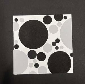
This project was to improve the pace of work in order to demonstrate fluidity and become more relaxed while working under a time restraint. Additionally, it was designed to create representational abstract compositions of a specific word.
All three final compositions are 4’’ x 4’’ and mounted, centered, on black boards, 6’’ x 6’’
Compositions:
Dots and lines may touch but not overlap
Dots and lines may extend off the picture plane but should be trimmed flush in final composition
Dots and lines may be as large or as small as you want Dots and lines may be in black or gray, and only one shade of gray

Only the prescribed combinations are used 2 dots + 2 lines 2 dots + 1 line All dots All lines
1 dot + 1 line 1 dot + 2 lines
Only one of the final compositions may be all dots or all lines
Gestalt is a method or theory of art that essentially allows your mind to complete the image rather than having a whole picture.

Honestly it is not that difficult for me to make a ‘well-crafted object’ because I put everything into a project that I tend to give myself more time to perfect it. Therefore, I think this project was not any different than other ones I have done.
Similar to the previous answer, I like to spend extra time to perfect the details since a lot of the time the detials in a project make or break it.
This project opened my mind to abstraction because it allowed me to see how the other people in the class interpreted either the same or different words. The part that I struggled with was during critique it was hard to interpret the piece without hearing the thought process of the artist in order to better understand their interpretation.
It was difficult to represent ideas without illustrating them because for a majority of the words they already have either a stereotype or some kind of connotation about them; that
was the hardest part, steering away from preconceived notions. I might use gestalt and abstraction to simplify either a project or word in general. I think a lot of the times people tend to complicate things generally so this technique allows you to quickly put something together while also being simple.

Graphic design relies on how a designer handles text through forms which can impact how the audience perceives the specific meanings. In the project, we were required to carve out and print letters to understand how negative space impacts a word.
The pictures above are examples of experimentation with my word ‘ooze’. One of the specifications were to modifiy the word, what I did was use a printer to create a dragging effect to better emphasize the word oozing.


I learned that letterforms are harder to work with than I initially thought. It is easy to pick a word but more challenging to take that word and translate it into a concept on paper. At the critique, it was interesting to see how everyone interpreted the words; it is interesting how different everyone’s mind is. I think my favorite part was learning the many ways to manipulate the word with the printer. Next time I think I would try experimenting more with the other meanings of the word

because I was stuck working on the literal meaning. I like what I did using another substance but expanding on that more as well by using other substances to see how the word is portrayed would be interesting.


Learn about past and current designers to understand the qualifications of what is design. Write a short post about a specific designer and present pictures of their work.
Corita Kent, who is also famously known as Sister Mary Corita, was an artist, educator, and advocate for social justice. Throughout her career, her artwork evolved as she did from using figurative and religious imagery to incorporating advertising images and slogans, popular song lyrics, biblical verses, and literature. Whatever she was going through at the time her artwork captured it. Sister Corita used a type of art called serigraphy, this medium has been around for over one hundred years, it is a term used for silkscreen printing that comes from the Latin term


‘Seri’ meaning ‘silk’ and ‘graphos’ which is Ancient Greek for ‘writing’. Silkscreening is used for everything from logos on t-shirts to posters. Serigraphy involves covering portions of silk with a coating that is then stretched on a frame, the image is masked with tape and a coating of glue is applied. Sister Corita would use bold, vibrant colors to create her serigraphs to draw attention to the meaning behind her pieces. To her, art was a tool for activism. Her style was also similar to Andy Warhol’s pop art. For instance, she was inspired by his famous Campbell’s
soup cans and began drawing on pop culture as source materials. She looked and found inspiration from everyday life which was prominent in her work of the ‘Enjoy’ logo that was taken from CocaCola, and paired with a poem by another nun. I think that Sister Corita’s work is beautiful in the way that it is very colorful drawing your eyes directly to her artwork; it is captivating.


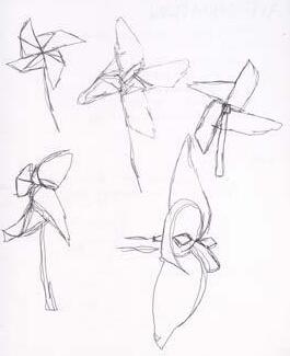
This project required us to work for a longer period of time on the same subject matter to transform and translate it into a variety of styles. Just like the title the project was designed to work iteratively and experiment with a variety of media.


12’’ x 18’’ poster printed on card stock featuring six iterations: continuous line, 2 master artists (Malika Favre, Keith Harring), collage, type collage, and geometric.


Through this process, I learned a lot about the different angles of a pinwheel. It forced me to look closely at how it works and specifically how I would be able to portray a 3D object in 2D. For me, the most challenging media was working in photoshop because I have never used it before to edit photos and was not confident. Photoshop can be used for so many different things that it was hard to do what I wanted to do without messing up and editing either the wrong layer or using the wrong tool for the job. Therefore, I found it more enjoyable to physically make the work rather than doing it online.
I think overall I will use photoshop moving forward to edit photos and create artwork completely using it just so I can expand on the beginner knowledge that I have and continue to expand on it.
If I were to continue with the pinwheel I think I might want to portray it in different environments to showcase how it moves. Additionally, I would make fun, interesting designs of the pinwheel in different positions to see how the designs would vary.

 Geometric
Master Artist
Geometric
Master Artist


Public Service Announcements (PSAs) are messages of information that are free to inform the public about many issues impacting the world. Typically the announcements are made through the government to warn, educate, encourage, cajole, or chastise but specifically to move people to action.

Poster
8.5’’ x 11’’ poster using the text supplied by your client, printed in black and white on colored or white paper
A coherent creative brief that includes ALL the text your designer will need


Poster is text only, no illustrations
Maximum two fonts but variations of font family can be used
Text can be reversed out
Poster can be a bleed print
It was challenging to use type only because I had to rely on using different fonts, the boldness of the fonts, and varying opacities of text boxes.
I used scale mostly for the headings or to highlight the most important information in order to grab the attention of readers. For instance, the title of my poster had larger text compared to the other information as well as the date
so that people are aware of when the proposals and portfolios are due.
I improved my skills working in InDesign, especially regarding putting text into the program. From this project, I also learned the difficulty of only using words and text on a poster that would grab the attention of viewers while appeasing my client’s guidelines. I can use these skills
in future projects to improve my ideas and designs.
Are you called to creative work? If so, how do you recognize that calling?
If not, to what do you feel called?
I would say that I am called to creative work but I am also called to do something else as well. I love being creative and believe that I should be using my creativity in the future whether it be for my main job or doing something on the side. As of right now, I think that I am being called to make a difference through politics since I am a political science major. Although it would be amazing to somehow combine the two into one job.
If you were guaranteed it would support you financially, what would you want to design or make for a living?
If I was guaranteed that being creative through design would financially support me I would want to do lettering and branding for logos. My style is more simple which is similar to a majority of logos and brands. Additionally, I love drawing and creating lettering so being able to do it for a career would be a dream.
Overall, I do believe that design plays a huge role in everyday life just like any other types of art. I think that in order to be good at drawing one must understand the concept of design; it is similar to figuring out a compelling composition.