2 minute read
CALIFORNIA COMFORT
INTERIOR DESIGN: LIV MEAD TIBLIER, MEAD DESIGN CO.
PHOTOHRAPHY: KRISTEN ELIZABETH STUDIO
Amixture of woods, metals and textures created a well-collected California vibe in this Windermere renovation project that included new furnishings, finishes, layout, architectural details and artwork. Liv Mead Tiblier, chief creative officer of Mead Design Co., previously worked with the clients on a few other projects, including a Florida beach condo.
“Our clients spend a quarter of the year in California. They love to surf and the whole California lifestyle. They have children in high school, so we wanted to bring back that approachable aesthetic from their travels. We were really inspired by Santa Barbara living. It’s casual but still tailored,” she explains.
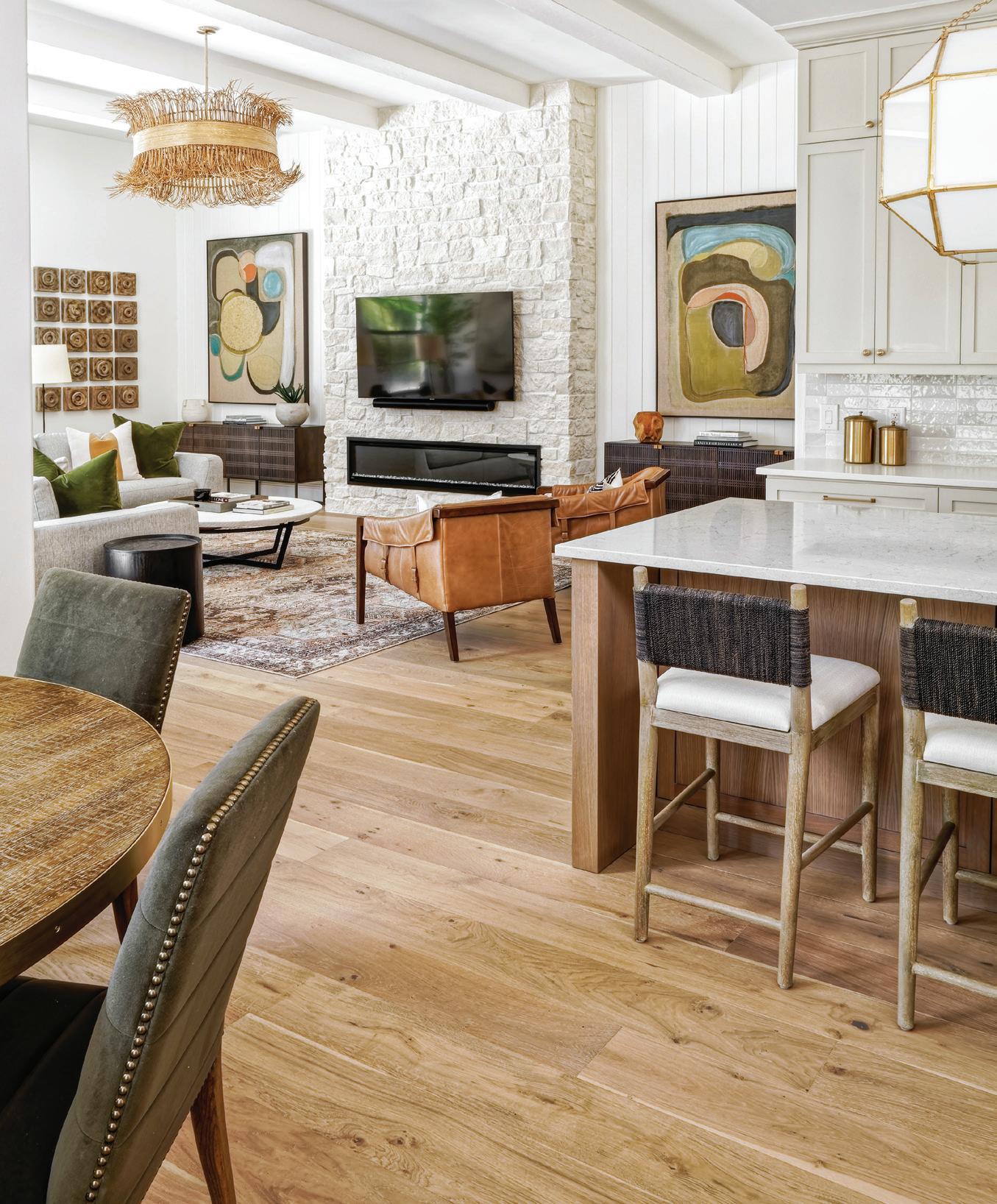
The living room and kitchen underwent the most major renovations. A corner fireplace in the living area created an unfavorable layout, so Liv added a linear stone fireplace on the back focal wall with surrounding shiplap. “I love how the kitchen opens up to the family room and features the oversized pendants. It can seat a lot of people at the island and it’s a great family kitchen,” Liv says.
Opposite: THE ORIGINAL FIREPLACE WAS REDONE AND CENTERED ON THE BACK WALL TO CREATE A MORE COMFORTABLE SEATING ARRANGEMENT. THE SHIPLAP, STONE SURROUND, LINEN ARTWORK, AND LIGHTING FIXTURE FROM ARTERIORS GIVE IT THAT COASTAL FEEL.
IN THE ADJACENT KITCHEN, LIGHTING IS ANOTHER STANDOUT WITH TWO LARGER GEOMETRIC LIGHTING FIXTURES FROM VISUAL COMFORT HANGING OVER THE CUSTOM STAINED WHITE OAK ISLAND WITH PLENTY OF SEATING. “WE LOVE AN ALL-WHITE KITCHEN, BUT WE WENT WITH A BENJAMIN MOORE NATURAL CREAM COLOR ON THE CABINETRY INSTEAD OF WHITE BECAUSE WE WANTED TO DO SOMETHING A LITTLE MORE TONAL,” LIV EXPLAINS. A BEDROSIANS CLOE TILE BACKSPLASH ADDS A LITTLE SPARKLE TO THE SPACE.
Top: THE GRAND FOYER MAKES A STATEMENT WITH A WELL-STYLED LEXINGTON TABLE. THE FRONT DOORS ARE ORIGINAL TO THE HOME.

Bottom: ANOTHER GRAND LIGHTING FIXTURE FROM VISUAL COMFORT PUNCTUATES THE DINING ROOM THAT ALSO FEATURES A FOUR HANDS RECLAIMED WOOD TABLE AND SUCCULENT CENTERPIECE FROM LOCAL WINTER PARK CUSTOM FAUX FLORAL COMPANY, STACKED AND CO.

“One of the things you’ll notice about the house is we really mixed the wood tones. Good design can do that — people get very stuck on everything has to be white oak, but it really doesn’t,” she adds. The breakfast nook and dining room feature darker reclaimed wood tables along with the foyer table, while the bathrooms have lighter wood vanities.
The grand foyer was actually part of a former formal living room that got broken up to add more square footage to the kitchen and breakfast nook. The front door is one of the only original elements kept in the home. “That was the one thing that we loved,” Liv says.

The entire renovation project took around nine months. “The goal of this project was to create a look for a well-traveled family who enjoy their time in California. When we design a space and clients give us free creative direction — and we know so much about the clients — it’s easy to tell the story through them,” Liv says.
Opposite, clockwise from top left: THE MAIN BATHROOM FEATURES A CUSTOM WHITE OAK VANITY, GEOMETRIC TILE, AND FUN WALL SCONCES FROM VISUAL COMFORT.
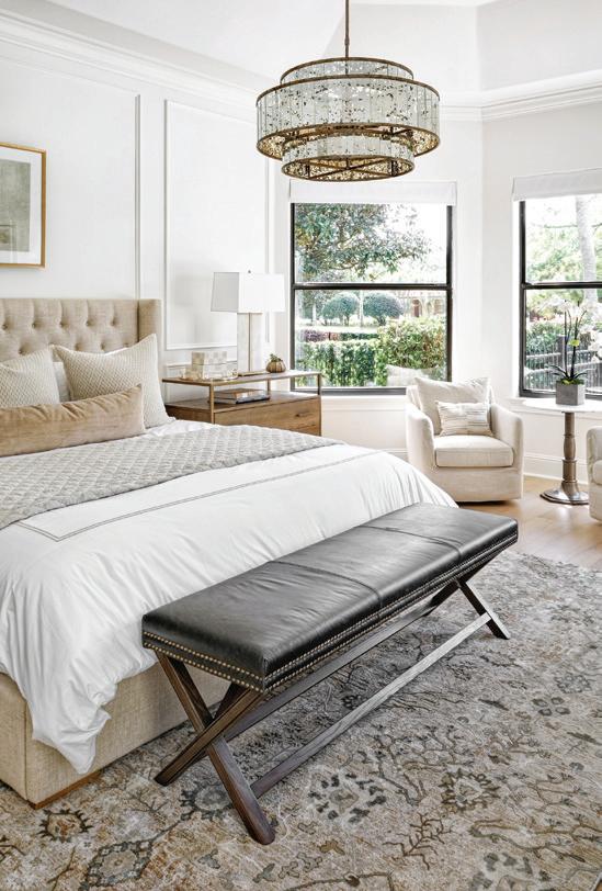
LIGHTING MAKES A STATEMENT, ONCE AGAIN, IN THE MAIN BEDROOM WITH A CHANDELIER FROM CURREY & CO. A BLACK LEATHER BENCH ADDS A POP AGAINST THE NEUTRAL FURNISHINGS AND BEDDING.
ANOTHER BATHROOM FEATURES THE SAME CLOE TILE THAT WAS USED IN THE KITCHEN AND CONTINUES TO MIX WOODS AND TEXTURES TO CREATE A NATURAL, SERENE SPACE.
AN UNEXPECTED POP OF COLOR CAN BE FOUND IN THE OFFICE WITH THE BLUE LINEN SWIVEL CHAIRS.


We kept the existing beams in the family room and just gave it a facelift. With window treatments, the math has to be spot on and it can be expensive, so a lot of people don’t do them anymore. It really is a wow factor and something we like to do with all our clients.


