


Graduated from a master 2, in art direction from Institut de l’Internet et du Multimédia (IIM) at Léonard DeVinci university (Paris).
A 5 months internship as a Graphic Designer in the Marketing team of Wella Professionals in Sydney, followed by an exchange program at UTS concluded my bachelor’s degree in “Digital Project Manager” specialised in multimedia creation and design. Then I did a 2 year apprenticeship in the communication agency Sologo, in parallel with my master in art direction.
Later on, in my professional career, I would like to work as a print and web designer. The edition & print dimension of graphic design is a field that particularly interests me.
Passionate about graphic design, typography and photography, I am always looking for new discoveries. Enthusiastic, dynamic and creative, I like to experiment by varying the media and tools.
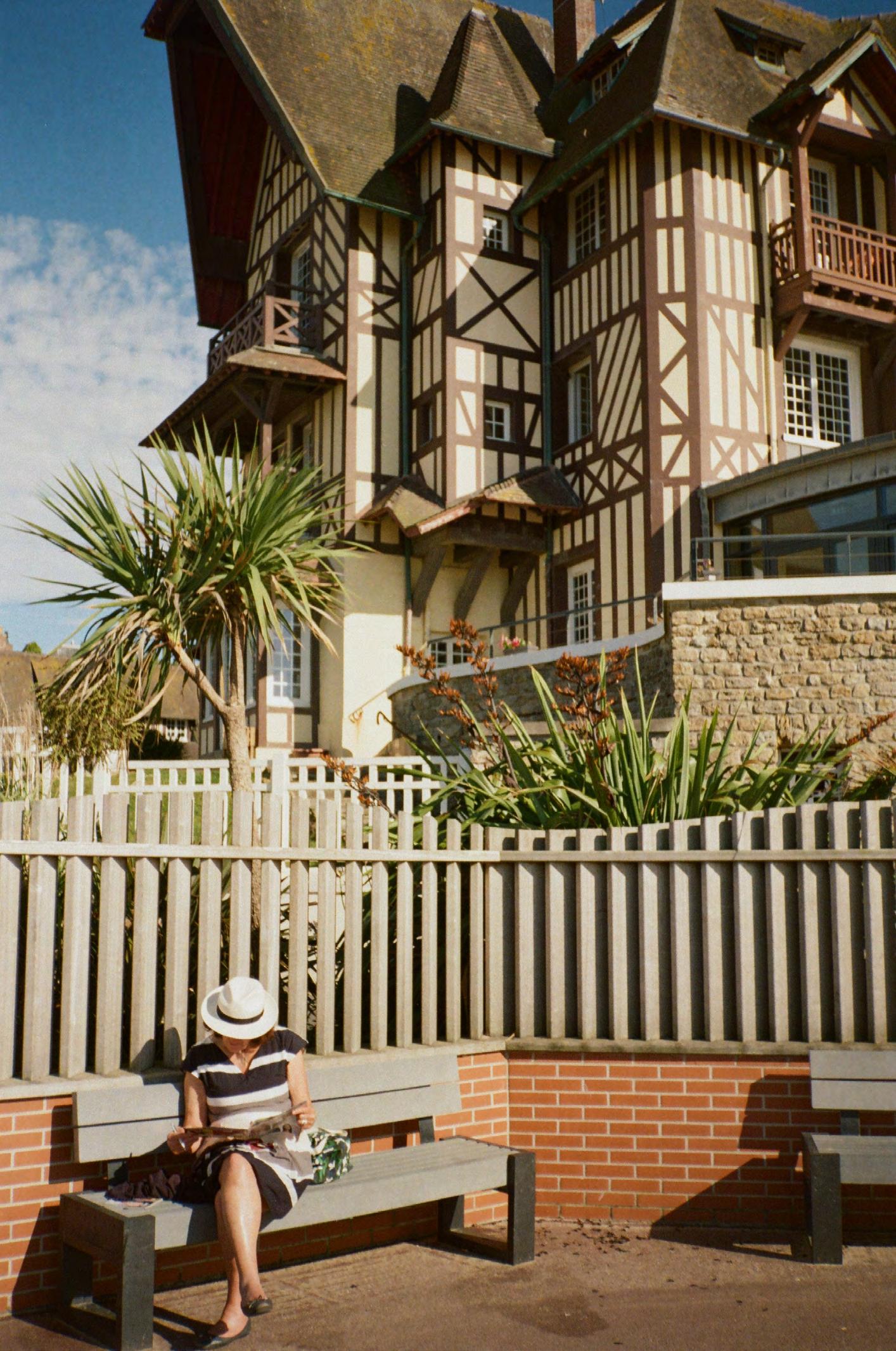
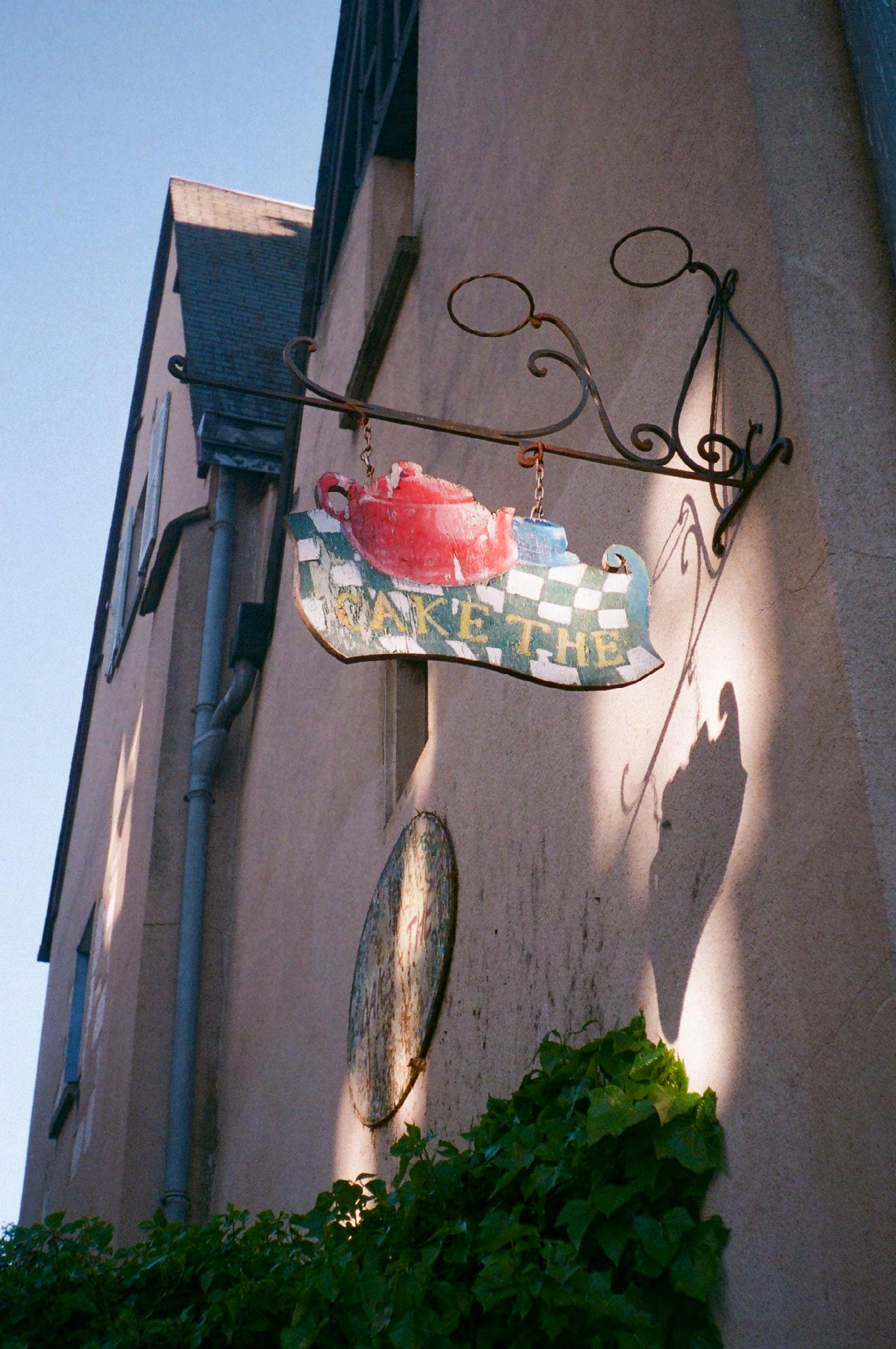
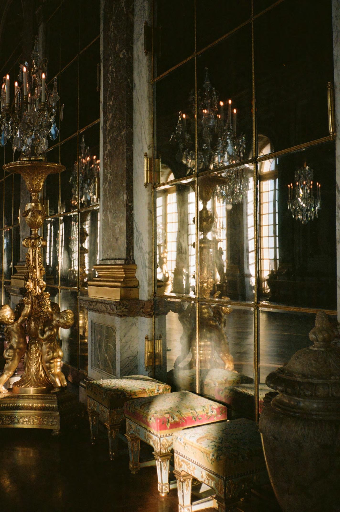
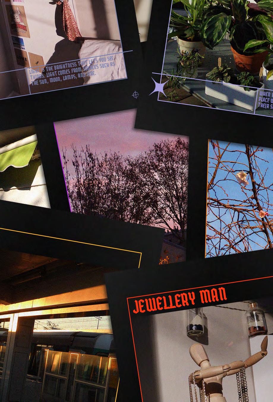
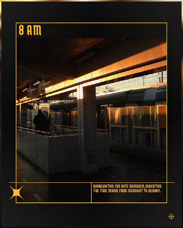
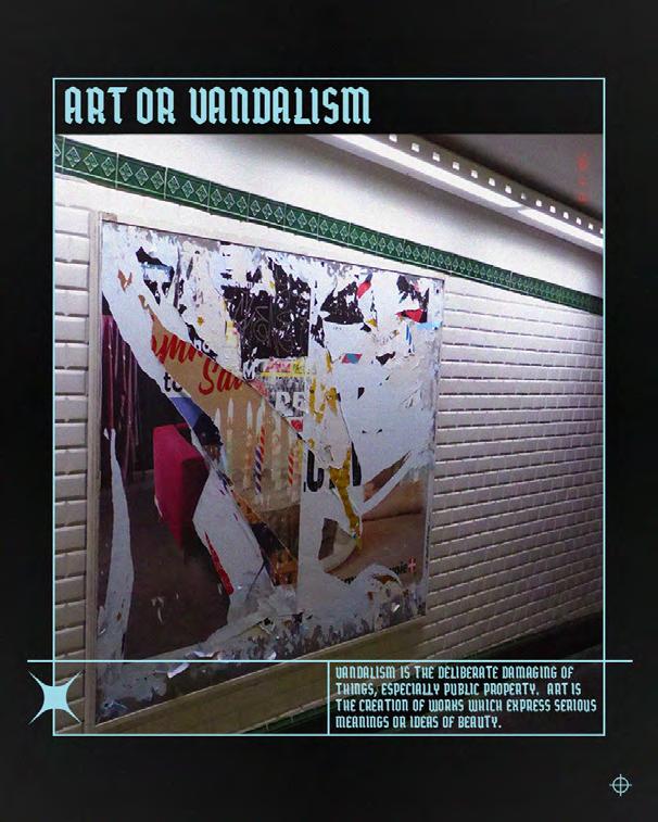
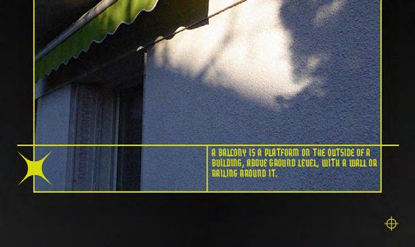
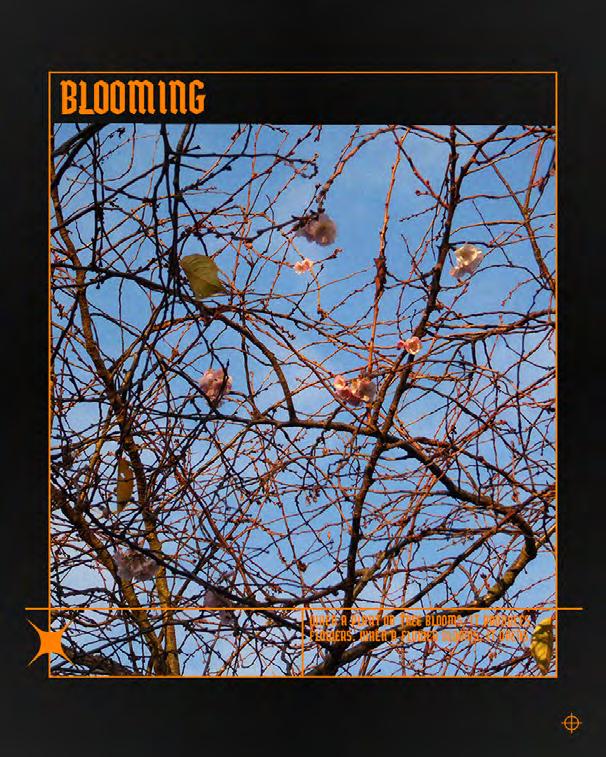
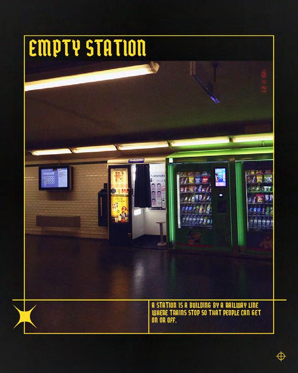
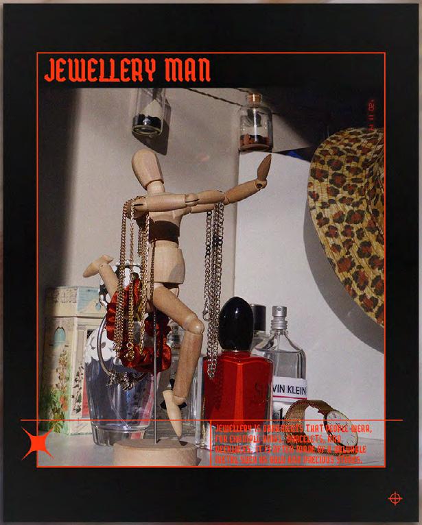
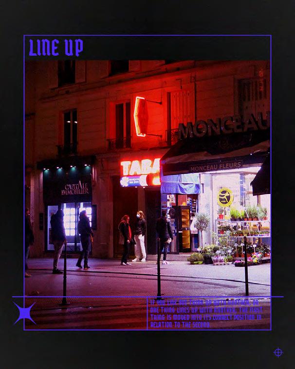
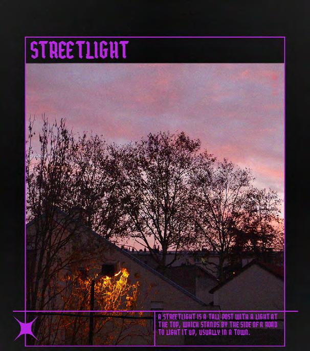
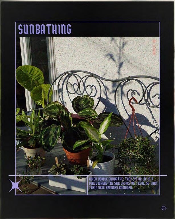
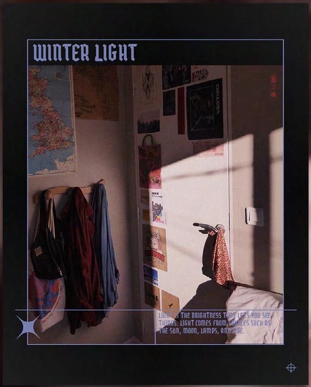
Film photographs taken with a 35mm camera - Personnal project -

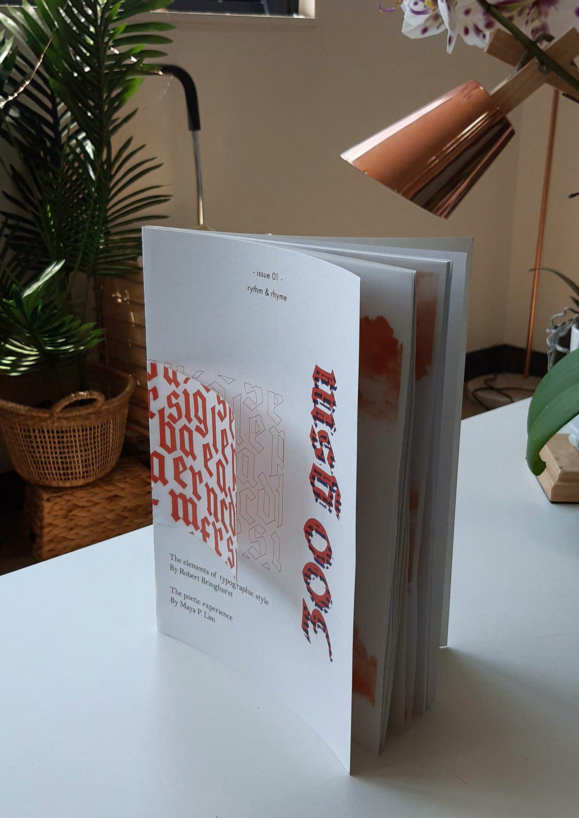
Magazine ‘300gsm’ made with Illustrator and InDesign. - University Technology Sydney Project -
300gsm is a typographic magazine aimed at designers or people who have an interest in design techniques, typography and creative content.
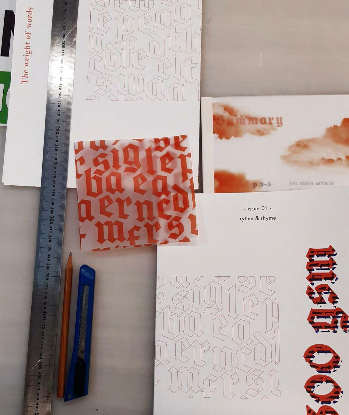
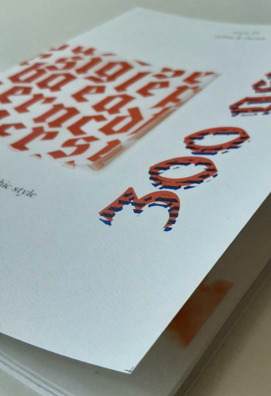
‘gsm’ stands for ‘Grams Per Square Meter’ and is the equivalent of ‘gm/2’.
The concept that the magazine is based on is transparency and some answers to these questions:
What do you see through something? What point of view do you have? Does it differ from the original state? Does it affect your experience?
300gsm in its entirety will submerge the reader in a journey through articles and its design.
Typography is the main concern in 300gsm. The beauty of letterforms is emphasized by the alliance between a gothic and a serif font, in fact, Cabazon is used in headings but also in imageries and designs throughout the magazine.
The magazine guides the reader through a grid of 5 columns, which structures his reading experience.
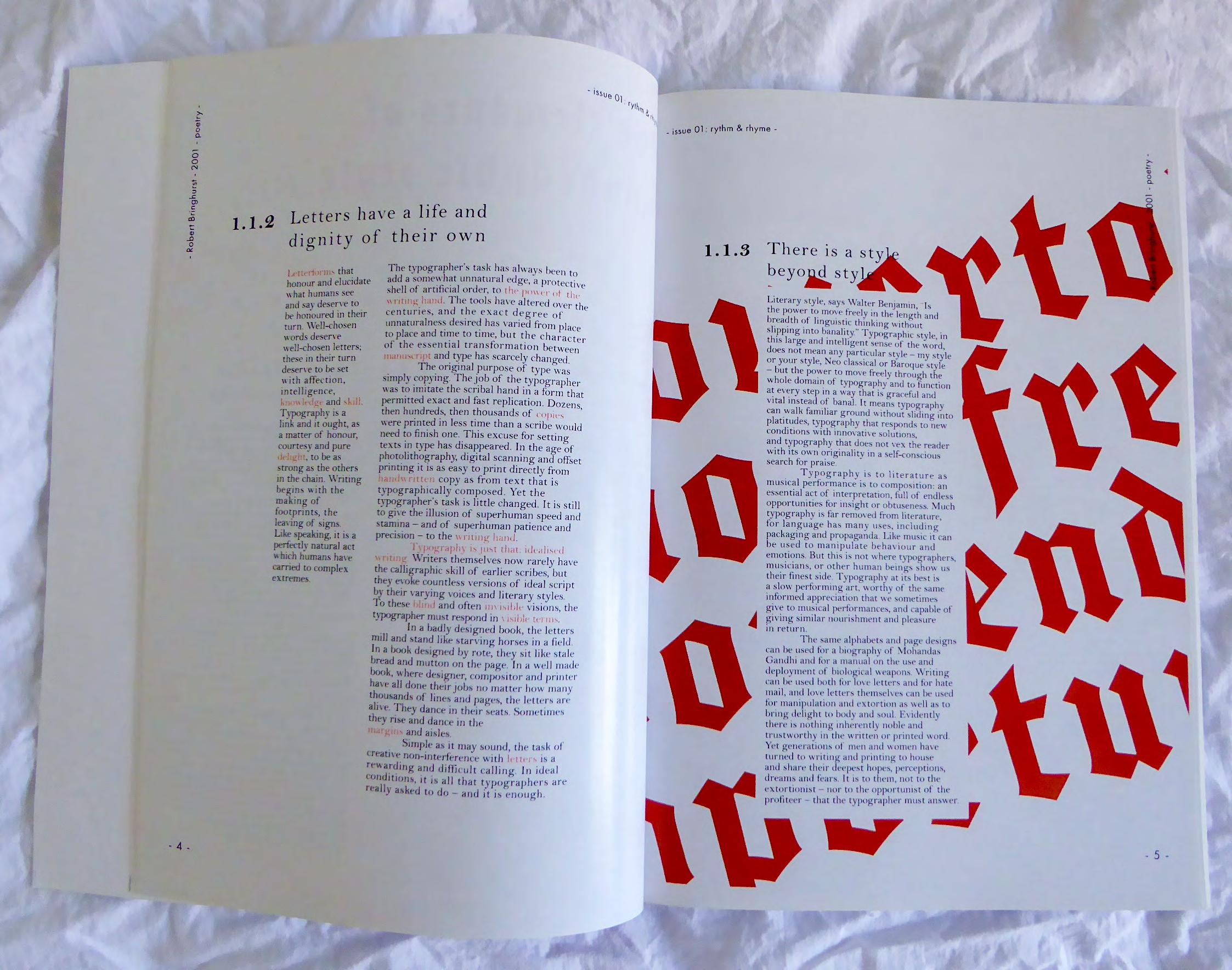
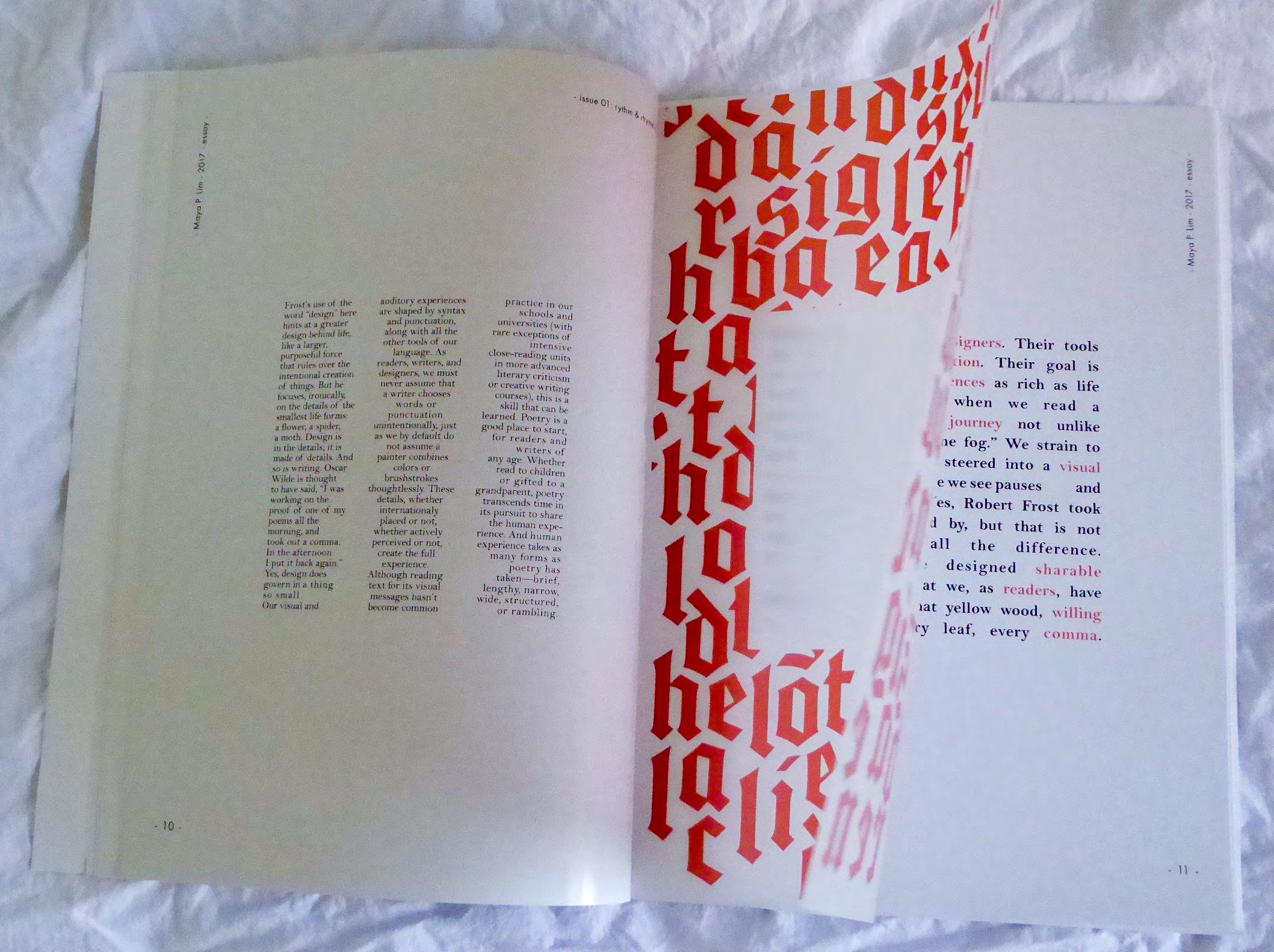
The main magazine pages are printed on glossy paper, 115gsm, A4. The style guide is printed on recycled paper, 115gsm, A4. Inserts are printed on tracing paper, 112gsm, A4.
Every imagery must contain or be edited with #ec6441. Photography must occupy 3 columns of the grid structure.
Inserts can be imagery or text (Cabazon), they must have no background and must be in #ec6441.
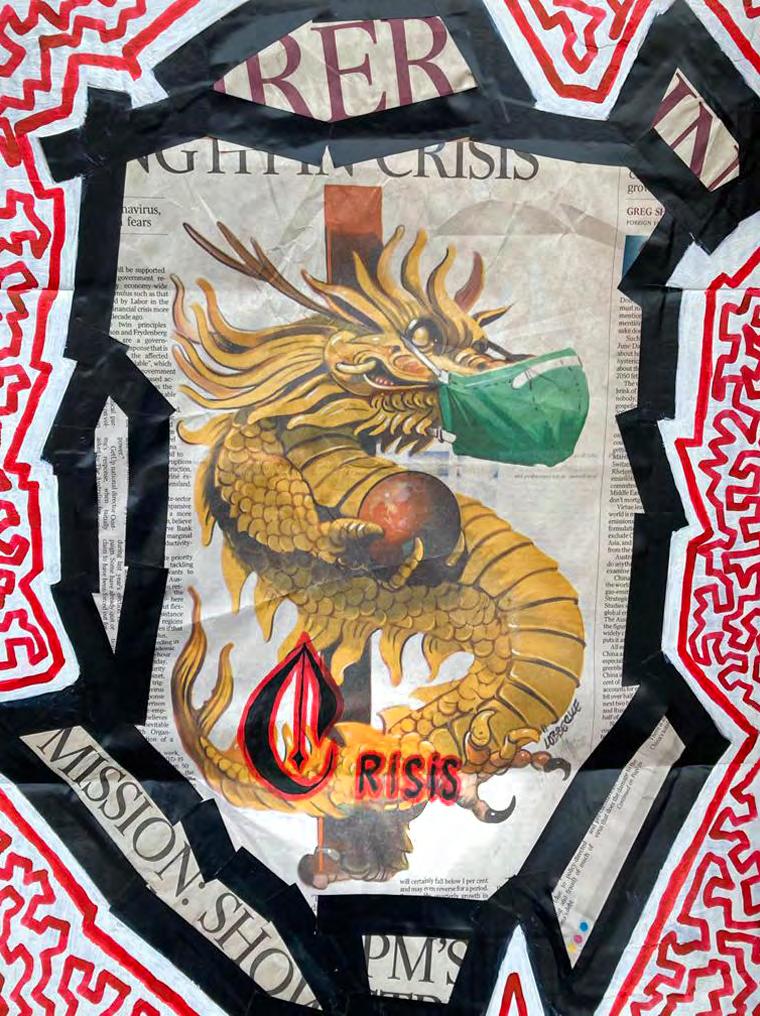
- Personnal project -
‘Crisis’ was made during the pandemic that we experienced this year. The title ‘Crisis’ is emphasised with the big gothic font of the first letter. The red outline is supposed to represent the confusion and chaos around the whole unprecedented situation.
Book covers made from handmade collages then scanned.
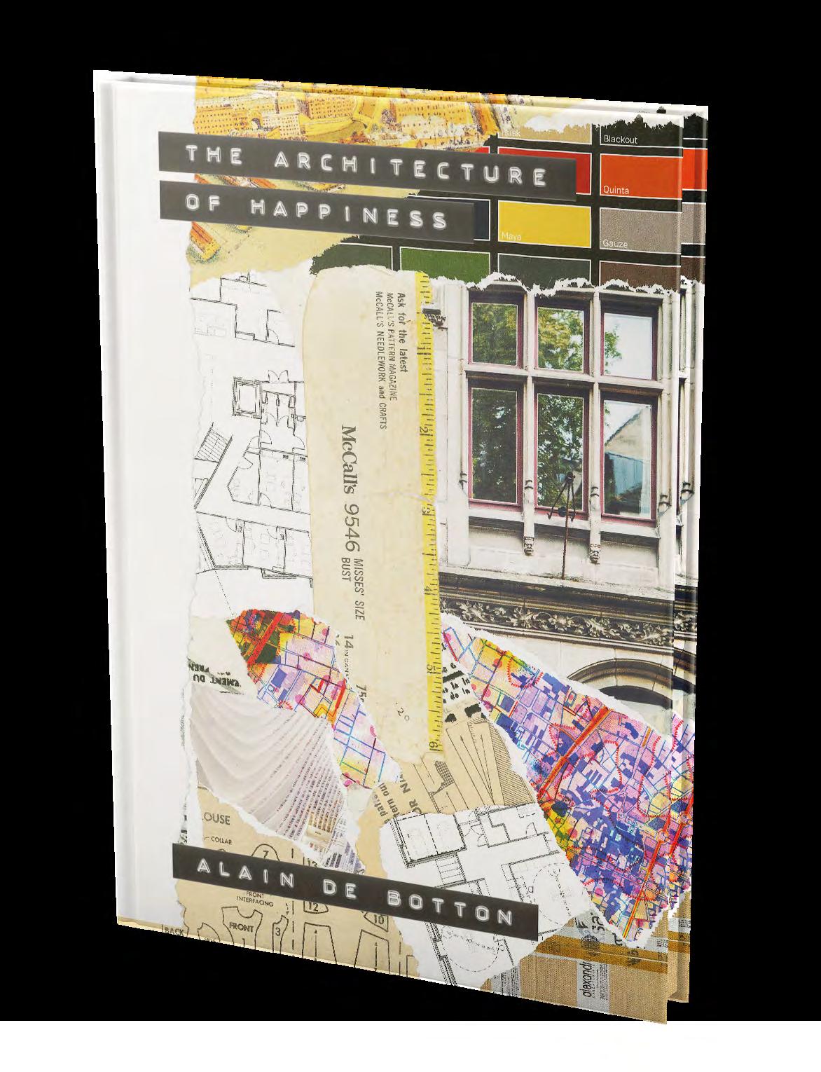
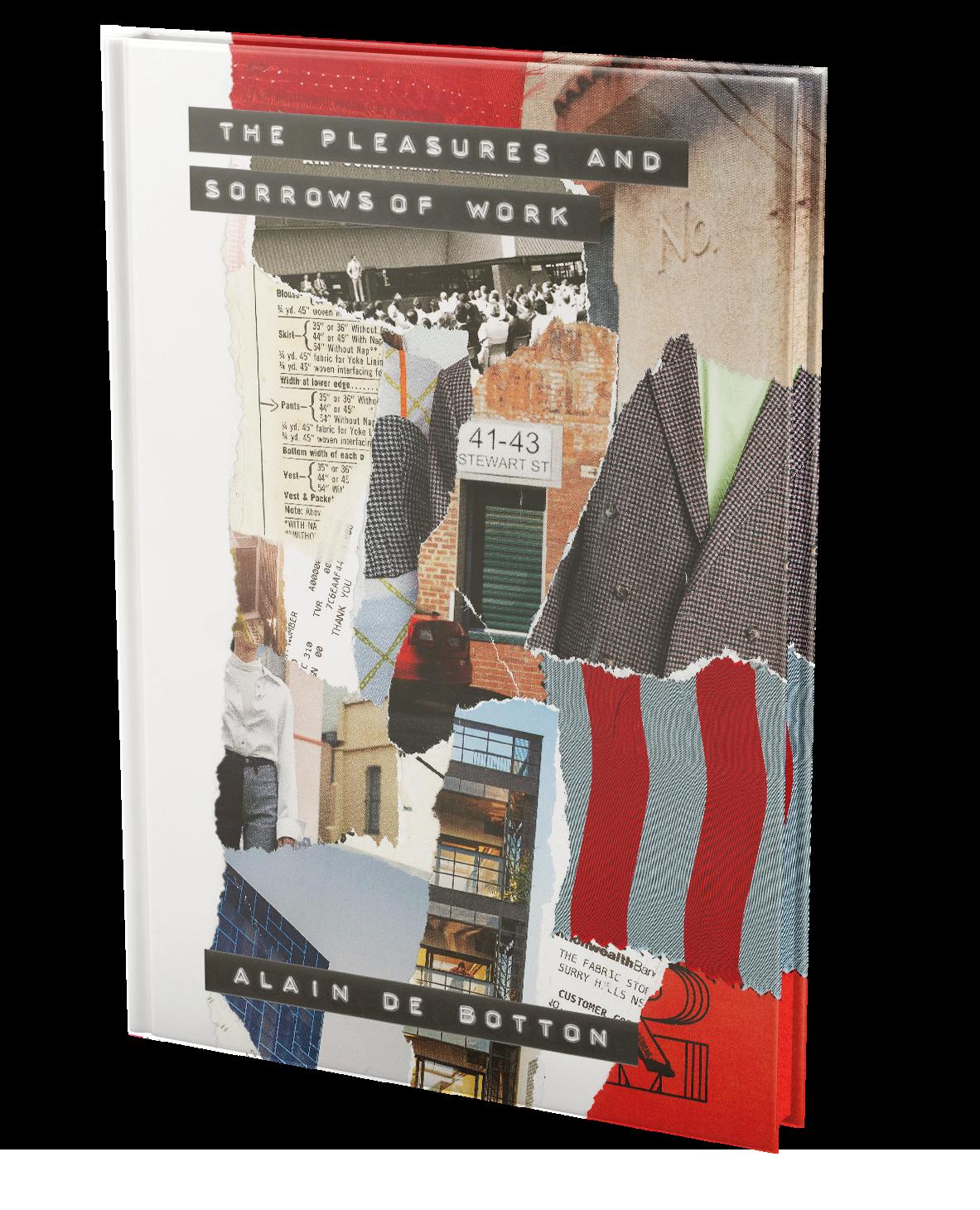
- University Technology Sydney Project -
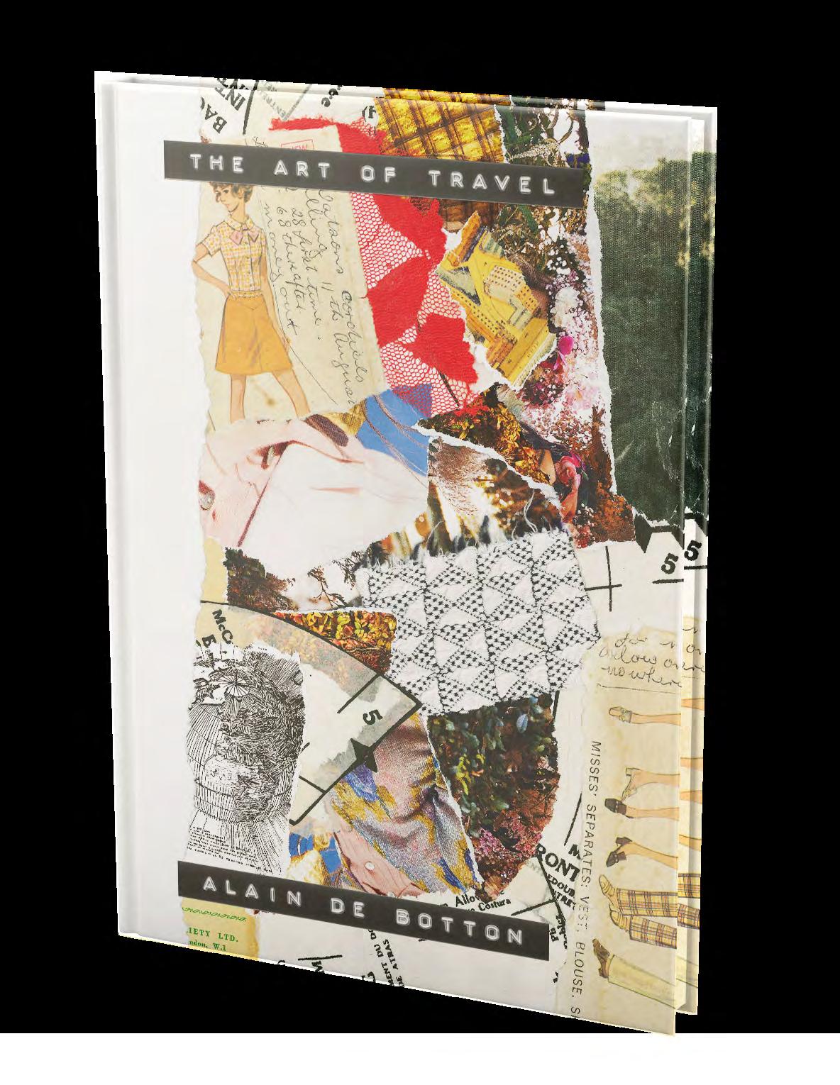
In this project, I had to imagine a series of book covers for Alain De Bottom’s work. The author aims to popularise philosophy. Those 3 books guide the reader through a journey of selfdiscovery.
Collage is the artistic expression
I found most suitable to convey nostalgia, a recurring emotion inside Alain De Botton’s work.
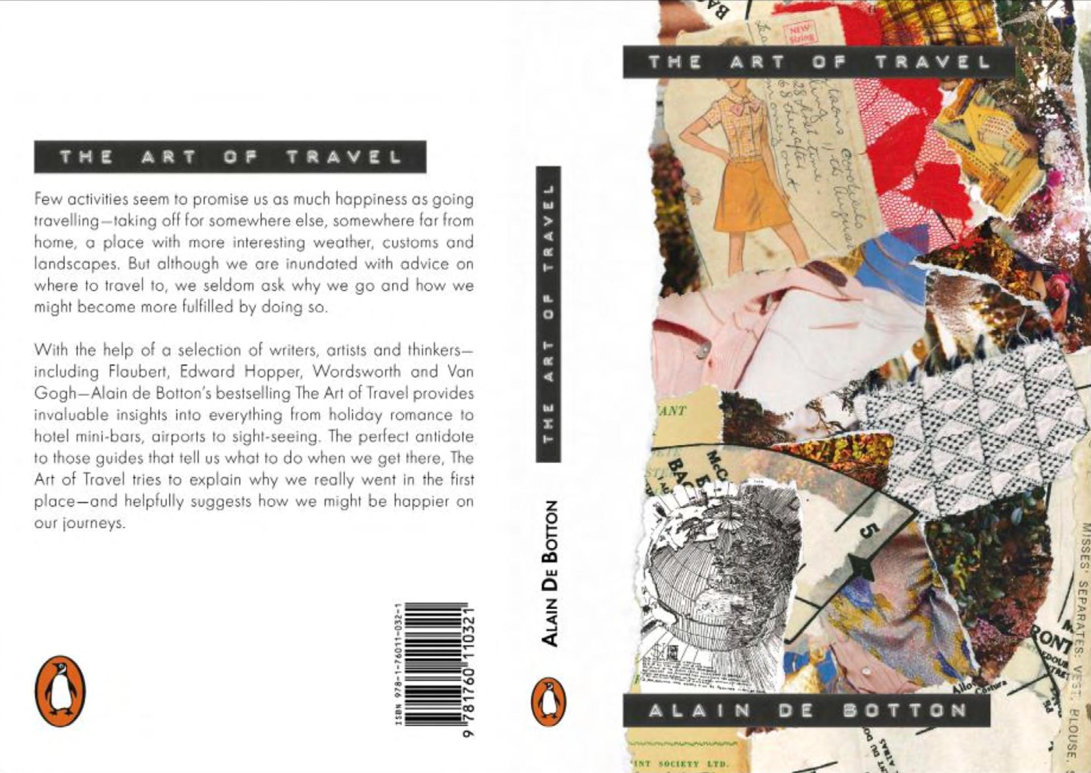
I have collected every single element carefully, from the pieces of old fabric to the sewing pattern, in order to express the richness of the world. They are souvenirs from life, each with their unique meaning and history, but together, they form a cohesive and significant story.
This technique is able to engage the viewer in a physical way, by attracting his attention towards the variety of visual details.
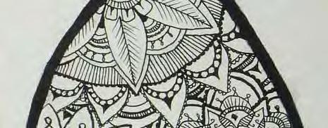
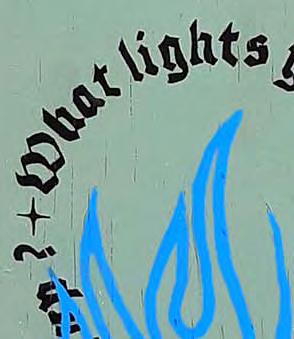
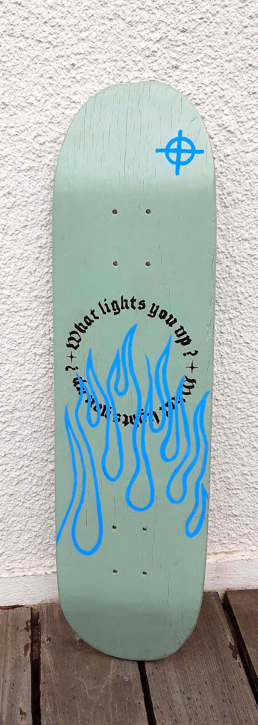
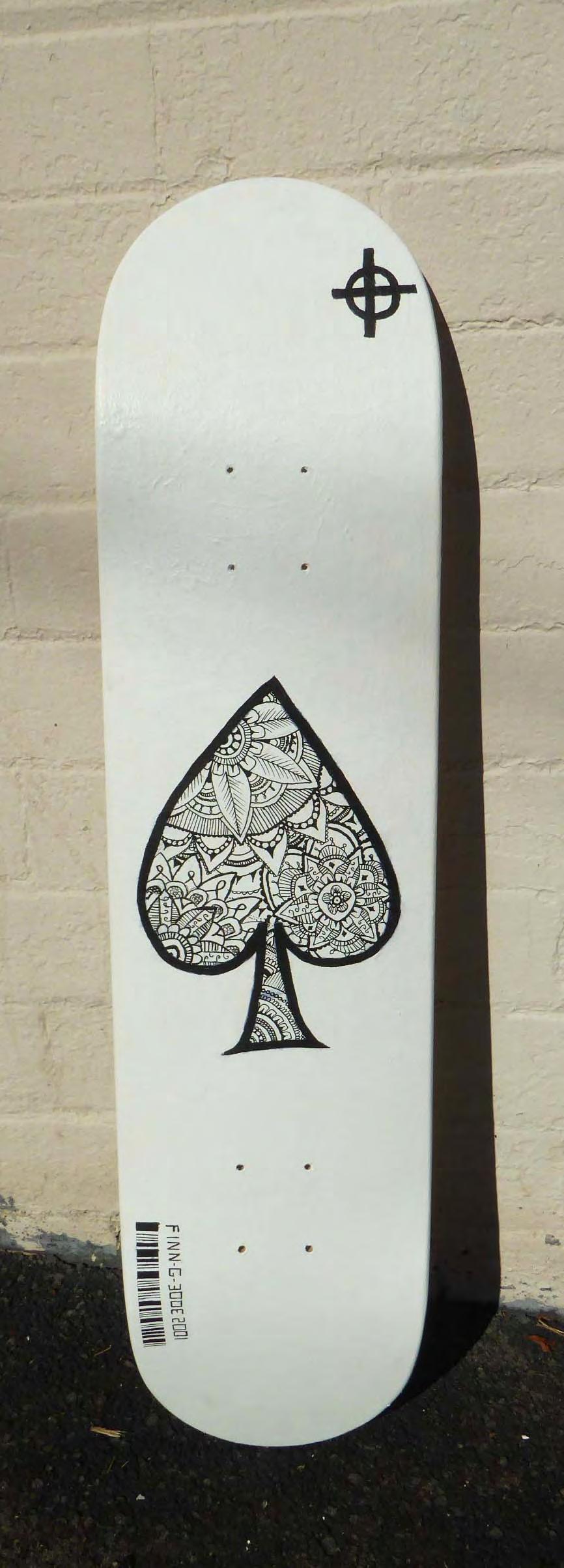
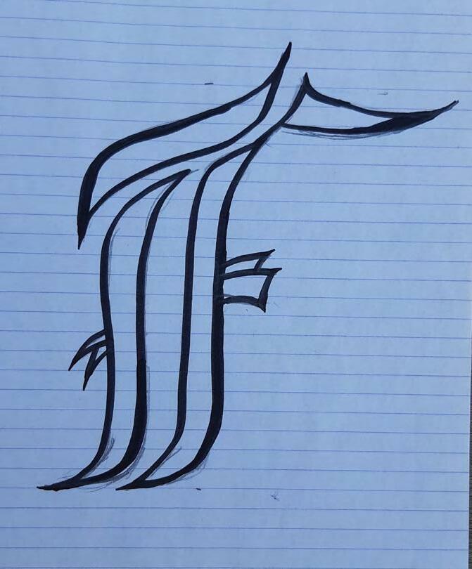
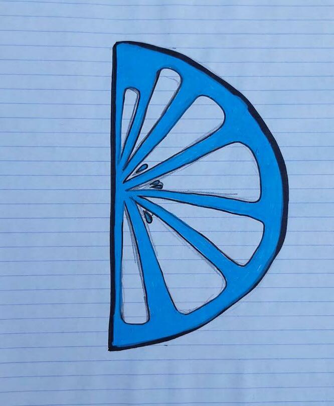
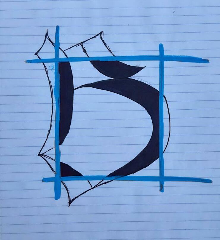
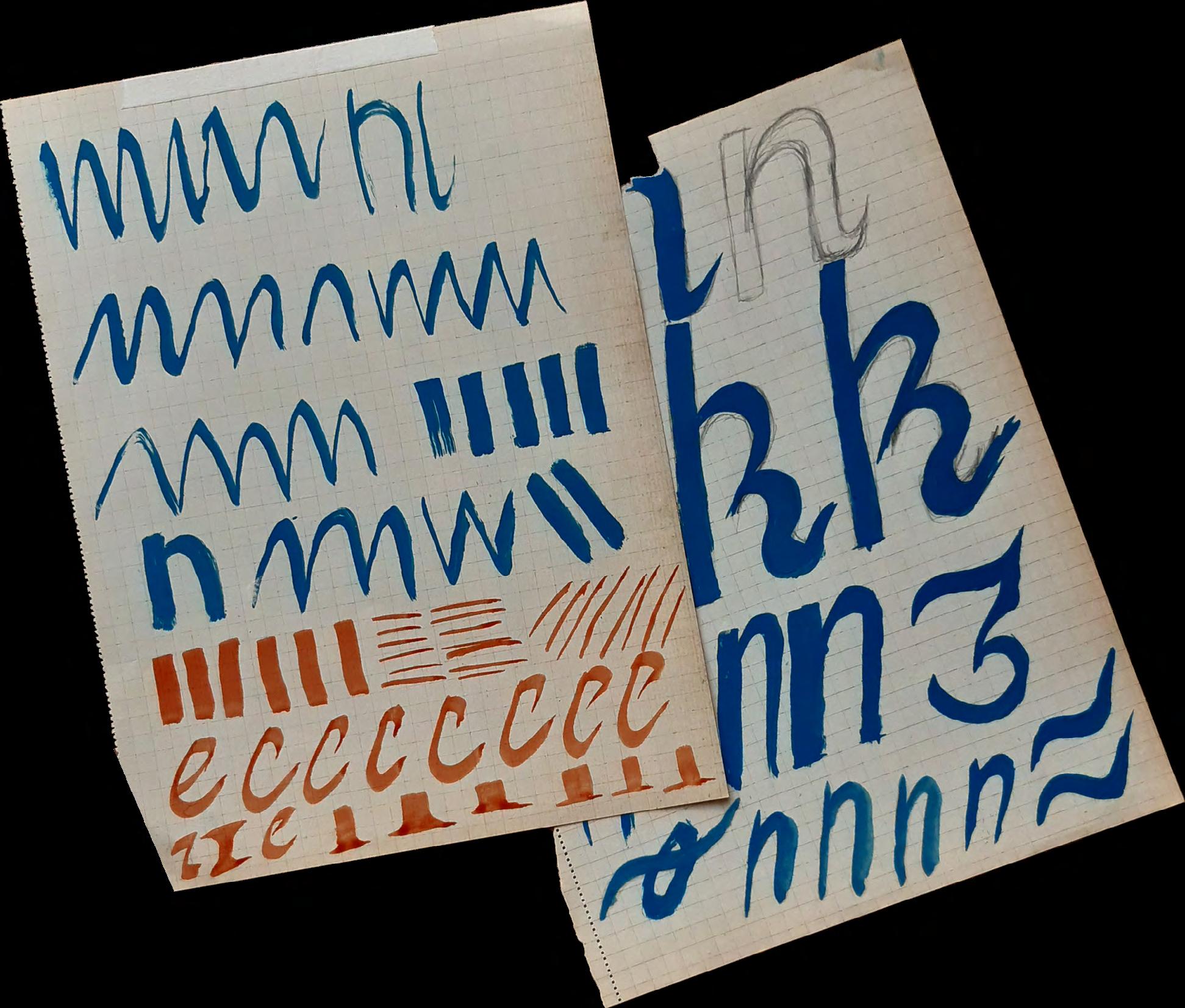
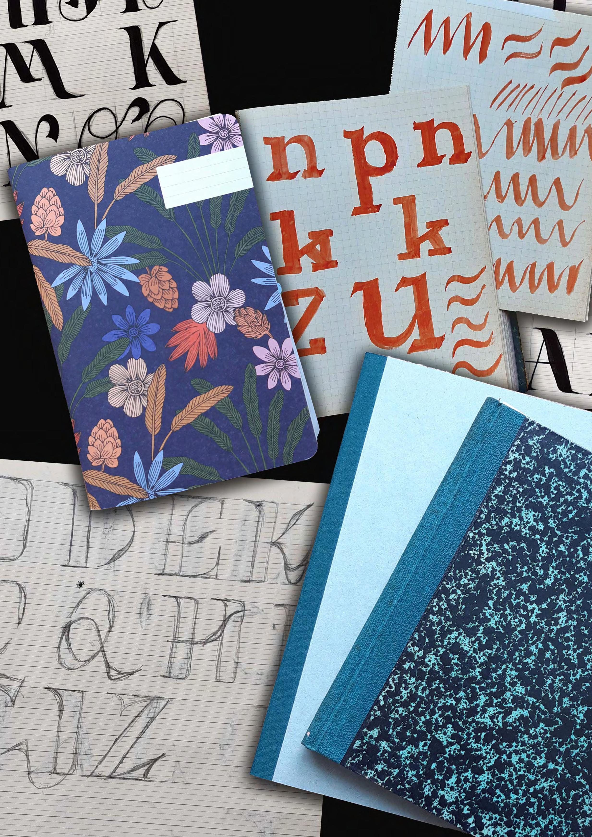
Exploration of lettering with paint & markers
- Personnal project -

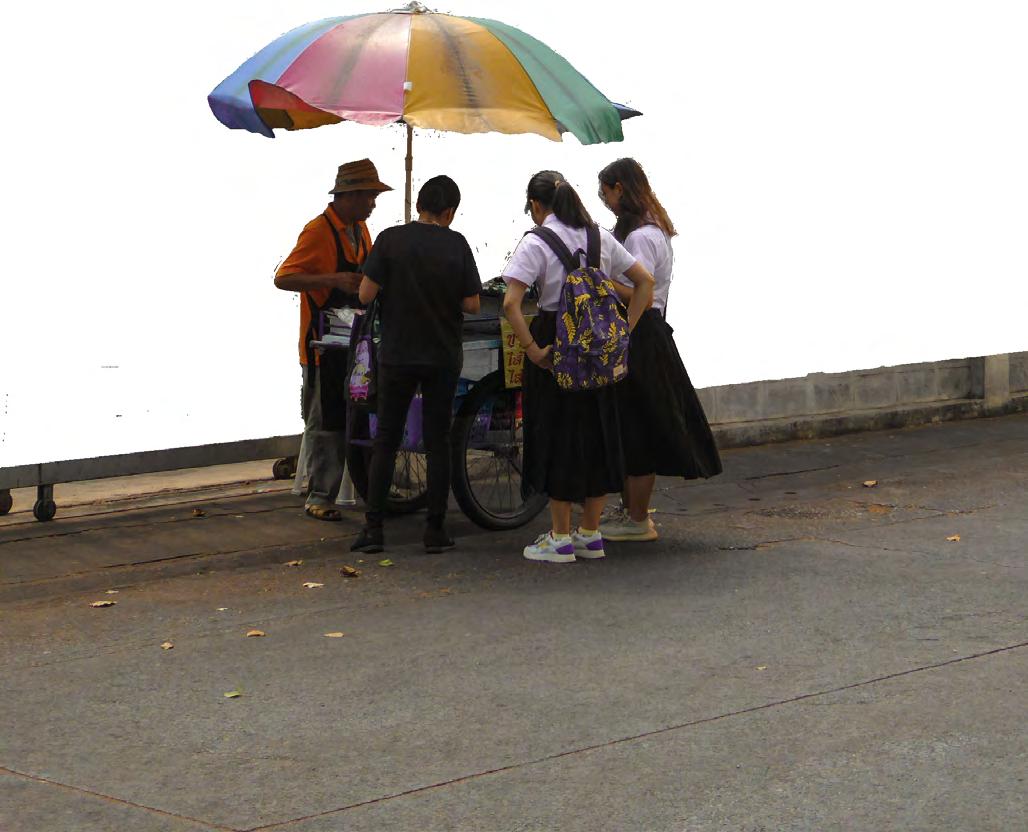
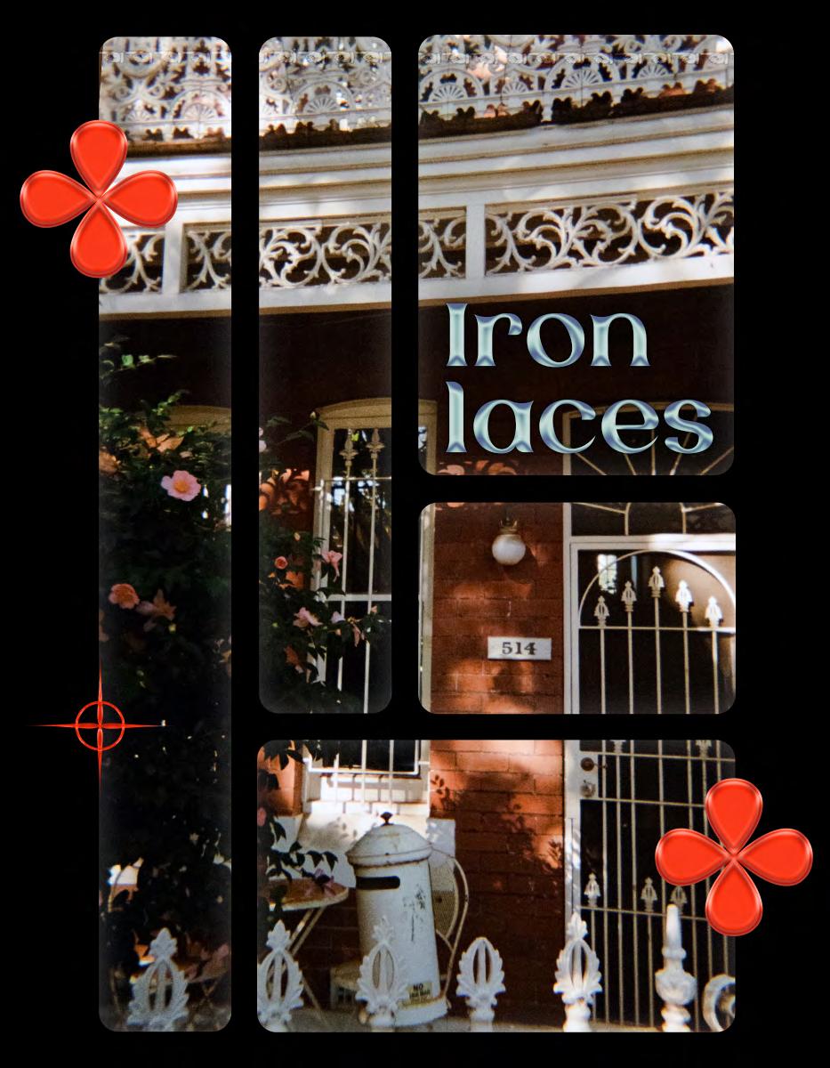
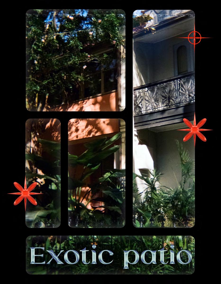
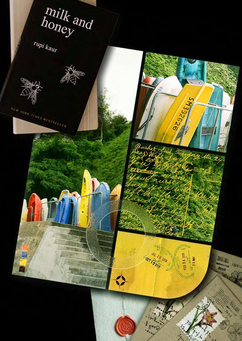
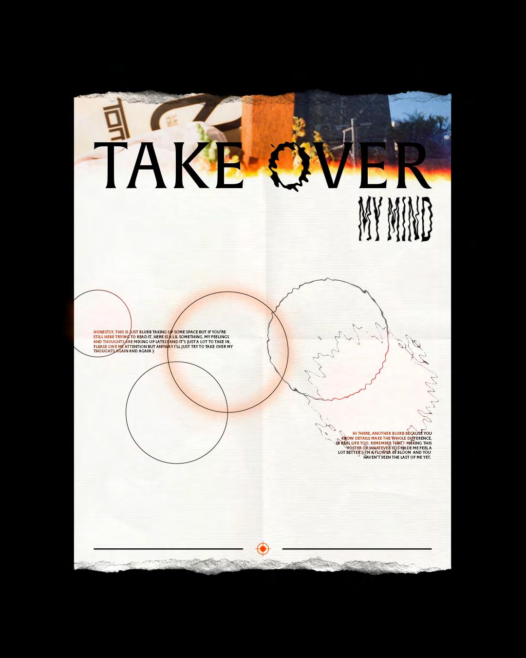
Digital posters made with Photoshop using photos I took. - Personnal project -




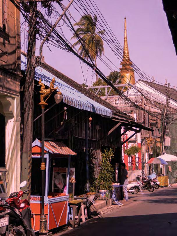
The first 2 posters are part of a series called “Rose des vents”. The aim is to highlight a city or a place. Those 2 are representing the city of Bangkok,
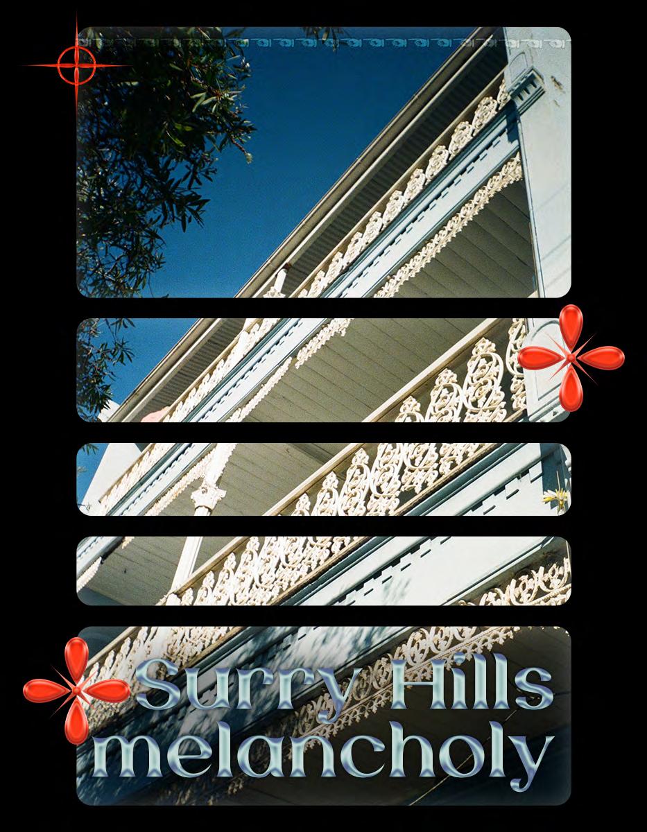
Posters on the right page are called: Surry Hills melancholy. This series is made with analog photos from Sydney. I had fun playing with the layout and what looks to me like a window through which you can see the neighborhood
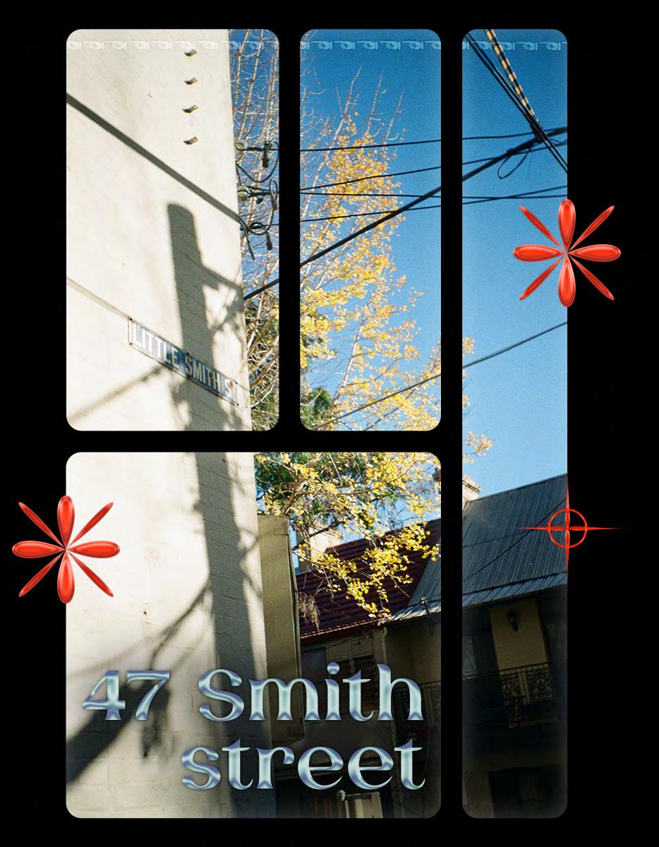
On pages 22 to 25, other posters made this year combining typography and film photos.

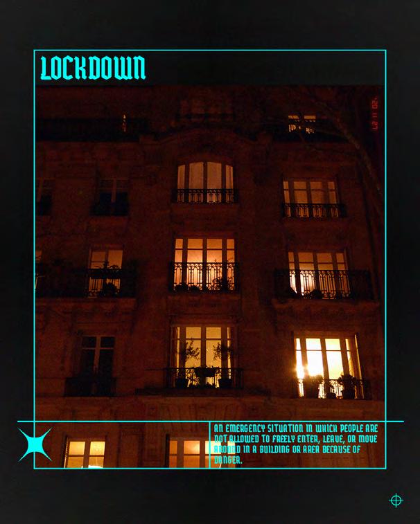

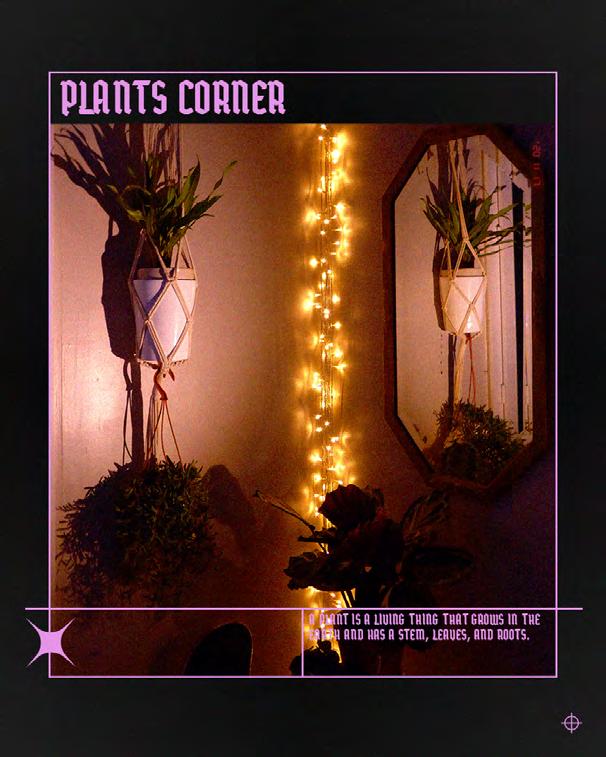
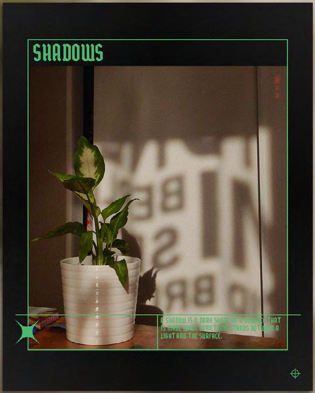
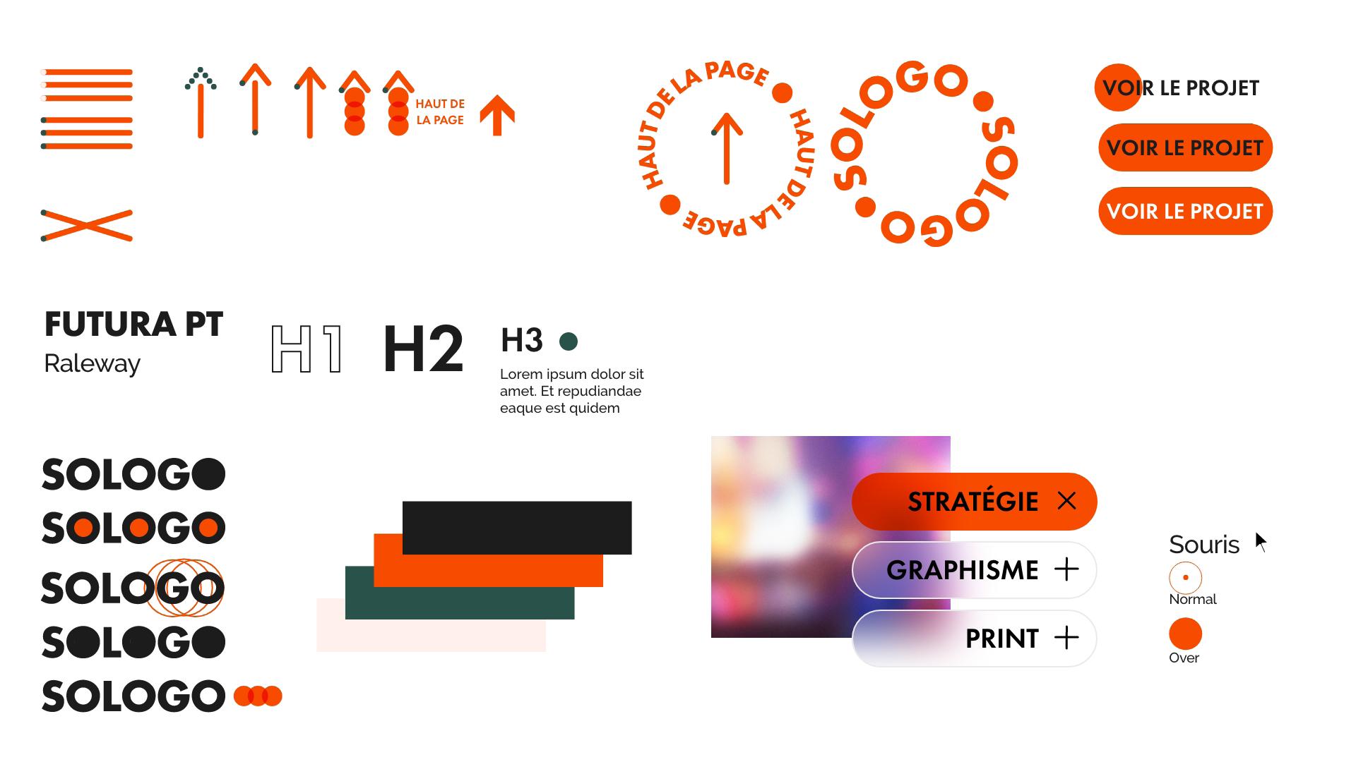
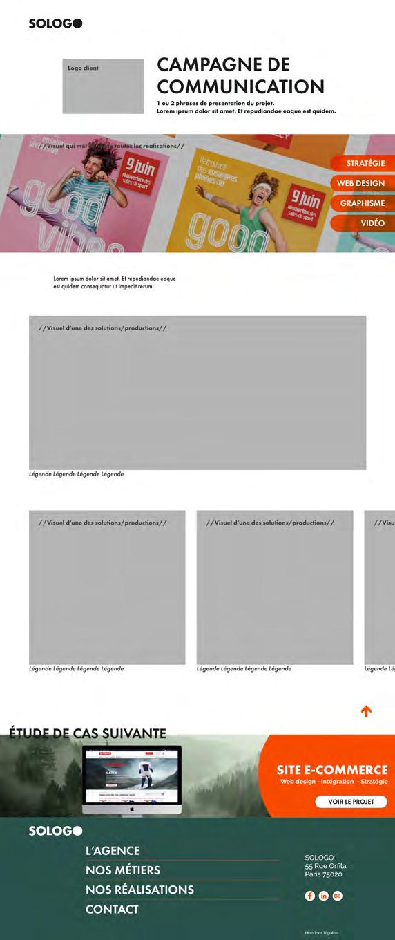
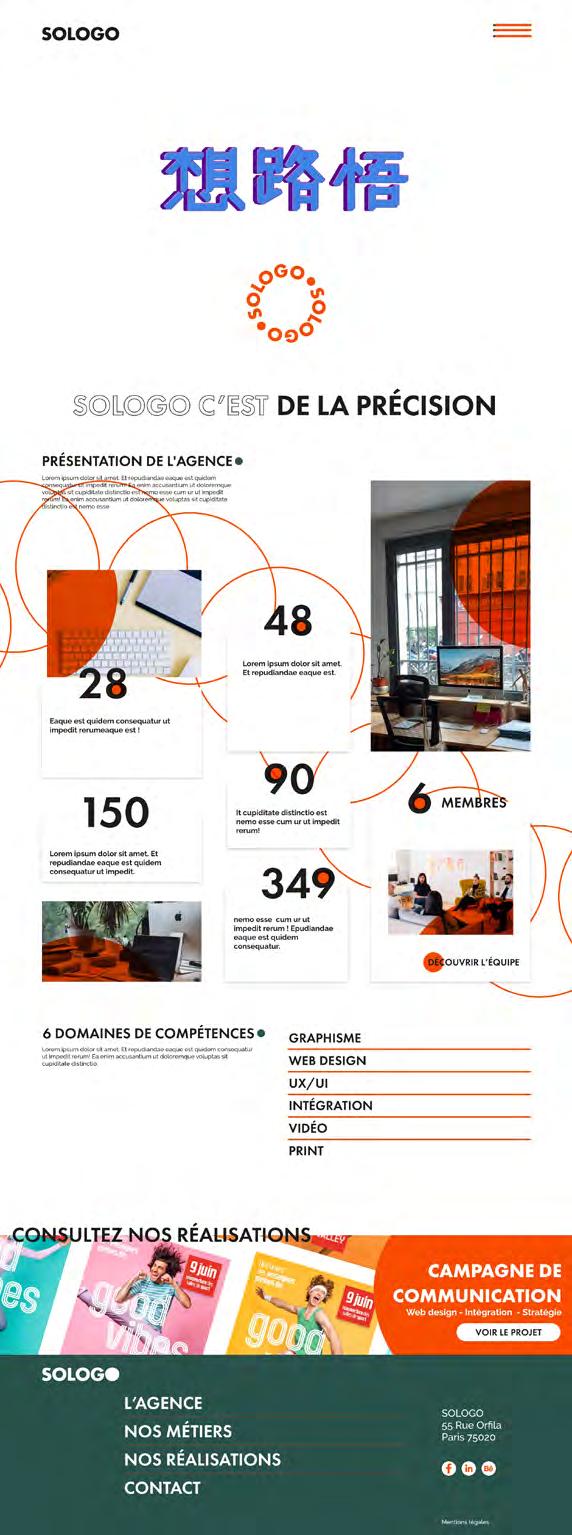
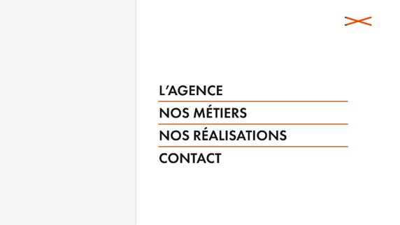
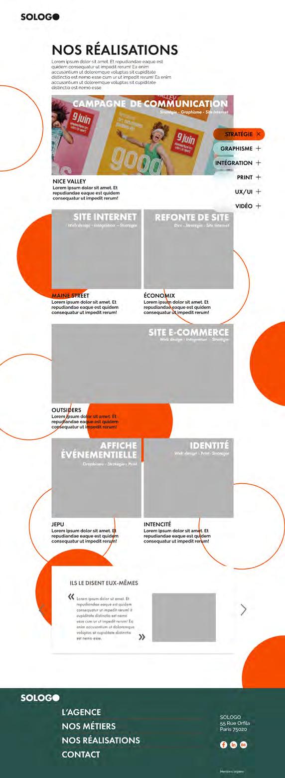
A suggestion of wireframes for the new website of SOLOGO, the communication agency I was working in.
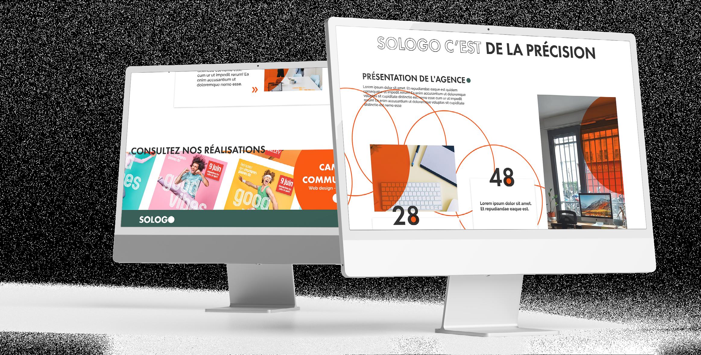
Art direction was inspired by the Gestalt principles.


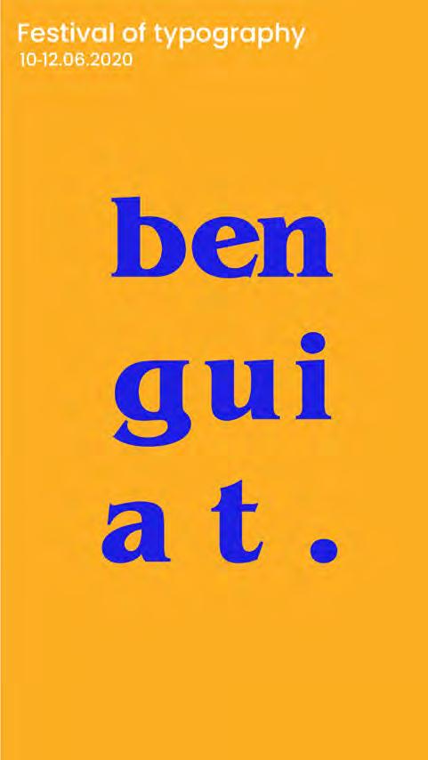
Kinetic posters made with Illustrator and After Effects. - University Technology Sydney Project -
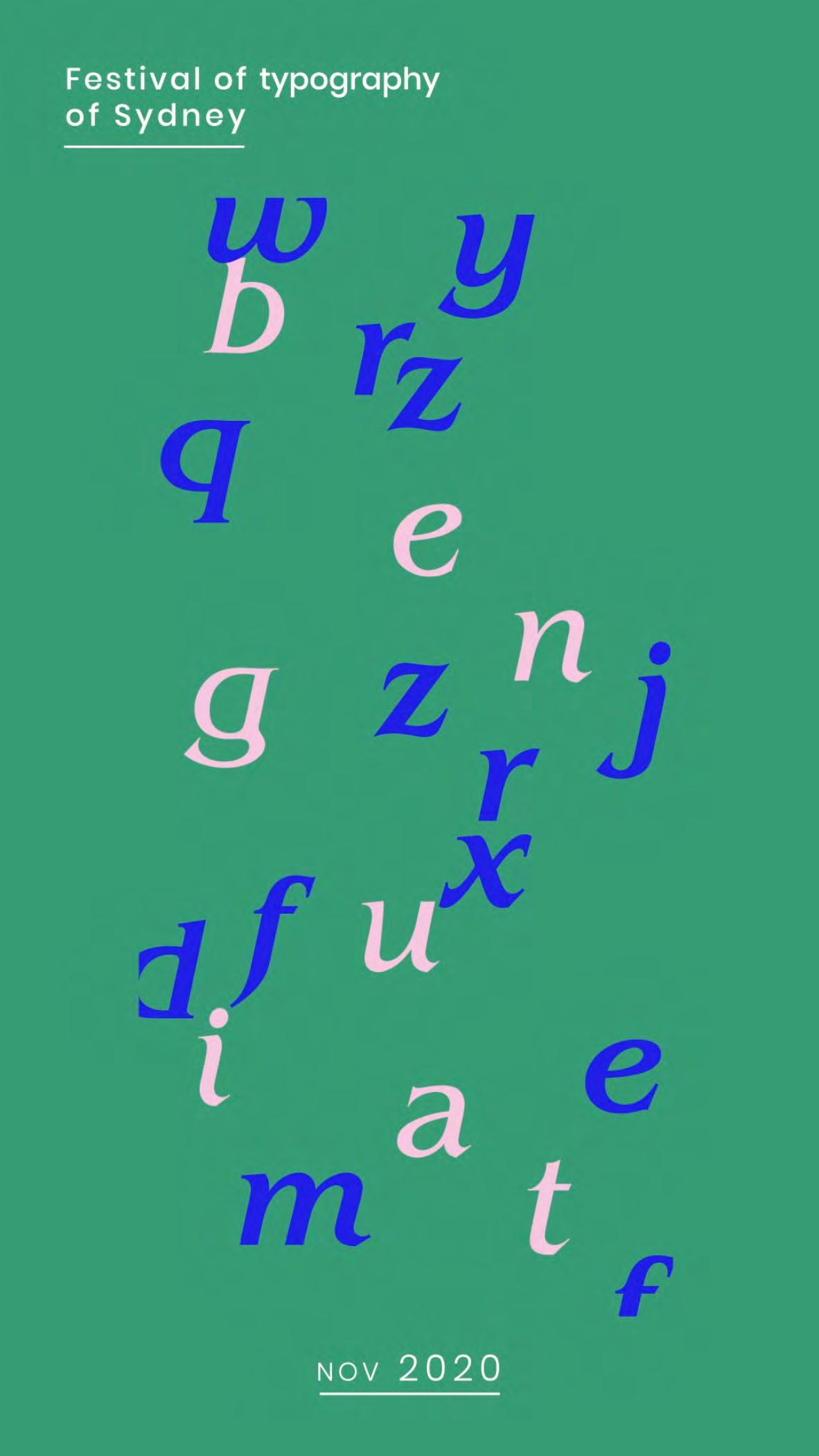
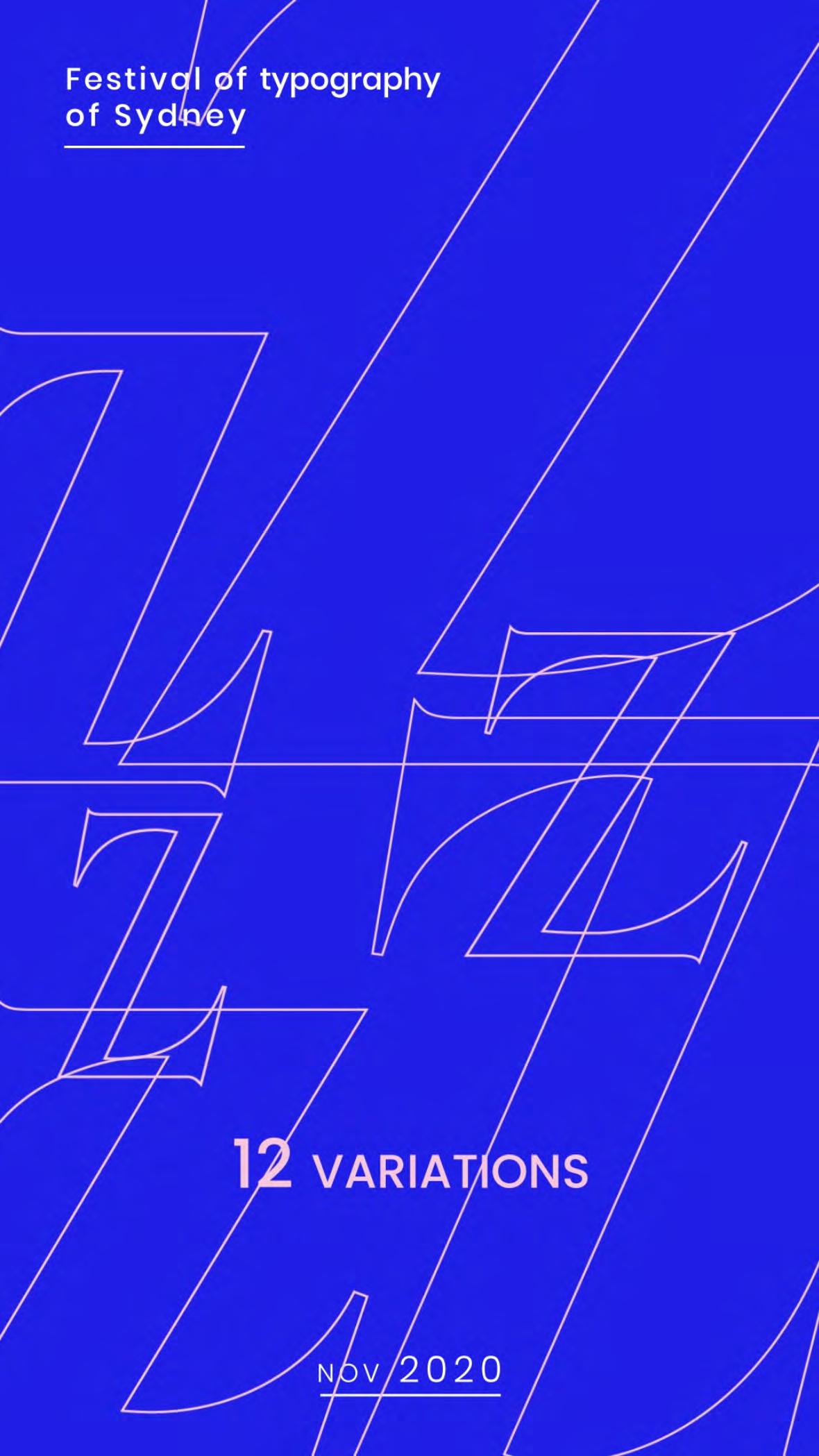
Serie of animated posters made for a festival of typography. I chose to highlight the fact that Benguiat has 12 font variations.
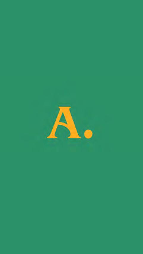
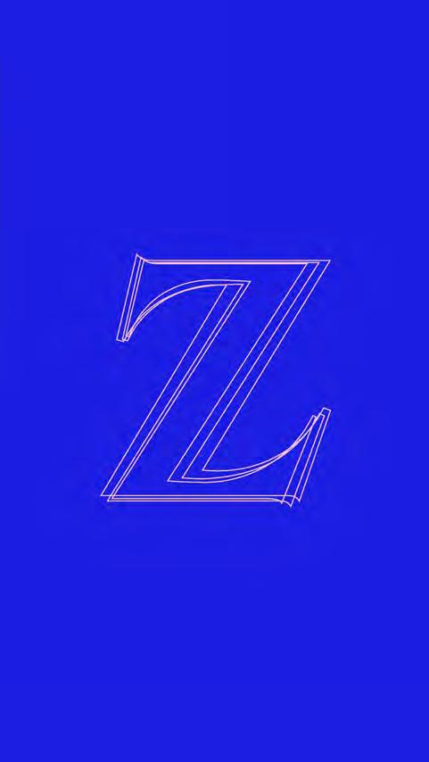
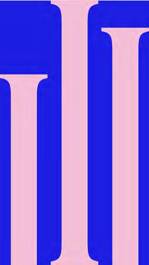
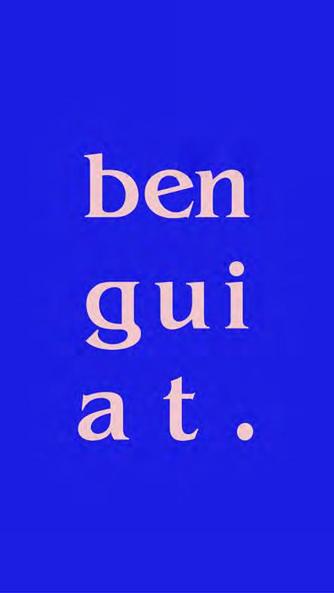
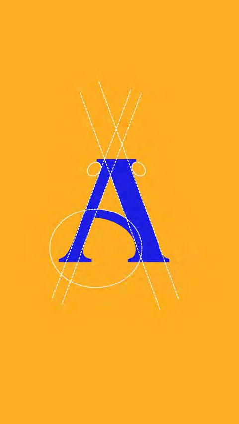
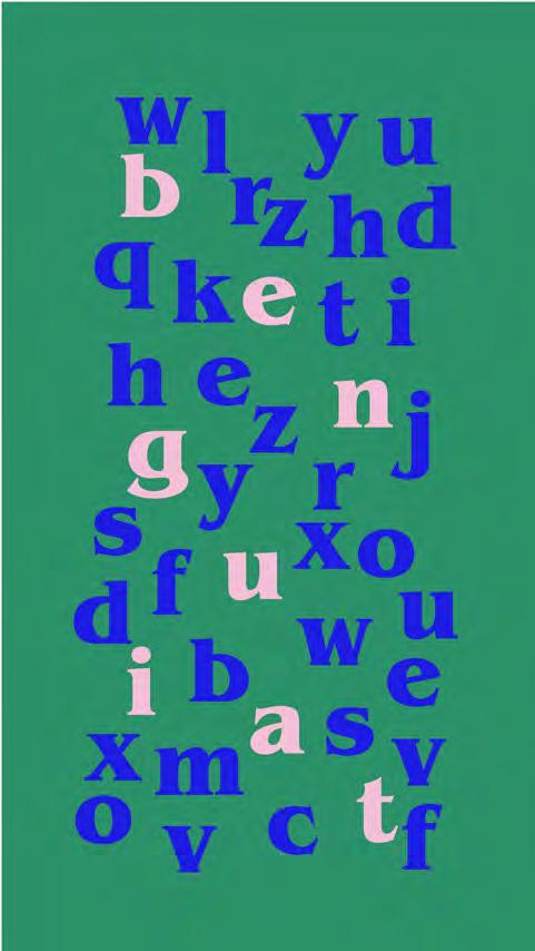
The green poster focuses on the transition of letter shapes between Bold and Medium Italic.
Something really important in this project is to emphasise the construction process of this typeface.


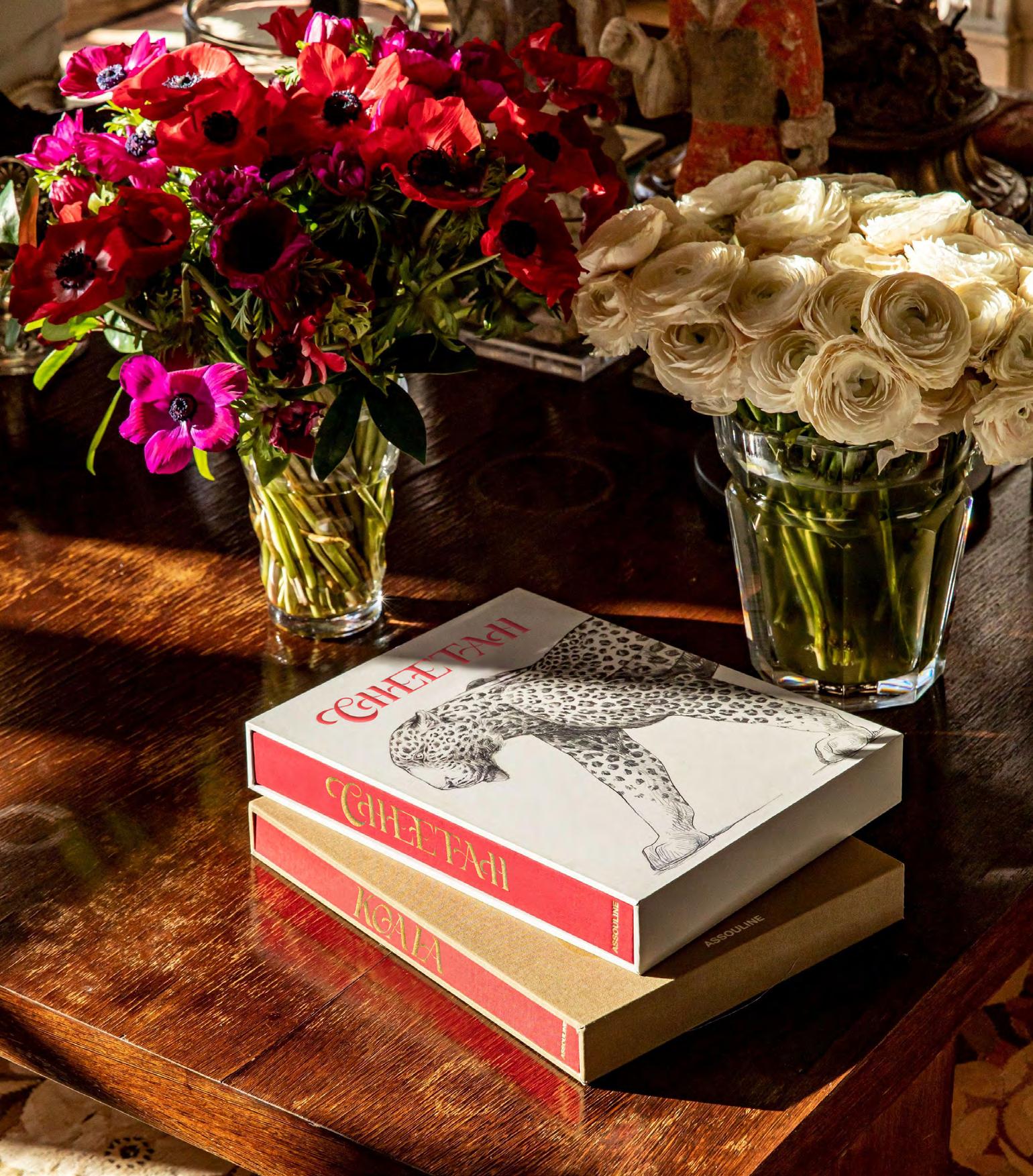
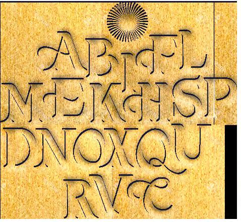
Equinox, made with Illustrator - Institut de l’internet et du Multimédia project -
I wanted to create a balanced font in the weights of the letters, a middle ground between smooth curves and straight, geometric edges.
This creation symbolizes a point of harmony between soft, natural shapes such as curls in opposition to an Elzevirs-like inspiration, with its characteristic sharp serifs and straight lines.
The equinox represents the balance between the seasons, the day & and the night, the full and the loose.
I also chose this font name for its typographic and phonetic aesthetic.
hand made font from drawing to vector path
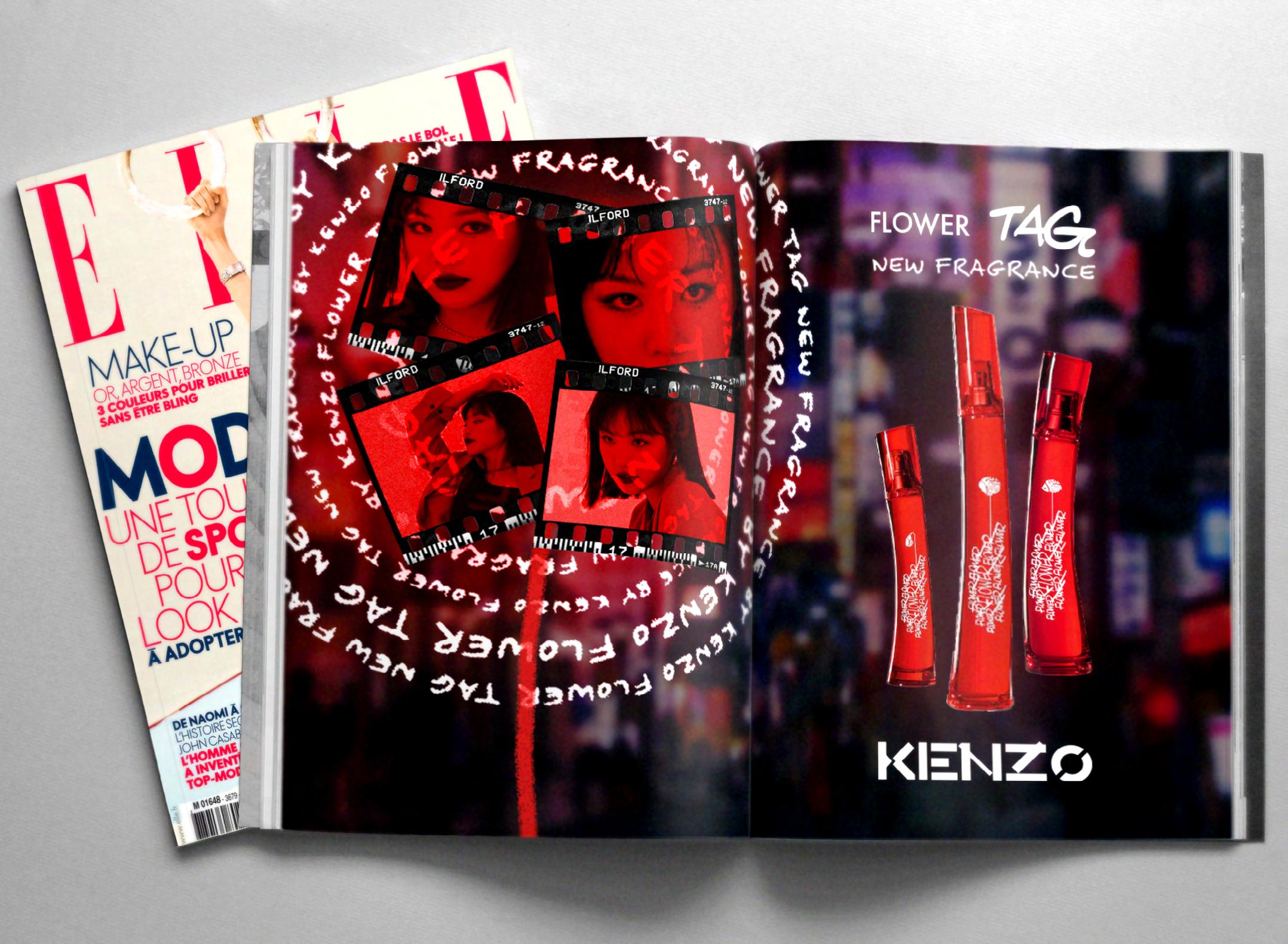
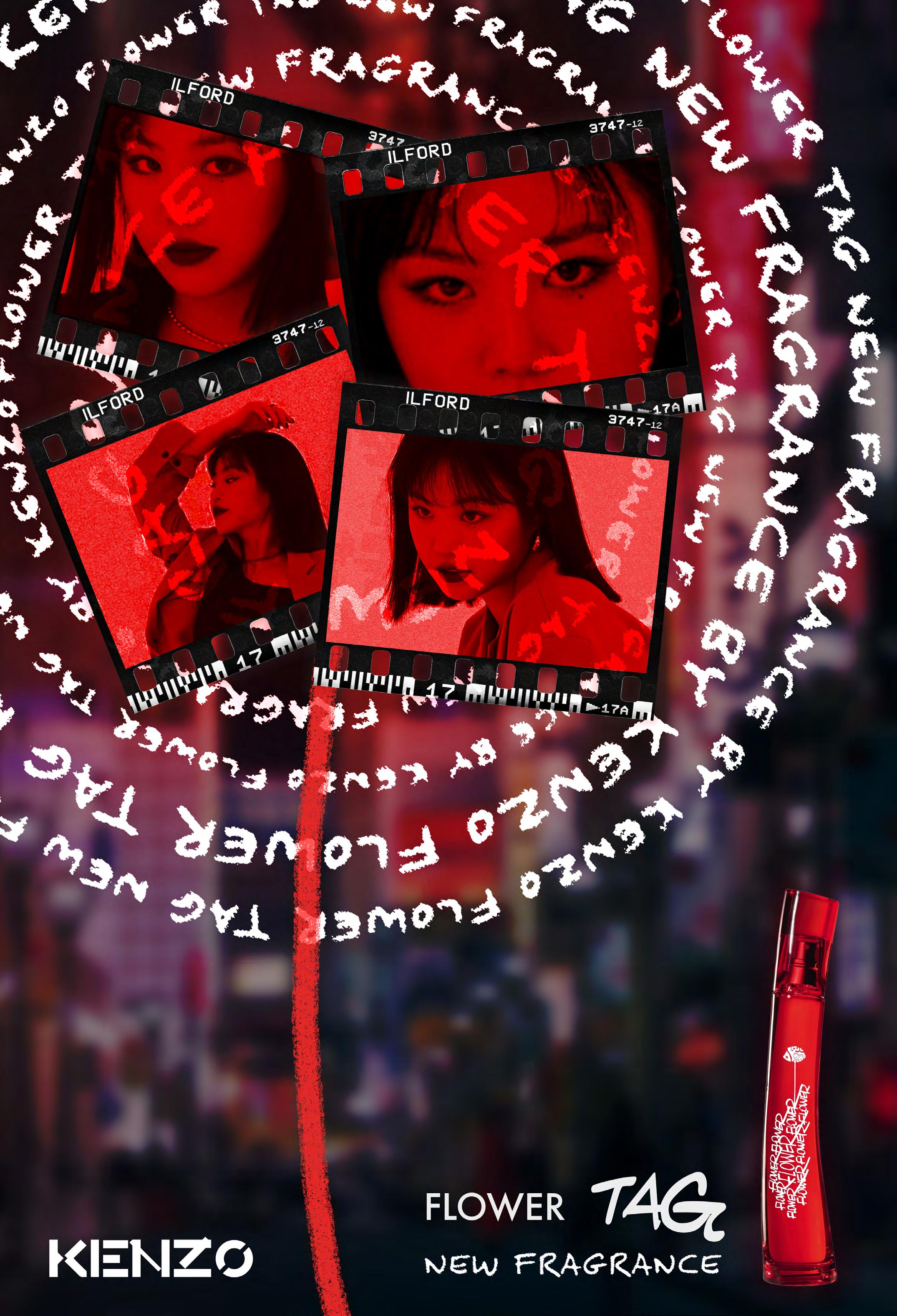
The artistic direction created for the Flower Tag New Fragrance campaign is part of a very urban, nightlife and instantaneous style.
The main element of the poster are these photos surrounded by graffiti. These words create a halo around this young woman. Her movements are
captured in these negatives, which gives an impression of spontaneity.
Wearing the perfume, the young woman becomes herself. She can free herself and break the codes of society. The shape of the graffitis also evokes a dandelion that is made to fly away after making a wish, the dream is there.
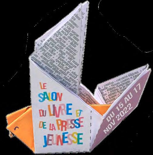
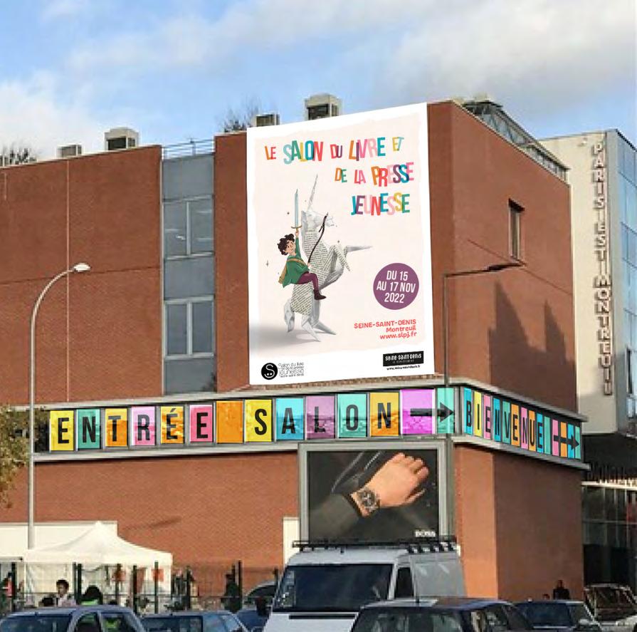
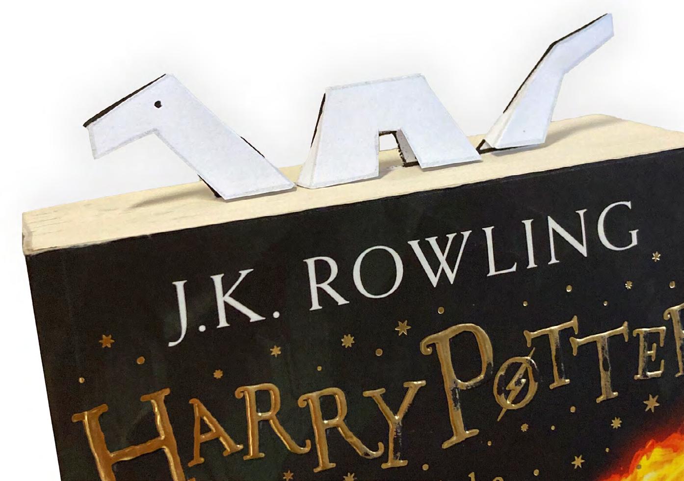
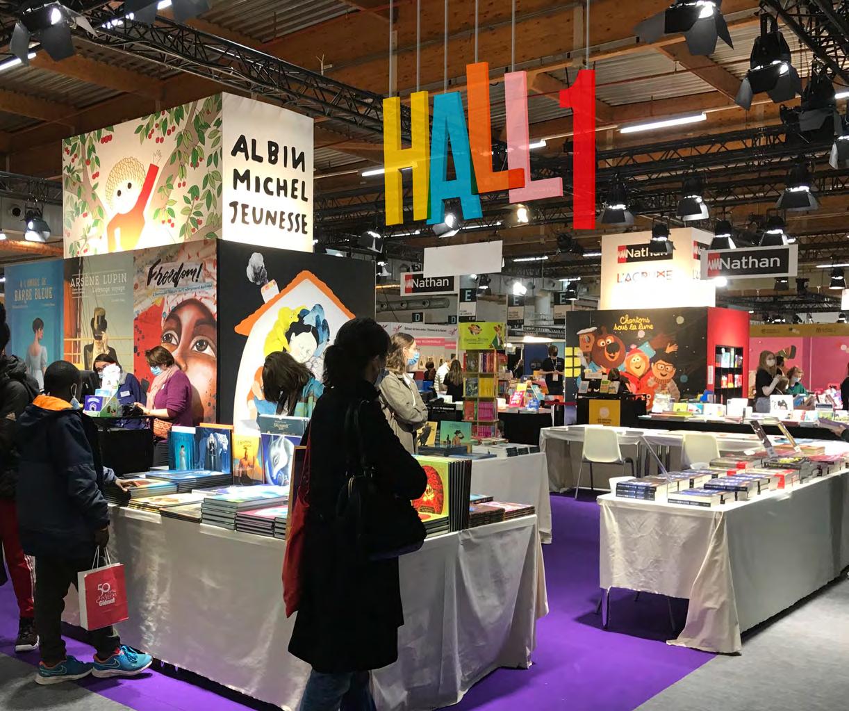
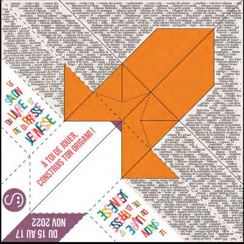
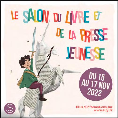
Multimedia production for a book fair, made with Photoshop & Illustrator, in a group of 5 students - Institut de l’internet et du Multimédia project -
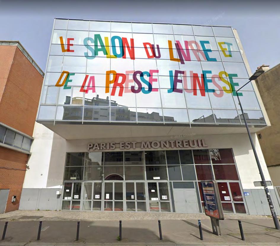
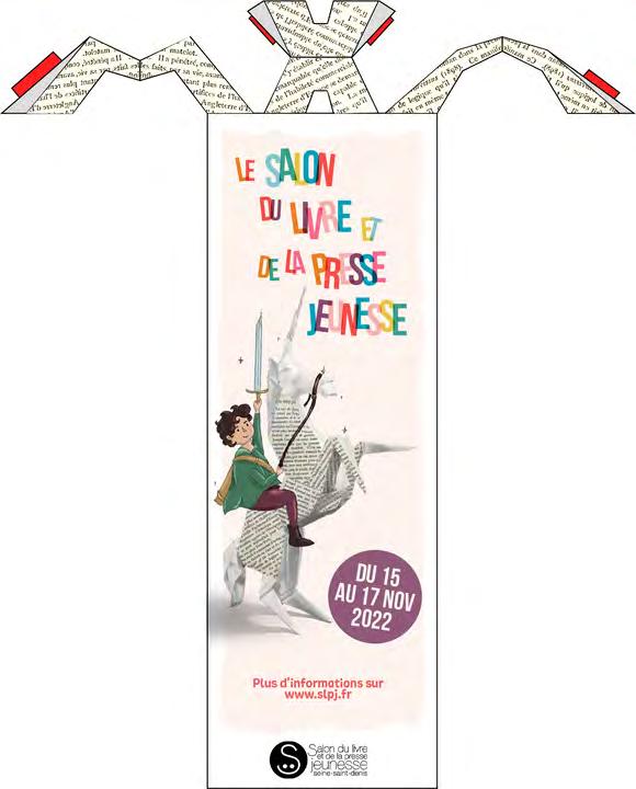
We had to produce the communication media for the 37th edition of the literature and youth press fair.
Our problematic was : How to reveal the imagination of children nourished by literature on the occasion of the faira?
Signage of the building, origami flyer, origami bookmark and hall numbers are presented on the following pages among all productions






































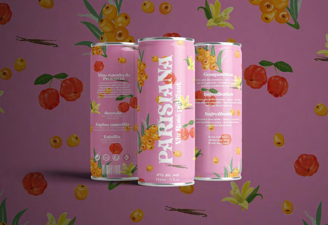
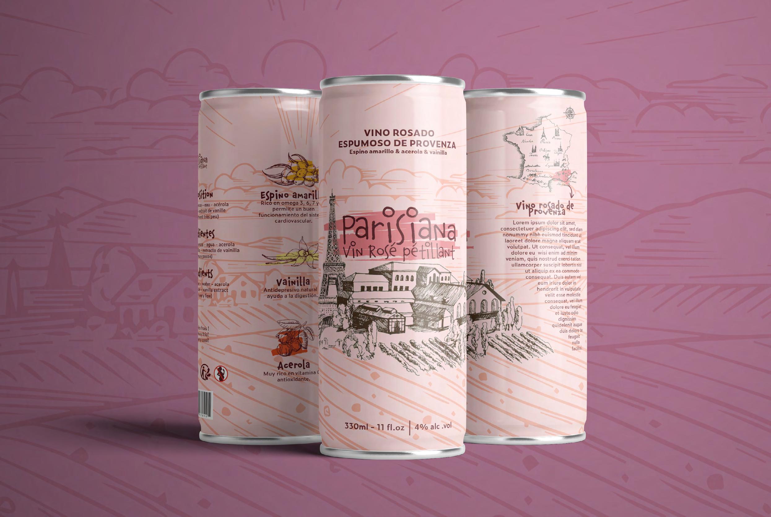
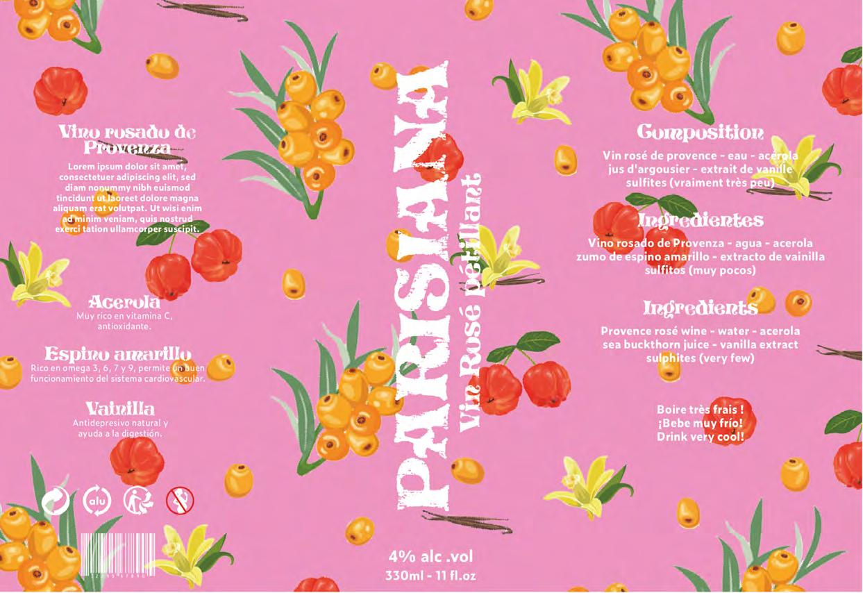
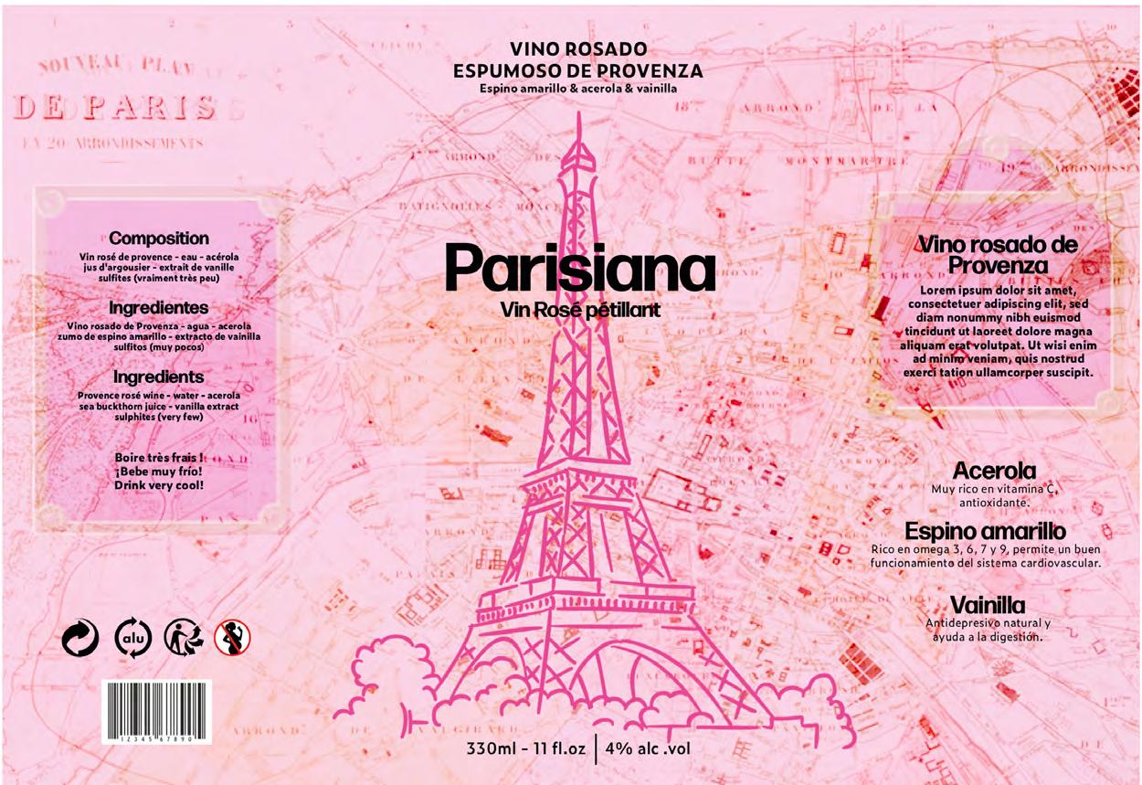
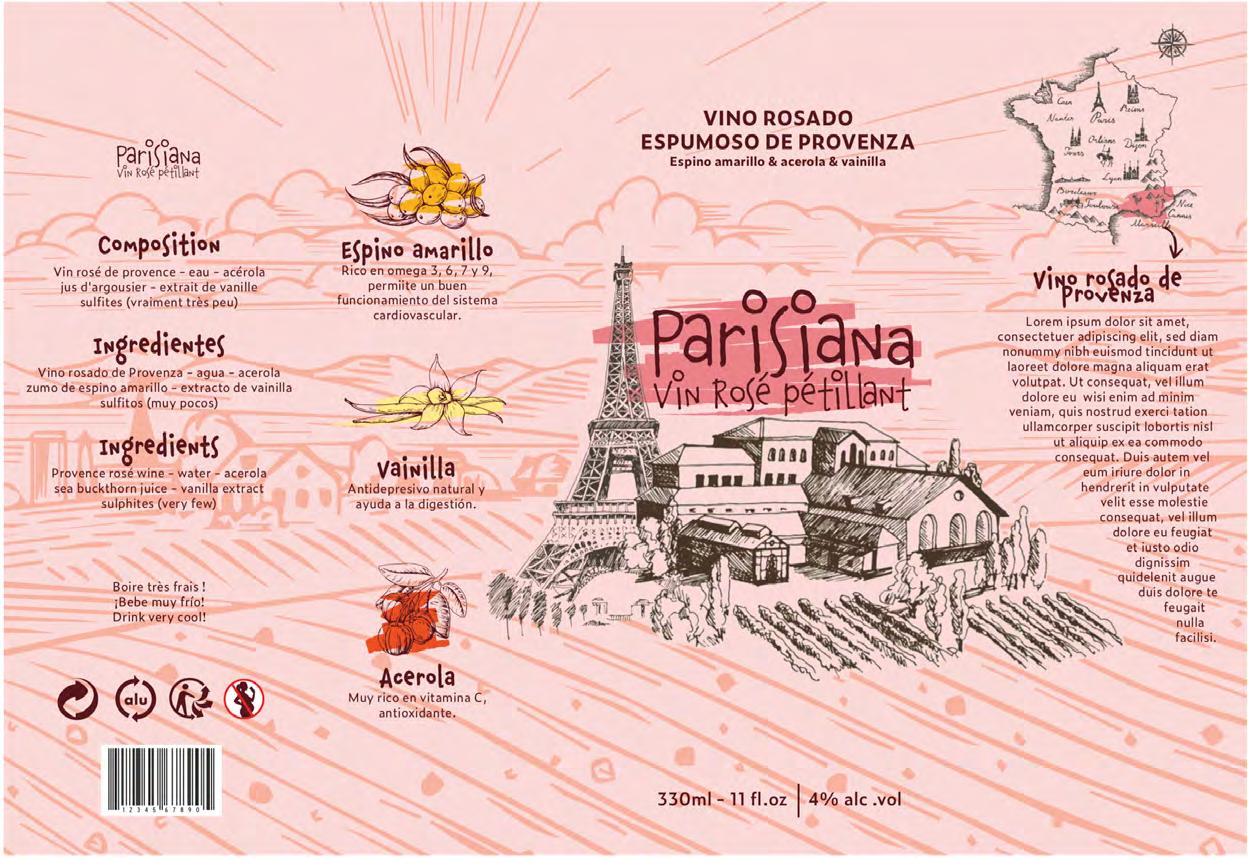 Suggestion of graphic identity and packaging for the brand Parisiana
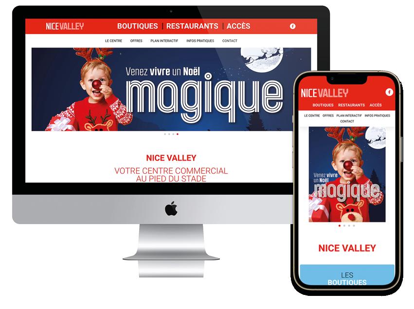
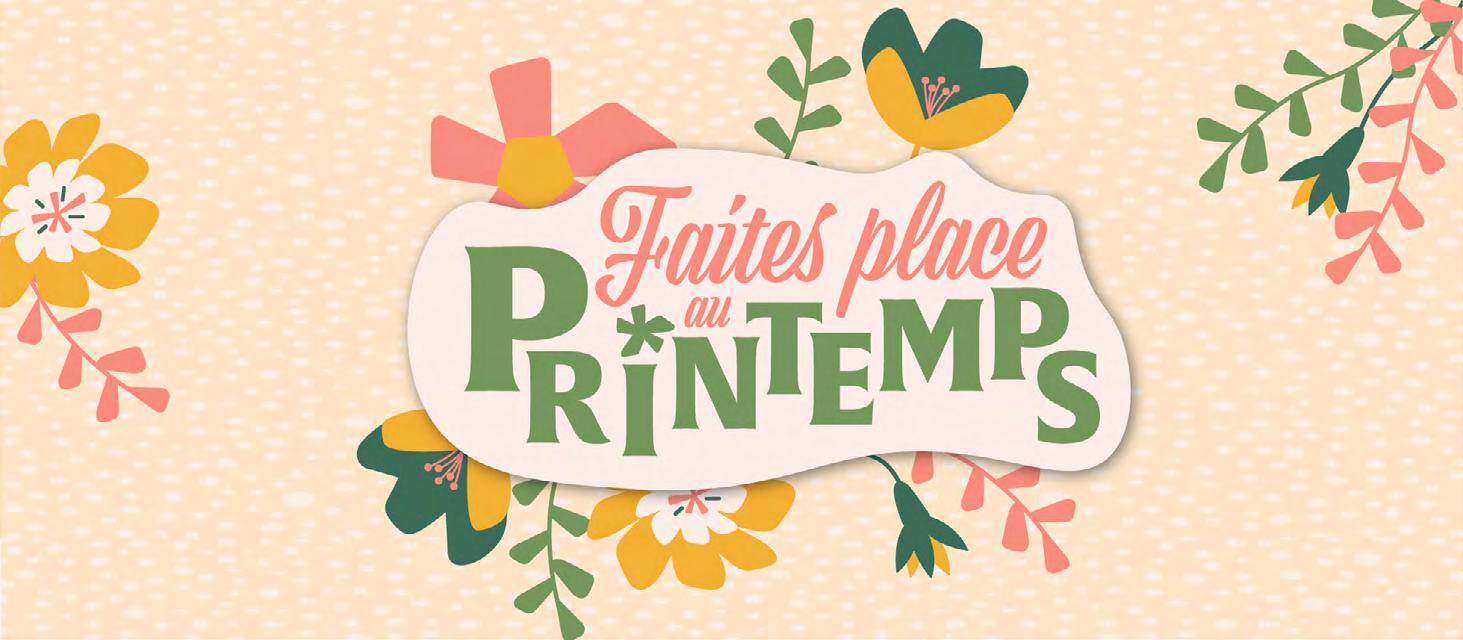
2 videos ( out of 12 ) for the summer cam paign Place Saint Mard
Animated OTS logo for youtube introductions videos
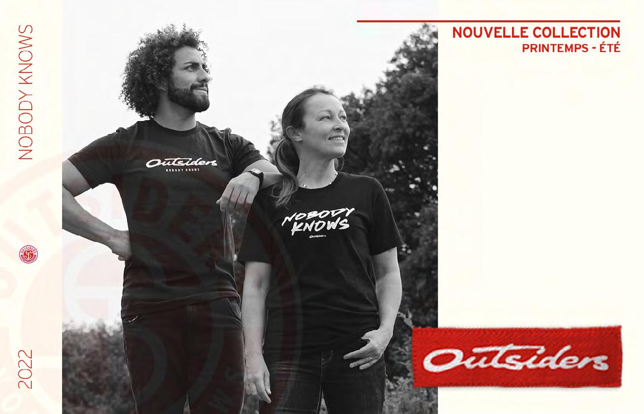
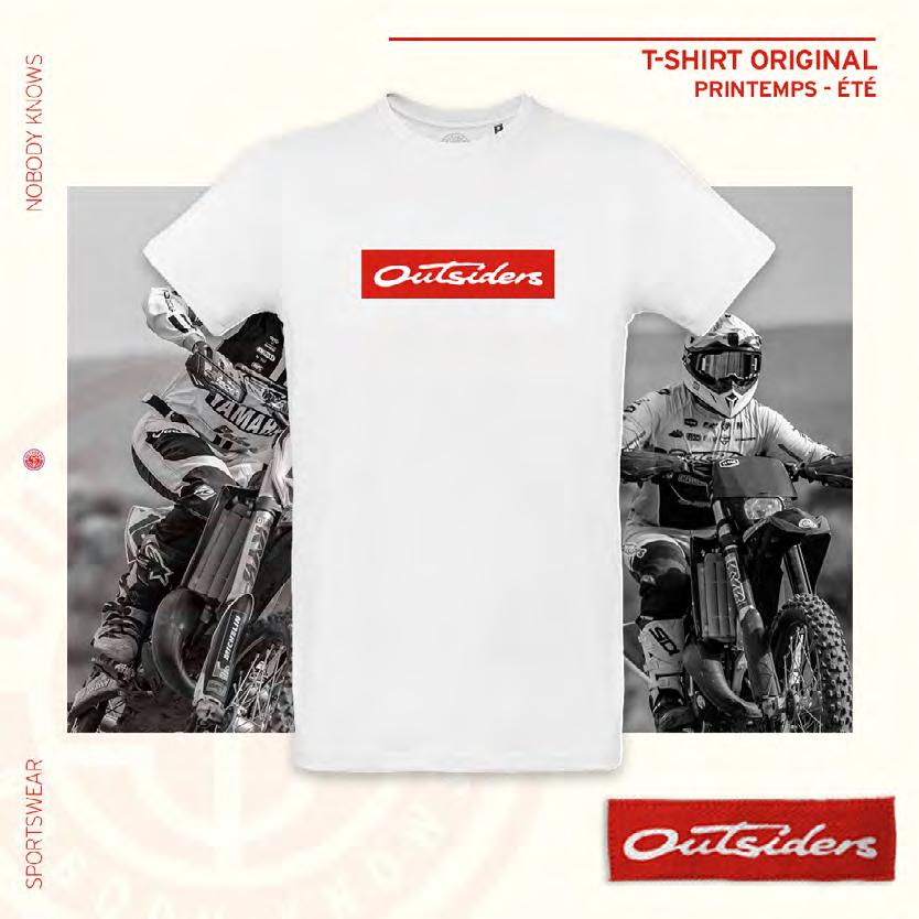
Suggestion of visual concept for the new Outsiders sportswear collection
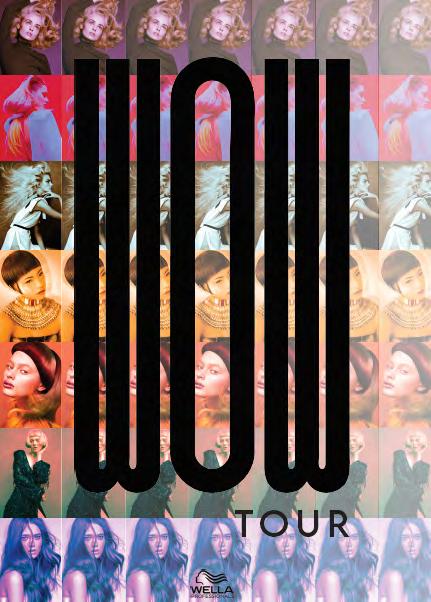
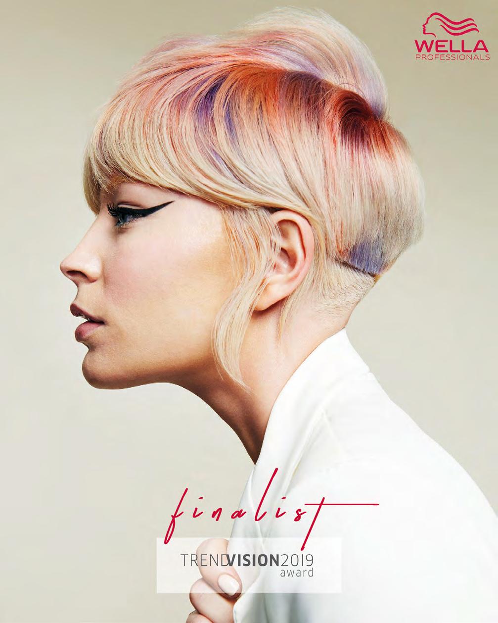
During my 5 months internship, I used the Adobe Suite to create content for the company on Illustrator, Photoshop, InDesign, After Effects - Professional deliverables -
I had to create different types of content for many platforms like posts and Instagram story, flyers, logos, web site banners or intern communication.
Flyers made for the Wella education team working in the hair salons.
Art direction created for Wella Waves the program. Here, 2 exemples of the 36 videos produced and a story for Wella Professionals ANZ Instagram.
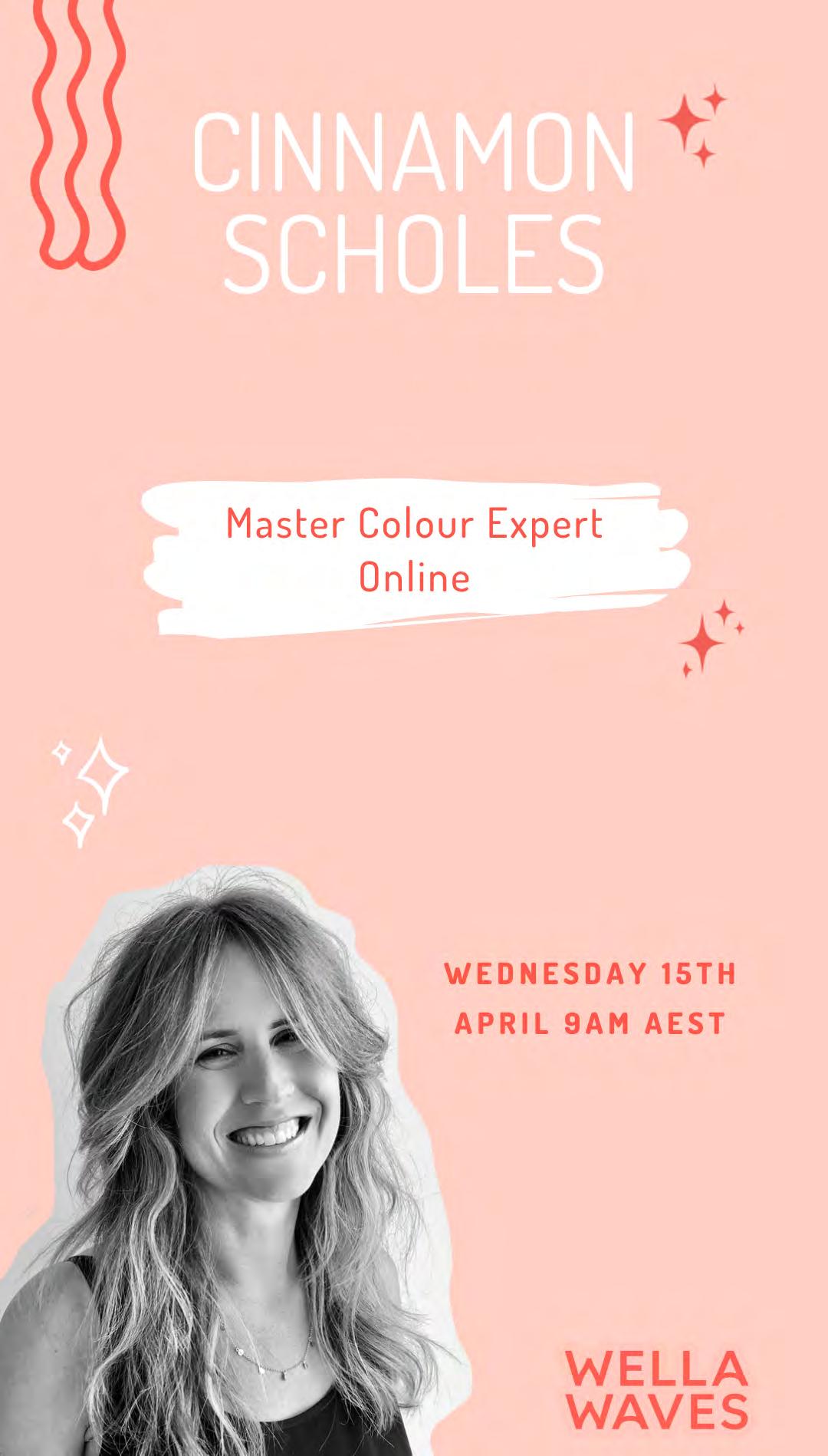
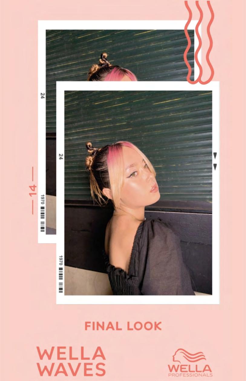
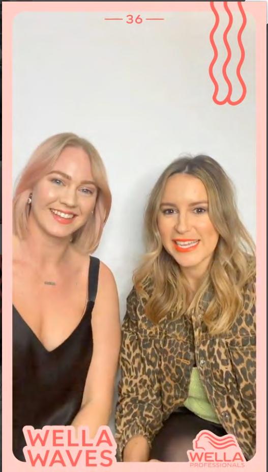
Logo created for an intern project, ANZ means Australia and New Zealand.
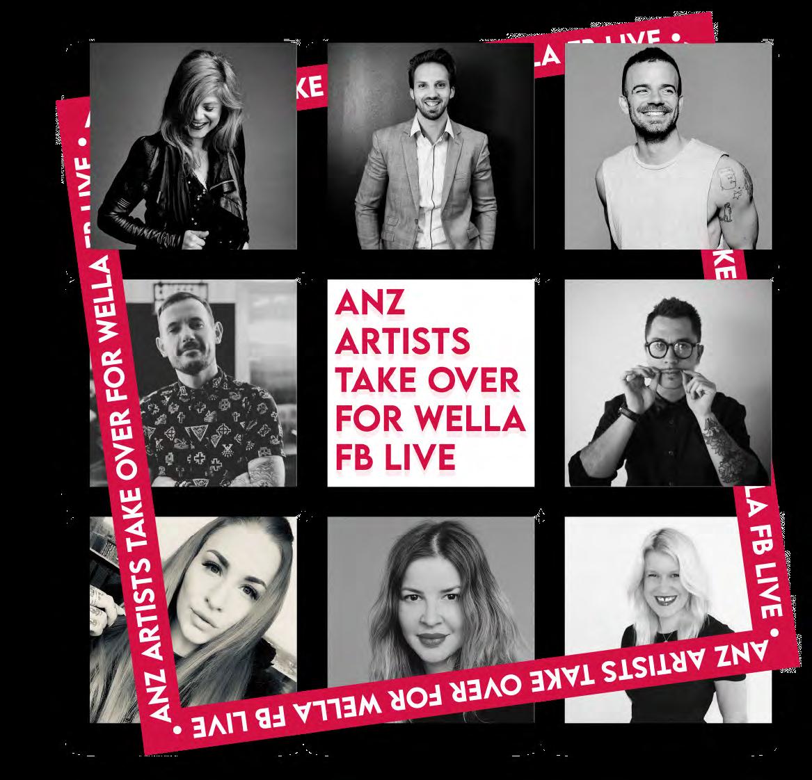
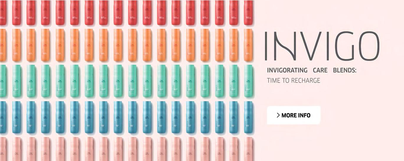
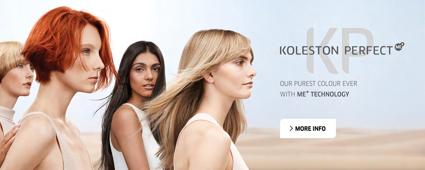
Above, product banner created for the external communication. Instagram post highlighting ANZ artist of the company

App design made with Illustrator, Photoshop and InDesign. - Institut de l’internet et du Multimédia project -
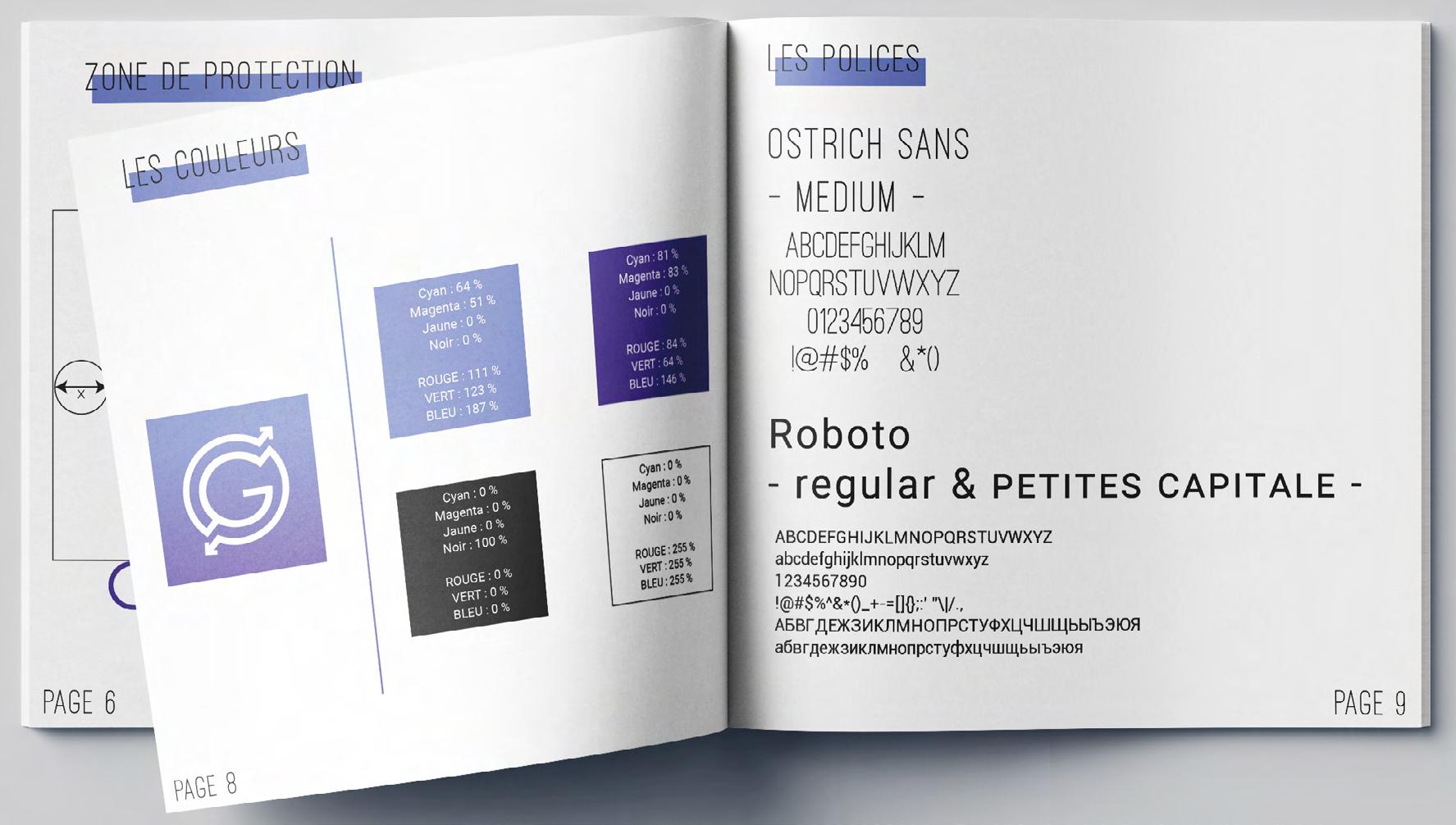
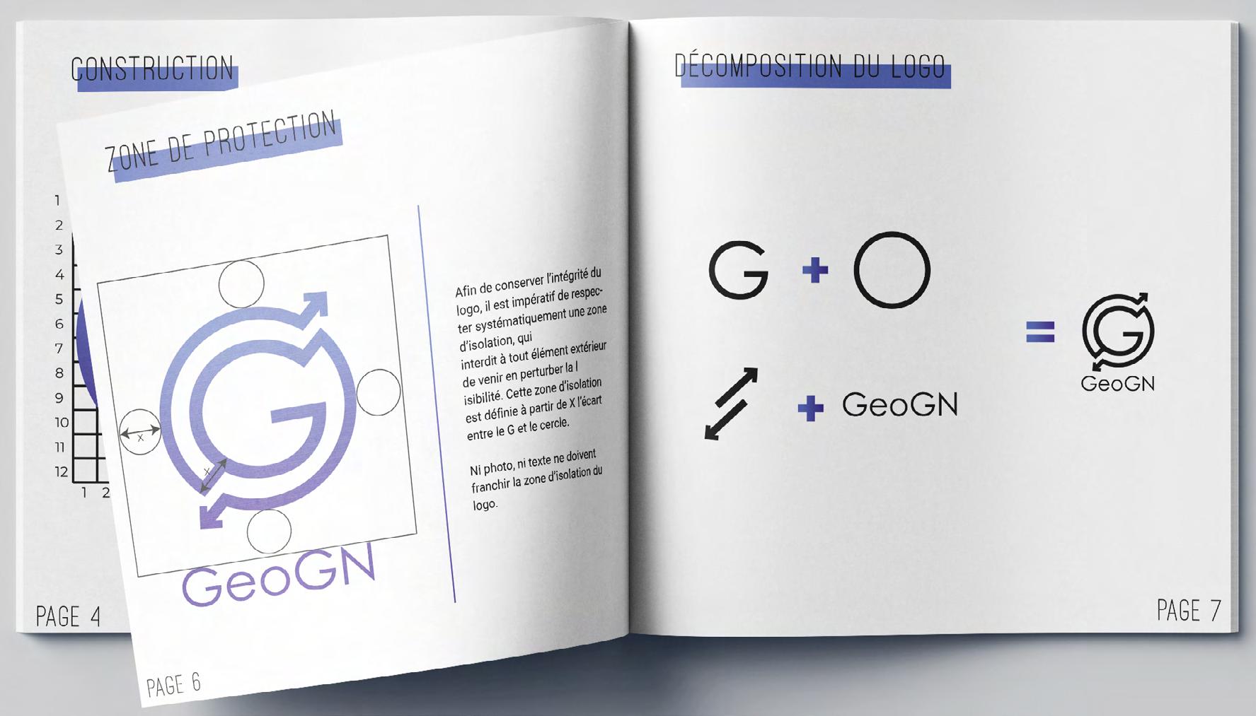
GEOGN is an app for the GIGN. Its goal: help members, the french unit of the national gendarmerie, to commmunicate and move around safely. I had to produce the logo, graphic chart, moodboards, poster, wireframes,
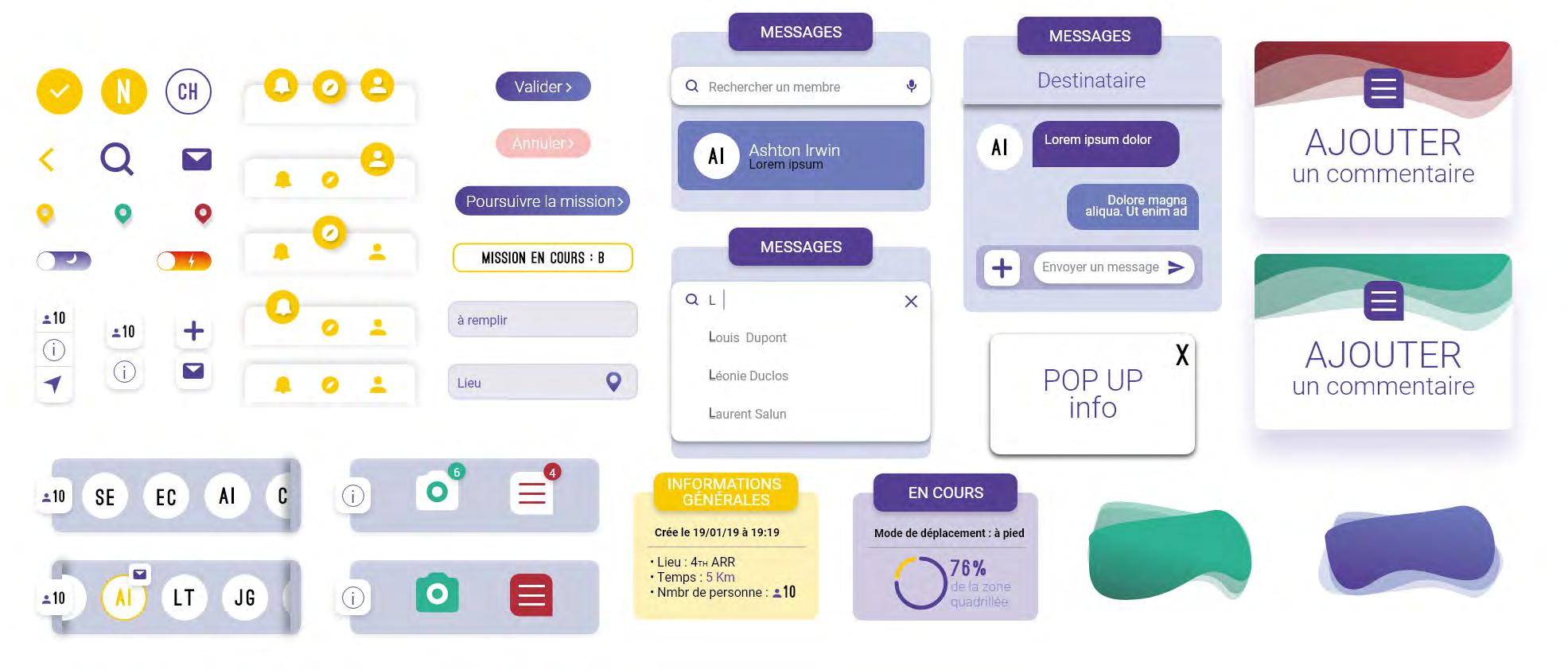
animated workflow, user experience tests, UI assets and finally the animated mobile prototypes. On the last page, here is the presentation poster for the app.
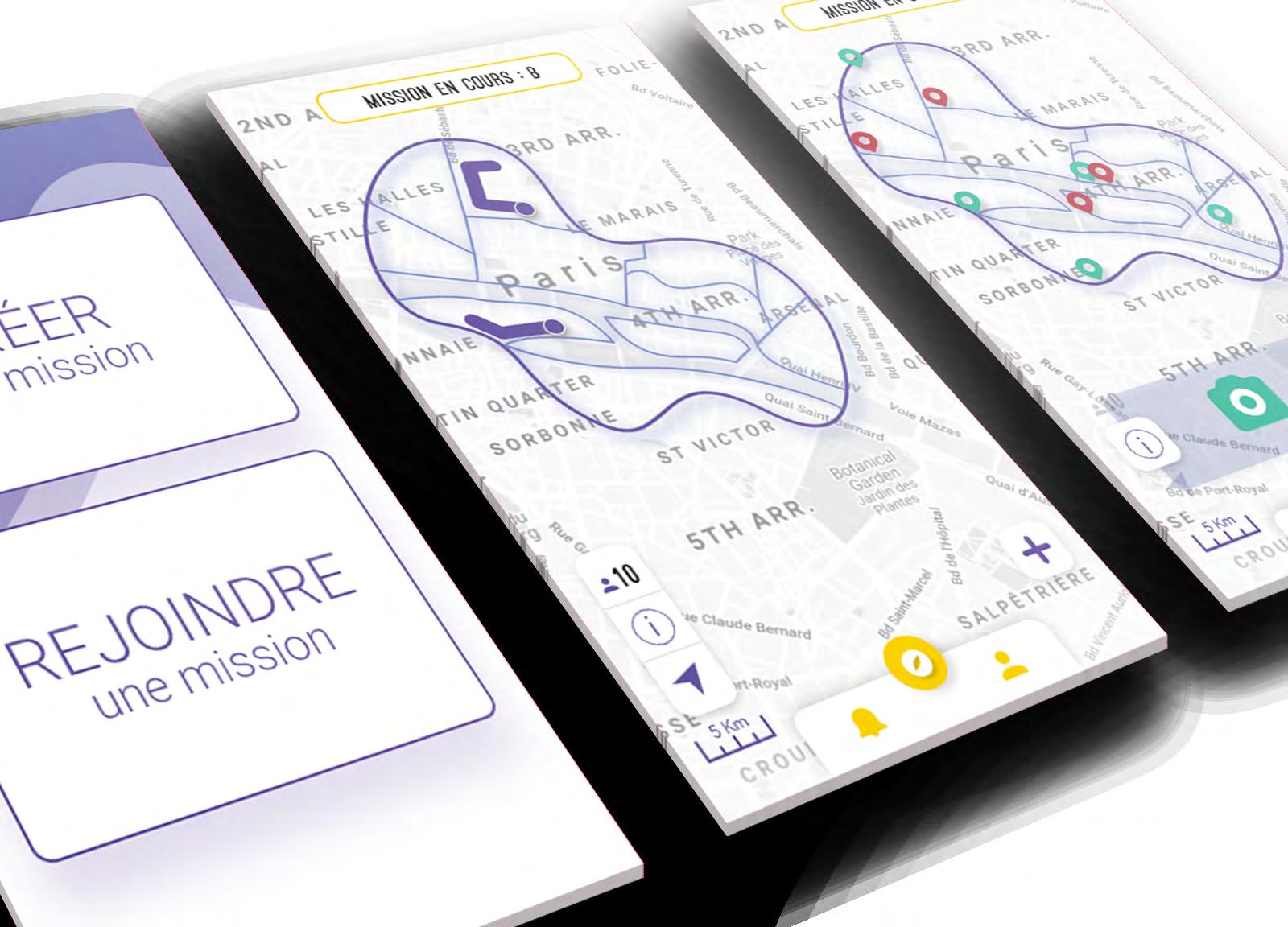
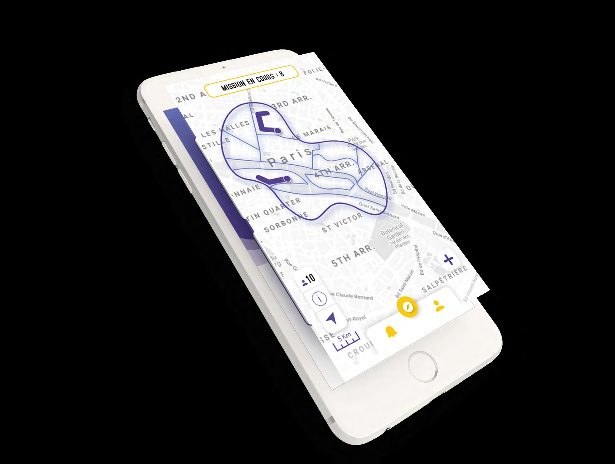
Remplace le travail sur carte manuscrite par des recherches dynamiques et qui évoluent à mesure que les agents progressent dans la mission.
Suit en temps réel le parcours des agents qui opèrent dans la mission à travers la zone de recherche établie.
Chefs de projets : Valentin NAVARRO - Théo PERCHERONLionel SARAVANAN - Salomée TORDJMAN
Partage les informations essentielles de l’avancée de la mission grâce à des fonctionnalités d’ajout de photos et commentaires sur la carte interactive.
Techniciens : Isaac BENAYOUN - Oriane MOUTTAPARémy PACHOCINSKI - Anaïs UY
oriane.mouttapa.pro@gmail.com 06 65 94 96 18
Hope you enjoyed my work, don’t hesitate to contact me for any questions. I would love to discuss it with you.
