7 minute read
Open Day
Blurring the boundary between indoors and out, this inspiring family home combines a laidback lifestyle with subtly sophisticated interiors.


‘It's a great house to wake up in every morning, and a great house to dwell in,’ says interior designer and artist Lisa Twyman of her home. ‘It makes you feel free, positive, motivated, excited.’ Part of the reason for this is undoubtedly the way the home perfectly suits its location: it is situated in Salt Rock, on the Indian Ocean coastline north of Durban, where the tropical climate makes for year-round indooroutdoor living – as well as the challenge of keeping everything cool during the extremely hot and humid summer months.
With her husband, Will Haynes and their daughter Bo, who is nine years old, and their son Jock, seven, Lisa spent some time living in the area in a rental property before deciding on the ideal piece of land on which they could build their dream home. ‘Once we had made up our minds … we fell well and truly in love with the plot, so much so that the build became very much about the garden,’ says Lisa.
‘We did not want to impose on it, or mess up the flow of it too much,’ she adds. During the first few years they lived here, she says, ‘any extra budget available was spent on the garden and planting’.
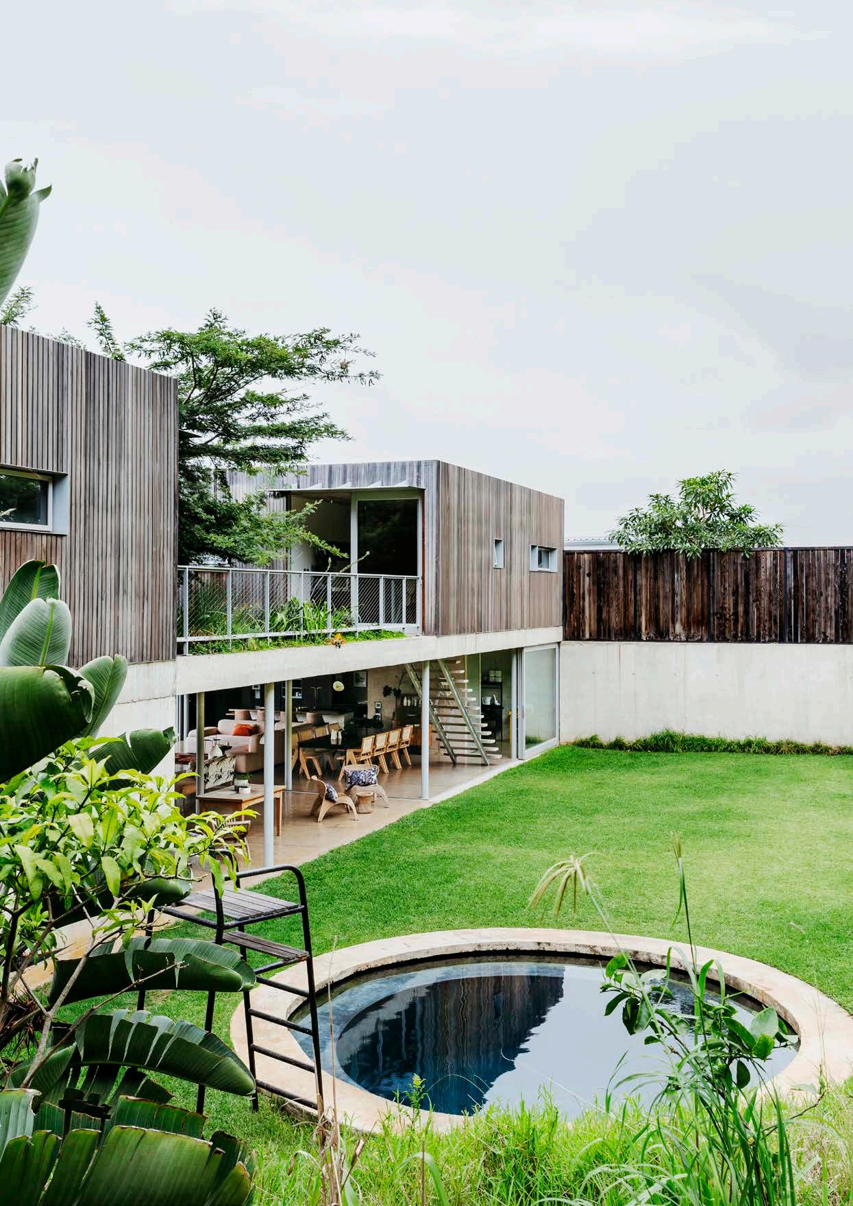
The key principle for Lisa and Will was that ‘the house needed to become part of the landscape and not feel plopped onto it,’ Lisa says. And this is precisely what they have achieved. The ground-floor living area opens up completely to the outdoors, allowing the spaces to be opened or closed to the elements as required.
This ‘blurred boundary’ – as Lisa describes it – between interior and exterior is further enhanced by the fully open-plan nature of the living, dining and kitchen spaces, as well as the use of simple, low-maintenance materials such as unadorned off-shutter concrete and balau wood, which is used for cladding and screening where necessary. The resulting structure is, as Lisa says, all about ‘honesty in the construction and use of materials’.
Adding to the home’s radical ‘open-ness’ is its striking central courtyard space. In this area, a trio of trees grow up through an organically shaped ‘cut-out’ in the slab that forms the first floor of the house, drawing the eye up towards the sky and disrupting conventional distinctions between indoors and out.

When it came to decorating the open plan living spaces, Lisa says the ‘concept was to create a relaxed yet creative space’ and to keep things ‘minimal, playing with colour and texture – and a few touches of pattern – so that the interior became an oasis of calm in a riot of green garden’. She explains that because the garden is visible from everywhere in the home, it in effect ‘becomes a part of the interior and needs to be taken into account when implementing the interior decor and finishes’.
Ensuring that the interiors felt uncluttered was also important because, Lisa says, the pieces put into the space need to enhance the simple and sculptural qualities of the house, rather than detract from it. But of course that doesn’t necessarily mean creating a brutally minimalist look. Rather, while finishes here are kept ‘pared back and subtle, so that the raw materials and construction of the house remains central,’ says Lisa, colour is also important to her as a designer – as is ‘a thoughtfully curated space.’ She relished the ‘freedom of curating our own space with our favourite things’, and adds that she enjoys ‘creating depth and surprise by combining unexpected colours, such as mannequin pink and deep orange.’
The family’s lives are busy, with both Lisa and Will at work during the day and the kids coming and going to and from school and other activities. Fortunately, Lisa says, ‘the house is our oasis. The island in the kitchen is where we congregate on weekdays – homework for the kids and cooking for us.’
For both Lisa and Will, the loveliest place in their home is their tranquil bedroom. Essentially ‘a simple box’ with an outlook that frames the view of the nearby Indian Ocean, ‘it’s great for a siesta, and the best view to wake up to,’ says Lisa. And the deep grey wall colour is perfectly conducive to rest. ‘The place where you start and end your day is so essential to your wellbeing – and this room has proven that to me ten-fold,’ she adds.
The entire house is generally cool throughout the long summer days and nights, but in spite of this, during the warmer months ‘the kids spend a lot of time in the pool during the afternoons and evenings, as we do on the weekends,’ says Lisa. Saturdays and Sundays here are usually given over to lazy lunches after mornings spent at the beach – Will is a dedicated surfer.
Form follows function in the best possible way in this home. It combines simple, authentic materials with an architectural design that sensitively responds to its location, as well as Lisa’s laidback yet sophisticated approach to its inviting interiors. No wonder, then, that she happily declares this house to be ‘the most uplifting space I have ever lived in’. PROJECT INFO:
TEXT
Robyn Alexander
STYLING
Sven Alberding
PHOTOGRAPHS
Lar Glutz / Bureaux
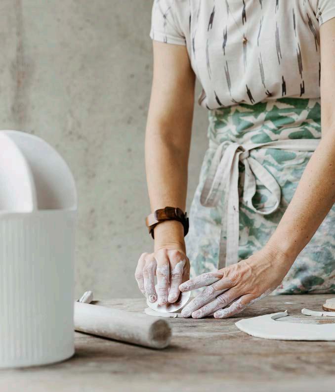
LEFT: Lisa’s studio and office are on the landing at the top of the stairs. The wooden worktable was given to Lisa by her mother and her apron is by Skinny laMinx (skinnylaminx.com). At the moment, Lisa says, ‘other than a few renovation projects, I am focusing on the product design side of my business. This home has become my muse. I design pieces inspired by it, showcase them in the space, and then sell them via my online store (lisatwyman.com).’
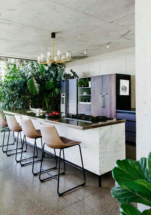
RIGHT - TOP LEFT: The gallery-style kitchen was designed by Lisa and made by a number of contractors. ‘The idea for the kitchen design was to have it blend into the living space and appear more like furniture than a conventional kitchen fit-out,’ she says. ‘So, I used a variety of finishes (dark timber, brass, marble, black steel) and lower counter heights to ensure it blended in as part of the living area. And it does flow seamlessly, both in appearance and function. The island can become an entertaining zone, and is a family zone during the week.’ The @home (home.co.za) bar stools have been reupholstered in vinyl. The Marc Newson-designed hob is from Smeg (smeg. co.za) and the striking brass cupboard handles are custom designs by Lisa Twyman (lisatwyman. com). The chandelier light fitting was a lucky find at a Cape Town vintage store.
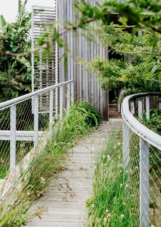
RIGHT - TOP RIGHT: The roof garden walkway leads from the main bedroom side of the first floor of the house to the children’s bedrooms and playroom on the other side. The unvarnished balau decking has weathered naturally, and only water-wise plants have been used as ‘the soil is very shallow and dries out quickly when there is no rain,’ says Lisa.
RIGHT - BOTTOM LEFT: ‘The round pool contrasts with the more linear shapes of the house,’ says Lisa. The pool was designed by Will and built by Karl Wang of KR Projects (krprojects.co.za). It is made from concrete and is three metres deep, with a 40cm step all around, lending itself to fun and games for the kids and lounging for the adults. The ‘lifeguard chair’ is an old tennis umpire’s chair from Lisa’s primary school. ‘I made some enquiries,’ she says, ‘and it was unearthed from a storeroom in my home town.’
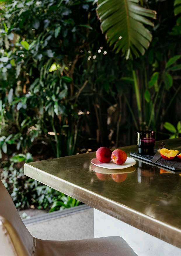
RIGHT - BOTTOM RIGHT: Lisa Twyman (lisatwyman.com) made the white ceramic vessels; the slate serving platter is from Weylandts (weylandts.co.za) and the black glass from Mr Price Home (mrphome.com).

The front of the house is clad in hardwearing raw balau timber, which is ageing naturally. The section with shutters on the first floor is where the main bedroom is located. Karl Wang of KR Projects was the contractor who built the house; he was ‘exceptional’, says homeowner Lisa Twyman. ‘Challenges that did arise were dealt with effectively and expediently, and he made the building process a pleasurable one.’ The timber used for the garden wall is burnt cedar.
