6 minute read
Farmhouse Style
Embracing farmhouse style, minus the monograms and kitsch
Mari-Jane Williams The Washington Post
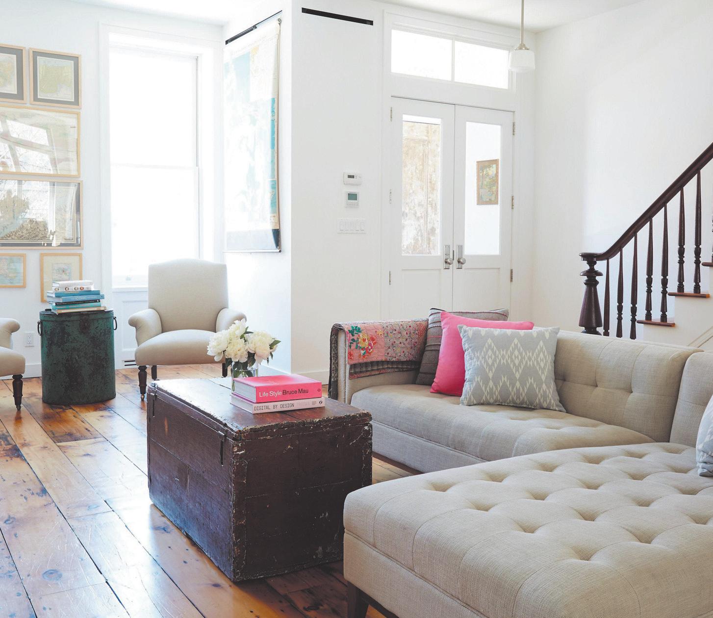
Southern or farmhouse style is certainly having a moment. Many homeowners crave a cozy retreat, particularly as the outside world feels increasingly harsh and polarized. And the style, long a staple in rural areas, has become an aspirational look for urban homes as well, in part thanks to HGTV and shows such as Fixer Upper that have brought the aesthetic to a broader audience. Some would say, though, that the overuse of the look has pushed it into kitsch territory. For anyone who loves those cute sayings and can’t imagine a kitchen wall without the stencil proclaiming “Live, Laugh, Love,” by all means, you do you. A home should be, first and foremost, a reflection of your own style. But if you want to implement that cozy, rustic style in a subtler, more classic way, listen up. Kim Leggett, of City Farmhouse in Franklin, Tennessee, author of City Farmhouse Style, says the key is to keep things simple, relaxed, natural and unfussy. “Rooms don’t have to be cohesive with each other” in a farmhousestyle home, Leggett says, “and I think that’s part of the attraction for designers and homeowners. We’re all so busy that when we come home, we want to walk into a space that feels warm and cozy.” Here are her suggestions, taken from a phone interview and an email exchange, for creating a comfortable space with a farmhouse vibe - minus the cliches. • Say no to mass-produced pieces Part of the kitsch problem, Leggett says, is that a lot of big-box retailers sell mass-produced items to capitalize on the farmhouse trend. But in reality, the style is best created with authentic pieces. “It’s just more of a storied approach to design,” she adds. People have been trained to go in that cookie-cutter direction because it’s all over social media, Leggett says. Instead of searching Pinterest or Instagram for inspiration, Leggett suggests turning to books and magazines from 10 to 20 years ago for a more authentic version of the aesthetic. Leggett likes Architectural Digest, Country Living and other shelter magazines, or books such as “New Farmhouse Style” by Terry John Woods. Then shop local antique shops, flea markets and thrift stores to find items you love. When choosing furniture, go with a minimalist approach, Leggett says. “Farmhouse style is not formal or fussy. Select furnishings that are simple in design with straight lines, kind of like the Shaker-style furniture.” Items made with brown wood are showing up in homes again, Leggett says. “Shunned for years as ‘too dated’ by designers and home decorators, these classic pieces are making a strong comeback,” she writes in an email. • Keep it neutral “Most design mistakes are the result of color,” Leggett says. She suggests keeping the walls white. She likes Dune White from Benjamin Moore and Pure White from Sherwin-Williams, saying they work well in both large and small spaces and complement both white and gray upholstery. Leggett prefers white sofas to keep things light and bright. Although
she generally recommends antiques and one-of-a-kind items, this is one area where she says to buy new. You want your seating to be comfortable (to match that laid-back decor), and newer pieces are better for everyday lounging. Warm up the neutral walls and furniture with colorful accessories, including pillows and area rugs. “A rug is the best place to start if you want to incorporate some color,” Leggett says. Because it’s on the floor, it’s a little more subtle than putting a bold color on your walls. She likes vintage or Persian rugs with some wear or fading that give the sense that they are timeworn. Shop antique or vintage stores, she says, and look for somewhat muted colors. • Make textures and accessories the star “Accessories are the jewels of the space,” Leggett says. But choose them carefully. They should be conversation pieces, rather than generic items purchased online. “You have to get out and visit places where you can find these things,” she adds. “The thrill of the hunt is part of the story, and these things will be more meaningful.” But don’t go overboard. Edit the accessories to create the look of a carefully curated space. Instead of a cliche saying, either in a frame or painted on the wall, assemble a collage of vintage portraits or prints in interesting frames. A special mirror over a large piece of furniture is a great way to create a focal point and make a space seem larger, Leggett says in an email. The not-going-overboard advice also applies to the current shiplap obsession. Leggett says that although shiplap can add texture while still being fairly minimalist, it should be used sparingly unless it is in a period home. It’s more difficult to change than wallpaper or paint, and when the trend fades, it could make contemporary homes look dated. If you want to incorporate some shiplap in your home without overdoing the look, she suggests using it in a kitchen
Q: My new-to-me house still has its 1950s pink bathroom. What kind of shower curtain should I get to match? I’d like something like what it would originally have had, but none of the “pink bathroom” pictures I can find online seem to have shower curtains.
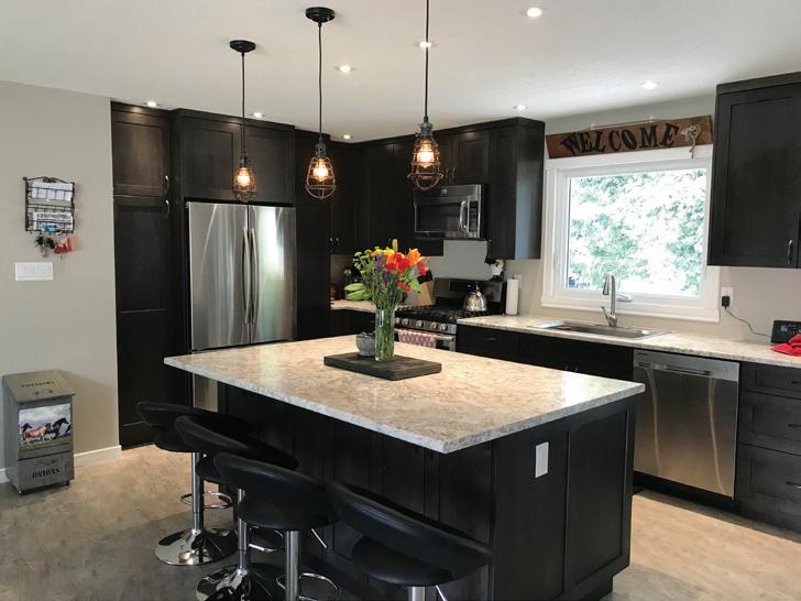
Your Dream Kitchen come true...
A: Please never change. There is nothing better than your 1950s pink tiled bathroom, and I love that you love it. In this case I would go the clean white shower curtain route as it contrasts the best. Or you could do black, which is more of the era. Polka-dot would be amazing and cheeky.

Q: How has Instagram changed the design world? A: It’s not so much Instagram for me as it is the camera phone. I feel fundamentally like the camera phone has literally changed the way we see the world around us, in most cases in a supersaturated color scheme, through a 5 1/2-inch piece of vertical glass. I see the rise of maximalist design completely as a result of the camera phone. In the design industry I think Instagram has allowed more people to call themselves designers than actually should, and showcase a very narrow body of work, and that’s disappointing.
Design Ideas
LIMITED TIME OFFER ENDS JUNE 30, 2020
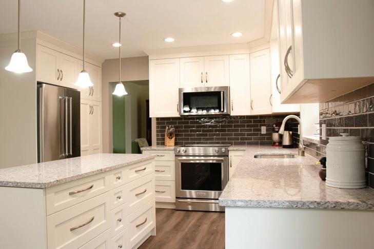
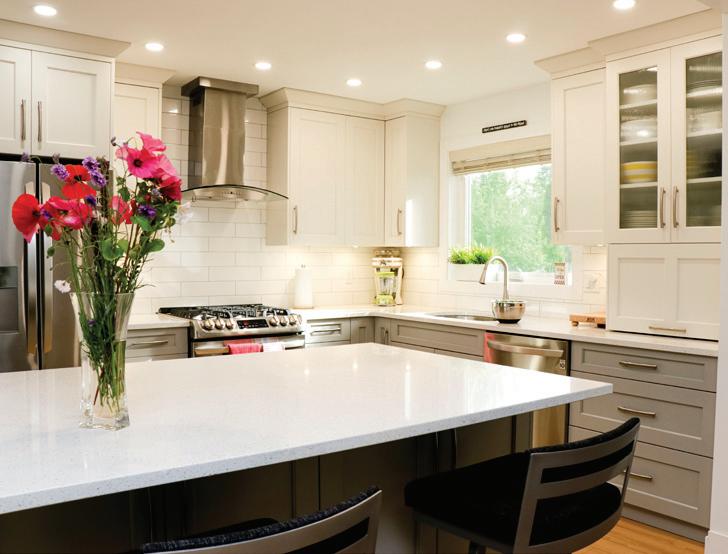
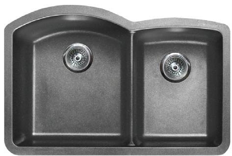
Purchase your kitchen cabinetry and quartz countertops with us and receive a ‘Pearl’ sink and faucet of your choice absolutely FREE! VALUED AT $1400 (Altera Brushed Nickel, Santino Brushed Champagne or Damien Nero Black) *some restrictions may apply, contact us for full details
Kitchen & Bathroom Cabinets | Designers & Installation Team Quartz Countertops | Tiles - Ceramic and Porcelain Blinds & Window Coverings | Flooring | Full Remodeling Service 250.561.1888 • 2165 S. Ogilvie St. www.newlookinteriors.ca


