


Angel's Share
Carbost, Isle of Skye IV47 8SR, United Kingdom
Rhino, Unreal Engine 5, V-Ray, Adobe Suite Partner: Muqiao Lei
Instructor: Andrew Saunders 2024.01 - 2024.05
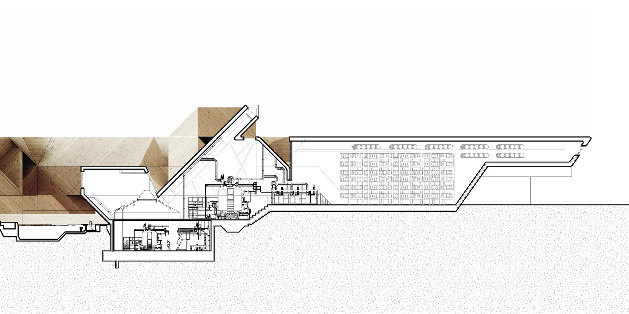
In architecture, we capture the sublime by drawing upon Edmund Burke’s idea of astonishment—an unexpected experience. Our approach involves crafting unexpected spatial transitions, from a distillery to a bath and extending into daunting natural landscapes. This strategy blurs the distinctions between what is natural and what is artificial, creating moments that surprise and engage. The distillery process exemplifies this, with its systematic, precise nature juxtaposed against the vast, overpowering landscape and our human fragility. By integrating sauna and bath facilities within this precise environment, we further catalyze a stark juxtaposition between sensory experiences and spiritual reflections.
This project aims not only to build structures but also to evoke feelings and thoughts that resonate with those who walk through our creations. With this project, we invite everyone to experience the sublime, and to feel the astonishment.
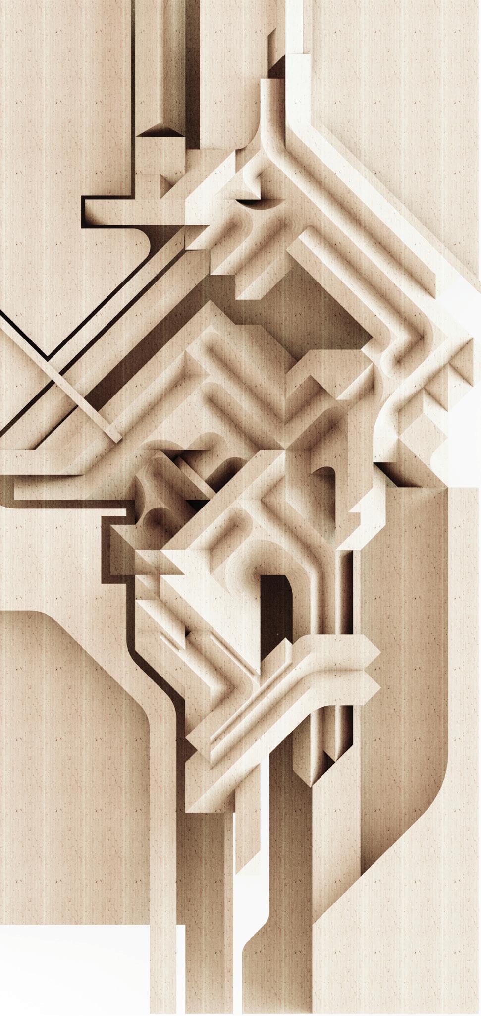
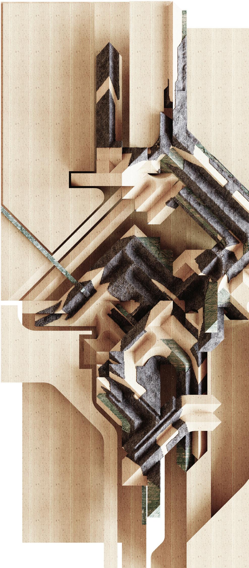



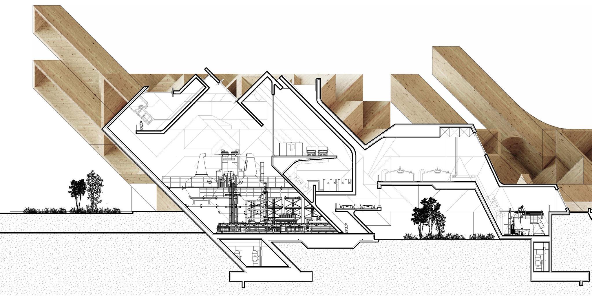
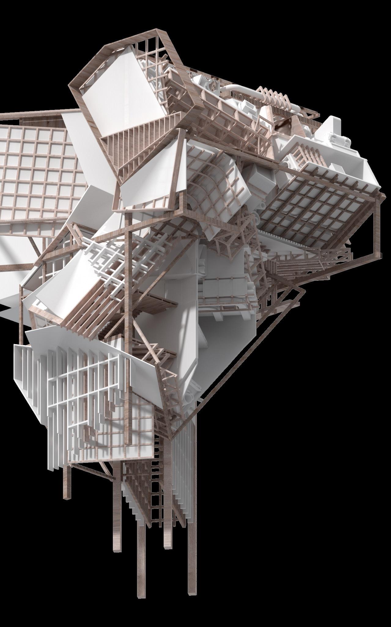
The entrance of our facility is a key area for expressing the sublime. The towering chimney serves not only as a functional element but as a dramatic visual guide, directing the gaze upward and echoing the grandeur of the surrounding mountains. This architectural feature acts as a metaphor, inviting visitors to look up and contemplate nature and perhaps even a higher power. The use of geo textiles, a reflection to Scotland's textile industry, and high-performance materials in construction allows us to strategically expose parts of the CLT framework while concealing others, enhancing both aesthetic appeal and defamiliarization of the material.
The interior rendering shows a view of the stills, and from the corridor above, visitors can see the distillation scene underneath. The stills are vaporized through the chimneys above, and another interior rendering shows the sauna room, where we have taken the geometry from the sculpture by Fred and combined it with the equipment of the sauna through curved CLT. We made these interiors bright, in contrast to the somber natural landscape of Skye, to explain Burke’s definition of sublime obscurity using light in architecture.

Elevation The entrance of our facility is a key area for expressing the sublime. The towering chimney echoing the grandeur of the surrounding mountains. This architectural feature acts as a metaphor, geo textiles, a reflection to Scotland's textile industry, and high-performance materials in construction both aesthetic appeal and defamiliarization of the material.

serves not only as a functional element but as a dramatic visual guide, directing the gaze upward and metaphor, inviting visitors to look up and contemplate nature and perhaps even a higher power. The use of construction allows us to strategically expose parts of the CLT framework while concealing others, enhancing


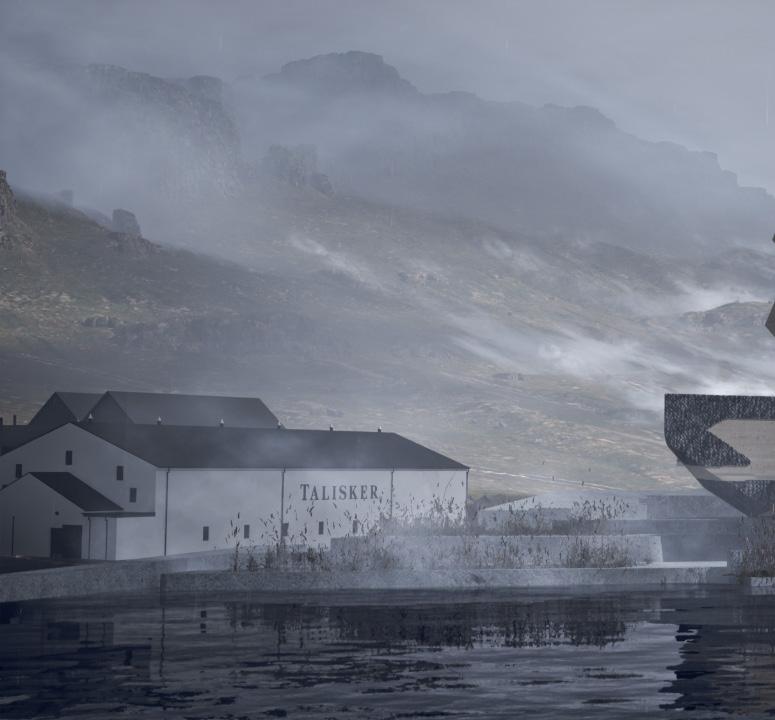
As visitors pass through the courtyard, they encounter the unexpected scene of the 'bath view.' Here, the steam from the heated pools mingles with the mountain mist, enveloping the space in a mysterious fog that heightens the sense of the unknown and evokes a slight trepidation. This fusion of elements captures the essence of the sublime, concept of astonishment in every unexpected view.

Instructor: Nate Hume 2023.01 - 2023.05
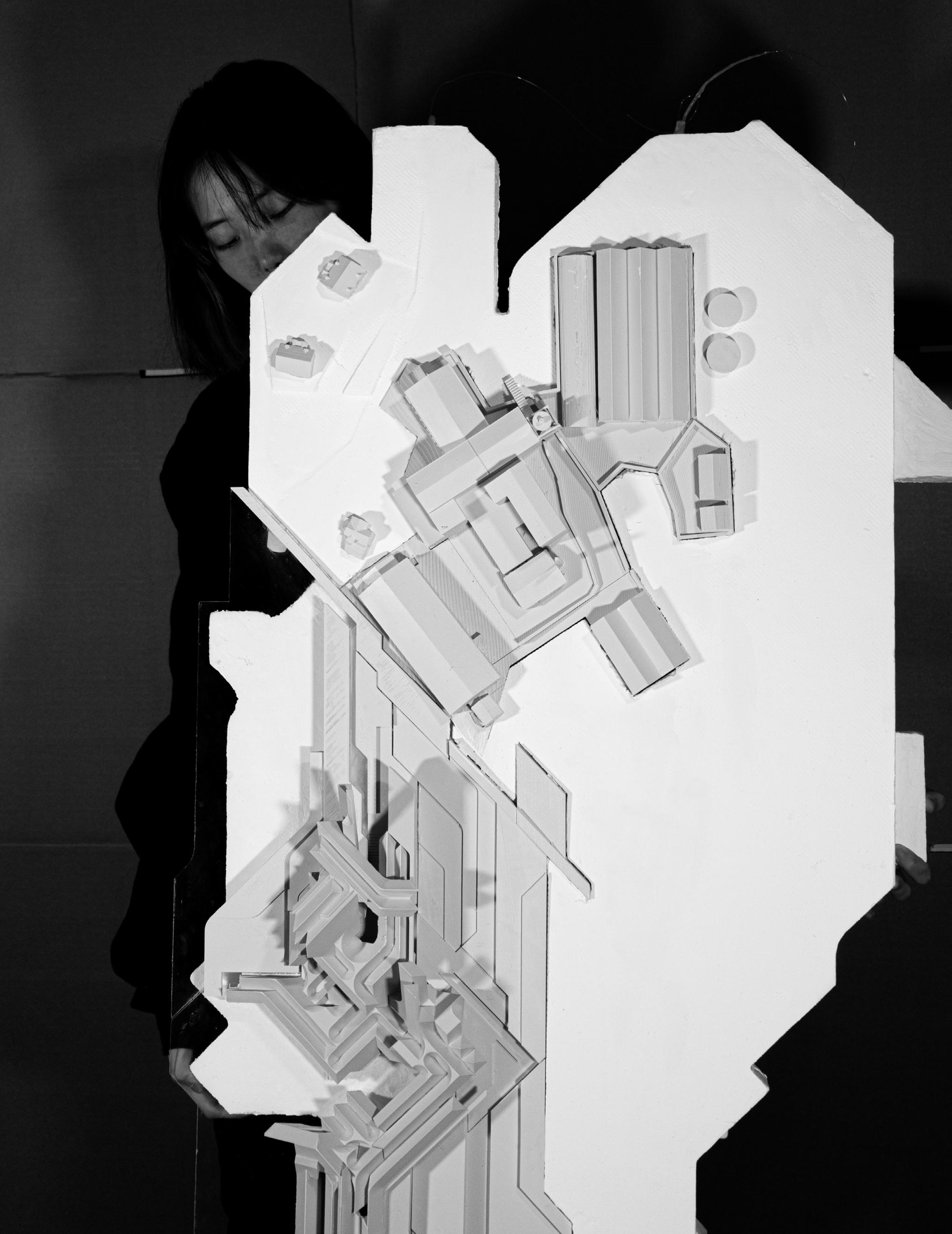
This pioneering architectural project stands as a profound statement against the estrangement from our traditional food systems, urging society to reconnect with and respect the origins of their sustenance. The concept is birthed from an analogy of anatomizing structures as is done with animals, aiming to confront and reconcile the disconnection felt towards the food industry, particularly meat production.
The design champions a revolutionary approach by integrating meat recycling processes, transforming waste into valuable nutrients for plant nourishment. These plants are not just a symbolic nod to sustainability, but a critical component of the building, redefining the concept of recycling in architecture. Furthermore, the project employs mycelium as an innovative biomaterial, signifying growth, and life, emblematic of the cycle from consumption back to production.
The facade, a critical aspect, amalgamates mycelium with a sophisticated triple-glazing system, arranged in an intricate tile pattern. This not only emphasizes the building's transparency metaphorically, reflecting the need for a clear understanding of our food's journey from origin to plate, but also functionally, promoting natural light and energy efficiency. The mycelium, while aesthetic, is a crucial sustainability factor, showcasing potential in biodegradable construction materials.
Ultimately, this architectural feat serves as a reminder and educator. It's a physical manifestation of a philosophy that stresses the importance of recognizing and respecting the lifecycle of our food, fostering a more conscious, sustainable, and empathetic society.

Site Plan
The project's site plan ingeniously tucks the entrance on a deeper side, ensuring harmony with nearby structures while inviting visitors on a secluded journey through verdant spaces. This intentional pathway amidst greenery aligns with the building's ethos of fostering a deeper connection with our food sources, subtly immersing visitors in nature before they even enter. By navigating through this green corridor, guests are primed for an intimate experience, resonating with the project's core message: understanding and respecting the lifecycle of food.


Floor Plan
The architectural floor plan presents a unique composition where each different program is encapsulated within its
In the more open areas, spaces are dedicated to the restaurant and an exhibition gallery, where visitors are welcomed are designated for meat processing activities, including the slaughter area, food processing units, and laboratories. provocative, it's integral to the project's mission. By exposing viewers to the reality of meat production — a demo food consumption.
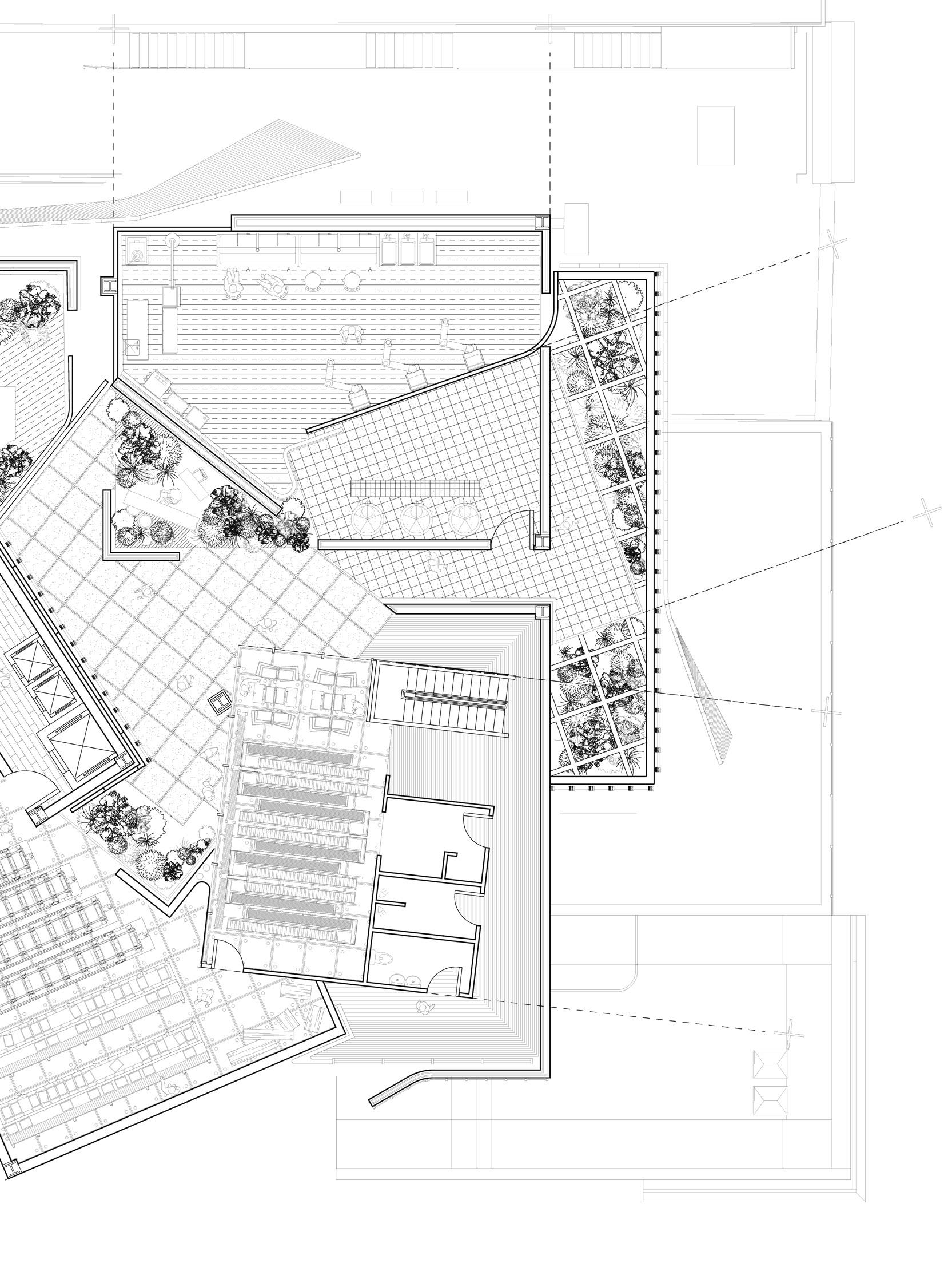
its distinct volume. As these volumes overlap, the interconnections between various programs gradually unfold. welcomed to dine and simultaneously witness the intricate process of mycelium panel production. Conversely, the more private zones laboratories. Notably, a section of the slaughter area is made visible to the customers through glass partitioning. While this decision might be section of the slaughter process — the design confronts and educates them, breaking the detachment that often characterizes modern


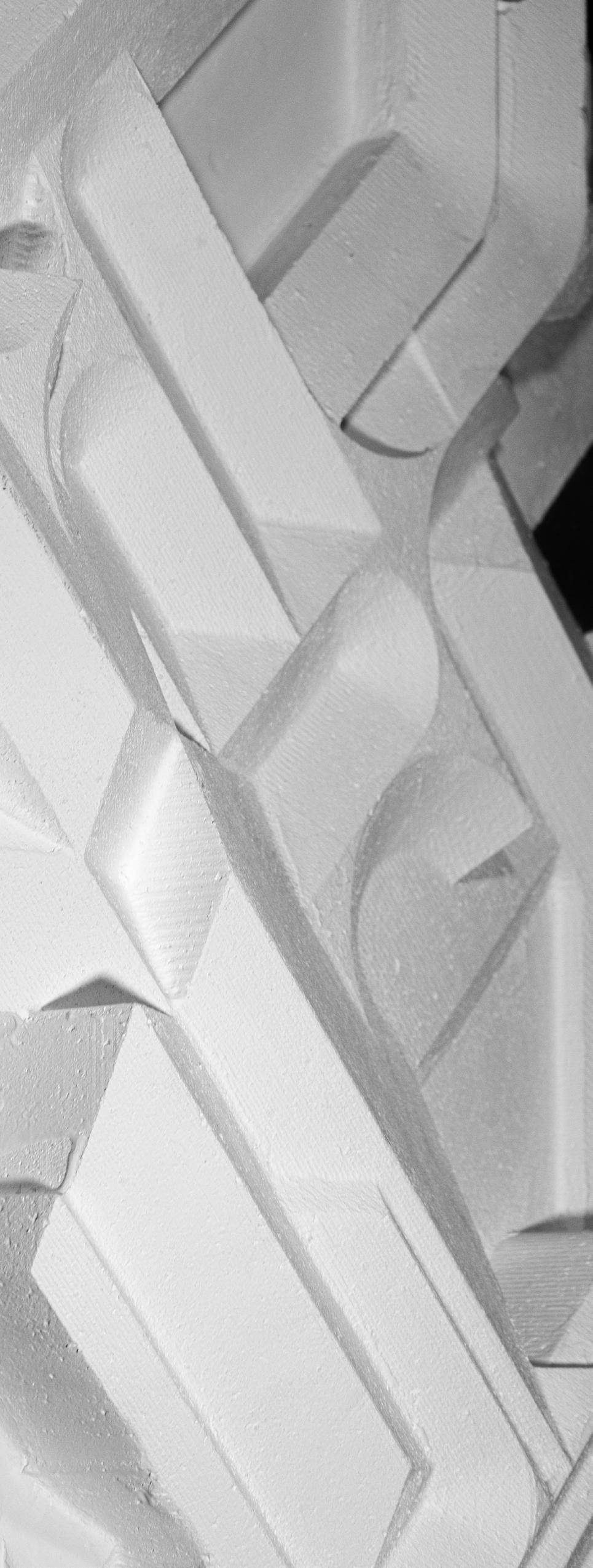
The interplay between the digitally fabricated mycelium panels and the laser-cut timber elements results in a model that is both an architectural exploration and a work of art. It pushes the boundaries of materiality and form, suggesting a futuristic vision where organic and fabricated components coexist and complement each other within a built environment.


Through The Valley
Houdini, Unreal Engine, Keyshot Partner: Sara Halawani
Instructor: Barry Wark 2023.09 - 2023.12
Viale Enrico Panzacchi, 8, 40136 Bologna BO, ItalyThe architecture program proposed here embarks on a profound exploration of the iconic porticos of Bologna, aiming to reimagine their role and appearance in the context of environmental integration and climate adaptability. At its core, the program poses two critical questions: How can these historic structures be re-envisioned to showcase their connection with the environment more intentionally? And, is it possible to perceive the processes of weathering and ruination not just as decay, but as a form of beauty in itself? Through this lens, the initiative seeks to extrapolate the essence of the porticos into new civic spaces that are responsive to climate trajectories, thereby redefining their significance in the urban landscape.
Central to this exploration is the design of a new civic space that navigates the nuanced territory between the remnants of Roman ruins and the traditional portico. This space is envisioned as a living testament to the gradual enmeshment of architectural forms with the natural world, showcasing materials that age gracefully over time and interact dynamically with environmental forces. The program proposes the innovative use of thick brick walls for southern shading and stepped surfaces on the east and west, fostering spaces where plant life can grow freely, blurring the lines between the built environment and the natural landscape.
The significance of this architectural intervention extends beyond the mere physical transformation of spaces. By treating the portico as a threshold that is neither fully indoors nor outdoors, the program encourages a reevaluation of how architectural spaces can mediate between human habitation and the natural world. This perspective is further enriched through the use of computational design tools, which enable the creation of intricate and textured surfaces that respond dynamically to environmental conditions. These technological interventions allow for the accelerated visualization of weathering, offering a tangible representation of the temporal and ecological narratives inscribed in the fabric of the buildings.


Delving into the details, the project features bricks on the southern side, which are not only locally sourced but also demonstrate a functional awareness of sunlight and shading patterns. These bricks align with the environmental conditions, creating a sustainable aspect of the design.
The use of 3D-printed stone, tinted with the distinctive orange hues reminiscent of Bologna, introduces a subtle variance in coloration that adds depth and vibrancy to the structure. In a seamless transition, sections of this stone descend to meet the brickwork, continuing the stepping motif that is central to the design language of the project. This stepping is not just a visual element but also a practical one, as it allows the architecture to respond dynamically to different ground levels and the associated spatial experiences.
The design thoughtfully incorporates variations in ceiling height to curate distinct atmospheres within the same structure. On one side, the lower ceiling height fosters intimacy, complemented by the inclusion of benches that invite contemplation and social interaction. In contrast, the opposite side features a raised platform beneath the portico, offering a diverse range of views and perspectives, enriching the visitor's experience.


Brick/Stoen Detail After Weathering
The project's material dichotomy serves as a narrative on the temporal nature of architecture, contrasting the enduring solidity of brick with the ephemeral qualities of 3D-printed stone. The bricks, resonant with the steadiness of tradition, form the foundational backbone of the structure, suggesting permanence and resilience. These bricks are chosen for their time-honored reliability and the way they anchor the entire design in a sense of historical continuity.
In juxtaposition, the 3D-printed stone is a testament to transience, a material deliberately selected to exhibit the signs of weathering and the relentless march of time. This innovative material choice is not only about aesthetic appeal but also about creating a living architecture that evolves. Small steps and intentional gaps within the stone elements become fertile grounds for natural occurrences such as the sprouting of weeds and the growth of moss, turning the structure into a canvas that captures the essence of decay and rebirth in its crevices and contours.


The weathering on the building is much more pronounced. The decaying stucco on the bricks indicates long-term exposure to weather, where water has infiltrated and contributed to the material's breakdown, leading to flaking and crumbling. This effect is exacerbated in areas without the protection of overhanging elements or where the water runoff is particularly heavy, demonstrating a history of natural wear.
The stepping on the left side of the building features vegetation growing over and around the brickwork and steel surfaces. These stepped planters create a cascading green effect, which not only offers a visual gradation but also shows how the building has interacted with the natural elements over time.


Rhino, Adobe Illustrator, Adobe Photoshop, V-Ray instructor: Eduardo Rega Calvo 2021.09 - 2021.12
In the heart of Philadelphia, a city celebrated for its historical significance and architectural grandeur, lies an underexamined narrative of power dynamics encoded within its urban fabric. The traditional axis system, emanating from pivotal institutions such as City Hall and extending to the Philadelphia Museum of Art, has historically symbolized a concentration of authority and influence. This symbolic axis, often perceived as a testament to the city's heritage, inadvertently perpetuates a visual and spatial hierarchy that privileges certain institutions over the public realm.
Our project, situated at the nexus of these power lines next to the Philadelphia Museum of Art, seeks to challenge and reinterpret this symbolic axis. By scrutinizing the "Philadelphia Difference" in the context of urban design, we aim to question the conventional narratives of power that have been etched into the cityscape. The project's objective is not merely to disrupt this axis but to reimagine it as a space of inclusive narratives, fostering a sense of community and equality rather than hierarchy.
To achieve this, our design strategy employs a series of spatial interventions that disrupt the linear continuity of the axis. Through the creation of long lines of spaces and walls, we introduce a new visual and physical narrative that diverges from the traditional axis of power. These interventions are designed to provoke thought, encourage public engagement, and facilitate a multiplicity of perspectives. By doing so, we aim to de-consolidate, dissolve, and de-sanctify the entrenched notions of power and privilege that have historically dominated Philadelphia's urban landscape.
Our project is a call to action for designing for the public good. It seeks to equalize power relations within the city and advocate for a more just and equitable urban environment. By focusing on specific points of intervention, such as the areas surrounding the Museum of Public Art and City Hall, our design approach offers diverse answers, responses, and recommendations to the complex issues embedded within Philadelphia's axes. In doing so, we aspire to not only challenge the existing spatial hierarchies but also to inspire a reimagining of urban space as a platform for democratic expression and social cohesion.
 PMA Research
In exploring the artworks of various eras and regions, a significant realization emerged: artworks convey meanings far deeper than the mere labels affixed to museum walls can capture. This disparity between intention and interpretation underscores a fundamental limitation within the traditional museum model. Enclosed spaces and the conventional modes of display restrict the depth of engagement, leaving the narratives and complexities of artworks partially obscured from public view.
Furthermore, the role of authority in the art world—typically manifested through funding and institutional support—raises questions about the prioritization of art appreciation. While financial backing is crucial, there seems to be a disconnect between the allocation of resources and the facilitation of meaningful art experiences. The focus often lies more on the preservation and display of art rather than on enhancing public understanding and appreciation. This misalignment suggests a need for a reevaluation of how art institutions engage with their audiences and the broader community.

The contradictions and problems of the city of São Paulo are the background of a collage on the axis. Social inequalities are taking shape, evident in the encounter between slums and luxury apartments. Public spaces are subverted, with driveways becoming recreational areas and places for demonstrations, while sidewalks and squares become beds for the homeless. Similar problems are the result of the very rights represented by this axis. I hope that my project will create a safe environment that can provide space for young artists and for niche art to speak, protest, create, and subvert the reality.


The extension of the museum, as envisioned, seeks to transcend this traditional model by embracing a more contemporary concept of "production and performance." This paradigm shift aims to transform the museum from a space of static display to a dynamic environment where art is continuously created, performed, and interacted with. This new concept encourages a deeper, more active engagement from the audience, inviting visitors to be part of the art-making process, to experience performances that breathe life into artworks, and to engage in dialogues around the art.
Such a museum would not only house art but also produce it, blurring the lines between the artist, the artwork, and the audience. This approach aligns with the contemporary understanding of art as an evolving dialogue, one that is shaped by the interactions between the creator and the viewer. It recognizes that the significance of art lies not just in its historical context or aesthetic value, but in its capacity to provoke thought, evoke emotion, and inspire change.
By adopting this concept, the museum extension is not merely adding more space but is redefining the purpose and potential of museum space. It is an acknowledgment that art is a living, breathing entity that grows and changes in meaning with each new interaction. This transition towards a model of "production and performance" invites a broader, more diverse audience to engage with art in ways that are meaningful, personal, and transformative.
BUILDINGS


Inch

The intervention begins with the construction of a wall that serves as both a physical and metaphorical branching point. This wall is not a barrier but a declaration of divergence from the traditional, monolithic structures that dominate cultural landscapes. It acts as a canvas for graffiti and other forms of street art, symbolizing a commitment to inclusivity and the dynamic expression of voices often marginalized.
As the wall fragments, it gives rise to a new institution that stands in contrast to the quiet, controlled environments of conventional museums. This space is dedicated to the exploration and presentation of student and emerging artists' work. It is designed to be open and fragmented, encouraging visibility and interaction between the artists and the broader community.
This new institution embodies a philosophy that values the process of art-making as much as the finished product. It seeks to facilitate an ongoing exchange of ideas and to expose the art and the artists to the public in a manner that is both honest and transparent. By doing so, it aims to foster a more engaged and informed dialogue around art, culture, and society.
In keeping with the spirit of transparency and openness, the management model of the institution itself reflects a departure from traditional hierarchical structures. It aims to be a model of collaborative governance that prioritizes inclusivity, diversity, and community engagement.


By positioning this new institution next to the Philadelphia Museum of Art, the project not only challenges the traditional axis of power represented by established cultural institutions but also offers a vision of what the future of art and urban space can be. It is a bold statement in favor of artistic freedom, social dialogue, and the transformative power of art in public life. Through this intervention, I hope to inspire a reevaluation of the role of art in society, making it a catalyst for change, reflection, and community building.


Deployable Structure
Semester: Sping 2023
Rhino, Auto CAD, Laser Cut
Instructor: Mohamad Al Khayer 2023.01 - 2023.05
The seminar showcases a selective representation of deployable structures. While the students investigated multiple deployable systems throughout the term, the portfolio strategically excerpts three quintessential systems that best exemplify the breadth and depth of their innovative exploration.
The seminar will unravel the intricate details of the first two systems, each characterized by deployable mechanisms that expand in two distinct directions, as exhibited by the images provided. These preliminary systems, through the process of design iteration and computational analysis, establish a foundational understanding of kinetic geometries in both two-dimensional and three-dimensional contexts.
The highlight of the seminar is the unveiling of the final project—a sophisticated amalgamation of the two initial systems. This final structure exemplifies the height of complexity achieved by combining the directional expansions into a singular, cohesive deployable form. The seminar will present the comprehensive development process, from the choice of materials like laser-cut MDF and stainless steel screws to the precision engineering of joints and connections informed by week nine's computational data.
Attendees of the seminar will be taken on a detailed journey through the design process, experiencing the evolution of the deployable structures from their initial conception to their final intricate form. This deep dive into the project's trajectory promises to offer insights into the fusion of design thinking, geometry, and material innovation, revealing the multifaceted challenges and breakthroughs in crafting structures that are both interactive and capable of reimagining the utilization of space. The presentation aims to foster a deeper appreciation for the aesthetic, functional, and transformative impact these deployable structures can have on architectural and design practices.


Material:
Scissors / Joints: - Laser cutting, 1/8” mdf
Connections:
- #6 - 32x1 - 1/2” Stainless Steel Screw
System Discription 01:
The project transitions from studying three-dimensional folding using single scissor mechanisms to employing double scissors to enhance the system. The double scissor system, involves an intricate arrangement of scissors that intersect or pair up, effectively doubling the points of articulation. This innovation expands the scaling capabilities of the structure, potentially allowing for a greater range of transformation and a more extensive utilization of space. It also likely contributes to the structure's stability and offers new geometric configurations.

Material:
Scissors / Joints:
- Laser cutting, 1/8” mdf
Connections: - #6 - 32x1 - 1/2” Stainless Steel Screw
System Discription 02:
The system illustrates how computational design has guided the precise arrangement of joints and connectors to facilitate motion. The layered composition of the structure is visible, highlighting its three-dimensional form when fully expanded.
Each joint in the system is a result of careful design and calculation, comprising seven components including four types of "JOINTA" which form the primary connection points. These are supplemented by the E-shaped "jointB" and the "JOINTC" which function as intermediary connectors, possibly allowing for the transition between the two primary joint types, enhancing the flexibility and range of movement within the structure.


Material:
Scissors / Joints:
- Laser cutting, 1/8” acrylic
- Laser cutting, 1/8” mdf
Connections:
- #6 - 32x1 - 1/2” Stainless Steel Screw
Final System Discription:
The final project represents the apex of the exploration into deployable structures, inspired by existing installations in a lobby setting. These structures, while aesthetically pleasing, seemed disconnected from the space they occupied and the people within it. Addressing this, the final design is a deliberate composition of polygons and multifaceted deployable elements.
When individuals gather underneath these structures and look up, they are met with an array of centripetal geometric patterns that evolve as the structure moves. This dynamism allows the structures to resonate with the occupants, providing a constantly changing overhead landscape. The changeability of the patterns creates an interaction between the structure and the viewer, making the viewer an active participant in the experience.
The thoughtful integration of movement, form, and interaction within the final deployable structure seeks to redefine the relationship between architectural installations and their users. By combining the two initial systems into one complex entity, the final project showcases how such structures can enrich spaces, not just visually, but through the creation of interactive and responsive environments.


Market St, Philadelphia, PA 19139
Drawing from the rich musical concept of the 'tuplet', the Tuplet Tower architectural project transcends mere physical connectivity, becoming a symphonic bridge between cultures and communities. Strategically positioned at the juncture of a bustling high-rise residential area and the revered original bandstand, the tower epitomizes architectural harmony, weaving the urban fabric of its diverse surroundings into a cohesive whole.
At its core, Tuplet Tower is a sanctuary for musicians, designed to be in perfect harmony with the surrounding musical ecosystem. A physical bridge not only facilitates a direct connection to the America Bandstand but also guides residents down into a vast concert hall, where a dedicated DJ stage awaits to amplify their art. This seamless integration of living spaces with performance venues encourages a vibrant flow of creative exchange, fostering innovation and melodic evolution.
The selected work delves deeper into the structural aspects of the Tuplet Tower, offering detailed insights into the plan, sections, and interior/exterior section details, alongside physical models at various scales. It showcases how the project's conceptual underpinnings are manifested in its physical form, highlighting the architectural techniques employed to achieve a seamless blend of function and aesthetic, in service of musical and community integration.


C - CHANNEL

STEEL DECKING FLANGE
WIDE FLANGE
GDB DROP CEILING
DOUBLE GLAZING
WIDE FLANGE
METAL SOFFIT

Building Section - East/West Looking South


Beilong Lake Residential ID clubhouse
Beilong Lake, Zhengzhou, China
Rhino, Auto CAD, Enscape
Firm: David Chipperfield Architects 2023.05 - 2023.07
The Beilong Lake Residential ID clubhouse, rejuvenated by the visionary David Chipperfield Architects, presents a sanctuary where nature and illumination gracefully descend into the subterranean spaces, crafting an oasis of tranquility and warmth. The design ingeniously integrates areas such as a welcoming courtyard, an elegant reception doubling as an exhibition space, a serene clubhouse lounge for intimate negotiations, and specialized spaces including VIP meeting rooms, a kids' area, and functional offices. The material palette is a thoughtful composition of beige limestone, smooth plaster, light timber, and accents of marble and fabric in shades of green and pink, all working in harmony to blur the distinctions between the indoors and the outdoors. This curated selection of materials not only enriches the tactile and visual experience but also bathes the interiors in a natural, bright, and inviting glow. Each element, from the strategically placed staircases to the meticulously designed corridors and lounges, converges to forge an environment that is both luxurious and comforting, making the Beilong Lake clubhouse a true embodiment of modern elegance and natural beauty.


The second-floor plan accentuates a strategic corridor layout that ensures seamless circulation throughout the space. The corridors are broad and run parallel to the building's exterior, granting access to various ancillary rooms and central areas, which are likely to include functional spaces such as offices or meeting rooms. The layout is engineered for efficient navigation, leading residents and guests through a journey punctuated by visual connections to the courtyard. This design choice underscores the corridor not just as a passageway, but as an integral component of the building's experience, inviting pauses and interaction, rather than merely being transitory.
In contrast, the first-floor plan presents a more diverse array of spaces with the corridor acting as a guide to distinct zones such as the reception area, VIP meeting rooms, and lounge areas. The central courtyard remains a focal point, providing a visual and spatial relief from the enclosed rooms. The corridor in this plan appears to offer a more intimate scale, suited for the varied activities occurring in adjacent spaces, suggesting a rhythmic flow that gently propels movement from the bustling exterior to the tranquil interior courtyard and vice versa.


Nestled within the embracing arms of modern architecture, the courtyard serves as the vital nucleus of the residential complex—a dynamic thoroughfare for residents and visitors alike. It's a deliberately crafted sanctuary where the rigidity of stone and concrete yields to the organic tapestry of a vibrant garden. This space is alive with a spectrum of flowers and grasses that sway to the rhythm of passing breezes, anchored by a tranquil circular water feature that whispers serenity into the surroundings.
As the sun journeys across the sky, the courtyard becomes a theatre of light and shadow. The architectural overhangs and latticed screens carve the sunlight into dynamic patterns, which animate the walls and floor in a quiet celebration of time’s passage. The interplay between light and shadow not only highlights the natural beauty of the courtyard but also marks the passage of time, turning the area into a living clock observed by those who find a moment to pause in their day.
The courtyard is not just an element of transit but the most poignant expression of the building's ethos— where the built environment and nature are not just adjacent but are in conversation. It is here that the journey through the building becomes an experience, not just a route, encouraging a moment of reflection in the embrace of natural bright warmth, the soft touch of limestone, and the dance of shadows, crafting an ever-changing, yet timeless, space.
What's the past is prologue,
