5 minute read
Typography Legends | Typolicious
from Typolicious
by Ashley Price

Zuzana Licko
Advertisement
Over the last 15 years, Licko's designs have grown less extreme, but no less radical.
As one of the first type designers to exploit the potential of the Apple Macintosh in its pre-designer days, Zuzana Licko transformed the pixel from low-resolution imitation to high-style original. Her early Emigre fonts not only revolutionized digital typography but also opened up the market for the smaller foundries whose quarter-page ads populate today’s design magazines. She has designed more than two–dozen typeface families and oversees the Emigre foundry, which currently offers 300 or so typefaces.
Born in Czechoslovakia, Licko immigrated to the US with her family as a schoolgirl. She studied architecture, photography and computer programming before taking a degree in graphic communications at the University of California at Berkeley. When Rudy VanderLans, her partner, launched Emigre, she began to contribute fonts to the fledgling ‘magazine that ignores boundaries’. Rather than replicate typographic forms already adapted from calligraphy, lead and photo typesetting, Licko used public domain software to create bitmap fonts. Emperor, Emigre and Oakland appeared in the magazine and were soon advertised for sale when VanderLans and Licko co-founded the Emigre foundry.
Emigre’s development reflected the evolution of digital technology while questioning conventional ideas of legibility and layout. Licko’s highly structured typefaces counterbalanced VanderLans’ organic compositions. The ‘Emigre aesthetic’ lay at the heart of a once–controversial battle on the American design scene, pitting them against Modernists such as Massimo Vignelli, who referred to the new typography as ‘garbage’. The debate did little to slow the popularization of the Emigre fonts, which by the late 1980s had moved beyond alternative pop cult status into the mainstream (The New York Times, ABC and Nike). The graphic design establishment has since recognized Licko and VanderLans with a 1994 Chrysler Award, the 1997 AIGA gold medal and the 1998 Charles Nypels Award for Innovation in Typography.

www.typedrivesculture.com
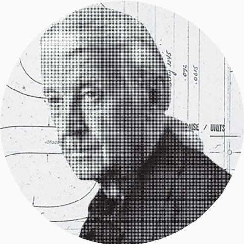
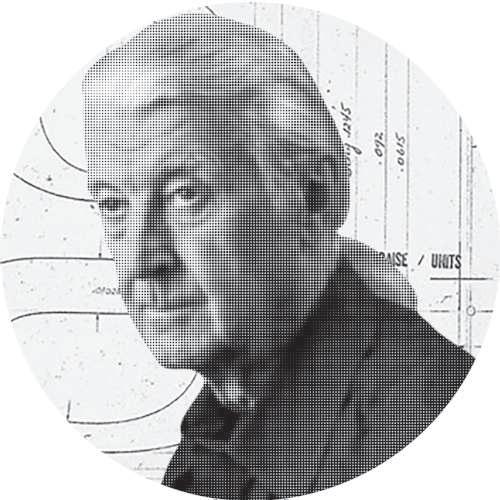
Matthew Carter
A master type designer who crafts letter forms of unequaled elegance and precision for a seemingly limitless range of applications & media.
Matthew Carter is a type designer with fifty years’ experience of typographic technologies ranging from hand-cut punches to computer fonts. After a long association with the Linotype companies he was a co-founder in 1981 of Bitstream Inc., the digital type foundry, where he worked for ten years. He is now a principal of Carter & Cone Type Inc., in Cambridge, Massachusetts, designers and producers of original typefaces.
His type designs include ITC Galliard, Snell Roundhand and Shelley scripts, Helvetica Compressed, Olympian (for newspaper text), Bell Centennial (for the US telephone directories), ITC Charter, and faces for Greek, Hebrew, Cyrillic and Devanagari. For Carter & Cone he has designed Mantinia, Sophia, Elephant, Big Caslon, Alisal and Miller.
Carter & Cone have produced types on commission for Time, Newsweek, Wired, U.S. News & World Report, Sports Illustrated, The Washington Post, The Boston Globe, The Philadelphia Inquirer, The New York Times, Business Week, The Walker Art Center, the Museum of Modern Art, Yale University, and the Hamilton Wood Type Museum.
Starting in the mid-’90s Carter has worked with Microsoft on a series of “screen fonts” designed to maximize the legibility of type on computer monitors. Of these, Verdana, Tahoma and Nina (a condensed face for hand-held devices) are sans serif types; Georgia is a serif design.
Carter is a Royal Designer for Industry, and a Senior Critic on Yale’s Graphic Design faculty. He has received a Chrysler Award for Innovation in Design, the AIGA medal and the Type Directors Club medal. In 2010 he was awarded a MacArthur Fellowsvhip, and in 2011 he received the Lifetime Achievement Award from the Smithsonian National Design Awards.
Four Questions for Alejandro Lo Celso

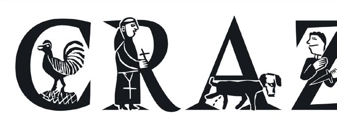
"Crazy" is in Amster Versal Iluminada, a typeface from Alejandro's PampaType foundry. The typeface was created by by Francisco Gálvez.
Alejandro Lo Celso is the founder and principle type designer at the fount foundry PampaType, the very first digital type foundry in Argentina, which pioneered the latest wave in Latin American type design. PampaType's broadly recognized and internationally prized designs are handcrafted following visual, rather than mathematical methods.
1 // How did you originally get interested in typography & design?
Typography is the encounter of design and literature. I’ve always thought that typography was my safe escape from the commercial world of graphic design. But when I recall my family stimuli, I realize it all came naturally. My grandmother had a taste for calligraphy: she used to draw in fi ne black letter on all the title pages of my mother and her brother’s schoolbooks. And she loved literature. My mother became a historian, and now she paints. On the other side, my grandfather was an architect and an artist, and my own father is an architect too, and an urbanist. I fi nd myself playing in between all these universes.
2 // What typography trends are you loving most these days?
I’m not particularly interested in trends; they change too quickly. I prefer to think of typography as the materialization of more perennial
words. I love books and reading, and I love the idea of creating typefaces that are comfortable to read. On the other hand, a typeface you publish is like a daughter that leaves home and makes her own path. One day she comes back home with a boyfriend and who knows if you’ll like him. In 2013, we were invited by a Mexican art school to put together a large exhibition of our work in type design. The gallery was approximately 2,000 square feet and we had only 14 days to mount it. I had to coordinate the efforts of 20 people who kindly came to help. It was a great success in the end.
3 // Which of your projects are you most proud of thus far in your career and why?
There are several. As a teacher I’m proud of having run many workshops and courses in many places. I think I’ve been a privileged apprentice to those experiences. I led the small team that created Garonne, a tailored type system for the city of Toulouse in France. That was a wonderful and quite unusual experience. PampaType is now growing our type library on a collective basis. A great challenge for me today is taking care of the work of other designers and trying to help them reach their highest capabilities.
4 // Describe your dream project.
That’s a hard question to answer. I guess I don’t really dream of the unreachable, the far beyond. I’m currently working on a type system for the public university here. That is an awesome project that I didn’t imagine I’d ever do, one day. I could say it is a dream project, but actually I am inside the dream!

