3 minute read
Interior Design Ideas

INTERIOR DESIGN
IDEAS
Advertisement
After the last eighteen months, many people are now seriously considering updating their homes - creating new spaces, changing color schemes, furniture and even artwork. It’s become clear that home décor has an impact on emotions and well-being.
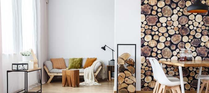
An emphasis on natural light, good ventilation, and biophilic (connection with nature) design have gained in popularity. This is accomplished with the use of indoor plants, skylights, and open indoor-outdoor floorplans. Another noted concern is on climate change; many are now considering sustainability and which materials are best to use for the health of our planet.
Homeowners want spaces that reflect their personalities, interests, hobbies, and history. Outdoor spaces are being treated as integral parts of the home, creating additional rooms to expand a family’s living and entertainment spaces. Stylish furniture is being chosen to be compatible with the indoor space.
(. . .continued on page 4)
Vintage and antique furniture are also making a comeback due to the widespread interest in sustainability. Lamps are important, not just for lighting, but also as art or a statement piece.
The styles of the 70’s have made a resurgence, but with a twist. More muted and earthy tones have replaced bright orange, along with rounded furniture and multiple patterned fabrics.
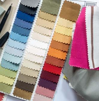
This year Pantone has named “Very Peri” its color of the year. “Very Peri” is a bold blue with violet-red undertones, often called periwinkle. Periwinkle represents serenity and calmness as well as vibrancy and excitement.
According to Pantone, “Veri Peri” helps us embrace this altered landscape of possibilities, opening us up to a new vision as we re-write our lives: rekindling gratitude for some of the qualities that blue represents complemented by a new perspective that resonates today, Very Peri places the future ahead in a new light.
CHOOSING COLORS IS AN IMPORTANT ELEMENT FOR THE DESIGN OF ANY HOME.


These are transformative times and “Very Peri is a symbol of the global zeitgeist of the moment and the transition we are going through.”
Expect to see Very Peri in many different shades and uses. It can be used as an accent color for pillows, glassware, accent chairs, area rugs or art.
Or one can try periwinkle patterned wallpaper to create excitement on walls, ceilings or even cabinets.
Etsy has named Emerald Green their color of the year. It is a reminder of nature and works well on walls, bedding, pillows, and art.
Other paint companies have chosen a more neutral color palettethis year in the belief that calm is needed after the uncertainty of the last two years. Either way, bright cheerful colors are sometimes exactly what we need.
yours!THE CHOICE IS

This is how you say it’s going to be okay.
Every 8 minutes the American Red Cross responds to a disaster and makes this promise. You can help us keep it.
Donate today at redcross.org