1 minute read
The design of beacon has three key features:
Multi-functional
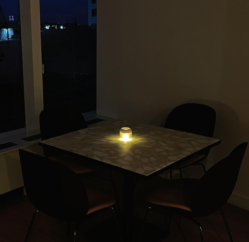
Combination of a mood light and QR code sign to fit on already crowded restaurant tables
Advertisement
Dimly-lit Environment Affordable
Easy QR scanning in all lighting conditions, including dimly lit environments.
A simple and minimal structure to reduce costs for bundled purchases
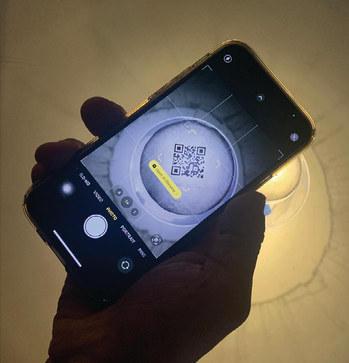
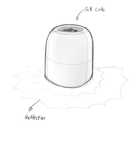
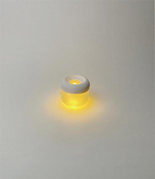
The Beacon’s unique design features a two-way lighting system that creates a beautiful reflection on the table. Meanwhile the top light functions as a backlight for the QR code.

Through prototyping, I discovered that a backlit QR code is much easier to scan without having to use the flash on your phone.

I minimized the number of parts needed, including diffusers, a main body, and chargeable lighting parts, to keep the cost per unit down.


The form study focuses on both visual and tactile aspects. I ensured that the Beacon was easy on the eyes but also on the hands. The concave surface on top invites touch. I also added a braille indicator to help BLV users locate the exact scanning point.


During FGI interviews, I identified another key pain point related to the interaction between customers and servers, which often relies on eye contact. To address this pain point, I incorporated a subtle signaling feature into the design. By flipping over the light, customers can signal servers when they need assistance. This feature was partially inspired by the bat signal.


Special thanks to
My family
Co-author, Heejae Kim
PoD Faculty
PoD Class of 2023
Chancey Fleet
Elyse Voegeli
Carrie Morales
Sam Seavy
Juan Alcazar
Raghav Chhabra
Carly Ayres
Thomas Smith
Pamela Lawton
Shannon Finnegan


