2 minute read
New Numbers Just Out: Extreme Storms & Warmer, Wetter SE Texas Ahead


Chanelle Stigger
Note: Chanelle began by reviewing the Jefferson County’s worst recent storms. Many of those photos and facts can be seen elsewhere in this section.
Advertisement

Now I’ll talk more about climate, specifically normals or what we call “climate normals.” These are calculated every decade. So for example the last one to come out was 2020. So the climate normal that’s out now is from 1991 to 2020. Our normals change every decade, and some of them are increasing every decade. It’s important that we pay attention to what’s normal for now, because what’s normal now is nothing in comparison to what has happened before.
So these normals are created by observations. NOAA employees and volunteers like my coworker and I take observations every day; that’s a part of our job, to collect certain data points, for example temperature. The normals that I’ll be talking about: max temperature, min temperature and precipitation. We collect this data and we’re quality controlling it. And then it gets sent up to what’s called NCEI [National Centers for Environmental Information, a related agency to The National Weather Service—ed.] and then from there they’re building these climate normals.
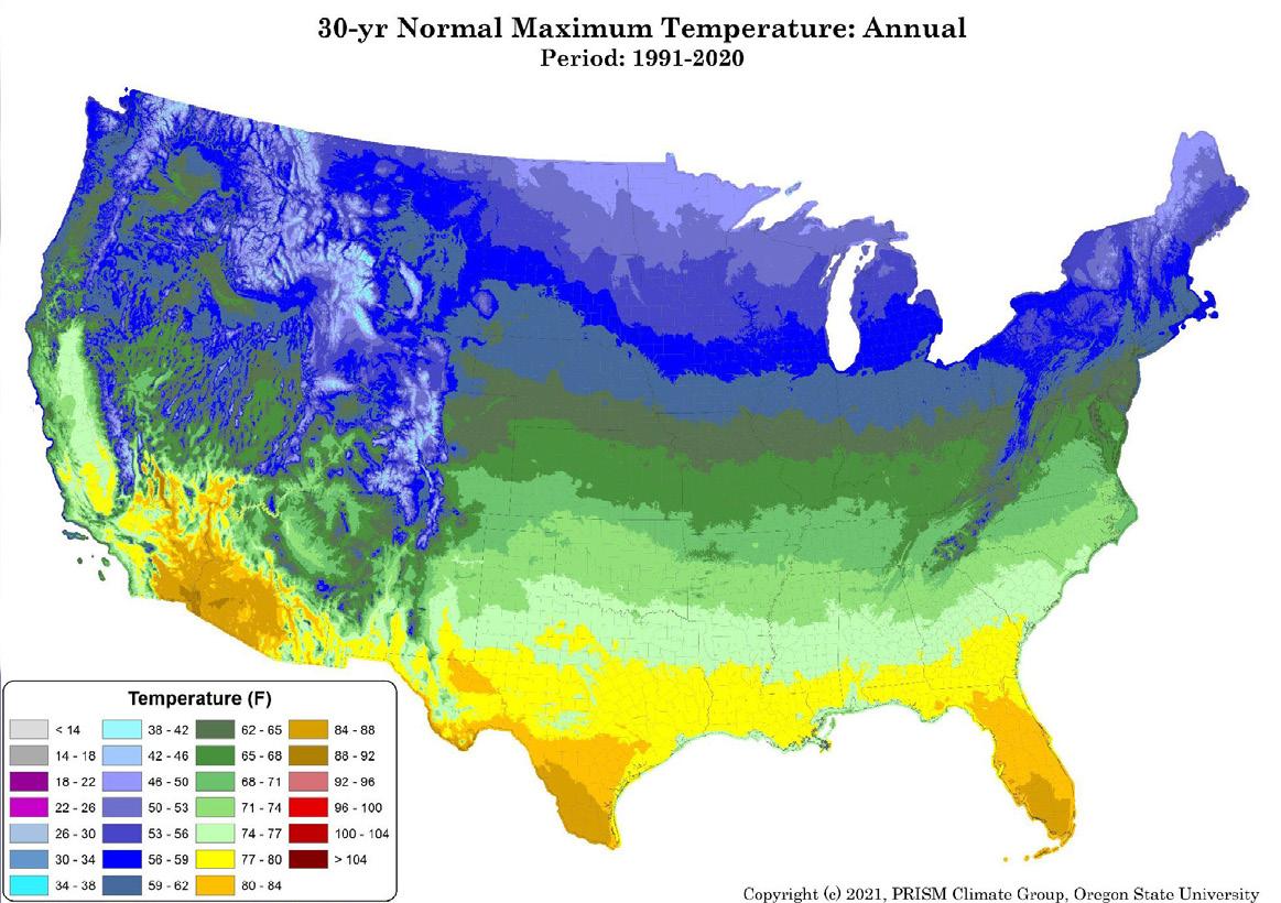
Chart 1: Here you see the difference between 1991–2020 and 1981–2010. Temperatures are higher now almost everywhere (brown). Precipitation is lower in the Southwest but higher in East Texas (blue).
Chart 2: For our average max temperature—this is annual across the entire year—for Southeast Texas we’re looking at 77 to 80 degrees (yellow).
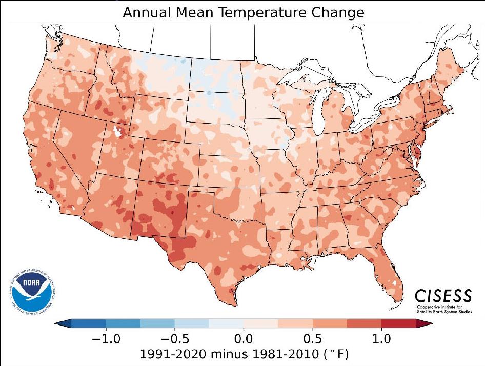
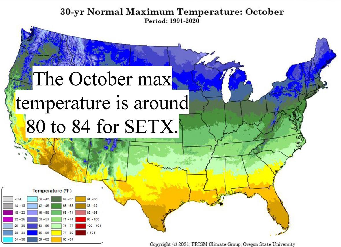
Chart 3: For October alone, our normal was about 80 to 84 (tan), which, if we try to compare it to the older 30-year normals, we would have blown it out of the park. However, with our normals increasing every decade, what we have now was in range. For October in Beaumont-Port Arthur, the average temperature was 82.3, so it fits. But if we were to use prior climate data—it would have been blown out of the park.
Chart 4: Precipitation compared to a century: what they did here is they took the U.S. normals from 1901 through 2000 and then they compared it to 30year normals from 1930 to 2020. And as you can see in those last two maps—look at our area—what has happened? We’ve seen an increase, we’re definitely seeing an increasing trend of water and precip in this area, with the blue showing increase.

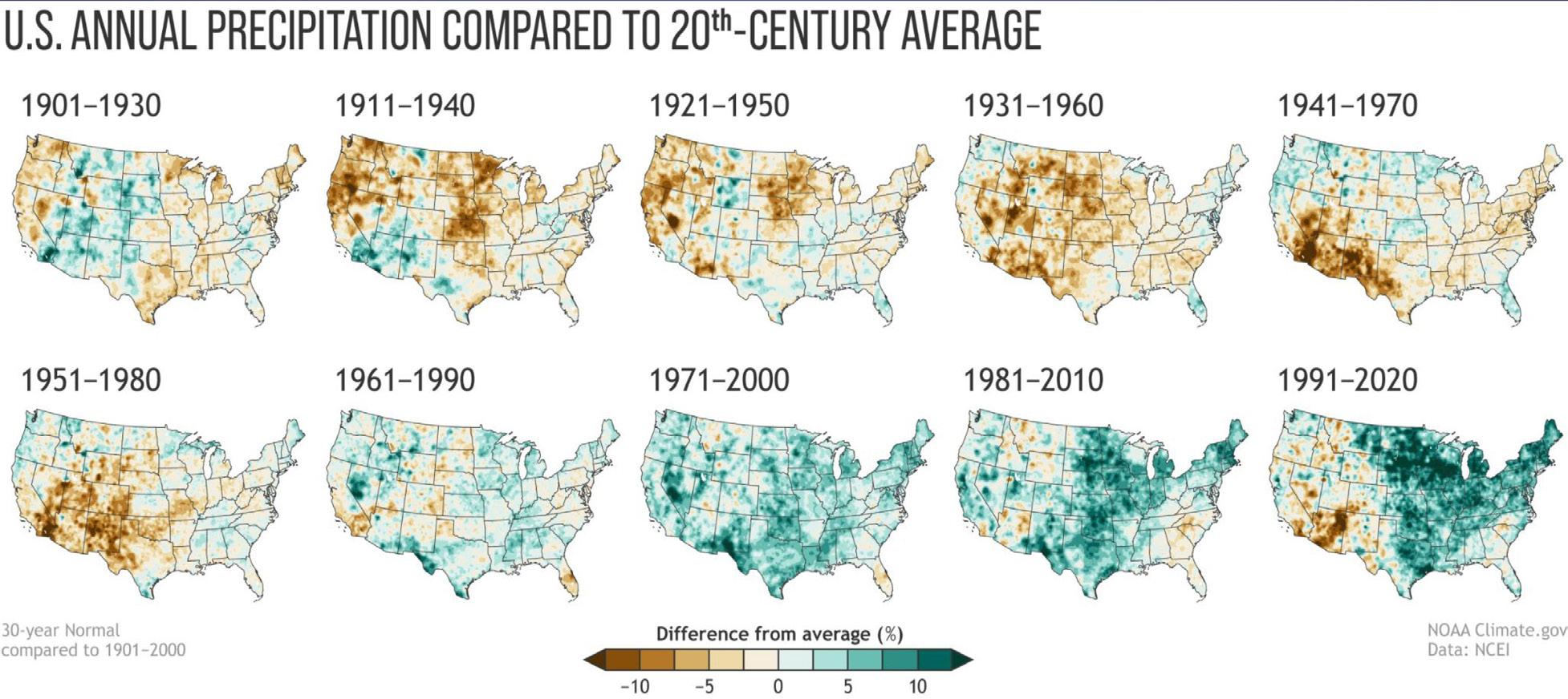
Chart 5: Temps compared to a century—this is the same thing: we’re comparing 1901 to 2000 and then those last two are ones in the 21st century. You can see, and especially in that last one, closer to now, you can see warmer temps, with brown showing increase.
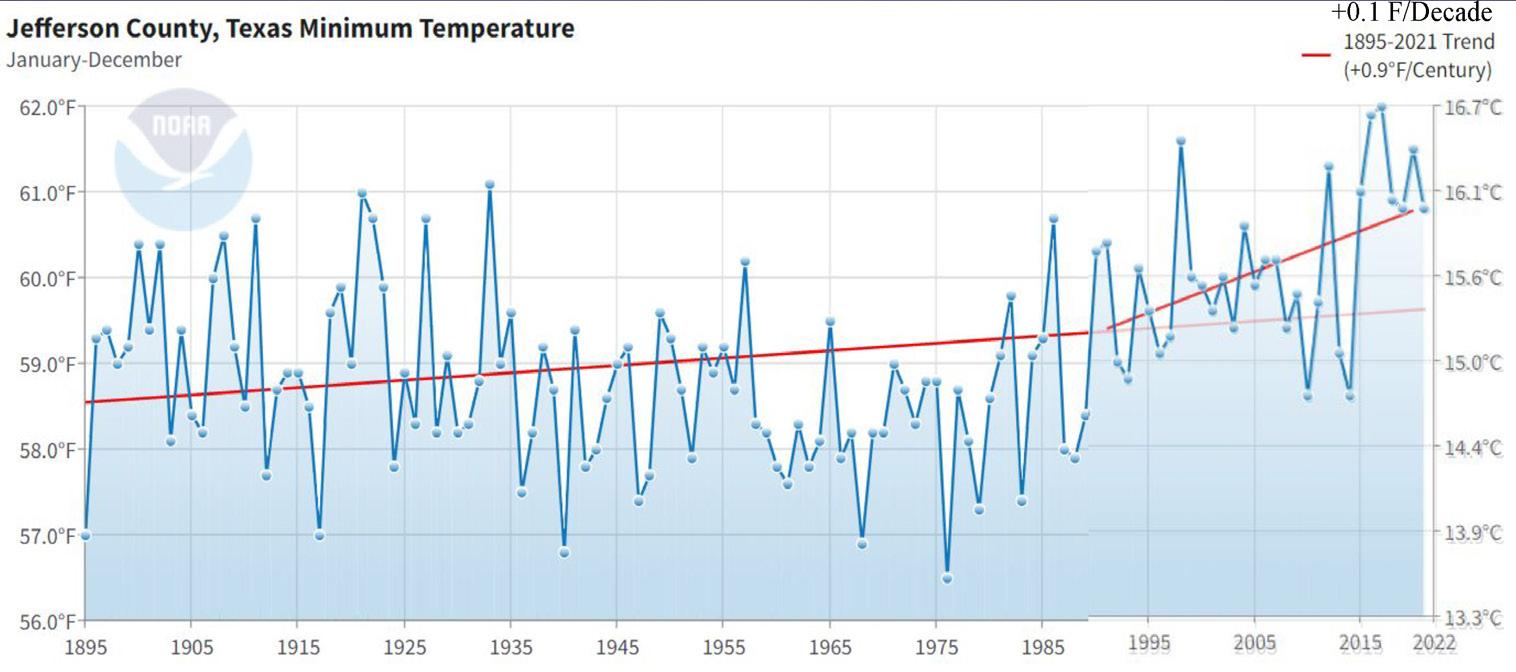
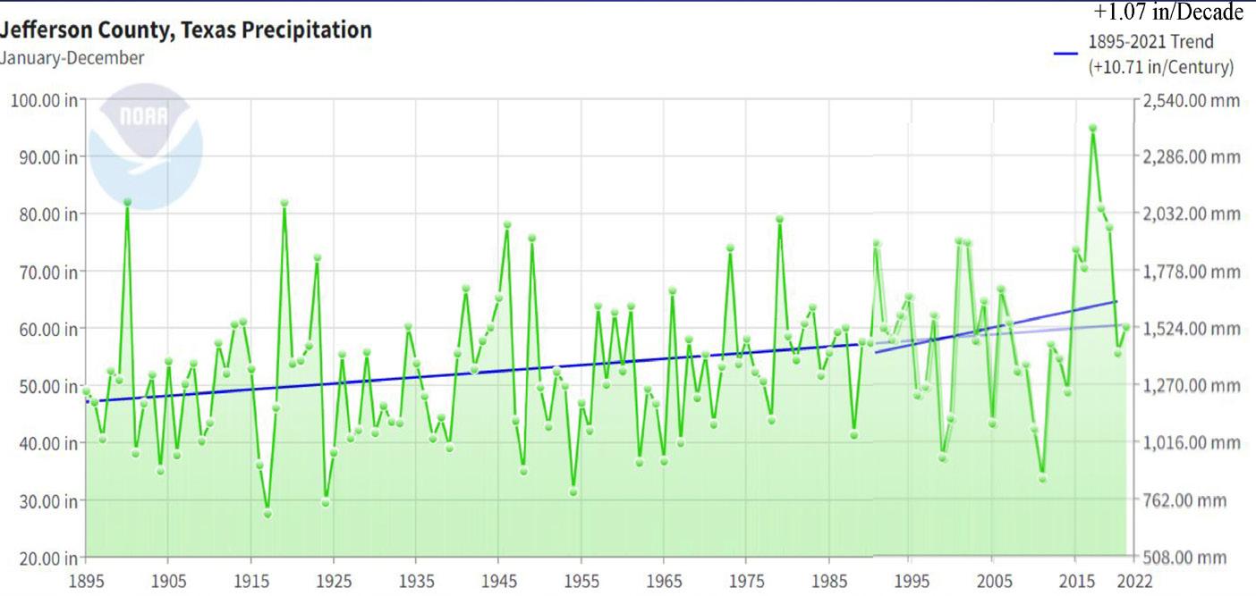
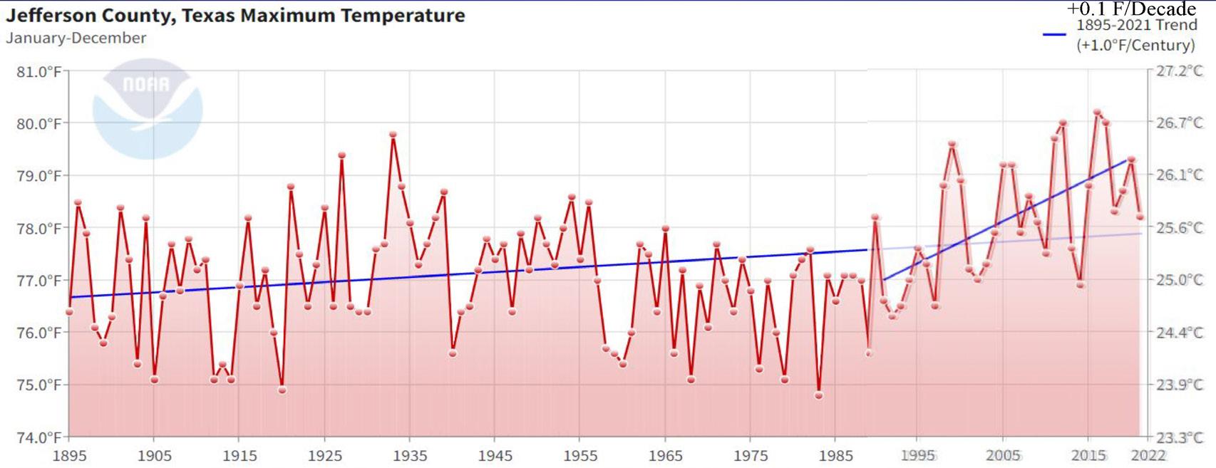
Charts 6, 7, and 8: Here are trends for Jefferson County: maximum temps, minimum temps and precipitation. The long lines show the 1895–2021 trend and the short lines show the 1990–2021 trend. See how it’s gotten steeper for each? Higher temps, more rain. And we are getting a lot warmer at night. Our nighttime temperatures, and I was talking about this with my coworker here, we are becoming more tropical in this region.
Channelle Stigger works for the National Weather Service Lake Charles Office after majoring in atmospheric sciences and meteorology at North Carolina A&T State University and living in Japan. She is a primary school football official, second lieutenant in the Civil Air Patrol, and plays the alto saxophone.