Destructive Regeneration
Exploring the idea of using

Exploring the idea of using decay as a generative and facilitated process in building
Bartlett - MSci Architecture Year 1
BARC0142 Sample Building
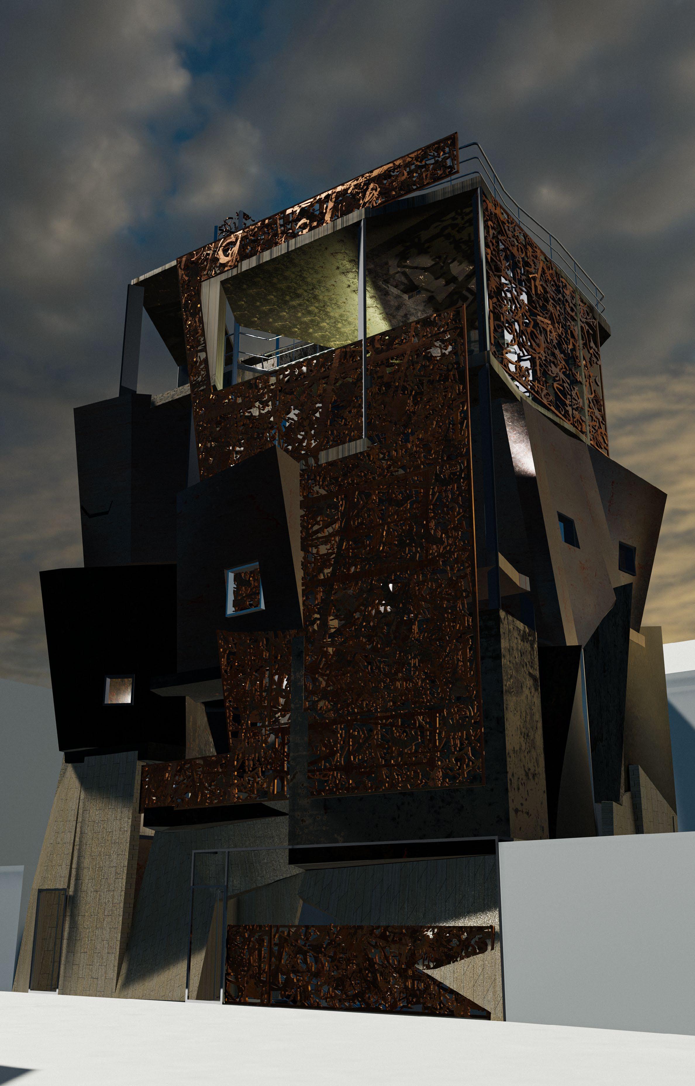
Destructive Regeneration is a night-time focused food hall located in Brixton, opposite of the O2 Academy. The building is heavily inspired by decay, being a generative and destructive process that is fabricated, but also planned for. A study first examines how human presence in space will fundamentally change the surrounding environment. Human activity is directly linked with the decay and destruction of buildings and structures, which in itself can then be altered further by weathering and time.
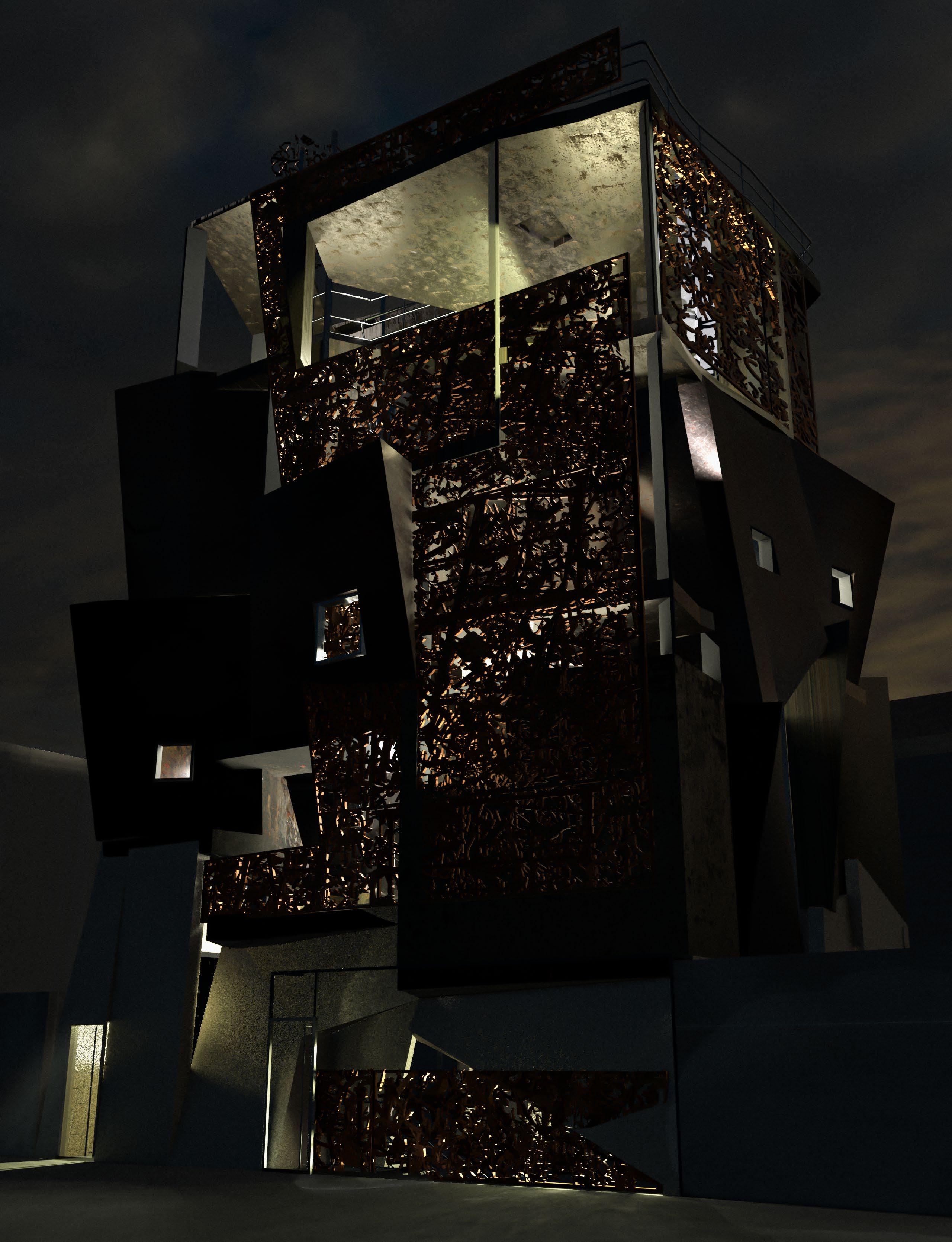
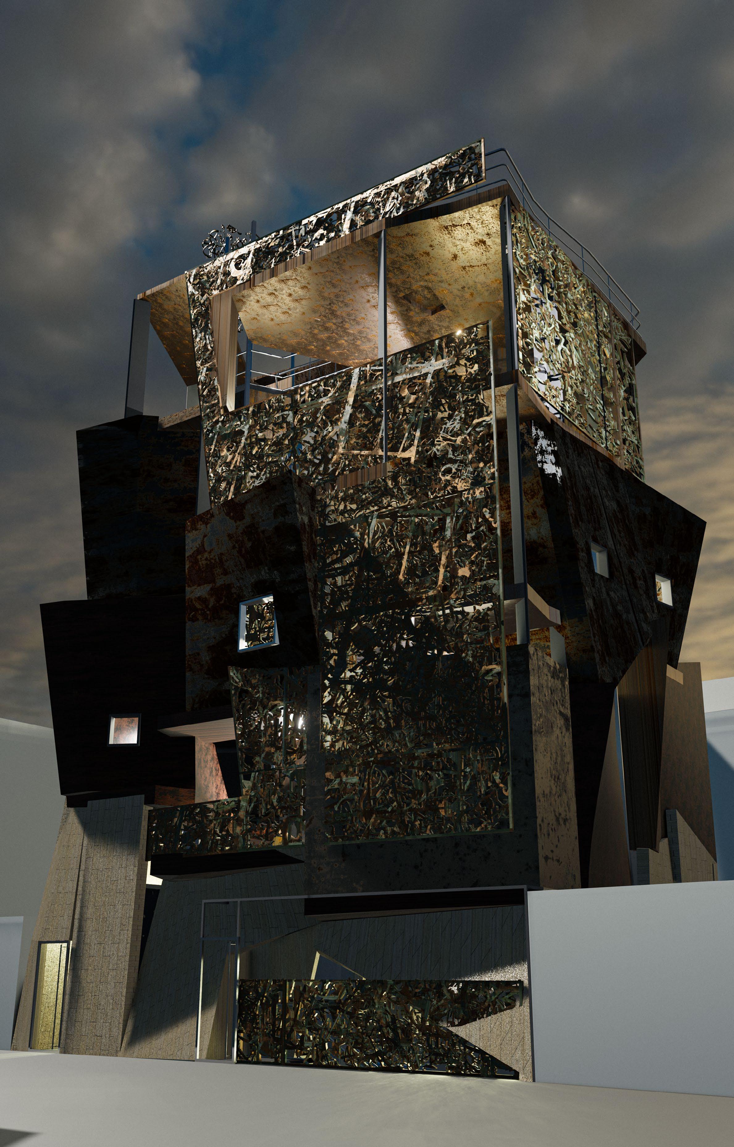
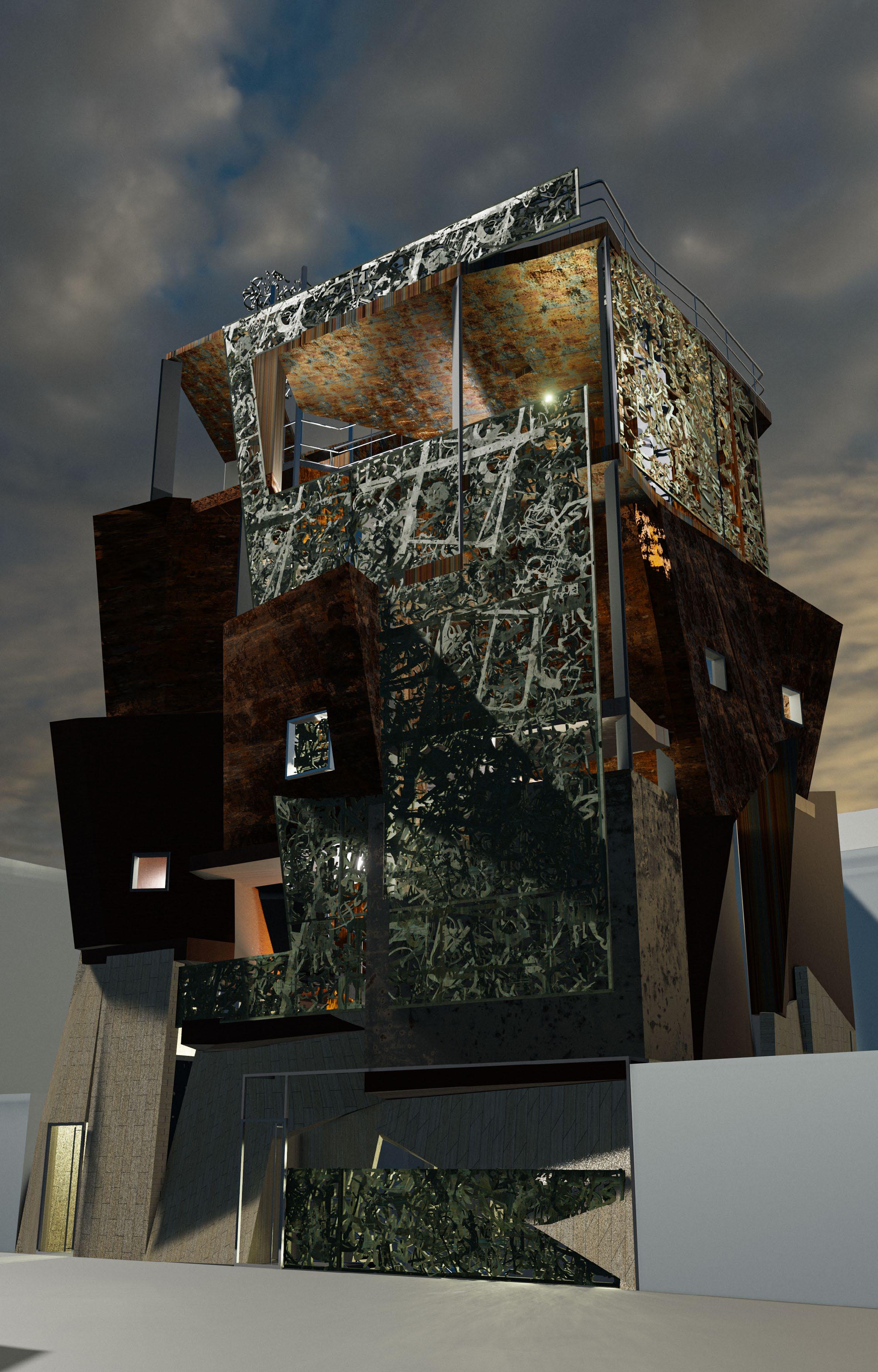
From the exterior, the abstract form rises as a patchwork of new and weathering steel and copper panels; gleaming silver to tarnished grey to reddish-brown, whilst also shimmering bronze to murky greens and bright turquoise hues. In the facade’s breakup, windows, skylights, and planters create a new naturally lit quality inside, and emit indirect light at night. The abundance of layering and limited perspectives allows the food hall to appear like a lantern, giving off soft light.
Visitors, including foodies, night-time industry employees, and queuing event-goers descend into the market from street level. As a result of this renewal of nighttime vibrancy and activity, through food and gathering, Brixton can be re-identified at night.
d e
2.1. Brixton Site 1-100
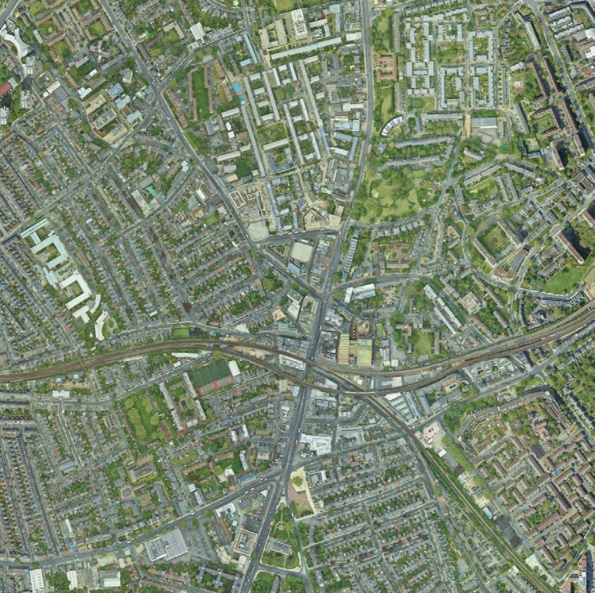

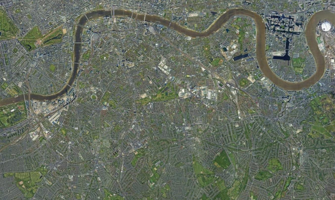
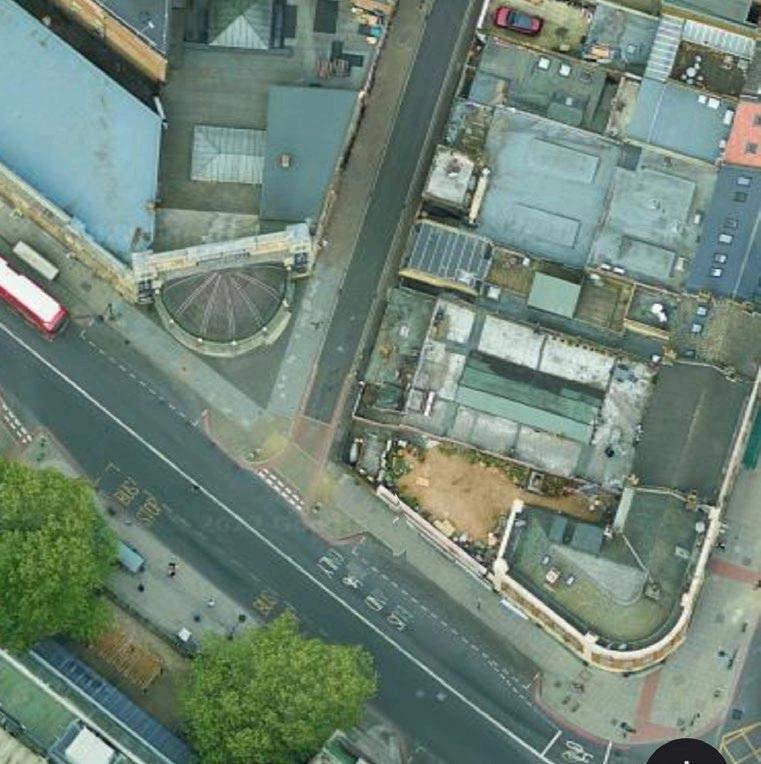

Site survey of Astoria Walk, located near the O2 Academy in Brixton, looking at decay in three main forms: human activity, natural, and material. While the connotations related to decay are negative, not all decay has negative effects. Graffiti has an important role in shaping both horizontal and vertical urban space. To some, seen as decay and dereliction, but to others as art, it is an additive layer that gives more complexity to what it covers.
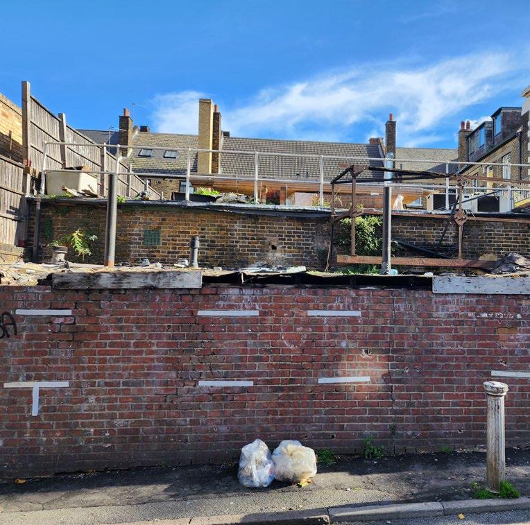
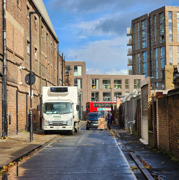
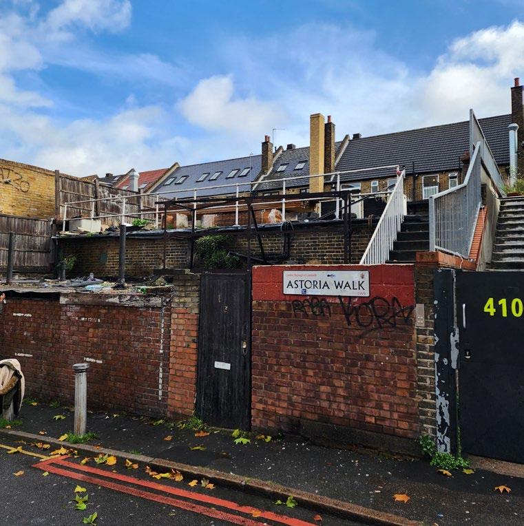
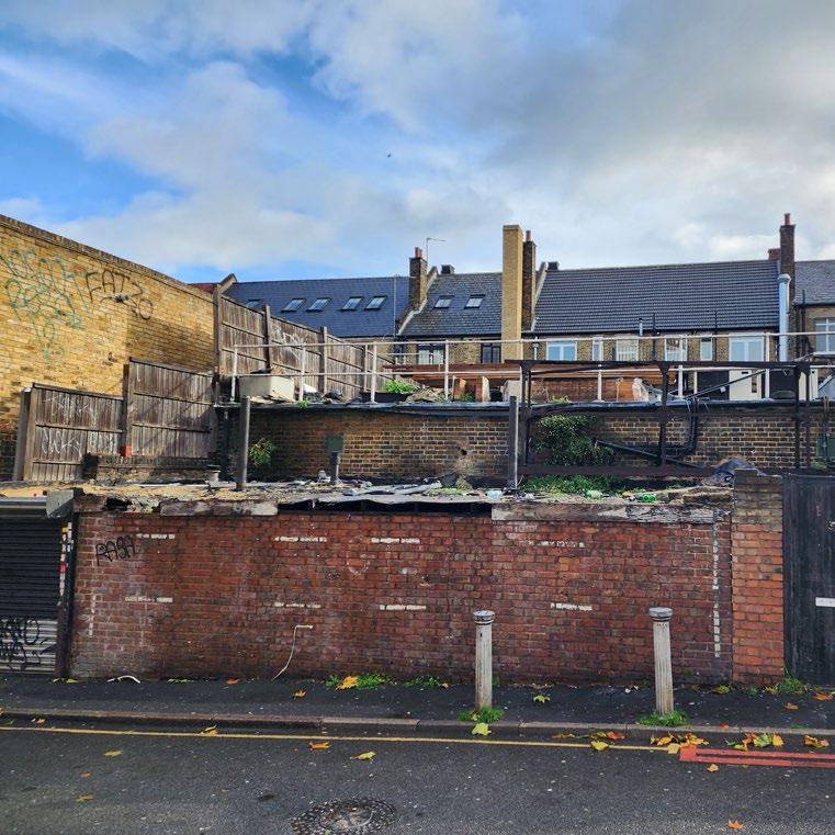
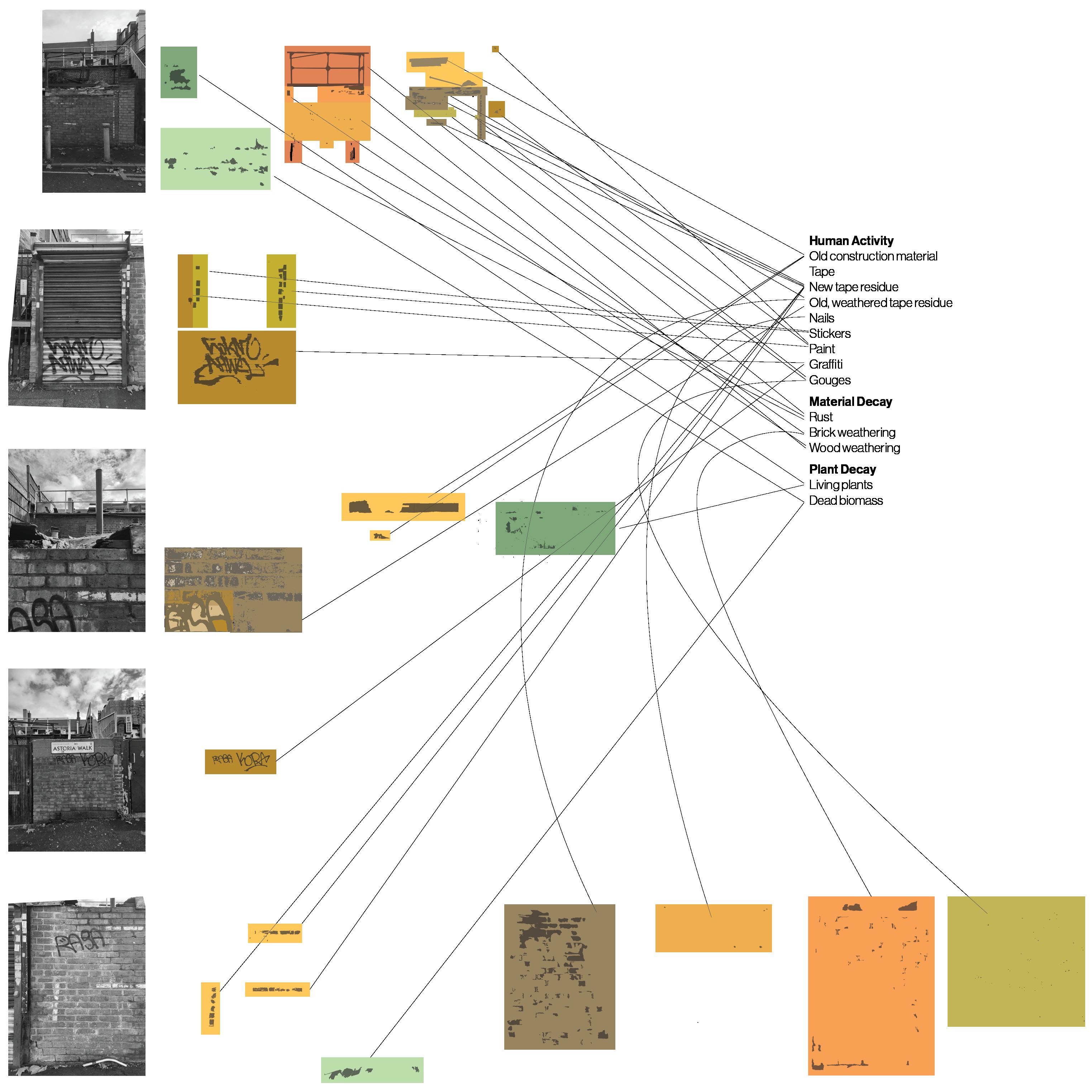
Images on the right show the site and some of its context. The drawing below shows where elements of decay are on the site, while categorizing them by type. Here, decay is used as a way to visualize human activity and inactivity on specific areas within a site.
 ^ Series of images showing the site, from large to small scale: London, Brixton, site plan, then site pictures.
Drawing of the site, in plan, then in elevation, with elements of decay highlighted, then categorized.
2.1.1. Brixton Site 1-100


Facade Combination
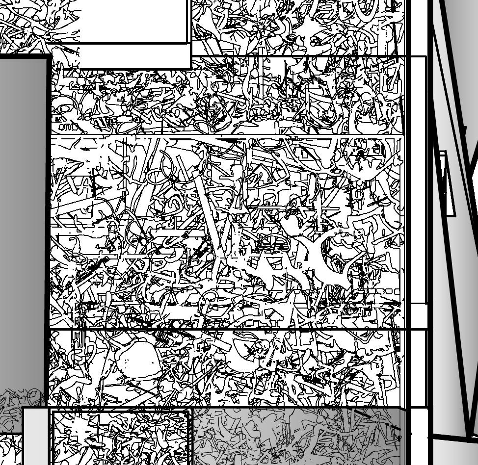
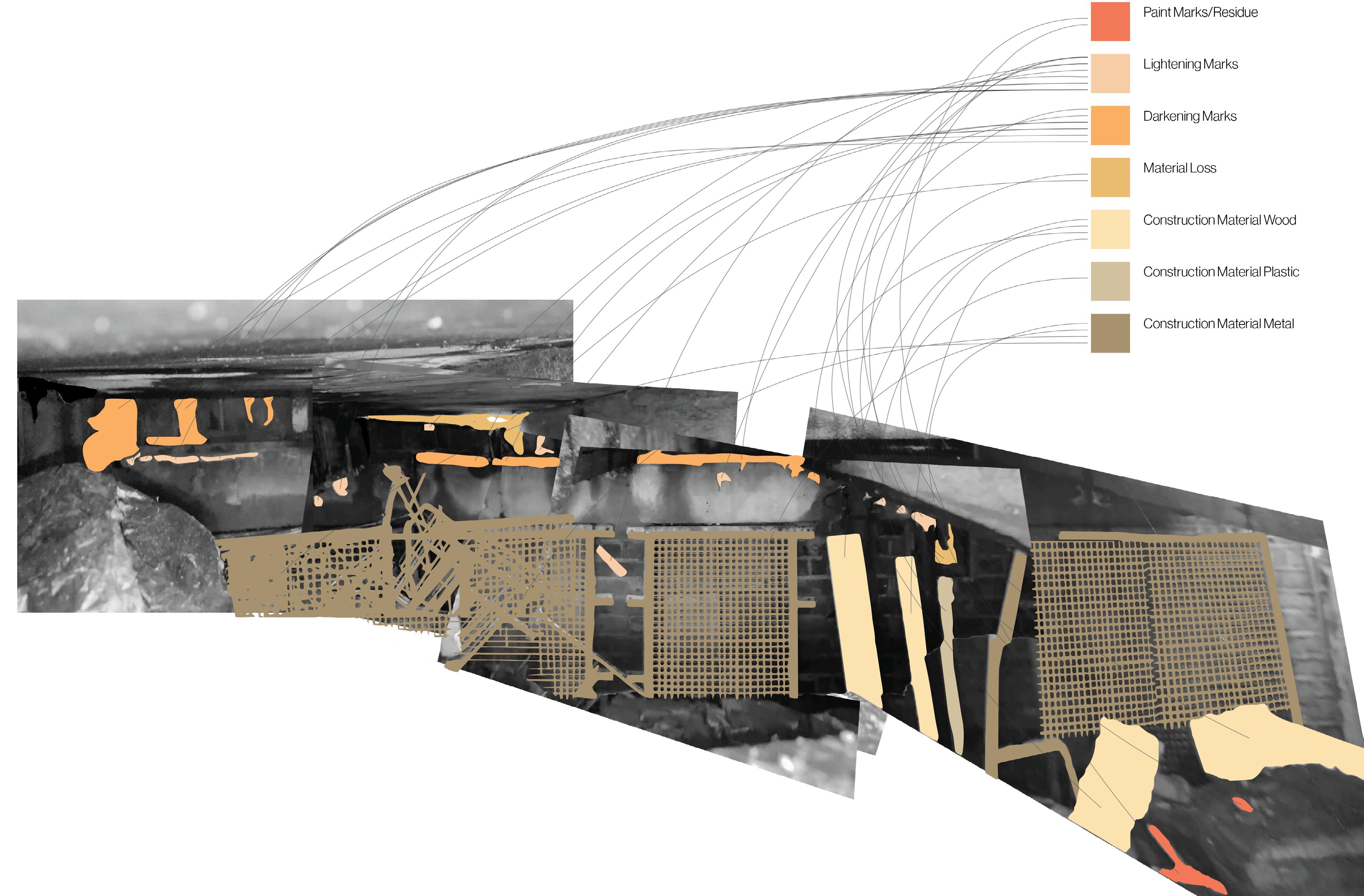
Peering through a hole in the front facade of the site, one can see into part of the main building, to the back facade of the site. Recreating the facade, then mapping and categorizing the moments of decay shows how prevalent human caused and material decay is within the site.
Overlaying the decay within the front and rear facade shows little correlation, except for a height at about 1.8 meters where the front and rear facade experience significant material decay.
 Elevation with the decay on both front and back facade overlayed.
Mapping of elements of decay on a patchwork of photos recreating the rear facade of the site.
2.2. Brixton Site 1-1, 1-2
Perspective Model
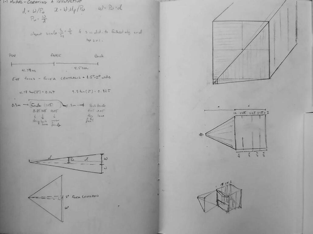
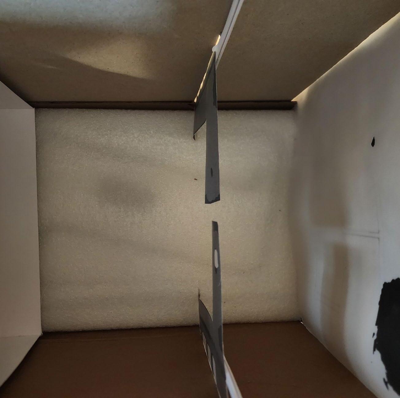
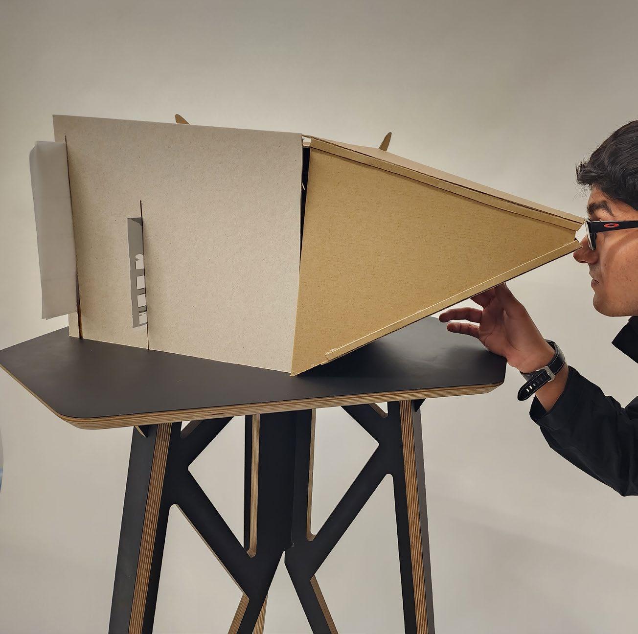
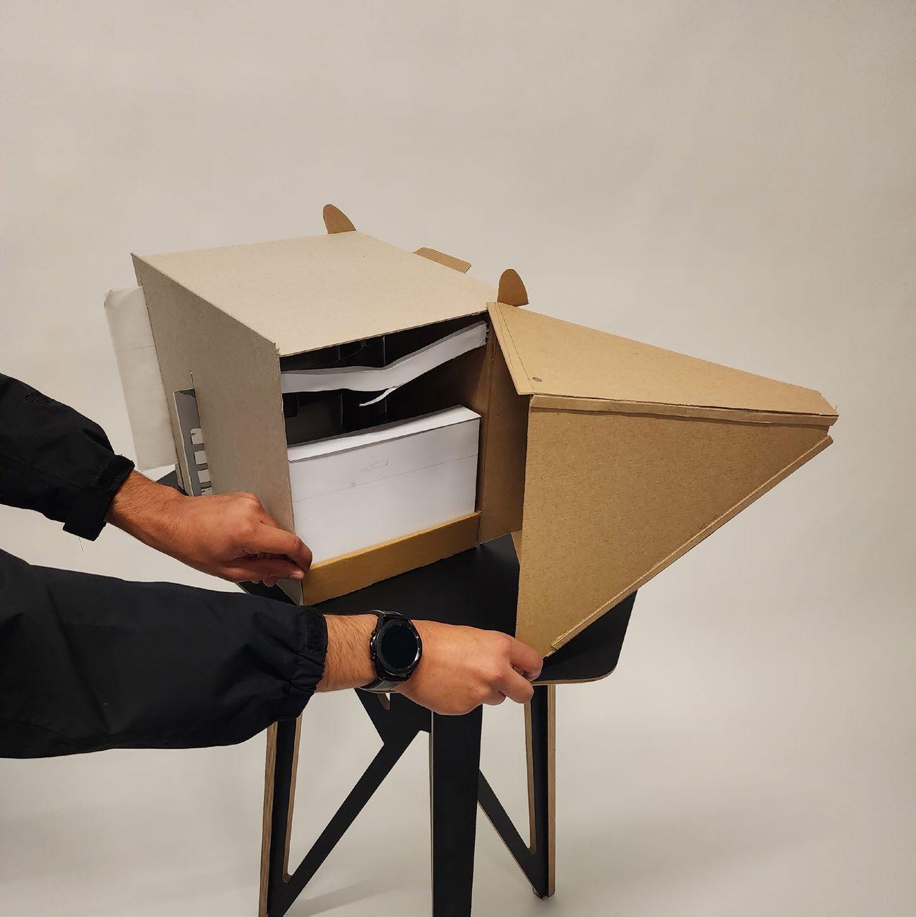
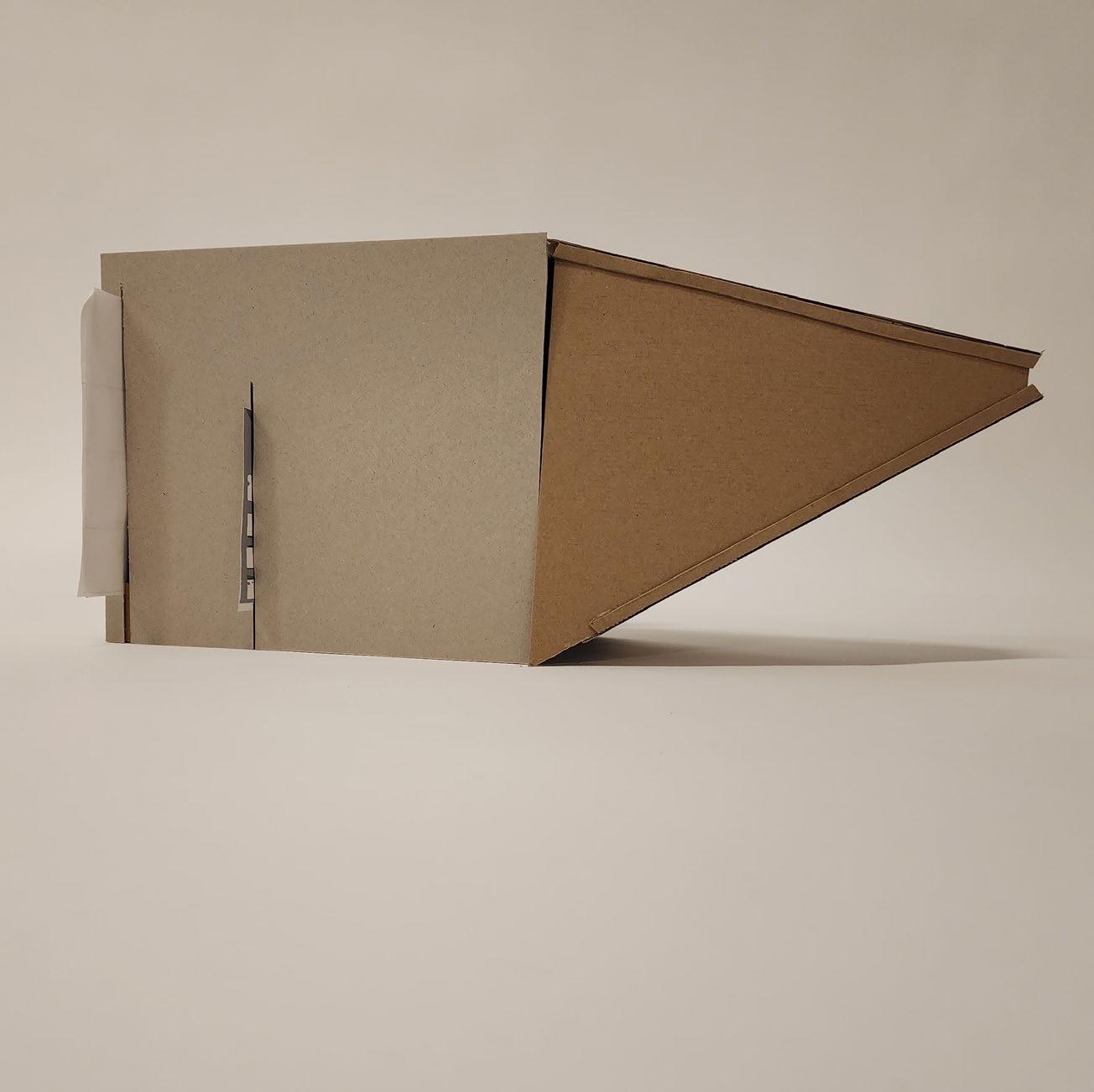
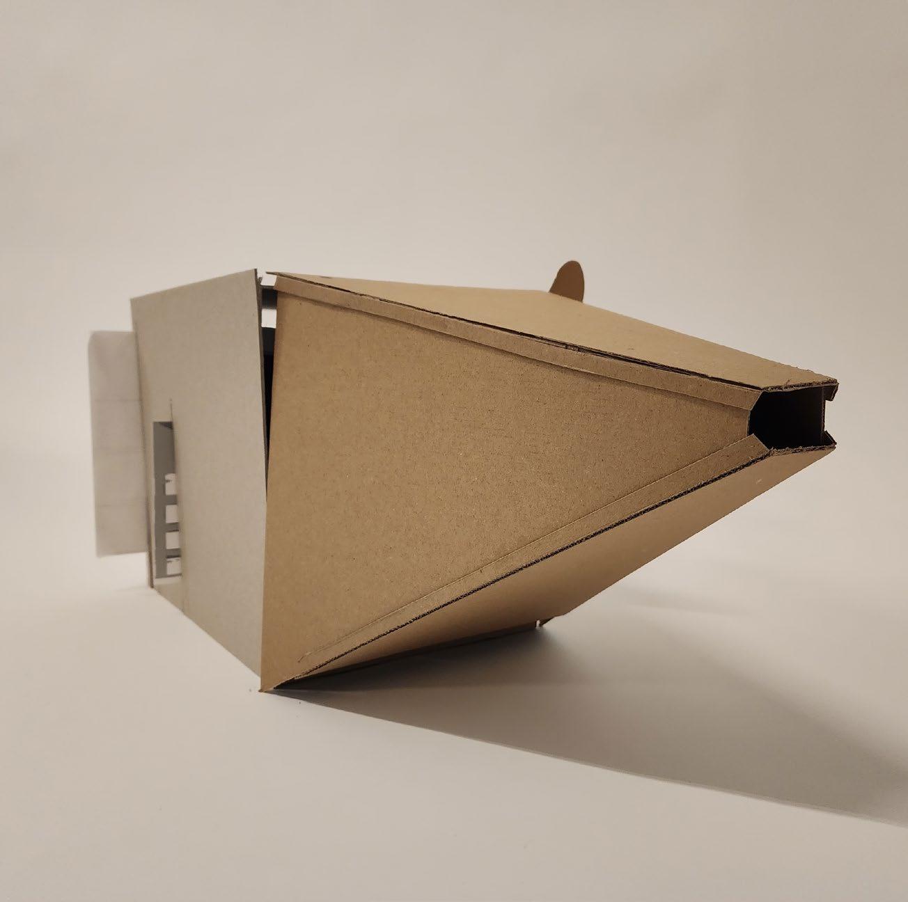
Perspectival model used to recreate a view of the site through a hole in the front facade, exposing the inner spaces. This compressed model uses scales of 1 to 1, 1 to 1.25, 1 to 1.5, and 1 to 2 at various distances from the viewer in order to create the view. Each scale corresponds to the distance between the viewer and the back of the model.
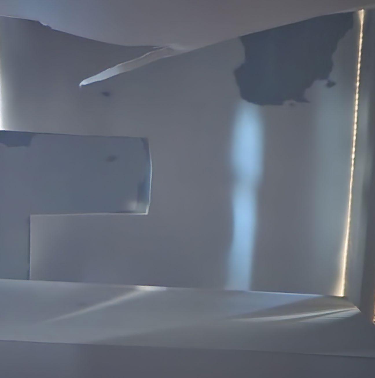
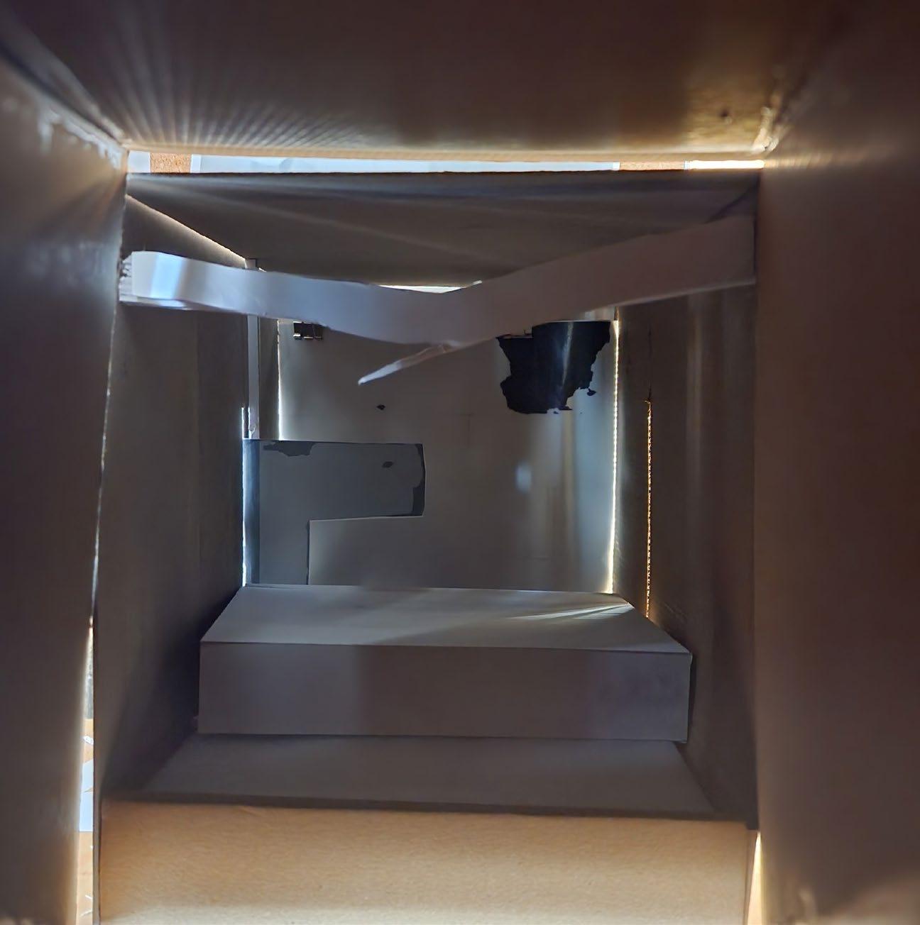
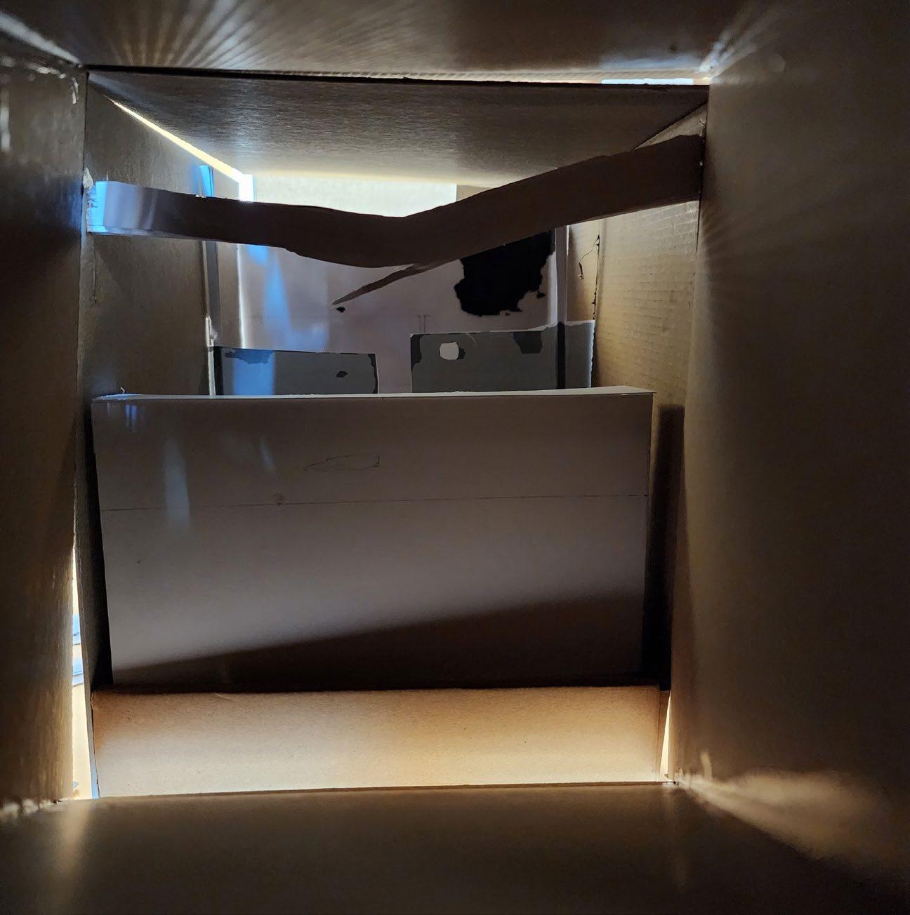 Multi-scale model examining the site from a single perspective, while compressing distance.
This page from the sketchbook illustrates how the fovea, or the central 2% of the eye’s field of view, shows what people focus on. Dimensions for the model and scaling the view down were calculated.
2.3. Brixton Site 1-500
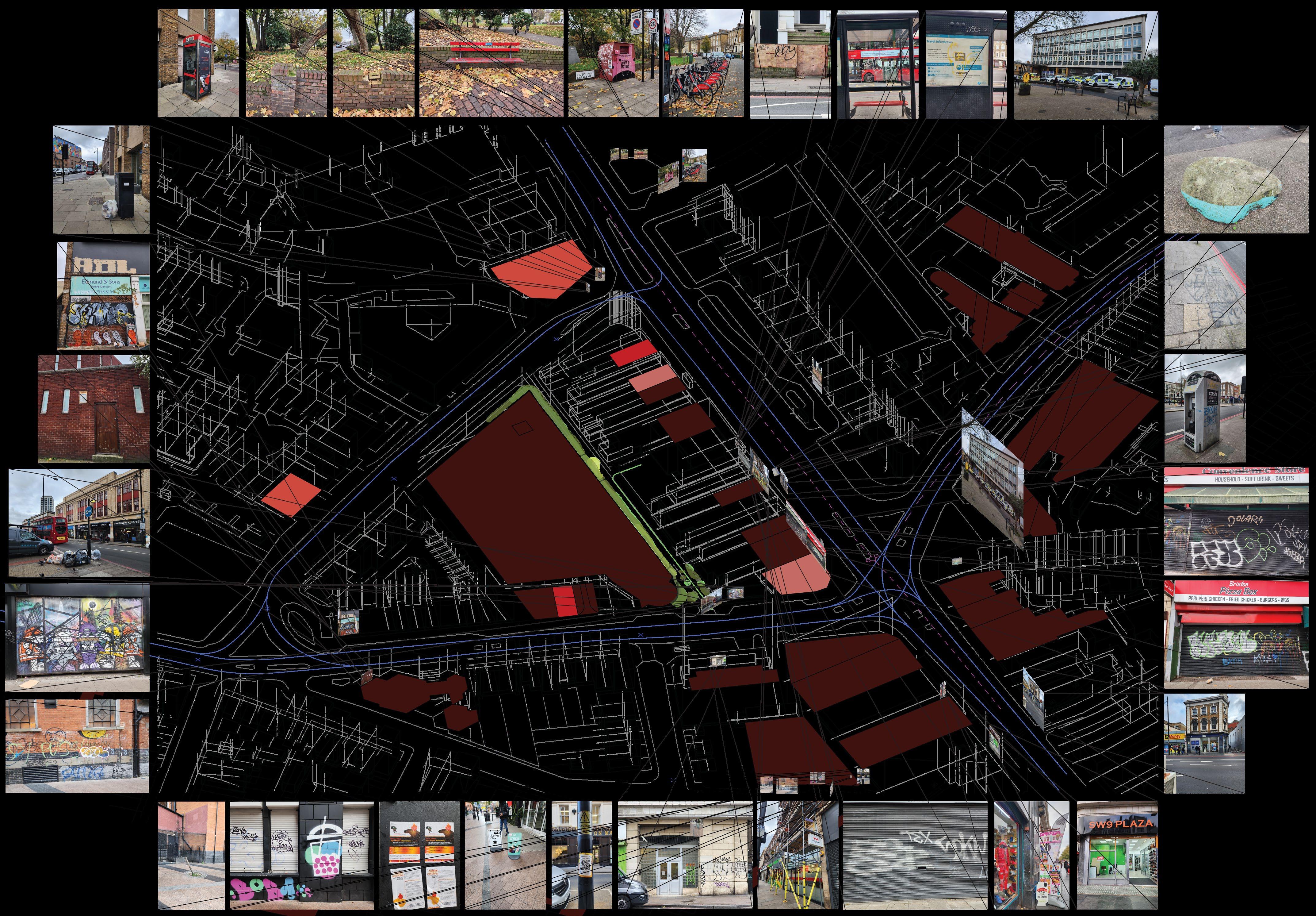
Composite drawing illustrating busier areas in the site surroundings, using event queues, hours of operation for nearby businesses, and bus routes. In addition, images showing decay are mapped to their locations, showing that increased human presence is linked with increased decay.

Mapping series that shows operating hours of nearby businesses. The orange color signifies buildings that operate only in hours between 6am and 6pm. The red hue is for buildings that operate between 6am-6pm as well as 6pm-12am. The purple hue shows the one business, a restaurant, that is open for a number of hours between 6am-6pm, 6pm-12am, and 12am-6am. The illustrations depict different day: Monday through Thursday; Friday; Saturday; and Sunday, in order from left to right.
Bus erjac urtle Sackville 6pm-12am Bus erjac urtle Sackville 6pm-12am open midnig Pizza Jennings Common tion Barbers ondon only Finance ebab
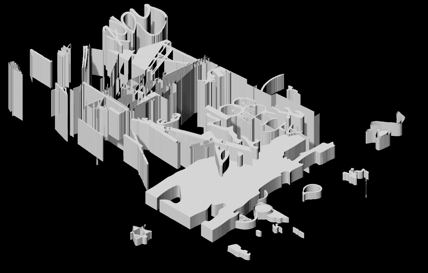
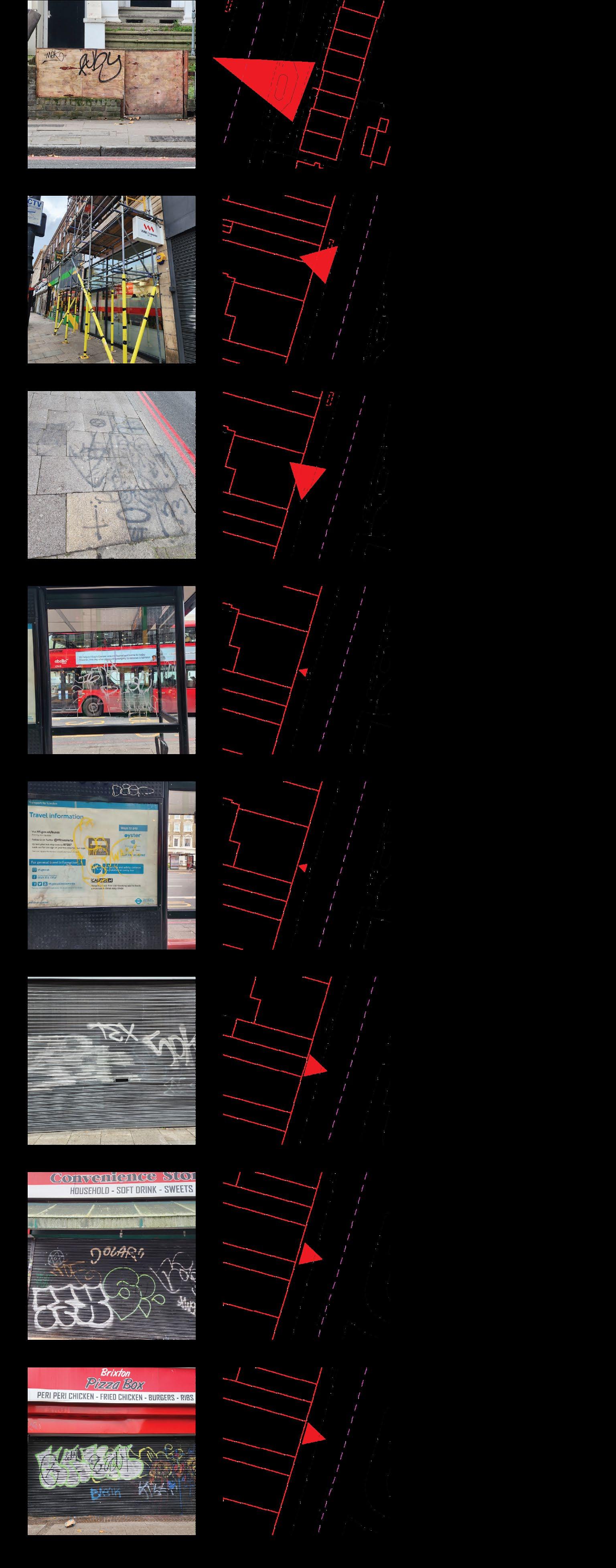
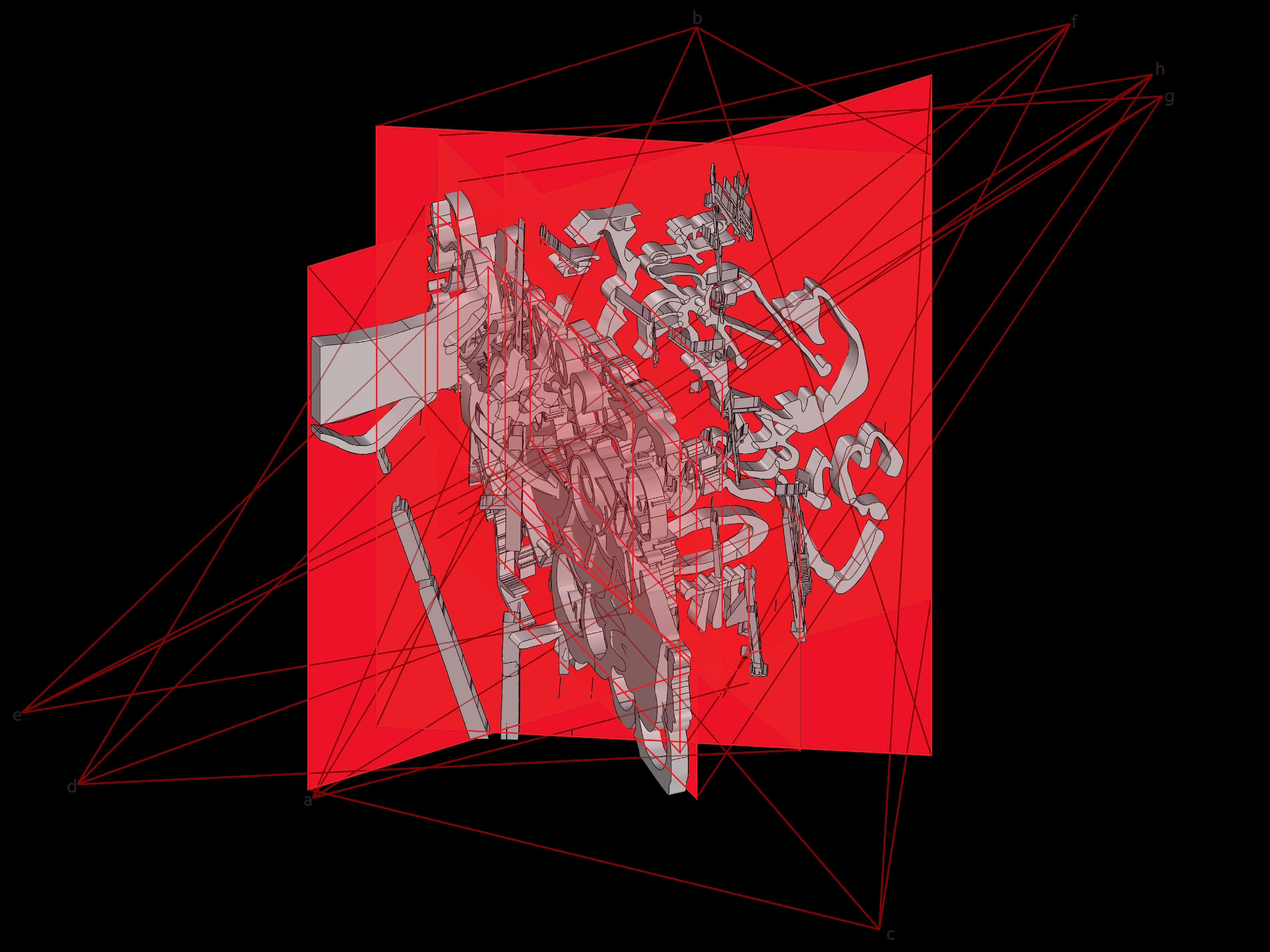
Elements of decay are outlined, then combined to create a conglomeration of extrusions. Each element is oriented in the direction that the picture was taken. Many of the elements of decay are oriented parallel to each other, being on the same main road.

3.1. Brixton
Decay Extrusion
Isometric illustrating the decay extrusions with their viewing angles and mapped to the key on the right.
a.
b.
c.
d.
e.
f.
g.
h.
Plan of the decay extrusions with the viewing locations.
Elements of decay, with locations, the position that they were viewed from, and traced to show their extents.
Isometric of elements of decay, extruded by distance to the site.
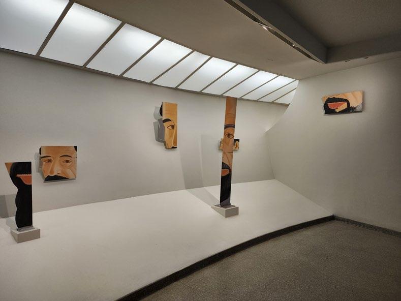
Reference: Allen Ginsberg, 1985, by Alex Katz.
A portrait of poet Allen Ginsberg is split into 6 pieces, taken from different angles. The viewer, while moving between different positions, can recreate the face in full.
3.2. Brixton Quick Modeling
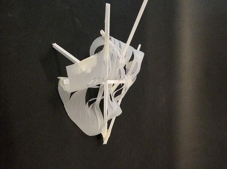
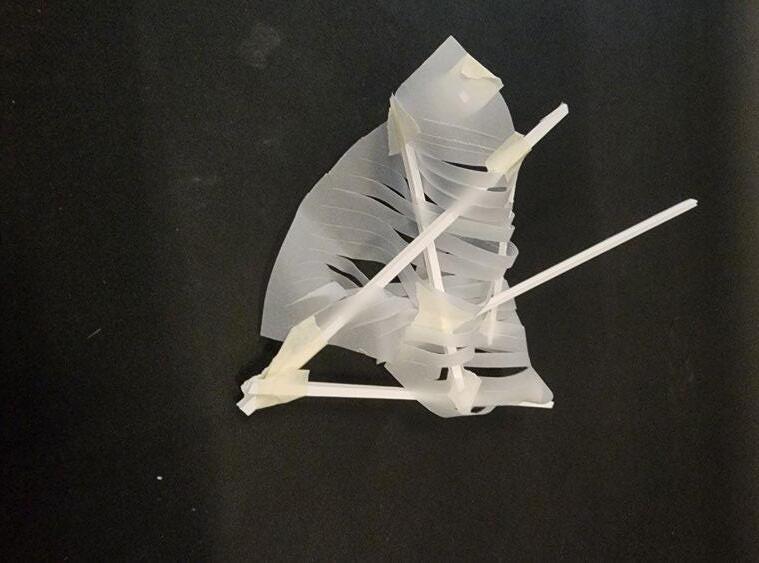
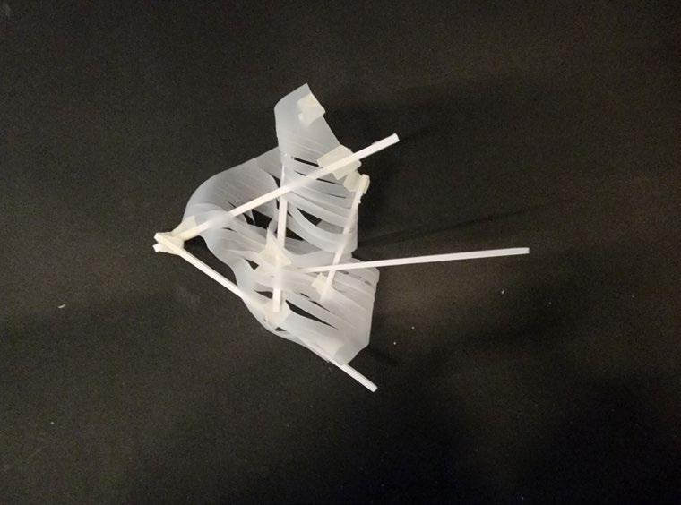
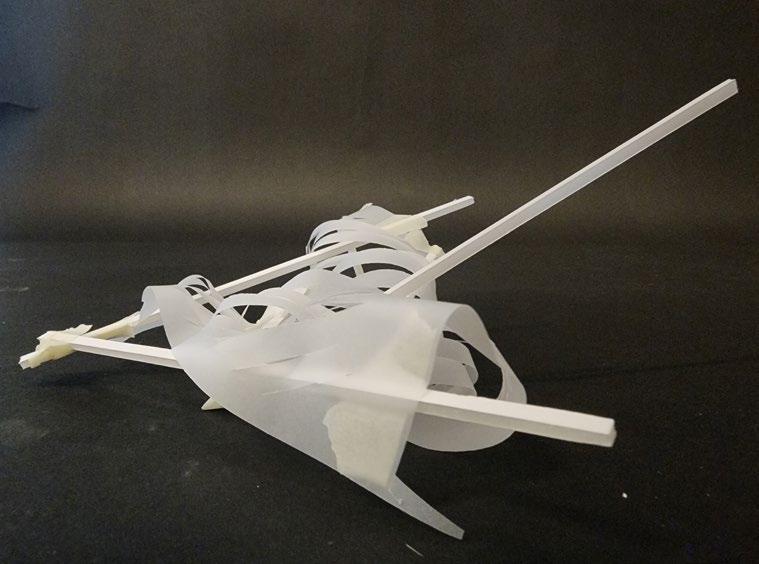
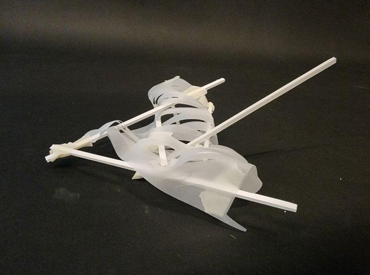
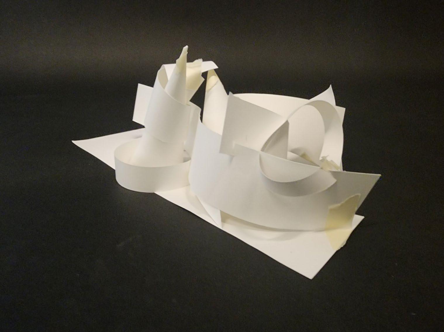
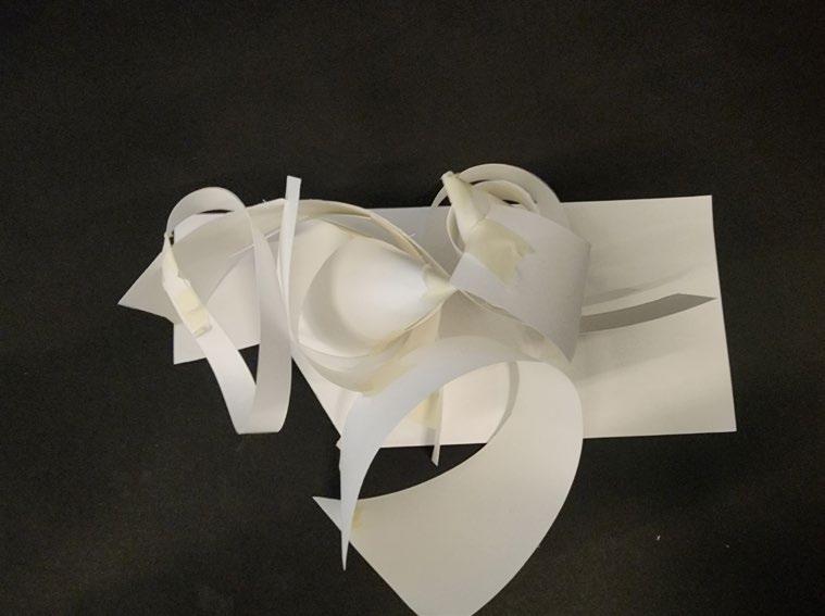
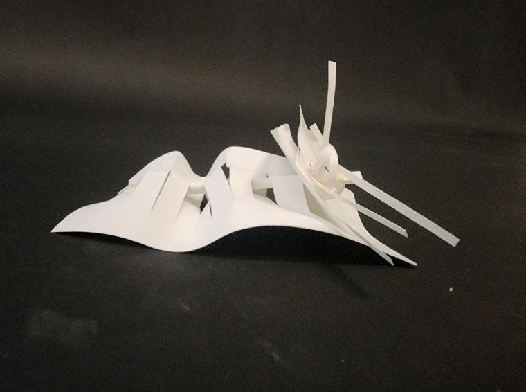
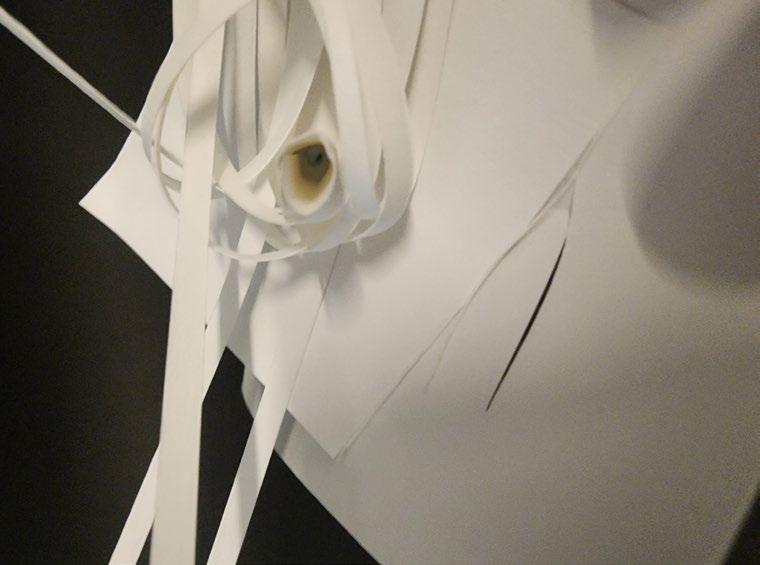
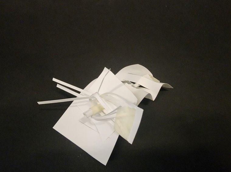
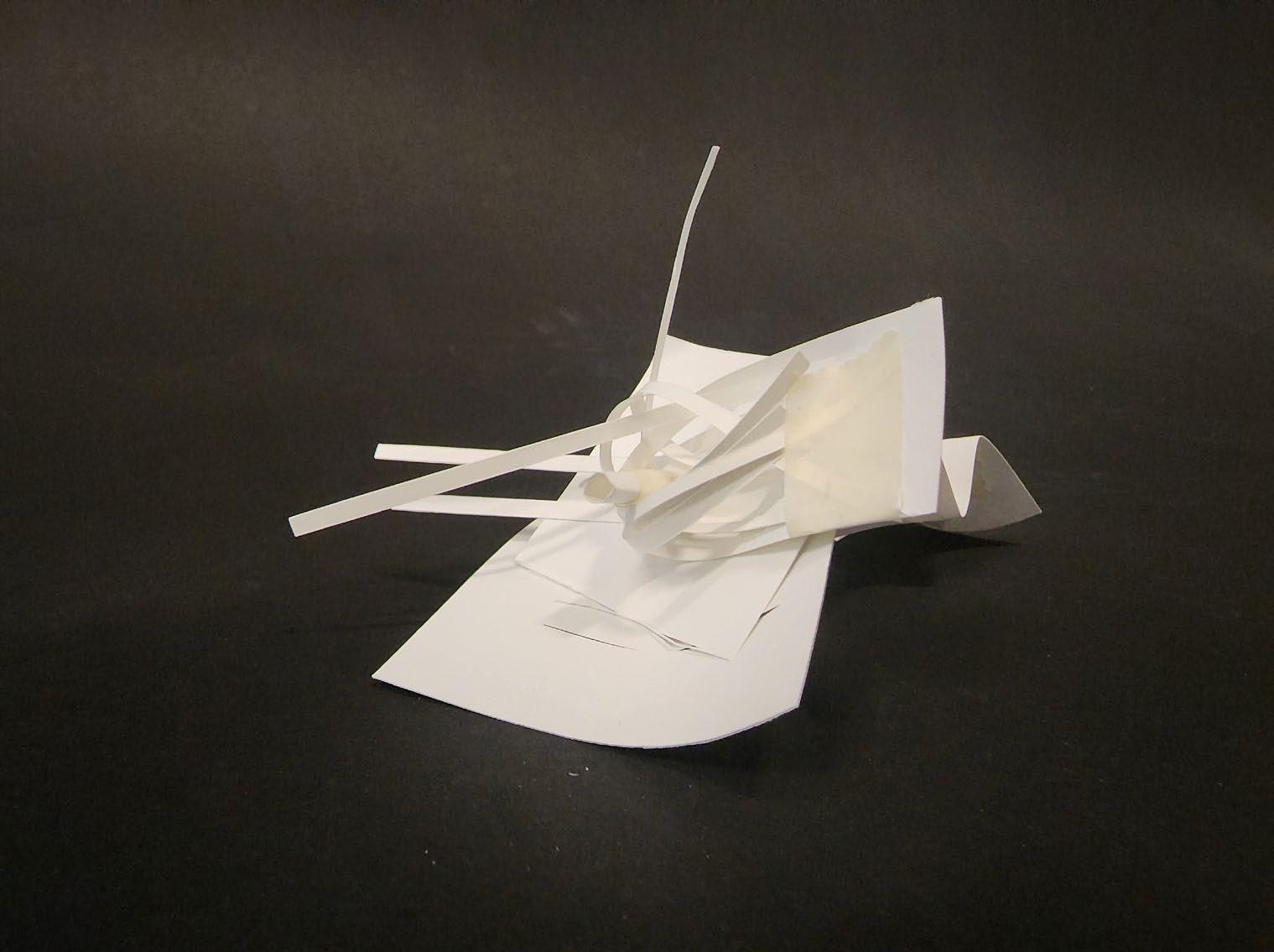
Quick modeling was used to give form to the phrases “shifting perspective”, “seeing through”, and “to merge” that could describe the site. In addition, they were used to create a quick site model, then create cuts within the model that relate to broader contextual conditions.
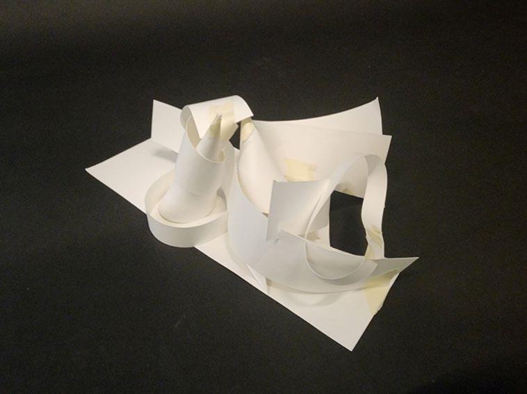
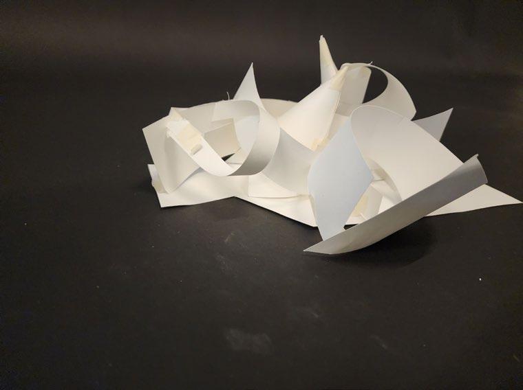
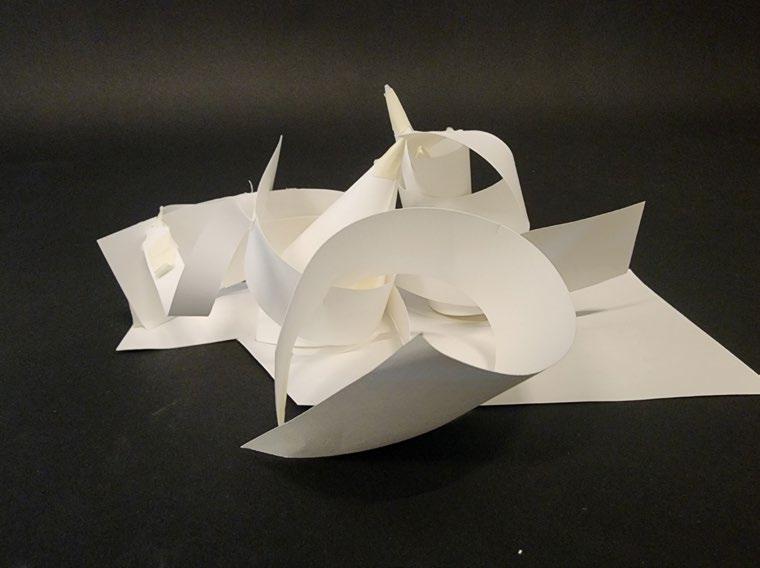
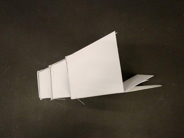
Top images: rippling form created to show the idea of “shifting perspective”. The undulating form creates pockets of hidden and visible space. Middle images: longer form focused on a single axis to show “seeing through” a cylinder. Other elements are arranged around the central axis of vision. Bottom images: fluid forms connecting to illustrate the action of to “merge”. All parts are curved yet linked.
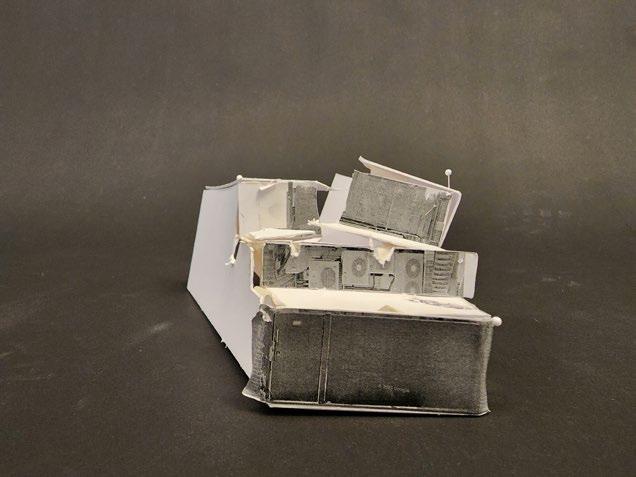
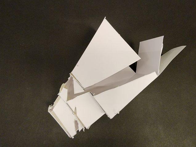
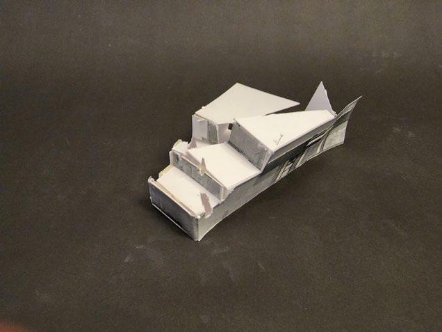
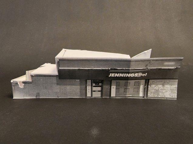
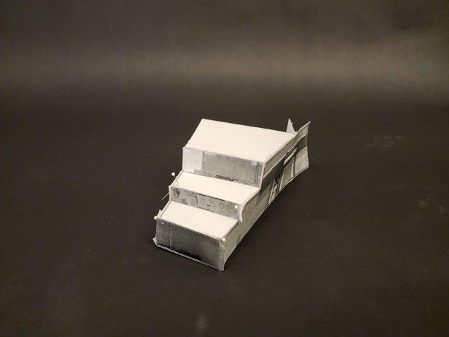
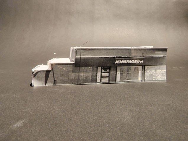
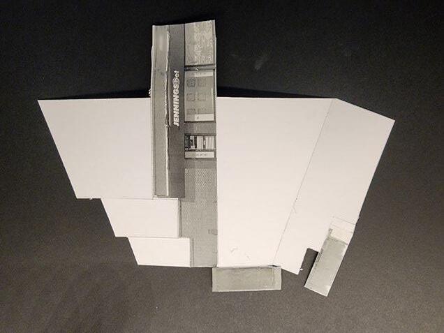
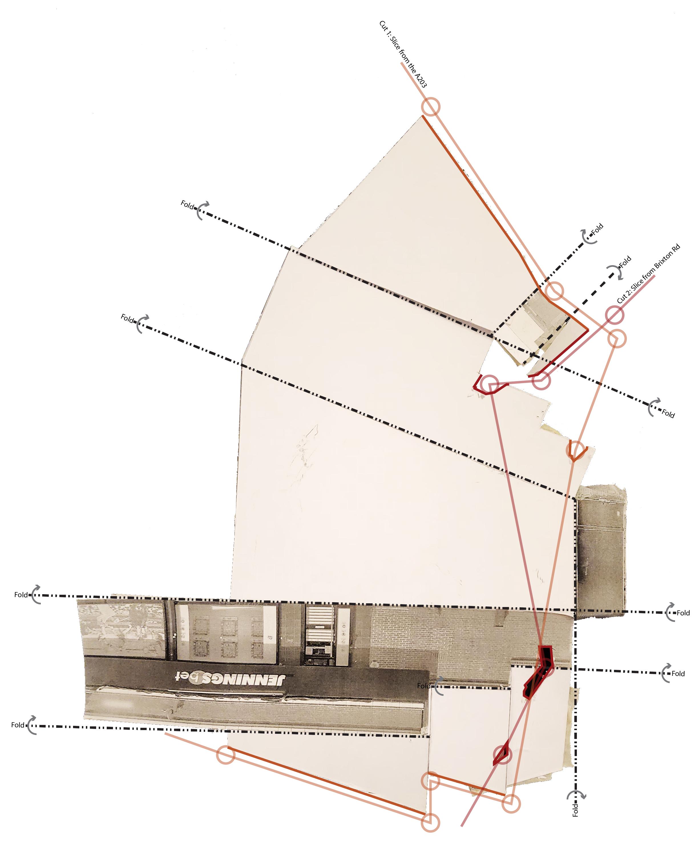
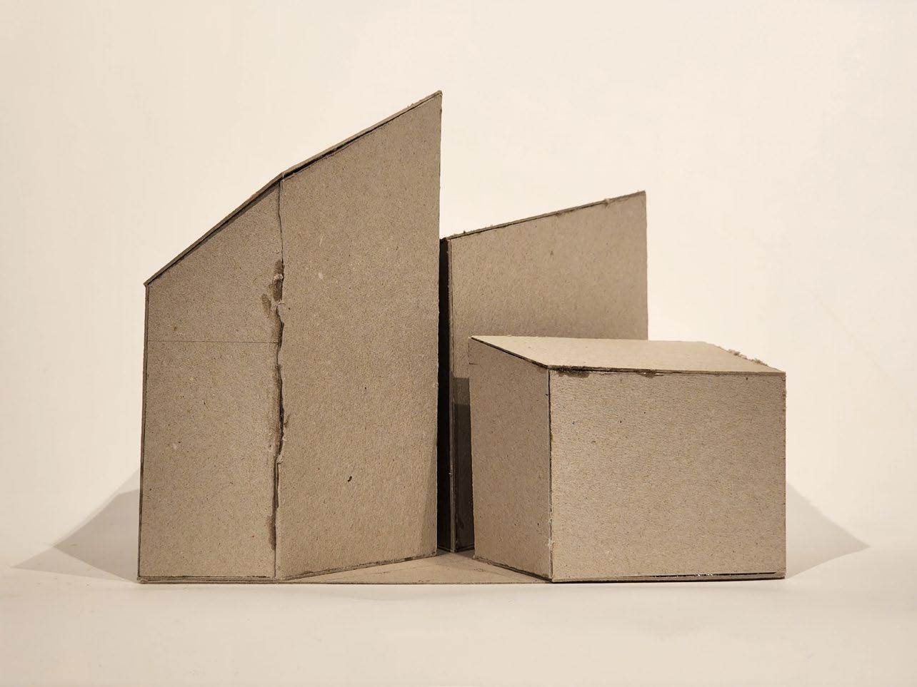
Unfolded exterior facades of the adjacent building located directly south of the site, connecting Astoria Walk to Stockwell Road/A203. The building is cut along two axes, one towards Stockwell Road, and another towards the elements of decay on Brixton Road. Images on the far left show the model, prior to, and after being cut.
Images below show the quick model of an adjacent building to the site, prior to, and after being cut along two main axes. The unfolded model is annotated on the far right.
4.1. Early Building Iterations

The earliest iteration focused on splitting the site using the aforementioned “axes of decay” from the cut model. Each volume was oriented to maximize sunlight as well as create a stepping of heights. A pair of studies, on Steven Holl’s Storefront for Art and Architecture and mimicking decay on Grasshopper helped generate ideas on facade and detail.
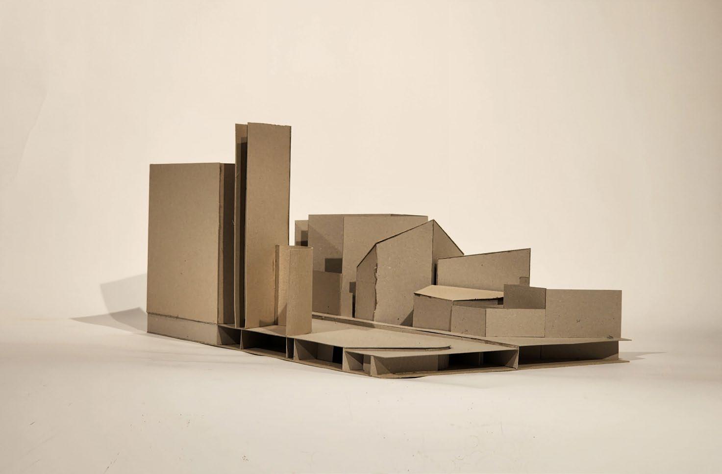
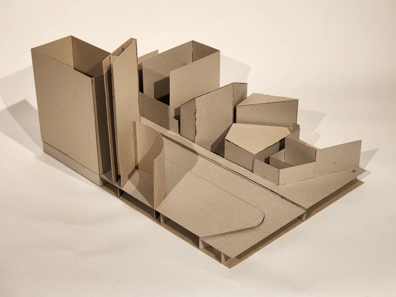
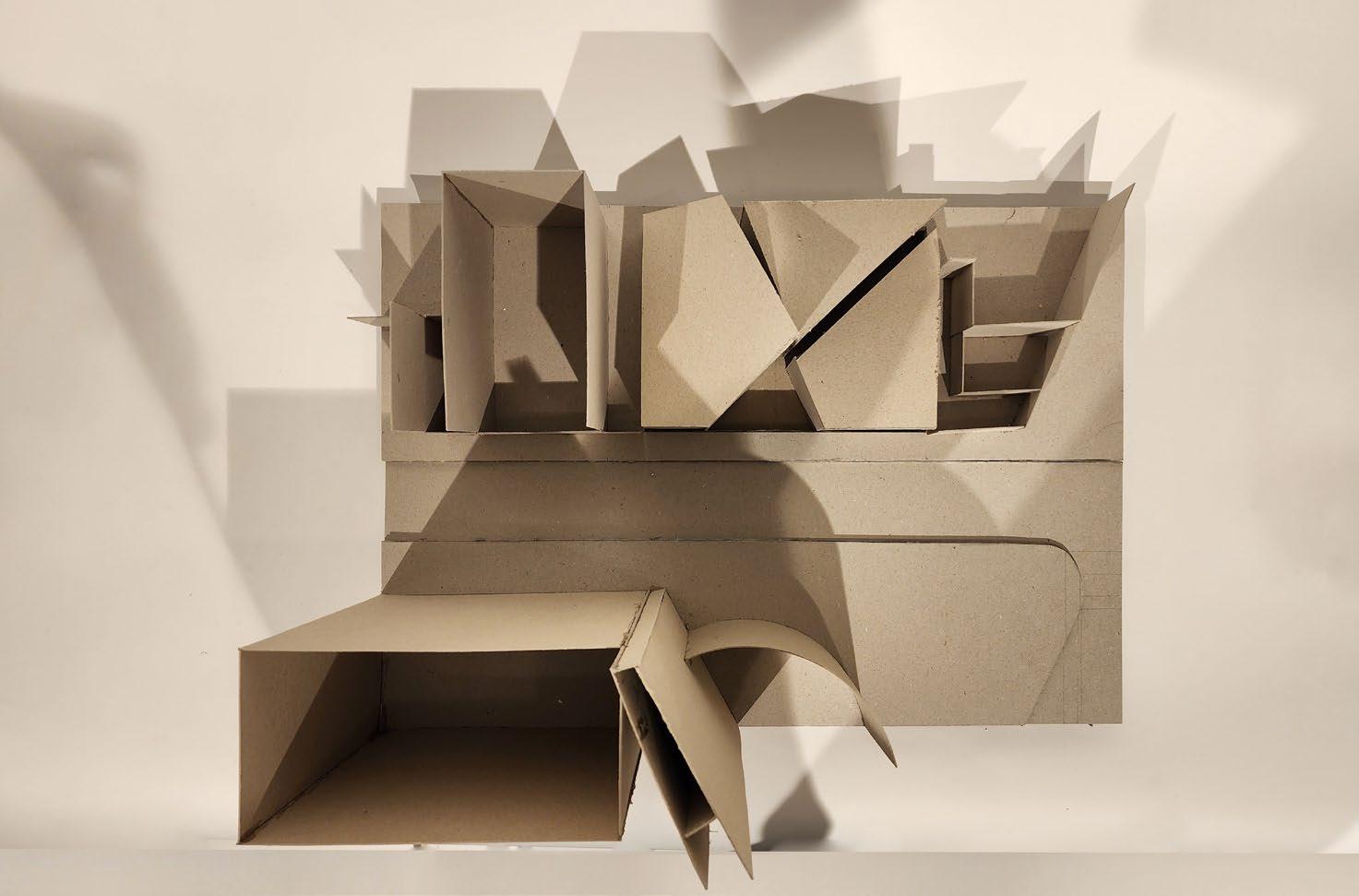
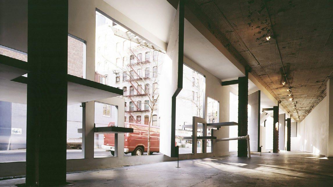
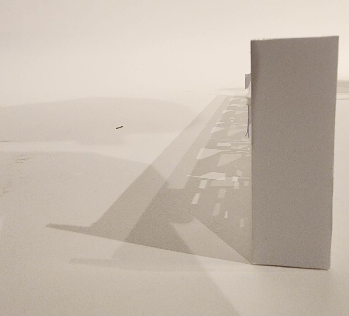
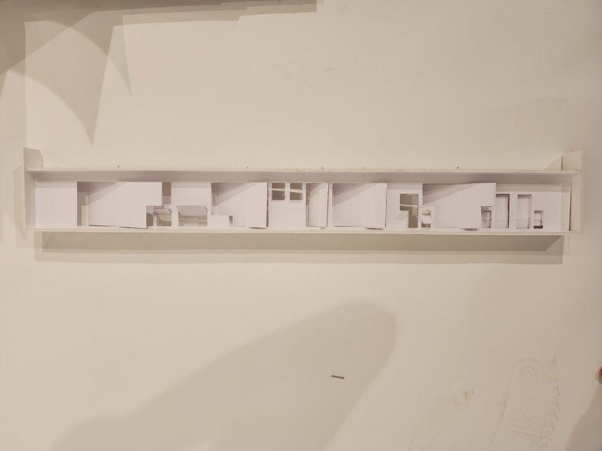
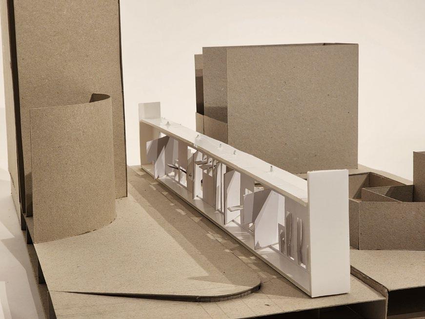
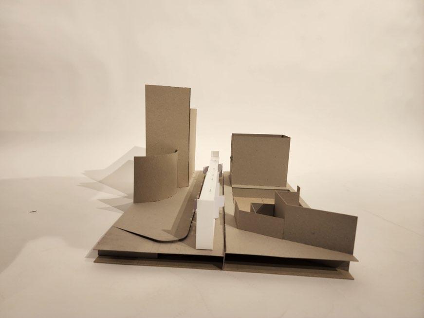
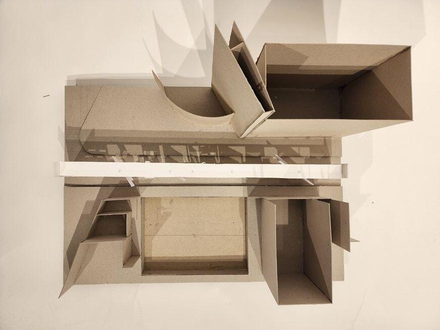 Steven Holl’s Storefront for Art and Architecture in New York used rotating panels in order to bring in light. To the right, that facade is reconstructed and placed on the site model. The lighting qualities produced by the model are used as inspiration for building iterations.
4.2. Decay-Patchwork
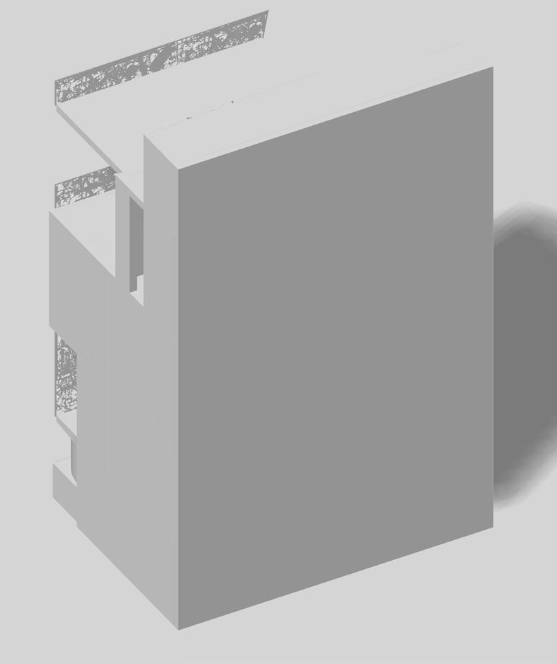

Facade
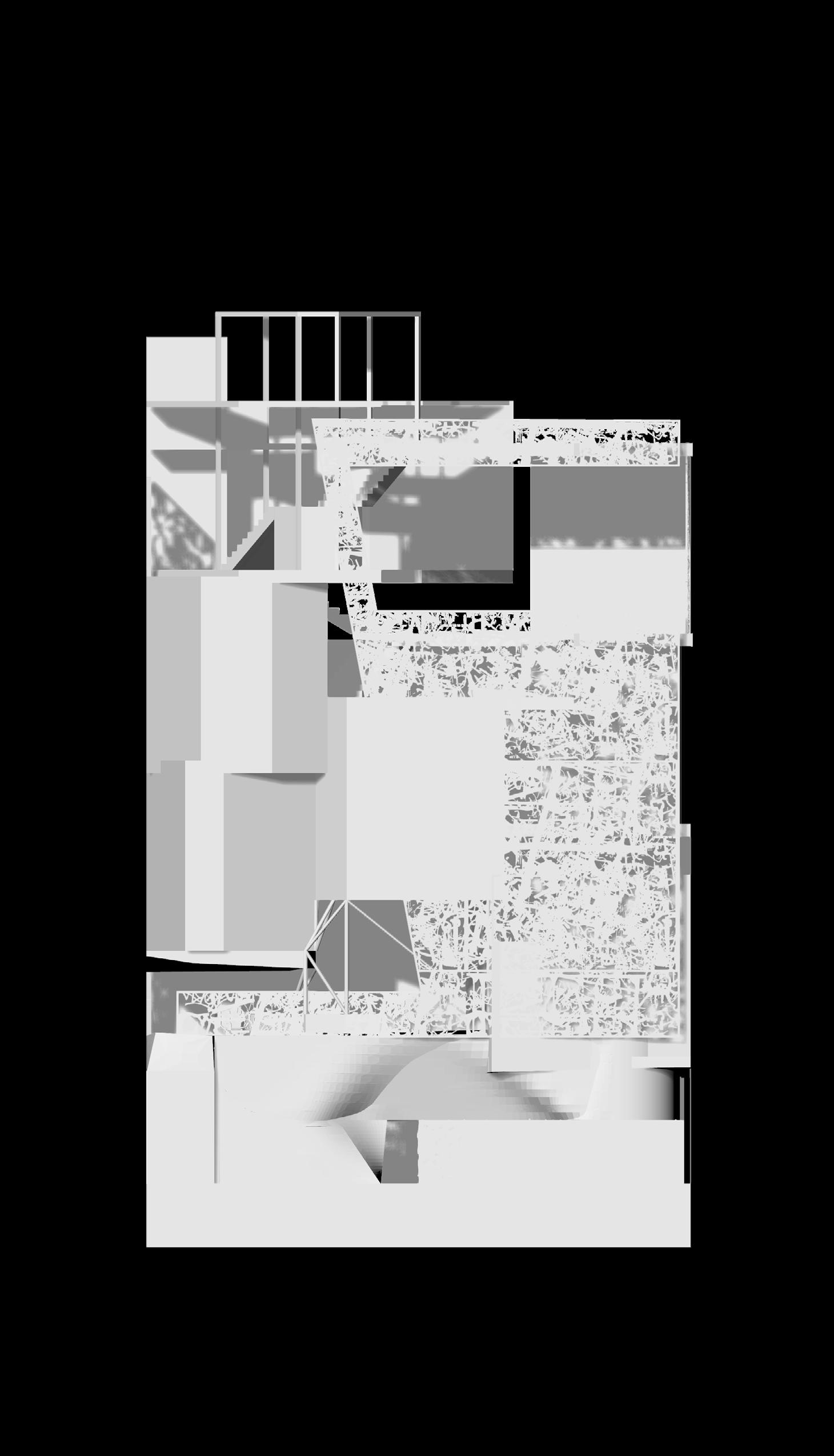
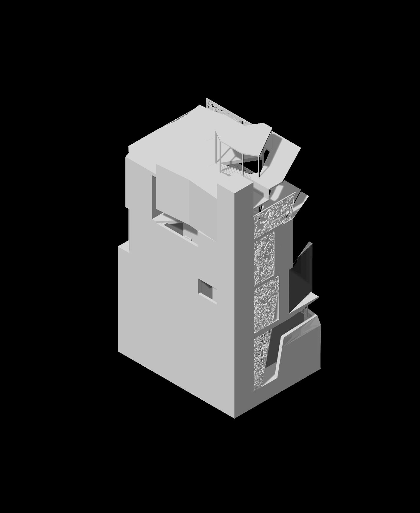
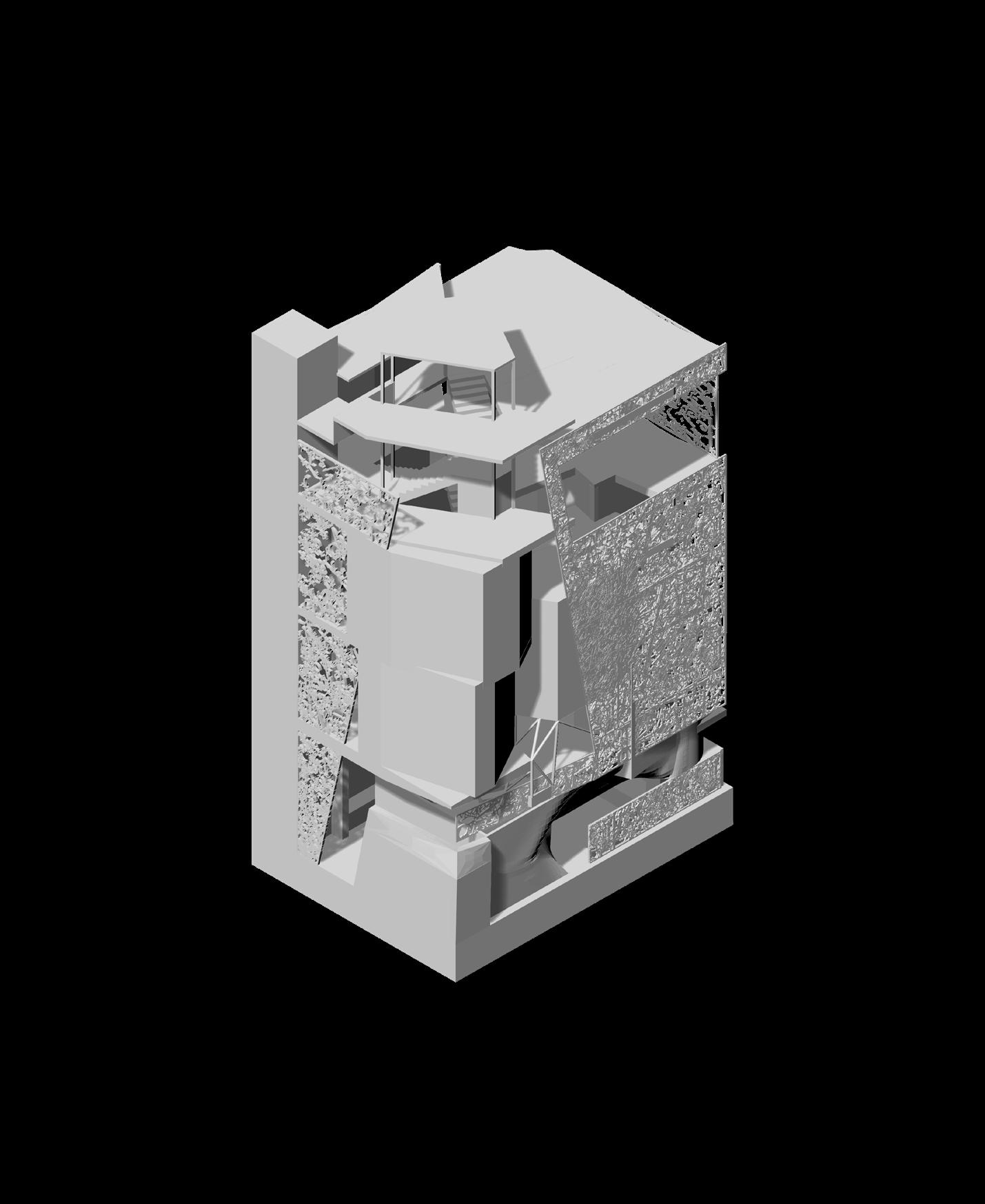
Using the studies on facades and decay, mapped elements of decay from the site study were combined to create a patchwork of volumes for parts of the building facade. The facade is permeable, allowing light and views to penetrate.
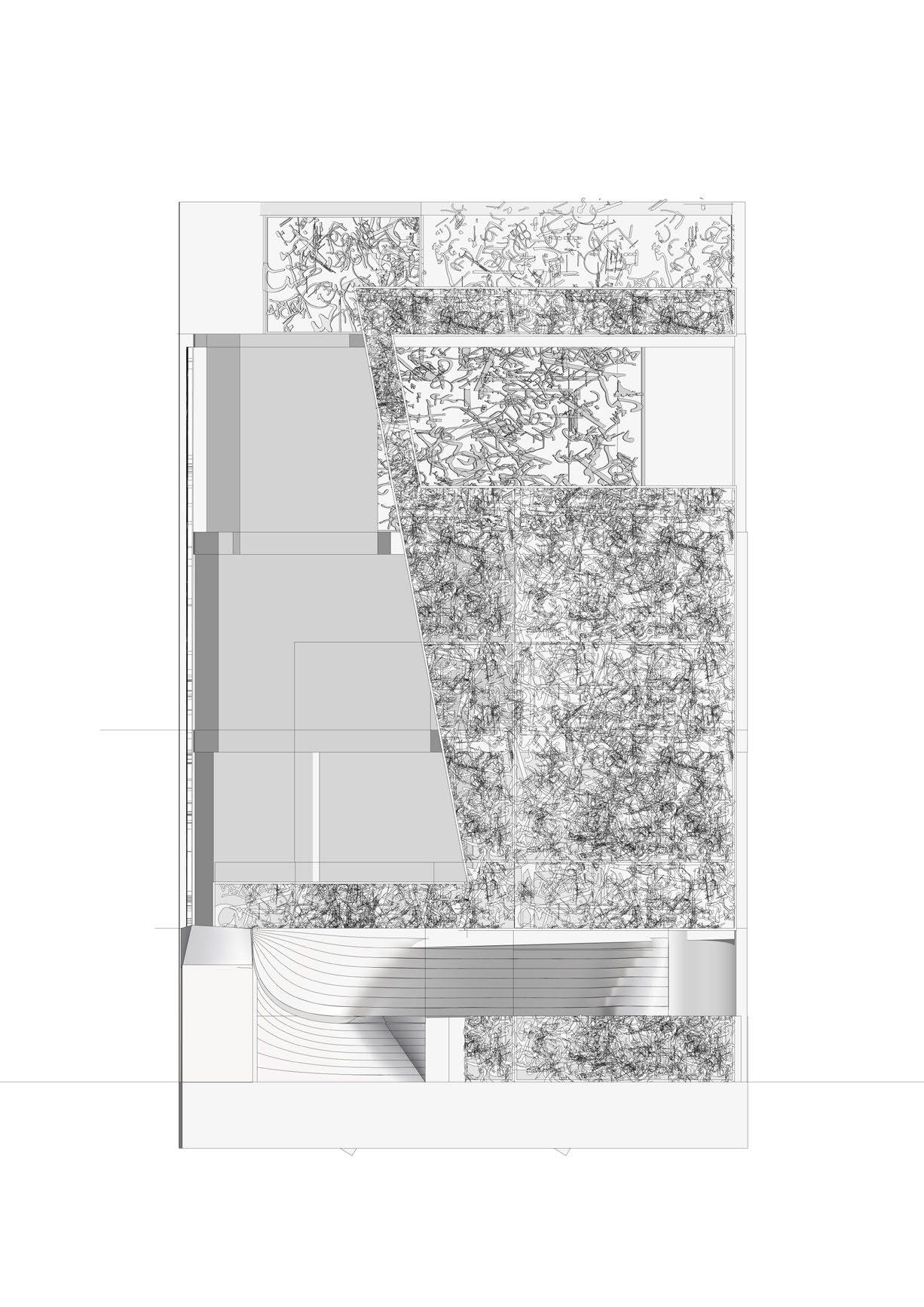
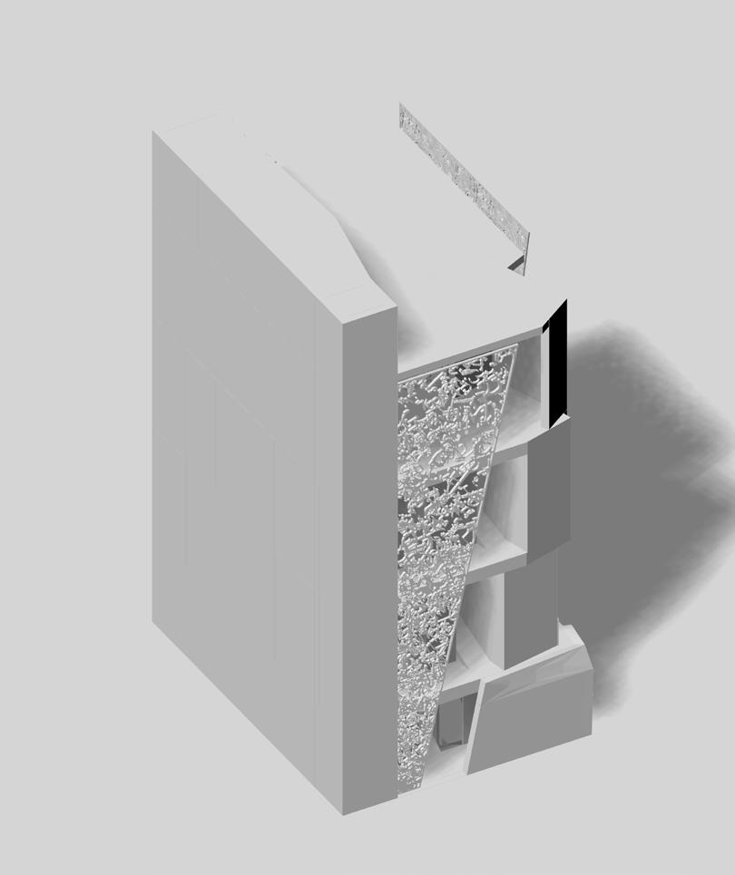
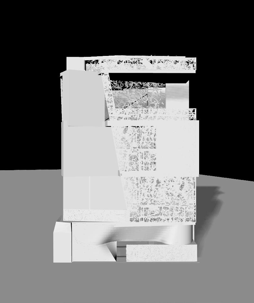
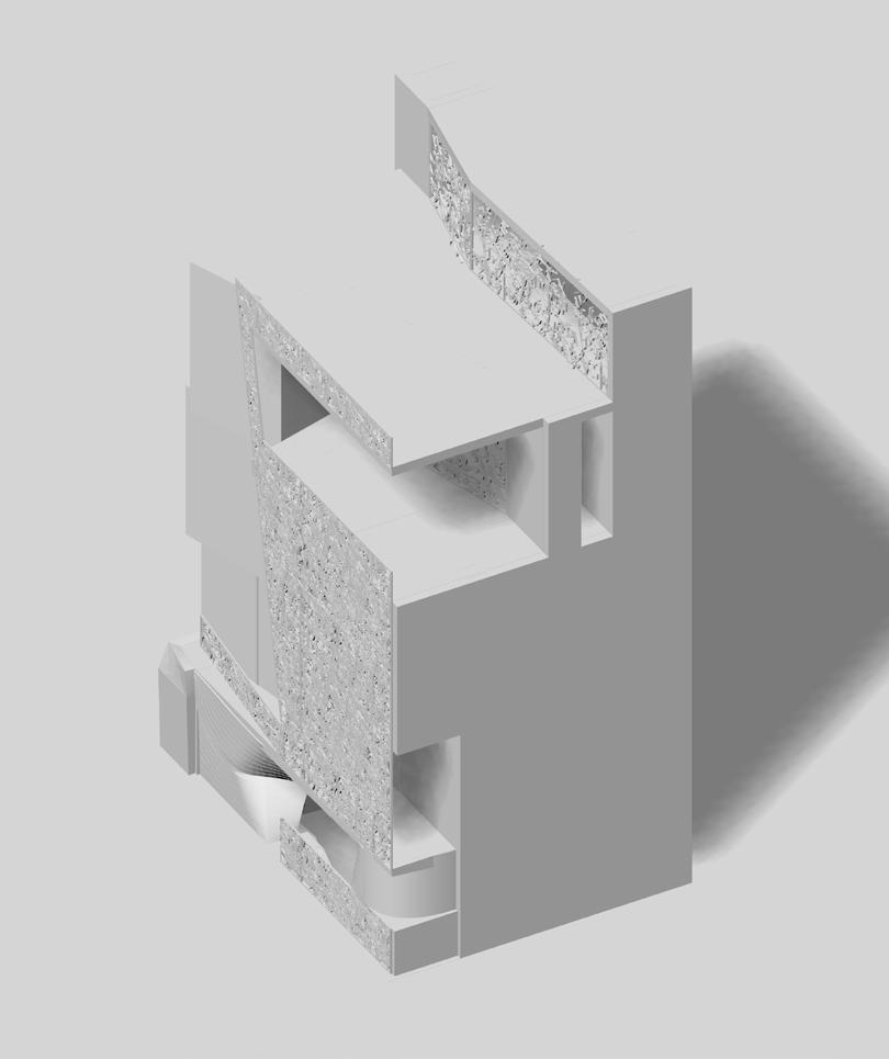
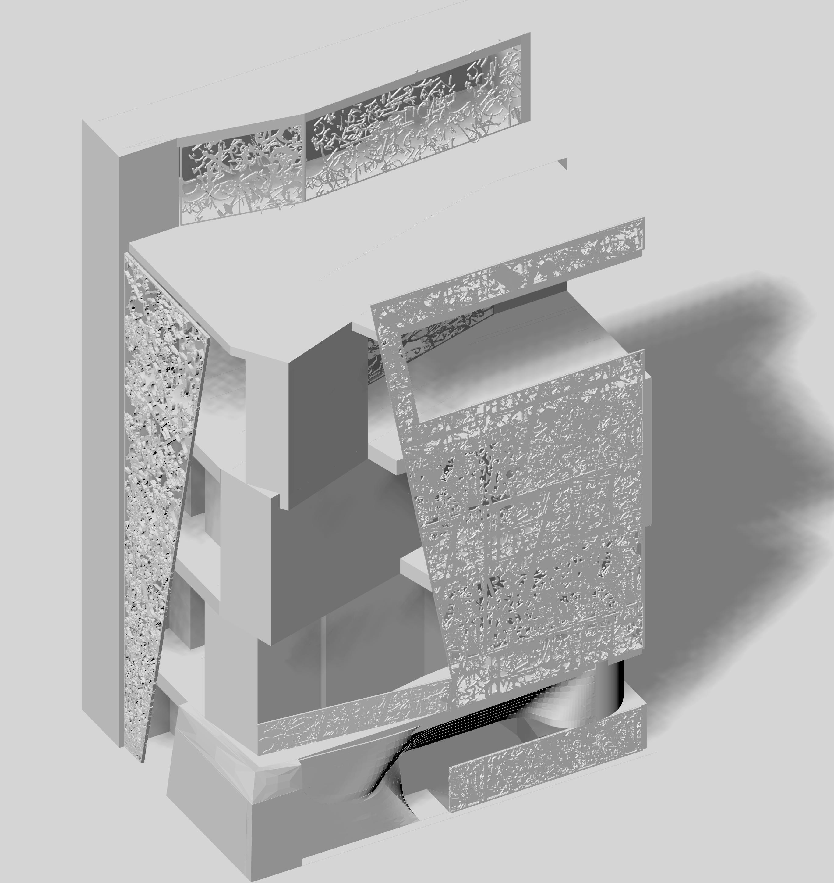
The building programme was determined to be a street-food hall, catering primarily to those queueing at the O2 Academy, as well as being open through the night for graveyard shift workers.
The permeable, patchwork facade filters light and views, but still allows for access and openness. During the day, this limits solar heat gain, while allowing for light. At night, this creates a softer, lantern effect that doesn’t bother neighbors but entices people to enter.
The facade is again less dense at the upper levels where seating would be located, allowing customers to look out on to the street.
The front patchwork facade is less dense at the ground floor, allowing passersby and people in the queue to catch glimpses of the inside.
The twisting of the corner elements create a somewhat concealed view down Astoria Walk.
4.2.1. Split Level Iteration
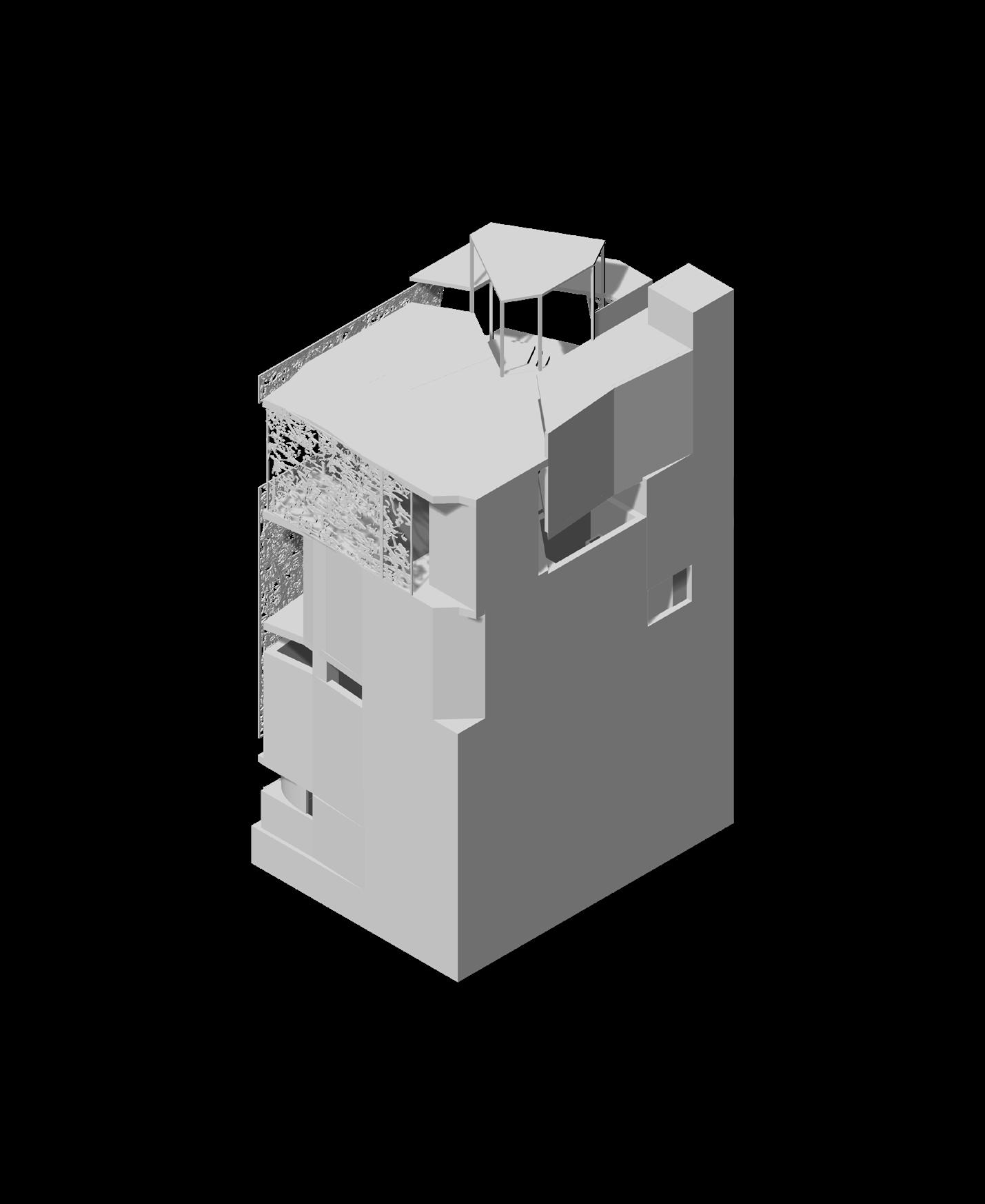
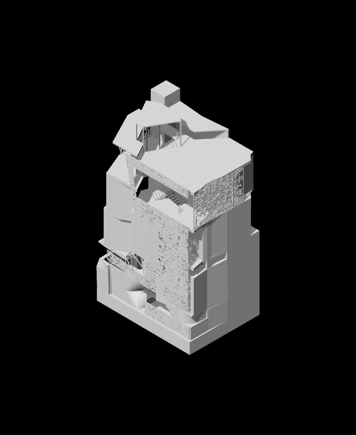
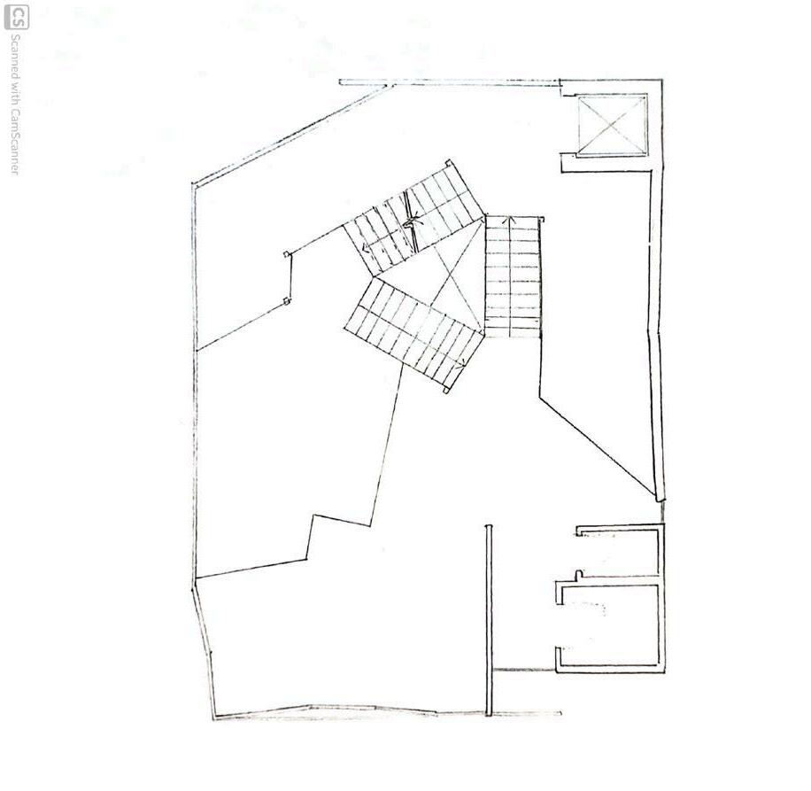
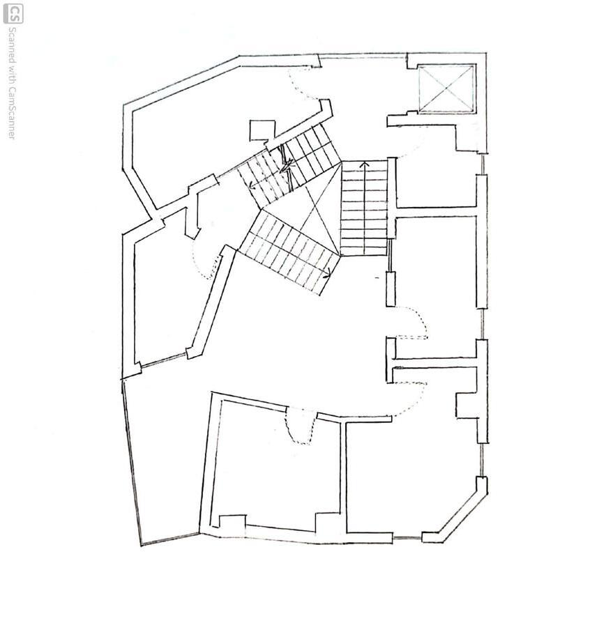
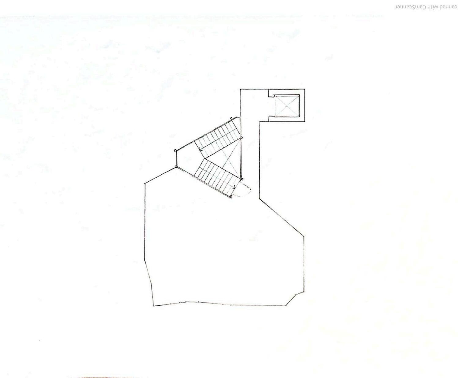
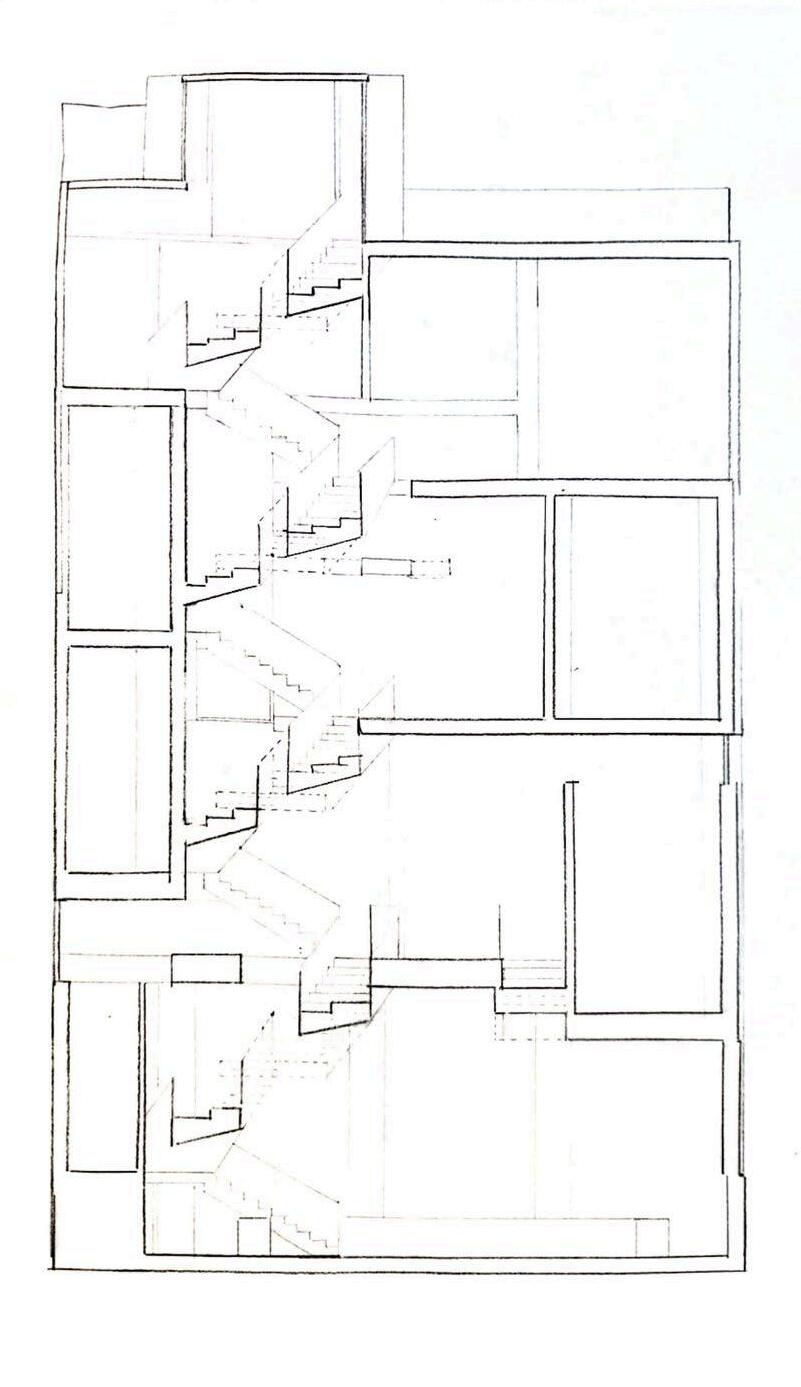
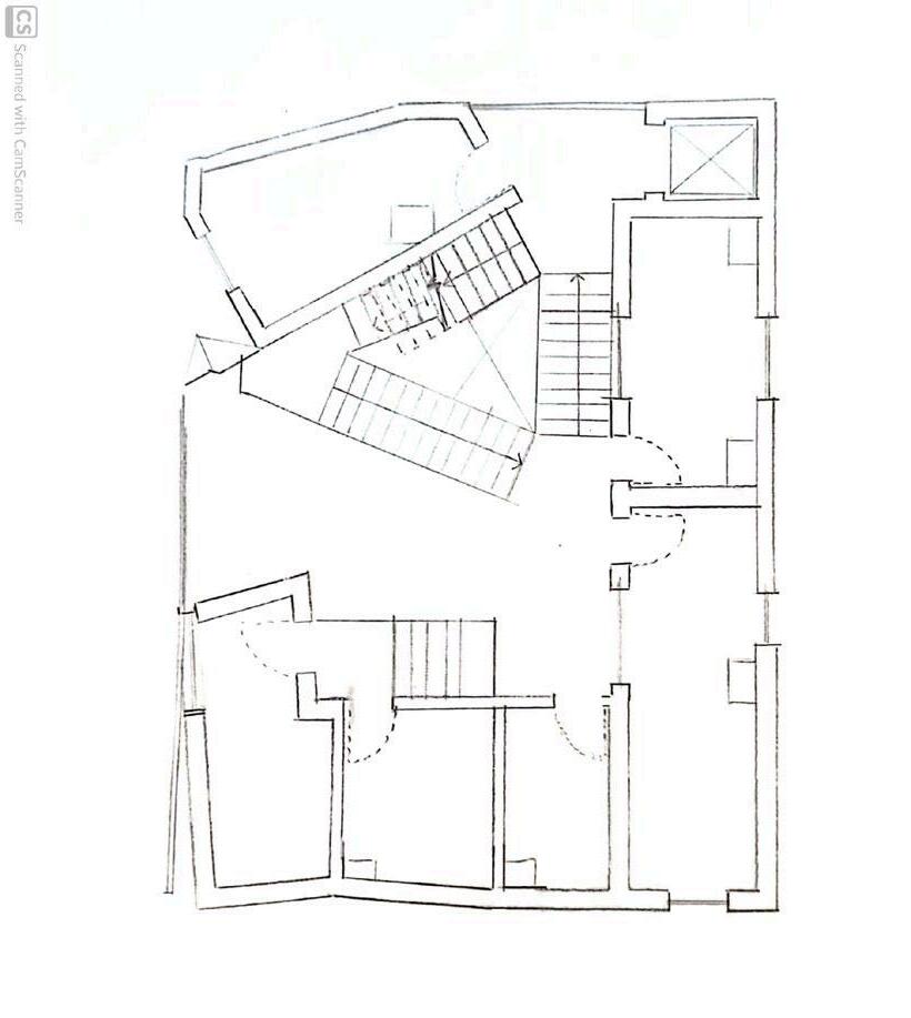
Continuing from the previous iteration, a new circulation strategy was used. A central core of stairs with landings every 1 - 2 meters allows for split levels. As customers ascend, they pass various kitchens with opened walls and seating areas. Furthermore, the irregularly placed levels allows for cutting views into the building, usually accentuated with large square windows.

4.3. Facade Panel Study
Intrigued by using decay as a generative process and cultivated product, the facade panels were designed with metals in mind: copper and steel. These metals both create a patina, or rusted appearance once exposed to the elements over time. While copper is commonly used for this purpose, steel isn’t usually designed to rust in buildings, either used as stainless steel, or pre-rusted into corten steel.
A series of 4 steel plates were rusted through a chemical process designed to accelerate the process. Pieces are first submerged in white vinegar for 15 minutes, then allowed to dry, submerged in a hydrogen peroxide and salt solution, and finally removed and allowed to dry. Pieces were submerged in hydrogen peroxide for 15, 20, 30, and 45 minutes, respectively.
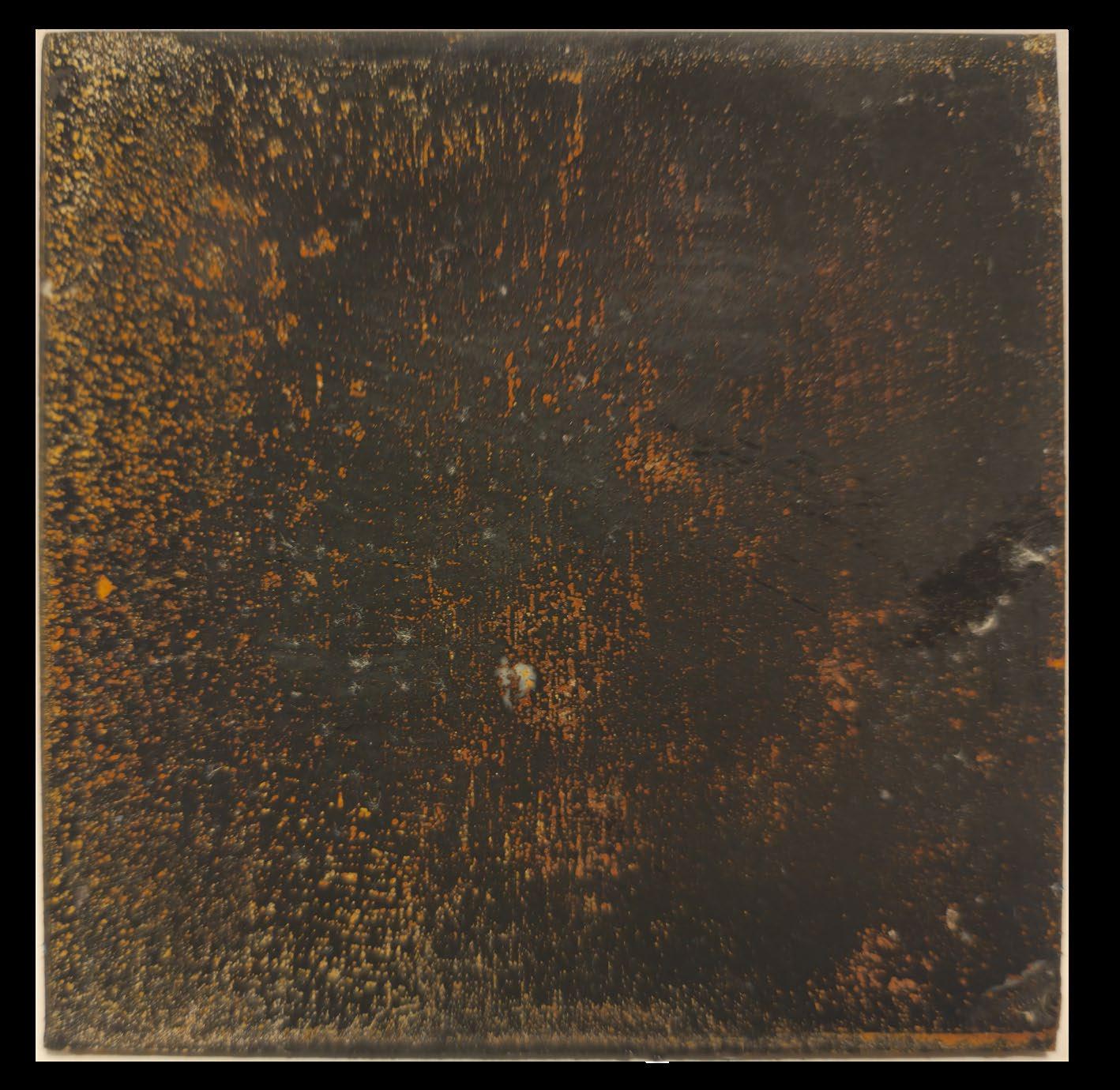
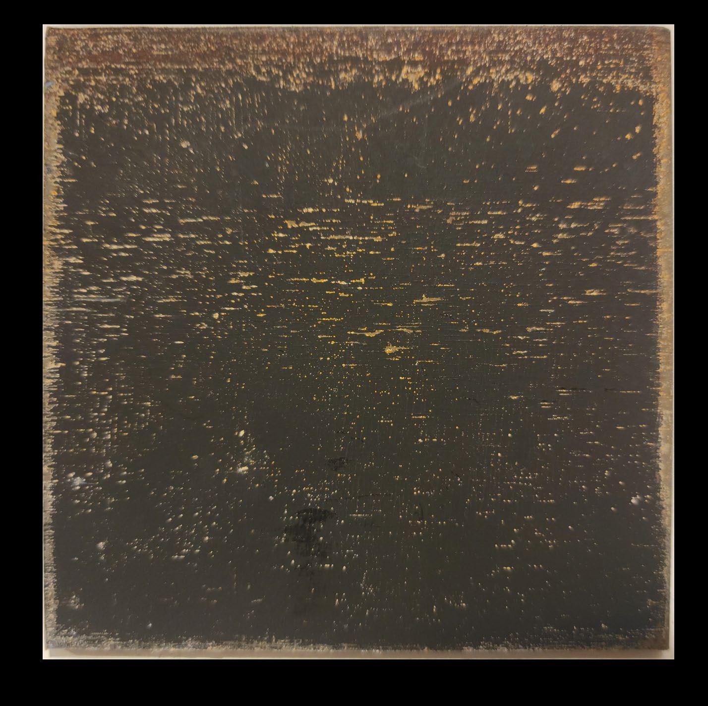
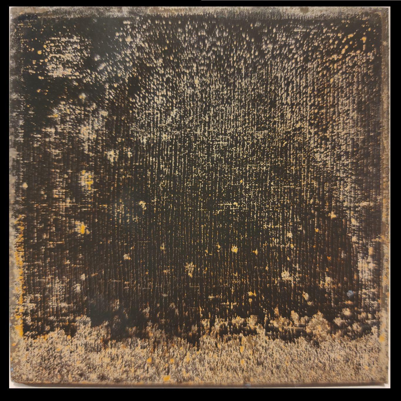
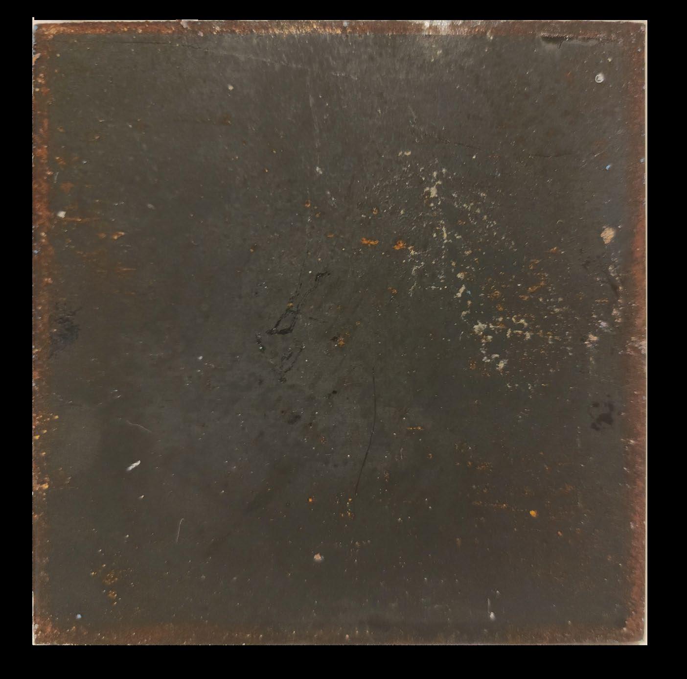
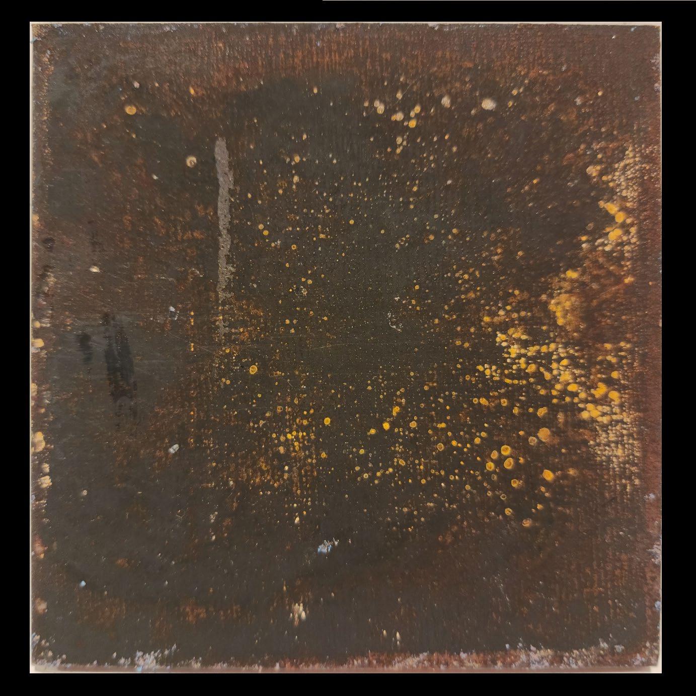
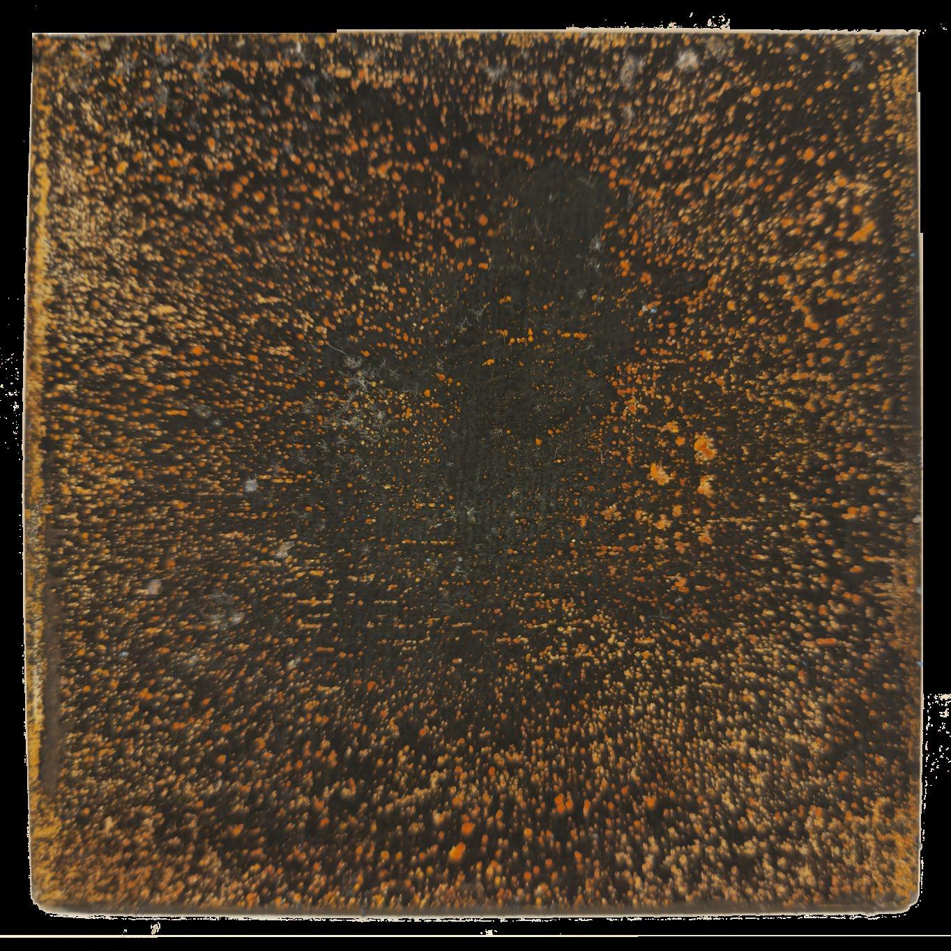
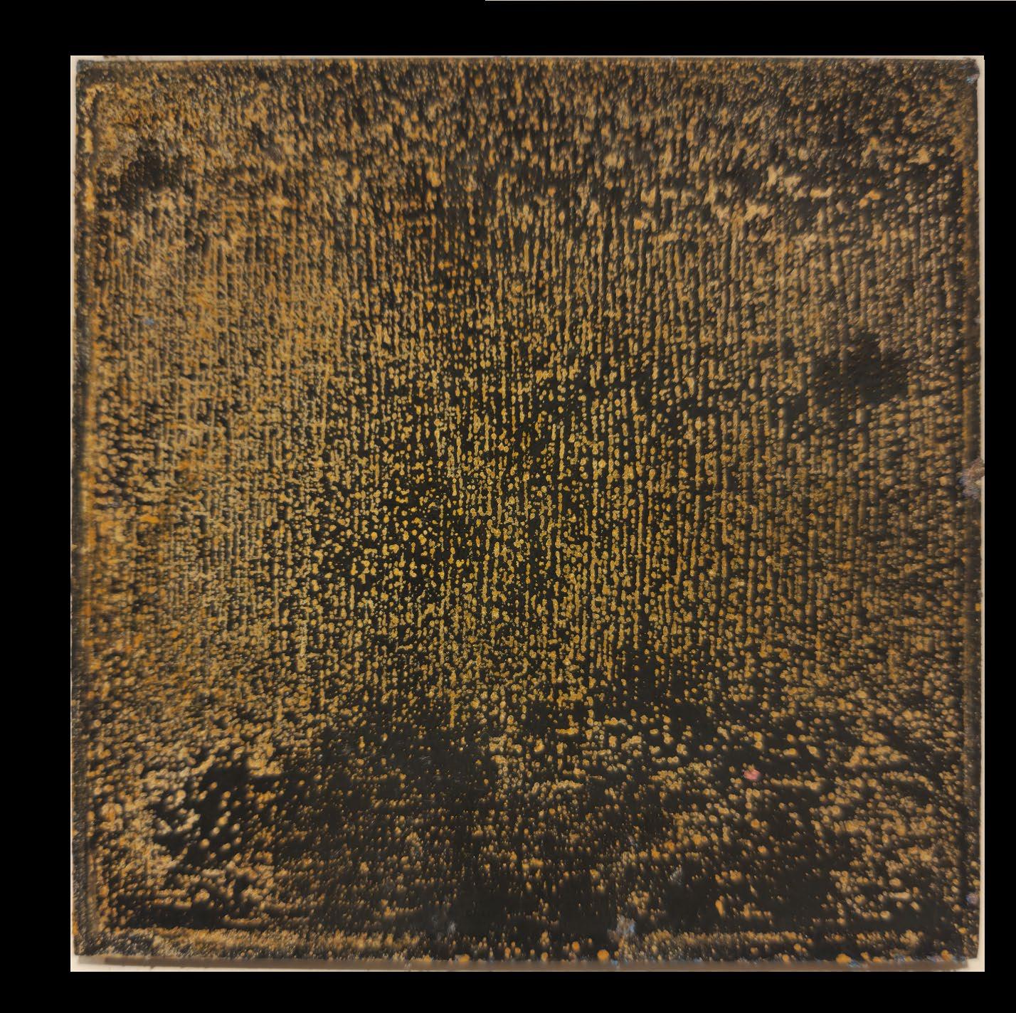
Due to the nature of the chemical reaction, which is exothermic, and the protective coating on the metal, heat was produced. This created the blackened appearance of the metal pieces. However, facade panels may be heated due to the necessity to remove excess heat from the kitchens themselves.
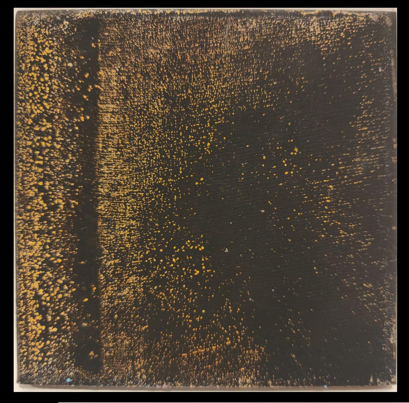
Top images are the front of each piece, with the back on the bottom From left to right, the time of reaction was 15, 20, 30, and 45 minutes.
4.3.1. Facade Panel Study
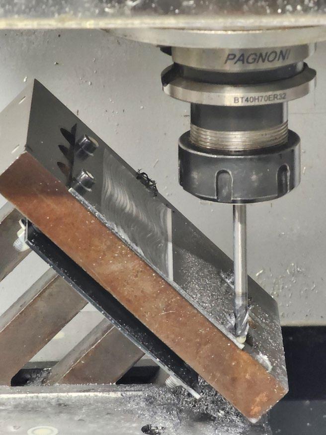
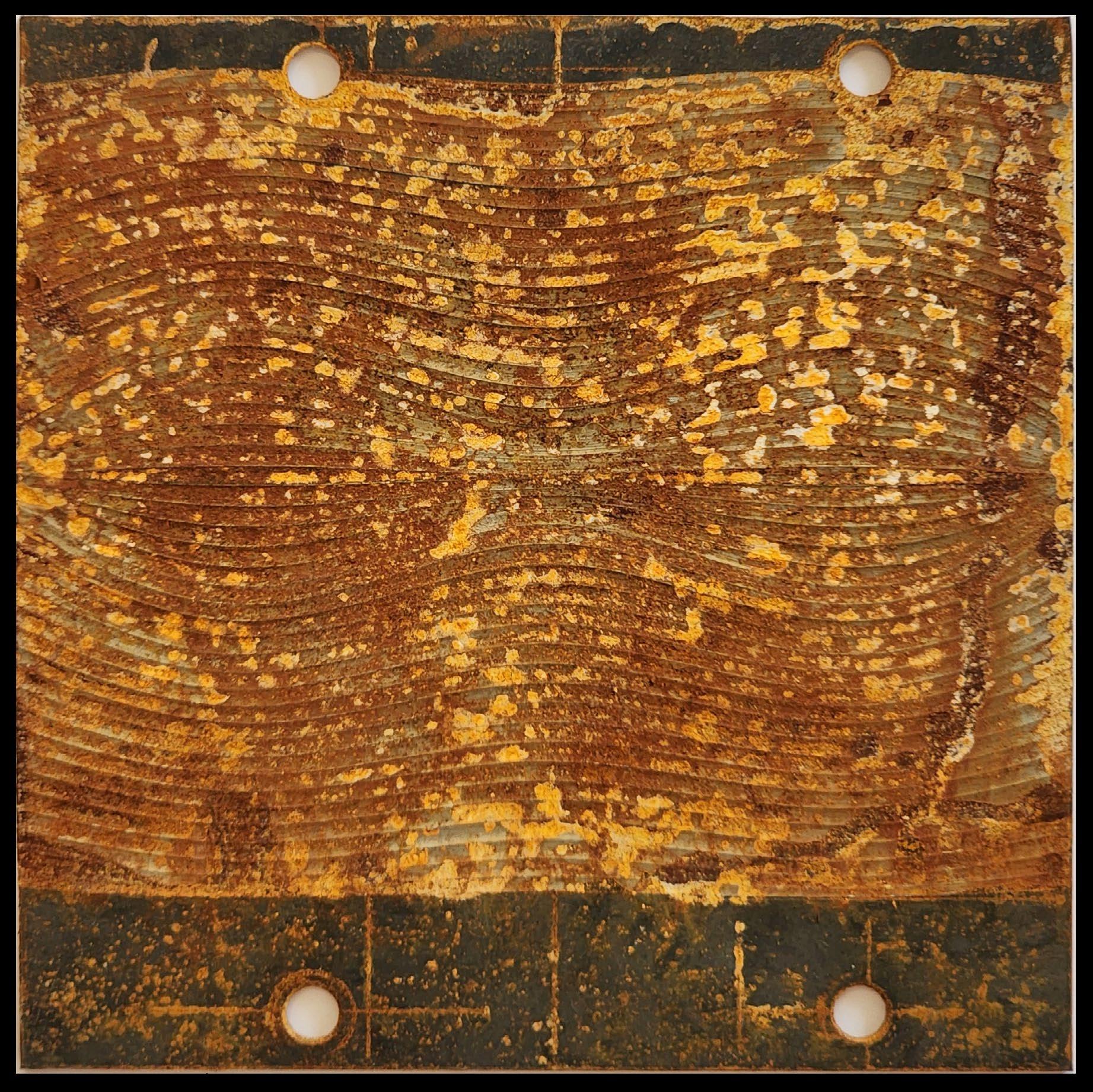
Rather than allow the decay to occur randomly, using a CNC machine to create different surface conditions and interesting geometry allowed for more control. The two metal pieces were cut according to an undulating texture, which used larger cusp sizes to create ridges.
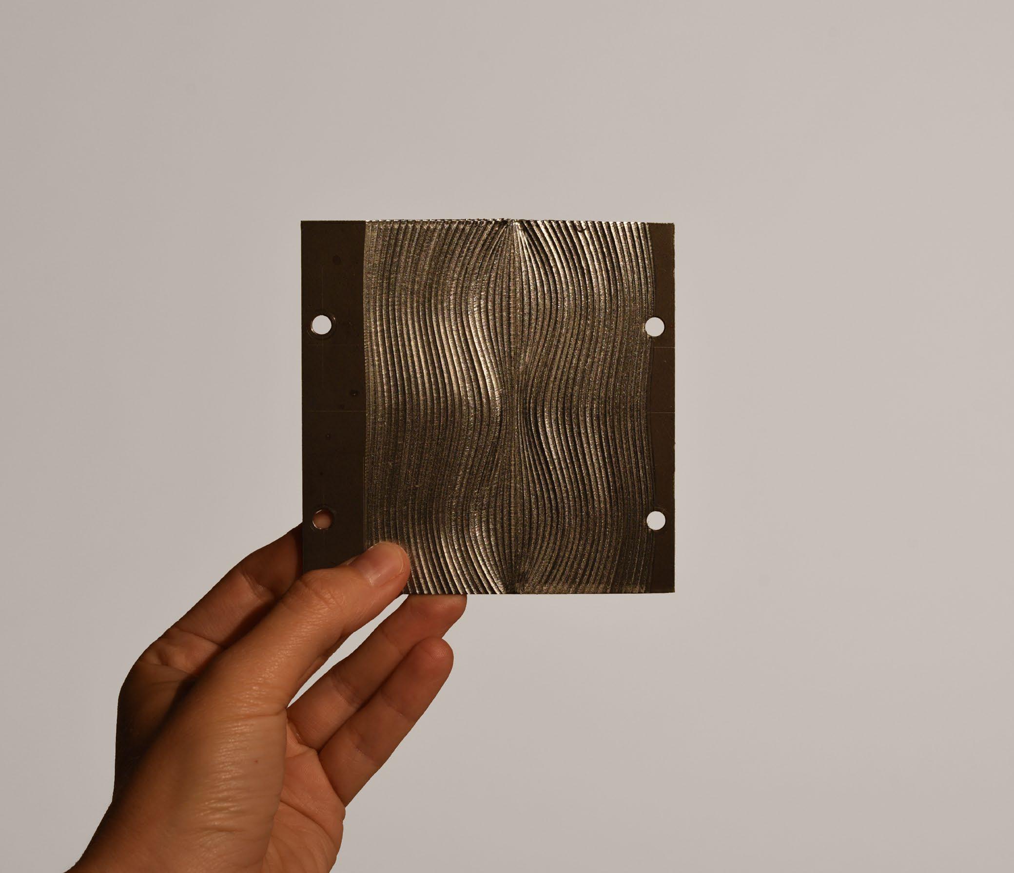
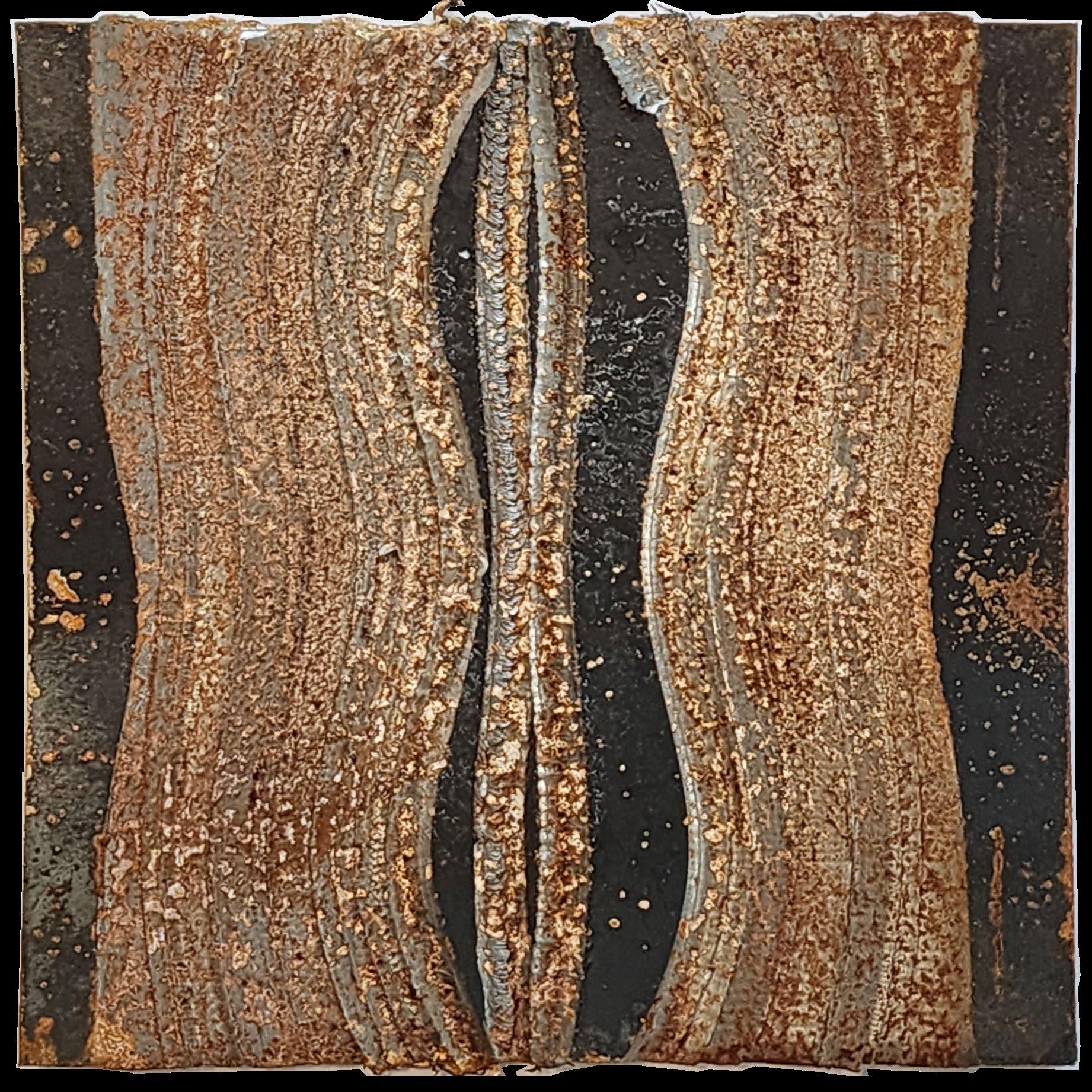
In the top array of images, the first CNC-cut metal piece was cut horizontally. The machining failed, due to a number of reasons:
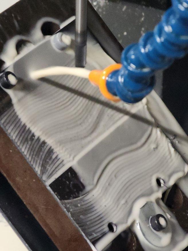
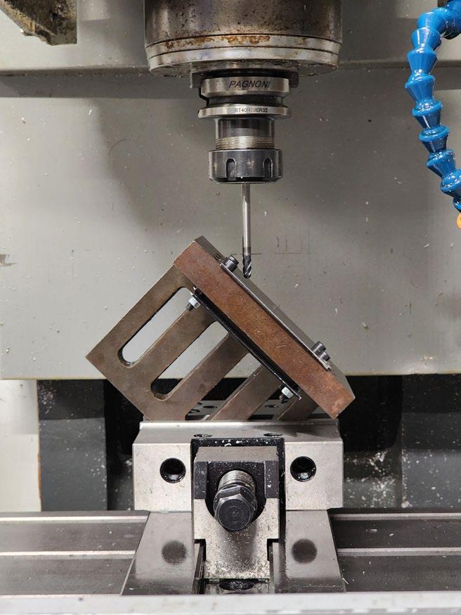
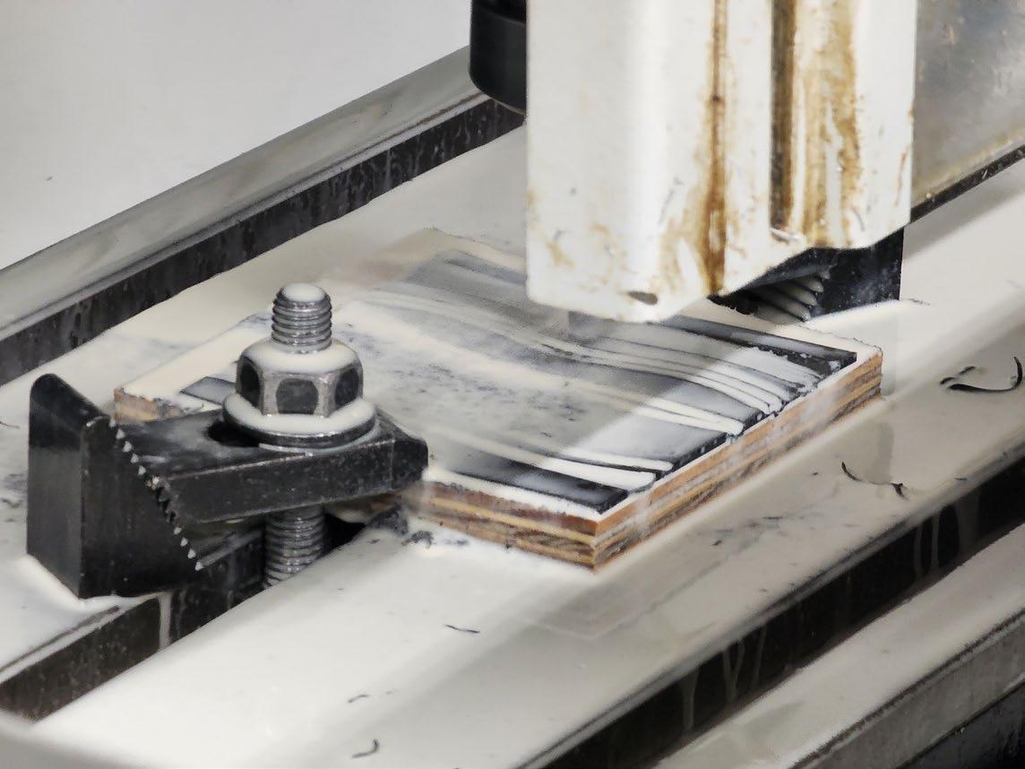
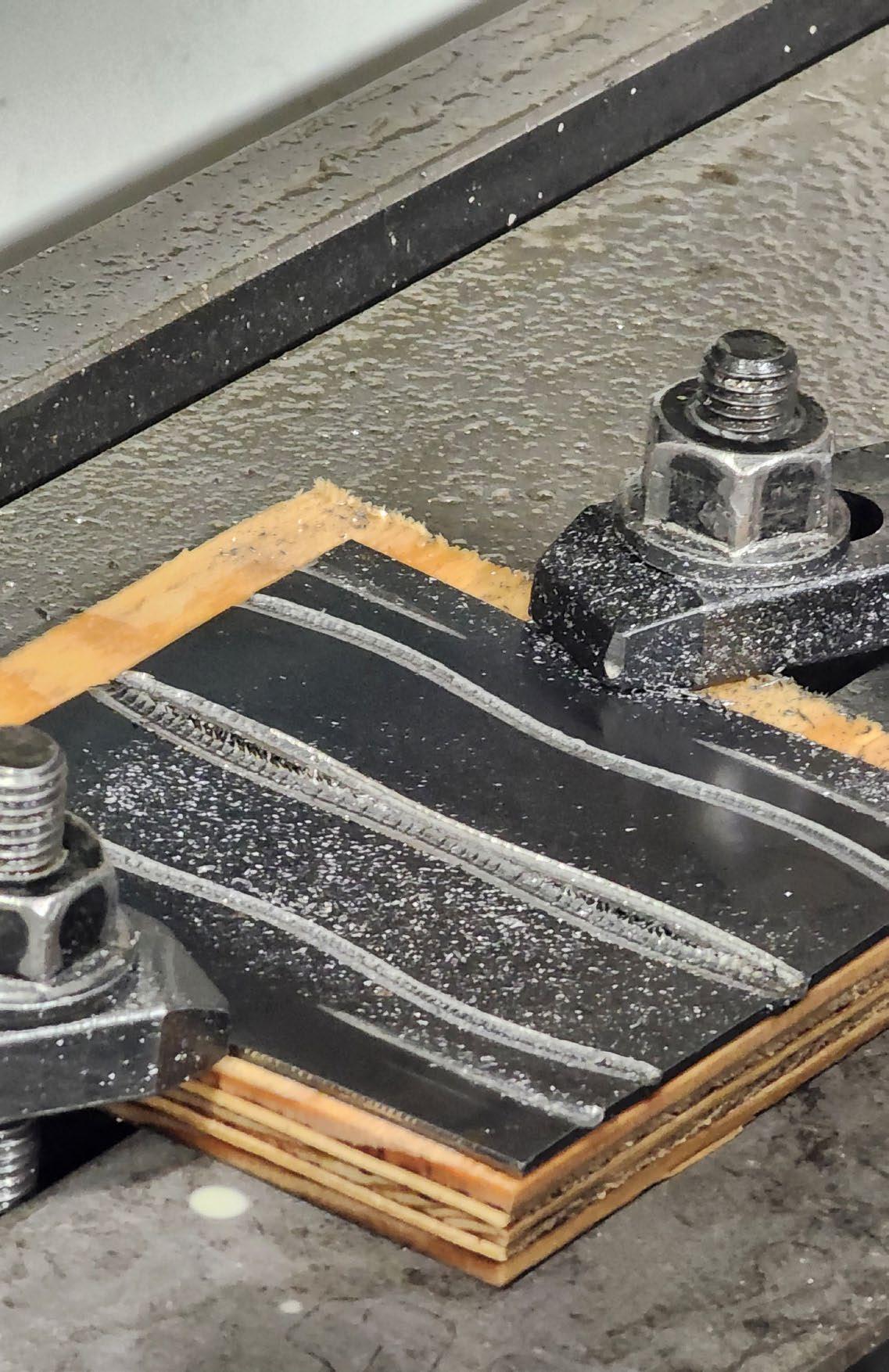
1. Clamps weren’t placed at all 4 corners, leading to bowing upwards in the center
2. The piece began to vibrate and deflect
3. Small cut depth forced the cutting tool center to cut, which has a low velocity
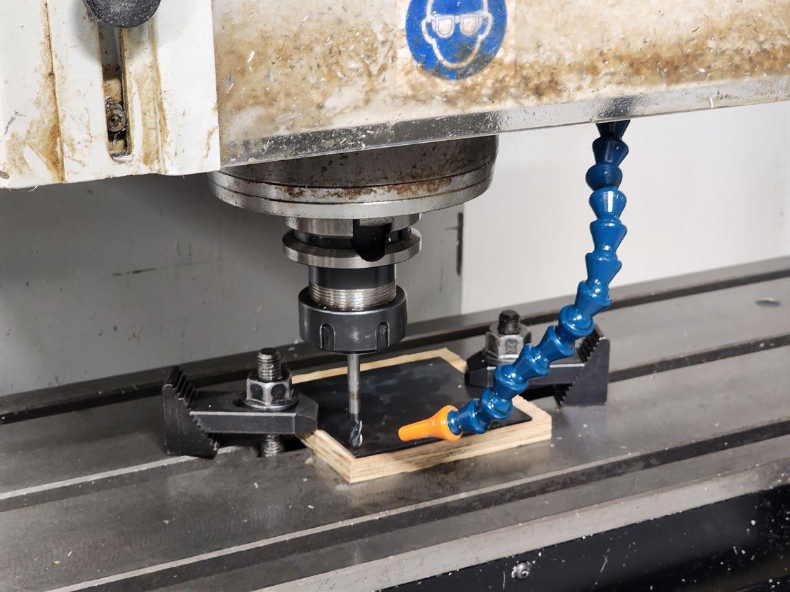
4. Small cusp size and stepover distance ensured for a long machining time
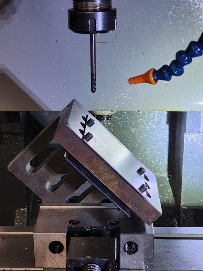
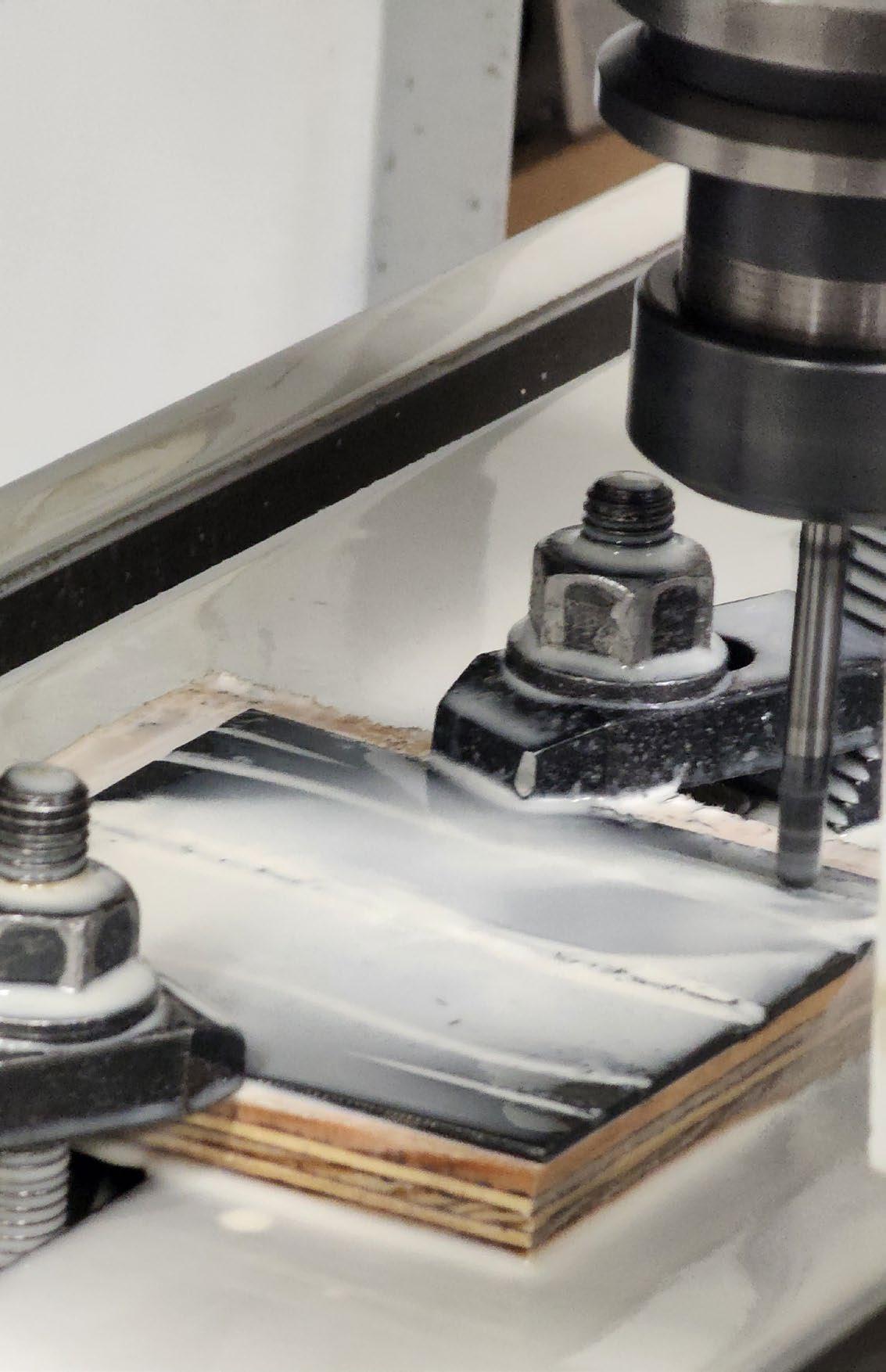
In the second attempt, the piece was set at a 45 degree angle, in order to increase the cut depth and also using the edge of the tool. Rather than clamped, the metal was screwed into place. Stepover size was increased, leading to a much more visible pattern.
The piece was then rusted with the same process as earlier, left in the solution for 20 minutes. Here, the machined areas produce a brighter colored patina, rather than the blackened color.
5. Final Iteration
In the final iteration, the decay patchwork is added to the skylight, crowning the building. This also brings filtered light down through the building. The metal facade pieces are pulled and pushed to create opportunities for views, light, and planters. Metal surfaces on the floors, walls, and ceilings decay over time, creating a multicolored patina. However, kitchen interiors and counters are constructed from stainless steel, and are easy to clean for food safety.
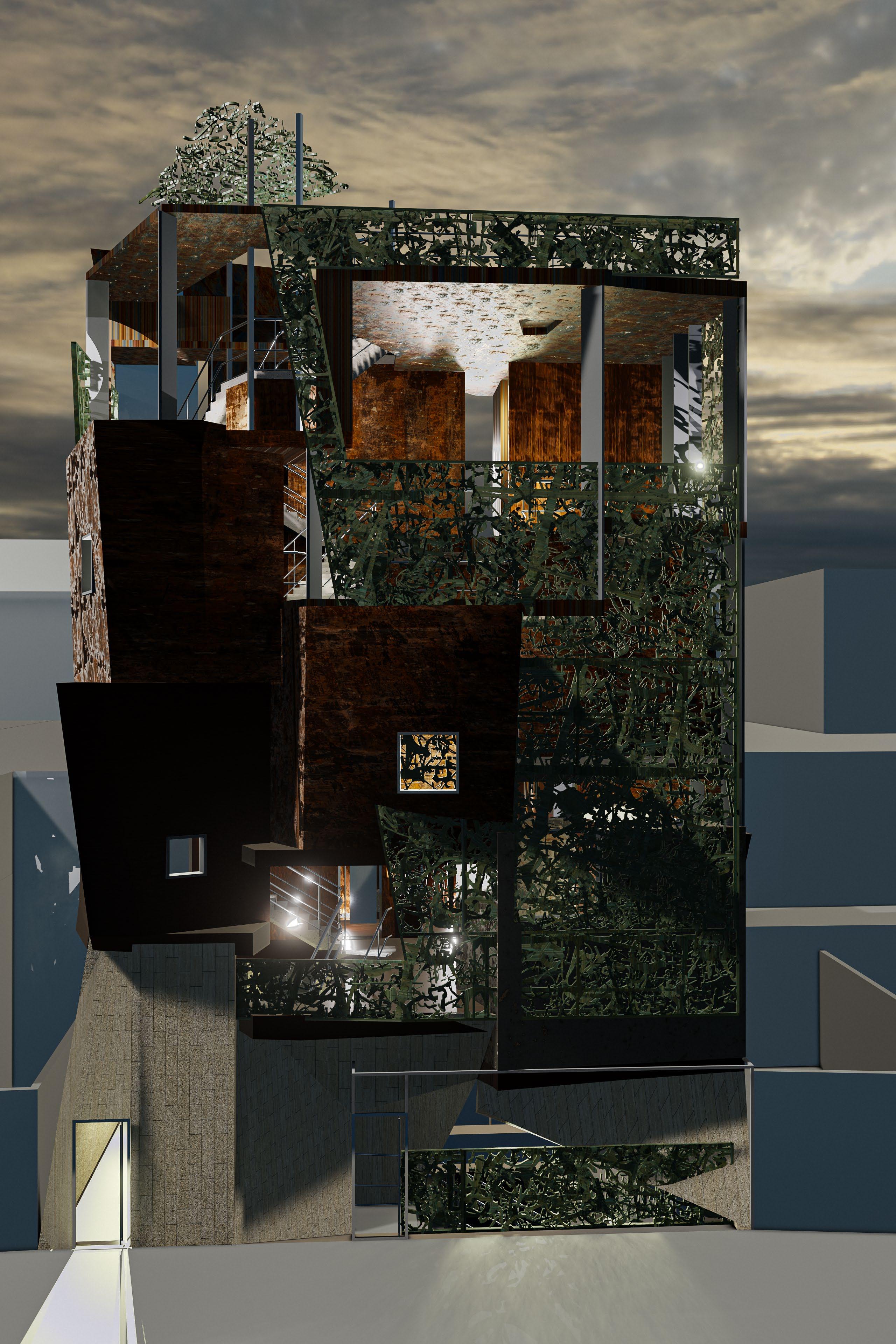
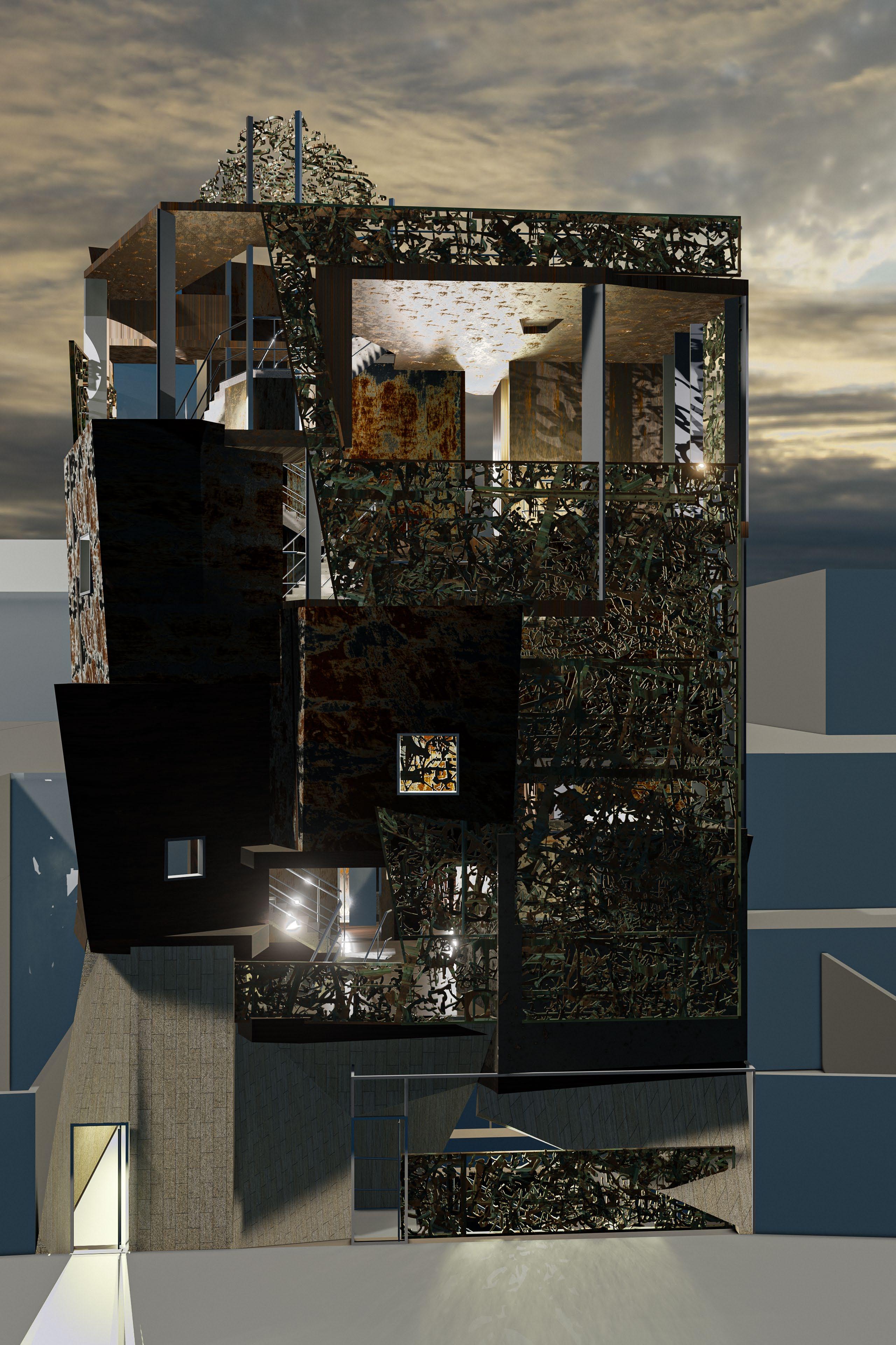
The entrance is altered, with pieces of stone cladding parting, as if a deep gash was made into the earth. Here, visitors descend into the building. Glass is more widely used in the upper levels, where seating areas are located.
The building is heavily inspired by decay, being a generative and destructive process that is fabricated, but also planned for. From the exterior, the abstract form rises as a patchwork of new and weathering steel and copper panels; gleaming silver to tarnished grey to reddish-brown, whilst also shimmering bronze to murky greens and bright turquoise hues.
These metal sheets, draped over the building form, bend and twist, creating a curving and jutting out facade. Sheltering these weathering pieces, a composite of decay found in Brixton is sandwiched between glass in shining copper. All of these pieces patina over time, allowing the building to have an entirely unique appearance at every moment. In the facade’s breakup, windows, skylights, and planters create a new naturally lit quality inside, and emit indirect light at night. The abundance of layering and limited perspectives allows the food hall to appear like a lantern, giving off soft light.
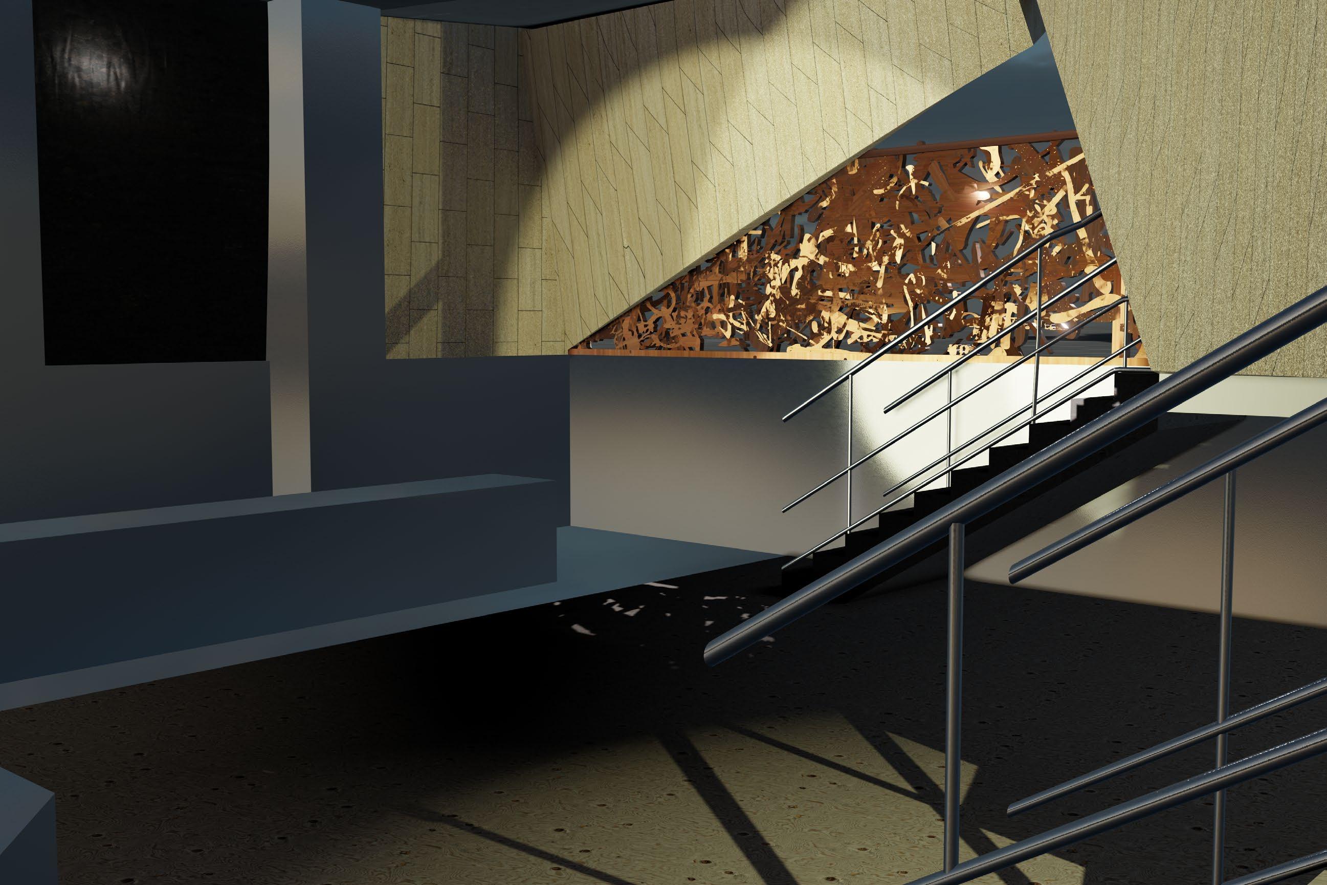
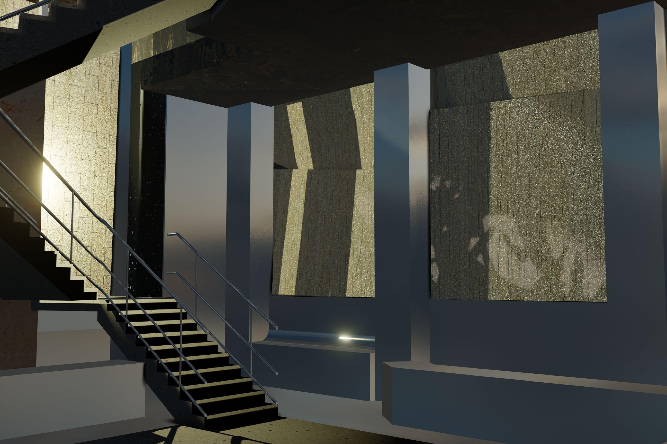
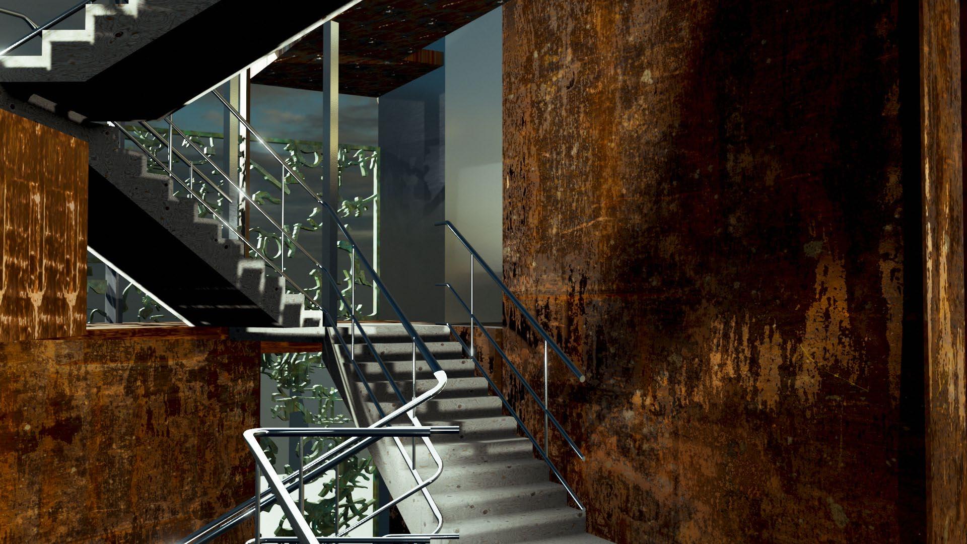
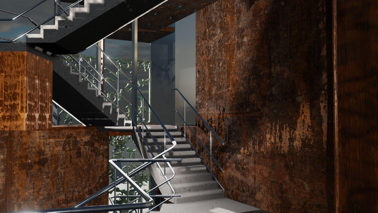
Visitors, including foodies, night-time industry employees, and queuing eventgoers descend into the market from street level. Peering up through the atrium, a skylight brings filtered light through the building’s center. Ascending the triangular staircase allows visitors to peer into the kitchens, access seating, and marvel at views from the terrace. An interlinking of these spaces creates a blending of cooking aromas, conversation, and people. Rising up the building brings viewing areas and places to gather, looking over the O2 Academy across the street as well as Brixton’s nightlife.
As a result of this renewal of nighttime vibrancy and activity, through food and gathering, Brixton can be re-identified at night.
5.1. Site Plan: 1-100
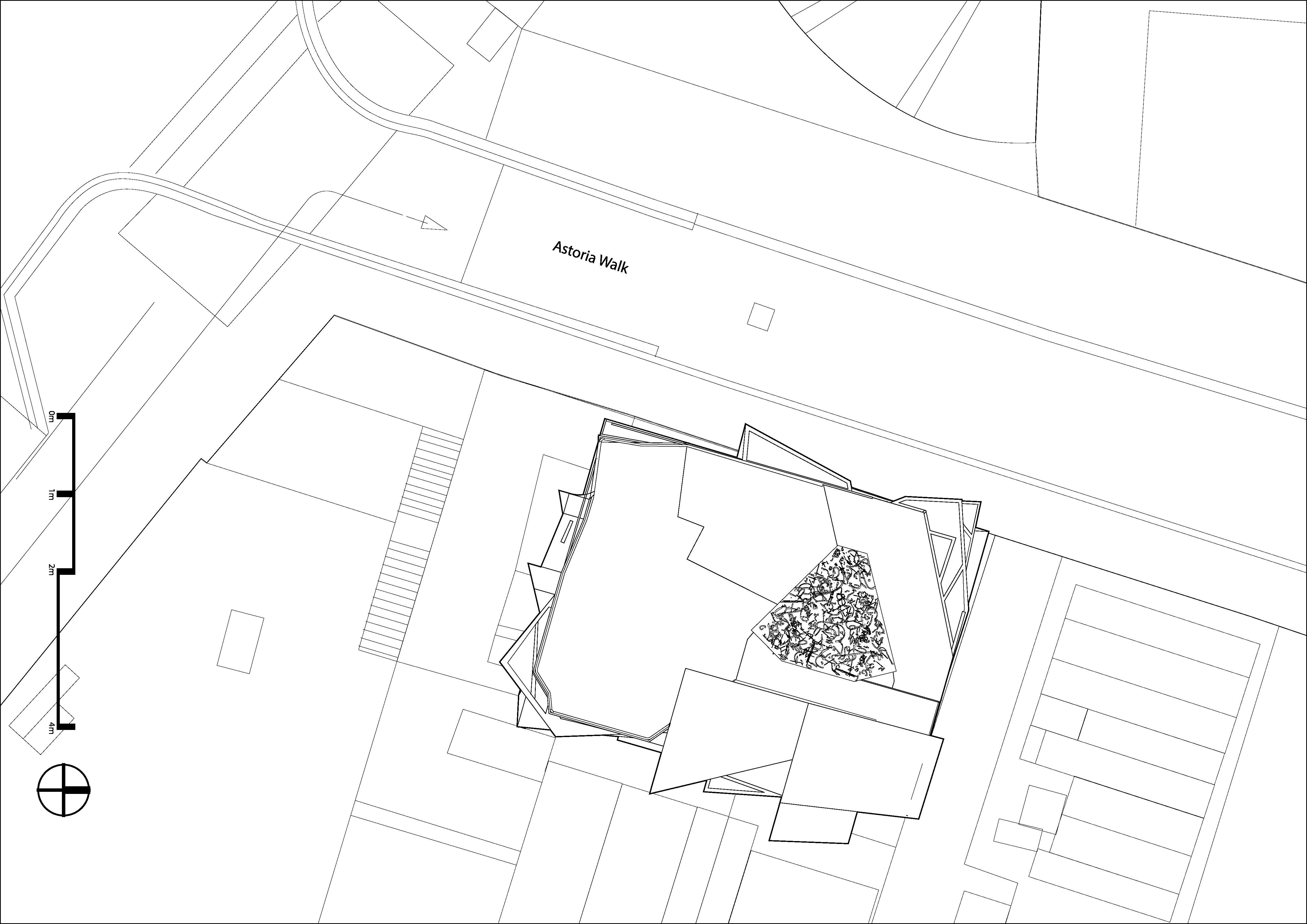
The building, located across from the O2 Academy in Brixton, is a prime location. Using the full street frontage, the building activates itself in attracting customers. As pieces of the building extend beyond the building plate, they both maintain and reject the rectilinear form of the building and site. The central, triangular atrium can be seen with the copper screening above.
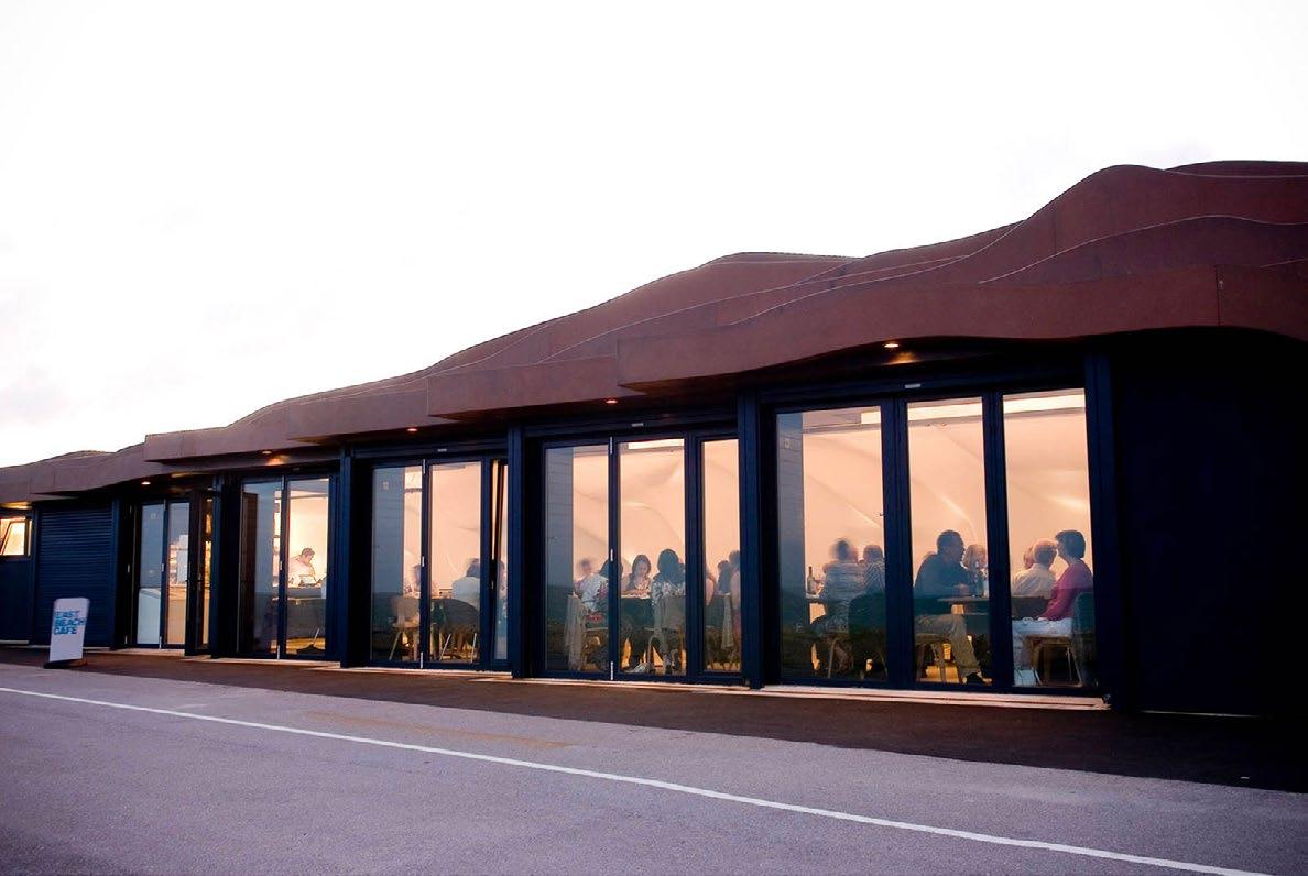 Heatherwick Studio’s East Beach Cafe acts as a proof of concept: a cafe housed within a rusted shell. However, the corten steel is manufactured, rather than allowed to obtain such a shade.
5.2. Ground & 1st Floor Plans: 1-50


The ground floor contains counters for ordering food, payment, and collection. These surfaces, in stainless steel, often bend out from the interior facade, reinforcing the concept of bending metal sheets. Dumbwaiters connect the kitchens above to the points of sale.
Visitors can enter through two doors, either the north door, which leads to the lift for those with mobility impairments, or through the south door, with stairs that descend 1.5 meters. The space is expansive, with up to 5 meter ceiling heights. Facades and surfaces are comprised of stainless steel, Portland stone, and timber.
The first floor contains kitchens and some seating space. This floor has four different split levels, providing varied ceiling heights and connections to other spaces.
a. Entrance b. Counters (ordering, payment, food collection) c. Central queuing area d. Dumbwaiters Cut: 1m Cut: 6.5m a. Kitchens b. Seating area c. Dumbwaiters d. Decay cladding (copper) e. Atrium (void) b.
In the 1-10 detail above, the wall buildup and the join of the copper and metal/stone facades can be seen.
5.2. 2nd & 3rd Floor Plans: 1-50


The second floor also contains kitchens and seating areas. There is a new, standing area with tables for more customers. Planters from the first floor are visible at this height.
The third floor has the store and a very large seating area. Toilets are located on this floor, close to the majority of the dining customers. At this height, few buildings near the site meet the cut: the O2 Academy, a nearby apartment complex, and flats on the next street.
a. Seating area b. Store c. Point of sale d. Decay cladding (copper) e. Toilets f. Atrium (void) a. Kitchens b. Seating area c. Standing area d. Dumbwaiters e. Decay cladding (copper) f. Atrium (void) Planter Planter Planter Planter Planter
Cut: 11m Cut: 15.5m
5.2. 4th Floor Plan: 1-50

5.3. Elevation: 1-100
The fourth floor houses the terrace, with lift and stair access. At this elevation, double height and extra tall ceilings from the third floor breach this point. The triangular stair also opens onto the terrace. The terrace doubles as a space for eating and drinking when weather permits.

Cut: 18.5m
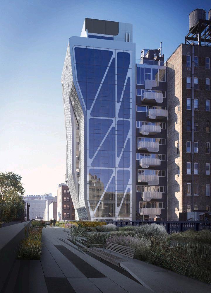
Neil Denari’s Highline 23, with its bending metal panels evokes similarities to the design here, where the bending creates a unique facade. Furthermore, he fabricates the metal in order to add a textured finish.
Elevation: Astoria Walk (ENE)

a. Terrace b. Decay cladding (copper) c. Atrium (void)
5.4. Section Drawings: 1-100


The first section cuts perpendicular to Astoria Walk, in the SSE direction. The stairs are continuous, from bottom to top, with the inner rail acting as one single piece, bent and curved many times. To the right is the O2 Academy, with queues along the pavement.
The second section cuts parallel to Astoria Walk, in the ENE direction. Many rooms and spaces are longer in this direction, to take advantage of views onto the street-scape as well as to accommodate a large number of visitors.

a. Entrance b. Counters (ordering, payment, food collection) c. Kitchens d. Seating areas e. Store f. Storage g. Terrace h. Dumbwaiters i. Void (ventilation, utilities) a. Counters (ordering, payment, food collection) b. Kitchens c. Seating areas d. Terrace e. Decay cladding (copper) f. Dumbwaiters
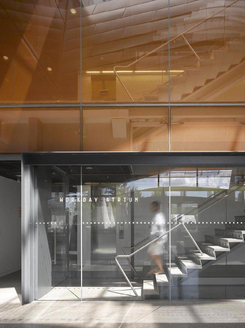
In the Bill & Melinda Gates Hall at Cornell University, Morphosis Architects use a thin steel railing, which is emulated in the final design iteration to the right.
5.5. Renders
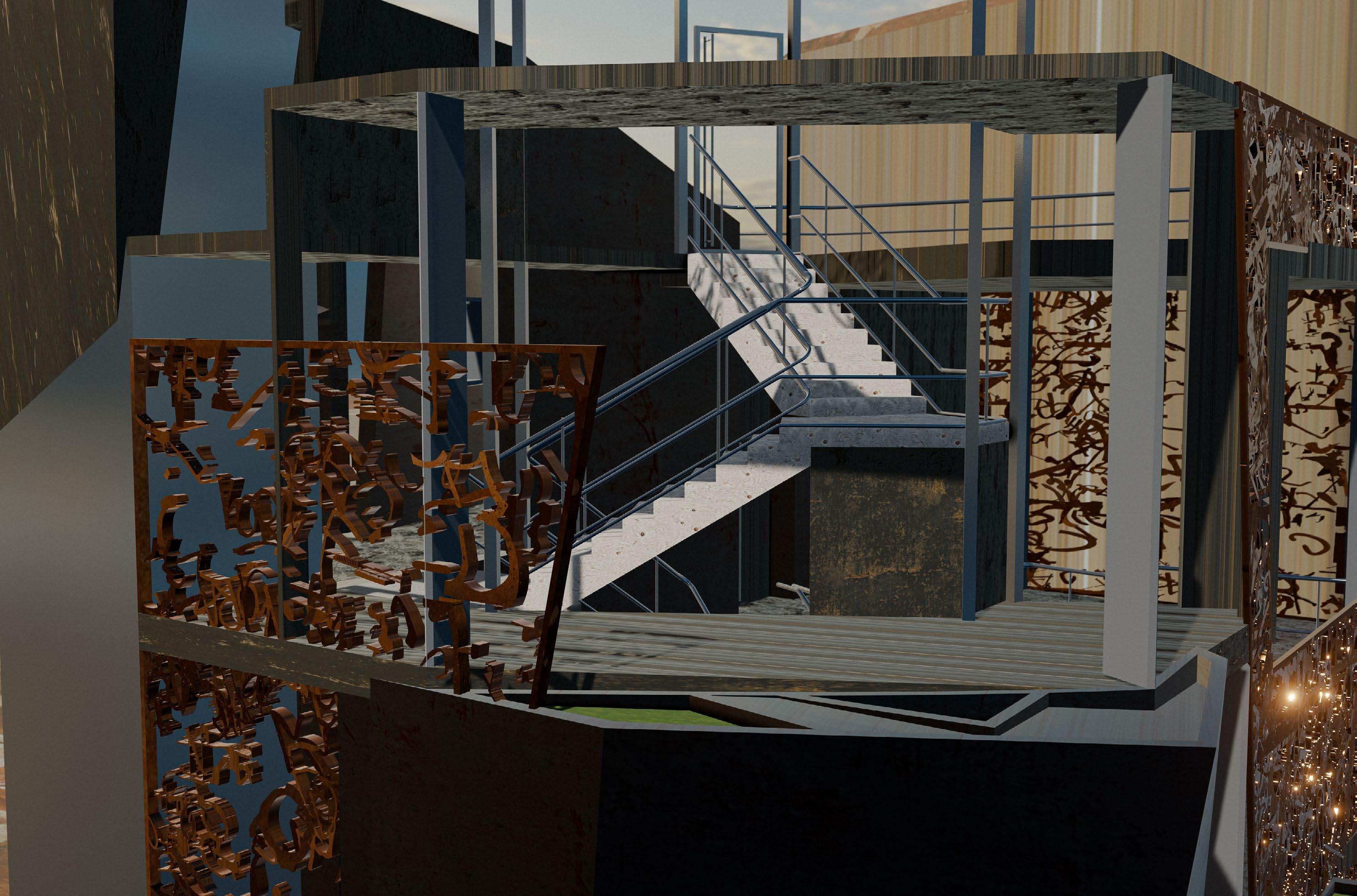
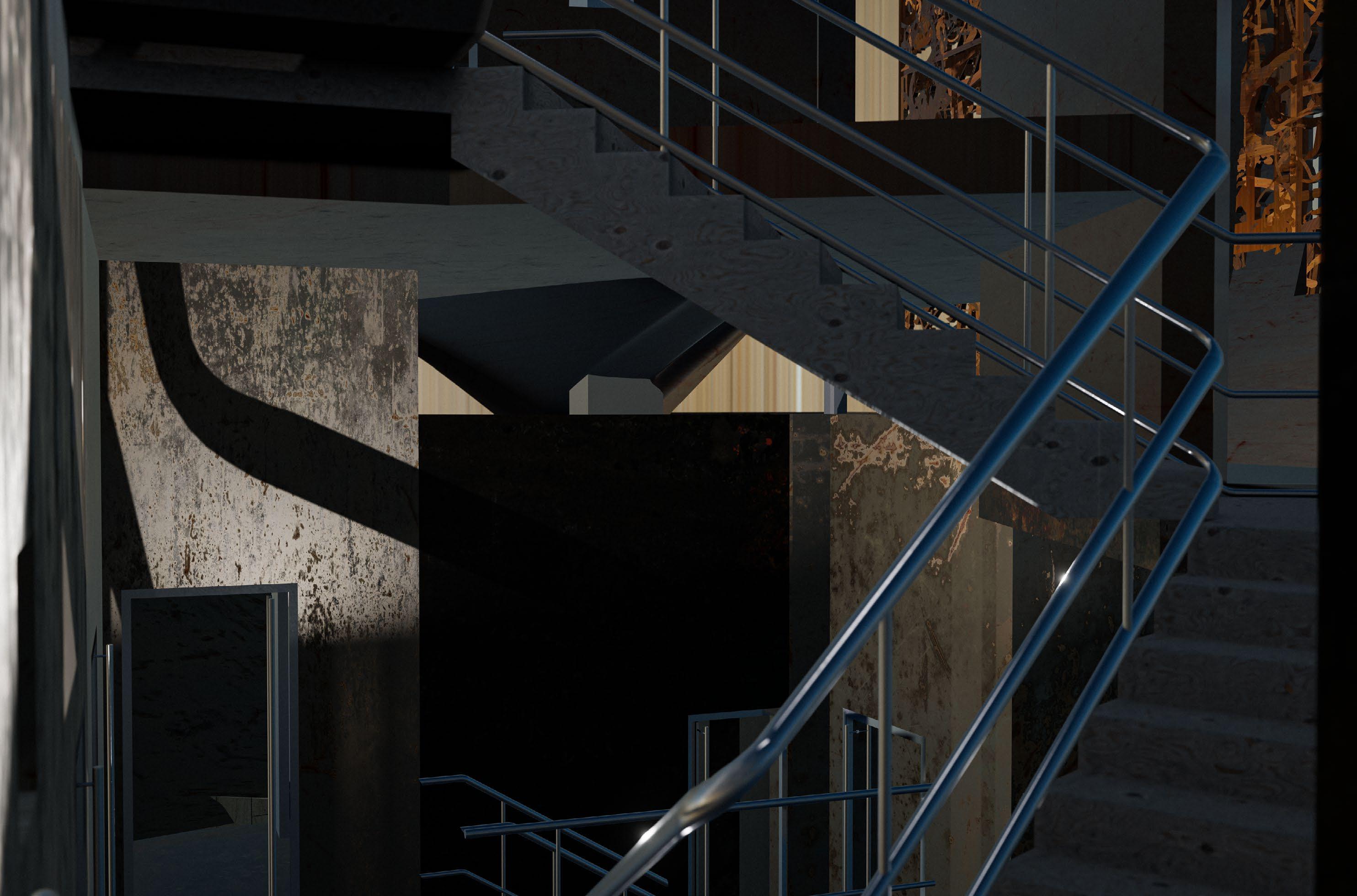
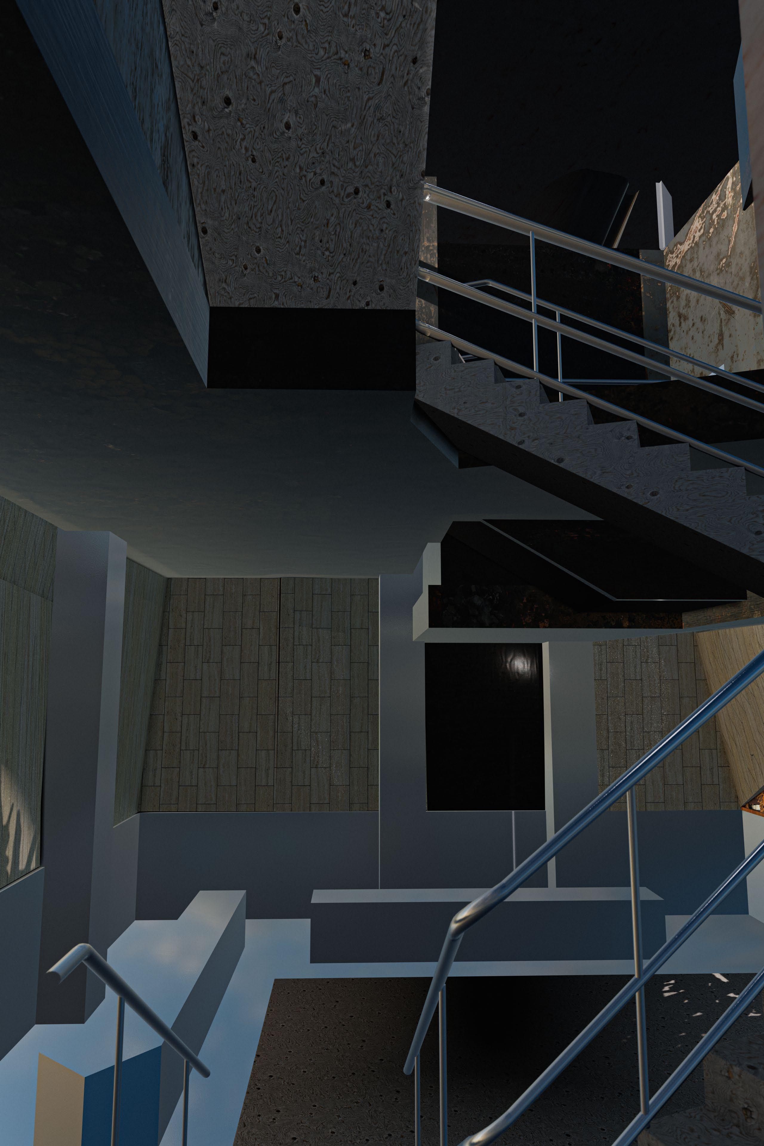
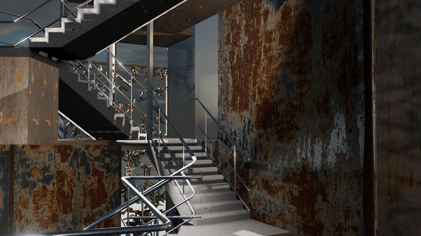
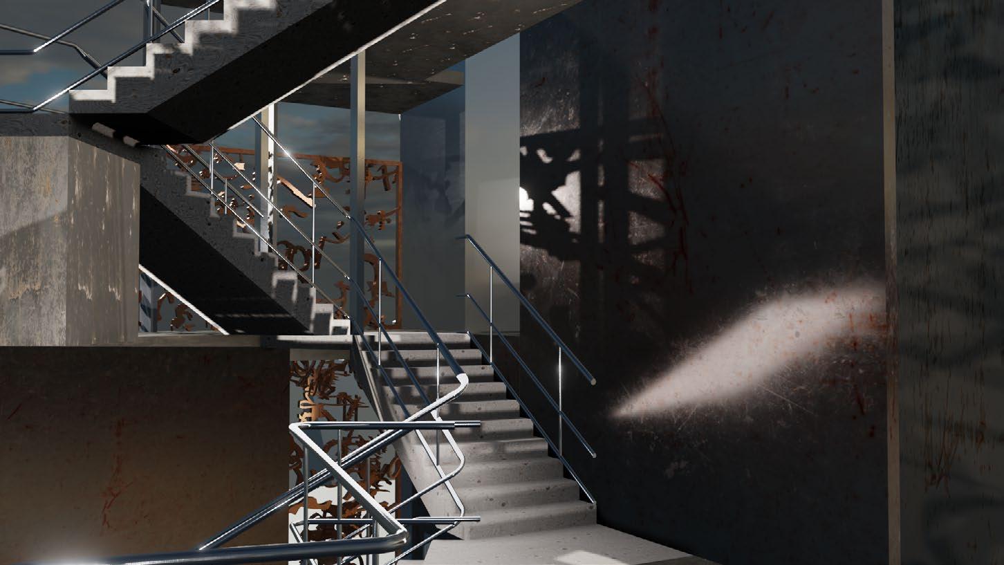
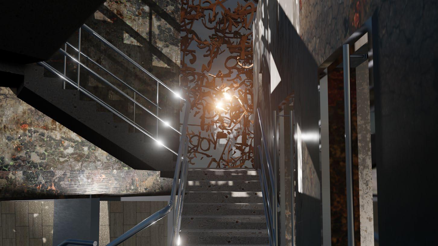
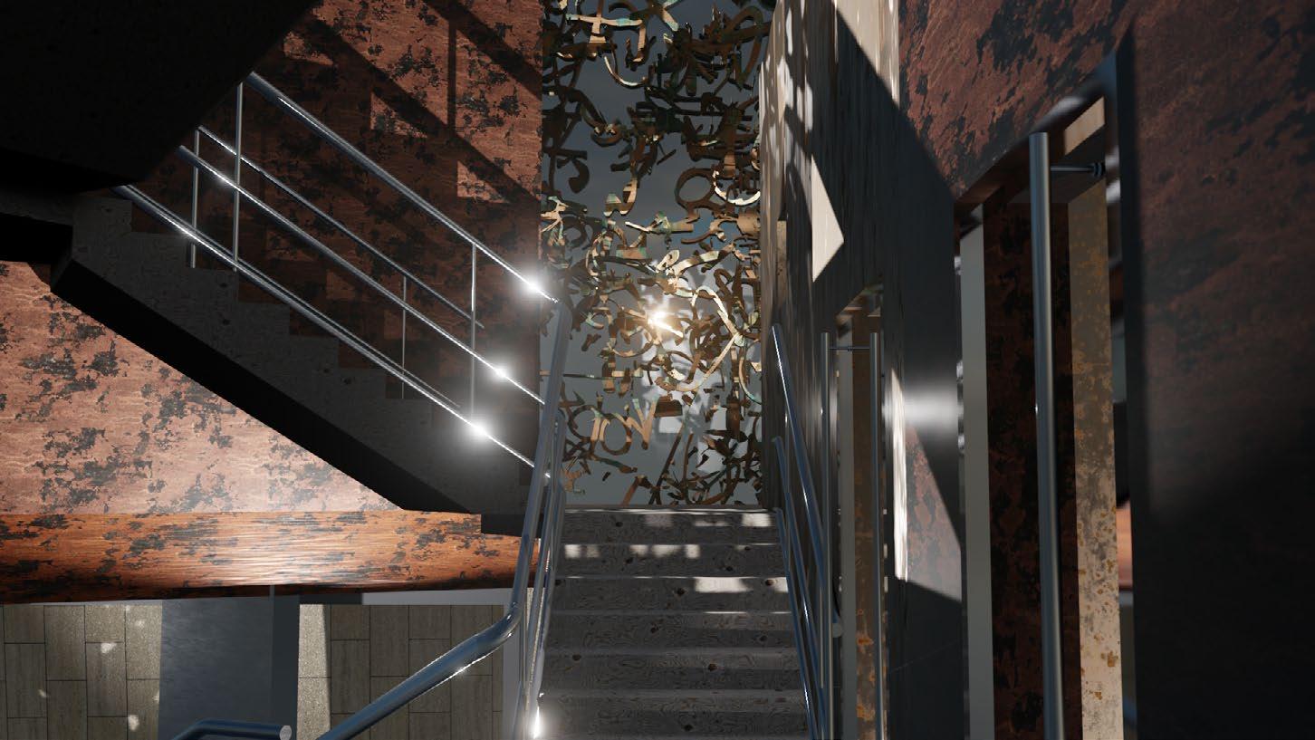
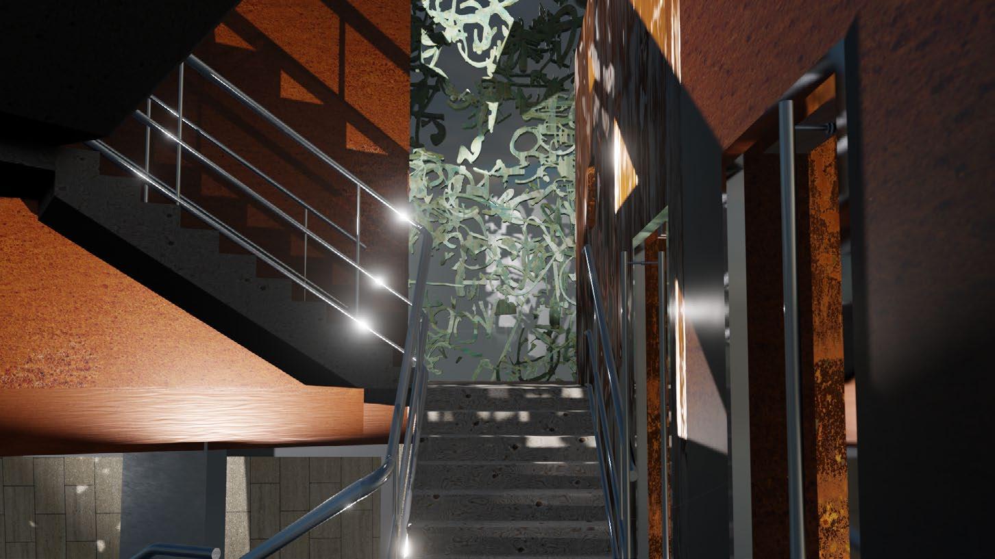
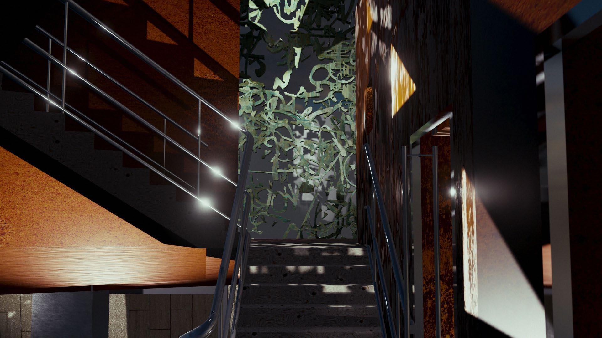
Interior renders illustrate the fragmented space, with the stairs being visible in most areas of the building. The uppermost floor is covered with glazing in order to take advantage of natural light. The different materials- wood, metal, and stone- mixed with levels of decay, create a patchwork of material qualities.


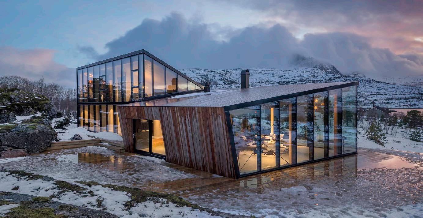
Stinessen Arkitektur’s Efjord building navigates both rusting metal and a harsh climate. Rather than have metal panels, the building has wood with iron particles, which patina. However, this allows the architects to control the level of desired patina. In this final iteration, the metal panels are differentiated, with some having more or less protective coating, allowing the building to slowly patina over decades.

5.5. Renders
The rightmost render illustrates the building at night, as a lantern, giving off soft, indirect light. The patchwork facade acts as a shading and filtering device, limiting the emission of light while also creating unique lighting patterns on nearby surfaces.

On the next page, a series of renders from the pavement illustrate the change in the building’s appearance over time. Starting on the left with the building at completion, and finishing with the building nearly fully decayed, it is the in-between- varying levels of decay in different materials- that creates the most visually interesting moments.


5.6. Animation 1
Scan the QR code to the left for a link to the animation. Or type the link: https://youtu.be/0ayyFYBKU7M
This animation illustrates the change in the building over time, showcasing the prominent steel wall on the right, which becomes a vibrant redishorange hue. In stark contrast, the stair, stainless steel railing, and elevator shaft retain their finish.


5.6.1. Animation 2
Scan the QR code to the left for a link to the animation. Or type the link: https://youtu.be/bjWEy60OWMg
This animation illustrates the change in the building over time, showcasing the copper screen and the “burned” steel sheets, which turns a dark shade. In stark contrast, the stair and stainless steel railing retain their finish.


 ^ Series of images showing the site, from large to small scale: London, Brixton, site plan, then site pictures.
Drawing of the site, in plan, then in elevation, with elements of decay highlighted, then categorized.


 Elevation with the decay on both front and back facade overlayed.
Mapping of elements of decay on a patchwork of photos recreating the rear facade of the site.


 Multi-scale model examining the site from a single perspective, while compressing distance.
This page from the sketchbook illustrates how the fovea, or the central 2% of the eye’s field of view, shows what people focus on. Dimensions for the model and scaling the view down were calculated.


 Steven Holl’s Storefront for Art and Architecture in New York used rotating panels in order to bring in light. To the right, that facade is reconstructed and placed on the site model. The lighting qualities produced by the model are used as inspiration for building iterations.


 Heatherwick Studio’s East Beach Cafe acts as a proof of concept: a cafe housed within a rusted shell. However, the corten steel is manufactured, rather than allowed to obtain such a shade.

