5 minute read
Spectrum! Fifty Shades of Green.
Written By: Trystanne Cunningham
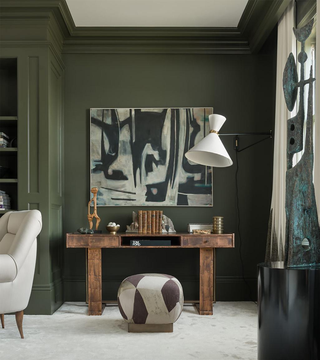
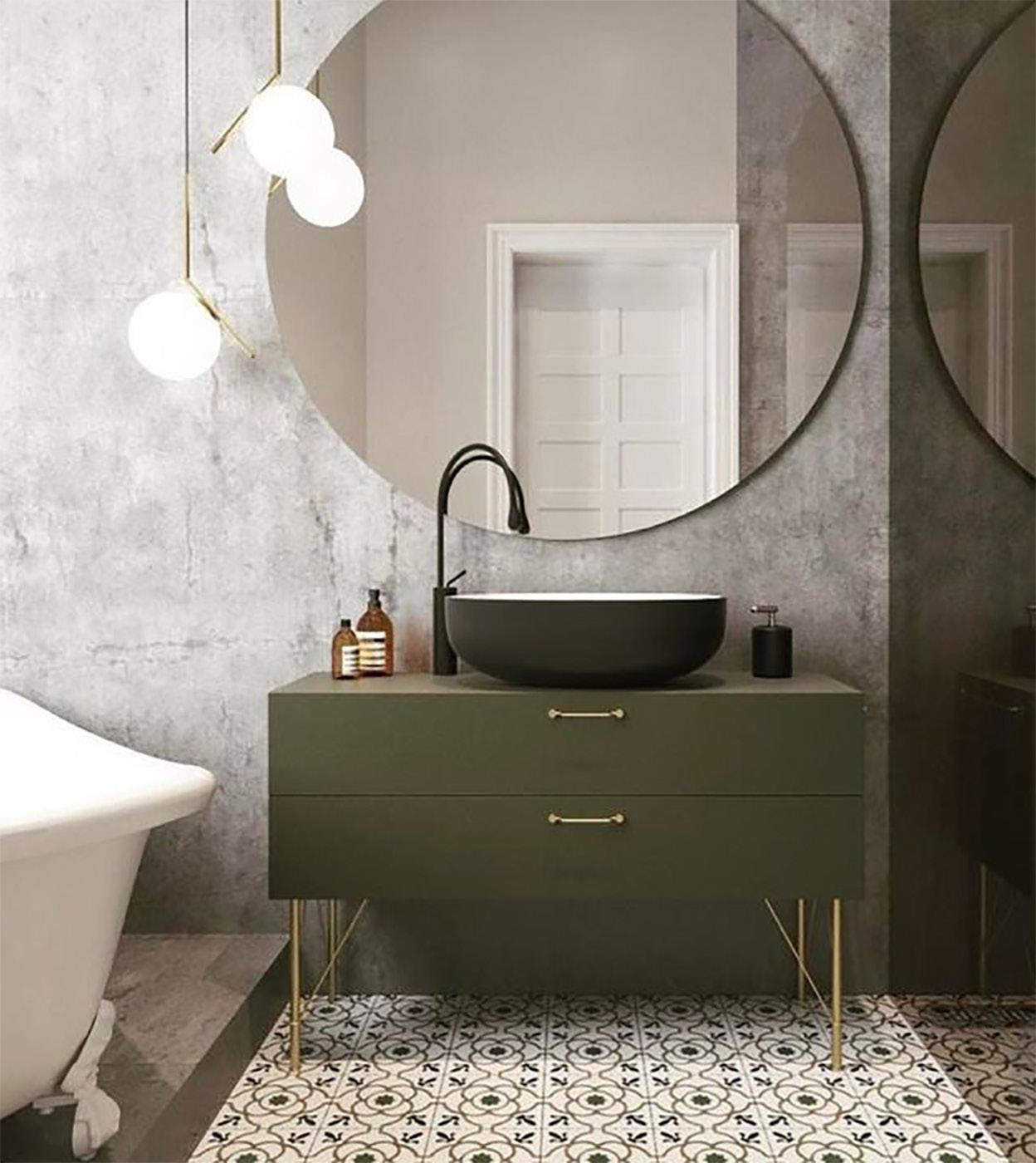
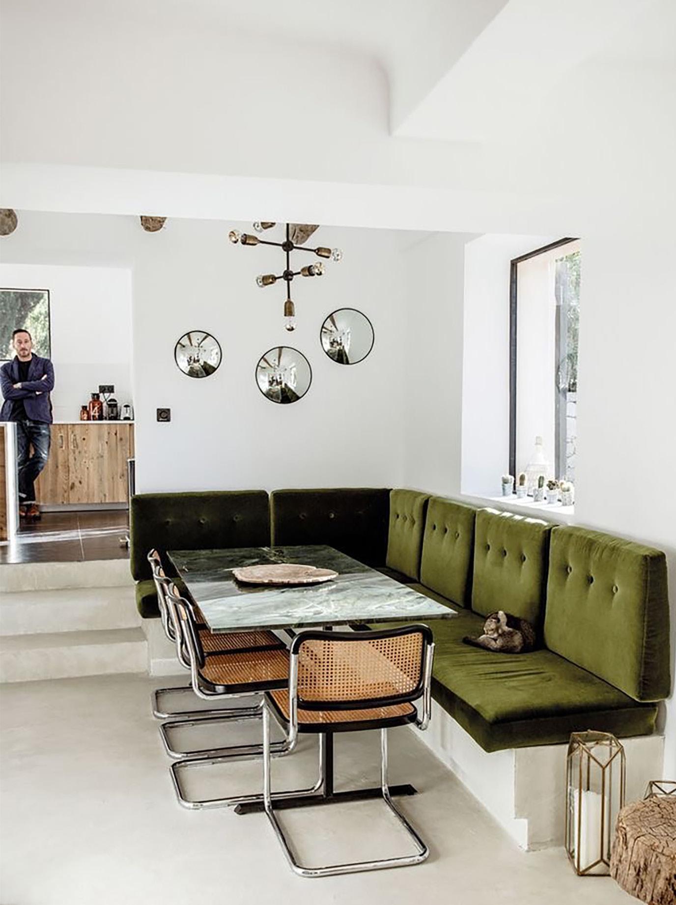
Ireland is know for its warm people and culture and also as the Emerald Isle. That is due to the many shades of green throughout the year from its lush fields. We've picked our favorite interior design inspirations that helped to guide spectrum for this issue. Fifty shades of green... rejuvenation, harmony and thoughts of nature come to mind when we see the color green. It can soothe and awaken. Greens can inspire with jewel tones suggesting luxury and comfort. And, as a design canvas for 2019, it invites compliments in yellows and blues at the edges of the green spectrum. Greens surround us in nature. In small or large use, it brings new life and forest freshness to relax your mood and perception. Its broad range of tones and hues offer interior designers and their clients so many options. Green works in most environments as an accent wall, sofa and chair, throw pillows and rugs, paintings and ceramics. Brighter greens become focal points while softer tones create comfort zones. Green colors are thought to increase appetite and vitality, so designers use it in kitchens and breakfast rooms, often combined with bright yellows and oranges. If you won’t commit to green tile or flooring, you might bring it indoors with dishware, wallpaper, or stripes and prints. Because it suggests nature’s tranquility and harmony, it works well in bed, bath, or sunrooms. Regardless of the type of space you're decorating, there's nothing more important than paying attention to details. Here, we share decorating pointers from our archives and tips from top designers to help you make sense of what good design really means. If you're open to mastering a few basic decorating principles and putting your creativity to the test, you're sure to enjoy a home that's both comfortable and stylish.
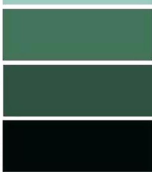
One of nine new paint colours from Farrow & Ball, this green — you are seeing it here first — is called Bancha. ‘Named after Japanese tea leaves, it provides a feeling of security,’ says the firm’s head of creative, Charlie Cosby. Estate Emulsion; farrow-ball.com

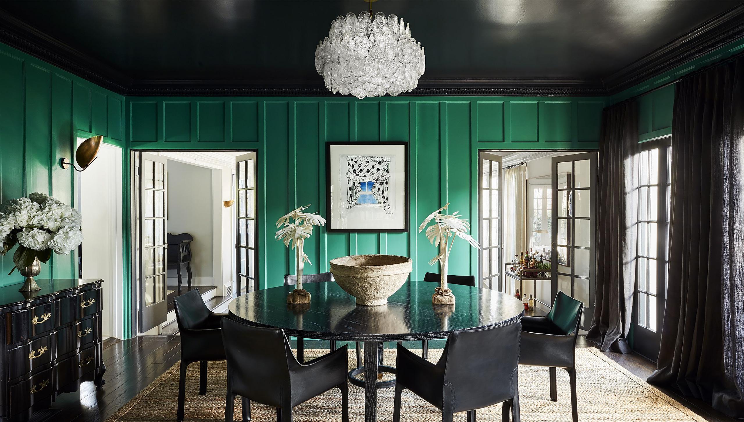
Looking at your home from a holistic perspective—seeing how each room works in balance against the others—can help craft a welcome variety in your spaces, like this emerald and charcoal dining room that adds a touch of formality to an otherwise contemporary Los Angeles home.

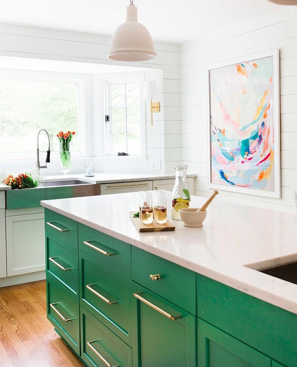
KELLY GREEN
Kelly green is an American term. The name derives from the fact that the surname Kelly, as well as the color green, are both popular in Ireland. The first recorded use of the term kelly green as a color name in English was in 1917.” – We love Kelly Green because of it’s bold preppy yet traditional look. Surprisingly, its elegant feel adds vibrancy to any room with it's crisp, and clean palette. It pairs beautifully with brass accents.


PINE GREEN

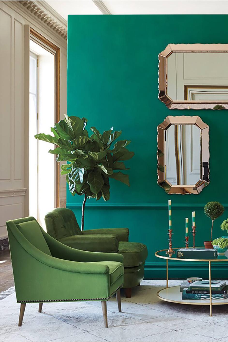

Pine green is a rich shade of spring green that resembles the color of pine trees. It is an official Crayola color (since 1903) that is this exact shade in the Crayola crayon, but in the markers, it is known as crocodile green. We love Pine Green because it’s got an earthy feel without being dull. It brings a fresh approach to any space and pairs beautifully with maroon or burgundy. Shades of green similar to Pine Green are Teal and Myrtle Green.
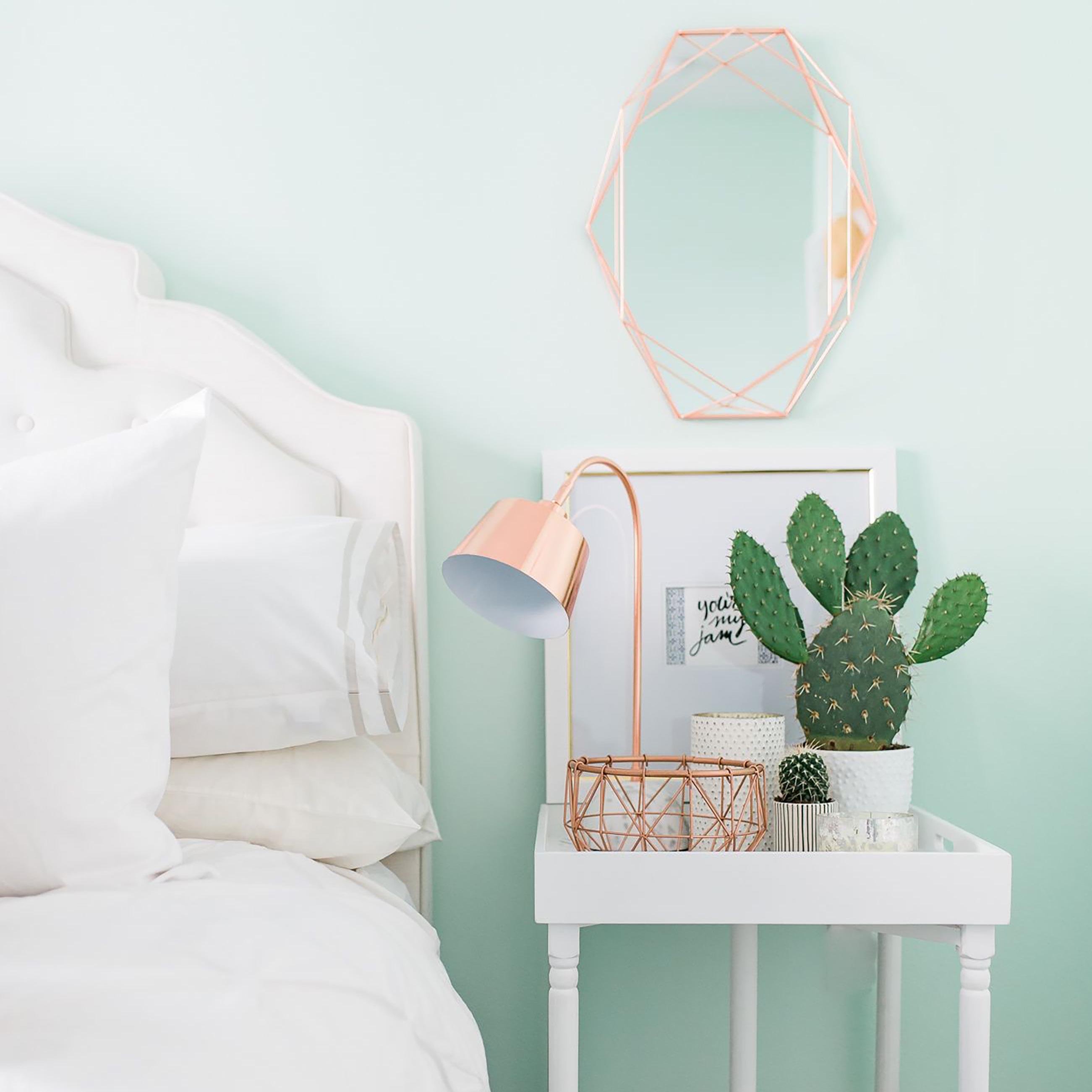
MINT GREEN
Mint green is a pale tint of green that resembles the color of mint green pigment, and was a popular color in the 1950s, and 1990s. We love Mint Green because it’s retro! You know a color was popular when large appliances were being made into it. That being said, we do love how it’s making a comeback, especially in the kitchen. Light shades of mint bring a sense of freshness into a space that can’t be described and it pairs nicely with lighter woods and of course, natural light.
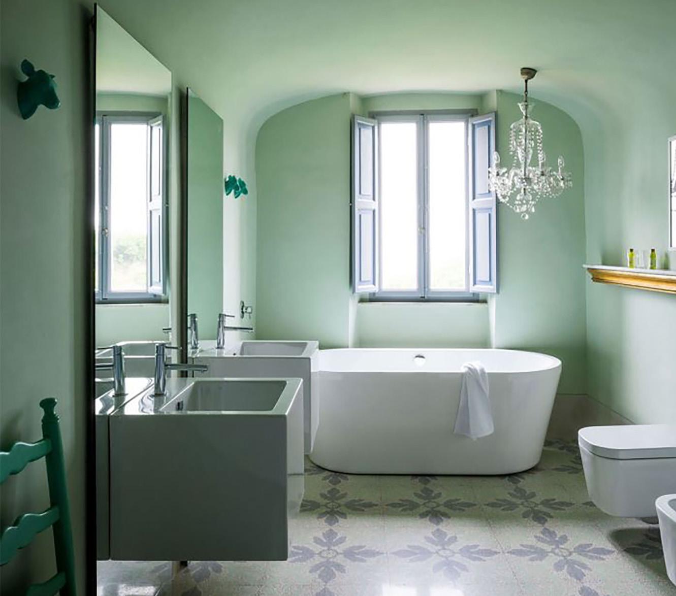


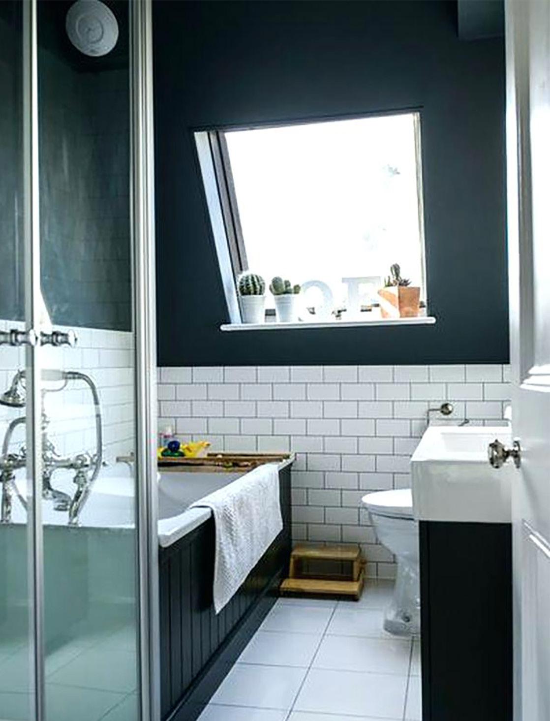
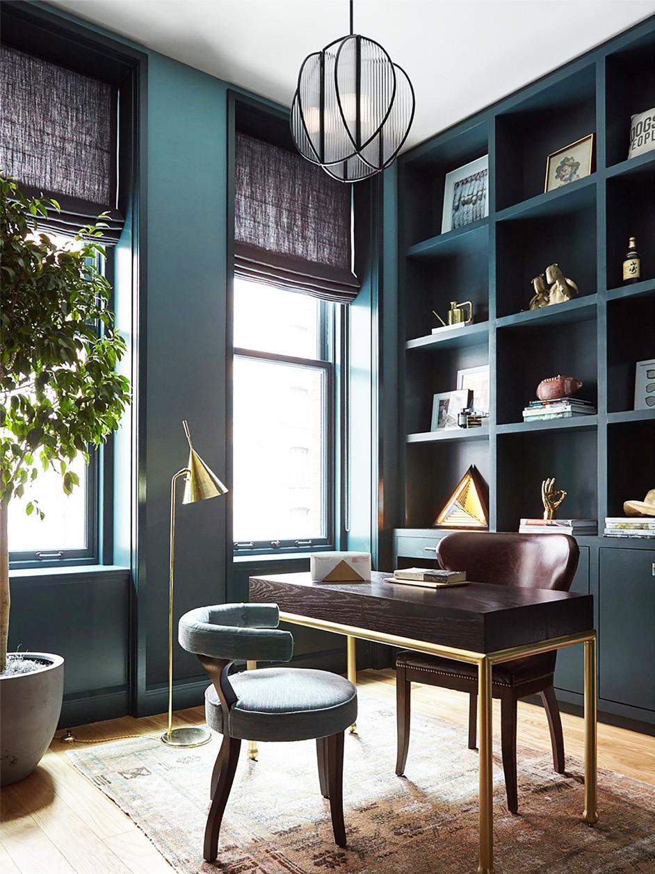
Sometimes called Eagles green, Midnight green is a dark shade of green. It is also a dark shade of cyan. This can be readily ascertained by noting the fact that this color’s red value is zero, and also that its green and blue values are almost equal. It’s the official primary color of the Philadelphia Eagles of the American National Football League. This is one of our favourite shades of green because it’s bold and sometimes so dark you can’t tell if it’s green or black. It’s a great contrasting color to reds and oranges and basically matches to black because of it’s dark pigment. We think it’s simply stunning.

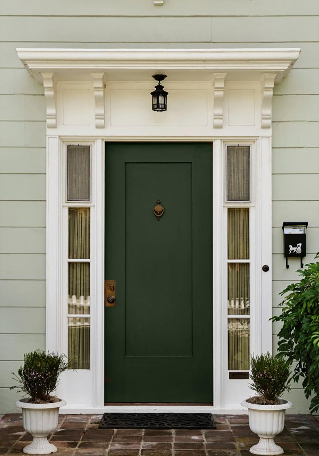
Midnight green
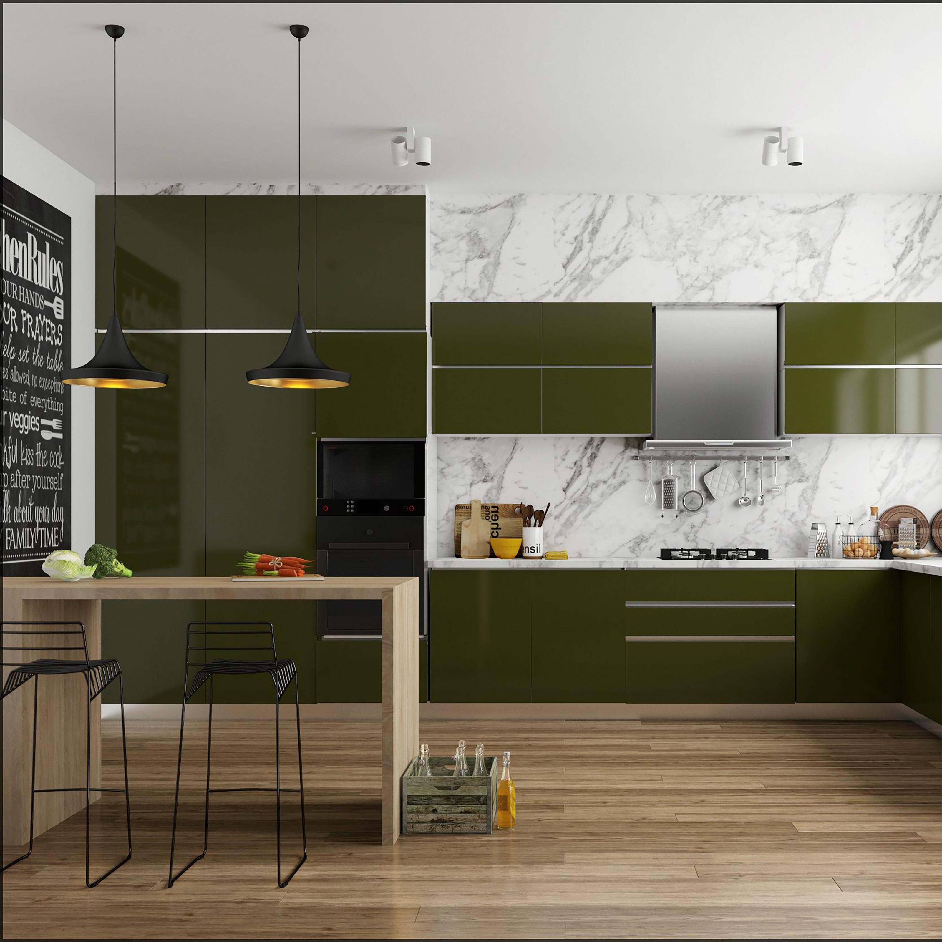
In actuality, Olive green is really a shade of dark yellow. Olive is a kind of muddy green color. When gray or black is added to yellow, the various shades of the color olive are produced. We love Olive Green for it’s warmth and sophistication. It reads old school but if used appropriately, can be quite modern and it pairs nicely with warm wood tones. Other shades close to it include Army Green and Reseda Green.
OLIVE GREEN
