BILL GRAHAM PRESENTS IN SAN FRANCISCO


Victor Moscoso FD-51 Postcard, 1967

In the 1960s, the Fillmore and Avalon Ballroom in San Francisco became famous for their live music shows that helped shape the era’s culture. These venues hosted many well-known bands and artists like Jefferson Airplane, the Grateful Dead and Janis Joplin. Promoters like Bill Graham at the Fillmore and Chet Helms at the Avalon brought together music lovers and performers, creating a vibrant scene that pushed the limits of rock music and art. The shows were known for their exciting performances, colorful light displays, and eye-catching poster design that became symbols of the psychedelic era. The designs’ bold, swirling typography made them both art pieces and visual puzzles—drawing in eyes and setting the tone for something truly unforgettable...
Wes Wilson BG-47 Postcard, 1967
Wes Wilson BG-50 Postcard, 1967
The psychedelic posters of the Fillmore and Avalon Ballroom featured swirling, distorted typefaces that captured the era’s countercultural energy. Artists like Wes Wilson, the father of the psychedelic poster, blurred the line between text and art. Wilson explained, “The letters went psychedelic themselves. They were not supposed to be easy to read but part of the entire scene,” highlighting how his designs were intentionally difficult to decipher. This approach contributed to the chaotic, mind-altering feel of the posters, reflecting the 1960s music and culture. The fluid, curved letters became an immersive experience, inviting viewers to engage with both the design and the music.
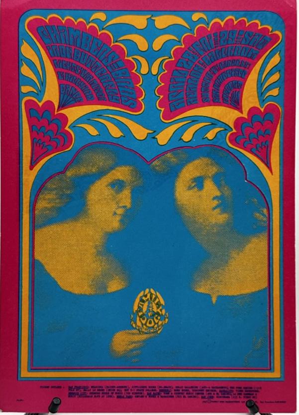
The psychedelic font style of the 1960s took a lot of inspiration from the decorative lines of Art Nouveau, especially the work of artists like Alphonse Mucha. Mucha’s flowing, organic lettering influenced designers like Wes Wilson, who added bold curves and intricate details to create fonts that felt alive and dynamic. This mix of Art Nouveau’s elegance and the psychedelic era’s energy shaped the unique, eye-catching typography of the time, which became a key part of the counterculture movement. It reflected the creativity, experimentation, and free-spirited mindset that defined the 1960s.
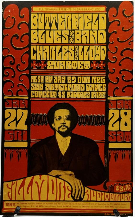
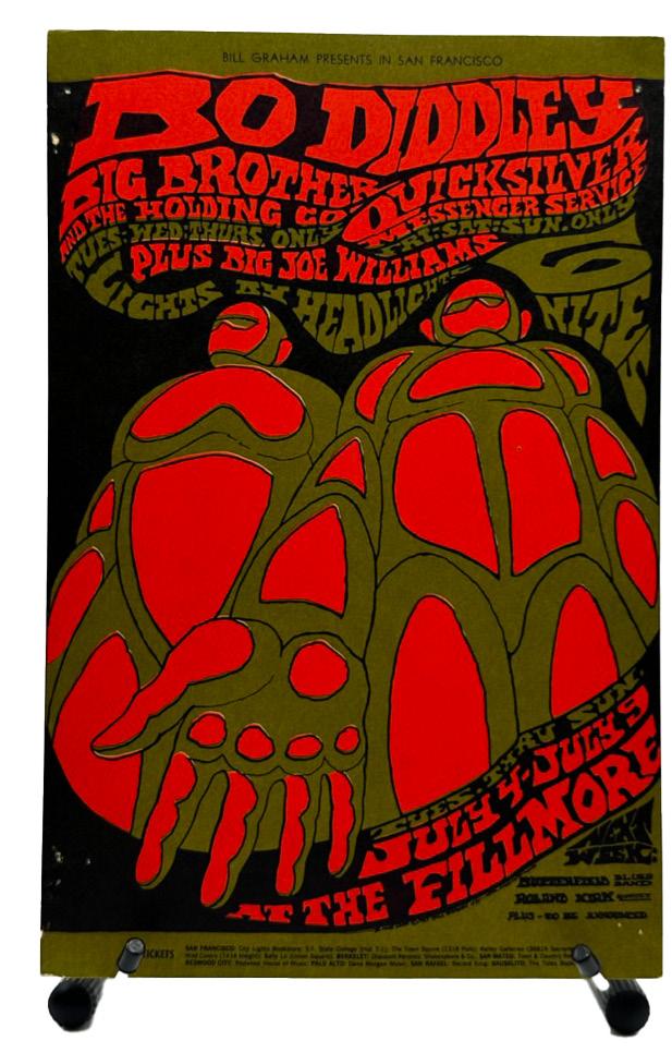
Wes Wilson BG-61 Postcard,
1967
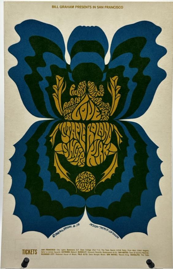
Patrick Lofthouse
BG-116 Postcard, 1968
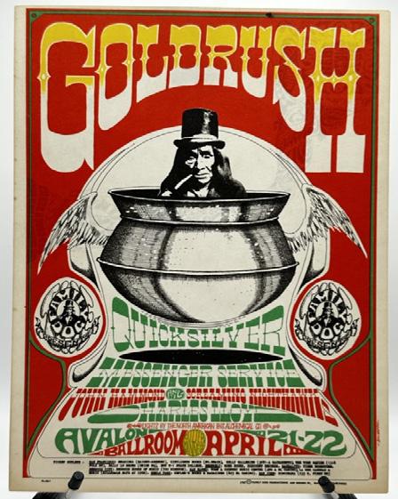
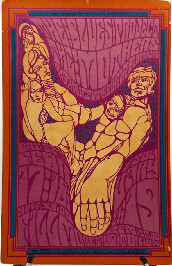
Rick Griffin FD-58 Postcard, 1967
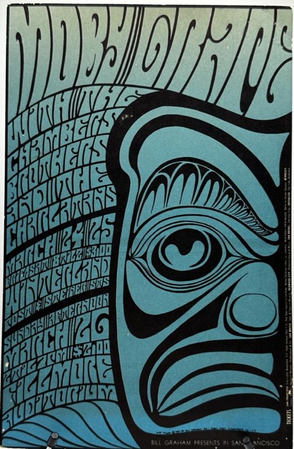
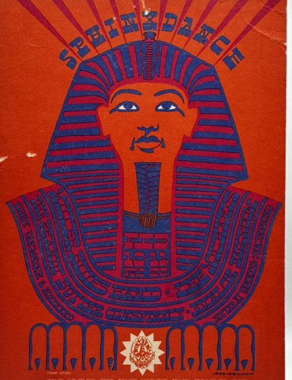
Victor Moscoso FD-47 Postcard, 1968
The use of bold, expressive fonts helped define the counterculture movement, becoming a visual language for a generation. It all began in San Francisco, and it’s impressive how these typefaces still capture the vibe of the 1960s. They’ve become lasting symbols of that era’s energy, creativity, and counterculture spirit, especially in places like Haight-Ashbury where their influence remains strong. If are in the area, keep an eye out!
Hi! I’m a Design major at the University of San Francisco. Growing up in Warrenton, Oregon, and now living in the Bay Area, my surroundings inspire my design work. I love how design can capture the energy of a moment and transport you to another place—a feeling I strive for in my art.
I’ve been designing since 2019 and enjoy working with Adobe Illustrator, Photoshop, and InDesign. When I’m not working, I’m playing guitar in my band or exploring San Francisco with my camera. I’m excited to keep growing as a designer and see where my creativity leads!