

Rayza Gaharza
Partakusuma 2023
Portfolio UI/UX Design

3
CURRICULUM VITAE
Rayza Gaharza Partakusuma
As a UX researcher with a passion for design , I bring a unique perspective to the tech industry. With a background in architecture and years of experience in visual and interaction design , I ve honed my skills in creating intuitive and engaging user experiences. My expertise in research methods , data analysis, and user testing allows me to identify user needs and pain points , and design solutions that meet those needs. I thrive on collaborating with cross-functional teams and using design thinking to solve complex problems.
EXPERIENCES
UX Researcher
AntiGrvty (PT Gravita Driatama Sentosa)
Jan 2023 - Present
Junior Architect
APTA Studio
Apr 2021 - Aug 2021
EDUCATION
Bachelor of Architecture
Parahyangan Catholic University
2018 - 2023
SKILLS
AWARDS
3rd Prize Winner
Architecture Competition
Emergency Evacuation Shelter
CAREDs Indonesia
Jan 2019
Atelier Cosmas Gozali
Feb 2021 - Apr 2021
Junior Architect
President
Himpunan Mahasiswa Program Studi Arsitektur (HMPSArs)
Jan 2020 - Jan 2021
User Experience Design
User Interface
User Experience
Art Direction
Visual Design
Digital Illustration
Storyboarding
Team Management
Project Plans
CERTIFICATES
UX Design Certificate
Google UX Design
Professional Certificate
1
1 CURRICULUM
VITAE
1 CONTENTS
2 MRT JAKARTA
PUBLIC TRANSPORTATION
UX Analysis UI Design App Redesign
4 LANGIT MUSIK
DIGITAL MUSIC PLATFORM
UX Analysis Usability Testing App Revamp
DIGITAL MENU APP
3 MAKA MENU
User Centred Design Product Design
5 FIND YOUR SPARK
PERSONALITY CARD
Conceptual Design Product Design
Improving Tickets
feature experience
 by Rayza Gaharza
Project case study
UX Analysis UI Design App Redesign
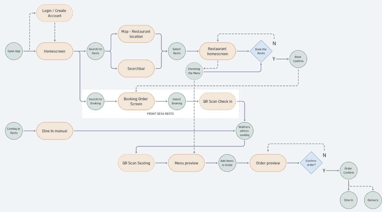
What is feature? Tickets

A feature where you purchase MRT tickets to ride one station to another within the app. The ticket is a digital QR that will be scanned for the user access. The ticket is scanned before and after the trip on the MRT gate.


From the user or travellers POV, the features is quite clanky and unfinished. The tickets is useful when traveller forgot to bring Flash or E-money. There is room for improvement and high potential use case if the product is delivered with better experience.
In this study case will be evaluating the user experience and conduct a research based on the MRT Tickets feature.
Current User Experience for Ticket feature in MRT Jakarta
Research Goals
To understand user behaviors when purchasing MRT tickets for the their ride
To understand the reason user are using the tickets feature
To understand user needs & obstacles when they are using MRT tickets
Research Methods


Identify user flow and experience within the app
Observing their expectation
Observing their obstacle and frustration
Interviewing users pain points and obstacle
Interviewing users of their goals and interests
Respondents Tools
Analyzing user flow and interaction
Identifying user problems and potential improvement
Sorting priority problems and improvement


Usability Testing User Interviews Card Sorting
GF, 20 yo
College student SA, 27 yo
Digital marketing GP, 46 yo
Softball coach AK, 23 yo
College student
Figma
Zoom Google Sheets Google Form
Interest
Planning / organize the schedule
Research information gathering
Travel on time
Budak Korporat

User type 1
Bambang Sugiyanto
32 Years Old, Accountant
Goals
Travel on time, based on schedule
Reminder on the ticket trip arrival
Easy access to scan and access the gate
Description
Bambang is a hard worker in one of the big 4 company of accounting. He work 9am to 5pm on weekdays. Living with a small family he works in Sudirman area, which MRT provides access to. He rarely came late to work and spent most of his spare time with family.
Needs & Expectations
Easy to check schedule and directly purchase the ticket for the ride
Check transportation routes and arrival-departure schedule
Easy access to check/ edit the booked ticket
Pain Points
Doesnt know the exact time of train arrival and departure
Failure on QR scan at the gate
User Flow ACTION TASK LIST Schedule the Trip Arrive in the Station Tap in Waiting on the Platform Travel within the MRT Tap out Checking the schedule Pre purchase the ticket Checking the ticket Checking the train arrival Tapping in the ticket Play favorite music / podcast Checking current work etc. Tapping out the ticket Rush to directly to work QR scan failure Confused interface of the schedule Doesnt know the exact time arrive in the destination The ticket doesnt refresh to tapout HMW help user to pre purchase the ticket from schedule HMW help user to prioritize train arrival and tickets HMW help user to understand total time travel HMW help user to identify checkout ticket HMW help user to show ticket easily FRUSTRATI ONS IMPROVEMENTS
OPPORTUNITY
Mau CFDan
User type 2
Rosa Rami
27 Years Old, High school Teacher
Interest
Research information gathering

Travel easy and unbusy
Travel with friends and family (multiple purchase)
Goals
Reminder on the ticket trip arrival
Easy access to purchase multiple tickets and share to friends
Description
Rosa is a mother of 2 children, her family always spent CFD together at Sunday morning. Doing a cardio while having a good social interaction. MRT is one of the convenient public transportation she uses. She wanted to easily travel with her relatives.
Needs & Expectations
Easy to purchase multiple tickets and share to friends
Understand the time of busy MRT rides to get better experience
Pain Points
Confusing and boring UI
Needing to scan friends ticket via my personal phone
User
Flow ACTION TASK LIST Arrive in the Station Tap in Waiting on the Platform Travel within the MRT Tap out Checking friends location Purchase multiple ticket Tapping in the ticket Tapping in friends ticket Play favorite music / podcast Talk and hangout with friends Waiting to arrive in the destinat ion Tapping out the ticket Tapping out friends ticket Needing to share my phone to scan Confused interface of the schedule Doesnt know the exact time arrive in the destination The ticket doesnt refresh to tapout Needing to share my phone to scan HMW help user to easily purchase multiple ticket and share the ticket HMW help user to understand total time travel HMW help user to understand etiquette in MRT HMW help user to identify checkout ticket FRUSTRATI ONS IMPROVEMENTS
OPPORTUNITY
Anak Tongkrongan
User type 3
James Riyadi
19 Years Old, Business college student
Interest
Travel easy and unbusy
Travel on time
Goals
Reminder on the ticket trip arrival
Easy access to scan and access the gate
Description
James usually meet and spent his time in SCBD, he love to chill and casually meeting his friends in that area. The place itself is great for him, not to fancy nor shady. He rarely uses MRT, most of the time he rides his 90s BMW.

Needs & Expectations
Understand the time of busy MRT rides to get better experience
Check transportation routes and arrival-departure schedule
Pain Points
Confusing and boring
UI
Flow ACTION TASK LIST Arrive in the Station Tap in Waiting on the Platform Travel within the MRT Tap out Purchase the ticket Checking the train arrival Tapping in the ticket Play favorite music / podcast Checking current work etc. Tapping out the ticket QR scan failure Doesnt know the exact time arrive in the destination The ticket doesnt refresh to tapout HMW help user to understand total time travel HMW help user to identify checkout ticket HMW help user to show ticket easily FRUSTRATI ONS IMPROVEMENTS
OPPORTUNITY
User
Research Summary
User Journey
The user flow is quite straight to point. Some of the features are not needed and too many third party that is implied. The ticket feature is useable yet lacks failure on QR scan and confused user flow.
Lacks of Information
The information that are needed are inform in separate pages. Implementing on compact information will improve user understanding of the MRT and ticket feature.
Underwhelm Visual
The visual of MRT app does not represent visual identity of MRT Jakarta. Some of the visual are hard to identify and there is a lot of ads in the app, which confuse the user.
User Flow
pre

user to identify checkout
HMW
HMW help MAU CFD AN ANAK TONGKRONGAN
ACTION BUDAK KORPORAT Schedule the Trip Arrive in the Station Tap in Waiting on the Platform Travel within the MRT Tap out
ticket
etiquette in MRT
HMW help user to
purchase the ticket from schedule HMW help user to prioritize train arrival and tickets HMW help user to show ticket easily HMW help user to understand total time travel HMW help user to identify checkout
HMW help user to understand total time travel HMW help user to understand
ticket
help user to understand total time travel
user to identify checkout ticket
HMW help user to easily purchase multiple ticket and share the ticket help user to show ticket easily
HMW help
HMW
to be Developed
Selected Opportunity
HMW help user to prioritize train arrival and tickets
HMW help user to identify checkout ticket HMW help user to understand total time travel
HMW help user to prioritize train arrival and tickets
What is the problem?
Separated!
Ticket Highlight
Visual Hierarchy
The information of train arrival and ticket is shown in different page section.
User have difficulty in identifying train arrival and tickets in the MRT app. While user are tend to check the app for train arrival and their tickets.
Why is this a priority?
Based on user testing, user goal upon opening the app is to check the ticket to scan on to enter the station. While opening the ticket take a couple steps and can be simplified.

The failure of this problem will make:
(1) The queue in MRT longer while user open the app
Visual Hierarchy
Using the visual as call to action, user will prioritize their attention towards different visual identification. The ticket feature is one of the most used function in the app, so it is good to prioritize in the homepage.
Current visual hierarchy lacks of information that imply in the homepage. Prioritizing ads and additional features from third party app.
To improve the effectivity of the homepage is to prioritize the primary feature and design the secondary feature that support the main function.
PROBLEM
(2) User frustrated while using the app SOLVING IMPROVEMENTS


SOLVING Ticket Highlight User Flow Prototype
Design Information Architect To test the design prototype
- Copy the link to your browser shorturl.at/esBIU
UI
HMW help user to understand total time travel
What is the problem?
they do not have the information of knowing when will they arrive at their destination.
As user travel within the MRT There is an error where the information that is applied only the arrival of the train in the station.
Why is this a priority?
From the user testing that has conducted, user will benefits from arriving on time while they plan or travel. While they travel with the MRT they will know when and what station are they currently at.
Only Departure Time
Travel Timeline
Informative Graphic
Travel timeline will give user the current state of location (station) and time of arrival. The travel timeline will give user a better experience knowing when they will arrive comparing with other public transportation.

Intuitive and Fun
The failure of this problem will make:
(1) The user arrive late or not knowing when they will arrive.
(2) The user uses third party to search for the information.
With the travel timeline, we can apply identity of the MRT train traveling or accelerating in the timeline bar.
This feature will make user to came back and uses the app while traveling with the MRT. Which in the last version has not been implemented.
PROBLEM
SOLVING IMPROVEMENTS


SOLVING Ticket Highlight User Flow
Design
Architect To test the design prototype
- Copy the link to your browser shorturl.at/esBIU
Prototype UI
Information
Visual Indicator
Color Differentiate
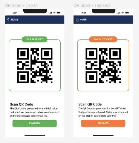
HMW help user to identify checkout ticket
What is the problem?
The current version of the app has , which is implemented with QR scan. The only difference they made is only in green small bar, which is hard to acknowledge.

Why is this a priority?
lack visual clarity of the checkout ticket
This lack of visual will make user confused and having difficulties while using the app or in travel. With this confusion will make the user to ignore the app and travel with flazz or e money instead.
The failure of this problem will make:
(1) User confused and difficult while using the app
(2) Unable to pass the MRT gate
(3) User to ignore the app and use different payment method
Better User Flow
The help of color differentiate or other visual indicator can help user acknowledge the difference of tap in and tap out. The initial color of the QR will still be black and white for the QR to scanned easily.
The user understanding where they got to one point on app is important. The current version of the app does not give a good user flow of the tapout QR scan. Making the user confused and frustrated.
The indicator of the ticket will be shown clearly if the user has already tap in and ride the train, and introduce new visual for tap out and arrive in the destination.

PROBLEM
SOLVING IMPROVEMENTS
The only
difference


SOLVING Ticket Highlight User Flow Prototype
Design Information Architect To test the design prototype
- Copy the link to your browser shorturl.at/esBIU
UI
UX Design Course
Maka Menu
Digital Menu and Ordering App
User Centered Design Product Design

Project case study
by Rayza Gaharza
Personas


Project Overview
Maka Menu


Maka Menu is a digital menu and ordering app, that provides intuitive booking, ordering system for local restaurant. Maka Menu features an easy to use interface that is easy to understand and engaging for the user. Maka Menu focused on alternating the function of paper menu to digital menu.

Paper Menu Problems
Slow & hard to update
It is not possible to instantaneously update paper menus with your most recent offerings or unavailable products.
Worn or dirty paper
The restaurant is unable to entirely prevent water or oil stains from appearing on the paper menu.
Project Goal
Improving engagement rate of the product will gain higher chance of product purchases.
Cost and Time consuming
Average restaurant reprints the menu 3 times a year which leads to high printing costs.
Wireframe


Understanding the User User Research Personas User Journey Map Problem Statements 1 Starting the Design Paper Wireframe Digital Wireframe Low-Fidelity Prototype Usability Studies 2 Understanding the User High-Fidelity Prototype Mockups 3 User Testing Lofi Prototype Hifi Prototype
Design Phase
User Persona
Boedi Widodo
45 Years Old, City Council
Berkeley, US
Goals
Boedi is an immigrant from Indonesia to United States. He pursued his political journey with passion without any connection. He loves to go to high end restaurants to hangout, have a brunch or breakfast with his family or coworkers. The tendency of going to high end restaurants is the waiting lists and reservations. He is rarely able to find seats for groups of people.
Hangout with family or coworkers in high end restaurant
Frustrations
A long waiting list in the restaurant
Rarely able to find seats for group of people
Hard time to talk in English (language barrier)
User Journey Map

1 - Understanding the User
User Journey Map
Syarief Jamal
27 Years Old, Fintech start-up
Abu Dhabi, UAE
Goals
Syarief is a young entrepreneur from Abu Dhabi. He spent most of his time at his office and barely find spare time in his working hours. The way he sees high end restaurant is a space for him to relax, good meal, and services. Most of the time he get frustrated if the ordering system took a while.
Frustrations
To be able to eat a good meal with a quick and enjoyable experience
Takeaway for his favorite dinner in home
Pending and a long time waiting for the order to come
Unavailable delivery or takeout foods

+ 1 - Understanding the User
User Journey Map

Tamar Saddak
21 Years Old, Intern in FnB company
Seoul, South Korea
Goals
Tamar is a young girl who loves to spend time with friends and family. She is a wonder kid and an activist. She found that dining in restaurant shares a diligent atmosphere that she loves. She rarely went to high end restaurant, only occasional times - once a year. She struggle to find the fitted restaurant and food menu for her vegan food.
Frustrations
To eat a good healthy vegan meal in high end restaurant
Takeaway for his favorite dinner in home
Overbudget food prices
Struggle to found the vegan menu
User Persona 1 - Understanding the User
Accessible
A smooth and easy to use app for broad range of user
Research Summary
Connectivity
To push an intuitive branding identity on every restaurant
Easy to Understand
Information system that easy to understand for the user
+ 1 - Understanding the User
Quick and easily order food
In this scenario user stumble upon problems such as queuing and waiting. With the help of the Maka app the user easily check in and order the food easily.
Writing storyboard help visualize user activity and empathize on user pain points.

Storyboard - Close up
Preview and order food directly to table
The draft design of the UI within the Maka app. User arrived, scanned the QR, and ordering food.
This storyboard are a draft wireframe on how the user interact and use each page to fit their needs and expectations.

+ 2 - Starting the Design
Storyboard - Bigger picture
User Flow
Simplifying front desk and waiters job
Th pp int nd d to compil th front d k nd w it r job, in which:
W lcoming u
A igning t bl
D liv ring m nu
Compiling ord r
D liv ring ord r
Coll cting p m nt
Information Architecture

Menu as highest priority
Und r t nding u r cc th M k pp wh n th h v lr d rriv d in th r t ur nt, M k pp m inl focu d on improving th xp ri nc on dining in th r t ur nt.
+ 2 - Starting the Design
First wireframe and testing
As the wireframe are designed, user have a general knowledge on the visual and function of the app.

Usability Testing (UT) are intended to learn from the user point of view on experiencing the application, whether if the user understand the goal and task of the App
Usability Testing
RG, 22 years old
Graphic Designer
Research Findings
Round 1
Findings
Users need differentiate booking and ordering CTA
User want a quick booking system
User want more details on the restaurant search page
Round 2 Findings
LF, 23 years old
Digital Marketing
RK, 44 years old
College Lecturer
User want to identify the brand identity within the menu
User want to differentiate booking page layout with the homepage
+ 2 - Starting the Design Wireframe
Design Iterations

Homescreen

Home screen update develop for more interactive design interface. The design are modern and simplified, pushing user to explorer the feature straight to their needs.
Search Page

Search page design more subtle, developing user interaction towards the restaurant page rather than categorizes.

Menu Page
The menu is design to give more engagement of the product towards the user, developing the product stories aiming for additional purchases from the users.


+ 2 - Starting the Design Lofi Prototype
*After usability study
*After usability study

Prototype 3 - Understanding the User
Hifi Prototype
Accessibility Consideration
Design Interface
Designing a simple and straightforward interface for the user, minimizing their choices and promote essential features for the users
Additional Payment System
An additional payment within the application to integrate user flow within the app
Additional Features
Provides two features for
1. Booking - manage a waiting list in the restaurant
2. Dine In - to deliver a smooth and intuitive ordering
+ 3 - Understanding the User
Insights and Strategies from Music player UX Research

UX Analysis Usability Testing App Revamp
Project case study

 by Rayza Gaharza


PROJECT OVERVIEW
Langit Musik
BACKGROUND
Langit Musik is a music streaming application owned by the Telkom group that offers a new way to stream songs and podcasts legally and without limits via PCs, mobile phones or IndiHome TV. Langit Musik app features stream songs and podcasts for free from the service's library of more than 11,000,000 songs.
RESEARCH GOALS
Understand LM and Non LM users end to end journey for music exploration
Discover a comfortable experience for in app ads that would not cause users to bounce from the app
Provide key solutions for users searching, listening, interacting, and sharing experiences for revamp sky music
Explore user journey when user is purchasing premium account
DELIVERABLES
Service: UX Research and UX
Desig
Platform: iOS and Androi
App: Langit Musik App
TIMELINE
Jan to Feb 2023
Research Phases
Create Research Plan
Create Interview Questions
Listening to songs, interactions and share Discuss with tech team
Synthesize Research Result
Find Respondents Music Player
Comment and Karaoke
Feature
Music
Wireframing
Create UI Design
Analyze Submission
Share
Planning Execute Research
Research Plan
RESEARCH QUESTIONS
Usecase 1 - Listening to Music
Describe your activities and conditions (scenario) when you wanted to listen to songs?
Is there a difference in the choice of music in other conditions or scenarios?
What information helps you to choose music?
After you listen to the first song you selected, does the next song play by itself or do you have to put your own song on?
On a scale of 1-5, how often does the next song match your song preference?
In your opinion, what could be improved?
Usecase 2 - Interaction during Listening to Music
Based on your experience - regarding music content, what usually motivates you to watch/listen to live stream content?
If you see a live session in a streaming music application like Spotify (which is the most used), in your opinion, what kind of content or interaction will be available in it?
Do you like karaoke? Have you ever used the karaoke feature in a music application?
When is this feature used? and the form of scenarios that occur in karaoke conditions?
If you look at the karaoke feature in a music application like Spotify, what do you imagine the form and activity in karaoke would be like?
Usecase 3 - Sharing Music
What do you do if you find a song you like?
If you like to share, what do you usually share? Explain your reasons!
Please direct how do you share the song !
After you arrived at the page, why did you wanted to share via social media?
If you saw a song posted on a social media story that your friend heard, what made you interested in listening to the music being shared?
In terms of information, what information do you think can be included when sharing information about music?
DENTS Ananda
23 Years Old
Architect Naufal
22 Years Old
College Student Raihan
23 Years Old
Music Antusiast Ariqo
23 Years Old
Model Raihana
21 Years Old
College Student
RESPON
Music Player
HYPOTHESIS
Users are categorized by two sections when listening to music: Focused state - Listening to music; and Non Focused State - Multitask with music for background
Users would rely on random songs when they click next or after the playlist is finished

USABILITY TESTING RESULT
Problem 1: Users felt frustrated when the auto play on music app misplayed the song and ruin their listening experience.
Focused Stat
User would search songs directly from the search page and would que the next upcoming songs
Non Focused Stat
User would identify a certain playlist based on artist then would fine which playlist that suits with them
Problem 2: Users listening behavior did not introduce new songs or genres. Continual of repeated songs bore users time by time
PROBLEMS SOLUTIONS
Problem 1: Users felt frustrated when the auto play on music app misplayed the song and ruin their listening experience.
Ease Exploration, provide user to select songs manually based on their mood while listening to music
Provide Control on Queue list, provide clarity for user to identify song based on the queue list and giving control (Arrange and remove
Problem 2: Users listening behavior did not introduce new song or genre. Continual of repeated songs bore users time by time
Related Page, provide ease accessibility for users to access recommended song, playlist, artist, and album.
Daily Mix Playlist, provide fresh new playlist for user to explore and discover new songs

Result
Usability
Comment and Karaoke Feature

HYPOTHESIS
Not all types of users want to do karaoke. There are two types of systems: Karaoke - Karaoke solo and sing; and Singalong - Take part with singer
Users are not familiar with commenting on music platforms. Their motivation on interacting in comments is the content and influencer
USABILITY TESTING RESULT
Problem 1: Music content are not appealing for user to comment on.
Problem 2: Carpool karaoke are popular and enjoyable among Gen Z. User listen to songs while they are on the road and experience carpool karaoke.
Karaok
15% of the user preferred Karaoke on mobile. The feature is amazing and fun yet there is not a lot of popularity of the feature.
Sin alon
85% of the user preferred Singalong on mobile. The user have not experienced and found comfort on singalong rather than karaoke experience with minus one (without singer)
PROBLEMS SOLUTIONS
Problem 1: Music content is not appealing for users to comment on.
Problem 2: Carpool karaoke is popular and enjoyable among Gen Z. Users listen to songs while they are on the road and experience carpool karaoke.
Interaction within Comment, users are able to reply and gift within the comment section
Gamify Karaoke, providing exciting and fun for the user experiencing the Karaoke feature

Usability Result
Share Music


HYPOTHESIS
Most users seek music sharing to be personalized, that is why their method of sharing will be towards Instagram stories.
Users would customize the design on their stories and insert captions that reflect their feelings towards the songs.

USABILITY TESTING RESULT
Problem 1: Sharing need a high customizability and flexibility. When it comes to sharing user will customize the form of information and visual, fitting their personality and purpose when they share.
Problem 2: Good design is relative. All of the user that are tested has different preference on the template design for the user to share.
PROBLEMS SOLUTIONS
Problem 1: Sharing need a high customizability and flexibility. When it comes to sharing, users will customize the form of information and visuals, fitting their personality and purpose when they share.
Problem 2: Good design is relative. All of the users that were tested have different preferences on the template design for the user to share.
Share videos, music, album covers, or links. Users have multiple options on how they share their selected music
Visual posters, Album covers, GIFs and stickers, Users have multiple options on how they share their selected music
Usability Result
Wireframe

Find Your Spark
Personality Card

Conceptual Design Product Design
Project case study
 by Rayza Gaharza

PROJECT 04
Project Overview
Find Your Spark
The goal of this project is to create a unique and engaging user experience centered around a personality card game. With this interactive game, users will have the opportunity to discover their inner spark through a fun and interactive experience.
Through the Find Your Spark game, users will be able to reveal one of their unique sparks, providing them with a deeper understanding of themselves and their passions. Our hope is that this project will inspire users to pursue their dreams and unlock their full potential.
Design Phases
Brainstorm
Generating and sharing ideas in a group setting. In the collaborative space between designers.
Story Concept
Creating an engaging and intuitive user journey through thoughtful design and testing.
Design Prototype
Visual representation of the final product that simulates user interaction.
Development
Bringing the final design to life through coding and implementation.
*on other division side
Brainstorm


Generating and sharing ideas in a group setting. In the collaborative space between designers.
Design Collaborative
Working together with other designers or stakeholders to create the best possible user experience and interaction for a product or service.

Bringing together diverse perspectives and skill sets, design collaboration can help ensure that the final product is functional, aesthetically pleasing, and userfriendly.
Base Story
Once upon a time, in a world not too different from our own, every person was born with a spark within them. This spark was a representation of their individuality, creativity, and spirit. It was said that the brighter the spark, the more vibrant and fulfilling a person's life would be.

However, as people went about their daily lives, they soon discovered that navigating the world around them could dull their spark. The stress and pressure of work, relationships, and societal expectations weighed heavy on their minds, causing their spark to flicker and fade.


For some, the loss of their spark was a slow and gradual process. They found themselves feeling less passionate about the things they once loved, struggling to find motivation and inspiration in their daily lives.
But, some people find out they could not to let their spark die out. They made an effort to slow down, connect with their passions and desires, and


Seek out the things that reignited their spark.
And in doing so, they discovered that their spark was not lost forever. Instead, it was simply waiting to be rekindled, waiting for them to give it the attention and care it needed to shine bright once more. o they continued on their journey, seeking to nurture their spark and live a life filled with purpose, passion, and joy. And in doing so, they proved that no matter how dull the world may become, the spark within us will always burn bright if we choose to keep it alive.
torylin Introductio Proble Clima olving
Comic Strip
of the Charachters
the Story Main Concept Reignite Your Spark
tory of Daily Life Concept Interactive Visual Stor y
Personality Card F
L
O
W
Gathering References
Example
Draft of
Character Design Stor y Concept
The Ignitor
C
reating an engaging and intuitive user journey through thoughtful design and testing.
Leaders and initiatives
Eager to start and gathering people to share their goal
The Marie Kondo
Organized, utilitarian, committed, and practical
Happy to clean and make things tidy
The Saintlike Passionate, social and charismatic
Bubble, generous, and reliable
Friendly, kind to people - new and closest ones
The Sparkkeeper
Steadfast, dependable, and resilient
Happy to be within the group of friends
The Phoenix
Kind and quite
Happy with me time, the person tends to be calm
Creative, adventurous, and independent
Creative seek for adventures
Creative, adventurous, and independent
Mediator, always putting themselves in the middle of the conflict.
Always active on creating and doing something
Feedback WANTED
Main Concept
CTA to Start the Stor y
Joni wakes up, full of Sparks, excited to work T
parks slowly fade away
Interactions Meet homeless, Pick one - Jamming in the music or just give money?
Arrived home, Pick one - Play games or reading books? Choose one option Choose one option Choose one option
Result Scene Reveal Personality Type
The Trailblazer
The Peacemaker
The Maverick
Stor
y Scene
raffic j
S
ams & deadline
Car broke down Joni has to go home another way between Stories On the way home, Pick one - Take MRT or walk?
Wireframes

1
Visual representation of the final product that simulates user interaction.


Development


Bringing the final design to life through coding and implementation.


*on other division side


PROJECT 04
rayzagp@gmail.com
instagram.com/ordinary.png
behance.net/rayzagp
linkedin.com/rayzagaharza

2023
Portfolio UI/UX Design
