2 minute read
SPECTRUM


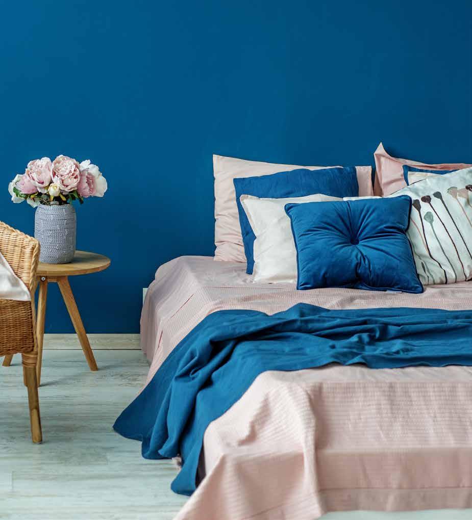
Feeling Blue
Blue is a versatile color in tone and style, from adding it here and there throughout a room to making it the main color of a design.
Advertisement
The many uses of blue are akin to the characteristics of our surrounding oceans. Blue can represent tranquility like a calm sea, or vigor like roaring tides. Brighter and lighter blues appear more frequently along surfaces, while deeper blues are more prevalent in quieter spaces. Understanding the different tones that blue can convey makes it ultimately more helpful to add the color into a home’s design.
Eric Borja, store manager of Rainbow Paint Supply, said he personally prefers pairing blue with gray because it is an easy combination of colors to look at.
continued on page 10
PUBLISHER
Maureen N. Maratita
EDITORIAL COORDINATOR
Morgan Legel
CONTENT COORDINATOR
John I. Borja
DESIGN & LAYOUT
LJ Mingoy Conrad Calma
DIGITAL MEDIA SALES
Natalie Gilbert
ADMINISTRATION
Jennifer Orot
DIRECTOR Ken Duenas
MANAGING DIRECTOR
Marcos W. Fong
The Real Estate Journal — February 7, 2022. Entire contents copyrighted 2022 by Glimpses Media. The Real Estate Journal is published monthly by Glimpses Media. 161 US Army Juan C. Fejeran St., Barrigada Heights, Guam 96913. (671) 649-0883; Fax (671) 649-8883. POSTMASTER: Send address changes to Glimpses Media, P.O. Box 3191, Hagåtña, Guam 96932. Send e-mail to glimpses@glimpsesofguam.com. All rights reserved. No material may be printed in part or in whole without written permission from the publisher. Printed by Guam Daily Post LLC, on Guam. In the Northern Mariana Islands, contact Glimpses Media at Glimpses of Saipan Inc., 2nd Floor Transpac Business Center, Middle Road, Gualo Rai, Saipan, MP 96950, or call (670) 235-7645; Fax (670) 234-1801. Send e-mail to subscriptions@ glimpsesofguam.com.
Glimpses Media includes Guam Business Magazine, Marianas Business Journal, MBJ Life, The Real Estate Journal, Beach Road Magazine, Buenas, Drive Guam Magazine and Pocket Deals. continued from page 9

Blue is also a gender-neutral color, Borja said, and playing with lighter and darker tones allow more flexibility.
“Light blues look really nice as accents when you use darker accents, like a blue decorative pillow on a darker colored couch.”
One perk with the blue color is how it can almost mimic the same kind of neutrality as black or gray, which is why it is sometimes hard to tell if something is black, gray, or navy blue. It is more prominently shown when hit with light. For design purposes, this means that darker blues can be paired with virtually any color when in rooms with dim lighting.
Brighter blues may serve as primary colors in youthful spaces, like a child’s room or a recreational space, but they also make excellent accent colors. Bright blue curtains add a fresh vibe to a room when light shines through them. Bright blue picture frames hanging on walls add a pop of color, especially when wall painting options are limited to bare, neutral colors.
“You just don’t want to go overboard with it because then it’ll look boring,” Borja said. “Like with neutral colors, too much blue can be a little bland.” p


