
2 minute read
Home & Real Estate Classic Blue


5 ways to incorporate the Pantone Color of the Year into your space
By Stephanie Andrews Balance Design

Each year we anticipate what the Pantone Color of the Year is going to be. This color is a trend predictor of what we will be seeing in both fashion and home accessories. For 2020, the Pantone Institute has selected a color that they named Classic Blue. As we enter a new decade with feelings of uncertainty in our upcoming elections, global warming, and other daunting issues, Pantone seems to be trying to reassure us by choosing Classic Blue. The Pantone Institute – the company behind the standardized color matching system for everything from print publications to fashion – describes this color as calming and timeless.
Here at Balance Design, we liked both the name and the comfort (like a pair of our favorite, well-worn jeans) of this color, so it was not hard for us to embrace. See how we have used the color in some of our favorite designs and learn how to incorporate this into your own space.
Be on the lookout for this color in the year ahead and consider utilizing it in your own home, in any capacity. It may help to make life a bit calmer in 2020!
Stephanie Andrews is the founder of Candler Park-based Balance Design. For more information, visit balancedesignatlanta.com.
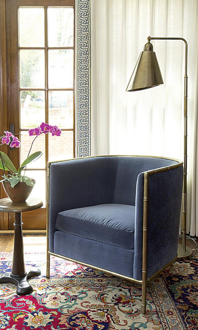
▼Use Classic Blue on an accent chair or incorporate it into the trim on your window treatments. This historic Druid Hills home had beautiful Persian rugs layered throughout the space. We found that Classic Blue cooled the warm red tones and helped to relay a timeless style.

1 2
▼A Classic Blue area rug can help to add a calm feeling to your home. This over-dyed Classic Blue rug offsets the whiskey leather and wood tones in this masculine sitting room located in midtown Atlanta.
3 4 5
►A Classic Blue vessel or upholstered armchair in your dining room. This Asian inspired ginger jar was the perfect item to layer on the dining table to compliment the Greek key upholstered arm chair in this classic Druid Hills dining room.
▼Add some Classic Blue wallpaper to an accent wall or even an entire room. We loved that Classic Blue wallpaper adds an eclectic and whimsical feeling to help build a room’s personality. We used Hygge & West wallpaper on both the curved stairwell and in the powder room.

◄Add Classic Blue cabinetry to your kitchen. We love how the Classic Blue island and cabinet storage boxes added to both kitchens’ clean and classic looks. These beautiful yet functional workspaces were exactly what our clients were looking for when remodeling their homes.


A decade after demolishing the old Herndon Homes public housing project, a new mixed-use development featuring affordable housing for seniors will finally rise in its place.
The Atlanta Housing Authority broke ground today for the $166 million mixed-use Herndon Square on Northside Drive, west of Downtown. The development will also include 36,500 square feet of retail and health and wellness space.
The full development won’t be complete until 2026, but phase one – a 97-unit mid-rise building with housing for seniors age 62 and over – will open in Spring 2021. Herndon Square will eventually have 681 apartment units, with 45 percent dedicated to affordable housing for those earning up to 80 percent of the area median income.
Phase two of the development will have a mix of affordable and market-rate housing, retail, health and wellness space and greenspace. The final phase calls for 32 townhomes to be sold at standard market rate.


