6 minute read
Managing The Health Of Your Assets Using Power Bi
BY JACQUI TYLER
A critical element of any business is document control. The profession of Document Control enforces controlled processes and practices in the administration and management of documents. Sectors that utilise document control include, but are not limited to, engineering and construction and those seeking or holding ISO 9001 certification.
Advertisement
To achieve good governance and control over documents, an essential factor is to ensure they are centrally located. This situation is sometimes not possible due to a range of factors such as company restructures, legacy systems, information silos or the lack of perceiving the inherent value of documents as a business asset. To assist good governance and control, the implementation of reporting and analytics can provide a valuable mechanism for end-users.
This article looks at the utilisation of Microsoft Power BI as a tool to identify the health of documents - irrespective of where the data is located - in an asset management department of a large organisation.
The administration, management, and control of documents that sit in various sites can be extremely challenging, and inadequate document control processes are a primary agent that can be detrimental to an organisation. A study by Boyd, Pucciarelli and Webster (2012) emphasised that defective document-driven business processes can expose companies to serious risks and/or compliance issues.
Further to this, the study showed that this situation is common across industries, companies and businesses. Poor and inadequate processes in the management of documents has the potential to result in high costs to businesses.
For end-users, reporting and analytics provide an avenue to display what has occurred in the past, communicating what is currently happening, and providing a guide to future events.
Power BI offers the ability to connect, model and visualise data from a range of sources and can be used as an important reporting and searching mechanism in the administration and management of documents.
Data visualisation, a feature of Power BI, is a process of taking raw data and transforming it into graphical or pictorial representations such as charts, graphs, diagrams, pictures, and videos which explain the data and allow insights to be gained by the end-user.
Background
In 2018, a new document management system was being implemented in my organisation. As a member of the Asset Data area, I was tasked with understanding the state and status of documents in Network Asset Management (NAM). My role as a Business Improvement Analyst, was to assist with document control activities in NAM for end-users. This took place in conjunction with a co-worker in Asset Data and Assurance who managed the NAM team site. In this context, end-users comprised engineers from the fields of Civil, Electrical, Signalling and Telecommunication.
Utilising Power BI, a dashboard report was developed by a co-worker in the Asset Business area of asset management. When this person left the organisation, I assumed the administration of this dashboard. On taking over the dashboard, my initial idea was to supplement what had been previously developed.
I had minimal experience with Power BI, but soon came to the realisation that building the Power BI report from scratch would benefit in two areas. Firstly, I would gain a broader understanding of the data I was working with, and secondly, I would also develop skills in using Power BI. In developing the report, I was able to determine that NAM was responsible for approximately 1400 documents.


These documents were sitting in four different SharePoint sites: the company-wide SharePoint library which held 17,000 documents, and three different team libraries comprising 420, 350 and 69 documents. Each of these libraries had been built by different people and/or teams, and each held different structures, data categorisation and metadata fields.
MICROSOFT POWER BI
What is Microsoft Power BI? This application can be described as ‘a collection of software services, apps, and connectors that work together to turn your unrelated sources of data into coherent, visually immersive, and interactive insights’. https://www.brightwork.com
Reports, dashboards, and apps in this application are the building blocks that are used to explore data and to make business decisions. Large volumes of data from multiple sources can be used to present interactive dashboards and Business Intelligence reports.
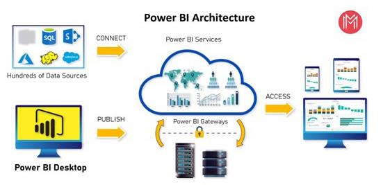
THESE MAGES ILLUSTRATE THE POWER BI APPLICATION.
Figure 1 - Examples of Data Sources that Connect to Power BI
(Source: https//www.datacamp.com)
Figure 2 - High Level Power BI Process
(Source: https://mindmajix.com)
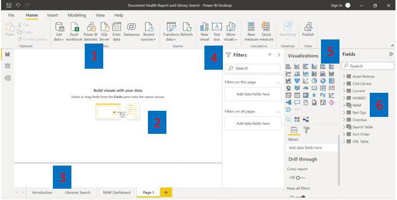
Figure 3 - Power BI Page Layout
This image shows the features and functions of Power BI.
1. Data Source Import
2. Visualisation pane
3. Report pages
4. Visual filters
5. Visual options
6. Imported source tables
Below outlines the features and functions of Power BI’s reporting page


Report Creation
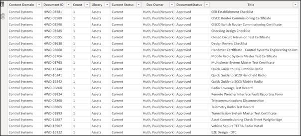
Figure 4 - Example of Data Source Table
The first step in the development of a report was to connect to the source data, located in four different SharePoint sites, and then to shape and clean the data so that specific information could be presented. Each source was brought in as a table and then the data was arranged or transformed.
This included the renaming of tables and columns, ensuring field columns contained the correct data type, for example: dates in date fields, text in text fields, removal of spaces, correction of field errors, removing rows or columns not required and so on. In Power BI, the functionality to shape data is quite comprehensive.
The next step was to enhance the data using measures, calculations, relationships, and the writing of queries using M language (Data Mashup or Data Modelling Language) and DAX (Data Analysis, Expression).
These two languages are used to manage, manipulate, filter, and analyse the data, but they are not the same and not dependent upon each other. Each one has different syntax, structure, and logic. They also enhance the data so that improved analytics and visualisations are displayed.
M LANGUAGE
Figure 5 to Figure 7 are examples of M Language used for the addition of a conditional column in the Advanced Editor and for the creation of a new query table.
DAX
DAX (Figure 8) includes a collection of over 200 functions, operators, and constructs to calculate and return one or more values. This helps you create new information from data already in your model. Using DAX, you can add three types of calculations to your data model:
• Calculated tables
• Calculated columns
• Measures
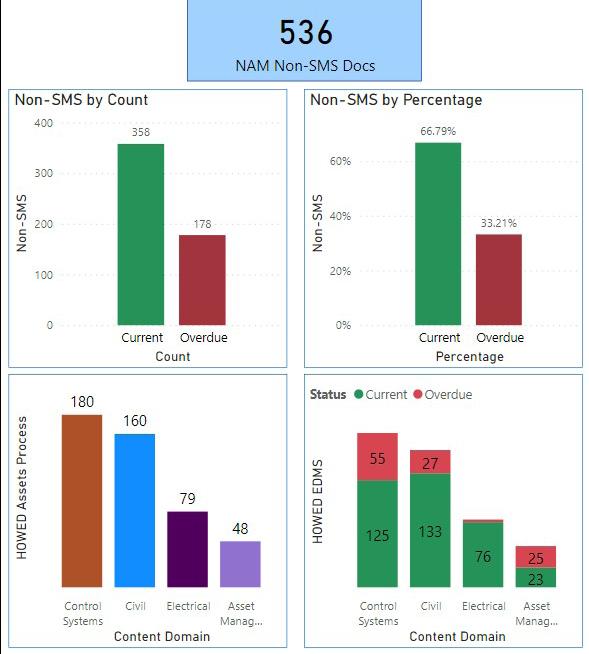
Once the data was shaped, the next stage involved aligning and combining the tables to a single source table. This was done by using a formula to select specific fields from each source table to create an additional table where relevant fields could be manipulated. Using this information, visualisations were then added to the report canvas. The final report was comprised of six pages and provided end-users with different data and visualisations on each sheet comprising a range of tables, column charts, cards, slicers, and filters. Tables provided the data in a grid view where the related data was displayed in rows and columns i.e., document number, document title, effective date, review date, process owner, author, content domain and trends over time for each content domain for current and overdue documents. Column charts provided a count and percentage for each content domain for documents for the relevant area. A card was used to display a single number showing the total document count for NAM documents and a chiclet slicer allowed data to be filtered using a ‘button’ for a particular selected category.
Visuals in the report were presented using various colours, fonts, text sizes and background colours. In addition to this, was the ability to search for and display documents from the various SharePoint sites via a hyperlink. Data could also be filtered according to various options that included content domain, date, area, status, and process owner.
Visualisations in the report are shown in Figure 9 and Figure 10.
Conclusion
The above demonstrates how Power BI can be used to effectively govern and manage information sources residing in various locations. This application allows the presentation of data in distinct patterns where informed observations can be made. Additionally, large amounts of data can be managed quickly and effectively. Using Power BI, management in my organisation can utilise the information in the report to provide up-to-date information on the status and currency of documents for specific content domains. This enables the various areas to utilise and prioritise resources more efficiently, to ensure documents they own are current. Team members can use the search option to locate documents via a keyword search or via a filter regardless the location of the SharePoint site. As data is being pulled from the source and the report is automatically refreshed each day, near-real-time analytics of trends and indicators can be accessed by end-users.

About The Author
Jacqueline Tyler is a Business Improvement Analyst at Aurizon Network. She holds a Master of Information Management Records Management and a Bachelor of Arts. With seventeen years’ experience in the field of Information Management, Jacqui uses this knowledge helping Network Asset Management administer engineering documents. Specialising in Document Control, Jacqui uses her expertise for the daily governance of documents working as a gatekeeper with the Aurizon Enterprise Document Management System.


