
CONTENTS
BLANK SPACE

WITH INTERNATIONALLY ACCLAIMED ARCHITECT EDDIE JONES

design concept
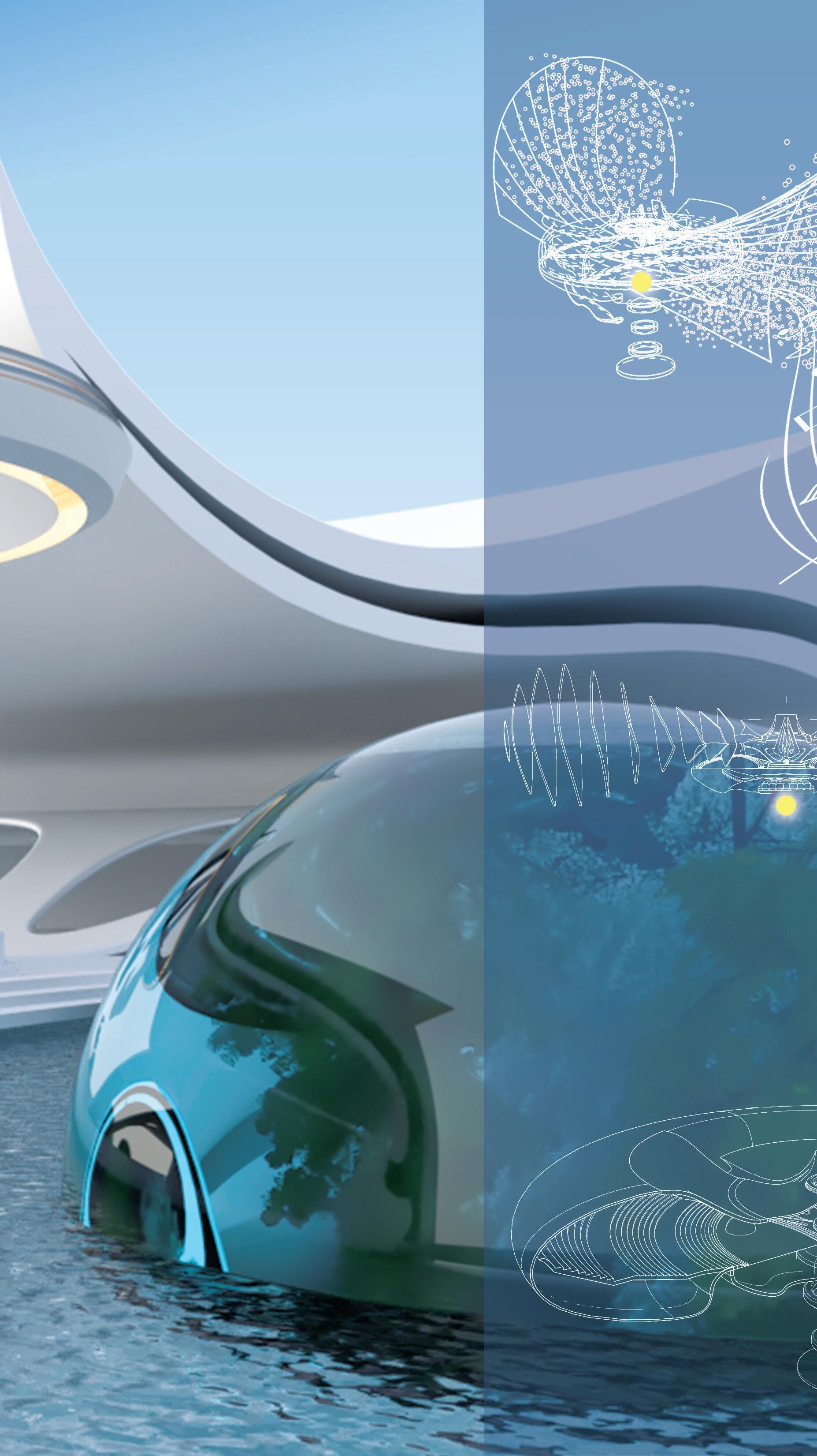
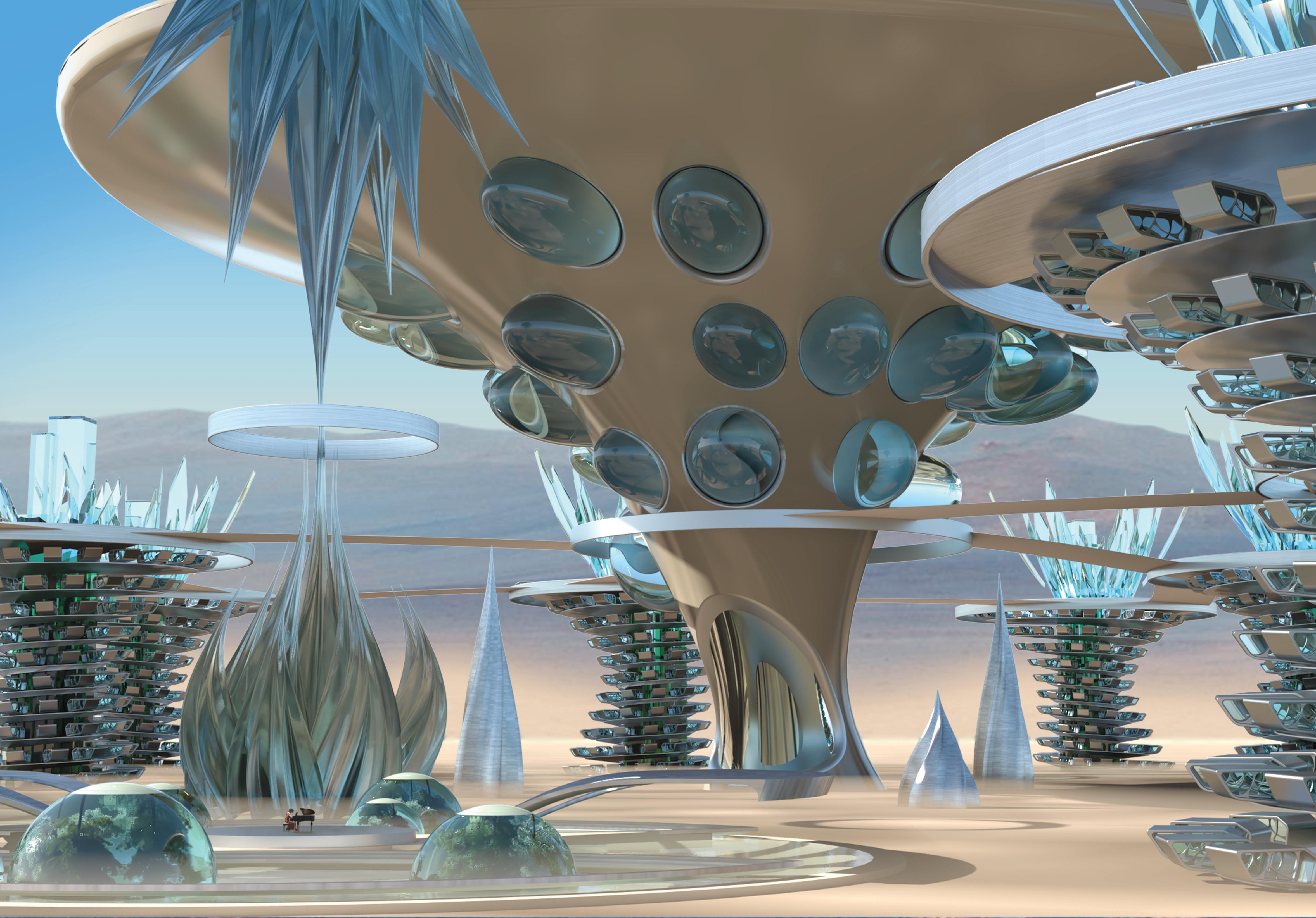
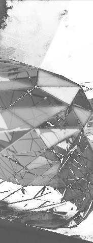
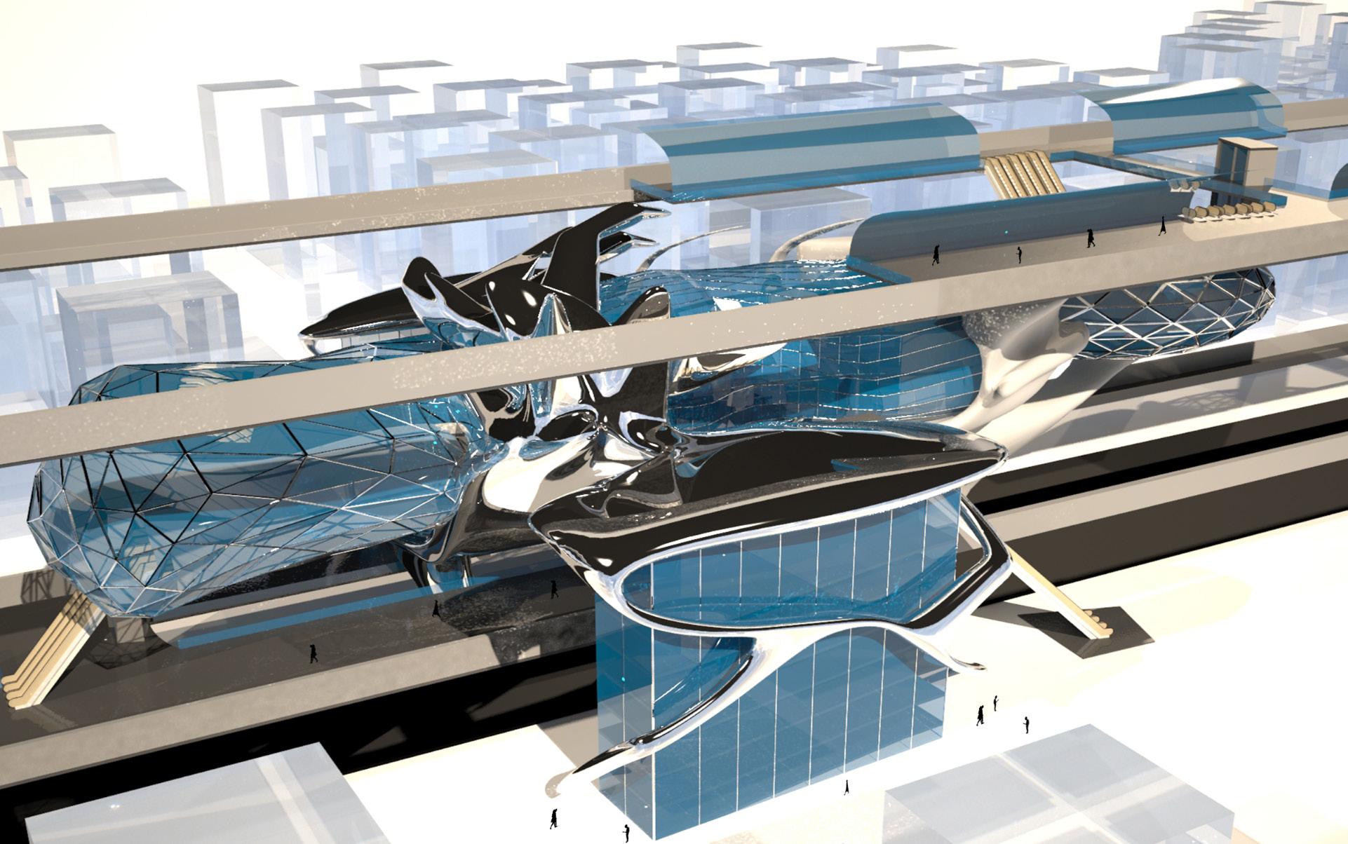
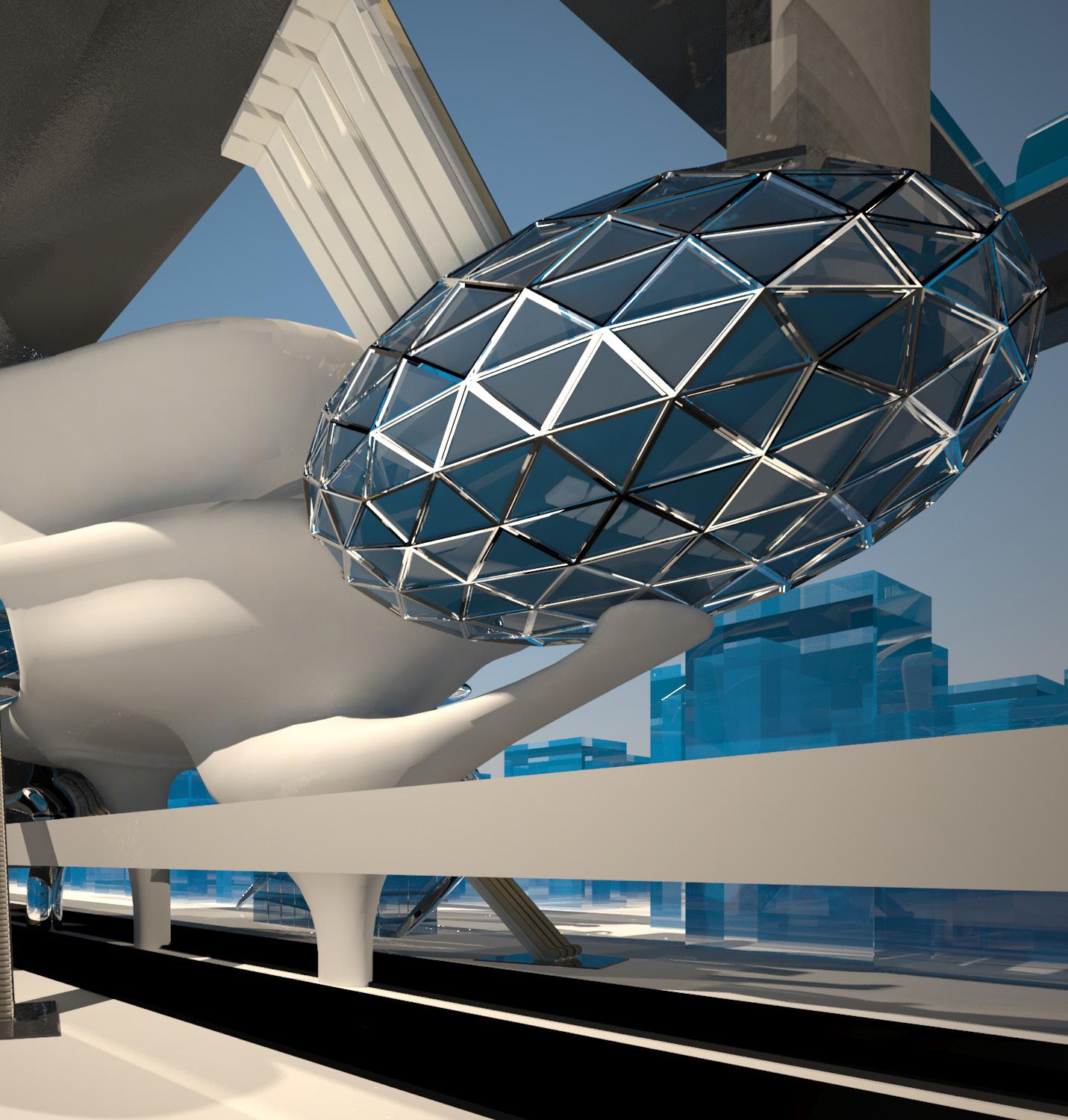
The idea of outer space is daunting, but is also a never-ending blank canvas. To rebuild civilizaion, one must honor the roots - water. I imagined a future where water can be more than just a life-giver. It can also be our tool. If we can use nanobots to freeze water to ice, we can use it as scaffolding technology with no cost at formwork and removal. It can also be re-used infinitely.
design problem
The idea was to imagine 200 years into the future and visualize a a subsequent time of space colonization and human proliferation. This design was under the express mentorship of Eddie Jones where I was expressly in charge of specific parts of the competition process. I was responsible for design thinking and in charge of modeling and rendering.
design solution
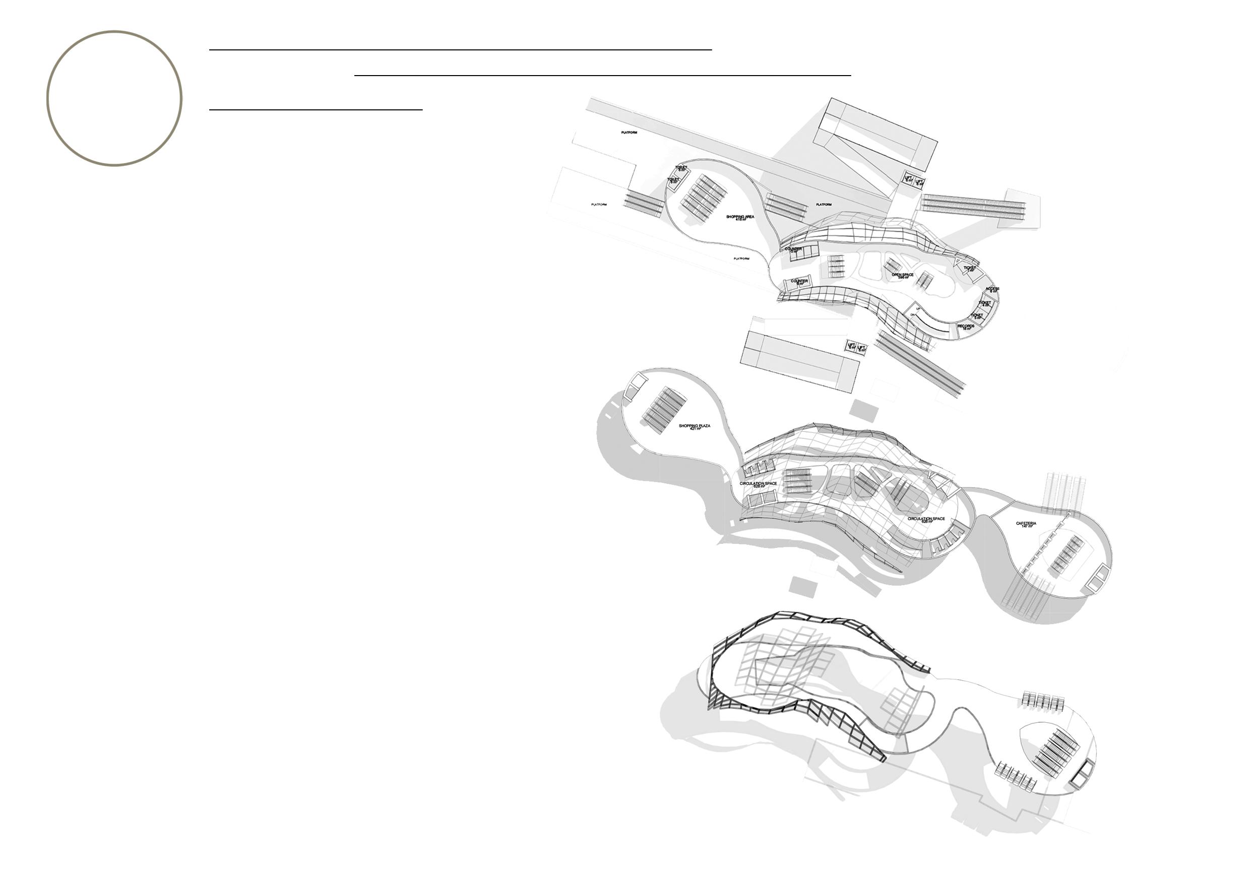
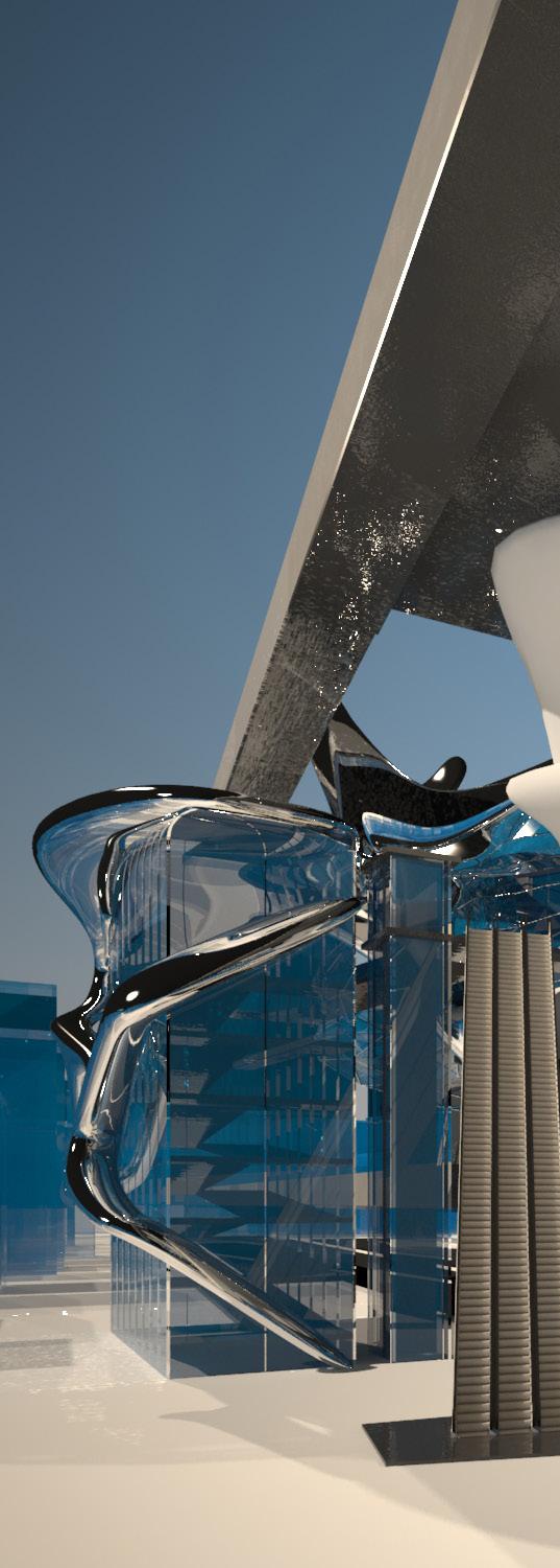
We imagined a utopian and dystonic society simultaneously as a result of choices based on realistic constraints such as energy while building on the abstract art of building with water. We kept water as a keystone due to its supreme importance to life as we know it, and created spaces that best represent the ideals of space exploration, infinite greed, and unquenchable thirst for adventure and exploration. It automatically reflects the inherent nature of humans as inevitably curious - a nature that can equally proliferate or destroy the species as we know it.
THE TURBULENT SEA TRANSPORTATION COMPETITION



SUNNYSLOPE HIGH SCHOOL AT
ORCUTT | WINSLOW
design concept
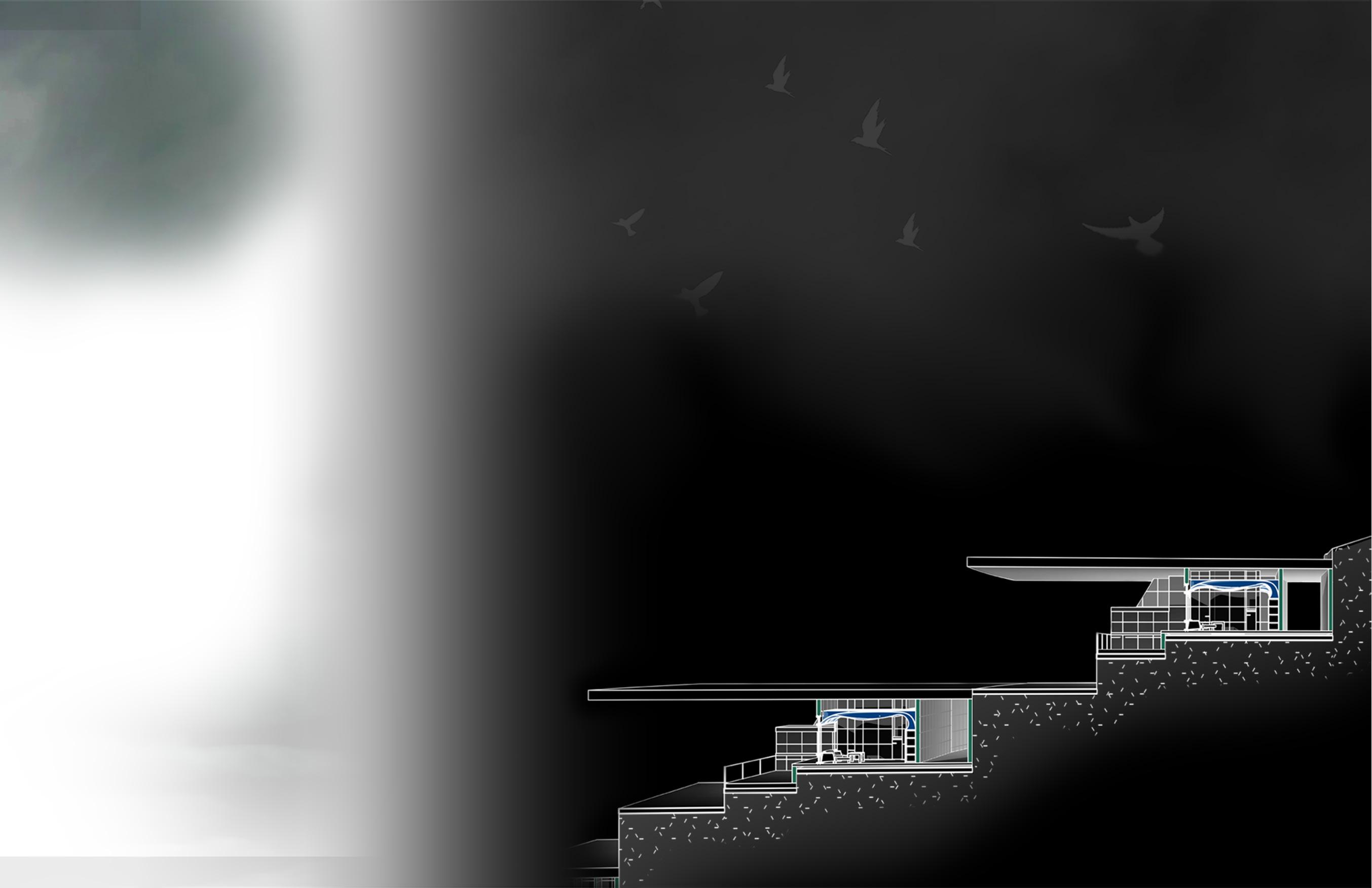
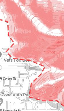
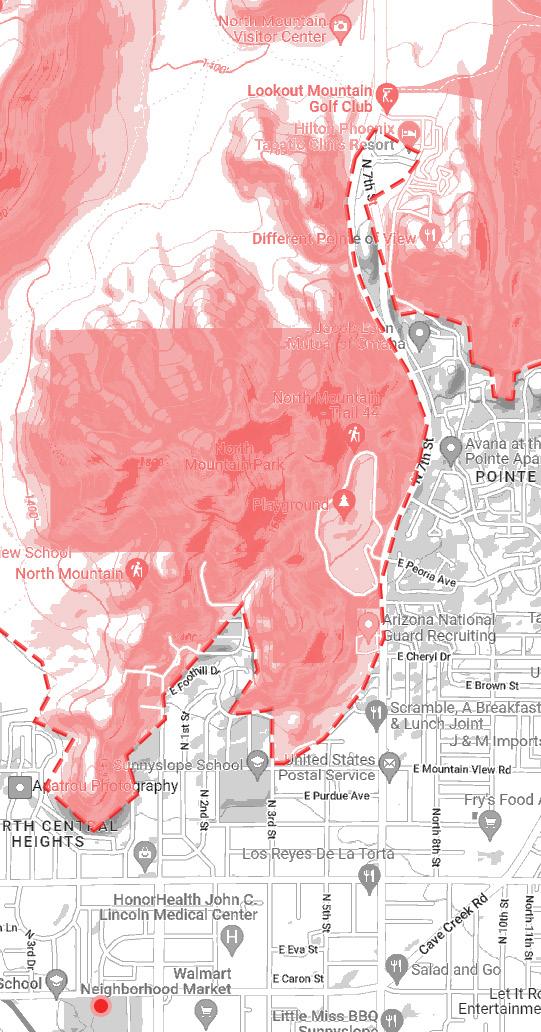
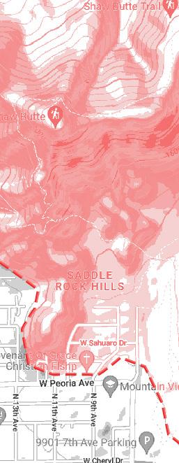
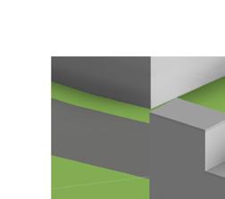
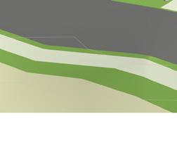
The idea for this design was aimed for the AIA Awards DESIGN FOR DISCOVERY criterion and information of topographical landform parameters around the site was crossreferenced with movement of water representing the mascot of the school ‘VIKINGS’ who were sea faring.
design problem
The topography and road network in front of site was too much inforrmation, pushing cost of cutting panels and margin of error too high. There was a level of simplificaion necessary for the demography and landform to be correctly respresented through paneling within budget design solution
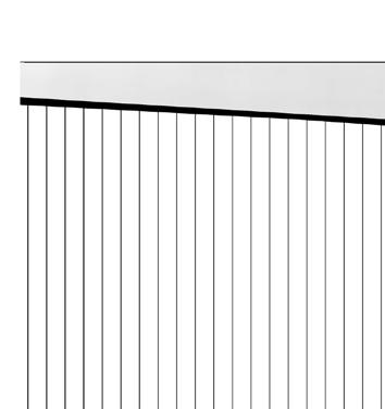
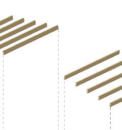
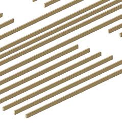
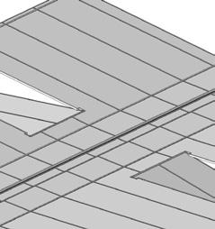
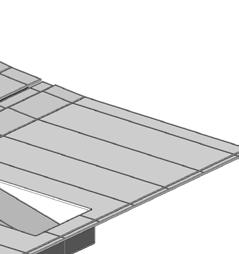
The first step was to work with the randomized wave form to extract horizontal lines to separate panels followed by experimenting and producing a algorithmic grasshopper script that could rationalize the values of horizontal lines to eliminate wastage of panels by cutting and creating panels on multiples of standard factory widths of 1ft, 2 ft, 3 ft-4 in, and 5ft
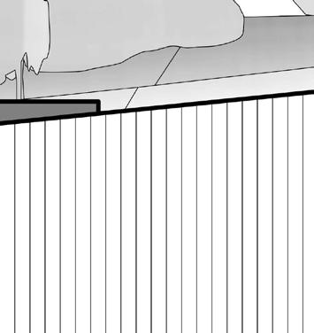
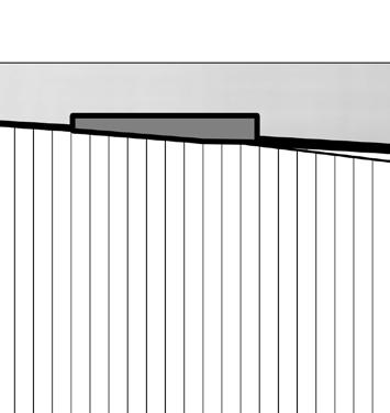
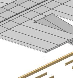
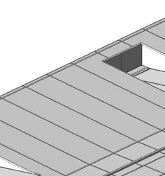
Finally, any panels falling within a certain height range dictated by the topography was folded to hang 1 in, 2 in or 3 in depending on the height of the mountain and the knife-edge would extrude accordingly for continuity.

design coordination
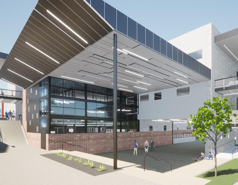
The success in this was the contractor only needed 4 different types of panels in the end with minimal site cutting. The design of the panel included the fold of the panel, minimizing wastage to the absolute minimum.
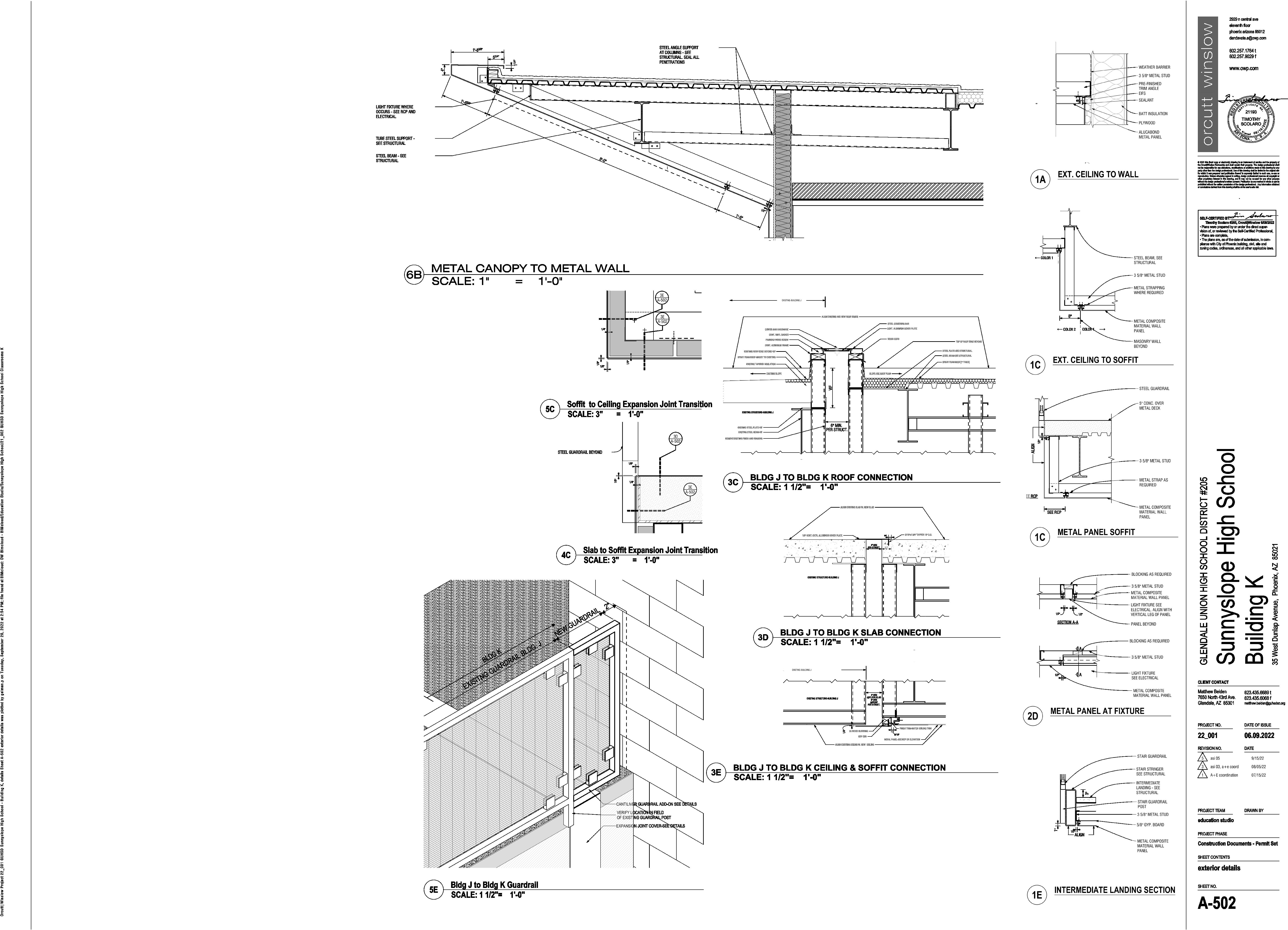
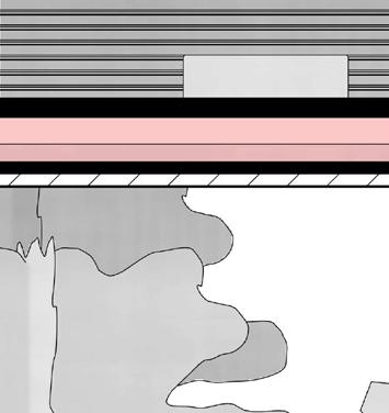
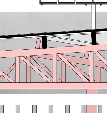
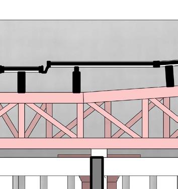
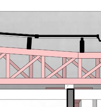
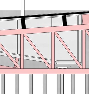
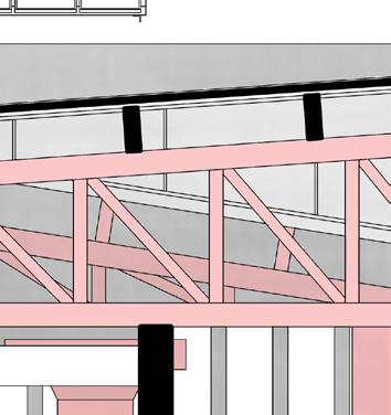
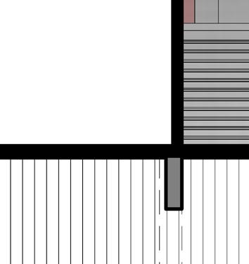
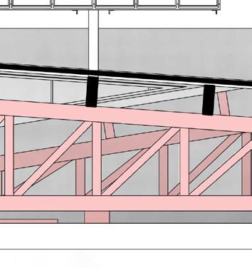
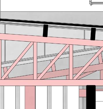
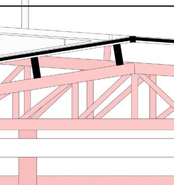
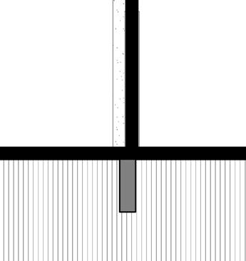
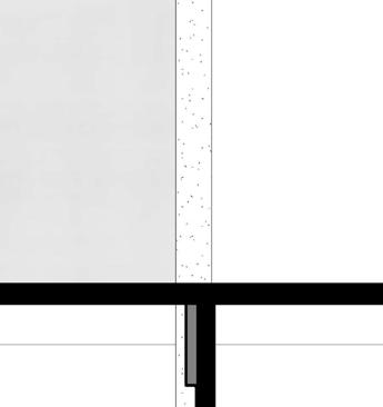
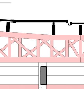
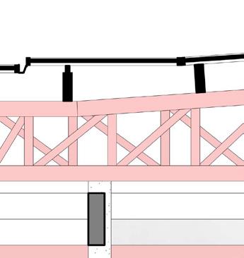
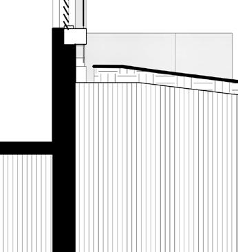
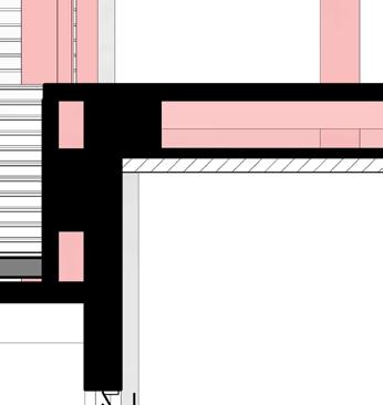
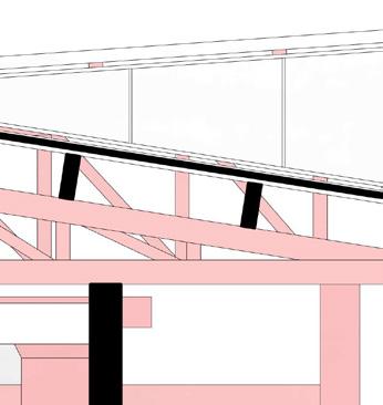
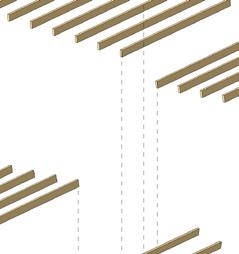
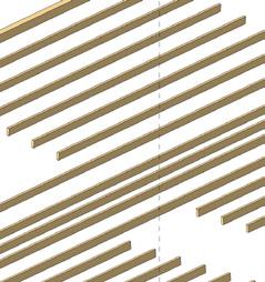
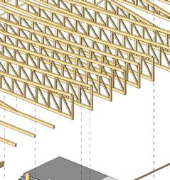
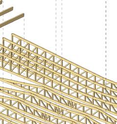
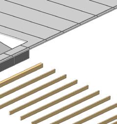
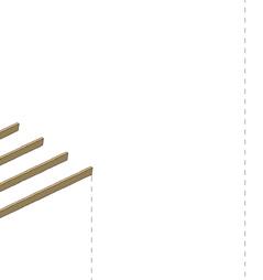
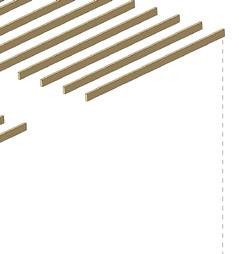
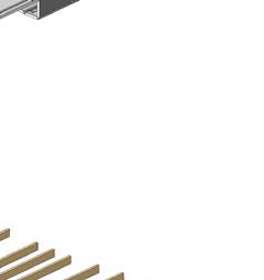
The roof required coordination for drainage and waterproofing. Especially at the knife-edge detail at the end so the top doesn’t look bulky and aligns with the vision of the design, some effort to coordinate through with structural and other relevant consultants. There was the issue of not having enough space to pass the rainwater drain pipes through that canopy since the beams were taking up a lot of the available space without leaving enough for the pipes to slope through. A later coordination effort reuired the change of beam direction in the canopy to adjust for all the functions to come together seamlessly.
The crickets and roof rides had to adjust with the canopy design to be most optimally designed across all engineering passing through it.
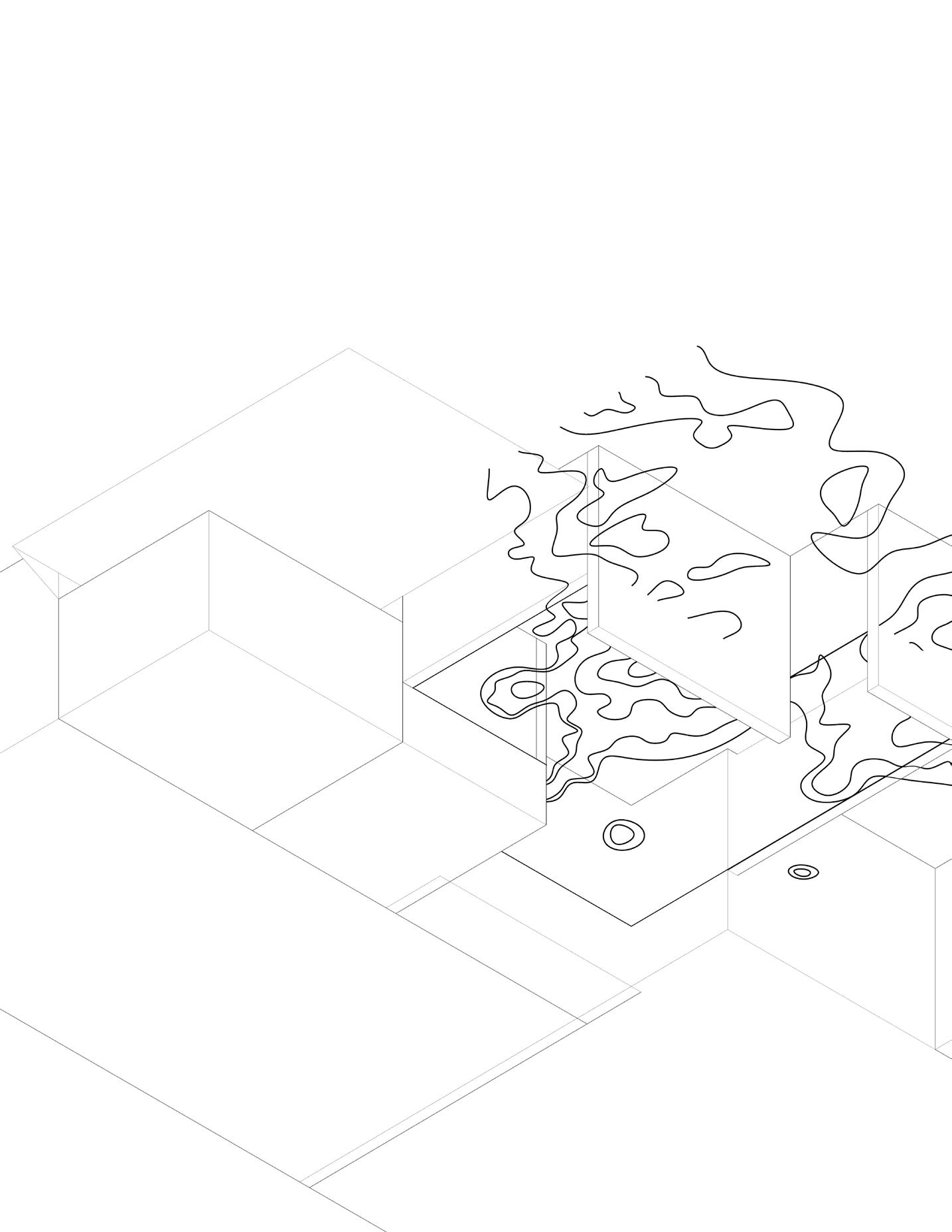
The first step is to consider the topography as a function of points and curves delineating how the panels will “pop” from the ceiling plenum as well as how the panels will cut.
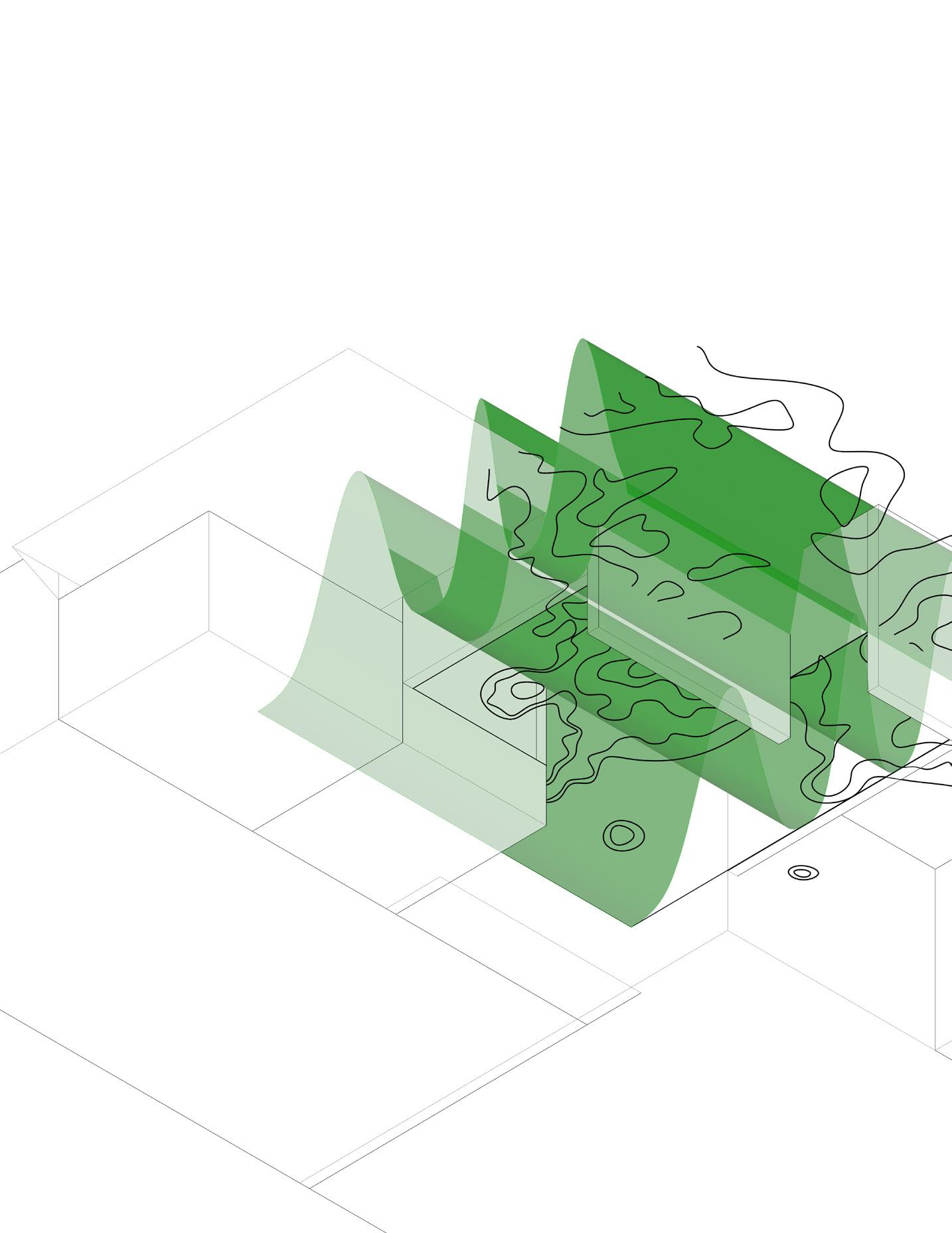
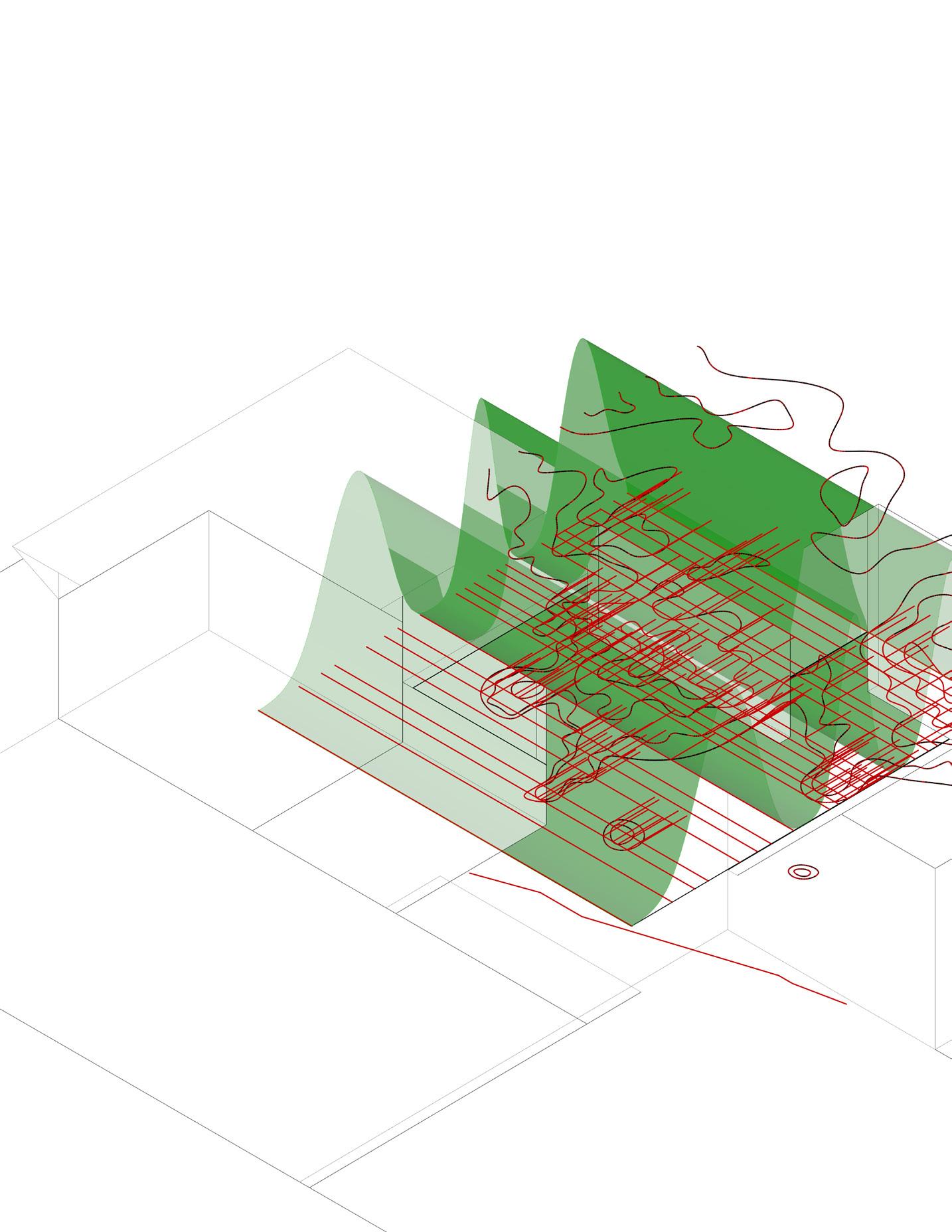
The second action is considering the “wave” represented by the school maascot “Vikings”. Waves ae a function of conpression rarefaction, uniformly represented by the sine curve in mathematics. The curve is made eccentricat the two ends and compressed to simulate the
Finally, panel divisions are extracted and normalized from the intersection of topography curves with the lines of the projected wave on to a plane. Th points are simplified to multiples of 1ft, 2 ft,3 ft 4 in, and 5’ only so construction can take place with minimal to no on-site panel cutting.
design execution
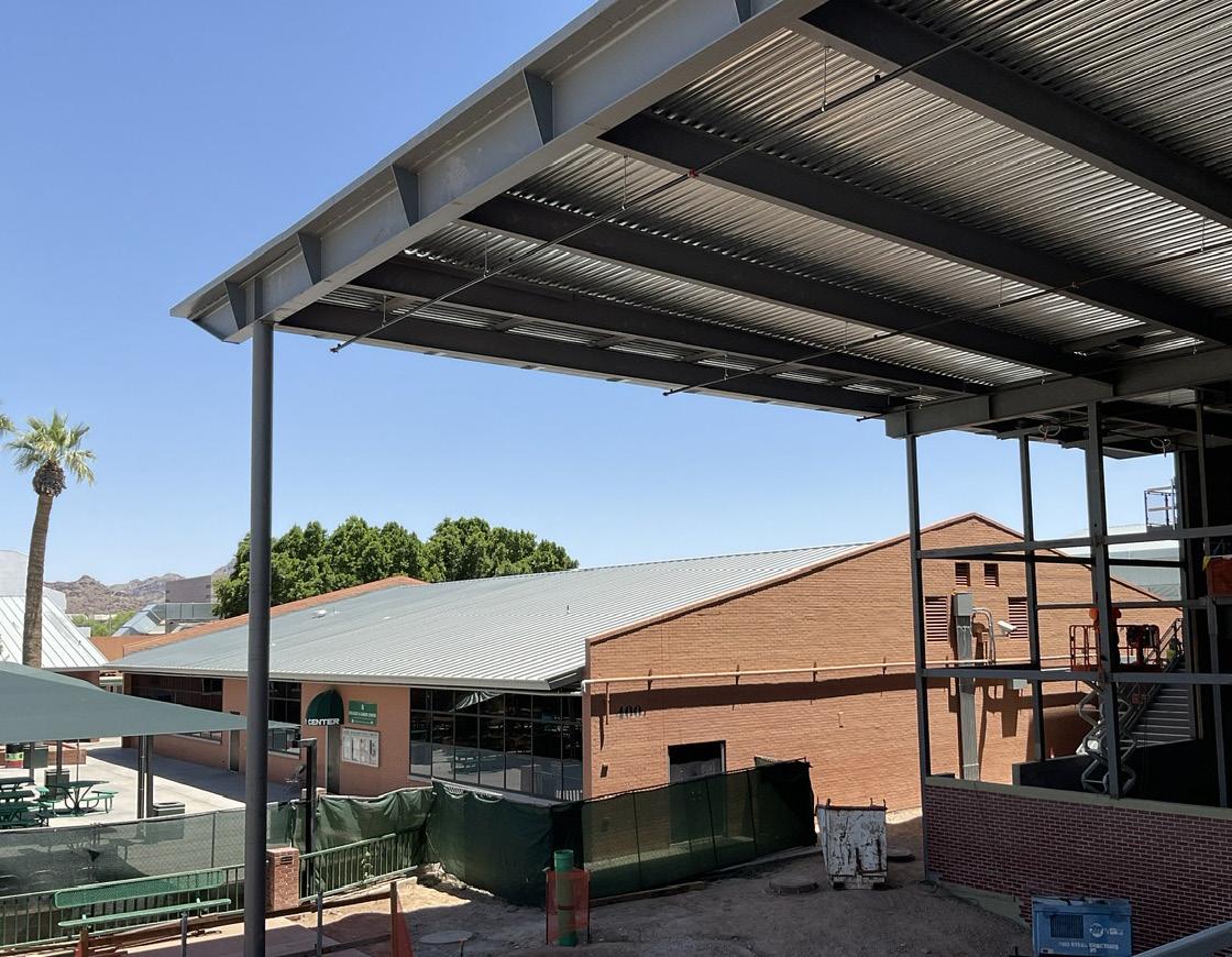
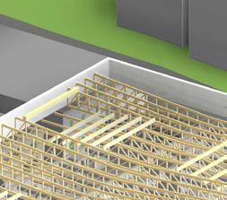
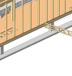
The challenge was to represent the idea in a fashion simple enough for the contractor to execute with minimal error while reducing the need for RFIs to clarify questions. Site cutting had to be reduced to onl the very end pieces and every structural member of the ceiling assembly had to be normalized to values of whole numbers. Beam span directions had to coordinate and rotate to pass the sprinkler and rainwater pipes in the already narrow space taken up mostly by 18 in deep beams. To fix it, the roof slope had to be ridged in the center and along the length of the knife-edge.
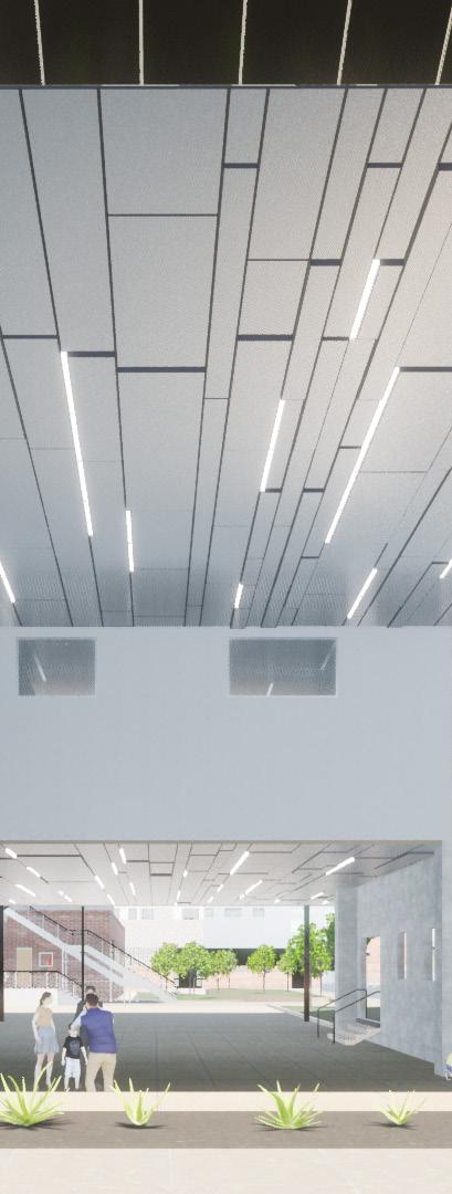
The neighboring low-rise buildings visible beside the construction is set to be demolished in the end of the phase, so steps had to be taken to not affect the supporting columns and structure throughout the construction. There were fine opening of 1” slear embedde into the panel system to incorporate lighting in between so it can manifest and hightlight the overall finished product.
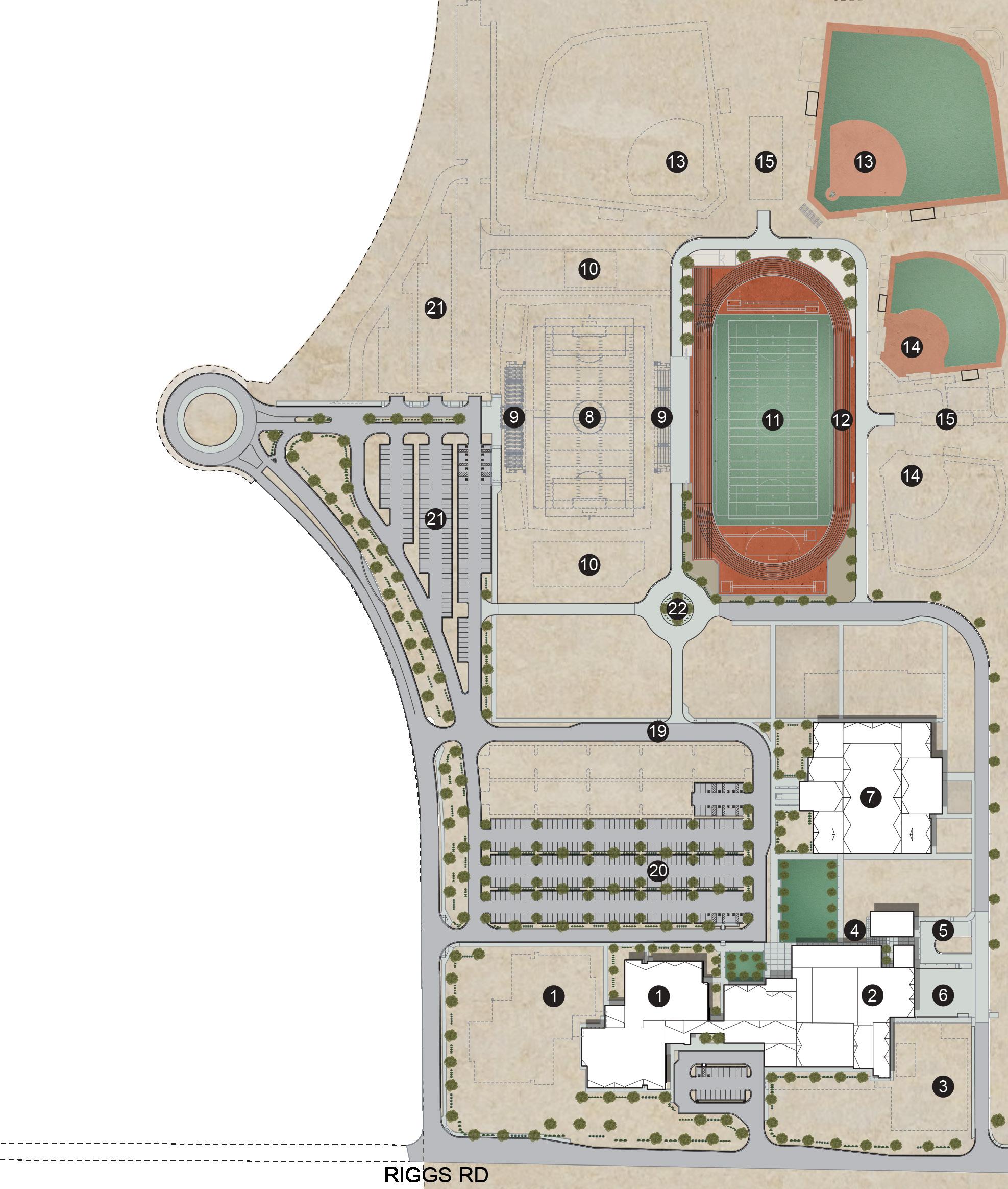
CRISMON HIGH SCHOOL AT

ORCUTT | WINSLOW
design concept
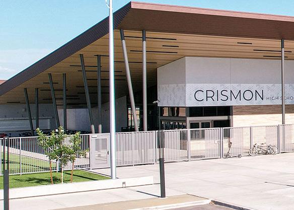
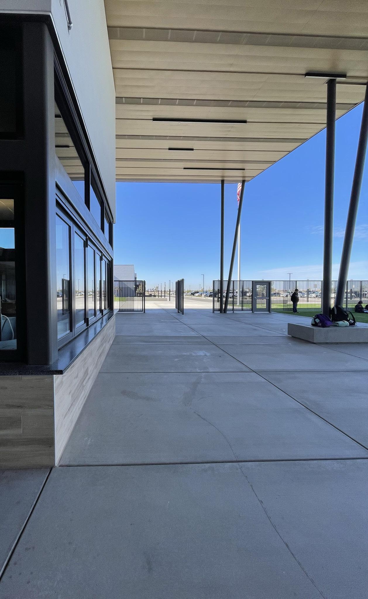
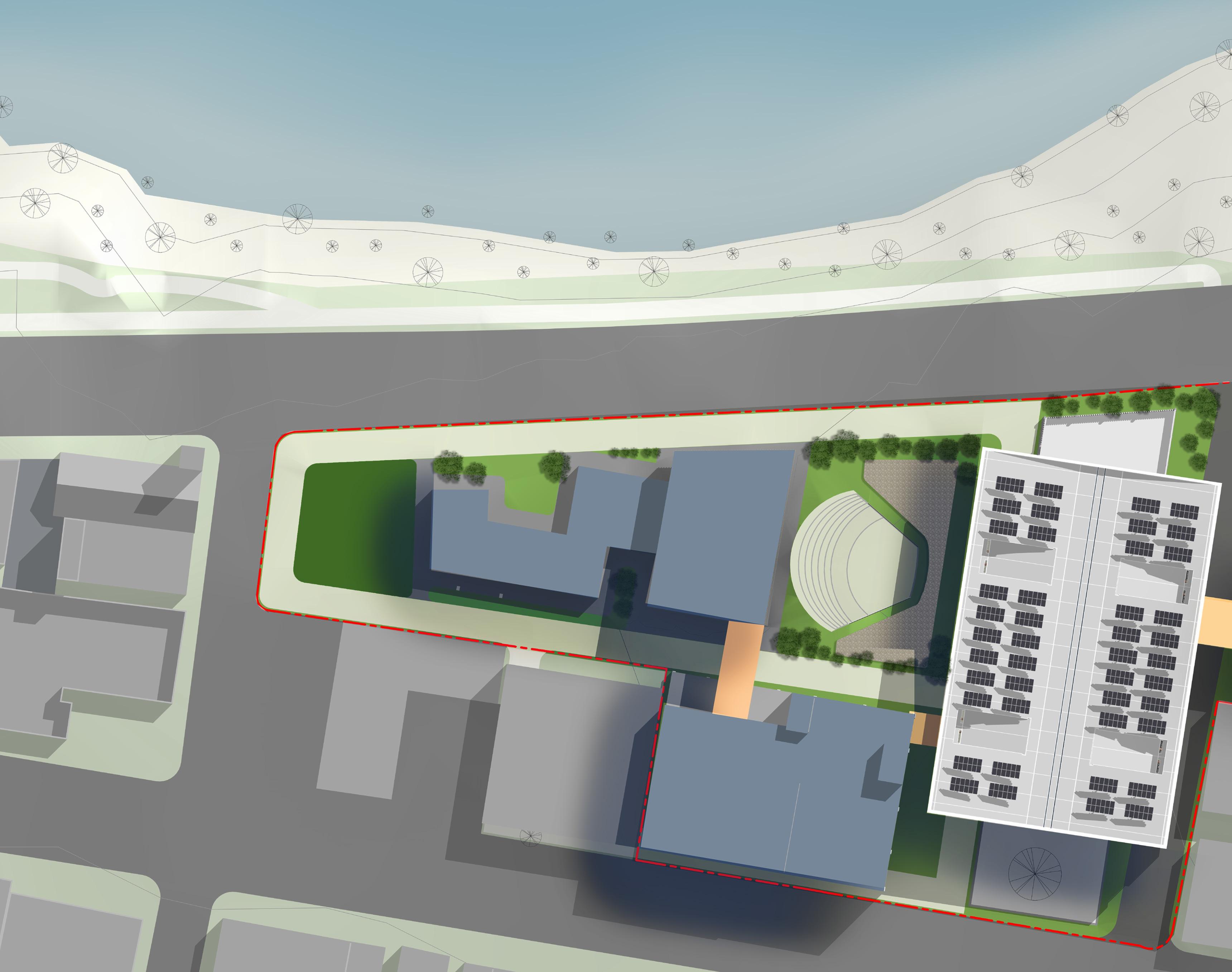
As the heart of the school campus under the Queen Creek Unified School District, this will be a one-of-a-kind building with truly unique moments and experiences that collectively seek to elevate the arts. We saw an opportunity to develop a connected series of experiences highlighting these moments using various spatial grammatical elements including site forms, landscape and hardscape elements, building forms, transparency/ opacity, construction techniques, signage, etc.
design responsibilities
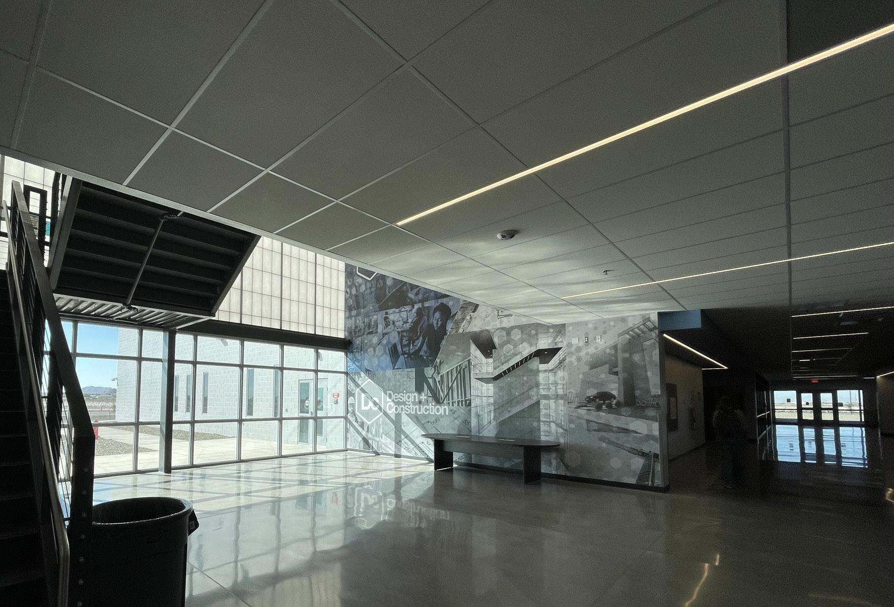
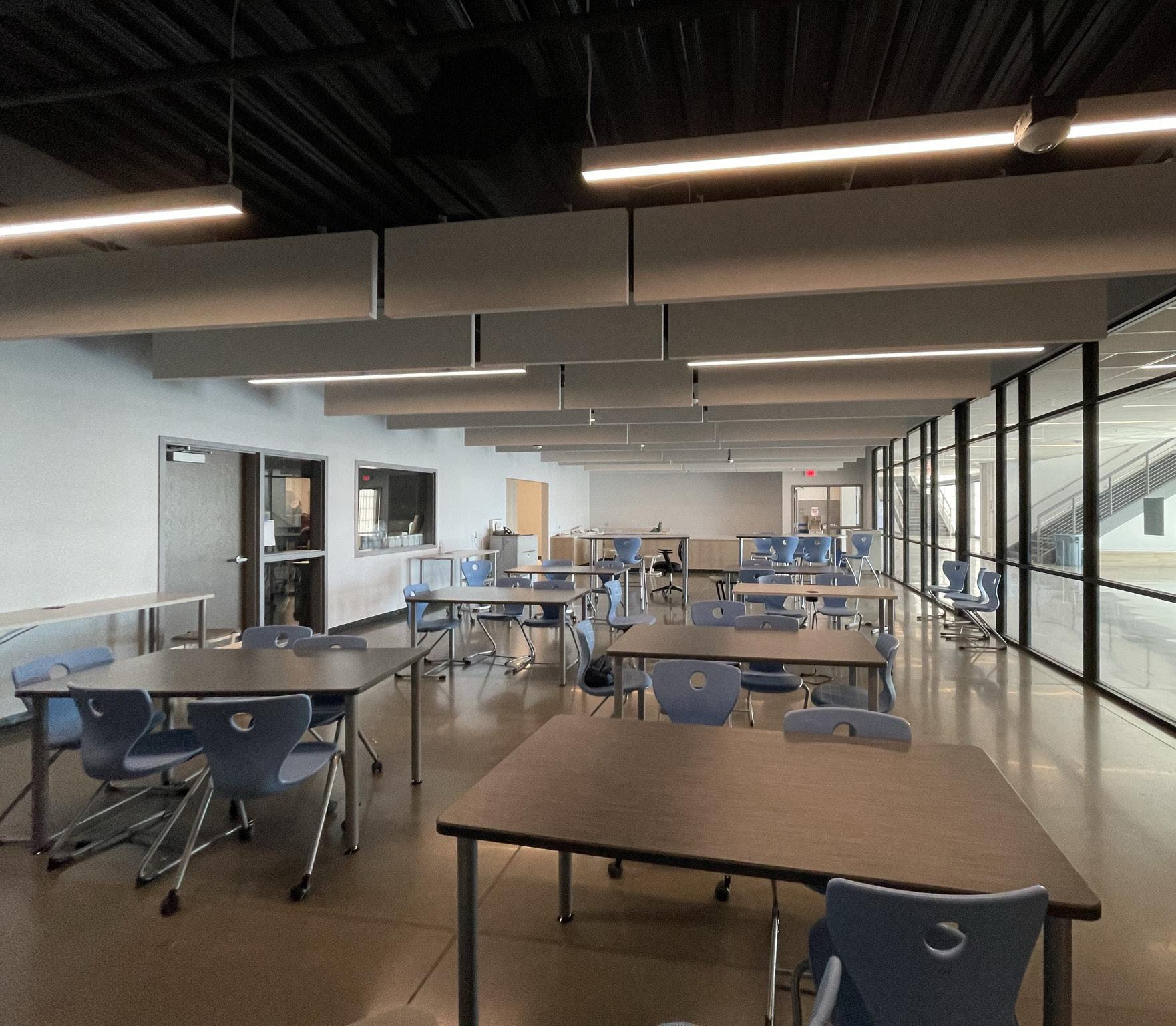
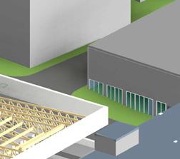
My responsibilities for this project developed as time passed since this was the very first project I was assigned to after joining Orcutt Winslow. It began with participating in the construction drawing effort, with my involvement in storefront elevation. After successfully completing it, I moved on to door and window schedules, understanding every aspect of the related construction process. Following this, my responsibilities increased to the reflected ceiling plan where I took on the responsibility to champion all ceiling grids, some related details, and light fixtures, coordinating that with the electrical and mechanical enginners for lighting and diffuser locations.
This was a long and exciting back-and-forth until I parallely jumped to site modeling, some aspects of design and the major responsibility of producing documents to present to clients. I learnt a lot during this project lifetime, especially about ceilings considering the sheer volume, variety, and complexity it involved.
IDENTITY IN SENSATION

design concept
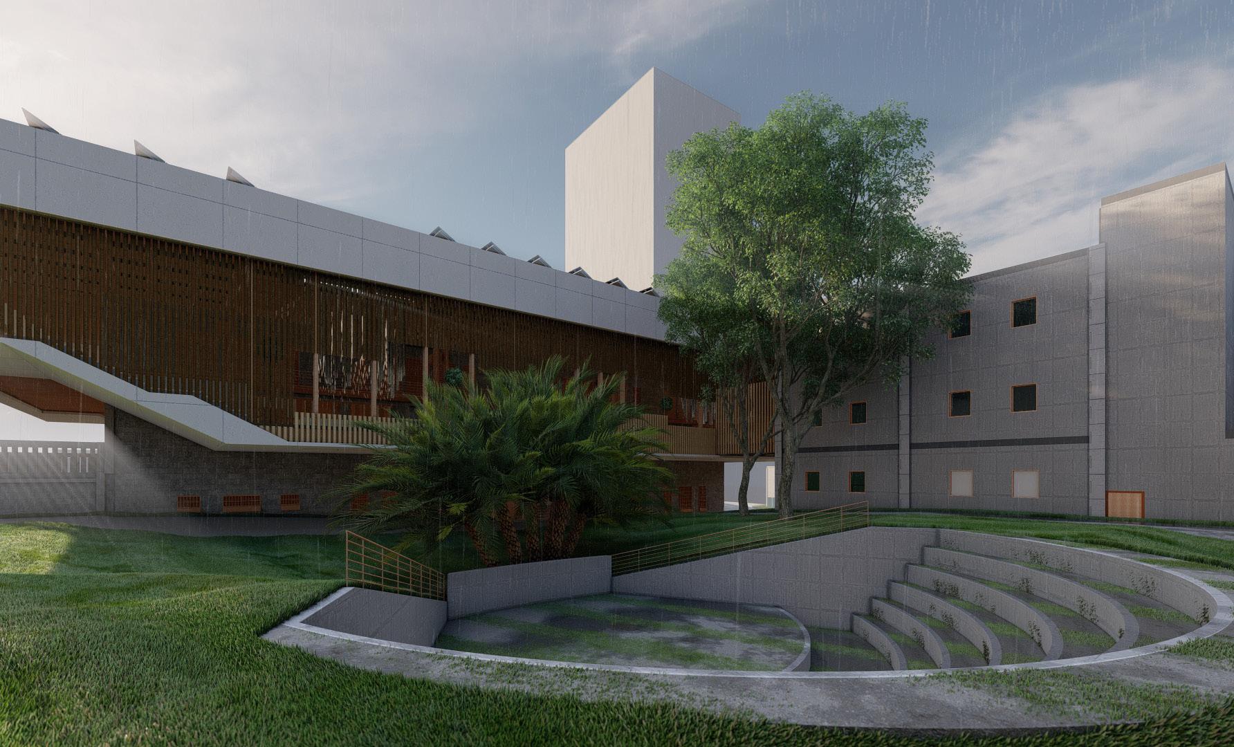
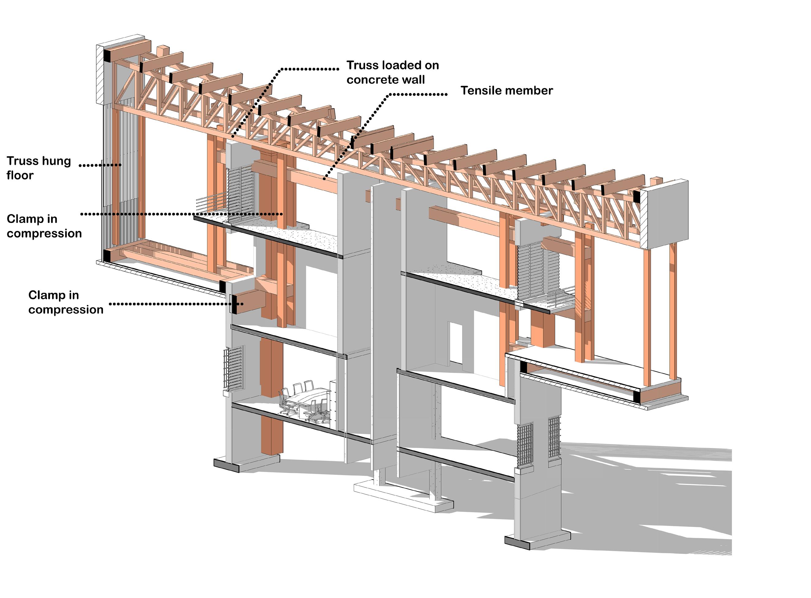
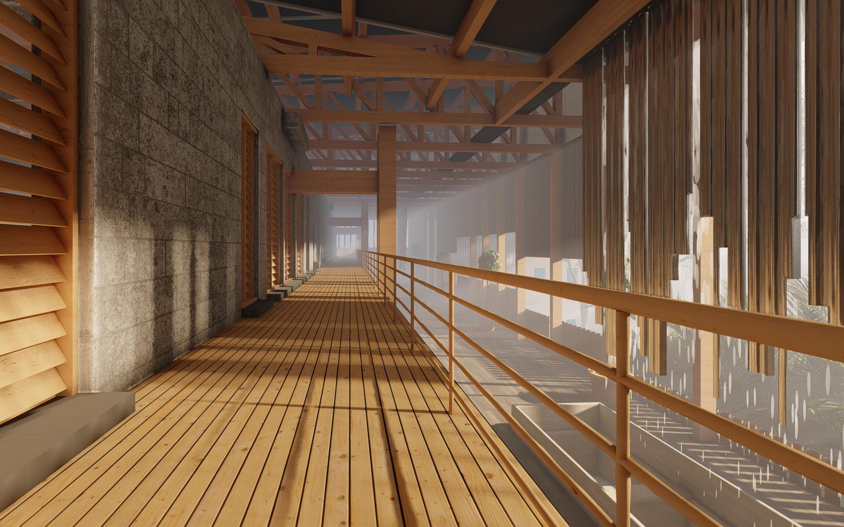
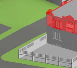
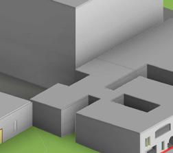
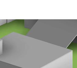
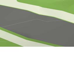
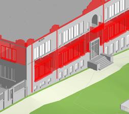
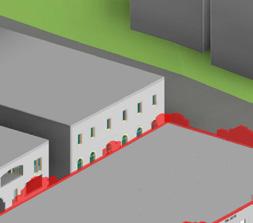
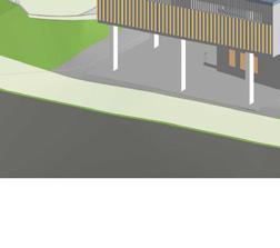
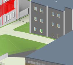
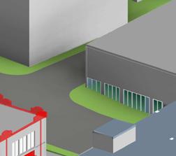
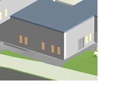
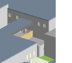
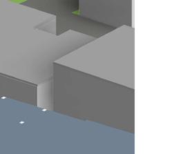
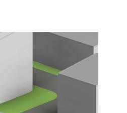
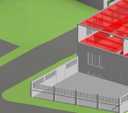
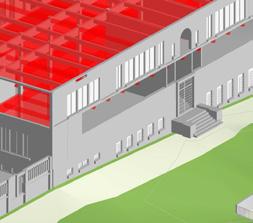
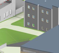
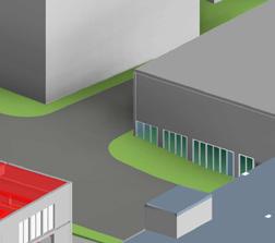
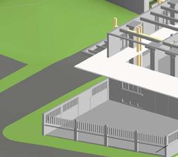
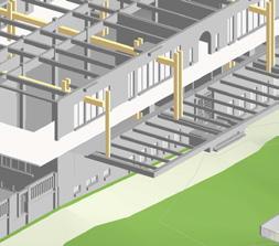
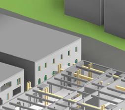
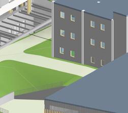
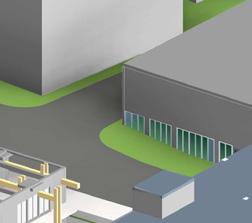
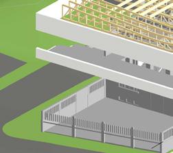
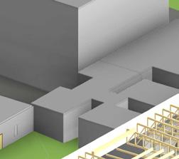
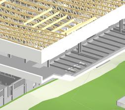
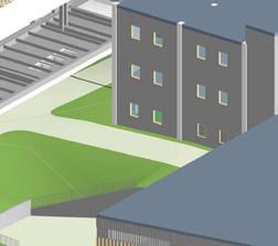
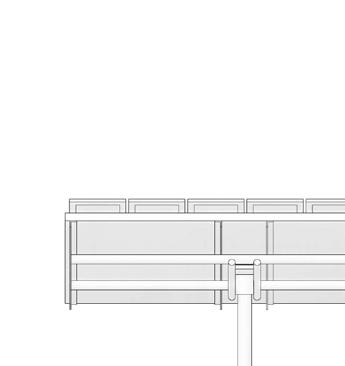
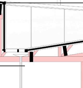
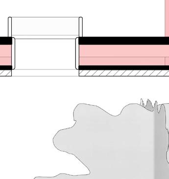
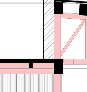
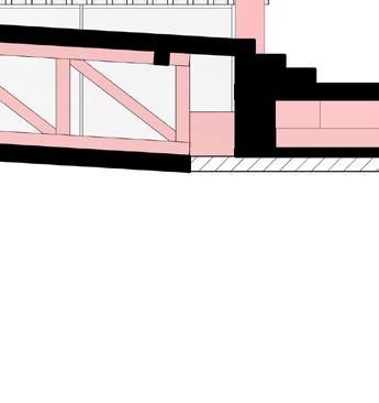
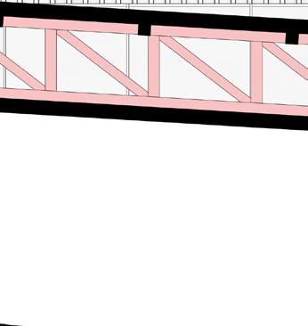
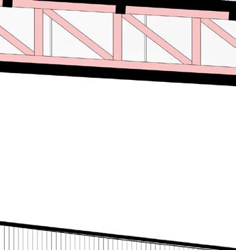
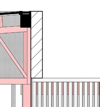
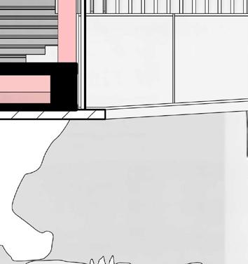
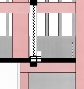
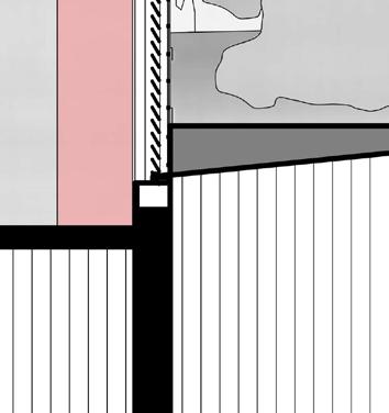
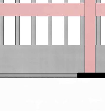
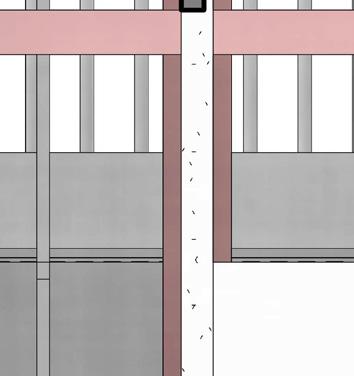
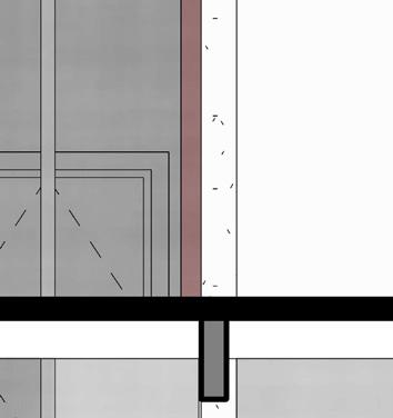
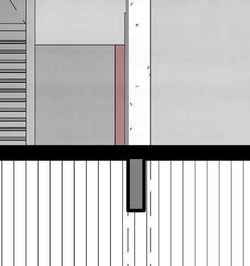
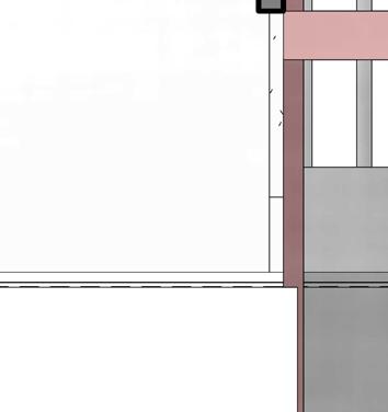
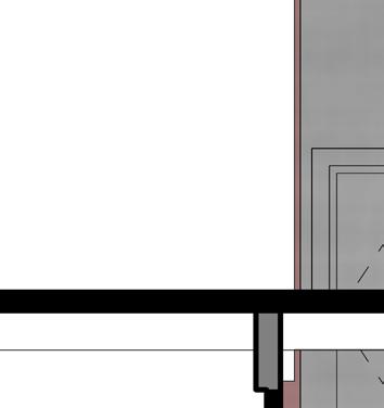
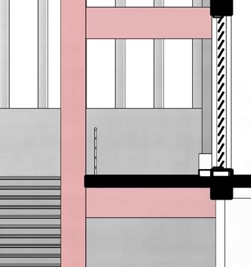
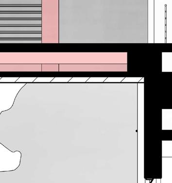
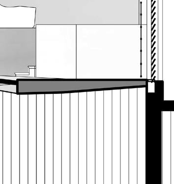
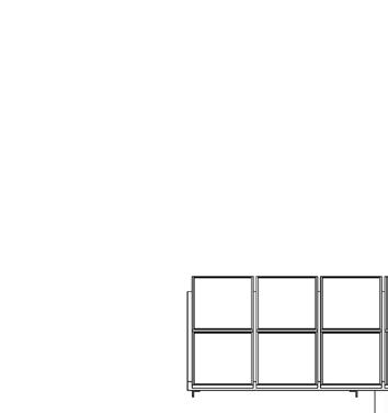
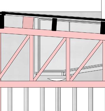
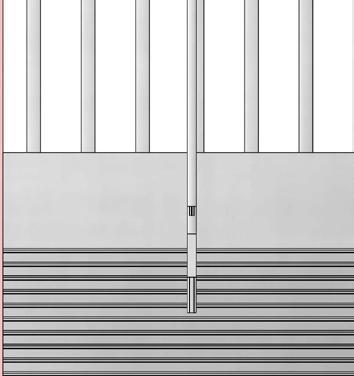
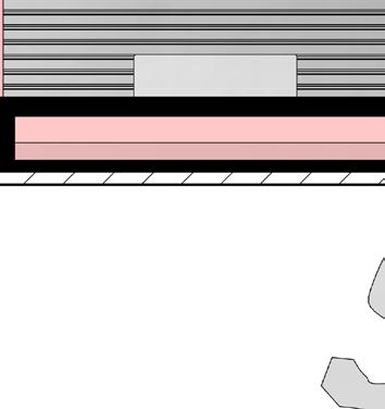
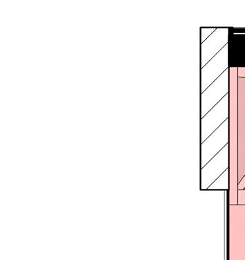
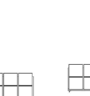
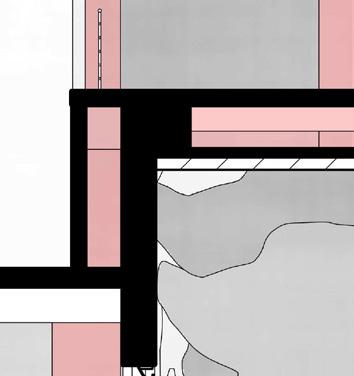
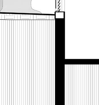
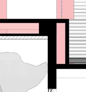
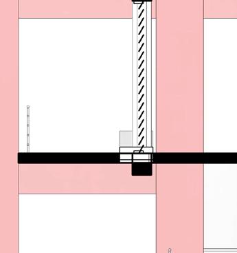
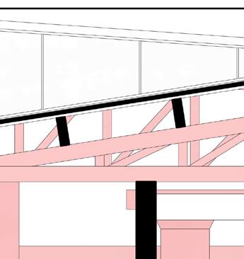
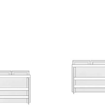
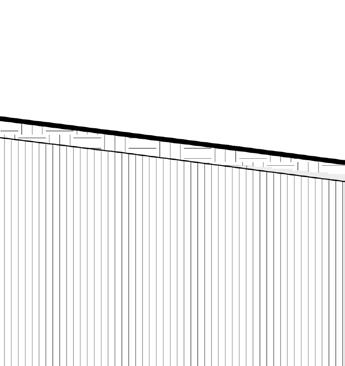
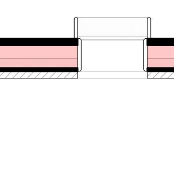
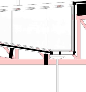
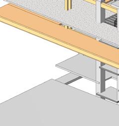
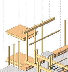
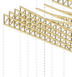
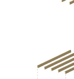
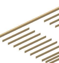
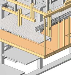
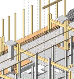
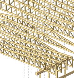
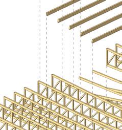
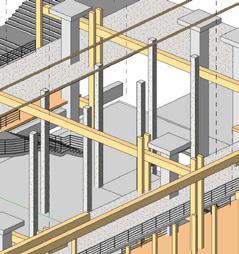
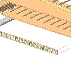
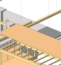
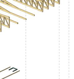
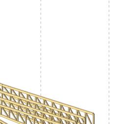
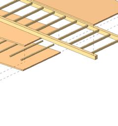
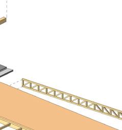
The design embodies the ideology of identity that has been lost in this pre-existing Martin Brumbaugh school since its colonial period of construction. Taking inspiration from the site and people of Puerto Rico, the new program and design aims to undestand the people’s love for outdoors and reinterpret it as a need for its people to express, mingle and deliver to them their identity in full. The most important move for this building, which is now a museum and safe haven from the frequent hurricanes that torment it, is a double level gallery giving a panoramic view of the full environment. The construction is inter-knitted with the existing building through low-cost clamping and spanning techniques with timber, giving its original jail-like appearance and colonial oppresive feel a mode of communication while keeping its history intact.





















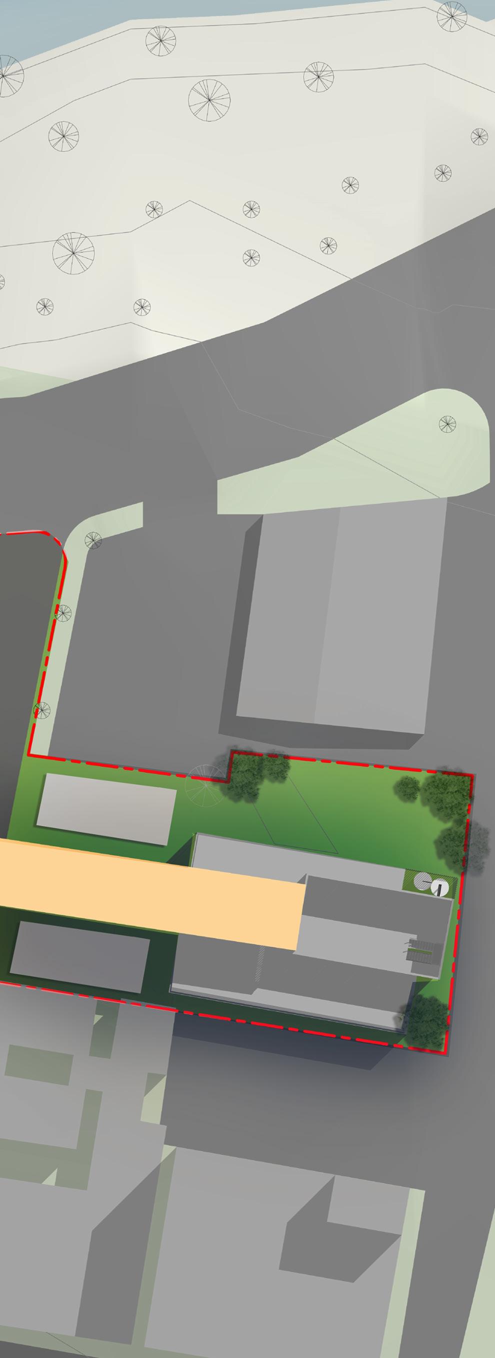

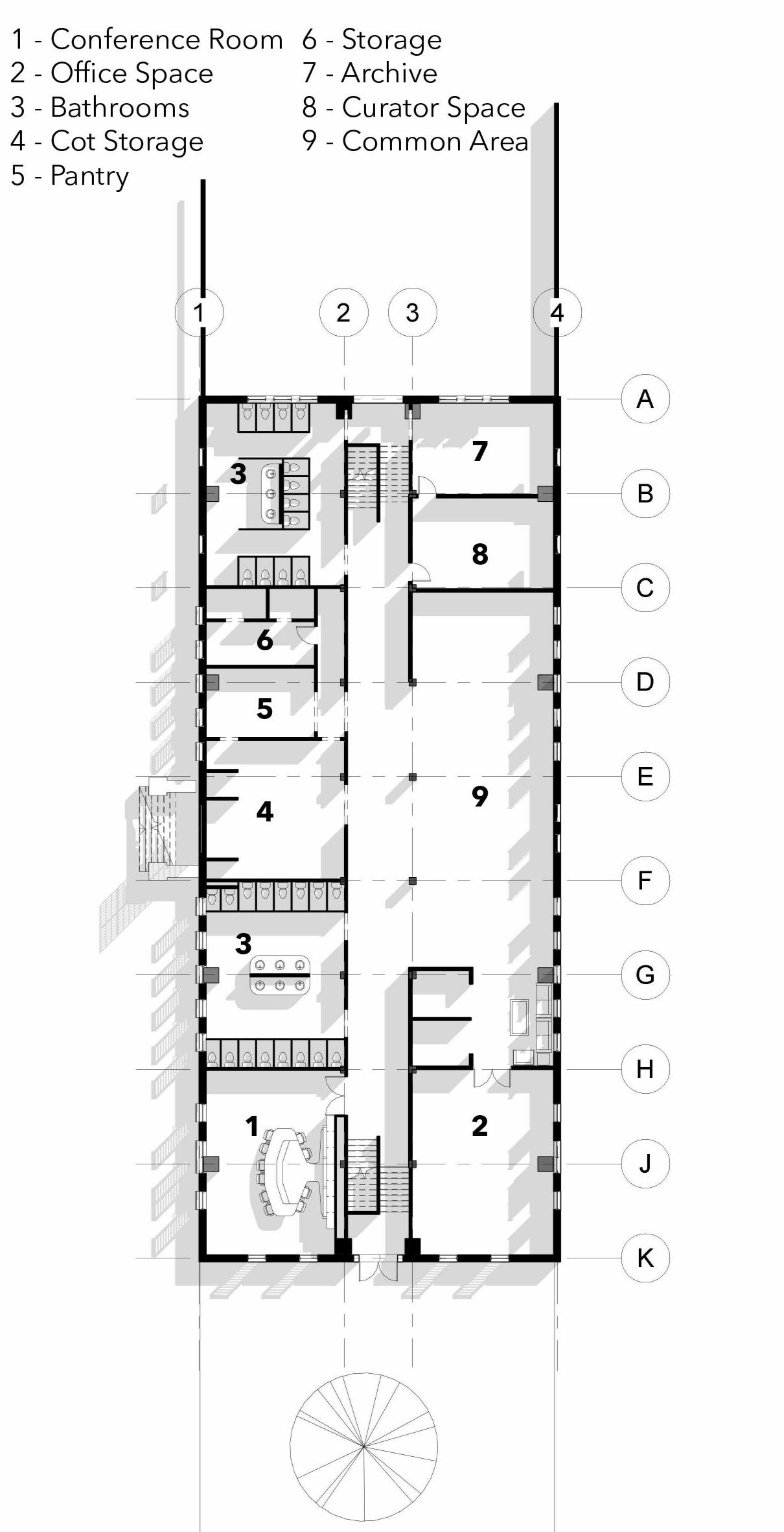
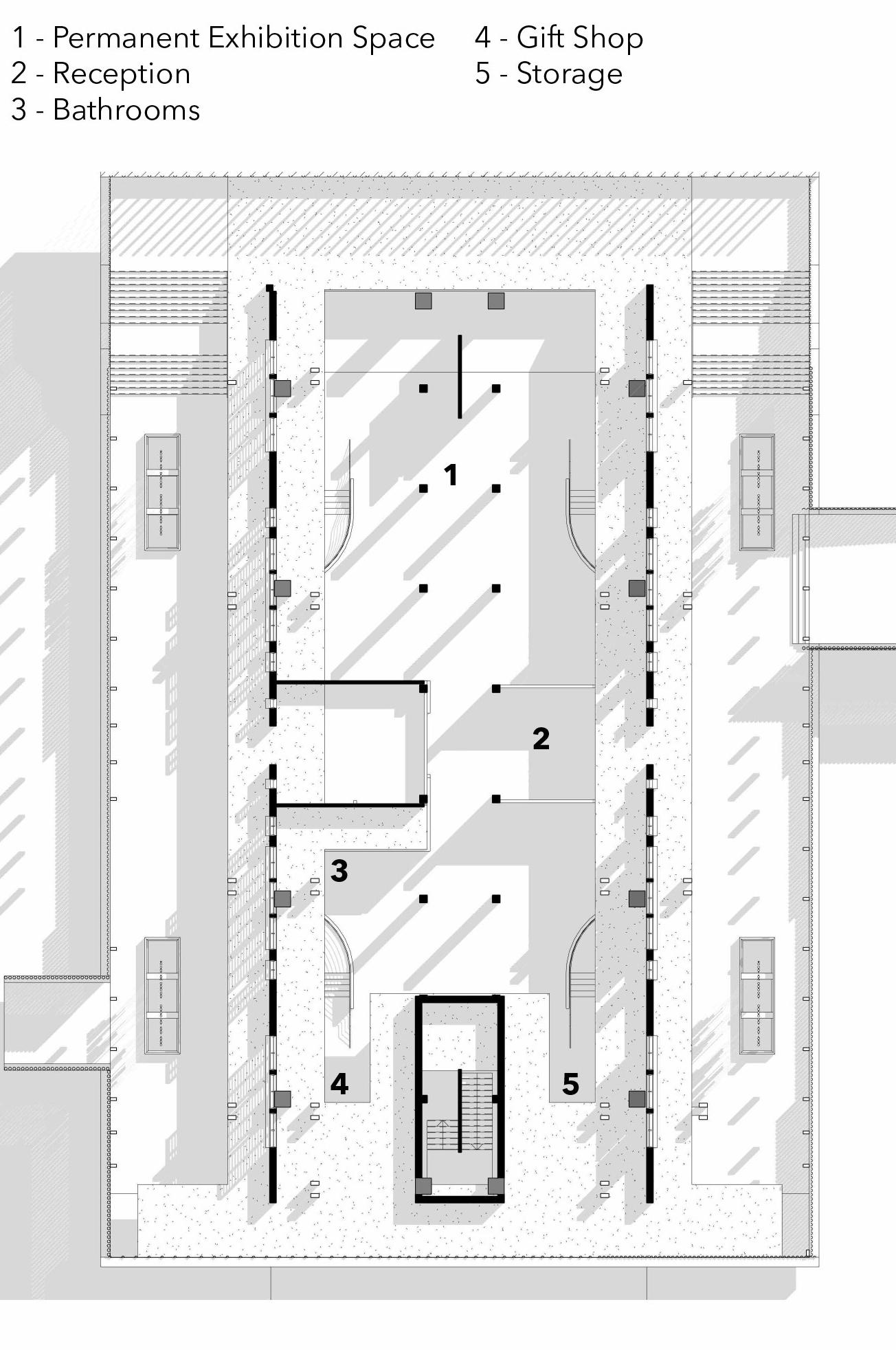
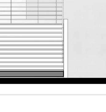
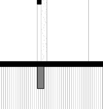
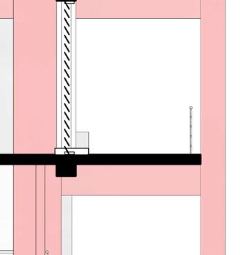
ROOF LEVEL 6"



























SECOND FLOOR 0"





FIRST FLOOR 0"
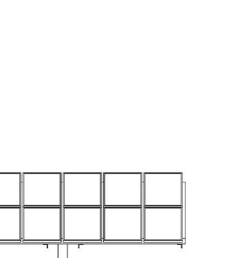


BASEMENT FLOOR 6"



































SPORTS COMPLEX
NATIONAL INSTITUTE OF TECHNOLOGY PATNA
design concept
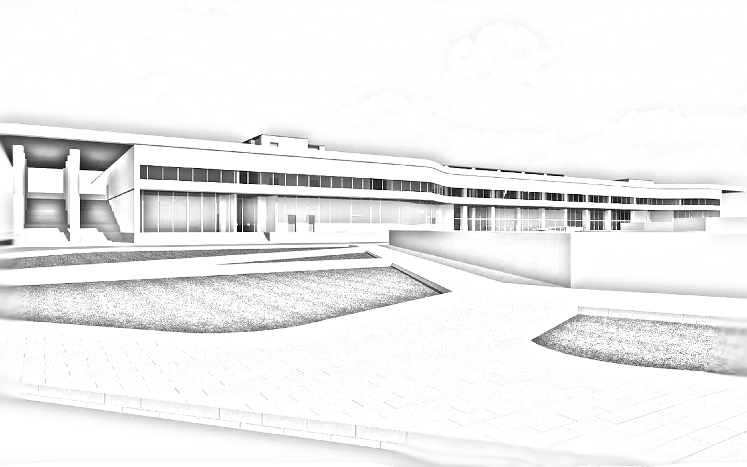
The National Institute of Technology Bihta Campus is the second fully-fledged campus for the institute in which I study. I had been given the opportunity by my professors and Head of the Department of Architecture to make the initial design for the Sports Complex of it. The design includes a fully facilitated functional Student Activity Centre, Indoor Swimming Pool and Canteen, with adjacent BasketBall, Volleyball and Law Tennis courts spanning over a 300m x 400m rectangular site.

design considerations

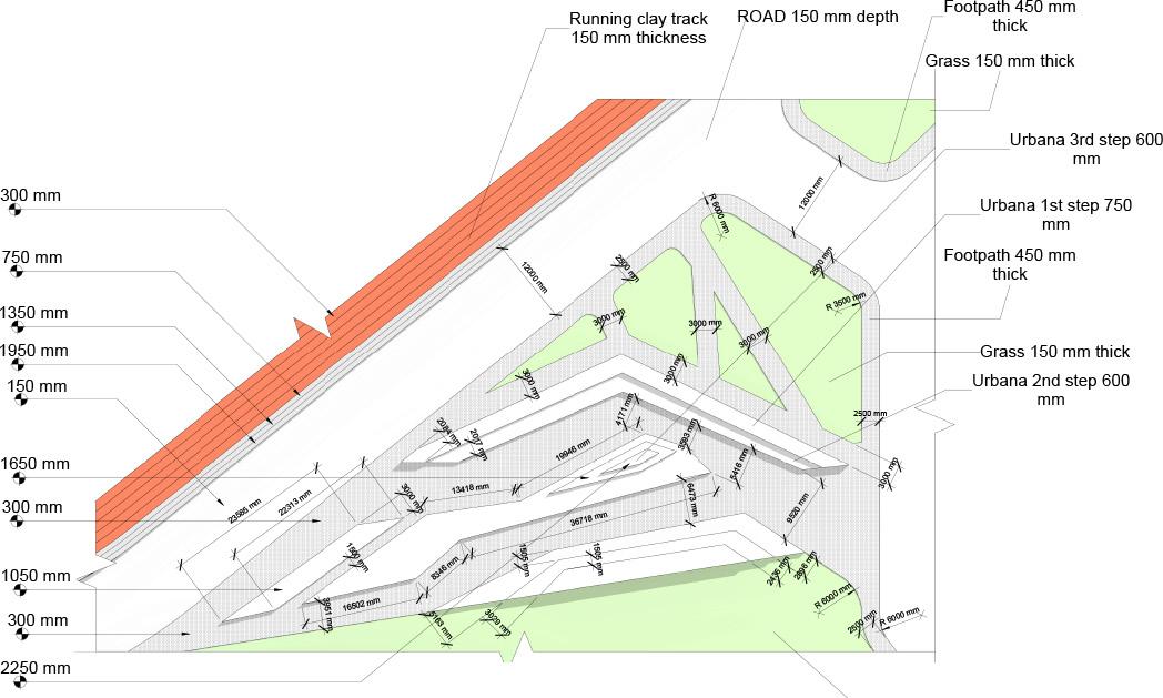
The design is made giving priority to circulation. The arterial road is 12 m wide while secondary roads are 6 m wide. All the pedestrian walkways run along the both sides of the road with each of them 2.5 m wide.
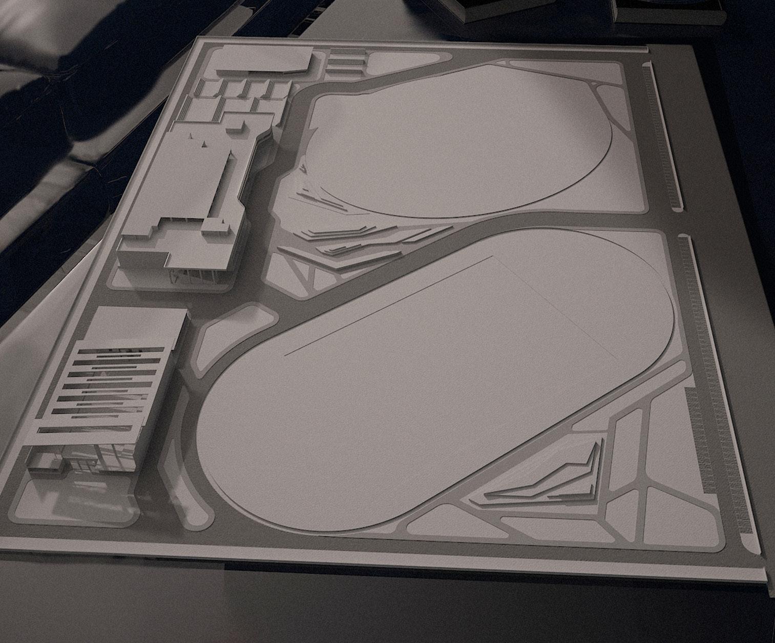
The site contains a Cricket Ground, Football Ground, Sand Ground (for short putt, long jump etc.), 10 person Running Track as well as basketball, volleyball and lawn tennis courts for exercise and sports purposes.
Buildings include the Student Activity Centre (SAC), Canteen (800 seatings) and an indoor National Grade Swimming Pool.
design union
The Student Activity Centre (SAC) building is the extracurricular hub of the institute. All atheletic, musical and other similar activites and events will be coordinated from here. Hence, sports facilities, seminar rooms and other necessities must be provided here. The building is painted white - as pure as snow with glazing along the top to allow for sunlight to enter. All required circulation elements have been provided to optimize time consumption in movement and maximize ease of flow. In most cases, corridors have been avoided and an open planning methodology has been adopted.

UNION STATION
ARIZONA STATE UNIVERSITY
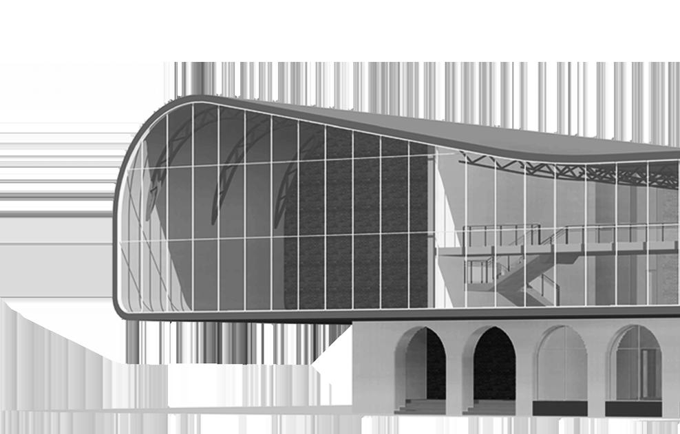

design concept
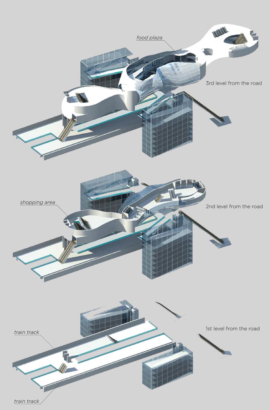
The site is an old station in Tempe, Arizona. The aim of this design was to redevelop this site into a student hub for The Design School of Arizona State University. So, it was conceived as a studio building with all the necessary requirements and a food and relaxation plaza, making an independant and close-knit system of academic fabric into the city. It’s retro-fitted in the Union Station.
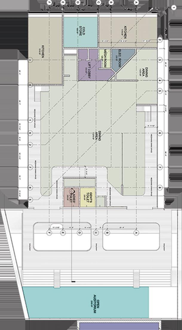
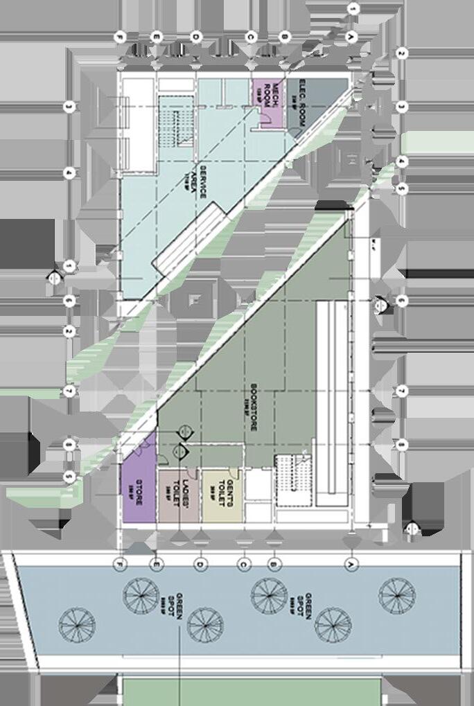
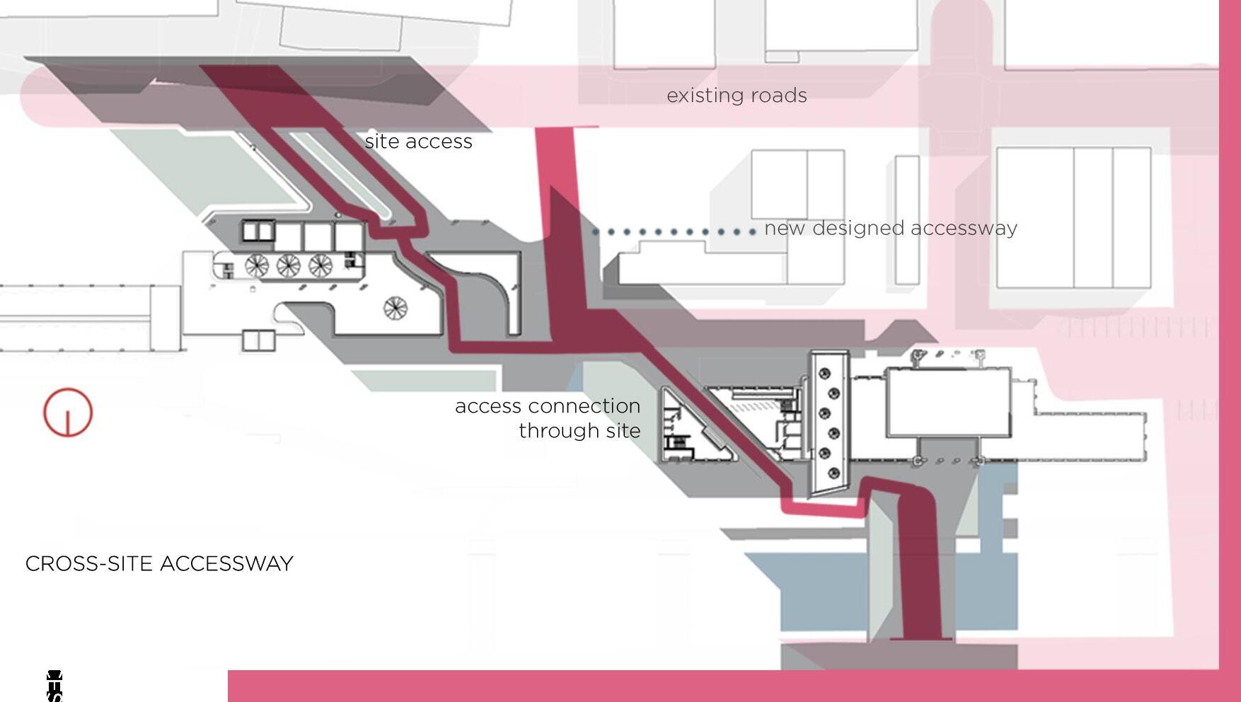
Roads are cut into the site in a way that there is smooth-flowing connection through the site so vehicles and people can flow easily. The concrete structures are inter-dependant masses of loosely sheared concrete. They work as a single unit by transferring the common load off the common wall that is shared by the two major masses. The old structure is expected to be retro-fitted with a structural frame capable of handling such a load with ease. The building is oriented in the north-south direction for light to pass.
base form of the union station to be renovated.
void through the form to allow for cross-circulation of traffic and pedestrians. Also functions as a drop-off.
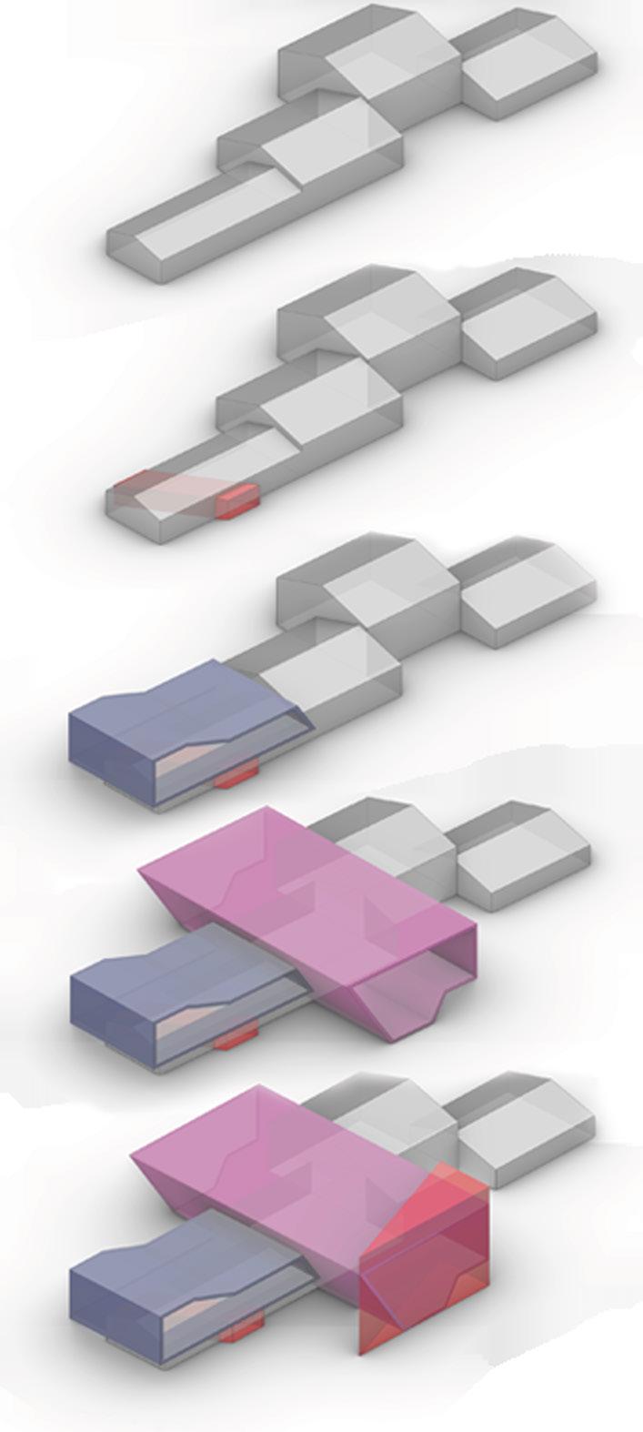
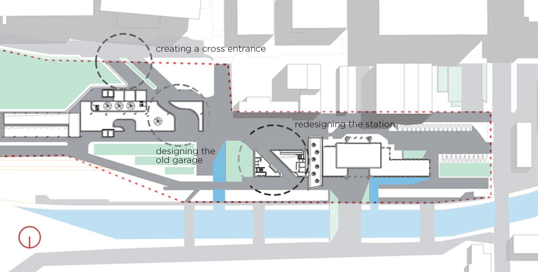
mass added over the section chosen to be the restaurant. max allowed renovation is 50%. Acts as protection from the sun.
Covered garden and zen relazation space created as a connection between the old and new building. Upper space acts as an open theatre.
Ana
R O T H I
B H A T T A C H A R Y Y A
A mot vated and exper enced designer with a se f- mposed h gh standard of excellence I reve n the sensory aspect of design and streaml ne construct on through innovation and sustainabi ity Working on actual designs and software s nce middle school, my exper ence is leagues ahead of my age or education
(480) 628-0574
roth architect@gmail com
bit ly/rothi-portfol o2023
bit ly/rothi- inkedin
8 / 2 1 – p r e s e n t
Architectural Designer | Orcutt Winslow LLLP

Des gned conic canopy at Sunnyslope H gh Schoo , m rror ng site topography
Streamlined panel layout and framing via Grasshopper el m nating s te panel cutt ng w th nnovat ve prec s on
Managed construct on adm n stration for 2 school bui d ngs Conducted site visits addressed RFIs and reso ved structural and mechanica cha lenges whi e upholding adherence to design ntent
Contr buted to award-winn ng Crismon High Schoo design col aborating on concepts with mult discipl nary teams Oversaw BIM coordinat on and egress
Managed 6 school renovat on projects from acquis tion to perm t rece pt n 2 months Coordinated consu tants and contractors throughout construction
Co laborated with cl ents engineers, and architects to deve op des gn concepts for mu t p e renovat on & addition pro ects with f uctuat ng scopes
Conducted on-site observations and research to gather nformation about the project and prepared reports proposals and presentations
Responsible for model ng crit ca Revit parametric fam l es for the stud o
Faculty Associate | Arizona State University
Herberger Institute for Design And the Arts
Instructed a se f-created studio on Parametricism examin ng the dynamic evo ution of des gn paradigms and the introduction of new parameters
Taught a se f-created stud o with Kar n Santiago (Principal Lightvox Studios) using cross- am nated t mber in des gn, with a heavy focus on construction
BIM/Arch Designer | Sixty First Place Architects
Created deta led architectura drawings for m l tary and residential pro ects Co laborated with consu tants for clash detect on on Navisworks and Lum on
8 / 2 0 - 9 / 2 0
Student Design Collaborator | Jones Studio Inc.
Master
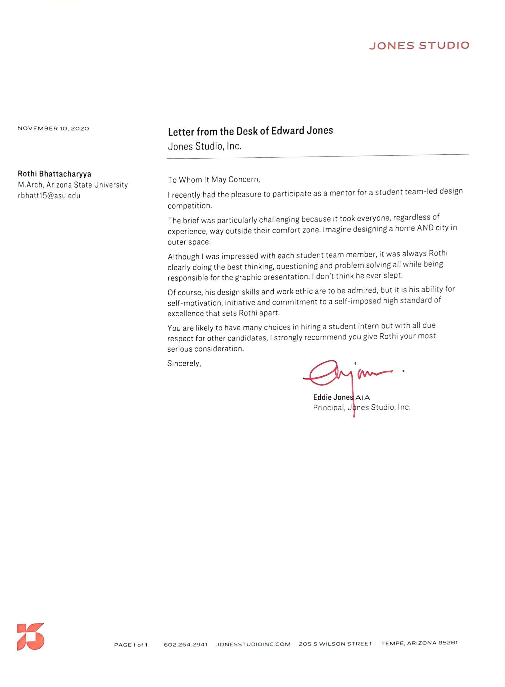
Created extraterrestr al communa iving for Blank Space competition
Mentored by award-winn ng arch tect Edd e Jones Exp ored conceptua design hon ng cr t cal think ng ski ls for final presentation
Drawing Perspective View Independent of its Graphical
Constraints: Mathematical Approach
AICMSE, University of Oxford, UK
Us ng a genera mathematica formu a for ca cu at ng graph cal 3D perspect ves instead of the age-o d graphical method of van sh ng po nts Reduc ng oad on graph cs card and transferr ng t to processor for software
“Curiouser and curiouser...”-
Alice in Wonderland
