5 minute read
Developing a personal style by taking Control of Colour By Ingrid Popplewell
This excellent workshop on Taking Control of Colour run by David Rosen, consisted of three 2 hour Zoom sessions on 3 successive days with 6 participants (one of whom was in Perth in Australia!)

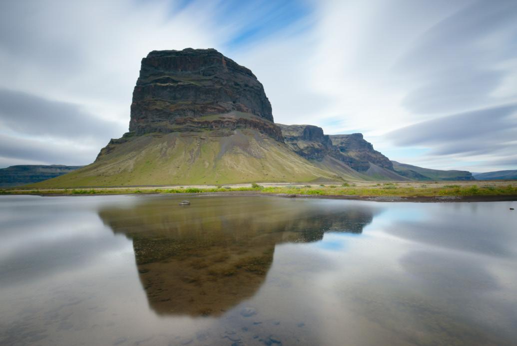
Lomagnupur Mountain Iceland
David Rosen
David started by talking about colour in photography and how it contributes to the success or otherwise of both representational and fine art photography. He explained how he has been influenced hugely by cinematography where colour grading is very sophisticated in its purpose to create a desired emotional response in the audience. He shared the work of 5 photographers where a consistent colour palate contributes significantly to their style.
Technical points
We discussed the technical side of colour management in the computer and camera software. David talked about the different colour spaces, sRGB, AdobeRGB and Prophoto and their significance and how to work with them.
We then discussed Basic Colour Theory: the meanings of hue, saturation, luminosity, shade, tint and tone and ways of combining colours.
We were shown how to create a fill layer in Photoshop and fill it with a colour from our image and then blend this layer with the original image. This allowed subtle manipulation of the colours without the introduction of a ‘new’ colour. The blend mode and opacity can be changed for the desired effect and can be applied locally rather than globally by the use of a mask and brush to either paint in or paint out the effect as desired.
We were then introduced to the very powerful Adobe Colour tool. This is part of the online package when you subscribe to Photoshop and Lightroom. It allows you to explore the colour palette of any image you can bring into the tool and extract a colour swatch, which can then be used to alter the colours in another image. The most obvious use would be to create a cohesive portfolio for a project by using the colours from one of the images and applying this swatch to the whole set, however it has enormous creative potential beyond this.
We used the Blendif tool in PS to apply colour depending on luminosity levels, almost painting in the colour rather than washing it in.
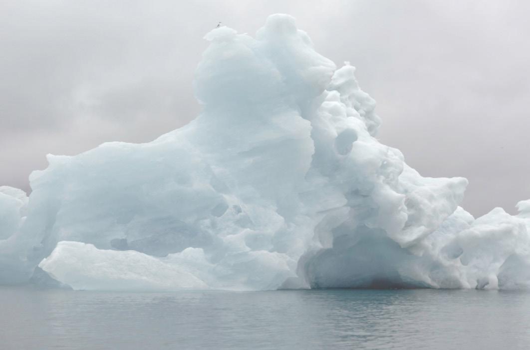
Iceberg Joulsarlon Lagoon Iceland
David Rosen
David showed us his version of the Orton Effect and how to work with this to produce subtle changes both globally and locally in an image.
We used the linear and radial gradients combined with blending modes to change the look of the sky or to help draw the eye to the subject in a picture.
We used the Gradient Map to apply a desired colour palette where the colour is assigned to a particular tonal level.
We discussed the pros and cons of presets. David felt they had value as a starting point. It is now possible to see the sliders in a preset in Lightroom and to alter its opacity which has made them more useful.
Personal Style
We discussed an approach to developing our own style. David shared his approach: he created a ‘Visual Mood Board’ of images , photographic and cinematographic, that resonated for him. He used this as a starting point to understand and reflect on his own photography. He also suggested a ‘Word Cloud’: collecting words that describe 80% of your images to find underlying themes that you might not even have been aware of.
He recommended 3 books:
Steal Like and Artist by Austin Kleon Find Your Artistic Voice by Lisa Congdon The Art of Photography by Bruce Barnbaum
He showed images from 5 photographers whose work he admires, where colour is a significant part of their personal style:
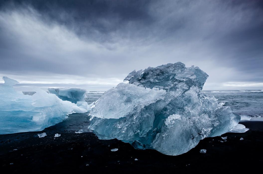
- Rachel Talibart - Laars van de Goor - Verity Milligan - Edward Burtynsky - Sandra Bartocha Floating Ice Jokulsarlon Beach Iceland
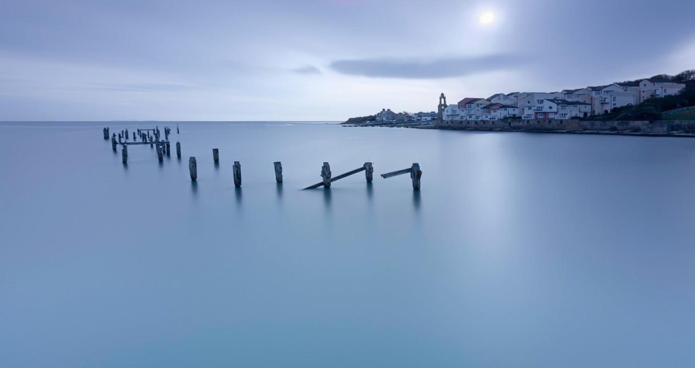
Swanage Pier (Dorset)
David Rosen
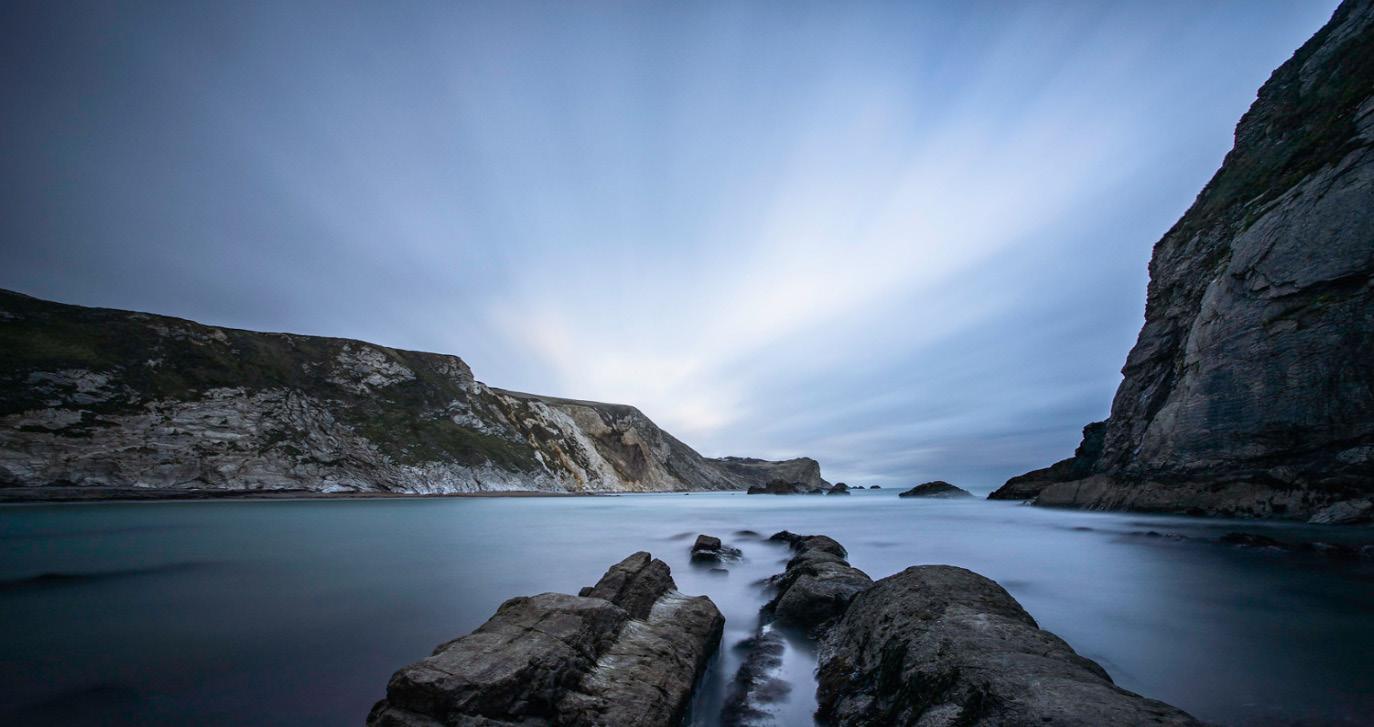
Man O War Cove Dorset
David Rosen
Summary
This was an excellent course. We discussed basic colour theory and learnt many techniques for applying or changing colour in different ways. I would say that you would need a good working knowledge of PS to follow most of the technical learning. The message was to do this with intent and to do it in a subtle manner. We discussed personal style, whether we had it and how we might explore it. We had a chance to experiment with the techniques between the sessions and to share and discuss our results.
The sessions were really well organised and presented. David responded to questions as they arose. He was encouraging and I believe, inspired us all to be more aware of the possibilities offered by understanding and manipulating colour.
All images © David Rosen


