VISUAL ART
THE MAGAZINE OF THE ROYAL PHOTOGRAPHIC SOCIETY VISUAL ART GROUP / FOUNDED 1921 NO. 162 / 2023 / ISSUE 1
COMMITTEE
John Cavana ARPS (Chairman) visualart@rps.org
Carol Paes ARPS (Secretary & Newsletter Editor) visualartsec@rps.org
Barry Barker FRPS (Treasurer) visualarttreasurer@rps.org
Mark Deutsch LRPS (Membership Secretary) visualartmembership@rps.org
Wendy Meagher LRPS (Exhibitions Lead & Magazine Co-ordinator) wmeagher@gmail.com
Michael Butterworth LRPS (Group Web Editor) visualartweb@rps.org
Gill Dishart ARPS (Circles Secretary) gill@dishart.plus.com
Michael Kitchingman LRPS (Residential Weekends Co-ordinator) mike.kitch@outlook.com
Martyn Pearse (Exhibitions Member) martynpearse@gmail.com
Bob Bracher ARPS (Exhibitions Member) rpbracher@yahoo.co.uk
SUB-GROUP ORGANISERS
Rollright
Barry Barker FRPS visualartrollright@rps.org
Northern Mary Crowther ARPS visualartnorth@rps.org
If you are interested in having or organising a Visual Art Sub-Group in your area, please contact:
John Cavana ARPS visualart@rps.org
VISUAL ART
CONTENTS
NO. 162 / 2023 / ISSUE 1
4. A View from the Chair
John Cavana ARPS
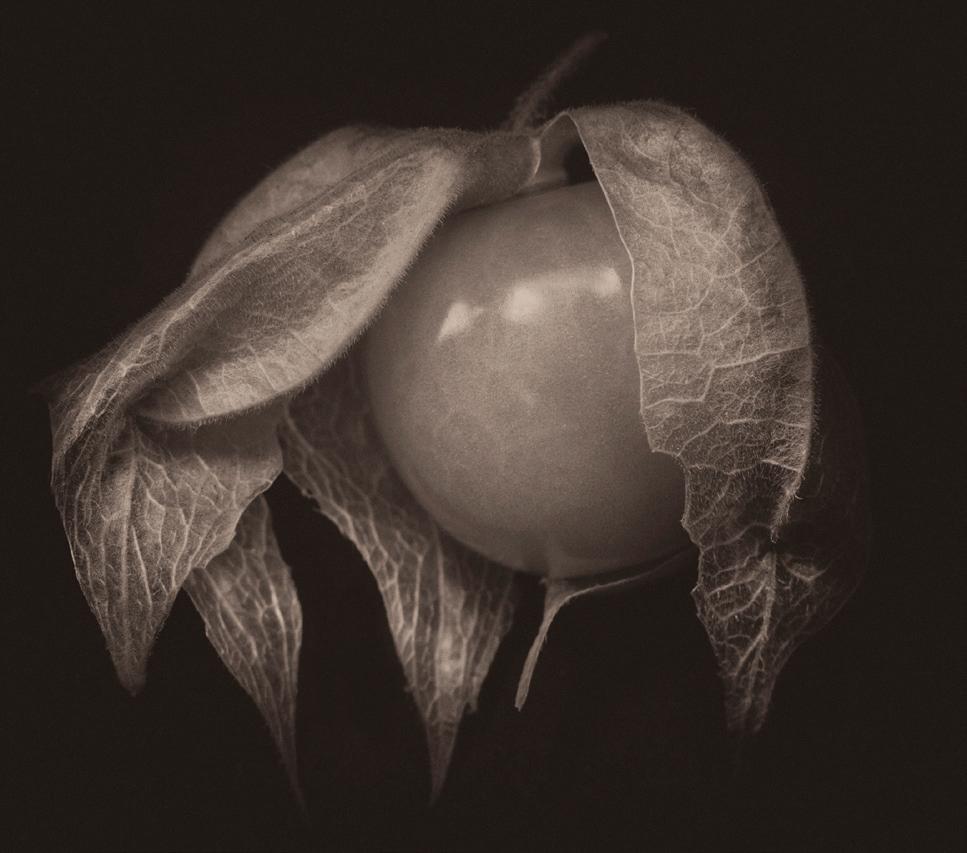
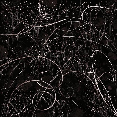
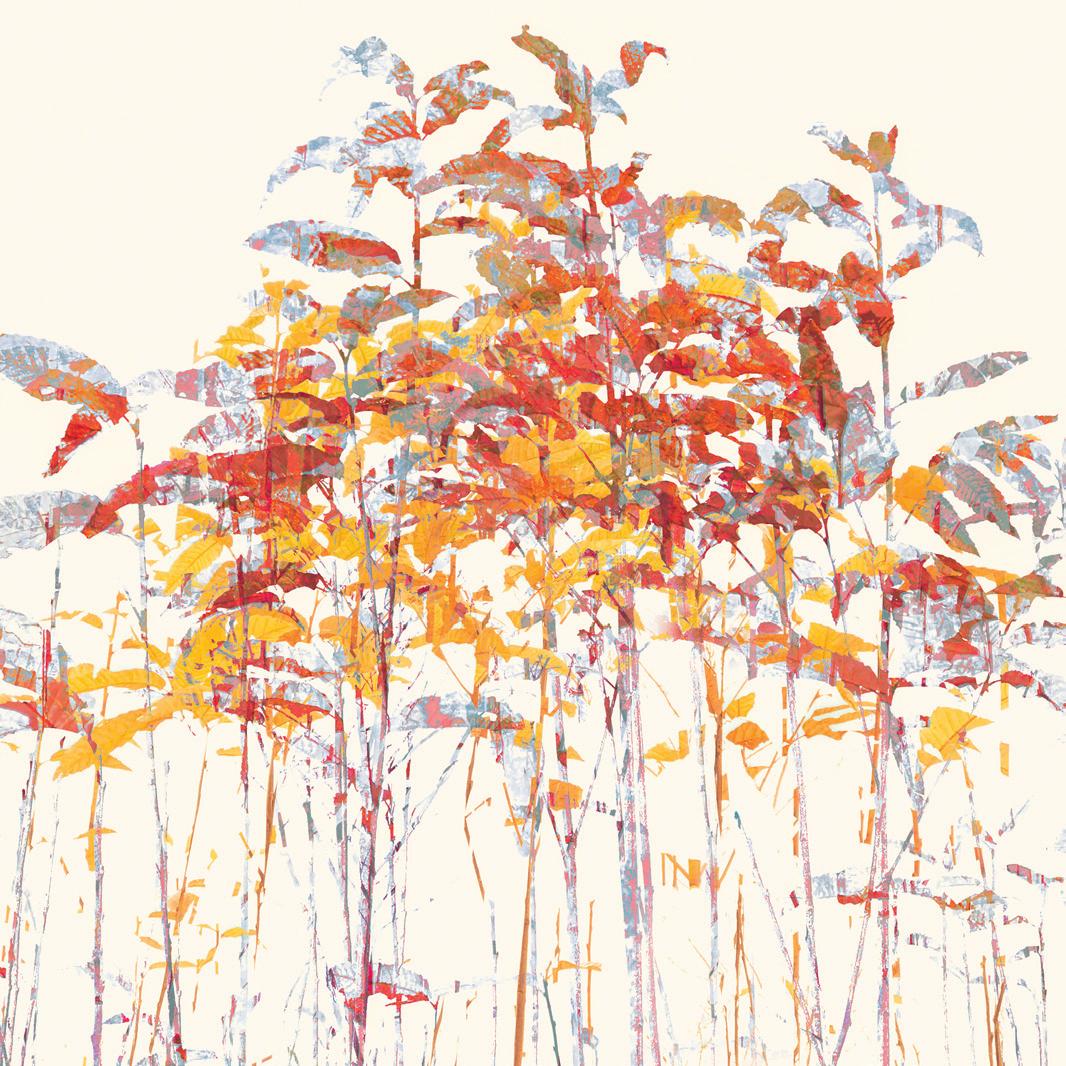
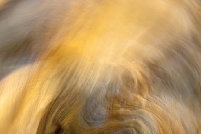
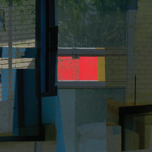
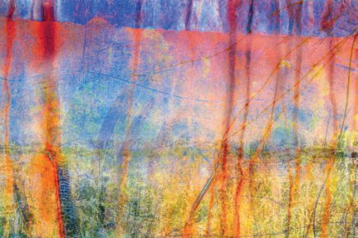
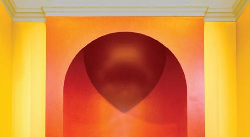
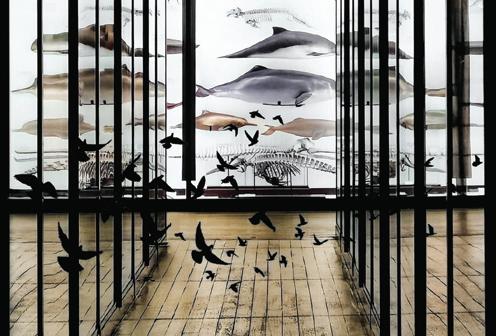
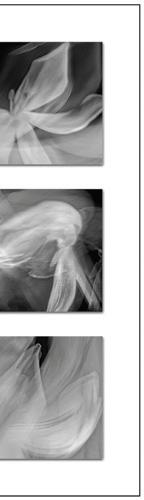
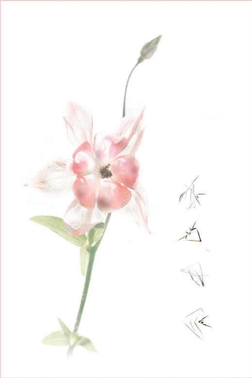
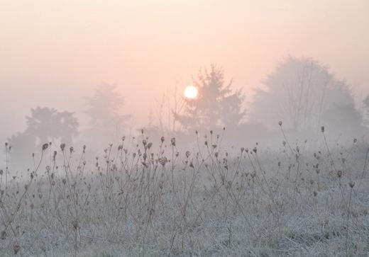
Front Cover Image: by Justine Ritchie
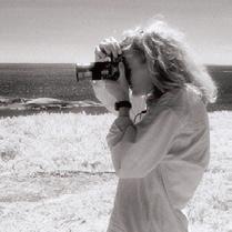
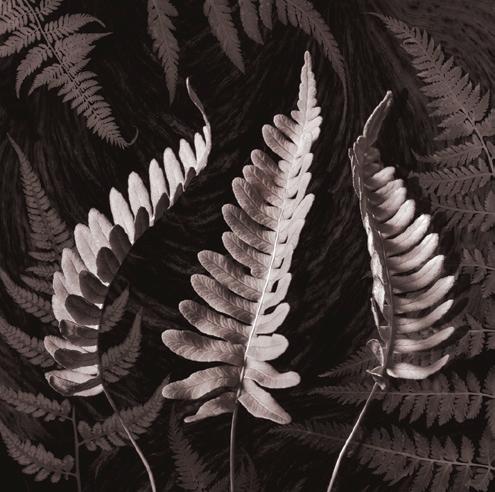
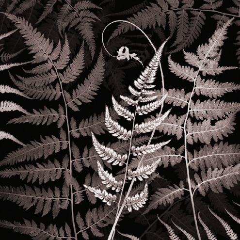
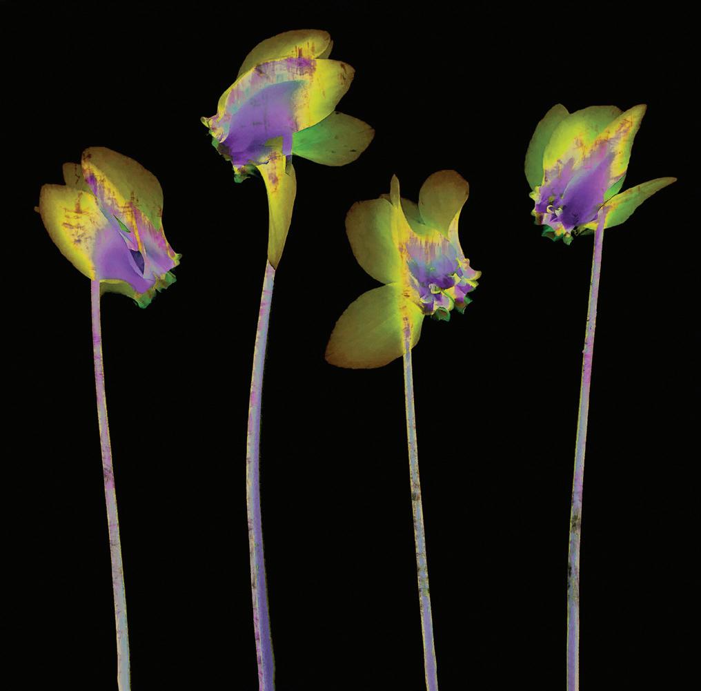
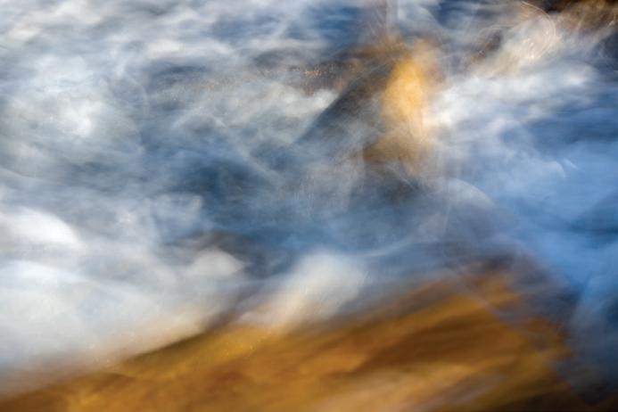
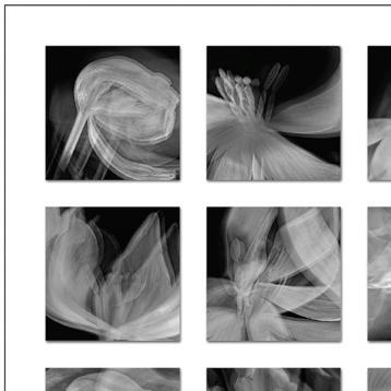
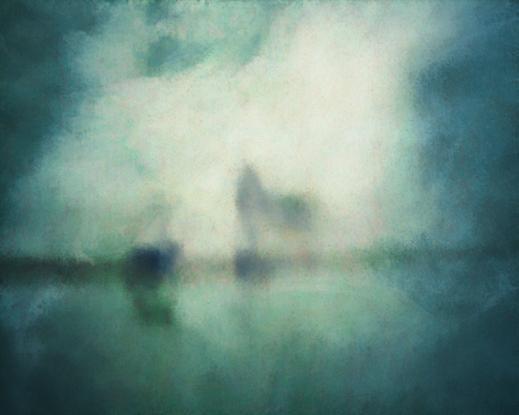
Inside Front Cover Image: by Krista McCuish
4. Editor’s Comments
Nicki Gwynn-Jones FRPS
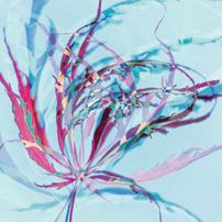
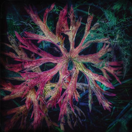
5. Botanicals as the seeds of ideas
Krista McCuish
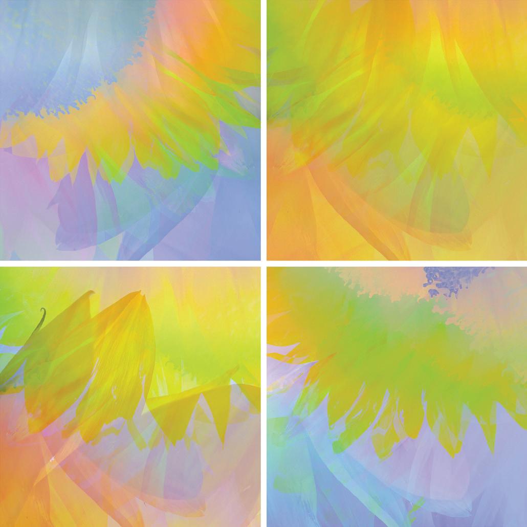
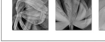
10. iPhone botanical abstracts
Jane Simmonds
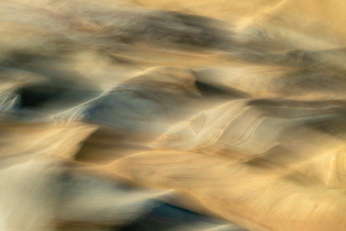
15. Responding to seaside rocks
Basia Bogacka ARPS
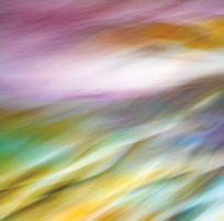
20. Lockdown blues to Loch Broom blues... Justine Ritchie
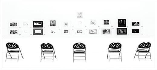
26. Members’ Print Exhibition 2023
GUEST EDITOR: Nicki Gwynn-Jones FRPS (flychick110@googlemail.com)
DESIGNER: Paul Mitchell FRPS (paul@pmd-design.co.uk)
Visual Art is The Magazine of the RPS Visual Art Group and is provided as part of the annual subscription of the Group. © 2023 All rights reserved on behalf of the authors. No part of this publication may be reproduced, stored in a retrieval system or transmitted in any form or by any means, electronic, mechanical, photocopying, recording, or otherwise without the written permission of the copyright holder. Requests for such permission must be addressed to the Guest Editor. The Royal Photographic Society, RPS Visual Art Group and the Guest Editor accept no liability for any misuse or breach of copyright by a contributor. The views expressed in this magazine do not necessarily reflect the policies of the Royal Photographic Society or of the Visual Art Group.
Printed by Bishops Printers Ltd., Portsmouth PO6 1TR
3
A View from the Chair
JOHN CAVANA ARPS
This is the third Visual Art publication to land on your doorstep in 2023 and we hope you will relish the content that Nicki has put together for all of us to enjoy. In this bumper edition we are also delighted to present you with all the selected images that will feature in the Visual Art Group Print Exhibition 2023.
It is again a time of change in the production of the VA Magazine. After giving us several years of his expertise in design and production, we are about to lose the services of Paul Mitchell FRPS. Paul’s input has been of the highest standard and he has always gone the extra mile when dealing with printers and ancillary external bodies. Paul’s everincreasing workload meant that something
had to give. We will miss him greatly. This presents us with a problem, and I am hoping that somebody reading this will feel that they are able to help. We seek someone who knows Adobe InDesign and would be willing to design and assemble 3 or 4 publications per year, and liaise with the printers. Our three wonderful guest editors will continue to supply the material for publication. If you feel that this is something you would be happy to do please do get in touch, using visualart@ rps.org
Meanwhile life in the VA group goes on as normal. Our central and northern subgroups offer a mixture of speakers’ days, photo walks and show and tell meetings.
Editor’s Comments
NICKI GWYNN-JONES FRPS
All four featured artists in this edition have a passion for photography as a creative process inspired by the natural world. All work mindfully and intuitively, their work expressive and emotive.
Krista McCuish is an artist and naturalist from Nova Scotia, Canada, and has previously worked as a critical care nurse and as a geologist. Her background in science has helped her to understand natural processes and how they influence the subjects that she studies and photographs. This, together with her intuitive eye for visual design and her imagination, enables her to create evocative compositions that are often surprising and unexpected; she says, ‘It is my intention that quiet conversations from within are expressed thoughtfully in my images.’ Her work has been widely published.
Jane Simmonds has won many awards for her abstract botanical photography,
particularly in the International Garden Photographer of the Year contests. She lives in the beautiful Forest of Dean, where inspiration comes not only from the woods, but also from the patterns and reflections found in nearby ponds and lakes. She, too, is attracted to a more intuitive way of working, which allows her to experiment freely and her imagination to have free rein. She also loves to explore colour, which for me, in these troubling times, conveys much-needed joy.
Basia Bogacka is sensitive to visual messages from both art and nature and believes that what nature has to tell us has never been more important. Through photography she tries to express her emotions towards nature, be it a flower, an animal, a rock or water. She says, ‘nature is my partner in everyday life. I respect it and I respond to it. The images I make uncover this relationship for me, help me to understand better how I see, rather than what I see.’ After a life in academia she
It is still our hope that the south-west sub-group will form again, so please check the group webpages on the RPS website for progress on this. Residential weekends continue to be fully subscribed and greatly enjoyed, and the print and email circles continue to inspire and encourage us. The needs of the group and our ability to interpret its future direction are constantly changing. In the recent AGM papers, we ask for your ideas on how you think we could best improve our group. We have a number of initiatives under consideration, and would really like to hear your suggestions as well.
With best wishes
John
now lives in Northumberland, where she has been lovingly creating a wildflower meadow around her house.
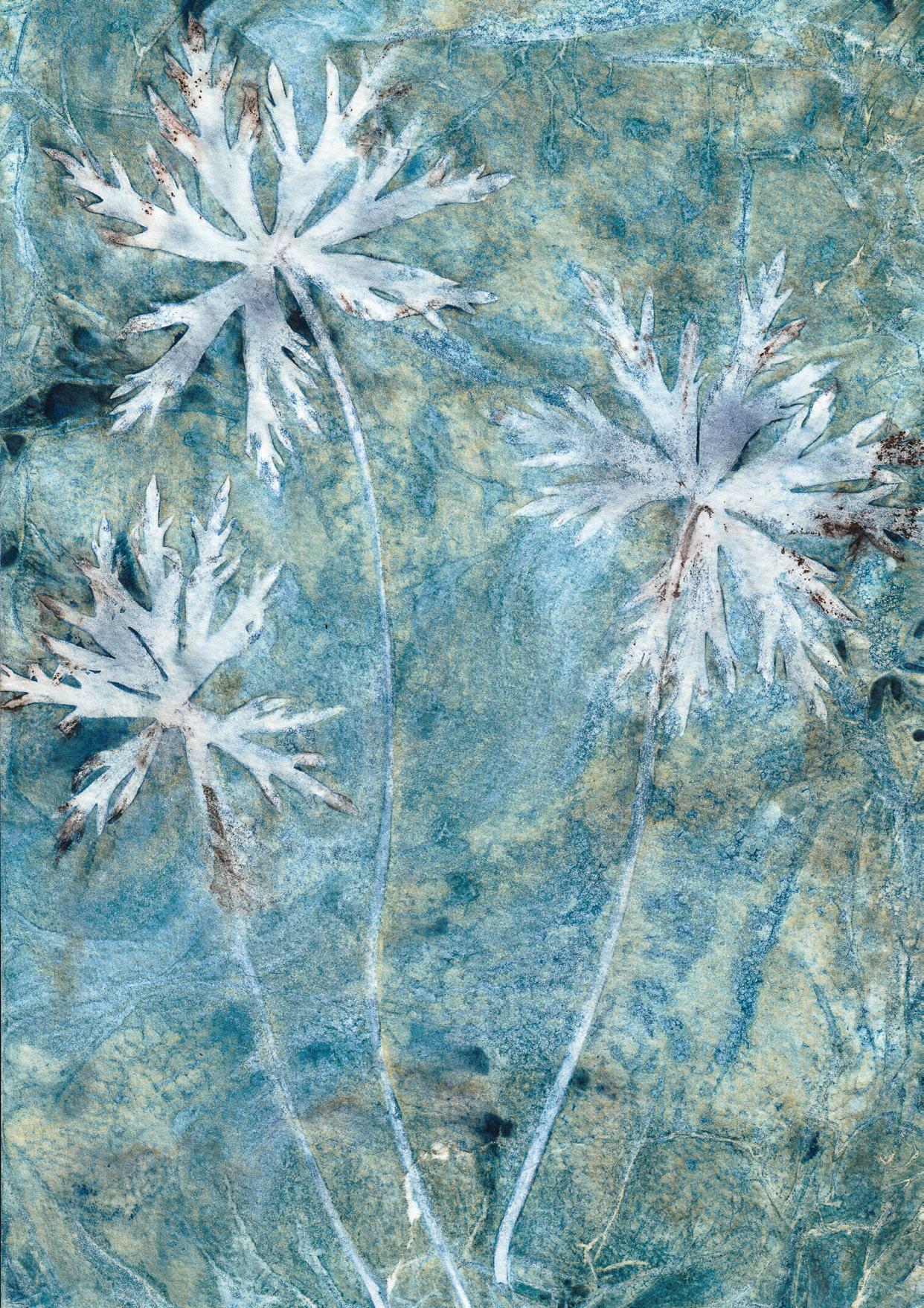
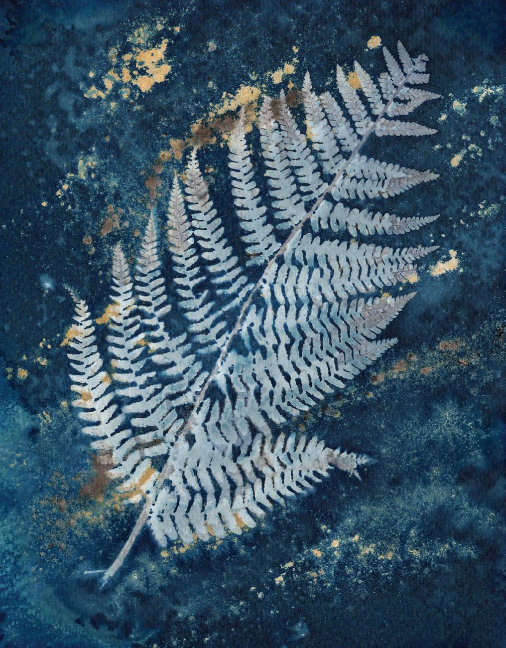
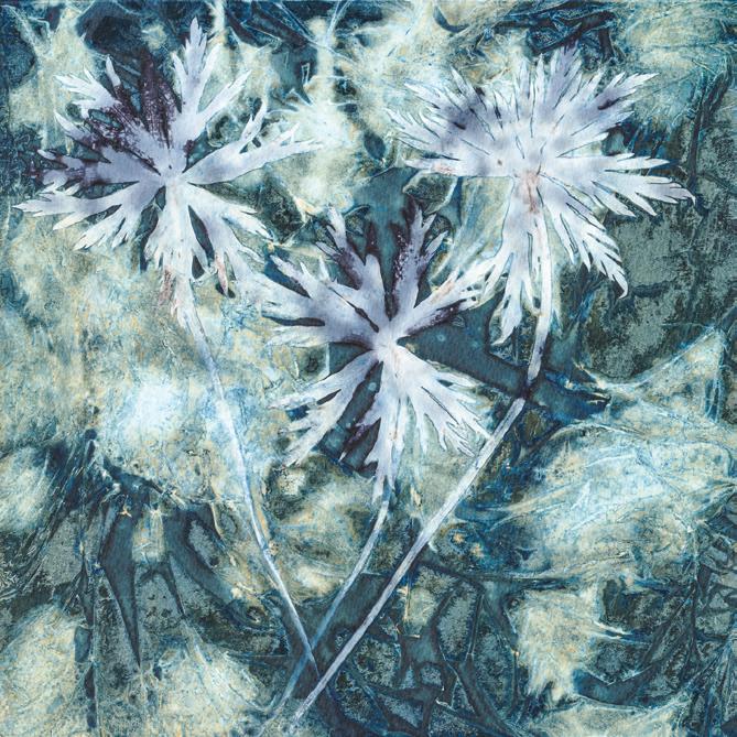
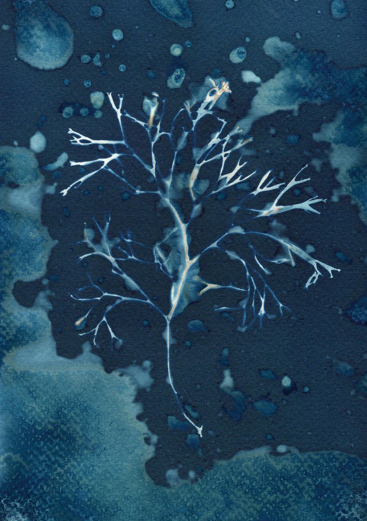
Living on a remote hillside in the North West Highlands of Scotland, photographic artist Justine Ritchie is inspired by the wild, elemental landscapes and seascapes, and her work reflects both the natural world and also man’s interaction with the environment. For her, photography is a way of drawing attention to these remote, often fragile places that are so threatened by the unprecedented global emergency that is climate change. Her work adopts a mindful, intuitive approach, engaging all her senses, and incorporates both camera work and alternative photographic processes, such as cyanotype and anthotype printing.
I very much hope that you enjoy the magazine.
Nicki
4 COMMENT
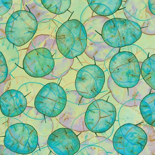
Botanicals as the seeds of ideas
 KRISTA McCUISH
When COVID-19 struck our region with local travel restrictions, I struggled to find a little solitude to be alone with my camera. But then I found a solution - I discovered still life photography as an additional approach to making photographs, and I came to love it even more for selfexpression than intimate landscape photography. I no longer limit myself to composing outdoor subjects in situ; now I also arrange compositions indoors, guided by my imagination and intuition. Still life work allows me to create something entirely new and unexpected. When I work with botanicals in the studio, I often find my best seeds of ideas.
I walk into my makeshift studio and shut the door. Time slows down. Distractions fall away. I feel the creative possibilities lurking in the room. My mind is temporarily free to experiment
and play with light, textures, colour, and form. Minutes turn into hours. I’m lost in thought as I work through my ideas. What do I want to say with the objects of my attention? How can I bring my ideas and emotions into a photograph?
My studio is the old dining room, and it now houses a collection of cabinets, drawers, and a large assortment of vases filled with dried botanicals. An old farm table sits in the corner by the window, a black velvet backdrop draped behind it. Its worn surface has grasses, dried stalks, and pieces of bark spread out and waiting to be choreographed into a composition. The room is a naturalist’s treasure trove. Under the table are baskets filled with beach stones, shells, bones, driftwood, and a variety of seedpods. The sills are lined with wasps’ nests, several fallen birds’ nests, a porcupine skull, and many sizes of sea urchins and sand dollars.
5 FEATURED PHOTOGRAPHER
KRISTA McCUISH
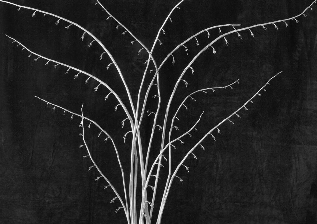
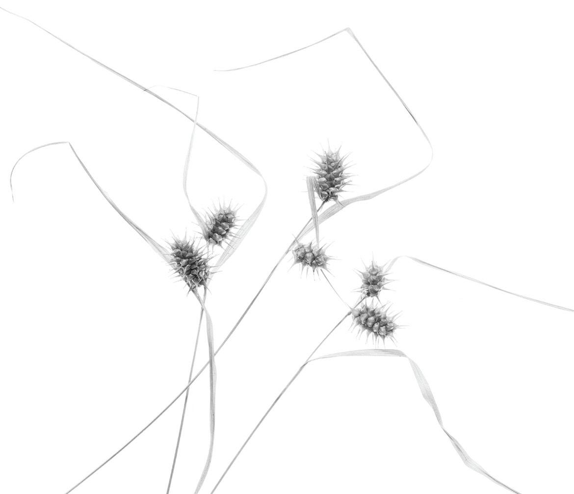
Today, I gathered old stalks of Solomon’s-seal from the front garden. The stalks are bare of leaves, and, together with the rows of tiny stems, they have captured my attention for their pleasing curves and design details. I arrange them one-by-one by pressing them into a floral foam brick. I experiment with shaping the light using a continuous LED light and a diffuser. It feels as though the dried stalks are wanting to arrange themselves back into their original form, as they were in the garden. It is a simple composition with a repeating rhythm of curved lines framed against a black background. It has a calming effect on me.
and bringing them indoors to study them further.
I was introduced to photography as an adolescent, and I remember the excitement I felt when I developed my first roll of film in the darkroom. At first, I made uninspiring images of just about anything that I found interesting, and to record travel memories and personal milestones.
to make compelling compositions that would be more self-expressive. It was not a quick task. There were no shortcuts for experience, and I had many failures before making any images that I found satisfying. Taking a less-travelled path while striving for originality and fresh perspectives had its challenges, but the journey became more personally rewarding.
In childhood, it blossomed as I explored and discovered details waiting to be found in the forest and lakeland surrounding my home in Nova Scotia, Canada. I began collecting natural specimens from the garden and forest
Time for photography was limited while I chased several busy careers and raised a family, but I always remained connected to the visual arts and to the natural world. I rekindled my interest a decade ago and realised that I wanted to approach it more seriously. I no longer wanted to make easy or repetitive images following tips and prescriptive techniques. I also had no desire to travel to popular destinations, preferring to discover the creative potential that existed closer to home. Eventually, I learnt more about the art of photography as a medium for creative expression; I spent several years studying the history of art and photography and taught myself how
Many artists have written about how a photograph has the potential to ask questions rather than to simply provide answers - it can provide mere illustration, or it can ask questions of the viewer by conveying a photographer’s intent. Over time, photography has become my way of creating expressive art that mirrors my emotions, while at the same time asking viewers to reflect on their own emotions and how they are responding to the image.
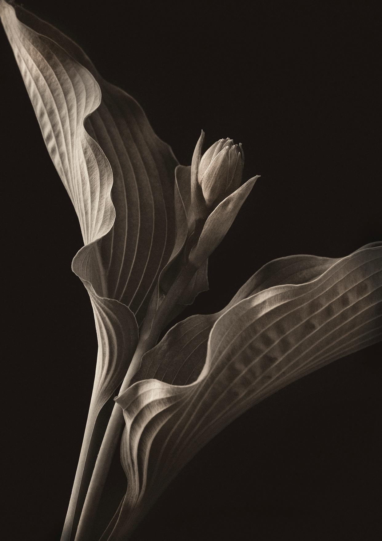
I am now back in the studio and working with several hosta leaves and a small flower bud. This time, I use a bendable clamp to hold them in place, and work with natural light from a north-facing window. I’m interested in the structures,
6
My interest in botanicals and natural history began as a toddler wandering in my mother’s garden.
FEATURED PHOTOGRAPHER 8
shapes, and lined veins of the leaves with their curved edges, and the novelty of a simple bud. The leaves and bud together have a sensuous nature that is harmonious and radiates an emotional intensity.
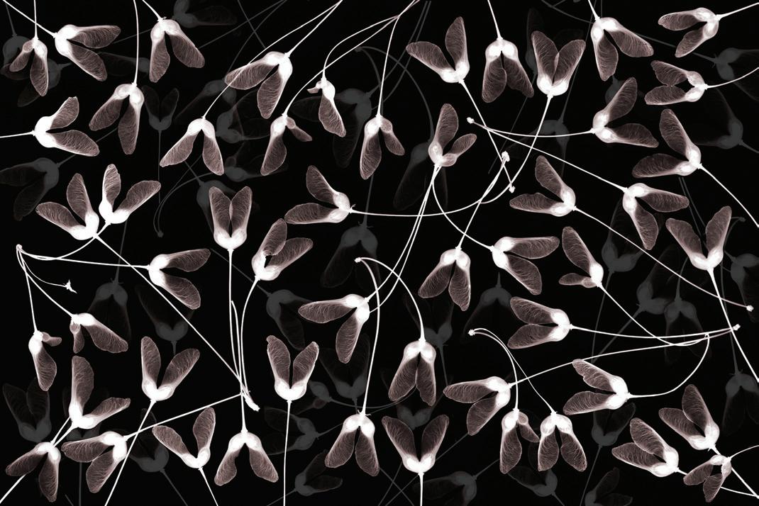
One day, I collect maple seeds (samaras) from a red maple in the woods behind my house. I notice the seeds have translucent winged tips and would render textures nicely while illuminated on a light pad. I make a pleasing arrangement of shapes and playful curved lines.
I am reminded of playing with these seeds as a child and the joyful fascination of watching their aerodynamics when they were released into the wind and spun to the ground.
On another day, I have a Beethoven symphony playing in my head. I photograph flax stems and maiden hair grasses individually with continuous LED lighting and diffusers. I’m drawn to the lyrical quality of the grasses. They resemble melodic lines counterbalanced with the structure of the flax stems. This time, I bring the individual files into Photoshop and create a multilayered composition. I feel like I am creating harmonious botanical music in my mind’s eye. I title the work ‘the lyrical power of botany’.
I will never stop learning and experimenting with photography as expressive art. My photographs of botanicals seek to express what I see and feel. They are a way to explore wide-ranging emotions and fill me with creative and artistic joy. When I share my studio work with others, I want to give viewers a sense of the beauty I see in ways that are uniquely my own - planting the seeds of creativity. Viewers may take a step closer, engage their own emotions, and see that there are unlimited possibilities for self-expressive approaches to photography as art.
www.kristamccuish.com
9 KRISTA McCUISH
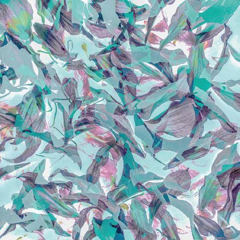
iPhone botanical abstracts
JANE SIMMONDS
My photographic journey started the traditional wayI bought a DSLR and learnt all the technical aspects of photography that would enable me to make the kind of classic images that I saw in magazines and on social media. Living in the Forest of Dean, I was drawn to photographing the beauty of the natural world that I saw all around me on my woodland walks, paying particular attention to small details in the landscape, or to botanical subjects such as leaves and flowers, yet producing fairly conventional images.
As time went on, I began to find this approach to photography less satisfying and somewhat limiting - I just felt that something was missing. But then around 7 years ago I began discovering the work of photographic artists such as Valda Bailey and Doug Chinnery, who were pushing the boundaries of photography by exploring techniques like ICM and multiple
exposures. Their wonderfully expressive images were all about colour, light and form rather than faithful reproductions of reality. It was like opening the door to a whole new world of exciting possibilities in which I could learn to create images which were more personal to me and my imagination.
I love the experimental nature of ICM and multiple exposure photography; results are often unpredictable and usually unrepeatable which can be frustrating, but when something interesting emerges during a session, the rewards can be immense. This kind of photography also enables me to explore my passion for colour; I am endlessly fascinated by the different colours and shades within a colour that can be produced by making simple adjustments as I create a multiple exposure - for example, by changing the white balance settings during the process.
10 FEATURED PHOTOGRAPHER
Why use an iPhone for creative photography?
It’s often assumed that a DSLR/ mirrorless camera with multiple exposure functionality and several blending modes is needed for this kind of photography and indeed I do have such a camera, but over the last 5 years many of my botanical images have been made on my iPhone - initially a little SE but more recently, a 13 Pro. For me, my phone is a creative tool just like any other camera and it has the advantage of always being in my pocket or bag. I have never enjoyed having to carry around a heavy bag of camera gear plus tripod, and I much prefer the freedom
of being able to go for long walks in my local woods with just a small bag and my phone, waiting for something to catch my eye, whether it be the interesting shapes of winter grasses or the vibrant colour of a summer foxglove. This frees me up to be creative in a more instinctive way and allows me to remain in the moment, rather than having to think about camera gear and settings, or even whether I can be bothered to get the camera out of the bag in the first place.
I also use my phone to make abstract botanical images at home using collected items such as petals and seed pods arranged on an A3-sized light pad.
I do not have the space for a properly equipped home studio, but this minimalistic set-up works well for me.
Smartphone cameras are sometimes dismissed as being good enough only for record shots or Instagram selfies, and certainly my 12mp phone camera has some limitations, but it is still more than capable of producing images of sufficiently good quality for printing at a reasonable size for exhibitions and for sale as cards - indeed, some of my bestselling prints were taken on my iPhone. Which Apps?
I like to keep things simple and prefer to use just a small number of apps to create my botanical images.
11 JANE SIMMONDS
12
FEATURED PHOTOGRAPHER
My favourite app for multiple exposures is PhotoSplit - sadly not available on Android - as it is easy to use and has a large number of blending modes available. I can take a sequence of images to use as layers from within the app itself, or I can use any image or series of images already on my camera roll, or I can use a combination of the two. I then experiment with each blending mode to see which I like best and use the opacity slider to reduce the effect if needed.
The main disadvantage of PhotoSplit is that it is only possible to produce square format images. I do enjoy working in this format but if I want to work on images in
different aspect ratios, I use the double exposure function in Pixlr instead. There are not as many blending modes, but it is a reasonably good alternative to PhotoSplit and is available for Android as well.
I also use the Slow Shutter App to create impressionist ICM images for use as layers in my multiple exposures. I save these images in a folder on my phone so that I can find them easily. I also have a separate folder for images of textures and colours that catch my eye while I am out walking - these can also come in useful as layers when creating new multiple exposures.
Post-processing
For quick edits on my phone, I like using Snapseed as it is free and has a large range of powerful editing tools. Not all my botanical abstracts are destined to be printed or shared - some are just quick ‘doodles’ or ideas for future development, like a painter might use a sketchbook, and so a few minutes in Snapseed is probably all that will be needed. If I particularly like an image, I will import it onto my computer to look at on a bigger screen, before opening in Lightroom Classic for post-processing and preparing for printing. Sometimes only minor adjustments are needed but at other times I may make quite radical
13 JANE SIMMONDS
changes, either to the whole image or to particular colours within it. As my images are not based on reality, I can take them in any direction that feels right to me.
Alternative techniques, such as multiple exposure photography, have allowed me the freedom to experiment and to express how I see the world around me in a different way. I hope I have shown that creativity is something that can be explored with minimal equipment, as long as there is a willingness to experiment and make the best use of what you have. Using a smartphone as I do may not suit everyone, but it is definitely an option worth exploring for anyone who would like to try these techniques using a device that they almost certainly already own.
www.janesimmonds.co.uk
14 JANE SIMMONDS
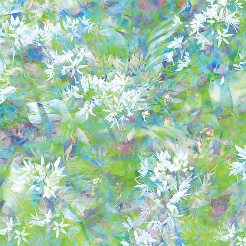
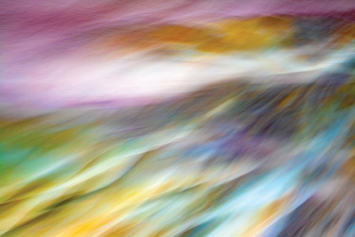
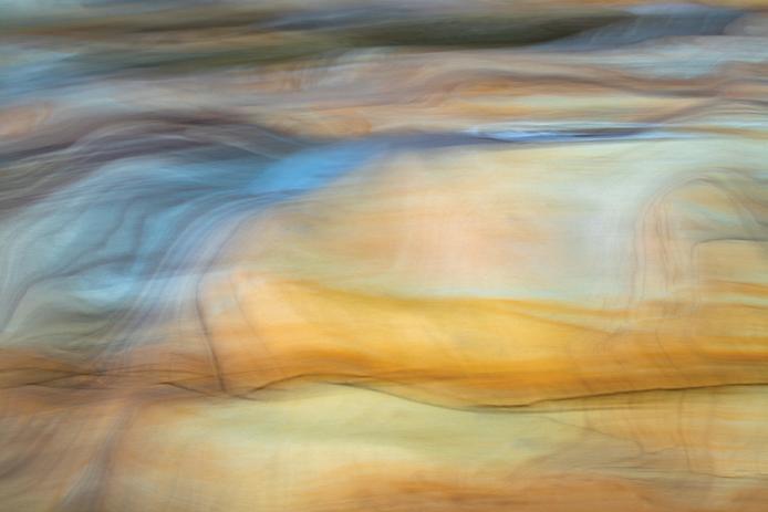
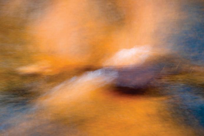
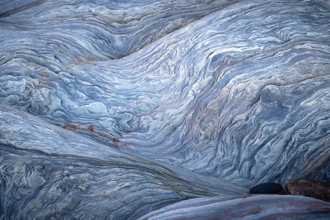
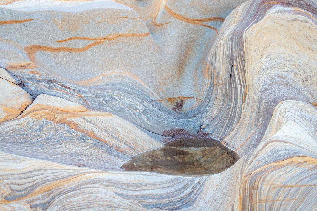
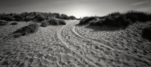
Responding to seaside rocks
BASIA BOGACKA ARPS
‘The camera is an instrument that teaches people how to see without a camera.’ For me, this statement by Dorothea Lange seems to be true. I believe that photography has helped me to become more aware of my surroundings, more sensitive to visual messages, to the beauty and complexity of nature.
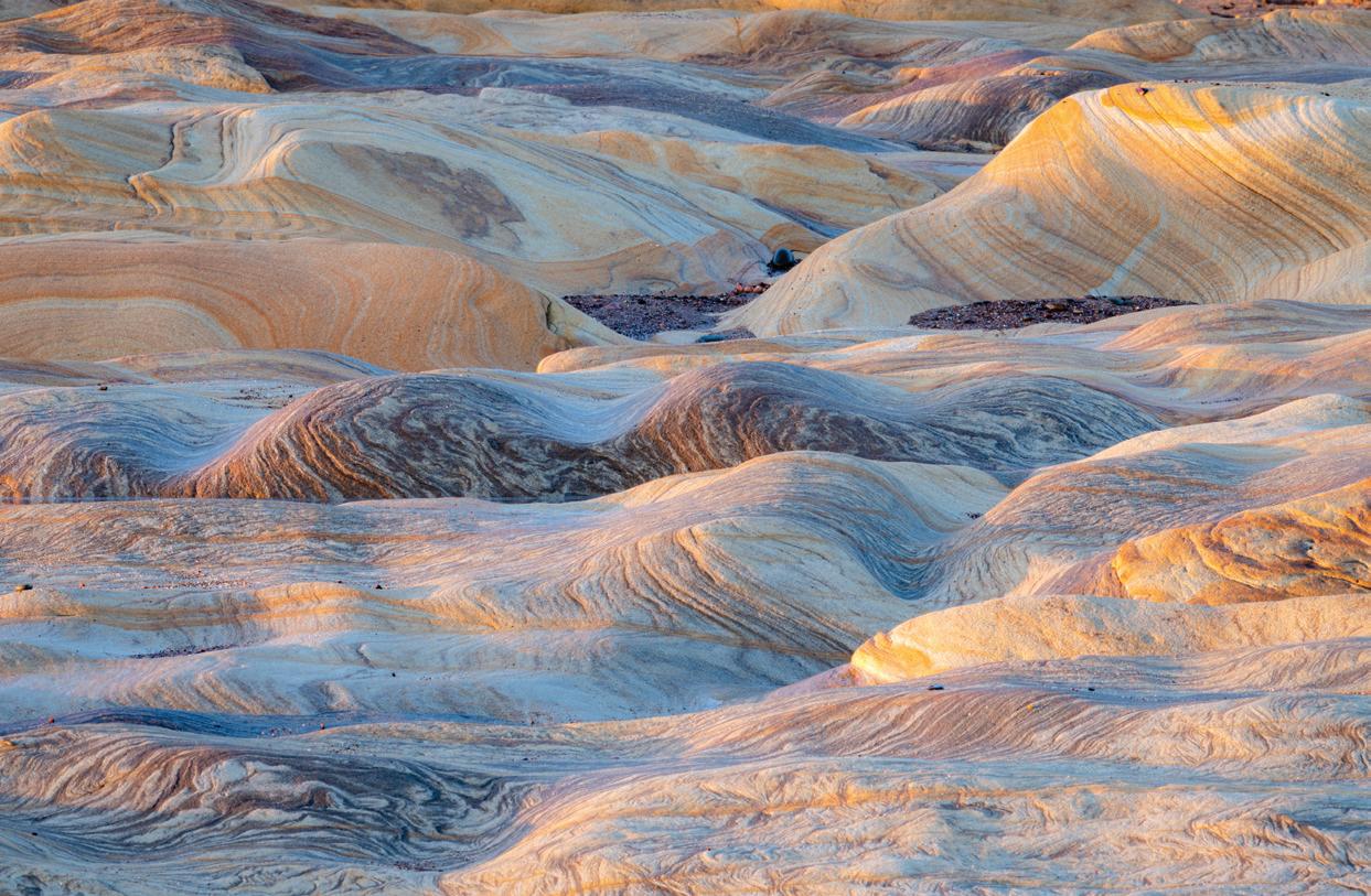
In recent years, I have been a frequent visitor to Spittal Beach on the North-East coast of England, which is not far from where I now live. One of the reasons for going there is to photograph the sandstone formations, which are absolutely fascinating. And not only to me; many people love them. Their varied colours, smooth surfaces, various strata, curvy shapes, steep gorges, hills, valleys and pools create a world in itself.
I have been taking pictures at Spittal Beach of both intimate landscapes and more abstract ones for quite a while, and I
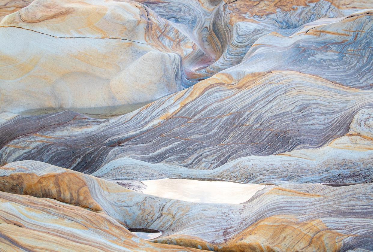
never cease to be amazed. But these rock formations have their own secret life that nobody knows about - they coexist with the North Sea, with its tide and the weather conditions. Often, they hide under a deep layer of sand, viewing the outside world only through a little tip of their top. So, we know that they are there, resting from our intrusion. Maybe they are just bored with all the photographers - I would not be surprised.
But sometimes they show their glory. I particularly remember one winter morning, when I went to the beach to photograph the sunrise. The sky was beautiful, and I made some images of the seascape, but my biggest excitement of the morning was the sandstone lit by the low sun. The rocks seemed to enjoy being stroked by the sunrays, as if they knew when would be the best moment for them to emerge from hiding under the sand.
15 FEATURED PHOTOGRAPHER
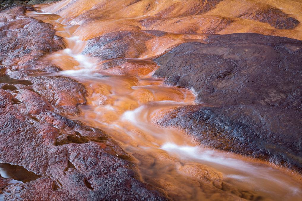
Each time I go to the beach, I visit the small cave at its south end. A stream of water rich in iron comes out of the cave and paints everything on its way with red. For me, this is a mysterious place - a small cross hangs from the ceiling at the cave’s entrance and it, too, has its own life, with the stream meandering through the rocks and soft sand towards the sea, creating a different delta each day.
Further south behind the cliff, if you are lucky, you may see more rocks, somewhat pinkish and bluish in colour and with very wavy patterns. These are rarely visible, but no less interesting. I have had this privilege only a very few times.
Over time I have become quite familiar with the stones and their life on the beach. I can recognise various patterns, shapes, gorges, pools. Sometimes I give them names, like ‘Oasis’ where a small pool of water is surrounded by desert-like hills. I am always very happy when I can find these places again after some time of not seeing them. I have developed a relationship with these rocks, and I like observing their life. When waves splash them vigorously at high tide, they tell me: look, this is all fine, we can withstand the powerful hits of the waves, and anyway, the waves will go away soon. They also tell me a similar message on a windy day, when they are exposed to buffeting winds: be strong as a rock.
I believe that being on the beach and photographing the sandstone gives me some strength. It certainly gives me a lot of joy. I remember one day in December 2020, I spontaneously danced on a less rickety part of the stones with my camera in hand, set on continuous shooting and slightly longer exposure than usual - just for fun. To my surprise I saw images reflecting my feelings of happiness and the joy of being there, of being close to these mysterious stones, connecting me to the history of their creation millions of years ago. The images reflected my mood. I was hooked - I wanted to try more intentional camera movement photography to create images which would interpret my response to the rocks.
16
FEATURED PHOTOGRAPHER
17 BASIA BOGACKA
FEATURED PHOTOGRAPHER
18
‘Soul of Spittal Sandstone’ was the title of my project at the photography workshop run by the ICM Photo Magazine which I took at the beginning of 2021. The timing of the course could not have been better for me. It helped me to focus on expressing my emotions through photography and to free myself from conventional ways of observing Nature. You can see the projects of all the participants here, in the ICM Photo Magazine | Beginnings Workshop Exhibition (icmphotomag.com)
I tried to capture impressions of the wind sweeping across the rocks, sandstorms in a desert, water encircling the stones, all in a way which was not only scale free, but also spirited and dynamic. I also tried to express my feelings towards the place by making more abstract images of colour and line. These rocks, through their coexistence with the tidal sea, sand and wind, are alive and continually change their appearance. Sometimes seaweed adds a splash of vivid green to the yellow, orange, grey and purple of the stones. The play of colours can be as exciting as the rocks themselves.
Dorothea Lange’s quotation has more dimensions than I initially thought. She also said,
It seems to me that the camera has also taught me about myself, who I am, what my emotions about nature are, how I see the world around me. Can a camera be a mirror of our souls? It is not that simple, but creative photography can reveal something about ourselves.
www.bbfotoimpresje.com
19
BOGACKA
BASIA
‘Seeing is more than a physiological phenomenon... We see not only with our eyes but with all that we are and all that our culture is.’
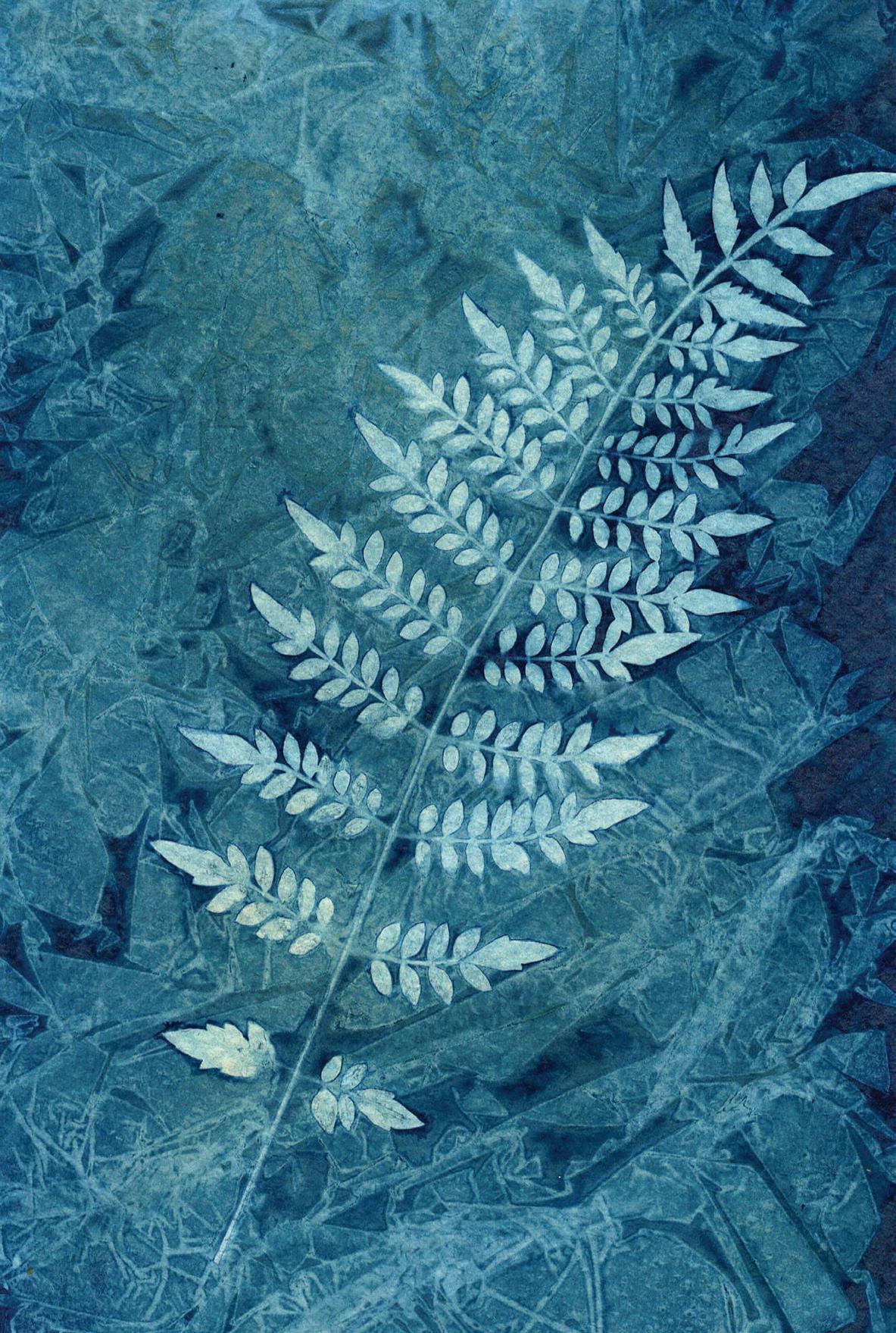
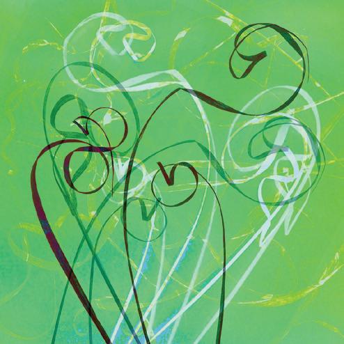
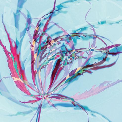
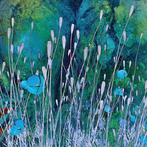
Lockdown blues to Loch Broom blues…
JUSTINE RITCHIE
Given that the colour blue, from aquamarine and teal through to indigo and midnight, belongs to the spectrum that I have been most drawn to, one that has calmed, cleansed and energised me in equal measure, it was only a matter of time before the alternative photographic process of cyanotype printing would come under my radar - a process that I’ve since fallen in love with, owing to its transformative nature and the captivating blue prints that it can produce.
It was at the start of the first lockdown, when the sudden and unusual abundance of time enabled me to pick up previously unread magazines, that I came across an illustrated article about botanist and photographer Anna Atkins, who mastered and popularised the technique, and used the process to document her large collection of algae. Instead of illustrating her botanical research with sketches, Atkins sought ‘to obtain impressions of plants themselves’* by creating cyanotype prints which produced striking blue and white photograms.

20 FEATURED PHOTOGRAPHER
FEATURED PHOTOGRAPHER
Her book, Photographs of British Algae: Cyanotype Impressions, published in October 1843, is considered the first photographically illustrated book.
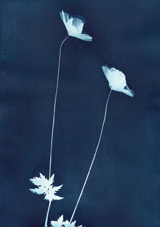
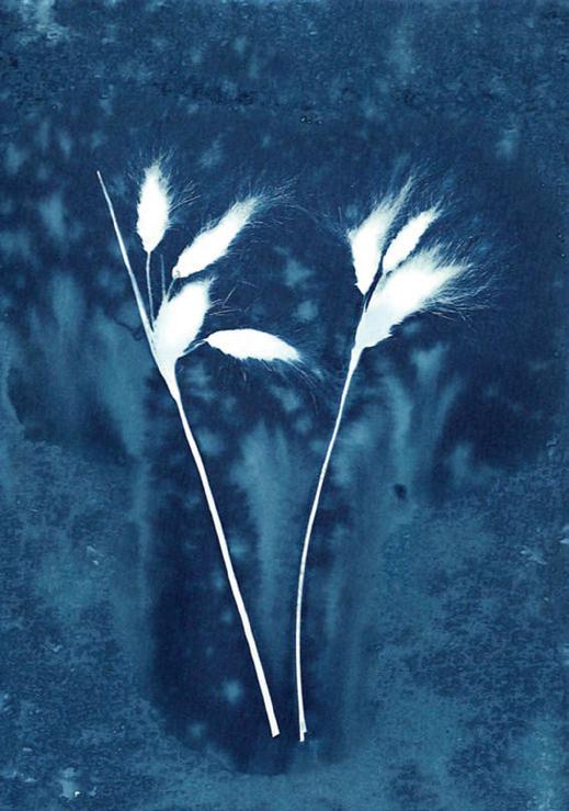
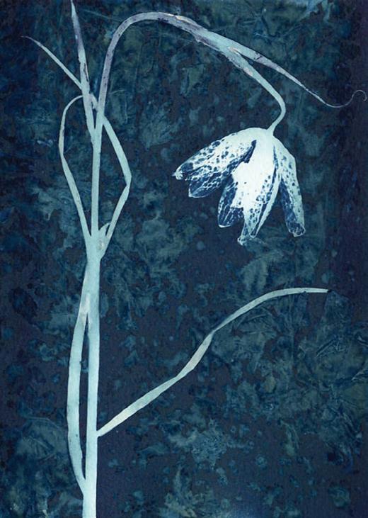
I was immediately captivated by the image that accompanied the article - a delicate off-white imprint of sea lettuce set against a striking Prussian blue background, and knew I had to try creating my own.
It seemed a simple process in principle: fine art paper - I used a 300gsm cold pressed water-colour paper - is coated with a light-sensitive emulsion created by mixing two chemicals together - ferric ammonium citrate and potassium ferricyanide - and then the chosen subjects, for example, leaves, flowers and feathers, are placed directly onto the paper and exposed to sunlight to create a simple contact blueprint. When the exposure is finished - times for this can vary immensely - it is fixed by rinsing the paper under a tap or hose in a tray of cold water for about 10 minutes to remove unwanted chemicals, and then by leaving the paper to dry. The full effect will not be reached for about 24-48 hours as oxidation takes place over an extended period, with the blue colour deepening over time. Some cyanotype artists also use a dilute hydrogen peroxide solution to speed up the oxidation process, in which case you see the final result immediately, but I prefer to let it evolve more naturally. It is the transformative nature of this process that I find so appealing; when the emulsion goes on,
22
it is a yellowish green colour, but as it is exposed to the sunlight it starts to darken to a grey-bronze, similar to that of a slow worm’s skin. As you rinse it in cold water, it turns to a deep Prussian blue with the imprint of the subject forming a contrasting off-white impression.
Unlike film or digital photography, I soon learnt that this analogue technique was not reliant on textbook camera settings or an understanding of the conventional photographer’s triangle of aperture, ISO and shutter speed. This was going to be a far more intuitive process in which the
interplay of sunlight intensity, number of coats of emulsion on the paper, type of paper, the exposure time and the physical properties of the subject matter, such as its translucency, would become far more relevant.
23 JUSTINE RITCHIE
Living alone and confined to a tiny island in the Hebrides for the duration of the first lockdown, it really felt as if the drawbridge had been raised, and my foray into the world of cyanotypes became more than just a photographic experiment. It became my antidote to a frightening period of the unknown - a period of fertile solitude in which I could lose myself in nature and immerse myself in the transformative process of creating these blue and white photograms outside in the April sunshine. I began by using the flowers and plants that were growing outside my back door - plants I’d previously acknowledged but not examined in any great detail. However, with time on my hands and the groundhog day existence of Covid briefings, statistics, death roll calls and the extensions to lockdown restrictions, I could lose myself in the shapes, forms and delicate fractal patterns of the flora, and consider the necessary exposure time for the sunlight to penetrate the paper thin petals of a poppy.
became an ardent forager, collecting found natural objects such as feathers, leaves and lichens which I would take back home and press between the pages of my largest, heaviest books - books that soon resembled cairns, stacked and angled with a random uniformity atop my living room coffee table - a plateau once reserved for coffee mugs and unread magazines.
I would wait until late in the evening to coat sheets of cold pressed water-colour paper with the cyanotype chemicals, as this needs to be done in a darkened room. The paper also needs to dry in darkness, otherwise it will react with the slightest shard of light to which it is exposed. I cleared out one of my shelved kitchen cupboards, and then taped black bin liners to cover up the cracks where the newly coated paper sat overnight to dry.
The tiny self-contained annexe that I was renting was soon transformed into a creative haven - paper, a guillotine and disassembled clip frames scattered on the floor and glass jam jars that I’d put into the recycling were repurposed as vessels for my paint brushes. My clothes airer became a drying rack for rinsed prints and more book tower cairns were created to press the dried prints, but none of this mattered as it wasn’t as if I’d be having anyone to visit anytime soon.
I place a sheet of glass or perspex over the top and use bulldog clips to keep everything in place before finally exposing it all to the sunlight. The print can be placed flat or at an angle which can also produce an interesting effect, as the moisture has a chance to run a little. Realising that you can add other substances at this stage to create some interesting background colours and textures (e.g., turmeric), led me to experiment with a bit more kitchen cupboard alchemy, and the result was a series of prints with a greater depth or sense of movement, and differing shades of blue as well as some yellows and greens. I found it better to over rather than under expose as this seems to allow the UV to penetrate through the subject matter and create a little more detail rather than a plain shadowgram. After lockdown #1 was lifted, I left the island and moved to a remote hillside 600ft above Loch Broom in the north west Highlands. It was here that I began foraging along the shore, discovering all kinds of seaweeds and wondering how best to press them and prepare them for creating cyanotypes. I had begun to research the process in more depth and had come across the method of wet cyanotypes, in which the coated paper is either exposed along with the subject matter before the emulsion has dried, or the dried coated paper is sprayed with water or another diluted solution just before being exposed to the sunlight. Swimming amongst the wrack and kelp at high tide, I was able to watch them swaying gently in the shallows in time with the ebb and flow of the tide and realised that the prints created should be wet cyanotypes, as I felt that this was the best way to reproduce impressions of their form and sense of movement in the water.
24 FEATURED PHOTOGRAPHER
My days on this small yet vast island soon became a routine of runs, walks and swims during which I
My new obsession with seaweed and shoreline alchemy coincided with the launch of the first seaweed festival, which took place on Isle Martin in September 2021. I was invited to exhibit some of my seaweed cyanotypes in Ullapool and I presented a talk as part of the festival programme.
I have since embarked on a long-term project to document as many of the different species of seaweeds that are found in Loch Broom and Little Loch Broom as possible, and I hope that this may be another way of highlighting the importance of seaweeds and how marine plant life has a significant role to play in tackling climate change.
*Atkins, Anna, ‘Introduction’ in Photographs of British Algae: Cyanotype Impressions (Kent, 1843). www.justineritchie.com
JUSTINE RITCHIE
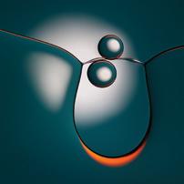
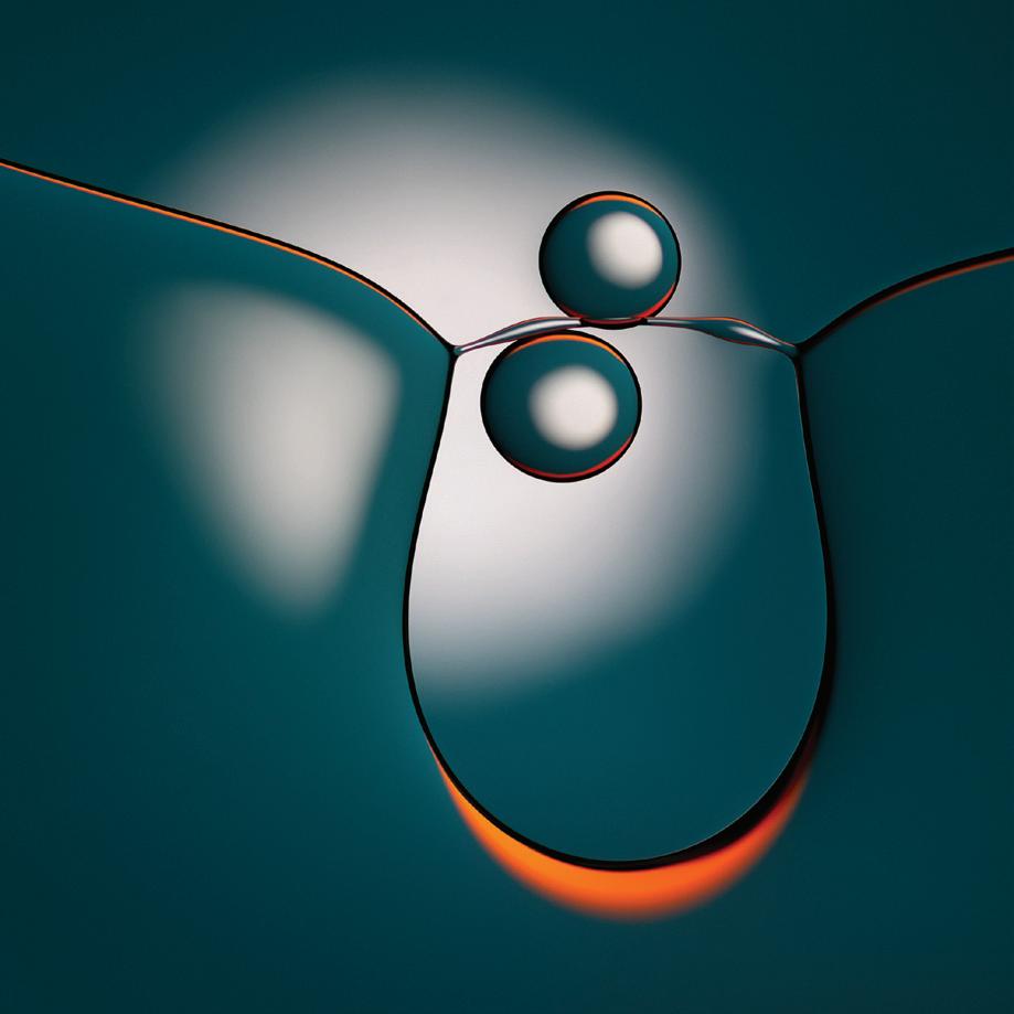
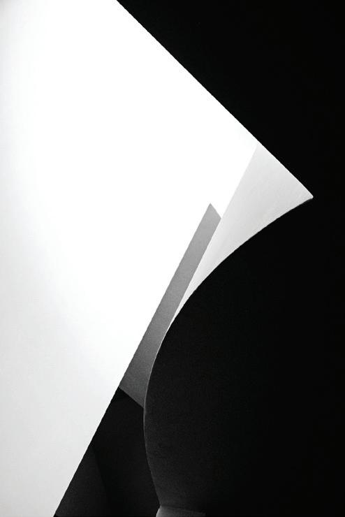
Light-Dark 73C (Oil & Water) Martin Parratt
Simplicity is the key to this image and superb technical ability is essential, but also a considerable degree of imagination is required to produce such a beautiful image. The colours are just right, with the orange accents adding that lift to the image which elevates it to a higher level. The design is very satisfying and beautifully balanced, a worthy winner.
Elegant simplicity and a minimalist composition with excellent use of line, proportion, scaling and colour all combined perfectly to produce a very stylish print. This image stood out during the selection process and it was easy for me to support it in being awarded the Gold Medal.
A beautifully crafted image, of impeccable technical quality, this image stood out for its purity of presentation and the dramatic colours which instantly arrest the attention. The immediate impression is of a relatively simple image but there is such a beautiful depth to the colours and tones it becomes almost three-dimensional, as if the elements could be picked up in the hand. A mesmerising work, with a strong visual impact contrasting with serene calmness and elegant minimalism.
26
Martin Addison FRPS
Philip Joyce FRPS
Viveca Koh FRPS
MEMBERS’ PRINT EXHIBITION 2023 | GOLD MEDAL
FRPS GOLD MEDAL WINNER
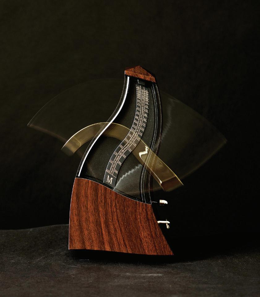
Flexi-Time Anthony Chapman
MARTIN ADDISON FRPS AWARD
This is a very creative photograph, beautifully produced and immaculately printed. What appealed to me was the imaginative approach and how the metronome seems almost to be moving with the music. A most successful image in my opinion.
I pay very little attention to image titles, as I think that most images should speak for themselves, but I do enjoy the title of this one - ‘Flexi-Time’ is just perfect.
27 MEMBERS’ PRINT EXHIBITION 2023 | SELECTOR’S AWARD
Martin Addison FRPS
ARPS
Midnight at Panamint Springs Hunter Johnson LRPS
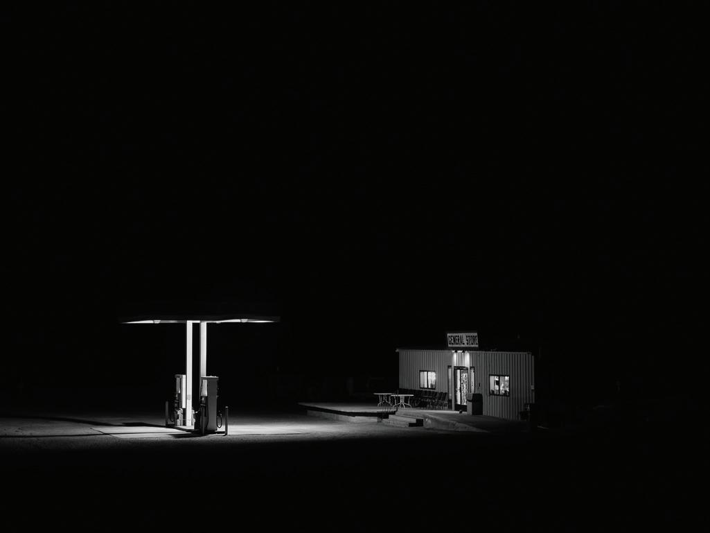 PHILIP JOYCE FRPS AWARD
In the process of selecting, it is usual for a number of pictures to stand out and that’s exactly what this image did. It was my personal choice for a number of reasons. Firstly, the essence of America leapt out and immediately spoke of the sense of a grand road trip, conjuring up thoughts of Robert Frank, amongst many who have traversed the States, to tell an American story. The print is beautifully crafted and the dark tonal range perfectly evokes a sense of isolation: a gas station, almost lost in the night save for the magic of electricity, offering refuge. The composition is reminiscent of Edward Hopper’s work; the scaling creates a powerful atmosphere. Overall, a picture with impact and meaning that invites reflection.
28 MEMBERS’ PRINT EXHIBITION 2023 | SELECTOR’S AWARD
Philip Joyce FRPS
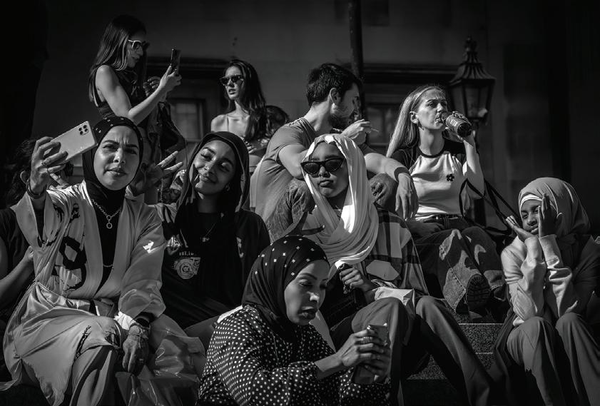
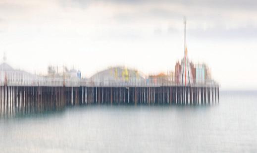
Under the Pier John Foster ARPS
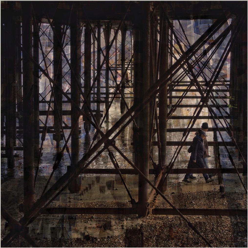 VIVECA KOH FRPS AWARD
An image which really invites the viewer in to explore all the details; there is a wonderful painterly quality here in not only the light but the structure of the pixels themselves. Beautifully observed and impeccably timed in the positioning of the figures, who are just about to walk out of the frame, my attention was immediately captured by this image
and the sense of depth within. The predominance of very dark tones interspersed with minimal pops of colour and light create a limited colour palette which only serves to strengthen the visual impact of this superb work.
29 MEMBERS’ PRINT EXHIBITION 2023 | SELECTOR’S AWARD
Viveca Koh FRPS
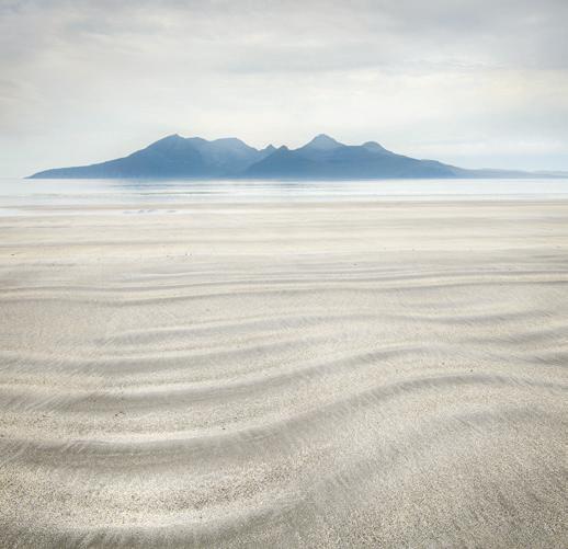
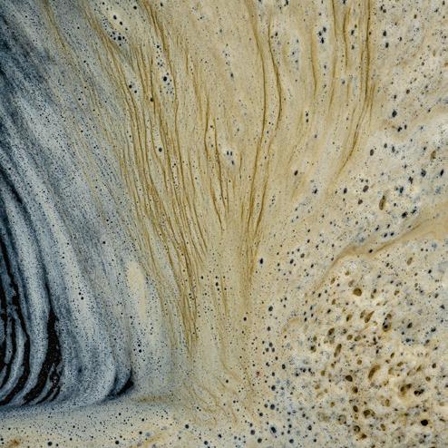
HIGHLY COMMENDED SINUOUS SANDS ISABELLA HILLHOUSE LRPS
HIGHLY COMMENDED METROPOLIS MARTIN ERHARD FRPS
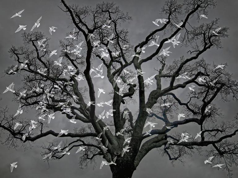
HIGHLY COMMENDED TAKING FLIGHT JO MONRO ARPS
30 MEMBERS’ PRINT EXHIBITION 2023 | HIGHLY COMMENDED
COMMENDED RE-ENTRY NATHANIEL COALSON ARPS
COMMENDED
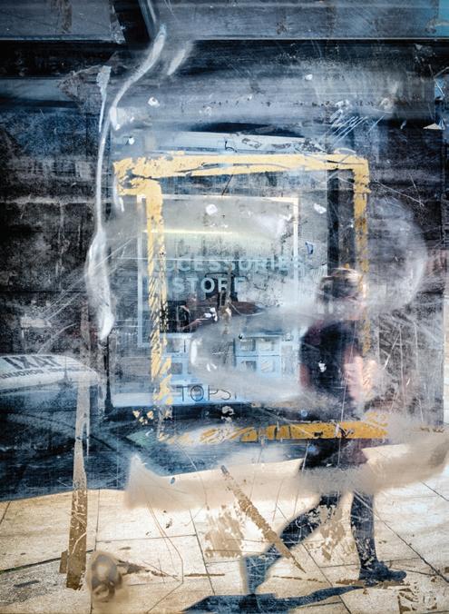
TRAFALGAR SQUARE SELFIES RAYMOND BRIDGES LRPS
COMMENDED GLANCING LIGHT PAUL O’FLANAGAN LRPS
31 MEMBERS’ PRINT EXHIBITION 2023 | COMMENDED
MEMBERS’ PRINT EXHIBITION 2023 |
32
ACCEPTED
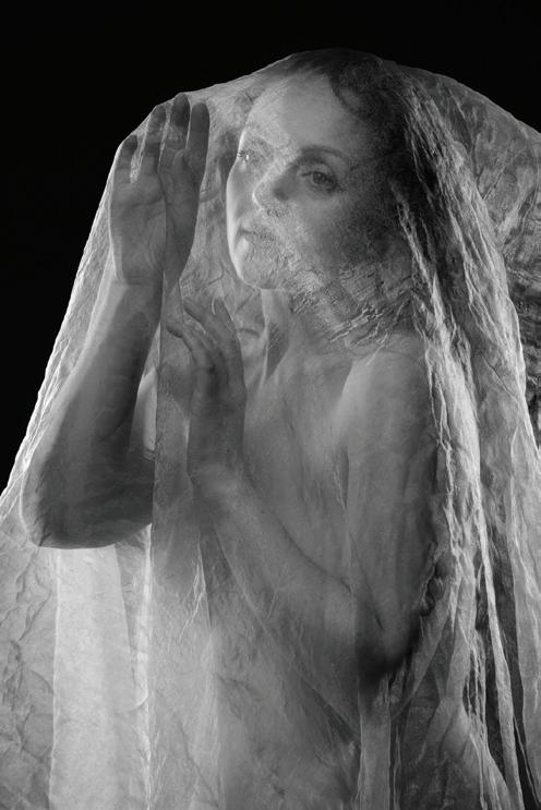
BEHIND THE VEIL • PAUL BATHER ARPS
REDUNDANT ORANGERY • PAUL BREWERTON ARPS
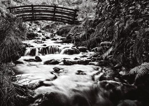
BRIDGE TO NOWHERE • GARY BOURNE LRPS
ROOM TO VIEW • ROBERT BRACHER ARPS
DESTRUCTION • CAROLINE BRIGGS LRPS
ROOM TO THINK • MICHAEL BUTTERWORTH LRPS
33 MEMBERS’ PRINT EXHIBITION 2023 | ACCEPTED
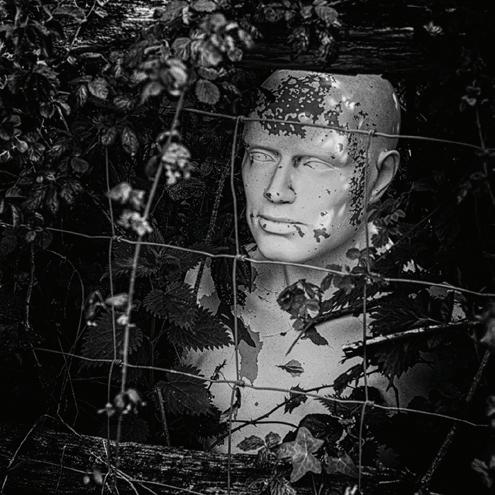
FOREVER TRAPPED • MALCOLM BROWN ARPS
THE END OF THE LINE • COLIN BRYCE LRPS
SOFT TOUCHDOWN • CLAIRE CARROLL
ALTERED IMAGE • JOHN CAVANA ARPS
DISSOLVING • JOSÉ CLOSS
REACH DOWN REACH UP • MICHAEL CANT
ABSTRACT • STEPHEN COLLINSON LRPS
MEMBERS’ PRINT EXHIBITION 2023 | ACCEPTED
34
ROCKY NOOK • CLARE COLLINS ARPS
STREET SCENE PORTUGAL • JOHN CORBETT ARPS
LOOKING SOUTH • DOUG CROCKETT ARPS
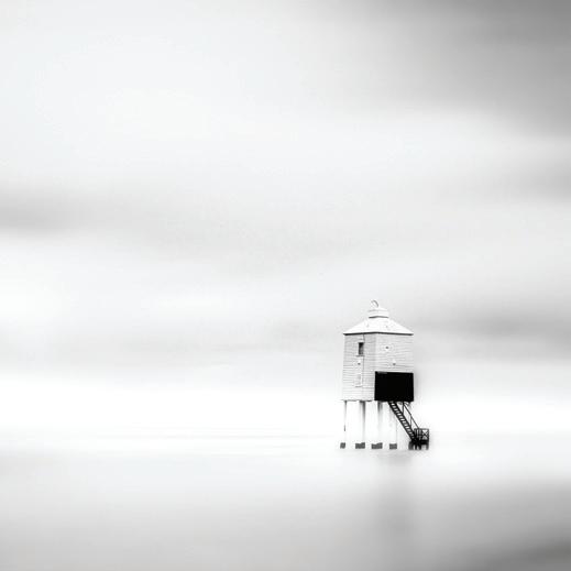
THE LIGHTHOUSE AT HIGH TIDE • COLLEEN DONALDSON ARPS
BILLINGSGATE • MARK DEUTSCH LRPS
LIVERPOOL 1 • DAVID FELLS LRPS

35 MEMBERS’ PRINT EXHIBITION 2023 | ACCEPTED
ETON MESS • PHILLIP DOVE LRPS
GOLF COURSE TREES • PHIL DOWNIE
PARROT TULIP • DIANE FIFIELD ARPS
PIER VISION • ANGELA FORD ARPS
MR FOX • JANET DOWNES LRPS
AUTOMATIC DISTORTION • ROGER FORD FRPS
MEMBERS’ PRINT EXHIBITION 2023 | ACCEPTED
36
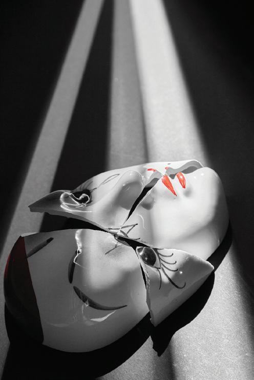
BROKEN • DAIN EVANS LRPS
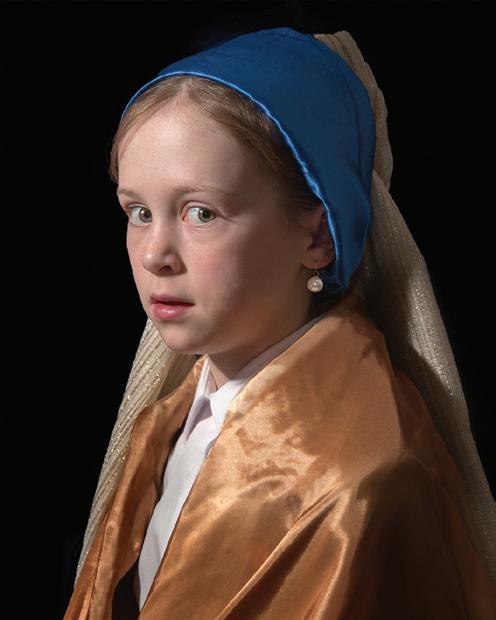
AFTER VERMEER • DEREK GODRIDGE LRPS
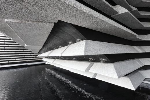
CONCRETE - V&A DUNDEE • ROBERT GALLOWAY LRPS
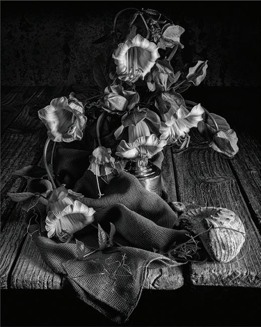
COBAEA ARRANGEMENT • ROSEMARY GIBBS LRPS
HOLYWELL BAY IN WINTER • SUSANNA HOARE ARPS
37 MEMBERS’ PRINT EXHIBITION 2023 | ACCEPTED
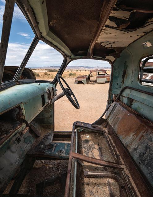
DESERT DRIVING SEAT • RICHARD HALL LRPS
RACE IN FOG • PAUL HERBERT ARPS
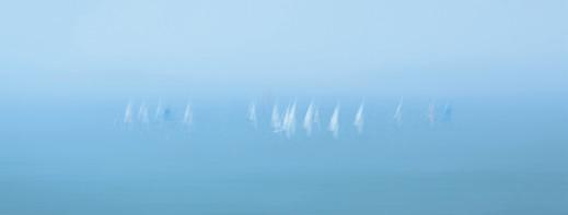
BOATMAN’S STEPS • ROBERT HERRINGSHAW ARPS
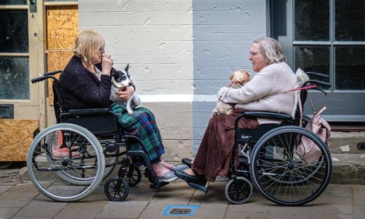
GOOD FRIENDS • RAY HIGGINBOTTOM ARPS
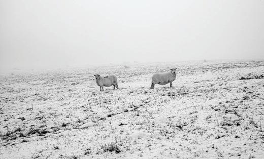
WINTER • ROBERT HUGHES LRPS
WIND AND WAVES • SUSAN HENDRICK FRPS
ALCOVE FITZWILLIAM MUSEUM • SALLY KITCHINGMAN
MEMBERS’ PRINT EXHIBITION 2023 |

38
ACCEPTED
FLIGHT OF FANCY • MIKE KITCHINGMAN LRPS
CITY-EARTH CONNECTION • PETER EVANS
OUR GARDEN • DEREK JONES LRPS
3 LILIES • JULIE HOLBECHE-MAUND ARPS
EXPLORATION • COLIN LAMB LRPS
SIESTA • JOHN NASH LRPS

39 MEMBERS’ PRINT EXHIBITION 2023 | ACCEPTED
LAST LIGHT AT THURNE • JIM LAWS LRPS
NATURE AND NEMESIS • ANTONY LONG
STEEL & STONE, PONTCYSYLLTE AQUEDUCT WENDY MEAGHER LRPS
GRIEF • EVE MILNER
DANCING TULIPS POLYPTYCH • SHARON LEIGHTON ARPS
SELFIE IN WINDSOR • CAROL PAES ARPS
40
MEMBERS’ PRINT EXHIBITION 2023 | ACCEPTED
MISTY MORNING STROLL • JIM MULLER
ALIEN WORLD • LYNDA MORRIS LRPS
CHINESE SCROLL • MICHAEL PARMEE ARPS
BANTHAM • ANNA STEVENSON FRPS
SUSANNA • DERWOOD PAMPHILON ARPS
41 MEMBERS’ PRINT EXHIBITION 2023 | ACCEPTED
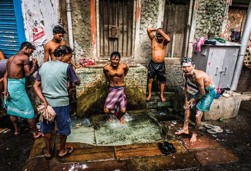
COMMUNAL BATHING KOLKATA • DAVID POLLARD ARPS
ANGLES • MARTYN PEARSE
INCOMING TIDE • KAY REEVE FRPS
BEAUTY BENEATH • SAMANTHA RUTH
THE SCOTSMAN • CHRIS PERFECT ARPS
MOTION & BLUR • MAUREEN TYRRELL
MEMBERS’ PRINT EXHIBITION 2023 | ACCEPTED

42
SPOTLIGHT • BARRY ROBERTS ARPS
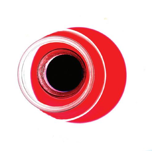
RED & BLACK • MICHAEL SAYER ARPS
DIFFERING STYLES • JULIAN SHAW LRPS
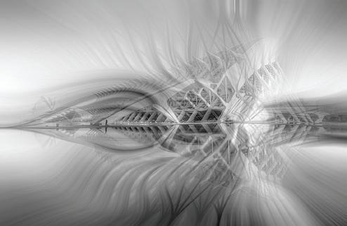
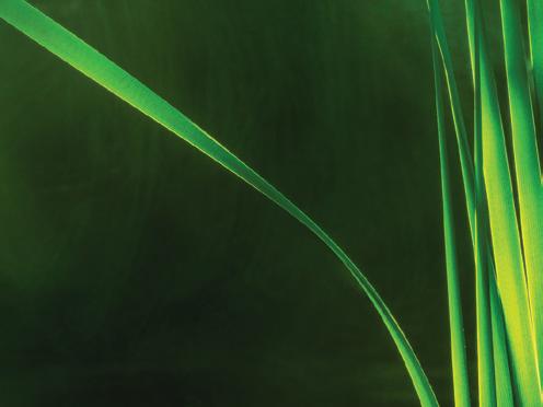
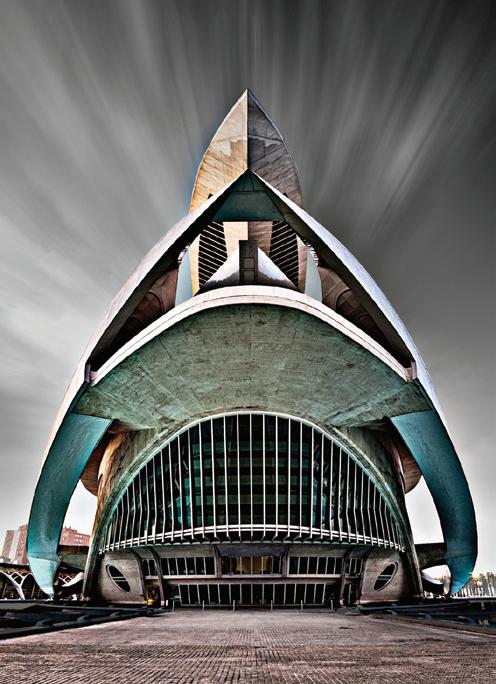
OPERA HOUSE VALENCIA • BARRY SENIOR HonFRPS
REEDS • CLIFF SPOONER ARPS
43 MEMBERS’ PRINT EXHIBITION 2023 | ACCEPTED
WEB OF LIGHT • MARTYN SMITH LRPS
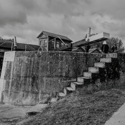
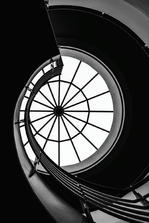
MUSEUM STAIRCASE • KEITH SURREY ARPS
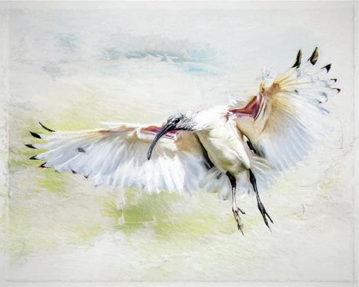
IBIS IN FLIGHT • MARILYN TAYLOR ARPS
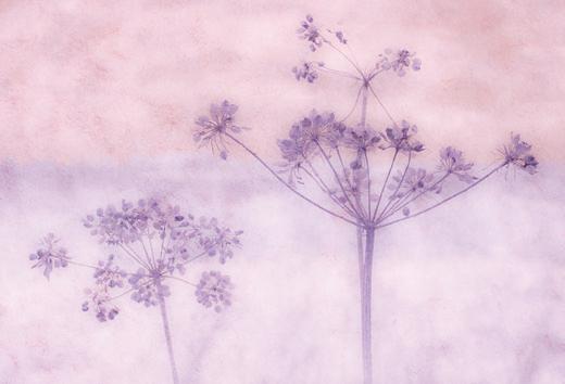
COW PARSLEY • SUE VAINES LRPS
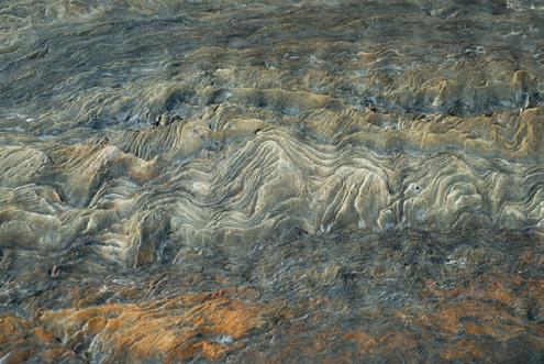
STRATA • JOHN STEPHENSON LRPS
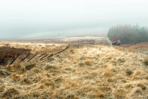
STANAGE RIDE • ROBERT STYRING ARPS
44
ACCEPTED
MEMBERS’ PRINT EXHIBITION 2023 |
STAIRWELL, TATE, ST IVES • JOHN TIMBRELL ARPS
SUNRISE IN THE MIST • LINDA WEVILL FRPS
MISTY MORNING • BILL WHEELER
HENRY MOORE SCULPTURE • JONATHAN WILLIAMS
ABSTRACT - RED & BLACK • SIMON WELLS
45 MEMBERS’ PRINT EXHIBITION 2023 | ACCEPTED
FLOOD • BARON WOODS FRPS
FISH EYE LENS • GRAHAM ZIMMERMANN LRPS
46
POSTAL AND EMAIL PORTFOLIOS
Get even better value from your membership of the Visual Art Group: join a circle. Email circles are free to join, while print circles will cost you no more than postage. Meet new people keen to share their experience, to ask questions and to comment on your photographs. Get a different angle on your work from people who are neither fellow club members, nor your family! Members range from new recruits to very experienced photographers, from people who just want to enjoy their photography with new friends, to people working towards distinctions.
There are print and email circles and we’d welcome a few more members. Join a circle.
To join or ask for more information, just email Gill Dishart ARPS (gill@dishart.plus.com).
47
https://rps.org/groups/visual-art/
