SANDERS
ABOUT US
Sanders Stay is a global short-term rental company headquartered just North of Copenhagen, Denmark. The company was founded in 2019 by Bo Sander, who brought with him a wealth of experience from his successful long-term rental enterprise Nordic Housing. Seeing plenty of competition within the short-term industry, but not much separating the competitors from each other, Bo identified an opportunity for a new company to come in, stand out, and prosper.
SETTING A NEW STANDARD
The word ‘standard’ can mean a lot of different things for a lot of different people – even nothing for some. But for us, it means everything. Our aim is to set a new standard in the short-term rental industry. It might sound overly ambitious, but we truly believe we can. A high standard for us means tending to the needs of those we care for.
Our Guest Communication Centre is always open, and every day of the year. Our interiors are always stylish and of high quality. Our homes are always found in the best spots around. We always take note of your concerns, suggestions, thoughts, and worries. We go that extra mile; we prove that we truly care.
WHEN THE WORLD IS YOUR OYSTER, BECOME A SEA FOOD LOVER
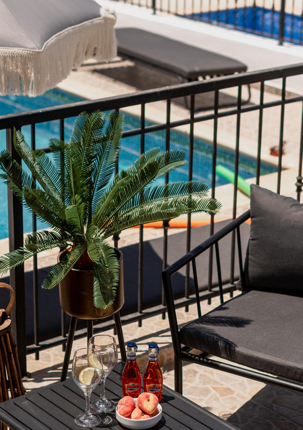
Different travellers have different priorities and needs. Some must have views of the sunsets every evening, others demand close proximity to the ocean (or at least a cooling pool for emergency dips!), while some only concern themselves with metropolitan vibes, wild nightlife, and roomy dancefloors. Finding a perfect spot in the sun or the ideal environment for a remote workweek can be a challenge. Many times we choose to go to somewhere we’ve never been before. So, there’s usually a tingle of uncertainty when booking rooms and making reservations. That should never be the case with Sanders.
Interior Guidelines - Brand Manual
1.
SANDERS
MODERN FURNISHING, INSPIRING INTERIORS
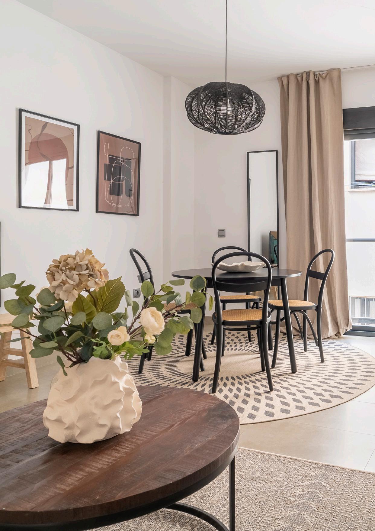
We believe that staying in a Sanders home should feel a certain way. In the best of worlds, the home feels extraordinary enough to make your entire holiday special. That’s how we want your vacation to feel, at least. There’s always a tiny chance it might rain. To make sure we deliver on a good experience, we put a great deal of attention and care into our interiors and furnishing. Embracing our Scandinavian heritage, we work exclusively with high quality furnishing, sleek and timeless designs, and in natural colours.
Scandinavian design is characterised by functionality and elegance. It’s a style that works incredibly well in a vacation home.
BUILDING SUCCESS ON A CLEAN CONSCIENCE
We base our partnerships on an understanding of not only shared business values, but also what environmental perspectives and ideas we have in common. The same goes for our suppliers, where we work exclusively with those that share our ecological approach to products and services. Our model of taking charge of existing properties with untapped potential, and then upgrading the exteriors, interiors, and furnishing, makes for a truly green business plan. Instead of wasting resources on building something completely new, we upgrade and develop instead. Improving and setting our standards also means we can guarantee a great travel experience, and even extend and expand the seasons for visitors. If we can do something, we should do something.
Interior Guidelines - Brand Manual
1.
The single most identifiable element of our identity is our logo. Consistent use of our logo is key to retaining brand strength through immediate recognition of who we are and what we stand for as a brand. We believe that our Logo should be the same in every operation and production we do.

Interior Guidelines
LOGO 2.
Why have 2 logos (Logomark + Logotype + Combination):
A lot of logos have both text and a picture. Some logos have text that forms a picture. In fact, logo trends seem to favor experimental hybrids. So really, there’s three choices. It’s not just logotype vs. logomark, it’s more like logotype vs. logomark vs. a combination.
Recently companies have begun using more than one logo. A trend known as variable or responsive logo design recommends having different logo variations depending on where they’re located. For example, the same company might use a logotype for their email letterhead, a logomark for the corner of their mobile website and a combination for a giant street billboard. By having multiple logos, you can select the best one for wherever you put them.
The pros of logotypes:
• Comes across as traditional and classic
• Ideal for name recognition
• Ideal for brand awareness
• Can provide information about the company
• No risk of brand confusion
The cons of logotypes:
• Less options creative designs; not as “fun” as logomarks
• Doesn’t work as well for long or hard-to-pronounce brand names
• Font trends change over time, so stagnant logotypes may appear dated after a few years
The pros of logomarks:
• Highly personalized and unique
• The right icon can capture and convey complex ideas—an icon is worth 1,000 words
• Can be enlarged or compressed to fit a variety of locations
The cons of using a logomark:
• Can slow down brand recognition for new brands
• Don’t fit every location — logotypes tend to be more compact
• Runs the risk of creating an emblem that looks too similar to another logomark
Pros of combining a logotype and logomark:
• Boosts name recognition for unknown brands that still want to use a logomark

• Can be creatively combined for visual wordplay or a more meaningful message
• You get the benefits of of both
Interior Guidelines - Brand Manual
Our Primary logo is simple, clean, and stylish. The “SANDERS” represent the world of properties and services we offer with a prominent professional side. This logo can be used with the icon or without. It is available for use in charcoal and off white in all instances where it is used on its own. Overall style - cool & professional.
The font used it’s a modified version of Google sans

• Official Documents
• Reports
• Contracts
• Signage on buildings
• Anything commercial
Interior Guidelines - Brand Manual
LOGOTYPE
Our Icon is simple, clean, and stylish. The “S” represents the world of properties and services we offer with a prominent professional side.
This logo can be used with the icon or without. It is available for use in charcoal and off white in all instances where it is used on its own. Overall style - cool & professional.
The font used it’s a modified version of Google sans
• Official Documents
• Reports
• Contracts
• Signage on buildings
• Anything commercial
Interior Guidelines - Brand Manual
LOGOMARK
DO’S
• Use provided brand color correctly
• Allow enough space around the logo
• Should be scaled correctly
• Always use horizontally, except if told differently
DON’T
• Change the logo shape


• Overlay unneccessary elements
• Stretch the logo disproportionately
• Use the logo vertically
Interior Guidelines - Brand Manual
DO’S DON’T
• Use provided brand color correctly
• Allow enough space around the logo
• Should be scaled correctly
• Always use horizontally, except if told differently
• Change the logo shape

• Overlay unneccessary elements
• Stretch the logo disproportionately
• Use the logo horizontally
Interior Guidelines - Brand Manual
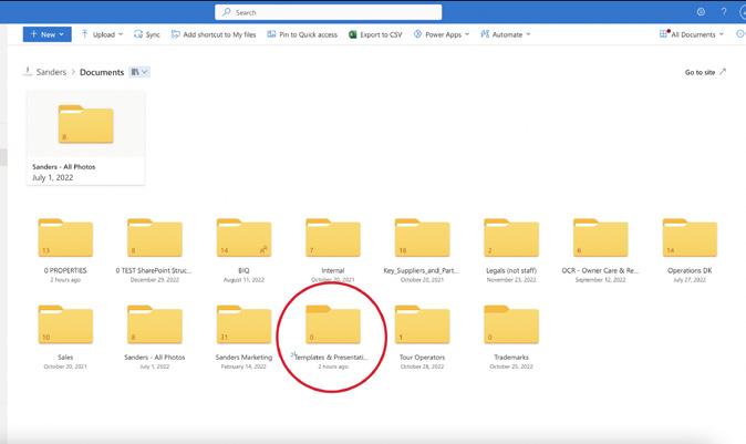
Where to find the Logos in all formats

Open OneDrive


OneDrive

1.
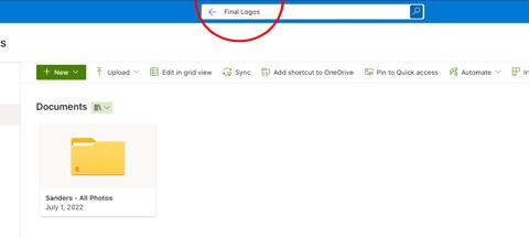
In the search bar type
“Final Logos”
2.
Click on the first folder
“Final logos”
4.
Black logos folder, all formats.

3.
Here you will find the AI, PNG and SVG formats. Both Black and White.
Interior Guidelines - Brand Manual
DO’S DON’T
• Use correct formatting
• Use images and charts provided (ex. logo)
• Always check if the document is updated
• If not sure about something in the document, feel free to ask BIQ for clarifications
• Don’t start without the structure provided
• Don’t overdo the colors
• Don’t forget to proofread punctuation and grammar
• Do not modify directly the document provided by BIQ (example the powerpoint presentation)
Interior Guidelines - Brand Manual

Vedbak Strandvej 328 | 2950 Vedbak, Denmark sandersstay.com

 Interior Guidelines


