4 minute read
K Velis Turan
Earlton, New York, U.S.
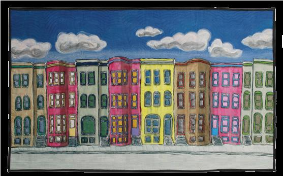
West Village East
37 X 25 inches, 2014
New York City provides limitless inspiration for K. Velis Turan. Skyscapers, bridges, train tracks, and highways fill her work with geometric intricacies. Vignettes of city residents interacting with their urban environment provide humaninterest stories that also inspire her.

Architecture and highways
Architecture is enthralling to me, buildings both urban and rural. I am captivated by the design of buildings, how they create an array of textures, lines, angles and shadows. The excitement of cities is a favorite subject of mine. Luckily I live just a couple of hours away from New York City, one of the most exciting cities in the world.
My background as an illustrator and graphic designer now forms the basis of my art. I appreciate the way things fit together. Recently I have been doing a series on Intersections based on overhead photographs of highway interchanges that demonstrate the planning necessary in the construction of the roads. How to get vehicles from one place to another via the easiest route is a puzzle, and intersections are the answer for at least a section of these routes. I find the highway intersections graphically pleasing and exciting.
Photos
When I visit places, I take a lot of photos. I review them again and again and after a while some come to the top. They just need to be made into art. Since there are no rules about using a photo as inspiration, I can add, delete, or adjust elements in any way that makes sense to me. I want my work to capture what is best in any landscape: the design, color, texture, jazz and energy, without ugliness.
The overall design is what I look for in each piece. But where a figure is appropriate I’ll add it, as in Village Psychic. I was drawn to the combination of the building, the signage, and the fortuneteller sitting on the stoop. It was a whole story.
In Broadway El, I liked the way the train tracks lined up like the four people sitting on the bench waiting for the next train. I used the photo I took of the people and transferred it onto fabric to get them into the work. They were important to both the design and the story.
Deconstructed screen printing
I use a variation of deconstructed screen printing, a technique that was developed by Kerr Grabowski.
above: Baltimore Row 24 x 39 inches, 2014 right: The Village Psychic 35 inches X 25 inches, 2011

I start with a series of drawings, some from photographs, others from ideas I have that are kicking around in my head or in my sketchbook. I’ll draw several variations until I come up with my final version, which I then enlarge to the full size of the screen.
I make up drawing fluid, which is a mixture of sodium alginate and dye (usually black). Using a syringe filled with the drawing fluid, I trace the drawing onto the screen. These lines act as a resist to the dyes, giving me lines and color separations on my piece. Once the screen is dry, I print onto a large piece of broadcloth using fabric dyes, soda ash, and the sodium alginate mixture forced through the screen with a squeegee. I let the dyes develop with time and heat, then wash, and decide how to proceed. Currently, I am using more textile paints made from concentrates, watercolor crayons, fabric markers, photo transfers and embellishments to get the feeling I want in the pieces.

Color and stitch
Zinnias are my favorite flowers. I plant a large garden with zinnias every year. They are bright, bold, and come in all brilliant colors. They make me happy. My love of flowers gives me the colors I use in my work. Why should my art be realistic? It doesn’t have to be. It can be any way I want it to be, and I want it colorful.
I don’t feel a piece is done until I have added my “thread strokes” through free-motion machine stitching. Thread strokes are to my quilt what brush strokes are to a painting. They add dimension, color, and texture to each piece. I’m not precise in my stitching either with my machine or by hand; I just want to follow the clues from the piece, adding to the surface until I am satisfied that it is completed.
Framing and selling
It is important to me that my work is easy to display and hang properly. My “back-side frames” have four wooden slats: two wide slats on the top and bot- tom and two narrow slats on the sides. These are sealed and painted so they won’t react with the fabric. Then they are inserted into fabric pockets sewn to the back of the piece. This method makes my work easy to ship and store. I like the way my work is presented by this method, and so do the people who buy my pieces.
I sell my work at exhibitions, through galleries, and directly to people who contact me. Art quilts are now accepted as fine art, and it’s exciting to have someone love your work enough to pay you money and want to live with it. It’s the best feeling in the world.
Broadway El
28 X 20 inches, 2011


