Die Sublimation Print Experiments Samples and Technical Information
Contents: 3.
Method•Materials•Intention
7.
Process•Change
11. Plants Used 27. Technical and Process Notes 47. Summary and Reflection
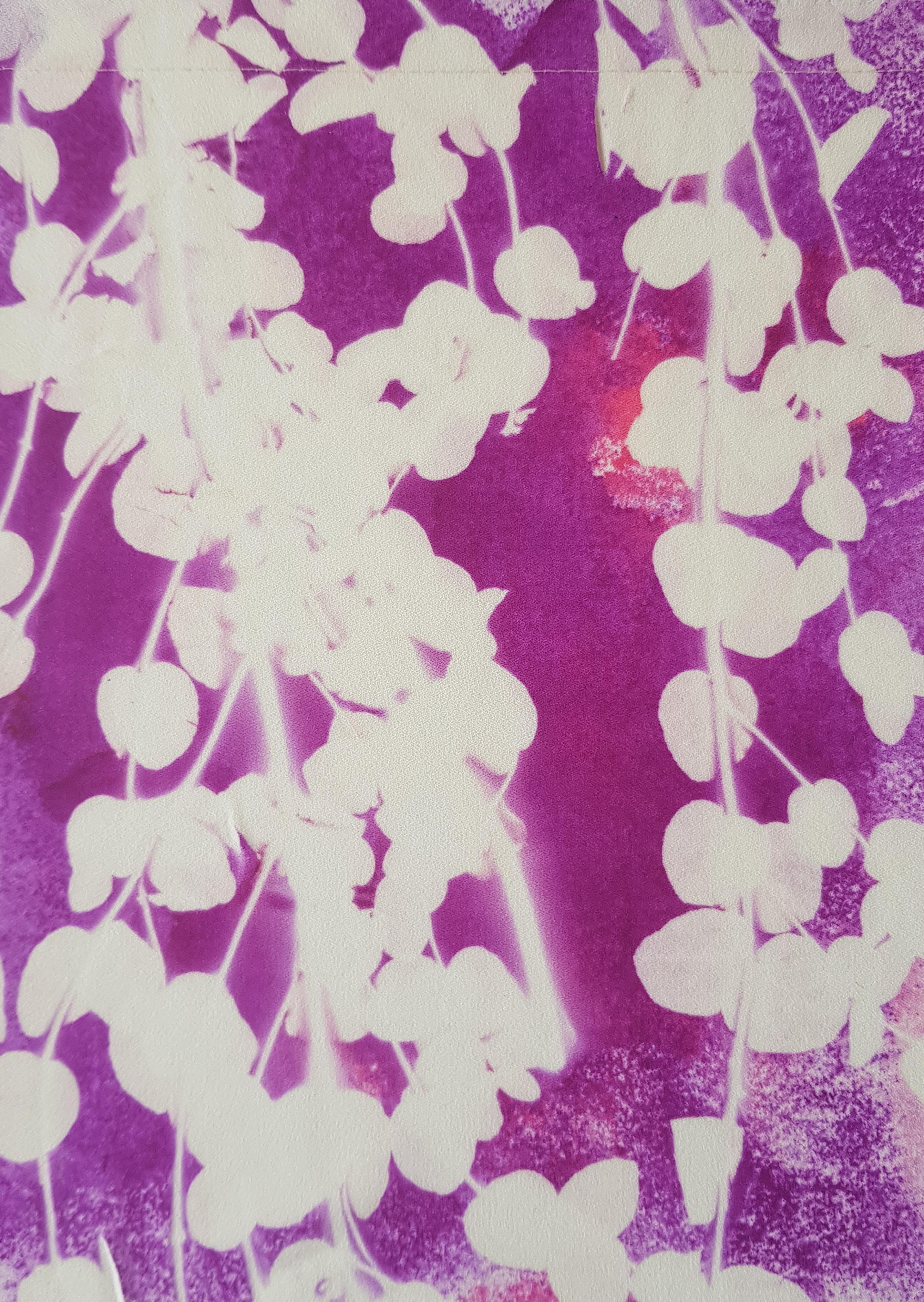
Method•Materials•Intention These fabric samples were created using disperse dyes, a mixture of pressed plants, fresh foliage and a heat press. Carrying on from my previous experiments using a variety of blue dyes, I wanted to try and emulate the look of Cyanotype but with the introduction of new colours. From those available I choose cherry red and violet as they reminded me of summer bedding plants. As I initially intended to create monochrome pattern samples, they were also colours that were bold and bright and had the potential to replicate cyanotype imagery but perhaps with a different feel. The colour choice was less important than the possibility of achieving textural imagery. One of the most interesting ef* fects produced in my first batch of samples was the faded, dap* pled look created with repeated use of the disperse die coated sheets. Subsequently for these samples, the disperse dyes were coated onto sheets of A4 paper using different techniques to produce a range of textures. Which were as follows: 1. 2. 3. 4. 5. 6.
Block Colour Block colour onto screwed up, then flattened paper. Colour washed Splattered Colour wash, pressed onto paper Application with pipette onto damped paper.
I used synthetic fabrics I had to hand, a polyester satin and crepe, a poly/cotton organdie, beige polyester georgette and a synthetic 'wool’ herringbone tweed. This wasn’t just a cost cut* ting choice I wanted to sample as much as possible on scraps of fabric left over from other projects to make use of materials I may have otherwise discarded. With sustainability in mind I wanted to try and carry out my project utilising fabric I owned, was second hand or cutting room scraps from industry wherever possible and certainly within the initial stages of experimental sampling. To create the prints, plant materials were sandwiched between coated sheets and fabric and placed inside the heat press set to 200 degree C for 40 seconds.
3
4
Polyester Crepe
5
Polyester Crepe
6
Polyester Crepe
Process•Change
It became apparent within a few prints that the monochrome idea was not going to work with the limited plant materials I had available that day. During the heat press process the sublimation dye transfers onto the plants and any other materials being used to create the print. The resulting colour coating then transfers with each successive print. In addition, aesthetically the monochrome prints were rather dull. It made more sense to change tack and utilise colour transferal between prints, this meant that I could reuse my plants continuously, work quickly (as I didn’t have to spend time preventing colour contamination of my materials and the heat press) and explore potentially interesting colour, pattern and texture. From this point I began actively encouraging colour transferal onto the plants, selecting the coated sheets specifically for the results they would achieve on the next print, meaning each heat press influenced the outcome of the next. I worked like this until my coated sheets were exhausted of colour.
7
8
Polyester Crepe
9
Polyester Satin
10
Polyester Crepe
Plants Used: Eucalyptus Feverfew Daisy Grass Ferns Wild rose leaves Herb Robert Common Chickweed Christmas tree 11
Leaf litter
12
Polyester Crepe
13
Polyester Satin
14
Polyester Satin
15
Polyester Satin
16
Polyester Crepe
17
Polyester Crepe
18
Polyester Satin
19
Polyester Satin
20
Polyester Satin
21
Polycotton Organdie
22
Polyester Crepe
23
Polyester Satin
24
Polyester Satin
25
Polyester Satin
26
Polyester Satin
Technical and Process Notes • Cherry red sheets yielded only 2 to 3 prints • Violet sheets produced an average 3 or 6 prints depending on application method. With block colour producing the most. • Navy Blue sheets yielded between 5 to 12 prints again with block colour application generating the most copies. • Polyester Crepe produced the crispest images and the brightest colours. • Colour results on Satin although bright were on the garish side in comparison to same colours on Crepe. • Colour results on Poly/cotton Organdie were muted, probably due to cotton content combined with sheer, open weave of fabric. • Pressed and dried foliage generally produced the finest details although were more susceptible to the effects of heat, disintegrating after continued use. This will need to be factored in if I wish to experiment further. It may be worth picking and pressing plants now to ensure I have them available. • Fresh plants produced more abstract results, although this may have been more to do with the type and bulkiness of those I used.
27
28
Beige Polyester Georgette
29
Polycotton Organdie
30
Polycotton Organdie
31
Polycotton Organdie
32
Polycotton Organdie
33
Polycotton Organdie
34
Polycotton Organdie
35
Polycotton Organdie
36
Polycotton Organdie
37
Polycotton Organdie
38
Polycotton Organdie
39
Polycotton Organdie
40
Polycotton Organdie
41
Polycotton Organdie
42
Polycotton Organdie
43
Polycotton Organdie
44
Beige Polyester Georgette
45
Synthetic Herringbone Tweed
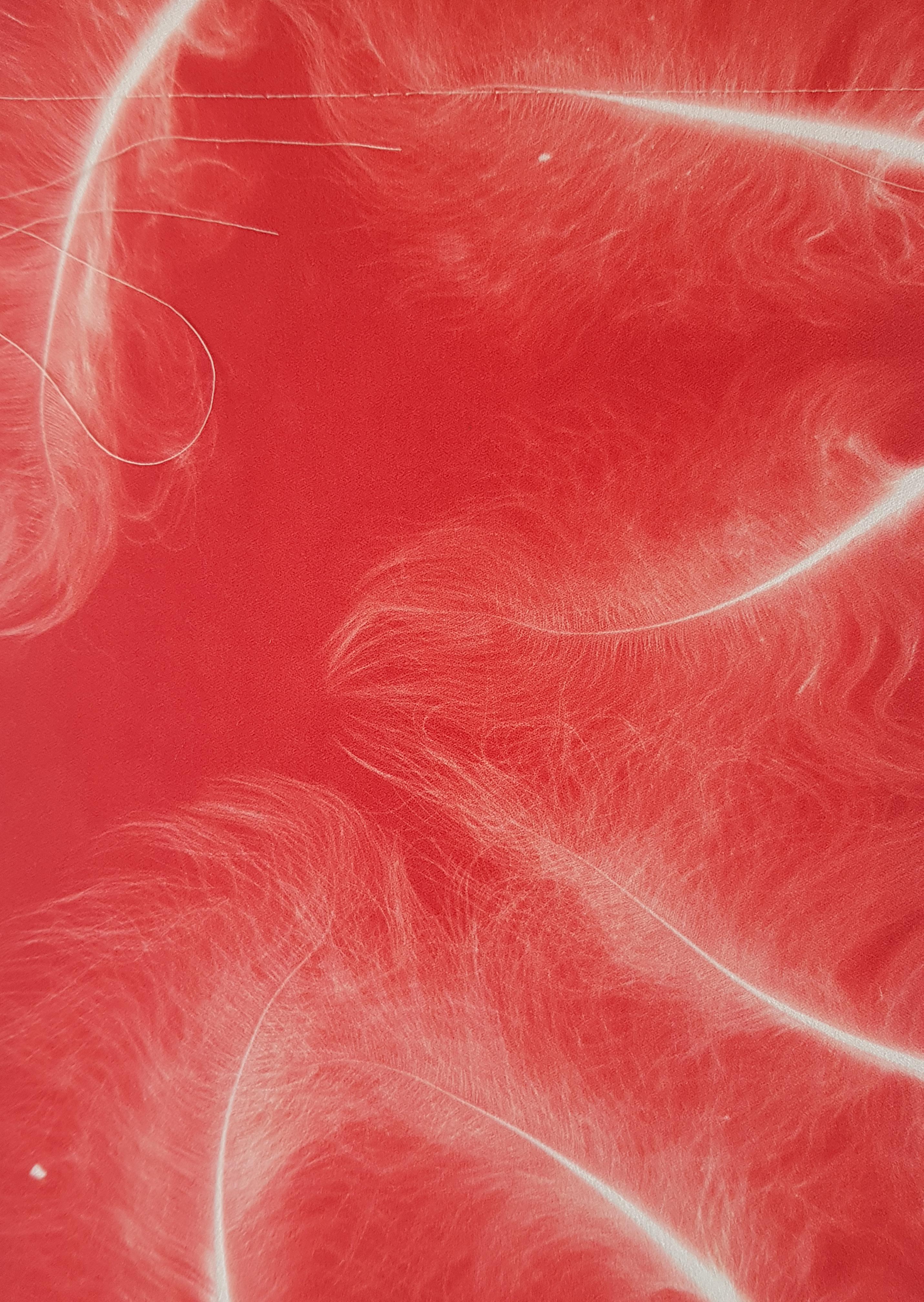
Summary and Reflection There are aspects to die sublimation printing that I really like, the speed at which you can achieve results, the happy accidents that occur, the simplicity of the process and it’s ability to capture plant detail in a similar fashion to Cyanotype. Plus there is the added bonus of being able to add to an image through further printing that is not possible in Cyanotype, so in that respect there is more flexibility in it’s application to textile printing and of course a wide range of colours available to use. I found the way of working with this set of samples quite interesting too, allowing the results of every heat press to impact the next and regret not keeping them in the order in which they were produced. At one point I separated them into fabric type for some reason that escapes me and it is only whilst compiling my work for digitisation that I realise I could have better evaluated the samples and gained more insight had I kept them in order. It may have been useful to analyse results for future development. However, since my work with Cyanotype printing has developed since I produced these samples back in March, there is little of value to be had in them at the moment. Aesthetically they are pretty enough but except for a few prints I don’t find them especially exciting. Of course, I’m comparing them to what I feel I have achieved now with my print design, but at the time of sampling I was quite excited by the possibilities of developing textile prints through dye sublimation. I really liked the feather prints, the bold clarity of the red version and the inky blue splotches of the blue. I also love the idea of preserving these plants forever in print design, almost like a textile version of Emily Dickinson’s Herbarium books. So they did have their merits. I think ultimately my work has moved on, but I think there could be a place for die sublimation printing in my work. There may be a way of combining it with Cyanotype, perhaps to enhance details or add colour. As Cyanotype prefers natural fabrics and dye sublimation synthetic, I could experiment with layering fabrics produced in each method or appliqued details. Having said that I am also thinking that synthetic fabrics lack the air of sophistication and quality that will be needed to produce a garment for my final outcome that could be considered in any way Couture. So perhaps I’ll save the dye sublimation for sampling along the way.
46