2 minute read
Pantone’s color of the year is Very Peri
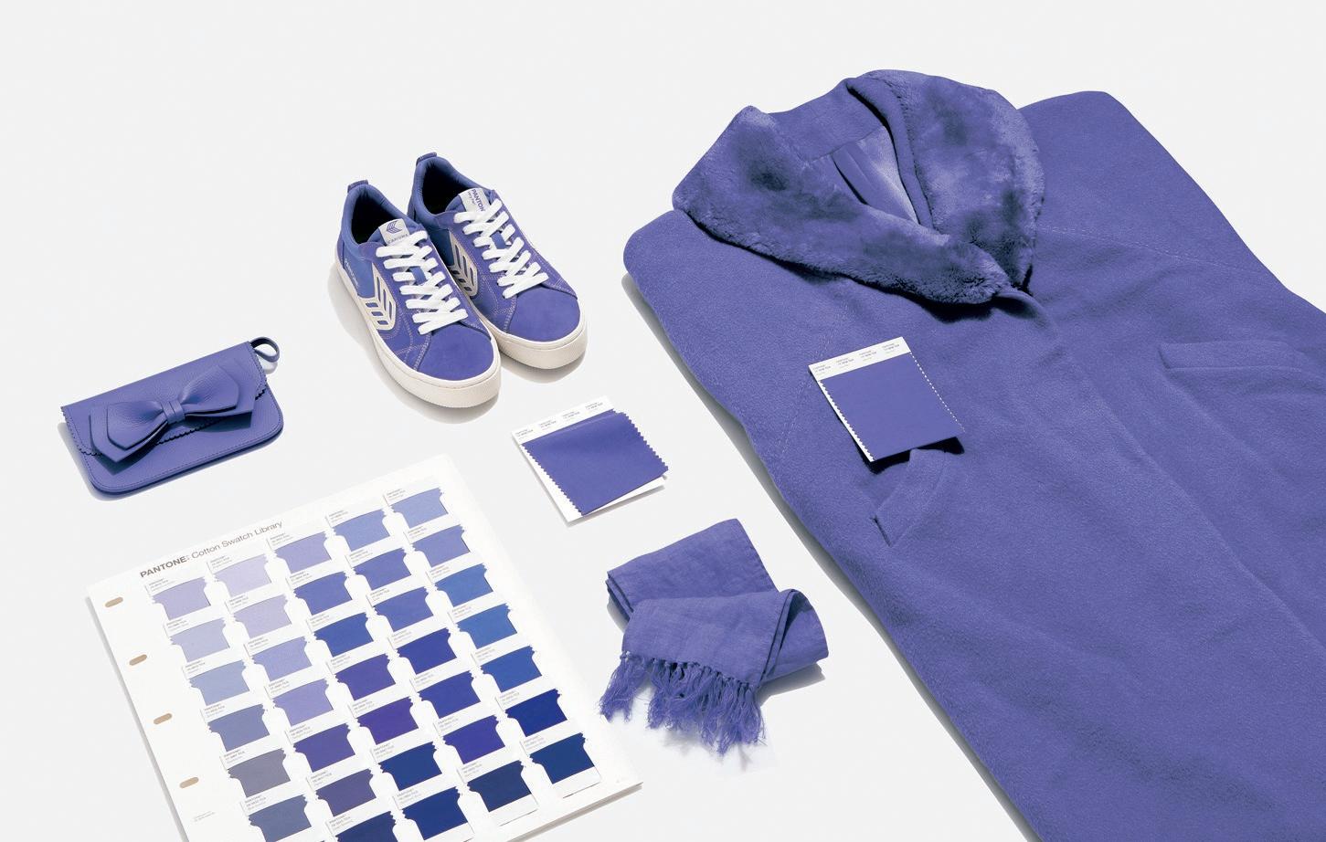
Very Peri, Pantone’s 2022 color of the year, along with suggested compatible colors.
Photos courtesy Pantone/TNS
Advertisement
By Patricia Sheridan
A hue of blue is Pantone’s color of the year for 2022.
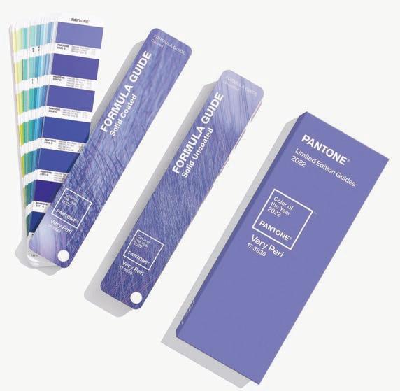
Very Peri (17-3938) is a periwinkle shade that’s easy on the eyes, but represents courage and inventiveness, according to Pantone. The color system calls the new shade of blue “a dynamic periwinkle blue hue with a vivifying violet-red undertone.”
“Creating a new color for the first time in the history of our Pantone Color of the Year educational color program reflects the global innovation and transformation taking place,” said Laurie Pressman, vice president of Pantone. “The complexity of this new red-violetinfused blue hue highlights the expansive possibilities that lie before us.”
Minneapolis designer Lucy Penfield, whose work has been featured in major shelter magazines, said: “For the artist in all of us, Very Peri is the quintessential reverie, an escape from the everyday.
“Soft flowing sheer drapes in Very Peri or a dreamy textured vinyl wall covering with hints of Very Peri iridescence will transport you to new intuitions,” she mused.
It is a color that calms and encourages. In these turbulent times, it might be worth investing in a can of Very Peri paint for an accent wall. Its reassuring nature makes it a natural for the bedroom. It adds a pop of color without being domineering, which makes it perfect for pairing with patterns.
Lisa McMenamin of LSM Interior Design in Peters loves the new color.
“I see using it with other softer colors and having Very Peri the statement color. Periwinkle blue has always been a favorite of mine. Think spring!” she said.
Consumers will also start to see the color on kitchen appliances, clothing and accessories.
“I would treat it as a blue and use it as an accent color paired with a darker navy,” said Pittsburgh designer Katy Popple. “It would be perfect in floral arrangements, decorative accessories and art.”
Century Furniture and Huntington House both use Very Peri on upholstered chairs. SmithHonig, a Georgia-based home decor line, is known for designs inspired by the founders’ travels. Visual artist Melanie Honig and designer Kellie Smith incorporate the periwinkle hue in pillows, tassels, wallpaper and more.
Uttermost’s Westerly table lamp is 100% Very Periish and is an easy entry point to add a little color to your life.
“Very Peri is a symbol of the global zeitgeist of the moment and the transition we are going through,” said Pressman at Pantone. “As we emerge from an intense period of isolation, our notions and standards are changing, and our physical and digital lives have merged in new ways.”


