
2 minute read
In with the new


Art by Urvi Kulkarni and Beck Von Tersch
These older logos can provide a sense of comfort for consumers, they have downsides. Playing too much into nostalgia can hinder the company's branding strategy, especially when a brand does not appeal to a nostalgic audience.
Advertisement
“If the business is newer and follows trends in its identity, nostalgia might not be the best way to create its look. For example, Netflix might not want to be a nostalgic brand because they want to be more current,” Yang said.
For some brands, it might make sense to move away from outdated design trends in favor of a more simplistic design. Additionally, 3D design may have too many challenges to make it a style worth keeping.
“3D design entails a lot of shading and gradations in color and brightness, and in severe production, that’s challenging and can be quite costly,” Yang said. “So if the designers can design a good-looking logo in 2D, that can be a better option than 3D.”
Still, these design changes can have significant pushback, especially from consumers. According to the report “Creating effective logos: Insights from Theory and Practice,” graphic designers often overlook consumer responses to logo changes. Consumers tend to be “subjective and have strong preferences for familiar subjects,” while the designers may be “more objective in their evaluations.”
Some of these design changes, especially toward logos with more extreme changes, can provide a negative emotional response, like Rizvi’s response to the new Pringles logo.
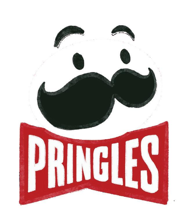

“I’m not going to go as far as to say I’m disgusted by it, but what is that? The nostalgia is gone, and it’s kind of just bland,” Rizvi said.
The overall trend toward simplistic design to an outsider may seem like a confusing change, but there is reasoning behind the switch in design trends.
“Once people were accustomed to screens and used the iPhone every day, design trends moved to more material design in a flat screen,” Yang said. “Businesses are considering how they can increase the energy from their brand from consumers and how to communicate their brand identity better to consumers.”
While some consumers have come to accept the simplified logos, some still feel concerned by the growing minimalistic trend.
“I hate minimalism. I hate it. It feels way too corporate. It’s not interesting, not fun. There’s no personality, and it’s just bland,” Tang said.
However, as Yang explained, a logo change can sometimes increase in popularity, despite the initial backlash to the rebrand.


“When they first launched the new logo of Instagram, people hated it. In response for users at the time, it was bad because they had nostalgic attachments to the iconic design. If they had kept the same logo, it would have been outdated, so I think that was a good design change,” Yang said. “Right now, there’s no one arguing that they should go back to the original logo.”
Additionally, students tend to feel less nostalgia towards the older Instagram logo, instead recognizing its outdated design.

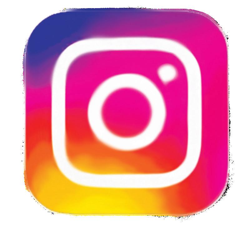
“I feel like this just looks kind of old. I didn’t use Instagram when this was the logo, so it’s just not as familiar to me,” Rizvi said. “The other one is the one I see on a regular basis. I’ve seen this much more, and this is the one that has been there when I have used Instagram.”
Despite the criticisms, simplistic logo designs are here to stay. However, as Yang explained, another trend is for brands to get more data on what consumers want in a logo to influence further redesigns.
“The most important thing for nice use of logos is that it is important to understand and implement how consumers think and how to express our brand identity with design,” Yang said.


