SEAN FOWLER
Residential


Conceptual


1000 POYDRAS STREET
New Orleans, LA
Design for a structural technology company’s office space in the New Orleans Central Business District


52,000 square feet
at Tulane University
for Spring 2022 integrated studio
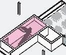
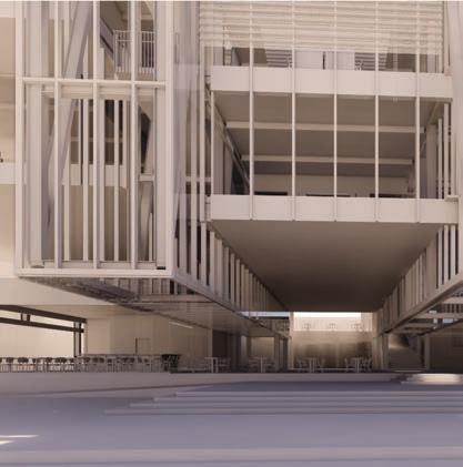
with Irene Keil, studio instructor Irene Keil, studio coordinator1000 Poydras Street is a private office building for a structural technologies company in the heart of the New Orleans Central Business District and downtown. The site was previously a parking lot used for football tailgating, so while it was not ideal public space, there was a desire to keep as much of the site footprint as public as possible, which drove the decision to lift and cantilever the office space above a plaza below, shading the public space from the harsh sun and inclement weather. Connection was a key driver of this project, creating visual links between typically distinct levels of the office space and a visual relationship between the office spaces and the plaza and public space. This connection also extended to circulation through the site, creating an uninterrupted spiral up the form of the building, from the plaza and the public realm through the private office spaces, further fostering connection between the various levels of workspace.
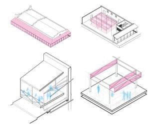
Lifting the building above a plaza, creating visual and circulatory connections between levels, and the other performant aspects of the design (daylighting, passive ventilation, rainwater collection) were all underpinned by the structural armature of the project. This separated the program into distinct zones for office, circulation and back of house uses, created free plans without intervening columns, and allowed for the sheared floor plates fostering the visual connections. The office space is divided into more public and private zones, separated by the halflevels which create visual connections while still allowing privacy and distance between the uses.
perspective from northeast corner
existing site aerial


zoning constraints
structural armature
building massing operations
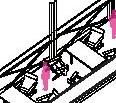
structural axonstructural detail








BHAKROTA WATERSHED PARK
Jaipur, Rajasthan, India
Proposal for managing runoff, collecting rainwater, recharging groundwater & creating a network of vibrant public spaces in the peri-urban perimeter of Jaipur


2.44 square kilometers


at Tulane University for Fall 2021 research studio part of the Yamuna River Project
with Andrea Bardón de Tena, studio instructor Iñaki Alday, research lead Pankaj Vir Gupta, research leadThe Bhakrota Watershed Park is a response to the climate crisis in Jaipur, Rajasthan, India.
Drought conditions in the region, a growing population and continued urbanization have taxed the water system to the point almost a third of the city’s water needs are not met, and this problem is projected to worsen.

This project proposes a network of watershed parks, dramatically reshaping the terrain to capture runoff, recharge the depleted groundwater reserves and provide for Jaipur’s current and future water needs. These parks help meet the region’s water needs while tangibly demonstrating the water supply and demand to the populace.

Based on conservative calculations, one three square kilometer park situated optimally could collect an annual average of more than twenty-five million liters of water per day, providing for more than a quarter of Jaipur’s current water supply deficit. This water would
be captured both for use and to recharge the catastrophically-depeleted groundwater.


Recharging the groundwater is a vital function of these parks, as the compounding water debt from sectarian water management and wildcat agricultural wells has significantly exacerbated the current water crisis.
A network of six of these watershed parks is proposed around Jaipur, making use of the portions of the city with the most impervious surfaces and stormwater runoff, while avoiding those areas where this water interception would reduce collection by the already stressed streams and rivers.
Conservatively, six parks of similar three-kilometer scales could collect enough water to provide for the current and projected water deficits for the city while also recharging almost an additional fifty million liters of water per day. One park is shown as an example of how to apply a straightforward set of rules to any
location, allowing flexibility in situating any of the watershed parks which make up this larger network and contributing to the optimization of stormwater and runoff collection. Sites are selected to minimize the impact on homes and businesses, collecting vacant and fallow lands into large tracts with only the most necessary impacts to residents. The existing plot structures are used as a grid onto which simple transformation can be applied: adding or removing earth, and in only grades.


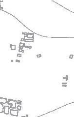


These rules, combined with a study of the topography, hydrology and ecology of the site and surroundings, develop a landscape optimized for redirecting and collecting stormwater and runoff. The collection areas are then designed to maximize the groundwater recharge efficiency, while the spaces created in the grid of existing plots are programmed to create a greater connection between the populace and the water, the land and the ecology.

RICHTER GALLERY
Atlanta, GA
Study for a gallery exhibiting the works of Gerhard Richter from the High Museum collection, with artists’ studio space and apartments
90,000 square feet
48 apartments (+10 artists’ studios)

at Georgia Tech
for Fall 2013 studio
 with Charles Rudolph, studio instructor
Lars Spuybroek, studio coordinator
The Gerhard Richter Gallery is a museum and learning space dedicated to the work of the German contemporary artist. Multiple, layered elements, either single- or mixed-media, are common in Richter’s work and concealing, altering or exposing the layers beneath is the standard effect. The gallery was designed to create a similarly-layered effect both in procession and section, mediating visitors’ view of their goal through mixed materials and concealing or revealing new experiences as they continue through the space. To this end, solid walls are inserted only parallel to the longitudinal axis of the space to allow continuous, if mediated, views throughout.
The location and density of the site demanded program in addition to a freestanding monument celebrating a single artist, and the adaptive reuse of the adjacent 1315 Peachtree Street building provided inspiration for a densely-layered urban infill design. While the adjacent property layers museum, library and offices spaces, the Richter


Gallery layers museum, artist studios and affordable co-housing programs, working to alleviate the Atlanta-area housing deficit while providing space for artists and more directly contributing to the broader goal of cultural institutions and galleries--inspiring further art, whether in response or unrelated to the individual exhibition. The vertical layering of mixed program elements continues the conceptual framing of the gallery space through the remainder of the building, expanding this conceit into a third dimension in a way less-explored by the eponymous artist.
existing site aerial


residential studio gallery office & cafe
procession & view diagramtransverse building & program sectionlongitudinal building & program section


NORTH AVENUE FARMERS MARKET
Atlanta, GA
Study for an urban farmers market with a program layout & roof structure based on the growth of snake skin


53,000 square feet


at Georgia Tech

for Spring 2013 studio
with Jihan Sherman, studio instructor
 Lars Spuybroek, studio coordinator
The North Avenue Farmers Market is a study for replacing Atlanta’s historic Sweet Auburn Curb Market with a new market on a site closer to the current active and mixed-use hub of the city.

In response to both the existing program of the historic market and the context of the new site, the program includes a mix of small food stalls for independent farmers and vendors to use during market hours throughout the week and full-service restaurants which would stay open outside market hours and service the surrounding community.
This new building includes significant covered outdoor space for dining and gathering, both in response to a need of the existing market and to provide a “third space” for the apartments, offices and park adjacent to the site. This supplemental gathering space is intended to draw neighbors and patrons to the market where they would enliven the currently sparse street front, add to the sense of activity and patronize the new shops

and restaurants.
This program pinwheels around the central, outdoor gathering space of the market, both to create more private outdoor dining areas separate from the main, public plazas and to address the challenging grades of the site, which rises more than twelve feet from west to east. This pinwheeling program adds procession to the form of the building by revealing slivers of buildings beyond, which draws occupants further into the site and provides a sense of exploration while also driving the form of the roof.

The program of an active, urban market was supplemented by a focus on pattern study and form generation from the research of Lars Spuybroek the function and growth of animal skins and patterns. Study of snake skins informed the superroof of the project, the repetitive, unitized form of which undulates over the site in response to the activity of the program below.
BANKS FOOD HALL


Columbus, GA
Adaptive reuse of an existing warehouse building as a food hall with stall frames for tenants




14,874 square feet


380 seats


$2,800,000 budget
for W.C. Bradley Company with square feet studio


 Sean Fowler, Co-project manager
Holden Spaht, Project manager

The Banks Building was built by the W.C. Bradley Co. in 1907 to store cotton shipped up the Chattahoochee river before heading to textile producers across the country. The W.C. Bradley Co., which has long refocused its business to real estate, still owns the building, which they wanted to convert into a small food hall serving Columbus’s vibrant riverfront. From the initial site visit it was clear the Banks Building—not unlike the rest of the city’s well-preserved built environment—is a conceptual palimpsest: composed of layers, each expressing marks made by successive inhabitants. The food hall program and facilitating architecture was envisioned as another layer in this history, neither obscuring the found conditions nor imitating them. A wrap-around porch, drawn from the industrial vernacular on the historic Columbus waterfront, is tacked lightly to the exterior of the building, creating a generous outdoor dining area with a front porch overlooking the river. Similarly, the former rail spur between the Banks and Whitewater Express buildings is transformed
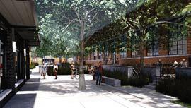
into an intimate dining garden, featuring trees, lounge furniture and an elevated deck, which transitions between the loading-level building floor and the lower ground level. The original arched openings in the building’s masonry walls were maintained and their locations drove circulation and program layout. Six new openings in the northern façade connect onto the porch, separate from the original architecture. The food hall features eleven stalls, a new public restroom and a main bar, with provisions for a small bar in the alleyway.


HIGHSIDE MARKET DESIGN DIRECTION


Columbus, GA
Design direction for adaptive reuse, new construction, landscape, signage, branding and interiors

43,416 square feet / 1.5 acres
$7,100,000 budget
for The Cotton Companies with square feet studio
Sean Fowler, Co-project manager
Blake Burton, Project manager
in coordination with:
Barnes Gibson Partners Architects HILLWORKS
Highside Market is the adaptive reuse of a former commercial and industrial site just north of the thriving downtown in the new Uptown District. This reuse includes a nowdefunct Streamline Moderne auto dealership and repair shop from the opening decades of the twentieth century and a Mid-Century bank building, both converted to mixeduse programs with a blend of office, restaurant and commercial spaces throughout. In exploring the opportunities for this development, two additional outparcel buildings were proposed, adding further uses and new construction to the site. For this project, design direction included leading conversations on the intent for the development, site design, input on tenant mixes and requirements, feedback on the architecture and landscape, coordination with the marketing and branding group, and design control over the new construction and adaptive reuse elements, with a particular focus on common spaces and the interior of the former auto dealership.
211 BUILDING INTERIORS
Columbus, GA
Adaptive reuse with common spaces and stalls for tenants




27,823 square feet
$2,100,000 budget
for The Cotton Companies with square feet studio
Sean Fowler, Co-project manager
Blake Burton, Project manager
Sean Flaharty, Designer in coordination with:
Barnes Gibson Partners Architects
The 211 Building at Highside Market is a Streamline Moderne auto dealership and repair shop converted to a mixed-use program, including office space, restaurant tenants, commercial spaces and a market hall for retail stalls and tenants. The proposed design included wood-framed tenant stalls, wrapped in a translucent polycarbonate to allow natural light from the large industrial windows deep into the market space. Stalls are separated by modular and prefabricated plywood partitions, partially perforated to allow further light into the space and designed for tenants to use a modular merchandising system to display their wares. These modular partitions allow flexibility for the retail tenants and provide opportunities to work with smaller retailers or shorter-term leases. The curves and arches of these stalls, with the curves of the rest of the architecture and the refined use of commodity-grade materials references the Streamline Moderne and automotive history of the building without imitating the design.
251 ARMOUR DRIVE
Atlanta, GA
Adaptive reuse of an existing warehouse building as a white-box office space, including extensive exterior modifications


37,416 square feet
$3,580,000 budget
for Preferred Office Properties

with square feet studio
Sean Fowler, Co-project manager Holden Spaht, Project manager Sean Flaharty, Designer251 Armour Drive is the adaptive reuse of an existing warehouse and industrial building just north of Midtown Atlanta. The existing architecture was designed to focus on the industrial use and isolate the building from the site, so the primary architectural interventions focus on the building faces to blur the edges between the interior building program and the context. This invites the surrounding district to the edge of the building and extends office activities out where the two conditions can overlap. This repositions the building from an inwardly-focused industrial building to a commercial building with multiple public faces addressing both Armour and Ottley Drives and the future BeltLine connection. By wrapping the north and west faces of the building with a new covered deck, screening public spaces with planters and perforating the east face of the building to insert a new enclosure within, formerly barren spaces are recaptured as tenant amenities. The exterior cladding of the existing pre-engineered portion of the building
is opened to reveal new programmed and conditioned spaces within, capturing tenant space while providing a covered porch. Design for this project required considering not only the immediate, flexible needs of office tenants but the longer life of the building once the BeltLine connection cuts through the Armour Yards development, which included the potential for opening this once-introverted building further to better connect with this new public space and allowing additional conversion from office spaces to commercial and restaurant tenants as development continues in the surrounding neighborhoods.
ATLANTA DAIRIES RETAIL STALLS

Atlanta, GA
Providing move-in ready tenant stalls & frames for a small retail market




5,600 square feet

for


Paces Properties with square feet studio
 Sean Fowler, Co-project manager
Holden Spaht, Project manager
Emily Wirt, Designer


The Atlanta Dairies Retail Stalls is the repositioning of a first-generation retail space at the Atlanta Dairies adaptive reuse development along Memorial Drive.
Initial designs for the adaptive reuse of this historic building included two typical retail spaces accessed only by an internal corridor off the main street frontage of the project, and following initial openings in the development, the owner realized these suites were not attractive to the tenants they wanted, and needed a way to better activate these internal and corridor-focused retail spaces.
while celebrating the Mid-Century industrial heritage of the existing development without blocking natural light.


These partitions provide security, branding and signage opportunities, options for merchandising in the new spaces, and allowed most of the construction work to take place off-site, minimizing noise and disturbance next to active tenants while allowing for a compressed construction schedule.


 Emily Mastropiero, Designer
Concerns for this redesign included allowing natural light deep into the spaces, foregrounding the historic architecture and providing for tenant flexibility while still making new spaces more ready for retail uses than typical “white-box” construction.

After the owner signed initial tenants for these new, smaller retail stalls the project was even able to be permitted so tenant move-in would not require additional permitting or inspection, reducing scope and delay required of retailers and allowing the new market to open more quickly.
$300,000 budget corridor entrance existing corridor elevation


Combining the two spaces allowed natural light deeper into the units, and a modular, prefabricated partition system provided a sense of separation and enclosure for retailers

900 DEKALB AVENUE
Atlanta, GA
Adaptive reuse of an existing warehouse building as white-box office, retail & restaurant spaces


22,758 square feet
$1,000,000 budget
for King Properties with square feet studio
900 DeKalb Avenue is the adaptive reuse of a previous warehouse and industrial building along DeKalb Avenue in Inman Park, including multiple office and retail suites, a coffee shop, outdoor gathering space and a restaurant.

The inwardly-focused building, well-suited for the original use, was opened up to better suit the new program and a location only blocks from the vibrant Eastside BeltLine Trail.

A cut was opened through the building, connecting the office and retail tenant spaces and separating the restaurant tenant from the rest of the uses while creating an outdoor plaza and gathering space, connecting through to the office lobby with a new wooden deck and entryway. New awnings were installed around the proposed restaurant tenant to allow ample room for outdoor dining and activate the street frontage of a building otherwise separated from the street by parking. The east face of the building was heavily perforated, with the enclosure pushed back from the original building face to create a
covered breezeway for the retail tenants and provide more space between the parking lot and front doors while preserving much of a mural beloved by neighbors. And a generous office lobby, with a coffee shop and bakery serving tenants and neighbors, opens onto a number of office spaces occupied by non-profit organizations, developers and others. Design for this project included a number of meetings with neighbors, the City of Atlanta and the Atlanta BeltLine, Inc. to ensure the development met overlay standards, addressed neighborhood concerns and responded both to tenant needs and the continuing development of the BeltLine trail.


WHITE PROVISION CO-WORKING SPACE
Atlanta, GA
Adaptive reuse of multiple tenant spaces at White Provision, combining them into a coworking space with a new addition


18,590 square feet
$7,160,000 budget
for Jamestown Properties with square feet studio
Sean Fowler, Designer Blake Burton, Project managerThe White Provision Co-working Space explored possible expansions of the retail and office spaces at the development in response to other mixed-use and office developments along Howell Mill Road. This project included converting existing retail spaces to “white-box” office spaces, combining existing office spaces and adding more than 6,000 square feet of new tenant space along the railroad side of the site to connect these spaces for a potential coworking tenant. The new steel and glass office space provided a stark contrast to the early 20th-century meat packing plant while reflecting the reclaimed industrial aesthetic of the larger development and neighborhood, and included rooftop common and event spaces with connections back to the historic building. The history and expansions of the original building, with the existing tenants remaining in their spaces and an active rail line within feet of the property edge added further constraints to the design. Connections

to the existing buildings were required at multiple points, but the accreted nature of the development required a flexible approach to these openings. A completely-separate structural system was necessary to free the expansion from the eighty-year-old structural system, wind through multiple sub-levels and around uncertain existing conditions, while minimizing the impact of large columns and beams through operating tenant spaces and addressing constructibility and cost concerns, without undermining the existing structure of the building.
This expansion and the associated interior work would have combined more than 18,000 square feet of office space for a headquarters tenant or large co-working space to rival adjacent developments and Midtown office spaces with the unique history of an adaptivereuse project.

LITTLE BEAR
Atlanta, GA
Interior restaurant fit-out with exterior modifications


1,245 square feet
36 seats
$350,000 budget bar
SHEP’S GRANT PARK ACE HARDWARE
for Jarrett
Stieber with square feet
studio
Sean Fowler, Co-project manager
Carolyn Balfour, Interior designer
John Bencich, Founding Principal
Little Bear is a small restaurant space within the redevelopment of the Summerhill neighborhood near Downtown Atlanta and the former Turner Field.

Following years running the successful neighborhood pop-up Eat Me Speak Me in a variety of restaurants, chef Jarrett Stieber wanted a fixed space of his own, allowing more stability and flexibility than previous pop-ups allowed. The rotating, seasonal menu and strong relationships with local farmers influenced design decisions for this project, including the mix of soft tones and textures from farm eggs and fresh produce, communal and small-group seating, and draped string lights for a casual, outdoor atmosphere. Local connections and relationships are embedded throughout the space, from a bar top painted by a longtime employee, to the custom banquette by a local maker and the artwork by friends and family members displayed throughout. The space showcases the warm and eclectic manner of the owner.
Atlanta, GA
Interior retail fit-out for a local hardware store, including exterior modifications

5,705 square feet
$300,350 budget north elevation
for Zach Stafford with square feet studio
Sean Fowler, Co-project manager
Holden Spaht, Project manager
Shep’s Grant Park Ace Hardware is the second Shep’s Ace Hardware franchise in Atlanta, following Shep’s Midtown Ace Hardware.


Located in the Larkin development along Memorial Drive, Ace Hardware is one of the anchor tenants of this adaptive reuse of a previous refrigerator coil factory and former Atlanta Habitat for Humanity headquarters. The clear spans of the previous industrial building was well-suited to the free plan required for vendor merchandising and required minimal architectural intervention. Registers and office program became the main focus of the space, with a custom walnut service counter anchoring the far end of the axis established by the front entrance. A soffit above the point of sale further captured the space with additional shelving behind, dropping from the higher ceilings of the original structure for a more intimate customer service experience at checkout, drawing from the owner’s personal interactions with customers.

office back of house
Memorial Drive point of sale parking
point of sale
retail floor
MARY HOOPA’S HOUSE
Atlanta, GA
Interior restaurant fit-out with patio


2,740 square feet

111 seats

$350,000 budget
for Robert Phalen with square feet studio


 Sean Fowler, Designer Luke Wilkinson, Project manager

Mary Hoopa’s House of Fried Chicken & Oysters was a new restaurant in East Lake’s adaptive-reuse Hosea + 2nd development from Chef Robert Phalen of One Eared Stag in Atlanta, inspired by the classic cuisine of the past. The namesake, Mary Hoopa, was Phalen’s mother-in-law’s cook, known for incredible yard-to-table recipes. Inspired by similar restaurants in Southern Louisiana and across the south, with a color palette evoking early 20th-century A&P Stores, the design brought a warm and classic feeling to the space. The adaptive reuse of the existing building left peeling plaster walls throughout which were complimented by reclaimed heart pine floors, painted plywood paneling and an eclectic mix of salvaged antiques and Mid-Century furniture. The floating oyster bar is a focus of the space, joining both halves of the dining room while connecting to the larger full-service bar for drinks and dining. A soffit above this bar helps provide a more intimate experience, while lights, wall treatments and local art create a


similar effect in the rest of the space. And a large, communal dining table at the entrance to the kitchen creates an experience similar to sitting at a kitchen table while dinner is being prepared, helping bring people together in the tradition of southern food. Outside, a large, covered patio connects to the rest of the development while accommodating the messier realities of shuck-and-eat oysters and fried chicken, acting as a neighborhood gathering space.
A warm, classic atmosphere intended by the design is clearly evoked in the space, service and food, and matches the attitude of the owner.
bar

oyster bar
dining room restrooms

chef’s table
kitchen

patio

BIG BAD BREAKFAST
Homewood, AL
Adaptive reuse of an existing retail building to a new restaurant space, including major exterior modifications and restaurant fit-out

3,591 square feet
129 seats
for Bodnar Investment Group with square feet studio
Sean Fowler, Designer Luke Wilkinson, Project manager
John Bencich, Founding Principal
Big Bad Breakfast Homewood is the adaptive reuse of an old bank building in Downtown Homewood, Alabama by a local, multi-restaurateur and the second location for this popular business.

The “Steep & Deep” building was home to a number of uses, including a bank, Chinese restaurant, and the eponymous skiing, snowboarding and SCUBA diving shop, with the Red Lion, a dive bar in the basement, open longest in continuous operation for more than fifty years.
The layered history of the building—with a still-operational bar below—required a number of large architectural interventions, including infilling the former bank drive-through with space for the ground level kitchen, substantially expanding the second floor and adding a large egress stair to the back of the building. On the exterior, these additions are clearly marked by changes in texture and material, including the black brick infill on the front

facade, dark steel stair on the back and new, bright-red metal panels.

The ground floor is focused on a large breakfast bar and ordering counter, with booth seating for larger groups and a large wood stair connecting to the second floor. On the second floor, large overhead doors provide clear views through the space and breezes on nice days, while the furniture is laid out to provide enough seating for the popular restaurant.
Checked floors connect the ground and second floors visually, with diagonal wood soffits dropping from the exposed structure to provide for more intimate dining in the fixed seating, and lighter wood banquettes and wainscot brightening up the spaces.


ordering
&
675 DREWRY STREET
Atlanta, GA
Conceptual study & entitlement work for a ground-up condo building on the Eastside BeltLine Trail


59,000 square feet
35 units (+2 leasable suites)
for Capital City Real Estate with square feet studio
Sean Fowler, Co-project manager Holden Spaht, Project manager675 Drewry Street is a proposed condominium building along the Eastside BeltLine Trail, just north of Ponce de Leon Avenue in the historic Virginia—Highland neighborhood.


Replacing an early 20th-century industrial building later converted to artist lofts, design for this project responded to a number of overlapping parameters, including a constrained, urban-infill site; more than ten feet of grade-change along the street-frontage; the recentlyadopted Virginia—Highlands Master Plan; BeltLine Overlay District zoning requirements; and the concerns of multiple, overlapping neighborhood groups.
Reconciling these constraints helped clarify the requirements for this project and allowed creative opportunities to address challenges which presented during design, such as including small commercial or residential leasable spaces with the condo units to screen non-active uses from the BeltLine and street frontage; adding penthouse spaces to the top level of residential units to increase unit sizes; and reducing the depth of the parking
deck by removing internal vertical circulation, using site grade to provide required vertical connection.


Following conceptual design, municipal and neighborhood meetings, public engagement and an Atlanta City Council vote, the site was rezoned as required, clearing the way for this development to provide more housing along the BeltLine and continue densifying one of the more dense in-town neighborhoods.

MORNINGSIDE RESIDENCE


Atlanta, GA
Ground-up single-family residence in Morningside-Lenox Park
3,880 square feet

$1,601,000
with square feet studio
Sean Fowler, Designer Blake Burton, Project manager
The brief for this residence was direct–create a modern, resort-like forever home for a professional couple. Two uncomplicated forms sit effortlessly atop a concrete foundation on a steep and narrow site. These forms conceal an open interior with ample amounts of light-filled public and private space, centered around an intimate pool terrace. Structure plays a key role, as the home expresses how it was built, and materials were chosen for durability and tactility. Simple and deliberate solutions lead to a home offering tranquility and a respite from city life.

CASTLEBERRY HILL ROOF DECK
Atlanta, GA
Residential roof deck repair with shade structure

360 square feet
$35,000
with square feet studio
Sean Fowler, Project manager John Bencich, Founding PrincipalNineteen years after the initial work, the owner of the Castleberry Hill Penthouse and Roof Deck returned to refresh this outdoor gathering and entertaining space. The work began as a simple repair to the existing deck, replacing weather-worn wood exposed on a rooftop for almost twenty years, but further conversation with the owner increased the scope to further modify the deck and outdoor spaces, providing protection from the harsh sun and lighting with a new shade structure to expand the function of this space and allow use throughout the day and year.
This allowed the owner to entertain during the depth of summer, expanding their enjoyment of the space and allowing more and more varied use from the reinvestment in this roof deck and attached spaces.


BOUTIQUE SHUFFLEBOARD & EVENT VENUE at ATLANTA DAIRIES
Atlanta, GA
Feasibility study for a boutique shuffleboard venue with bar & food service program


10,500 square feet
300 seats
for Paces Properties with square feet studio
Sean Fowler, Co-project manager Holden Spaht, Project managerThe Boutique Shuffleboard & Event Venue at Atlanta Dairies is a feasibility study for a firstgeneration retail space at Atlanta Dairies along Memorial Drive.

This space is buried within the main building, accessed from the front by an internal corridor, but connects to a walkway off Memorial Drive and opens onto the internal courtyard space of the development, but with a larger interior footprint. With such an important space yet only two short edges of exterior connection, the challenge was to focus as much activity along the facade as possible to make use of natural light and attract guests. The site constraints allowed the architecture to showcase different activities along each edge, with further depth of programming from either face or the internal corridor. The game program is aligned to the west edge to capture the natural light, so the back of house space can take up the eastern “rear” of the space, with a full bar and ordering window along the south edge, overlooking the courtyard.
existing interior
restrooms
upper deck
lower deck
penthouse
Residential & Multi-family
kitchen
game & event space
bar & dining
alternative plan study
bar
Cold Brew Bar ordering window
alternative plan study
CHARLESTON NAVAL SHIPYARD ARCHITECTURAL LANGUAGE RESEARCH


North Charleston, SC
Architectural language, typology & materiality studies of a historicallydesignated navy yard


145 acres


for Thomas & Hutton with Post Loyal Architecture + Industrial Design


 Sean Fowler, Designer Allen Post, Managing partner
Chris Loyal, Partner
Sean Fowler proposed this research to the partners and the client team as a way to better direct the master plan and proposed architecture, and developed the research independently with minimal feedback from the partners.
The Charleston Naval Shipyard is a defunct navy base located along the Cooper River in North Charleston, South Carolina. The site is historically-designated, as are more than thirty buildings from a period of more than seventy years.
The client is interested in preserving and restoring the historic buildings while developing the rest of the site with new architecture which responds thoughtfully to the existing conditions, requiring a comprehensive understanding of the existing buildings due to the marked differences in the ages, styles and construction types, and to find common language for new construction which fits with the historic buildings.


FOOD HALL & STALL TYPOLOGIES


Varies


Typology studies of typical food hall and stall arrangements, layouts & dimensions


for square feet studio with square feet studio


Sean Fowler, Designer Holden Spaht, Design director
Sean Fowler developed this research independently from initial studies performed under the direction of Holden Spaht, the design director for square feet studio.
This food hall and food stall typology research was initially performed for a new food hall development, drawing on experience designing and fitting out stalls in markets and food halls across the Southeastern United States.


The typological study was invaluable to communicating with the original client and exploring the feasibility of alternative designs and layouts for their project, so the research was expanded upon outside client-specific work to develop a more rigorous survey of possible configurations as a tool for both winning and executing future food hall and market projects.

ASSEMBLY YARDS
Doraville, GA
Feasibility studies for four sites in the larger Assembly Yards development

60 acres

for Paces Properties with square feet studio
Sean Fowler, Designer Holden
Spaht, Project managerAssembly Yards is the mixed-use redevelopment of the General Motors Assembly Plant in Doraville.

A longtime client was interested in purchasing multiple plots in this larger project for a variety of programs to strengthen the mixed-use components of this site, and needed help exploring possibilities for these disparate spaces.
Included in these plots were a relocated pre-engineered metal building to be re-purposed into a food hall, a ruin park on the site of a partially-demolished building, a triangular park on the site of demolished material silos to be converted to an indoor-outdoor event venue and park space, and the bridge which once allowed factory employees to enter the manufacturing building over the railway, to become the centerpiece of a boutique gaming and entertainment venue, with vendors and an elevated bar and dining area above the proposed greenway cutting along the edge of the site.

FOOD HALL at ASSEMBLY YARDS
Doraville, GA
Feasibility study for the relocation & adaptive reuse of a pre-engineered metal building as a food hall, with white box tenant stalls


22,000 square feet
for Paces Properties with square feet studio

The Assembly Yards Food Hall is a re-purposed pre-engineered metal building, relocated from an original location elsewhere on the site. The wide structural span of this building made it ideal to explore market layouts on the interior, pushing through and peeling back the skin to create outdoor bars, ordering windows and covered patios, responding to the site conditions and adjacent programs. The density of mixed uses, including an adjacent hotel and nearby office and residential buildings required addressing the site from all four sides, suggesting a confetti diagram anchored by two full-service tenants and opening toward the center of the site and nearby greenspace with covered outdoor dining. Previous research on food hall typologies and layouts allowed a number of different studies based on experiences with other operating food halls, potential efficiencies and opportunities, such as an elevated mezzanine dining space, made possible by the large structural bays of the existing building.
Conceptual & Site Studies

BOUTIQUE GAMING & EVENT VENUE at ASSEMBLY YARDS
Doraville, GA
Feasibility study for the adaptive resuse and expansions of an existing stair tower & bridge as a boutique gaming venue & food service concept


20,800 square feet
for Paces Properties with square feet studio
Sean Fowler, Designer Holden Spaht, Project manager
The Assembly Yard Bridge was once employees’ entry to the General Motors plant from the parking lot across active railway tracks, but with redevelopment of the site and conversion of the track to a public greenway, the tower and bridge remained as a ruin connecting nowhere. The initial design suggested a vertical food hall, with a number of small tenant spaces arrayed vertically along the tower, dining on the bridge over the greenway and a cascading stair connecting the far end of the bridge directly to the greenway. With tenant interest from a boutique gaming and social event company, the base of the building was re-imagined as a large gaming hall with a patio over the greenway, restaurant in the base of the tower and a bar on top of the bridge, still including dining looking out over the site and a connection from the far end of the bridge. Re-purposing the bridge in this way provides life and activity both along and above the greenway, while allowing large-scale signage opportunities for the site and tenant.


TRIANGLE PARK MUSIC VENUE at ASSEMBLY YARDS
Doraville, GA
Feasibility study for an outdoor concert & event venue with ground-up fast-casual & full-service restaurant components


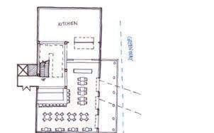


19,200 square feet
for Paces Properties with square feet studio
 Sean Fowler, Designer Holden Spaht, Project manager
The Assembly Yards Triangle Park is an industrial ruin left by the demolition of a set of large silos once serving the manufacturing on site. This was a residual space left in the master planning of the site, which provided an opportunity for additional mixed-use amenities in an already-dense development. The shape and layout of the plot allowed for a large outdoor music venue facing away from the adjacent residential buildings, anchored by a pair of restaurant spaces—one full-service, the other fast-casual—and ticketing at the three corners of the triangular parcel. Outside evening and weekend concerts and performances, the full-service restaurant could program the large yard and auditorium seating as a beer garden, with communal seating and outdoor games, ensuring life and activity throughout the year at a key intersection within the development. This site also provides an ad-hoc “front yard” and “third space” for residents nearby.
site aerial existing conditionsexisting conditions


plan diagrams


Conceptual & Site Studies
Conceptual & Site Studies
HERCULANEUM WORKBENCH

Sean Fowler from the works of Christopher Schwarz, Lost Art Press
Inspired by a preserved first-century fresco from the ruins of the Roman town of Herculaneum, in the shadow of Mons Vesuvius; a preserved second-century bench recovered from a well outside the Roman fort in Saalburg, Germany; a Soviet-era ethnography of Estonian craft traditions; and a continuing, two-millennia history of low work benches throughout the world, Christopher Schwarz researched the history of woodworking benches from the earliest known representation of woodworking to the present day to better contextualize his work and the modern craft and maker movement. Drawing from this research, without access to a shop and using only the most basic hand tools (a handsaw, chisel and block plane), this bench is the product of both the democratization of craft tradition and a resurgence of craft practices. It is well-suited for woodworking without dedicated shop space or in a cramped apartment, and also works well as a console table or extra seating for guests.

STAKED HIGH STOOL


Sean Fowler from the works of Christopher Schwarz, Lost Art Press
A continuation of and improvement upon the skills learned during construction of the Herculaneum Workbench, and the first project completed with the new bench, the Staked High Stool is a continued lesson in Christopher Schwarz’s democratized woodworking. Constructed from the same 2x12 construction-grade pine as the workbench, this project showed the escalating fit, finish and quality from continued practice and available surfaces on which to work.


