Edition Issue The Makers Edit 06 Region UK Magazine
You can make things well with tools, equipment, techniques, technology, and machinery. But without ideas that have been agonised over, adapted, shared, explored, and crafted, you’re just one of many.
Join us as we showcase our latest designs and creative collaborations with Pearson Lloyd, Patrick Norguet, Samuel Wilkinson and Simon Pengelly.
Every new product shown during CDW challenges our perception of design through sustainability and innovative engineering, we look forward sharing these with you.
21st-23rd May
Welcome to the sixth issue of Sketch, the Makers Edition.
Sketch is a forum to showcase new ideas, trends, opinions, and products from Allermuir and Senator. Two completely different brands with one vision to create innovative products for the workplace. In this edition we go behind the scenes, honouring the minds behind the design.
Introduction The Makers Edit 3
�N TH�S �SSUE
Get to know industrial designer Samuel Wilkinson, the mind behind one of Allermuir’s latest additions, Yõso.
Meet the team behind Allermuir Design Studio and take a sneak peek behind the scenes of the studio’s latest shoot.
a maker.

Get inspired by this sofa edit curated by Allermuir. Showcasing some of their best collections, settings and tips on how to
An eclectic
A selection
tell us
In the studio with Samuel Wilkinson Allermuir Design Studio Makers Toolbox 08 18 14 MEET THE MAKERS 01 IN THE MAKING 02
in
Design Studio’s latest playlist curated with Spotify, guaranteed to keep you motivated while in the studio.
The
The Sofa Edit by Allermuir What’s New 39 24 40
bunch of thinkers.
of our designers
their perspectives on making and becoming
Listen
to Allermuir
Discover the latest product ranges to be added to Allermuir’s extensive collection of chairs, soft seating, storage and more.
Makers Mixtape
style. Sketch 06 The Makers Edit 4

Explore the latest additions to Senator’s collection of architecture and storage, giving you the most out of your space.
An account on Salvation Armys newly constructed headquarters in Denmark Hill. Furnished to last, featuring classics from Senator and Allermuir.
Dawn Scott, Senior Colour Designer at Dulux Trade gives us an insight on how to use colour within the office in order to improve well-being and productivity.


In this segment we break down studio Pearson Lloyd’s exploration into ‘Material Change’. Discover ways to reduce our impact on our ecosystem when it comes to design.
Together with Selma Momme, a textile artist with a visionary approach, Gabriel have captured the transformative spirit of circular fabric, Gabriel Loop.
Maximise your space Material Change by Pearson Lloyd 54 72 03 WE MAKE SPACES 04 MAKE A BETTER WORLD
You Some say this is rubbish by Gabriel A Dulux guide to office design 66 86 60 Contents The Makers Edit 5
new seating system for Senator, Contour is a lightweight, flexible work and meeting chair designed with circular principles in mind. Introducing Contour 78
Spaces by
A
MEET THE MAKERS THE MAKERS EDIT 06 –21 01
Someone who actively engages in creating or producing things, often with a hands-on approach. Makers often enjoy the process of learning new skills, problem-solving, and bringing their ideas to life through their own efforts. They may work in various fields and they typically value experimentation, collaboration, and sharing their knowledge with others in the maker community

IN THE STUDIO WITH

Samuel Wilkinson


Meet the Makers 8


Catch up with industrial designer
Samuel Wilkinson, the mind behind Allermuir’s latest addition Yõso.
A fusion of craftsmanship and technology, Yõso is a elegant armchair rooted in traditional design values with a modern expression. We have a chat with Samuel to gain further insight into his studio and inspirations for latest creation Yõso. by

In the studio with Samuel Wilkinson 9


Meet the Makers 10
Samuel's Studio
This is your first collaboration with Allermuir. Tell us a bit about yourself!
SW I am Samuel Wilkinson, an industrial designer with a studio in Elephant & Castle, South London.
We work on a variety of projects from small consumer products right the way up to large installations in the public realm, specialising in furniture and lighting.
Have you always had an interest in design? What has the journey to where you are today been like and where do you hope to see yourself 5 years from now?
SW My first contact with design was through completing a 2 week work experience as a 17 year old in an architect’s firm. They asked me to try CAD and this really opened my eyes to how things could be designed. Then after A-levels and an art foundation I went to study Furniture and related product design at Ravensbourne.
After graduating I worked for different studios for 6-7 years then started my own studio.
I have been lucky to work on a wide range of projects with good clients. In product design, and especially furniture/ lighting, you have to keep pushing and its not easy. Some things work out, others do not, which can be frustrating.
“I love what I do so the main thing for me is to always be inquisitive and passionate, look to learn new things and trust in your instinct.”
Although I have had my studio for over 10 years and only feel now I am getting towards where I want to be, so hopefully for the next 5 years I can continue to
keep building and work more interesting projects.
What are three things that inspire your design?
SW Form, function, context.
Tell us about your studio space, when it was established, where is it, anything particular you chose about the area or the space itself etc.
SW I have only just moved into a new space at the start of this year as the building I was in for last 3 years is about to be demolished. My new space is in an old Catholic school. It is one large room with very high ceilings and good light and works well. I wanted to find something near Waterloo as I moved out of London a few years ago and now travel in so Elephant & Castle is perfect. The area has been in much needed regeneration mode for the last 10 years so has changed a lot. Its far from completed yet but I like the mix of old and new.
How would you describe your studio in three words?
SW Comfortable, functional, airy.
What is the one thing you couldn’t manage without in your studio?
SW Probably my computer, its obviously the best tool! It does make me respect, even more, the mid-century masters and how they managed without it!
When is your favorite time of day to get in the studio and design?
SW I often find that I’m most productive between 6-8pm in the evening. My assistants leave at 6pm and the emails stop so it’s easiest to focus on completing some tasks.
In the studio with Samuel Wilkinson 11 "the best tool"
When it came to designing Yõso what was your process?
SW It started with a lot of sketching, searching for different combinations and junctions.
Sketching rarely involves a whole chair, I often look for signature details or new lines through a new product so these can be quite loose. Then if I find something with potential I will sketch it in more detail or even go straight to 3D CAD to see if the proportions can work.
We came up with four different designs and presented them to Allermuir and Yõso stood out.
“The task wasn’t to create something new, how can you reinvent the wheel? But rather to reveal the form that already existed. As an industrial designer I use my knowledge of production to harmoniously blend, traditional design sensibilities, with technology, and manufacturing, to create products that have a subtle freshness but most importantly stand the test of time.”
At this stage the 3D CAD is already at about 90% the final chair but the last 10% requires patience. First thing was to 3D print a 1:5 scale model to review general proportions, then make a loose 1:1 blue foam model the arm / leg / back junction.
We then made a simple timber 1:1 prototype to start to test ergonomics. As the back rest sits on top of the arm, getting the seat balance is more difficult as changing one thing directly affects another. After a few focused weeks of testing iterations of 3D printed backrests, we found the right geometry.
As its Allermuir’s first all timber arm chair I was quite involved in the production development from previous experiences. Helping the chair migrate smoothly through any structural updates / cost implications. I really enjoy this part of the process as there is always compromise and the challenge staying true to the original design intention while still making an efficient product.
What was your most and least favourite part of that process?
SW Both these applied to waiting for the first production sample. It took some time and being patient in that moment is difficult as the hard work is done. You really want to see the design in its true materials and test the chair!
Are there any other designers that inspire you and your making?
SW Most admiration at the moment comes from mid-century Danish designers like Wegner, Juhl, Kjaerholm etc. There is so much quality and consistency to their work, each with their own style but always on point.
What new materials and technologies interest you the most right now?
SW For me its not really the materials but the approach. I always try to imbue a deeper consideration for a products life cycle and impact on our world, so its great that this is more front and center of all product launches than it used to be.
Lastly, inspire us, what’s going on in the design community? Anything you have seen recently… events, books, films?
SW I haven’t been yet but I am looking forward to see the Enzo Mari exhibition at the design museum. Also the Salone del mobile arrives in two weeks so this is always the highlight of the year, see new design and old friends!
Meet the Makers 12
Discover more of Yõso on pg.42


In the studio with Samuel Wilkinson 13

Meet the Makers 14

SmithMatthias is an award winning design studio founded by Jack Smith and Gemma Matthias in 2014.
SmithMatthias’s rich toolbox of skills and experience combined with their love of the natural world informs an exploration of ideas through quality of craftsmanship and sustainability of materials which all culminates into products that are kept for longer and have a low impact on the planet.
“A maker brings ideas into existence; from the realms of the mind’s eye into the tangible world. A maker is brave, patient, and refines their craft. Fuelled by passion, guided by experience, befriended by time, and rewarded by curiosity.”
@smith.matthias
Any advice for aspiring designers?
“Our advice would be to make as much as possible. Making encourages new ideas and solutions and takes you in directions you may not have predicted. It gives you a deeper understanding of a process and craft and inherently leads to problem solving.”


 Makers Jack Smith & Gemma Matthias
* Makers Toolbox 15
 Maker Mark Gabbertas
Yorkshire born Mark Gabbertas graduated from Durham University with a degree in Political Philosophy. After eight years as an account manager at the advertising agency, Saatchi and Saatchi, Mark was ready for a change. In 1990 he left advertising to follow his passion and trained as a cabinet maker.
After only two years training Mark set up on his own company and was commissioned to design the furniture for the Atelier restaurant in Soho, which won the FX Furniture in Practice award in 1995.
In 2002 Mark established the Gabbertas Studio in West London.
What is the best piece of advice design or otherwise that you have ever been given?
“Identify and understand the questions you need to ask yourself before you start designing… what are you really trying to solve through the design process?”
@gabbertasstudio


Meet the Makers 16

British Designer Simon Pengelly founded London based Pengelly Design in 1993 after working for the Conran Design Group and the in-house design team of Habitat.
Pengelly Design Ltd now collaborates globally with the most progressive design -led companies working within the realm of transport and product design, lighting and interior design in addition to furniture design.
Pengelly’s affinity with new materials and production processes results in products which are both light weight and sustainable, yet at the same time offer timeless appeal.
Any advice for aspiring designers?
“Become a maker first, as it will inform everything that you design in a way that can’t be taught!”
How would you define a 'maker'?
“The term ‘maker’ means different things to different people… for me it is about ‘physical knowledge’, i.e. a sixth sense developed as a consequence of working with and understanding a combination of materials, tools and processes, that with practice creates knowledge that becomes second nature, and which permeates and affects all aspects of creative thinking and problem solving.
Makers are generally happy people, and the idea that ‘head, hand and heart’ are inextricably linked in the creation of an object, means that makers are always in touch with themselves in a way that is difficult to articulate but obvious to see, as the results often convey the enjoyment and satisfaction derived from making something, be that by hand or machine.”
@simonpengelly

* Uku, latest development
 Maker Simon Pengelly
Makers Toolbox 17
the Meet Team
A diverse bunch of thinkers and makers from all over the world, their obsession with design is what unites them all. Graphic design, photography, illustration, interior design and of course, product design is what makes the team so eclectic — all equally curious, all equally creative. Inspiration, product trends, technology, and material developments go in. Elegant and innovative furniture comes out.


Meet the Makers Allermuir Design Studio 18
Click below to go behind the scenes on our shoot day...



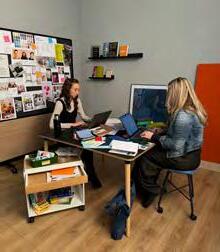


000 ADS-Shoot-BTS 0027 0008 x 0025 ADS-Shoot-BTS 0026 ADS-Shoot-BTS x


Team


Meet the Makers 20 Sustainability Exhibitions Interior Design
the Art-direction & Styling
Kash
Rachel
Graphic Designer Group Brand Executive Go
pg. 46 to
new
Graphic Designer & Photographer
Product Designer
Graphic Designer
to
discover
crate curved. Photography

Allermuir Design Studio have designed the following products:
Furow, Pache, Turo, Sunda 1, Sunda 2, Mayze, Mayze Mobile, Jinx, Silta, Crate Divide, FortySeven, FortySeven XL and Pause.


Allermuir Design Studio 21 Allermuir is design, design, design Allermuir is detail driven Allermuir is sustainable Allermuir is colour Allermuir is Allermuir design studio Allermuir is not defined by trends Allermuir is just right Allermuir is finishes Allermuir is a manufacturer Allermuir is you Allermuir is precise Allermuir is for life Allermuir is people Allermuir is music Allermuir is always questioning Allermuir is playful Allermuir is a sketch Allermuir is reclaimed Allermuir is fashion Allermuir is stop collaborate and listen Allermuir is detail Allermuir is outdoor Allermuir is for the here and now Allermuir is architectural Allermuir is pulp Allermuir is hospitality Allermuir is mobile Allermuir is playful Allermuir is love Allermuir is workplace Allermuir is seductive Allermuir is recycled Allermuir is calming Allermuir is inviting Allermuir is stickers Allermuir is award winning Allermuir is original Allermuir is anything but ordinary
*
Animation
Editorial Product design & testing Graphic Designer Product Designer Product Designer Graphic Designer Digital Artist Creative Manager
Trend & forecastingcolour
Copywriting
A series of actions or steps taken to achieve a particular result or goal. Processes can be found in virtually every aspect of life, ranging from manufacturing and business operations to biological functions and creative endeavours.

IN THE MAKING THE MAKERS EDIT 22 –53 02
PROCESS


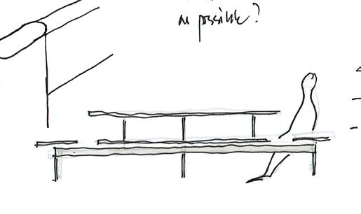

The sofa edit
Our range of sofas are lavishly generous in their comfort, balanced with architectural lines finished with exquisite detailing. In this edit we break down some of our favorite sofa collections, settings & tips to styling.
by
Finding the perfect fit pg. 26


Discover more with latest category brochure... pg 30
Essentials pg. 27


Stunning Receptions pg. 28

 Office
New!
Bastille Sofa pg. 31
Ultimate Comfort pg. 29
In the Making 24
 Jinx
Mozaik
The Sofa Edit by Allermuir 25
Ad-Lib by Senator
Finding the perfect fit
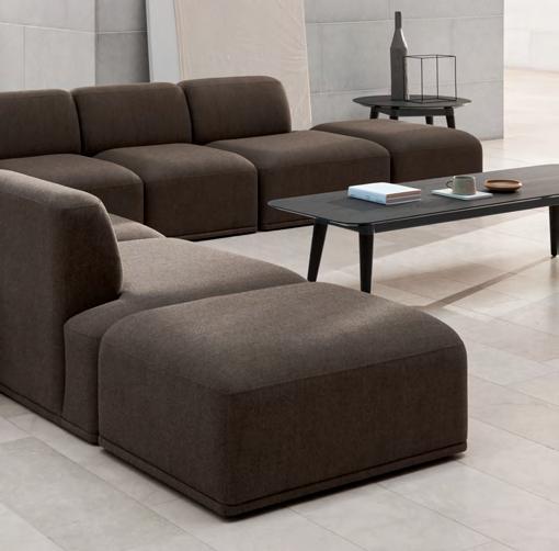
A design that doesn’t dictate your creative direction. Shape your space with our hand-crafted modular collection. Suitable for homes, offices and public spaces. These sofas can be used individually or linked together.

Dynamic seating
Benches, ottomans and footrests all support sofa spaces.The Mozaik benches for example allow for different seating styles that in turn facilitate different patterns of behavior, function and interaction.

The space surrounding a sofa is equally as important as styling the sofa itself. Wall art, prints and varying frames can be used to complement a sofa as the natural focal point of a room while helping create atmosphere. No sufficient wall space? Stand larger frames against the wall instead.

 Orai
Mozaik
Mayze
Paver
Picture this...
01 02 03 04 In the Making 26

Side tables offer the perfect spot for a cup of coffee, book and other essentials. For working spaces the Host table, a standalone table for use as laptop support or work surface, is essential.


storage systems like Crate Divide can be used to open and enclose spaces to suit your needs. Create intimate work spaces or open collaborative ones, offering an adaptability perfect for the office.

Essentials 05 | Haven bench by Mark Gabbertas 06 | Plum by Mark Gabbertas 07 | Mayze Mobile by Allermuir Design Studio
Office
Sofas that help support collaborative working environments.
Haven Bench
Plum
Mayze Mobile
Add a side of... 01 |
Allermuir Design Studio 02 | Mayze
Allermuir Design Studio 03 | Orai by Mark Gabbertas 04 | Mozaik by Mark Gabbertas
06 07 05 The Sofa Edit by Allermuir 27
Paver by
by
Modular
Modular storage
Add a side of...

Batan offers the perfect collection of dynamic side tables. Including a selection of colours, textures and materials from terazzo to brass tops. The soft, rounded design of these tables lend themselves to being more social, allowing conversation to flow naturally across and around them.

Stunning receptions
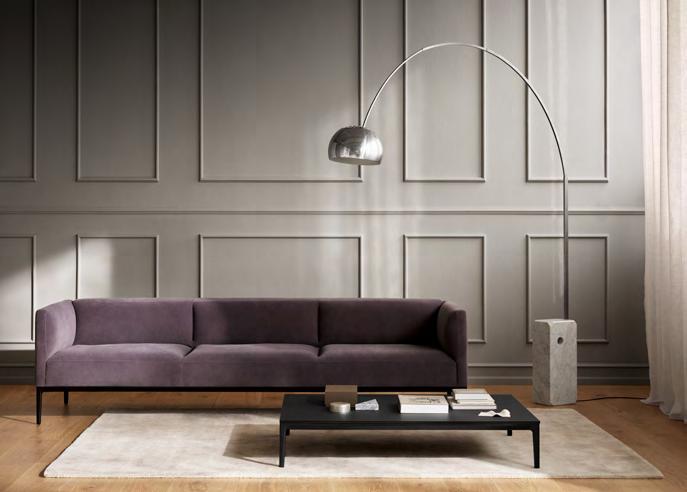
Low level seating for high quality reception and lounge areas. These sofas maintain their comfort and form in high use areas, perfect for stunning reception areas or for creating relaxing spaces in corporate lounges and breakout areas.
Light up your space
Give our sofas the attention they deserve by framing them with lighting. Floor lamps are great for naturally drawing the eye to the space and smaller lamps can be placed on coffee tables to give more visual variety.
Rugs are a great way to add some texture or pattern into the space and bring all furniture together.

09 08
Flourish the Floor
Orai
In the Making 28
Stirling
Bringing nature into a space can help those in it escape, perfect for break-out spaces. Adding a large plant to the side of a sofa balances the space creating a light and ambience. To make more of a feature, add a collection of different plants in varying heights.


An arrangement of cushions
Ultimate comfort
These sofas capture the epitome of comfort, suitable for a wealth of environments. Distinctive silhouettes from Jinx’s geometric form and angular lines to Obris’ soft frame and clean lines designed to bring instant comfort.
Layering in cushions can not only provide additional comfort but help to transform a soft seat. Add dimension by using a mixture of shapes, sizes and patterns.
Our Tylus cushions are a stylish complement to any of our soft seating and sofa ranges.
 Jinx
Jinx
11 |
12 |
10
| Jinx by Allermuir Design Studio
Plum by Mark Gabbertas
Obris by Jonas Wagell
Obris
Plum
Ultimate break – out escape 10 11 12
08 | Orai by Mark Gabbertas 09 | Stirling by Allermuir Design Studio
The Sofa Edit by Allermuir 29
Looking for something specific?


Introducing the all new Allermuir
Brochures.
Category
Endless Possibilities
Bastille Lounge is an evolution of Bastille. Bastille’s generously contoured and curved silhouette is the definition of luxury. Bastille Lounge is a fusion of heritage and modernity that isn’t over designed. It’s restrained simplicity is delicate and timeless allowing Bastille Lounge to act almost chameleon, transitioning between a wealth of settings from corporate to hospitality.


 Bastille Lounge | Club chair
Bastille Lounge | 3 Seat Sofa
The Sofa Edit – Bastille Lounge In the Making 31
Maker
Patrick Norguet

In the Making 32
Bastille Lounge
3 Seat Sofa

The Sofa Edit – Bastille Lounge 33
Bastille Lounge Club chair
Batan Extruded Blend Side table


Bastille is simple to the eye but that’s not to say there hasn’t been consideration through the design, combining the old, with the new, to produce something that shows the finer details through the story and aspects such as stitching without pushing boundaries too far. Bastille Lounge isn’t about over design it is about an extreme confidence that comes from a timeless design “ “

 Bastille Lounge | 2 Seat Sofa
Patrick reviewing prototypes
In the Making 34
You’ve been a contributor to Allermuir for some time, but it’s been a while since we’ve seen each other. Tell us a bit about yourself, your activities and what you’re doing at the moment.
PN My team and I are working on a multitude of different projects and issues. These projects are at different stages of maturity, some in creation and some in development.
At this time of year we’re finalising a lot of projects that will be presented at the Milan show next April. But some new products, depending on the country, will be presented on other occasions, for example at the Chicago show.
Where do you find the most inspiration?
PN Inspiration is a question of creative energy. I find it in the random encounters I have with people. I can’t work with a company if, from the outset, there isn’t this desire and energy to innovate; energy to undertake, innovate, create and take risks too.
My creativity is the result of many elements, a person, a machine, a material, a country, a culture, nothing Cartesian at the outset.
How do you go about designing a new product?
PN I spend a lot of time observing the context, understanding the brand, the factory, the needs, the objectives and the processes. I build up a body of
‘material’ on which I can base my work.
So, as with every project, I start with a blank page. I don’t like applying recipes or imposing a style, as that would be too easy and dishonest.
I spend a lot of time drawing, researching to find the right style, like a musician finds the “RIFF”. Once found I work to make the drawing as accurate as possible, as clear as possible, removing the superfluous to find the right character for the object.
Then the challenge begins: communicating and preserving the idea, the design throughout the development phase until the object is industrialised. A process that also depends on the quality of the manufacturer, but this stage is vital and exciting.
What was the thought process / inspiration behind Bastille Lounge?
PN This project is part of a program that we started 3 years ago. It’s always very interesting to continue a project over time by completing it like a family.
Starting with the Bastille design it was obvious to design other seats, adding to the range and the product offer.
What do you think of this new collection?
PN It’s a collection that’s simple and to the point, and that can be used in a wide range of spaces. A hotel, a reception hall and so on.
The Sofa Edit – Bastille Lounge 35

In the Making 36

The Sofa Edit – Bastille Lounge 37
Batan Extruded Blend Side table
Bastille Lounge Club chair
Turn up the volume with this playlist curated by the team behind Allermuir Design Studio. Guaranteed to encourage creative making.
In the Making 38
Click below to listen...


Intimidated (feat. H.E.R.) – KAYTRANADA
Glasshouses – Maribou State
When the Going Gets Tough, The Tough Get Going – Billy Ocean
MANTRA – Bring Me The Horizon
Looking For Love – Disclosure
Running Back To You –Charlotte OC
Time Moves Slow –BADBADNOTGOOD,
For Us – Daul, THAMA
Samuel
T. Herring
Makers Mixtape 39
Candle Flame – Jungle, Erik the Architect
An exclusive look at our latest designs and creative collaborations. You can make things well with tools, equipment, techniques, technology, and machinery. But without ideas that have been agonised over, adapted, shared, explored, and crafted, you’re just one of many. Each new product we make challenges others perceptions of design whether through sustainability or innovative engineering. Our new range of products has it all. by
In the Making 40
What’s New


What’s new by Allermuir 41
Yõso chair by Samuel Wilkinson
Maker
Samuel Wilkinson
Yõs õ
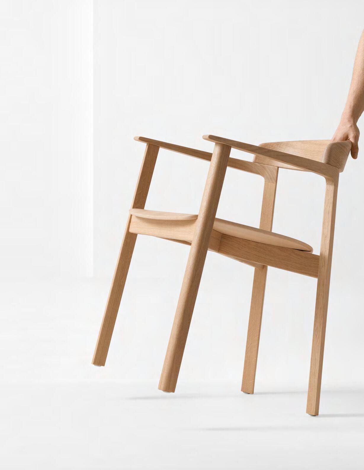
A distinctive grouping of parts, Yõso, is an honest take on a classic timber armchair.
Made purely from oak wood, Yõso is a fusion of craft and technology to create an elegant arm chair rooted in traditional design characteristics but with a modern expression.

01
In the Making 42
~
Yõso chairs by Samuel Wilkinson


Yõso’s subtle details are a true celebration of craftmanship and traditional design sensibilities that have pushed the boundaries of manufacturing to reveal a product that honours the artistry inherent in Yõso’s design.


Yõso’s subtle personality is a process of restraint and refinement, allowing the materiality of Yõso’s sculptured and cultured frame to shine.

What’s new by Allermuir 43

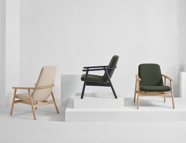
Uku

Uku, is a visually delicate wood lounge chair. Designed to be harmonious and balanced, with no individual feature being the main protagonist, allowing Uku to elegantly fit into any setting.
Uku possess a subtle Scandinavian influence where materiality, honesty, and warmth, are familiar characteristics of wood, are quietly abundant. Furthermore, the upholstered elements have a visually intuitive and inclusive relationship with the frame.
In the Making 44 02
Uku by Simon Pengelly

“Before designing any wood chair, I want to understand the benefits and requirements. For me, the inclusion of wood in the design suggested the need for a softer, more tactile, and familiar design, with reference to residential applications.
I wanted the design to possess a Scandinavian influence where the honest, tactile, warm, and familiar characteristics of wood are quietly abundant, and where the upholstered elements have a visually intuitive and inclusive relationship with the frame.”



What’s new by Allermuir 45
Maker Simon Pengelly

Crate Divide is an adaptable structure that zones open-plan environments to create multi-functional private and collaborative spaces. The core principle of Crate Divide is to offer flexibility; from high to low, storage, TVs, curtains, biophilia, straight, T or L shaped, the only limitation is your imagination.
The latest update to Crate Divide introduces curving, allowing users to seamlessly specify fully circular spaces or to elegantly snake their designs around their chosen environment.
The addition of curtains creates a whole new look and gives a stylish aesthetic with a dual purpose, providing an acoustic insulation and visual privacy, further adding to the many benefits Crate Divide offers.
03 In the Making 46
Makers


Allermuir Design Studio

crate curved


What’s new by Allermuir 47
Crate Planter
Crate Caddy
Crate Credenza
Crate Mobile Crate Divide
The Lounge

The Reception
Use the Crate Divide curve segment to create a luxury breakout and hideaway space for colleagues and teams to escape away from their desk for a meeting or more casual conversations. Create
and luxurious


welcome
style. Shad d R g Rea o S d L R d d R g Sh d H dde Le Rea o S d L g Sh d Products shown: 1 Crate Curved by Allermuir 2 Famiglia
Allermuir 3 Sunda 1
Products shown: 1 Crate Curved by Allermuir 2 Conic Table by Allermuir 3 Plum Sofa by Allermuir In the Making 48 02 02 03 01 01 03
a visual and acoustic spot to
and greet your guests in a secluded
by
by Allermuir

The Team Space
Allermuir and Senator products complement each other perfectly. Crate Divide by Allermuir provides a softer, residential feel, that when paired with Pailo and Circo by Senator create a far more functional and collaborative workspace.

Products shown:
1 Crate Curved by Allermuir
2 Circo by Senator
3 Pailo by Senator


The Breakout
Famiglia is a very adaptable soft seating product that can blend perfectly between hospitality and corporate environments. Used here with Crate Divide creating a comfortable and relaxing waiting space or a more informal nook for a team catch-up.
Products shown: 1 Crate Curved by Allermuir 2 Famiglia by Allermuir 3 Sunda 1 by Allermuir Sh de R gh R a o Sh d R S d d R h Sh d L H de R gh R a o H d L R H d R h H dd S d L H d B H de Le ad d R h o Sh d R Sh d Crate Curved Settings 49
02 03 01 02 03 01

In the Making 50

Crate Curved Settings 51


WE MAKE SPACES THE MAKERS EDIT 54 –69 60 – 65 54 – 59 03
MAXIMISE YOUR SPACE BY SENATOR
A COLOUR GUIDE TO OFFICE DESIGN


66 – 69
SPACES BY YOU
DULUX,

Maximise
Shard 2.0 X&Y
your We Make Spaces 54

StoreWall
Maximise your space by Senator 55
Pebble by Allermuir
Space by
The
Shard 2.0 collection offers informal and impromptu spaces for up to four people. As workspaces change to become more collaborative, and social, the need to meet is ever increasing.
Pods
These pods may look like bespoke joinery but they are in fact free-standing pods that can slide into any workspace. Open or closed, they can increase your visual and acoustic privacy or create a natural zoning within open-plan offices but more than this, they are comfortable and collaborative nooks, designed to facilitate better in person meetings.


Work Booths
Using the same typology as the Shard Pods, the Shard 2.0 Work Booths are a back to back free-standing product that can easily blend between canteens or corporate offices.
Shard 2.0
We Make Spaces 56


A banquette seating product that has all the flexibility thanks to it’s modular design. The addition of the corner piece means all sorts of shapes and configurations can be made from more traditional canteen inspired environments to large meeting and breakout areas.
Collection
Banquette
Shard 2.0 Pod
Shard 2.0 Booth
Maximise your space by Senator 57
Shard 2.0 Banquette
Storage

StoreWall
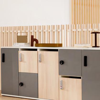
StoreWall will help you create a well-organised and modern work environment. Senator offers a wide range of storage solutions and functionality thus you will be able to select or create customised cabinets best suited for your office space. Offering plenty of features from filing to waste storage, integrated seating and lockers.
We Make Spaces 58


Solutions
Lockers
Lockers is Senator’s range of personal storage lockers designed to suit a wide range applications, solutions and uses. All created to be customised to you and your office.
 Postal Boxes
Planters
Maximise your space by Senator 59
Safety Lockers
Dulux, to office design.

We Make Spaces 60
a colour guide...
When designing office spaces, it is important to consider functionality as well as beauty to ensure all employees feel welcomed, at ease and able to perform to the best of their ability. In this article, Dawn Scott, Senior Colour Designer at Dulux Trade, explains how this can be achieved with well-considered specification of colour.
Dulux, a colour guide to office design 61
OPINION PIECE
Introduction
People spend 80-90% of their time indoors and for many, a large proportion of this is spent at work. It is therefore crucial that office spaces are carefully designed to ensure that all occupants feel comfortable and inspired to do their very best each day. As such, when it comes to designing workspaces, building users should be placed at the heart of design. This means selecting products and colours that will serve their needs and help to improve their well-being and productivity.
When designing workspaces, it is important to assess each area of the office and identify how it will be used, as this will influence the design requirements. For example, in the main work areas and meeting rooms, employees are more likely to need concentration spaces, whereas break out areas may be designed to help people unwind or relax. However, it is also important to provide a mix of neutral and visually stimulating spaces, to provide employees with a choice on where they want to work, as everyone will have a personal preference, and there are also cultural associations with different colours. This is a particularly important factor for neurodivergent people as some might prefer calm spaces, while others might thrive in a workplace with brighter tones on the walls.
A great place to start is with a Biophilic colour palette, which reflects the balance and spectrum of colours found outdoors. By echoing the colours of nature, designers can begin to offset the sterile feel of a tech dominated space and help create an environment employees want to spend time in.


We Make Spaces 62 001 High Summer 005 Sweet Embrace 003 Ocean Stone

Entrances and lobbies...
Entrances and lobbies are the first space people will encounter when entering a building. First impressions count, which means it is essential to set the right atmosphere in these areas. Depending on what your business or brand stands for, you might want to create an uplifting atmosphere and if so, then brighter tones


like the bright yellow High Summer or the violet Fragrant Peony will be the perfect option. On the other hand, if you want to create a more down-to-earth and trustworthy welcome, then muted shades of blues like Ocean Stone, greens like Pea Shoot and delicate tones like Sweet Embrace may be best.
Products shown:
Famiglia by Allermuir
Conic Table by Allermuir
Crate Divide by Allermuir
Orai by Allermuir
Batan by Allermuir
Dulux, a colour guide to office design 63
004 Pea Shoot
002 Fragrant Peony
The office...
Colour can be a great tool for improving focus and boosting productivity. In fact, carefully selecting colours for a workspace can positively impact employee productivity, engagement, creativity, and happiness. However, colours with high contrast and excessive brightness can strain eyes over time, which can lead to discomfort and fatigue. As such, it is recommended that nature-inspired shades, such as calm colours like Tranquil Dawn and Horizon View or the soft blue Serene Waters, should be applied to surfaces that are to be viewed for extended periods. This is because nature-inspired tones typically have softer contrasts and lower brightness levels, which allow for a more visually comfortable working environment to be developed.


We Make Spaces 64 Products shown Kin | Allermuir Play Table | Senator Crate Cradenza | Allermuir Chemistry | Senator iWorkchair | Senator
002 Tranquil Dawn
001 Horizon View
003 Serene Waters


Products shown
Kin | Allermuir
FortySeven | Allermuir
Host | Alermuir
Crop | Allermuir
Talon | Senator
Mote | Senator
Framed | Senator
Conclusion

To bring the Biophilic theory to life, Dulux Trade partnered with BRE, Oliver Heath Design and other manufacturers to create the BRE Biophilic Office demonstrator –an innovative space which showcases how connectivity to the natural environment can have a positive impact on office occupants. The office demonstrator features colours from Dulux’s Biophilic colour palette.


Break out spaces...
Everyone needs some downtime during the workday and colour can be used to help people relax. For break out spaces or areas like the kitchen that might be used during breaks, consider warmer shades that feel homely and welcoming. Brighter colours like Winter Pumpkin or deeper colours like Pink Sandstone work well - especially when complemented by a creamy neutral tone like Treasured Memory.
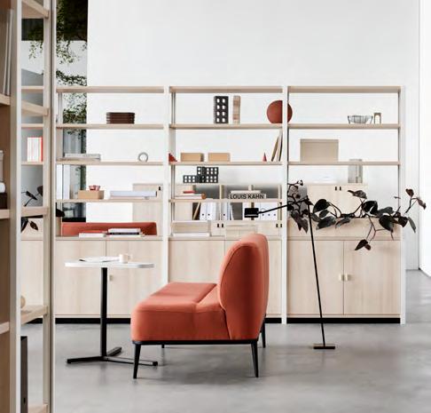
In conclusion, placing occupants at the center of colour and design is crucial to ensuring office spaces work for everyone. Using colour to lift people’s moods and help them make the most of their downtime, is just as important as creating a link back to nature to support productivity and well-being in the work area.
Dulux, a colour guide to office design 65
To find out more about how Dulux Trade can support your next project click below
003 Pink Sandstone
001 Winter Pumpkin
002 Treasured Memory

In 2023, The Salvation Army UK and Ireland moved to a newly constructed headquarters in Denmark Hill. Located at 1 Champion Park, the new office is built next door to the Grade II-listed William Booth College, the historic training centre for officers, designed by Giles Gilbert Scott in 1929. CASE STUDY
Salva t ion Army
We Make Spaces 66

Spaces by you – Salvation
67
Products shown: Famiglia by Allermuir Haven by Allermuir
Army
The Salvation Army wanted a high-quality, long-lasting building that was fitting to its practical values of ‘soup, soap and salvation’. TateHindle Architects were invited to respond to the brief appropriately, to design with humility, while complementing its distinguished neighbour.
Mirroring but modernising the design language of the Gilbert Scott original, the building’s central focus is a large atrium, which acts as both ‘stage’ and ‘shop front’ and can be viewed by the balconies on each floor. Multi-functional spaces and a café surround the atrium to form a welcoming hub for staff, volunteers, and the community.
Whilst creating visual connection between almost all areas, the clever use of materials and furniture still allow for private settings for sensitive conversations.
‘Designed to last 100 years,’ the project required furniture that was carefully chosen to stand the test of time, as well as enhance the well-being of its users and encourage communication.
Recognising that modern working environments allow for changes in posture, all Senator and Torasen desks were specified to be height


 Products shown: Silta by Allermuir Haven by Allermuir Famiglia by Allermuir
We Make Spaces 68
Floor plates are stepped allowing better daylight and connectivity.

adjustable, and in meeting rooms, tables featuring soft angles were chosen so that everyone can be seen. Allermuir Silta tables prompt collaborative perch or standing meetings, with or without high stools.
High backed sofas and chairs, such as Haven and Tarry by Allermuir provide acoustic benefits as well as a degree of visual privacy, without interrupting flow. The inclusion of Haven Pods and CellPods create a ‘space within a space’.
Andrew Justice, Senior Property Project Manager for The Salvation Army said,
“This project was a beautiful meeting of hearts and minds, to create an environment that invites community and connection, for employees, volunteers, and visitors alike. We have a responsibility to the charity to make considered choices, which like The Salvation Army, stand the test
of time. We seek to work with companies who share our values of care and integrity such as The Senator Group, who provided a thoughtful and smooth service from start to finish.”
 Products shown: Furow by Allermuir Haven by Allermuir Circo by Senator Tarry by Allermuir
Spaces by you – Salvation Army 69
Sustainability runs deep through everything our makers do. From the materials they source, to the way they design and craft their products, right through to the delivery, As makers we should all work hard to do the right thing.


MAKE A BETTER WORLD THE MAKERS EDIT 76 –93 0
4


Material Change
Established in 1997, Pearson Lloyd is a design studio based in east London specialising in industrial and product design, furniture and interiors. The studio’s work ranges from research, objects, aviation, public realm and interior design projects, with the goal to tackle global economic and environmental challenges.
In 2023, as part of Pearson Lloyd’s ongoing research to improve the circularity of mass produced products, they reviewed how their material palette had changed over the past decade in response to the emerging circular economy. Collecting their thoughts into an essay and later exhibition, ‘Material Change’.
SHOWCASE
Make a better world 72

with Pearson Lloyd
Material Change with Pearson Lloyd 73

Make a better world 74
Introduction
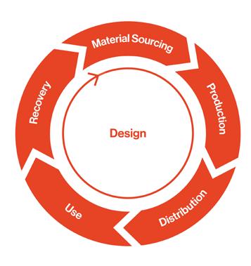
The 2002 Design Council Annual Review stated that 80% of the environmental impact of a product is defined at the design stage. Today we realise that our choice of materials and the way we use them is affecting our planetary future.
We must all confront the impact of our work and take action. It’s time to make a material change to the way we act as designers.
Materials are the foundations of all physical products. In the pre-industrial era, our every-day needs were provided for by local craftspeople working with local materials –animal, vegetable and mineral – available in their natural environment. Material sources were nurtured and maintained to ensure a sustainable supply, and production ‘waste’ was largely returned to the land whenever feasible, renewing the cycle. The aesthetics that emerged from these processes were a natural by-product of the craft techniques and functional characteristics of the materials, which developed into archetypes that have sustained for millennia.
Since the industrial revolution dramatically accelerated our exploitation of the world’s natural resources, the majority of materials used in mass production have derived from virgin sources extracted from the earth. Within our living memory, and certainly in the last two generations characterised by mass consumption, material selection for a product was a relatively straightforward – and apparently benign – process. Timber, aluminum, steel, plastic, textile, glass…materials were selected on the basis of price and functionality, lead times and reflected investment in tooling,
minimum order quantities (MOQs), expected sales and colour selection. Rather than using regenerative materials, grown by nature using solar energy, we have been extracting and refining cheap materials such as oil, where the cost lies in labor and extraction processes rather than the true value of a precious, finite resource.
In the last 20 years, the development of a truly global supply chain further opened up international channels of supply that were handled by agents and procurement teams based on classical tender processes. The ‘outsourcing’ of material supply and production to remote and often opaque centers of industry had the unintended consequence of clouding our understanding of the impact of these decisions and the damage done to both human and planetary health.
The climate emergency that we are now experiencing has forced us all to consider what we must change to reduce and reverse our impact on our ecosystem.

Material Change with Pearson Lloyd 75
Circular Principles
Design with waste materials
The decision making process of circular design goes far beyond the simplistic matrix of form, function, quality, time and price. Different materials, manufacturing techniques and supply chains can have global warming potentials that vary by as much as 10x.
Understanding the relative impact of material choices in terms of carbon dioxide equivalence (CO2e) presents essential data for designers. Setting benchmarks and goals with clients gives us the opportunity to limit the impact of products on the health of our planet.

Design for self-assembly
Plywood has been a dominant material in upholstered furniture frames for decades. As a composite material with 25% of its weight derived from glues, plywood is effectively a single-use material.
As a circular alternative to traditional upholstery framing Pearson Lloyd found that REPP (recycled expanded polypropylene) can be molded into structures and assembled using reversible fixings that allow material separation, recovery and recycling at end-of-life.
Design for circularity Design with
Most soft upholstered furniture is designed to use polyurethane foam for comfort, which, as a thermoset plastic, cannot be easily recycled.
By using biodegradable and regenerative materials we can reduce the amount of extractive resources used in furniture production. Bio-based materials reduce the industry’s reliance on fossil-fuel raw materials, which delivers a significant CO2e saving, reducing impacts on global warming.
In the past, almost all quality furniture was delivered to the customer as a finished and complete product. As brands have globalised, this model created highly inefficient transportation networks.
By transferring assembly to the user, it’s possible to radically reduce the carbon and financial costs associated with transport and enable repair of the product at a later date when damaged or worn.


Make a better world Material Change with Pearson Lloyd 76
bio-based materials
01. 04. 02. 03.
for Senator
Contour


Design for repair
Complex upholstery is a barrier to maintenance and repair, which shortens product life cycles and creates extreme waste.
Such waste can be easily avoided by ensuring each component in the furniture's system is repairable, as seen on CoLab for Senator. In addition, exposed fixings promote easy assembly and on-site replacement of parts. With reversible assemblies, parts that do reach end-of-life can be removed and recycled.
Design with mono-materials
Molded-shell chairs are traditionally manufactured using glass-fiber reinforced plastic to deliver enough strength within a lightweight form. These composite materials cannot be broken down into their constituents to be recycled, creating huge amounts of waste. By using 100% fiber-free polypropylene, these shells can be recycled for reuse.
06.
Design with new technologies
Traditional upholstery techniques use layers of different materials to create an often inseparable stack of composite subframes, foams, springs, glues and textiles.
The potential of 3D knitting to replace composite upholstery with a demountable mono-material fabric on a lightweight frame is an example of how technology can support the transition to a zero waste and low-carbon future.


07.
05.
Camira 3D Knit technology
CoLab for Senator
Contour
by

Make a better world 78


Introducing Tern 79
Makers
Luke Pearson & Tom Lloyd

Contour is a lightweight, flexible work and meeting chair, featuring a highly efficient single piece plastic backrest that provides generous ergonomic support to a wide demographic. Abstaining from complex mechanics, this compliant back allows for just enough dynamic movement to facilitate changes in posture. The inclusion of an upholstered and contoured seat pan enhances ongoing comfort across the entirety of the chair.
Make a better world 80


Introducing Contour 81
Refined form
The range has only what you need for a given purpose to reduce visual clutter.


Make a better world 84 versatile
adaptable, & repairable
Adaptable, flexible scope
Despite its simplicity, Contour boasts a highly adaptable platform that can migrate seamlessly between desk work, casual meetings and touch-down sessions, as well as educational and workshop environments. The swivel version’s integrated tilt mechanism makes the chair supremely suited to medium- duration light work activities.

Repairable and recyclable
Contour is designed in accordance with circular design principles, ensuring each component product in the system can be easily repaired. All components are made using recycled plastic and both backrest and seat come with removable covers to ensure repairability and longevity.

Simple built, highly versatile
Contour has been designed for versatility. The backrest can be configured with either plastic or upholstery and interchangeable ancillary parts allow for easy modification, including legs, arms, tablets and a bag tray.

Introducing Contour Make a better world 85
Some call it rubbish

SHOWCASE Make a better world 86
– we call it
Reinvention.
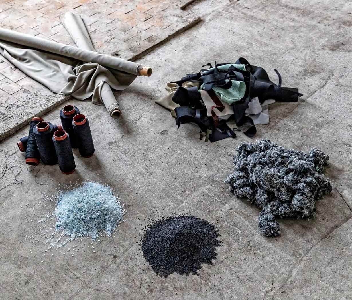
Where others see trash, Gabriel see possibilities. That is why Gabriel Loop was born. Instead of allowing textile waste to end up in incinerators or landfills, waste is collected from their customers and own upholstery productions and recycled into new vibrant textiles. Gabriel believe that every piece of fabric has a story to tell, and are committed to giving them a new life. Together with Selma Momme, a textile artist with a visionary approach, they have captured the transformative spirit of Gabriel Loop.
Gabriel x Selma Momme
Some say this is rubbish by Gabriel 87

Make a better world 88
Re-inventing the textile industry...
Gabriel Loop is a ground breaking closed-loop textile recycling system, breaking the cycle of waste by transforming discarded textile waste and recycled plastic bottles into beautiful and durable new creations.
Gabriel champion resource conservation by harnessing the materials they possess, rather than depleting the planet with fresh ones. By recycling polyester textiles, they minimise waste, use resources wisely, and reduce their carbon footprint. Establishing a circular take back system that forms a closed loop for textiles.


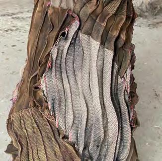
Through textile artist Selma Momme’s lens, discarded fabrics transform into breathtaking floral sculptures, demonstrating the limitless potential of textile waste, and illustrating the profound impact that conscious consumerism can have on our planet.


From waste to wow... 89 Some say this is rubbish by Gabriel
Join the conversation
@senator_social / @allermuir
Connect with us on Instagram and keep up to date with the latest products and ideas.


Issue Downloads
You can view and download all the settings in this issue of Sketch by scanning the QR code above.
Where to find us
United Kingdom
The Senator Group, Skyeside Drive, Altham, Accrington, Lancashire BB5 5YE
North America
Corporate Headquarters, 4111 N. Jerome Road, Maumee, Ohio 43537
Join the conversation
Instagram
What is Sketch?
Sketch is a forum to showcase new ideas, trends, opinions, and products from both the Senator and Allermuir brands. Two completely different brands but with one same vision to create innovative products for the workplace.
Senator and Allermuir brands are part of The Senator Group.


 Makers Jack Smith & Gemma Matthias
 Maker Mark Gabbertas


 Maker Simon Pengelly


 Office
 Jinx
Mozaik


 Orai
Mozaik


 Jinx
Jinx


 Bastille Lounge | Club chair
Bastille Lounge | 3 Seat Sofa


 Bastille Lounge | 2 Seat Sofa
Patrick reviewing prototypes


 Postal Boxes
Planters


 Products shown: Silta by Allermuir Haven by Allermuir Famiglia by Allermuir

 Products shown: Furow by Allermuir Haven by Allermuir Circo by Senator Tarry by Allermuir


