Introduction
Constant Anton Nieuwenhuys (1920–2005), known always by the mononym Constant, was a Dutch painter, poet, sculptor, musician, philosopher and theoretician associated with several of the most signficant groups of the post-war European avant-garde and an important social visionary of the future.
After early artistic studies in Amsterdam and Bergen during the war, Constant, together with his brother, the painter Jan Niewenhuys, and the artists Karel Appel and Corneille, founded the ‘Experimentele Groep in Holland’ (1948) before linking with Asger Jorn, Christian Dotremont and Joseph Noiret to form CoBrA (Dotremont's neologism composed of the initials of Copenhagen / Brussels / Amsterdam) later in 1948. After the dissolution of CoBrA in 1951, Constant spent time in London where his first thoughts of urbanism and (re)construction were prompted by war damage.
It was Constant's invitation to the congress organised by Asger Jorn's ‘Mouvement pour un Bauhaus Imaginiste’ and his subsequent meeting with Guy Debord in Alba in 1956 that led directly to Constant's gesamtkunstwerk, ‘New Babylon’. The Situationist International (‘Internationale Situationniste’) that emerged from the synthesis of Jorn's 'Mouvement pour un Bauhaus Imaginiste' with Debord's 'Internationale Lettriste' in 1957 was rejected initially by Constant. After the movement adopted the concept of ‘unitary urbanism’ as propounded in the joint Constant / Debord ‘La Déclaration d’Amsterdam’ (1958), Constant joined – at least briefly, he left in 1960 – and ‘New Babylon’ was born.
The coinage ‘New Babylon’ was Guy Debord's, describing Constant's futuristic urban utopia (Constant rejected the apposite term due to its strictly satiric affect in More's original intention), a planet-wide city governed and served by machines with a new form of man, social and communal, equal and free, liberated from labour: homo ludens emerging from the pupa of homo faber. Constant's first thoughts on ‘New Babylon’ were articulated in ‘Another City for Another Life’ (1959) but these ideas that had begun to germinate in 1956 were developed and explored by Constant over the next 20 years in extensive media: series of models, sketches, etchings, lithographs, maps and collages, as well as manifestos, essays and lectures.
Presented here as a collection are representative materials from all of Constant's oeuvre — from the ‘Experimentele Groep in Holland’ in the 1940s, his war-inspired ‘8 x La Guerre’, the birth of CoBrA via ‘New Babylon’, to his late portfolio reproducing paintings (‘Plaisir et Tristesse de l'Amour’) and his meditations on his important influence Cézanne. There is also important additional contextual material relating to the birth of CoBrA (Constant's presentation copy of Carl-Henning Pedersen's ‘Drømmedigte’), the emergence of Situationism, the collaborations of Jorn and Debord (‘Fin de Copenhague’ and ‘Mémoires’), Jorn and his brother Jørgen Nash (‘Stavrim, Sonetter’), Debord's psychogeographic ‘map’ of Paris and the birth of ‘New Babylon’ itself.
Although ‘New Babylon’ as a project came to an end in 1974, Constant's magnum opus concluded with the exhibition ‘New Babylon’ at the Gemeentemuseum Den Haag in that year, the ideas and concepts, the aspirations and ideals that Constant strove to promulgate are as relevant, if not even more so, now.
3
Constant, from No.
13
Reflex. Orgaan van de Experimentele Groep goede morgen haan goede morgen haan — Facsimilie
8 x La Guerre
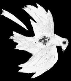
Het Uitzicht Van de Duif
Voor Eeen Spatiaal Colorisme
Pocket-Music for 2 Guitars
New-Babylon Tekeningen 1961–1962
New Babylon — Announcement
New Babylon — Dutch edition
New Babylon — English edition
Sex-Lieder von C. Caspari mit Sechs Lithografien
Constant 1945 – ‘65
museumjournaal voor moderne kunst. serie 10, no. 5
Constant. New-Babylon: Schilderijen, Plastieken
de New Babylon Informatief. No. 1. Juli 1965
de New Babylon Informatief. No. 2. Oktober 1965
de New Babylon Informatief. No 4. (Venezia 1966)
Constant - Van Cobra tot Nieuw Babylon
New Babylon Bulletin. No. 1. Verkeer. (Traffic)
Labyrismen
Expositie Constant aquerellen en etsen
Constant, een illustratie van vrijheid
Constant
Plaisir et Tristesse de l’Amour
Constant. Fanny Kelk, Interview en Kritieken
A Propos de Cézanne
lectura sub aqua - experimenta typografica (Sandberg)
lectura sub aqua - experimenta typografica (ibid. — in wrappers)
Drømmedigte (Carl Henning Pedersen)
Exposition Internationale d' Art Experimental (Sandberg) plus (Appel et al.)
Guide Psychogéographique de Paris (Debord)
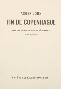
Fin de Copenhague (Debord / Jorn)
Mémoires – Structures Portantes d'Asger Jorn (Debord / Jorn)
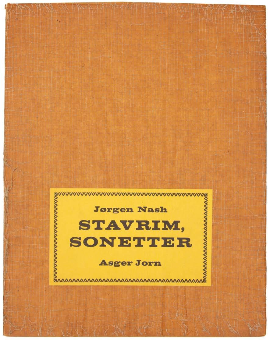
Stavrim, Sonetter (Nash / Jorn)
Part 1: constant Part II: sandberg, jorn, debord et al
09 11 15 17 23 29 33 35 37 39 43 47 49 49 51 53 53 55 57 61 63 67 67 69 71 73 73 77 81 83 85 89 91 95 99 101
CONTENTS
‘The modern city is dead; it has been sacrificed to the cult of utility. New Babylon is the project for a city in which people will be able to live. For to live means to be creative. New Babylon is the product of the creativity of the masses, based on the activation of the enormous creative potential which at the moment lies dormant and unexploited in the people. New Babylon assumes that as a result of automation noncreative work will disappear, that there will be a metamorphosis in morals and thinking, that a new form of society will emerge.’
— Constant

part i Constant, from No. 13 Constant
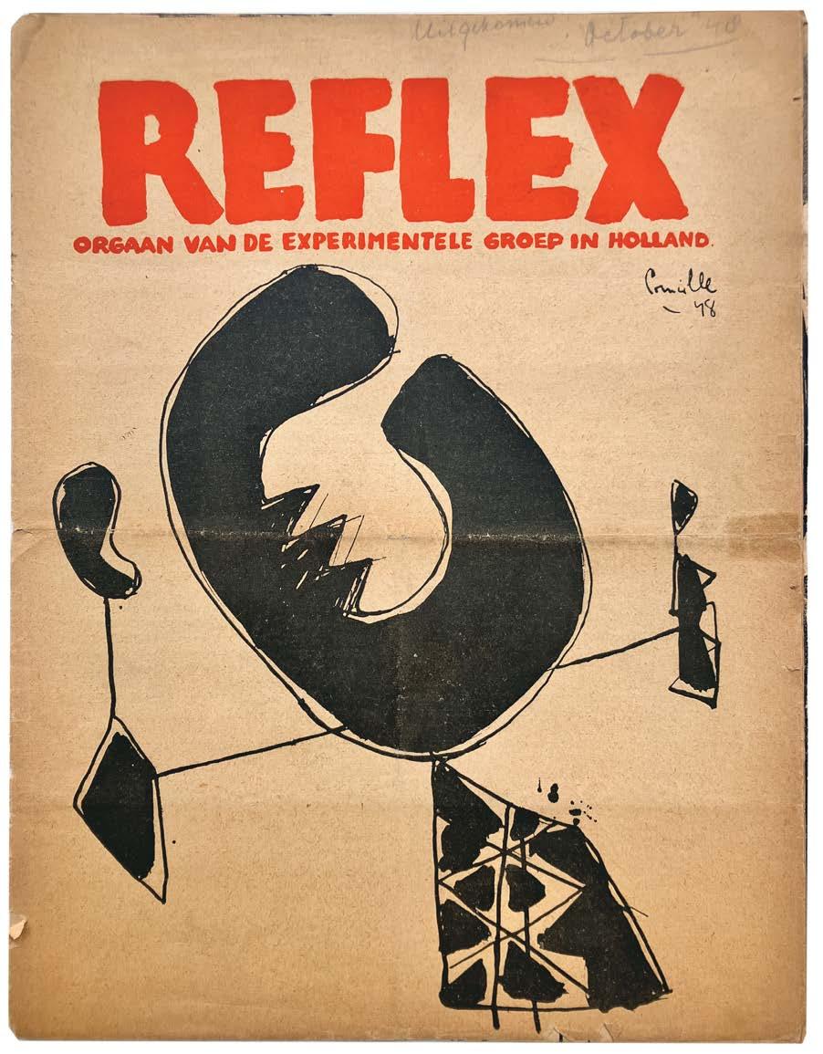
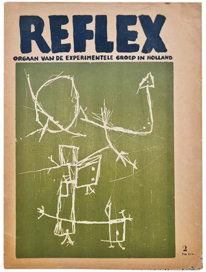
Reflex. Orgaan van de Experimentele Groep in Holland. Nos. 1 & 2. (All Published) amsterdam. 1948–1949
2 vols. 4to. (c.305 × 235 mm). [4 bifolia; 5 bifolia]. Printed text and illustration throughout with original lithographs & monochrome reproductions on thin newsprint paper; the original lithographs are printed recto only on thicker stock. Original publisher's printed wrappers, stapled as issued (here without staples), each with title and illustration to front cover.
The complete series of the fragile ‘reflex’, the rare pre-CoBrA publication with original lithographs, issued by ‘Experimentele Groep in Holland’.
The CoBrA movement was founded in Paris on Nov 8 1948; these publications were published in September / October 1948 and February 1949. As of March 1, 1949, the magazine ‘reflex was renamed CoBrA. In these issues one finds: a Manifesto by Constant; poems and texts by Corneille and Jan Elburg; the text ‘To The Point’ by Eugene Brands; the first published poem by Lucebert; texts by Gerrit Kouwenaar, A. Roland Holst and a poem by Dotremont.
No. 1: with 4 full page lithographs by Constant, Jan Nieuwenhuijs, Karel Appel, Corneille all recto only on thicker paper;
No. 2: with 4 full pages lithographs by Corneille, Brands, Rooskens and Wolvecamp all recto only on thicker paper.
[Le Fonds Paul Destribats 525].
9
1
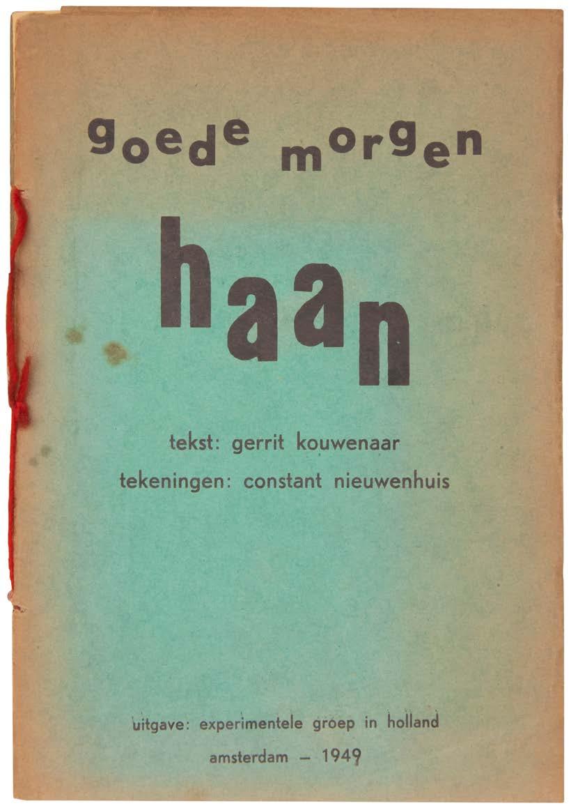
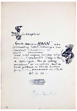
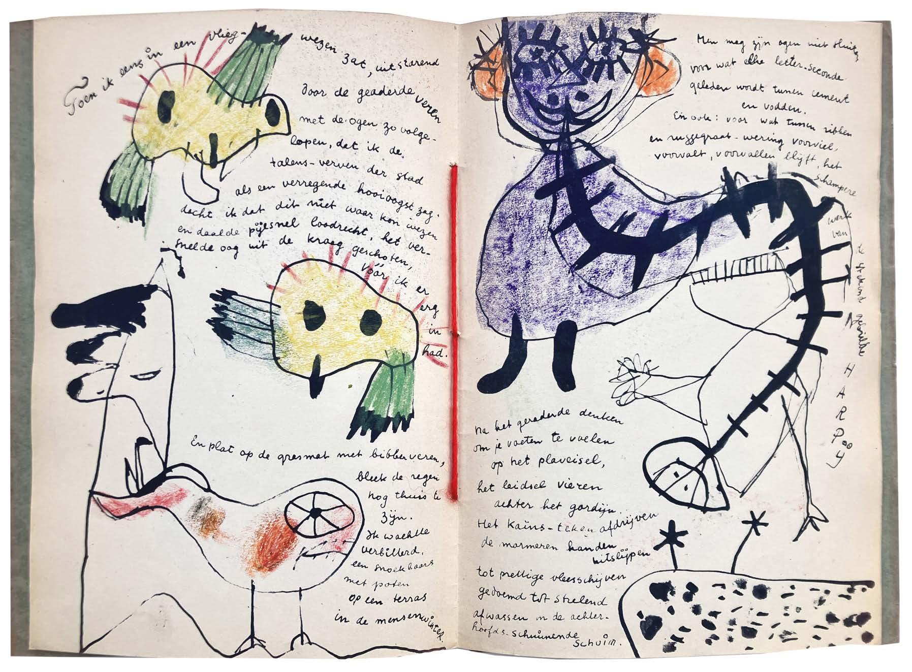
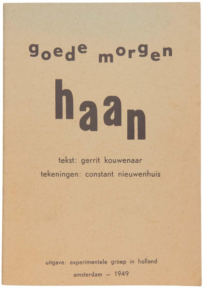
Kouwenaar, Gerrit goede morgen haan amsterdam. experimentele groep in holland. 1949
Large 8vo. (252 × 176 mm). [8 unnumbered leaves]. Leaf with pictorial title recto, six leaves with text and illustration recto and verso, final leaf verso with justification, Kouwenaar's reproduction manuscript text and Constant's illustration in lithography throughout, the illustration with additional colouring by Constant by hand; sheet size: 248 × 172 mm. Original publisher's green printed wrappers with typographic title in lowercase in black to front cover, leaves pierced and with thick scarlet string tie, as issued.
A very good copy of constant's very scarce first book with extensive colouring by hand by the artist.
From the edition limited to 30 numbered copies, each coloured by hand by Constant, this copy signed and numbered by Constant in blue crayon.
Published by the Dutch ‘Experimentele Groep in Holland’ which Constant had helped found, ‘goede morgen haan’ by Gerrit Kouwenaar features illustration by Constant to illuminate Kouwenaar's reproduction manuscript text. Although the book appears to be a children's book - the English title is ‘Good Morning Cockerel’ - the book alludes to deeper and more universal themes.
‘A small printed booklet with poetry by Gerrit Kouwenaar and drawings by Constant. They created it in 1949 and it was supposed to be a little joke. This is also one of the lines in the booklet: “Everyone considers themself to be a joke. A joke is allowed”. The words and drawings are an expression of the playfullness [sic] of their creators where sometimes the words came first and the drawings followed as a reaction and sometimes the other way around.’ — Stichting Constant
The colour for each example, executed by Constant by hand, varies, with the consequence that each copy of the book is unique.
11
2
No. 2: Goede Morgen
1949
Haan
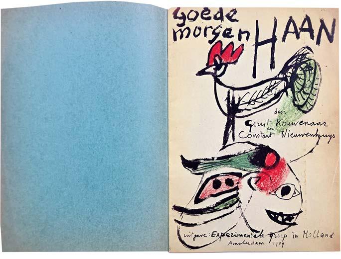
Kouwenaar, Gerrit goede morgen haan amsterdam. em. querido's uitgeverij. 1978
Large 8vo. (246 × 174 mm). 8 unnumbered leaves. Leaf with pictorial title recto, six leaves with text and illustration recto and verso, final leaf verso with justification, Kouwenaar's reproduction manuscript text and Constant's illustration in lithography throughout, the illustration with additional colouring by Constant by hand, explanatory text to interior of rear wrapper. Original publisher's green printed wrappers with typographic title in lowercase in black to front cover, stapled as issued, wrappers faded.
The later facsimile of constant's first book, the collaboration with Gerrit Kouwenaar, ‘Goede Morgen Haan’.
Printed in 1978, just under forty years after the original book, this facsimile is of copy number '1' signed by Constant and Kouwenaar in red ink. Published originally by the Dutch ‘Experimentele Groep in Holland’ which Constant had helped found, 'goede morgen haan' by Gerrit Kouwenaar features illustration by Constant to illuminate Kouwenaar's reproduction manuscript text.
15
3
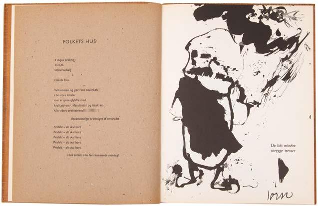
4
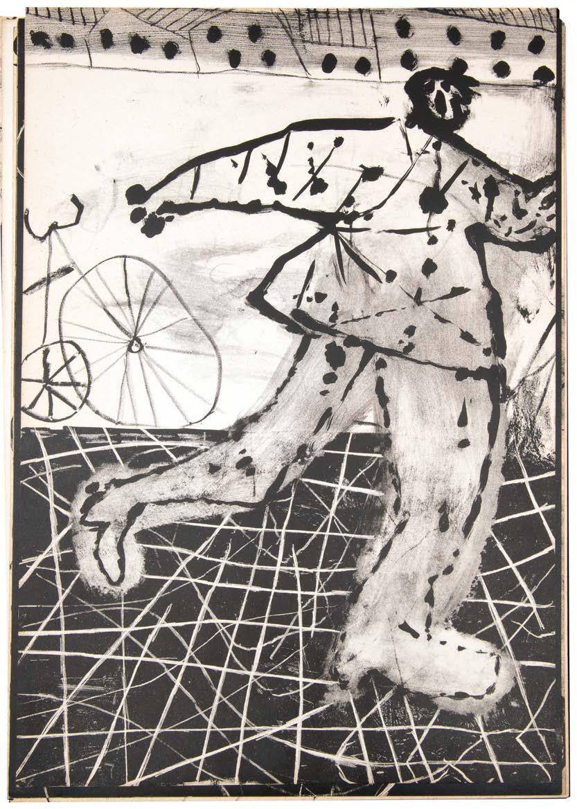
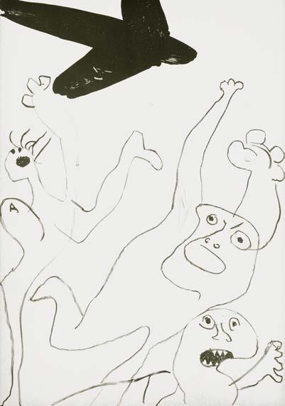
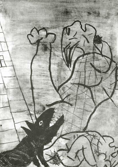
8 × La Guerre amsterdam. (by the artist). 1951
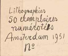
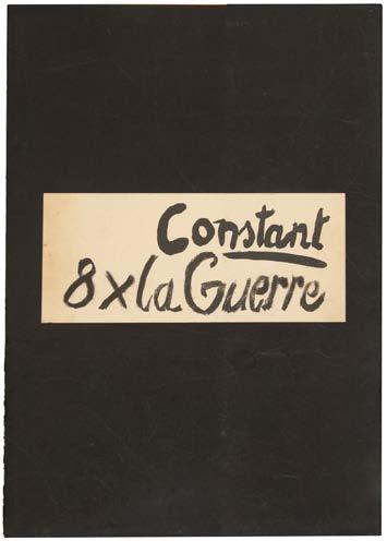
Folio. (412 × 288 mm). [8 unnumbered leaves]. 8 original monochrome lithographs by Constant numbered 1–8 in pencil verso, white paper label with justification (100 × 138 mm) with lithograph text by Constant pasted to verso of front portfolio flap; sheet size: c.400 × 284 mm. Loose as issued in original publisher's thick black paper portfolio with flap, white paper label (100 × 234 mm) with lithograph title by Constant to front cover, later black cloth grey laid paper-lined box with title in grey to front cover.
Constant's first portfolio of prints the powerful lithograph series based on the horrors of war.
From the edition limited to 50 numbered copies, this copy inscribed ‘épreuve d'artiste’ and signed in pencil by Constant to justification.
‘… dans “8 x La Guerre”, il montre avec une clarté particulière la condition actuelle de l'homme ... La condition humaine en 1951, six ans après la fin de la Seconde Guerre mondiale, six ans après Hiroshima et la révélation de la Shoah, c'est donc, dans l'ordre des planches: être bombardé aveuglément par des avions, voir les siens mourir violemment, se trouver seul et terrorisé, être poursuivi et attaqué par des chiens de gare ou des loups, mourir parmi les débris d'une ville incendiée, fuir et hurlant, se heurter à un cheval crevé au pied d'une cheminée d'usine, voir un homme à tête de chat tuer à l'arme blanche la symbolique Colombe de la Paix.’
— Philippe Dagen
[Dagen 8–15; see Philippe Dagen's ‘La gravure telle une flèche plantée dans l'armure du temps,’ pp. 21–34].
17
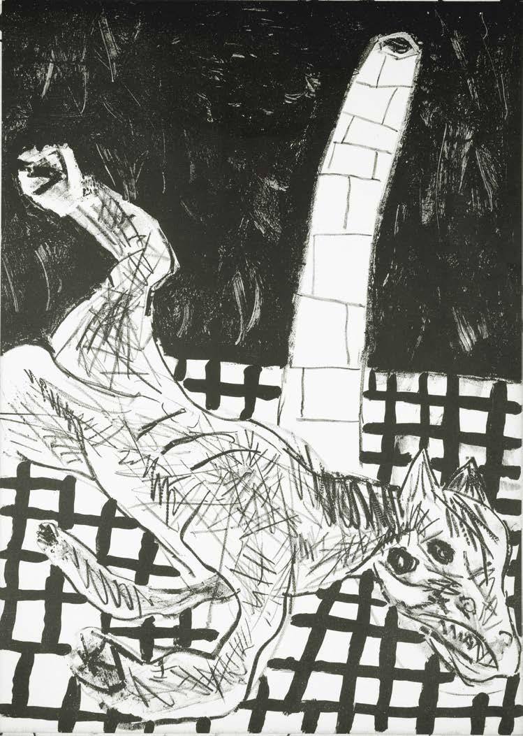
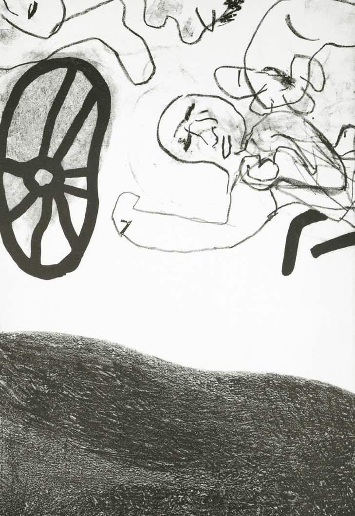
and right: No. 4, 8 × La Guerre, 1951
above
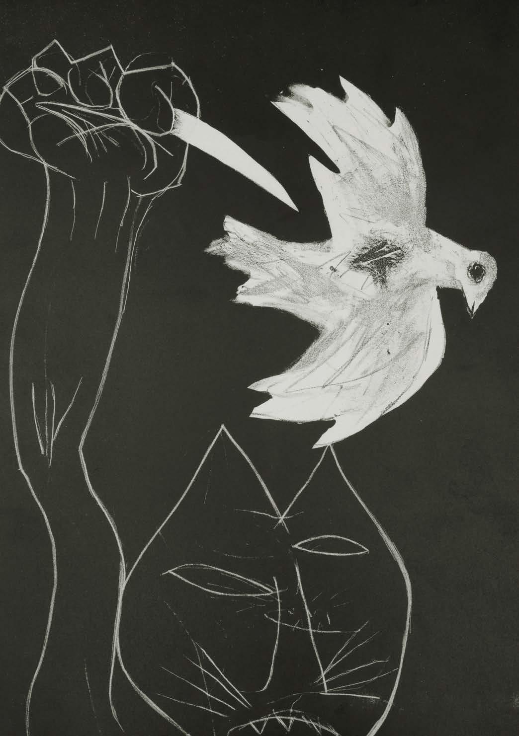
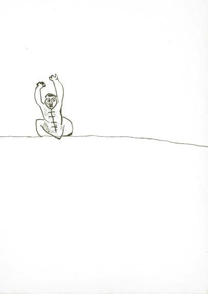
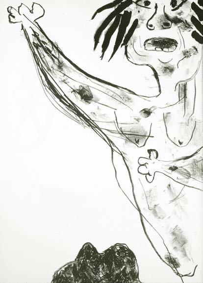
 above and left: No. 4, 8 x La Guerre, 1951
Elburg, Jan
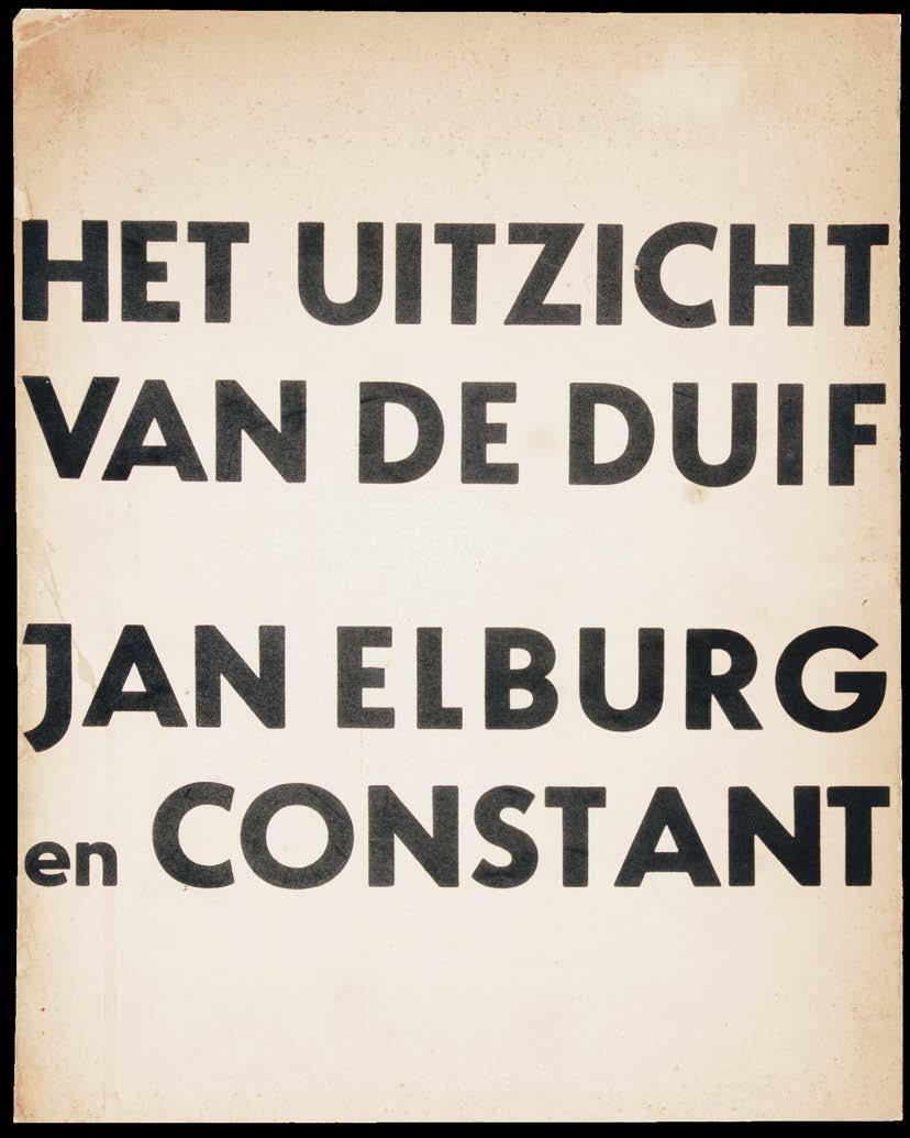
Het Uitzicht Van de Duif amsterdam. galerie le canard. 1952
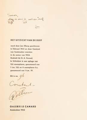
Folio. (340 × 272 mm). [9 bifolia]. Bifolium with opening of Elburg's printed verse recto and verso with original colour woodcut by Constant and 8 bifolia numbered 2–9 on first recto each with verse by Elburg and original colour woodcut by Constant as spread, justification to interior of rear wrapper. Loose as issued in original publisher's printed wrappers with titles to front cover in black, justification printed to interior of rear wrapper.
Presentation copy of constant's collaboration with Elburg, illustrated with original colour woodcuts.
From the edition limited to 125 numbered copies signed by Constant and Elburg; four hors commerce copies were also issued. Elburg's presentation is in sepia ink to the justification: ‘Simon, / vlieg / kijk er eens in / nit mit een duif. / Jan’. (The words ‘vlieg’ and ‘kijk’ and ‘in’ and ‘nit’ have been written so as to be interchangeable). Although we have no evidence for it, it is tempting to imagine that the recipient of this copy was Simon Vinkenoog, the Dutch poet who collaborated with Constant for ‘New Bablylon’.
According to the colophon Elburg wrote the poems in February 1951 and Constant made his woodcuts in the Summer of 1952.
‘On November 1952, “Het Uitzicht van de Duif” was presented in the Amsterdam gallery Le Canard , a loose-leaf edition of a long three-part poem from 1951 by Jan G. Elburg (1919 – 1992), illustrated with nine color woodcuts, summer 1952, by Constant (1920 – 2005). The large-format edition was published in a limited edition of 129 numbered and signed copies. Four of these - “hors commerce” numbered from I to IV - were intended as personal copies for Constant, Jan Elburg, the Le Canard gallery and the printer G. A.Verwey. The remaining 125 were for sale.’
— Stichting Constant
[Dagen 17–25].
23
5
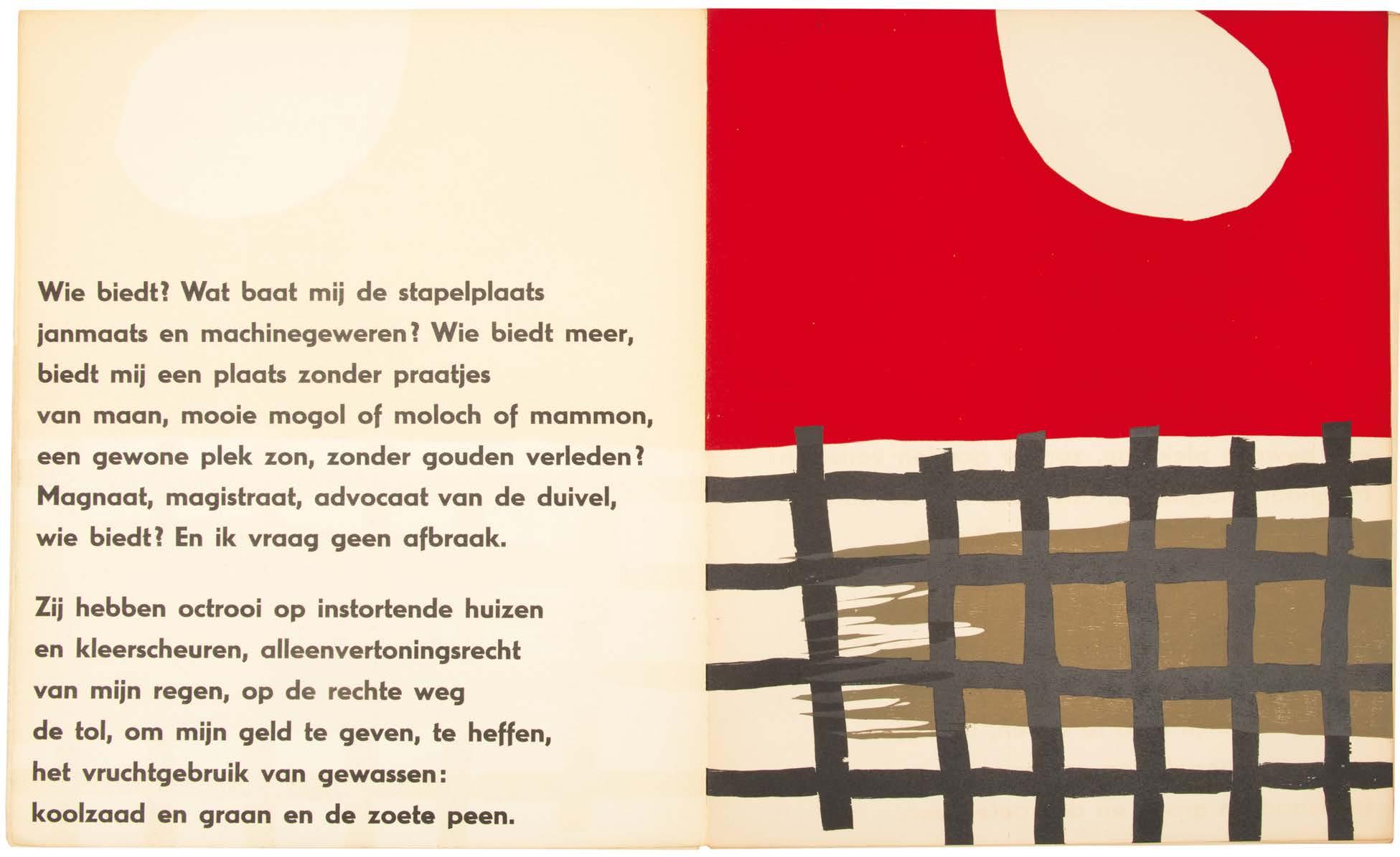
above: No.
5, Het Uitzicht Van de Duif, 1952
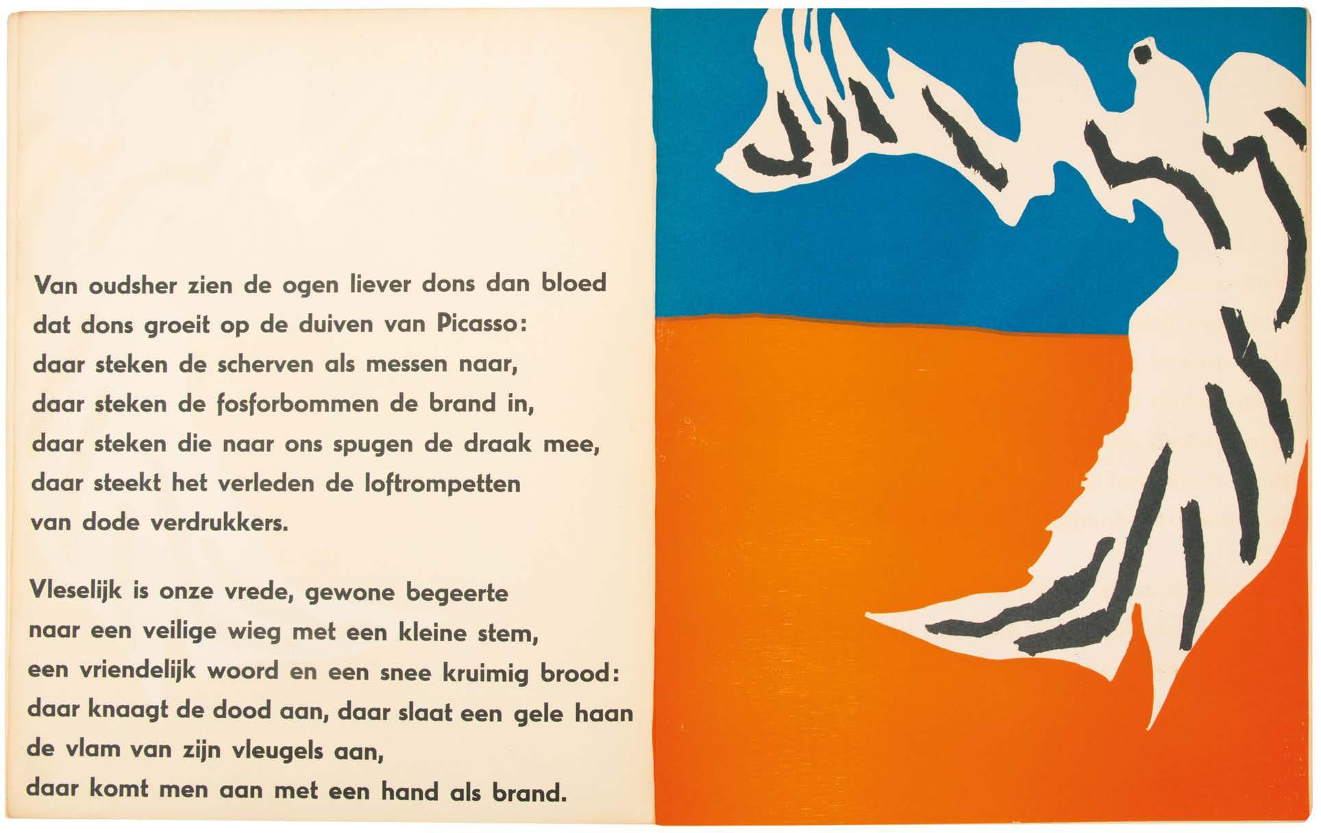
above: No. 5, Het Uitzicht Van de Duif, 1952
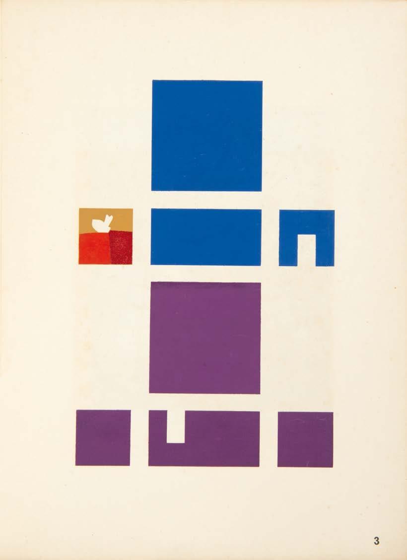
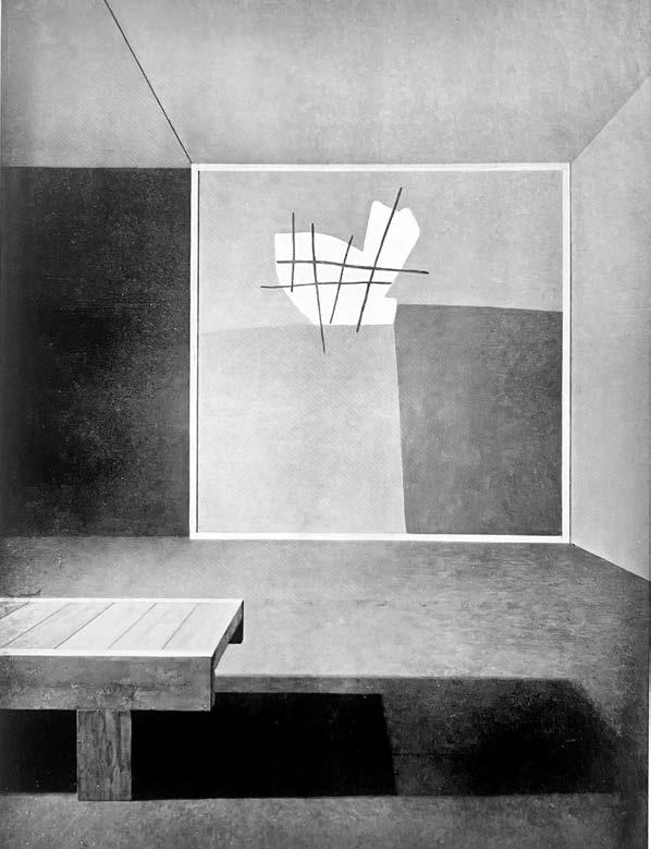
Van Eyck, Aldo Voor Eeen Spatiaal Colorisme amsterdam. (printed by g. a. verweij te schiedam). 1953
Folio. (350 × 260 mm). [5 leaves + bifolium]. Leaf with explanatory text ('een ruimte in kleur'), 3 colour plates printed by Constant by hand, leaf with applied monochrome reproduction photograph, bifolium with printed text 'spatiaal colorisme', the initial leaf and plates recto only and numbered 1–5, the bifolium with text recto and verso numbered 6–8, justification printed to rear inner wrapper. Loose as issued in original publisher's cream printed wrapper with titles to front cover in black, original glassine (fragile, chipped and worn) preserved.
Constant and aldo van eyck's analysis of colour and its inseparability from form.
From the edition limited to 50 numbered copies, this copy inscribed ‘H[ors]. C[ommerce].’ in pencil to the justification.
Published on the occasion of the design exhibition ‘Mens en Huis’ held between November 21st, 1952 and January 5th, 1953 at the Stedelijk Museum of Amsterdam, this analysis of colour theory relates specifically to the construction by Constant and Van Eyck of an experimental 'ruimte-kleur' (colour room). Constant and Van Eyck were awarded the Sikkens Prize in 1960 for their work.
In this manifesto, the artist and the architect state that colour appears passively and coincidentally in modern architecture. The emotional effect and space-creating capacity of colour remains unused, while colour is as much a determining factor as the constructive space. Colour should not be added to the construction or form, but should be conceived simultaneously and coherently with it.
‘Kleur is niet anders dan de kleur van de vorm en vorm niet anders dan de vorm van de kleur.’ (Colour is not different from the colour of the form and form is not different from the form of the colour). — From the text
29
6
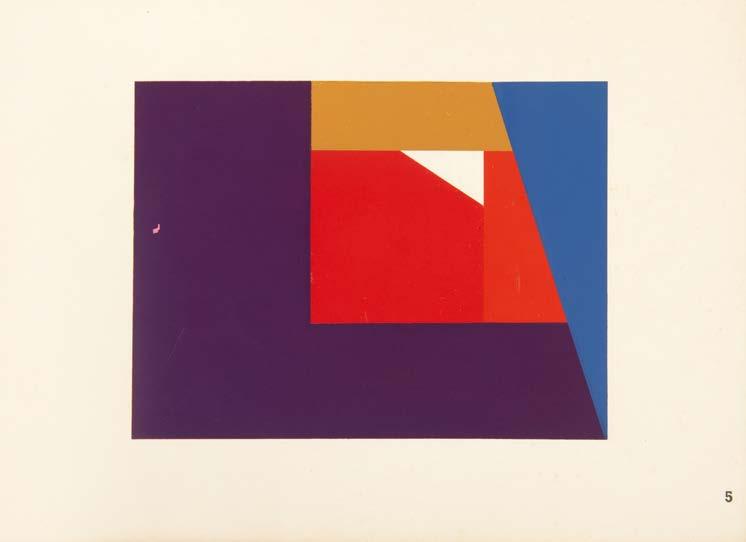
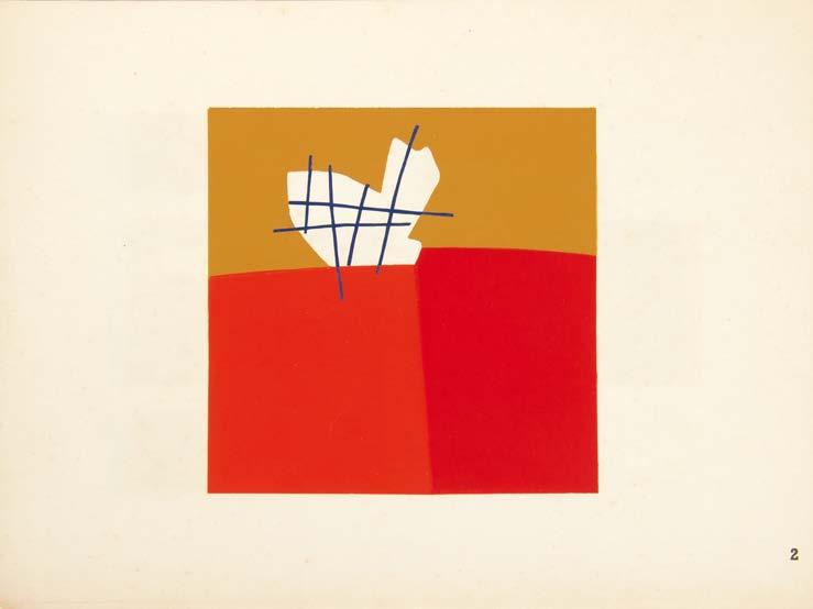
above and right:
No. 6, Voor Eeen Spatiaal Colorisme
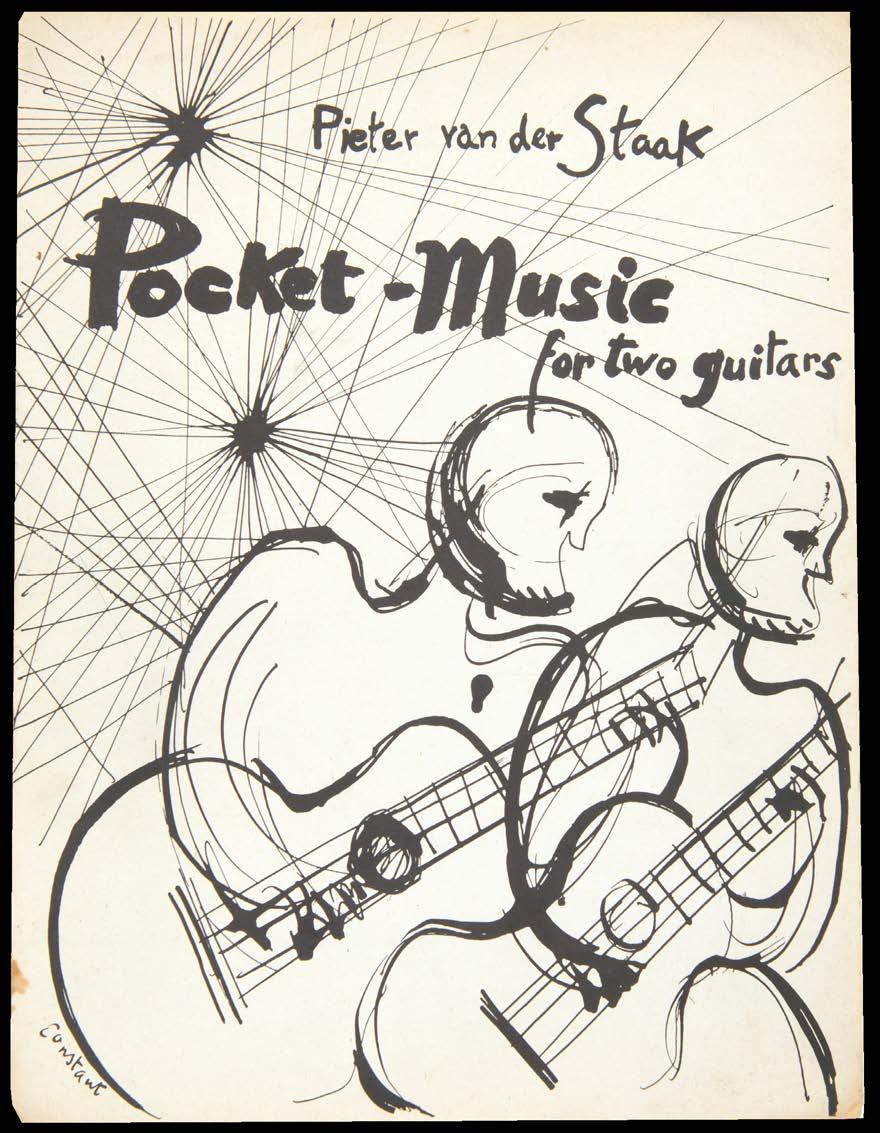
Staak, Pieter van der Pocket-Music for 2 Guitars
amsterdam. broekmans & van poppel. 1961
Small folio. (236 × 310 mm).
[Bifolium: 2 unnumbered leaves]. Justification / colophon to interior of front cover, inserted bifolium with printed music, the five movements for the guitar duet 'Pocket-Music' (Vestzakmuziek) by Pieter van der Staak concluding on interior of rear wrapper. Original publisher's white printed paper wrappers with monochrome illustration by Constant to front cover, advertisments to rear, justification to interior of front cover and printed music to rear.
the musical score, with a cover and signed presentation from Constant, for Pieter van der Staak's guitar duet.
From the edition limited to 32 numbered or lettered copies, this copy neither lettered nor numbered but with a signed presentation from Constant; all copies were to be signed by Pieter van der Staak and the first six examples were, in addition, to be hand-coloured and signed by Constant.
Constant's presentation, in pencil to the justification, follows the printed ‘This copy is’ and reads: ‘for Hillary [sic] / Constant’.
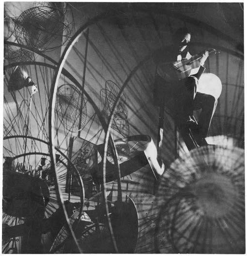
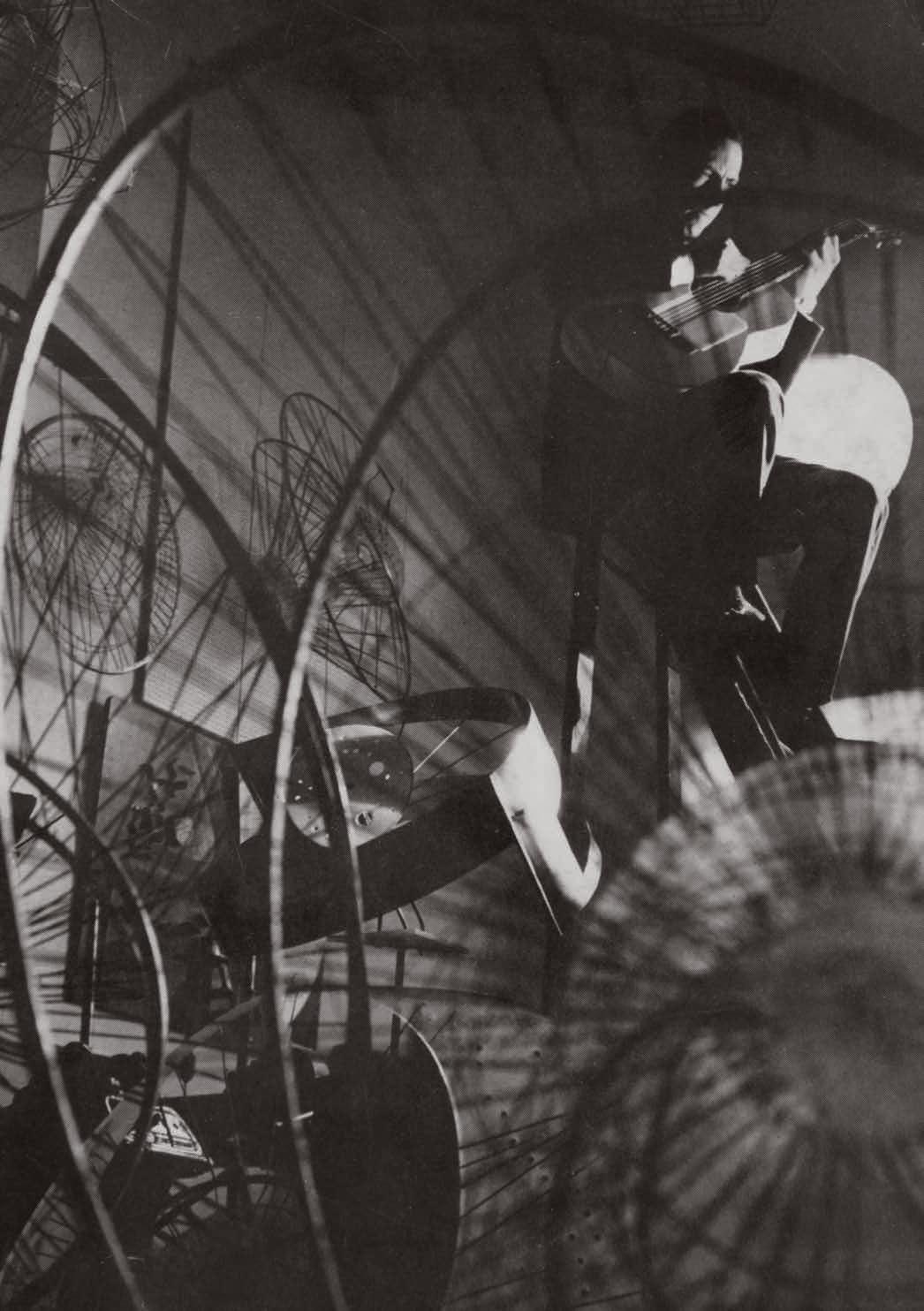
The cover of the catalogue featuring Constant's drawing recalls the famous photograph of Constant seated in his studio playing the guitar while seated on a high ladder and surrounded by his sculptures. Van der Staak dedicated the duet to Hans Niessen and Mijndert Jape.
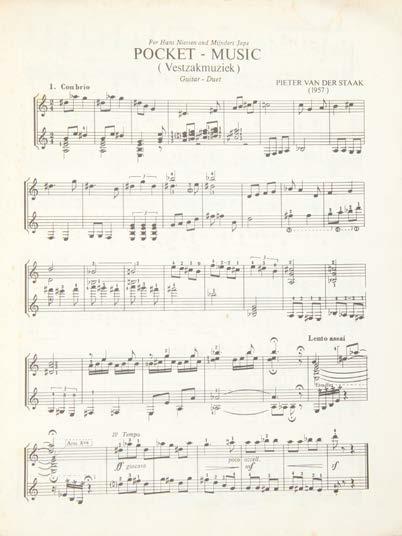
33
7
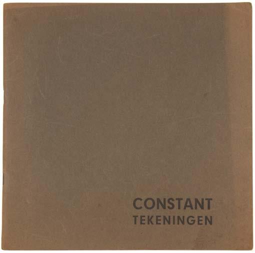
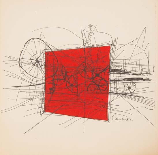
New-Babylon Tekeningen 1961–1962 rotterdam. galerie delta. 1963 8
Large square 8vo. (222 × 222 mm). [8 bifolia including wrappers]. Leaf with title and gallery details and Caspari's text in German and Constant's text in Dutch illustrated with 13 reproductions of drawings by Constant, one with colour and one double-page, final leaf with list of works verso. Original publisher's grey paper wrappers, stapled as issued, titles to front cover in black.
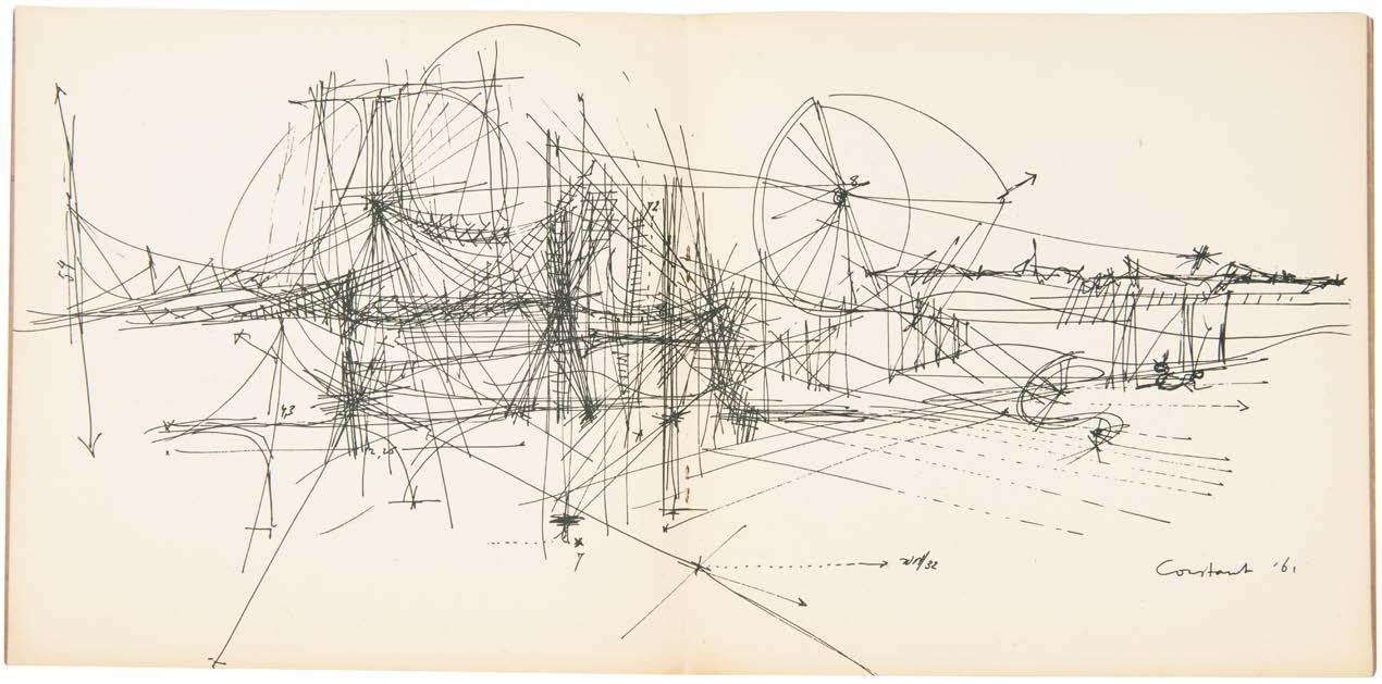
The catalogue for galerie delta's exhibition of Constant's drawings for New Babylon.
Constant had begun his theoretical utopian 'New Babylon' project in the late 1950s however the works presented here all date from the early 1960s prior to the publication of his eponymous book / portfolio.
35
Constant & Simon Vinkenoog new-babylon. (Publication Announcement) amsterdam. galerie d'eendt. (1963) 9
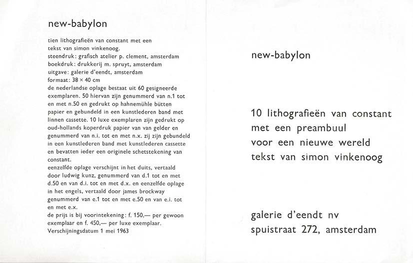
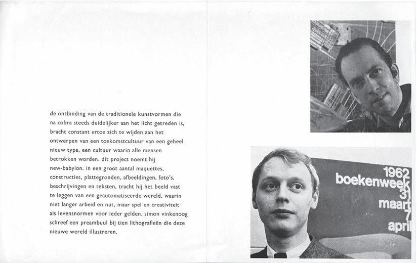
12mo. (152 × 121 mm). [Single folded sheet]. Printed text in lowercase in Dutch throughout on glossy paper stock recto and verso with titles, two monochrome reproduction photographs of Constant and Vinkenoog, brief descriptive text and details of the editions of the publication; sheet size (unfolded): 152 × 242 mm.
The very scarce original printed announcement for the Constant / Vinkenoog collaboration ‘New Babylon.’
The announcement, issued by the publisher, Amsterdam's galerie d'eendt, gives details of the three editions of ‘New Babylon’ (it was issued in Dutch, German and English simultaneously) together with the prices: ‘f. 150’ for an ordinary copy (50 copies in each language) and ‘f. 450’ for the deluxe copies (ten in each language) that each included an original drawing by Constant. The deluxe copies were also printed on ‘oud-hollands koperdruck papier van van gelder’ (i.e. Hollande Van Gelder) as opposed to on Hahnemühle Bütten. The publication date is announced as May 1st, 1963.
The descriptive text detailing the context of Constant's utopian vision of ‘New Babylon’, here in full, is illuminating: ‘de ontbinding van de traditionele kunstvormen die na cobra steeds duidelijker aan het licht getreden is, bracht constant ertoe zich te wijden aan het ontwerpen van een toekomstcultuur van een geheel niew type, een cultur waarin alle mensen betrokken worden. dit project noemt hij new-babylon, in een groot aantal maquettes, constrcties, plattegronden, afbeeldingen, foto's, beschrijvingen en teksten, tracht hij het beeld vast te leggen van een geautomatiseerde wereld, waarin niet langer arebeid en nut, maar spel en creativiteit als levensnormen voor ieder gelden. simon vinkenoog schreef een preambuul bij tien lithografieën die deze nieuwe wereld illustreren.’
37

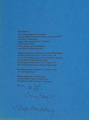
Constant & Simon Vinkenoog New Babylon amsterdam. galerie d'eendt. 1963 10
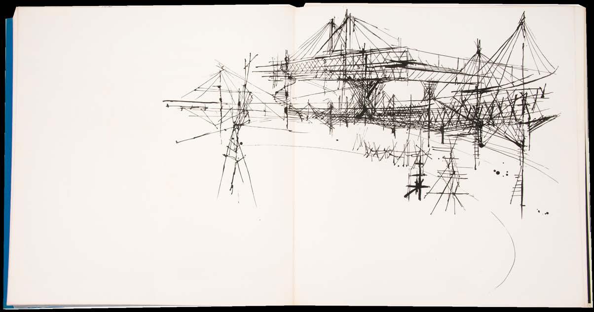
Square folio. (414 × 390 mm). [Single leaf, mounted leaf with original drawing under passepartout + 10 bifolia]. Leaf of blue paper with justification, passepartout with mounted original signed drawing by Constant in black ink and 10 bifolia numbered 1–10 to initial recto of each, each with an original lithograph by Constant, 8 double page and three with Vinkenoog's text; sheet size (unfolded): 398 × 758 mm . Loose as issued in original publisher's black paper-lined cream cloth chemise with title in blind to front cover and red cloth slipcase. [Dagen 33–42; see Mark Wigley's 'Constant's New Babylon. The Hyper-Architecture of Desire', Rotterdam, 1998].
An excellent example of the édition de tête of the Dutch edition of Constant's utopian vision 'New Babylon' with the signed original drawing.
From the edition limited to 60 numbered copies in Dutch signed by the author and artist, with this one of 10 on Van Gelder's Old Holland white vellum with an original signed drawing by Constant; an additional 50 copies on Hahnemühle-Bütten were also issued.
Matching corresponding editions, save for the language of the printed text, of 60 copies in English and 60 in German were also issued. The mise en page is by Constant himself.
The original drawing by Constant, executed in black ink on a sheet of wove paper (154 x 204 mm), is mounted under passepartout and signed at lower left, as called for. The drawing features elements reminiscent of the 5th and 10th lithographs.
In 1956, Constant started working on a visionary architectural proposal for a future society: ‘New Babylon’. Constant, as a co-founder of the CoBrA group in the late forties, stopped painting to concentrate on the question of ‘construction’. Or in Constant's own words, he created ‘a New World, where surprise and pleasure of the eyes mingle with innumerable questions, insights and speculations’ (Mark Wigley). Constant spent some time in London in 1952, moving frequently and became fascinated by the intricacies of urban form. 'New Babylon' envisages a formulation for the new man, a better social place and a new way of living in a community, combining the critique of modern architecture with the deployment of the latest technical developments.
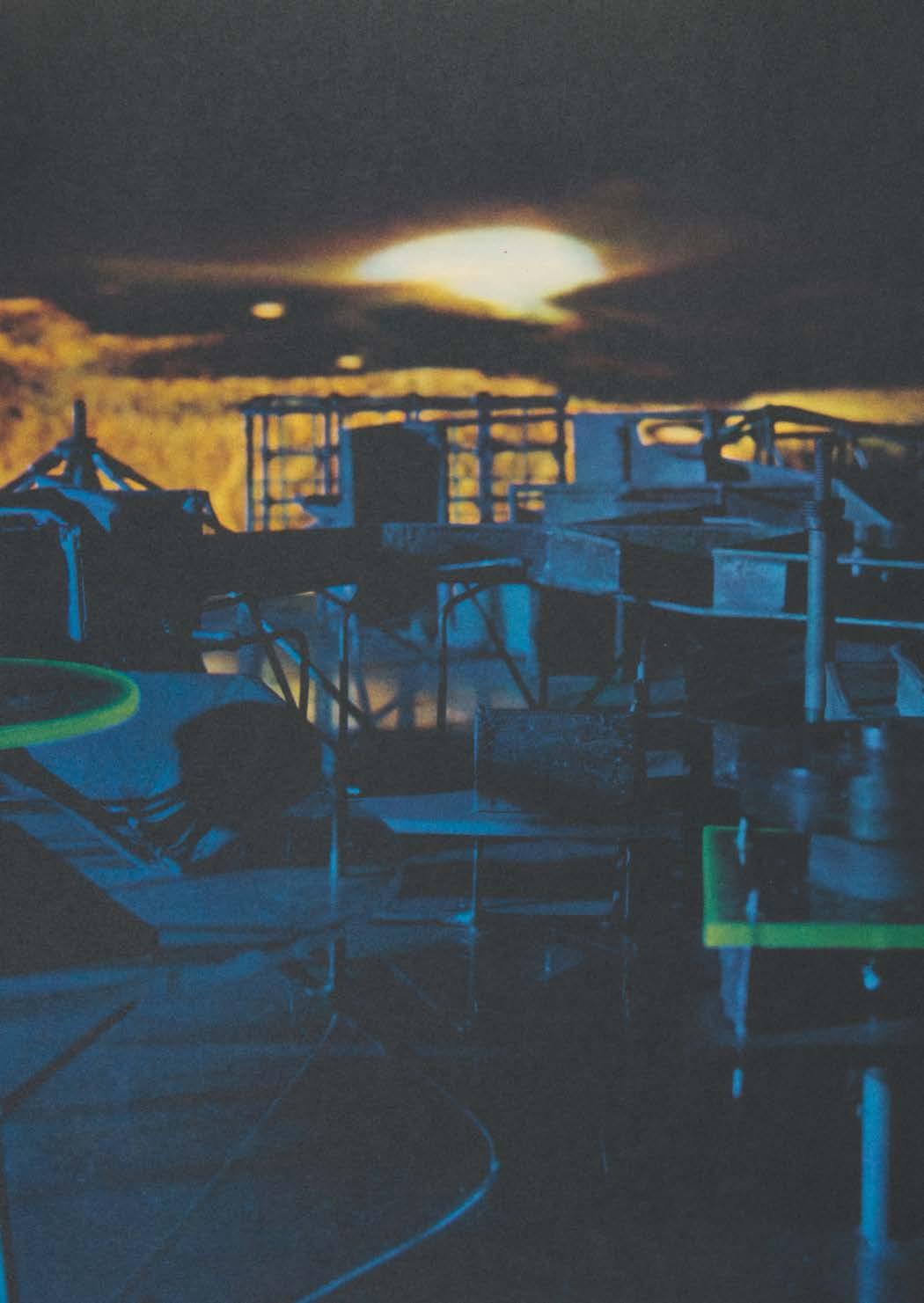
The artist elaborated his ideas subsequently in series of models, sketches, etchings, lithographs and collages, as well as in manifestos, essays and lectures. Constant became an architect himself and insisted that the traditional arts would be displaced by a collective form of creativity. The key words for ‘New Babylon’ were automation and space. In ‘New Babylon’ one sees a covered city, with huge labyrinths floating above the ground on tall columns, where vehicular traffic rushes underneath. All forms of mobility are supported and the structure of the city itself will be mobile and lack a clear identity. Social life becomes architectural play in Constant's view. A new architecture, a new city, calls for new media of representation. Due to his lectures, manifestos and interviews, his ideas were widely published in the international press in the 1960's and Constant attained a prominent position in the world of experimental architecture. Until 1974 Constant developed his ideas, acting in the belief that artists had the task to combine new techniques with the complex activity of urbanism.
39
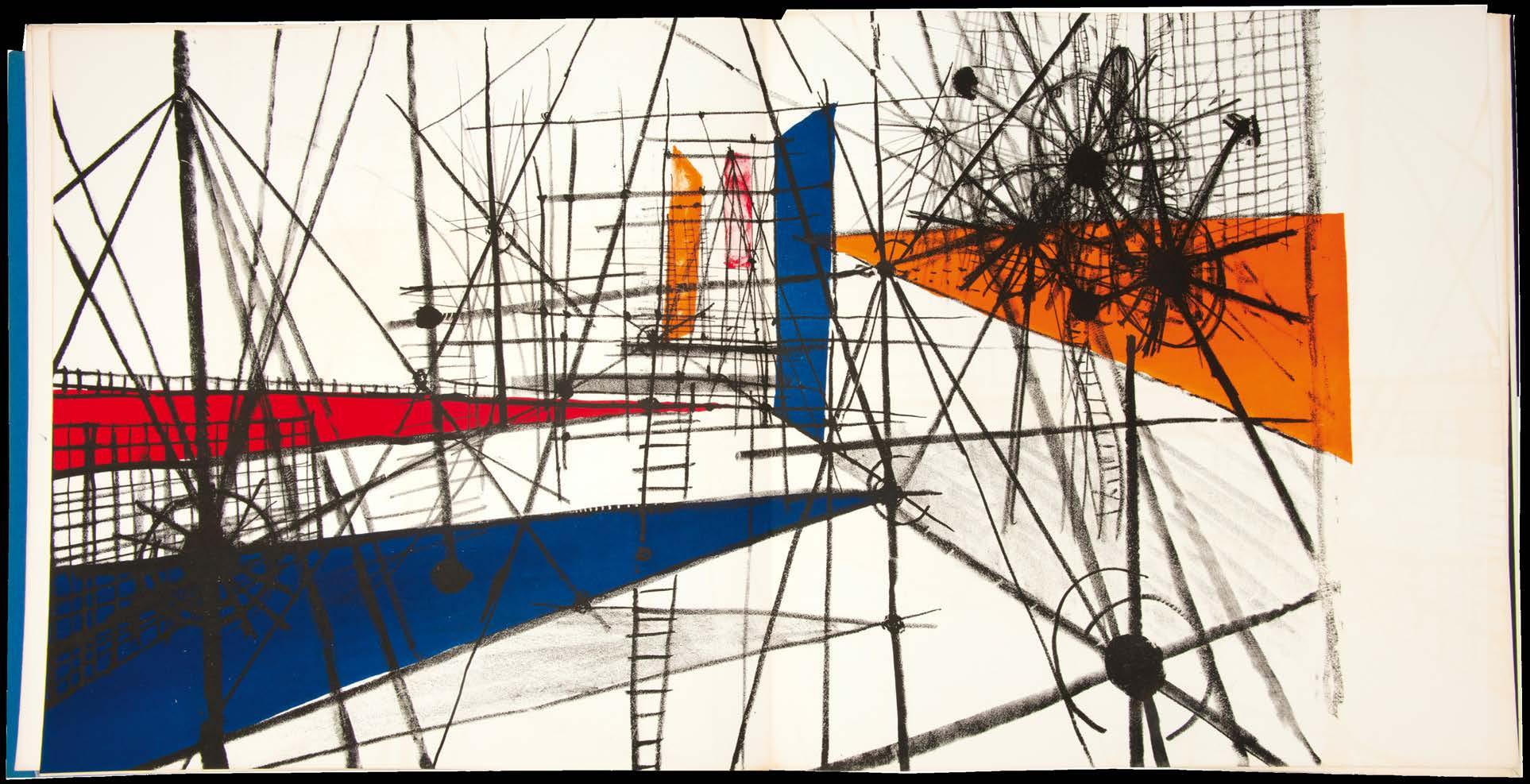
No. 10, New Babylon, 1963
above:

Constant & Simon Vinkenoog New Babylon amsterdam. galerie d'eendt. 1963
Square folio. (400 × 382 mm).
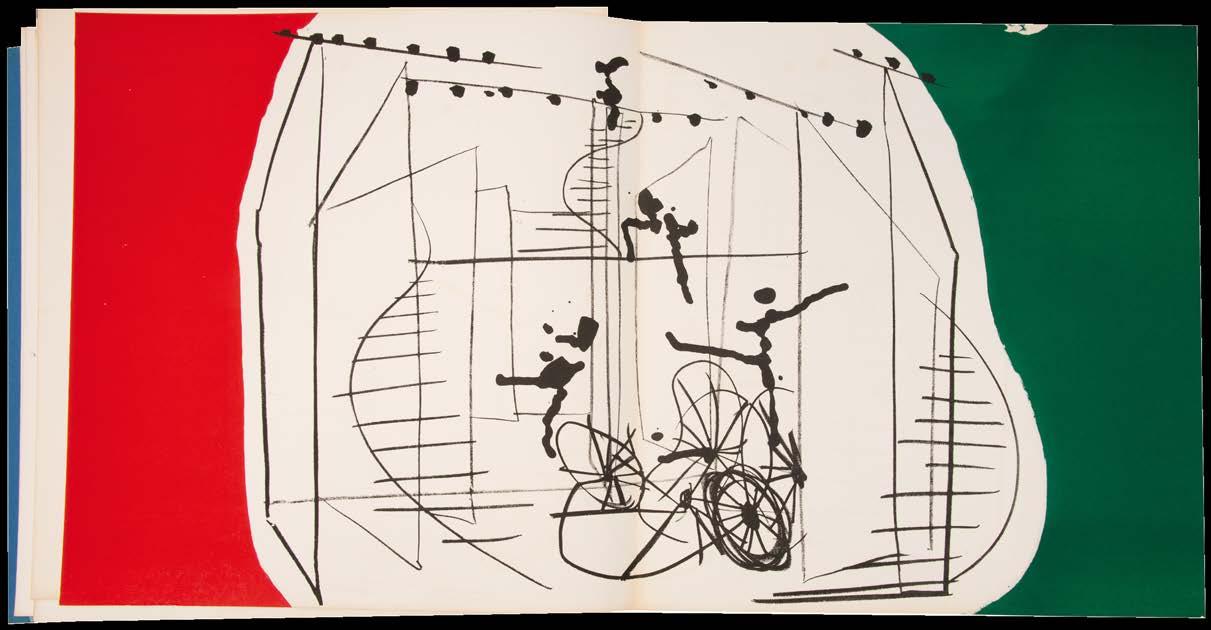
[Single leaf + 10 bifolia]. Leaf of blue paper with justification and 10 bifolia numbered 1–10 to initial recto of each, each with an original lithograph by Constant, 8 double-page and three with Vinkenoog's text; sheet size (unfolded): 398 × 758 mm. Loose as issued in original publisher's red paper-lined black cloth chemise with title in blind to front cover.
The english edition of Constant's utopian vision: ‘New Babylon’.
From the edition limited to 60 numbered copies in English signed by the author and artist, with this one of 50 on Hahnemühle-Bütten; an additional 10 copies were issued on Van Gelder's Old Holland white vellum that include an original drawing.
Matching corresponding editions, save for the language of the printed text, of 60 copies in Dutch and 60 in German were also issued. The mise en page is by Constant himself.
[Dagen 33–42; see Mark Wigley's 'Constant's New Babylon. The Hyper-Architecture of Desire', Rotterdam, 1998].
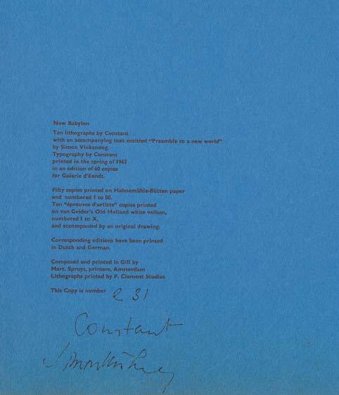
above:
No. 10, The signed drawing from New Babylon, 1963
43
11
above and right:
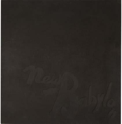 No 10, New Babylon 1963 (Dutch edition)
above and left:
No 11, New Babylon 1963 (English edition)

Constant & C. Caspari (Arthus Carlheinz Caspari)
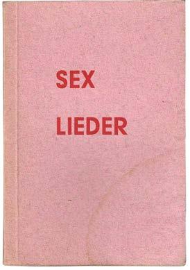
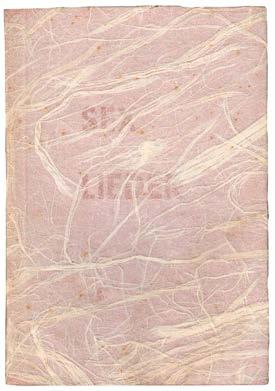
Sex-Lieder von C. Caspari mit Sechs Lithografien von Constant amsterdam. p. clement. 1964
Small 8vo. (154 × 106 mm). [18 unnumbered leaves]. Leaf with title, leaf with dedication ('für Boumi') and Caspari's 6 erotic poems illustrated with six original colour erotic lithographs by Constant, leaf with justification and Constant's presentation; all leaves printed recto only. Stitched as issued in original publisher's pink handmade paper wrappers, stamped title in red to upper cover, additional semi-transparent handmade paper jacket and plain tan paper wrapper.
The scarce erotic collaboration between Caspari and Constant with a presentation from Constant to his collaborator on ‘New Babylon.’
From the edition limited to 40 numbered copies, each signed and numbered by Constant in pencil; three additional ‘Sonderexemplare’ were also printed.
Constant's presentation is in blue ink to the justification: ‘voor Reyneke en / Simon bei gelegenheid / van hun huwelijk / Constant.’
The presentation appears to date from 1964, the year of publication of the illustrated verse collection, and the year that Constant's friend and collaborator on ‘New Babylon’, Simon Vinkenoog married his fourth - but not last - wife, Reineke von der Lind.
Constant's six erotic lithographs, one for each of Caspari's poems, are executed in tones of light and dark brown, pink and the white of the page. Caspari's poems, literally ‘sex songs’ but also a pun on ‘sechs lieder’ i.e. six songs, are titled as follows: ‘DIVANLALLE - anarchistische internationale’; BURGUNDERS LIEBESBYL - bürgerlische fassung’; ‘UBUS ALPTRAUW’; ‘DREIERLEILEI – gripsholmer folklore’; LITERATURKRITISCHER BORDELLSONG – versuch’; TURISTENFREUDE - fremdenfühers nachtgesang’. The book features a printed dedication ‘für Boumi’, Constant's pet monkey Boumibol.
[not in Dagen].
47
12
13
Constant 1945 – ‘65 rotterdam. editie galerie delta. 1965
Large square 8vo. (230 × 222 mm). [4 bifolia including wrappers]. Biographical text by Victor Nieuwenhuys illustrated with monochrome photographs throughout, reproduction of a work by Constant to interior of rear wrapper. Original publisher's printed wrappers, stapled as issued, monochrome illustration to front cover, gallery details to rear.
the scarce catalogue for constant's 1965 exhibition in Rotterdam.
The exhibition at Rotterdam's Galerie Delta was held between February 12th and March 7th
The text is a biographical sketch by Constant's son Victor and is illustrated with extensive documentary photographs of Constant's life. Key figures in the Experimentele Groep in Holland, CoBrA, and the Situationists are included as are Constant's monkey Jocko, his family, the poet Caspari, a single reproduction of a work by the artist and a portrait of Constant as a toddler with a book.
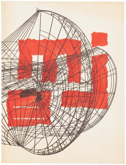
14 museumjournaal voor moderne kunst. serie 10, no. 5. 1965 amsterdam/otterlo. rijksmuseum kröller müller. 1965
4to. (250 × 190 mm). [17 leaves; pp. 113–144, (ii)]. Printed text in Dutch throughout, monochrome illustrations on glossy stock, final leaf with advertisements on grey stock, 'museumagenda' printed on red card recto and verso inserted loose. Original publisher's white printed wrappers with monochrome illustration by Constant, orange 'm j' and title in white on orange to front cover, contents to rear in black
Single issue of the dutch ‘museumjournaal’ with illustrated articles on Constant and Adolf Loos.
The ‘museumjournaal’ served as the joint periodical for a number of Dutch museums including the Stedelijk (in Amsterdam and Eindhoven), the Gemeentemuseum (The Hague and Arnhem), the Frans Halsmuseum (Haarlem) and so on. This issue features an extensive illustrated article on Constant (the cover of the issue reproduces his 1958 ‘turbulente constructie’) and includes several images of his New Babylon maquettes.
49
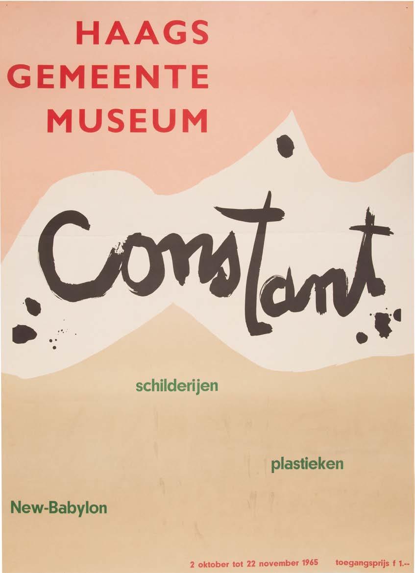
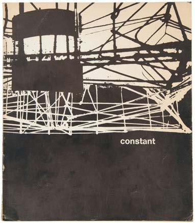
Constant. New-Babylon: Schilderijen, Plastieken (Catalogue & Exhibition poster)
The Hague. Gemeentemuseum. 1965
Small 4to. (206 × 194 mm). + Folio. (590 × 430 mm). [26 unnumbered leaves + poster]. 12 leaves with introductory text &c. on thin tan paper and 14 leaves with monochrome reproductions of works by Constant recto and verso on white glossy paper (a small area c.70 × 145 mm has been excised from an apparently blank are of the final leaf) together with the original poster for the exhibition printed recto only in pink and brown with text in red, green and black (the poster with one horizontal fold but in very fresh condition). Original publisher's black printed wrappers with work by Constant printed in white over front and rear covers, title 'constant' in white to front cover, photographic portrait of Constant to interior of front cover, credits to interior of rear cover, stapled as issued; poster issued loose.
The scarce catalogue together with the striking poster for the important exhibition of work by Constant held in 1965 at the Haage Gemeentemuseum.
The exhibition ‘Constant’ was held at the Gemeentemuseum in The Hague from October 1st to November 21st in 1965. The catalogue features an introduction by the director of the museum, Louis Wijsenbeek, Constant's text ‘de dialektiek van het experiment’ (The Dialectic of Experiment), Jos. de Gruyter's ‘kanttekeningen bij het schilderij fauna’ (Comments on Painting Fauna), H. van Haaren's ‘de uitdaging van newbabylon’ (The Challenge of New Babylon), a biography, exhibition history and bibliography as well as details of the exhibited works. The exhibits encompassed sculptures, maquettes, drawings, watercolours and paintings all related to Constant's utopian ‘New Babylon’.
The very scarce poster, unlike the catalogue which bears only the artist's name to the front cover, features additional detail concerning the exhibition and its title: ‘New-Babylon, Schilderijen, Plastieken’. Although we have no evidence, it seems likely that the poster was designed by Constant himself. We can trace only one other example, that held at the Fondation Constant.
51
15
16
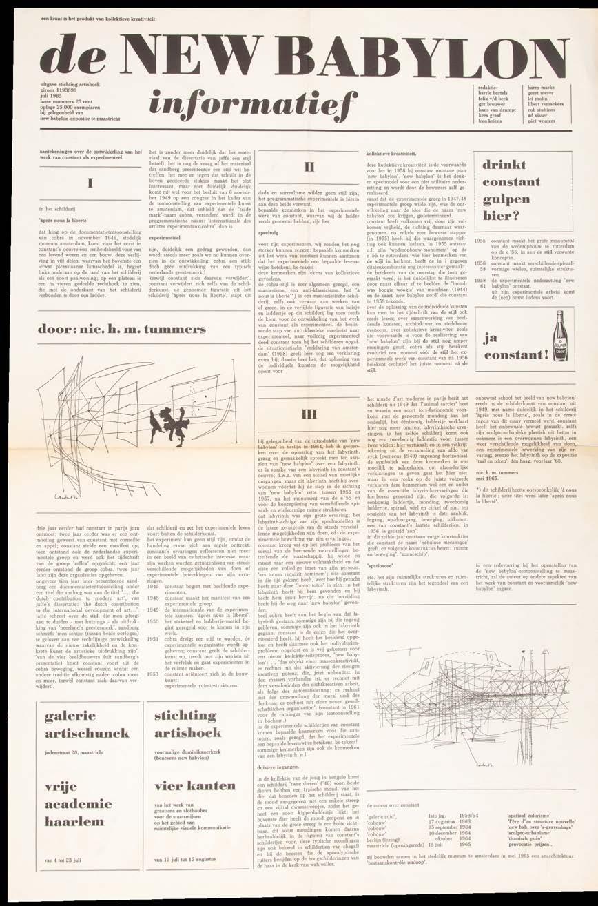
de New Babylon Informatief. No. 1. Juli 1965 maastricht. stichting artishock. 1965
Folio. (524 × 348 mm). [Single leaf of newsprint paper]. Drophead title and printed text in columns with two monochrome vignette illustrations and advertisements, all printed recto only; horizontal fold as issued and then folded again. Printed self-wrappers as issued.
The first issue of the ‘de New Babylon Informatief’ newsletter.
‘de New Babylon Informatief’ was published to coincide with the exhibition 'New Babylon' held at the Dominikanerkerk in Masstricht in July 1965. Issued in a large edition of 25,000 copies by Stichting Artishock (the sheet also features an advert for the Galerie Artischunk in Maastricht), the newsletter is both serious - it gives details of Constant's work and theories - and comedic featuring the punning beer advert: ‘drinkt constant gulpen bier? ja constant!’ with beer bottle vignette.
This issue of ‘de New Babylon Informatief’ was produced by a large editorial board that included Piet Wouters, Ad Visser, Harry Marks, Harrie Bartels, Felix Van der Beek and others. A further three numbers were issued.
‘een krant is het produkt van kollektieve kreativiteit’.
— The motto of ‘de NEW BABYLON informatief ’
17
de New Babylon Informatief. No. 2. Oktober 1965 Amsterdam. Anarchitectura. 1965
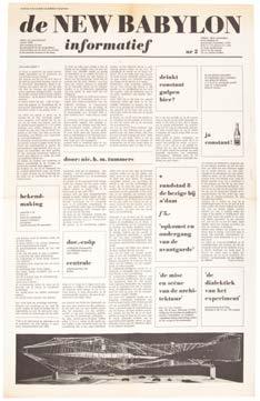
The second issue of the ‘de New Babylon Informatief’ newsletter.
This issue of ‘de New Babylon Informatief’, the second, was published to coincide with Constant's retrospective exhibition held at the Gemeentemuseum in The Hague between October 1st and November 21st, 1965. Issued by ‘anarchitectura’ the sheet cost 25 cents. The newsletter is both serious - it gives details of Constant's work relating to New Babylon - and comedic and as for the first issue features the punning beer advert: ‘drinkt constant gulpen bier? ja constant!’ with beer bottle vignette.
This issue of ‘de New Babylon Informatief’ was produced by a much smaller editorial group than the first issue and was headed by Constant's son Viktor Nieuwenhuys.
(Details as above)
53
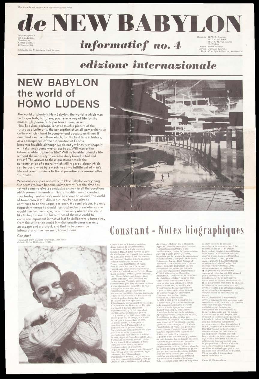
de New Babylon Informatief. No 4. Edizione Internazionale. XXIIIa Biennale di Venezia 1966 amsterdam. anarchitectura. 1965
Folio. (522 × 348 mm). [2 bifolia: 4 unnumbered leaves]. Drop-head title and printed text in columns in English, French, Dutch and German illustrated profusely with monochrome reproductions of works and photographs with large central spread with map of a city with colour overlay. Printed self-wrappers as issued.
The last of the four issues of ‘de New Babylon Informatief.’
This, the final issue of ‘de New Babylon Informatief’, was published on the occasion of Constant's exhibition at the Dutch Pavilion at the XXIIIa Venice Biennale in 1966. Edited by R.W. D. Oxenaar, G. J. A. ten Holte, H. J. A. M. van Haaren, and D. Welling, the newsletter presents a detailed analysis in text and image of Constant's oeuvre. In multilingual format with biographical notes, a bilbiography and catalogue of the works exhibited there are articles on specific aspects of the work (‘new babylon the world of homo ludens’, ‘Van Architectuur tot U.S.-R.’ [sic], ‘New Babylon - a proposition’, ‘Vers une liberté nouvelle’) and so on). The issue also includes the announcement of Situationism, the seminal ‘La déclaration d'Amsterdam’ issued in 1958 by Constant and Guy Debord as well as a large central pictorial spread reproducing a section of a map of The Hague. Enlarged and overlaid with colour sections to show the variation between ‘une ville traditionelle’ and ‘la même région faisant partie d'une système plus étendu de secteurs newbabyloniens’ the spread is exemplary of Constant's ideas.
‘Plan comparatif montrant la différence d'échelle entre une ville traditionelle de 600,000 habitants (La Haye) et la même région faisant partie d'un système plus étendu de secteurs newbabyloniens. Il est à noter que la vie à New Babylon étant nomadique, il ny aura pas d'habitants residentiels mais seulement des habitants de passage. Les éspaces entre les secteurs seront transformés en paysages artificiels.’
— From the central spread
This final issue was printed for distribution only and was not for sale.
55
18

Constant - Van Cobra tot Nieuw Babylon deventer. nv drukkerij de ijsel vh r. borst & co. 1967
Large folio. (410 × 340 mm). [25 leaves]. Leaf with introductory text in Flemish, English, French and German by H. van Haaren and 24 leaves with text in various languages and reproductions of works by Constant, printer's credit to rear wrapper interior. Original publisher's printed wrappers with titles in red, black & white to front cover with reproduction of a work by Constant, rear card wrapper interior with printer's credit, plastic calendar spiral binding as issued.
The contextual constant calendar with a survey of his work up to the date of publication.
Designed by Han de Vries, this calendar presents a survey of Constant's work in chronological format: each of the calendar leaves (the actual calendar on perforated leaves is detached as usual) features a large reproduction of a work by Constant and is preceded by a leaf with a contextual text (either by Constant or Debord or another related figure). The result is a fascinating survey of Constant's work presented in an exemplary pictorial and critical context.
‘Now Constant has made a name for himself, in Holland and abroad, he is lauded and applauded, he gets awards and - at times - he is vilified too ... Constant knew of no limits he gave full rein to his freedom of movement. Through the years he has remained the experimental artist he was back in 1948 when he was the co-founder of “Reflex” ... Basing himself on a critical and analytical observation of our present-day society, he developed his New Babylon concept which has its roots in the belief in the possibilities of collective creativeness… In studies, drawings, constructions and anti-functional vehicles for joy-riding the evolutionary process of New Babylon makes itself felt.’ — From van Haaren's introductory text
57
19
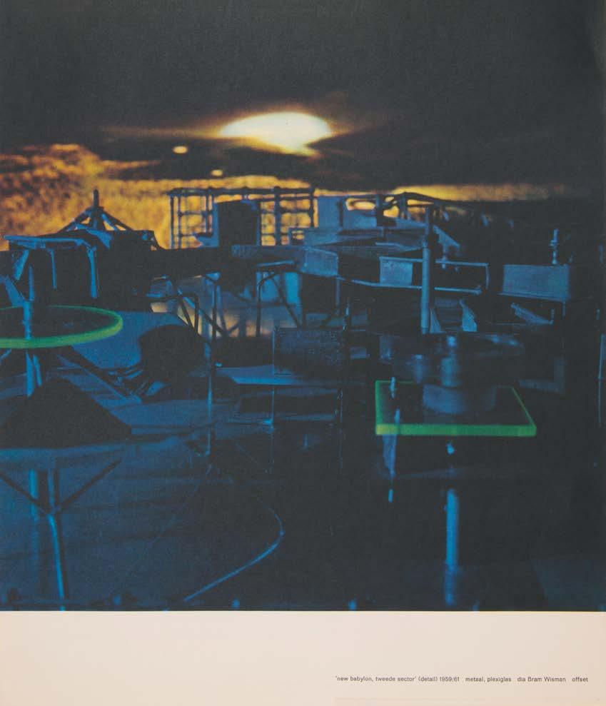
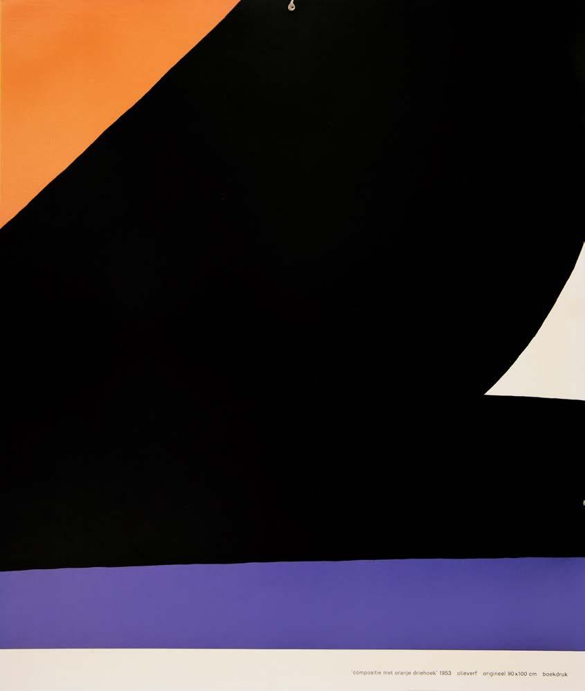
above and right:
No 19, Constant - Van Cobra tot Nieuw Babylon 1967
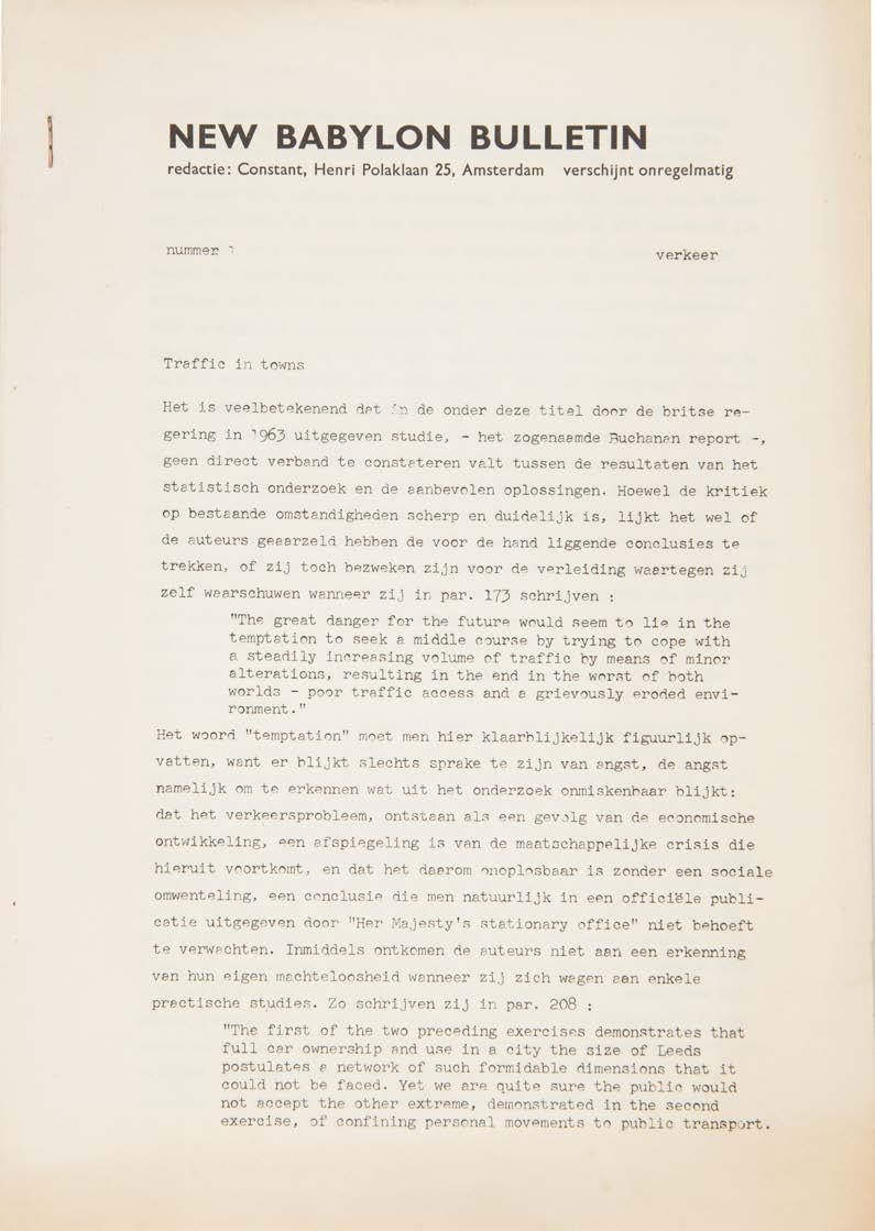
New Babylon Bulletin. No. 1. Verkeer. (Traffic). (All Published). amsterdam. (by the artist). (1967)
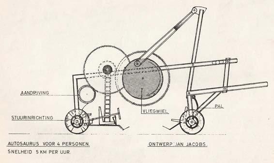
4to. (297 × 210 mm). [12 unnumbered leaves]. Drophead title and photo-copied typescript text recto only in Dutch with quotations in English throughout, monochrome graphics in the text, final leaf with full-page design of an 'autosaurus' by J. Jacobs. Stapled at upper left as issued.
The very scarce first and only issue – an analysis of traffic – of Constant's periodical.
The ‘New Babylon Bulletin’ was proposed as Constant's forum for analysis of some of the problems of modernity and in particular those that ‘New Babylon’ would solve. The detailed analysis - the first section ‘Traffic in Towns’ uses Leeds in the UK as a model - of the problems, associated with the exponential growth of traffic prompted various practical solutions such as the restriction of urban travel to public transport, the staggering of working hours etc. The second section, ‘Verkeer in New Babylon’ (Traffic in New Babylon), moves to Constant's imagined utopian futurescape where the concerns of the first section are no longer applicable. The final sections are ‘Conclusie’ (Conclusion) and ‘Voertuigen voor joy riding’ (Vehicles for Joy Riding), hence the final leaf with Jan Joseph's design for ‘Autosaurus voor 4 personen’ (Autosaurus for 4 people).
‘And so, in his New Babylon Bulletin, Debord’s one-time situationist colleague Constant poured over the findings of Great Britain’s milestone 1963 Buchanan Report on Traffic in Towns, only to advocate the development of machines for joyriding ... ’. — Simon Sadler
We trace only a single example of this scarce document outside The Netherlands (where we locate four copies, at the International Institute of Social History, the Rijksmuseum, the University of Amsterdam and the Koninklijke Bibliotheek), that at Yale in the US.
[see Simon Sadler's 'The Situationist City', MIT Press, 1999].
61
20

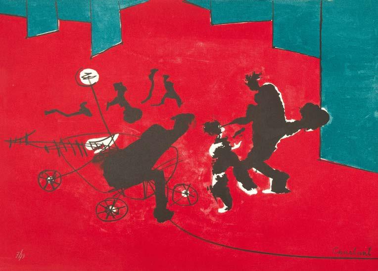
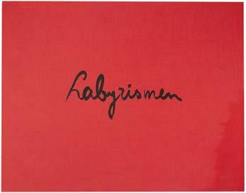
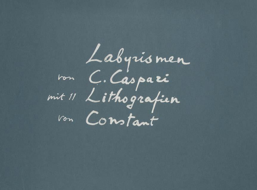
C. Caspari (Arthus Carlheinz Caspari), (Author) Labyrismen
amsterdam. by the artist / galerie krikhaar. 1968
Oblong folio. (400 × 500 mm).
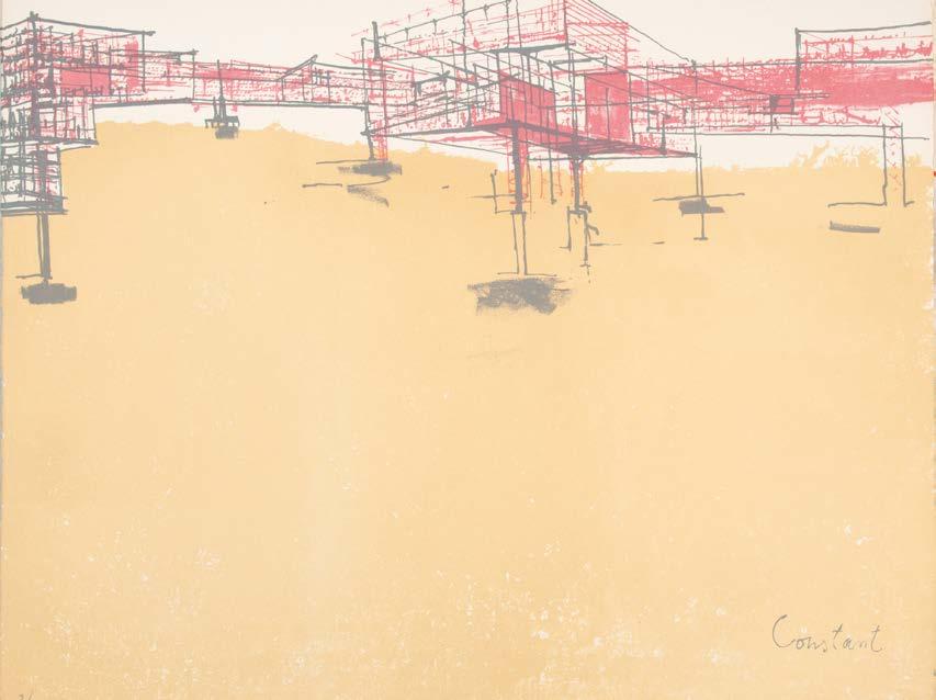
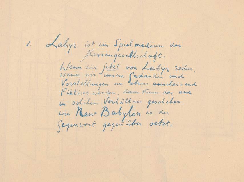
[23 leaves]. Leaf with title, ten leaves with Caspari's text, each numbered 1–10 and eleven original colour lithographs each numbered from the edition of 73 in pencil by Constant, the final lithograph also signed by Constant in pencil; Caspari's text in German printed after Constant's manuscript in various colours on Van Gelder Ingres, the lithographs all on Hahnemühle Butten, all sheets printed recto only, this copy with an addition pull of the title. Sheet size: c. 382 ×478 mm. Original hinged scarlet cloth portfolio by F. J. Swendeman, printed reproduction manuscript title in black to upper cover, interior divided into two compartments, printed justification in black to lower section with signature and copy number, original card chemise and slipcase retained.
Constant's very scarce post-New Babylon work ‘Labyrismen’
From the edition limited 73 numbered copies, signed and numbered by Constant in pencil to the justification; three hors commerce copies numbered in Roman numerals were also issued.
New Babylon was Constant’s nomadic city of the future, which through its labyrinthine network would be able to connect the whole world. The land would be everybody’s, robots would automate labour and man would have the freedom to be creative and play. This liberty would also take away the necessity for art, because man was able to be creative in his daily life.
The ‘Labyrismen’ form both a summary and a tipping point of Constant’s utopian undertaking. The war in Vietnam and the events of May 1968 in Paris brought a change to Constant’s views. He realised that New Babylon’s freedom also enabled people to give full rein to their darker desires. People would turn into their own enemies and eventually kill one another. Constant’s fear was that the freedom of this utopian place could also summon its downfall. The final years of New Babylon mainly show the horrors attached to this freedom, and can be detected in his Labyrismen - with the lithographs exhibiting a sense of turmoil, blood, and in the end, a burning city.
This copy features an additional pull of the title; as usual ‘Labyrismen 6’, the only colour lithograph not signed in the stone, is signed in pencil (also as usual all of the lithographs are numbered in pencil). The upper cover of the card slipcase features a large unidentified signature in red ink (‘Jaap / Hele [illegible]’) and at upper right what appears to be notes, or a poem, in blue ink.
[Dagen 58–68].
next page: No 21, Labyrismen 1968
63
21

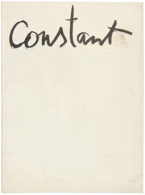
Expositie Constant aquerellen en etsen the hague. galerie nouvelles images. 1974
8vo. (210 × 210 mm). [2 bifolia]. Exhibition details to front wrapper verso, leaf with monochrome reproduction of a work by Constant recto and Hein van Haaren's analytic text verso, leaf with another monochrome reproduction of a work by Constant recto and biography verso, interior of rear wrapper with list of exhibitions and works exhibited. Original publisher's white printed paper wrappers, title to front cover in black, gallery details to rear cover, additional glassine jacket (detached) with gallery logo 'ni' in black to front cover.
The scarce catalogue for constant's 1974 exhibition of watercolours.
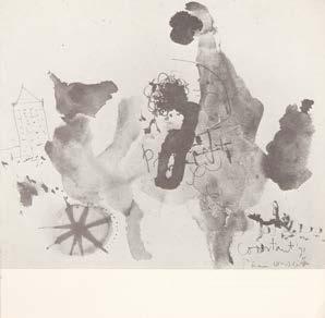
23 Kelk, Fanny Constant, een illustratie van vrijheid amsterdam. stedelijk museum. 1974
4to. (260 × 190 mm). [20 leaves; pp. 40]. Leaf with title and details about the David Röell-prijs verso, leaf with 'Juryrapport' recto and Fanny Kelk's text on Constant, final leaves with bibliography of books by and on Constant and with a list of exhibited works, illustrated with 17 monochrome illustrations of works by Constant. Original publisher's white printed wrappers with flaps, title 'Constant' to front cover, publication details etc. to front flap, monochrome photograph to rear, grey endpapers.
The catalogue of the exhibition for which Constant was awarded the David Röell-prijs.
The exhibition ‘Constant, een illustratie van vrijheid’ (Constant, An Illustration of Freedom) was held at the Stedlijk from November 28th 1974 to January 5th 1975 and Constant was awarded the David Röell-prijs for the work presented. The text for the catalogue is by Fanny Kelk and includes 17 illustrations of work by Constant produced between 1937 and 1974. The Jury report for the award is also included.
‘The David Röell Award, now called the Prins Bernhard Cultuurprijs, was created in 1963 and is awarded to Dutch residential artists whose exceptional merits have enriched the Fine Arts. David Roëll was director of the Stedelijk Museum Amsterdam between 1936–1945. He did an exceptional job guiding the museum through WWII. He was a member of the board of Prins Bernhard Cultuur Fonds and two years after his death the David Roëll Award was instituted.’ — Stichting Constant
67
The exhibition, at the Galerie Nouvelles Images in The Hague, was held between June 22nd and 3rd August, 1974. Constant exhibited 14 watercolours and forty different etchings not listed in the catalogue. 22
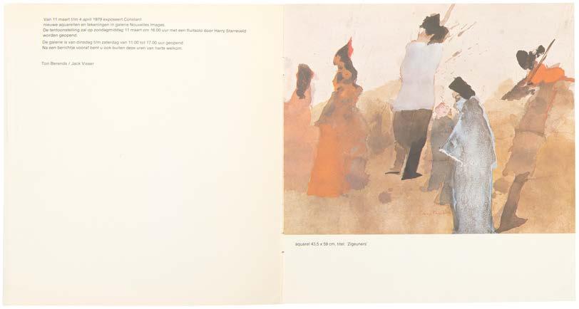
Constant the hague. galerie nouvelles images / nouvelles images imartect. 1979
8vo. (210 × 210 mm). [2 bifolia]. Exhibition details to front wrapper verso, leaf with colour reproduction of a watercolour by Constant recto, text 'Kijken en spelen: Constant exposeert aquarellen en tekeningen' by Wil Heins verso and on following verso and with two monochrome reproductions of watercolours. Original publisher's white printed paper wrappers, title to front cover in black.
The scarce catalogue for Constant's exhibition of watercolours, 1979.
The exhibition, at the Galerie Nouvelles Images in The Hague, was held between March 11th and April 4th, 1979.
69
24
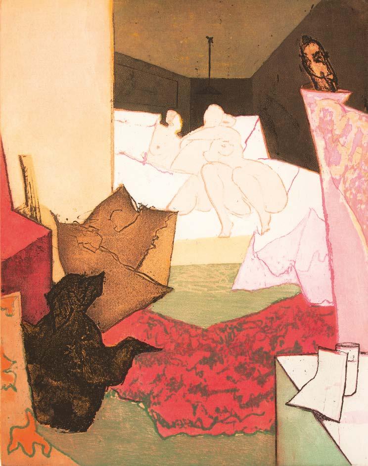
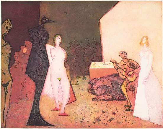
Plaisir et Tristesse de l’Amour amsterdam. g. i. n. gallery. 1979
Large folio. (725 × 608 mm). [9 unnumbered leaves]. Leaf with title, leaf with introductory text by Fanny Kelk 'Constant Beyond New Babylon' dated 1977, leaf with dedication 'Dedicated to the memory on [sic] Fanny Kelk', five original colour etchings with aquatint, each signed and numbered from the edition of 99 in pencil by Constant and final leaf with justification. Loose as issued in original publisher's brown silk-covered board portfolio with flaps, titles and publication details to upper cover in darker brown; large damp-stain with warping to upper left of portfolio, contents unaffected.
From the edition limited to 99 copies with each plate signed and numbered from the edition of 99 by Constant in pencil; 10 é[preuve] [d'] a[rtiste] examples were also issued.
Constant's original etchings with aquatint, each based on a painting made between 1975 and 1978, are titled as follows: ‘Het bondgenootschap van Casanova met de moraal’ (Casanova's alliance with morality); ‘De liefdesverklaring van Cyrano’ (Cyrano's declaration of love); ‘Plaisir et tristesse de l'amour’ (The pleasure and sadness of love); ‘De bekering van Venus’ (Venus' conversion); ‘Het proces’ (The process).
The etchings were printed on Magnani di Pescia paper by ‘Arte 3’, Milan. [Dagen 129–133].
71
25
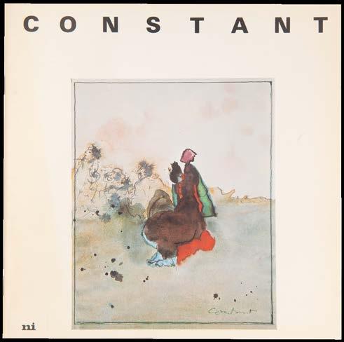
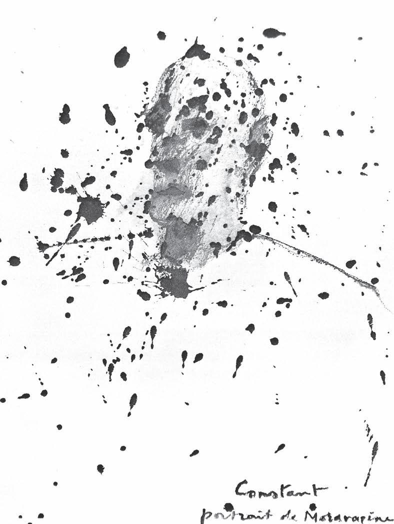
Constant. Fanny Kelk, Interview en Kritieken the hague. galerie nouvelles images. (1980)
Square 8vo. (210 × 210 mm). [12 leaves; pp. 24]. Title, monochrome reproduction of a portrait of Kelk by Constant verso, introduction by Constant and text illustrated with colour and monochrome reproductions of work by Constant throughout. Original publisher's white printed wrappers, stapled as issued, title and colour reproduction of a painting by Constant to front cover.
A collection of critical texts on Constant by Fanny Kelk, collected and published posthumously by the artist.
From the edition limited to 500 copies.
The volume includes: ‘Constant, een illustratie van vrijheid’ (published in November, 1974); ‘Constant en de eenzaamheid van de schilder’ (published in ‘Kunstbeeld’, March 1978); ‘Gesprek met Constant’ (published in the Stedelijk catalogue in March 1978); ‘Het aquarelleren van constant’ (‘Collection d'Art’, also March 1978).
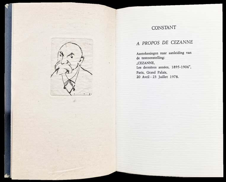
27 A Propos de Cézanne. Aantekeningen naar aanleiding van de tentoonstelling: ‘Cézanne, Les dernières années, 1895 –1906’ amsterdam. (wiet van rossum). 1985
8vo. (205 × 132 mm). [28 leaves including blanks and inserted doubled leaf with Constant's engraving]. Leaf with half-title, inserted doubled leaf of thick Japon paper with Constant's original etching, a portrait of Cézanne, title & Constant's text recto only throughout dated '28 mei 1978' and final leaf with justification; Constant's engraving was printed by Shirley Clement-Clifton. Original publisher's parchmentbacked blue laid paper boards by the Binderij Phoenix, gilt title to spine, matching blue laid paper endpapers.
An excellent example of the scarce meditations of Constant on Cézanne, with a presentation to the binder.
From the edition limited to 100 numbered copies, with this number ‘7’ signed by Constant in pencil and with the portrait engraving of Cézanne on Kozo Japon paper.
Constant's presentation is in pencil to the justification: ‘Aan David / Simaleavitch [sic] / met dank! / Constant’.
David Simaleavich (b.1952), to whom the book is presented, is a highly respected and innovative American bookbinder who worked extensively in Holland from 1974. He founded the Binderij Phoenix in 1981 (the binder of the present book) and operated for ten years before selling it and returning to the US.
Inspired by the extensive exhibition at the Grand Palais (‘Cézanne, Les dernières années, 1895 - 1906’), this book presents Constant's thoughts on Cézanne, his technique, his style, his influence (and influences) and innovation. This deluxe version of Constant's text was issued in vellum-backed boards and with the engraving on Japon Kozo; the majority of copies - the number is not specified - were issued in wrappers.
73
26
Guy-Ernest Debord
Willem Sandberg
Karel Appel et al.
part ii
Asger Jorn
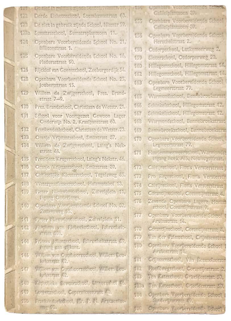
Servus Fidei. (Willem Sandberg) lectura sub aqua - experimenta typografica amsterdam. j. f. duwaer & zn. 1944
Small 8vo. (158 × 217 mm). [18 unnumbered leaves]. Text printed throughout in red & black. Stitched as issued in original publisher's cream flexible relief-printed phenolic resin 'flong' boards.
The first of willem sandberg's iconic clandestine pamphlet series, here in the majestic relief printed boards.
From the edition limited to 200 numbered or lettered copies, this copy neither numbered nor lettered.
The book was issued with various bindings. The present copy has stiff wrappers cut from a printer's relief matrix (part of a directory) with small partial purple ink stamp on inside of front cover: ‘Zeitungs-Mater’.
The text is one of 18 clandestine pamphlets created by Willem Sandberg as part of the Dutch resistance movement during World War II. The multilingual text is printed in red and black using several different fonts with occasional decorative elements.
‘Throughout the war Sandberg was active in the Dutch resistance movement, and in the spring of 1943 was associated with a daring raid. The Gestapo put a price on Sandberg’s head, forcing him to go into hiding for fifteen months under an assumed name. It was during this time that he made the first of his experimenta typographica, hand-made booklets in which he collected inspirational quotes from his wide reading, and to which he added his comments in writing and in typography. In giving each quote a definite typographic character, Sandberg transformed his seemingly loose collections into intensely coherent meditations on the great questions of life so disregarded outside his hiding place. Some of the booklets were later published using a mixture of type and hand-rendered elements. The first of these, “lectura sub aqua” (reading under water), was published illegally in 1944. The experimenta typographica demonstrate the materials, styles and conventions he was later to adopt for a wider audience. The Stedelijk catalogues are in this sense a continuation of the experiments of Sandberg’s wartime seclusion, in which he was similarly prolific: he made twelve of the eighteen experimenta typographica in the period from December 1943 to December 1944.’
– Mafalda Spencer ‘Eye Magazine’ Issue no. 25, 1997
This copy with faint purple stamp ‘Zeitungsmater’ to front cover verso.
77
28
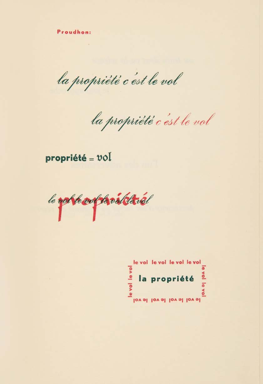

above and right:
No 29 Lectura sub aqua 1944
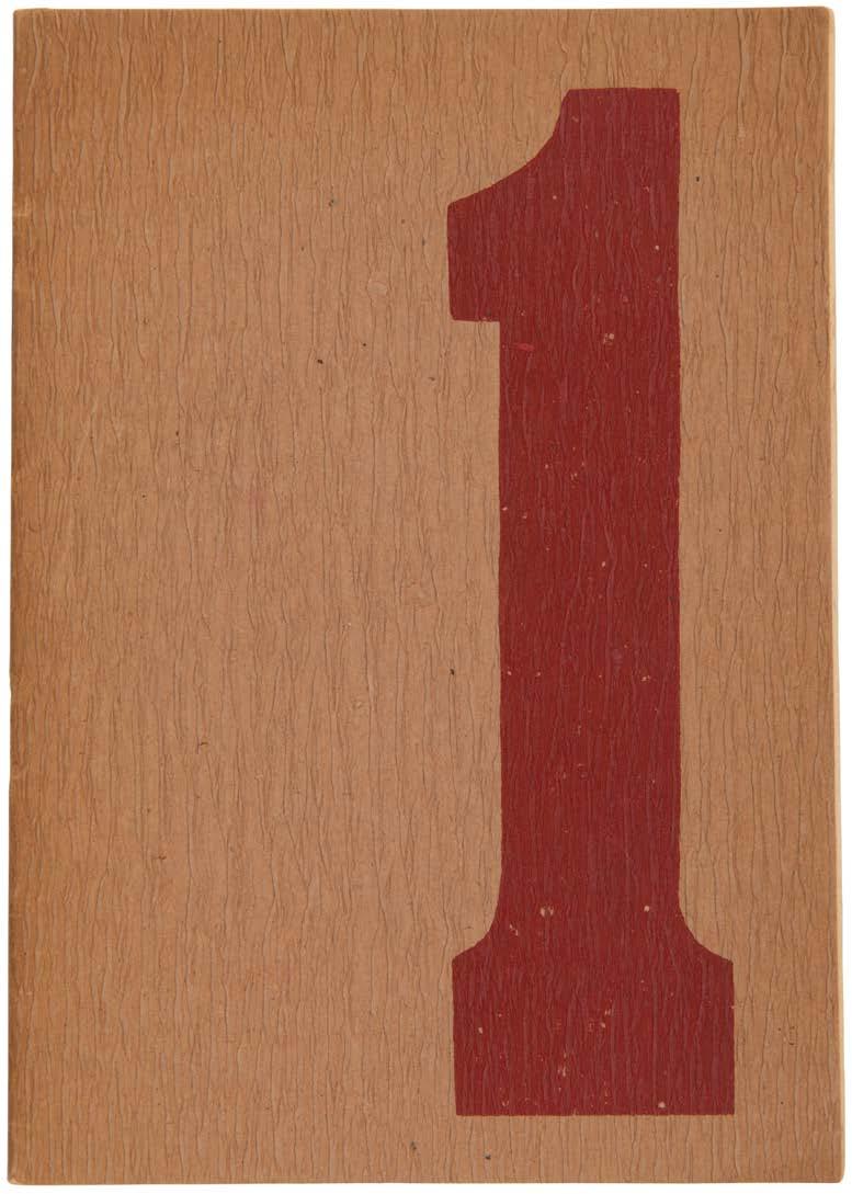
Servus Fidei. (Willem Sandberg) lectura sub aqua - experimenta typografica amsterdam. j. f. duwaer & zn. 1944
Small 8vo. (206 x 145 mm). [18 unnumbered leaves]. Text printed throughout in red and black. Original publisher's thick crepe paper wrappers, stapled as issued, with a large '1' printed in red to front cover.
The first publication in willem sandberg's series of ‘typographical experiments’, here in crepe wrappers.
From the edition limited to 200 numbered or lettered copies, this copy neither numbered nor lettered.
The book was issued with various bindings. The present copy has the thick crepe paper wrapper used as an interim solution during the German Occupation.
The multilingual text, printed in several different fonts in red and black, is one of 18 clandestine pamphlets created by Willem Sandberg as part of the Dutch resistance movement during World War II.
81
29
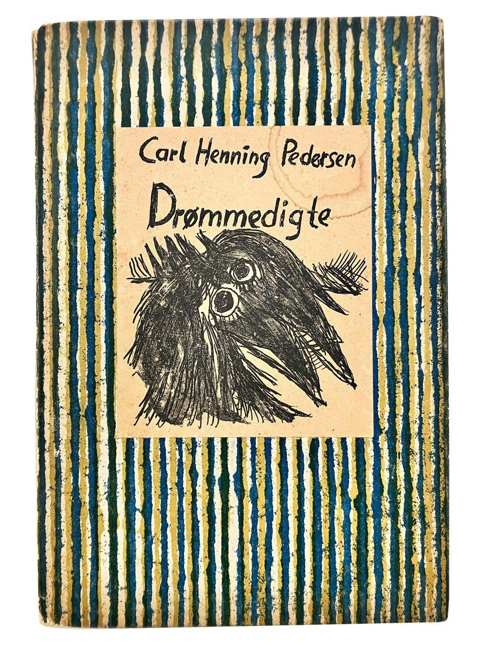
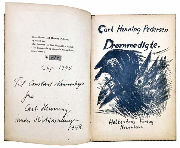
Pedersen, Carl Henning Drømmedigte. (Dream Poems) copenhagen. helhestens forlag. 1945
8vo. (222 × 152 mm). [32 unnumbered leaves]. Leaf with frontispiece recto and justification verso, leaf with reproduction manuscript titles and large vignette and Pedersen's verse in Danish with illumination recto and verso throughout including several spreads without text; lithograph text and illustration throughout. Original publisher's yellow and blue striped printed paper-covered boards, white printed label with titles and lithograph vignette in black to front cover.
Constant's presentation copy of Carl Henning Pedersen's artist book.
From the edition limited to 300 copies, signed and numbered by Pedersen and dated ‘1945’ in black ink.
Pedersen's presentation is in black ink to the justification: ‘Til Constant Nieuwenhuys / fra / Carl-Henning / [undecipherable one word including the name of the Høst group to which Pedersen belonged] / 1948’.
Pedersen was a significant contributor to the subversive Danish avant-garde art periodical ‘Helhesten’ issued clandestinely during the Second World War. The abstractions of the Helhesten group (also Høst) - as in Pedersen's illustrations and illuminations for the present workunlike those of the New York Abstract Expressionists, retained a basis in figuration. Pedersen, along with Constant, were founding members of CoBrA, the international art group formed by the amalgamation of the ‘Experimentele Groep in Holland’, the Danish ‘Høst’ and Belgium's ‘Groupe Surréaliste Révolutionnaire’ in 1948. The 1948 presentation from Pedersen to Constant is a notable testament to the founding of the group.
With the ownership signature ‘Groenendijk’ to the front free endpaper recto.
83
30
31 Sandberg, Willem Exposition internationale d'Art Experimental. 3 – 28 Novembre 1949 amsterdam. 1949
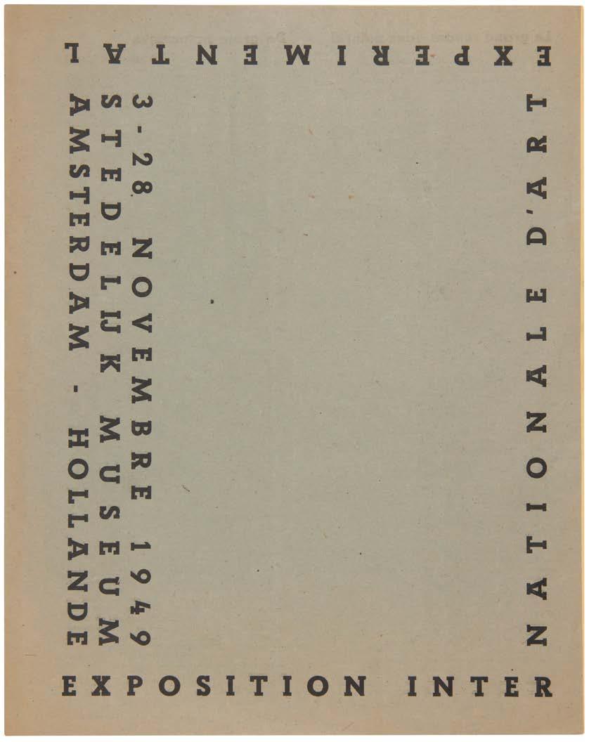
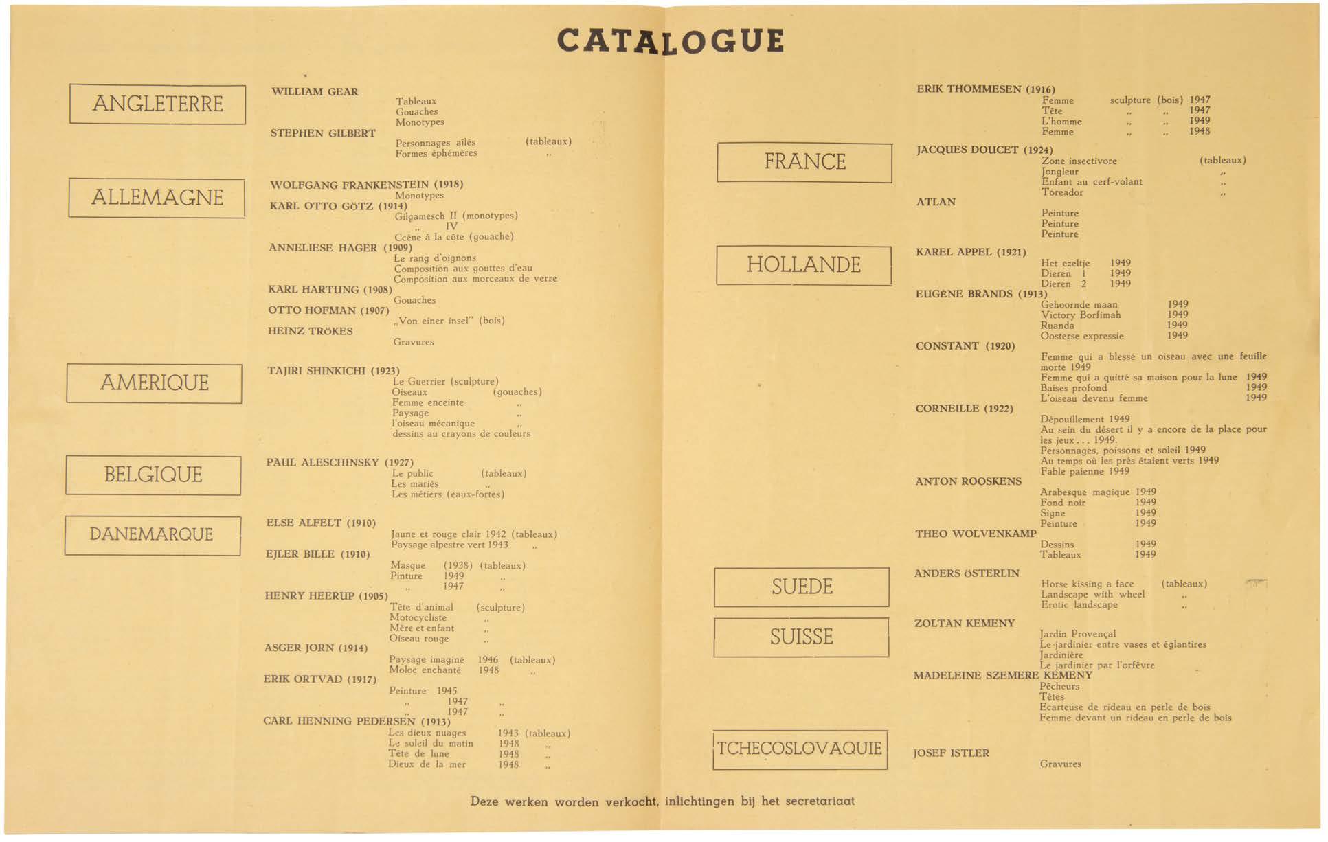
4to. (297 × 235 mm). [2 bifolia]. Printed text in French and Dutch recto and verso on grey paper, Christian Dotremont's 'Le grand rendez-vous naturel' / 'De grote natuurlijke samenkomst' and Corneille's 'Promenade au pays des pommes' and large analytic plan, a spread on yellow paper, headed 'CATALOGUE' and detailing the exhibitors, their nations and the works exhibited. Original publisher's grey / blue printed wrappers with titles to front cover in black (the rear cover concerns Corneille's 'Promenade au pays des pommes').
The very scarce catalogue for the first international exhibition of Experimental Art, held at the Stedelijk and organised by Willem Sandberg under the aegis of CoBrA
CoBrA was formed by the artists Karel Appel, Constant, Corneille, Christian Dotremont, Asger Jorn, and Joseph Noiret on 8 November 1948 in the Café Notre-Dame, Paris where the Dotremont-penned manifesto ‘La cause était entendue’ was signed. The artists were united in their adherence to a doctrine of complete freedom of form and colour, their sympathy to Marxism and their antipathy to Surrealism.
Formed as an amalgamation of the Dutch ‘Experimentele Groep in Holland’, the Danish group ‘Høst’ and Belgium's ‘Groupe Surréaliste Révolutionnaire’, CoBrA was short-lived but achieved a number of objectives: the periodical CoBrA, a series of collaborations between various members called ‘Peintures-Mot’ and two large-scale exhibitions. The first of these, for which this is the catalogue, was held at the Stedelijk Museum in Amsterdam, November 1949, the second at the Palais des Beaux-Arts in Liège in 1951 after which the group dissolved itself.
For this exhibition at the Stedelijk, the participants, a truly international coterie, included those from England (William Gear and Stephen Gilbert), Germany (Wolfgang Frankenstein, Karl Otto Götz, Heinz Trökes et al.), America (Tajiri Shinkichi), Belgium (Paul Aleschinsky [sic]), Denmark (7 artists including Asger Jorn and Carl Henning Pedersen), France (Jacques Doucet and Atlan), Holland (6 artists including Karel Appel, Constant, Corneille and Anton Rooskens), Sweden (Anders Osterlin), Switzerland (Zoltan and Madeleine Szemere Kemeny) and Czechoslovakia (Josef Istler).
‘L'exposition internationale d'art experimental organisée à Amsterdam, dans le musée de la ville, mais sous le signe de Cobra [sic], par le groupe expérimental hollandais réunit les artistes les plus honnêtes et les plus sains d'aujourd'hui.’ — From the text
This fragile catalogue is necessarily scarce and we can locate only those copies at the Bibliothèque Kandinsky in Paris and at the Stedelijk in Amsterdam.
85
above:
No 31, Exposition internationale d' Art Experimental, 1949

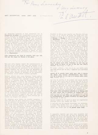
Appel, Karel & Pierre Alechinsky, Corneille et al. Plus. No. 1.
brussels. 1957–1958
4to. (298 × 216 mm). Illustrated throughout in black and white with printed text in French, or English, or Italian. Original publisher's printed wrappers stapled as issued with original colour lithograph by Appel in red and black over front and rear covers.
The founder of zero’, Hans Sonnenberg's presentation copy, of the first issue of the CoBrA-influenced periodical plus’
This copy with a presentation in blue ink: ‘To Hans Sonnenberg / Very Sincerely / Ph. d' Arschot.’; d' Arschot's presentation is at the head of his article art-essentiel contre art-jeu. ’
‘plus was edited by Jean Dypreau, Theodore Koenig, Serge Vandercam, Jean Verbruggen and Philippe d'Arschot, who presented the issue to Hans Sonnenberg as above. Hans Sonnenberg (1928–2017) founded ‘ zero in 1959 as an artist group for the promotion of young Dutch artists. Offered the management of a gallery in The Hague in 1960 he called it ‘eroz . His later gallery, Galerie Delta, led to his pseudonym ‘Mr. Delta’, also the title of an exhibition of his collection at the Museum Boijmans Van Beuningen in Rotterdam in 2012. Constant’s important exhibition of New Babylon drawings (‘New-Babylon Tekeningen 1961–1962’) was held at Galerie Delta in 1963; an exhibition of photographs of Constant and others (‘Constant 1945 – ’65’) was also held there in 1965.
The magazine also contains illustrations of works by Alechinsky, Corneille, S. Vandercam and others. Literary contributors include M. Lecomte, Dylan Thomas, T. Koenig and M. Havrenne.
[Le Fonds Paul Destribats 605].
89
32
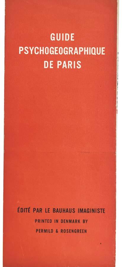
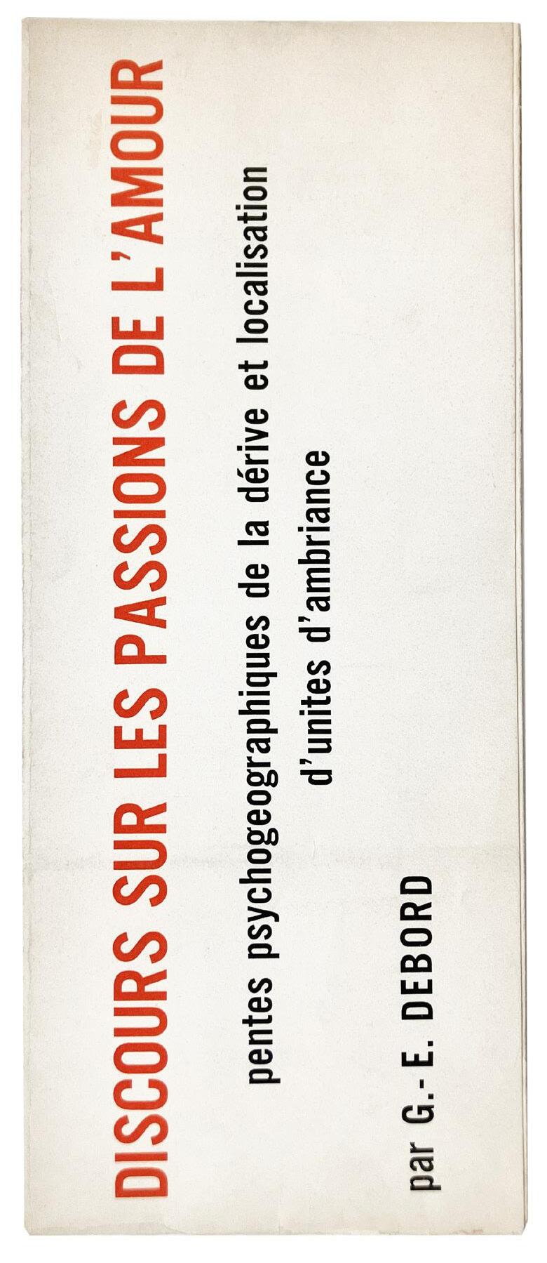
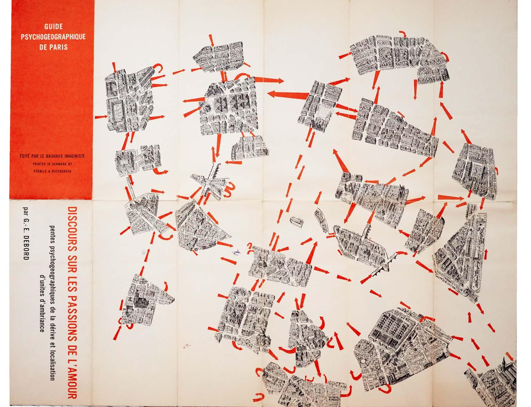
Debord, Guy-Ernest Guide Psychogéographique de Paris. Discours sur les Passions de l'Amour. Pentes Psychogéographiques de la Dérive et Localisation d’Unités d’Ambiance copenhagen. edité par le bauhaus imagiste / printed in Denmark by Permild & Rosengreen. (1957)
Single folded sheet. (600 × 740 mm, unfolded; 300 × 124 mm, folded). Lithograph printed recto only in red and black. Original printed wrappers (when folded) with printed titles and explanatory text recto in white and black on red and verso in red and black on white.
A very good copy of Debord s Situationist collage map ‘Guide Psychogeographique de Paris’, published by Asger Jorn in his new series ‘Bauhaus Imaginiste’.
This early ‘Guide Psychogéographique’ is a typical example of a poetic interpretation of the city in accordance with Situationist concerns, and its format particularly in terms of orientation and printing when folded –references deliberately the familiar Michelin guides. Debord continued to develop his cartographic ideas in ‘Situationist International’ from 1958.
The full title of the ‘guide’ translates as ‘Discourse on the Passions of Love. Psychogeographic Descents of Drifting and Localisation of Ambient Unities.’ The title references an essay by Blaise Pascal (c.1753) of the same title, in which he draws on minds driven by love and finesse, tending towards distractions or ‘dérives’ in a way that would have appealed to Debord.
‘But I must here, once and for all, inform you that all this will be more exactly delineated and explained in a map, now in the hands of the engraver … not to swell the work … but by way of commentary, scholium, illustration, and key to such passages, incidents, or innuendoes as shall be thought to be either of private interpretation, or of dark and doubtful meaning after my life and my opinions shall have been read over (no don’t forget the meaning of the word) by all the world …’
— Guy Debord quoting L. Sterne's ‘The Life and Opinions of Tristram Shandy, Gentleman’
‘The ‘Guide Psychogéographique’ selected a bird’s-eye view meticulously drawn by G. Peltier and published by Blondel la Rougery in 1951. Consciously modelled on the celebrated Turgot map of Paris (1739), it showed the city in perspective, at an angle roughly equal to the point of view established for the Carte de Tendre. This oblique view, as opposed to the geometrical survey of the map, offered a sense of place, space, and buildings analogous to the aerial photograph, allowing for the viewer an imaginary entry into the urban fabric. Indeed, in the same year Debord will go so far as to credit Chombart with the perception that an urban neighbourhood is defined by more than the sum of its geographical and economic factors, but also ‘by the image that its inhabitants and those of other neighbourhoods have of it.’ Data of this kind, noted Debord, were “examples of a modern poetry capable of provoking sharp emotional reactions.”’ — Anthony Vidler Drawing Matter
This copy bears small annotations (‘B’ / ‘BX’) in biro to the centre of the map.
91
33
 right: No. 33
Guide Psychogéographique de Paris, 1957

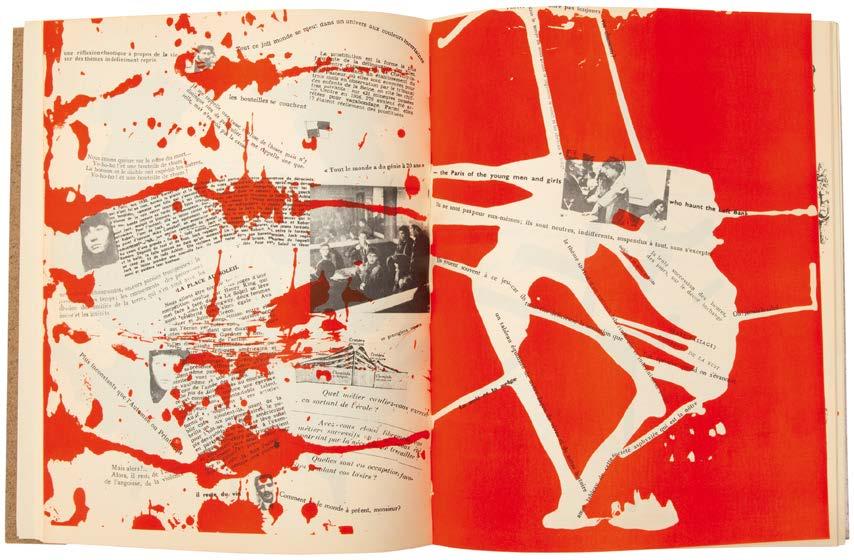
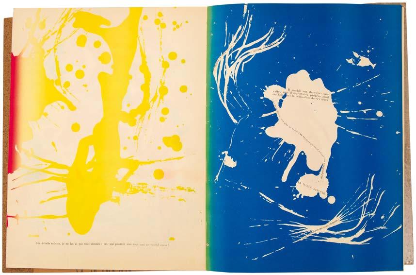
Jorn, Asger & Guy-Ernest Debord Fin de Copenhague copenhagen. permild & rosengreen [for] le bauhaus imaginiste. 1957
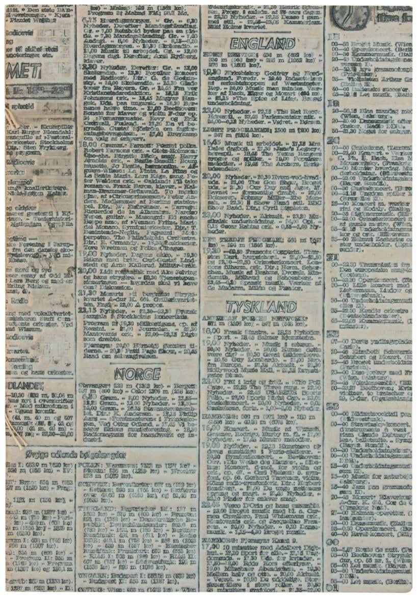
Large 8vo. (256 × 176 mm). [18 unnumbered leaves]. Leaf with printed title recto, 16 leaves with compositions in colour and monochrome by Jorn and Debord and final leaf with printer's credit and justification verso. Stitched as issued in original publisher's blue flexible relief-printed phenolic resin 'flong' boards, the embossing (unique for every copy) from the Danish newspaper 'Politiken', with the original (?) glassine jacket.
an excellent copy of the spontaneous Jorn / Debord collaboration produced reputedly in a single day.
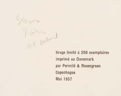
From the edition limited to 200 copies, this copy signed by both Jorn and Debord to the justification and numbered ‘6 / 200’ in pencil.
The binding of the present copy, protected with its original (?) glassine jacket, is remarkably well-preserved and the pale blue tone of the original printing matrix is notable; many of the small felt supports pasted to the verso of the matrix prior to printing are also preserved.
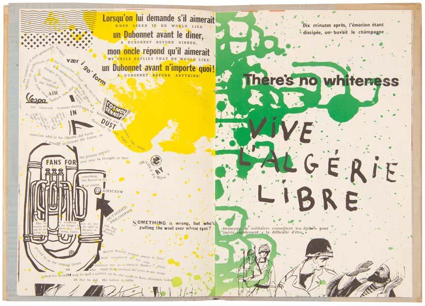
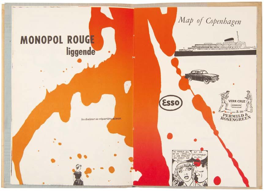
The first collaboration between Asger Jorn and Guy Debord (the two had met in 1954), produced during the final phase of Debord's Lettrist phase and very shortly before the establishment of the Situationist International, 'Fin de Copenhague' has acquired a mythical cachet. The origins of the book are mysterious but Jorn's authorised version suggests that the book was produced and published in a 24 hour period - other sources suggest 48 hours - of theft, drink and iconoclasm. On Debord's arrival in Copenhagen, Debord and Jorn stole a stack of newspapers and magazines (the multilingual and visual content of ‘Fin de Copenhague’ suggests that magazines had to have been included in the theft) from either a shop or a newstand before alcohol prompted the creation of a series of typographic and visual text collages incorporating advertisements, maps and text clippings from the stolen material. A visit to Jorn's printer followed, where the artist, seated atop a ladder, poured, dripped and splashed paints of various colours (green, yellow, red, blue, orange, brown, black and mixtures thereof) directly onto the printing plates for the recto and verso of an eight-page sheet (roughly 984 x 332 mm when trimmed); the sheets for the book were then printed with

95
34


Jorn's action-painting structure as the basis for a second run through the press when the collages were added in black. A different prevailing idea is that the collages were printed initially and provided the structure on which Jorn then based his action-painting before the large sheets were printed, folded and cut to form the block of the published book with a single added sheet for the title and justification in letterpress. The book was then bound in an embossed binding, made using the ‘flong’ method of relief printing, of pale blue phenolic resin, the relief for each copy taken from a random section of the Danish newspaper ‘Politiken.’ The binding for each copy is therefore unique.
‘The old Futurist and dadaist technique of insult, abuse and satire die hard, if only because the Modern Movement that grew out of them has developed almost as many pomposities, inhumanities and hypocrisies as the attitudes it replaced. Among the most salutary recent eruptions of the grand old method is Asger Jorn's “Fin de Copenhague”… that uses the combined techniques of collage and action-painting to satirize gemütlich Europe in general, the author's native Copenhagen in particular and Le Corbusier in passing. Thus, much of the text has been clipped from steamy newspaper serials and confronted with clippings from the ultimate guardian of middle-class morality, the agony column of “Elle”.’
— The Architectural Review
‘Among proto-situationist visual works, Ansger [sic] Jorn and Guy Debord's “Fin de Copenhague” (1957) is distinguished by its radical approach to cartography ... in “Fin de Copenhague” the map almost disappears in the labyrinth of visual poetry, collage, and modifications of readymade visual material. The end result is not illegibility, but a short-circuiting of different technologies of reading: the text reads like a map, collage like a text, and map like a drip painting.’ — Branislav Jakovljevic
[see 'Marginalia', pg. 223, 'The Architectural Review', Vol. 122, No. 729, October, 1957; see Branislav Jakovljevic's 'The Space Specific Theatre: Skewed Visions 'The City Itself'', 2005].

97


Jorn, Asger & Guy-Ernest Debord Mémoires – Structures Portantes d'Asger Jorn paris. imprimé ... par permild & rosengreen [&] edité par l'internationale situationniste. 1959
4to. (276 × 214 mm). [32 unnumbered leaves]. Half-title recto, black verso, title and Debord's text with images printed in black, Jorn's 'structures portantes' in lithograph colour, final leaf verso with printer's and distributor's credits. Original cream paper wrappers, with original sand-paper dustjacket.
An excellent copy of the most famous of Situationist collaborations with the original sand-paper jacket.
Guy-Ernest Debord's ‘prefabricated’ texts are framed within Jorn's psychogeographic designs, thereby creating one of the most memorable, politically-committed artist books of the last century. The sand-paper wrappers were intended to damage any other books that 'Mémoires' might come into contact with or be shelved alongside.
The warning on the title page 'Cet ouvrage est entièrement composé d'éléments préfabriqués' refers to the practice of 'détournement' developed by the Internationale Lettristes and adopted by the Situationists.
This copy, unlike many, is in excellent condition, with the text block inserted loose into the jacket.
[Kellein pg. 57].

99
35
36 Jorn, Asger & Jørgen Nash Stavrim, Sonette copenhagen. permild & rosengreen. 1960

4to. (270 × 214 mm). [30 unnumbered leaves]. Leaf with monochrome photographic portrait (in police line-up form) of Nash verso as frontispiece, printed title with list of published works verso, pictorial title by Asger Jorn and Nash's verse illustrated and illuminated with lithograph vignettes and full-page and double-page lithographs by Jorn throughout, final leaf with publisher's credit recto against a yellow background and printer's credit verso in English; printed text in Danish on various paper stock. Original publisher's card wrappers, brown twine-covered paper jacket with yellow printed label with titles to front cover in black.
A signed copy of Jørgen Nash's poetry collection illustrated by his brother the painter Asger Jorn, here in excellent condition.
Signed and dated ‘16.3.1960’ by Jørgen Nash in black ink to the first leaf.
This book of Jørgen Nash's poetry, ‘Stavrim, Sonetter’ (Rhymes, Sonnets) was issued on his 40th birthday – as per his inscription ‘16.3.1960’ –and was illustrated by his brother, Asger Jorn. Jorn's illustration and illumination is characteristic and although in monochrome only for the present book is reminiscent of his work for Debord's ‘Fin de Copenhague’ and ‘Mémoires’.
Also included is the publisher's announcement for the book, a single sheet of cream stock (250 × 200 mm) with printed text recto only. The text, in Danish, begins ‘En bog af Asger Jorn og Jørgen Nash - to kaettere i dansk kunst og poesi’ (A book by Asger Jorn and Jørgen Nash two heretics of Danish art and poetry) and continues in a similar vein.

101
bibliography
Dagen, Philippe. Constant, Graveur Cercle d’Art, 2004
Kelvin, Thomas. Fröhliche Wissenschaft: Das Archiv Sohm. Staatsgalerie Stuttgart, 1986
Jakovljevic, Branislav. The Space Specific Theatre: Skewed Visions ‘The City Itself.’ TDR (1988-) 49, no. 3 (2005): 96–106.
Sadler, Simon. The Situationist City. MIT Press, 1999
Wigley, Mark, and Constant. Constant’s New Babylon: The Hyper-architecture of Desire. 010 Publishers, 1998.
Le Fonds Paul Destribats: Une Collection De Revues Et De Périodiques Des Avant-gardes Internationales À La Bibliothèque Kandinksky. Bibliothèque publique d’information du Centre Pompidou, 2011.
'The Architectural Review', Vol. 122, No. 729, October, 1957


text
Halliwell
Printed February 2024 by Blackdog Digital
Rupert
photography Natasha Marshall catalogue design Juliet Ramsden
sims reed rare books 43a duke street st. james's london sw1y 6dd info@simsreed.com +44 (0) 20 7930 5566 @simsreed_books shapero rare books 106 new bond street london w1s 1dn ow@shapero.com +44 (0) 20 7493 0876 @shaperorarebooks
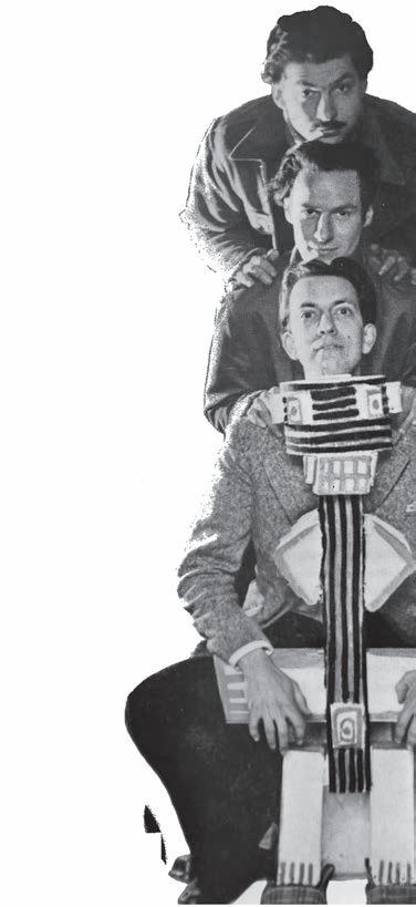
Right: Experimentele Groep (top to bottom Appel, Corneille and Constant), from No. 13


SIMS REED








 above and left: No. 4, 8 x La Guerre, 1951


 No 10, New Babylon 1963 (Dutch edition)
above and left:
No 11, New Babylon 1963 (English edition)


 right: No. 33
Guide Psychogéographique de Paris, 1957
