CONTENTS
In the Details
Chinese Contemporary Museum - Detail Design, Los Angeles, CA
Material that Connects
Campus and pavilion design for Sweet Water Foundation, Chicago, IL
Rethinking Haussmann Levitate
21st Century Multi-Story Residential Building, London, UK
Revitalization Project with Existing Buildings, Hangzhou, China
Xixi Paradise
Luxury Hotel in the Xixi Wetland, Hangzhou, China
4-in-1
A Space Research of Field and Program
II III IV V VI VII
Flux
A Visualization of a field in space, Hangzhou, China
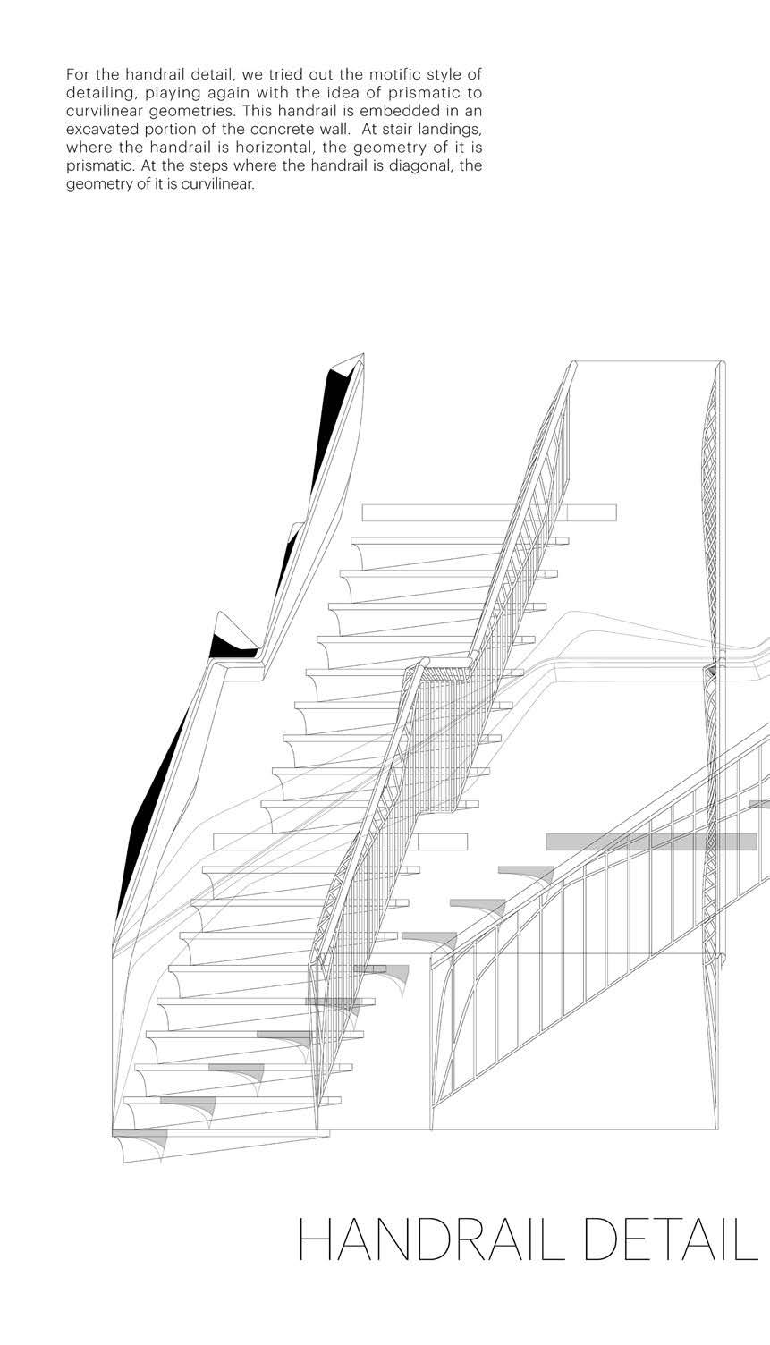
In the Details
Chinese Contemporary Museum - Detail Design

Los Angeles, CA
Individual Work, 2018

Instructor: Dwayne Oyler, Jenny Wu
The Architecture Detail, Edward R. Ford identified five widely accepted approaches to the design of an architecture detail, with the intention of both exploring what makes a successful architecture detail, as well as the range of strategic approaches that might lead to their conception. This studio considers a range of critical positions on the issue, and tests their outcome through the design of both a detail and its host building. The idea is that the studio would produce a back and forth design process between the detail and the building design, one that is not necessarily a direct product of the other, and, in fact, may produce a more “subversive” relationship (to use Ford’s term) than a subservient one.




Material that Connects
Campus and pavilion design for Sweet Water Foundation, Chicago, IL


Individual Work, 2017
Instructor: JEANNE GANG
Sweet Water Foundation aims to democratize, globalize, and commercialize urban agriculture practices for resilient 21st century communities via hands-on, real-world learning grounded in concepts of community, equity, and resilience. To further expand the work of the Sweet Water Foundation, a community or institutional partner will be collocated at their existing facilities in Washington Park, Chicago, to create a new Campus Center.
Fabrication Details Isometric Perspective
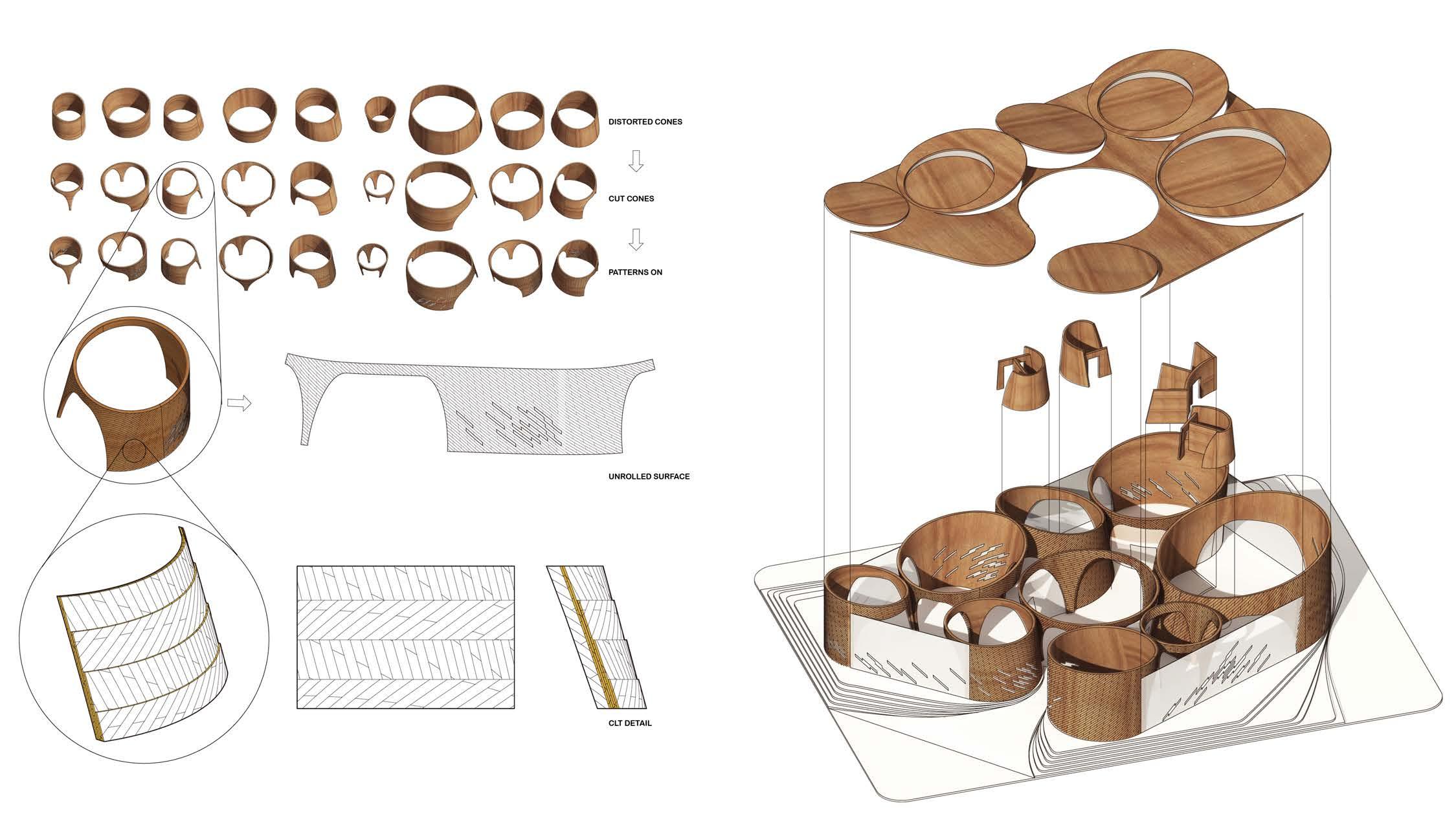
Timber is chosen as the material based principally on its: visual and tactile qualities, material properties, and environmental credentials. The construction logic builds on the idea of small pieces assembling together into a stronger material.
The timber strips are cross-laminated layer by layer into cone-shape walls, and the curved walls lean on each other to work structurally feasible and economical. The patterns on the walls follow the texture of lamination, indicating the orientation of the structure.

Dynamic Lobby Form Follows Fabrication
The circular roof cast curvilinear lights on the cone-shaped walls, which will change during the day time. The furniture also follows the circular language, creating semi-private space for social activities.
The patterns on the wall follows the orientation of laminated wood, and the seats are arranged along curves from cones. Everything in this auditorium is embedded in the cone-shape space.


Scenario 3
Future Campus Plan

In the further development of the campus, the pavilion serves as an “exchanger” of goods. As more programs such as gym, kitchen, theatre coming in, the pavilion also become a “connector” in between different elements.

Rethinking Haussmann
21st Century Multi-Story Residential Building, London, UK

Individual Work, 2017
Instructor: FARSHID MOUSSAVI
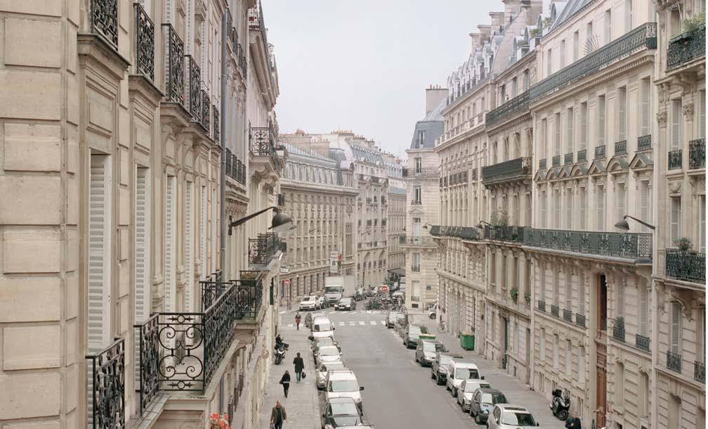
Typical Haussmann Block in Paris
Haussmann blocks have continuous facade which defines the large boulevards. The continuity contains diversity and also blocks the street life away from the residential blocks.
In the 21st century, London has been described as the world’s foremost ‘global city’, hallmarked by its dynamic financial market, as well as its diverse and growing population. The ever-increasing dissolution of live-work divisions owing to the omnipresence of digital technology, the rise of social media and an aging population are also other forces impacting the city’s housing stock.
The concept drawing shows that the typical Haussmann has the enclosed façade, the inside and outside of the block is very distinct, you can only see one façade from the outside. By opening the block, there is a new condition that the inside becomes the outside. A new blur of two façades system was created. At the same time, two different façades are faced with different contexts, the red one is faced to urban context, the blue one is faced to nature context.

New Open Block
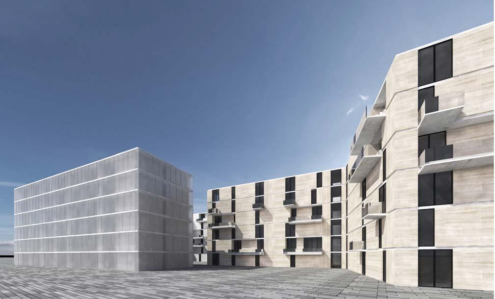
The new block opens the continuity and has two facade system, one faced to urban life and another faced to green landscape. At the same time, the openness allows the merge of urban and natural elements.

Urban and Nature
Two façade systems, one faced to nature, the other one faced to urban context. The façade faced to nature and park is more open, with insert balcony, and it’s also sunken to create more openness. The façade faced to urban context is operable polycarbonate boards. They are translucent and can be open to let fresh air in also closed to block the noise from outside. For the urban façade, The grid changes from bottom to the top, the scale of polycarbonate panels from large to small. The larger ones on the ground level can be open to change the urban space and influence the civic life, the smaller ones on the top can be open on a wider angle and has more openness.
Units Variation
In terms of units variation, there are basically four types of units from the degree of privacy to community. They are Independent units, shared private units, collective private units, shared collective units. They contain the different lifestyles of people. To arrange all the units on the site, the shapes of units follow the geometry of the project. And they are assembled together on the site. The larger independent units are put to the boundary of the site to have better street view, the communal units are put in the middle the site to share a community.


Unit Section Perspective
Two facade systems: one with operable polycarbonate panels, another side with sunken balcony. The polycarbonate panels are translucent which guarantee privacy, and the sunken balcony maximizes the natural view.

Day View
In the day time, the operable panels are opened to allow fresh air in and to get a urban life view. The translucent facade also provides the privacy to the residents.

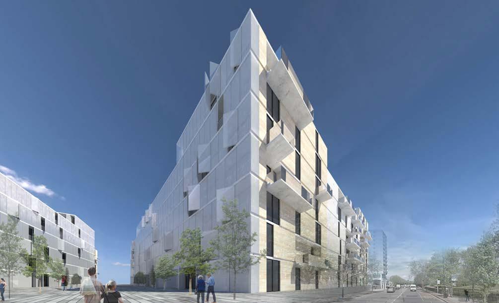


Night View
During night, the operable panels are usually closed because of the privacy. The lights coming from the interior create an ambient atmosphere.
Levitate
Revitalization Project with Existing Buildings, Hangzhou, China

Individual Work, 2015
Instructor: LIN DUODUO
Existing Site New Site
Hangzhou, the ancient capital of Song dynasty and a modern consumerist urban center, is combined with tradition and modernism. The rapid development brings not only economic profits but also the inequality and heterogeneity between different districts -- new large centers mixed with old small buildings.
In the site, the lower residential areas are isolated among the new buildings such as hotels and malls. At the interaction of old and new buildings, there are four buildings residing -- a library, an art market, and two offices. The old and the new can be seen as two different social fields. This project is going to revitalize the site by inserting an art museum complex. The strategy is to keep the old and search for a way to combine together. The social fields in different dimensions interact between new buildings and old buildings – by remaining the old buildings and inserting the new function at the same time.


Zoning
In order to revitalize the current site, a new set of zoning provisions needs to be created to provide proper organizational and volumetric constrains. A new merged platform with programs of exhibition spaces, cafe, shop, office and restaurant is raised above the existing market -- preserving the vibrant market and connecting the other three old buildings.

1:200 Model Entrance View


An escalator in the entrance connects the ground and the art museum, which shows a welcome gesture to the residence. The staircase also becomes a place where people get together and social activities occur.
Isometric Decomposition


The three separated buildings share one platform in the air. The platform can be traffic space and extension of programs of existing buildings. New doors are made where floating art museum meets the existing walls, the floors of old buildings and museum are merged together.


Because of the loop-shape of the museum, a short cut connects two parts of it. The corridor also guides visitors to continue the exhibition trip.
Corridor In-between Free Traffic to The Museum
Besides of the main entrance, there are other 3 convenient ways to go. The escalator is placed between the two old buildings, where serve the most people.

New and Old
The indoor view shows where old and new combines. The left side is city view and modern truss structure, while the right side is old bricks view. The diffused natural light from dormers offers a comfort light environment for exhibition.

Xixi Paradise
Luxury Hotel in the Xixi Wetland, Hangzhou, China
Individual Work, 2014


Instructor: WANG JUNRU
Xixi is a wetland, which has a rich nature view of water and trees. Considering the hotel’s clear regional programs, it is divided in strips. This project aims to explore the relationship of nature and architecture. The generation strategy is based on the field of natural elements – existing trees and ponds. The architectural form is decided by the tangent of natural field. In order to gain a closer relationship with nature, the roof and wall surfaces merge together and form a continuous surface.
Numeric Analysis of Generation
The formation of the hotel is based on the numeric analysis from the existing water and trees.

Living under Nature
The continuous roof surface and plan shape several courtyards, each shows a step close to nature.

Hiding in Nature
An elegant hotel, not in city, but in nature. At Xixi wetland, a place with splendid natural view, this hotel is hiding right here. Trees, water, and grass stand for a life without worries, an idyllic and poetic life. Wood, concrete, and glass make the building grow from the ground, using appreciable and pleasant materials.

Walking into Nature
The continuous curved structure combines the roof the floor, indicating the fusion of nature and artificial building. The transparent glass makes it easy to get the outdoor view, and in the entrance lobby, the curved roof also shows an attitude of welcome and hints a customers’ circulation.

4-in-1
Group Work, 2015
Contribution: Model/Photography/Drawing
Collaborator: LIU Qingrong/WU Xueqi/HE
Chendi
Instructor: HE YONG
A Space Research of Field and Program + =
Decomposition
Concept Diagram
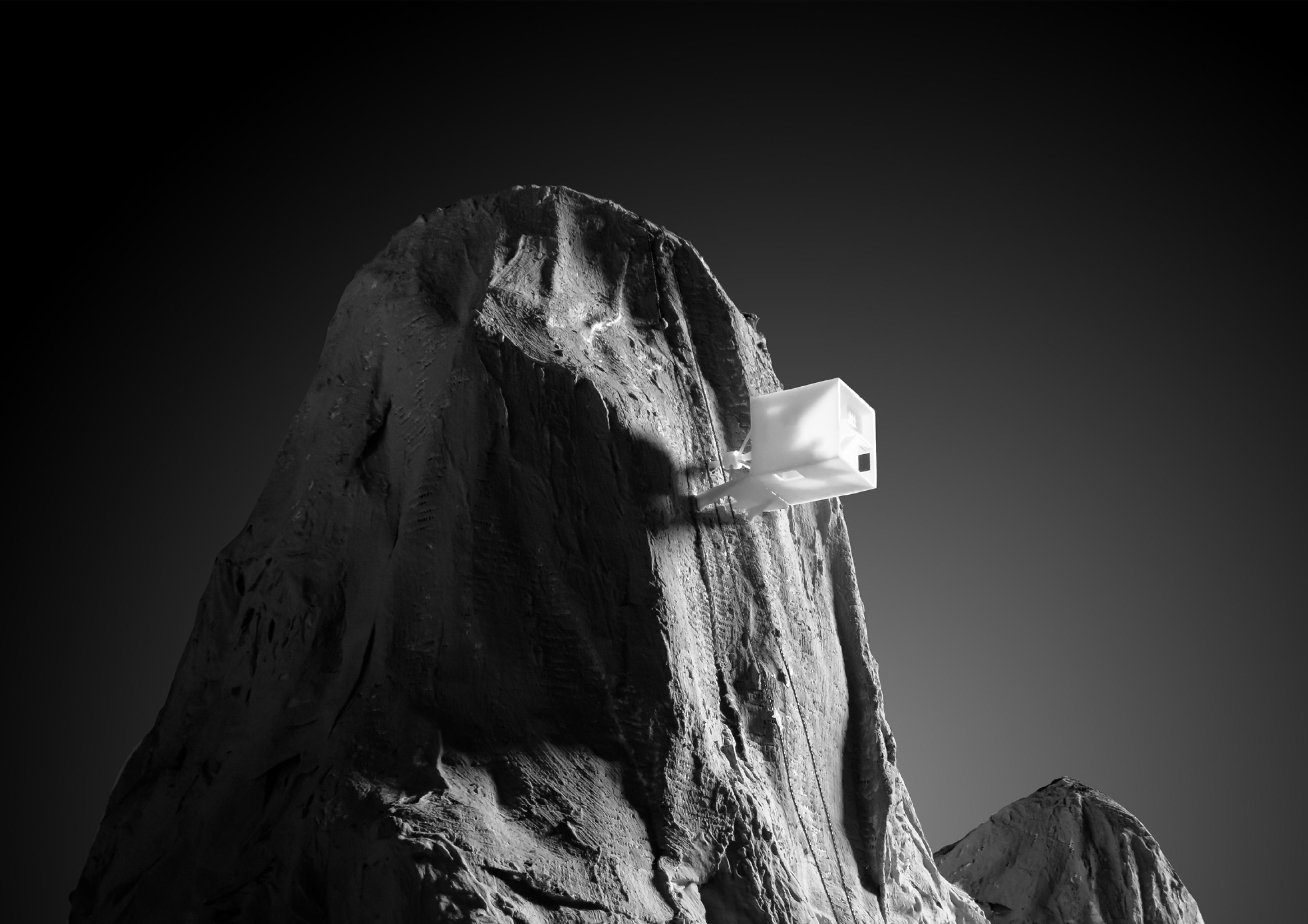
The simplest field of a building is a house, and different fields stands for different programs. Everyone's routine in a house is a circle, and through the FIELD's perspective In this project, tried to minimize the space for each program and therefore redefining conventional spatial notions. With this new definition, it enable the house to roll, letting the user redefine the space regardless of orientation. It's also about a discussion of relationship between FIELD and PROGRAM, and people as the center. In normal houses, people are moving and the house is still; In this case, the reference system changes because of the moving house.
Light Chronic Analysis
The movement of shifting brings a lot of new characters of this cube. Such as the light change with the rolling angle. Moreover, the furniture must be multi-functional, which means one piece of furniture can be used in different bases. At the same time, the light changes with the usages change. Multi-functional furniture also works on redefining interior space -- one flat could transfer into an enclosing wall.


Model Bird View


After the space research, the project aims to serve forest rangers or mountaineers who have to live in wild and mountain for a certain long time. They need a normal living functions but only with a minimal living space. The ‘Shifting Cube‘ is inserted in the mountain with a platform to stand. The way to go to the house is climbing the rope on the mountain, according with the common way of forest rangers and mountaineers.


Flux Group Work, 2016
Contribution: Concept/Electronic Design/ Drawing/Model
SENSOR BOUNDARY SENSOR BOUNDARY
A Visualization of a field in space, Hangzhou, China
SENSOR FIELD
Collaborator: GAN Keyu/ ZHOU Yifan/ZHANG

Fan
Instructor: WANG Hui
Fielogue


‘‘Fielogue” comes from ‘Field‘ and ‘Dialogue‘, and this project is about the visualization of a field in a space. In order to study the man-made interference in a static space, a helium-filled device floating in the air is made – just like throwing a handful of iron filings around the magnetic field – when people passed by, the infrared induction will be triggered and lead to the balloon’s own movement.
The balloons are placed in a grid of 4 x 6, each by 2.5 meters, in the entrance hall of Architecture Faculty. When people walk into these ‘clouds’, the ‘clouds‘ moves down and open the view. After people walking through it, they leave a filed of ‘wave’. This ‘wave‘ can be regarded as the man-made interference to a field in a static space. With this wave, the invisible field in a space can be seen.


