14 minute read
Typography as Discourse Katherine McCoy, David Frej 1988
The recent history of graphic design in the United States reveals a series of actions and reactions. The fifties saw the flowering of U.S. graphic design in the New York School. This copy-concept and image-oriented direction waschallenged in the sixties by the importation of Swiss minimalism, a structural and typographic system that forced a split between graphicdesign and advertising. Predictably, designers in the next decade rebelled against Helvetica and the grid system that had become the official American corporate style. In the early seventies, Robert Venturi’s Complexity and Contradiction in Architecture emerged alongside the study of graphic design history as influences on American graphic design students. Simultaneously, Switzerland’s Basel school was transformed by Wolfgang Weingart’s syntactical experimentation, an enthusiasm that quickly spread to U.S. schools.
[…] Here on the edges of graphic design, the presence of the designer is sometimes so oblique that certain pieces would seem to spring directly from our popular culture. Reflecting current linguistic theory, the notion of “authorship” as a personal, formal vocabulary is less important than the dialogue between the graphic object and its audience; no longer are there one-way statements from designers.The layering of content, as opposed to New Wave’s formal layering of collage elements, is the key to this exchange. Objective communication is enhanced by deferred meanings, hidden stories, and alternative interpretations. Sources for much current experimentation can be traced to recent fine art and photography, and to literary and art criticism.
Advertisement
Allen Hori, Typography As Discourse, lecture poster, 1989. Influenced by French poststructuralism, critics and artists deconstruct verbal language as a filter or bias that inescapably manipulates the reader’s response. When this approach is applied to art and photography, form is treated as a visual language to be read as well as seen. Both the texts and the images are to be read in detail, their meanings decoded. Clearly, this intellectualized communication asks a lot of its audience; this is harder work than the formal pleasures of New Wave. […] The focus now is on expression through semantic content, utilizing the intellectual software of visual language as well as the structural hardware and graphic grammar of Modernism. It is an interactive process that—as art always anticipates social evolution—heralds our emerging information economy, in which meanings are as important as materials.

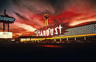
Denise Scott Brown, The Stardust Resort and Casino, Las Vegas, 1968.
Dan Friednam, Typografische Monatsblätter, no. 1, magazine cover, Switzerland, 1971
Willi Kunz, pages from 12 T y p o graphical Interpretations,1975. Marshall McLuhan noted that Kunz understood “the resonant interval in structuring designs.”
Katherine McCoy, Richard Kerr, Alice Hecht, Jane Kosstrin, Herbert Thompson, Visible Language: French Currents of the Letter, 12.3, July 1978.
Willi Kunz, Strange Vicissitudes, exhibition poster, USA, 1978, Photographas by Friedrich Cantor.
Edward Fella, Artemisia, Lithograph. USA, 1987. Richard Eckersley, The Telephone Book by Avital Ronell, book spread, University of Nebraska Press, USA, 1989

April Greiman (design and typography) and Jayme Odgers (art direction, photography, and design), poster for California Institute of the Arts, 1979. The printed surface is redefined as a continuum of time and space.

Allen Hori, Poster, announcement: “Lines Presents the Reading of Gender, March 1989” (for conference at Detroit Institute of Arts & Part of Lines Series), ca. 1989.
Jeffery Keedy, Calendar for Los Angeles Contemporary Exhibitions (LACE), December 1988/January 1989.

PAINT THAT NEVER DRIES
Il titolo di questa sezione, che racconta l'impatto della rivoluzione digitale nel graphic design, è una citazione tratta da Hybrid Imagery 02 di April Greiman, “the paint never dries, in the Mac universe" che rende evidente come il digitale apra a nuove concezioni. Il progetto grafico perde ogni possibilità di essere completo, nel mondo digitale, è sempre aperto all’incertezza e a nuove modifiche. Diventa quindi sempre più forte la spinta verso la sperimentazione, l’apertura verso l’errore e il sovvertimento di ogni visione rigida, univoca, codificata. Nasce un nuovo mondo di infinite possibilità.
02
Interview with April Greiman Emigre 1988
Emigre: Do you design differently now that you work on a computer? April: This would be very hard to articulate. I think that I design completely differently since I’ve become Mac-fluent. Everything at one point or another goes through the cone of my Mac. We’re able to bring in 35 mm slides, scan them into the Quantel graphic paintbox, bring in a Mac image or a digitized image, bring in live video, then put all these things together. This provides a whole new texture. And for sure, the most profound part of this is the Macintosh influence.
Emigre: Will the Macintosh contribute to a change in graphic design mostly in the area of production, or will it influence design aesthetics as well? April: Both! In principle, I would agree that the Mac saves us time and all that. But what I experience is rather than just doing something quickly, we’re looking at more possibilities. Instead of doing more work, we are seeing more options. Now we spend more time visualizing and seeing things, and before the Mac, we spent more time doing things. You wouldn’t look at twelve different sizes of a headline type, because it would involve setting the type and then statting it and you would just say, “Oh come on, I don’t have to try this subtler difference.” But with the Mac, once the information is stored, you can just look at seventy-two thousand variations. And then the accidents happen and you say, “Oh that’s so much better, why don’t I go that way?” And then you are off trying a whole new idea. This pioneering, where you don’t have an aesthetic yet and you don’t have tradition, is both time-consuming and wonderful. To feel lost is so great. There are only a few areas in this very controlled industry that you can feel like that.
April Greiman, Does It Make Sense?, poster for Design Quarterly, no. 133, 1987. It was composed of digitized images was output by a low-resolution printer.


Emigre: Where will these experimentations lead to? April: There are two ways that we are pushing this technology. One is by imitating and speeding up normal processes of different disciplines, such as production and typesetting. In those cases the technology is a slave and is simulating what we already know. But I think that, if we all keep going the way we are going and other people jump in, all desperate for new textures/ new languages, then the other area in which it’s going to advance is a new design language. Rather than get the language that’s built-in to speak to you in English, you say, well, I know it can speak English, it does that very well, but there’s also a new language. What do digital words really mean and say? There is a natural language in that machine and I am interested in finding out what that is, and where the boundaries are.
Amtion / Fear Zuzana Licko, Rudy VanderLans 1989
Computer technology provides opportunities for more specialization as well as integration. Today, less peripheral knowledge and skills are required to master a particular niche. For instance, a type designer is no longer required to be a creative mind as well as a skilled punch cutter. There is also the possibility of better communication, allowing for increased crossover between disciplines. Designers can control all aspects of production and design, no longer requiring an outside typesetter or color separator. Text, image and layout all exist as manifestations of the same medium and the capability of simultaneously editing text and composing the layout will influence both design and writing styles. It is now possible for one individual to take on all functions required in publishing, including writer, editor, designer, and illustrator, thus bringing together a variety of disciplines and consequently streamlining production.
The integration of previously isolated disciplines makes computeraided design a seamless continuum of activity similar to that experienced by children. In fact, computer technology has advanced the state of graphic art by such a quantum leap into the future that it has brought the designer back to the most primitive of graphic ideas and methods. It’s no wonder that our first computer-generated art usually resembles that of naive cave paintings! This return to our primeval ideas allows us to reconsider the basic assumptions made in the creative design process, bringing excitement and creativity to aspects of design that have been forgotten since the days of letterpress. We are once again faced with evaluating the basic rules of design that we formerly took for granted.
Rudy VanderLans, cover for Emigre, no. 11, 1989. Three levels of visual information are layered in dimensional space. […] But what separates digital art from its analog counterparts aesthetically? Mostly it is our perception. There is nothing intrinsically “computer-like” about digitally generated images. Low-end devices such as the Macintosh do not yield a stronger inherent style than do the high-end Scitex systems, which are often perceived as functioning invisibly and seamlessly. This merely shows what computer virgins we are. […] Creating a graphic language with today’s tools will mean forgetting the styles of archaic technologies and remembering the very basic of design principles. This is perhaps the most exciting of times for designers. Digital technology is a great big unknown, and after all, a mystery is the most stimulating force in unleashing the imagination.
Hybrid Imagery: The Fusion of Technology and Graphic Design April Greiman, Eric Martin 1990
Since its introduction in 1984, the Macintosh computer has rapidly become an essential tool for designers, not only tor familiar tasks but also for its ability to suggest entirely new solutions.
At April Greiman lnc it was immediately recognized for what it is-a new paradigm, a conceptual “magic slate” opening up a new era of opportunity for graphic artists. lt has since become an integral part of every project at many levels: brainstorming, camera-ready art, typesetting, electronic page composition, and on and on in ever-expanding applications. […] The renowned friendly Macintosh environment, with its cozy iconic mimicry of familiar tools like erasers and paintbrushes, makes it supremely easy to use. At the same time, this reassuring familiarity obscures what is provocative about this new tool, much of which contradicts ordinary practice:

The “Undo” function allows you to take back something you just did, without a trace or, with another click, restores it. The traditional way of thinking would call this a great way to correct mistakes. In fact, you learn to think of it as a means to attempt them. Mistakes are accidents, and accidents often reveal unexpected possibilities.
lt’s so easy to edit as you go along that editing becomes part of the original act of creation, instead of being something “done later.” This is wonderful, but takes getting used to. lt makes so many things that were so hard so easy that there’s a renewed emphasis on why you’re doing what you’re doing in the first piace. In other words, how good is your original idea? Nothing is ever “finished” in the conventional sense. The paint never dries in the Mac Universe. You may stop working on a piece any time you wish, but you may also, years later, wake up a document and go right on manipulating it as if you had never stopped. Everything is always alive.[…] Perhaps the most profound implication for the future is that digital technology collapses all media into a single desktop tool speaking one digitai language. lt is really a single metamedium. A sound is generated, edited, and remembered as a unique pattern of the same computer “bits” (on / off electronic impulses) that describe a color, for example. This is why the generic Mac “Cut and Paste” function is so effortless. Previously separate media begin to diffuse, to merge with others. Cut a picture, paste it into a song. A word is a color is a sound is a movement. The new significant media are hybrids. The age of the specialist is replaced by the age of the dedicated generalist. - EM
April Greiman, for the Fortuny Museum, Venice “Pacific Wave” exhibition 1987.
A Brave New World: Understanding Deconstruction Chuck Byrne, Martha Witte 1990
Today, the technological changes taking place in typography have been brought about by the personal computer. […] The ability of the computer to allow variations at low cost gives the designer the freedom to experiment until the page seems “right,” whereas previously, tried-and-true formulas were necessary in order to predict the outcome more certainly, and avoid undue expense at the typesetter.
Today’s seemingly boundless freedom precludes the need for many typographic conventions and even brings into question the need for that most sacrosanct of mid-twentieth-century graphic design devices-the grid. Grids are but one means of organizing visual material, a means to an end, not an end in themselves. […] The grid may be dead, and if so, the computer will have been the culprit.
But while the computer provides the technical ability to accomplish a seemingly new look in typographic design, it is certainly not the only inducement to aesthetic innovation. The evolutionary temperament of general culture is capable of producing an atmosphere that stimulates a variety of creative disciplines to respond simultaneously, sometimes similarly, sometimes dissimilarly. And designers often find concepts and images generated by disciplines remote from design seductive and worthy of appropriation. Sibyl Moholy-Nagy writes that two of the most dynamic revolutions in twentieth century typography, Futurism and the Bauhaus, were fueled by the excitement of ideas generated by such seemingly unrelated developments as the automobile, Einstein’s theory of Relativity,
and Freud’s theories of the self. According to Moholy-Nagy, the inventive quality in all of these ideas had to do with motion, and so typography, “in it’s age old function of filtering the great artistic movements down to a residue of simple communication, then took upon itself this restlessly evolutionary trend.. ..”
Within the last few years, typography and design in general have been influenced, either directly or indirectly, knowingly or unknowingly, by the concept of “deconstruction.” Most designers moving in deconstructionist directions vehemently deny any knowledge of deconstruction, much less admit to being influenced by this encroaching concept from critical thought and philosophy. But design does fall under its influence, if for no other reason than because designers live in the culture that gave birth to deconstruction.

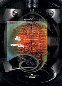
P. Scott Makela, Cranbrook Design: The New Discourse, exhibition announcement, USA, 1990
April Greiman in collaboration with Jayme Odgers. WET Magazine cover, 1979. April Greiman, “Shaping the Future of Health Care” poster, USA, 1987.
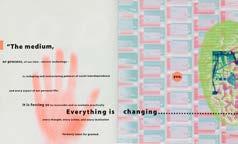
The actual screen image of the entire poster “Does it make sense?” of April Greiman, in its “Reduce to Fit” size on screen on MacDraw.
Rudy VanderLans, Zuzana Licko (type design), advertisement page for digital typefaces, from Emigre n.6, 1986
Rick Valicenti, ( Thirst ) Poster for Lyric Opera of Chicago 1988.
Zuzana Licko Oakland, USA, 1985. Zuzana Licko digital typefaces of the late 1980s such us Oakland were originally designed as bitmapped fonts for 72-dpi resolution.
Template Gothic, typeface designed by Barry Deck in 1989. In 1991, it was released by Emigre. Deck designed Template Gothic while studying at California Institute of the Arts under artist and graphic designer Edward Fella.
Glenn A. Suokko and Emigre Graphics, cover for Emigre, no. 10, 1989. Traditional typographic syntax yielded to an experiment in unconventional information sequencing for a special issue about a graphic design exchange between Cranbrook and Dutch designers.


John Plunkett, Barbara Kuhr (designers and art directors), WIRED magazine, premiere issue, 1993. , Wired magazine, front-of-book spread. The “Electronic Word” section is a graphic and theoretical exploration of the expanding digital world.
Jennifer Morla, poster for the National Museum of American Art, 1995. For the 25th anniversary of Earth Day, Morla included different images of land, water, and animals, all watched over by human eyes.
DECOSTRUCTING TYPOGRAPHY Questa sezione racconta gli esiti dei temi trattati nelle due sezioni precedenti, i presupposti teorici e gli strumenti tecnici, hanno permesso al graphic design di avere una nuova forma, anche caotica, 03 in cui il designer interpreta i contenuti - aldilà di leggibilità e norme precostituite - e cerca di comunicarli, lasciando aperta la comprensione a molteplici letture. Il rifiuto delle regole, e il pensiero decostruttivista hanno portato ad una vera e propria ridefinizione della tipografia e del graphic design.


