6 minute read
How to Artist Journal
A BEGINNER’S GUIDE TO KEEPING A SKETCH JOURNAL Jane
Get Creative 6
Advertisement

An imprint of Mixed Media Resources
19 W. 21st Street, Suite 601 New York, NY 10010 sixthandspringbooks.com
Editor
Lauren O’Neal
Creative Director
Irene Ledwith
Art Director
Francesca Pacchini
Chief Executive Officer
Caroline Kilmer President
Art Joinnides Chairman
Jay Stein
Copyright © 2023 by Jane Maday
All rights reserved. No part of this publication may be reproduced or used in any form or by any means—graphic, electronic, or mechanical, including photocopying, recording, or information storage-and-retrieval systems— without written permission of the publisher.
The designs in this book are intended for the personal, noncommercial use of the retail purchaser and are under federal copyright laws; they are not to be reproduced in any form for commercial use.
Permission is granted to photocopy content for the personal use of the retail purchaser.
Manufactured in China
First Edition
An art journal, also known as a sketch journal or illustrated journal, is similar to a traditional journal, but you use images instead of (or in addition to) words. It’s the book of your life, the things you feel, an expression of the creativity within you. It is for YOU, a colorful conversation with yourself.
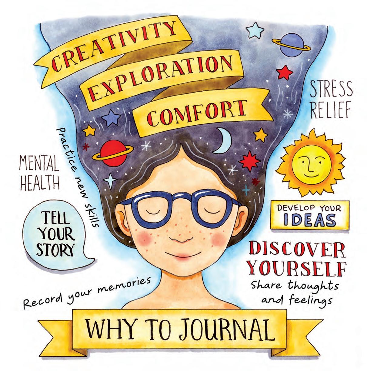
Illustrating your life can become quite addictive. My day just isn’t complete unless I make time for my journal, even if it’s just a few minutes of sketching or jotting down notes. Getting started might seem a little for it each day. As you get used to journaling, you’ll see improvement in your skills, you’ll become more creative, and you’ll start thinking in a more positive and mindful way.


Like any skill, your drawing will improve with practice. I think of my sketch journal as both a mental exercise and a form of meditation. It is both a way of exploring my world and a record of my life and thoughts.
Another benefit to committing to a journal habit is that you’ll see your own style develop and your art skills improve. You are under no obligation to share your sketches with anyone, although you may find that doing so will have a positive impact on your future efforts.

Some people find it inhibiting to start a new, pristine sketchbook or journal. I actually have two on the go all the time. I have one high-quality sketchbook that I use for “finished” pages that I want to keep and share, and another well-used, scruffy book that I use for learning and experimentation. Nobody sees that book but me!
Color (also called “hue”) is created based on the way an object reflects light. The color wheel shows how colors relate to each other and helps you create harmonious palettes. Primary colors cannot be made by mixing other colors. The primaries are red, yellow, and blue. Secondary colors are a mix of two primary colors. Tertiary colors are a mix of one primary and one secondary color. Shades are made by mixing a color with black, and tints are created by adding white to a color.
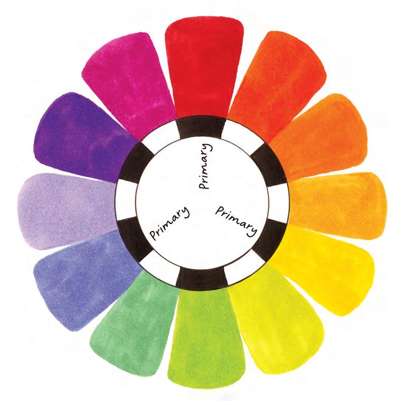
Analogous colors (next to each other on the color wheel)
Complementary colors (opposite each other on the color wheel)
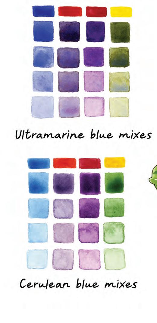
Color temperature matters when mixing colors. There is a warm and cool version of each primary color.

“Warm” blues are closer to red on the color wheel; “cool” blues are closer to yellow. “Warm” reds are closer to yellow, “cool” reds closer to blue.
“Warm” yellows are closer to red, “cool” yellows closer to blue. The top color palette shows ultramarine blue (warm) mixed with cadmium red (warm), alizarin crimson (cool), and cadmium yellow (warm) watercolors. The bottom palette uses cerulean blue, which is cool. Notice how the greens look “cleaner” when you mix with a cool blue! The purples look less muddy when created with a cool red.
Thumbnails are very small, loose sketches that are helpful for planning your layout before you proceed to sketching your drawing. I keep a notebook of thumbnails of ideas for future pages.
A color rough is a small, loose sketch that helps you work out your color scheme for a design. It’s a good idea to get your colors worked out before you dive into the finished piece.


I have a separate sketchbook with grid paper that I use to keep rough sketches of ideas for future journal pages. I used to think that I would remember my ideas in my head, but that didn’t work!
The finished page actually sticks pretty close to the very rough idea sketch. I left out the cat, and in hindsight I wish I had left him in, but remember, we don’t dwell on our mistakes!

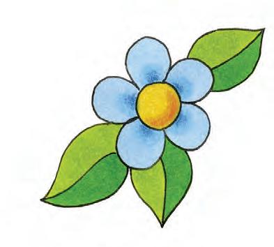
When you first begin to draw flowers, they will probably look something like this: a basic center circle and five petals. Flowers have endless variety, though. By combining different centers and varying the shape and number of petals, you can create many types of flowers for your journal pages.
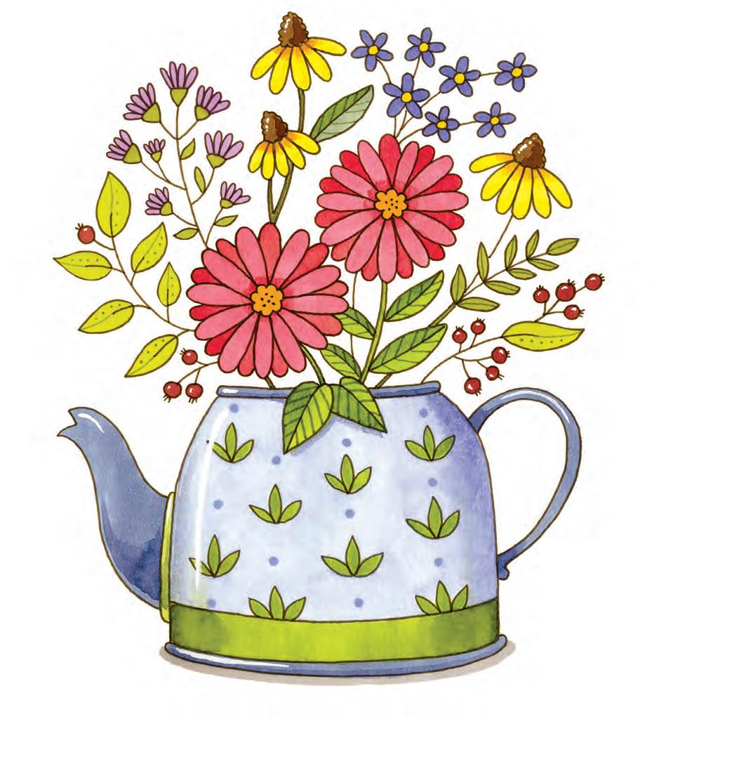
Here are some sample ways to doodle flowers. Draw with a pencil first, and make sure your pen is waterproof if you want to use markers to color them.
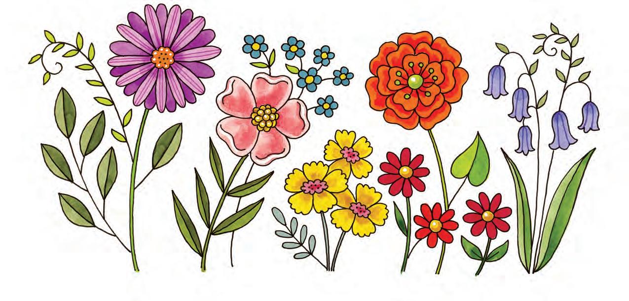
Be sure to vary the sizes and shapes of the flowers and leaves.
1. Start with a flower center.
2. Choose a petal shape.
3. Choose a leaf shape.
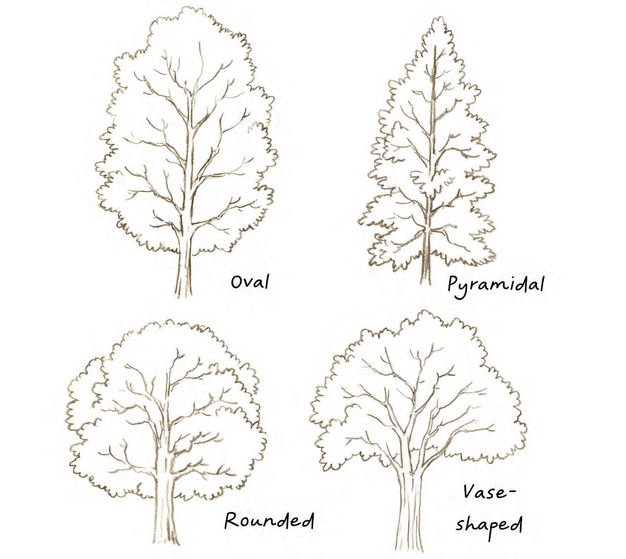
It’s tempting to draw all trees as just a simple trunk with a ball on top, but your drawings will look better if you add variety and a more refined shape. There are several basic tree shapes to consider.
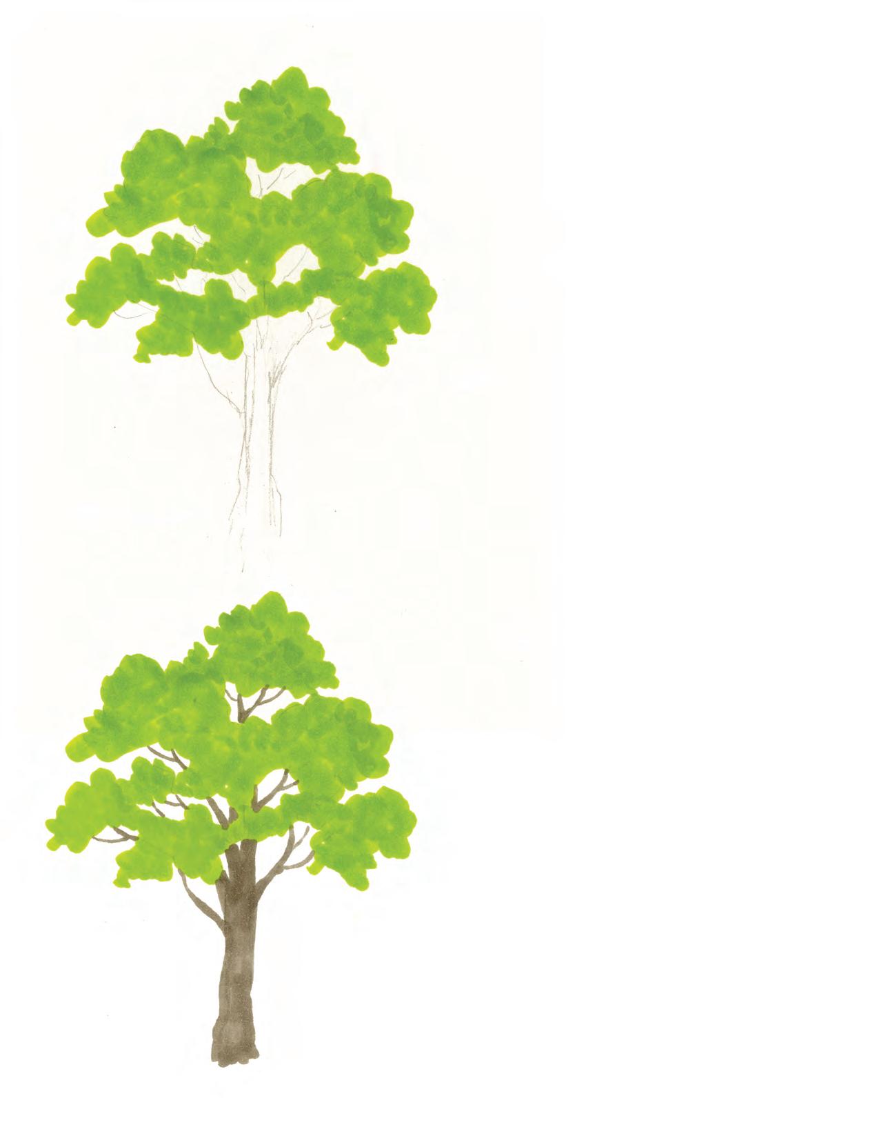
1. To draw a tree with markers, begin by lightly sketching the trunk with pencil. Then block in the rough shape of the foliage with a midtone green. Leave gaps where the sky shows through. The foliage is not a solid mass.
2. Draw the trunk with a warm gray marker. Place small twigs and branches throughout the gaps in the leaves. Erase the pencil marks.
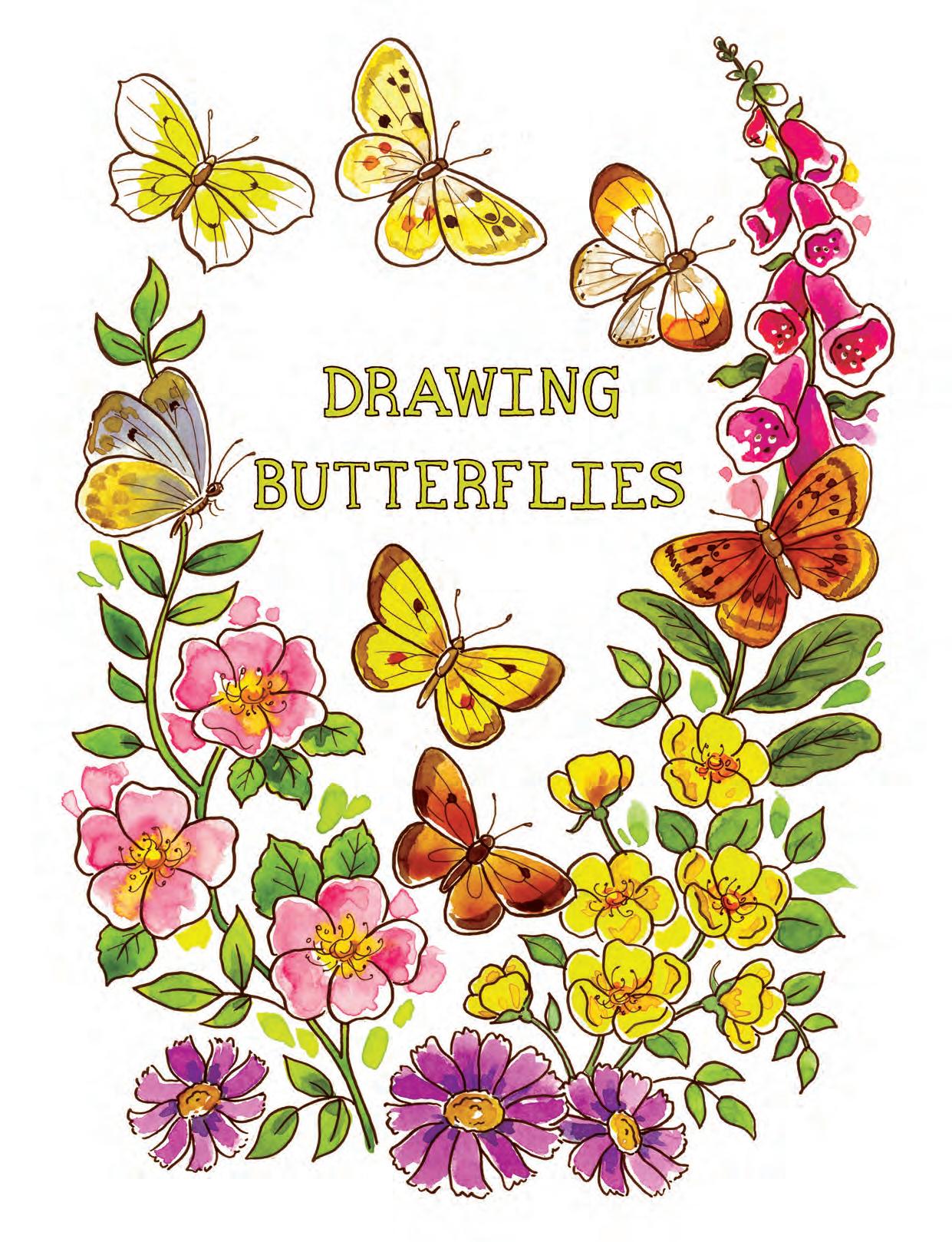
The key to drawing butterflies and other insects is symmetry. The right side is a mirror image of the left side. It can be helpful to draw one side, trace it, then flip the tracing over and transfer it onto the other side using graphite transfer paper. This is how I ensure that both sides are a good match.

For lettering, you really don’t need much more than a pencil and eraser, but many people like to get more elaborate in their journals and sketchbooks.
I always start with a pencil, keeping my graphite lines light so they can be easily erased. A clear plastic ruler is helpful for creating guidelines. Working on grid paper can also help you achieve straight lettering.
Waterproof fineliners are my go-to for lettering, but I also like brush pens when I need a more varied line. Outlined letters can be filled in with markers or paint.
Experiment until you find the tools that work best for you. Seek out pens that can be purchased open stock, so you can try them without needing to buy a large set.
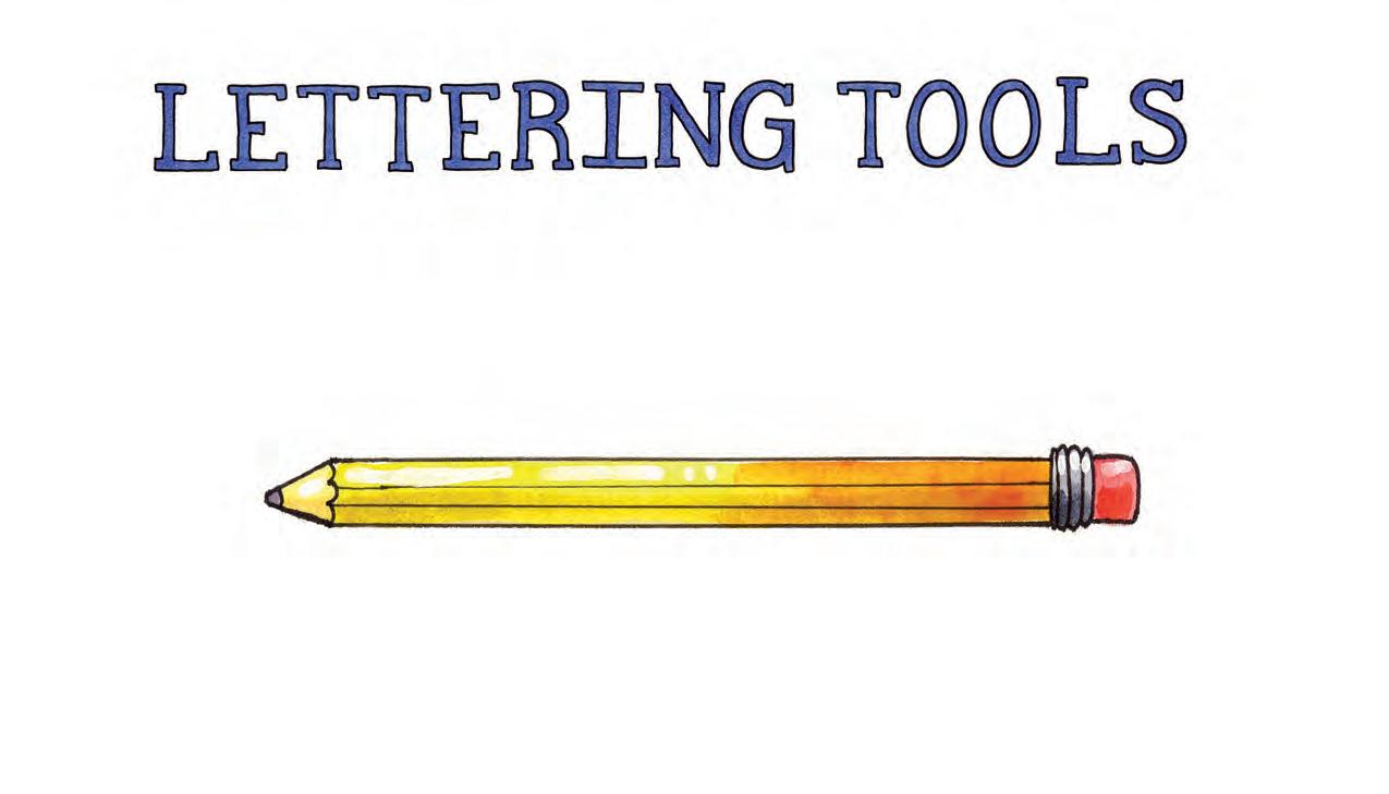

Here are some favorite fonts for you to try when laying out your journal pages.
Adding lettering in the white spaces around your drawing may seem like an obvious solution, but consider placing the lettering within the drawing itself. The fence posts and plant pots here were a perfect choice for placing text.

Feel free to use a variety of fonts or lettering styles on your journal pages. Remember, this is hand lettering, and the fact that it’s not perfect is just part of the charm.
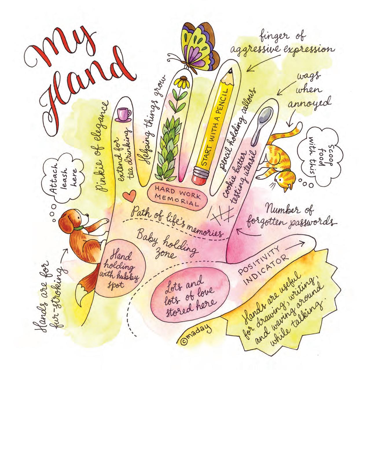
The hand is the symbol of the self. Have you ever seen palmistry charts that purport to show your future in the palm of your hand? Making a map of your hand is a good exercise in focusing on what makes you the person you are.

Think about the things and experiences that define you. For me, when I think of my hands, I think of holding both babies and paintbrushes, symbols of family and career.
Consider making a gratitude jar that you can fill with small notes of thankfulness.

Practicing gratitude for one month can rewire your brain and give you a more optimistic outlook.
Focusing on gratitude helps create a positive worldview. It can strengthen relationships and remind you of what’s important.
Practicing daily gratitude can reduce blood pressure, benefit your immune system, and have a therapeutic effect. Simply jot down a few items each day that made you happy. Your pages can be as simple or as complex as you like. Focus on each day and the pleasures you experience.

A journal is the perfect place to store special memories of loved ones. Consider making tribute pages of the important people in your life. Lately, I’ve made sure to share my pages with their subjects while I still can.

A tribute page can also focus on one special day in your subject’s life. Birthdays, anniversaries, and graduations are all important moments. These pages can make touching gifts.
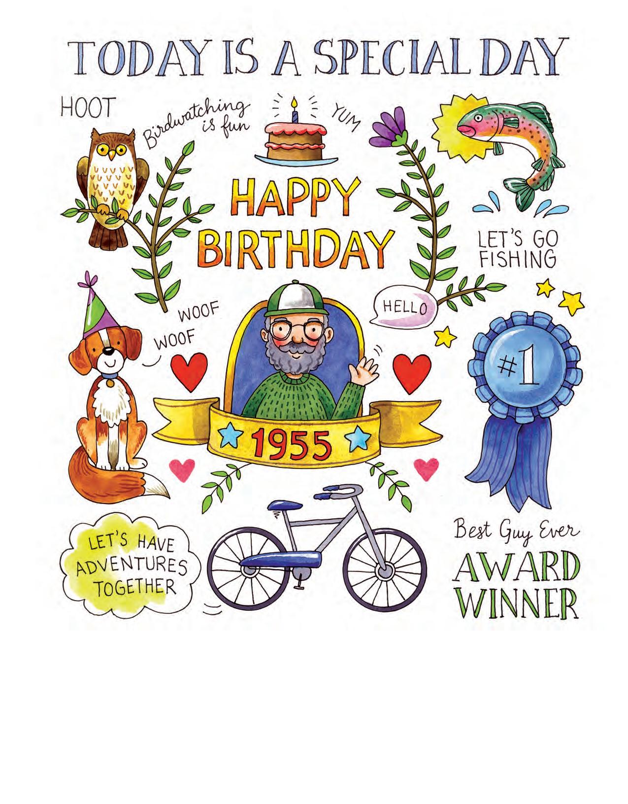
Step 2: Once you’ve worked out where you want everything to be in pencil, ink the lines with a waterproof fineliner pen.

Step 3: Color the page with watercolors. Sometimes I leave some of the page without ink outlines, such as the hearts on this page. I think a little variety adds freshness to the design.

