

In collaboration with Jeslyn Tan
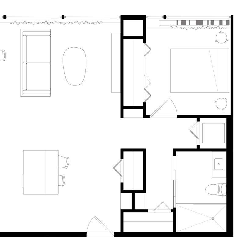
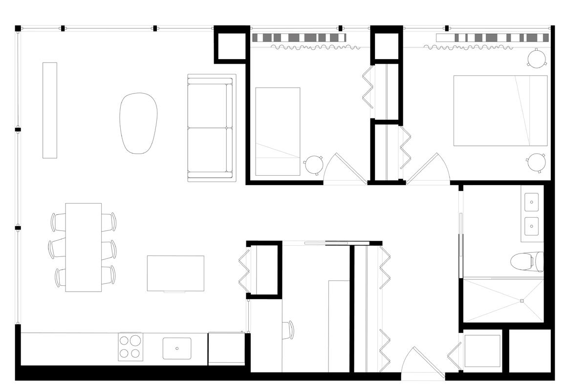
The project proposal seeks to build a 300-unit affordable housing complex and master plan located on an underutilized site in the Pilsen neighborhood of Chicago, Illinois. The existing empty condition encouraged the infill of a complementary design to integrate itself better into Pilsen’s existing diverse fabric. The site is bounded by 3 distinct conditions: an active commercial street to the South, a smallscale residential street to the East, and an elevated railroad line on the Northern boundary.
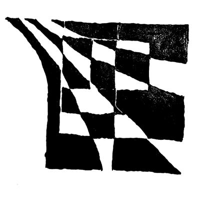
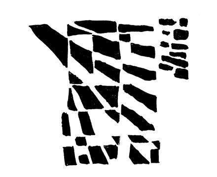
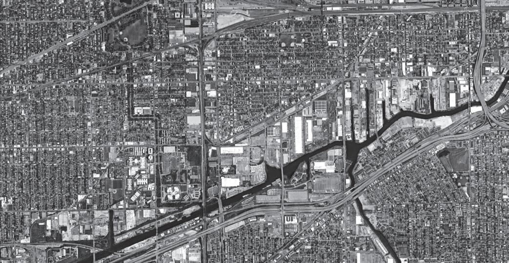
001 A 1914 Sanborn Map of the project site with now demolished National Lead Co. White Lead Works factory and surrounding neighborhood of trades and housing. 002 Current state of the empty and underutilized site located next to former Chicago, Burlington and Quincy Railroad railway. 003 Early figureground site studies.


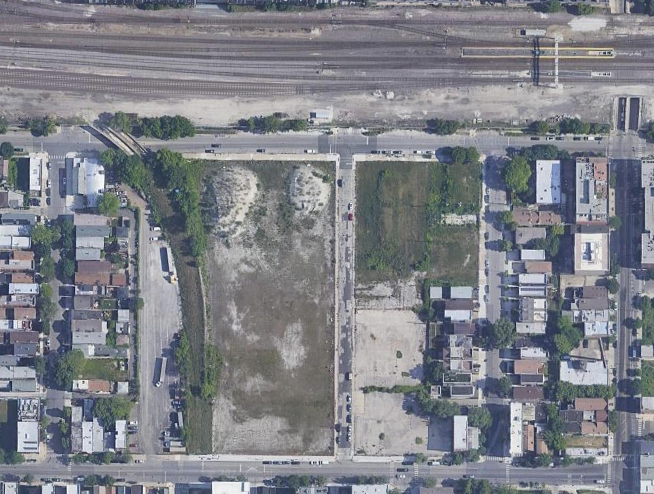


The industrial history of Pilsen grew after the 1871 Great Chicago Fire destroyed much of the existing city and displaced a majority of the population. Post-fire, Pilsen became a thriving live-work community due to its great labor resources and connection to the canal along the South Branch Chicago River for ease of transporting goods. Due to the relevance of our site historically playing into this narrative, the concept explored the elevated railway system in Chicago.


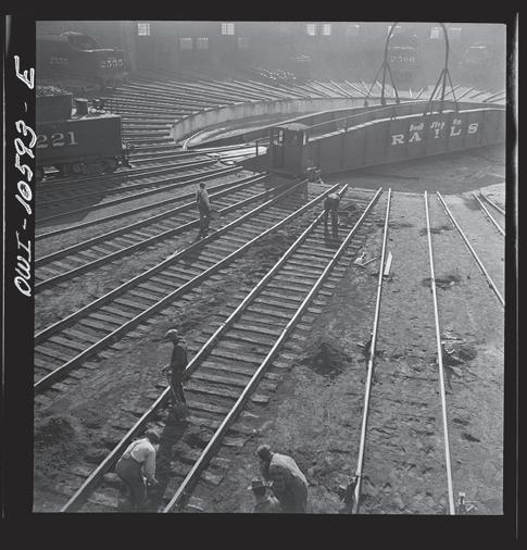
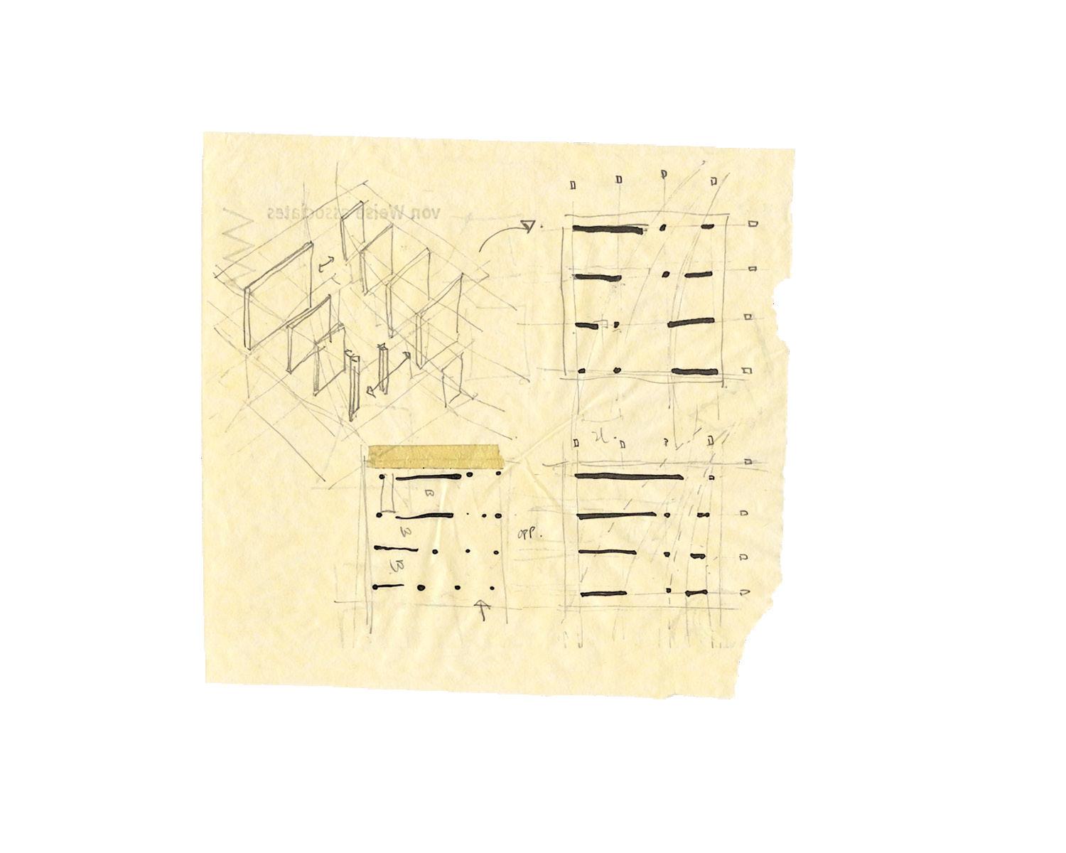
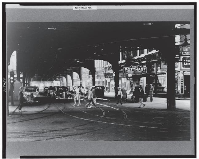
004 Under the elevated tracks. Chicago, Illinois (1940). 005 The turntable at the roundhouse at an Illinois Central Railroad yard (1942). 006 Early sketches exploring the integration of railroad history and over/under conditions of the elevated railway lines in Chicago.




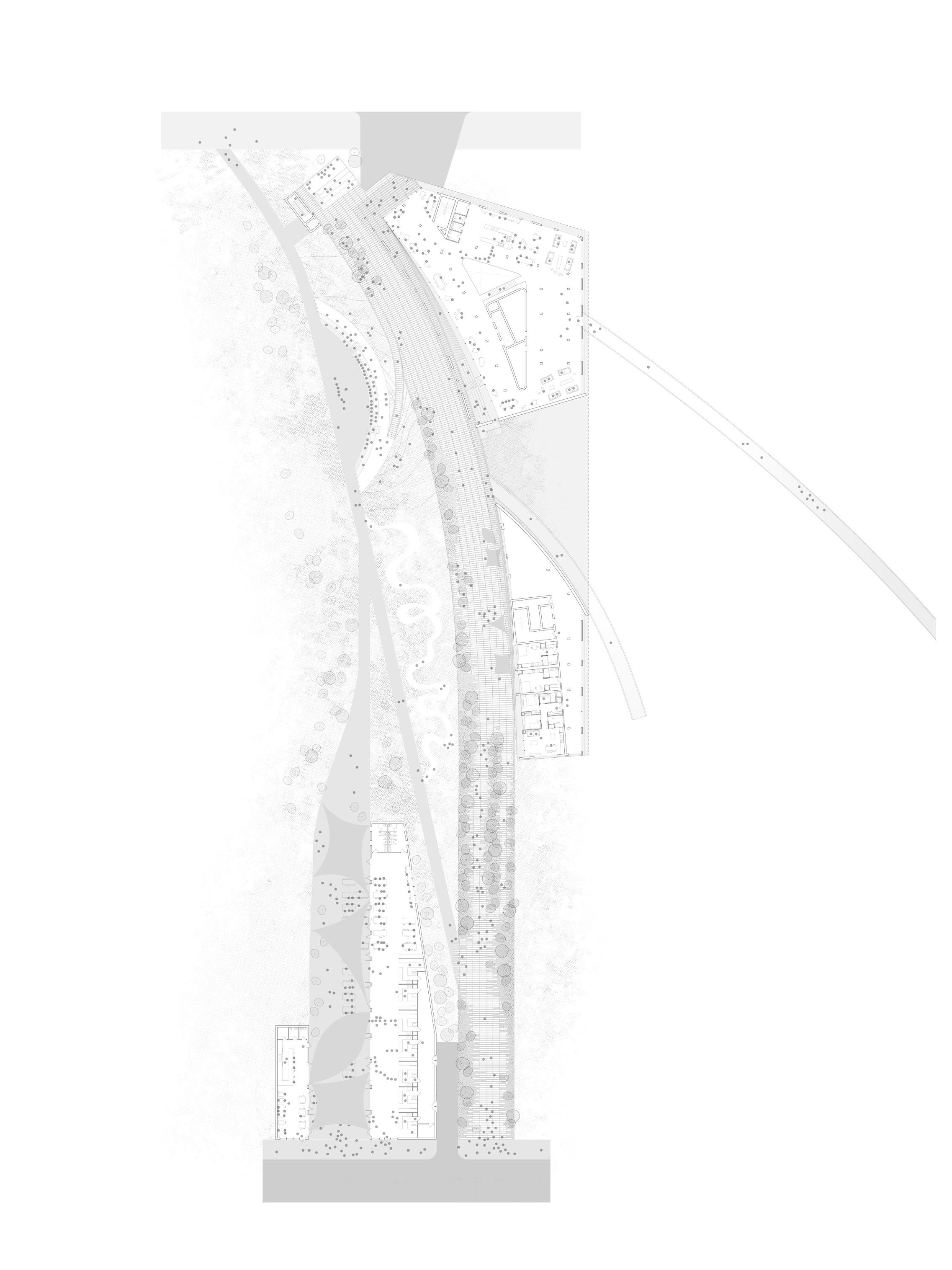


The El Paseo trail is a proposed 4.2-milelong recreational trail traveling from the northernmost boundary of Pilsen, located on our site, South and into Little Village. The proposed development is a result of the decommissioned and underutilized Burlington, Quincy and Chicago Railroad that historically transported goods to and River. This proposal realizes the El Paseo

uses such as food markets, an outdoor amphitheater, an observation deck, and arrayed along the curve of the El Paseo


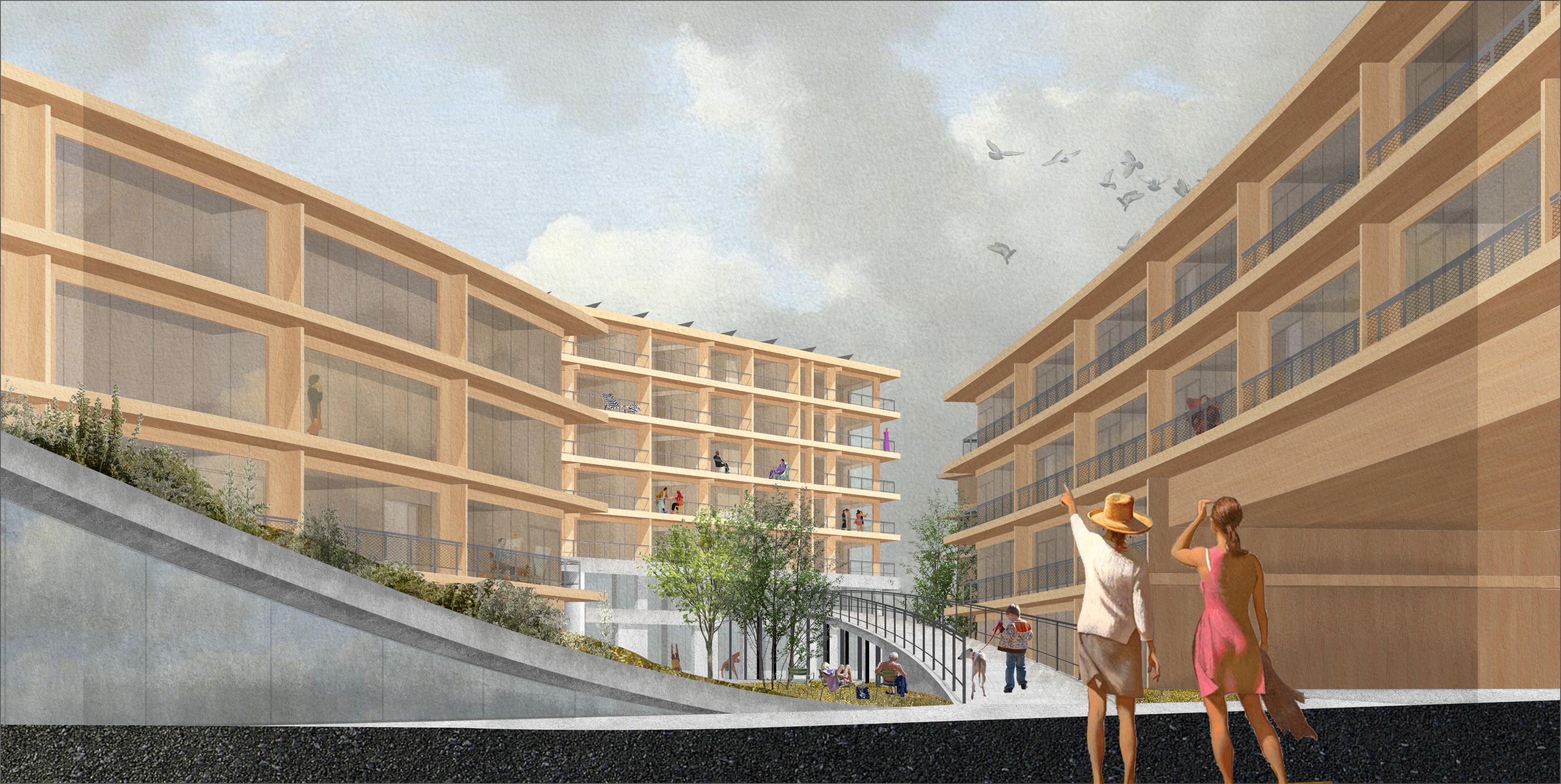
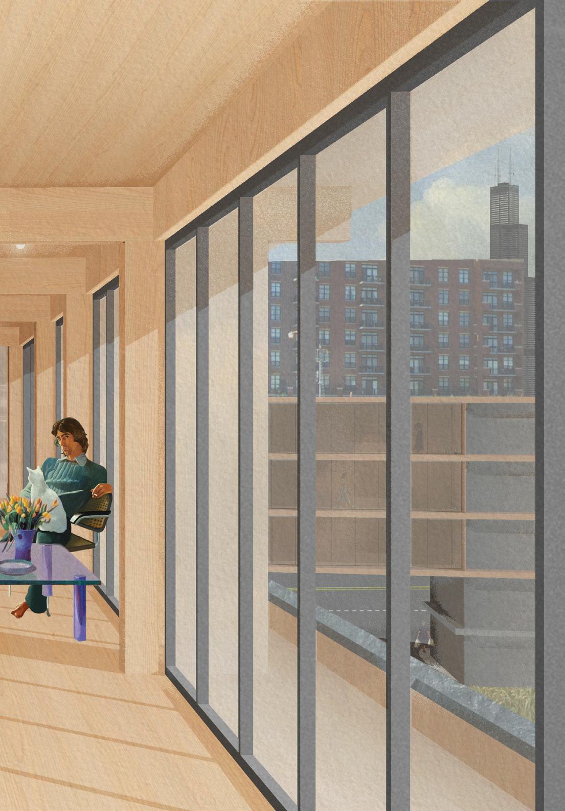
008 Collaged site render looking West toward the large apartment complex between the avenues created from smaller building typologies.


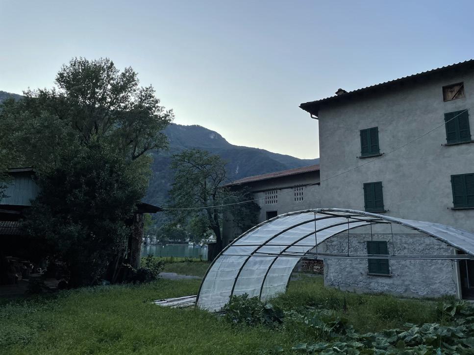
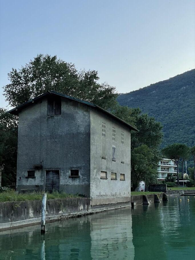
This project is located in a small village town on Lake Lugano in the southernmost canton of Switzerland. This project proposes a small-scale elementary school classroom pavilion that further extends the footprint of the site with the reuse of two underutilized storage buildings for further educational and administrative programs. Many programmatic decisions were based on the pedagogical reforms in the Ticino school system made present in the existing post-war elementary school designed by Swiss architecture trio Aurelio Galfetti, Flora Ruchat Roncati, and Ivo Trümpy. Contrasting the common American elementary school system, these schools took into account the new freer and more community educational concepts.
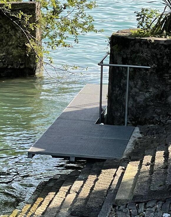
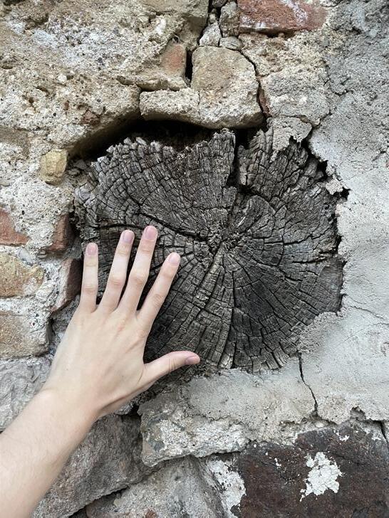
009 Original school designed by Aurelio Galfetti, Flora Ruchat Roncati, and Ivo Trümpy in Riva San Vitale (1963-64/72-73). 010 + 011 Photos from the proposed site for the new school with existing underutilized buildings.
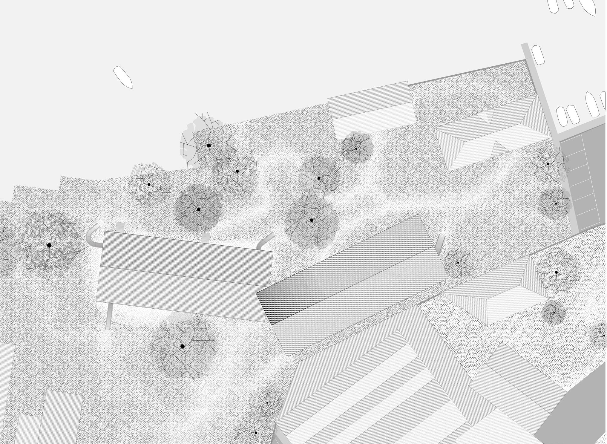

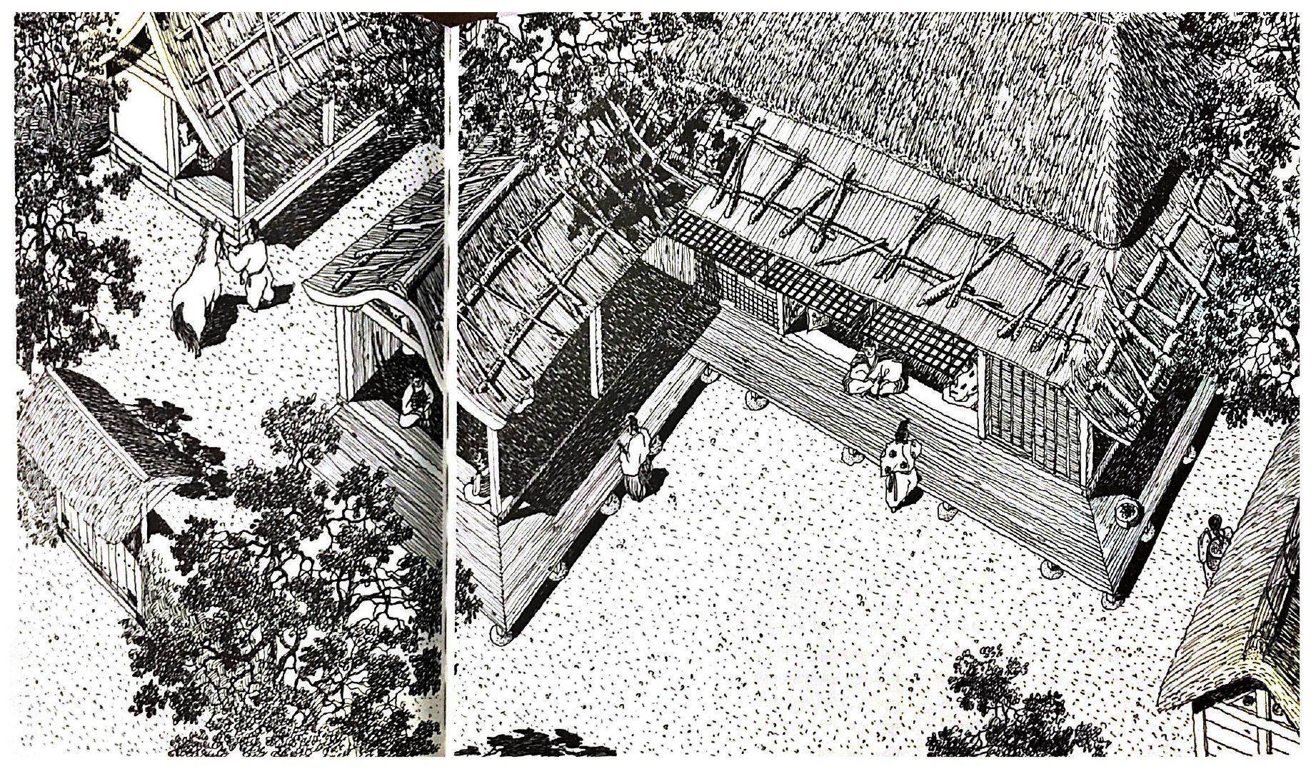
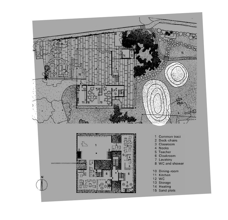
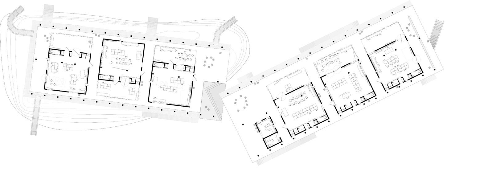
The qualities of prevalent and jumping-off metaphorically group’s bern which between the more playground to Period
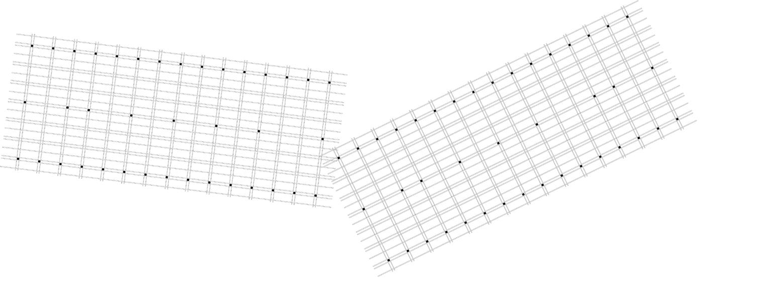
Examples of grate Original Aurelio Ivo Trümpy earthen
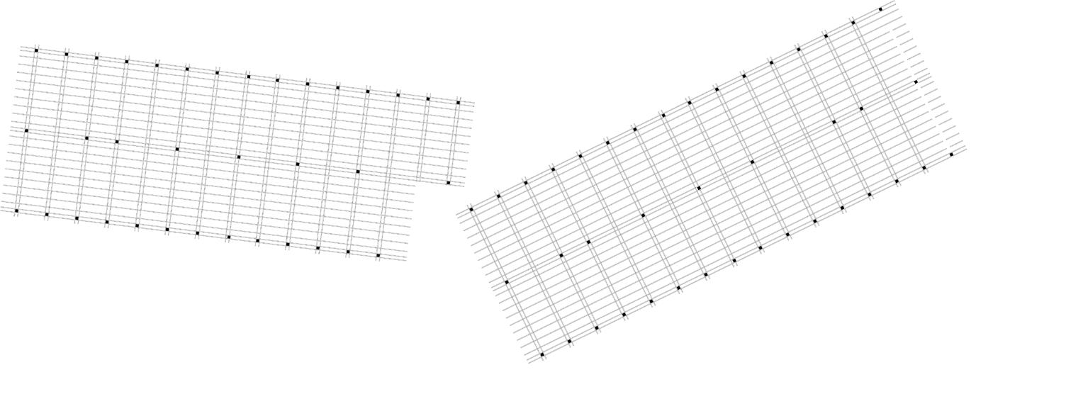






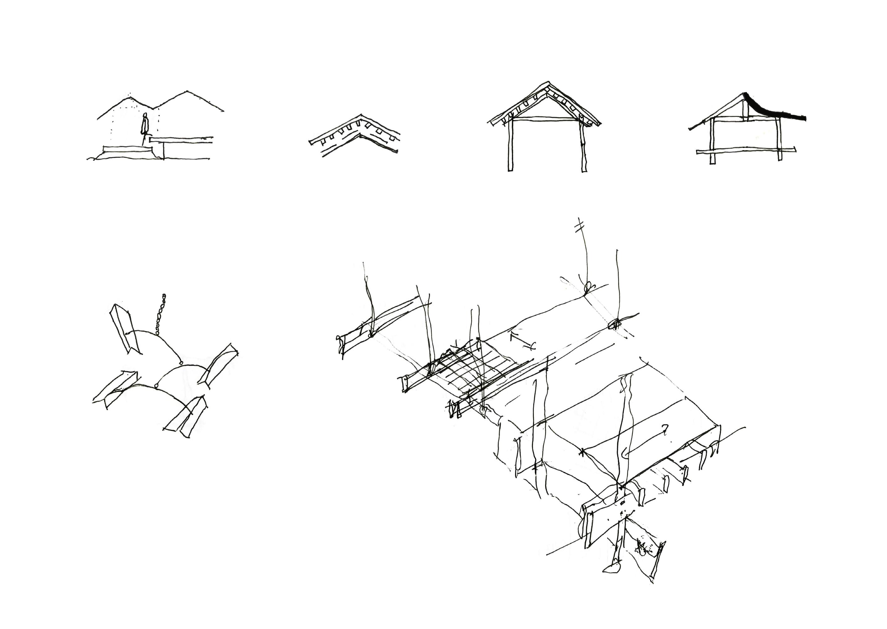
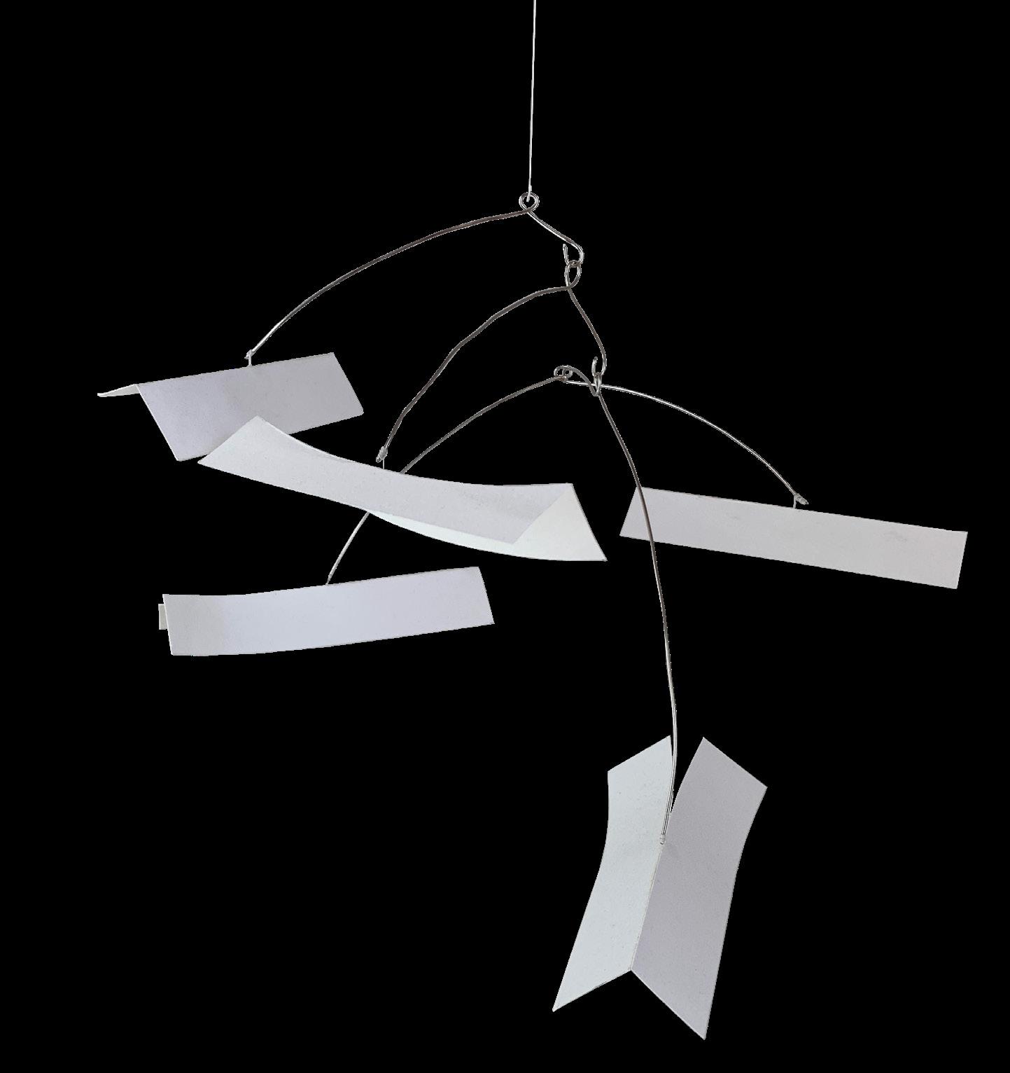
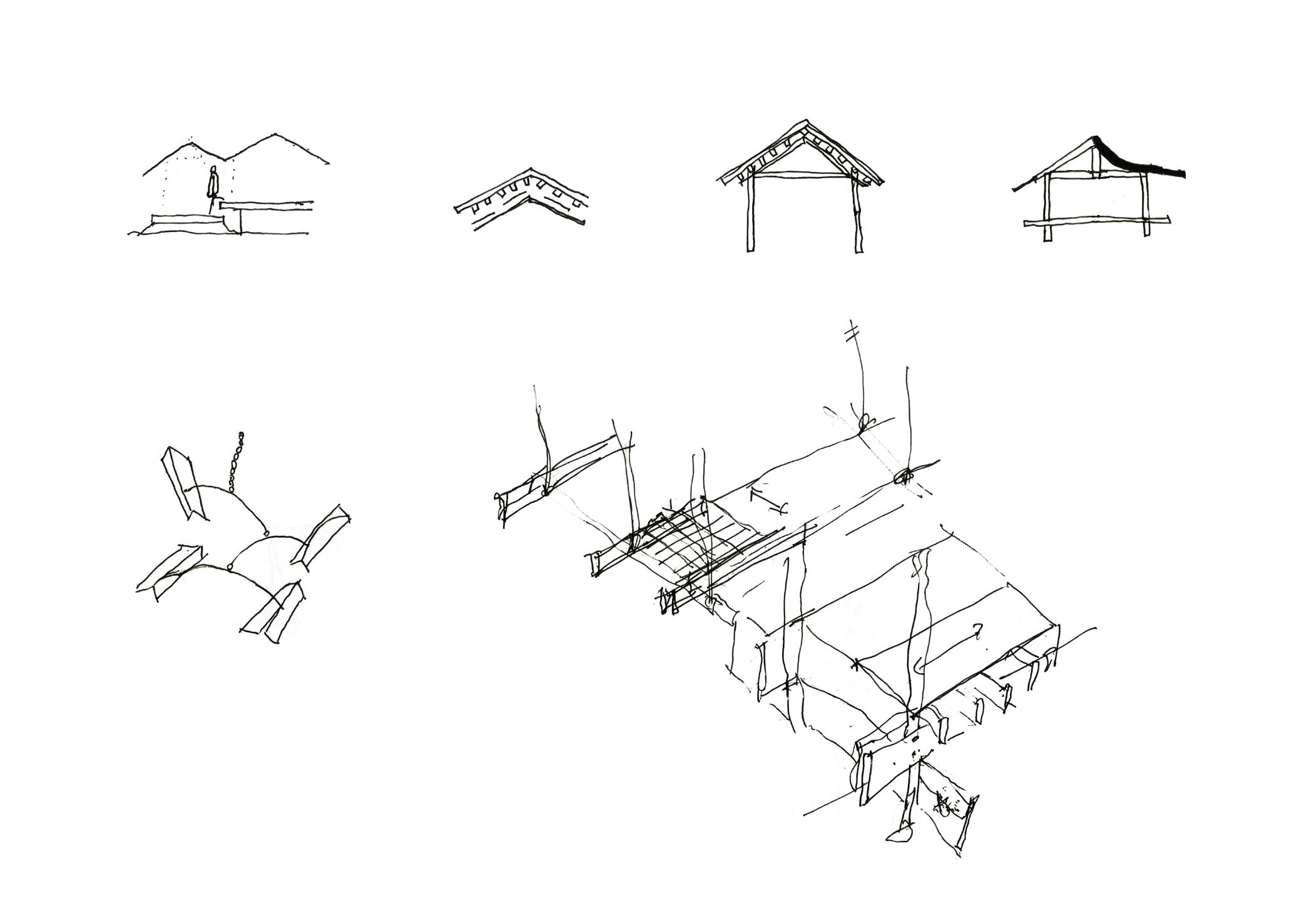
015+016 Collages of differing scales showing the tectonics of the school. 017 Mobile of gable roofs studied and considered in the design process. 018-020 Preliminary sketches documenting the design process of different aspects of the project.




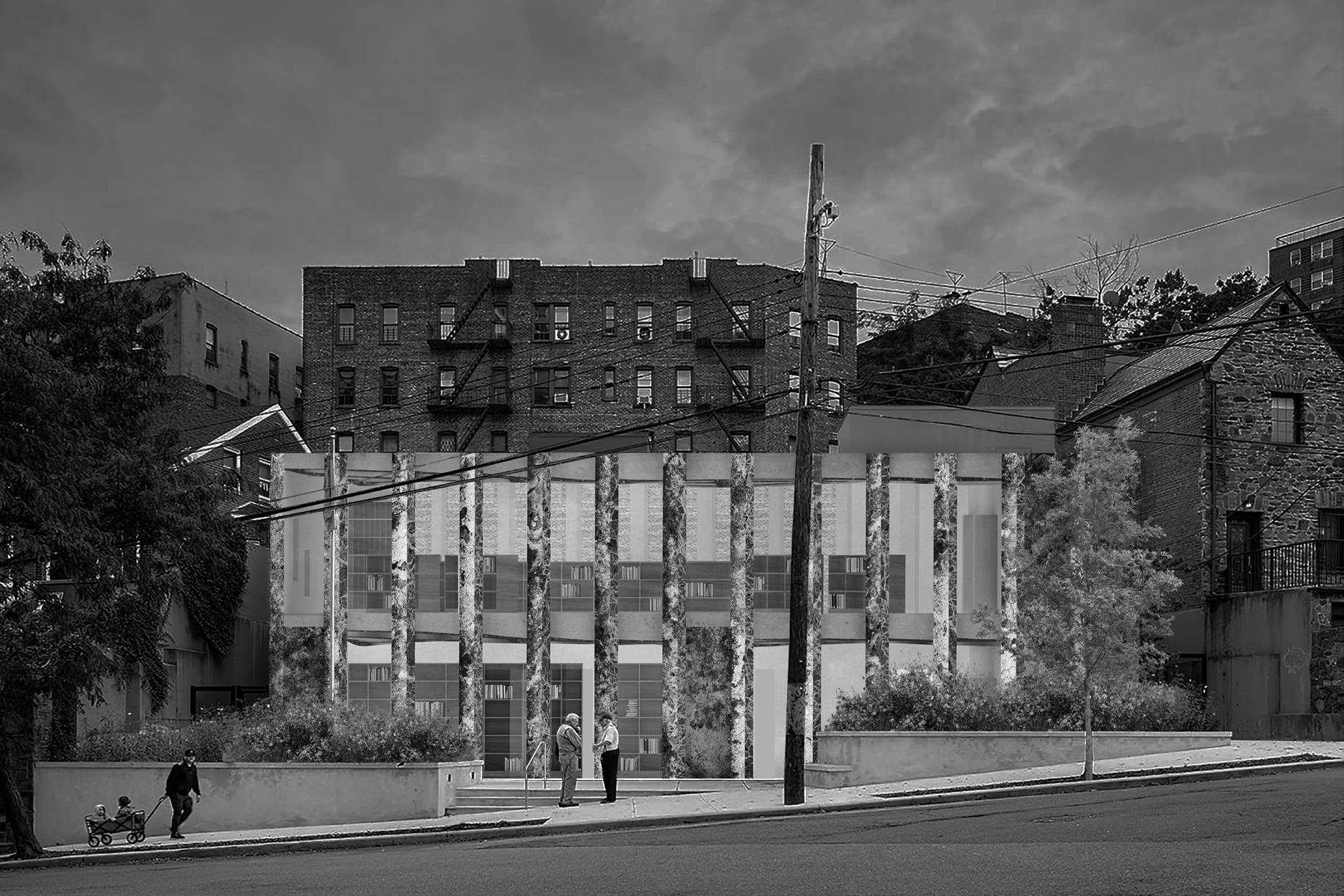
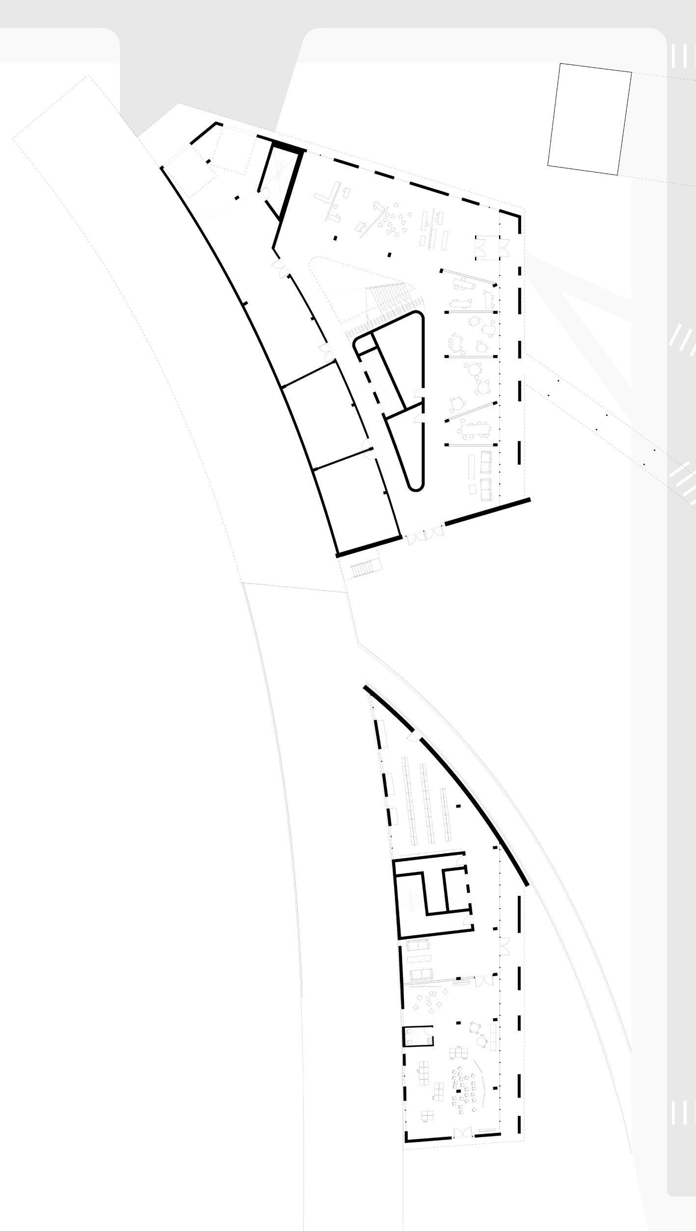
In the past, libraries acted as beacons of infrastructure for literacy. In the era of Carnegie’s philanthropy, libraries gave free access to books for those who previously had limited access. Over a century has passed and libraries have lost public favor and funding. This project tackles the current dilemma of designing a public branch library that responds to community needs. In a time with inequality in access to information and opportunities persists, it’s important to create a space that welcomes the surrounding neighborhood.
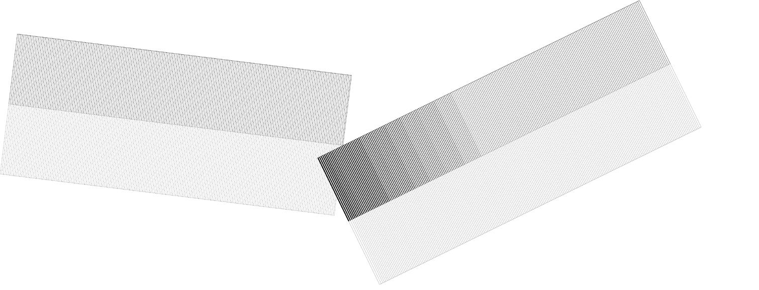
The facade makes use of lenticular design to make commentary on the connotations of neoclassical and institutional architecture styles. The change between a transparent and monumental facade depends on the direction of approach.
021 Front facade facing Cannon Pl showing adjacent neighborhood context. 022 Differing facade conditions based on the perspective of approach. 023 Graphic expressing the appropriation of materials from 20th century Bronx libraries in the Ctrl+C - Ctrl+V nature. 024 Large Manhattan schist outcropping at the rear of the site. 025 Fondazione Querini Stampalia detail by Carlo Scarpa, 1969.
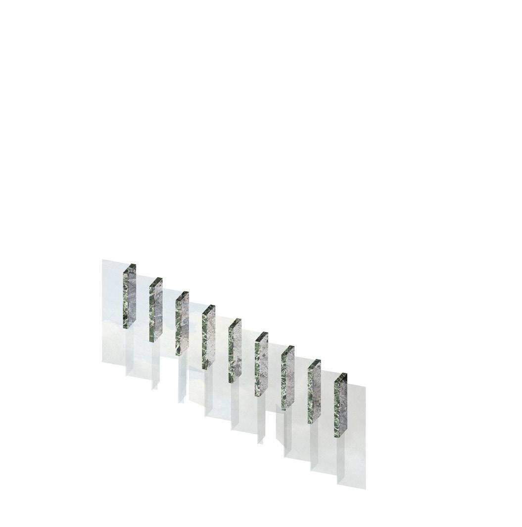
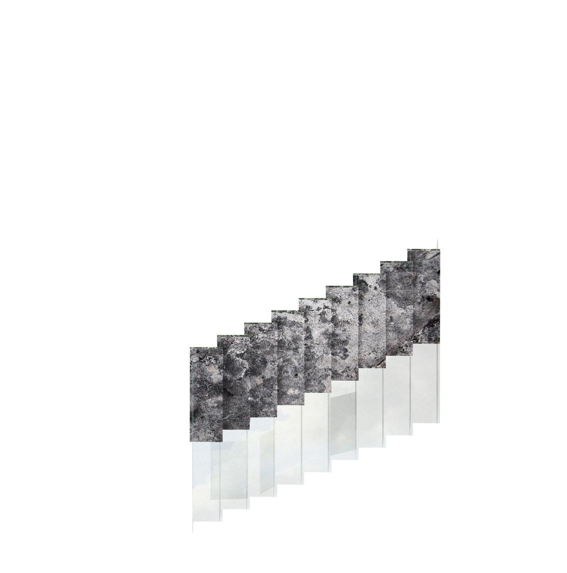
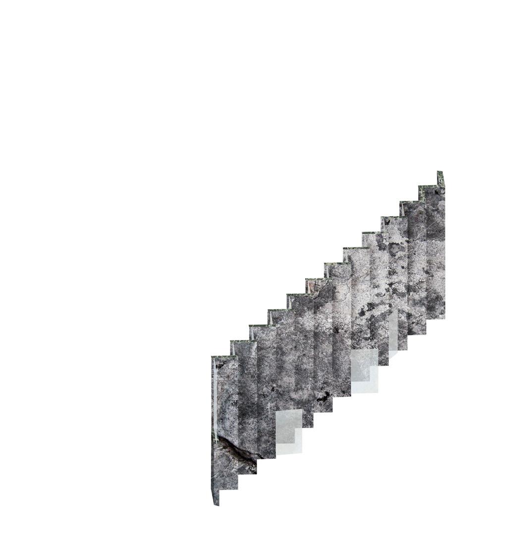
+ brick + concrete + glass , flags , bronze sculptures , intimidating facade , carved plaques , strong street presence
+ brick + concrete + glass , flags , bronze sculptures , intimidating facade , carved plaques , strong street presence , stairs

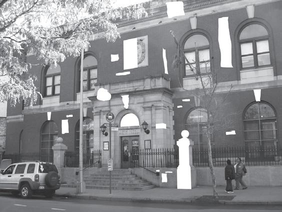
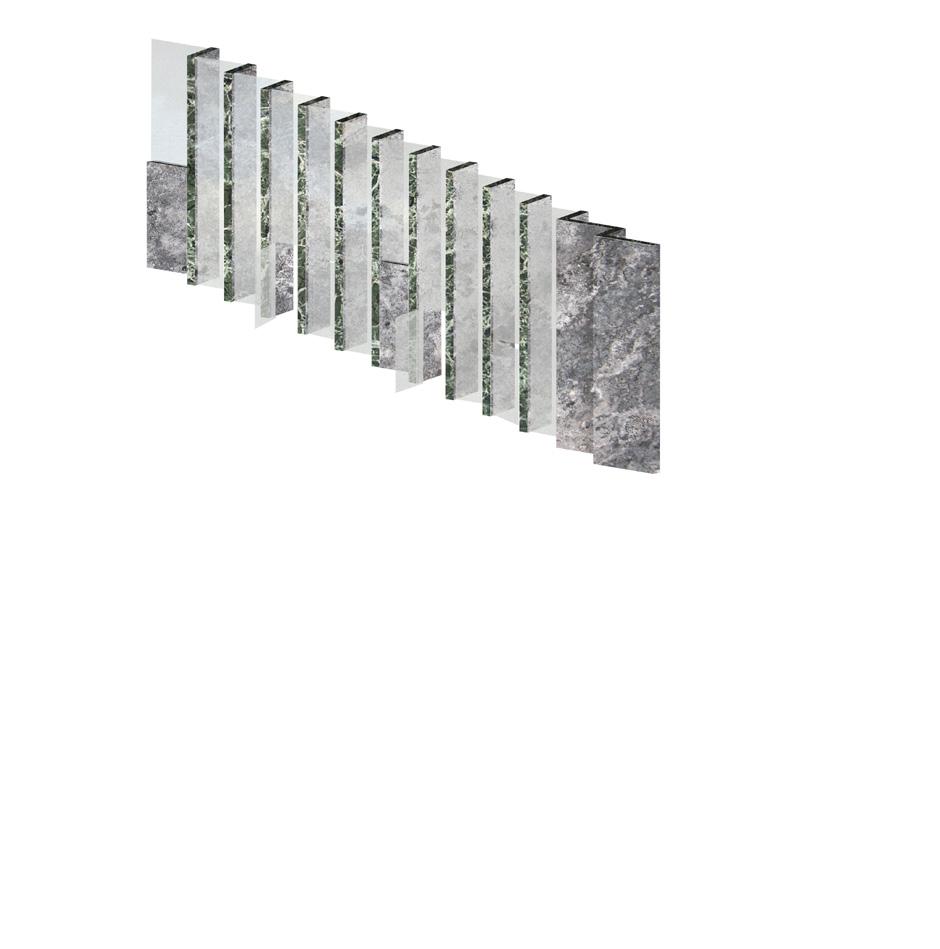
+ brick + concrete + glass , flags , bronze sculptures , intimidating facade , carved plaques , strong street presence
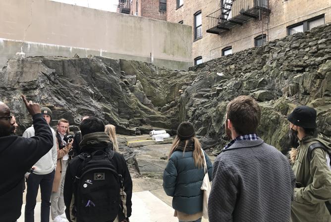


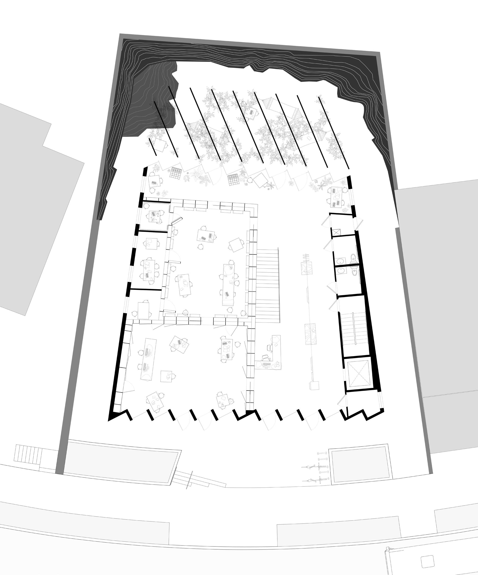
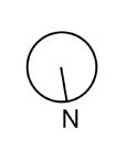
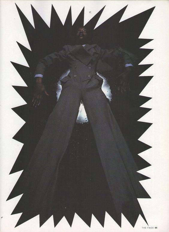
026 Collages exploring the concept of a series of interconnected parlor rooms reminiscent of traditional Western architecture in juxtaposition to the International Style and Le Corbusier’s free plan. 027 McQueen Of England editorial by Nick Knight for The Face, November 1996.



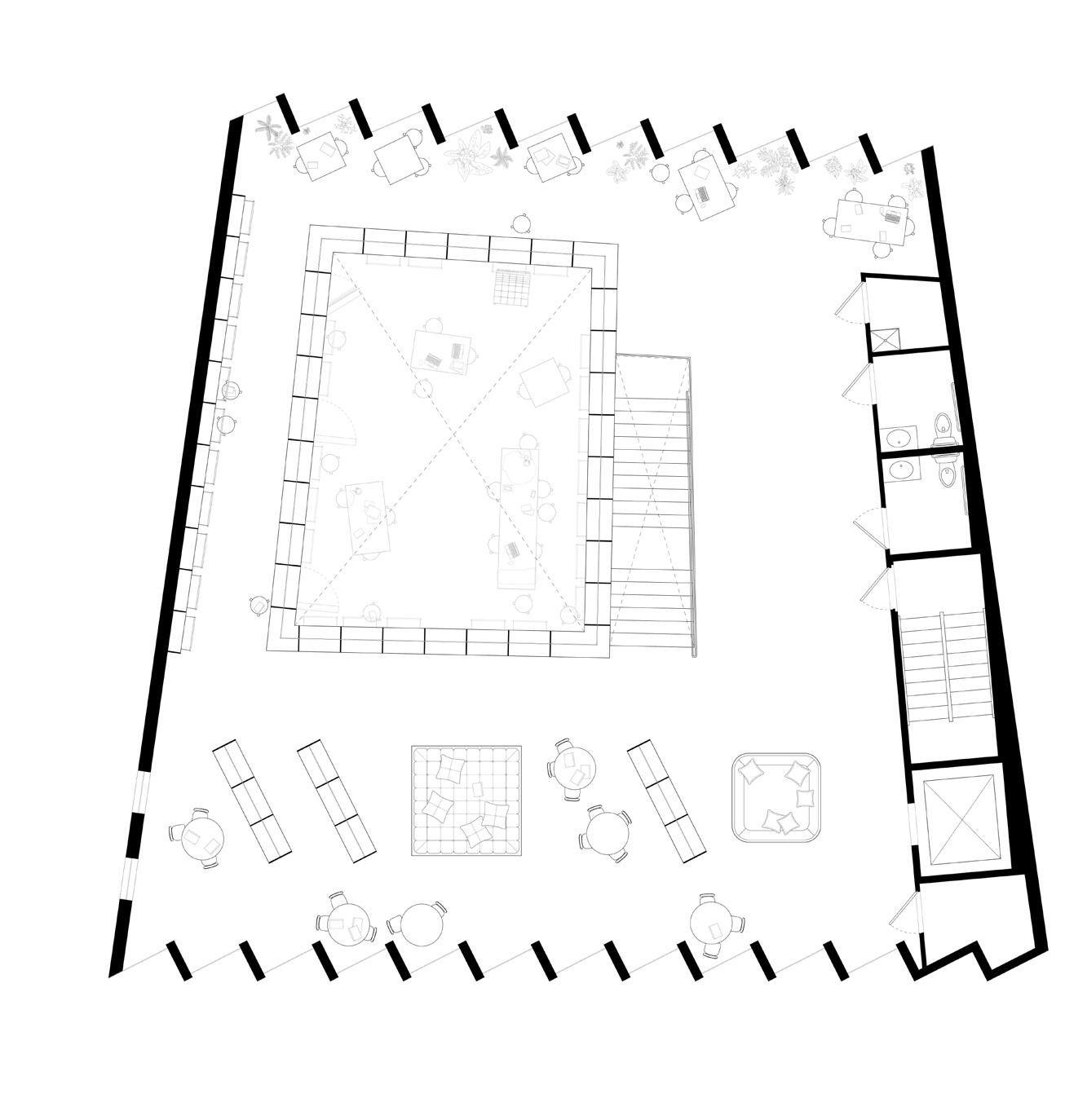
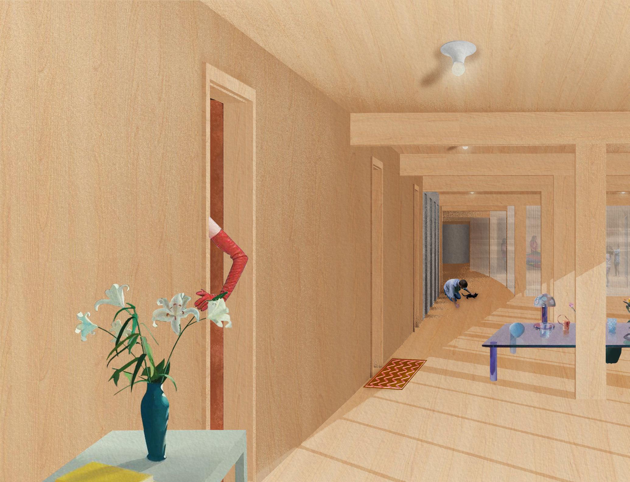
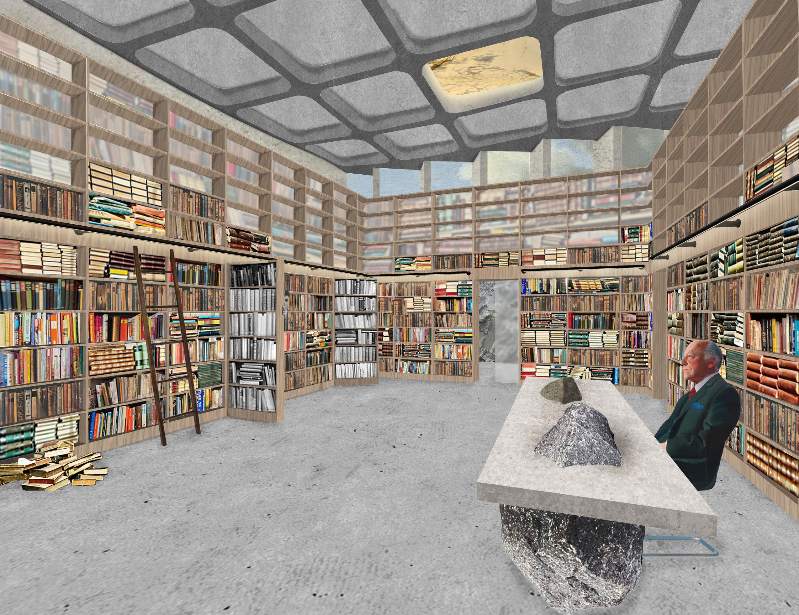
028 Collage render of a view inside the adult reading room with bookshelves that extend to railing height on the second floor, creating an atrium. Bookshelves disguise concealed study spaces and a recording studio available for reservation by community members. Custom waffle slab ceiling and onyx skylight seen above.
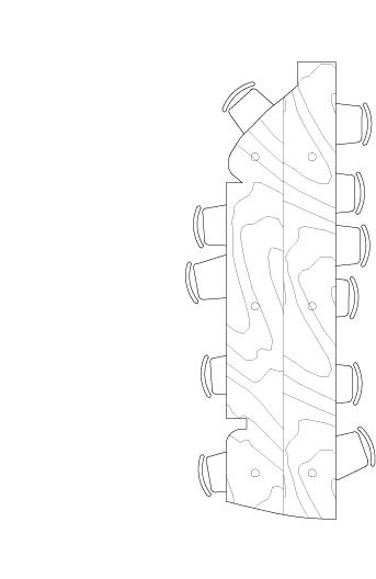
029 Early study exploring the method of pouring rockite in molds of miniature topography. 030 Final rockite iteration showing the combination of a varying topography intersected with a disciplined grid which creates a new take on the structural waffle slab ceiling. The contrast between rough and smooth is also present within the proposed ceiling. 031 Early sketch of the dolmen tables dispersed throughout the library.


3rd year, 1 week
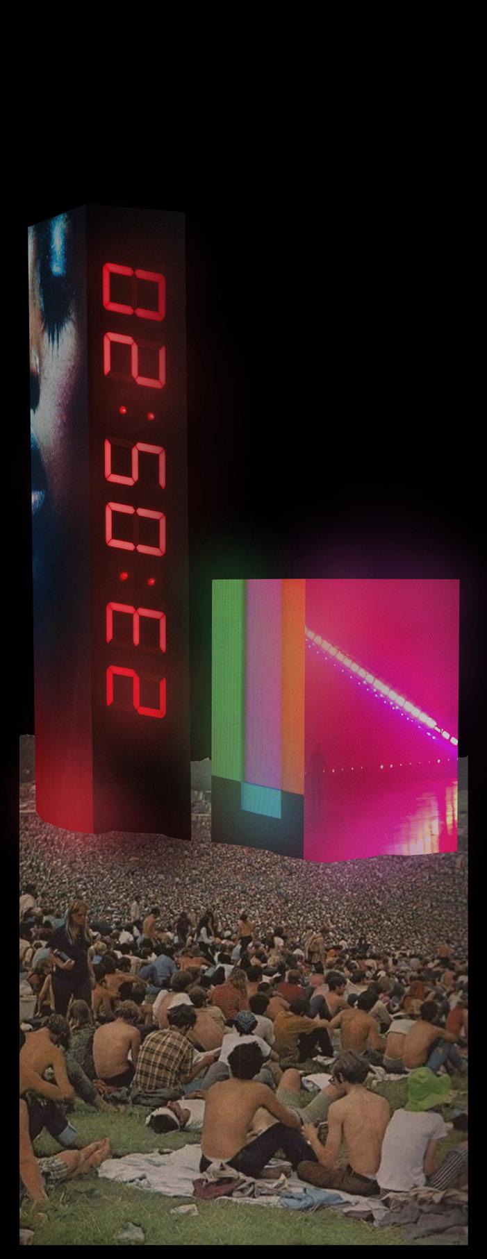
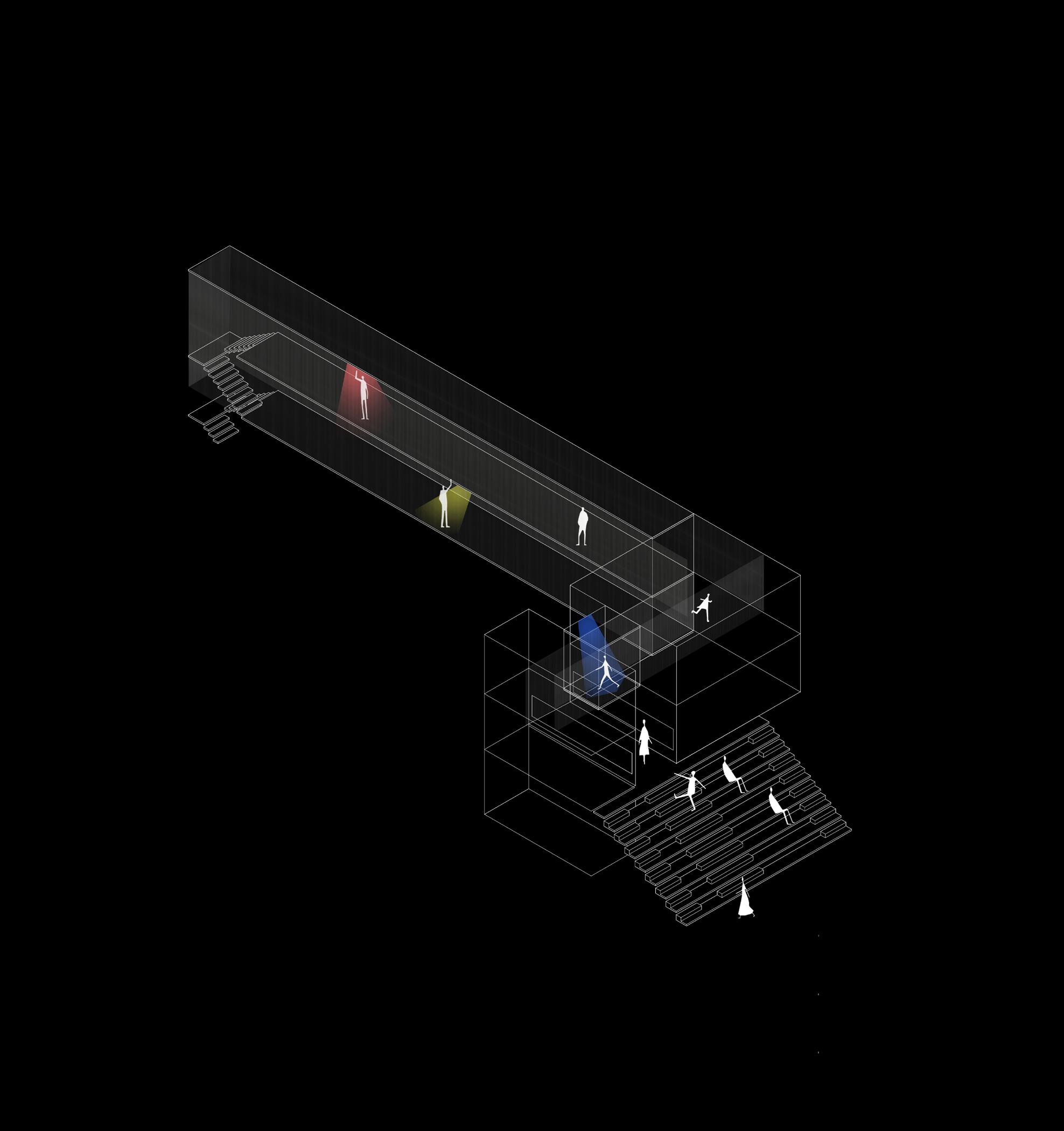
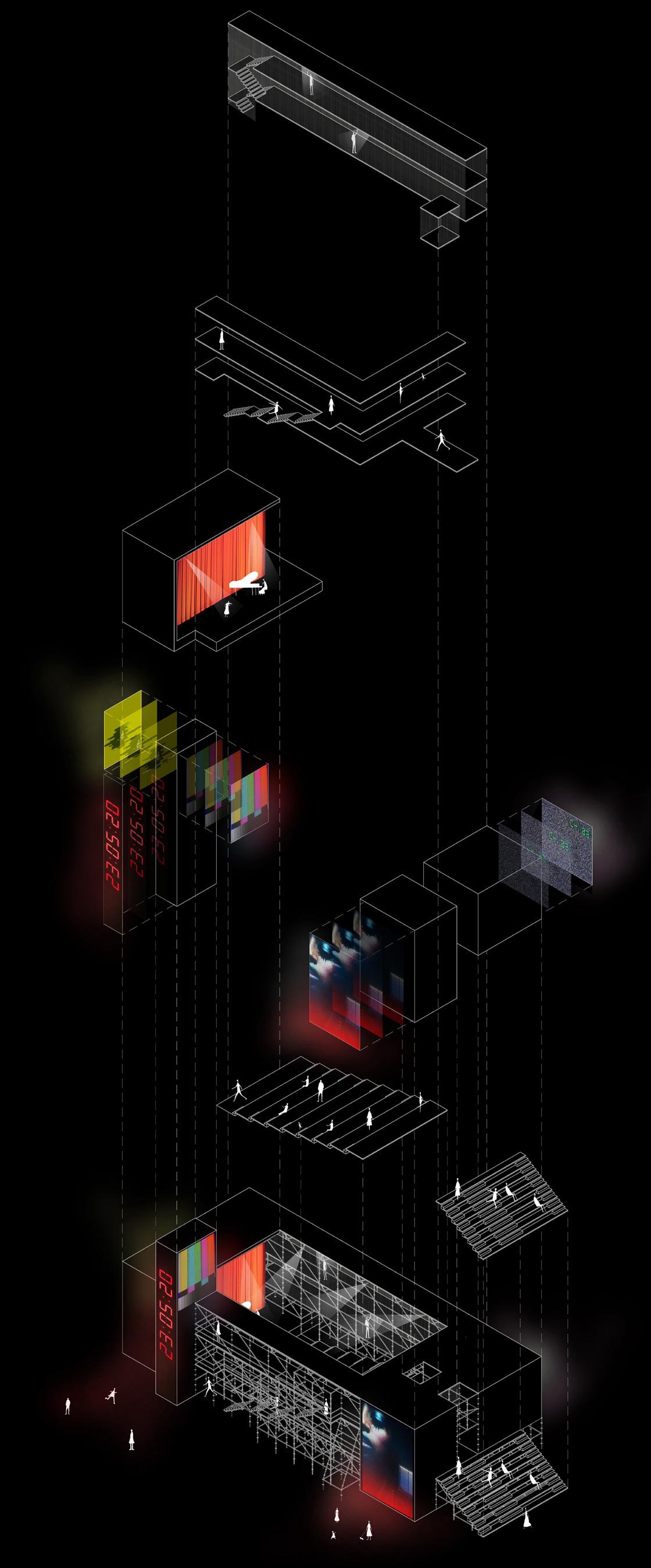
This open-air theater centers around nighttime and the idea of multi-scale interactive performances. Viewers in the stadium seating have a different experience from those on the balconies to those viewing from the lawn outside the main structure. The idea was to keep things temporary, so scaffolding was chosen as the main building component. Media pylons tie back to the grandiose of the pylons on campus while displaying live performances. In addition, they leave a sense of heightened tension and buildup to the performance with a digital countdown.
This entry also explores the processional aspect of a performance. The backstage becomes the entry for visitors, as they must walk through a two-way mirrored entry exposing the behind-the-scenes. A multistory glass catwalk expands the typical idea of the main stage.
032 Media pylon collage. 033 Axonometric showing the procession of performers from private spaces to the transparent catwalk. 034 Exploded axonometric graphic breaking down the prominent layers of the open air theater.
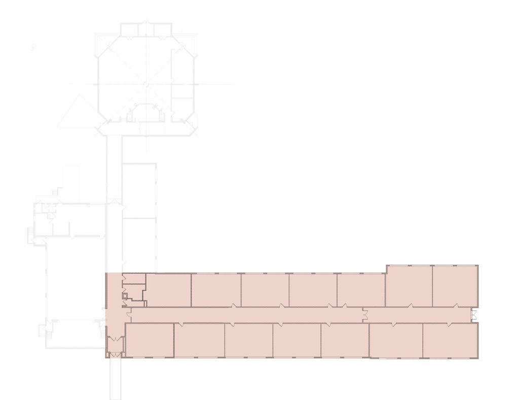
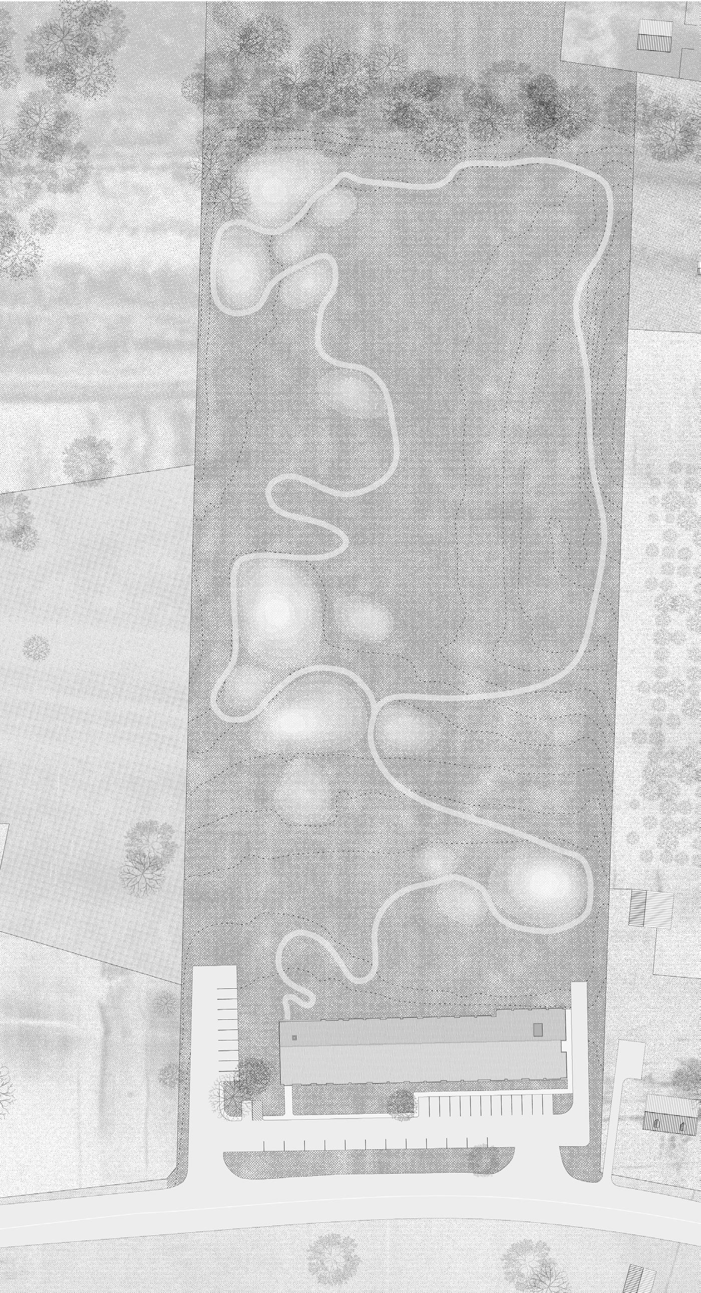
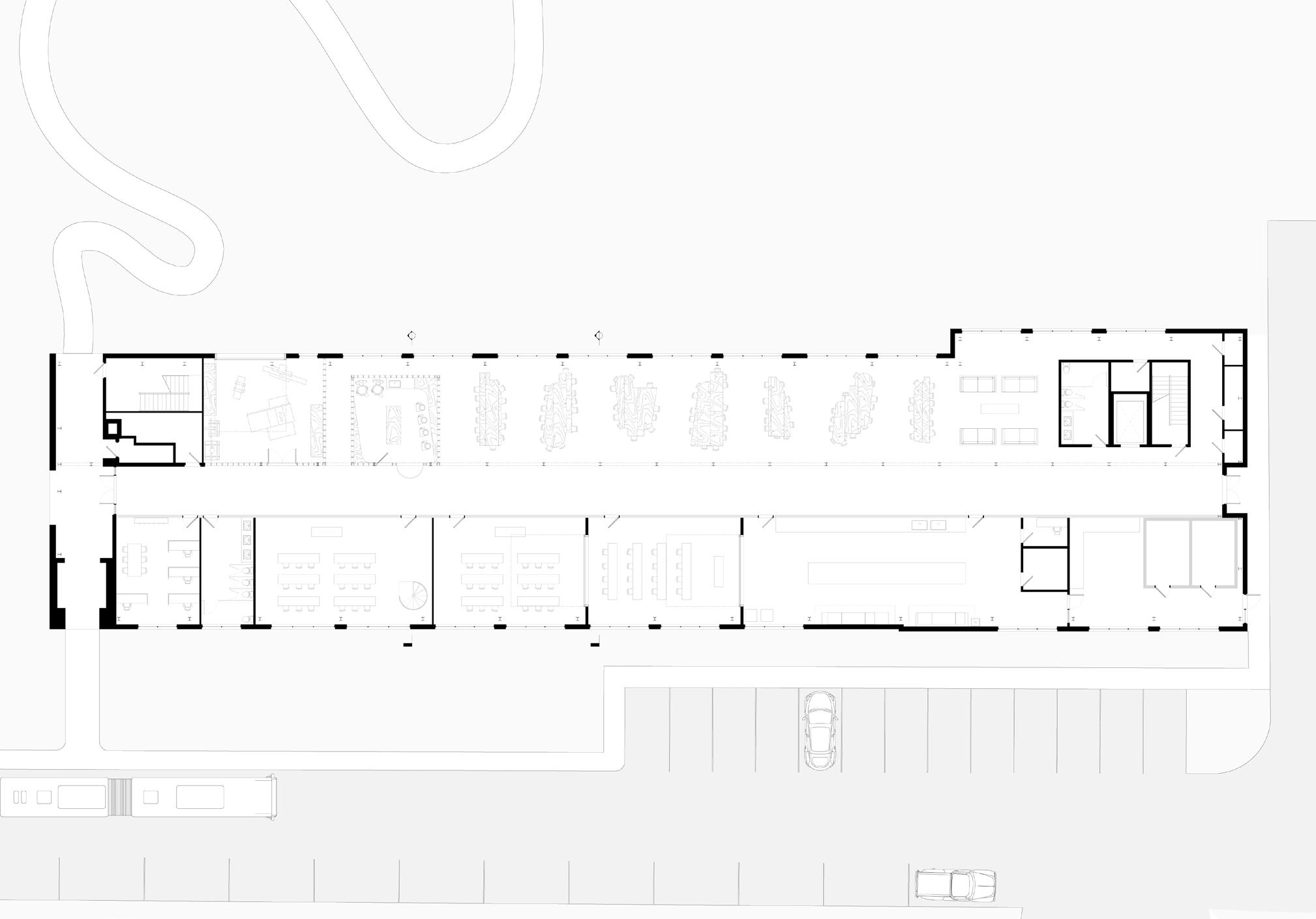
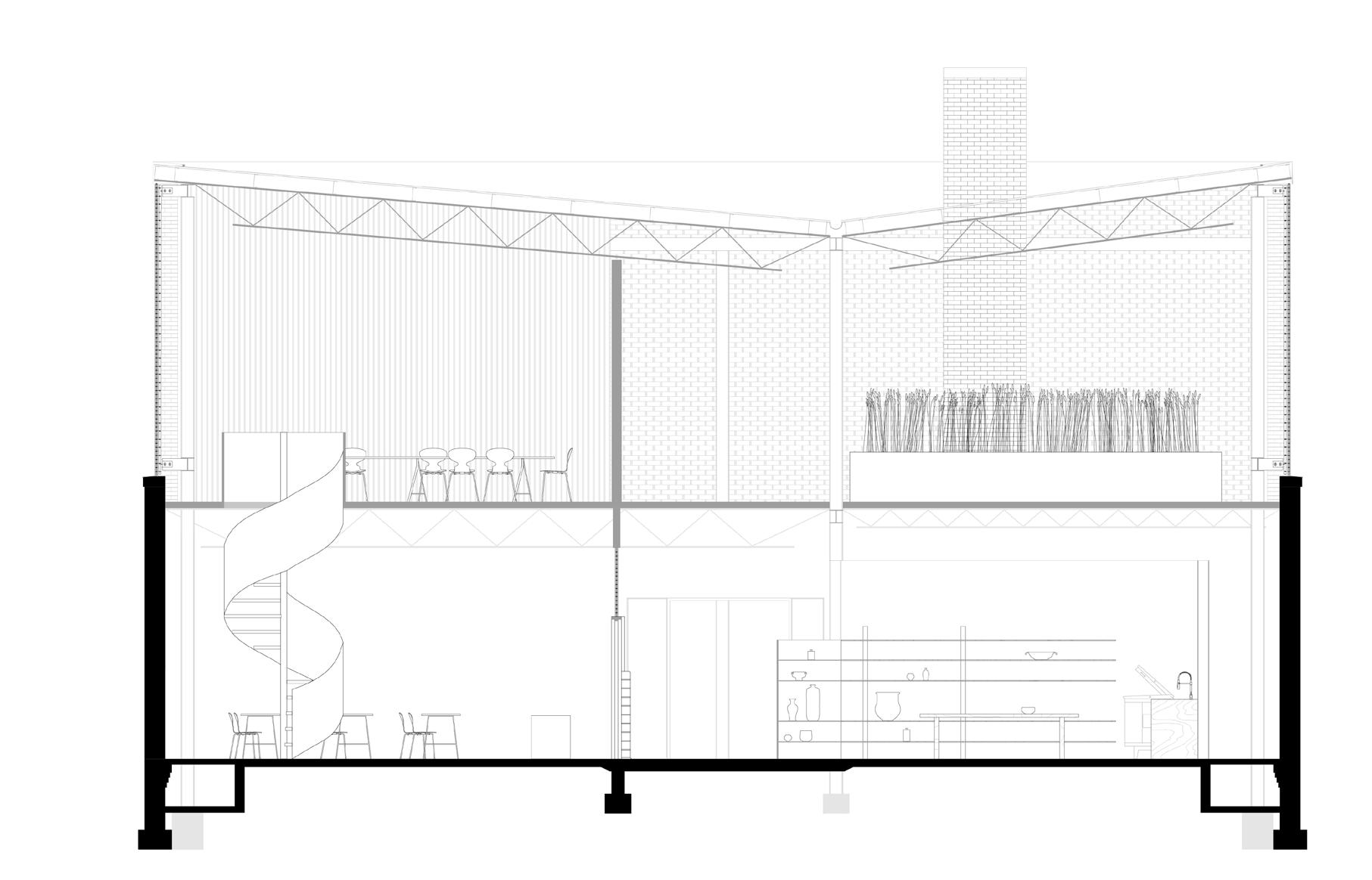
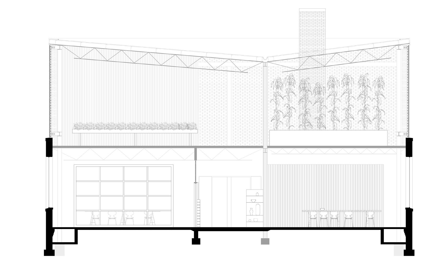
The project is an adaptive reuse of an existing 1951 public elementary school. We were asked to create a food center for Blacksburg, VA and the surrounding community. This project examines the relationship between architecture, modern agricultural practices, and food insecurity. The building houses a shared kitchen that can be leased by startup businesses in the community, classroom facilities to teach skills to members of the community, a pottery studio, wood shop, mess hall, and massive greenhouse. The center offers nutrition and agriculture education and cooking workshops for the public, as well as community soup kitchens using the produce grown in house.
035 Diagram of demolition plan. 036 Conceptual sketch shows how the demolished school debris can be buried on site and create sculptural topography in the rural landscape. 037 Finalized front elevation including the addition of a glass brick greenhouse.

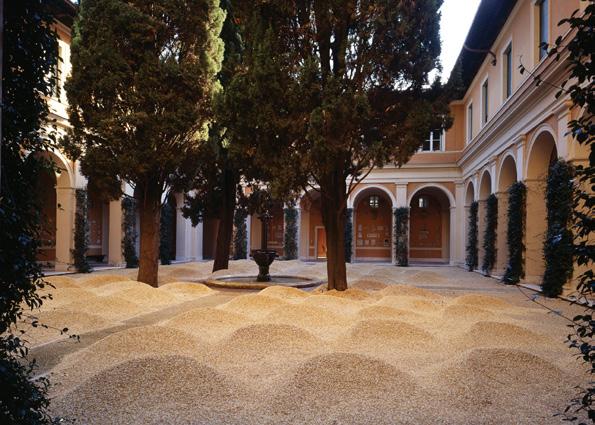
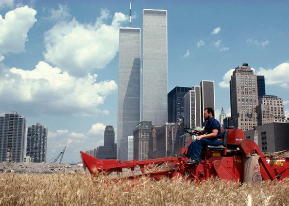
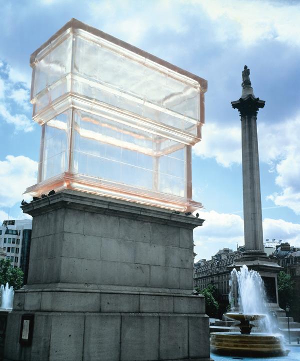
038 Site of community food center utilized for public walking trails and art. Visitors walk through trails that engage with the contours of large mounds and native ground cover. 039 Il Cortile Mare by Maya Lin, 1998. 040 Wheatfield - a Confrontation by Agnes Denes, 1982. 041 Monuments by British artist Rachel Whiteread, 2001.


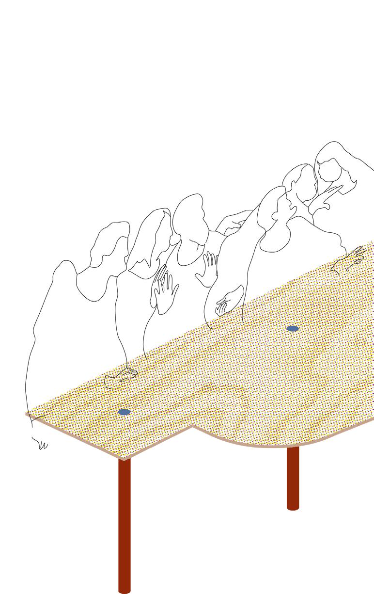
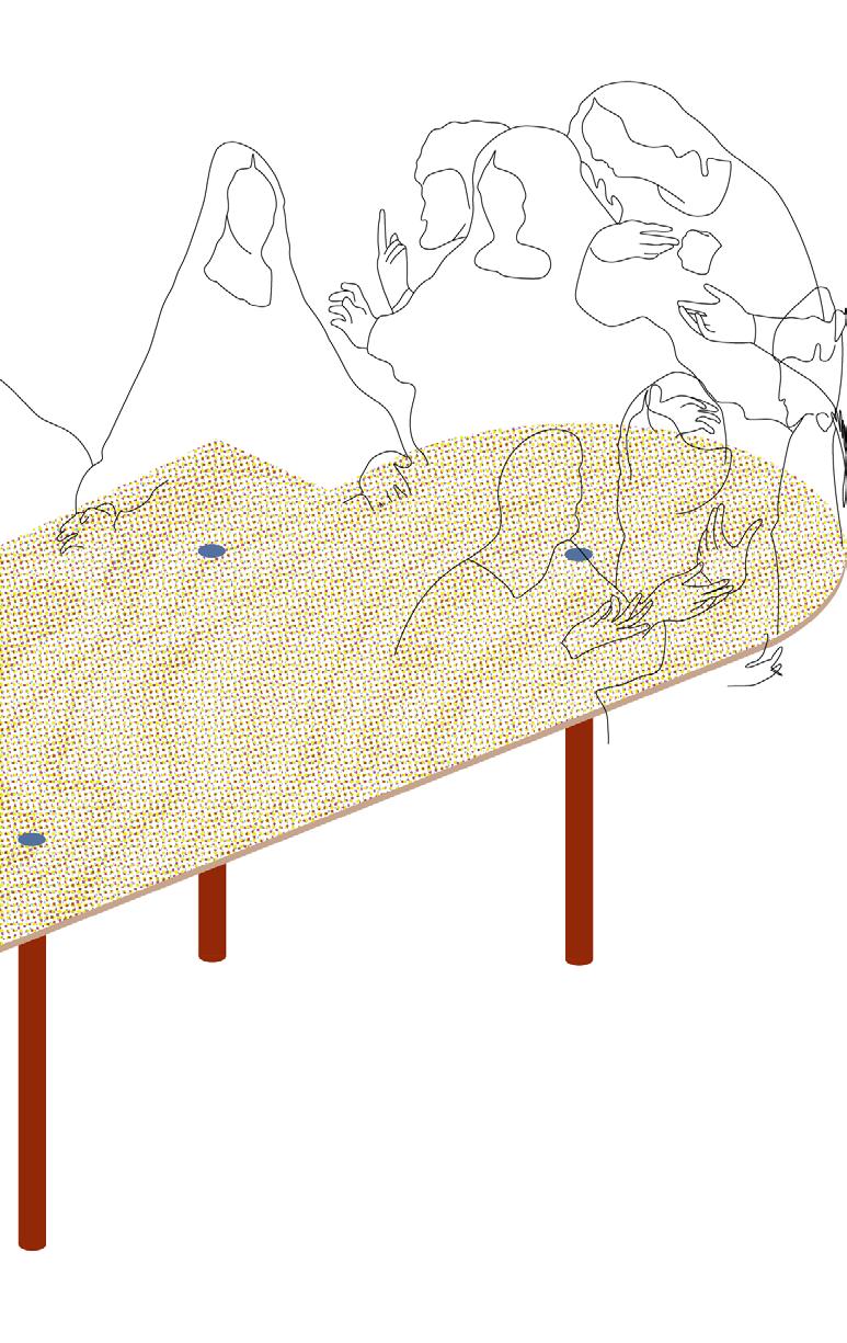
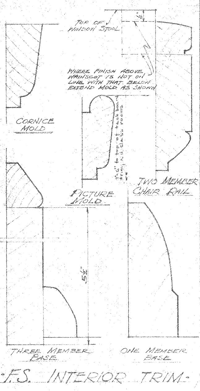
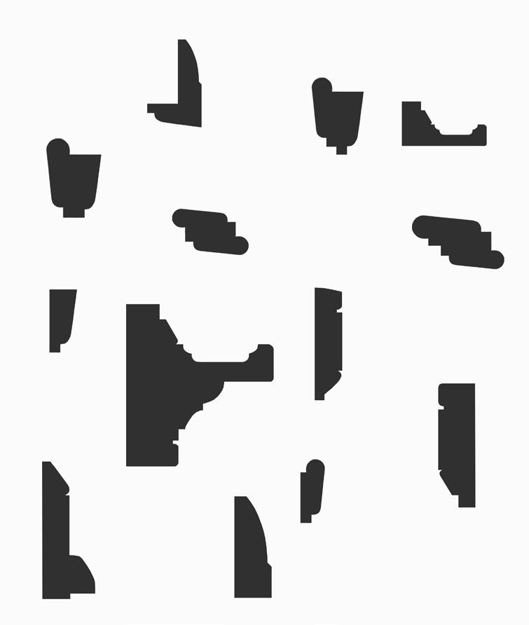
042 Community tables for congregating, which are used for community meals, crafts, and public work space. The frankensteined tables formed from trim drawings allow for different groups to congregate at the same table or host one large group together. 043 The Last Supper by Leonardo da Vinci, 1495-1498. 044 Handdrafted interior trim drawings from the original 1951 elementary school construction set. 045 Early study of silhouettes and shapes made from interior trim drawings.


2nd year, 1 week
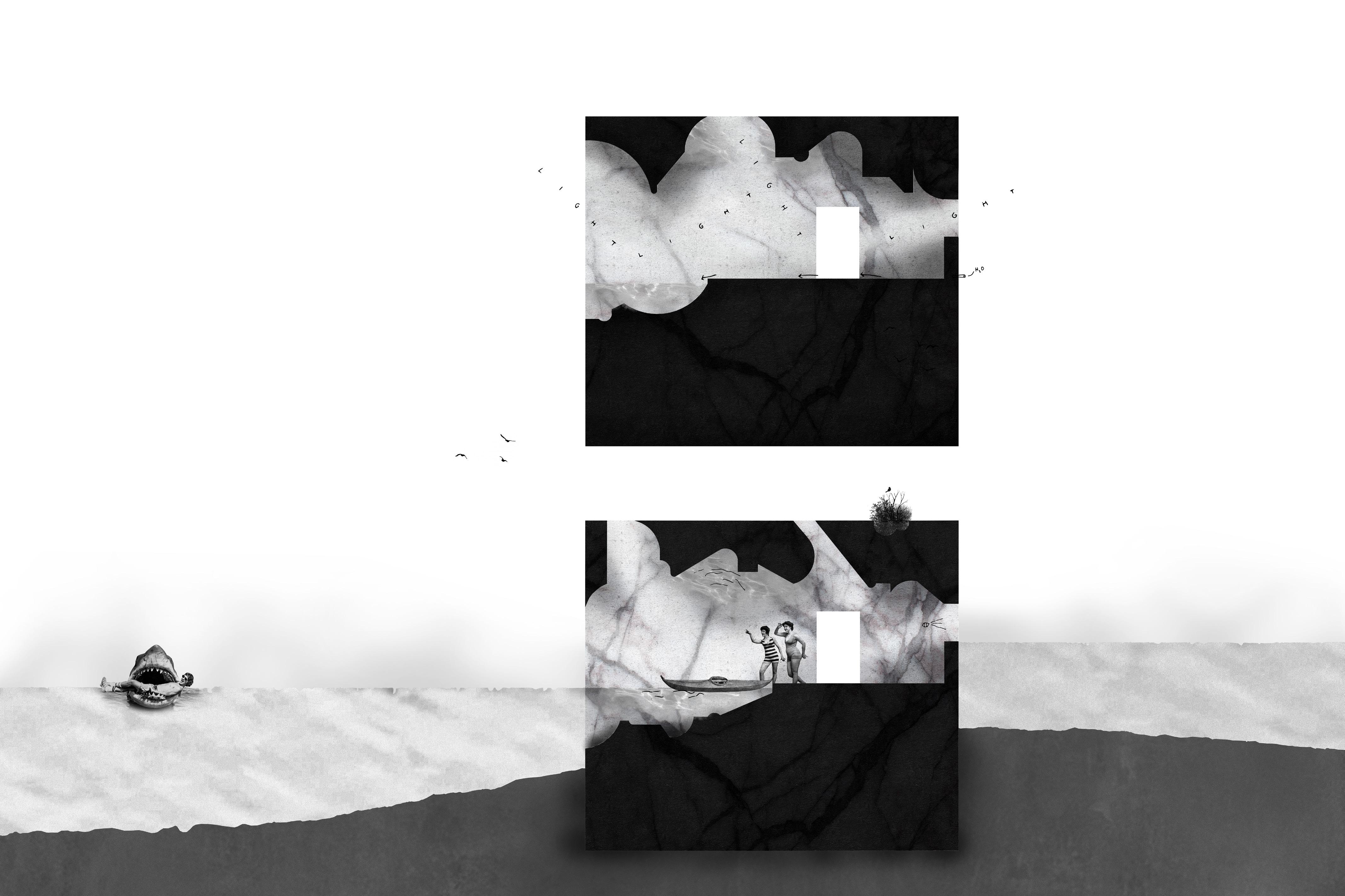
One week project to design a space to store rental kayaks along the Duck Pond on the Virginia Tech campus. The competition was judged anonymously by a group of faculty and alumni based on a concept board and model. The design concept was to insert a solid mass into a preexisting strip of land separating two holding ponds to create a new way to observe the ponds. The solid mass is then carved out to be occupied both by humans and nature. The subtraction of the overhead plane was inspired by the observation of debris being pressed into mud, and the cavity created when it was removed.
The graphic shows an idealized version represented by one solid piece of marble. This came from wanting to treat this space as an inhabitable sculpture, and in a way is treated the same way a bust would be carved and subtracted from.
046 + 047 Two section cuts which show the changing overhead plane and water-to-ground transition space between two ponds of varying heights.

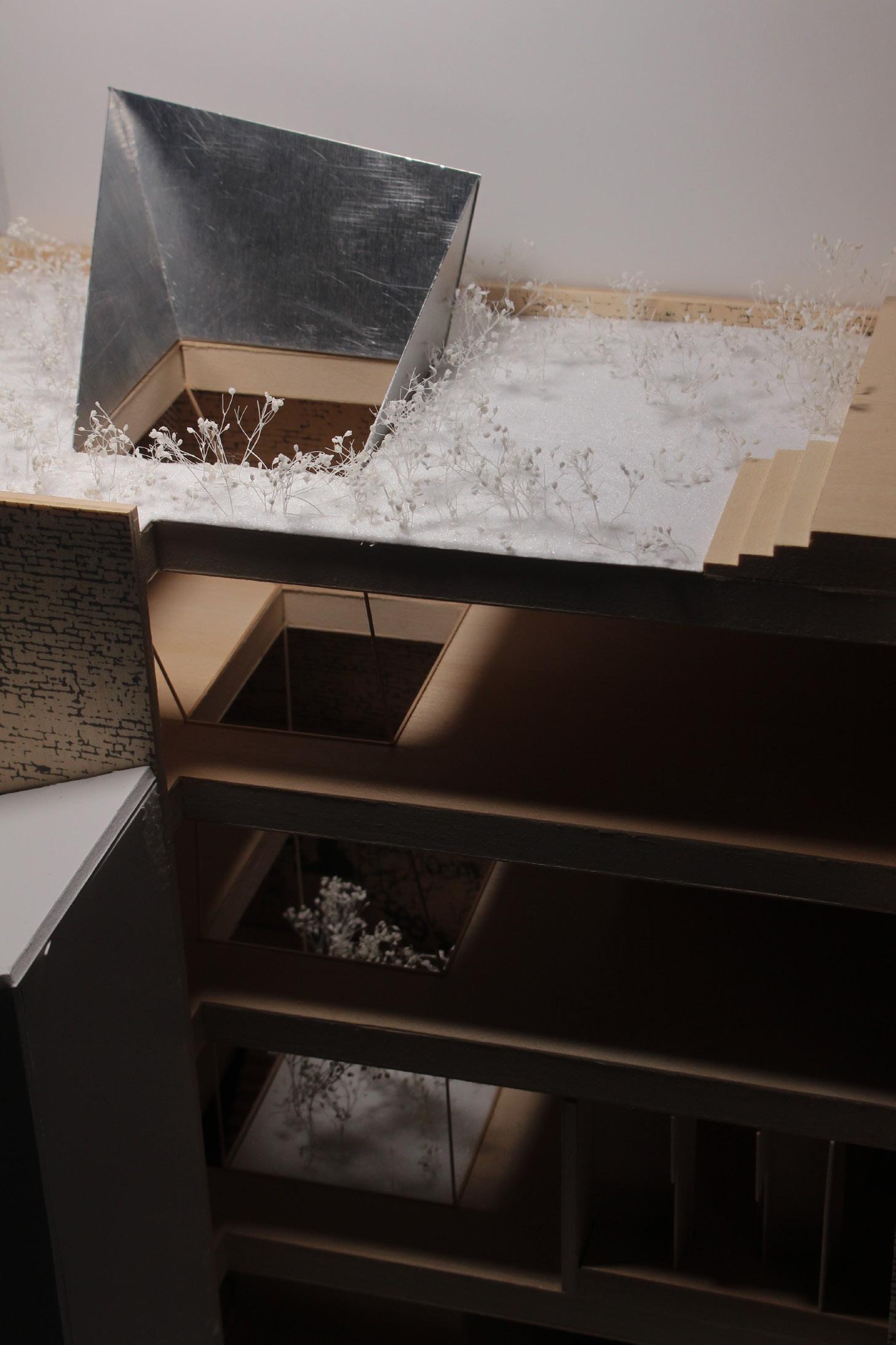
048 Final competition model which shows the relationship to the adjoining ponds. 049 Model detail showing a scaled model looking out at the upper pond at a new perspective. 050 An exploded sketch of the project concept.


2nd year, 12 weeks
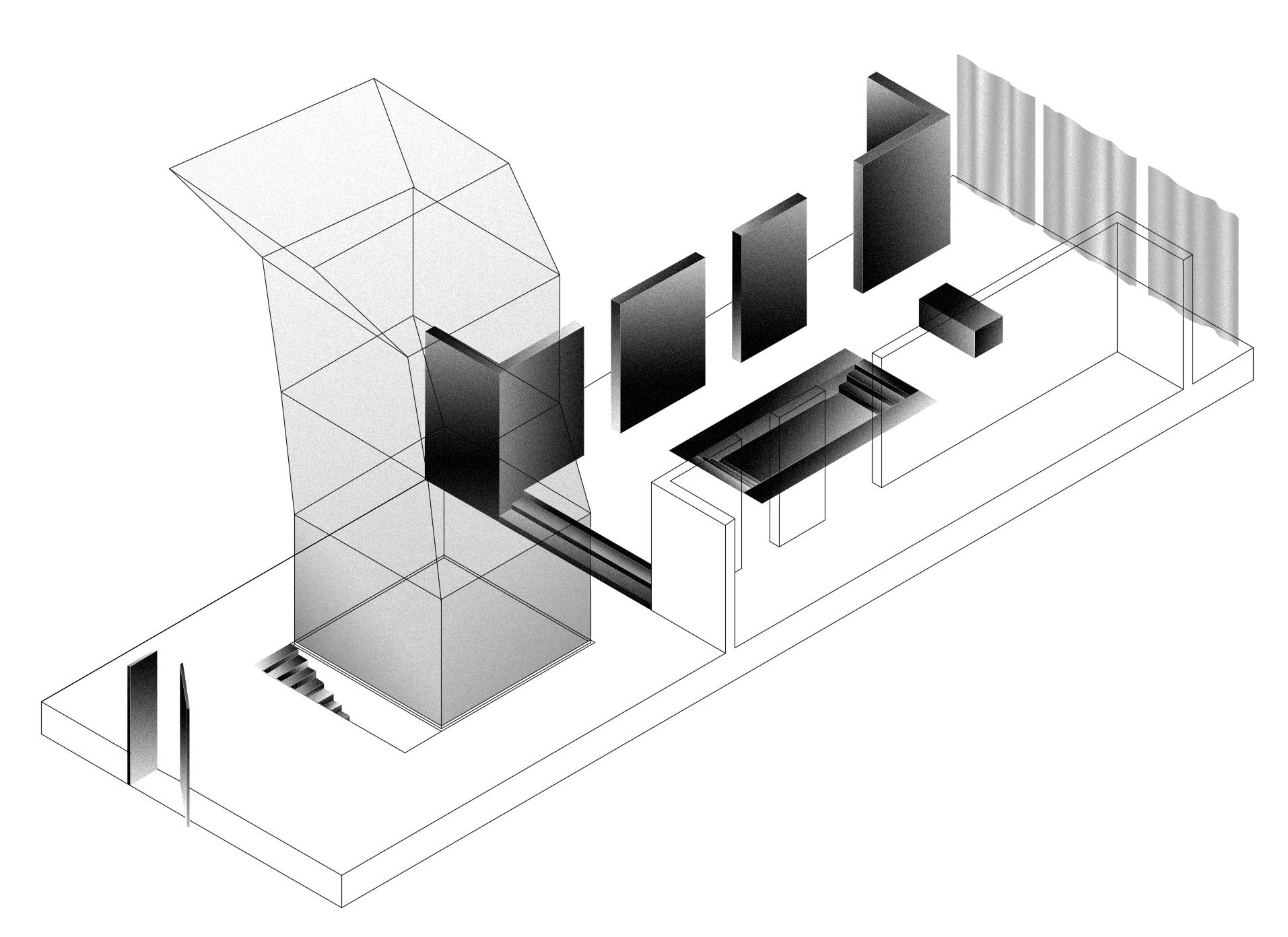
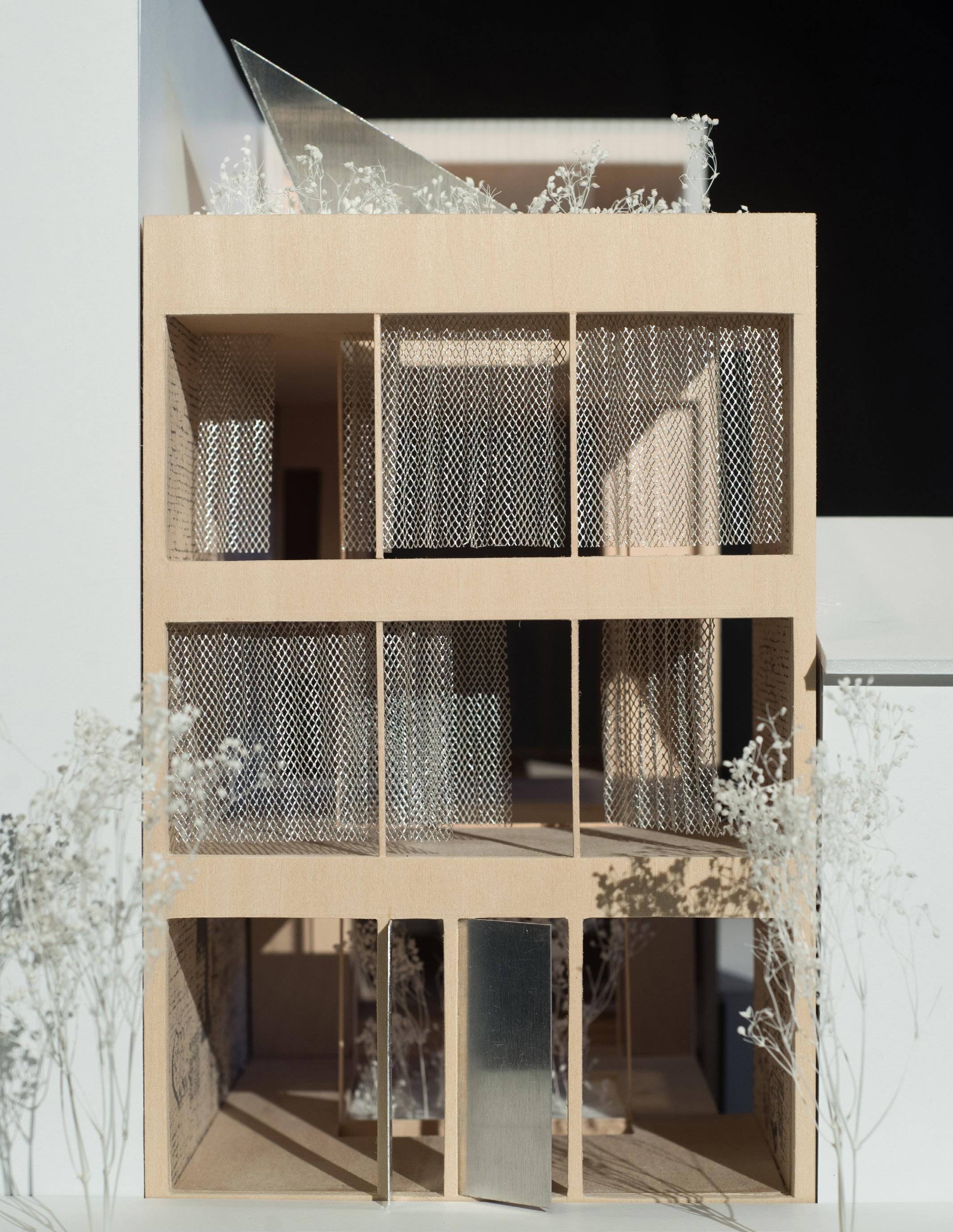
This semester long project was to create an infill, mixed-use building in an abandoned lot between two existing buildings in Soho. The two exterior walls were left and a new three story building with rooftop apartment was proposed. The program includes a consulate with lobby, office space, gallery space, and visiting resident apartment, while also housing a laundromat for the surrounding neighborhood. The proposed design features a four-floor spanning light well which acted as the main organizational element of the building.
052
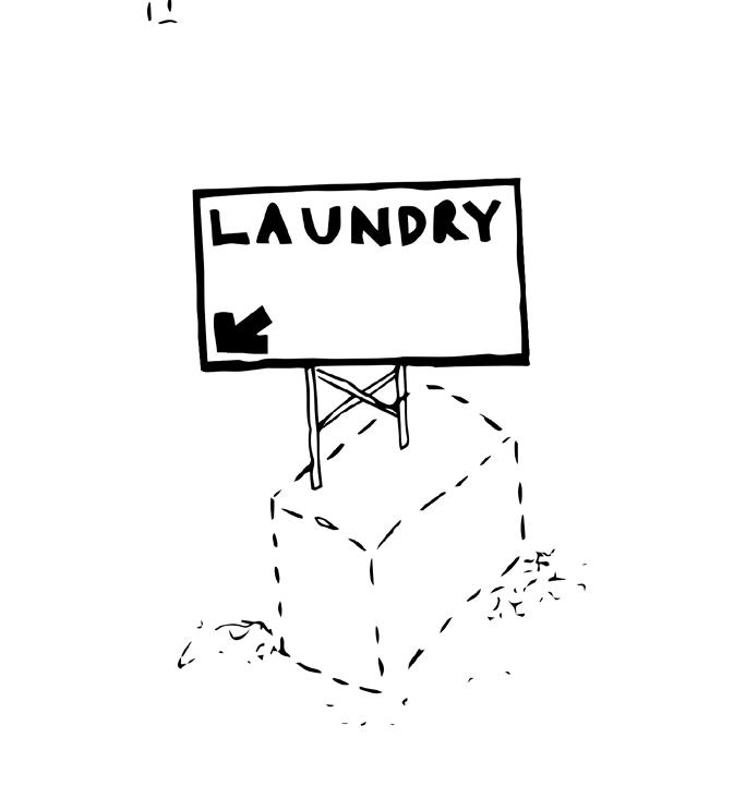
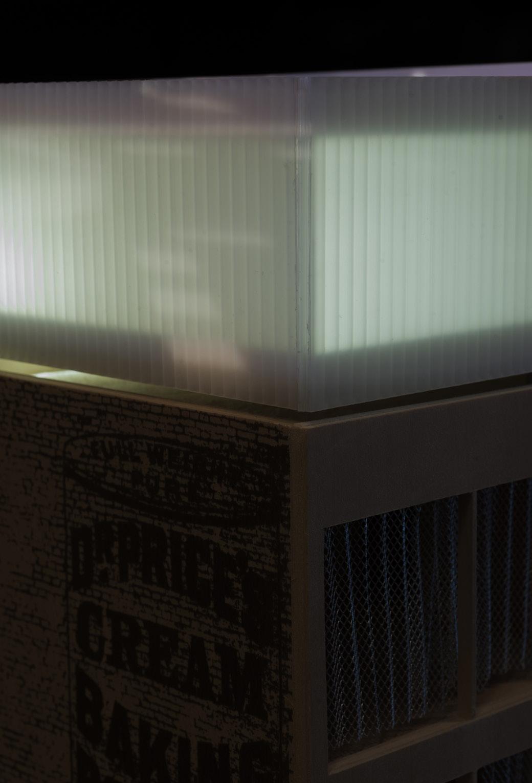
051 Axonometric view of first floor elements including the center courtyard and sunken waiting space. 052 An early iteration of the relationship of the laundromat to the building. 053 Facade view from street-side with movable metal mesh curtains.
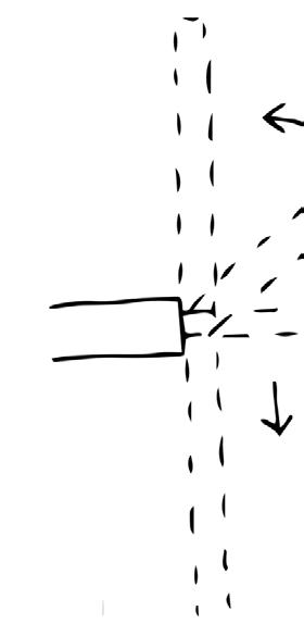
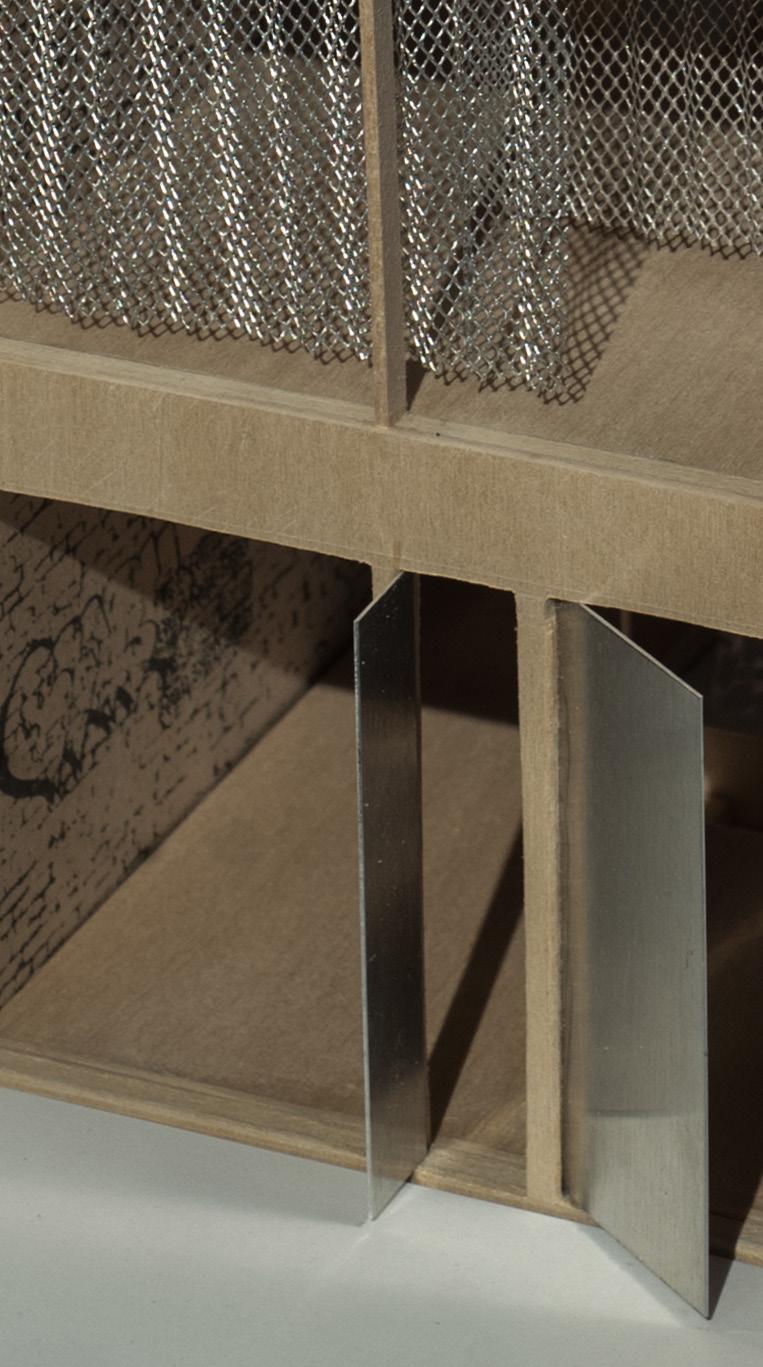
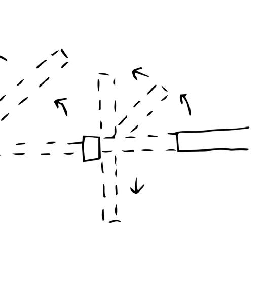
054 A reveal draws attention and juxtaposes what is the new roof-top apartment and the existing building. 055 Large entry doors with tracks that allow the doors to move and symbolize to people walking by whether or not the consulate (large door) or laundromat (small door) is open. The hierarchy of door size is dependent on the amount of space each business occupies in the building. 056 Section cut view of central light well with top piece that acts as part sculpture and part utility by optimizing reflection of light into space. The well is unconditioned to allow the green space on the first floor to change with the seasons. This allows people occupying the building to have a direct relationship to the natural world.

year, 4 weeks
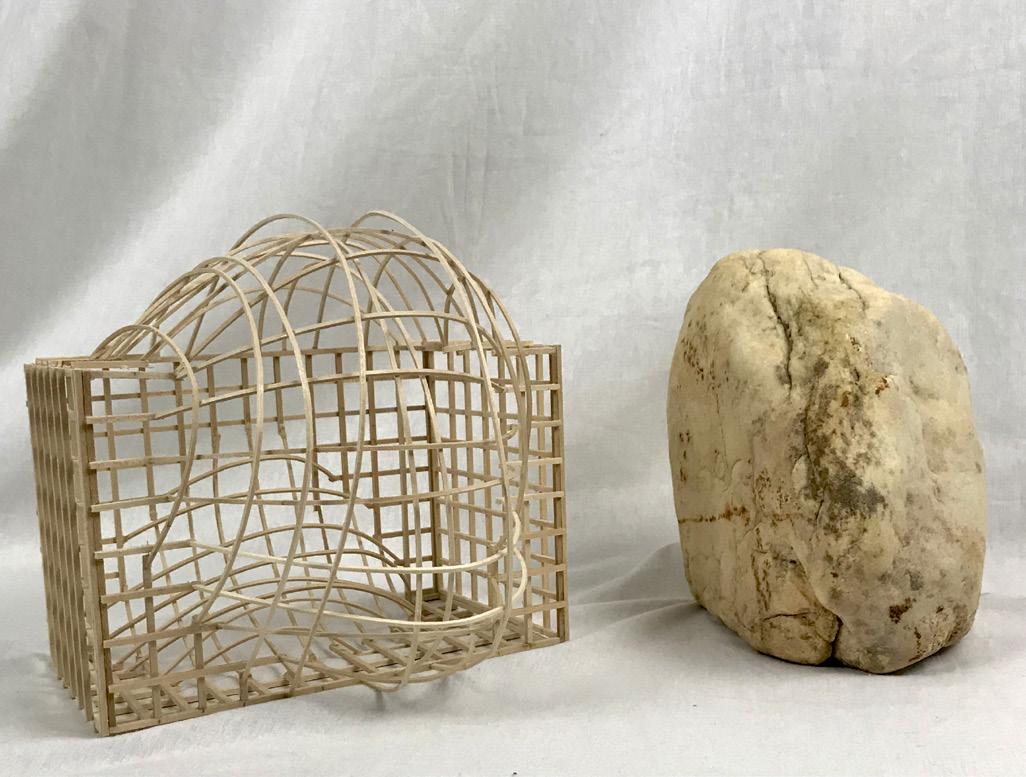
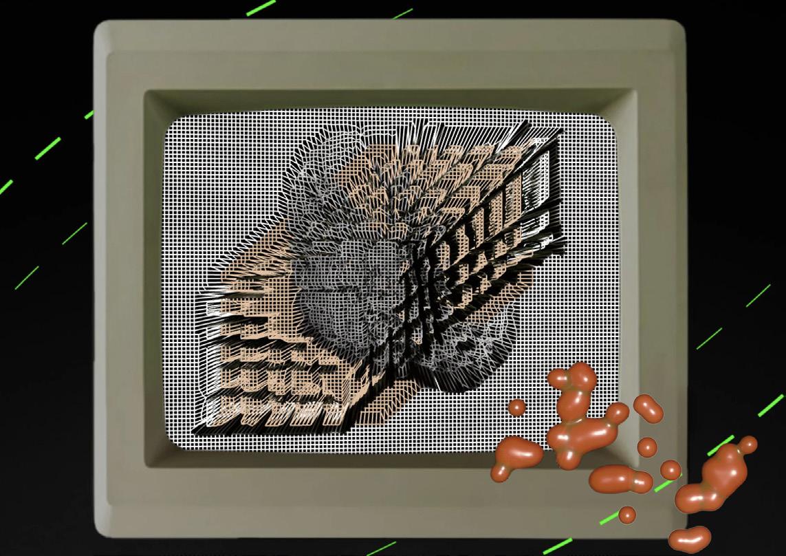
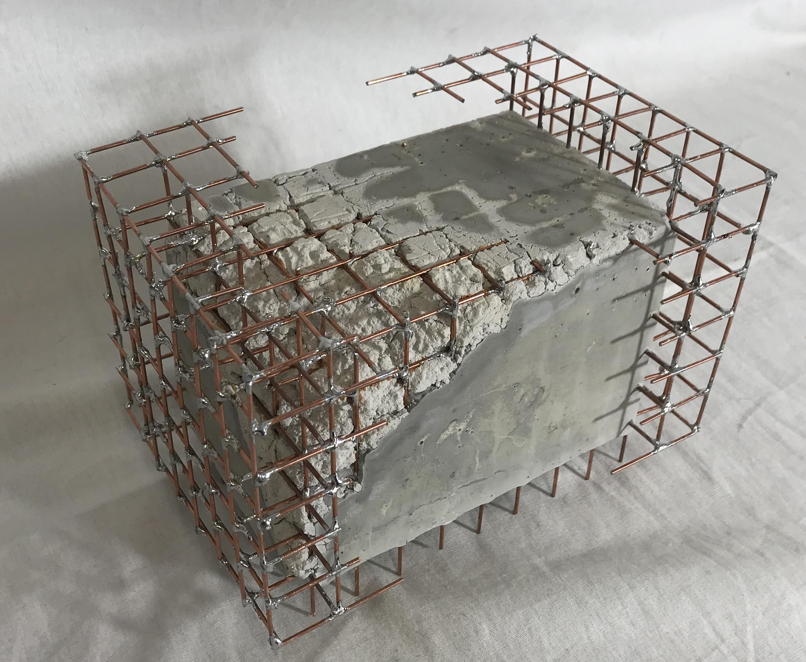
An exploration of how a controlled grid interacts with an organic object, and the effects of the interjection. This concept prompted the study of how a grid meets a solid and what is created in that intersection. I was interested in deconstructing a solid and chipping away at it to uncover the underlying grid, but also ways that a void is created from the removal of a mass.
057 The first iteration exploring how an organic object changes a uniform grid. 058 Copper grid with removed section before rockite pour. 059 Final model made of copper rods and rockite. 060 Final pin-up graphic.

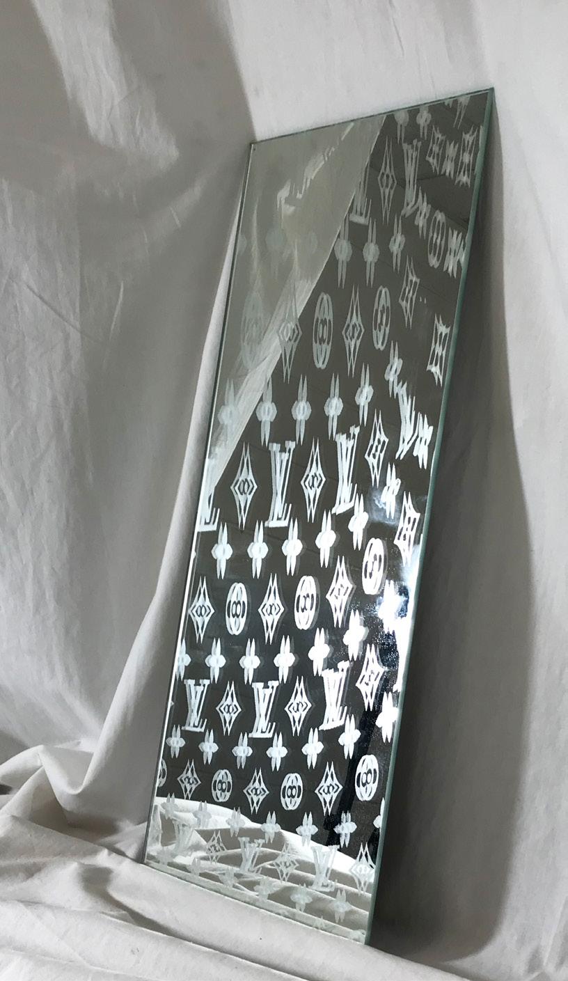
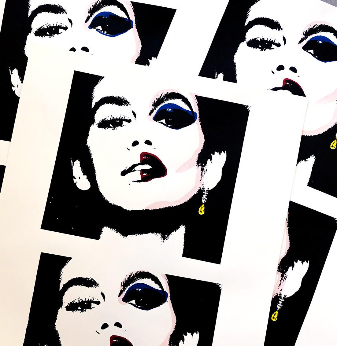
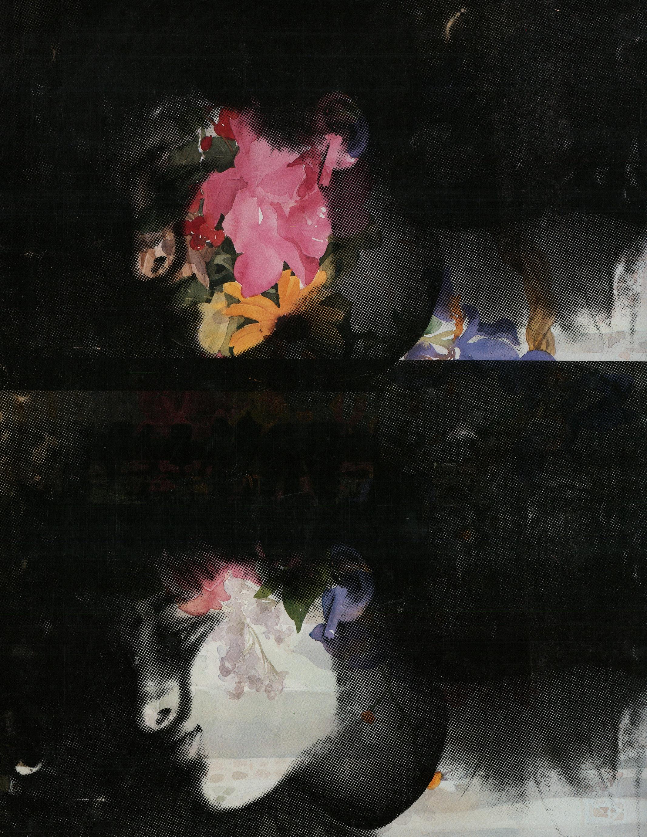
061 A bootleg take on the classic Louis Vuitton monogram warped and etched into a reclaimed bathroom mirror. 062 Four-screen print of model Kaia Gerber. 063 Self portrait via office scanner on found floral paper.
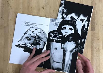
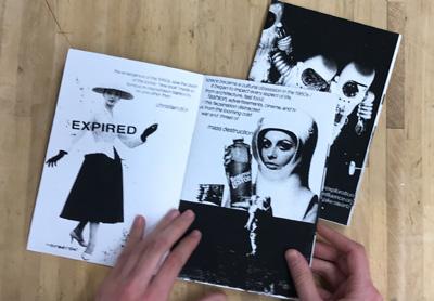
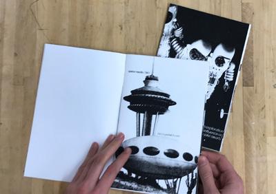
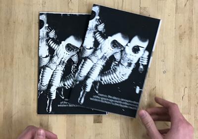
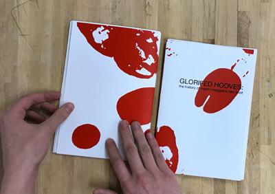
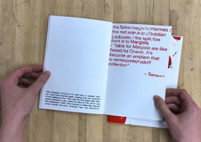
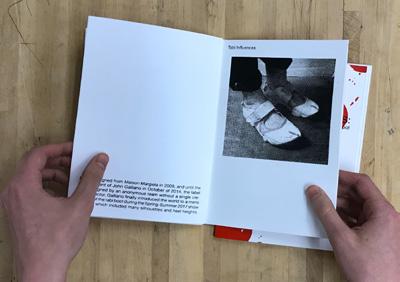
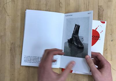
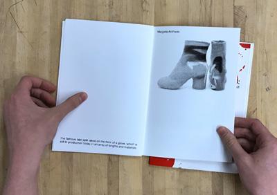
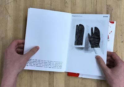
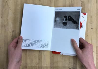
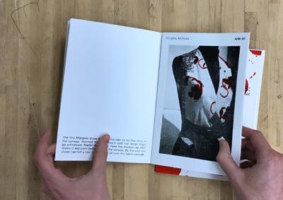
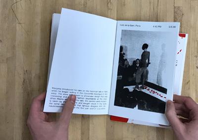
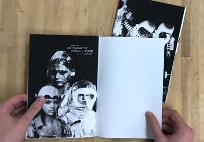
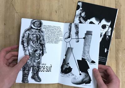
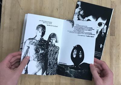
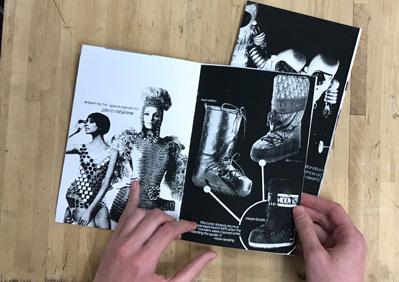
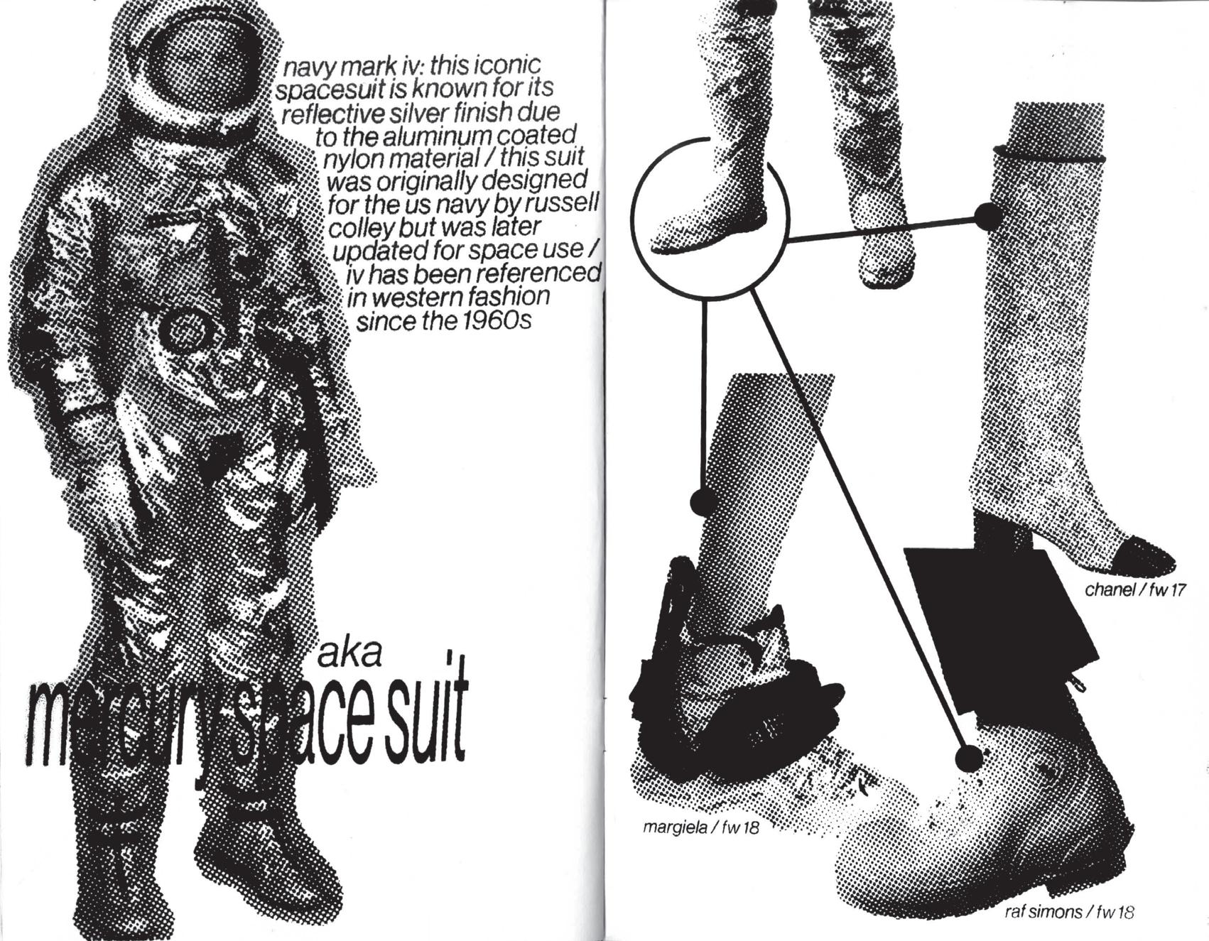
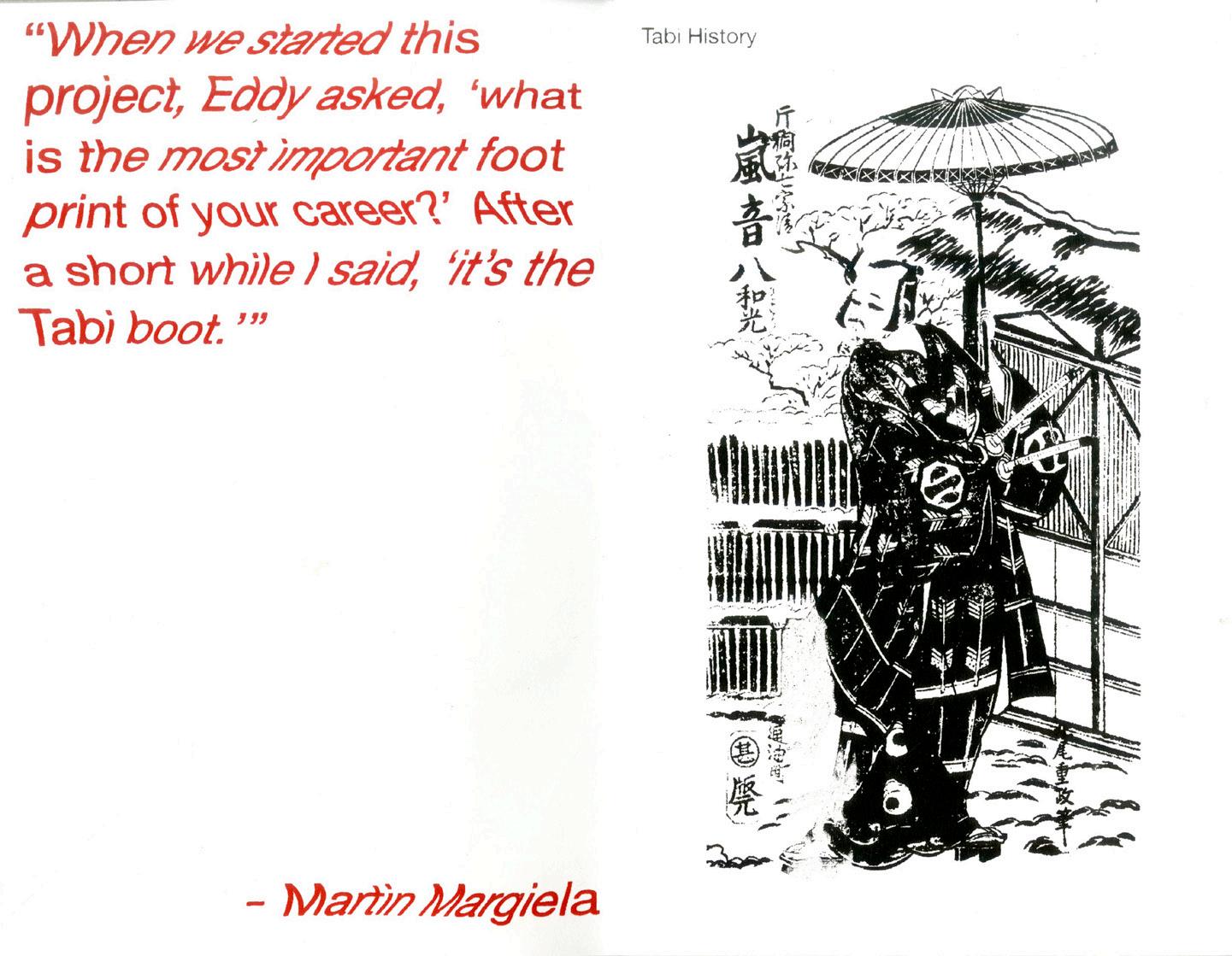
064 Progression of zine that explores the history and roots of space inspired fashion. 065 Progression of zine that documents the history of the Maison Martin Margiela house staple- the tabi boot. 066 Scan of page seven of man vs. the abyss: an exploration of the space age and its influence on western fashion. 067 Scan of page one of GLORIFIEDHOOVES: thehistoryof martin margiela’s tabi boot. Text, graphics, and silkscreen by me.

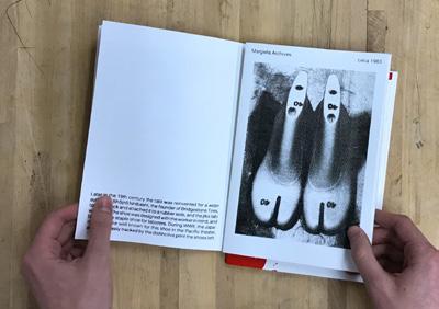
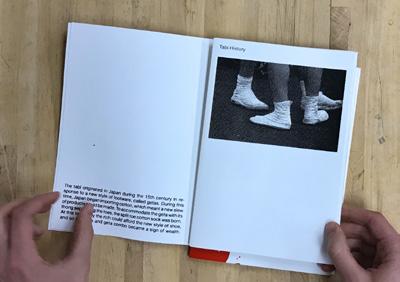
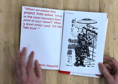

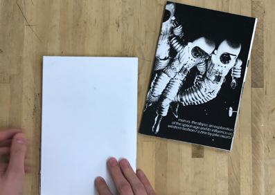


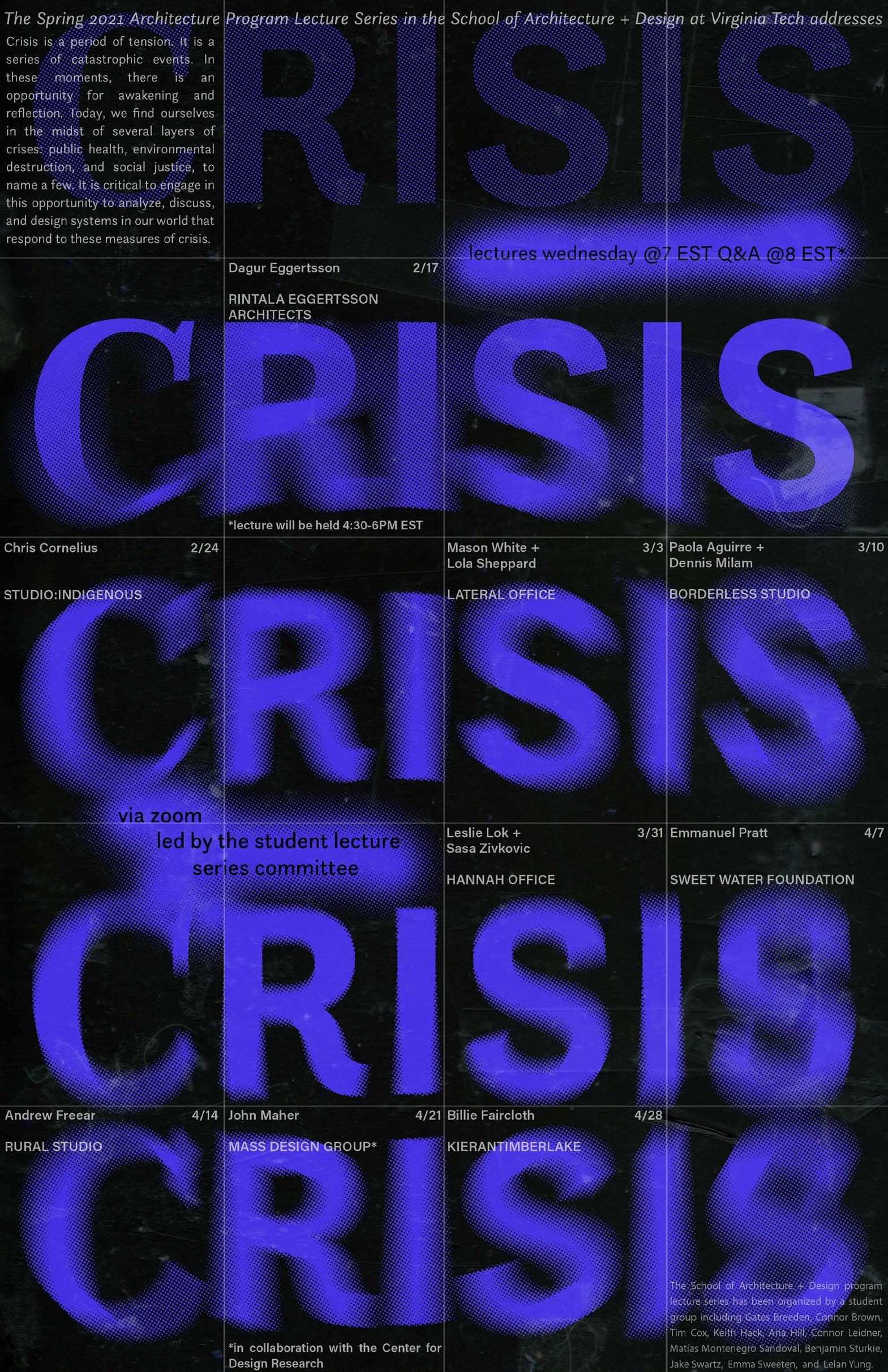

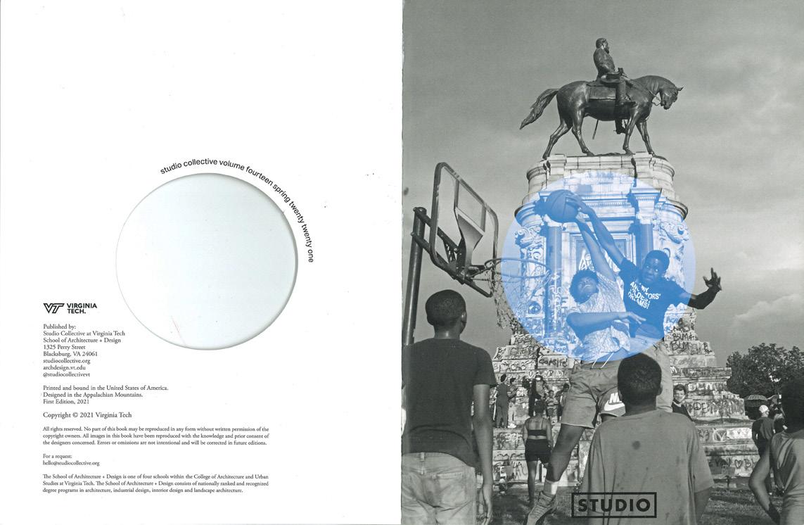
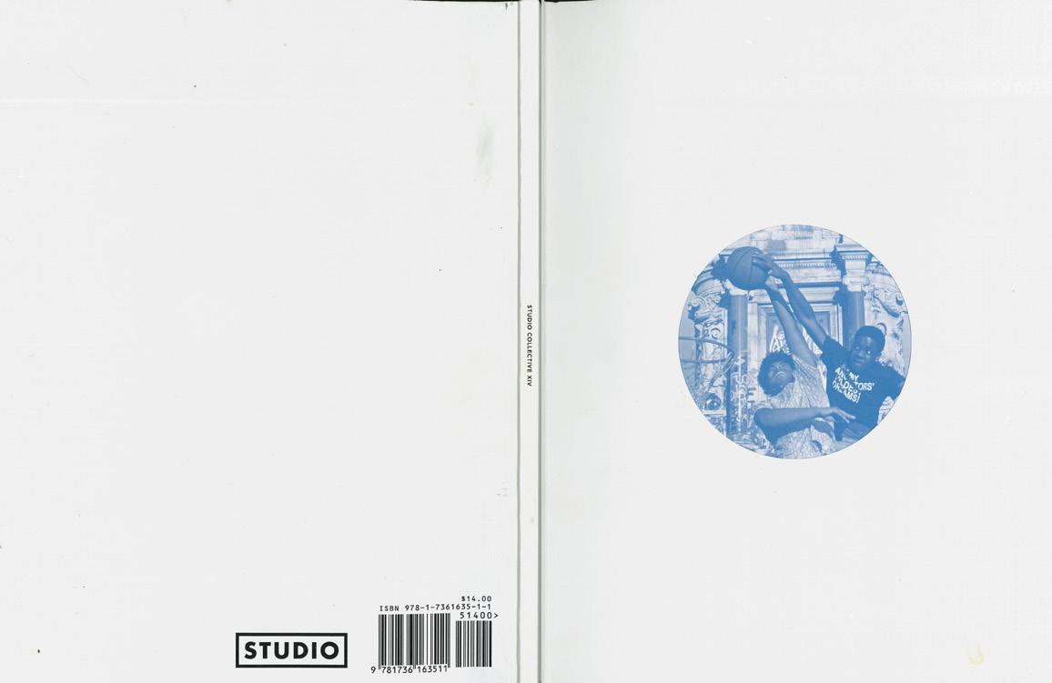
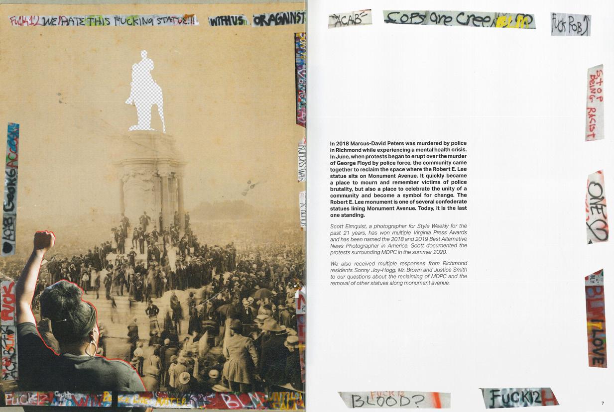
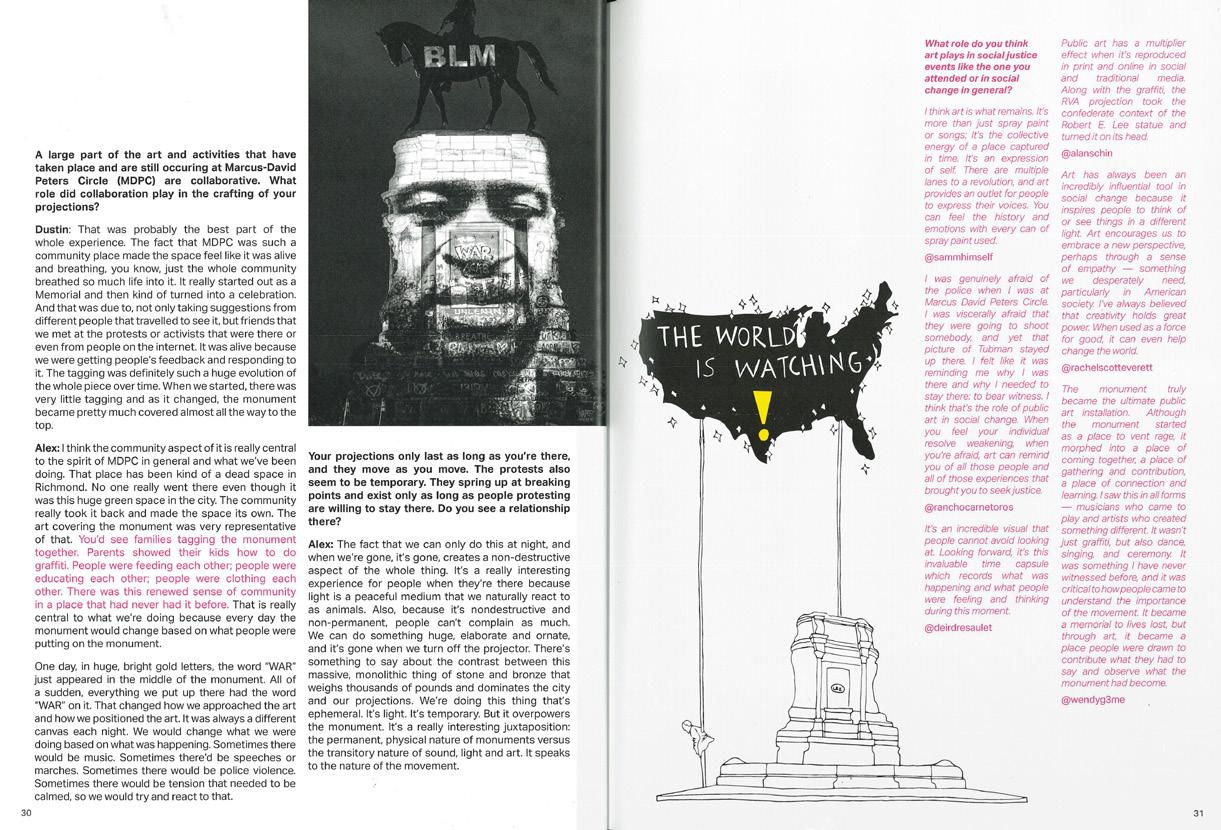
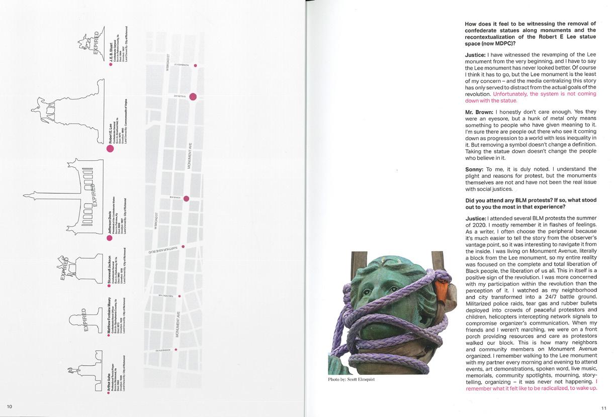
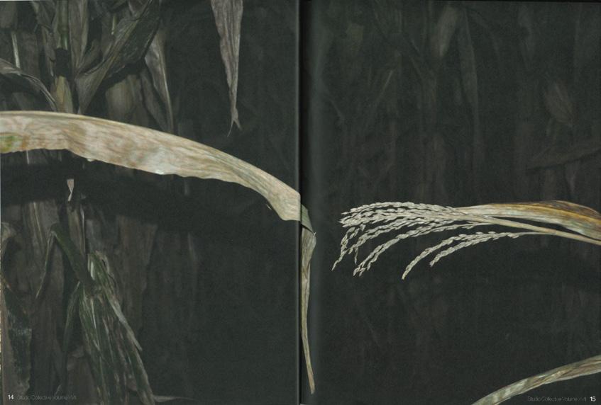
and back cover of Studio Collective issue titled Crisis. 071 Immediate page that reveals the surrounding the cover photo. 072-076 Graphics collages for individual stories within the

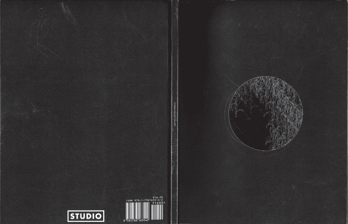
Modeled on the open format of the SA+D studios, the journal is an archive of conversations and documentation about design featuring the work of students, faculty, alumni, and greater community. It is carefully crafted by studetns to be both an academic record and source of intrigue. A new volume is released every semester.

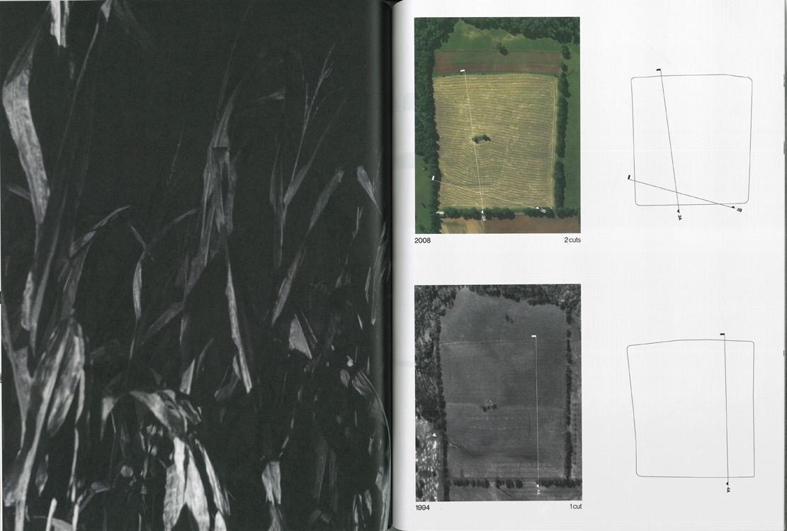
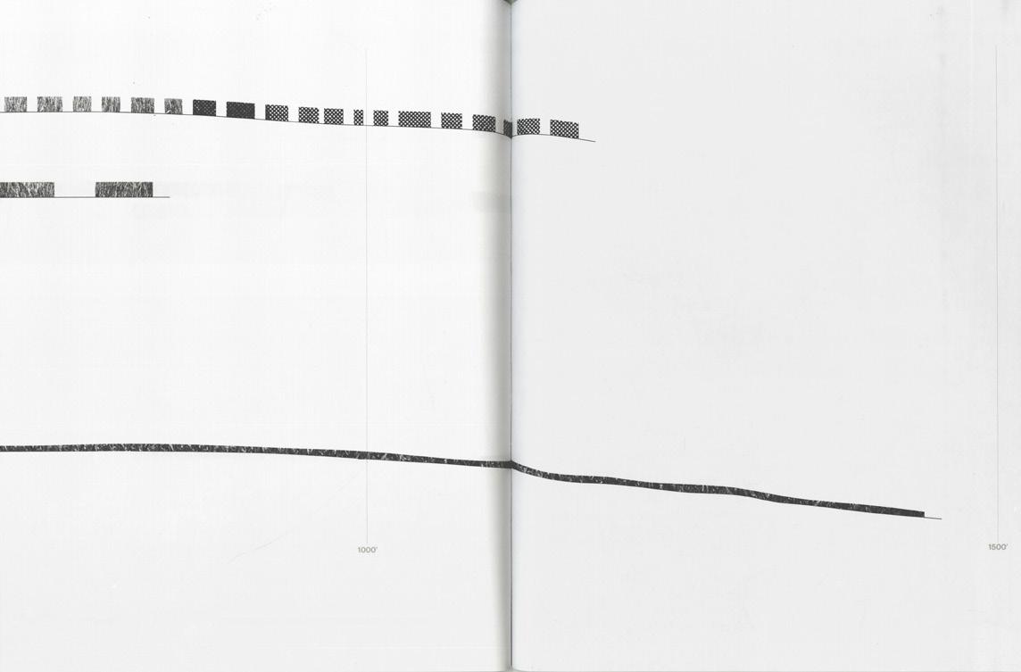
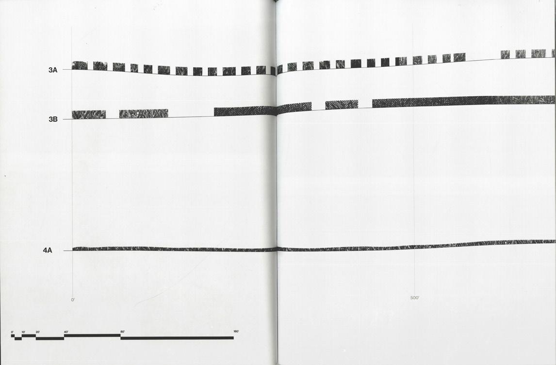
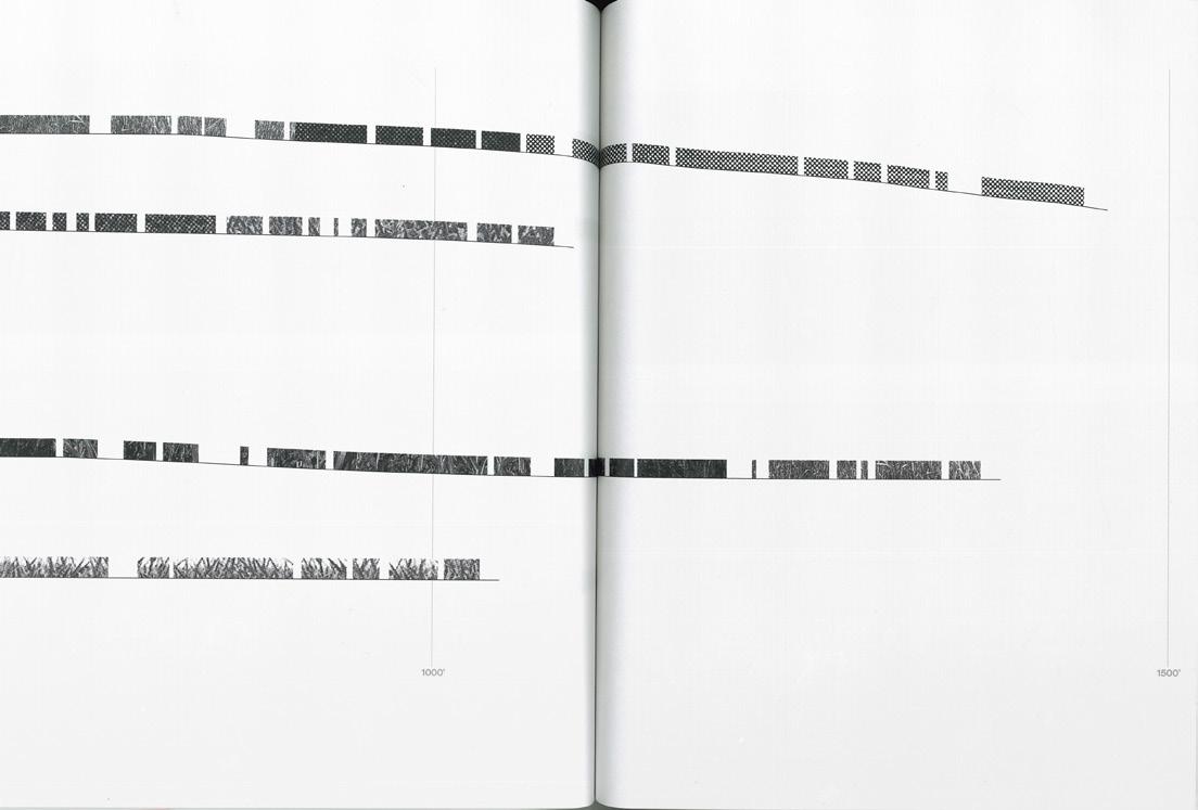
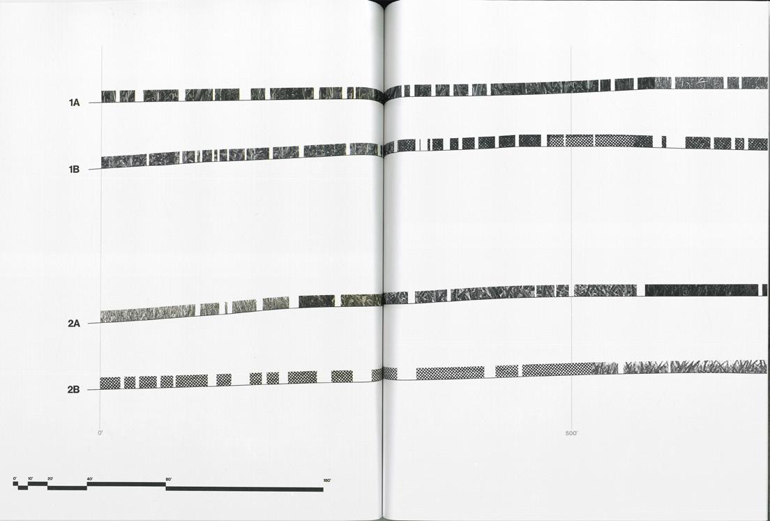
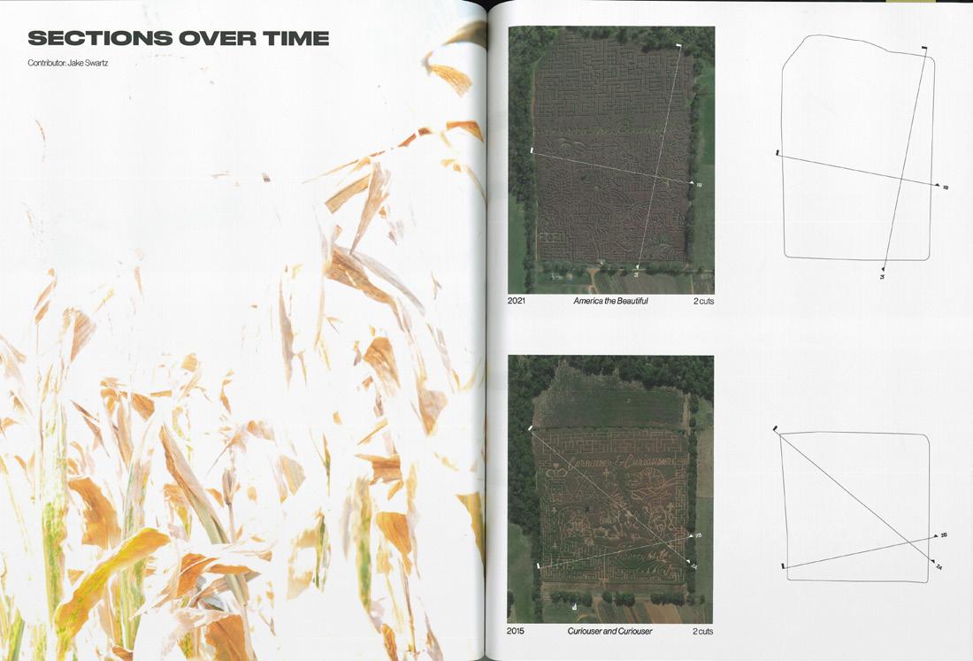
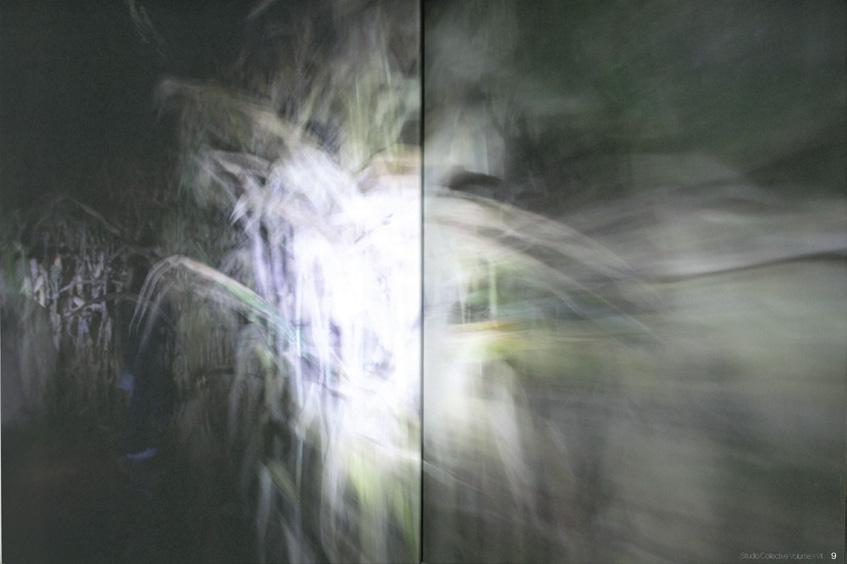
077 Front and back cover of Studio Collective Volume XVII issue titled Maize. 078+079 Sections drawings through local corn maze through time taken from surveillance photography.
