5 minute read
A STUDY IN SERENITY


Written by Bridget Williams / Photos by Robert Burge
The domino effect was set into motion soon after the homeowners significantly upgraded their outdoor spaces, taking some shine off the interior of their nearly twenty-year-old suburban home. To remedy the disparity from the inside out, builder Aaron Esposito of Esposito Construction assembled his favorite collaborators: interior designer Amy Cimba of Bittners and Mike Smith of Artistic Kitchens. The multi-month project, during which the homeowners decamped to a home in a neighboring community, was a down-to-the-studs reinvention that added usable square footage without increasing the original footprint. A strong and overarching desire by the homeowners to bring in "light and freshness" resulted in the placement of more oversized windows along the home's backside.

Crossing the threshold, first-time visitors would have never guessed that, before the renovation, the foyer and formal living room had been soaring, two-story spaces. "Doing things at a more human scale" is how Cimba explained the transformation, which added two new rooms upstairs while maintaining generous ten-foot ceilings.
The calming interior design palette, which explores the entirety of the white, grey, and black chromatic scales, announces itself in the foyer, along with the repeated elements of gold accents, decorative paneling, and beguiling light fixtures. "It's the story of sophistication, extreme finishes and detail, and pushing scale," said Cimba.

Monochrome certainly doesn't have to mean mundane, as Cimba expertly exemplifies in her selection of a dupioni silk mural by Phillip Jeffries in the chinoiseries style enveloping the dining room walls. The simple, clean lines of the white lacquered dining table with hints of gold leaf detailing allow the chandelier, with rock crystals dripping from gilded "branches," to take center stage.
Cimba carefully delineated child and adult spaces throughout the home. While the living room, with its ebony lacquered-built-in bar cabinets on either side of the hearth and snow-white boucle-textured upholstery on four wingback chairs, is undoubtedly intended for the latter, smartly chosen Crypton fabric repels stains from pet and people of all ages and ensures that no room is deemed off-limits.

Serving up drama and gourmet French bistro vibes, the kitchen, hearth room, and eat-in area are among the hardest working rooms in the home and a favorite place for the family's Frenchie Bella to lounge in the sun. Overhead, newly added reclaimed beams give the impression they were "uncovered" as part of the renovation. Amy described the installation of the gently arching beams defining the entrance to the built-in banquette nook as "an amazing feat of carpentry." A pair of oversized pendant lamps suspended above the island stand up to the visual heft of a brass hood surmounting a La Cornue range.


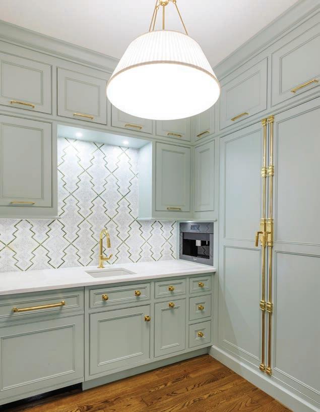
Designed to "take pressure off of the kitchen," it almost seems a shame that the home's scullery—a room traditionally used for washing dishes— and elevated from ordinary to exceptional, is tucked away from sight. The color of the scullery's cabinetry calls to mind a Ladurée macaroon shop in Paris. A playful mosaic tile backsplash, in a pattern similar to the wallcovering in a nearby office space, complements the cabinetry. Cremone-style hardware on the scullery's paneled refrigerator is a design element culled from the kitchen's upper mirror mullion cabinets. "Particularly when it comes to storage, we took the time to think on every aspect and how we could meet the family's needs now and in the future," explained Cimba.
The homeowner's children have ensuite bedrooms on the second floor. The extra square footage gained as part of the renovation resulted in a chic and comfy media room with a fireplace and a sitting room off of the daughter's bedroom. Built-ins on either side of the fireplace in the media room act as a clutter buster, while hardworking upholstery fabrics on the sofa beds can stand up to even the most rambunctious sleepovers.


In contrast to the energy upstairs, the first-floor primary suite is a study in serenity. A section of mosaic tile selected for the floor in the primary bath served as inspiration for the home's overall color palette. Overhead, opaque glass discs fall like rain from the faux bois arms of an ethereal chandelier. Centered between walls dressed in a luxurious chinoiserie wallcovering from Gracie, a soaking tub sits beneath a dramatically draped window. What was once a study has been absorbed into the primary suite as enviable closet space.
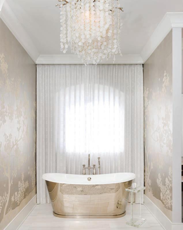
Walls on either side of the soaking tub in the primary bath are dressed with a chinoiserie mural from Gracie.
In a departure from the gold hardware found elsewhere, polished nickel campaign-style pulls accentuate the floating vanity built by Mike Smith. His and her water closets, a steam shower with an integrated drain, and a dedicated laundry room with ample storage round out this resort-like retreat.

Whereas ceilings elsewhere in the home were lowered, they were raised in the primary bedroom. Tongue and groove paneling emphasizes the vault. Whispers of light blue break up the monochromatic color scheme like a pebble tossed into a lake.

Whereas ceilings elsewhere in the home were lowered, they were raised in the primary bedroom. Tongue and groove paneling emphasizes the vault.
A pitfall in interior design can come when the look of something is prioritized over its function, leading to uncomfortable or impractical spaces. However, as this project demonstrates, with careful planning and clear communication, one needn't sacrifice pretty for practicality.