4 minute read
Mix & (Mis)Match
Interior designer Isabel Ladd employs her signature style for a forever home in Chevy Chase
Written by Bridget Williams / Photography by Andrew Kung
Engaging in a conversation with interior designer Isabel Ladd is a bit like watching a hummingbird. They both maintain a fascinatingly frenetic pace, are attracted to bright colors, and add beauty to the world. Isabel started our most recent chat by emoting, “It’s the best and worst thing to be an interior designer right now; everyone in America hates their house and wants everything new, and now.” At present, she’s managing no less than a dozen projects.
One of her recently completed interior design projects for a couple in the Chevy Chase area represented her third collaboration with the wife, who she came to know through her parents, Isabel’s first clients when she struck out on her own. Isabel was first tasked with the wife’s apartment in Washington, DC, followed by a place in San Francisco, the first home with her husband. It’s interesting to note that Isabel designed both without ever setting foot in them.

Interior designer Isabel Ladd in the home’s living room.
Isabel refers to the couple’s Lexington home as their “forever home,” based on the observation that they paid specific attention to the primary suite’s interior design. “In my experience, when people are decorating a transitional residence, the emphasis is on the public spaces,” explained Isabel. She went on to say that once they find a place to put down roots, homeowners tend to focus on private spaces because they have already made significant purchases for the other rooms.
When it came time to orchestrate the interior design for this home, Isabel said the couple uttered the three sweetest words a designer can hear: “you do you.” Given the green light and largely starting from scratch, Isabel got to work employing her signature mix of lively colors rendered in patterns that don’t seem like they should match, but somehow, they always do.

Throughtout, the home’s neutral walls are animated by vibrantly hued artwork.
While she’s been quoted as saying “beige is not a color,” the walls had recently been painted in neutral hues. Isabel, who is always conscious of budgetary concerns, advised her clients that rather than take a huge chunk of their budget for wallpaper and paint, they should decorate the rooms first and reassess the wall color after. The couple, who naturally gravitate to neutral colors, ended up leaving the walls as-is, allowing a diverse collection of artwork to animate the neutral backdrop.
Isabel said the jumping-off point for the interior design started with the dining room rug. As the room is visible as soon as you enter the foyer, she wanted something that popped. Isabel grounded the rug’s vibrancy with brown and white embroidered upholstery in a Greek key-inspired pattern on the captain’s chairs. “I love the modern mix with the traditional motif,” she explained.

The dining room rug served as the jumping off point for the home’s interior design.
Given her long-standing working relationship that has evolved into a genuine friendship, Isabel remarked that it wasn’t too hard to nudge the couple out of their comfort zone. She recalled that they told her they were nervous but trusted her when she proposed more outside-the-box items such as the family room’s green velvet sofa.

A vignette in the primary suite.
Speaking of that sofa, it replaced a 35-year-old hand-me-down that had traveled with them from home-to-home. Now relegated to the lower level in this home, Ladd said it speaks to the notion that if something is made well in the first place, you can get a lot of longevity from it.

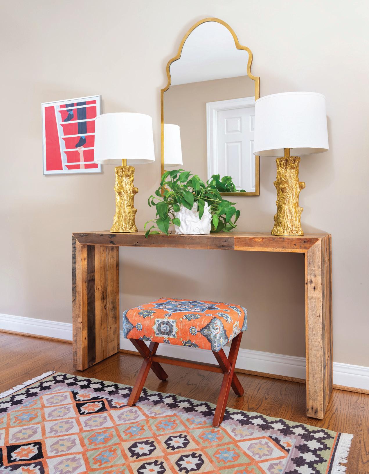
Isabel brought tears of joy to the wife when she spied this console at the top of the stairs; the arrangement is nearly identical to the entry in their former home in San Francisco.
The wide embroidered tape Isabel specified for the family room sofa is repeated on the navy drapery in this room and the parlor. Eschewing a more formal furniture arrangement, Ladd placed four comfortable and inviting armchairs around a large round ottoman, making the space ideal for activities like family game night. “Especially now, people need a TV, toy, and techfree reprieve,” said Isabel. Rather than having a formal space that’s an unused afterthought, the homeowners now have a welcoming space accommodating a broad range of activities.

At the top of the stairs, Isabel created a vignette that brought the wife to shed happy tears. Using a console from their previous residence, she recreated the setup from the foyer in that home. An update to the scene is an artwork from Ikea that Isabel found on the floor of the wife’s office on installation day, proving that things don’t have to be expensive to be impactful.
The homeowners are avid readers, and to help pass their love of reading to their children, Isabel fashioned a cute reading nook in a space between the children’s bedrooms. Outfitted with a pair of swinging pod chairs and a fluffy rug, the couple initially wanted to use “off the rack” draperies in this space. Isabel, who likes to give her clients a present to mark a project’s completion, installed custom window treatments that had originally hung in her first-born son’s nursery, a gesture indicative of her closeness with the homeowners.

One of Isabel’s clients is fond of calling her a “fairy housemother.” It’s an after effect of doing such a good job that her patrons call on her for assistance with the smallest design decisions, often long after completing a project. The owners of this home recently asked for help selecting planters for either side of the front door. “It’s such a complement that I’ve created cute monsters,” Isabel said with a laugh.

