

Sora Sato CV
Date of birth
11. January.2000
EDUCATION
2018~2022 BA in Architectural Design College of Arts and Design, Department of Architecture, Musashino Art University

2015~2018 Secondary Education
Teikyo University High School, Hachiouji, Tokyo
TECHNICAL SKILLS
Sketch Up
Illustrator Photoshop
Vectorworks


InDesign
Lumion
Twinmotion
Premiere pro
Rhinoceros
2019 Vertical award (Highest award) for project FLOW
LANGUAGES
Japanese (native)
sora.arc18043@gmail.com
+81-80-7887-8562

1-19-75 Irimacho, Chofu-shi, Tokyo-to 182-0004 Japan

03
Graduation Work
11

Excellent Work at MAU
EXTRACURRICULAR ACTIVITIES
2020 Jul.~Sep. Architectural Workshop TODAIJI
Barcelona Architecture Centre onlinePresentation

Excellent Work at MAU/ Vertical award
2022 Apr.~Nov. Maeda Atelier
HOBBY
REFEREE
Available on request
Excellent Work at MAU
Architecture Workshop
COMPLEMENTARY PLAN FOR SHIUBYA
Subject: Graduation Work/Research
Academic project
Year: Year 4, 2022
Tutor: A.Takahashi

Project type: Architecture

Purpose: A new type to stay
Size:
The area in front of Shibuya Station is currently experiencing a construction rush. High-rise buildings line the area, and a new walkway is about to be formed between buildings. Thus I asked myself whether these integrated redevelopments were being carried out for the public to improve pedestrian space. Road widening with pedestrian paving has been completed on Route 246 and Meiji Dori in Shibuya. However, when I looked at these streets, I realized that they had not been maintained after the widening. I suggest a microarchitectural intervention for the hidden spaces created by the road widening. Even though this is a micro intervention, if it provides an interesting and useful pedestrian-oriented space that has never existed before this will enhance the visual and functional appeal of the area.
SHIBUYA Urban Park Timeline
Miyashita Park was created on raised artificial ground along with the culverting of the Shibuya River.

Since the 1990s, the area has become a haven for homeless people.
Renovation Work Plan

In 2009, Miyashita Park was facing problems with a large number of homeless people making the area very rundown. Due to this, Shibuya Ward planned renovation work. One of the members of the organisation advocated the eviction of the homeless people who had lived there until then, and assisted in moving them into a shelter. Many artists and civic groups raised their voices against this policy.
Despite some opposition, Miyashita Park became a park with commercial facilities. Currently, it serves as a landmark in Shibuya, but with the introduction of a charge for the facility, it is no longer a space that anyone can use like it used to be.


For reconstruction after the Great Kanto Earthquake of 1923 (Taisho 12), based on the city planning of 1927 (Showa 2), it was developed as Tokyo’s first ring road, “Kanjo Route 5”.


Along with widening of the sidewalk , it contributes to the safety and comfort of pedestrians and cyclists by securing bicycle running space.
Improvement of disaster prevention (removal of utility poles, earthquake resistant live lines), improvement of safety and comfort (barrier free, cycling spaces)


Stage I
I picked up some elements that are used in this previous vresion of the city. But these are of no use in modern times.
UnutilisedSpace

Stage II
Looking back on this site at past, there were certain places in Meji Street. I propse alternative public spaces with items that I picked up in Stage I.
Behavior
VacantStore
Emptystoresareconspicuousduetosoaring landpricesandtheimpactofcoronavirus.
StreetSpace
UrbanSpace

Wideningthesidewalkcreatedanemptybuilding whichcanberepurposed.Regulationsaresostrictthatpeoplecannotusethis spaceproperly.
Wecanseescenesofcommonalityfromtimetotime.
StreetLive
GreenSpacewithFences Behind VendingMachines
areTherearealotofspacesthatsurreoundedbygreenfences.
bytheycancreatefreespaceoftheirown citymateiralssuchasvendingmachines.
Stage I



I conducted a site survey in order to correct city elemnts for creating public spaces.


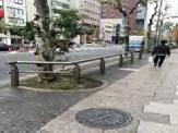


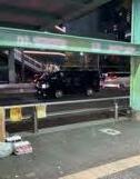


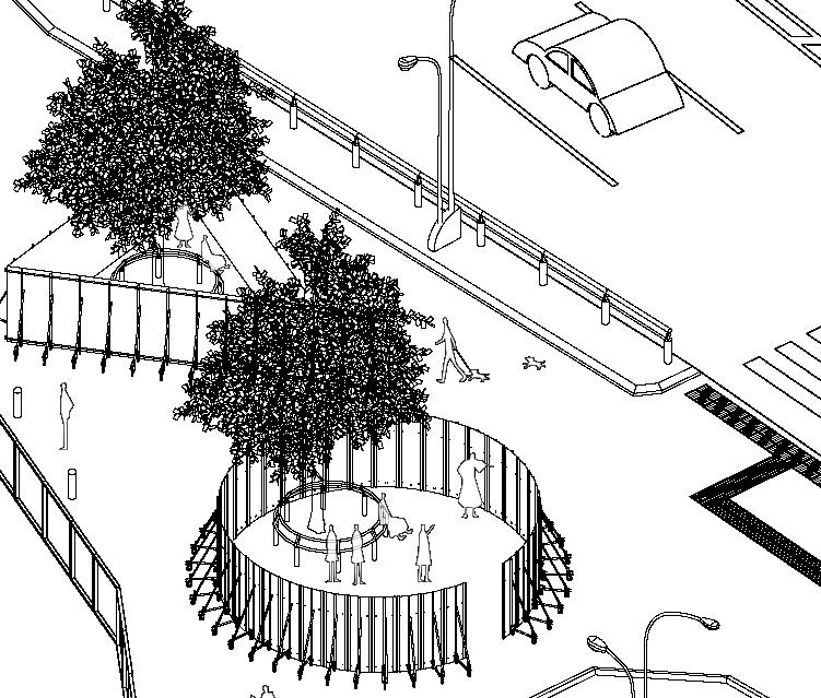
Use: Rest area, live venue Area: 60m2

Material:circular bench, temporary fence
A temporary object created with a moveable fence is inserted in an open space located on the north side of Miyashita Park. At night, it can be a venue for street performances, and during the day, it can also be a resting space for pedestrians.

Use: Rest Space Area: 3.5m2
Material: Pipe, Vending Machine, Soundproof sheet Creating a space for a person to rest above the vending machine, and a viewing platform overlooking the nearby plaza and Miyashita Park.
Use: Waiting Area Area: 10m2


Material:Electric pole, ladder, door, bollard pole
A temporary bus stop has been installed on Meiji Dori, which connects Shibuya and Harajuku. As an overflow-waiting area for buses, part of the roof of the empty building can be opened.

Use: Rest Area Area: 2.4m2
Material: Fence,Ladder Pedestrian Bridge
There are many pedestrian bridges on Shibuya-dori. Is it possible to create a new public space for people by gently shifting the fence of the structural part under the pedestrian bridge?
Use: Garbage dump Area: 1m2

Material:car stop, triangular cone

There are many car stops in the space created by the road widening. By combining with the triangular cones used during temporary construction, we will set up a garbage storage in Shibuya.
Use: Bicycle Parking Area: 2.5m2
Material: Fence, Pipe
A temporary parking spot will be set up in a corner of Shibuya Ward, which is overflowing with bicycles.
Use: Karaoke, Fashion Show, Telephone Box Area: 16.5m2
Material: Temporary Scaffolding Telephone Box, Ladder, Advertisement, Pipe
In open space, unutilised telephone boxes are used for Karaoke, Fashion Box, Call. These behavior represents Shibuya culture.
Advertisements for prevention of sight from the street


-The fences in suburban area of Tokyo-


-Fence-
An upright fence creates a landscape of a suburban residential area. The purpose is to construct various spaces by manipulating the fence.
fence fence public public private private
THE POSSIBILITY OF THE FENCE
How do fences create common spaces?
Subject: Design Studio III-1
Academic project
Individual
Year: Year 3, Semester1
Tutor: Professor A.Takahashi
Lecturer M.Harigai
Project type: Thought
Purpose: Think about a way of urban space
Size:
-Background-

Many fences are laid around the site and play a role in promoting safety and privacy. However, the fence that bears the boundary of the site needs to be considered from various perspectives, such as creating a landscape and building a relationship between the city, architecture and the fence, in addition to safety and privacy.
In these photoes, houses are enclosed with fences and their boundaries completely separate them from each other.
-Potential problems-
-Offers convenience and practicality-
-Fence enclosure


-Distinct division among residents; less interaction Fence
-From conventional pattern to proposed pattern-
◎Sitting
◎Taking a rest ◎Taking shelter from the rain ◎Playing outside
It may be a city resource that is owned by individuals and shared at the same time. added functions to normal purposes to separate each lands.
The left image is a conventional pattern for houses in Japan, while the right one has multi-purpose fences with common spaces.
-My proposition-
Japanese suburban areas are typically categorized into two spaces-private and public-and these two areas lack a common or shared space. One example of a common area is a common yard in a housing complex, which both housing complex residents and pedestrians can access. Hence I would like to rethink the purpose of the fence. There are 9 ideal examples of how I intend to change closed areas into a variety of spaces by transforming fences. These fences can stimulate interaction among neighbours and pedestrians.
Conventional Pattern
A series of closed spaces
Proposed pattern


Create new spaces through multi-purpose fences

-Diagram-


Basic manipulation
:Fence
:Stream of people and line of sight


0: Conventional Pattern


01: Connect territories
-Movable fence
-Between stores events, promotional activities, etc.
-Between houses barbecue, pot luck, etc.
00: Create room
02: Set up a front yard 03: Rest Area
-The common place closer to public area
-Walkway
-Encourages interaction with residents
05: A space in a corner
-Corner fence setback to create new space
06: Garden sharing
-Fence functions as a window


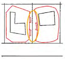

-Fence opens to residents for garden viewing
07: Common yard
-Fence corners create a significant space
-Children’s playtime, parents’ chitchat
-Benches in vacant spaces
04: Public
-Appreciate works from a bench
08: Covered space
-Covered space as in European street
09: Vertical fence
-Fence extends vertically hence vertical common space


-Interaction in the city-
A HOUSE COMPOSED OF FENCES
How does a fence create a common space instead of dividing spaces into private and public?
Subject: Design studio III-2


Academic project
Individual
Year: Year 3, Semester 2, 2020
Tutor: Professor S. Fuse
Lecturer A. Koji
Project type: Architecture
Purpose: House with Gallery
Sizes: 172 sq.m. (Site)


38.863 sq.m. (Architecture)


For this project, I chose to design a house at a corner site in Sengawa, which is located in the suburban area of Tokyo, for an artist couple.
The house consists of extended fences from each side to establish the shape of the house.

One common problem of a typical Japanese residential area is the lack of common or shared space as spaces are only categorized as either public or private. Therefore, I would like to address that.


Currently, neighbourhoods and cities in the suburbs are completely independent from each other and I would like to create a space where interaction is possible.
Normally, fences are used and positioned as a division between private and public spaces, but I think that fences can be used to create a new and improved landscape in the city.
-Program-
Road (Public space)


-Initial sketches-
Common gallery space
Private space ( work/ life space)
-Occupants-
If each house can have a common space that other residents have access to, believe that an interactive area would be created. Therefore, in order to embody this idea, tried to build a house that is born from a “fence”.
-Concept Models-


The overall structure of the house is formed by weaved fences, making it appear like a single fence. Based on its architectural form, weaved fences form a spiral fold (or the space between one fence and another fence), which is assumed as the space for the artists’ gallery.
-Models-


-Floor Plan-


Can
FLOW
Subject: Design Studio II-2
Academic project
Individual
Year: Year 2, Semester 2
Tutor: Professor A.Takahashi
Project type: Architecture
Purpose: Station
Size: 695 sq.m/438 sq.m.


In this site, Kiyotaki Station on the Takaotozan Railway has access to cable cars going to Mt. Takao. It takes about 5 minutes on foot from Takaosanguchi Station. Mt. Takao has more than 2.6 million climbers annually and boasts the highest number of climbers in the world.
This project is a station design. The station consists of three volumes. The station building consists of HP shell units. Depending on the space type, the station is designed to change how to combine HP shells. For the volume in the station building, I tied to establish a quite space compared to other volumes. Therefore, I seek the shape of combination by HP shells. Furthermore, when it comes to foam, I designed it in order to show each directions such as footprint, lift, station building, mountain and the front.
The site is located on Mt.Takao. Although it is a relatively low mountain, it is blessed with a variety of vegetation and a place of relaxation for the citizens of Tokyo.
analysis-
The Orange lines show the stream of people. Visitors normally walk from Takaosanguchi Train Station to Kiyotaki Station for cable car access. I redesigned this station for visitors who would like to take a cable car or a lift, or hike to the peak.

Train Station
-Architectural Composition-
-Study Models-


I designed this building and created spaces with different combinations of HP shells depending on the characteristics of each space.
In this volume, I tried to make a more spacious volume compared to three other volumes in order to visitor take a rest comfortably.
-Structure Model-


-Perspective from the station building-


MUSASHI-SHINJYO HILLS


Can architectural hills be a field where children can play freely?


Subject: Design Studio III-1
Academic project
Individual Year: Year 3, Semester 1
Tutor: Professor A.Takahashi
Lecturer M.Harigai
Project type: Architecture
Purpose: Playground / Rest area

Size: 1,138 sq.m./930 sq.m.

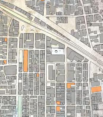


The site project is located in Musashi-shinjo, one of the suburban areas in Kawasaki City, Kanagawa, Japan. The area is known for in housing communities and shopping streets. This area has nine shopping streets. The site is accessible to two adjacent streets; I Mall Shopping Street and San mall Shopping Street.
Musashi-shinjo has a lot of kindergartens which do not have their own playground. In addition, there are insufficient parks.


In this work, I introduced a new flow and established a playground. This architecture allows children to play freely. The gym’s facade, where children’s activities can be seen, is viewable from the street.
PROJECT IS HERE!
This site is around 5 minutes from the train station and 9 shopping streets.. Around the station are both residential and shopping areas. Located in the shopping areas are many kindergartens. However, there is not enough space for children to play such as playgrounds, gymnasiums, or parks. So in this project, I decided to establish a building for children. It is a hill for children.
-Perspective from the east side of the building-


-Plan/Section-


-Map-

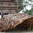
The gate represents the barrier of the Buddhist area of Todaiji Temple.


-History-
FACE TO FACE WITH NANDAIMON GATE OF TODAIJI TEMPLE
Subject: Extracurricular Activity
Group work
Role: Design/ Construction
Year: Year 3
Judges: S. Fujimoto, A. Hirata, R. Asizawa
Project type: Folly

Purpose: The space by historical interpretation


Size: 25 sq.m.
Member: Shunichi Kato, Nanako Hiramatsu
This project is a workshop for architecture students. This project’s purpose is to create a prototype rooted in the place through understanding the historical land, culture, and history.


The project was divided into three stages - site analysis and cultural analysis, research and process, and realization.


Site analysis and cultural analysis -Site analysis was done in group where three members were responsible for finding information about the site. This process involved Digi map analysis and photographic recording of the area. For cultural analysis, students were asked to gather information about the prevailing culture and history of the Heian period.
Research and Process- Develop an increased critical awareness of emotion and function within this design field. Our main goal was to highlight the supremacy of the Nandaimon Gate.

-Nandaimon Gate-
In this combination, Sashihijiki is inserted into the shaft of the pillars, and the pillars in between are solidified through Nuki, a Japanese style of “carpentry joint connection”.
-Study Progress-

-Perspective from the north side of the folly-
Roof material

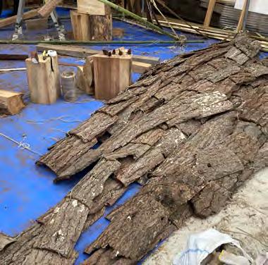
Pine skin


Structure material
Bamboo
-Aerial view-
-Elevation-
-Constitution/ Materials-
These are the Pine skins which used to grow in precincts of Todaiji temple. It is divided into four equal parts and becomes firewood.


4,500
-Section-
2,200

-Building Process-




-Perspective-


