26 minute read
The Insider
INSIDER
Function, Flavor and Art
Landscape expert Jennifer Schamber of Greenscape Gardens shares her insights on St. Louis gardening and the addition of potager practices.
Edited by Moe Godat Portrait photography by Colin Miller/Strauss Peyton
Embracing French Style
A potager garden is a French style of ornamental food gardening that beautifully blends function, flavor and art into a landscape. It can also be simply called a kitchen garden. Flowers should draw in pollinators, and other companion plants can increase the resiliency and rigor. Veggies, fruits and herbs are intertwined together, working as a plant community to help make each other more productive and useful.
Incorporating Practices
Consider incorporating some beautiful new pots into the landscape and fill them with a combination of flowers, veggies and herbs. It’s always best to place these pots as close to the kitchen or patio as possible. Start learning about what types of flowers are edible, like pansies and nasturtiums. Also consider what types of fun cocktails you enjoy in the summer and grow the ingredients like mint, basil and lemon verbena.
Becoming a Budding Herbalist
It’s best to start with growing in pots. Be sure that the pots have good drainage and use a good quality potting mix. Planting doesn’t start and end in the spring, it starts in early spring with cool season crops, continues into late spring with warm season crops, then back to cool season crops again in late summer/early fall. With some planning in place, cool season crops can be protected and the harvest season can continue well into the winter.
Pollinator Haven
A perfect potager garden will draw in pollinators and other beneficial insects and birds with flowers and berries, but keep in mind that you’ll be sharing your blueberries with the robin if you don’t have a plan to protect them. Ideally, in a very productive garden, there could likely be enough to share with everyone. These types of gardens are usually in enclosed spaces where large animals, like deer, do not have access.
Perfect Companions
Certain plants are best planted together, while others should be kept apart. For example, basil is very beneficial to plant near tomatoes because it seems to help repel certain pests and some say can help enhance the vigor and flavor of the tomatoes. Carrots are also known to do well when grown with tomatoes. There are lots of great companion planting charts online to use as a guide when deciding how to design an edible garden.
A Quick Maintenance Tip
The most important maintenance requirement is to be prepared for the neighborhood rabbits and squirrels to be curious about what has been planted. There are some effective repellents that are derived from hot pepper wax or simply sprinkle some cayenne pepper around new plantings to help deter the pests, although barrier methods (fencing and cloches) are most effective. It’s also important to understand that high production gardens aren’t low maintenance… the more you give, the more you get back.




Go Ornamental
When choosing materials for a potager garden, consider using as many natural materials as possible: real stone edging, cedar wood obelisks, terra cotta pots and metal crafted trellising are preferred over plastic or vinyl. These materials are enduring and timeless and create the feel of an Old-World garden. Of course, this is a very personal space, so there are no rules when it comes to doing what brings you joy.
Know Your Goals
A fun goal to have with a potager garden is to try to incorporate at least one small thing from the garden into a meal (or cocktail) every day. Whether this be eggs from a chicken coop, flowers from a redbud tree, foraged wild violet flowers or canned veggies from the last season’s harvest, with some planning and a lot of passion, we could all be eating like kings in our “Potager du Roi.” . See stlouishomesmag.com for resources.
Bathed in soft, neutral hues and outfitted with plush seating pieces, a covered pavilion adjacent to the pool lets the vibrant colors of the landscape steal the show. A massive tree-stump coffee table lends an organic feel.

Town and Country Classic
A highly collaborative team brings their creative visions to reality in this extraordinary new build that feels brand new yet comfortingly familiar.
By Jeanne Delathouder Photography Megan Lorenz Architect Lauren Strutman Architects Builder Jeffrey Homes LLC Designer Accent on Cabinets
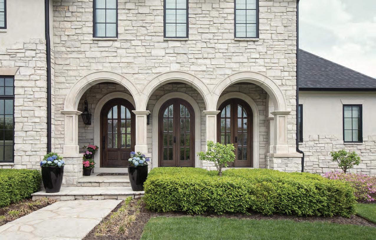
Clad in stucco and stone with three distinctive archways and a strikingly tall window in the stairwell at the front of the house, this Town and Country dwelling immediately exudes an air of timeless, classic style. The inspiration for this exquisite St. Louis home? The homeowner’s impeccable eye for design and her desire to create an inviting, idyllic little haven where family, friends—and even the family dogs— would always feel welcome and comfortable.
“What is most enjoyable about this home is its connections to the lovely outdoors surrounding the home,” says Lauren Strutman, principal architect at Lauren Strutman Architects. Expansive windows capture the views, the spacious front porch is warmly inviting and the rear of the house features a covered lanai for dining and an outdoor living area with a fireplace.
“Before we started this project, the homeowner saw a house online that she used for inspiration on the exterior,” recalls builder Jeffrey Bernstein of Jeffrey Homes LLC, who worked with the creative team throughout the construction. “She worked very closely with the team to cultivate the same look, and they created this beautiful home. I work with some great people, and this homeowner is certainly one of my
favorites. She made the process so easy and was always appreciative of the workmanship. We completed her home many months ago— and we are still great friends,” he jokes.
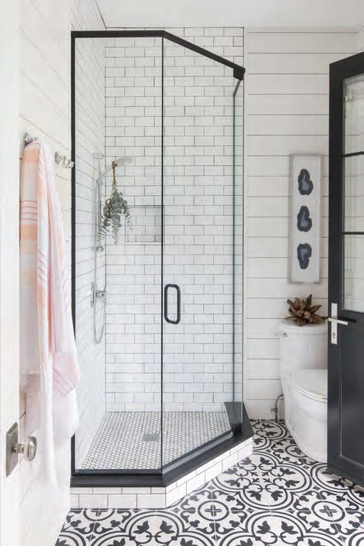
Specifically designed to fit the family’s active lifestyle, the space offers plenty of places to work from home. Spacious laundry rooms on both the main and upper levels take household convenience to the next level. A luxurious pool bath outfitted with Ann Sacks tile flooring, shiplap walls, a changing room, full shower and toilet opens from inside the house as well as an outside entry from the pool area—making it a breeze for guests and family to access while swimming and entertaining poolside.
“I knew what I wanted in my home, and to get it, I needed a great team,” says the homeowner, who collaborated closely with the architect, builder and designer. “Everyone worked so well together and very diligently. Building a home can be stressful for those who aren’t used to it, so having knowledgeable and flexible people is key. I have moved and remodeled several different homes, so I knew what I wanted and how to go about it,” she sums.
“When the homeowner told me she was building a new house, I was so excited for her,” says Kathy Israel, owner of Accent on Cabinets, who is also a family friend. “We had worked together on designing
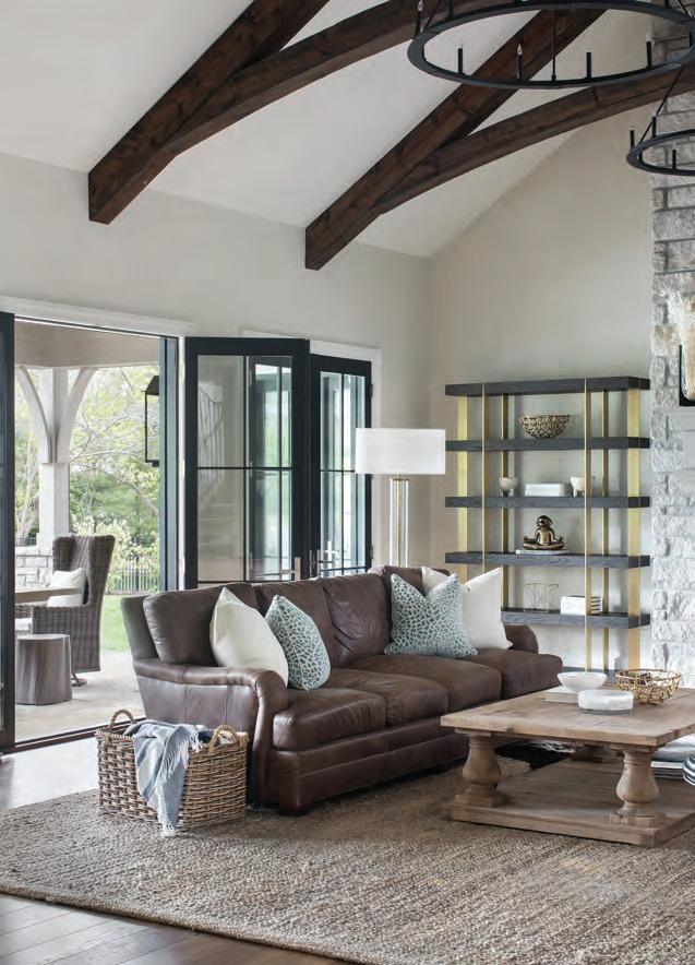
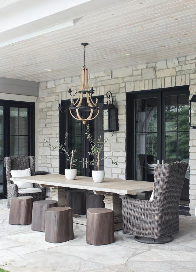
Clockwise from top left: The living area flows seamlessly into the outdoor dining space via a wall of French doors. A soaring vaulted ceiling, stone fireplace and magnificent wrought-iron chandeliers create stunning visual drama. A long stone table with plenty of seating on the terrace makes alfresco entertaining a breeze. Beautifully clad in graphic black-and-white Ann Sacks tile flooring, shiplap walls and a full shower, the pool bathroom features both inside and outside entrances for easy access.
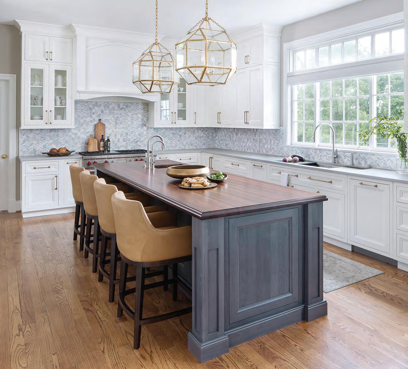
Designed by Kathy Israel of Accent on Cabinets, the kitchen’s extra-large island, topped with luxurious white marble, allows ample space for prep work, cooking and family gatherings. Expansive windows with pool views keep the cook visually connected to all the outside activities.

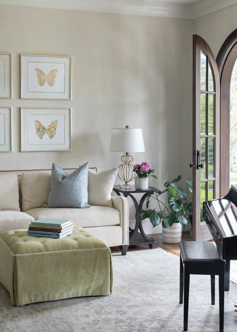
A large table surrounded by comfy upholstered chairs makes a roomy spot for casual meals just off the kitchen. High-durability European oak hardwood flooring flows throughout the home and lends a lustrous patina. Oposite page: A quiet seating nook and an elegant piano in the living area sit next to a graceful arched doorway that provides an abundance of natural sunlight and lush landscape views.
her previous kitchen, so we knew we could speak the same lingo. She and I bounced ideas off each other until we found the perfect space. She is very creative, so it was a blast to work together again,” she adds. When discussing the goals of the home with Kathy Israel, they knew it was important that the layout flowed seamlessly from the interior rooms to the exterior spaces. As a result, the overall design, from the kitchen to the main living areas, offers expansive entryways to the saltwater pools and outdoor living space. The home lends itself to a transitional style with a modern French vibe—it feels brand new yet comfortingly familiar. A soft neutral palette allows the homeowner to decorate effortlessly for every season, party and celebration without the stress of clashing colors. The style of the home plays with vintage elements while still feeling clean, intentional and warm, and the entire look can quickly be changed by adding or subtracting just a few accent pieces.
“I have some treasured things that I’ve collected throughout the years,” says the homeowner, “but I want to stress that my home is meant to be lived in and used. I’ve never felt I needed expensive pieces to look amazing. My rule of thumb is to always invest in natural, classic pieces that stand the test of time.”

For the kitchen design of this new home, Kathy felt it was essential to unite timeless—not trendy—details with functionality. Every element was carefully considered, from the inset painted cabinets and the warm tone of the island and butler’s pantry to the interiors of every cabinet and drawer. A marble countertop lends a luxurious, timeless feel, and all these special details work together to create a cozy hub where everyone loves to gather. Wolf appliances and Plato custom cabinets especially accommodate the demanding lifestyle of the homeowner, who loves to entertain.
“The overall kitchen design allows many people to cook, prep and gather without stepping all over each other,” says Kathy. “It’s laid out so harmoniously with the rest of the home that you always feel connected to others in the house even if you are the only one getting supper ready. The hearth room fireplace gives the kitchen a warm, cozy feel on a cold day, and on a hot summer day, you can see the action going on in the pool. Whenever I am a guest at this house, I feel like I’m on vacation because it sends off those vibes,” she laughs.
While working on this extensive project, one of Kathy’s most memorable experiences was flying to Chicago with the homeowner to look at hardwood floors. Together, they had researched a fabulous
European oak hardwood flooring from Hakwood that is often used in commercial settings. The hardwood doesn’t have a varnish on top and is engineered via a unique firing process that ensures even coloration and high durability.
“We went to a restaurant that had these floors installed— even in the kitchen—and we were amazed that there were no scratches in such a high-traffic setting,” explains Kathy. “We looked so silly walking around looking for marks on the floor, but because of the long hours spent researching this floor, it’s now being used regularly in the St. Louis area,” she notes.
“My advice to anyone building or renovating would be to invest in quality products like flooring, windows, doors, cabinets and fireplaces,” concludes the homeowner. “These are the things you’ll enjoy the most and are hard to switch out after you’re finished. Now that this house is complete, one of my favorite things to do is gaze out the French doors in the evening as the sun sets over the pool. Just beautiful.” See stlouishomesmag.com for resources and additional photos.
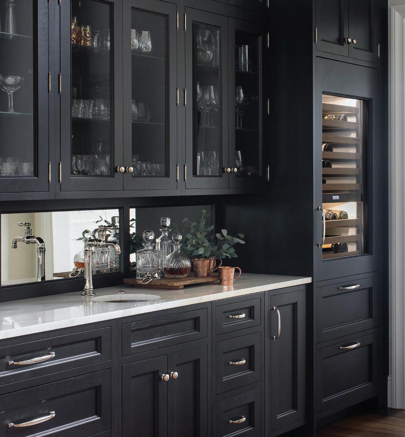
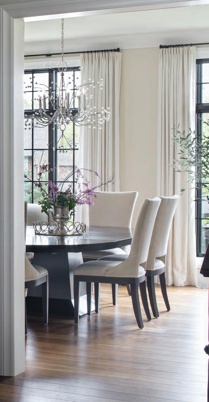
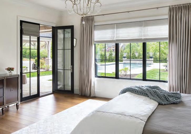
The elegant dark cabinets in the butler’s pantry mirror the ebony wood finishes featured in the adjacent dining room. A brilliant “Splashing Water” light fixture from Remains Lighting makes a dynamic statement over the dining table. “The homeowner and I flew to Chicago to see it in person,” Kathy recalls. “After picking it up, we stopped to get a bite before heading back to St. Louis, and when we returned to the car, it had been towed with this amazing chandelier inside,” she laughs. “It was so stressful to say the least, but we never laughed so hard.” This page bedroom: Expansive windows and french doors in the master bedroom bring the tranquility of the pool area indoors, providing a serene retreat for the homeowners. A crystal chandelier overhead lends an air of timeless elegance.
CALM, COOL AND COLLECTED
Thoughtful design choices and the owners’ eclectic treasures pair effortlessly in a stylish, modern new build.
By Kim Hill Photography Megan Lorenz Interior Design Julie Reinecke Designs Architect Gary Borror
The deck spans the entire length of the main floor. “It’s like being in a treehouse,” says homeowner Tom Shipp.

Sometimes it’s the slightest things—a chance encounter, an inspired purchase, hiring the right professional—that can change the direction of our lives or a project. So it was for the homeowners of this sleek, sophisticated home. As they were planning their new house, Tom Shipp and John Callahan were browsing at Metro Lighting when a Metro representative realized the two were overwhelmed at the daunting aspect of selecting every element for a custom home. The Metro rep referred them to interior designer Julie Reinecke. “They reached out to me before they’d even dug a hole in the ground, which always makes for the best experience,” says Reinecke, founder of Julie Reinecke Designs. “Although I’d never met them before, we just hit it off and I jumped at the chance to work with them.” Shipp and Callahan have been together for many years, most recently living in a large, traditionally styled home in Frontenac. Sited on two acres, “it was just too big for two guys and a dog,” says Shipp. “The maintenance was crazy.” When the two began thinking of building a new, smaller home, Shipp was drawn to the aesthetic of Rocio Romero, a Chilean-American designer who gained prominence in the early 2000s for her modern, minimalist styling utilizing kit housing. Shipp and Callahan even met with Romero representatives, but ultimately scrapped the pre-fab idea.
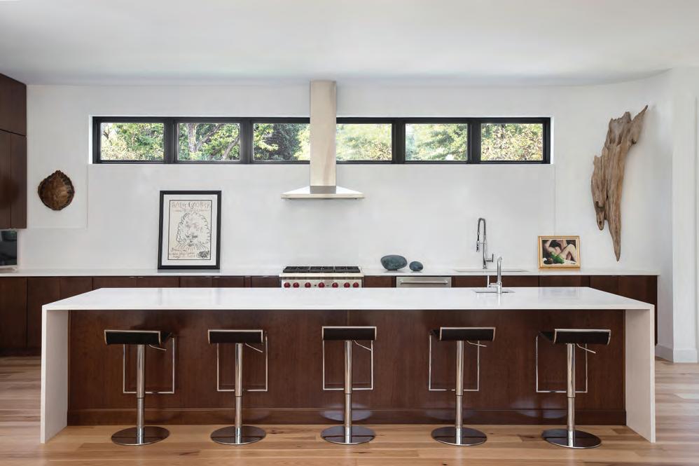

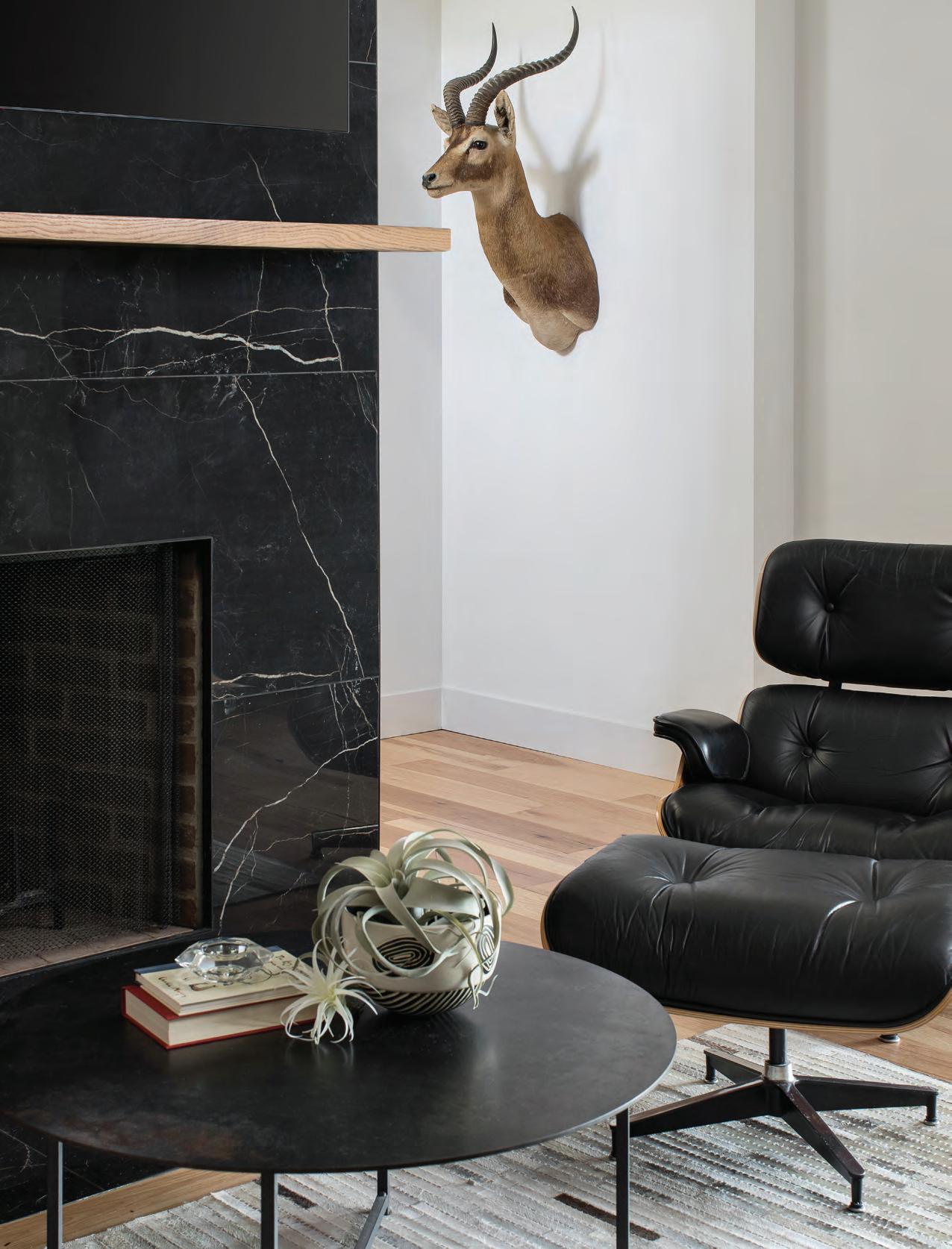
Opposite page top: The home’s eclectic mix of beloved treasures and sleek design choices include an antique Aztec stone seat placed by the front door paired with a rustic piece of cypress reclaimed from a Louisiana swamp. Opposite page bottom: Inspired by the look of open restaurant kitchens, homeowner Tom Shipp designed a stylishly symmetrical space. White quartz tops the counters and extends up the wall to the bank of black-framed windows. Piston stools lend a masculine touch. This page: Julie Reinecke’s husband, a talented hobbyist woodworker, crafted the floating mantel for the wood-burning fireplace in the lower level. Kicking back in his Eames chair, homeowner John Callahan uses this lower-level space as his den. The springbok antelope taxidermy, owned by the couple for decades, was nicknamed “Richard” by movers. “We just went with that name,” says homeowner Tom Shipp. “When you walk in the front door of our home and look down the stairs, Richard is looking right at you. It’s whimsical to me.”

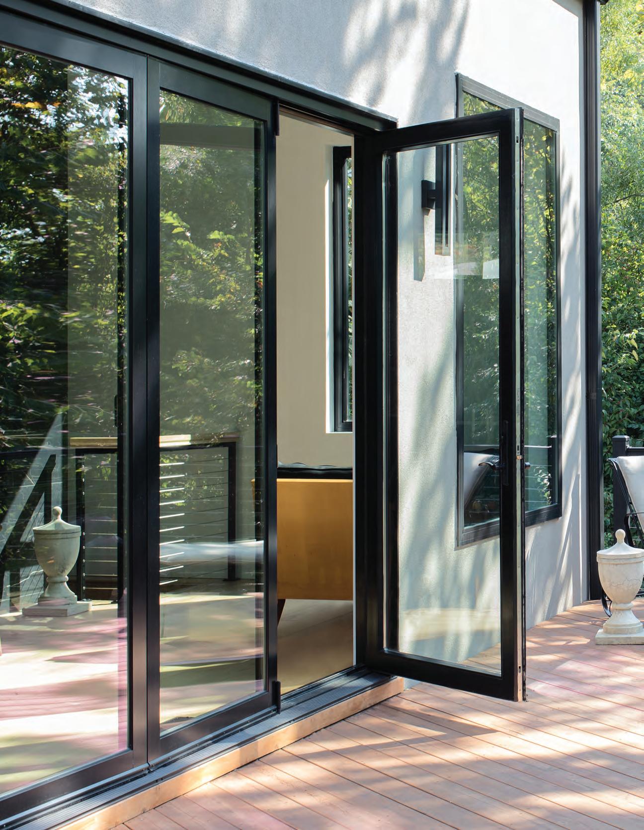
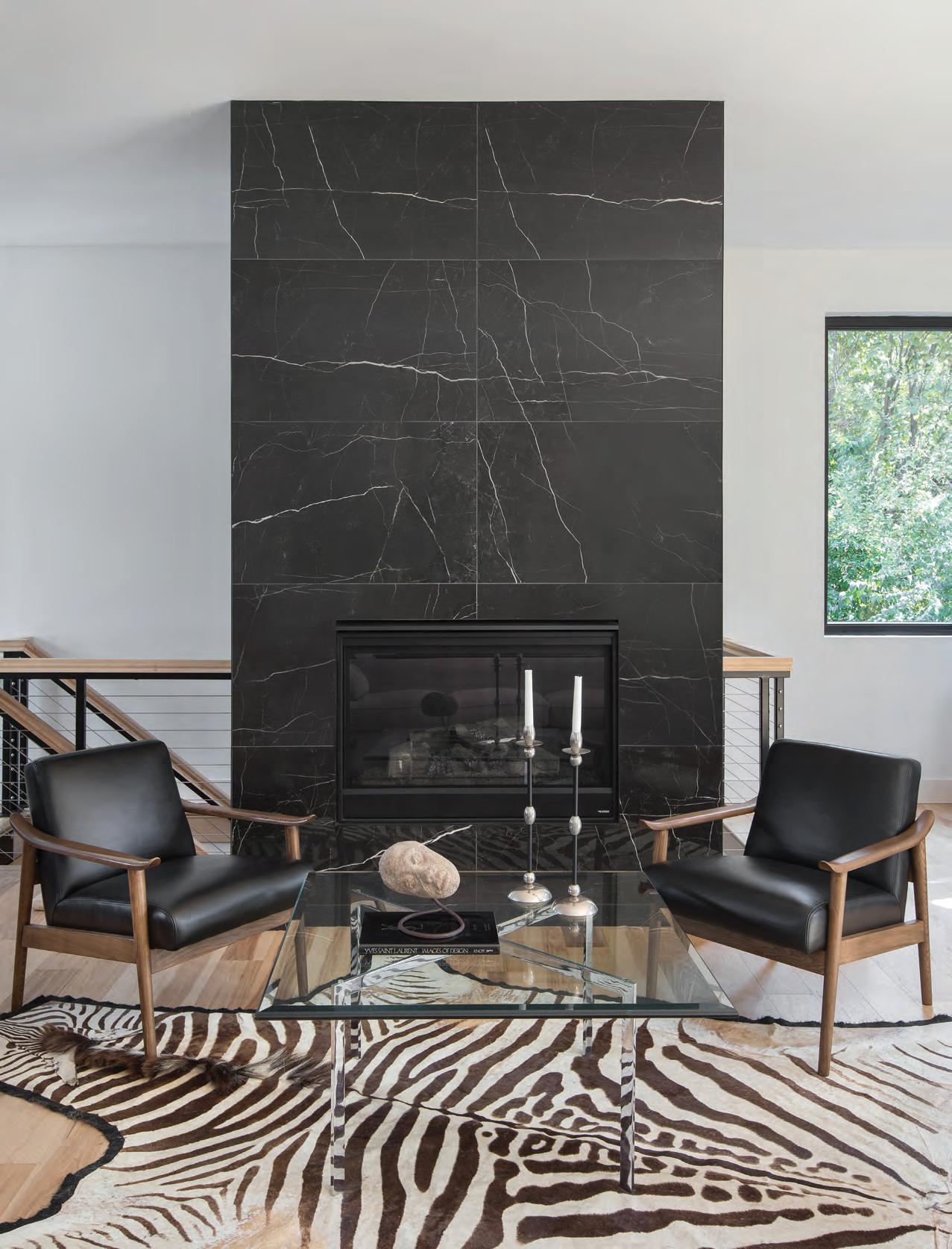
A large, 19th-century Chinese silk kang (or dais) cover from John Callahan’s collection hangs across the room from the equally dramatic, two-sided fireplace. “This very detailed tapestry, which has great scale, is a nice balance to the fireplace,” says Julie Reinecke. An accordion window-anddoor system pulls the outdoors in. “This house looks so timeless, you could pick it up and it could go in multiple settings,” she says.

Callahan was looking for land when he stumbled upon a steep lot within the Kirkwood city limits. The site’s "for sale" sign along a main road almost looked like it was placed as an afterthought. Heavily wooded, the lot overlooked the Meramec River in the distance. “It’s a unique lot that I think a lot of people passed over because they wondered how you could build on it,” Reinecke believes. But Shipp realized a home built on the site would deliver the privacy he craved. As the owner of a busy insurance agency, Shipp says home is “where I recharge my batteries.”
The couple engaged architect G. Clinton Borror of Eureka. “He understood the way we described the house we wanted to live in,” says Shipp, who conveyed his admiration of Romero’s design aesthetic in meetings with Borror. The result is a coolly contemporary home long on style and short on fussiness, with open concept kitchen, living and dining spaces on the main level. A dramatic, floor-to-ceiling window and accordion door system at the back of the home allows for what Shipp calls “the million-dollar views” of the Meramec River. “To them, it kind of feels like living in a treehouse, but a very sophisticated, sexy, well-thought-out treehouse,” says Reinecke.
She says every detail—from the selection of the font for the house numbers to the baseboards to the placement of art—was intentional. “They wanted a high-end, eclectic aesthetic that looks well-traveled and unique,” the designer explains. Reinecke says Shipp defined his desired look as negative space, which in this case, means stylish, uncluttered, calming and purposeful. Callahan, however, is more traditionally minded. “If there’s a wall anywhere, John has to have a piece of artwork on it,” Shipp laughs. “I do have some traditional in me, but I like modern. Julie did an amazing job blending our styles.”
Reinecke notes the two had “wonderful, curated pieces to ‘shop’ from.” Callahan was a part-owner of an interior design center in Dallas in the 1990s; several pieces of furniture and artwork were obtained through that business. He owned a large, 19th-century Chinese silk kang (or dais) cover. It now hangs in the dining area and pairs with Shipp’s Ethan Allen dining table and chairs. Beloved treasures such as animal hides, sculptures, an Eames chair and a tortoise shell end table were a few of the pieces Reinecke suggested they use in the new home. “They had wonderful, curated pieces, so it was fun to pull out what I thought were strong pieces that would really speak to their new space,” says Reinecke. “They didn’t want a lot of ‘stuff,’ so what we selected had to stand on its own.”
In the kitchen, Shipp wanted a minimalist aesthetic inspired by open kitchen restaurants. With no upper cabinets above the Wolf stove, the backsplash is comprised of two large pieces of white quartz, the same material used for the 14-foot-long island. A bank of windows trimmed in black, set high on the wall, allow natural light to flow in but provide privacy. A ventilation hood perfectly centered
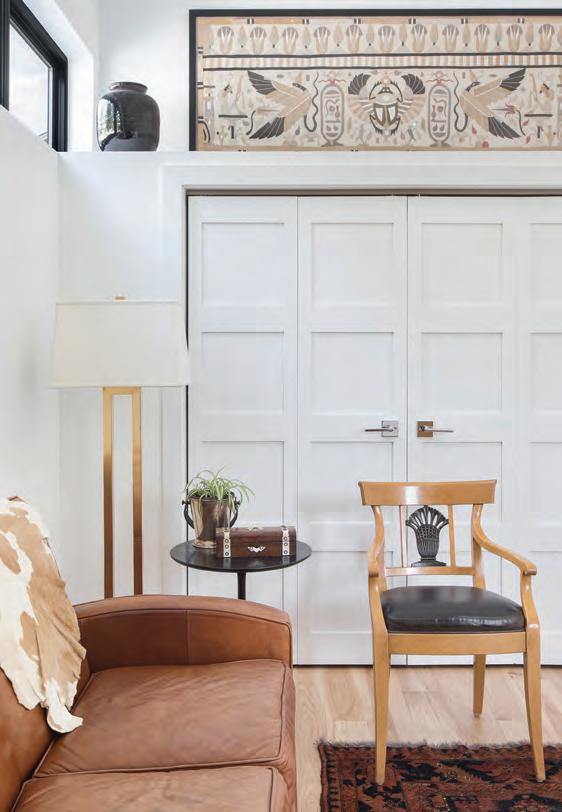
Top: Abundant windows let the outdoors in. “I wanted some seating here because I could envision myself reading and looking outside the big window,” says homeowner Tom Shipp. Designer Julie Reinecke helped the owners style the area with an acrylic table and stone statue from their existing collection of furnishings. The flooring is 6-inch hickory plank. Bottom: In the home office, a handmade Egyptian-inspired tapestry pairs with glazed Chinese pots. A Turkish rug grounds the space, while the formal chair is a nod to the homeowners’ sophisticated taste.

The two-sided fireplace clad in a heavily veined dark tile “is almost like artwork itself,” says designer Julie Reinecke.
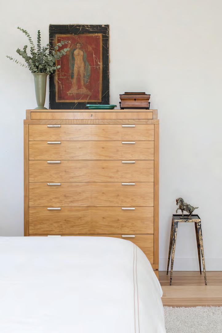
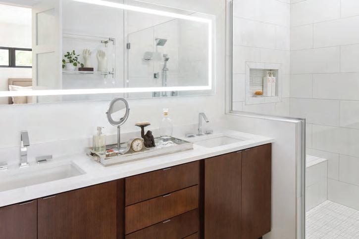
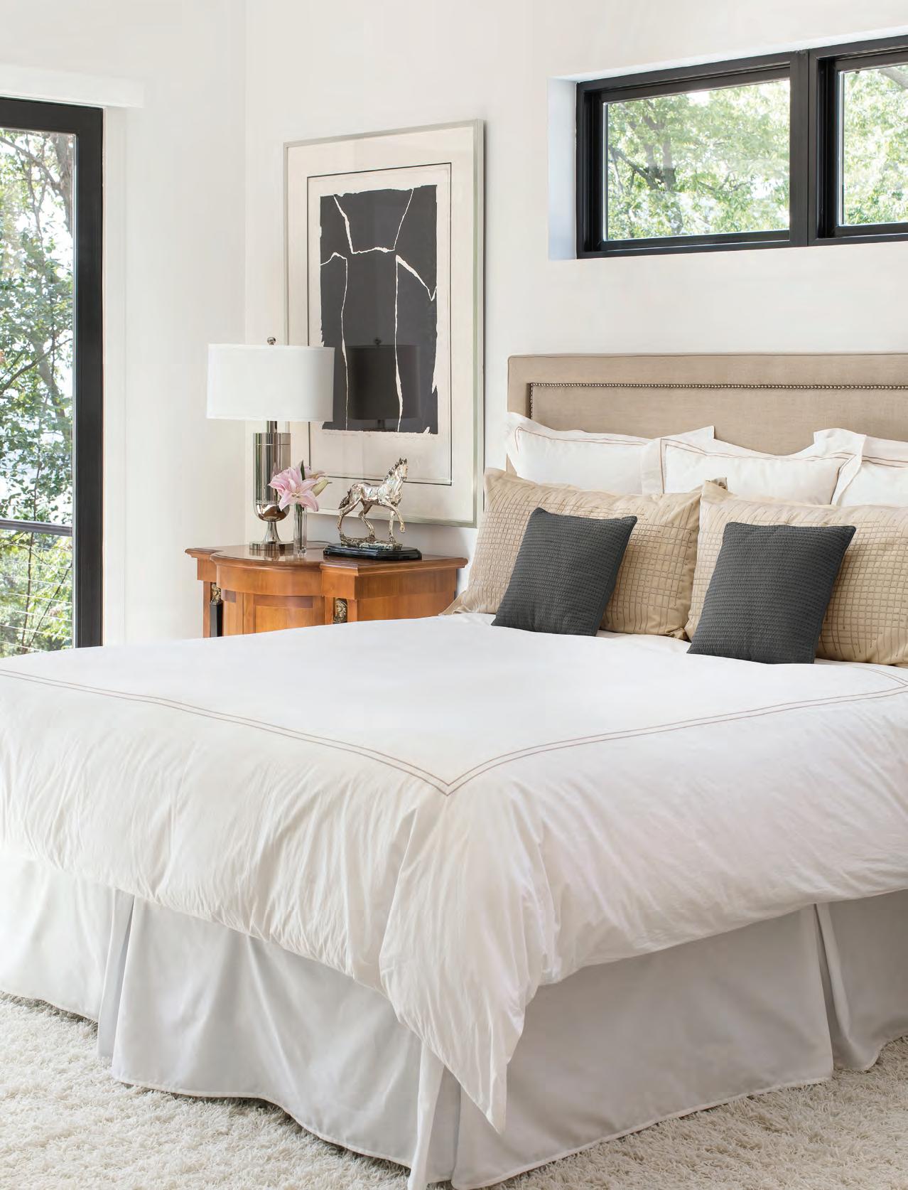
Top: The small equestrian sculpture is one of several pieces in the primary bedroom paying homage to the homeowners’ parents, who raised horses. The burled wood chest is from Ralph Lauren. Right: The Europhase LED backlit mirror in the primary bathroom “is almost like a piece of art,” says interior designer Julie Reinecke. “It’s unique, sexy and something a little different.” Homeowner Tom Shipp loves the architecture of Kohler fixtures, which were used throughout the home. Opposite page: A color lithograph by Adja Yunkers was a gift to the couple from friend and Lexington, Ky.-based interior designer Ken Lloyd. It hangs above a Biedermeier nightstand. Tall windows flood the primary bedroom with natural light. between the windows “is all you see when you look toward the kitchen from the living area, and that’s intentional,” says Shipp. The low-profile piston stools at the island don’t detract from the open aesthetic and lend a masculine touch.
A concave wall at the end of the bank of kitchen windows provided the perfect spot for a piece from Reinecke’s inventory. “I’d sourced this cypress piece on a Chicago shopping trip, not knowing where I could use it, but I had to have it because it was so unique in scale and texture,” says Reinecke. “Once I met Tom and John, I knew it would be stunning in their house. The fact it originally came from a Louisiana swamp and that Tom is from Louisiana, it was just meant to be.”
When they told her about the project, where it would be located and their desired aesthetic, “I knew it would be very unique,” says Reinecke. “They are so happy and proud of what they created, and rightly so.”
Reinecke, too, is so pleased with the finished project that she hired noted St. Louis photographer Megan Lorenz, who specializes in interiors and portraits, to take photos of the home for Reinecke’s marketing. According to Reinecke, Lorenz recognized the home’s coolly collected aesthetic and suggested it was worthy of publication. “Coming from such a wellrespected photographer who shoots beautiful homes all over was a great compliment,” says Reinecke, who then contacted staff at St. Louis Homes + Lifestyles. You’re viewing the result of that conversation. The slightest things can lead to new directions…and the best results.
See stlouishomesmag.com for resources and additional photos.

Garden Art
Jo Batzer’s English garden reflects her design background.
By Lucyann Boston Photography by Kim DIllon
Jo Batzer paints with plants. She draws with driftwood and sketches with saplings. One look at her garden and you see she is an artist. Colors, textures and shapes flow together and then play off each other.
A mélange of greens in a variety of textures welcomes visitors to her English Tudor home: the dark green, heart-shaped leaves of English ivy provide a carpet for chartreuse fans of mounded hosta. Backing the hosta, more structured, tiny leaved boxwoods lead to feathery stands of Japanese painted fern and maiden hair fern, flowing from the door-side urn. A delicate mix of white and lavender impatiens provides the only other color. White-edged hosta on one side of the front door is repeated in the creamy leaf margins of the variegated dogwood on the other side of the entrance.
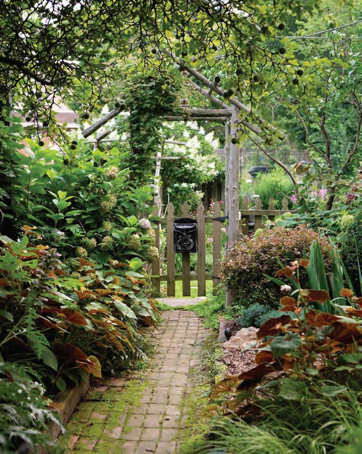
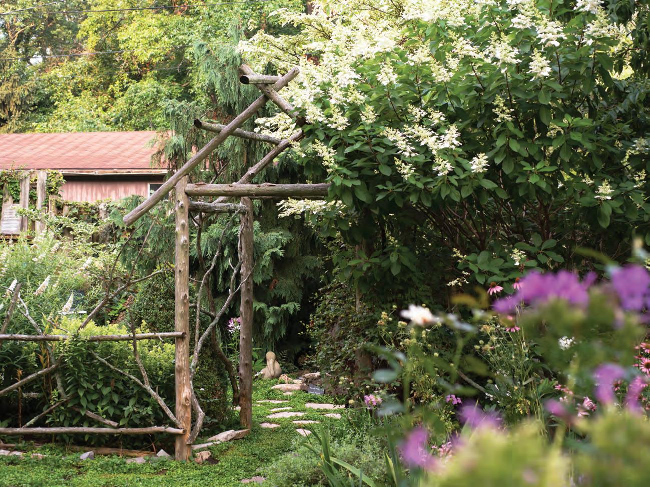
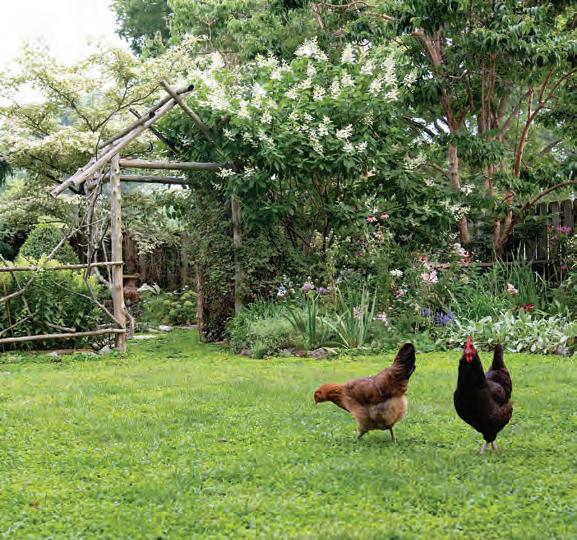
In the back, a flowing rustic fence and arbor created by Jo and a friend from tree trunks and branches divides the space into sunny and shady areas. On one side of the arbor, the conical white blossoms of a tree-like Tardiva hydrangea arch over the arbor and seem to point toward the graceful, triangular wands of the white butterfly bush, mimicking a similar shape on the other.
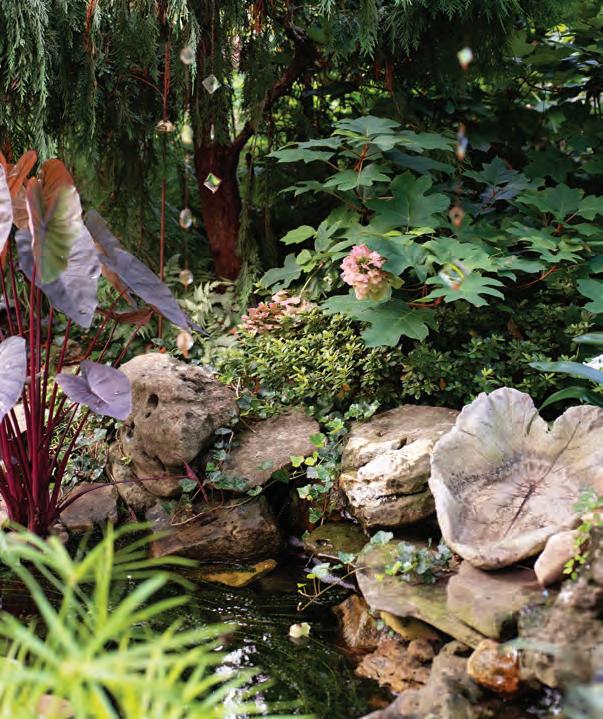
The sculptural, free-form lines of water-washed driftwood, reclaimed from the shores of the Mississippi and Missouri Rivers, act as garden ornaments along fence lines and beside pathways.
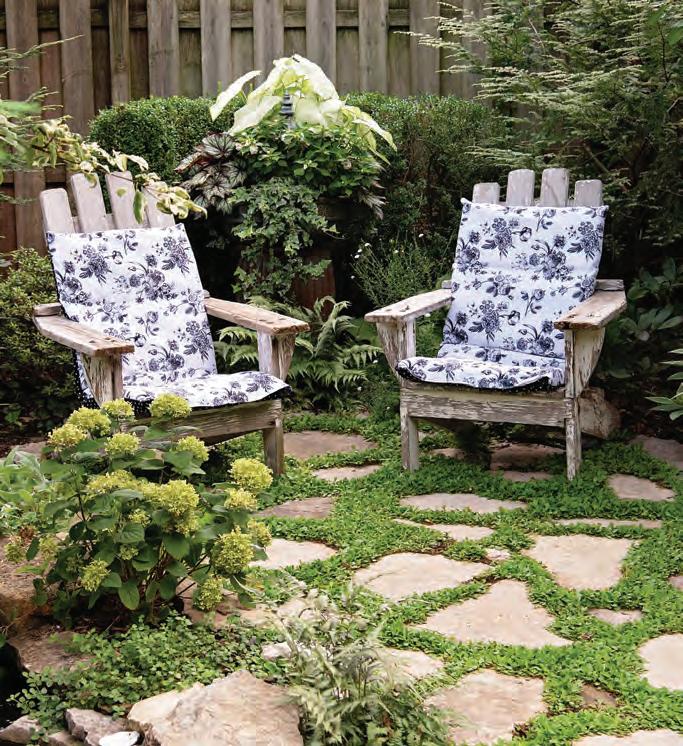
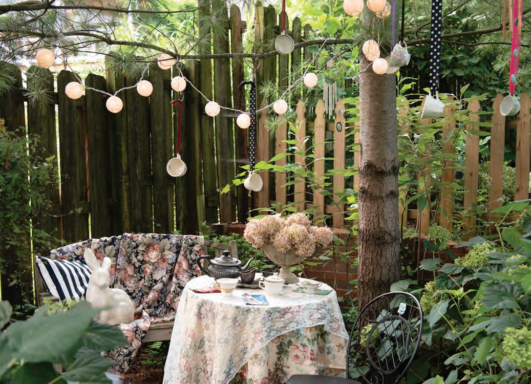
Dangling from a tree branch, teacups suspended on ribbons and a string of tea lights decorate a quiet corner of the landscape. They leave no doubt about the purpose of the small, lace-covered refreshment table and chairs below.
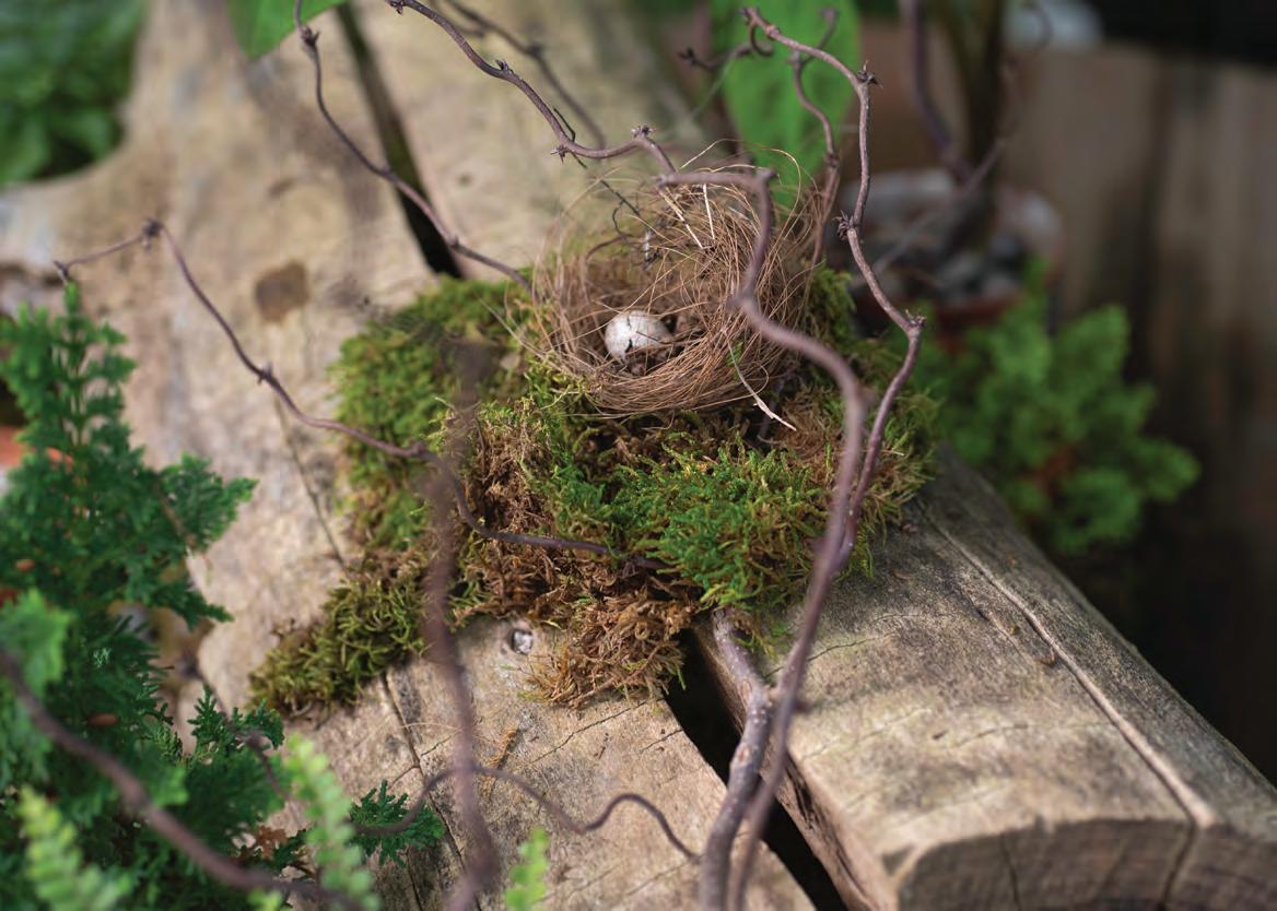
In a clump of fern, a bird’s nest containing a pale blue egg is nestled on a bed of moss draped across an ancient silvery log. It is a detail that could have been plucked from a Dutch Master’s still life.
-Jo Batzer
The blend of art and horticulture that is so evident in Jo’s garden had its roots early in her life. An honors art student in high school, she envisioned a career in commercial art, working in advertising or animation. Marriage and a move to a small town in Kansas diverted her into a job in the floral industry, which she immediately loved.
“I’ve always been drawn to anything that combines art with science,” she says. “Floral design incorporated my love of plants and design principles learned in college.” She ended up finishing her art degree with an emphasis on photography but on moving back to St. Louis, she decided “horticulture was my true calling.” She earned a second degree in horticulture from the well-known program at St. Louis Community College-Meramec.
Her talents were immediately snapped up by the Missouri Botanical Garden. During her 14 years at the garden in a variety of capacities, she worked on the side for private clients doing garden design and landscaping. Eventually, her landscaping business became so successful, she left the Botanical Garden to work full-time at her own business JB Designs. She also continued to work part-time in the off season in the floral design industry for Ambius, a company specializing in commercial interior landscaping and holiday decorating services.


If that weren’t enough, during the pandemic when public gardens closed and private garden tours were non-existent, she founded Garden-Lou.com, a website dedicated to all things gardening in the Greater St. Louis area.
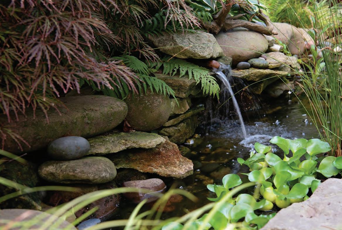
With her talent spread wide, it is in her own garden in Spanish Lake that she has put down her deepest roots. Her English country landscape, which she began from scratch in 1995, reflects the Tudor architecture of her home. “I have been in love with England and Scotland ever since I realized those places really existed and were not just something I read about in story books,” she says. Those childhood pictures are recreated just three minutes from I-270. Mulch softens log-lined pathways. A carpet of the groundcover mazus reptans, interspersed with stepping stones, provides an open lawn for strolling chickens that seem to have stepped out of a Beatrix Potter sketch book. Small, bubbling water features make a charming addition to garden beds.
She treasures a comment from one of the first visitors to her garden as part of a Spanish Lake garden tour. “She was a little old English lady, and she told me that she felt like she was back in England,” Jo recalls. “I was just overwhelmed.”
While her garden features numerous perennials and shrubs, Jo describes herself as a huge tree geek, beginning with two black gum trees she planted shortly after moving in. Many of her trees have sentiment attached. There is the ginkgo she grafted as part of a class at Meramec. “A yellow wood a friend at the Botanical Garden gave to me that was 2 feet high and a scrawny little thing when I planted it. A golden larch tree which
is a descendent of a beloved friend's tree. A white pine my stepson brought home from grade school as part of Arbor Day. If I could get more trees onto this piece of property, I would. I recently switched to dwarf conifers,” she says with a laugh. “It’s a little like wine, first you like the sweet stuff, then you get into the dry reds.”
The reason for her love of trees: “When I look out of the house in the winter, I don’t want to see bare nothingness. I want to see form and structure and texture. I am a huge texture freak. I love things like peely bark.”
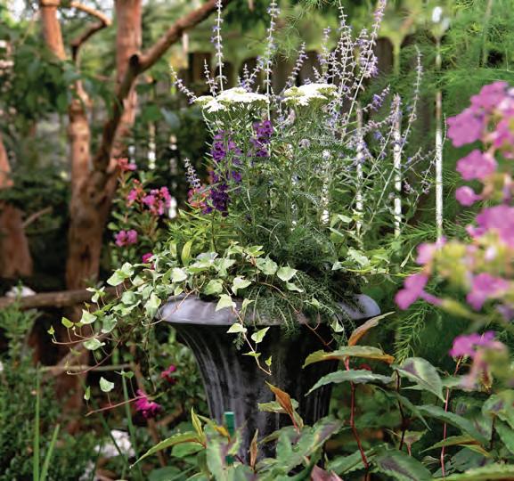
Even in the summer, she relies on texture, shades of green and variegated plants with shots of white. “This is where I come to relax,” she says of her own garden. “I am out dealing with people and their gardens all day. I don’t want to be in your face with color when I come home. I use lots of white and then maybe purples and pinks”
She also uses her own garden as a living lab to try new varieties. “How many plants have we all killed?” she asks rhetorically. “I like to do that in my own yard, not a clients’ yard.”
She draws a distinction between landscaping and “a true garden for intent and sentiment. Sentiment is one of the things that makes a true garden,” she says. “I still have the purple flag iris that came from one aunt and the sedum that came from another. I can’t look anywhere in this garden and not see an old friend or a place we have traveled. I can get another dogwood, but it won’t be the one my friend grafted for me.” See stlouishomesmag.com for resources and additional photos.
