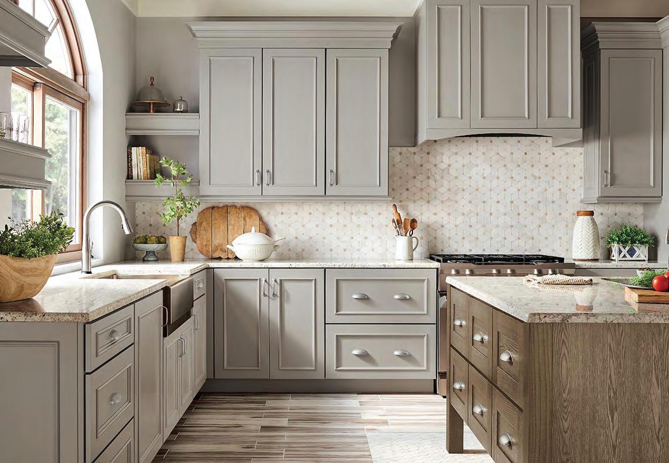
Kitchen Design: Christine Paul chrispaul@glenalspaugh.com
Photography: Anne Matheis




Kitchen Design: Christine Paul chrispaul@glenalspaugh.com
Photography: Anne Matheis


The experts at Ferguson Bath, Kitchen & Lighting Gallery are here to help create a home that’s as extraordinary as you are. Any project, any style, any dream—bring your inspiration to fruition at Ferguson Bath, Kitchen & Lighting Gallery. Visit fergusonshowrooms.com to discover more and find your nearest showroom.

PUBLISHER/OWNER: Suzie Osterloh
EDITORIAL DIRECTOR: Melissa Mauzy
MANAGING EDITOR: Molly (Moe) Godat
CREATIVE DIRECTOR: Kim Dillon
COPY EDITOR: Carol Wayne
CONTRIBUTING WRITERS: Lucyanne Boston, Jeanne Delathouder, Kristina DeYong, Kim Hill, Michelle Mastro, Wendy Noory, Gina Parsons, Andrew Wyatt
CONTRIBUTING PHOTOGRAPHERS: Trent Bell, Rachael Boling, Vera De, Neha Deshmukh, Robert Fernandez, Dan Forster, David Joseph Photography, Megan Lorenz, Anne Matheis, Colin Miller/Strauss Peyton, Karen Palmer, Reed Radcliffe, TripleRPhotography, Scott Sandler, Angie Seckinger, Fotis Serfas, Andrew Wyatt
SENIOR ACCOUNT EXECUTIVE: Colleen Poelker
DISTRIBUTION MASTER: Barney Osterloh
MARKETING + SOCIAL MEDIA SPECIALIST: Maya Brenningmeyer
ADVERTISING INQUIRIES: sosterloh@stlouishomesmag.com
EDITORIAL INQUIRIES: molly@stlouishomesmag.com
FOR SUBSCRIPTION INFORMATION: Email bosterloh@stlouishomesmag.com or visit www.stlouishomesmag.com
St. Louis Homes + Lifestyles Magazine

255 Lamp + Lantern Village Town & Country, MO 63017 636-230-9700
www.stlouishomesmag.com
©2023 by Distinctive Lifestyles LLC. All rights reserved. Permission to reprint or quote excerpts granted by written request only. Printed
PRESIDENT: Suzie Osterloh
VICE PRESIDENT: Barney Osterloh
St. Louis Homes + Lifestyles is a publication of Distinctive Lifestyles LLC
CONNECT WITH ST. LOUIS HOMES + LIFESTYLES ON THE INTERNET... HERE’S HOW:
WEBSITE: stlouishomesmag.com
FACEBOOK : facebook.com/stlhomesmag
INSTAGRAM: @stlhomesmag
TWITTER: @stlhomesmag

PINTREST: pinterest.com/stlouishomesmag
YOUTUBE: St. Louis Homes + Lifestyles
TIKTOK: St. Louis Homes + Lifestyles
FREE WEEKLY E-NEWSLETTER : sign up to receive it at stlouishomesmag.com
2023 Baths of the Year: entries due May 3
2024 Kitchens of the Year: entries due Oct 4
For downloadable entry forms and detailed information about each contest, please visit stlouishomesmag.com.
REFINISHING
Designed & built to be used as a bedside table in straw marquetry and walnut

SUBSCRIPTION

pages 68-69
pages 10-11
Just walk ing into a lighting showroom can seem overwhelming! There are so many lighting options to choose from. Where do you begin?

Some fixtures direct the light up; some direct the light down. Some are attached to the walls; some hang from the ceiling. Should I consider a floor lamp or a table lamp? Thank goodness when purchasing a new lighting fixture, the lamp shade is included. But what if I want to purchase an antique lamp or I inherited a table lamp that comes without a lamp shade? What type of lamp shade should I buy to properly complement the lamp (pages 10-11)?
Lighting our homes is complicated! It is so easy to get caught up in the design and color of the light fixture that sometimes we can forget lighting needs to provide a function aside from aesthetically improving the interior design. A well-lit, bright room feels bigger while dark rooms can feel smaller. There are shadows to consider along with how much natural light is coming into the room before making those artificial lighting choices. Layering the lighting in a space is of utmost importance too (pages 68-69).
Lighting your spaces can be tricky, and if you want to make sure you get the atmosphere and mood you’re looking for, bring in the lighting experts.
Frank Lloyd Wright nailed it as always!
Enjoy our annual lighting issue.
Suzie Osterloh Publisher/Owner

"More and more, so it seems to me, light is the beautifier of the building.”
—Frank Lloyd Wright


Every home has a need for bright, functional lighting to get everyday activities done. Task lighting illuminates the workspace, making your life easier.


 By Melissa Mauzy




Drum Shades: Drum shades live up to their name! With a circular top and bottom, drum shades form a cylindrical shape resembling a drum.
Empire Shades: Known for its elegance, an empire shade is notable for its tapered top with a larger, circular bottom. The diameter of the top circle is about one-half of the bottom’s diameter.
Square/Rectangular Shades: Square and rectangular shades bring a sharp, geometric accent to your space; they add particular contrast when paired with a rounded base. While you can probably imagine how the shapes of these shades will interact with your lamp base, interesting details such as rounded corners may bring unexpected panache to your replacement shade.

Bell Shades: Bell shades are basically empire shades with a little more flare! The top diameter is also about one-half of the bottom diameter, but it slopes down and flares out to a multi-sided bottom with corners.
Finding your way to the perfect lampshade can be harder than it seems! From shapes to fabrics to size and harps and finials, here is a short run-down on what you need to know about lamp shades.


 By Moe Godat
Tasseled velvet lamp shade, available at Anthropologie.


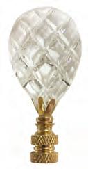
A lamp finial is an ornament that helps to secure the lampshade in place. They are functional, but can also be beautiful in a variety of colors, materials and decorative shapes. They serve as a small finishing touch to a space.
Silk: Silk is the fabric of luxury. For thousands of years, silk has brought a sense of elegance and sophistication to clothing and decor alike. On a lampshade, silk can create an air of romance and opulence. The smooth fabric reflects light and can create an iridescent effect. There are many different types of silk fabrics, so do some research to find the best for you. Use silks in a room to romance, luxuriousness and elegance.
Synthetics: Synthetic fabrics are man-made from a fusion of fibers. The two main types of synthetic fabric used for lamp shades are Anna and Supreme satin. Anna synthetic has a tight and thin weave and a durable texture. Supreme satin is glossy and glamorous; satin lampshades bring a luxurious sophistication to any room. Synthetic lampshades are a good option for retro or sophisticated themes.
Linen: Made from the flax plant, found in both luxurious homes and used for common dishcloths! It’s versatility and durability make it a great fabric for a lampshade. It’s two to three times stronger than cotton fabric and it also wicks away both heat and moisture. Use linen shades to add a charming feel to your space; they are perfect for creating a cozy atmosphere.
Cotton: Cotton is a popular fabric for lampshades because it’s easy to clean as well as easy to pleat, drape and gather for more decorative lampshades. Cotton lampshades help create a casual tone; consider using them in high-traffic or dirty areas as they are so easy to clean!
Alternate options: The lampshade material options are endless! From burlap to canvas, stained glass, tin and even seashells, there is a material out there to help create your perfect style.
Agate green stone lamp finial, available Ballard Designs.


Farlen lamp finial, available at Anthropologie.
Diamond-etched teardrop clear K9 crystal lamp finial with polished brass base, available at Royal Lampshades.
Quartz clear ball stone lamp finial, available Ballard Designs.

Decorative chinoiserie blue and white lamp finial, available at Royal Lampshades.

Jamie Briesemeister, CEO of Integration Controls, sheds light on home lighting automation.


 Edited by Moe Godat Photography by Reed Radcliffe, TripleRPhotography
Our goal at Integration Controls is to simplify and enrich the lives of our clients through curated solutions connected by design. Nearly every client asks for one thing: simplicity. It’s our job to understand what simplicity means to them, their home and their lifestyle so we can enrich the experience as much as possible. We then curate selected technologies and connect them—by design (and to the network)—to ensure the final user experience is simple and fun.
In all homes, we have light fixtures (the source of light) and light switches or dimmers (the control of light). A lighting control system takes the place of traditional light controls and creates an environment where all of the lights can “work together,” no matter where you are in your home (or across the world). Imagine going to bed and pressing a button that says “SLEEP”, and all of the lights you would have typically adjusted before bed adjust with just one press of a button.
Lighting control offers homeowners many benefits, including convenience, aesthetics, peace of mind and energy savings. When lighting interacts WITH the activities of daily living, it makes life more simple and convenient. The aesthetic benefits of lighting control are often in the style and type of keypad used to replace traditional switches. From attractive plastic buttons that are engraved to higher-end metal finishes, keypads offer a finer finish to a home design. Most of the time, lighting can provide peace of mind and when automated for certain events (nighttime, when a visitor comes to the door, etc.) it offers a sense of comfort. Finally, when programmed and designed well, lighting control systems aid in energy savings and ultimately, save electrical costs.

In new construction, we often work with the architect, lighting designer, electrician and builder to specify products that work well from start to finish. We can select all the right parts and pieces and wire the house accordingly, often with physical, wired connections. In existing homes, we are locked into the home’s existing wired infrastructure, and thus, we use different products, typically those with wireless communications. In this environment, our selections are minimized in style and type, but the overall functionality of lighting control can still remain.
Lighting control is going beyond the simple control of it (on/off/brighten/dim), with products now that offer tunable white lighting that adjust in color temperature throughout the day, so that the inside of your home resembles the natural daylight outside. This “human-centric” lighting trend has been proven to help people rest better, wake more easily and heal better after surgeries! It’s a trend we suspect will become a consideration with every lighting project in the future.
In addition to tunable white lighting, full-spectrum lighting is often requested. Instead of all shades of white, you can now bring in blue, green, red or other colors that can enhance your mood or the atmosphere you are trying to create. Another great technology enhancement would be “individually addressable fixtures.” Instead of lights that come on/ off because of how they are wired, these fixtures allow you to adjust the lighting plan as needed, so as the furniture plans change, the light in the house can adapt without the need for a renovation project. Of all of the solutions we offer to clients, lighting control is the most valuable, because we ALL interact with lighting on a daily basis. Why not simplify the thing you do every day? See stlouishomesmag.com for resources.


Douglas Dale has been working with yarn for a decade now, but they started using yarn to trace wood grains right around the height of Covid. “It was then that tracing wood with yarn was something rote and repetitive, and it just offered a good Zen activity,” they explain. It was also around the time that they started exploring ideas around gender and what it might mean to be nonbinary. “I really liked the metaphor of covering wood with yarn and making an object designed to encapsulate two different polarities of hard and soft, textile and wood, masculine and feminine.”


Draped in yarn, the pieces Doug crafts also come with another symbolic undercurrent: the yarn might extend beyond the wood, transitioning to loose fibers, or become influx on it. This appearance, of course, only adds to Doug’s overall message in their art that outliers exist in the world but are usually excluded because “they do not fit cleanly into any given narrative.” Doug says, “I have been thinking more and more beyond the literal identify stuff and thinking instead about the holes or flux or nuance that doesn’t cleanly fit into a story,” Doug says.

Case in point, Doug’s standout piece called “Checkpoint” is a little bathroom sink. It’s basically a basin pulled from a found bathroom sink and is covered in yarn that falls apart and hangs loosely as a fringe. “It’s a piece that I think is a really nice encapsulation of what I am thinking about in my art lately,” they say. “You look at it, and you aren’t really sure what structure is under there.” Hence, it’s a monument to identity, they explain. “The mirror over the sink is a site where you can be reminded of, ‘this is how people see me,’ or even just ‘wow, I look really nice today.’” In other words, the everyday activity of looking into the mirror can be imbued with significant meaning.
There is also a curious note of simplicity in Doug’s work. “Wood grains are simple and clean, but often as a material it can be taken for granted for its beauty.” Having dabbled in theatre and set design and spending time in the New York drag scene, Doug says, “I also really like the camp of dressing up the inexpensive material of wood.” At the same time, Doug enjoys design shows like Project Runway. “I liked the challenges where the contestants had to take found material and turn it into a ball gown in under 20 hours.”


Doug loves line and texture, and these new pieces they’re making reflect their usual creative impulses, except with a bit of a refresh. “In the past, I had always steered away from color because, like how a banana can overpower all the flavors in a smoothie, color can be all anyone sees,” they say. With Doug’s new art show set to start February, however, Doug will be bringing all the texture and lines plus a bounty of color.
Find Douglas Dale’s art show at the Duane Reed Gallery in St. Louis starting February 10 and running until March 18. The exhibit will include an opening reception on February 10. See stlouishomesmag.com for more photos and resources.
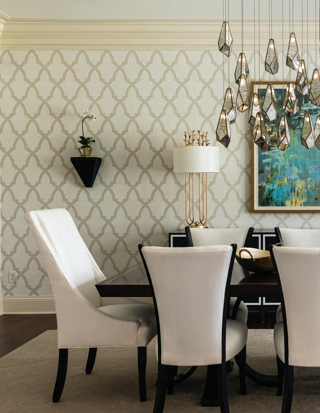
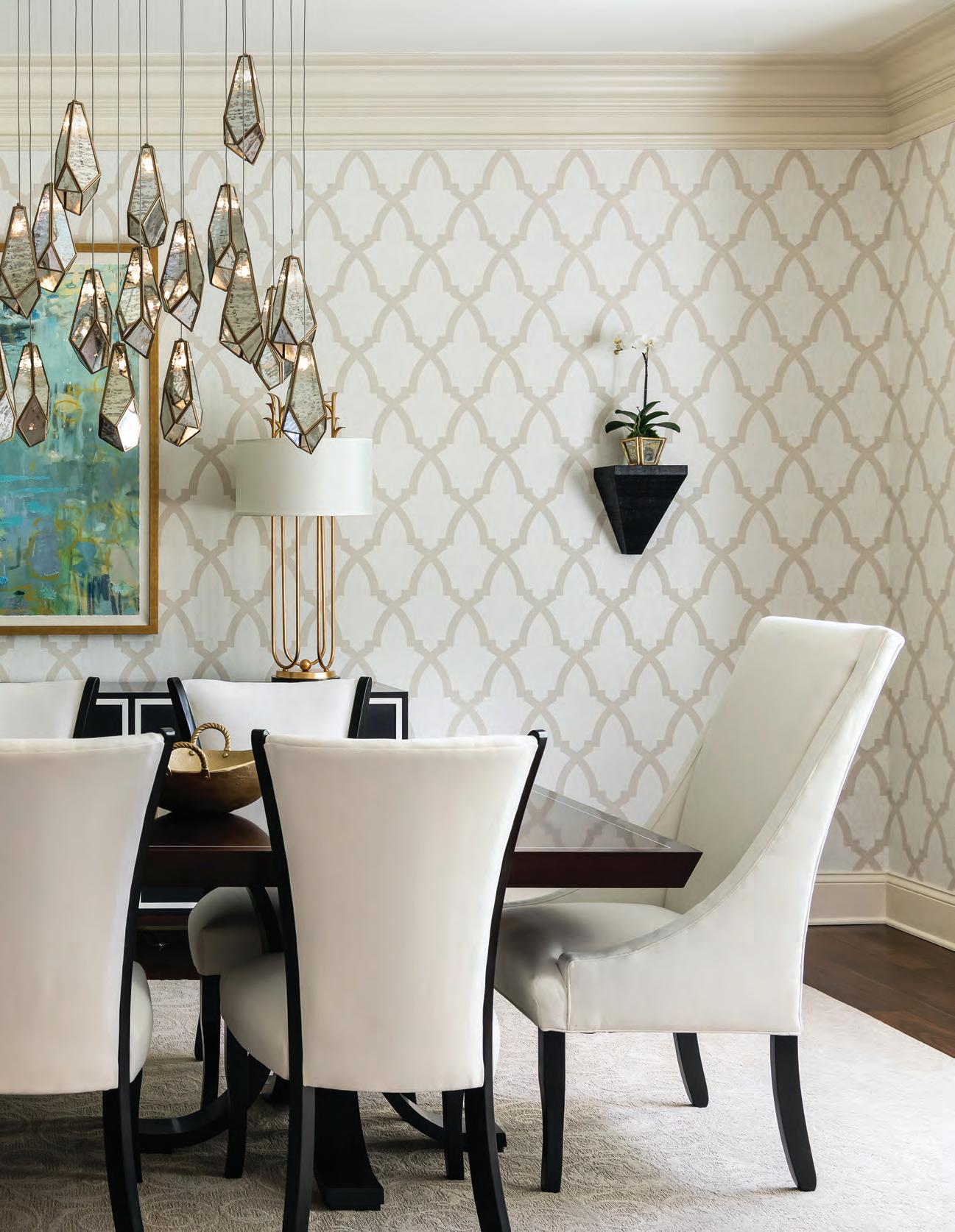
The showstopping Currey & Company multi-drop pendant light adds modern drama to the traditionally minded dining room, which also features a Kindel table. “Lighting can change the entire ambience of a home,” says interior designer Sandra Merritt, “and everyone who comes in goes crazy for this chandelier.”
 By Kim Hill
Photography by Karen Palmer
Interior Design Sandra Merritt Designs
Builder Droste & Sons Construction
Remember the iconic phrase “if you build it, they will come” from the movie Field of Dreams? It could be said that the owners of this St. Charles home reworked the idiom into “if you remodel it, they will come.”
T he owners are empty nesters who previously lived about two blocks away. That home, which the husband describes as a “standard, 2-story, 4-bedroom” started feeling a little tight when the couple’s adult children and their spouses came for family gatherings. “We were looking for something where we could spread out, so that as the grandchildren started coming, our house would be the place they’d want to be,” says the wife. “Our other house just wasn’t conducive to that because of the size. When they’d come over, we were all kind of stuck in the kitchen.”
The open floor plan of the new home’s main floor, with kitchen and family room flowing into one large space, an atypical, finished basement with windows and high ceilings, existing crown molding and trim work and a first-floor primary suite appealed to the couple. The home’s back yard, already private and flat, seemed perfect for installing a pool, and an existing elevator also helped seal the deal.
E ven with good bones and enviable attributes, the home had some drawbacks. Yellowish paint on the walls, large corbels in the kitchen and fluorescent lighting dated the home, and a primary suite with two separate sleeping areas and bathrooms needed reconfiguring. “It was all very 1980s and 90s,” recalls interior designer Sandra Merritt, principal of Sandra Merritt Designs.
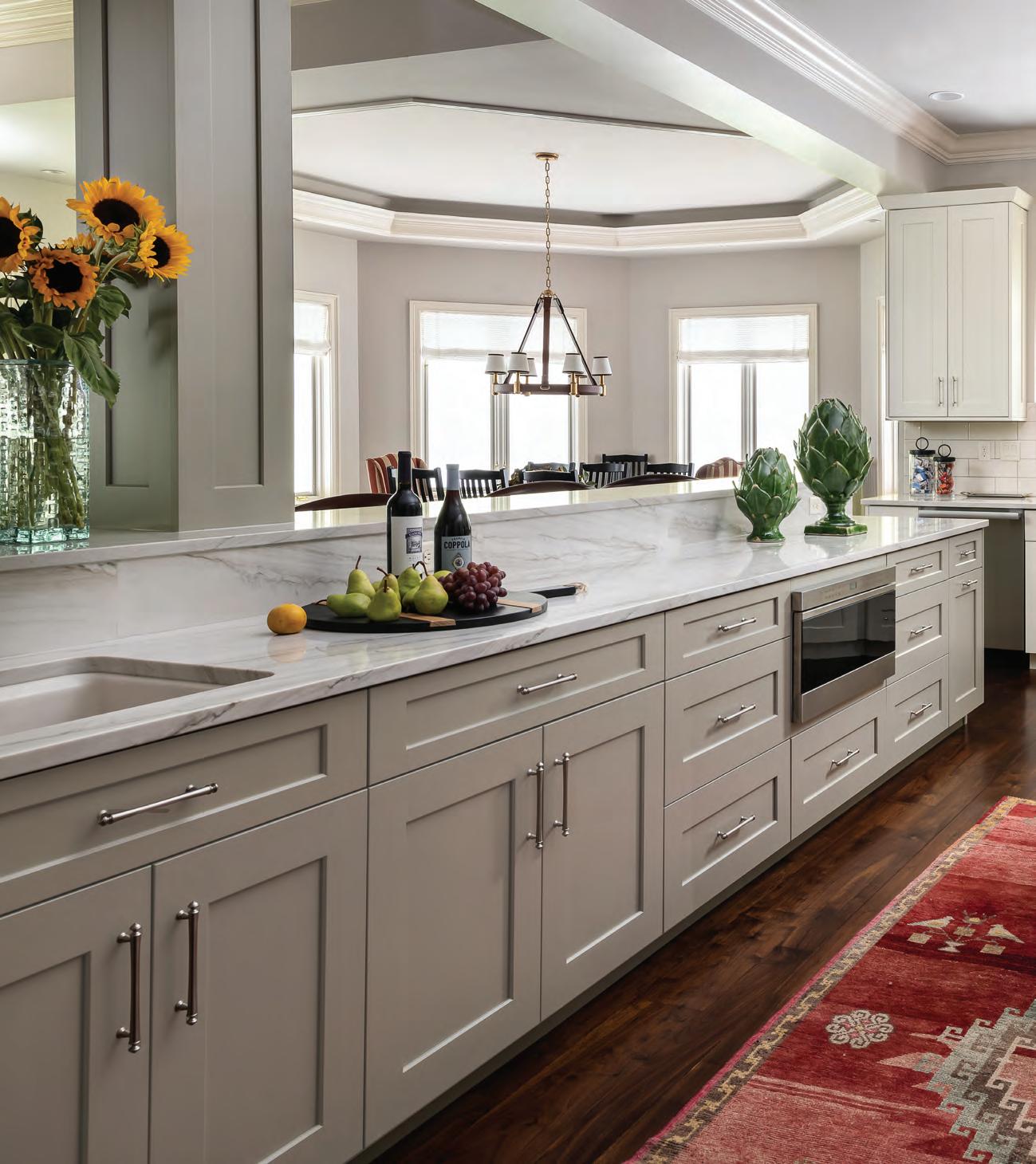
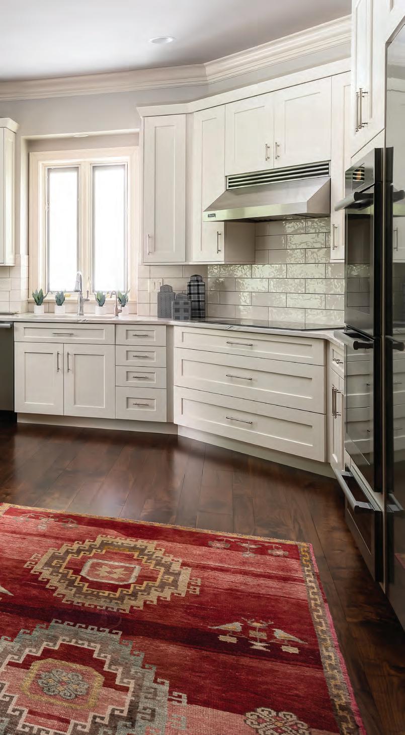
In the kitchen, a new walnut floor flows seamlessly with the hardwoods throughout the rest of the main floor. A second sink was added to the reconfigured island, which is topped with quartzite. The antique Turkish rug is hand-knotted wool and adds color and texture to the coolly sleek kitchen appointed with new, pale gray cabinets and new appliances.
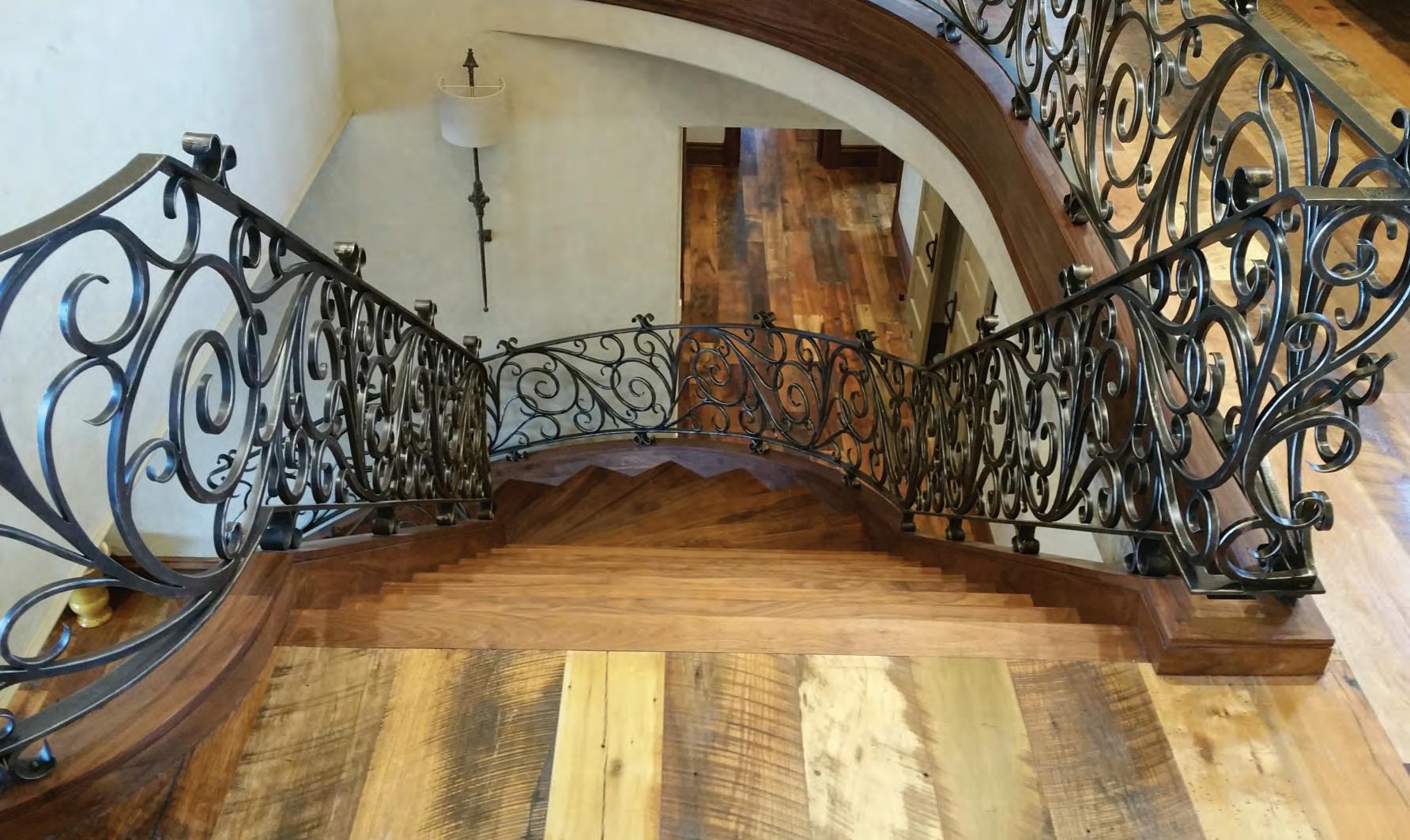
What started with the idea of a simple kitchen refresh and the remodel of the primary suite expanded into work impacting most areas of the home, according to Nate Droste, co-owner of Droste & Sons Construction. The scope of work included refinishing the original walnut floor and adding hardwood in the kitchen, reconfiguring the kitchen island while also installing new kitchen cabinets, appliances and countertops, opening up the stairwell to the basement level with new open railings, converting one of the sleeping areas in the primary suite to a sitting room, removing old lighting and installing new LED fixtures, new paint throughout the home and extensive wood casework in the home office.
M erritt says “the best move they made” was installing the open staircase to the basement. “Previously, it was just walls on all sides of a staircase going down,” she explains. “Now, when you walk into the home, you see the open stairwell going down to the lower level. It feels like a threelevel house instead of a house with a basement.” The husband notes he had finished the basements in their previous two homes. “That took a lot of time, and then nobody ever went down there,” he says. Opening up the stairwell in their new home was a high priority, and “our builder came up with a great plan to do that.”
P revious owners had already outfitted part of the expansive basement with a tile floor, a kitchen and leather furniture grouped around a fireplace. “That side felt very masculine to me, so I thought we’d make the other side of the large room feel more feminine, a little softer,” says Merritt. She chose a color scheme of navy and white, painting the walls in Benjamin Moore Navy with fresh white for the crown molding and trim work. “The crown molding elevates the space,” she says. “It’s very bright and doesn’t feel like a basement at all.” Budget-friendly upholstered pieces, tables and rugs invite grandchildren to play.

On the main level, the look is traditionally classic yet modern. “We wanted something that would be timeless, that we could live with for quite a while and not have to update,” says the wife. In the living room, mirrored tables lend a modern air to the traditional lines of the new upholstered
This page top: The couple selected nearly all new furnishings for the home, including the custom mirror by Friedman Brothers hanging above the Ralph Lauren lacquered console table in the front entry. “We didn’t want to have a preset idea of design style,” says the wife. “We wanted the home to feel fresh and new, plus this house is much bigger than our other one so anything we’d brought from our old house probably would not have worked in terms of scale.” Bottom: The vastness of the lower level appealed to the homeowners on their first look at the house. Designer Sandra Merritt suggested the crisp navy and white color scheme. Furnishings were kept budget-and kid-friendly to invite grandchildren to play. The space has already played host to a baby shower and other joyous family gatherings.

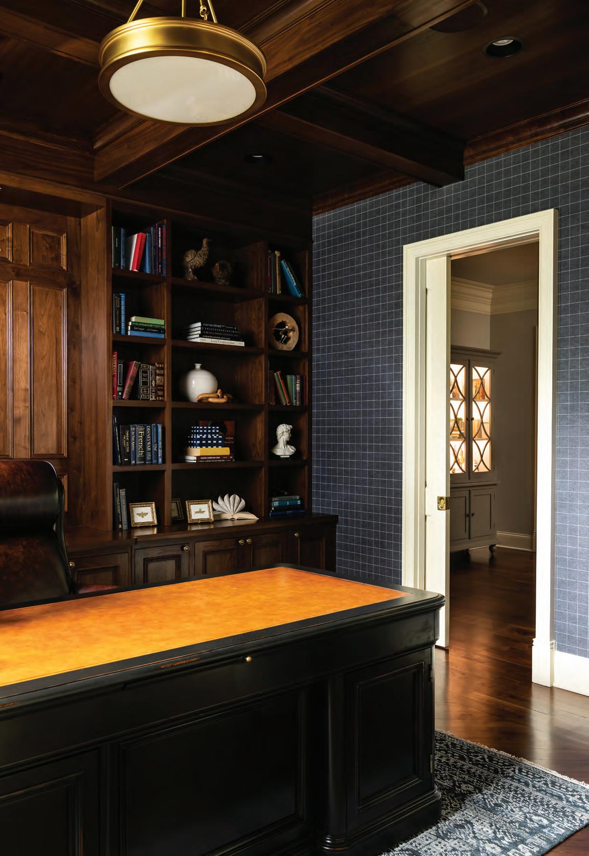
Opposite page: At the request of both builder and interior designer, the homeowners chose the Hekman executive desk with a leather top first to help drive design for the coffered ceiling, trimwork and color scheme in the home office. The husband had an idea for a beamed ceiling, but it was “ the builder who helped pull this all together to tie in the ceiling with the credenza and bookshelves behind the desk,” says the husband. “It went from a plain room to a really beautiful office.”
Phillip Jeffries Savile Suiting Plaid wallpaper in White on Navy completes the traditionalist look.
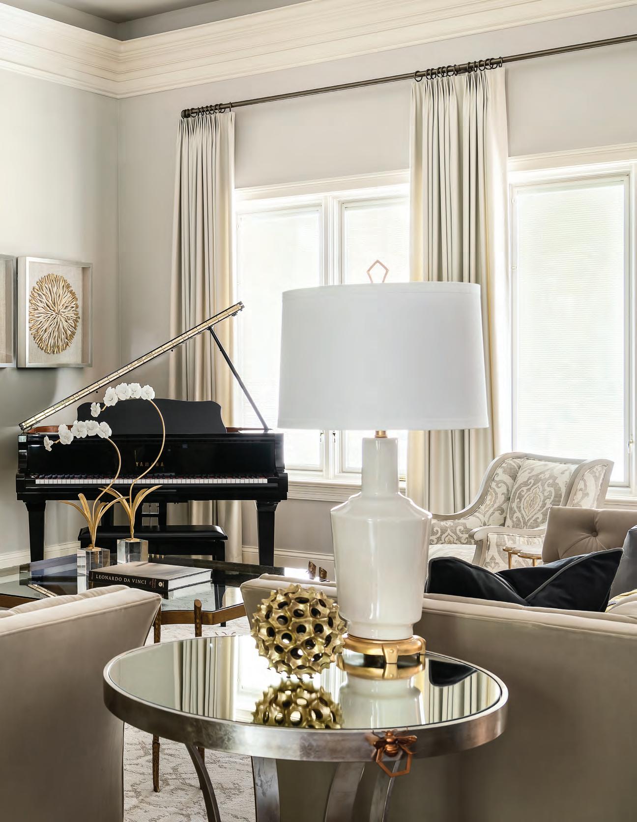
Substantial woodwork trimming the living room ceiling was part of the home’s appeal to the homeowners. They selected all new furniture for the home with the exception of the piano. Furnishings lean traditional with a modern edge, such as the round, mirrored side table from Chelsea House and gold-burnished accessories.
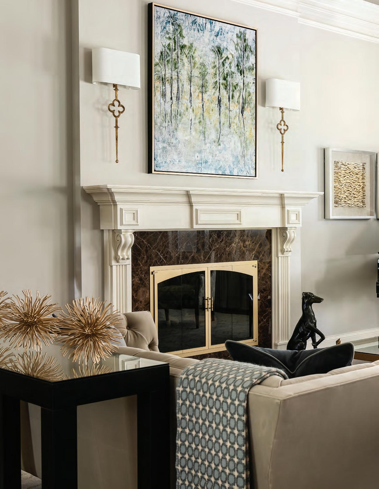
pieces. “The husband told me early on he didn’t like contemporary, so I had to tiptoe a few of these pieces in,” Merritt says of the tables and a few of the accessories. “He’s very much a traditionalist.”
She notes the dining room’s light fixture was a stretch for both homeowners in terms of style. “I saw this at High Point Market, and I knew it would make the room,” says Merritt. The Currey & Company multi-drop pendant light features mirrors with seams of brass in a cluster. “Even the wife wasn’t sure at first,” says Merritt. “But they trusted me, and everyone who comes in goes crazy for that chandelier.”
Merritt says lighting can change the entire ambience of a home. “You can walk in a house and tell its age just because of the lighting,” Merritt says. “The (previous) lighting in this home really dated the house. We’ve replaced it little by little and it’s made a world of difference.”
T he wife says narrowing design choices from the overwhelming number of possibilities is one of the many advantages in working with a designer. “Sandy helped steer us to things,” says the wife. Case in point: the desk for the husband’s home office. He wanted a traditional desk with a closed front. Merritt suggested several options, including the Hekman executive desk the couple ultimately chose. “We used the desk they picked out to model the trim work and color scheme,” Droste says. “The entire room was done in the same color of stain as the walnut floor.” The finished room features a coffered ceiling and wall of woodwork and shelves behind the desk.
The husband appreciates their home so much now that it's finished. “Quite frankly, I can’t believe what our house looks like today versus where it started. We are so proud to own it.” See stlouishomesmag.com for resources and additional photos.
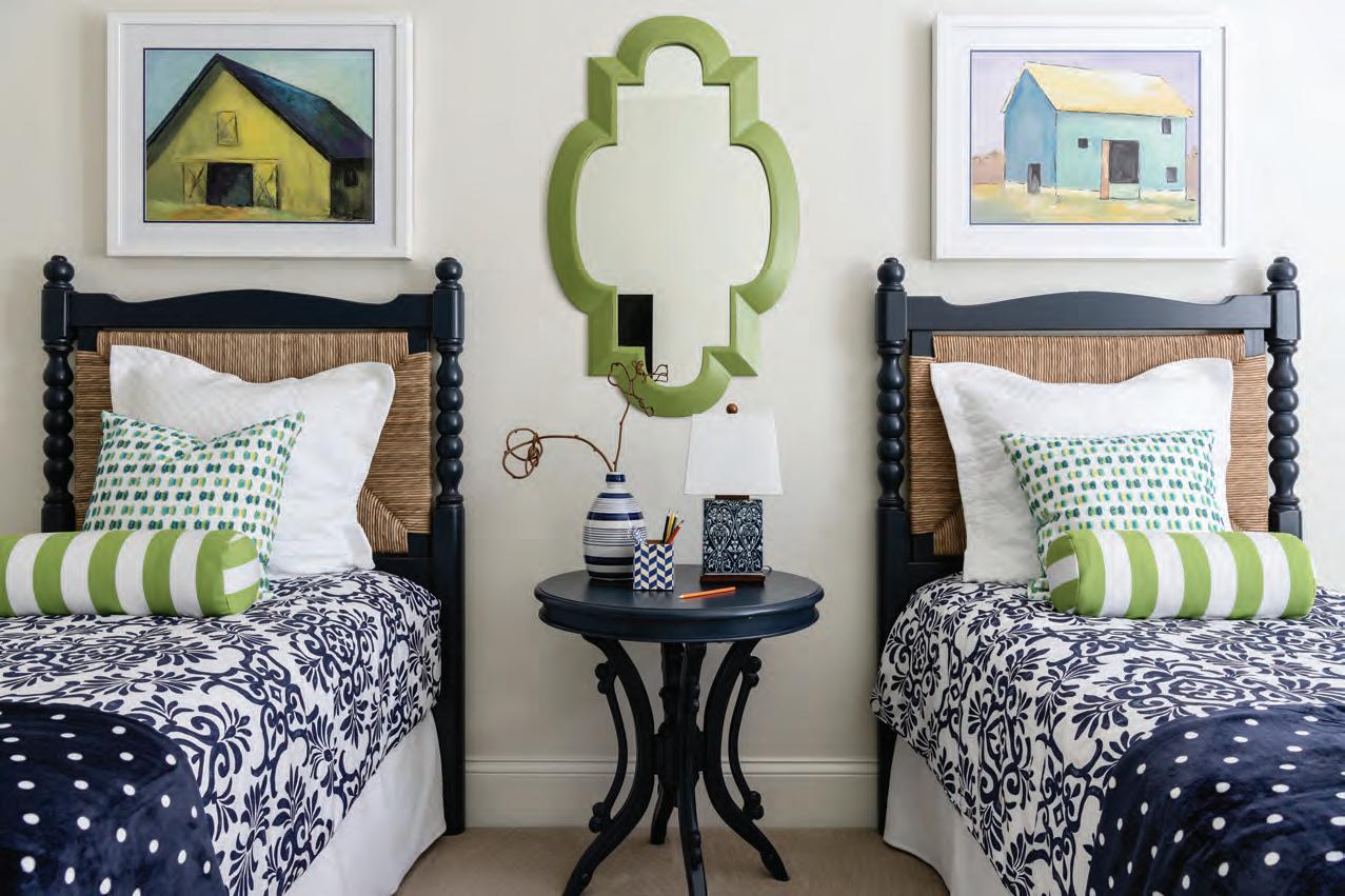
This page bottom: For sleepover nights with grandchildren, designer Sandra Merritt suggested one guest room contain twin beds. She added a mossy green to the navy and white palette used throughout the home. “I just love those color combinations and mixing prints,” says Merritt. “The room turned out to be very cheery and colorful.”
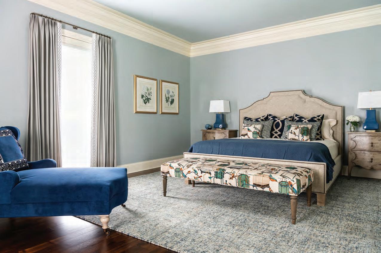
Opposite page top: Freshly painted trim work in the primary bedroom pops against the calming shade of Benjamin Moore’s Iced Marble on the walls and ceiling. Designer Sandra Merritt selected the fabric for the bench and coordinating bed pillows based on the wife’s love for birds. Custom draperies are by Berry Studio. Bathroom: New hardware from Worlds Away and new cabinet facings freshen the wife’s primary bathroom. A new mirror and sconces add a hint of Art Deco to the space. Sitting room: Serene in shades of blue, this sitting room was created from one of the two sleeping areas in the primary suite. “You can look out to a lake not far away from us, and it’s just a very comforting area,” says the husband.


With an exceptional hidden talent for design, homeowner Gina Lodike creates a fresh and modern coastal-inspired farmhouse for her family, room by room.
 By Jeanne Delathouder
Photography by Megan Lorenz
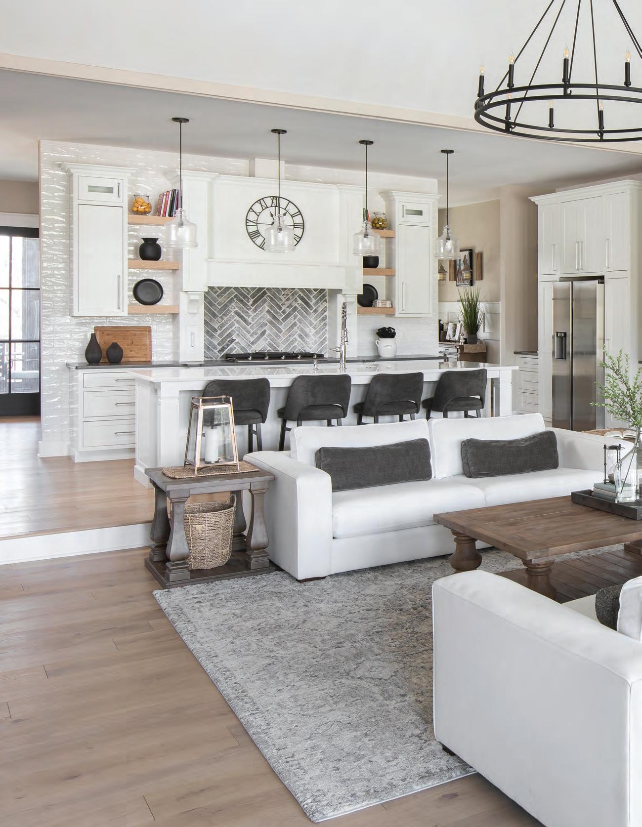
Awash in pristine white and layered with rustic finishes, the family living space emits a modern farmhouse vibe with coastal-inspired touches. Homeowner Gina Lodike’s spot-on lighting choices are key in giving each room a design-savvy aesthetic.
Gina Lodike is a natural. An interior designer at heart, her innate sense of scale, proportion, texture and color has revealed an artistic passion that beckoned to be expressed. After designing her family’s own 6,200-squarefoot home—along with a list of other interior projects she’s completed along the way—friends continue to push her to go into business for herself. This year, Gina says she may just take that leap. “My husband and I already have a family moving business,” she says. “But my friends keep telling me I’m good at this, so I’m really thinking seriously about pursuing it as a profession.”
Just one look inside her family’s new home and it becomes clear that Gina has an authentic natural talent for interior design. Nestled amidst a wooded four-acre lot in a quiet area just outside of Festus, Missouri, her home exudes a fresh and modern aesthetic that could only be achieved by someone with a keen eye for style.
“I feel like my overall design is modern farmhouse with hints of coastal,” says Gina, who claims she is far more adept at expressing herself through design rather than her own words. But step inside her home, and her descriptors are spot-on.
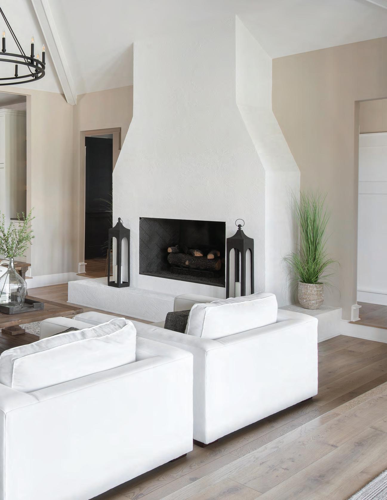
Upon walking through the front door, you are immediately swept away by an airy, open-concept living room and kitchen. Bathed in white, with a magnificent fireplace wall and sweeping vaulted ceilings, the space emanates a modern coastal vibe with generous white linen furniture offering extra-deep seating. Clad in natural oak flooring and accent walls throughout, this contrasting aesthetic creates a well-studied textural juxtaposition that lends a modern edge. In addition, wood furnishings, including the living room coffee table and a round pedestal table in the breakfast nook, lend a wonderful rustic beach feel to the home. “I love open-concept spaces and light breezy colors,” says Gina. “Most of the furnishings were custom pieces from Bassett—I like an assortment of styles brought together to make one beautiful space.”
From top to bottom, Gina carefully considered every detail in her home down to the lighting choices, which surprisingly all came from Wayfair. Every fixture is perfectly proportioned and stylishly supplies the jewelry
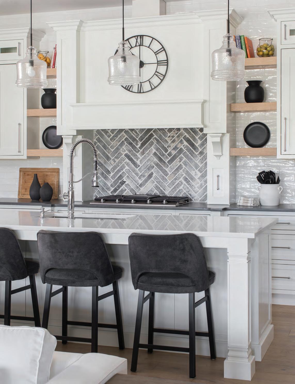
A massive wrought-iron chandelier complements the living room’s magnificent fireplace and vaulted ceilings. A natural oak accent wall highlights the dining room’s contemporary black fireplace. A clever multi-light pendant fixture befits the proportions of the long dining table. Opposite page: Sleek charcoal accent pieces lend dynamic contrast to the all-white kitchen, and a herringbone backsplash creates a patterned focal point.


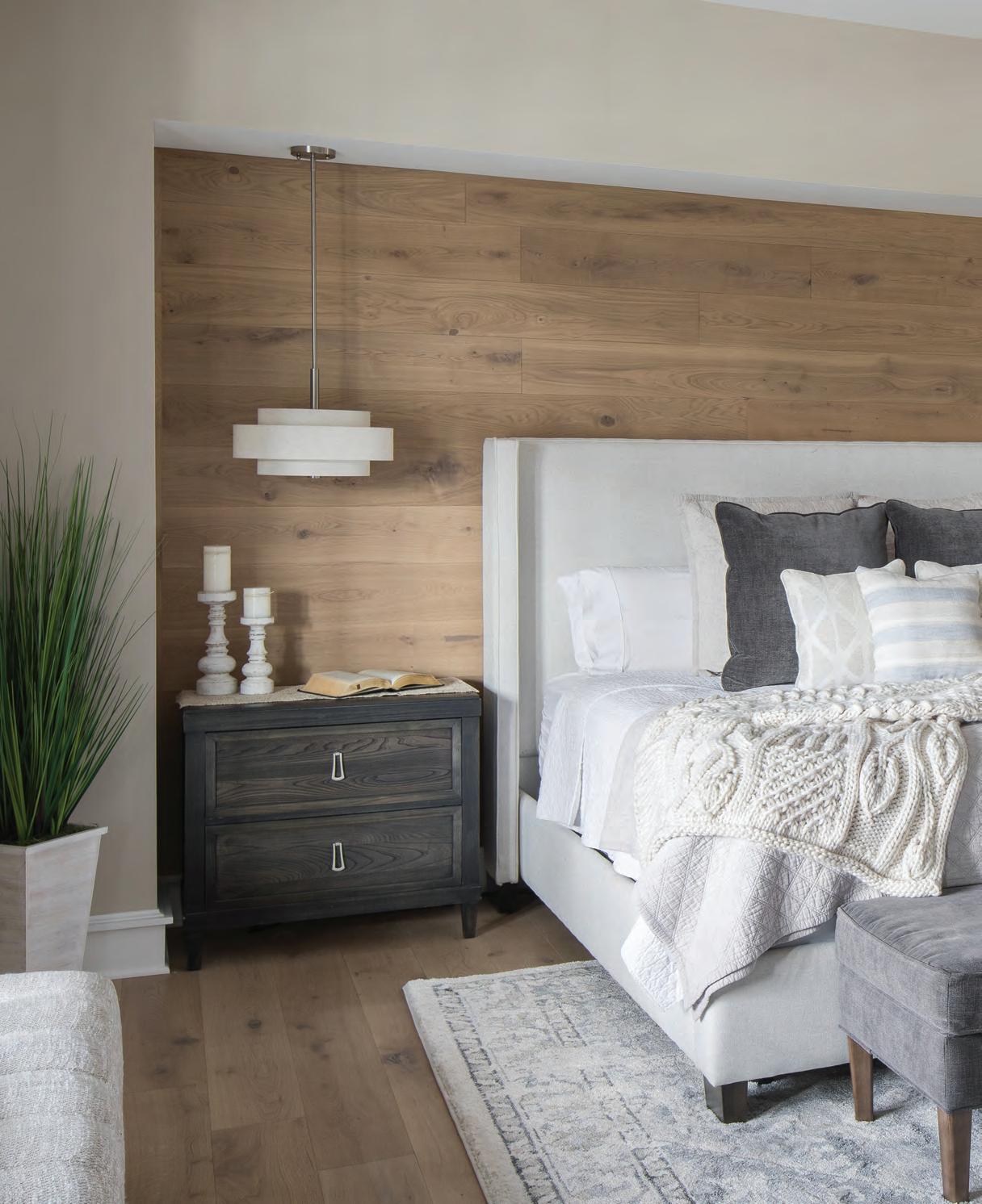
The primary bedroom’s oak accent wall makes a cozy niche for the stylish platform bed. Pendant lights cleverly illuminate the nightstands without taking up any surface space.
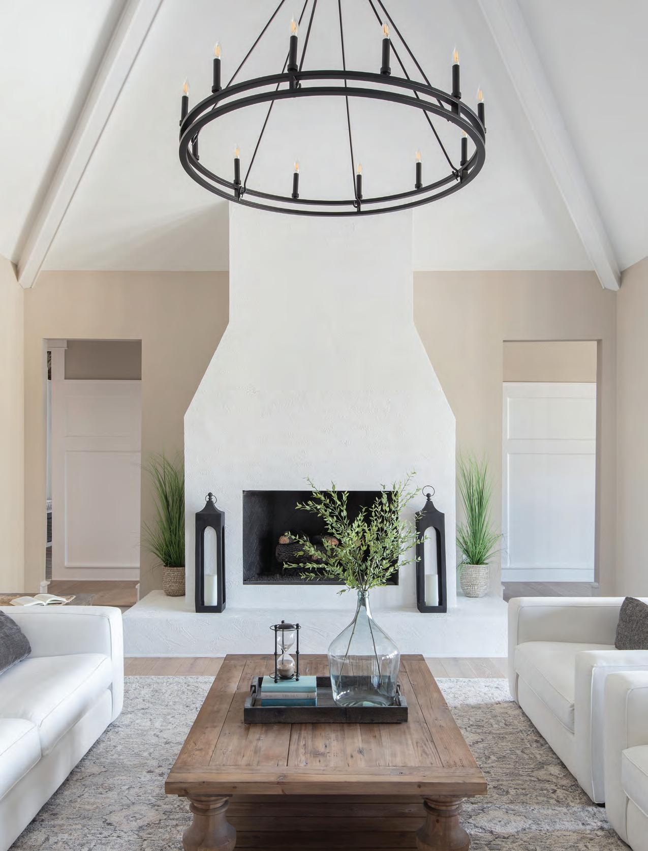
for each room. In the living area, a magnificent circular black wrought-iron chandelier makes the perfect focal point for the grand scale of the space. “The lighting needed to be one of the main features of the room,” says Gina. “I thought it would complement the massive fireplace and the vaulted ceiling.”
I n the kitchen, four clear-glass pendant lights illuminate a white marble-clad island accented with plush, charcoal-gray counter stools. A gray and white herringbone-patterned backsplash behind the stovetop creates visual interest with a compelling element of pattern. Directly behind the kitchen, the dining room features doors leading to a screened-in deck. A long dining table that can seat 10 required a modern touch to complement the contemporary floating fireplace as well as the length of the table. So, Gina added a linear-style chandelier with tiny pendant lights to illuminate the table and installed sleek black and white sconces to flank the fireplace. “I love the separation of the dining room from the rest of the home for a more intimate dining experience with the family,” she notes.
For the adjacent breakfast nook, Gina wanted to mirror the living room’s aesthetic to maintain the same vibe. Here, she installed a decidedly miniature version of the living room chandelier over the pedestal breakfast table surrounded by
Left: The beach-inspired guest bathroom emanates a spa-like elegance with open natural oak shelving and shimmering tile walls enhanced with chic white sconces. Even the mudroom takes on an element of luxury with neatly organized storage cubes, a cushioned bench and built-in storage cabinets.


cozy, built-in banquette seating. White wainscoting encloses the space and creates a sense of warmth and intimacy. “My color scheme is light and airy with accessible beige walls covering most of the home and light French gray in the primary bathroom,” Gina adds.
I n the guest bathroom, glossy tiled walls combine with woven decorative accessories and rustic oak open shelving under the vanity that strike a satisfying textural contrast. Slender white sconces lend an element of glamor to this spa-like oasis. “When I enter this bathroom, I immediately feel as if I'm on vacation,” says Gina.
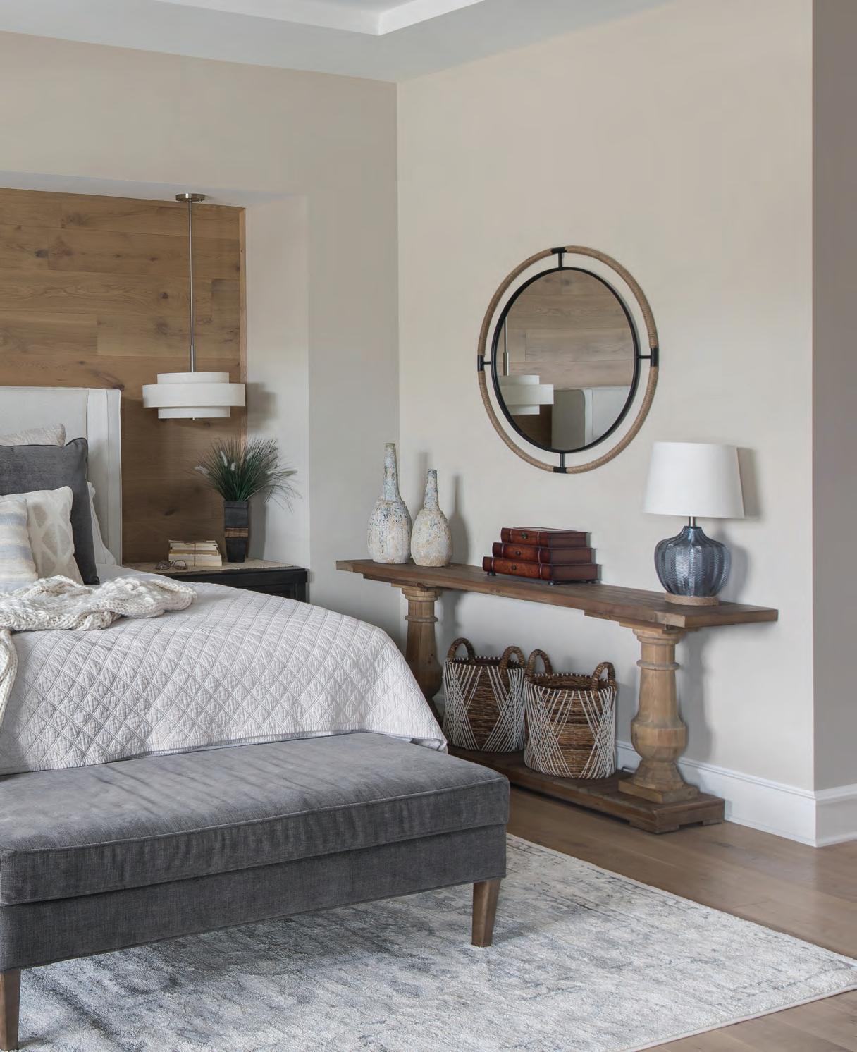
The primary bedroom offers a sanctuary of warmth and coziness, with wood flooring extending up to create a wall niche behind the bed directly across from a large fireplace. A chic platform bed piled high with sumptuous pillows, throws and coverlets creates luxurious layers of softness. A gray upholstered bench accents the bed, and a plush area rug anchors the room and complements the rustic oak flooring. “I love the hanging lamps on both sides of the bed,” says Gina. “It gives you more room for other décor and space on the nightstands.”
I n the primary bathroom, an elegant white soaking tub takes center stage amid an arched window enclave that captures views of the wooded landscape beyond. Clad in white herringbone-patterned tile flooring and French gray built-in cabinetry, the space emanates an

air of tranquility and sheer luxury. But the real wow factor comes from a botanical-themed painted mural by Missouri artist Kenzie Wolk. A talented painter who is known for her compelling large-scale murals, Kenzie’s gracefully subtle work of art brings a custom, one-of-a-kind embellishment that truly personalizes this unique space. “Kenzie is an amazing artist,” says Gina. “I saw some of her work and had to have her do this piece for our bathroom, which surprisingly only took a couple of days.”
Completed in July of 2021, Gina’s new home has been the place of many treasured family moments. But her insatiable passion for design always has her thinking ahead and dreaming about what she’ll do next. With the new year unfolding, she says she’s looking forward to several future projects, including adding a pool and all the landscaping in the home’s front and back yards.
“ We do a lot of entertaining throughout the year,” Gina says, “and we enjoy spending time with our children and our two King Charles Cavaliers, Max and Lucy. We love hosting gatherings with family and friends—from summer barbeques to holiday dinners. That’s the reason we built this home.” See stlouishomesmag.com for resources and additional photos.
A subtle yet impactful large-scale mural painted by Missouri artist Kenzie Wolk brings a wow factor to the tranquil primary bathroom. The gray and white tones complement the serene palette. Tucked into an arched wall niche, an elegant white soaking tub provides a peaceful spot to take in the woodsy landscape.

This U City landscape reflects a gardening heritage.
By Lucyann Boston / Photography by Kim DillonThe best gardens come with deep roots, and few are more firmly anchored in the soil than Cindy Thierry’s University City landscape. The front yard borders and berms and the shrubs and perennials that circle the back yard come alive in spring with bursts of color created by Cindy but with tendrils attached to gardens and gardeners who have gone before.
First, there are Cindy’s gardening roots nurtured on a farm in Vandalia, Illinois, where her grandmother created a special plot for

her plant-loving granddaughter. “We actually lived with her for a time and she was my touch point. I spent a lot of time with her, and she gave me my love of cooking and gardening,” Cindy recalls. “She was always sharing stuff with me; sending me home with this or that. Her house was on a hill and we would sit out on the front lawn and there was always a breeze. She loved tulips, roses and gladiolus.”
I n 1998, when Cindy and her husband, Steve McMahon, purchased their two-story, Colonial-style home, they discovered additional gardening roots already embedded in their one-third acre property. They were only the second owners of the home, which had been built in 1939 by legendary University City High School football coach Clarence (Stub) Muhl and his wife Adelaide, who reportedly loved gardening. By that time, the couple was in their 90s and the home had been vacant for a year.

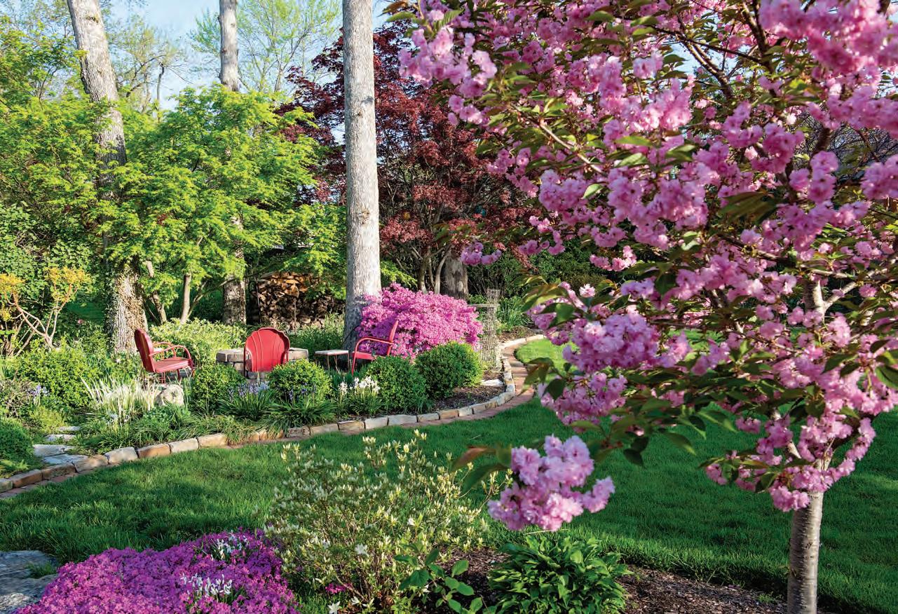
Little of the original landscaping was in evidence, other than a redbud tree at the corner of the house and some struggling spirea bushes under the front bay window. Invasive bush honeysuckle covered approximately half the backyard.
As she worked in her new landscape, Cindy discovered treasures. With the first warm days at the end of winter, white snowdrops popped from hidden corners. As spring began in earnest, the bulbs of dainty Spanish bluebells in shades of blue and white still lived in the soil. Native Virginia bluebells appeared all over the yard. A sweetly fragrant viburnum bloomed each spring.
Although in the years prior to their purchase the yard had been neglected, a benefit accrued from the 25 oaks that dotted the property and their leaves, many of which had been left to decompose for years. When Cindy began to garden in earnest, the naturally enriched soil allowed what she planted to thrive.


She has continued to add to the quality of her soil. When U City gave away ground up leaf mulch for free, “I used to line my trunk with plastic and haul it home.” Since the city has discontinued that practice, she orders Forest Fines, a mix of double-ground wood mulch and Black Gold compost, from St. Louis Composting each spring. In addition, she keeps a compost bin in her back yard.
Cindy also credits her roots within the University City community for the beauty of her garden. She was active in the U City School District, while the couple’s three children were in school, and also with U City in Bloom. Her husband is a University City Council member. “This is U City,” she says with a nod to the spirit of the community. “People are always trading and sharing.”
Plants in her garden that have come from other local gardeners include three miniature lilacs and a lovely stand of variegated Solomon’s seal. The bottlebrush buckeye, daylilies, golden Tiger Eye sumac and Japanese iris made their way into her landscape via the U City in Bloom plant sale. In turn she has divided and shared with others. “In the spring and fall, I post a ‘Come Shop in My Garden’ notice on Facebook. I tell people they can have this or that and how far they can dig. I know my garden has populated a number of other gardens,” she says with a laugh. “I have one friend who refers to her back yard as ‘Cindy’s garden.’”
Anchored by her selection of flowering shrubs, Cindy sees continual color as the hallmark of her landscape. In the spring, it begins with a progression of azaleas that bloom at slightly different times. Recently, she added two re-blooming varieties that provide fall as well as spring color. Hydrangeas keynote the summer garden and linger into fall. Red twig dogwoods and scarlet winterberries provide color even in the coldest months.
For all its beauty, the garden is grounded in Cindy’s flexibility and practicality. She is fearless in her ability to look at shrubs and plants that may not be thriving where they are and moving them to a different spot. No plants go to waste. As her borders expanded, she divided what she had and moved it throughout the yard. The scrawny spireas that were struggling around the front bay window when Cindy and Steve bought the house 25 years ago are now a “nice, big white bundle” highlighting the back border when they flower in the spring. “The biggest challenge I have in my gardening is throwing things away,” she says with a laugh. “I keep trying to convince myself that it’s okay to put a plant in the compost.”
Materials are repurposed as well. Following a serious fire in 2007, the house needed total renovation and Cindy and Steve decided to add on to the structure during the course of renovation. Dirt removed from the back yard became the berm that is now the highlight of the front landscaping.
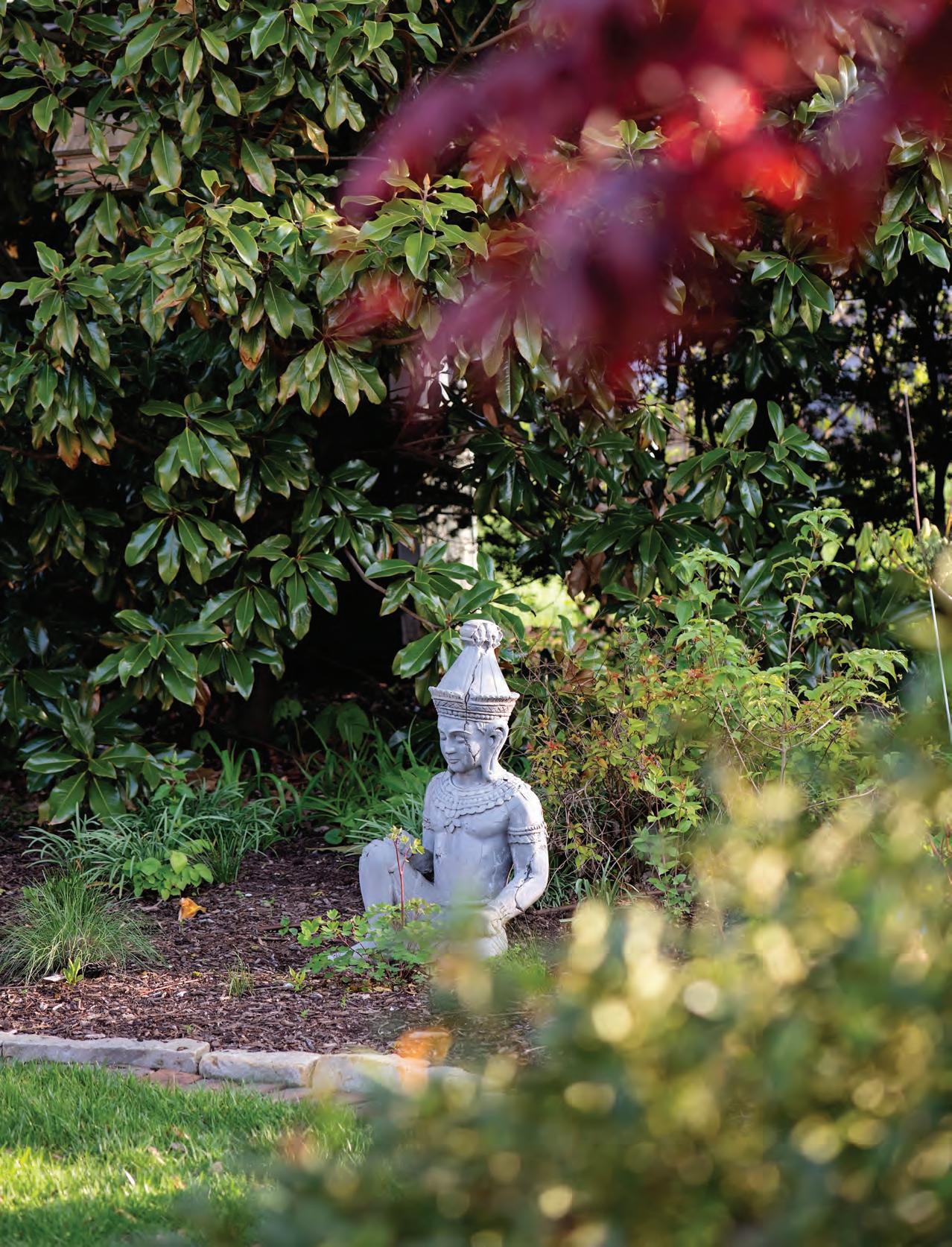
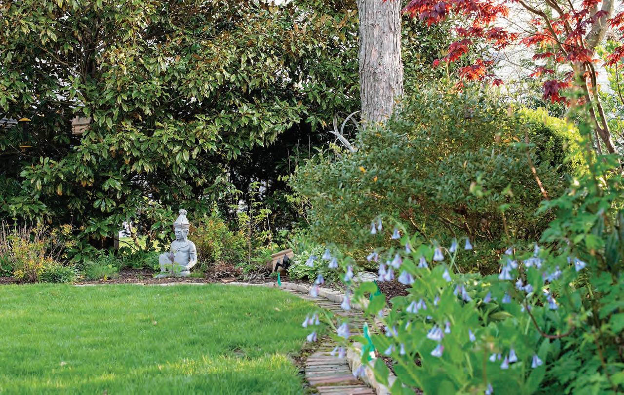

Stones from the original barbecue pit that was “falling apart” when the couple bought the house found their way to a stone wall that now helps define the front yard landscaping. The contractor working on their addition had stones left over from another project, which Cindy and Steve were happy to use. While Cindy works with the plants themselves, Steve handles the hardscapes such as walls and edging and has constructed an arbor and the firepit.

Throughout the years, Cindy has added decorative objects to her landscape simply because they delighted her. A kinetic sculpture purchased at the Tower Grove Art Fair was a birthday present to herself. At the London Tea Room, she bought an antique wire pavilion tower “just because I liked it.” An Oriental statue appealed to her when renovation from the house fire was in progress as a way to look forward to her future house and garden. A small sculpture of stacked stones reminds her of favorite hikes in both Hawaii and Michigan.
Despite all the changes she and Steve have made to the landscape, Cindy is always aware of the legacy she keeps alive. “A son who grew up in the house used to come by once a year and he told me his mother was a gardener and she would be so happy,” Cindy relates. “Every time I look out and see those spirea in the back, it warms my heart to know they once belonged to Mrs. Muhl.” See stlouishomesmag.com for resources and additional photos.

Apple trees are among the easiest fruitbearing trees to grow in Missouri! Adaptable and hardy, apple trees produce best in full-sun and with proper care can produce fruit for 25 years or more with yields ranging from five to ten bushels of fruit per mature tree. Please note that to grow this fruit successfully, you’ll need more than one tree for proper pollination. Having several cultivars with the same flowering times works best, as harvest seasons can range from early to late summer and fall depending
on the type.
I t’s important to remain aware of the many pests and diseases that can affect apple trees; while some cultivars have certain disease resistances, each cultivar is susceptible to its own array of problems. When purchasing an apple tree for your home, remember to thoroughly research the types of pests and diseases common to that cultivar in order to properly administer pesticides, especially during the growing season.
Pristine Apples
Color: yellow with red blush
Ripening time: early
Gala Apples



Color: red-orange
Ripening time: mid-season
Golden Delicious
Color: yellow
Ripening time: late
Pears
Moonglow Pears
Color: yellow
Ripening time: early
Seckel
Color: yellow-brown
Ripening time: mid-season
Kieffer
Color: yellow-green
Ripening time: late


Pears

Another popular fruit tree in Missouri, pears tend to be more difficult to grow than apples because of a high susceptibility to bacterial diseases such as fireblight. However, there are many types of blightresistant cultivars. Paired with careful pruning, fertilizing and spraying, pears are possible to grow in Missouri’s climate.
Much like apple trees, pear trees have a long life and can produce fruit for over 25 years if properly cared for. With a later harvesting time, you can expect to harvest pears from mid-to-late summer well into fall, usually around October. Again, you should plant more than one pear tree, preferably with a different, compatible cultivar to receive fruit.
Stone Fruits
I t’s important to do your research before planting a stone fruit tree, as they are often affected by late spring frosts and crop loss due to cold in the winter (though you shouldn’t worry unless it drops below 0 degrees). Stone fruits include peaches, nectarines, plums, cherries and apricots, though sweet cherries and apricots bloom so early in the season, they often won’t thrive in Missouri’s temperamental climate.
When considering buying and planting a stone fruit tree, there are several key factors to take into account. First is the planting site’s drainage and soil, as stone fruits are very sensitive to poor water drainage and heavy or shallow soil. One way to help with this is berming; a berm is a slightly mounded row. Like other fruit trees, they need careful care against pests and diseases; out of all varieties, sour cherries are typically the most disease resistant of the group.
Stone Fruits
Ripening Times
June: cherries
July/August: peaches, nectarines, plums
Fruit Bearing Age
2-3 years: peaches, nectarines
3-5 years: plums, cherries


Though gone in the wild, a rare plant lives on at the Missouri Botanical Garden.
By Catherine Martin and Andrew Wyatt, Missouri Botanical Garden.Where to find them:
Abutilon pitcairnense just came into bloom for the first time at the Garden in the Oertli Family Hardy Plant Nursery. It is being moved to the Linnean House for public viewing.

Abutilon pitcairnense was thought to be completely extinct until a single specimen was found in the wild in 2003. The plant was propagated and sent to the National Botanic Garden of Ireland and The Royal Botanic Gardens Kew. Unfortunately, in 2005 the last remaining wild plant died in a landslide, making the plant extinct in the wild. However, the species survives from material held in botanic gardens. The Missouri Botanical Garden received some seed for this species about a year ago.
Name and native habitat: This plant's native home is the remote
Island of Pitcairn, famous for the Mutiny on the HMS Bounty. The Bounty was dispatched by the Royal Navy to introduce Breadfruit from Tahiti to the Caribbean, but did not make it because a mutiny broke out in 1789. The captain and a small contingent of the crew were put in a rowboat, and the mutineers took the ship to Pitcairn and scuttled it. Pitcairn was chosen because of its remote location and not being on the Royal Navy charts at the time. Today, the descendants of the mutineers still live on Pitcairn.


Attendance is free! Saturday, March 25th, 2023
10am - 3pm
Shop casually all day and learn how to spruce up your everyday spring decor at assigned shop demonstr ations! Grab your tour card at your first stop + have it stamped along the way to enter to win a grand prize!
Grand Prizes
Prize #1: Two tickets to the Fox + a $100 restaurant gift certificate
Prize #2: Four tickets to the Fox
10am! Start your day
10am: Hearth and Soul Forshaw (West)
11am: The Gifted Gardener
Mary Tuttle's Florals and Gifts
The Porch in Wildwood
12pm: The Abbey
The Foyer Home Decor
2pm: Closing demonstrations at each shop
9640 Clayton Rd., St. Louis, MO 63124
Stop in for a delicious breakfast skewer and see the beautifully decorated Hearth and Soul Boutique
8935 Manchester Rd.,St. Louis, MO 63144
12pm, 2pm 12pm, 2pm
10am, 2pm 10am, 2pm
11am, 2pm 11am, 2pm
Sowing seeds of imagination
14334 Manchester Rd., Manchester, MO 63011
How to bring the outdoors in when entertaining!
16957 Manchester Rd., Grover, MO 63040
11am, 2pm
The Porch's 20 best Mother's Day gifts
1649 Clarkson Rd., Chesterfield, MO 63017
Fun Spring tablescape ideas for a weekend brunch or for dressing your Easter table
17021 Baxter Rd., Chesterfield, MO 63005
Elevating your bookcases
15977 Manchester Rd., Ellisville, MO 63011
Let sunbrella® fabrics give you the confidence to create an inspired home - inside and out


Only a block away from her parents’ home in the Central West End, Lauren Mathis saw an abandoned lot and envisioned a new building rising from the overgrown weeds and rubble.
At the suggestion of her husband, Tom Nations, the couple chose to build a four-family condo on the lot and decided to move from his downtown loft into one of the units.

The architect along with the builder, Lauren’s father Mark Mathis, owner of MLM Homes, worked diligently to satisfy the requirements of the neighborhood association and the preservation board. “They’re very rightly strict about new construction and additions to the neighborhood—preserving the historical feeling of the area,” Tom says.
By Gina Parsons Photography by Anne Matheis Builder MLM Homes Interior Design MJM Design Company Architect Curtiss W. Byrne Architect, LLCSince they were building from scratch, Tom and Lauren were able to request building design choices. Tom says his favorite part of the condo is the large, carefully-engineered folding glass door that opens to a patio off the main living area. “You can feel fresh air and spend time outside,” he says. They also left structural beams
A couple utilizes family members’ skills when building a home in the Central West End.
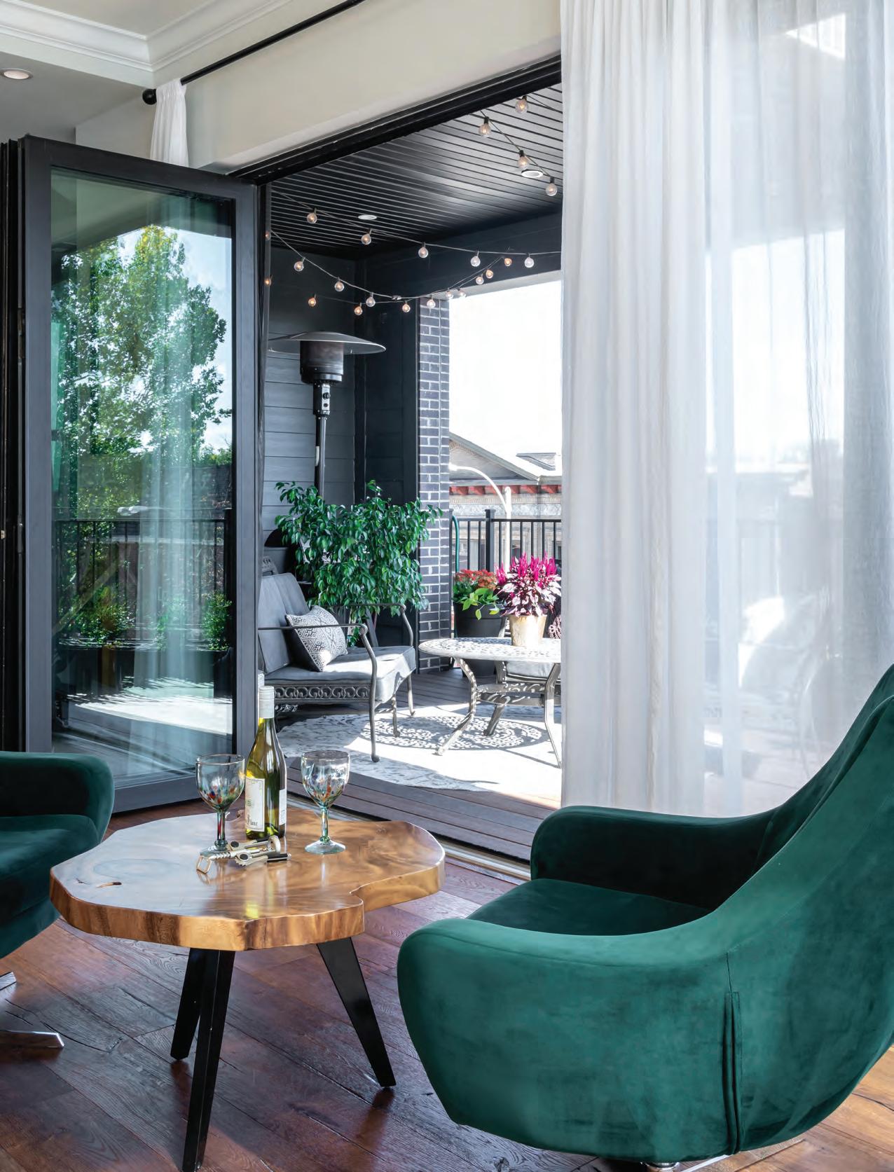
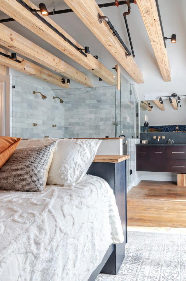
exposed, which helps the room feel “cozy, but open,” he says. They also have an open-concept master bathroom.
Lauren and Tom moved into their condo unit in the fall of 2019. For the most part, they waited until after they moved in to do the interior design to give them time to get a feel for the space. Tom then used his expertise as a graphic designer to look at each room and come up with design ideas. Much of his inspiration was from design choices he saw in hotels and restaurants.
H iring Lauren’s mother, Joyce Mathis, owner of MJM Design Company, as their designer was the natural choice. She helped with interior and exterior design. “They were a lot of fun,” Joyce says of working with her daughter and son-in-law. “Tom is a creative director; it’s really his forte. It’s one of the reasons he’s so fun. He’s so creative.”
Tom enjoyed working on the interior design with his motherin-law. “I’m pretty opinionated when it comes to design and how the space should feel. Joyce

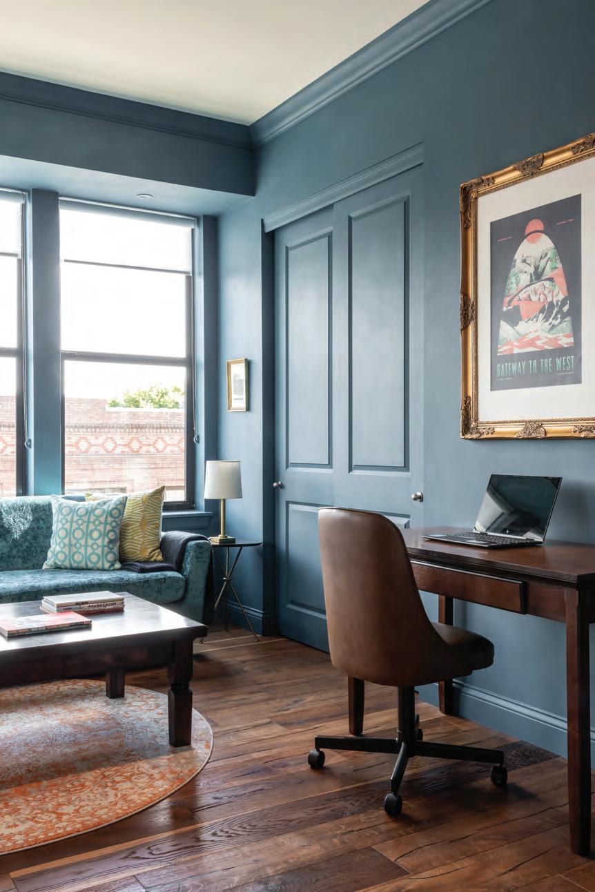
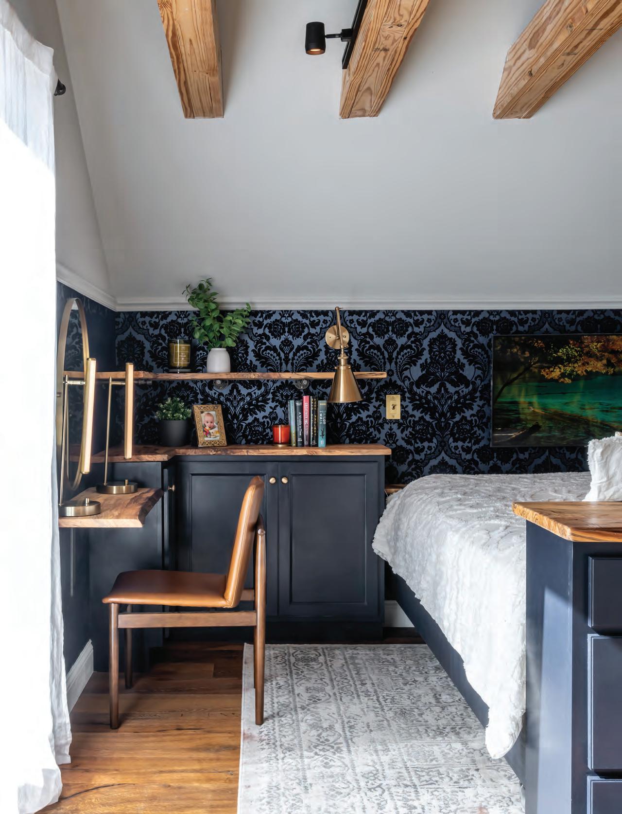
was kind of the perfect partner for me that way,” he says. Tom would describe to Joyce what designs he liked, and she would connect him with the right vendor from her many sources. For instance, after seeing a damask wallpaper in a Lafayette Square restaurant Tom sought a damask wallpaper for the master bedroom wall. “She turns up with four books of wallpaper that are all pretty close to that, to make that happen,” he says.

Tom and Lauren have had two children since they began
the building process. Their son is now three and their daughter is nearly two. They feel good about building for their family in the Central West End and believe that developing in the area was worth the effort. “It feels nice to make a contribution to the Central West End,” Tom says. “We’ve added a brick addition to this neighborhood. We feel good about it.”
See stlouishomesmag.com for resources.

This combined kitchen and living room renovation made the most of a small footprint with loads of texture and an excess of forward-looking designs.
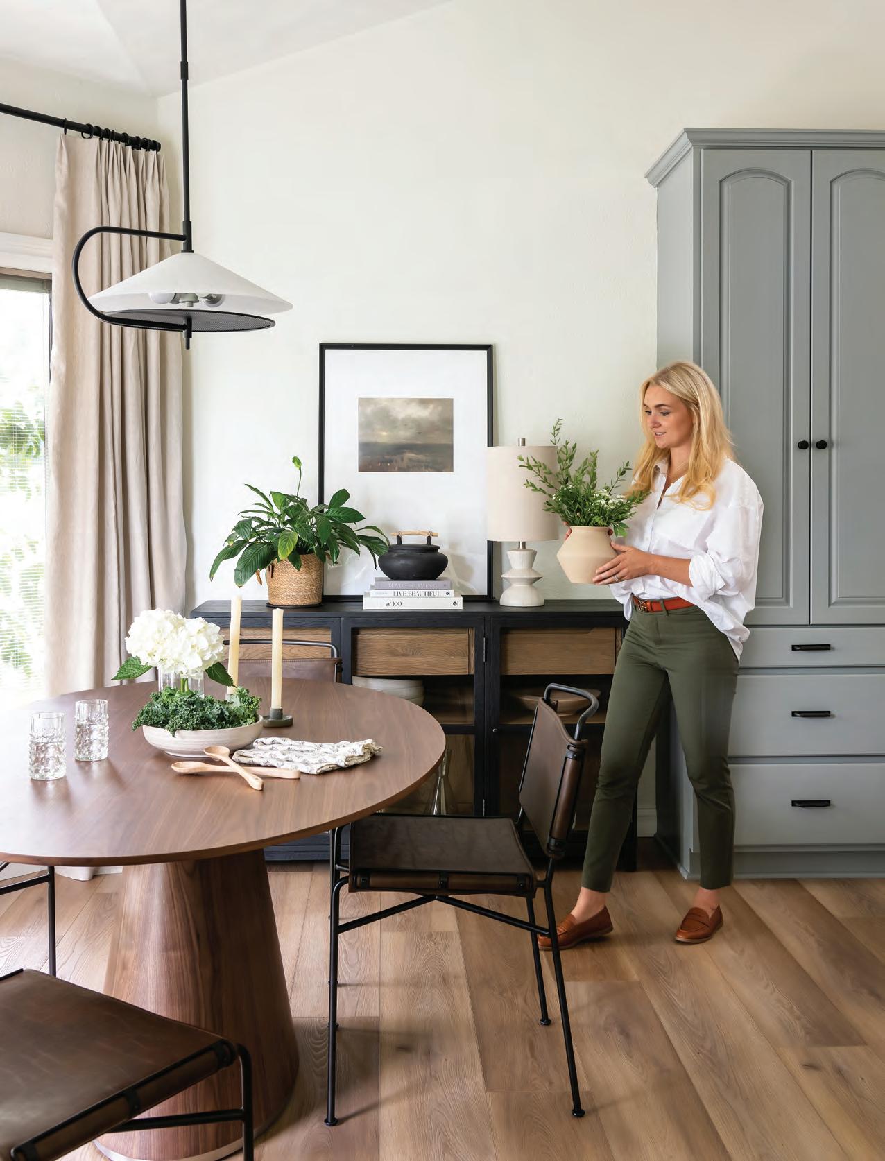
uilt 20 or so years ago, this home’s combined kitchen and living room space was ready for the ultimate refresh. Originally, these areas in the home had been covered in builder-grade (yet vividly bright) orange maple. At the same time, muddy brown paint covered just about everything else. However, this time around designing their home, the homeowners wanted a transitional style that weaved classic design with modern and dynamic touches.
“ The homeowners wanted something light, casual and timeless, but something that would still have a bit of character,” explains owner and principal designer Bailey Todd of White Cliff Studio. “They wanted something a bit more curated that was lighter and fresher than what they had.”
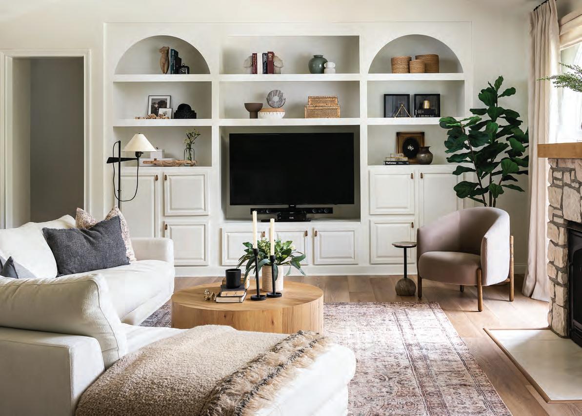
Upon completion, Bailey helped change about 90 percent of the kitchen and living room, from the backsplash and kitchen island to the living room fireplace and mantelpiece. Only the cabinetry remained the same, even though this too was painted and updated with some flourishes, arches and other custom components on the cabinetry sides and faces to make them feel more custom.
But topping the homeowner’s “fix it” list was the space’s original floor, the feature that had borne the orange maple color the most. “We built our house in the early 2000s, so it
was a pretty typical traditional Tuscan style with a brown and orange color scheme. I had fallen in love with a cinnamon maple hardwood floor that I saw on a design show and had to have it,” she explains. “As soon as that floor was laid, I knew it was too much orange, but it was too late. We lived with that design mistake for 18 years.”
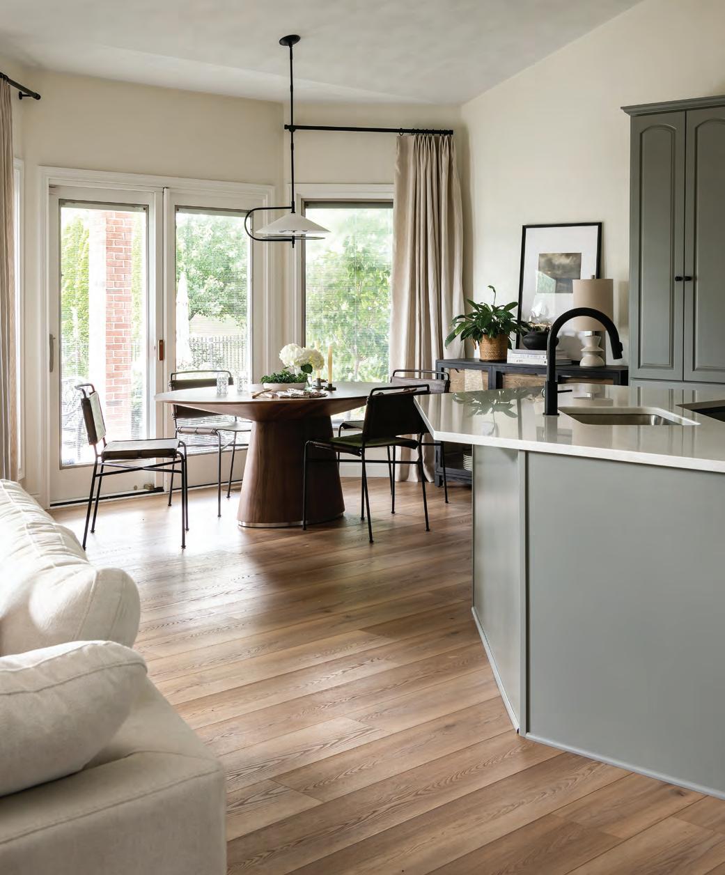
Hence the biggest change the homeowner wanted was to get rid of the orange floor and brighten everything up. The orange floor was replaced with brown-toned LVP, while the walls were painted a white and bright shade with warm undertones, handmade tile works as the kitchen’s backsplash, and a chameleon color of green clads the island and lower cabinets. “Depending on the time of day, this color can seem gray, green or blue,” explains Bailey.
The fireplace was also added. “That had been a plain wood oak box,” says Bailey. “So, we added light brick and the wood mantelpiece,” she says. The brick, evocative of nature because of its stone material, helps adjust the eye to the blending of outside and inside, as this wall’s windows peer out on the back yard. “I like to bring in natural elements wherever I can to make a home feel more welcoming and to blend the outside and inside,” Bailey says.
Adding texture especially helps for merging different styles.
A transitional home, the house combines vintage and modern, and one of Bailey’s secrets she reveals, is imposing pops of texture all over. “The number one thing I always tell people is texture, texture, texture,” she says. “Using texture can make smaller spaces combining different looks feel less overwhelming.” Even though the spaces have less furniture in them, it all still feels really full, from the window treatments to the wood tones to the handmade tile in the kitchen to help everything flow together in a breezy, effortless way. “We love how light and airy the space feels now. It just makes us happy,” says the homeowner. See stlouishomesmag.com for resources.



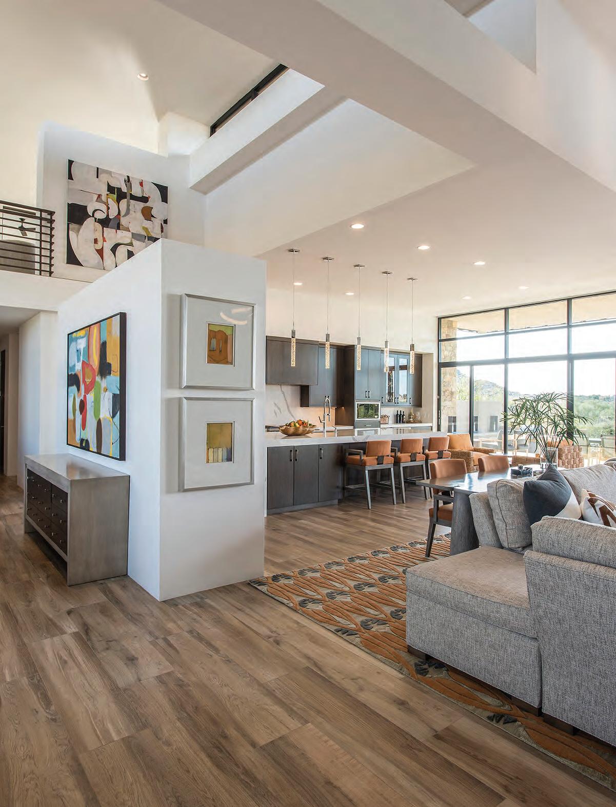 By Moe Godat
Southwestern states are known for their gorgeous desert scenery, which often influences the color palette of this design style. Mimic the rolling red hills and orange rock formations with rusty hues, terracotta accents and a pop of cactus green. Adding an aloe vera plant or two couldn’t hurt! To expand your color palette even further, add bright sun-beam yellows and the vibrant turquoise of desert skies.
The desert environment has many challenges year-round, so Southwestern interiors often embrace a casual comfort for homeowners and their guests. Well-worn or vintage pieces are often go-tos to help relieve the potential stress of a more formal atmosphere. When choosing fabrics, opt for weathered leathers and woven textiles.


Sand and carpet don’t mix! Southwestern flooring typically leans toward light woods and tile for easy cleanup. To add warmth, bring in loomed or woven rugs that are easier to clean. To bring in a wider variety of color, choose a rug with a colorful, graphic print!
No matter the exterior style of your home, you can bring some adobe inspiration into your interior design through mimicking the soft, smooth lines of traditional adobe homes. Pueblo-style architecture is characterized by the use of local materials like thick, rounded masonry, stucco walls and exposed beams. To increase the resemblance, adding Spanish textiles, ironwork and natural accents, such as desert plants, should do the trick. Not much of a green thumb? Choose artwork with scenic depictions or an abstract work with your preferred colors.
Don’t be so delicate! Southwestern design often features heavier, more durable furniture. Think thick legs and bulky finishes. These are often easier to wipe down without requiring detailed dusting or cleaning. One of the trendiest furniture options currently available are modern versions of the Equipale chairs, originally designed by Aztec artisans approximately 500 years ago.
There are endless options when it comes to incorporating geometric patterns into your Southwestern design. Use vibrant, decorative tiles in your kitchen backsplash or brightly colored patterns in your window treatments. Looking for something less permanent? Ceramic pots with geometric patterns or woven throws are easily changed.
Much like a bohemian-style home, Southwestern homes aren’t overly curated. Adding meaningful accents and accessories that reflect your family’s adventures is one of the surest ways to embrace Southwestern design in a way that feels truest to you.
These architectural firms are doing some of the best work in the Greater St. Louis area. We’re proud to call them our architect partners. Look to them first for your next project.


 Jim Bulejski Architects jbarchitect.com
Srote & Co Architects sroteco.com
DL Design DLDesign.com
Brendel Architects, LLC brendelarchitects.com
Donna F. Boxx, Architect, P.C. boxxarchitect.com
William D. Cover, Architect LLC williamdcoverarchitect.com


 Jeff Day & Associates jeffdayllc.com
Lauren Strutman Architects P.C. laurenstrutmanarchitects.com
Dick Busch Architects dickbuscharchitects.com
Schaub Projects Architecture + Design schaubprojects.com
Christopher D. Marshall Architect, LLC cdmarchitect.com
FUMAGALLI & LAMPE, inc. Lorif@flistudio.com
Use a variety of lighting “layers” to make a room beautiful. These layers will satisfy the different lighting needs in a room.
Information written and provided by American Lighting Association.
From providing the illumination you need to complete daily tasks to setting the mood for a romantic dinner, lighting serves multiple purposes and has a deep impact on the design of your home. This means you will need several types of lighting in a complete lighting layout.
General or ambient lighting is the overall lighting in the room. General lighting fills spaces with a soft level of overall light. This level of illumination allows enough light to be able to use the space. Ambient light levels will change with
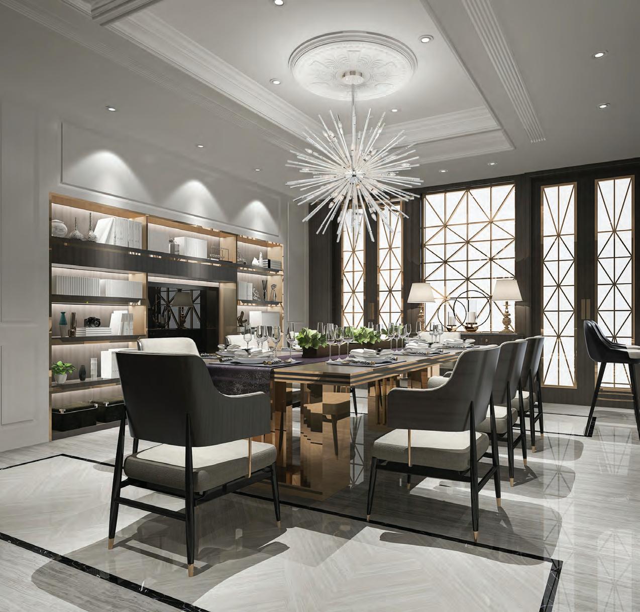
time of day and season; the levels should let you enjoy the room without being too dimly lit or with too much glare. Ambient lighting can come from a ceiling mounted light fixture in the center of the room, a series of recessed fixtures throughout the room, or any other combination of lighting that provides general illumination.
Task lighting is needed in the “working areas” of the home. The kitchen and bathroom benefit the most when the proper light is in place, so there is no glare or shadows and the light is bright enough to see easily without straining your eyes. Having a suitable lighting layout includes the positioning of the recessed lights based on the height of the cabinets. Under cabinet lighting in the kitchen helps you prepare food. Sconces by the bathroom mirror help you get ready to go out. A desk lamp, or a lamp by a comfy chair will help you read. Task lighting helps you do what you want safely and without eye strain.
Accent lighting is a requirement when you want to feature any design element in your space. Artwork and architectural details stand out when accent lighting is focused to draw attention to them. Check out alashowrooms. com to find your nearest American Lighting Association showroom! They offer trained experts and are wonderful resources for anyone looking to purchase lighting, ceiling fans or control products.
–Lighting control is key for customizing the levels of light in your space. Lighting controls are becoming more advanced with smart products that allow you to set your lights on a schedule, adjust the brightness and even change the color of your lights in some cases.
-Know your light source, then select the proper control or smart control system to ensure compatibility.
–When hanging a fixture over a table or island, the perfect height from the surface will often be between 30 and 36 inches and will depend on the volume and style of the fixture.
–To make a statement: instead of using one chandelier over a table, think about a series of two to three pieces positioned over the table.
By
Homes,
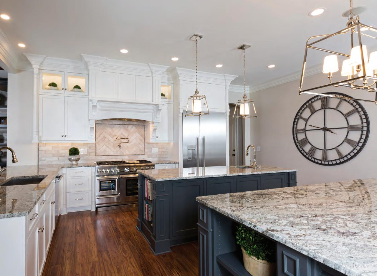
The project’s design theme didn’t come from some preconceived idea. Rather, the finished product, namely the ceilings at this one was the result of careful study and observation. Each moulding was custom created by piecing together multiple trim profiles to create something that looks and feels totally unlike what you see everyday in custom homes.
Ceilings don’t have to be plain, dull and white. Elevate the often forgotten surface with paint, wallpaper, beams and more!
By Melissa Mauzy By Blue Heron.The wood cladding material in the ceiling is a material from Resysta that combines rice husks, salt and mineral oil for a high-density, low-maintenance moisture- and fade-resistant finish.

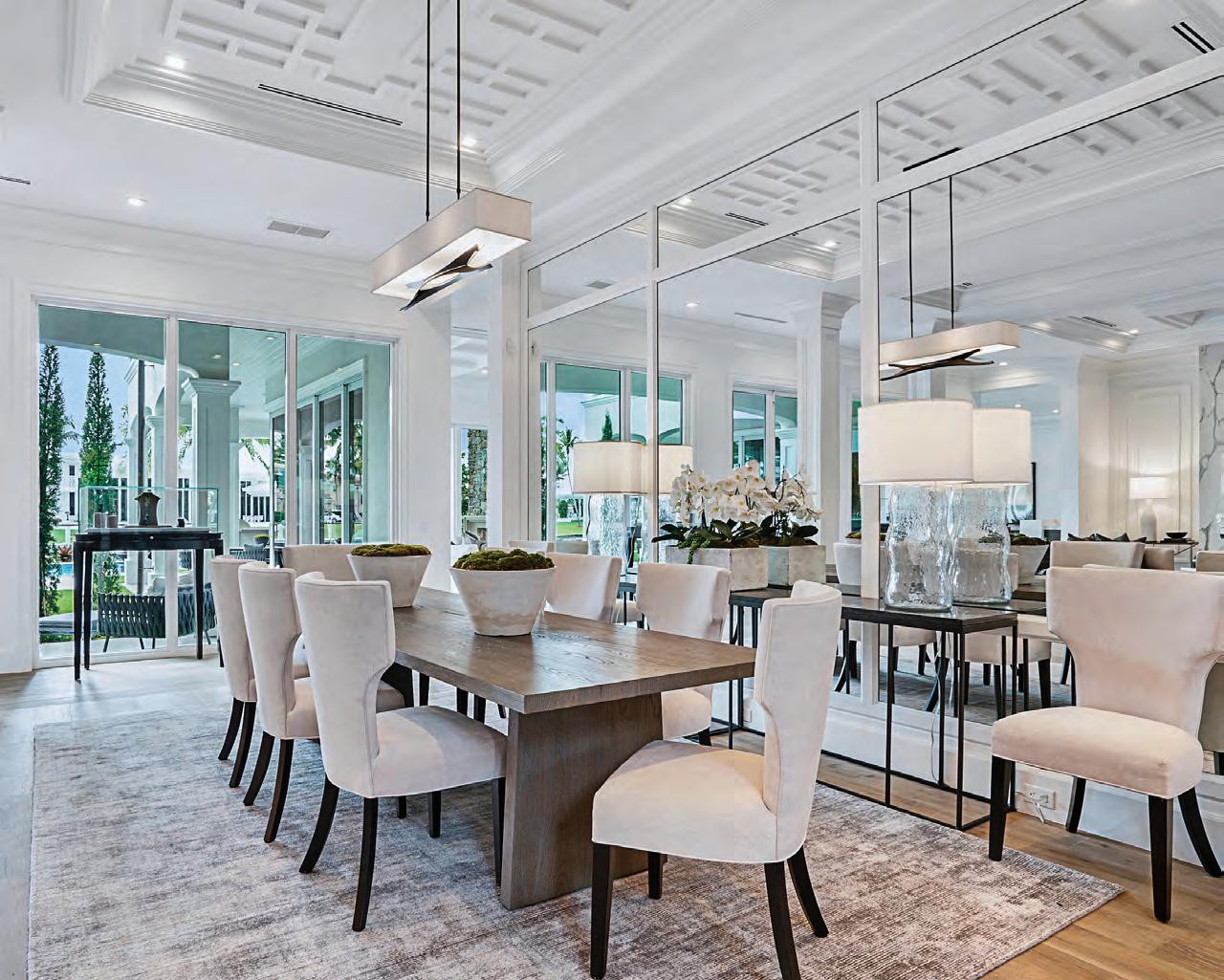
By Design Moe Kitchen & Bath. This was in an interesting kitchen where the ceiling design idea came from an old image that the homeowner had. The design and construction team did a lot of head scratching to give the client the exact design that she had in mind. It was quite a challenge putting together all of the cabinetry and matching molding pieces on several plains.

By Pierre Jean-Baptiste Interiors, Ltd. The designer added light gray wainscoting with dark brown, low VOC wall paint above to add contrast to the newly added custom wainscoting in this minuscule bathroom. LED recessed ceiling lights were integrated to reduce power consumption. Overall, this bathroom achieved the goal of being environmentally friendly as well as design conscious.
 By Linda McDougald Design | Postcard From Paris Home.
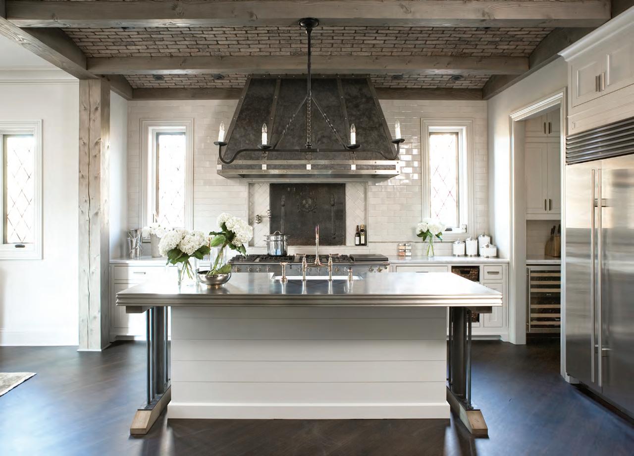
The ceiling in The Cliffs Lake Keowee residence features reclaimed beams. Arches between the beams are dressed with brick. A custom-designed and hand-crafted iron chandelier hangs over the island.
 Photography by Pierre Jean-Baptiste Interiors, Ltd.
Photography by Rachael Boling.
Photography by Dan Forster.
By Celia Welch Interiors.
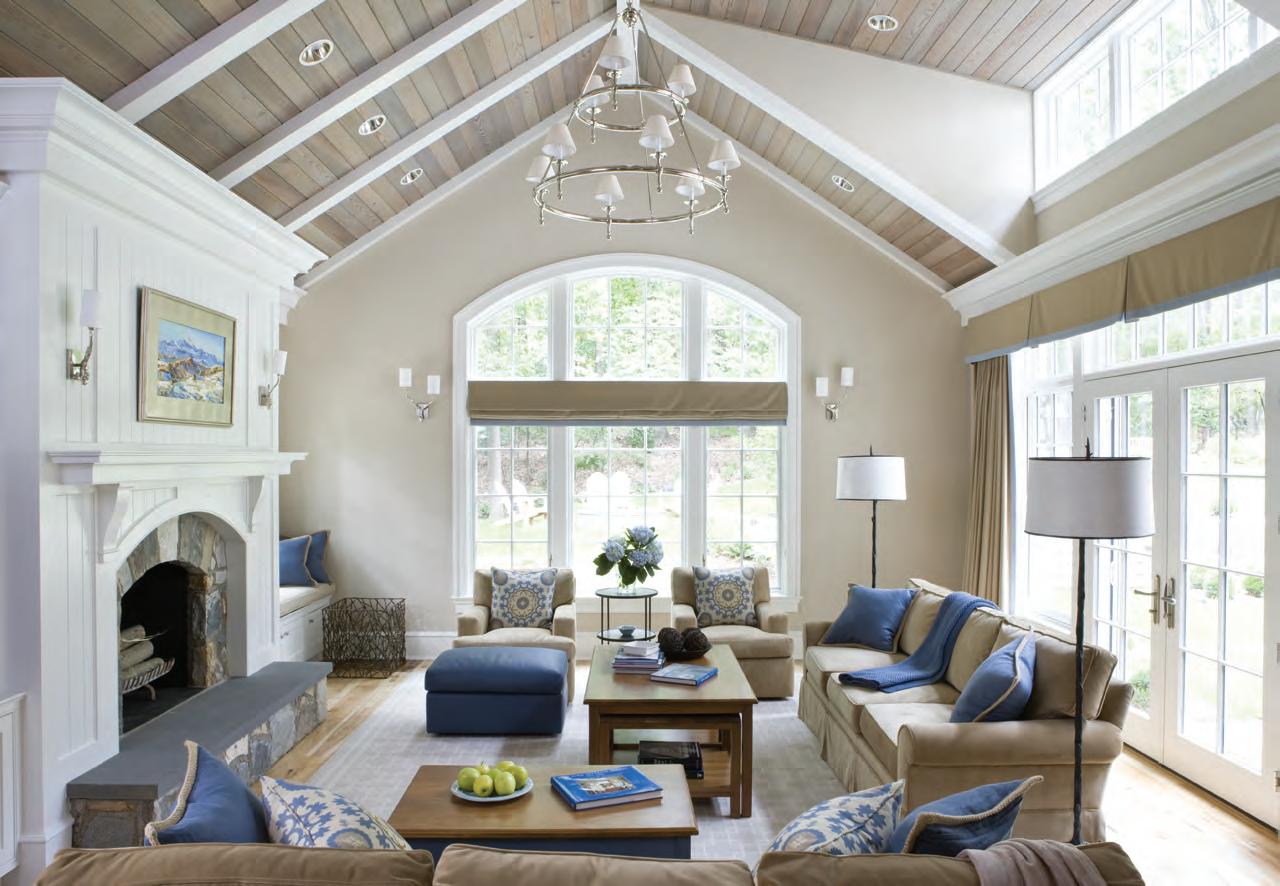
The designer lined the vaulted ceiling with cedar planks in a custom translucent stain allowing the natural beauty of the wood to come through. The effect, when added to the soft tones of the paint color and textiles, is to envelop the family room in an elegant warmth.
 By Rodriguez Studio Architecture.
This ceiling is in a converted attic in Brooklyn. The roof was a series of peaks and rafters. The designer clad the entire shape with finish grade plywood, added lights and then painted the walls black with blackbird paint.

Everyone can benefit from tinting the windows in your home. It allows you to keep your beautiful view while protecting your furnishings from the sun’s damaging rays and cuts down on glare for a more comfortable feel when you relax at home.

Unsurpassed

Get away and experience something new....these travel partners are going places, don’t let them go without you!
Outside of Nashville, Southall’s farm, inn, restaurant, and spa draw on nature’s bounty to nurture and replenish all who visit. Join the journey, Summer 2023.

www.southalltn.com

(615) 282-2000 contact: info@southalltn.com

Athens, Greece
Architecture/Lighting by Nikos Adrianopoulos
Architecture & Lighting
N ikos Adrianopoulos Architecture & Lighting in Athens, Greece, is anything but a boring architectural practice; their identity is defined by light integration in all its forms throughout any architectural design process to create memorable spaces with an overall “essential luxury” user experience. Their motivation is evident in every project, but perhaps nowhere more so than in the new Imanoglou Jewelry Store in Athens.
I manoglou is a high-end jewelry company focused on adding drama and elegance to their customers’ lives, a fact that the architects took seriously when designing the overall feel of the space.


“ We wanted to create a luxurious and elegant yet simple and modernized jewelry boutique,” says the firm. To start with the luxury, a golden stitch runs up the curved walls and ceiling to create two linked-together halves. This detail sets the tone for the space, promoting a peaceful aura with clean lines that gives the space the illusion of perfect symmetry.
They went dramatic and luxurious with the color scheme as well, using a deep emerald green and charred wood to complement each other and produce a gradient of light and color to add dimension. The space’s contrast
Places to go, things to do and see and people who are leaving their mark on the world of style.Nikos Adrianopoulos Architecture & Lighting works with Imanoglou Jewelry in Athens, Greece, to create a lighted shopping experience like no other. By Moe Godat Photography by Fotis Serfas, courtesy of Nikos Adrianopoulos Architecture & Lighting
comes with the clean-lined wooden jewelry counter with geometric elements against the unique hardwood mosaic floor.
The floating checkout counter is “edgy,” the firm says, and “adds to the gradual illusory contour of the space.” To add a more minimalist accent, they carefully selected amber colored chairs to blend with the jewelry displays.


The expert lighting enhances all this space’s unique features, creating a cohesive yet surprising final product that perfectly highlights the Imanoglou sells. “We wanted the lighting design to further refine the space, creating a successful balance while enhancing the beautiful and also functional end result,” they say. “The overall design exudes luxury with touches of linearity.”
See stlouishomesmag.com for resources.

When think ing about inspirational design elements, the globe (or green) artichoke is not usually top on the list of design requests. This spikey variety of the thistle plant, which has been cultivated as food, creates a globeshaped flower bud that we know and love to eat.
The simple globe shape with complex overlapping layered petals creates an opportunity for unique nature-inspired designs. The artichoke as a design element can be seen in drapery finials, as a motif in wallcoverings and textiles, illustrations, photography and lighting. The multiple shades of green seen in an artichoke are currently trending in kitchen cabinetry and the paint industry. The uniform, globe shape of the artichoke can be very useful for artists and designers, especially in the lighting design industry where the layering effect creates a simplistic, visual focal point.
Early Scandinavian designer Poul Henningsen, trained as an architect and later lighting designer for Louis Poulsen, was initially attracted to pure functionalism from the Bauhaus era in
the late 1920s but quickly modified the approach to a softer, more “organic” one. After 10 years of development and scientific study to eliminate glare, the PH Artichoke lamp was created in 1958. The lamp has a soft warm glow with multiple layers of copper-clad louvers, making this a stunning sculptural form which can be purchased still today after 75 years, a true classic design.

I n contrast, a different approach at achieving an artichoke-inspired light fixture with the use of upcycled papers such as vintage sheet music, old maps, flower bulb catalogs and recycled book pages can be seen in the designs of Aster + Quail pendant lights. The handcrafted pendant lights using cutout circles in an overlapping placement create the subtle artichoke abstract form.


The artichoke flower’s meaning and symbolism represents hope and prosperity; with a tender core and hard outer shell, the artichoke is a resilient design motif that has lasted for centuries.
Bottom:
Sunday

RECEIVE AN ENTIRE YEAR OF SLHL FOR ONLY

To take advantage of this offer, send your check along with name, address and telephone number to:
St. Louis Homes + Lifestyles, 255 Lamp & Lantern Village Town and Country, MO 63017


Online: stlouishomesmag.com/content/subscribe

countertops INSPIRE | DESIGN | LIVE


#1 Best Garden Center 1011


N. Woodlawn • Kirkwood, MO
Quartz
OF THE YEAR 2023
DEADLINE FOR ENTRIES IS MAY 3, 2023
If you are the owner or designer of a brilliant bathroom, enter our BATHS OF THE YEAR (BOTY) CONTEST. Winning baths will be featured in the AUGUST 2023 ISSUE of St. Louis Homes + Lifestyles.


4160 Meramec Street, St. Louis, MO 63116 314-771-1234 russostoneandtile.com
Photography by Anne Matheis.


Built-in coffee bars are taking over small sections of St. Louis kitchens, dressing areas and outdoor oases.
I adore breakfast and coffee bars in bedrooms. We have been including them in our designs for years. How wonderful to be able to wake up to your coffee brewing, or to get up in the middle of the night for a quick snack. The increase in popularity is due, in part, to clients traveling. You find breakfast bars in luxury hotel rooms and Air BnBs. I love having my cup of tea with me to sip on while I am getting ready. CJ Knapp, Yours by Design.
As homeowners embrace more and more personal perks and sleeping chambers continue to grow in size, think the coffee bars are here to stay. See more and more moving out of the kitchen to main and guest suites. It’s a great way for the early risers to start their day, without disturbing the entire house. Robert Idol, Idol Design.
For something that has been around for centuries such as coffee, a built-in coffee bar is a classic! Best located toward the end of your kitchen and out of the main prep area, a coffee bar can serve you and your guests without crossing paths with the cook. When designing for this space, we recommend a cabinet that sits directly on the countertop and has pocket doors for easy access and cleanability. Christopher Amburn, Chelsea Design Company.
I think most people can agree that the long wait lines at the local coffee shops can be a big deterrent to your morning rush. How wonderful it is to be able to create the perfect morning joe for everyone in the family at home! There are so many wonderful built-in options available as well as countertop options that are perfect for a designated area. I do believe this will be an ongoing trend that will become a classic in no time. Amena Zamora, Amena Zamora Designs.
The love for coffee isn’t going anywhere. Coffee bars utilize an everyday activity that is meant for the kitchen. They create a space where you can start a task and finish it without interrupting the main kitchen prep and cooking areas. These dedicated spots also allow your guest to easily serve themselves without feeling that they are in the way. Coffee bars are not limited to just the kitchen as they are appearing in dining rooms and living rooms! When designing these spaces don't forget the necessities: a quality coffee maker, mugs, area for plates and likely fresh flowers! Savannah
Sells, Youtopia DesignsThe built-in coffee bar is a craze in kitchen renovations, which will hopefully stay and evolve into a classic. It is a nice addition to traditional cabinetry or plain open shelving. The purposeful design allows for display of coffee and tea sets that are usually hidden away in close proximity to the prep area. Wendy Noory, Chromatix Hue. netry.
An in-house coffee bar is a personal luxury and is becoming a staple in new and existing homes. In-house coffee bars can run the gamut of style; they can be a simple set-up with a corner table, or they can be a sophisticated set-up that is high-tech and plumed-in for the quickest and easiest cup of coffee. For added convenience, in-house coffee bars can be added to just about any area of the home that coffee is enjoyed in, such as a counter near the dressing area, a home office or den or a back porch. In-house coffee bars are a simple luxury that will remain a must-have item for the true coffee connoisseur.
 Barbara Collins, Barbara Collins Interior Design
