5 minute read
BirdTrack Tutorial #2 – exploiting patch data..........Nick Moran
Recording birds across Britain and Ireland
Nick Moran
Tutorial #2 Exploring your records
Once your records are in BirdTrack, they ’re available for the ‘greater goods’ of monitoring, research, local report writing and much more. Whilst this may be ample motivation for some people to submit records, BirdTrack offers a range of exciting outputs that add an enormous amount of personal value to your records. The more records you have in the system, the more powerful it becomes for you.
This tutorial looks at the Explore My Records tool, and highlights a selection of the outputs available. To really appreciate the benefits of this tool though, there is no substitute for entering some records, then having a go!
Clicking the ‘Explore My Records’ link on the Data Home page (the page you see once logged in) takes you through to a blank set of ‘tabs’ in the middle of the page: Table, Map and Graph.
You can toggle between the Table, Graph and Map outputs by clicking the relevant tab at the top left of the screen. To the left of these tabs are a series of filters: Dates, Locations, Species and Project. The idea is that you set the filter – or filters – you want, click the ‘GO’ button, and the relevant selection of data is presented in the tabs.
Here, in order to show my life list records, I’ ve applied the most straightforward filter – viewing all of them as an example: 1. Click ‘Explore My Records’ on the Data Home page; 2. Click ‘GO’ in the ‘Dates’ filter on the left side of the page (the ‘Dates’ filter opens by default, and the ‘Select All Species’ radio button is automatically selected). …and that’s all there is to it!
Summary stats are presented along the top of the ‘Table’ tab, showing your life list, number of records, number of Complete Lists and number of locations.

Table Graph Map

Table Graph Map
The summary table accommodates 14 rows; if you have records for more species than this, you can scroll through the additional pages by clicking the numbers at the bottom right of the screen.
Table Graph Map
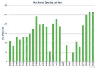
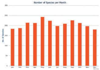
Up to 3 different graph outputs are available, depending on the filters that have been set. In the selection above (all your records), the graphs available are Number of Species per Year, Number of Species per Month, and Species Accumulation:
i
ii


iii
These alternative graphs are accessed by clicking the ‘1’ , ‘2’ or ‘3’ at the top right of the Graph tab, and you can either print or download any of the graphs by clicking the print or download icons to the right of the number buttons.

Table Graph Map
To view a map of the data selected, simply click the ‘Map’ tab.

If you want to download all the data that you have selected using the filter, simply return to the ‘Table’ tab and click the Microsoft Excel icon at the top right of the screen. The resulting spreadsheet contains two sheets, one marked ‘Summary ’ and containing the same information as displayed in the Table view, the other marked ‘Details’ and containing every record for every species, and any details such as count, breeding status, age/sex/plumage and comments.
Let’s look at a more complex example: records of a single species for a particular site, over a specified time period: 1. Click ‘Explore My Records’ on the Data Home page; 2. In the ‘Dates’ filter on the left side of the screen, click the ‘Date range’ radio button and select a ‘From’ date, ‘to’ today ’s date;
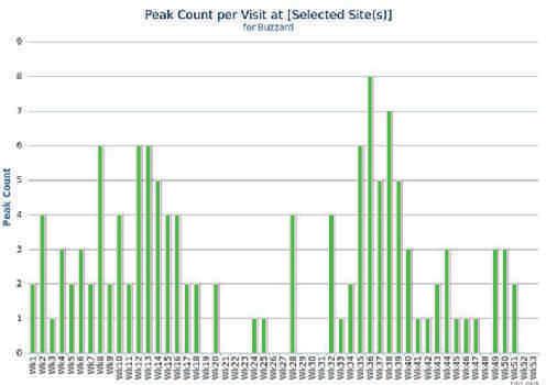
3. Minimise the Dates filter by clicking the ‘ ‘ button at the top right of the filter; 4. Click the tick-box by ‘Locations’ to open the Locations filter; 5. Click the ‘Specific Locations’ radio button and select a location from the box, or type its name into the ‘Search for’ box then click its name in the main box to highlight it; 6. Minimise the Locations filter by clicking the ‘ ‘ button at the top right of the filter; 7. Click the tick-box by ‘Species’ to open the Species filter; 8. Click the ‘Specific Species’ radio button and select a species from the box, or type its name into the ‘Search for’ box then click its name in the main box to highlight it; 9. Click ‘GO’ . In producing the graph below, I followed the above steps for my 2009–2012 Thetford Nunnery Lakes site Buzzard records. I then clicked the Graph tab and chose graph option 3, to show my peak counts per week for Buzzard at this site.
I’ ve been BirdTracking avidly since I returned from a seven-year stint overseas in 2009. During that period I’ ve entered more than 31,000 records, bolstered by another 14,000 from backdated notebooks from my formative years. Adding my day-to-day records hasn’t been an onerous task – it was simply a case of getting into the habit of logging my field notebook lists online, rather than writing up ‘in neat’ as I used to do. The beauty of the BirdTrack approach is that I can now access and interrogate my own records in a matter of seconds, instead of having to thumb through countless logbooks to find the information I want. No longer do I have to rely on memory or anecdotes – I can tell you for certain that my highest Buzzard counts at my local site are in early spring and mid autumn .. . and lots more besides!
Editor: So, if you have not already done so, join BirdTrack today and start working on your own patch data.
To help you do so Nick will be taking us through an example of SOG patch data and showing how it can be exploited at a special workshop we've arranged for 21 March. As we'll have wi-fi at the Holiday Inn, you can bring your laptop to participate in a ‘live’ BirdTrack session and adjust your own data.
If you don’t have a laptop you can still join in by sitting with any of the workshop's breakout groups.


