
18 minute read
Sumiko Island
from Sumiko PM6000
by SUMIKO
Sumiko Island
PM 6000 Creative Practice Portfolio
Advertisement

EN-JU,LIU K1909094

Target Audience


Before I do this project, firstly, I think about the keywords that match my style, and then I choose more developable projects from these keywords to find my target audience.
Personally, I like caricatures, black humour, and interrogative narratives, so I think in this direction, it is easier for me to catch ethnic preferences. Beside, depend on I am an undergraduate student, all of my friends who have just graduated and does not continue to study in graduate school, most people are directly employed. In the Asian working environment, fresh people often encounter many setbacks and pressures from their bosses and colleagues in social pressure, so I use this as my target group and create an outcome.
I chose the way of newspapers and periodicals as my finished product, in order to show that items available everywhere in the office are more influential. T
Try to imagine it, if you were holding a newspaper while working in the office and this newspaper is sarcastic about your working life, you would feel angry and funny, isnt it?
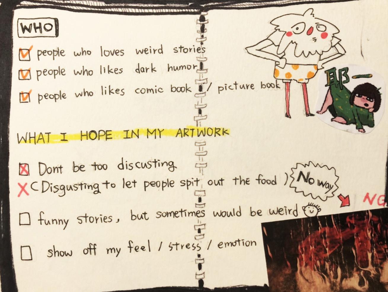
First, I started by focusing on the target group that I wanted to set up.
1 The people who love dark humour 2 The people who love weird stories. 3 The people who have much stress.
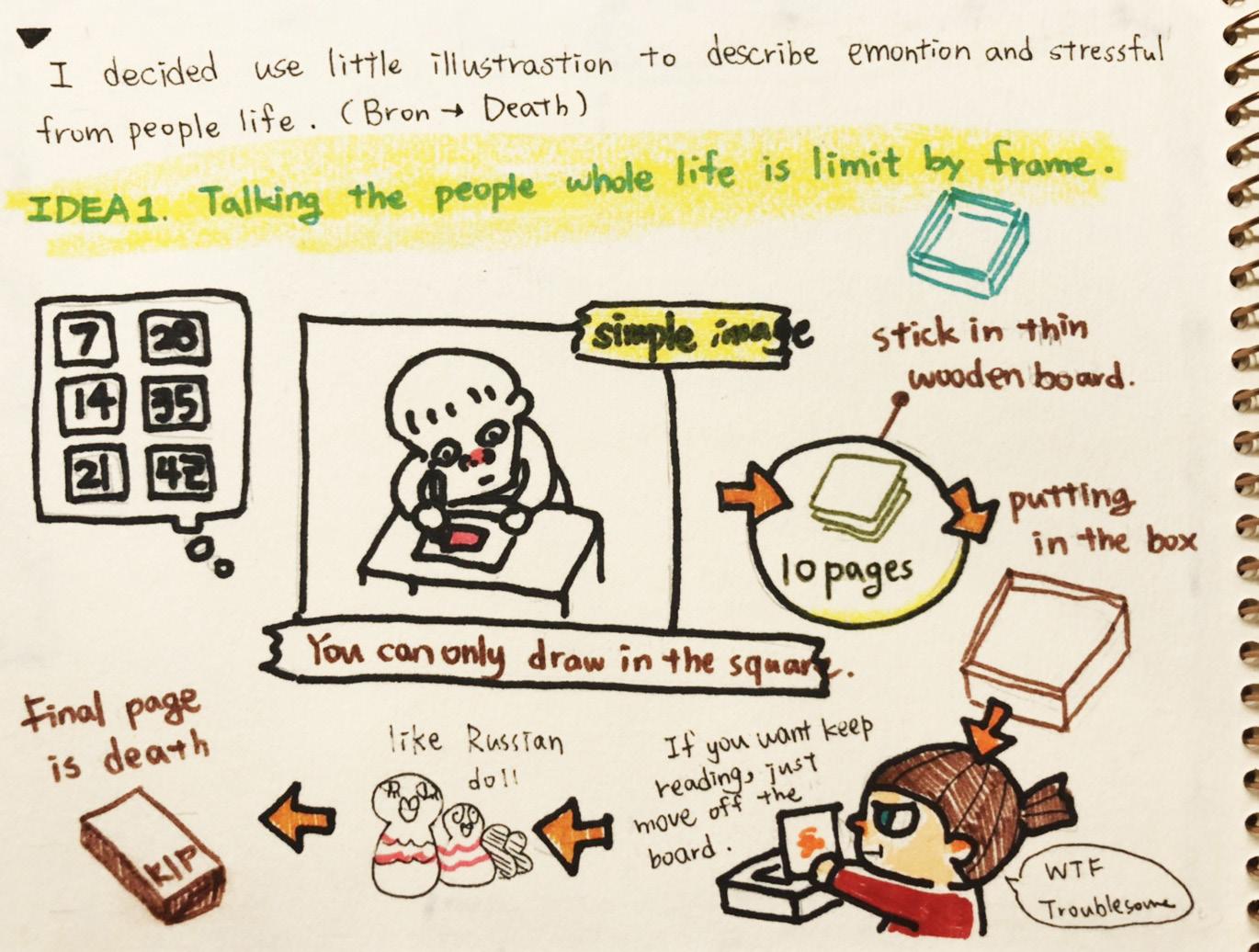
Secondly, I try to make three concepts to present my work.
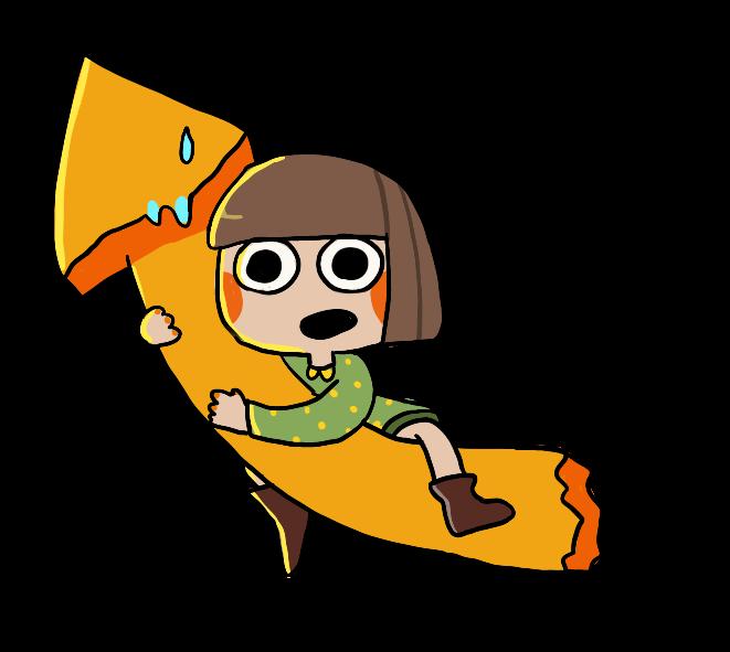
One is a toy brick with picture stories, and the other is a countdown date postcard, the final one which is my final decision is a newspaper which describes the office dark life.
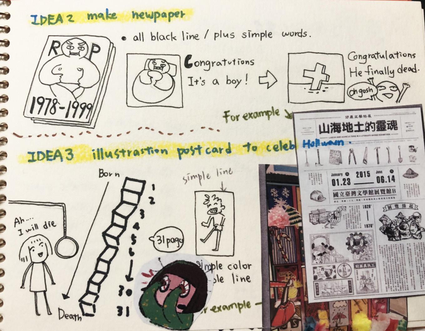
I'm used to collaging some references in sketchbooks that can help me remember and describe to other people what I want to present.

Draw sketch lines on iPad.

Match a simple colour and handwritten fonts. Finally enter the computer to repair pictures and type text.

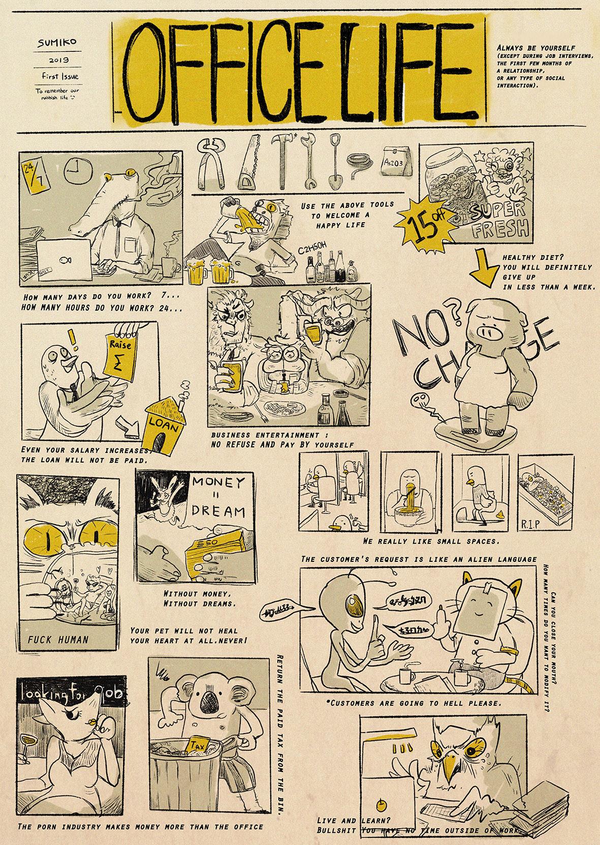
This is the first version which I made, and I want to present it in the form of an old newspaper.
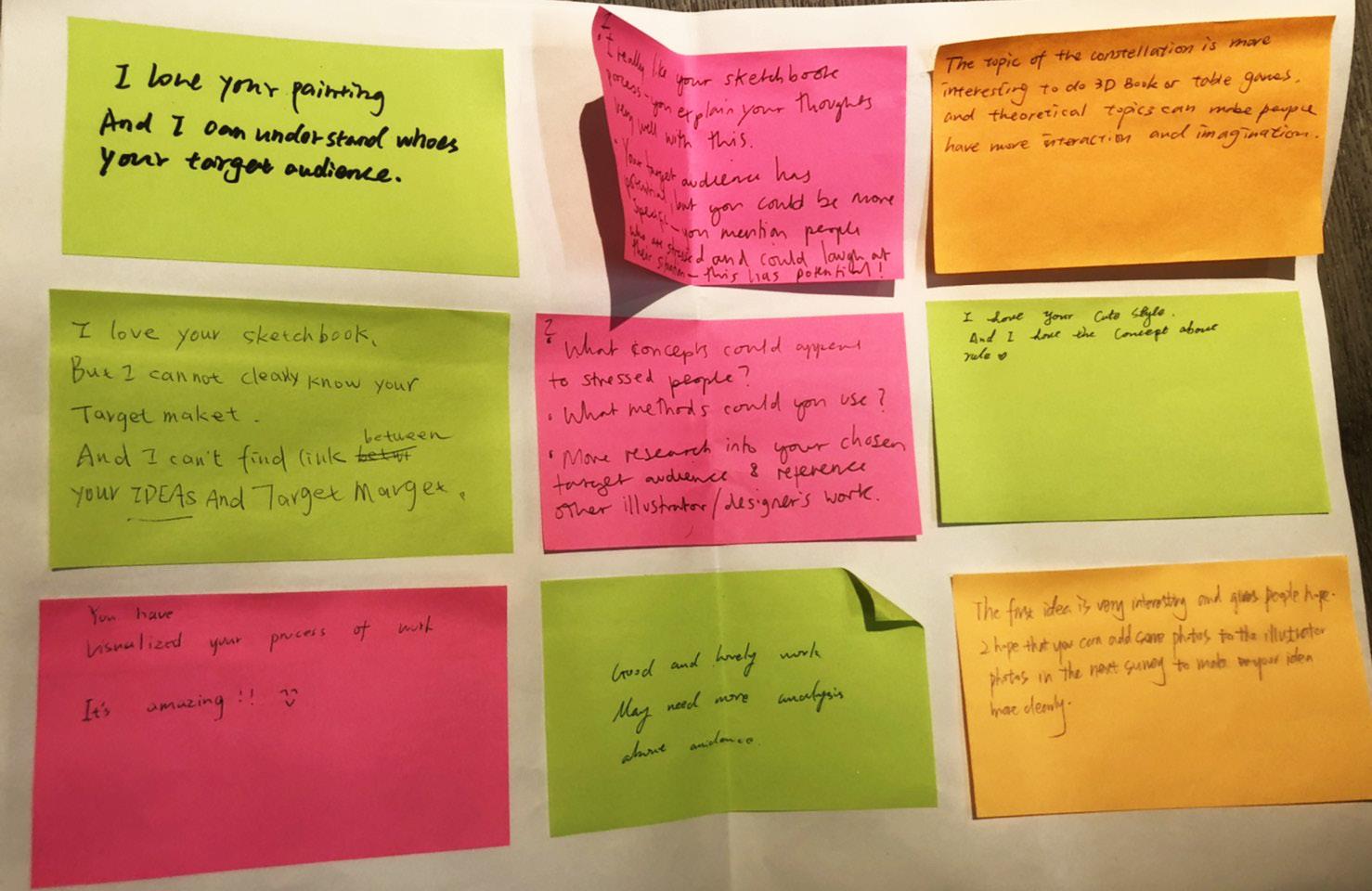
I got a lot of advice from my classmates and teachers. Most people like my character design and concepts, but they don't think this final work looks like a newspaper, so I have to make a change in typography.

Process


Thinking about my creative plan is a challenge for me. Because creation is like a habit to me, and I am used to creating something. And when I starting analysis my-self, it makes me feel burned out.
According to my creative process, I made a map of Sumiko island, which has all the material I need to complete my work, it is important as well. Besides, I used the style of the game to present this project, I tried to make something like a tourist map for this island. I hope everyone can clearly understand my creative habits after boarding the Sumiko island. There are as many as a dozen of my creative steps, but if we focus in a few points with a wide range, it is self-image, do research to find information, draw drafts, and then find similar cases and references infinitely, and finally complete my work between the endless setbacks and supplement caffeine.

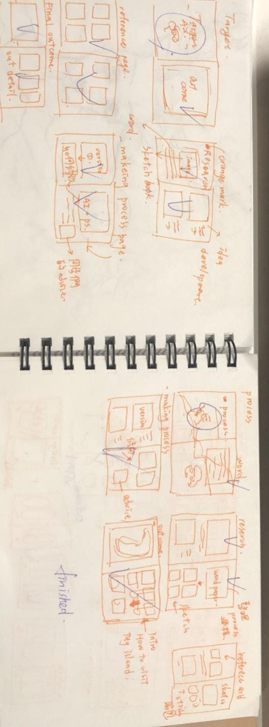
First I sorted out my creative process in words.

Then start the conceptual idea in the sketchbook.

I will draw some pictures when I am thinking about my concept, which can be my inspiration when I do the outcome.


Alter Ego

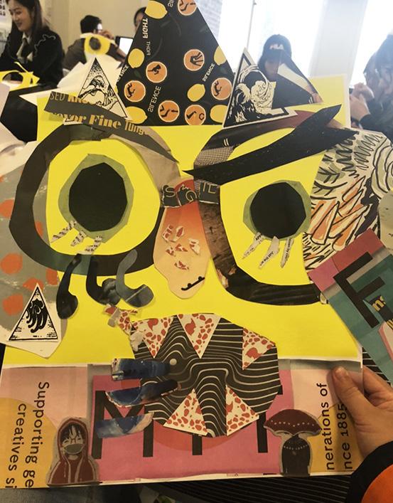

Before working on the alter ego project, first of all, I thought that I should be fully invested in the characters which I designed. In the casual collage creation in class, I chose many brightly coloured materials for decoration. Besides, I also found different styles of letters from many media, pieced together indecent text, I wanted to express the passion of young people and they're unrestrained as well.
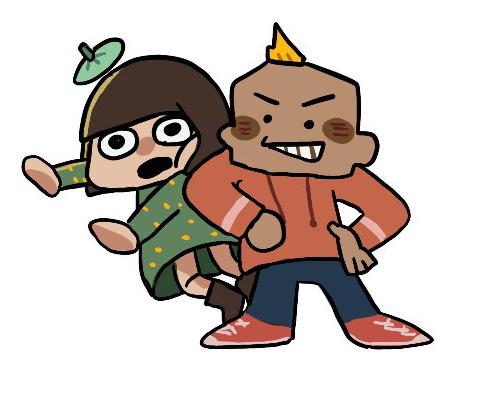
Finally, I created an eight-year-old kid named Tapioca. This name is derived from a very sweet and delicious drink in my hometown, but my character has a violent personality and is annoying to other people. This lovely name come by this bad personality makes funny.
I set up these keywords for my character: naive kindness grumpy love stubborn, just like a typical child who lacks parental care. I wanted to draw comics before, so this time I tried to express them in the form of comics. Although it was not completed, there is still room for modification and development in the future
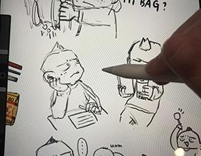
Try to figure out his expression during class.
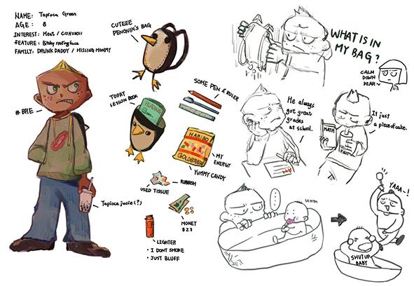
Tapioca was set up as a child from a broken family, his father was drunk, his mother ran away from home, and he was eventually sent to an orphanage.
But his stubborn personality made it difficult for him to integrate into the group.

So, I thought about the character setting, what would be in a schoolbag of such a slightly rebellious child?
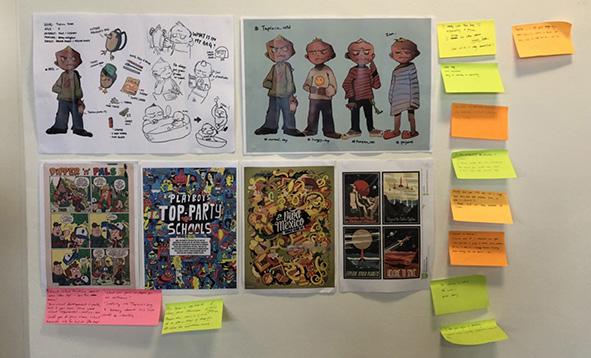
Some advices from other students and teacher, thay all forcus on what kind of story I want to draw.
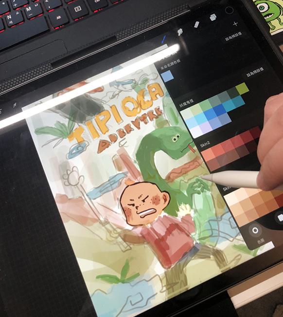

Make storyboards of story content and think about plots. Also think about story cover.
Take notes based on comments and draw comic strips.
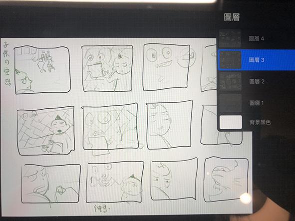

Advice note
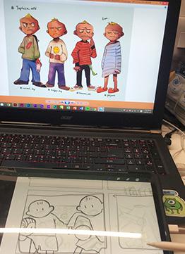

Check the character's shape and printing color. Because the drawing and finishing computer are not the same brand, it is easy to have problems in the final printing.
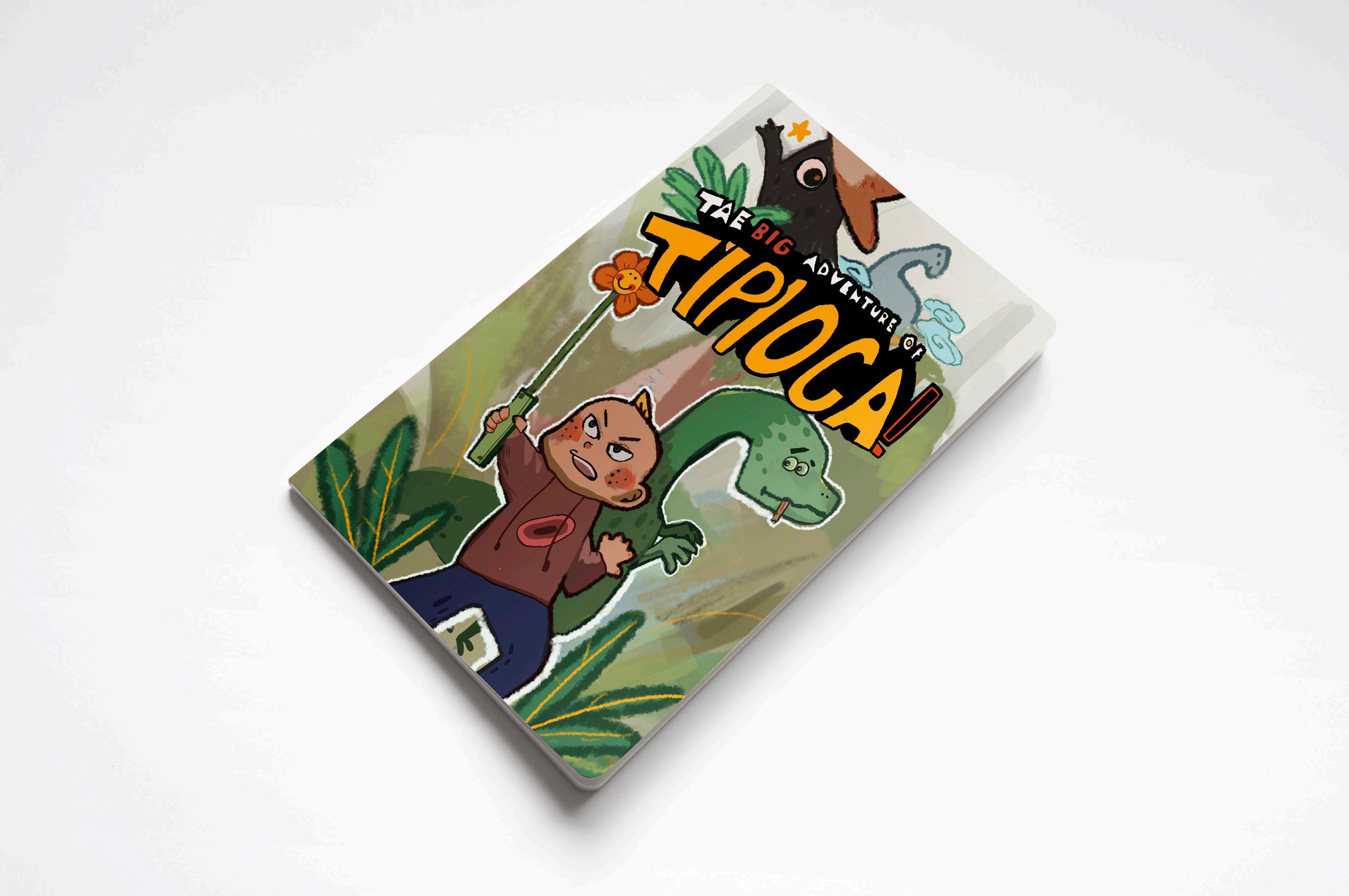
I ended up with a small 6-page comic book. The story has not been finished yet, and I will continue to produce it.

This page is the beginning, telling that lonely Tapioca is reading a book by herself. (The Big Adventure of Tapioca,Sumiko,2019 )

Suddenly, a strange person jumped Tapioca. This strange creature was wanted. It wanted to talk to Tapioca, but Tapioca did not plan to talk to him. (The Big Adventure of Tapioca, Sumiko,2019 )
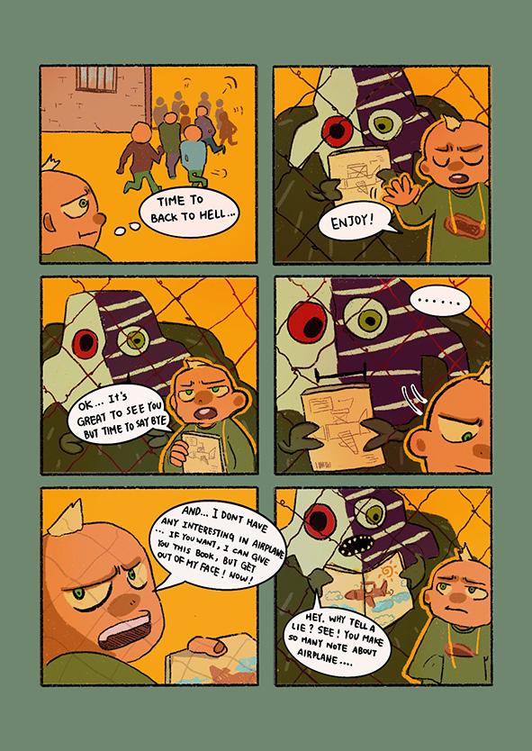
At the end of the class, Tapioca stated that he had no dreams and no interest in adventure, and gave the book to strange creatures. (The Big Adventure of Tapioca, Sumiko, 2019)
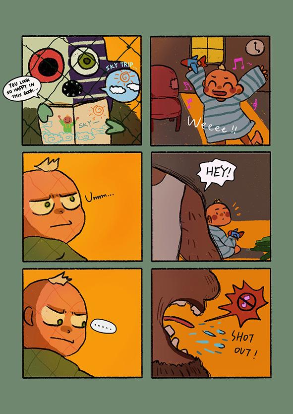
The weird creature turned a page of Tapioca's notes and asked him why he was lying. Tapioca recalled a time when he has a dream but been scolded before.(The Big Adventure of Tapioca, Sumiko, 2019)

Observation
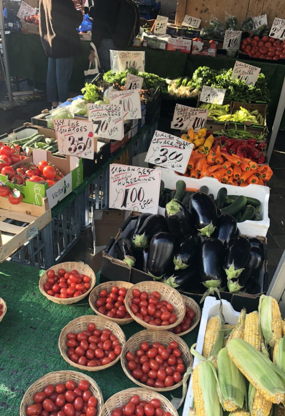


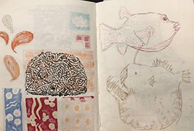
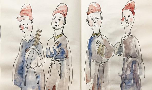
The first part of this project is to go to galleries and museums to collect objects and paint them in sketchbooks, which is a very interesting challenge for me. Collecting some objects can focus on the things that interest you. For example, I am very interested in totems, so I collected many patterns of wave carpet in the Victoria and Albert Museum, and practised shapes and colour matching in sketchbooks.
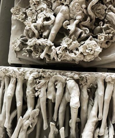
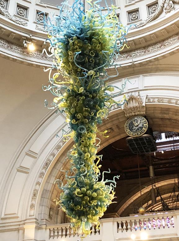
I think it is very interesting and useful to sketch some collections. Because when you sketch these beautiful crafts in your sketchbook, it also developed your skill much better.
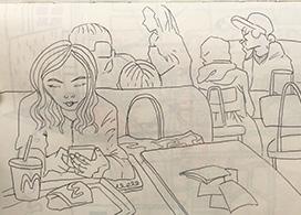
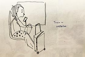
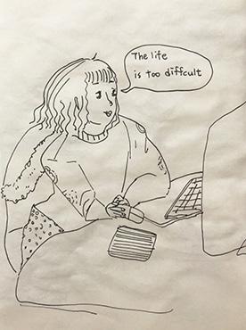
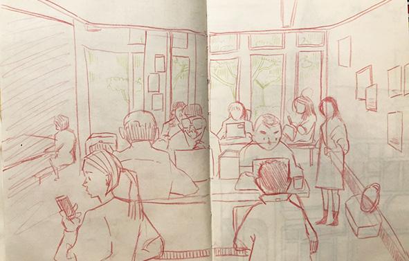
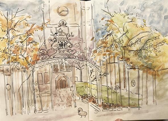
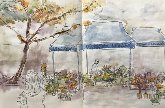
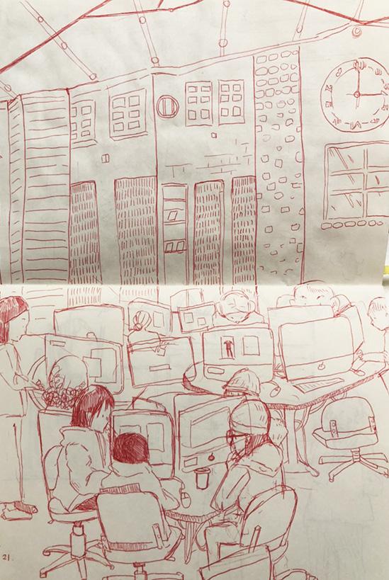
The second part is more difficult. It is necessary to sketch the relationship between people and space. Because people are not stationary like objects, it is more difficult to grasp the dynamics of people. In the early days, I drew pictures in the school and on the streets of Kingston. But recently, I drew some on the way because I went out to other countries. Besides, it's winter, sitting outside and drawing the crowd is really a big challenge. However, in the West, no one will bother you when drawing outdoors. When I was sketching in Taiwan, there was always a group of people around, and it is really stressful.

I think sketching is a very useful way to quickly increase your observation and drawing skills. You must catch the most accurate lines in a short time. It is also very helpful to develop your own painting style.

I went to the V & A Museum and the Natural Science Museum to collect some objects I was interested in and painted them.

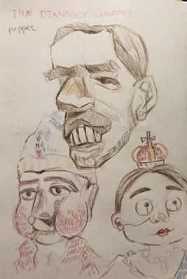


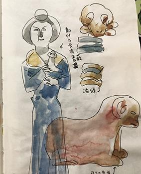
Patterns of Persian rugs collected at the V & A museum.

People and space.




Word


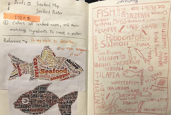
One of the ideas is to collect all kinds of seafood and assemble them to make a poster about environmental protection.
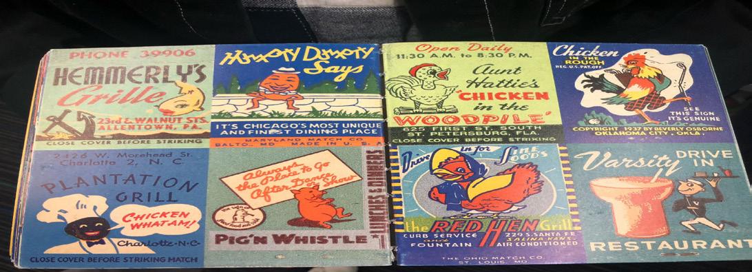
One of the ideas is to make a small text animation. I looked for the color of some old printed posters. I hope that the animation can be made into that style.

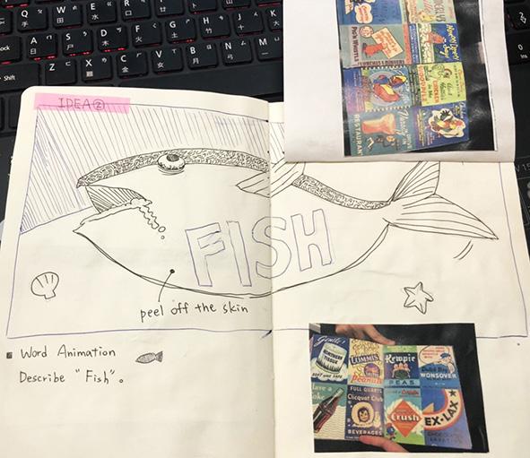
One of the ideas is designed for word “fish” in Chinese and made into a menu in a sushi restaurant.
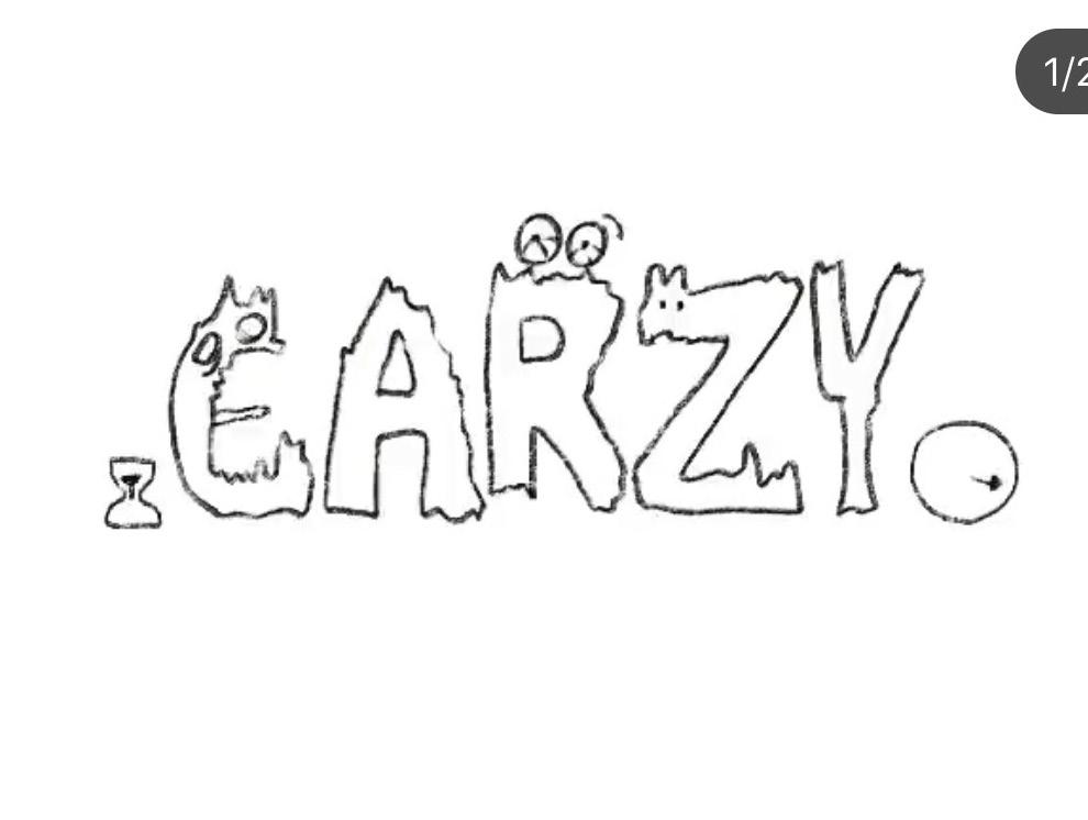

Another exercise on word design with images.
I chose two words which are crazy and hurt for design exercises during class practice. And I made design of crazy and hurt for a few seconds animation.


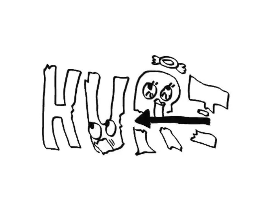

Try making small animations in class.

I received the word "poverty" from the teacher, and I had to complete a small outcome within 30 minutes, so I drew pictures of poor children even if they got a bowl for rice, but still not have any food for them, they only have "poverty".

Make the word more like a poisonous item.

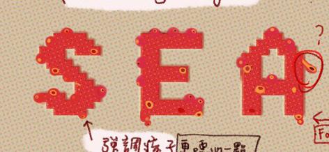
This is the first version of the poster. It was modified based on the opinions of teachers and students.
I think that word design and illustration are an inseparable thing. Only two of them can multiply together to make work much perfect. Before starting to do this project, we had a little practice in class, I chose two words, that are crazy and hurt, to make small animations, and the word design has a lot of space for development, whether it is a graphic design or a 3D stereo, it is very interesting to work.
And I also drew a single word about poverty with illustration, so at the end of class, I made three small works in two different forms in this practice.
When I development my final outcome, I changed a lot of words. I originally used the word "fish" for design. After the tutorial with the teacher, I decided to make word design much personality, so depend on I am allergies to seafood, the final selected word is "seafood".
In the beginning, I only planned to make posters, but after receiving the suggestions from my classmates and teachers, I can develop this project into a seafood allergy manual. It will be more interesting to set different dangerous levels for different types of seafood, it will be more distinctive than ordinary works as well.
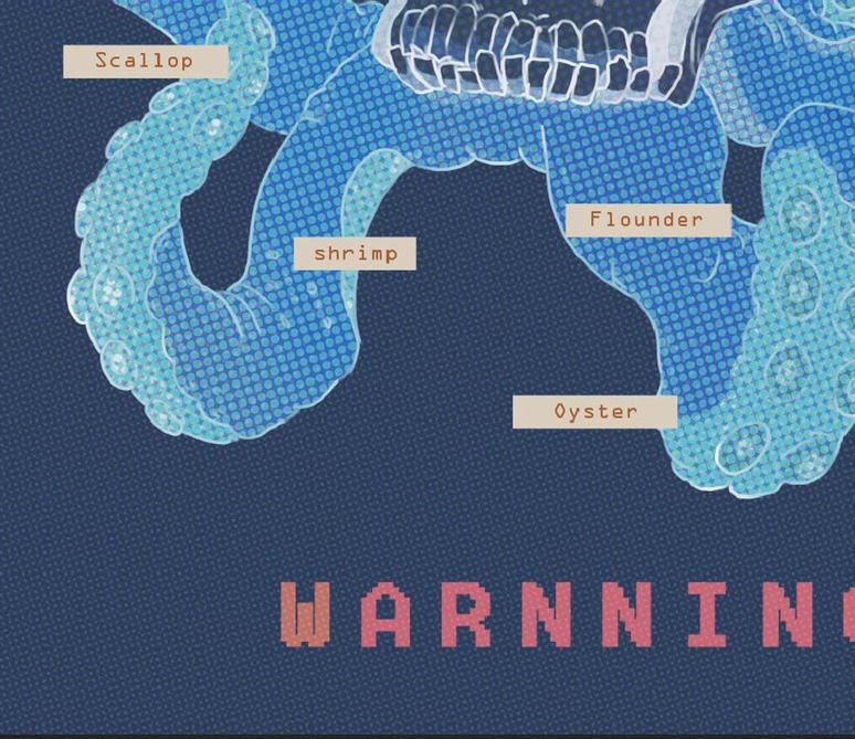
Use contrasting colors to make the poster more dangerous.

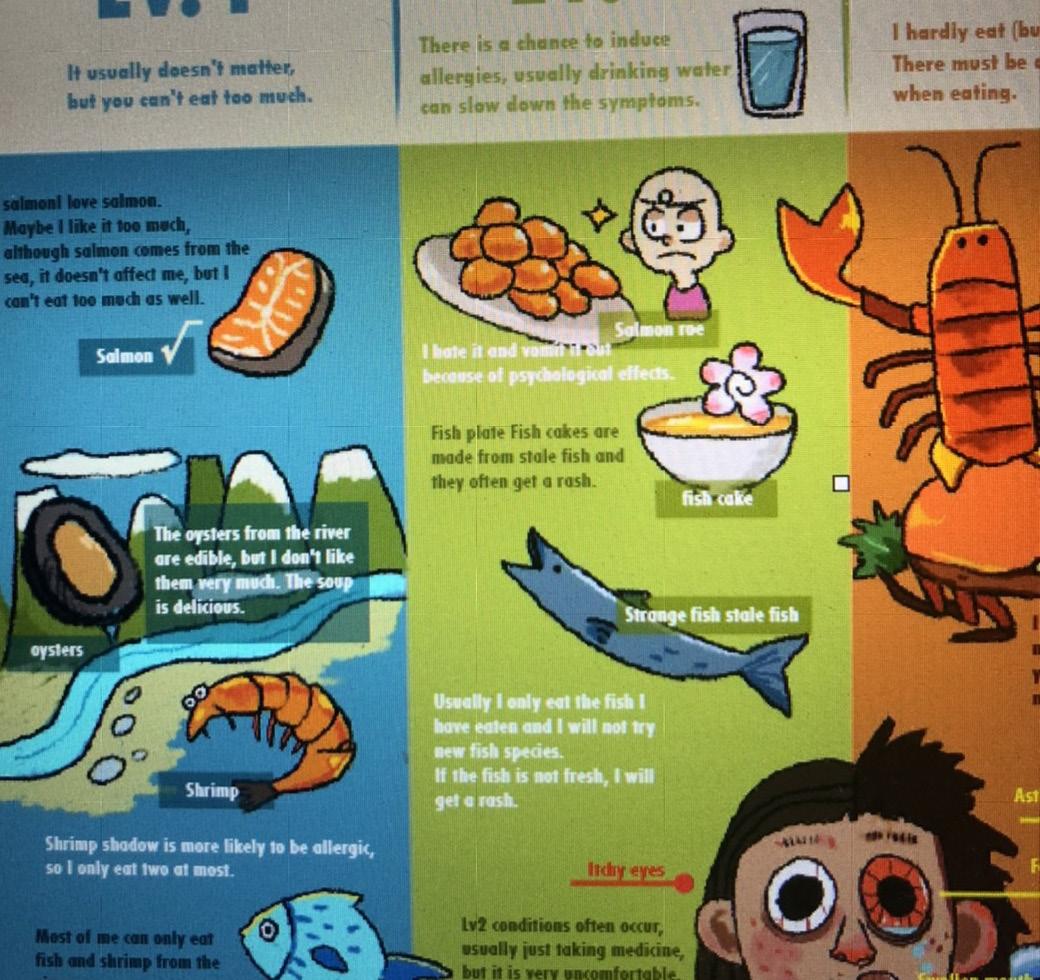
Based on the recommendations, start making the inside pages of the allergy instruction booklet.

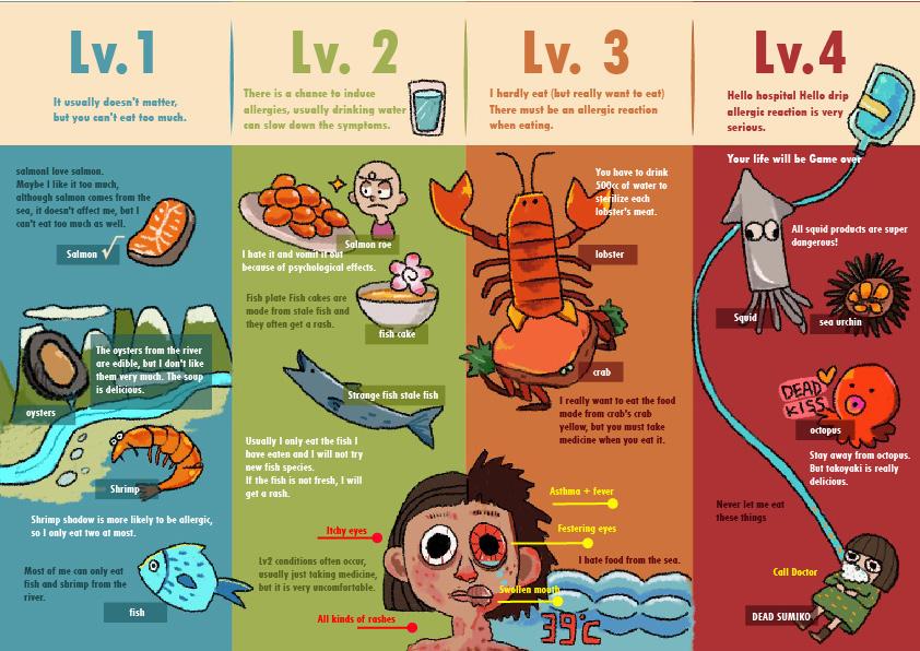
The cover of the booklet and the inside page of the allergy risk index.


Exhibition

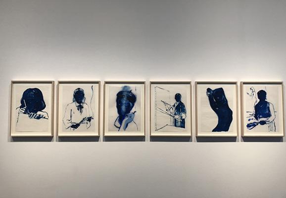
In this exhibition project, we visited 14 galleries on one day. This is the first time I walked into the West London Art District, visiting these private galleries, and it is very different between visited the private gallery and museum. There are not too many tourists come to visit private galleries, most of the guests are art collectors or art students, so the environment is relatively quiet compared to museums.
In this project, we also found that the layout of the private gallery is very different from the museum's route planning. The museum puts together the works of several artists, but most galleries do not. They only focus on one artist when planning the exhibition, the entire gallery is the work of that artist, and also provide the artist's booklet makes it easy for visitors to understand the artwork.
I think visiting galleries in London is a very interesting thing. There are many galleries that don't have obvious signs or just hide between lanes and private houses, it is difficult to find them. Not only the artworks are interesting, but also the gallery's architectural design is exquisite, and it is a key point to visit. Some galleries even extend underground to display the artwork; it is really cool.
Although it is very hard to visit so many galleries all day, it is also a rare opportunity to learn something different to me.
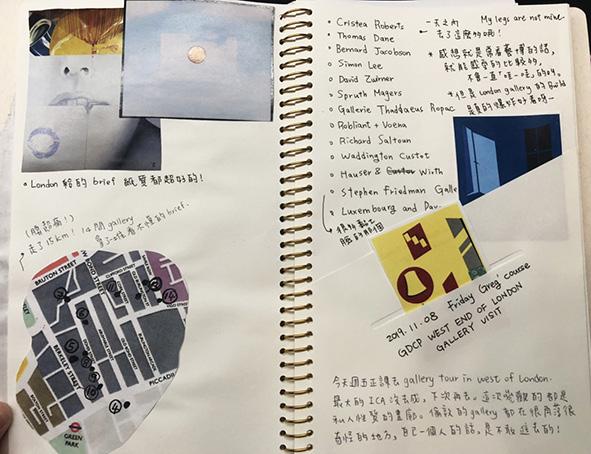
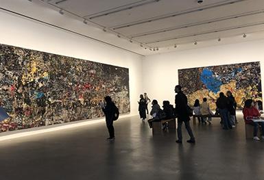

Make some note about name of gallery that we visited.


Starting Point


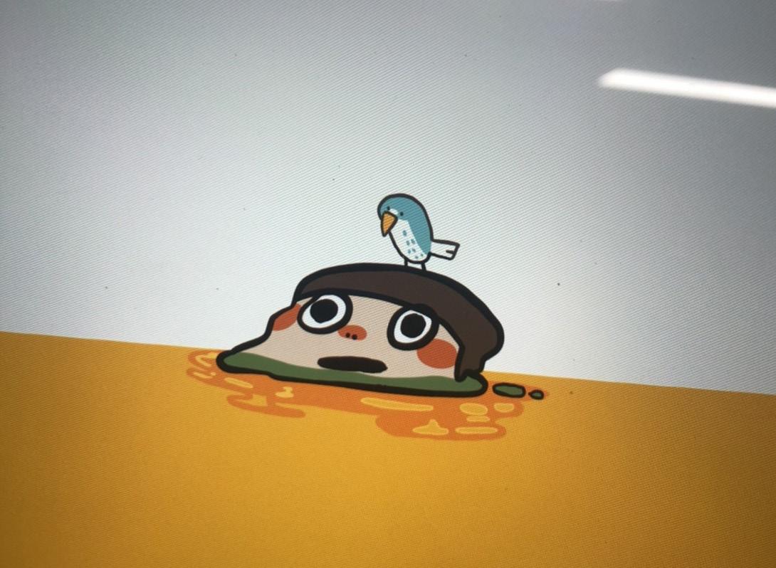
I have considered many forms of cover art. I originally wanted the cover art to look like an island which is same as my instagram account.

I tried the colour and style of the cover.
Because of my funny personality, I also changed a lot of different performance effects, such as melting myself in the oil.

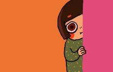
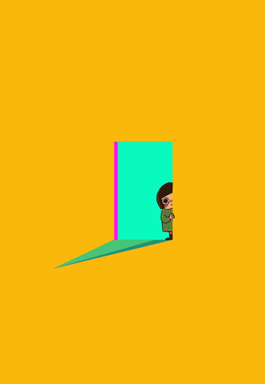
In the end, I chose to open the door like an elf to invite guests to design my cover.
I found that the pink colour did not have obvious colour rendering, and the orange colour would interfere with each other, so I changed to bright yellow later.
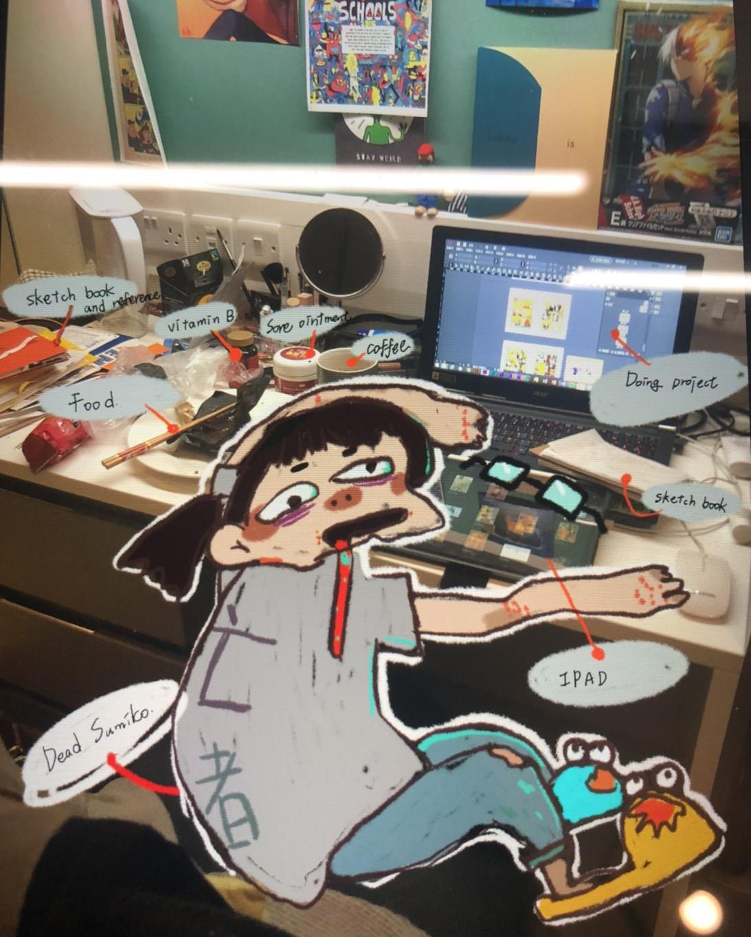


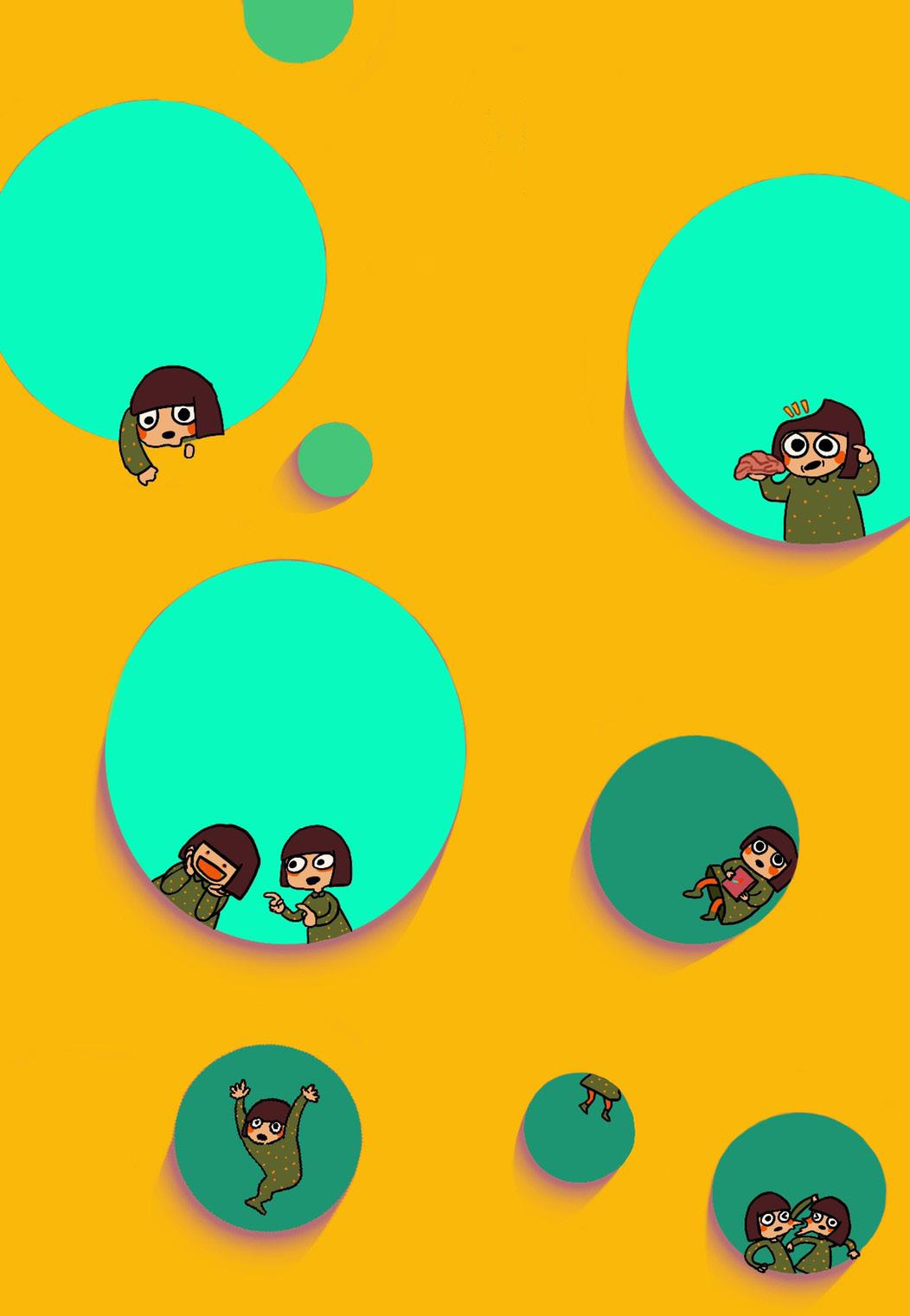
Before making this portfolio, I divided it into two parts to design this portfolio. The first part is a separate design for the front and back cover, and the other part is the typographic design of the inner page. Because this is a collection of my illustrations, I tried to make the cover a little childish, just like an elf inviting you into this illustration world.
In terms of colour style, because my works are rich in colour, sometimes they show mess, so I want to make the cover a little simpler so as not to make the entire book look too heavy.
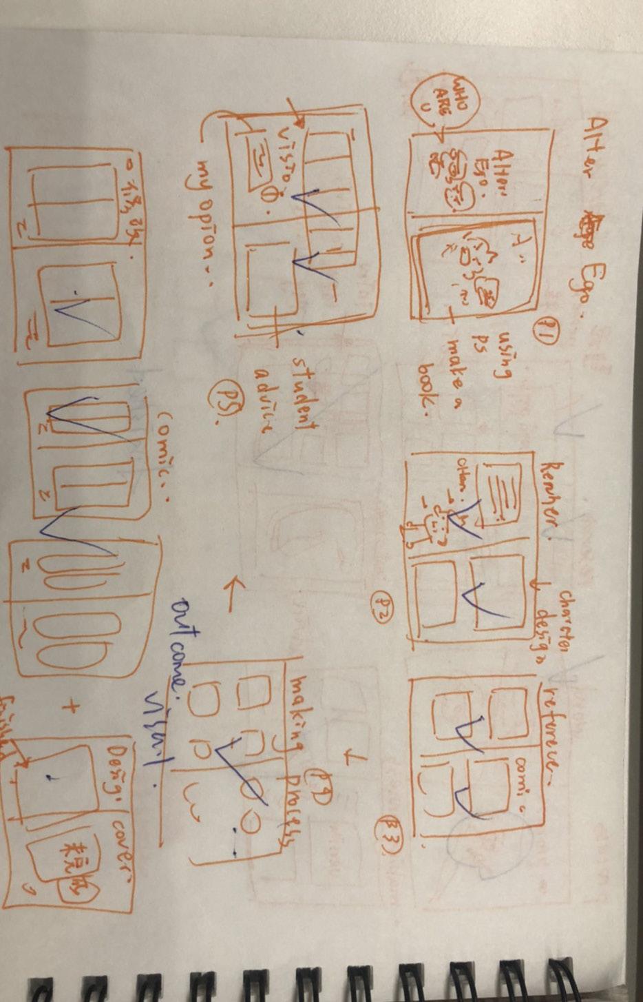
In the layout design of the inner page, I made a draft plan in advance. This has the advantage of organizing the materials and putting them into the portfolio. It is also clear if I am missing something. And there are a lot of projects that I need to the collection, so I have a spread page to introduce the next topic before each project, which is easy to read.
I think the most difficult thing about making a portfolio is that you have to sort out all the data for these four months and then unify them. I will also encounter some unsatisfactory works on the way, and then modify them, and then the production will often become longer and longer. However, it is very fulfilling to see that my four-month work has been integrated into an easy-to-read portfolio, and it is easy to find out what else is inadequate and needs to be modified.
https://www.dreamstime.com/stock-illustration-old-newspapervintage-newsprint-vector-template-retro-world-news-illustrationpage-image86066985
https://www.dreamstime.com/illustration/newspaper.html
http://www.juimg.com/shiliang/201408/qitashenghuo_561114.html
https://sc.macdown.com/pic/601875.html
Process
http://www.sohu.com/a/240790799_99891657
http://m.tooopen.com/view/548414.html
https://liuluchuanmei.artstation.com/projects/Y3nkb
https://www.zcool.com.cn/work/ZMjkzMjI3ODA=.html
Alter Ego
GRAVRITY FALLS POSTER (2018)
https://www.pinterest.com/pin/747456869379274218/?lp=true
Gravity Falls by Dave Perillo, part of the Mondo X Cyclops Print Works Present Never Grow Up: A Disney Art Show
Gravity Falls - Mystery Shack Travel Poster
Gravity Falls: Lost Legends composed by Alex Hirsch of the Graphic Novels, Adventure, Sci-Fi, Children genres.
https://en.wikipedia.org/wiki/Nancy_(comic_strip)
Word https://cn.dreamstime.com/%E5%85%8D%E7%89%88%E7%A8%8E%E5 %BA%93%E5%AD%98%E5%9B%BE%E7%89%87-%E6%89%8B%E5%86 %8C%E6%A8%A1%E6%9D%BF-image27181246
http://www.juimg.com/shiliang/201610/visheji_1055913.html
https://m.588ku.com/sucai/11710696.html
https://cn.dreamstime.com/%E5%BA%93%E5%AD%98%E4%BE%8B% E8%AF%81-%E4%B8%8E%E7%AB%A0%E9%B1%BC%E5%89%AA%E 5%BD%B1%E5%92%8C%E5%AD%97%E6%B3%95%E7%9A%84%E6%B 5%B7%E6%8A%A5-image90829339
Starting Point
Norme e Tributi MESE Il Sole 24 Ore, Ray Oranges (2015)
https://zh.pngtree.com/freepng/business-brochure-coverdesign_1287735.html
https://sc.macdown.com/pic/372214.html
https://sc.macdown.com/pic/531157.html
https://www.doooor.com/thread-23120-1.html
http://www.cdsns.com/market/product/18087


