
48 minute read
In the Modern World

from Dwell Asia #19
Modern World
Got a room for revolutionary ‘movement’?
Advertisement
Find out how the flipped, twisted, wrapped and bent details on metal sheets can turn a bench into a backrest, poles into a coat stand, and a tabletop into a tray while deceiving the eyes through the cloth-like flexibility and paper-lightness of its metal. nendo.jp 12 Products and Furniture 20 Q&A 22 Material World 24 Hotel Register 26 Square Meal 28 We Recommend 29 Houses We Love 38 Event Report 42 Rewind
Wondrous Quirks
Full of characters, these 13 new products introducing ways to flourish amidst the ambiance, while maintaining their wonderfully distinguishable twists.

B

C A
A. DL-L Drawer and Console by Craft Bro Company Who says that a table should stand on four legs? Craft Bro. Company speaks out through the ‘anomaly’ of the three-legged DL-L Drawer, which comes in a mix of walnut, ebony, maple, and brass with oil finish. A drawer on the side gives an edge of functionality to the table, makes it an unconventional piece of eccentricity. craftbrocompany.co.kr B. Three-legged Magazine Table by STUDIO248 There’s not enough pleasure in reading a magazine without the company of ‘ease’. Standing on durable wooden legs that make for a unique structure, steel plates are shaped in unique angles to store your lovely reading material, while a flat-topped surface is available to support precious belongings and refreshments to keep you going through the pages. golf.studio248.com
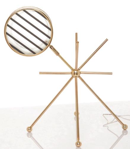
C. Asterisk Lamp by Lilianna Manahan As seen in the Asterisk Lamp, Lilianna Manahan embodies childhood memories and the whimsical appeal of children’s tales into her works. Standing on a table top exposing its brass casted body, which emulates an imaginary figure of satellites, Asterisk’s roving head beams its light in any direction in accordance with the user’s needs. studiomagee.com

D

D. Trinity Hammocks by Gilbert Tourville Now the third wheels won’t feel so lonely anymore. These comfortable hand-woven and quilted hammocks have a three-ring design made of durable stainless steel, offering the opportunity for a group laze as well as an intimate conversation. trinityhammocks.com
E. Side Table by Ffrash Turning trash into functionally beautiful products is amazing, but having less-fortunate children become green artisans and entrepreneurs by baking bottle caps that transform into colourful plates of plastic is the innovative world of Ffrash. Give your room a touch of “ffrashness” with this funky green and blue side table! ffrash.com F. MicroSun by Conture Indonesia What kind of life would we have without the sun, our one most loyal source of light? Bringing its warmth to people on Earth, MicroSun takes the form of a pendant lamp made of a special concrete mix that exudes lightness, with aesthetic versatility to either stand or be hung from the ceiling. facebook.com/contureindonesia
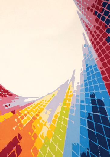
G. Vortex by The Rugmaker Who wouldn’t wish to dive into the magical realm of Wonderland and live an adventure? As the initial design of the ‘Into the Rabbit Hole’ collection, Vortex rug embodies the enchanting portal through the use of 100% New Zealand Wool and an array of colors with patterned shapes that invite outsiders to enter the whimsical world of Alice. therugmaker.com.sg F E
G
H

I J
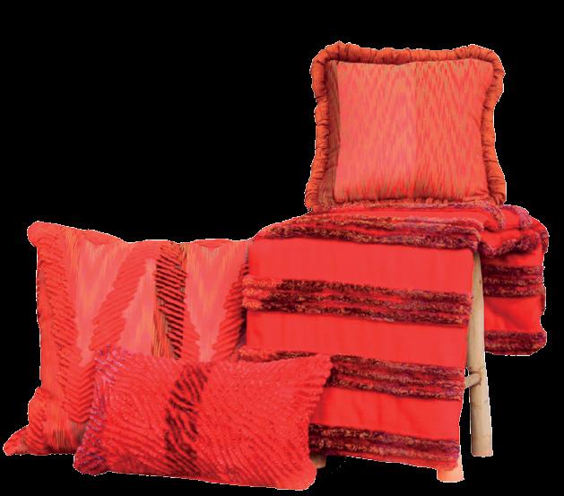
H. Moscha by Innovabric How do you add personality to a room? Cushions will do it, especially with a taste of the traditional incorporated, as seen in the Toraja colors cushion from Moscha Living. Bearing Indonesian ethnicity on its Orange Leaf color, this 50x50 cm cushion is simply impossible to miss. moschaliving.com
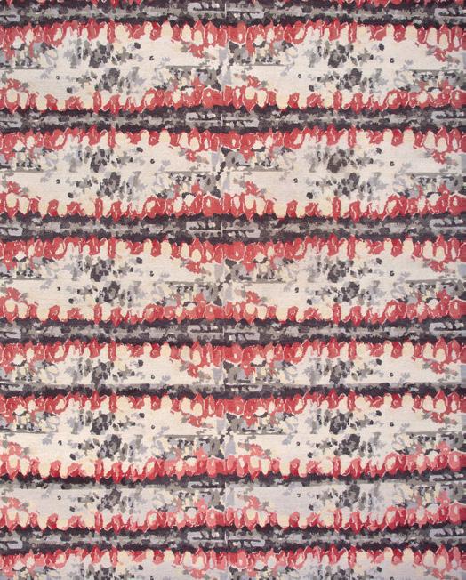
I. Wild Berry by Anna Carin for Designer Rugs Picking wild berries in the meadow and eating them with cream and sugar is Anna’s enchanting childhood memory that gives birth to the Wild Berry rug. Bestowing the dreamy quality of her youth into the Forsa Collection, the use of Tibetan Wool and traditional Nepalese hand knotting techniques enhance the Scandinavian aesthetic to her storytelling. designerrugs.com.au J. Grand Suite by EOOS for Walter Knoll What could be more important than your private life? Ensure its sacredness by providing the truest form of luxury for your seating arrangements with the Grand Suite. Showcasing a horizontal line of upholstery that flows into the armrest and board, this modular sofa is crafted to perfection with a choice of fine materials. walterknoll.de


M L K
K. Fly Me To The Moon Divider by Artes Living Dividing a room should be a joyful business. Aurora R.A. takes you on an imaginative journey to outlandish places with her ‘Fly Me To The Moon Divider.’ Here, strange shapes and beautiful colors are articulated in oil upon canvas, accentuating the room with plenty of frolicking fun. artes-indonesia.com
L. Rugg The Cabinet by Meizan Nataadiningrat Inspired by the Fountain of Marcel Duchamp circa 1917, Rugg The Cabinet was brought to life using reclaimed pine wood from an industrial junk stock area combined with a modified, ready-made trolley. Its simplicity brilliantly re-questions the role of objects in our daily lives. meizannataadiningrat. wordpress.com
M. Wooden Cutlery Collection by Aljir Fine Crafts Safe for food and for hand-washing, this Wooden Cutlery Collection comes straight from nature and ranges from forks, tea spoons and tongs to butter knives. Beautifully crafted in sawo and white oak wood with a natural or light brown finish, Aljir Fine Crafts gives your tableware an all-rustic look. aljirfinecrafts.com


Culturally Chic
Holding degrees in Industrial Design from RMIT University and MA Product Design from Istituto Europeo di Design (IED) on his backpocket, Alvin Tjitro- wirjo first established his design firm, AlvinT Studio, at Jakarta, Indonesia, in 2010. Through the creation of AlvinT, a furniture brand found in 2006, the designer intends to exploit the richness and diversity of Indonesian cultural heritage into a collection of furnitures with modern contemporary style. Take three looks at Amarta, Salaa, and Lyan chair from his newest collection, and prepared to be awed! Composed of natural rattan, mahogany wood and cushion fabric upholstery, Amarta dining chair is created through an approach to the classic Windsor chair, while its unique character owes much to the thickness, details and proportions on the design. Salaa lounge chair, made from twitchell fabric and steel, gives out a modern and sleek look to the outdoor, while the simple and refined design is supported by durability that trascends generations. And lastly, try dining on a chair that’s driven by details and affords a balanced proportions between natural rattan and solid wood. With the use of fabric upholster and leather binding that radiates simplicity, Lyan offers a fashionably comfortable dining. alvin-t.com


Bright On
Enliven your interior with a punch of supersaturated color in the form of vivid furniture and lighting pieces.

B
“Larger objects, like a sofa, can take control of the room. I select larger items first. I prefer classic and elegant anchor pieces that melt into the space.” —Jiun Ho, designer

C

D A
A. Mitt chair by Claudia & Harry Washington for Bernhardt Design Inspired by a baseball glove’s shape and stitching detail, the versatile upholstered lounge chair features soft, rounded edges—a boon for families with young children. Made in the USA. bernhardtdesign.com
B. Lazy sofa bed by Andreas Lund for Softline This isn’t your standard pull-out sofa; pushing the backrest down creates a flat sleeping surface. Available in hundreds of fabric and color combinations. softline.dk
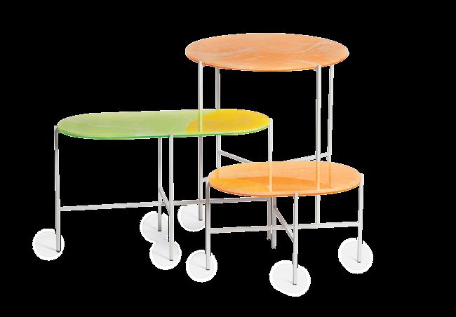
C. Neon tables by Sebastian Herkner for Haymann Thin layers of white onyx are placed atop acrylic to achieve an acid-washed look for the steel-legged tables. haymanneditions.com
D. Twiggy lamp by Marc Sadler for Foscarini Foscarini, an Italian lighting manufacturer, introduced seven limited-edition rainbowinspired colors of its popular LED or incandescent floor lamp. foscarini.com
G F E


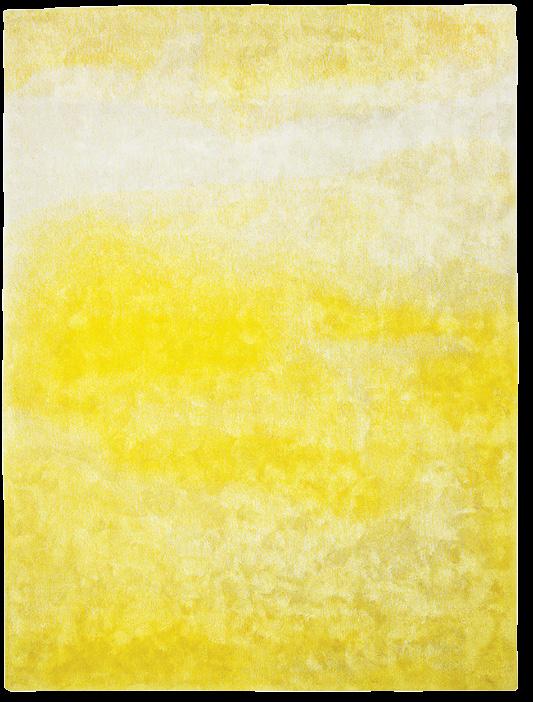
E. Contemplation I rug by Yasmina Benazzou for Tai Ping Celebrating abstract art, the wool-and-flax carpet’s golden gradient mimics the effect of diluted paint spilled on paper. taipingcarpets.com F. Bar Technicolor pillow by Leah Singh Bands of vibrant wool embroidery adorn the cotton throw pillow made in India. leahsingh.bigcartel.com G. Swell sofa by Jonas Wagell for Normann Copenhagen Available in 21 hues spanning lemon yellow to rich purple, Swell now comes in two- and three-seat models. normann-copenhagen.com

Architect Pierre Jeanneret masterminded furniture to embody India’s progressive architecture.
When India’s government commissioned Le Corbusier to design its new capital city in 1951, the project brief went beyond architecture. His cousin Pierre Jeanneret developed a collection composed of chairs, tables, desks, bookshelves, and room dividers that shared the city’s visionary symbolism. “Pierre Jeanneret’s furniture was conceived like an architect—minimalist and non-decorative,” says French gallerist François Laffanour. Jeanneret married modern sensibilities with traditional carpentry techniques to produce the pieces. Objects in the family, like the Managing Committee table and Cinema armchair (below), share a geometric language, and their dimensions correspond to Le Corbusier’s Modulor theory. galeriedowntown.com
Content originally published in Dwell® Magazine and/or on www.dwell.com, © Dwell Media LLC 2014. Published with permission of Dwell Media LLC. All rights reserved.

Frame of Thrones
Structure comes forward in this armada of architecturally inclined sofas and armchairs.

B

D A


C
E A. Superkink chairs by Osko + Deichmann for Blå Station Tubular steel pieces often feature a gentle bend, but the Swedish manufacturer Blå Station creases the corners as an angular statement. Comes in fabric or leather upholstery. blastation.com
B. Altay sofa by Patricia Urquiola for Coedition Coedition of France debuted its inaugural line this year. Prolific designer Patricia Urquiola created the Altay, which sports a glossy black coat on its beech frame. coedition.fr
C. Fly sofa SC3 by Space Copenhagen for &Tradition Movable cushions make it easy to get comfortable on this dowel-backed looker. Choose from white oiled oak (shown) or a darker smoked-wood version. andtradition.com
D. Elysia lounge chair by Luca Nichetto for De La Espada A frame in solid American black walnut (shown) or European ash hugs a padded seat and backrest. Fabric upholstery options include blue, red, and dove gray. delaespada.com
E. Yas by Samuel Accoceberry for Bosc Historically, stilt walking was a common way to move through wet terrain in the Gascony region of southwestern France. Bosc, a local furniture maker, uses this reference for its eiderdownfilled sofa. bosc-leslandes.fr
Engineering Room
By harnessing the latest high-tech innovations, like 3-D printing and nanotechnology, manufacturers are using science to create forwardthinking design.

C
“There are more and more good-looking engineered fabrics out there, and it’s worth considering them if you need upholstery that’s family and pet friendly.” —Betsy Burnham, interior designer
D A

A. Zartan Raw chair by Philippe Starck and Eugeni Quitllet for Magis Using a mixture of recycled polypropylene and natural wood fiber, the Italian manufacturer has made a stacking chair whose production is kinder to the environment. magisdesign.com
B. Afilla pendant lights by Alessandro Zambelli for .exnovo Marrying new materials with traditional ones, this lighting series features 3-D printed nylon shades and a Swiss-pine structure. exnovo-italia.com
C. Midsummer rug by Ritva Puotila for Woodnotes Consisting of tightly woven strands of paper yarn, the Midsummer rug is hypoallergenic, stain resistant, and easy to clean. woodnotes.fi
Delightfully tactile surfaces come courtesy of treatments ranging from showy to subtle.
Bloom blanket by Bianca Cheng Costanzo for Oak Form Origami folding techniques inspired this Italian cashmere throw. bloomblanket.com

Hug armchair by Studio Jean-Marc Gady Bumpy upholstery offsets the rigid oak structure. sieges-perrouin.com
D. Boiacca Wood table by LucidiPevere for Kristalia Oak legs support a tabletop made from Fenix-NTM, a water-repellent, anti-bacterial surface developed using nanotechnology. Though it looks like stone, the surface is soft and warm to the touch. kristalia.it
Content originally published in Dwell® Magazine and/or on www. dwell.com, © Dwell Media LLC 2014. Published with permission of Dwell Media LLC. All rights reserved. Ploum love seat by Ronan & Erwan Bouroullec for Ligne Roset Quilted stitching over foam padding gives this seat dimension and depth. ligne-roset-usa.com

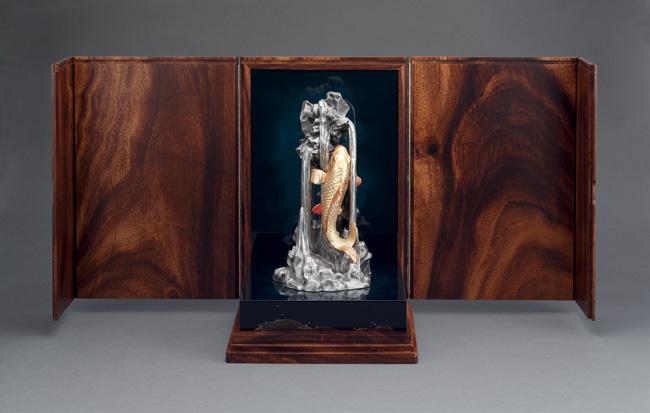
A Royal Match
A lovechild of Malaysia’s pewter empire, Royal Selangor, and one of Japan’s oldest lacquer houses, Zohiko, Shori is a true masterpiece born out of centuries of heritage and craftsmanship.
Text by Asih Jenie

Few brands can match Royal Selangor’s
decorated history. Proven to be as malleable as the pewter from which it has made its fortune, the brand has evolved from a humble 19th century cottage industry into a 21st century business empire. It has also elevated its products from common souvenirs to items and collectibles sought after for their design value. Since the crucial decision to form an in-house design team in 1978, the brand has continued to expand its design repertoire by collaborating with contemporary designers, as well as perfecting the pewter-smithery.
This year the brand has met a royal match – the lacquer brand Zohiko of Kyoto; one of Japan’s oldest stewards of ‘urushi,’ or the lacquering arts. Together, these two brands share almost five centuries of craftsmanship and, out of their collaboration, has been born an exquisite, limited edition –only 88 pieces are available to order – sculpture Shori, which combines fine pewter craftsmanship and an age-old lacquering technique called ‘maki-e.’ Literally translated as ‘sprinkled picture’, maki-e is a traditional multi-layered lacquering in which metallic dust is sprinkled to ‘paint’ a design on a wet lacquered surface using a ‘funzutsu’ (bamboo sprinkler) and a ‘kebo’ (hair-tipped paintbrush) – a technique Zohiko is famous for and has practised since 1661. This manual airbrushing technique is a painstaking process that often requires over one hundred layers of repeated lacquering and sprinkling that could take months to finish.
We caught up with Royal Selangor’s Executive Director, Yong Yoon Li, and Zohiko’s president, Tsuyoshi Nishimura, in Singapore to share more about their collaboration.
How did the collaboration come to be?
Yong Yoon Li (YYL): It was a matchmaking process. We have a mutual friend – the Yamamoto family from the Zippan group. The family introduced us to the Nishimura family, who told us they were interested in collaborating with Royal Selangor. Tsuyoshi Nishimura (TN): We’re always on the lookout to expand our products by
collaborating with companies outside of Japan. We look for companies that have the same values as us, a company rooted in tradition – a company that is unlike any other in the world. Royal Selangor fits those criteria. We also aim to continually evolve.
What was your initial reaction on mixing pewter with lacquer?
YYL: I said it was madness! It’ll never work! But then they [Zohiko] did some test-work with one of our products – this plaque with nine koi carps on it. They did the maki-e technique on it and the result was, WOW! It was intricate, so superbly detailed – they even added this motherof-pearl water drop on the lily pad. We were amazed at how well the lacquer worked on the pewter. So we said, Okay, let’s do this. The sculptures are cast in Malaysia and then flown to Kyoto for Zohiko to finish with maki-e.
What was the biggest challenge in crafting Shori?
TN: Everything! But that is what makes the effort worthwhile, and what makes the effort so rewarding. Lacquer sap is a very temperamental substance. It will harden when the air is at a certain humidity so we must keep the air just right. Some days, when it’s really dry, it will not harden and we have to wait, other days when it’s raining and humid, it will harden too fast so we must wait.
Can you share a bit about the maki-e techniques you developed specially for Shori?
TN: Aside from the three finishes on the koi, Go [bronze], Irodori [multi-colored] and Miyabi [gold], the the back panel and the base upon which the Shori is displayed is also treated with a maki-e technique called ‘mine kumonuri,’ which translates into foggy mountain. The finished look appears like dark mirrors, but on closer inspections it reveals layers upon layers of blue. Traditionally mine kumonuri is done in a green color. Shori premiered the blue version. It captures deep water and it casts a mystery that draws the viewers closer. YYL: All these are also displayed on a wooden box with matched wood grain. All of the boxes for the 88 pieces came from a single giant tree in a churchyard in Penang that was brought down by a storm. We’re salvaging the wood.
What’s next for Royal Selangor and Zohiko?
YYL: If last year Royal Selangor was about collaboration with contemporary artists, then this year it’s all about culture. We released our India-inspired collection in the first half of 2014 and now Shori is heralding an up-and-coming collection inspired by Japan. You’ll see more lacquer arts on our products too. TN: In the olden days in Japan, it was fashionable for men to carry a medicine pouch that contained a lacquered box, but that’s not so today. Nowadays, men carry pens and wear watches. We should integrate lacquer with these practical things, updating them so that more people will use lacquered items more often. We will continue to do this and we are always open for collaborations.


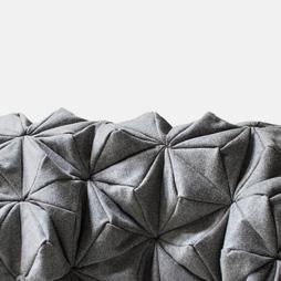
The Art of Folding
Paper and stone have nothing in common. For the Ishi Kiri Collection, Odyssey takes up the challenge by transforming the former onto the latter, with inspiration driven from origami – the art of Japanese paper folding.
Text by Anindia Karlinda
Imagine the flexibility and lightness
of paper, and try picturing the way it folds and can be sculpted to form any shape you want. The feel of folding paper should be familiar enough, since almost every childhood memory involves certain contact with origami, the Japanese art of paper folding. The fascination shown towards this art-form might be due to the whimsically versatile transformation brought by a piece of paper that holds no bound to creativity . That kind of charm is impossible to miss, as Odyssey can vouch to be true.
Aiming to be the best yet evolving master in the field of stone design, Odyssey Stone Architecture & Design uses its creative hunger to score breakthroughs above the common trends by exploring various stones while pursuing innovation in design. The company’s latest inspiration is the art of origami. Ruchika Grover, the Director of Odyssey, revealed why they were motivated to mix the unthinkable formula of paper and stone, “We wanted to create awe and surprise and make everyone rethink stone and its application.”
Reflecting on the possible outcome of translating the contour of origami paper into stones, Ishi Kiri Collection was conceived. Grover reminisced about how they came up with the idea for the collection, “We were looking at creating dimensional surfaces which gave the feel of paper and could be interspersed with light; the Japanese art of paper folding,
One of Ishi Kiri Collection’s best-seller, Puritsu (opposite) is inspired by pleats, as was shown by the way it syncs with the engravings and give out a grand flower-look pattern.
While it’s fashioned in a form of flower, Hana (left) pass on light thrhough the carving of its well-defined flower petals, while Sankaku (below, left) is designed with 2 stones, Jurassic Yellow Limeston and Indian White Marble, in triangular form to give a multidimensional look and feel, and Taiyou (below, right) ‘shines’ as bright as the sun through the use of circular pattern.


origami, was the basis of our inspiration for this collection.”
Following the birth of the idea, Odyssey made an extensive research of origami folding patterns and its interpretation in stone, while searching for the required types of marble, granite, and tools to achieve the desired finish and proportions. The main objective of the collection was to create a dramatic form of stone installation by exploiting the paper-like pleats and creases in multi-dimensional form.
For an extraordinary and dramatic result, the surfaces can be customarily designed using back-lit and front-lit options for the walls. “The dimensionality of the surface allows a varied intensity of light to pass through the different patterns, and since the surfaces use natural white marble as the base, the vein and the natural formations are also highlighted in every installation,” explained Grover, “and when it’s back-lit or front-lit, each pattern has a completely different look.” This passing of light through the pattern of the installations becomes the key feature of the collection, and a 30-mm Indian white marble sheet, known for its translucency, is used for engraving deep into the pattern, which enables the lights to penetrate and show up on the surface.
Each with a distinct identity and features, the installations for this collection can be used in numerous spaces; spas, bath areas, boundary walls, bars, just to name a few. The collection itself offers a mix of geometric, floral, classical, modern, and straight lines, up to 20 designs. The four designs considered to be the best-sellers are: ‘Taiyou,’ which means ‘sun’ in Japanese, displaying a circular pattern with engraving that emits light in a way that resembles the rays of the sun; ‘Hana,’ which uses well-defined flower petals to form a floral pattern, intensifying its beauty when installed with full light passing through the carving; ‘Sankaku’ is designed using Jurassic yellow limestone and Indian white marbles whose formations not only project a multi-dimensional look and feel, but also display a rotational appearance on the passing light, just like the sails of a windmill; last but not least, ‘Puritsu,’ which means pleats in Japanese, shows a grand pattern of delicate pleats harmonizing with the engravings and emitting the overall look of a flower.
“When one thinks of stone, words like heavy, cumbersome, bulky and solid cross the mind, but we have tried to dispel those notions with Ishi Kiri by making it translucent and paper-like,” spelled out Grover. She stated that the image they want to project is that of Odyssey pushing the envelope and exploring possibilities in a medium of stone that is rarely explored. And how has the response to this innovative approach been? To this, Grover stated, “Most of the people viewing the collection for the first time want to touch and feel the surface to really believe what they are seeing.”

Enlivening Journey
With a discerning creativity and fine craftsmanship, this hotel embraces the charm of midcentury style in collaboration with contemporary designers, makers and artists.
Text by Sunthy Sunowo
Nishi, one of Australia’s most sustainable
buildings may look like a giant concrete pineapple when viewed from a far, but look closer and the building will reveal its fascinating detail. The architecture’s element forms a dynamic façade while allowing a modern approach to fill the interior with such an elegant design.
Occupies three levels of Nishi building, Hotel Hotel was found by Johnathan and Nectar Efkarpidis, the brothers behind the initial idea. They love of hotels – as reminder of human’s transience and the importance of romance – encouraged them to put the idea into reality by made use of skillful craftsmanship to all of the hotel’s elements.
Many surprises will greet us when we walk inside the hotel, from the large scale of grand stairs to glassware to ceramics. Designed by March Studio in collaboration with a landscape architects, Oculus, the hotel’s grand stair is a geometric explosion of handcrafted salvaged local timbers. Rough-formed concrete structural lintels had been woven to create the feeling of a single, vast space that leads visitors to a hotel foyer – which looks more like a fancy living room than a lobby.
The Efkarpidis know exactly what they want, which is not another boutique art hotel. An intense collaboration with more than 56 designers, makers and artists was resulting in warm, artsy, profound and intriguing spaces. The secret garden and library is available near the foyer area to accommodate the guests and give them more alternatives of activity with books stocked by specialized small press publisher and distributor Perimeter books.
The enlivening journey starts from the outside to the foyer and into the bar before
The grand scale and design of the staircases gives a wow factor when we enter the foyer. In modern building Hotel Hotel brings in a touch of mid century furniture and create a story of colours, texture, and shape in each room. The Bar area are design with a simple constructive way to match the feel from the foyer.


arriving at a room where simplicity is expressed with a rich texture. Hotel Hotel’s rooms are the outcome of Nectar’s inspiration from the Australian shack, Cameron; while Efkarpidis had created and applied a quintessentially Australian vernacular to each room. Moreover, the spirit of mid-century style with a contemporary mind frame in the hotel’s 99 rooms will instantly steal the attention. It is Efkarpidis’ desire to eschew and discard the consumptive culture of contemporary designs and manufactures. Restored 20th century furnishings, collected objects, original artworks collected over ten years, and a limited run production of new pieces designed by Cameron and fabricated by European artisans bring up the soul of each room. The furniture’s characters fill in the space and arouse imaginations, while at the same time provide alluring comfort to the guests.


A Toothsome Adventure
With Portico’s charming setting, flourishing herb garden, and exceedingly creative fare, a feast on the veranda has never tasted so good.
Text by Asih jenie Photo by Asih Jenie
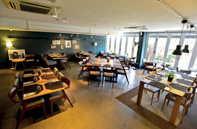
Tucked away inside an office
compound in Singapore’s Alexandra Road, ‘Portico’ is an oasis of green and calm. Guests enter along a pathway through the sunny, spacious alfresco dining area, which is decorated with a swing, greeneries and herb planters. Inside, photographs of Portico’s ‘families’ line the walls; guests can choose to be seated at the ‘dining room’ tables or at the intimate bar. The furniture, both indoor and out, combines blond teakwood with muted blue and cheerful splashes of citrusy colors and patterns that, together, create a friendly, relaxing seaside vibe to make you feel completely at home.
Portico is the brainchild of two restaurateurs, Alicia Lin and Sean Lai, who met a year ago when they opened neighboring restaurants in Singapore’s farmers’ market concept ‘Pasarbella.’ According to Lai, Portico is designed to create the experience of hanging out on a
(sophisticated) friend’s porch. The kitchen is helmed by Executive Chef Leandros Stagogiannis, whose resumé includes UK restaurants FiftyThree, St. Pierre and The Fat Duck. Armed with a solid training in classical French cuisine and pastry, and the many techniques and skills he has learnt over the years, as well as an incredible sense of fun coupled with precision, Stagogiannis will take diners on an unforgettable culinary journey.
The menu speaks volume about the chef’s creativity; who would have thought of putting together crispy sweetbread, onion puree and heart of palm in a salad? Or mixing soba noodles with truffles and ebi? How about pairing Tart au Citron


with onion ice cream? These combinations are definitely risks worth taking. Amazingly these unusual flavorpairings complement and balance each other wonderfully. This ingenuity also works in many other ways, such as satisfying your appetite, tickling (and expanding) your taste buds, and giving you some bragging rights both for having tasted something original and for having chosen to eat local. Yes, most of the ingredients are sourced locally, and the rest, regionally. The fish and selected seafood are fresh catches shipped daily from Pulau Ubin, while other particularities are sourced from the neighbouring islands of Indonesia. Then, to finish this exhilarating culinary adventure, Portico presents Lola – a custom-made, state-of-the-art coffee machine, which produces a gourmet cuppa like you’ve never tasted before.
On the Bright Side
The history of man overcoming darkness with the invention of artificial lighting, which led the march of civilization, is depicted through an inspiring collection of lights in over 600 pages of truly illuminated works.
Text by Lisa Amelia
1000 Lights
Written by Charlotte & Peter Fiell TASCHEN taschen.com

The sun, the greatest light source of
them all, has been the naturally decisive factor in the patterns of daily life since the earliest origins of humankind. With the great discovery of fire, the earliest means of artificial lighting was born in the form of campfires and torches. The advancement of man-made light – from the oil lamp to the first practical incandescent electric light bulb, and on to fluorescent tube lighting – signified an independence from the rhythms of nature and progressively enabled humans to enter a non-stop 24hour society. However simple it may appear today, the capability to turn on the light at the flick of a switch is one of mankind’s highest achievements and must never be taken for granted.
To celebrate the power of light over darkness, TASCHEN’s 1000 Lights has put together a shining selection of interesting lights. A range of the 20th century’s most thought-provoking electric lights are presented chronologically by decade – from Tiffany’s beautiful leaded glass shades to peculiarly surprising designs from the late 1960s and 1970s to the latest high-tech LED lamps – and represented by all major styles, from Art Nouveau to Radical to Contemporary. Focusing on domestic lighting design from the late 1870s to the present day, the book shows how the development of electric lighting at the end of the 19th century concurred with the emergence of the new profession of industrial design and its exciting application to the various types of luminary design.
Milk Bottle by Tejo Remy, 1991
Features a dozen frosted glass milk bottles, the lights hang just above the floor in rows of three by four, as in the old days when Dutch milk was delivered in crates.
Liane by Jean Royére, c.1959
Made of wrought iron and vellum, the six slender rods of this floor lights were twisted and turned like spaghetti in a harmonious arrangement, creating a vibrant and seductive look.
Lytegem by Michael Lax, 1967
This stunning high-intensity mini-lamp is not only equipped with a weighted-base for tabletop use and a bracket for wallmounting, but also an extendable telescopic rod and a 360-degree rotatable head.

Rising Above
The owner of Flexform’s New York showroom, David Levy, creates an elegant dining room overlooking Mexico City.
photos by Alicia Vera
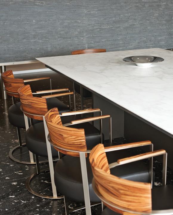
project City Apartment designer David Levy, flexformny.com location Mexico City, Mexico In a couple’s Mexico City apartment designed by David Levy of Flexform, a Murano chandelier hangs above a marble-topped dining table from the showroom (above left). The Antonio Citterio walnut-back Morgan chairs are also from Flexform (above right).
In the midst of Mexico City’s ever-
changing landscape, a time-honored residential model endures: the high-rise. It is in such a building that David Levy— owner of the furniture maker Flexform’s New York showroom and the head of the Mexico-based development firm Piso 18— has designed an apartment for an art-collecting couple with two grown children and six grandchildren.
“The clients particularly love Italian design,” says Levy, who established a European connection in the area most resembling a formal space, the dining room. “We tried to incorporate their love of European finishes and style into their casual yet still quite elegant living environment.”
Located just off the entrance to the apartment and separated by a floating Calacatta-marble wall, the room is spare, save for a substantial white-marbletopped Flexform table surrounded by a dozen of Antonio Citterio’s solid-walnut Morgan chairs, designed for the Bulgari Hotel in London. Levy added a custom black-lacquered Italian sideboard to hold tableware.
Levy sheathed the room in whitewashed pine, giving the illusion of more light, and clad the fireplace wall, which divides the room from the living room bar, in matte marble. A deep, low-slung recess in the fireplace offers a peek into the rooms beyond—allowing the space to be at once separated from and connected to them. Similarly, it can expand and contract as the family’s needs vary. “The couple can entertain their large family in the space, yet it still feels intimate enough to relax in at home after a long day,” says Levy, who adds that they use the room for “enjoying company, family reunions, casual relaxing, viewing the city, and fun.”
With its generous band of horizontal windows, the room looks down to the Piso 18– designed common area for the building’s residents, with walkways and children’s play areas. Beyond is a view of the bustling city, where cranes abound and a brand new batch of high-rises slowly ascends as a silent symbol of progress.
Content originally published in Dwell® Magazine and/or on www.dwell.com, © Dwell Media LLC 2014. Published with permission of Dwell Media LLC. All rights reserved.
Text by Sunthy Sunowo
project
Galaus
ARCHITECT
AnLstudio, anlstudio.com
Location
Seoul, South Korea
An Artful Living
An apartment in Seoul had given a new face that breaths art into life from which a balanced living is manifested.

There are so many aspects that can be
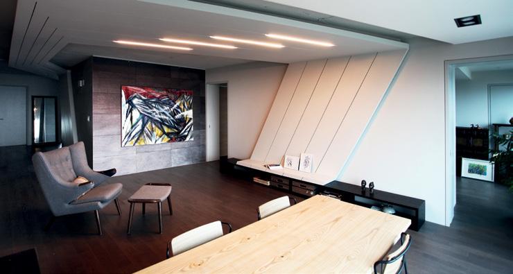
taken up from a renovation. One important thing is a moment to reassess what works and what does not. This is where AnLstudio gets the opportunity to explore an interaction between an atelier and a dwelling space. The client, a traditional Korean painter and collector, desired a space in which she could not only invite guests to view her paintings, but also to live comfortably in an environment that can shelter her tools and works; challenging the architect with the project’s main goal: merging life with art, as well as public living with the private one.
The proportions of the existing apartment presented some practical difficulties from the typical Korean
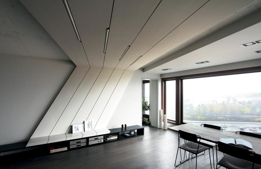
LDK-type apartments which integrates the living room, dining room and kitchen. The client’s apartment had a C-shaped wall in the center which divided the kitchen and living room, separating her life patterns in the two areas. Instead of seeing this wall as an obstacle and destroying it altogether, AnLstudio took advantage of it as a gallery wall, while incorporating the use of geometrical lighting structures throughout the ceiling to perform a connection between the living room and the kitchen. These fixtures were installed to display elements with three different lighting sources: direct, indirect and spotlight. The lighting structures then release a flow through the entire space and create a hybrid of the exhibition areas and living spaces with a visual continuity.


The apartment’s C-shaped wall (opposite, bottom) is used as a gallery wall to display the owner’s painting while geometrical lighting structures (right and opposite, top) are arranged throughout the ceiling to suggest a linkage between the kitchen and living room.
text by Lisa Amelia photos by Masao Nishikawa
Project
Cave
Architect
APOLLO Architects & Associates, kurosakisatoshi.com
Location
Tokyo, Japan
The Galvalume steel façade gives the house a distinctive feature, while a panoramic window emphasizes the characteristic of its corner site, horizontally framing the view of the neighborhood.

Corner Cave
A four-story house in a quiet residential area adorns the street with its clean-lined façade vestured in a combination of steels.
Known for his distinctively minimalist
approach, Japanese architect Satoshi Kurosaki of APOLLO Architects & Associates has completed an unpretentious, yet distinguishable house in Kagurazaka, Tokyo. Built for a single person, the 38.97-squaremeter house uses dark brown Galvalume steel for its exterior walls, neatly contrasted with galvanized steel sheets next to the entrance and around the garage. A panoramic window emphasizes the characteristic of the residence’s corner site, horizontally framing the view of the neighborhood.
Private areas of the dwelling such as the bathroom, toilet, main bedroom and a small

garden are located on the third floor. To meet the owner’s love of cooking, an open kitchen is situated on the second floor. Dressed in black, the kitchen dapperly stands out between the modest white wall and the laid-back wooden floor. A spacious storage area is assigned on the first floor, and a room with Japanese paper and tatami mats serves as a guestroom where minimum natural lighting is structured to create a microcosmos. In the basement is a wine cellar furnished with a custom-made rack, and a study with a sofa and bookshelves. All four levels are connected by the see-through stairs in the center. A large skylight showers the home with soft diffused light while various openings unveil the town view, providing a sense of space and depth to the compact interior.


text by Tiffany Chu photos by Eric Roth
30E Design transformed a hallway in a Boston brownstone from a “dumping ground for all the plumbing and utilities with an existing metal ductwork laundry chute” into a modern space that houses the laundry, furnace, and boiler. project My Beautiful Launderette architect 30E Design, 30edesign.com location Boston, Massachusetts
Happy Hamper
Often, we cleanse our duds in a wasteland of half-forgotten detergent bottles and dryersheet-detritus. But one creative couple in Boston’s South End have reimagined their laundry room as a sanctuary.
According to architect Anne Barrett of
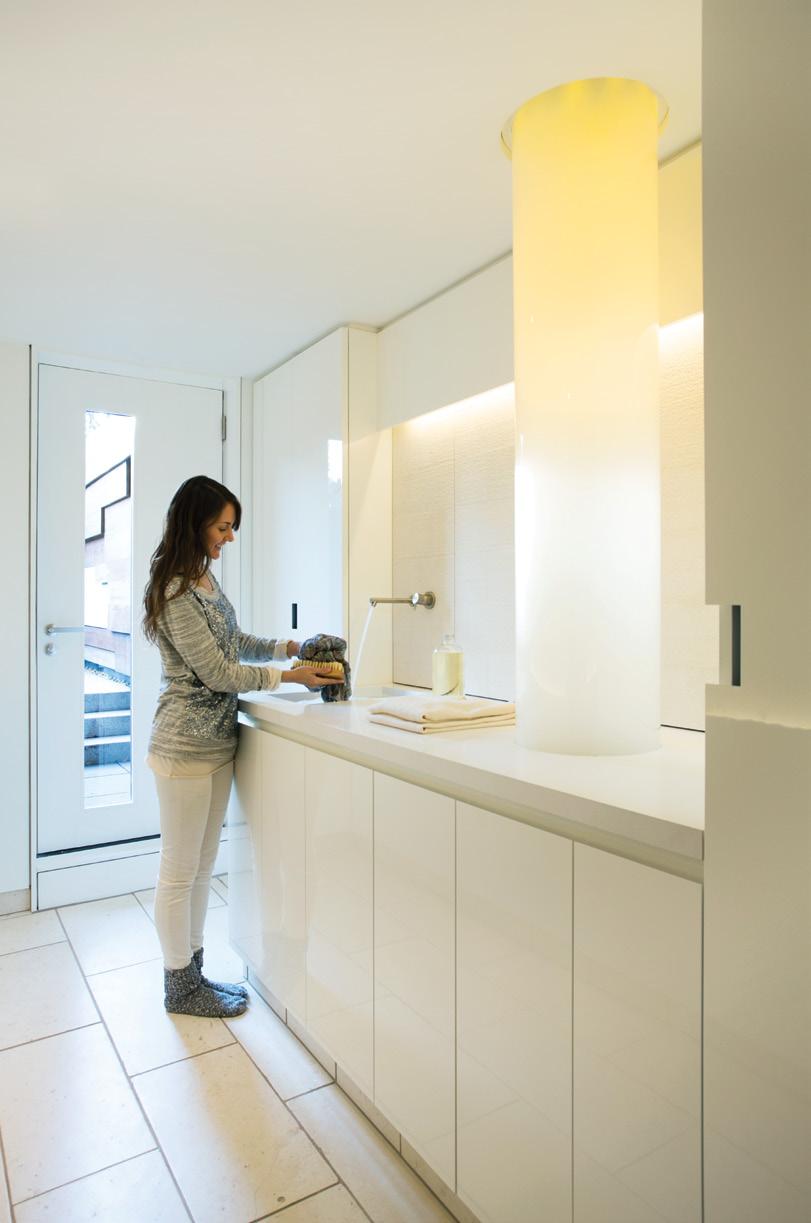
the Jamaica Plain, Massachusetts, firm 30E Design, the vision for revamping a laundry room in an 1849 Boston brownstone began with her favorite question: “What would James Turrell do?” The back-of-house space was originally a cold, dank hallway with a dingy aluminum vent linking the basement and first floor. Now anchored by a glowing borosilicate chute—illuminated by a bundle of fiber-optic cables—this laundry room is more of an art installation than a hub for domestic chores.
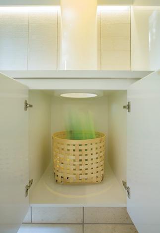
The residents wanted the space to be as beautiful as it is functional. Barrett’s challenge was to create a minimalist design to conceal the water heater, cables, Miele washer and dryer, and storage space, all of which are now tucked away behind lacquered cabinets and chiseled limestone. The sleek new laundry room forms a graceful passageway that serves as a transitional space from the main part of the house to the garden out back.

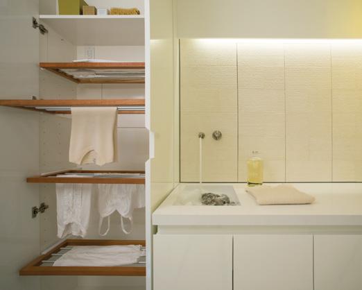
The focal point of the sleek, white space is a glowing laundry chute (left) illuminated from within by fiber-optic cables. The Pyrex tube was produced by a manufacturer of laboratory vacuum equipment and was sand-blasted from the inside to contain the light. The architect worked carefully to create ample storage for myriad uses, since the space doubles as a wet bar for entertaining due to its proximity to a garden terrace. The cabinetry cleverly conceals everything, including a custom drying rack (above).
Content originally published in Dwell® Magazine and/or on www.dwell.com, © Dwell Media LLC 2014. Published with permission of Dwell Media LLC. All rights reserved.
“We were given the brief to treat the project as an art installation. We took the approach of ‘What would James Turrell do if he were to design a laundry room?’” —Anne Barrett, architect

The top of the luminous chute sits beneath the residents’ first-floor sink; they can toss garments from their main bathroom through the diffuse tube, and into a basket below. “Life is messy,” one resident says, “but we never have dirty clothes around. The laundry chute is a big deal in our lives because it makes the mess from upstairs vanish.”
After occupying the house for over a decade, the residents knew exactly how to transform the space so it catered to their habits—and part of that meant that it does double-duty when they entertain. “When we’re not doing laundry,” says one, “this becomes a kitchenette—we can store glasses here, have drinks, a bucket of ice, and an hors d’oeuvres prep space for a garden party.”
For these clients, at least, Barrett says, “the laundry room is the new kitchen.”
Kitchen Confidential
A modest kitchen addition to a couple’s cottage outside of Brisbane proves that one 376-square-foot room can revive an entire home.
text by Kirril Shields
project Panorama Drive House architect Owen and Vokes and Peters, owenandvokesandpeters.com location Doonan, Australia
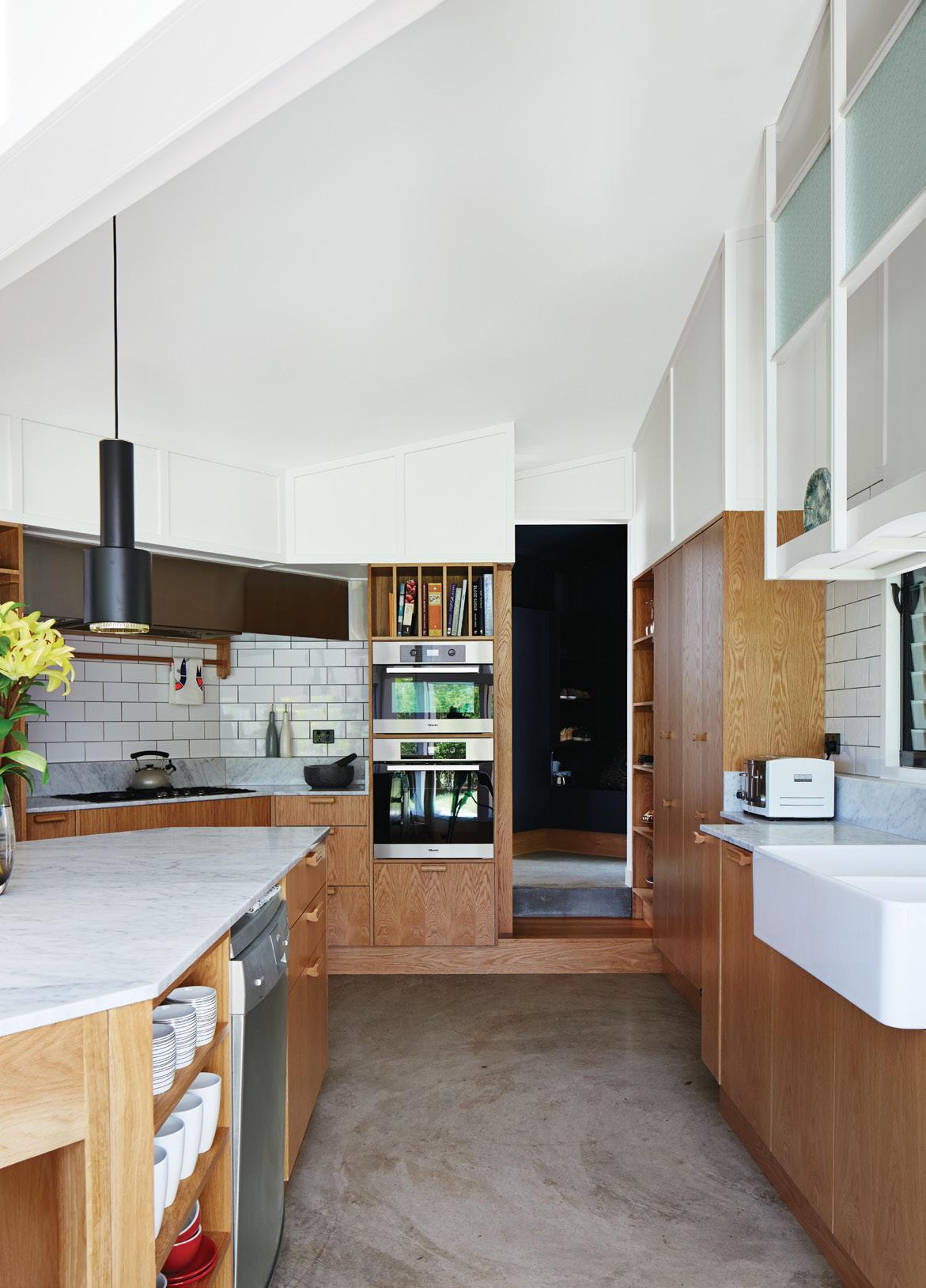
Brisbane-based studio Owen and Vokes and Peters designed a modern kitchen addition for a traditional Queensland-style timber house. Glossy Vogue Ghiaccio kitchen tiles set off custom cabinetry built by Cooroy Joinery & Woodworks using American oak veneer and Centor doors. The dishwasher is by AEG.
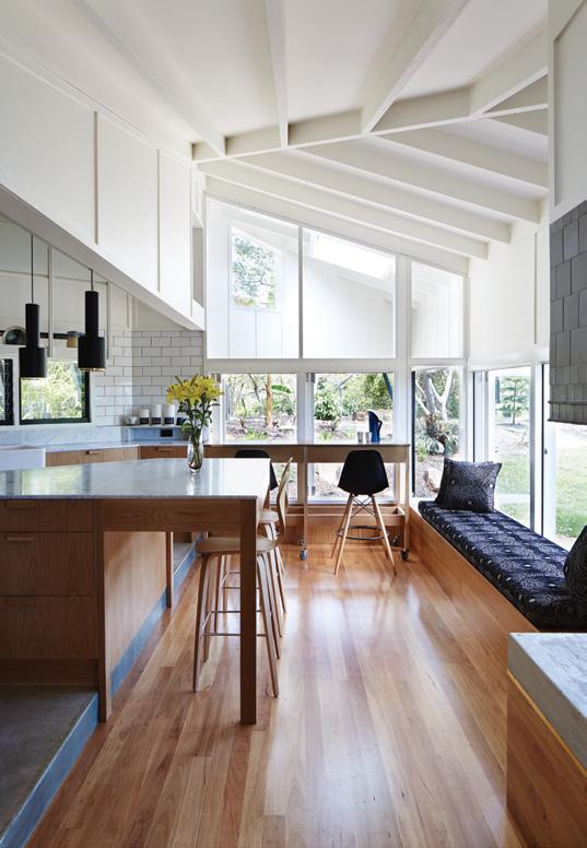
Content originally published in Dwell® Magazine and/or on www.dwell.com, © Dwell Media LLC 2014. Published with permission of Dwell Media LLC. All rights reserved. The kitchen addition is clad in James Hardie fiber-cement board (left). The architects used blackbutt wood for the flooring and Whisper White paint by Dulux throughout the interior (far left). An A110 Hand Grenade Pendant Lamp, by Alvar Aalto for Artek, hangs above the white Carrara marbletopped island. In the living area, an EcoSmart Fire ethanol-fueled fireplace is lined in charcoal tile by Winckelmans (below); the bench cushion is upholstered in Gillespie Onyx from Warwick Fabrics.
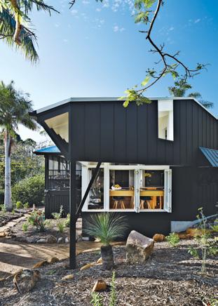

When Australian architects Paul Owen,
stuart Vokes, and Aaron Peters were hired to update a timber mountain house on the sunshine coast, outside of brisbane, they went small and modern—a complement to the region’s Queensland vernacular style. they installed a new triangular kitchen extension, measuring only 376 square feet, to clarify the entry to the house and create space for informal gatherings. historically, Australians often built their kitchens away from the main house, mostly as a way to minimize fire damage, a common hazard for wood-framed structures in this hot, dry climate. the separate kitchen was outdated by the 1940s, but owen and Vokes and Peters saw a certain elegance in such an arrangement, since it allowed for a veranda between the main house and the kitchen. “Neither inside nor outside, not quite a corridor and not quite a room,” owen and Vokes and Peters partner Aaron Peters says of verandas. “they’re delightfully ambiguous spaces that seem to be absent in many contemporary homes.” the extension is clad in panel boards made of fiber cement—a durable, cost-efficient material from Australian manufacturer James hardie. the cladding is coated with heat-reflective resene coolcolour paint in blackjack to reduce heat stress on the new structure. the architects chose black to help the addition recede when seen through the surrounding foliage. by contrast, says Peters, “the original house is painted white to underscore its primacy in the composition. We wanted the new works not to dominate the original house.”
the owners, a semiretired couple who intend to make the house their full-time residence, see the kitchen addition as a crucial social element where their extended family can convene to read the newspaper or sidle up for a chat while someone is preparing dinner. Enhancing the intimacy and warmth of the kitchen is an adjacent stairstepped lounge area that looks out onto the surrounding landscape. the architects created select apertures to the outside world with the careful placement of eaves, taking the focus off the broad, sweeping vistas and shifting the view onto certain moments in the garden and the odd glimpse of foliage. American oak–veneer cabinetry, carrara marble bench tops, and a custom surround for an Ecosmart fireplace contribute to the cozy interior.

Made in Indonesia
Inspired by the uniqueness of the Indonesian culture, 152 graduates of LaSalle College Jakarta showcased their design pieces through a creative show called I.MADE.
Text by Bernadetta Tya
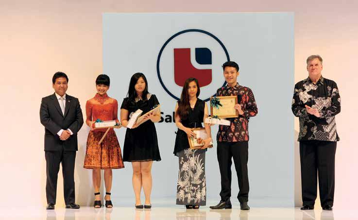
Held in the middle of April 2014, I.MADE
was a true celebration of design. Divided into two sessions, it started with a graduation ceremony for a total of 152 students, and continued with awards for the best students in each program. They were: Aswin Satriyo Aji for Fashion Design, Jessica Ariel for Fashion Business, Ivonne Prasetya Supandi for Interior Design, Patricia U for Digital Media Design, Pritha Primasari for Photography, and Agustina for Artistic Make-up.
A fashion show took the stage for the second session, which opened with Bala Turangga dance by EKI Dance Company. The show had seven sequences: Sultanate; Vanity Fair; Retrospective; Cosmopolites; Thermo Dynamix; Kidswear Mini Collection; and a collection by Febriyantin Athila, the Hempel Award Finalist.
“This year, LaSalle College showcased masterpieces from the best young designers, inspired by Indonesian culture,” concluded Mr. Douwes Lasmana, Head of Marketing & Communication.
I. MADE was held to exhibited the masterpieces from 152 graduates of LaSalle College (top). Part of the show was the body painting (middle) conducted by Artist Make-Up graduate. Best graduate students from each program (bottom) of LaSalle College.
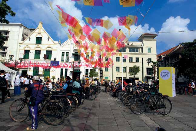
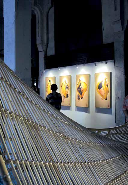
As venues, Kota Tua Creative festival 2014 made use of old buildings in Kota Tua (left) quarter including Kali Besar area and Lapangan Fatahillah field. One of the highlighted event was the contemporary art exhibitions which displays works of 30 artists of various medium, from paintings (above, right) to sculptures (above, left).
Rebirth of a City
Jakarta had thrown a grand festival to celebrate the revitalization agenda of the very soul of its historical quarter.
Text by Anindia Karlinda
Preserving a history is more than letting
its vessel to exist. Construction projects for new buildings become the most natural step in developing a city, but what will be the role of old buildings in this calculation? Kota Tua (Old Town) quarter was once the center of governmental and commerce activity back in the 16th century, but today, many old buildings in the area are poorly maintained.
In support for the cause, DKI Jakarta Provincial Government organized the revitalization and conservation programs, in which one of them was Kota Tua Creative festival (KTCf) 2014. Launched to publicize awareness and education of the program, it was held from June 21 to 22, using historical building as the venues for art and architectural exhibition.
One of the highlighted events was Jakarta Old Town reborn: 7 Projects for the City which showcased the works and ideas to revitalize 6 historical buildings and landscape by 7 teams of architects from Netherlands and Indonesia. Workshops, seminars, debates, negotiation with stakeholders, and consultation with government officials conceived an idea of ‘archipunctural urban renewal strategy’ which was envisioned as an injection of new activities that revitalize and make Kota Tua inhabitable.
Another highlight was ‘Ars longa, vita brevis’, a contemporary art exhibition displaying the works of 30 artists. Occupied almost two floors of Tjipta Niaga building, this exhibition allowed visitors to experience a historical office space from Dutch colonization era in a new light.
The main evidence that validates a wellfunctioning city is the accommodation of social, cultural and economic activities. This aspect seems to resonate well with the restoration of Kota Tua to its former glory, as the center of all activities for the people of Jakarta.
The Talented Twelve
Cultural expression in a dozen rooms of profound inspiration is a feast for the eyes and mind.
Text by Lisa Amelia
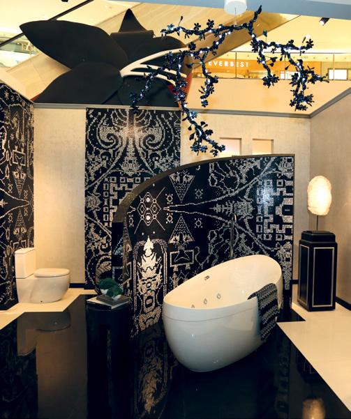
Eko Priharseno converted the Family Room (top) into a garden of foliage where the elements of Indonesian tropical verdures met modern-styled furniture. Ary Juwono’s luxurious Private Bathroom (above) used Bisazza mosaic tiles wrapped in the patterns of Bali’s Gringsing woven cloth.
It all started seven years ago, when the
path of twelve Jakarta-based interior designers crossed. At that time, despite the relatively young age, each of them has possessed a distinctive sense of creation. The remarkable talents were reflected from their personal works, which had spread, acknowledged and appreciated. Armed with one vision, they banded together to share their knowledge and inspiration in a ship named ID12.
The noteworthy mission was manifested in one exhibition, entitled The Colours of Indonesia. It was held in conjunction with Glorify Indonesia, a commemoration of Indonesia’s Independence Day, organized by Senayan City. Ran from 15-24 August 2014, the enticing collaboration has successfully contributed a fresh definition to contemporary interior design.
The visitors are presented with inspiring and enchanting works in twelve real-sized rooms created by ID12’s designers: Agam Riadi, Anita Boentarman, Ary Juwono, Eko Priharseno, Fifi Fimandjaja, Hendramianto Syamsulhadi, Joke Roos, Prasetio Budhi, Reza Wahyudi, Roland Adam, Shirley Gouw and Yuni Jie. Touring around the exhibition area felt like an enlightening visit to a house of a sophisticated person. Each room showcased a variety of colors, textures, moods and elements from which the personal touch of each designer is reflected. The beautiful diversity in the designs was connected with one major inspiration that is Indonesia.
Some of the designs applied the colors of local spices, fruits and flowers; while others used traditional patterns and woven materials. The styles varied from classic to contemporary, using traditional techniques to hi-tech production methods. In addition to the exhibition, this ten-day event also presented a series of programs, such as book and furniture launch, talk show, fashion show and student workshop. Part of the exhibition profit was donated as a gesture of appreciation to Habitat for Humanity, a nonprofit organization whose commitment is to build simple, decent and affordable homes with people in need.
“The Colours of Indonesia is a celebration of friendship,” stated Ary Juwono, the Chairman of this year’s exhibition. ID12 has grown into a positive synergy through each of the designers’ works. Collectively, they have given definition to a space, equalized function and aesthetic, and developed new ideas. Furthermore, they have preserved and strengthened cultural values by means of their designs.


Representatives from Nippon Paint Indonesia, Mr. Jon Tan, the CEO Decorative, and Irena Joesoeb, Head of Marketing (below) are accompanied by the two Gold WInners from NPYDA 2013 for architecture and interior design category, Raynaldo Theodore and Rahmat Hidayat while shwoing the mock-up of their projects for last year theme, RE:THINK RE:CREATE, which focused on renewing a historical and cultural space in Indonesia. The four of them sat alongside the four judges (left) for the 2014 competition, Roland Alam, Cosmas D.Gozali, Wendi Djuhara and Ahmad Djuhara on NPYDA 2014 press conference.
Future Teller
Nippon Paint Young Designer Award 2014 provides a room for creativity and determines control over quality of life in the future.
Text by Anindia Karlinda

Do you ever think of what kind of ideal
home in 10 to 20 years in the future would be? Takes up RE:THINK RE:CREATE Future Living 2030 as the theme, Nippon Paint Young Designers Award (NPYDA) 2014 gives a chance to young architects and interior designers to visualize an ideal community in existing areas and redesign it into an ideal future and environment-friendly residence. This annual event’s one main objective is to motivate the students of interior design and architecture at universities to be creative and innovative as they embark a real step in professional world.
Through the contest, young talents will be given a chance to engage in an international event, while at the same time gain an experience by interning in one of the industry’s biggest architectural firms. This year, the winner of Gold Award will be sent to Tokyo, Japan, to attend NPYDA Tokyo Conference 2015. China, Japan, Malaysia, Indonesia, Pakistan, Singapore, Thailand, Vietnam and Hong Kong are the 9 Asian countries that will take part in the event. The winners will participate in the international workshop with universally-recognized architects and interior designers, while their works will be expected to be displayed at Jakarta House Vision 2016 with Kenya Hara.
To succeed in this competition, one not merely has to “foresee” the future, but also has to create an innovative and sustainable living – an environment that will elevate the quality of life in 2030 to a more harmonious, healthful and colorful one.
Metal of Achievement

Heralded as the “Versailles of Industry” when it opened in 1956, the General Motors Technical Center in Warren, Michigan, remains symbolic of cutting-edge design.
Designed by architect Eero Saarinen
and landscape architect thomas Church, the 320-acre General Motors technical Center campus initially featured 25 buildings. the most visually arresting and technically challenging of these is the aluminum-clad Styling dome, an auditorium and exhibition space. harley Earl, GM’s chief of style at the time, believed that the center’s architecture should reflect the automaker’s emphasis on advanced engineering and design, and persuaded the company’s leadership to be ambitious and bold when commissioning the concept, says Susan Skarsgard, manager of GM Design archive and Special Collections. More than a half-century later, the center is still GM’s thriving creative hub where designers, engineers, and craftspeople develop prototypes and technologies—and the architecture continues to inspire. “Seeing the giant ‘wall of water’ on the lake for the first time in spring, or the blue skies over the colored brick in the evening—it’s a reminder that good design is important, impactful, and lasting,” Skarsgard says.
The Styling dome on the campus of General Motors’ Technical Center is 188 feet wide and 65 feet tall. At just three-eighths of an inch thick, the structure’s aluminum skin is proportionately thinner than an eggshell.
Content originally published in Dwell® Magazine and/or on www.dwell.com, © Dwell Media LLC 2014. Published with permission of Dwell Media LLC. All rights reserved.


