8 minute read
Colour Palettes


Sadie Pizzey
Sadie Pizzey Interiors is a full-service design firm based in Guildford. SP Interiors works on both residential and commercial projects and has recently been shortlisted for The International Design and Architecture Awards. Sadie designs with practical knowledge gained from extensive renovation experience. Her exceptional organisation and project management skills mean she keeps projects running to time and budget, developing innovative schemes and beautiful spaces to inspire clients. Sadie’s philosophy is: “We need our homes to be our battery chargers, to help us re-build and recover from everything that life throws at us. Designing spaces that embrace this, will dramatically improve our quality of life”.
www.sadiepizzeyinteriors.com COLOUR PALETTES
When the topic of interior colour palettes are introduced, a large percentage of people interpret that to mean what colour should I paint my walls? But actually the colour palette of a home is seen in every element of what makes up each space. From windows to flooring, to lighting, to joinery. It all makes up colours and textures that interact and impact each other.

WHERE TO START
When I design a single space or a whole house I have never started with wall colour, that is almost decided for me by the other selections that are made for the space. My design journey starts with the emotion of a home or room. I want to know how does that client want to feel in this finished home? What do they want to see and be drawn to as they move round their home? These big questions then get narrowed down to specifics and details.
TEXTURES
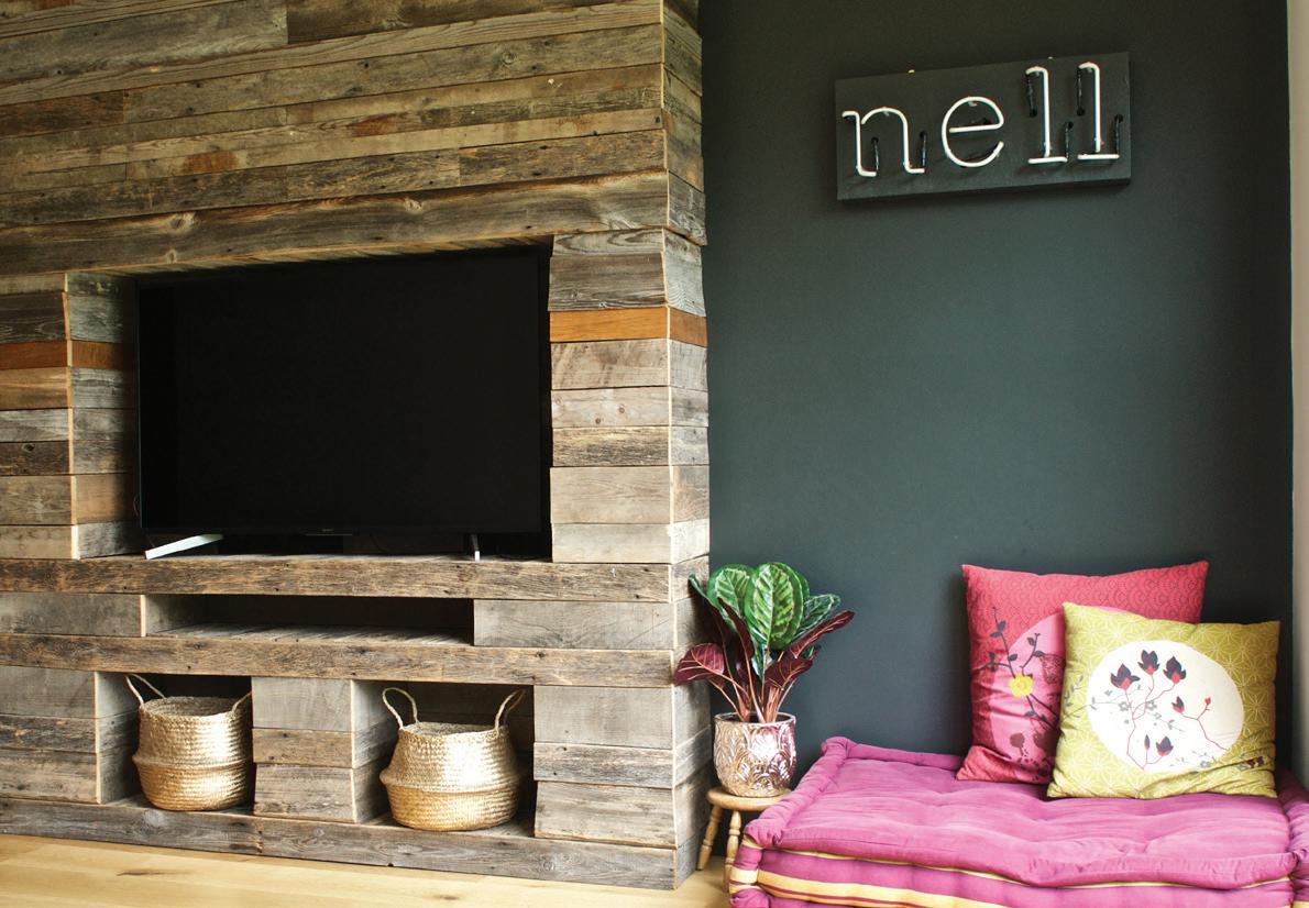
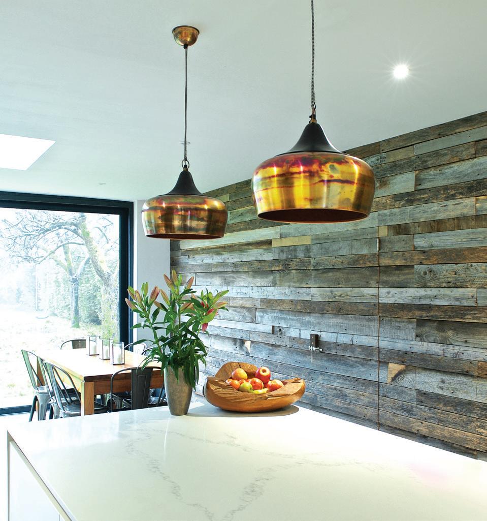
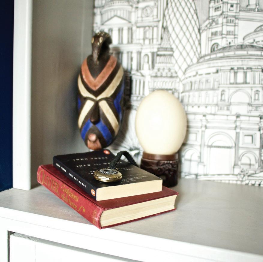
I am drawn to a lot of natural materials and unique textures. Although colours will come into the choices, the texture and feel is more of my jumping off point. I build up the textures and layers carefully for a project. I also want to think about what my stars of the space are. The juxtaposition of how a striking texture or colour will then impact my choices for the rest of the space. We want our interiors to be warm, inviting, inspiring spaces, so getting the balance right is incredibly important. A space that is busy and has lots of strong layers and features is messy and exhausting to be in.
Art can also provide the starting point. Either if a client has some beautiful art or is desperate for us to find a certain piece of art that
makes them feel a certain way. A recent project started in that exact way, the client had a beautiful painting of an Indian temple which was a mix of rich blue, burnt oranges and burnished golds. The painting and the colours were so inspiring that was our jumping off point and influenced the entire space.
When we are brought into service either a new build or a new extension, then clients often choose us because of our talent for using texture and interesting materials. Materials that bring warmth and personality to what could be a stark, uninteresting space or home. This then obviously influences our colour palettes.
THE RED THREAD
The red thread is a topic that is heavily discussed in the world of interiors. The concept is that through your home, there is a thread (of any colour or texture) that is repeatedly seen as you move through your spaces. I'm not saying that every space needs to be the same colour (that would be very dull!) just moments and hints of repeated colour or texture. In some of our projects you will see burnished metals as a red thread, in some spaces it is impactful and in others it is just a hint. Other projects are linked by hints of a repeated colour or variations within a palette.

KEY SPACES
If we are designing a whole home, then we always begin with the key spaces. The spaces that will impact the owners the most, and or the spaces that have the most design diemmas to solve. After the layouts are concrete, then we focus on those concepts to start with. As we move around the rest of the home, these concepts then impact the direction and choices we make for all the other rooms.
If we have chosen some incredible textures and an awe-inspiring material palette, then we are unlikely to select bright impact wall décor. It distracts and makes the room a visual headache. Balance is the key to all spaces. We are more likely to choose a neutral paint tone and add some moments of intrigue with colour and texture in smaller details, such as cushions, window treatments and other accessories.
INTERCEPTION OF ROOMS
How rooms intercept with each also plays a huge part in selecting palettes for each space. For example, if we have designed a light, heavy textured kitchen, then we are likely to play with contrast with say a utility room or pantry the leads off that space. This works for a number of reasons, if we stick to the kitchen/utility example by choosing a dark, contrasting palette for the utility room, it means that the useful utilitarian space is not highlighted from the kitchen. It remains a mystery of a space that is intriguing to the human eye.
This contrast can also work well with hallways. Often we meet clients who want to create a light, bright hallway. This is a challenge if you have a corridor effect with no natural light. Actually by embracing this and choosing a palette of dark, moodier tones, it not only creates a rich, inviting entrance to your home, but if you then open off that space with a light, bright room then the contrast is incredibly impactful.
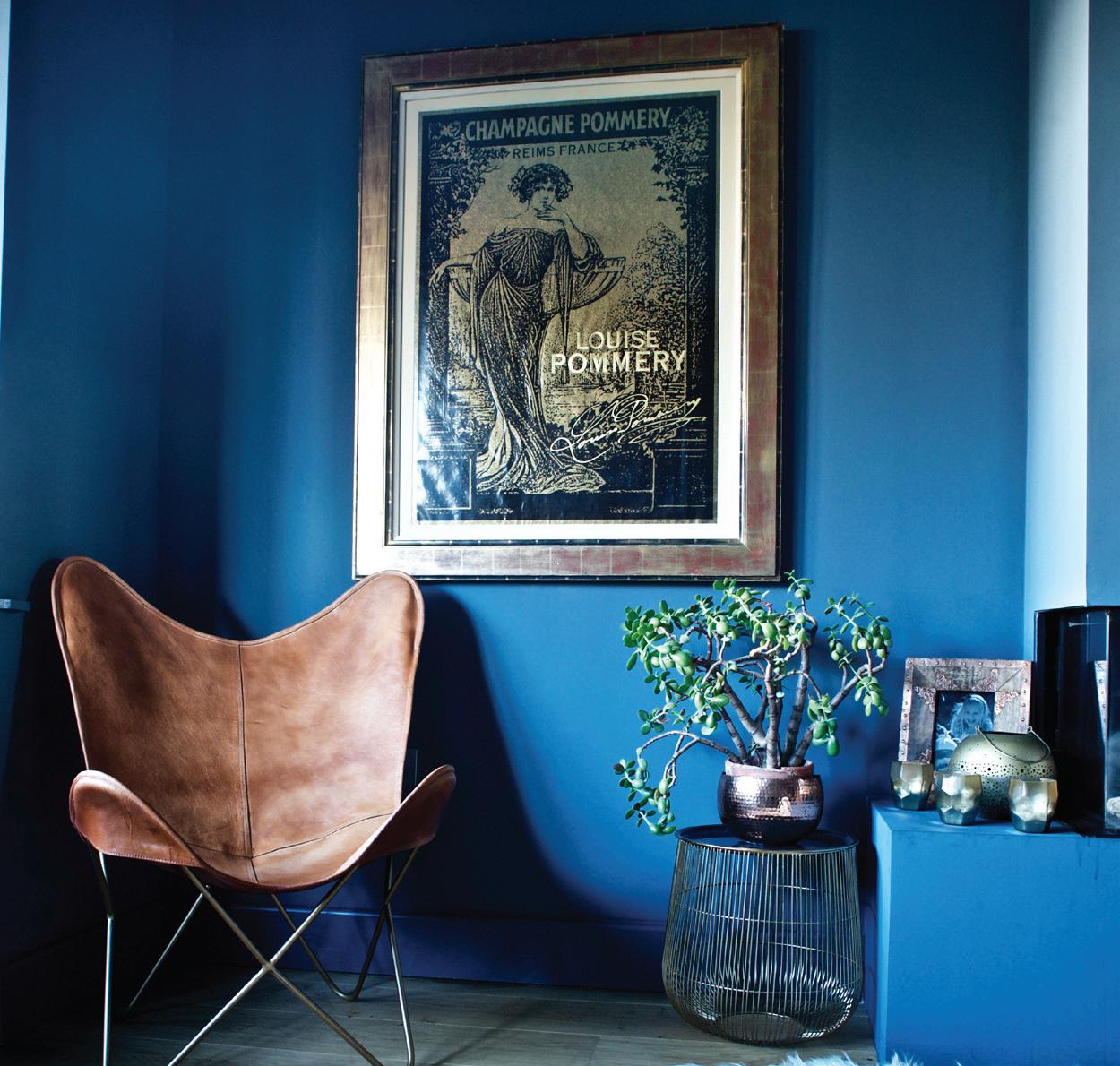
The interception of spaces is often a point that doesn't occur to clients. If you are selecting your palettes yourself, then one of the most important stages is to walk around your home and pay close attention to what can be seen from each space. For example If I look up my stairs my eye line is drawn to the master suit and our cabinetry for our walk-in wardrobe. With burnished metals being a strong thread in our home, this impacted my section for a rich deep blue finish with burnished metal gold leaf. Now if I had just chosen some white cabinetry for that space (because it's neutral and a common choice for joinery), I would see a horrible stark jar from the warmth and texture of the hallway.

ROOM USAGE
The usage of each space and how our clients want to feel in each space is another huge influence on the choice of colour palettes. If a client wants to feel inspired and uplifted in a space, then we will be more influenced by bolder colours. For restful spaces such as bedrooms and snugs, we select calmer, tranquil colours. These could be either end of the light or dark spectrum of colours.
STRENGTHS OF COLOUR
Open plan spaces present all sorts of design dilemmas and the colour palette is one. Sometimes it is appropriate to use contrasting colours to zone parts of the space. The tones still need to be with the same family.
Another good option is to choose paint ranges that offer different strengths. Little Greene's popular choice of French Grey is offered in four different strengths, which allows us a design a scheme that subtly changes as you move through the different areas of the space.

KNOWING WHAT YOU LIKE
After all is said and done this is your home. It should be a reflection of everything that makes you feel good about the world. As much as I could say that green is this years latest trend colour. You might hate green and it may have negative connotations for you. If you aren’t sure what you like, sometimes starting with your wardrobe is a good place to begin. If you find you wear lots of dark and rich colours, then chances are you will be happy to have them in your home. On our projects we always ask clients to spend some time collating inspirational images and then breaking down what they like about each image. We then bounce this back with concepts to see how clients respond to colours and textures combined together on one board.
If you would like to discuss an upcoming project with us, then don’t hesitate to get in touch at sadiepizzeyinteriors.com, where you can sign up to our Newsletter and receive a FREE PAINT CHOICE GUIDE.

andy@spraytanningguy.co.uk | www.spraytanningguy.co.uk | 07950 917391


AT THE PACKHOUSE