Hey there!
My Values
My brand stands for being decisive, organized, reliable, and resourceful. The tone of the brand is warm, friendly, and inviting. Working with us is easy, productive, fast paced, and of course fun!
My Skills My Promise
Presley Designs is a graphic design company whose purpose is to help others reach their goals through print and digital design.
Print Design
Brand Identity
UI/UX
Web Design Advertising Photography
Portfolio Contents
Tyler Candle Company
Rebrand
Siblings
Product Catalog
Colormax
Website Intent Magazine Case Study
Recipe Book
UI/UX App Case Study
Tyler Candle Company
Rebrand
Overview
Tyler Candle Company is a fragrance brand that currently has a great product line and many loyal customers. Currently, their brand is outdated and cluttered, for this project. I gave them a complete rebrand from the company name to brand standards.


Solution
I changed the name from Tyler Candle Company to Tyler Home Fragrances in order to better represent the brand’s wide range of products offered. This project showcases my ability to create a brand identity that is appropriate in its marketplace, long-lasting, versatile, and targeted. It also showcases skills in packaging, advertising, copywriting, and logo animation.
Ephemera
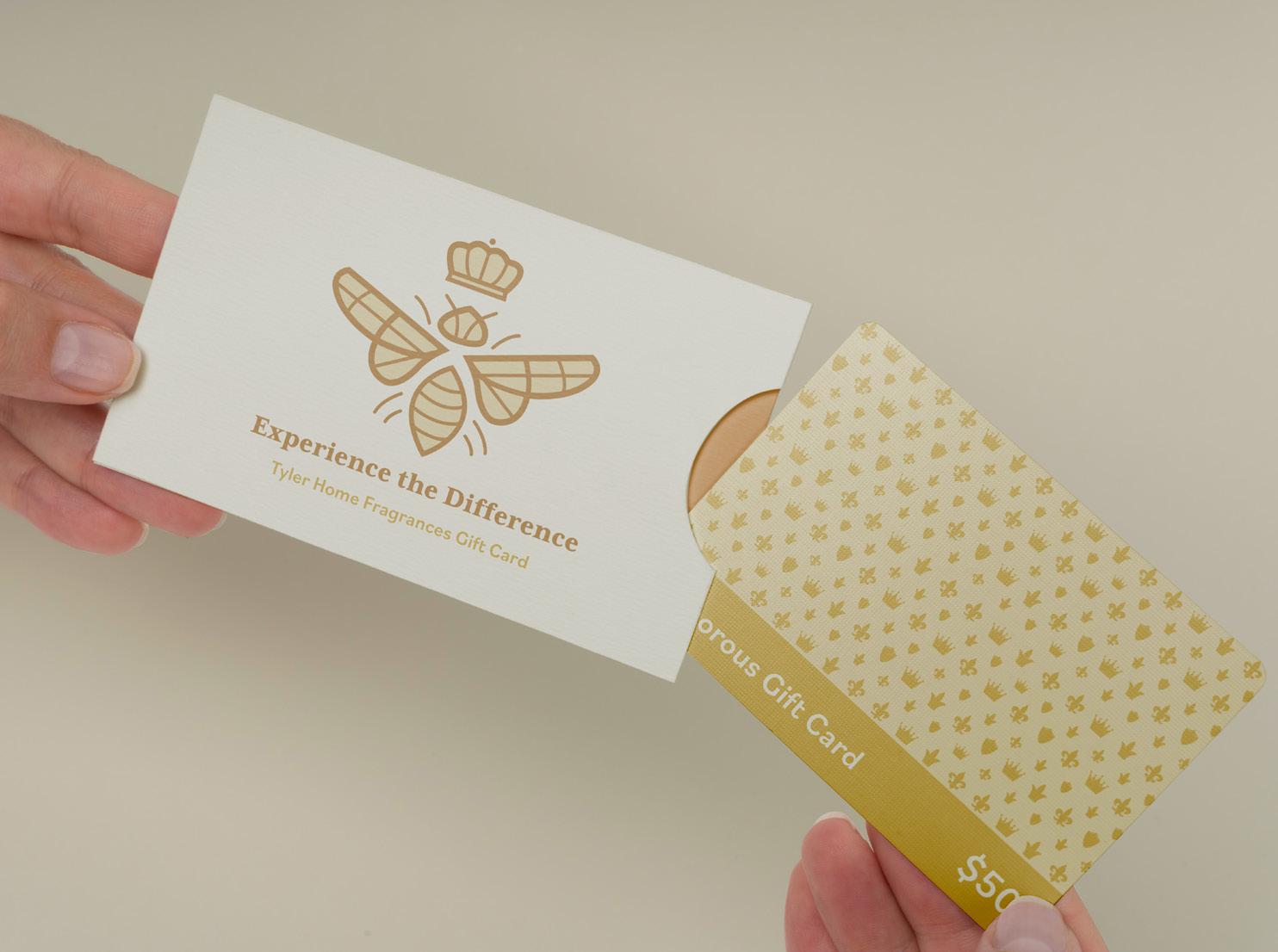
I created three unique ephemera pieces that coordinate with the other products that the company offers. The gift card and car fragrance would be offered in-store while the matchbox would be a gift with on-line candle purchases.


 Match Box
Car Freshener
Packaging


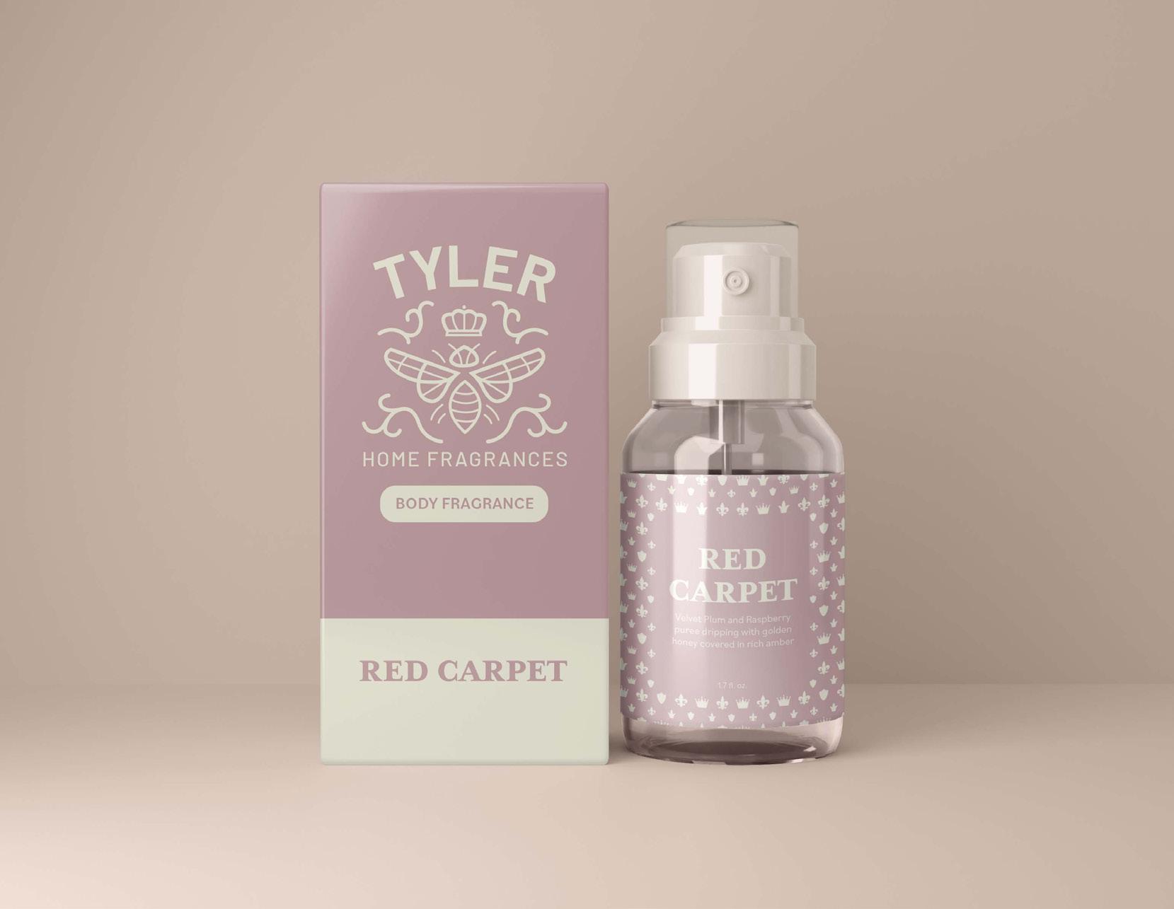
The Glamour Wash & Candles are the best-selling products for this brand. I created packaging for multiple different sizes, colors, and brand fragrance options. The body spray series shows the body spray packaging and how it appears in different brand colors paired with different fragrances. Customers will getting to take their products home in a beautiful carry-out bag.

 Glamour Wash & Candle Packaging Carry-out Bags


External & Internal Store Signs


This brand sells in person at the Tyler store, and then distributes products to other small boutiques. I created these in store displays to be sent out to distributors so they can sell the products out of cases that match the brand’s identity. I created new external assets for the home store in Tyler, Texas. The Store sign showcases the new logo and products. The window design showcases the new pattern and one of the main taglines.

 Store Sign, Window Design, Small & Large Display Cases


Siblings
Product Catalog
Long-format Publication Marketing
Overview
Siblings is a candle company founded by a Swedish brother & sister duo. They claim to have found a better way of making candles, by believing that thoughtfulness is the key to a healthier home and planet. When you buy a Siblings candle, you can be sure that they have carefully considered the ways their products affect the environment, and how they will impact your home.
Solution
The majority of this brand is sold on-line and in-store, so as part of the brand deliverables I created a stylish and inviting product catalog. The publication matches the brand’s look and core values, while also advertising Siblings’ amazing candle collections.

Type Choices
Maximum cozy, minimal impact.
Clean candles made with healthy ingredients, premium fragrances, compostable packaging, and your favorite reusable vessel.
Mood-board & Colors
Cover Process
I created many cover sketches, and multiple digital designs so that I could get multiple rounds of feedback. After getting feedback, I was able to land on a cover design that fits well with my brand and embodied the candle company’s goals.


Inside Spreads

Website Design

Overview
This project was an extensive redesign of a color correction eyeglasses website called Colormax.org. I created the updated website in Adobe XD and in WordPress. I took the time to redesign every element of the site from the brand identity and page content to the website layout. Although a majority of the changes made were cosmetic. There were still some content changes like removing repetitive information or making important information easier to find. The main improvements are an updated logo, a cohesive color palette, and many custom and engaging design elements added throughout.
Brand Standards


Screen Mock-ups
Responsive Screens


Intent Magazine Case Study
Brand Identity
Copy Writing
Overview
Long-format Publication
Photography
Intent is a lifestyle/self-care magazine geared towards those who want to make more intentional decisions to live their life in the healthiest way possible. The goal of the publication is to inform readers about how to do right by their bodies and mind. Because of this, the magazine is split into two different sections “Intentional Body” and “Intentional Mind”. In each section, readers learn about things that can make them happier and healthier. A lot of magazines focus on taking care of your body or mental health but Intent is a magazine that focuses on both!

Solution
In order to appeal to young adults that are looking to build an intentional life, I created a youthful and approachable brand identity. Intent Magazine is filled with bright bold colors, friendly type, inviting images, and type treatments paired with insightful articles in order to create an enjoyable and enlightening experience.
Mind-mapping & Competitor Study
The competitors for my magazine are Breathe Magazine, Flow Magazine, and Psychology Today. These magazines relate to mine because they all have content based on self-help and topics related to overall well-being. My magazine stands out from these because I combine the mental health topics from Flow and Breathe and the more clinical health topics from Psychology Today. There is also a difference from Flow and Breathe in that Intent magazine is much more photo-driven than illustration driven. In mind-mapping the concept for my magazine, I landed on the name Intent and the subsections Intentional Mind and Intentional Body.


 Competitor Covers
Style Choices
For typography I chose Josefin Sans for my headings and subheadings. I made this selection because I think it matches the simple and inviting look of the magazine. I chose Futura for the body copy and caption options because it is easy to read at a small scale and pairs well with my heading type. I chose colors that would make the viewer feel happy and calm. The bright tones match the articles featured in this magazine. My goal was for this magazine to have a lot of beautiful imagery as the focal point. These images were meant to complement the articles with pleasing content and placement.
Heading - JosefinSans Bold
Subhead- Josefin Sans Semibold
Body Copy - Futura Book

Digital Cover Process
I created many cover sketches, and multiple digital designs so that I could get multiple rounds of feedback. Through rounds of feedback, I was able to land on a cover design that promoted my brand and embodied the content found within the magazine.

Final Magazine


The final solution for this magazine is an intricate execution of information and design. The use of imagery and color is inviting and relaxing, and the articles are extremely informative. This final product showcases my long-format print publications skills, layout design skills, and brand identity design abilities as well.


RecipeBook


UI/UX App Case Study
Brand Identity
UI/UX App Prototyping


Overview
For this project, I did a complete UI/UX redesign of an existing recipe-keeping app called RecipeBook. With this redesign, I wanted to elevate the look and purpose of the app, while also showcasing my screen design skills and attention to detail. Everything changed from the logo and colors to many of the functions of the app. I created a welcoming and modern feel with many cool UX functions that can be tried out with an XD prototype link.
Solution
There were many components to this brand refresh; a new logo and an animated logo mark, a unique and personalized pattern, and five fresh and modern brand colors to pair with the new brand typefaces. I also created a wide range of brand-cohesive UI elements from iconography to buttons, to unique toggles. My coordinated UI element system helped the user easily identify certain parts of the brand as they moved through the app.
Original App Screen Designs Original App IconLogo Process

The first assignment to tackle was a new logo. I knew this was the first step in having a recognizable brand, their current logo did not have any memorable elements. I created the new logo and animated logo, along with many UI elements for the app.
Design Process
From the start of the project, I was given complete project freedom within the guidelines of keeping the brand’s main objectives and core values intact. The values included having the brand design elements fit within the clean aesthetic and to make the design feel welcoming to a wide range of users. The user base was mostly geared toward mothers/homemakers but the client did not want to mean that excluded users outside of that demographic. The client was excited to update their design and start reeling more users in.

Wireframes
After deciding on the brand style guide elements and creating the new logo. I was able to move into sketching and layout design with wire-frames. This is where I really went back to the research I did and made sure that all my decisions in the design stage were fitting with my UX goals and ideas. Making sure to also use the style guides that I chose to fit my user’s needs. By starting with wire-frames I was able to plan out everything I needed to and not cause myself to stumble or realize I left out important elements later in the project timeline.
Screen Designs
After sketches, my next step was to move into Adobe XD for digital designing and prototyping. This was one of the longest parts of the project and I created 35 different screen designs during this portion. After having everything laid out I used user testing to really finalize the RecipeBook app screen designs.


Wireframes
 Screen Designs

