
PORTFOLIO PORTFOLIO PORTFOLIO
AABIDAH STEVENSON
CONTENTS 03 Introduction 04 Typeface design 08 Typographic zine design 10 Magazine spread design 12 Creative experimentation and Editorial design 16 Typeface and poster design 18 Logo design 02
INTRODUCTION
Hi, my name’s Aabidah, I love to get creative and experimental with different art and design projects.
I’ve been exploring the world of graphic design for the past few years and want to take my career further with a degree at university.
You’re welcome to explore and have a look through my work on an array of creative briefs.
03
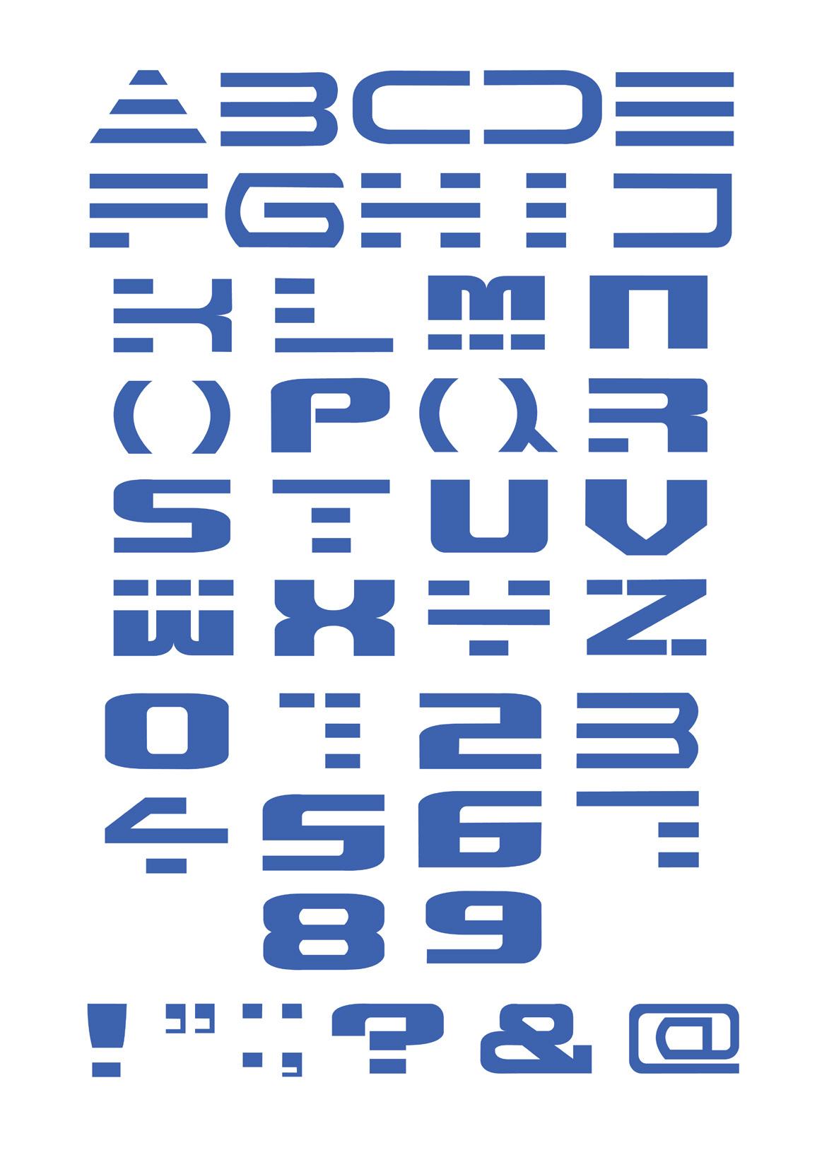
TYPEFACE DESIGN
Unit 10 Type as Image 09.19-10.19


The Unit 10 brief was broken down into two parts, ‘Type as Image’ and ‘Type x 10’ both focusing on how typography is used within our culture. The task set by the ‘Type as Image’ brief was to explore the work of a creative who’s work you find exciting and challenging, then develop a typeface inspired by this. The art style of my typeface was inspired by both Ilya Shapko and the cyberpunk genre.
04

I drew in my own grid lines to support me in ensuring each of the letter designs were of the same size and made multiple layers to manage the grid lines, draft shapes, colours and final letter designs when necessary.
05


I experimented with colour by constantly altering the colours added to the gradient mesh, adjusting the vibrancy, opacity, and overlay of the shapes.
06
In this project, we were encouraged to take inspiration from any type of artist besides a typography artist, e.g. an illustrator, photographer or sculptor. The main inspiration behind my typeface was an artist by the name of Ilya Shapko, who creates stunning illuminated illustrations. The vibrant colours used in his artwork contrast well with dark backgrounds, which reminded me of the neon aesthetic used in works based around the cyberpunk genre.
I would describe the personality of my typeface as dynamic, futuristic, and bold. The vivid colours are an expression of energy and life, whilst the gradients as well as the soft and sharp visuals emphasise the futuristic qualities of the font.

07
TYPOGRAPHIC ZINE
Unit 10 Type x10 Part 1 10.19-11.19
This project’s brief was to ‘design one deliverable of your choice using Helvetica - about Helvetica’. You needed to explore ways you can be expressive while being restricted to using only the Helvetica typeface and 2 colours (excluding the background colour). This project gave me many opportunities to experiment with composition and layout and I achieved this by trying out different methods and techniques when exploring typography in my work. I took advantage of colour, opacity, overlay, pathfinder, size, composition, reflection, refraction, layers, etc.


08
Inspiration from artists
I admire the Helvetica typeface in the way that it is unique, bold, contemporary, and controversial as well as a form of art. I have attempted to express this through my zine titled ‘A Series of Experiments’.


09
MAGAZINE SPREAD DESIGN
Unit 10 Type x10 Part 2 11.19

One of the tasks set during the ‘Type x10’ project was to design a double page magazine spread featuring a film quote of my choice, whilst being restricted to using only the Helvetica typeface. I drew 10 thumbnails of potential designs for the magazine before developing the final piece in Adobe Illustrator. The film quote I chose for this task was a reference to one of the final scenes in the 1982 Blade Runner movie.


10

11
CREATIVE EXPERIMENTATION AND EDITORIAL DESIGN
Unit 12 Poundland 11.19-02.20


This project’s brief instructed students to research and explore “Pound land”, as the main theme and later decide on a chosen narrative for the project. During the experimentation stage, one of the set tasks was to create a flag design for a “Poundland world”.
12


I experimented with type taking inspiration from typographic posters by the ‘And Atelier’ design studio.
13


14


The project’s final outcome was to create a double page spread, front cover design and back cover design.
The narrative I chose for the editorial was to create a parody of Alice in Wonderland that would include visual references to Lewis Carroll’s novel but be mainly focused on a ‘Poundland’ world. For example, the front cover’s main design focuses on an illustration of Alice entering ‘Poundland’ with one pound coins raining down from the sky to add a sense of surrealism to the artwork.

15
TYPEFACE AND POSTER DESIGN
Virtual Exhibition Poster 04.20
Students were set a task to design a mock promotional poster for a 2020 online virtual exhibition that would be showcasing the creative works of Year 2 graphic design students at Birmingham Metropolitan College.
The task required you to take inspiration from the work of a type designer and incorporate their design style into the poster. A different type designer was assigned to each student and I was assigned to Muir McNeil.
I conducted independant research online to explore and learn about Muir McNeil’s work. I started to visually respond to the artist’s work by having a go at drawing out some of Muir McNeil’s stylized type examples on grid paper.
Next, I started laying the foundation for the development of my type design in Adobe Illustrator by using a grid guide and marking out the spaces for the letter designs. I took steps to slowly build my type through different styles before experimenting with the colours, layering and imagery to be later incorporated in the final design.

16


17
LOGO DESIGN
Do More Design Projects 05.21


As of 2021, I have signed up to a graphic design platform called ‘Do More Design’ that provides commercial design experience opportunities to young and upcoming designers in the UK. So far, I have submitted logo designs to two separate client briefs. One client requested updated branding for ‘Peak Motorcycles’’ social media channels, whilst ‘The Conscious Sisters’ required a new logo design for their website.
After conducting research for the project briefs, I moved on to idea generation by mindmapping and drawing out visuals in my sketchbook. Later, I scanned in my sketches and started outlining my logo designs with the pen tool before developing them with added colour, gradients and type.
18


19


20


21
PORTFOLIO
CONTACT EMAIL creativedesign.aab@gmail.com