
1 minute read
Siqi Chen Tom Mcfarlane


With everything I want to interpret in an interesting and uplifting way. am a designer who enjoys weaving stories. The content of my work often stems from my observations and associations of subtle things, and through visualising the story content and arranging and reorganising words and images in a connected way, making the concept of the story accessible to the viewer and reader.
‘ENHARMONIC’ is a collectivist record label that brings together all individual orchestral and choir musicians/artists. Music is one of the greatest inventions of human civilisation and, like all the arts, it is designed to express the self-expression of emotions while evoking emotional resonance through creation. However, there is one problem with classical music that cannot be ignored: it is often considered to be an oldtime, joyless music that is only listened to by the elite and the rich. ENHARMONIC, as a collectivist record label, wants to make more people recognize the appeal of classical music, especially the modern youth. And ENHARMONIC wants to reposition classical music for the 21st century and make people aware that it is a contemporary and global art form.
Throughout this year, my practice has aimed to look at many different areas; from type design, creating album artwork, publication design, and identity design.
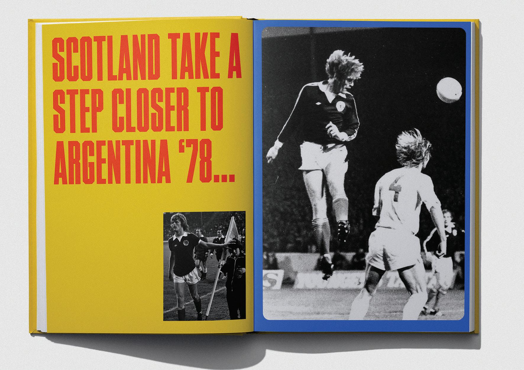
For my final project this year, I chose to do a research-led project, focusing on the story of Scotland’s journey to the 1978 World Cup; a tournament which galvanised the nation like no other. Unlike previous World Cup’s which saw Scotland exit early, this one felt different, and saw Scotland go into a major competition as one of the favourites to win. The Publication follows the national team throughout this time, and goes from the qualifiers, all the way to Archie Gemmill’s brilliant goal against Holland, which saw a nation hit peak football frenzy. Telling this story has allowed me to explore and experiment with typography, image, publication layout, and printed matter. This project aims to encapsulate the footballing hysteria, of the ‘78 world cup, the Tartan Army experience, and tell the story through its layout, and design choices.
A Historical and Contemporary Comparison of the Visual Language of Industrial Action in Britain. aims to discuss the historical and contemporary contexts, and influences of the visual language, established by the tradeunion movement in Britain. Within this essay I looked at a variety of areas; from the typography of the industrial revolution during the emergence of trade unions in Britain, to the influence of social media during recent union disputes.


