13 minute read
Cidanwangjiu Dycha Lo Erin
am a graphic designer from Tibet, China. During my time on the MDes Communication Design course, have focused on developing my skills in typography, branding and animation. I enjoy working across different media – contemporary and traditional – and throughout my work, strive to create visually impactful pieces that resonate strongly with the viewer.
In Unbreakable Locks, an animated short film, was inspired by George Orwell’s novel Animal Farm. which satirizes the mishandling of the COVID pandemic outbreak by some local governments in China.
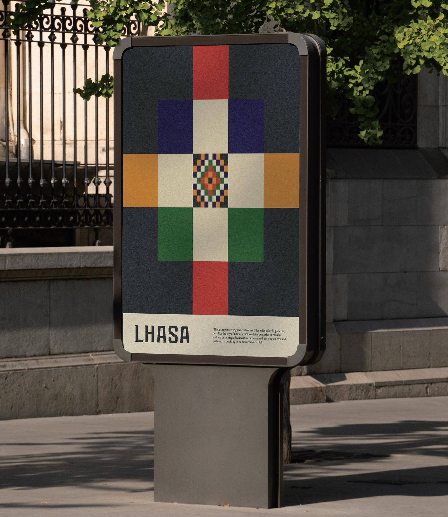
In Lhasa / City Branding, I fused traditional elements with graphic design to create a visual identity for Lhasa that is both modern and rooted in its unique history. I believe that design is a powerful communication tool, the concept of city branding has been applied to many cities and has become a trend in today’s society. Lhasa, as the capital city of Tibet, has a rich cultural heritage, and whether I am creating a logo or a complete brand identity, my aims is always to create a visual language that resonates with the audience and helps them better understand the unique culture of Tibet through this brand.
I am a graphic designer with an enthusiasm for branding and visual identity, where creative thinking is an essential part of my practice. My ideas will often explore and utilise antithesis or contradiction to provoke a response. My work is quite diverse, I don’t have a fixed aesthetic because my work is influenced by the message and brand. Through my work, I hope to inspire others to think differently and see things from a new perspective.
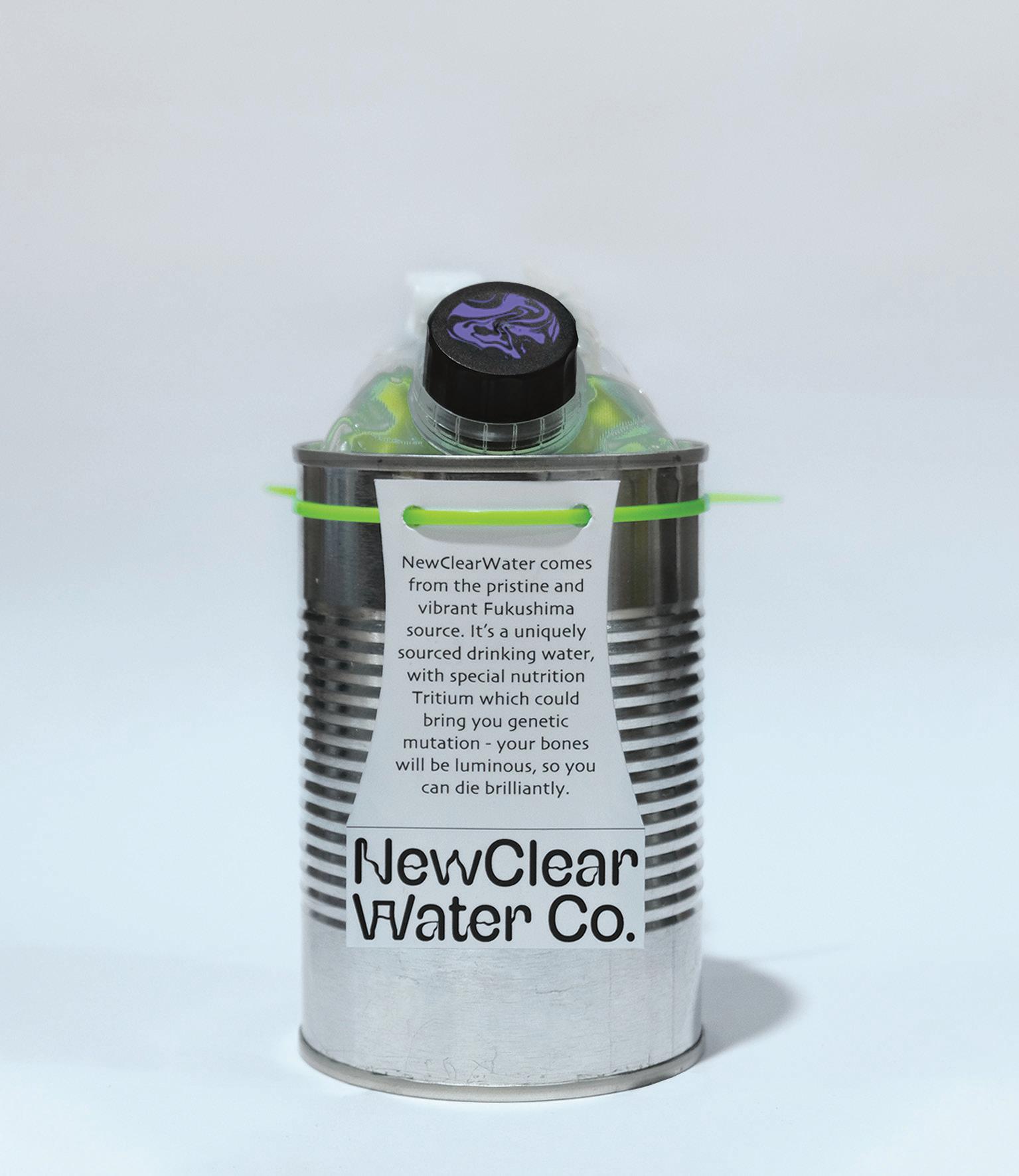
My main project explores brand identity and packaging design and is based on an imagined brand, the NewClear Water Co. My intention was to use the selling and advertising tactics of existing brands to satirise the frivolous attitude of some Japanese officials with regard to the reckless and immoral wastewater release plan following the Fukushima nuclear disaster. Which meant harmful contaminated waste water was combined with healthy drinking water. My hope is that through irony and humour, I can encourage people to engage with the issue.
Chen Jiaxin Yin
I am an illustrator with prior experience as a stage designer in Beijing. The mundane details of everyday life inspire my work. My final project focuses on food nostalgia among the Chinese diaspora in Glasgow. My work seeks to evoke childhood memories through observation of sensory experiences informed by research, personal memories and observational drawing.
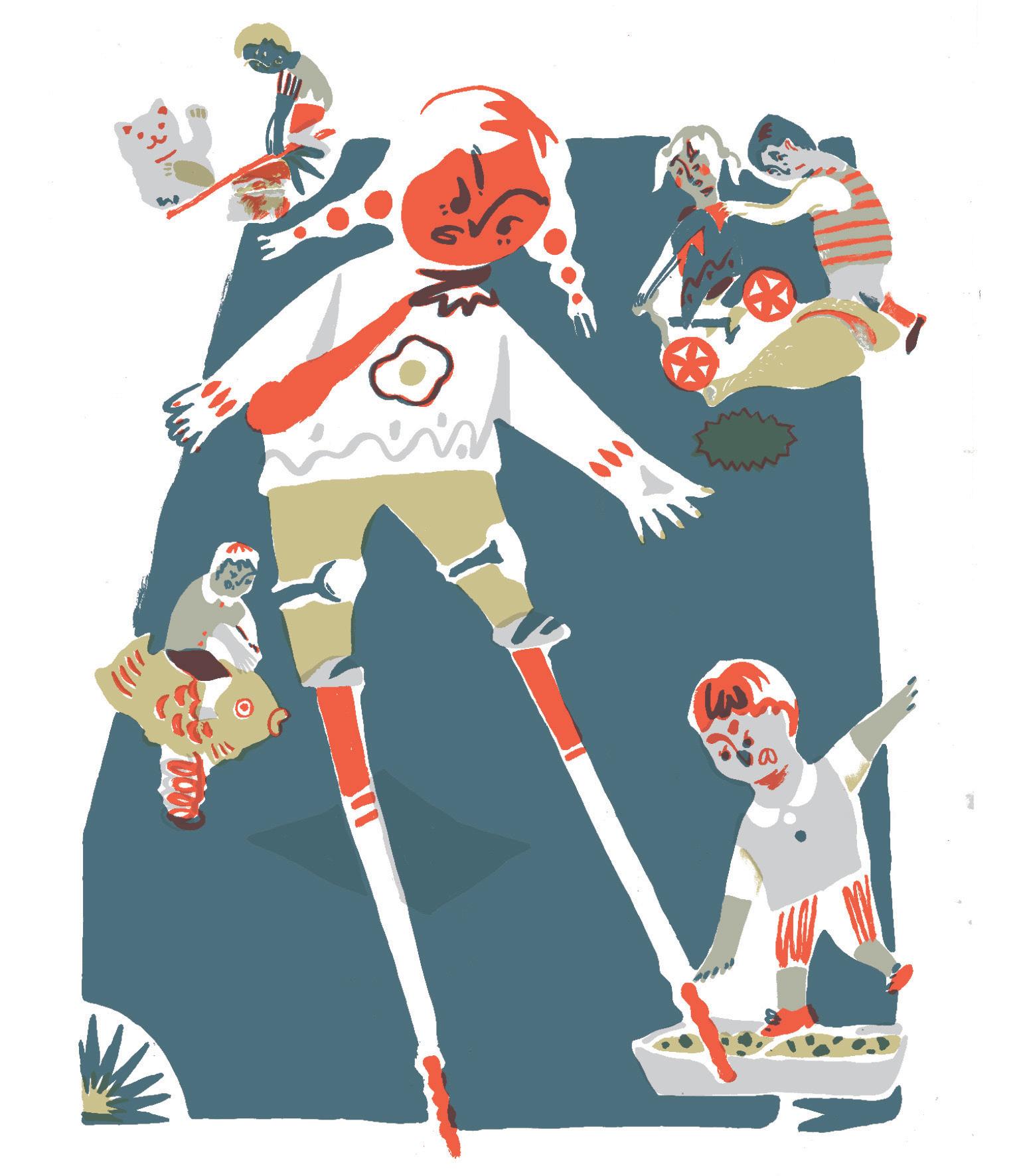
My work employs screen-printing with a limited colour palette. My colour palette adopts the palette of traditional Chinese painting connecting the origins of foods in China with their current expression in Glasgow. Often the versions of foods evident among the Glasgow diaspora provide an insight into the food traditions at a fixed point in time, reflecting the era at which the Chinese migrants brought their original recipes to Glasgow. In contrast, the food culture in China continues to evolve and change.
My illustration work is deeply rooted in how personally experience, process, and interpret the world around me. find my subject and inspiration in the everyday moments of life, moments which I strive to capture and express through drawing. I am constantly exploring new ways to combine traditional and digital painting techniques, seeking to create my own—unique—visual language, one that embraces dynamic mark-making and that brings out the best of both mediums.
My project, ‘The Reborn Bird,’ reflects my childhood memories intertwined with elements of ancient Chinese legends. Throughout the book, I have worked to incorporate traditional Chinese painting techniques into my images, to infuse them with a sense of cultural richness and depth.
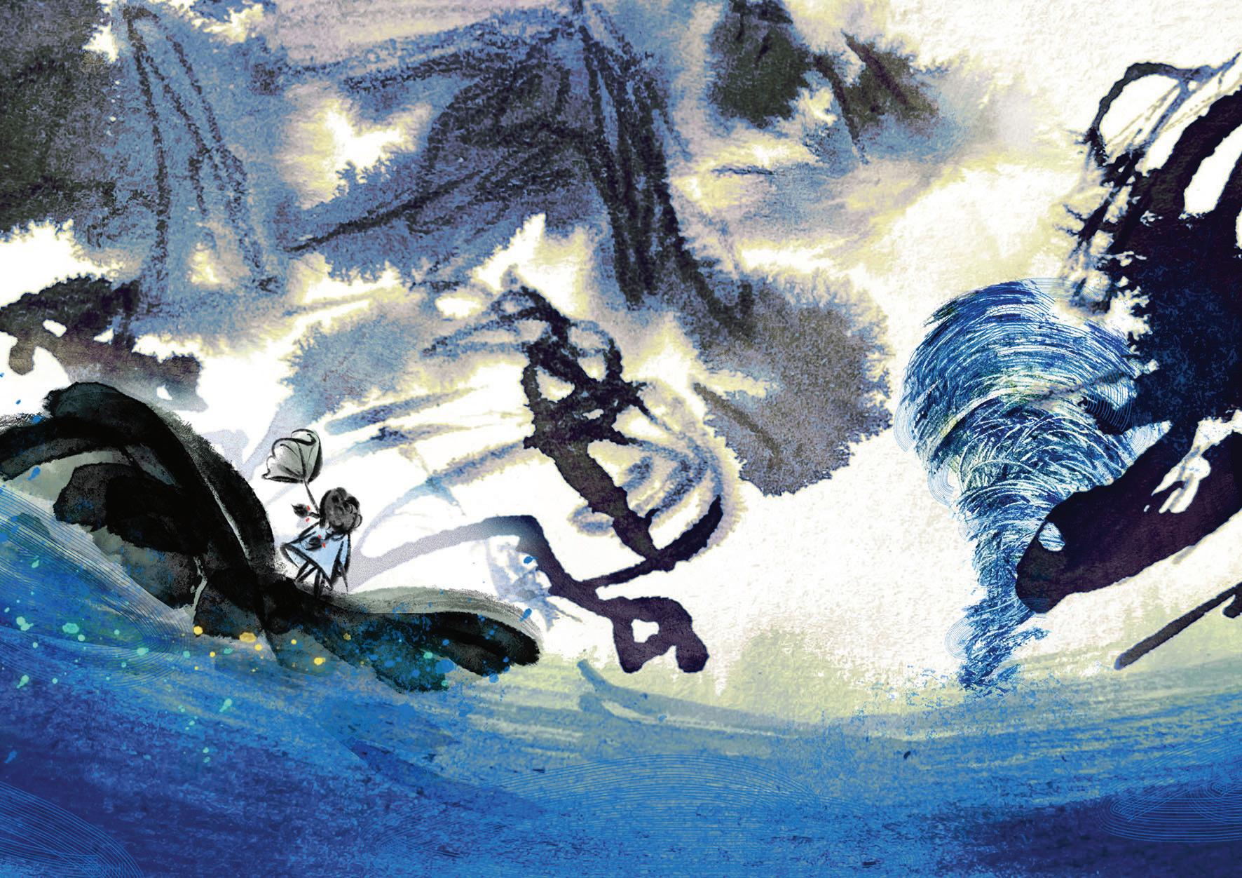
This book is dedicated to exploring the power of memory and the capacity for reflection to inspire and provide spiritual strength. By tapping into our significant and emotionally resonant memories, we can cultivate positive attitudes, that can provide support and allows us to grow—to overcome the challenges, both now and of the future, with renewed resilience and hope.
↘ @breezyw9527
↘ behance.net/charleswoodlo
↘ lodacha.charles@gmail.com
↘ @dycha.lo
↘ erinchen.cargo.site
↘ yungchingchen000@gmail.com
↘ @erinchen_illustration
↘ vongola27sky@qq.com
↘ @j.yin27
As a graphic designer with a background in law, have a passion for translating social issues into visual language and exploring the connections between the two, thinking about how to communicate with people through the language of design. Over the past 2 years have sought to develop my knowledge of typography and editorial design through a range of selfdirected projects – exploring themes such as isolation in the covid-19 and feminism inequality.
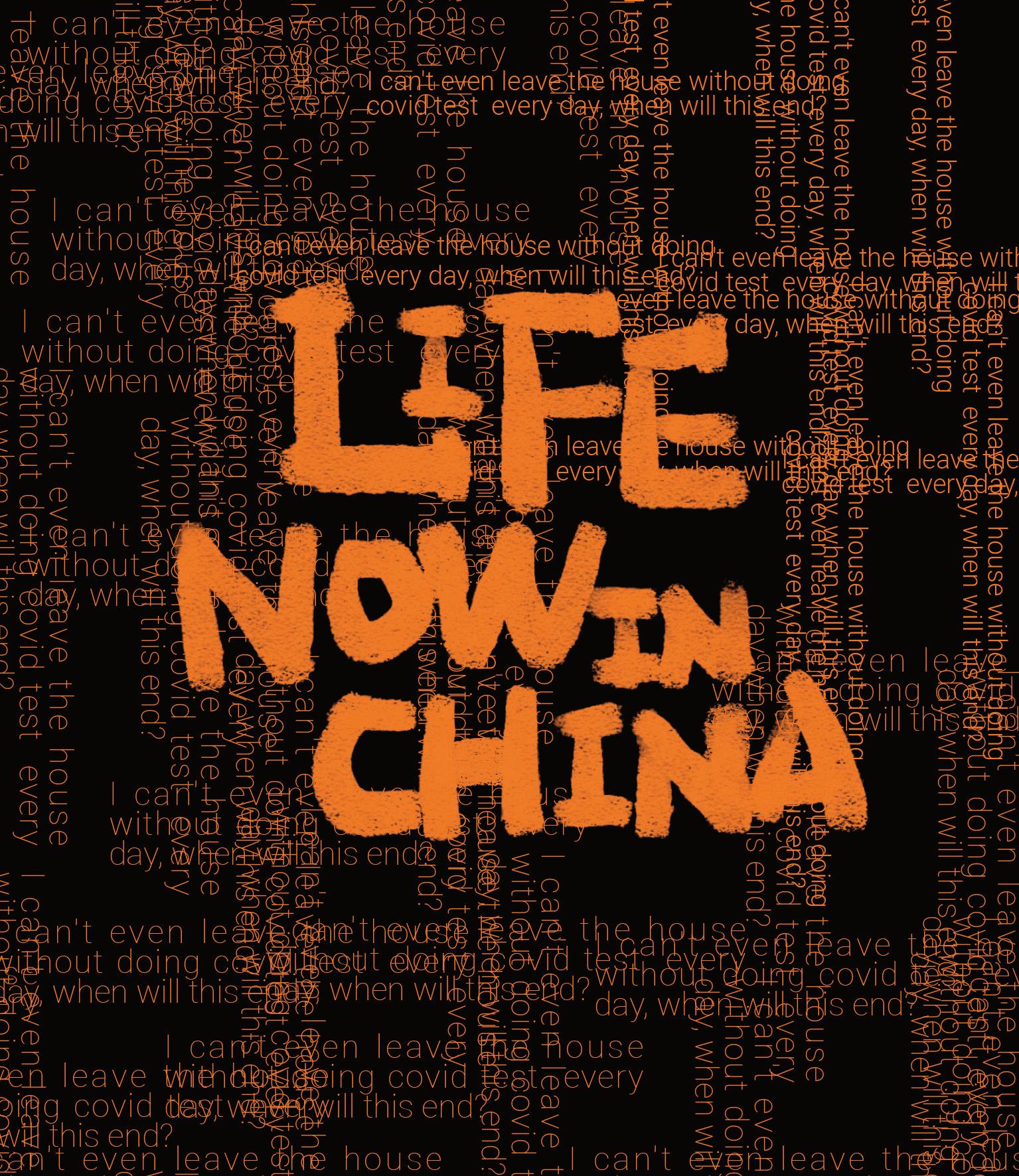
”LIFE NOW IN CHINA” is a publication that shows the daily life of Chinese people in the context of the COVID-19 from the perspective of my parents. My self-awareness as a Chinese person and my emotional ties to my family were the strong motivation for this project. used the images of everyday life collected from my parents as source material, deconstructed the content and visuals, and then tried to translate them into visual language using expressive typography.
“FEMALE’S HEALTH MATTER” is a protest against the inequality of gender data in medical research. This project came to create a visual system for this protest. focused on highlighting the fact that women are underrepresented in clinical drug trials and the problems this causes through the visual presentation of data visualizations. The hope was to promote gender equality by protesting against the gender data gap.
I am an illustrator-designer with an interest in the relationship between text and image. The aim of my work is to democratise information visually; the role of communication design is to convey a message whilst deconstructing abstract meaning. The course has located my illustration practice within a graphic design context, especially through poster design as it can harmoniously fuse illustration and type. use a combination of analogue and digital processes; creative ideation always begins with a humble sketch, which is then refined using software and finally reprocessed for print or screen. My visual language has been shaped by movements and styles of the early and mid-20th century; enjoy merging retro processes and aesthetics within my work.
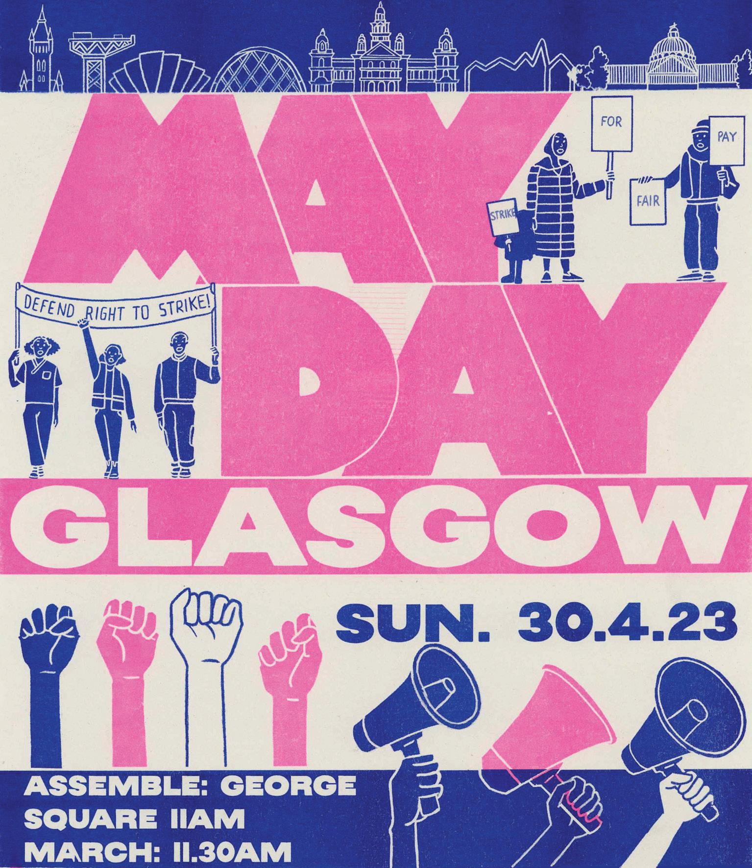
This year, I had the privilege of designing the May Day poster for the Glasgow Trades Union Council. As a cause that resonates with me deeply, it was an opportunity to design for a valued purpose. The main themes centred around Glasgow’s recent waves of industrial action and its opposition to the UK government’s Anti-Strike (‘Minimum Service Levels’) Bill. sought to create a bold impression of solidarity, unity, and resistance through a limited colour palette, striking imagery and typography. printed the posters using several processes but was drawn to risographs tactile vibrancy.
As a graphic designer and visual artist, I believe in the critical role of visual language to inform and influence, and am driven by the power of visuals to create change and inspire action. My practice primarily focuses on typography and editorial design, with a strong interest in printed material. In the exploration of various mediums and means, I strive to create work that not only communicates efficiently, but also sparks meaningful discussions and drives positive change.
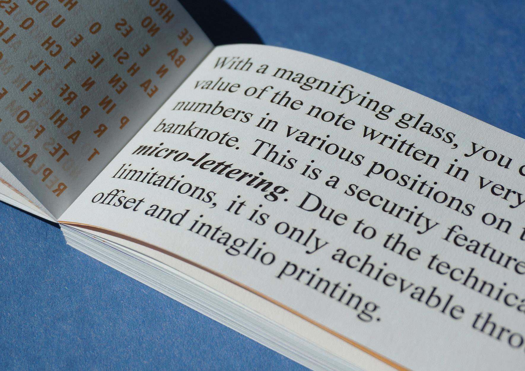
From an Economics background, am invested in topics that impact people’s lives within local communities. My recent project “Pounds” examines the value of money from a social and economic perspective, taking into account factors such as commodity prices and wages. To visualize this value, I made a publication as well as a set of objects where the unit of currency interchanges with other units of measurements. By making graphical comparisons of the ever-changing value of the British Pound, this project refers to bigger economic issues such as income equality and inflation, and questions the sustainability and morality of our current fiat currency system.
As a graphic designer and illustrator, I specialize in publication and printed matter, with a strong passion for abstract graphics, bright colours, and minimalist design. Drawing inspiration from my intercultural communication background and observations of human behaviour, I focus on creating designs that critically and sensitively reflect everyday life. My works are influenced by the diverse cultures, habits, values, and behaviours of people from cross-cultural backgrounds.
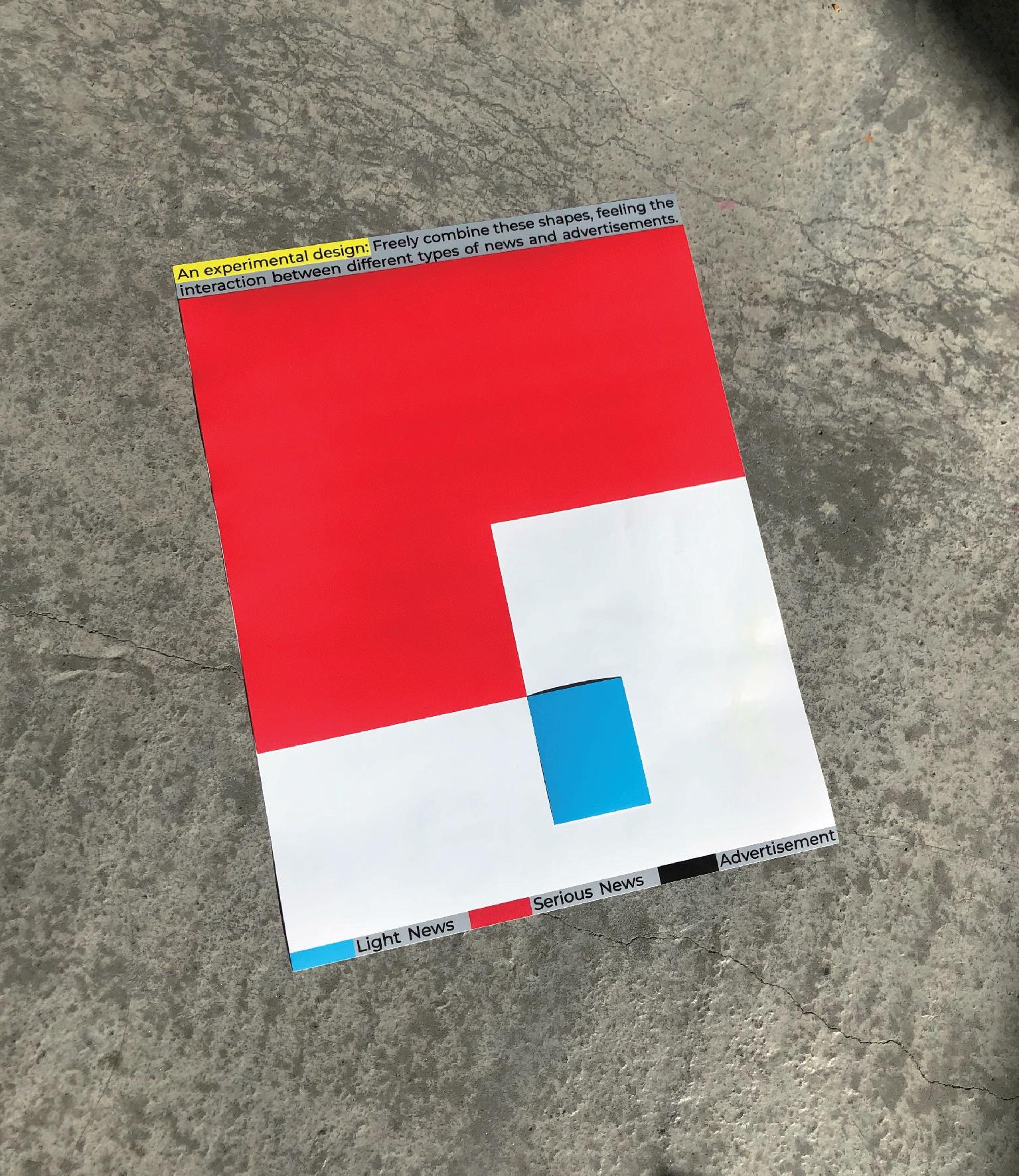
My master’s degree project explored the impact of news arrangement on our perception in an irrelevant reading context, within the context of information fragmentation. Through a series of experimental design practices, I employed three methods - “decode, tidy, and recombine” - to analyse the current news layout and presentation of newspapers and websites, reflecting on the information jostling caused by the complexity of arrangement and hierarchy. I aimed to communicate these experimental works through visual language and build an interactive relationship between my work and the audience, initiating a practical and reflective debate of daily seeing and reading.
Tingting He Tingting Zhang
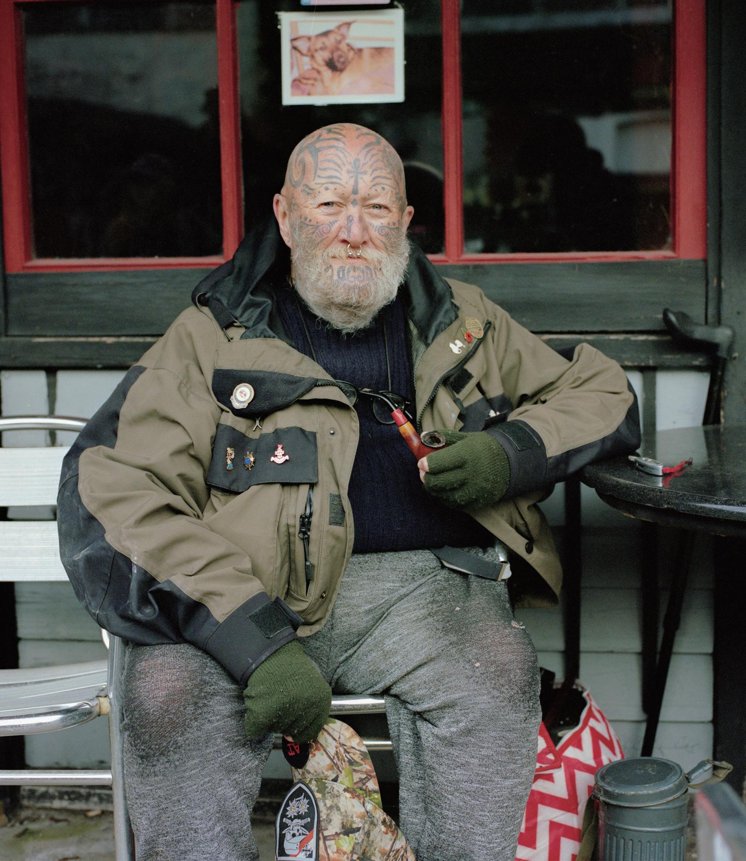
am a photographer from China who specializes in capturing landscapes and portraits. My work is deeply rooted in my exploration of the intimate relationships between different elements and the fleeting nature of life itself. Whether I am shooting on location or in the studio, I am always searching for new and innovative ways to push the boundaries of my craft. With a keen eye for detail and a deep appreciation for the natural and man made world, I am constantly striving to create images that are both visually stunning and emotionally evocative. Through my lens, I strive to capture the beauty of our world and the unique connections that exist between places and people. Whether I am photographing a shop front or a single individual, my goal is always to create an image that speaks to the complexity and depth of the human experience. For me, photography is a way of exploring beauty in unexpected places, to find stories and share these with others.
My major final year project is a documentary series based on The Barras Market in Glasgow. Through my photographs, aim to capture the colourful atmosphere and character of this culturally significant area in the East of the city.
As an interdisciplinary visual creative, my practice has gradually shifted from graphic design to photography and from landscape photography to staged photography during my studies at GSA. My work is often inspired by my life experiences and cultural environment, as well as social issues in general.
In previous projects have explored staged photography around the conceptual themes of gender, self and the gaze. Using a simple yet symbolically rich visual language, my images seek to create a representative narrative scenario independent of reality, representing the plight of women’s lives. I try to maintain an ambiguity in the images, where the subject or object may relate to any woman, as I want my work to communicate universally.
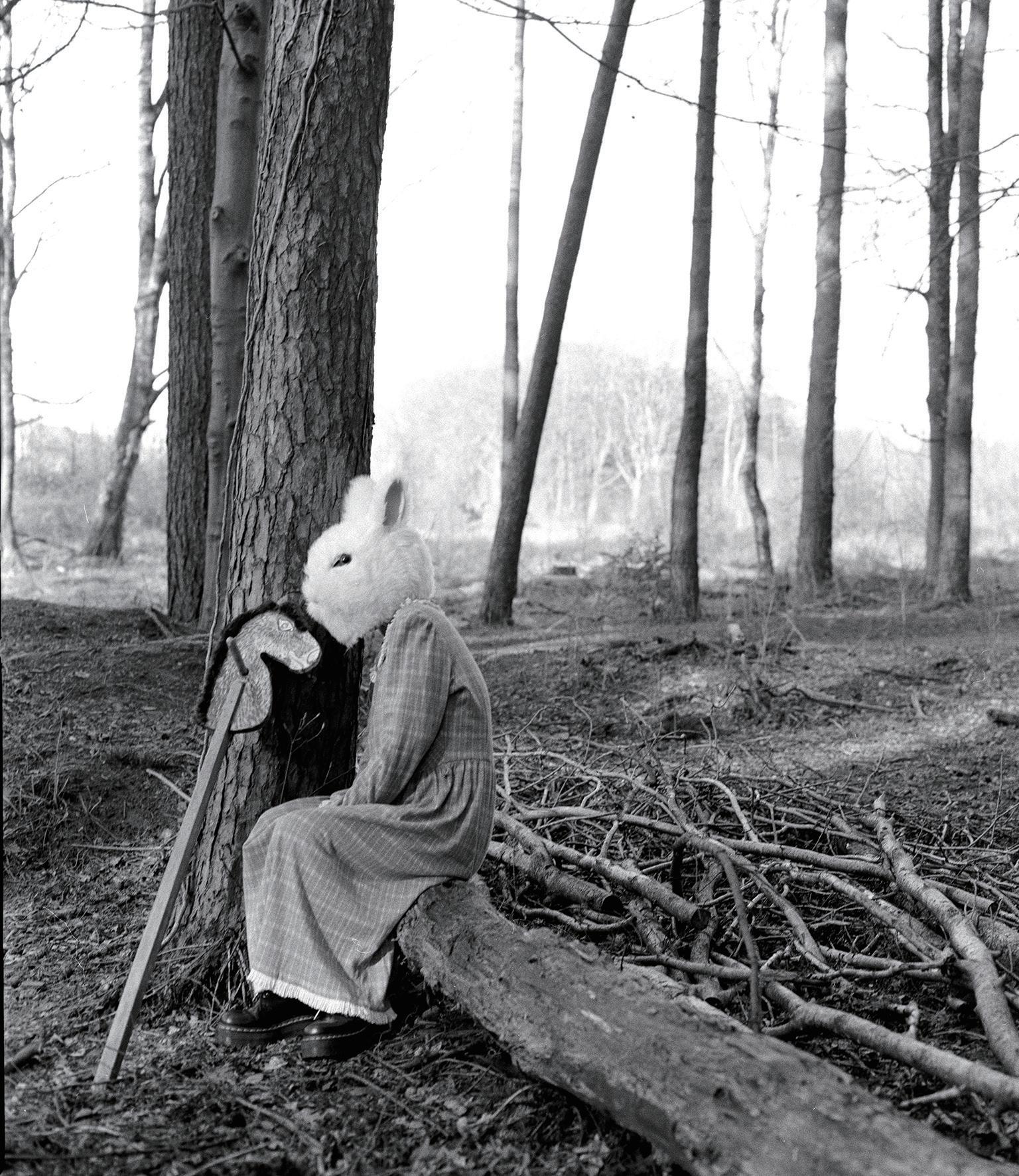
In my graduation project work, question my identity through a hypothesis: what happens to my psyche and body in a social life full of conflicts and contradictions, when the values of the self and the alter ego, the individual and the group, come into conflict? Through my images, I try to capture a sense of dislocation in scenes of interweaving reality and fiction, a balance between identity and belonging, personal beliefs and external values.
Xiaoyu Bu Xina Qu
As a socially responsible designer, my passion lies in addressing social, political, environmental, and personal issues through my creative endeavours. Drawing inspiration from my own experiences and those of others, strive to create meaningful projects that not only allow me to develop new skills but also enrich my understanding and perspective on the world. Over the past two years, I have focused on delving deep into the projects themselves, incorporating cutting-edge technologies such as Coding, AR, and 3D modelling to create immersive and interactive experiences that captivate and engage audiences.
Driven by an insatiable thirst for knowledge and a desire to master new skills and techniques, my studio practice is grounded in a commitment to continuous experimentation with various art forms. Through rigorous research and introspection, aim to bring a unique and thought-provoking perspective to each project, crafting compelling narratives that resonate with a diverse range of viewers. As a designer, I am dedicated to fostering a positive impact on society, striving to create work that raises awareness, inspires change and encourages conversation on pressing issues. By combining my creative prowess with my research interests, hope to make a lasting contribution to the fields of design and social engagement, pushing boundaries and breaking new ground in the pursuit of meaningful art and design.
My artistic practice is rooted in my extensive education and passion for photography and graphic design. I am dedicated to utilizing a range of different materials and physical techniques to manipulate and create images.
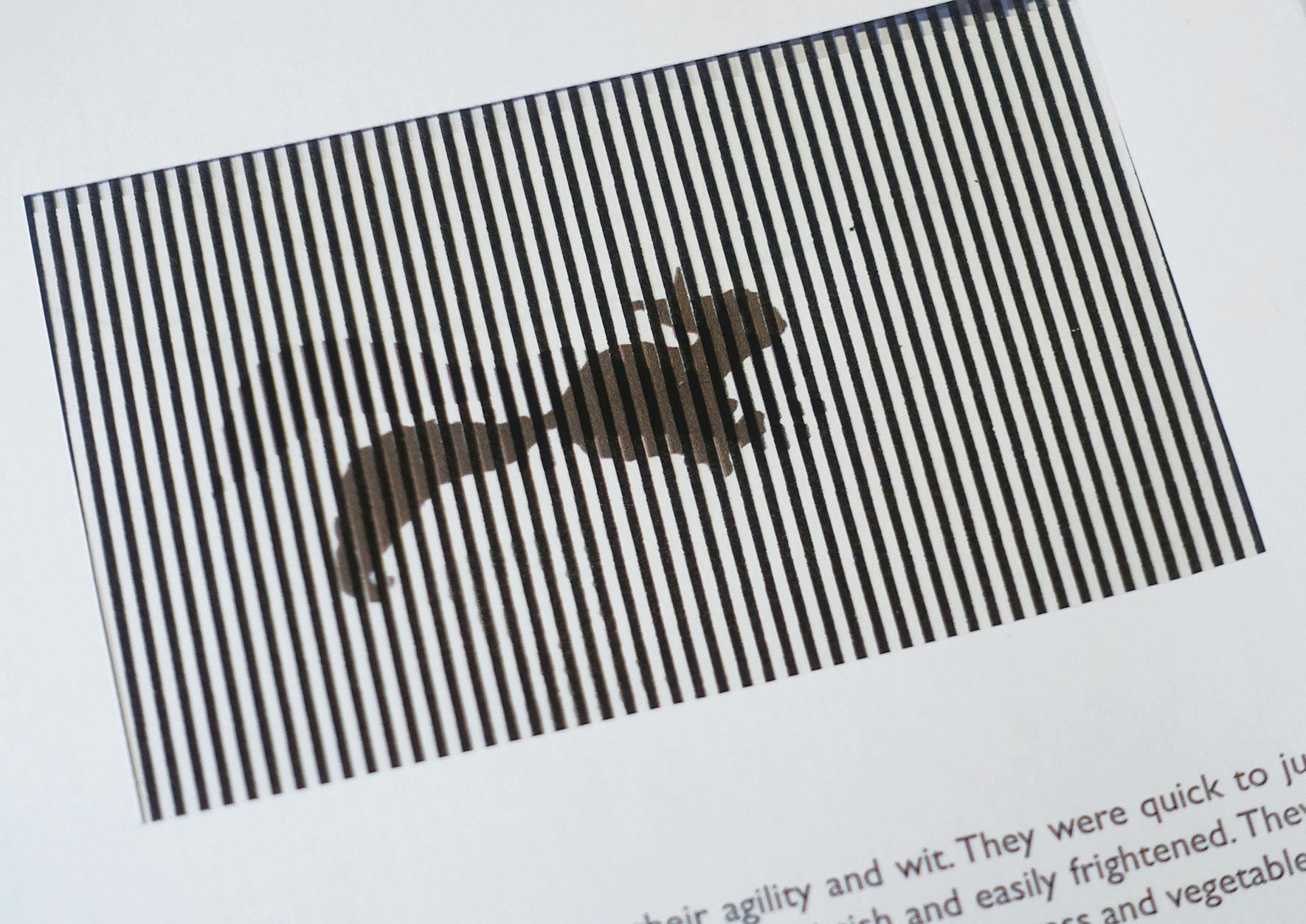
Through my work, I reflect on personal memories and explore the fragility of life, highlighting themes such as identity, family, loss and trauma - topics that are both deeply personal to me but are also universally understood.
My project, ‘Flesh and Blood’, is a series of images which are a visual representation of identity, pain, and memory presented in an autobiographical format. After my mother’s passing in 2019, my values and sense of self crumbled, the fragility of my body and mind became apparent leading to intense self-destructive tendencies. Through this project, tried to find a way to heaI, to make sense of that dark period. used my own portrait as the fundamental element throughout the work - photography served as the language, while physical manipulation and editing of the portrait served as the medium and in so doing, I attempted to visualize my personal memories and emotions and turn this experience into something cathartic and positive.
Yilin Chen Yiyao Fu Yuluan Dong Yutong Chen
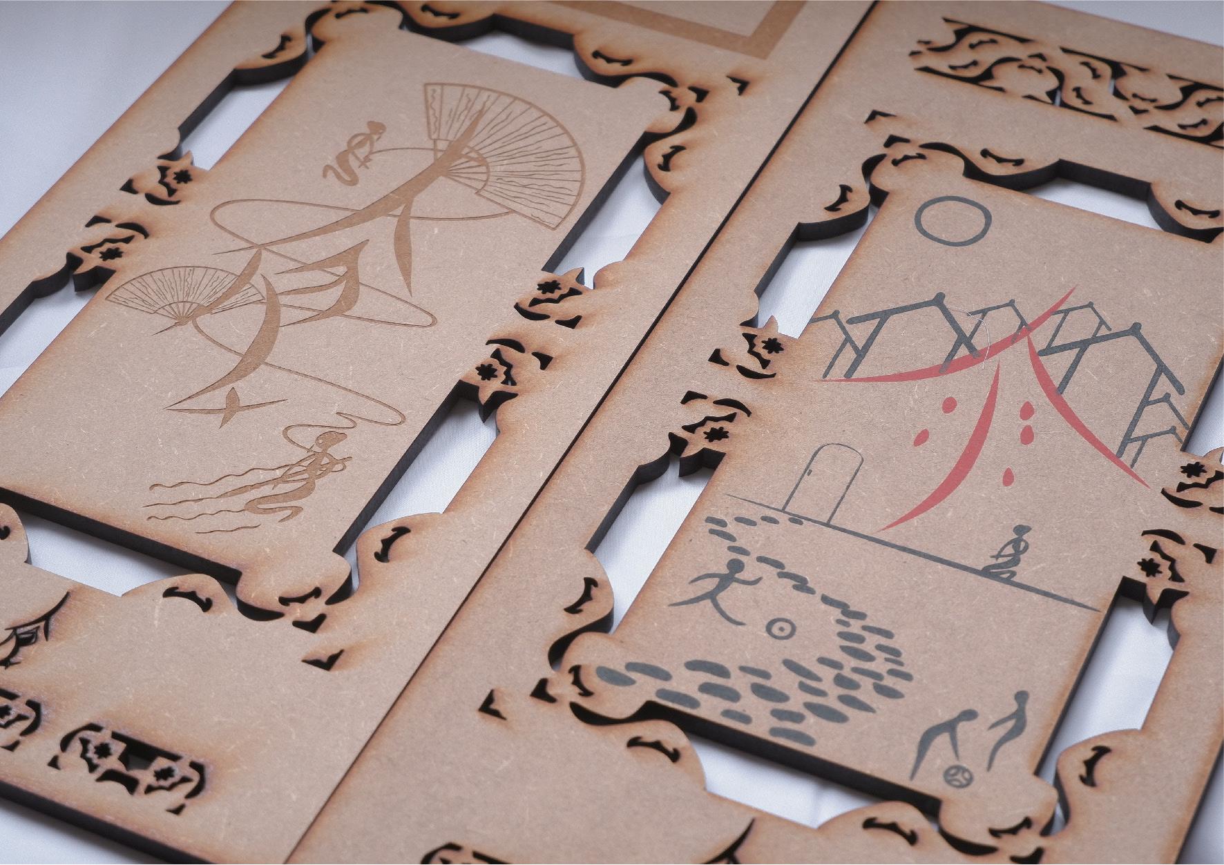
My Chinese cultural heritage informs my work. My final project explores Nüshu, a unique phonetic form of writing originating in the Jiangyong County of the Hunan Province of China around the 13th Century and used exclusively by women. My research explores the narratives behind women who used Nüshu to share stories at a point in history when women’s roles remained tied to the home and associated household tasks.
have experimented with a range of media to reflect the craft-focused origins of Nüshu. Finally, presented the narrative through folding screens that convey a sense of privacy for women sharing their stories through the Nüshu script employed in embroidery and other crafts.
I aspire to create illustration work that communicates either the specific content of the subject matter that inspires reflection and critical thinking, or the involved emotions that connect people. Recently I have been drawn to the sequential and narrative illustration projects, exploring how the image can inform the reader; to what extent — the Illustrator — have the power to influence the readers experience of the narrative — moving from image-to-image, page-to-page, and through the spaces and time within the narrative.
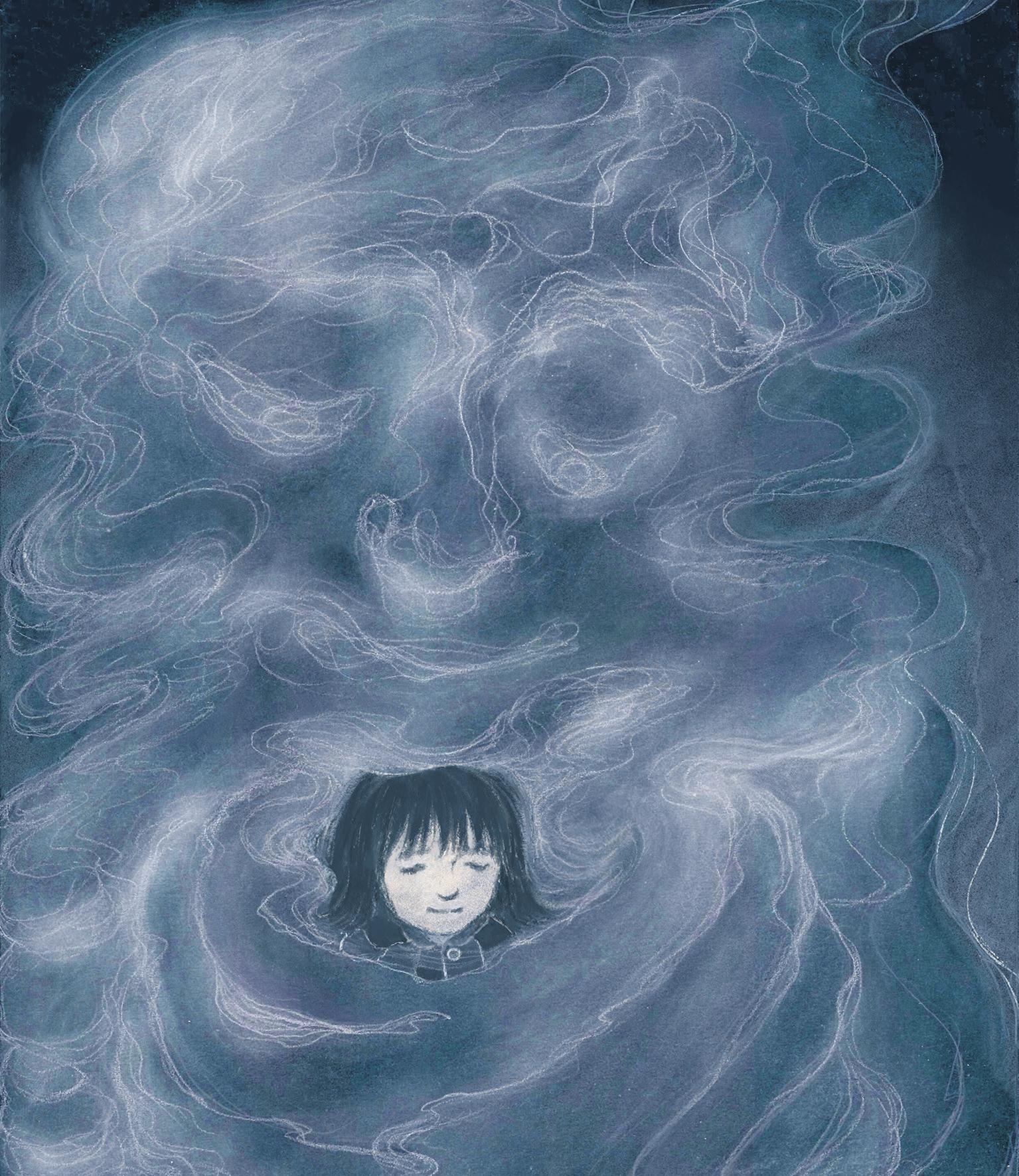
My graduate project is a comic book aimed at teenagers and young adults that explores their handling of interpersonal relationship dilemmas and their own inner struggles. The story revolves around a girl facing a crisis in her friendship and the negative emotions involved.
In the project personify the negative side of human nature as a character named “Mist”. The protagonist confronts her “Mist”, she meets it, is controlled by it, must face a direct mental collision with it and make difficult choices. This story is based on my observations and research into the human psyche, combined with my own reflections and leading me to the insights I present in this story.
I am a contemporary photographer based in both China and the UK. I hold an MA degree from the University of Edinburgh and am currently completing an MDes degree in Communication Design, specialising in photography, at the Glasgow School of Art.
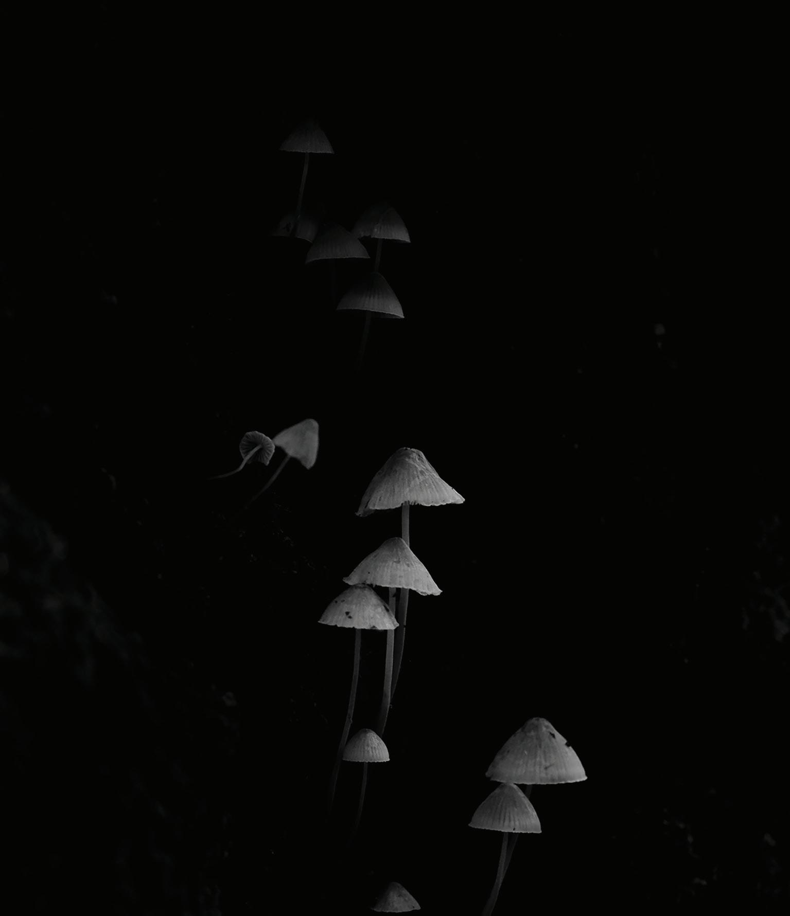
Much of my photographic work stems from my personal growth, experiences and observations of the world around me. For my latest project, I used the twilight and darkness outside as my photographic studio to explore the cyclical nature of life through Scotland’s native flora and fauna. My images can be poetic yet contemplative, evoking a sense of solitude and introspection. I am dedicated to pushing the boundaries of photography, challenging viewers to see beyond the surface and engage in a deeper dialogue with the world around us. My previous projects “Gone with the Wave” and “55°97’N, 3°3’W” have been exhibited at “The Unbounded Project” in 2023, hosted by the Three Shadows Photography Art Centre in China.
As I continues to evolve as an artist, I aim to create work that resonates with audiences on a personal level, inviting them to consider their own experiences and perceptions of the world.
I am an enthusiastic graphic designer, with a strong focus on typography and editorial design. approach my work by applying visual language to communication theories, and my particular interest lies in bridging cultural differences through graphic design. My research practice explores the democracy of language through bilingual typography. I believe that graphic design should not only be functional, but also imbued with humanism and warmth. To achieve this, I enjoy collaborating with creators from different fields, striving to create designs that truly reflect their intentions.
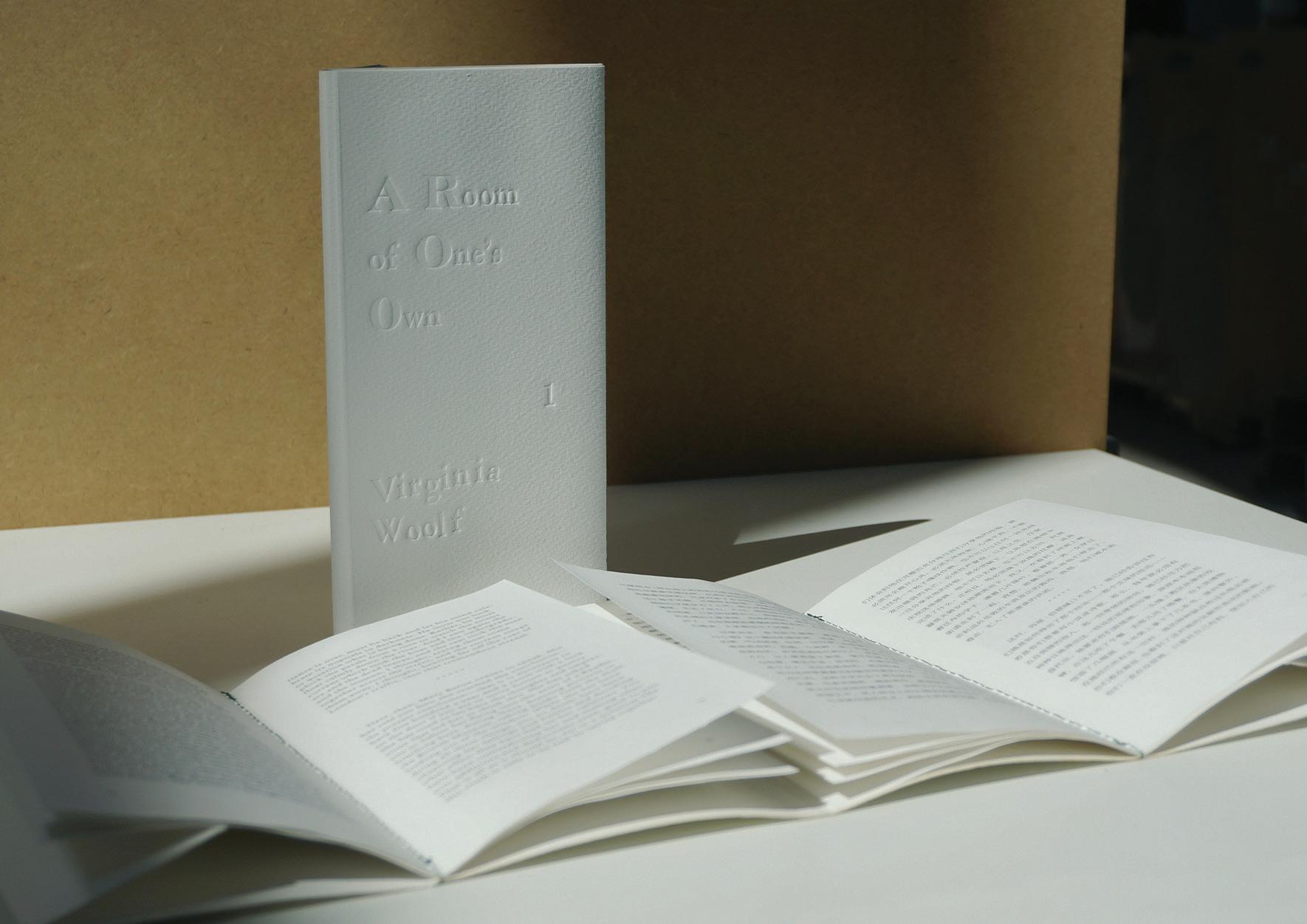
For my project A Room of One’s Own, I drew upon my personal resonance with the book and my high school years. I want to establish a connection between the book and its young readers, with a focus on the concept of ‘intellectual liberty’. used bilingual typography as a foundation, which allowed me to convey Woolf’s vibrant language and subtle metaphors, while creating an atmosphere of ‘intimate conversation’. My design has two aims: to explore the effectiveness of typography as a narrative experience in reflecting the content of text, and to establish a harmonious system of parallel bilingual typography.
Zhenghong Yang Zhenyu Wang
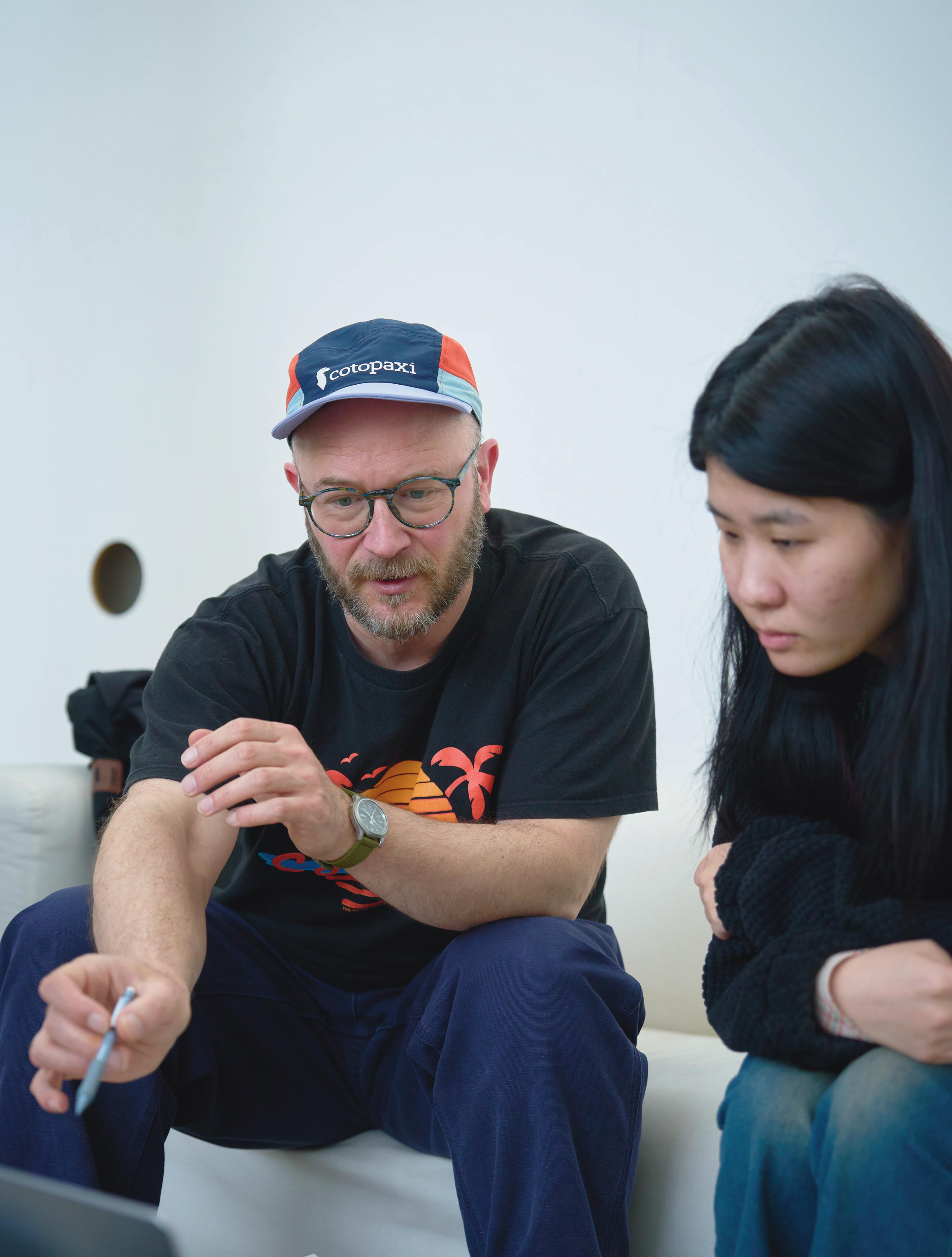
As a photographer and graphic designer, my studio practice revolves around photojournalism and documentary. am fascinated by the power of visual storytelling and the way that photography can capture moments and communicate powerful messages.
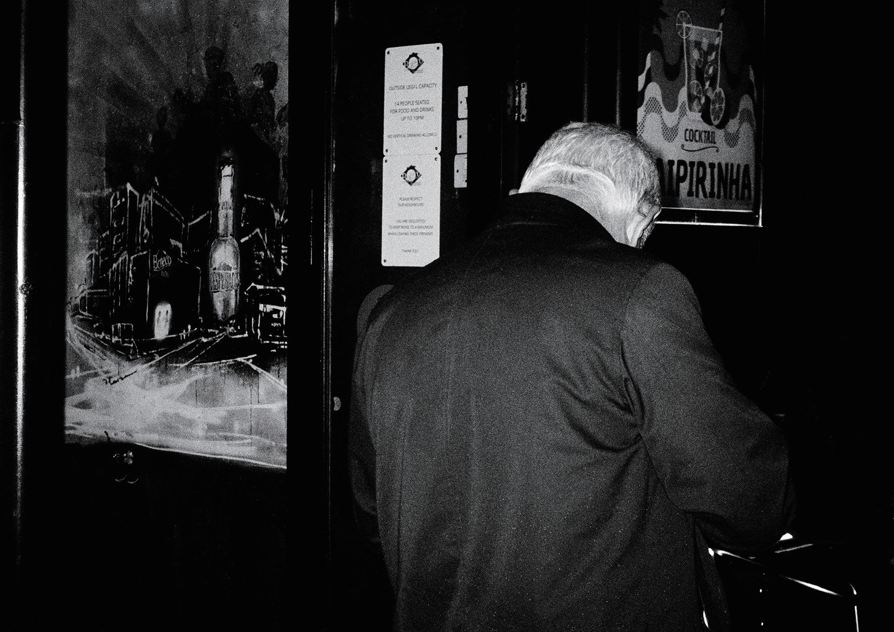
In my documentary work, focus on capturing real-life events and stories through candid images that capture the emotion and energy of a particular moment. I am interested in exploring the creative potential of the medium, experimenting with new techniques and approaches, seeking to create images that are both visually striking and conceptually rich. I am particularly interested in using texture and traditional darkroom and processing techniques to create a strong visual language that draws the viewer in and invites them to explore the image in more detail. My current project work explores the nocturnal transformation of the streets of Glasgow, capturing its ethereal and enigmatic essence, which have contextualised in photozines.
In addition to my studio practice, I am also deeply interested in the history and theory of photography. spend a lot of time researching and reading about the medium, exploring the work of other photographers, and thinking critically about the role that photography plays in our society.
As a graphic designer, I am an explorer and storyteller. My Chinese cultural roots and study abroad experience in Glasgow have given me a unique perspective on storytelling. I love using illustration and graphic design way to create captivating stories. am passionate about exploring design themes related to social justice, psychology, and children’s education. Graphics have the power to convey complex information in visually appealing ways. I excel at using videos and posters to tell stories that resonate with people more deeply. Currently, I am exploring the design expression of resource books.
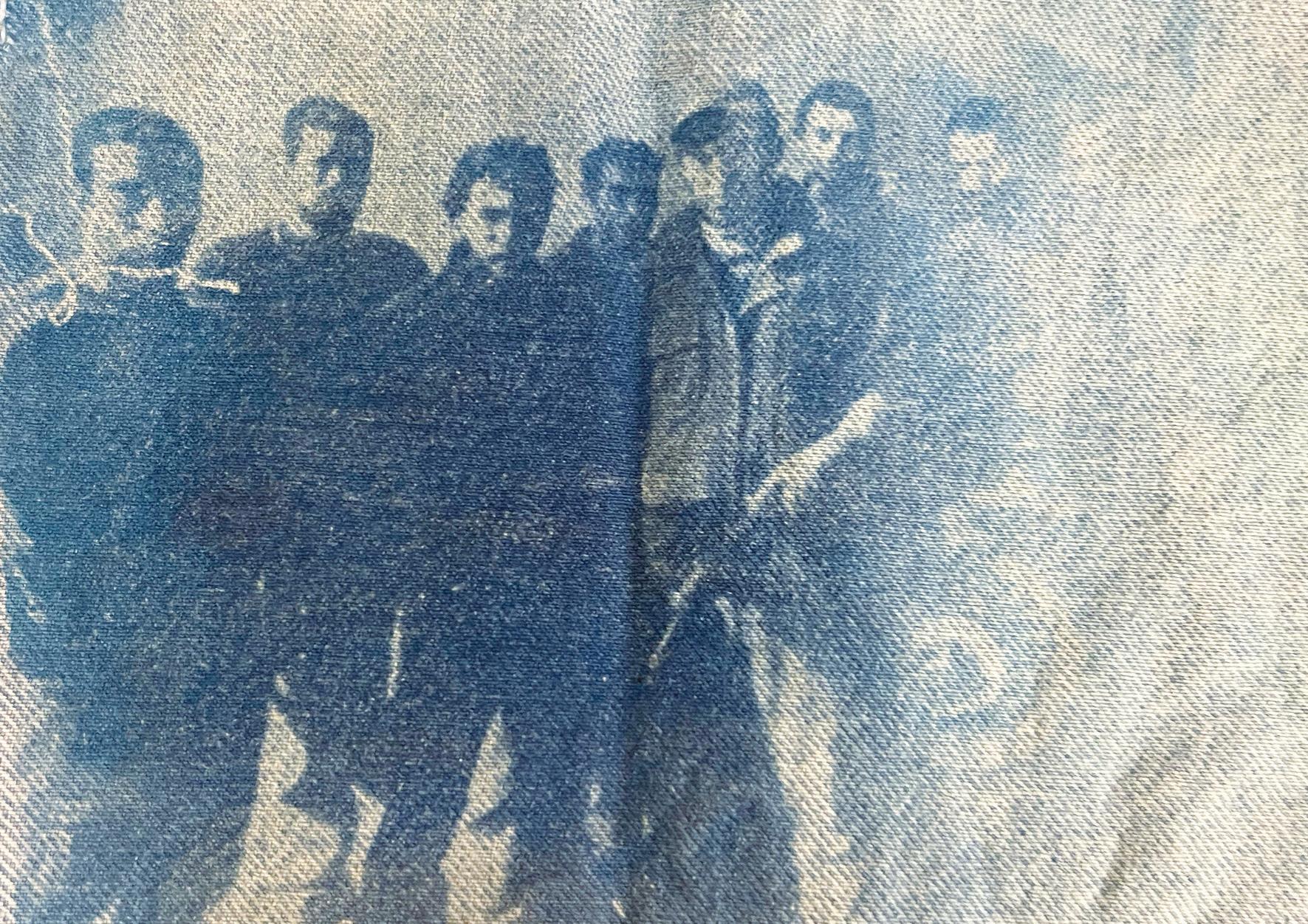
My graduation project tells the story of silicosis in the denim supply chain. The truth behind denim sandblasting workers’ breathing difficulties and struggling steps is hidden behind the classic appearance and fashion trends of denim jeans. I made complex and obscure information easy to understand through material collection and layout. aim to use a powerful combination of images and text to reveal the harsh realities of denim sandblasting and increase awareness of the silicosis caused by this process. Graphic design has the ability to evoke emotions and has the power to move people. In the future, will continue to dedicate myself to storytelling through graphics and illustration, using different mediums to express myself.
↘ 215803053@qq.com
↘ @yang4310yang
↘ zhenyuwang.net
↘ zhenyu.wang0612@gmail.com
↘ @zhenyu_wang16


