3 minute read
DESIGN Modern and Mid-Century
MODERN AND MID-CENTURY
Designer Cody Rackley adheres to original mid-century modern principles
Advertisement
which provides the cornerstone for his clients’ new kitchen.
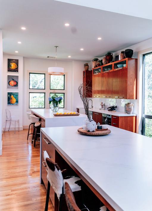
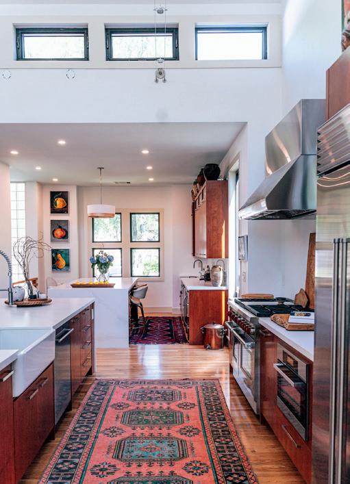
The extensive kitchen remodel began as an anniversary present from one homeowner to his wife, an artist and avid entertainer who envisioned a more functional space to accomplish everything she loves to do. Their home was designed by an architect who had lived there for many years before the new owners moved in and it was in need of a facelift. But Austin designer Cody Rackley understood the importance of maintaining the original architectural elements that made the home so unique. “Being a mid-century modern home, the owners wanted to keep the aesthetic true to the original design.
They kept the glass block windows, wood paneling and the original wood floors. These elements were the foundation for the remodeling. We wanted to make the kitchen feel as if this was original to the house and not a modern add-on,” he says.
Working within the original footprint of the kitchen and incorporating an adjacent dining room that was seldom used for dining, the homeowner new exactly what she needed to operate efficiently, and her main request was to include a 14-foot island like one she had seen in a friend’s home. Now the homeowner can have friends gather while she is prepping for the many elaborate parties she enjoys hosting and cooking classes she holds in her home. The additional space from the former dining room allowed for a separate 9-foot island. “This smaller island is used as a workspace during the day but is also an intimate space to have a romantic dinner for two or with another couple,” says Rackley. The two large islands determined the traffic flow and appliance placement throughout the rest of the kitchen.
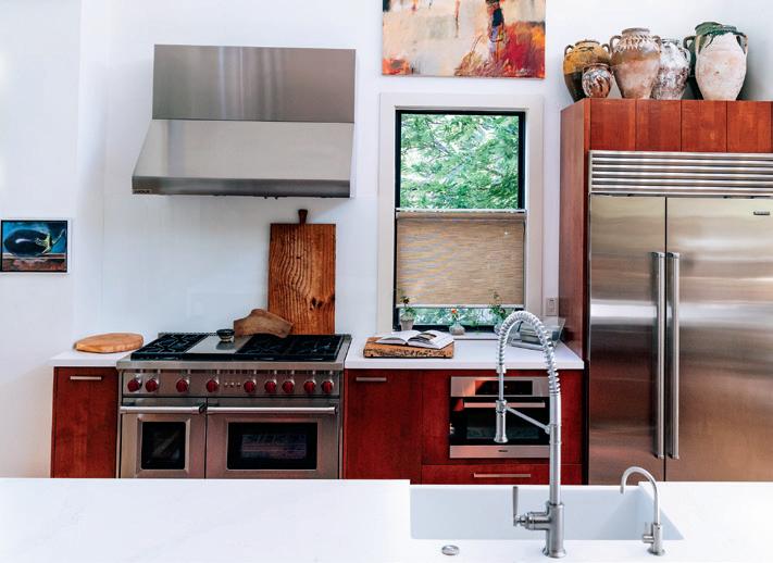
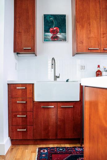
An original, freestanding paneled room divider that separates the kitchen from the living room, along with existing window and door trim, set the tone for the cherry wood cabinets with custom stain to match. Cabinets, by Diamond Millworks, were designed to replicate the style of the paneled divider but to also accommodate the homeowners’ antique water jugs, sourced from travels around the world. Upper glassfront cabinets with awning doors display other collectibles and mimic the original clerestory windows found on either side of the kitchen. Island countertops are Cosentino® Classic Calcatta; surrounding counters are Cosentino Extreme White Zeus. The backsplash is a custom seamless glass sheet mounted over a white painted wall. It was a perfect, clean solution for the homeowner who did not want decorative tile. Another request
was to forgo a stainless sink in favor of porcelain. Rackley chose farmhouse sinks which were more functional for his client’s daily use and says, “To keep the farmhouse sinks from screaming ‘farmhouse’ we went with a squared-off apron to tone it down.” And in line with a true cook’s kitchen, a Wolf® range, Sub Zero® fridge, EdgeStar® wine cooler and two ASKO dishwashers round out the appliance package.
Overhead, two strands of LED cable lighting from Tech Lighting all but disappear in the raised ceiling but provide adequate lighting to support the natural light from the clerestories.
Throughout the kitchen hangs the homeowner’s original artwork and Rackley says, “The fruit and vegetable paintings were actually created by her during the remodeling. She said she wanted something to do since she could not be in the kitchen doing what she loved. She was an artful woman and very inspirational!” So inspirational in fact, that she would leave daily notes on the oversized chalkboard to cheer on the work team. “It was always great to see a new note every visit!” u
STUDIO R 512-269-3898
AWARD-WINNING INTERIOR DESIGN
custom homes • condos remodels • commercial
Stephanie Villavicencio
Texas Registered Interior Designer 512.443.3200 www.bellavillads.com

HOME DESIGN
NIC HOLLAND ARCHITECTS, PHOTO BY PAUL BARDAGJY
