
30 minute read
A deep dive into the history

by The Skinny

Sketching a Scene
From early Slam events to pre-pandemic parties, we delve into the visual history of Scottish club culture with help from some notable club flyer and poster designers in the final part of our series platforming emergent writers, produced in partnership with Edinburgh International Festival
Advertisement
Interview: Chiara Wilkinson
Sometimes we are transported back to a particular night without warning. It might be spurred on by a dog-eared ticket found down the back of the sofa, or the remains of a poster peeking through a papier-mâchéd wall on the Cowgate. It could be an illustration you see while scrolling through Instagram, or the face of a stranger who once handed you a soggy flyer on Sauchiehall Street. Providing visual references for nights that may otherwise feel hazy with memory, graphic designers form an integral part of the clubbing ecosystem. Gone are the primitive days of posters made exclusively with felt tip pens and a photocopier; as digital design software has become more accessible, club artwork has grown increasingly varied and innovative.
Back to Basics
The house and techno explosion that was born in the United States made its way over to Scotland in the mid-1980s, back when posters disguised as adverts for car MOTs disclosed vital details for illegal raves. By the end of the decade, the underground electronic dance scene had fully infiltrated the commercial world. Block colours, geometric shapes, and simple motifs were popular in posters, and balancing a huge amount of event information with an eye-catching design was essential. Wendy Helliwell is a mixed-media artist from Edinburgh with a vast collection of original flyers from late 80s and early 90s club nights. She references a poster for a 1989 Slam Splashdown all-nighter at Tramway in Glasgow. “I’m pretty certain that was one of Scotland’s first legally organised raves,” she says. The poster is dense with information, packed with every ticket vendor in the country, coach departures, line-up listings, as well as promises of candy floss, a juice bar, and a ‘NASA weightless simulator’. “There were bus loads coming up from the Haçienda in Manchester, and the queues were enormous,” Helliwell recalls. “We only got in by the skin of our teeth. There was a bit of ticket fraud meaning that some of the genuine ticket holders were refused entry.” Another standout from Helliwell’s collection is an early Sub Club poster for the only Scottish date on acid house icon Adamski’s 1989 tour. It has a strikingly bright turquoise background, juxtaposed with an abstract splattering of gold paint. “Adamski wasn’t massively known at the time,” Helliwell says. “The night was just a complete sweatbox. You left and you were soaked to the skin.”
Playing with Pop Culture
“At the start of the 90s, people were really into ripping off movie posters,” says Paul Hagan, a 46-year-old flyer collector from Aberdeen, who set up a Facebook community group called Scottish Classic Club Culture just over a year ago. He references a poster from a 1991 Friday the 13th house and techno party in Inverness, featuring a typical horror movie graphic complete with an 18 film certificate. Hagan’s collection reveals that there was a lot of pop culture referencing going on in poster design at the time – be that logos, labels, or famous records – often because they were so easy to alter. “People did things like scan a videotape cover and manipulate it using some really primitive Microsoft Office thing,” he says. “Some of my friends would cut words out and stick them to flyers then photocopy them millions of times.” One of his posters – from a Disco Frenzy 90s night in Aberdeen’s Cotton Club – plays on the classic album cover for Sex Pistols’ Never Mind the Bollocks, Here’s the Sex Pistols. Meanwhile, the poster for a 10,000-capacity Hogmanay party at Edinburgh’s Royal Highland Centre in 1998 is based on a whisky bottle. Famed for being the home of Bass Generator’s happy hardcore, the poster depicts a frightening cartoon version of Father Christmas underneath the name of the event series, The Rezerection.
Sci-fi Stereotype
Memories of early rave flyers will more than likely conjure up images of aliens, UFOs, and loved-up robots. Dance music’s wholehearted embrace of the sci-fi aesthetic was in part due to design trends at the time, but also because of the futuristic event experience that promoters were determined to sell. “In the
Image: Courtesy of the artist and Wendy Helliwell The Rezerection
Image: Courtesy of the artist
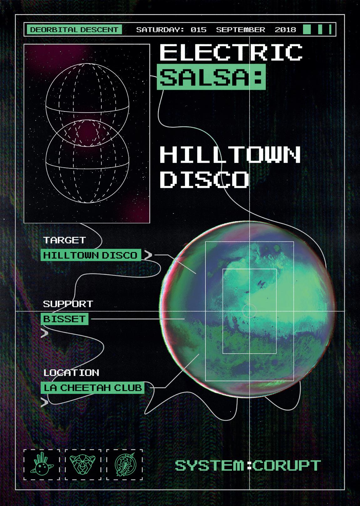
early 90s, you would go to raves and there would be massive laser shows and people dancing on stage dressed as robots,” says Hagan. “So the sci-fi imagery was carried on in that way.” He nods to a droid on the poster for a huge Technodrome rave held on an Ayrshire farm in 1991, and the mysterious alien egg taking centre stage on the design for the Sweatbox opening night at Dundee’s The Venue II. Fast forward a couple of decades and the futuristic, tech-heavy imagery was still around, although in more modern, subtle iterations. The design for the opening night of Inner City Acid – a night run by David Fleming between 2004 and 2009 in Glasgow – spells out the line-up in a digital-style font with an anaglyph image of the city’s skyline. Come the late 2010s, Paddy Hughes’ designs for Hilltown Disco – a record label and party collective born in Dundee – used textural layering and illustrations of transmitters to emulate a scene from inside a spaceship. Even an uber-sleek design by Russ Sealey, of Para Creative, for Terminal V’s 2019 The Rising event at the Royal Highland Centre plays on the cyberspace theme, with a neon globular cluster framing the event’s flashy line-up.
Talking with Typography
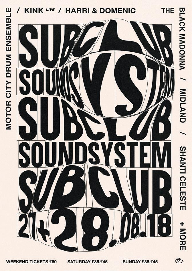
Although classic rave culture was famed for its maximalist flyer designs, the 2010s ushered in a new generation of designers who weren’t afraid to strip it right back to keep things fresh. Caterina Bianchini made a name for herself carving out the aesthetic for Sub Club Soundsystem by playing with the most basic of poster components – the text itself.
Image: Courtesy of the artist and Paul Hagan
Inspired by anything from household packaging to contemSweatbox porary artists like John Baldessari and Alan Fletcher, Bianchini would usually try to resist the urge to visually interpret the ‘sound’ of a night. “I wouldn’t be interested in making something look like a typical deep tech night, instead I’d make it really arty,” she says. Bianchini’s designs would always undergo a final edit to ensure the human alterations were obvious. “I liked adding little details that you won’t necessarily see firsthand,” she says. “But when you come up close and really interact, you can see that maybe one of the As is upside down, or one letter is more squished than the others.” Originally from Edinburgh, Bianchini landed a design role at Boiler Room in 2016 before going freelance for a variety of clients in electronic music. “I think that I kept doing posters for so long because of how expressive the work was,” she says. “It really allowed me to explore typography and my style came over time.” Bianchini now runs her own creative consultancy and branding agency in London, Studio Nari, and although no longer designing for clubs, she credits her grounding in posters for her fluid approach to current projects.
Caterina Bianchini
Paddy Hughes
Image: Courtesy of the artist
Cut and [cmd: V] Paste
Modernising the old school cutand-stick technique, graphic generalist Connor MacDonald – also known as Sensory Works – usually works via digital collage. He started out making posters for his own club night, Contour, at The Reading Rooms in Dundee, before moving to Glasgow around 2018 and working for the likes of La Cheetah Club and The Berkeley Suite. Despite using the same Photoshop collage technique, many of MacDonald’s designs look dramatically different. One might be hyper-realistic, while another resembles a children’s cartoon.


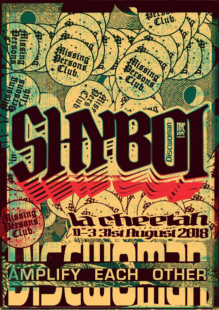
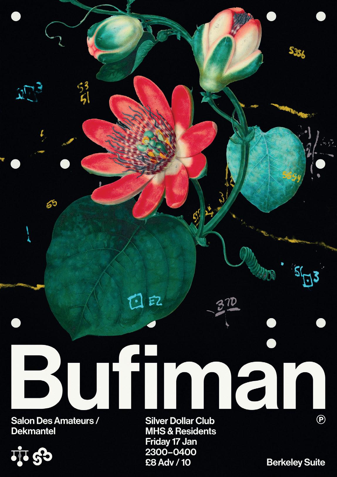
Image: Courtesy of the artist Image: Courtesy of the artist Image: Courtesy of the artist
Ryan Marinello Ryan Marinello Ryan Marinello
A poster for a Ribeka show at La Cheetah Club in 2018 shows a floating 3D rendering of names on the line-up, all moulded into a huge smoker’s lung. “[Ribeka] was talking about the texture and tone of the music and I just took it in a very material way,” MacDonald says. “Everyone’s names bloomed into weird organs, blown up and squashed together. There’s very few rules in this space, which makes it really fun to play around in.” One of MacDonald’s personal favourites is a design for a Bufiman show at The Berkeley Suite in January 2020, which was made using a cut-out of a flower painting from the Met Museum’s online collection. “There are hundreds of things that you can use for free, completely in the public domain,” he says. “No one’s ever really doing much with them; they just sort of sit there being old bits of art. The whole thing is about referencing different things so that people have a really good idea when they see the poster of what the night is about just by the vibe.”
A Photoshop Affair
Edinburgh-based DJ, promoter and self-taught graphic designer Ryan Marinello is another artist using Photoshop to create his poster artwork. Prior to the pandemic he regularly produced posters for club nights at Sneaky Pete’s, including his own TEESH party series. Although his work may not always follow a concurrent theme or aesthetic, his designs somehow always manage to look distinctly his own. “I got into poster design because I started playing around with Photoshop in my spare time, making collage-type stuff just for fun,” he says. “I’ve been asked by other designers where I went to art school or how I do things, but I don’t have any way to explain it apart from I’ve spent hours playing around with a program.” From rainbow colour fields to darker, graffiti-inspired type, many of his designs look so well-rendered and nuanced that it’s difficult to believe they were made digitally; but it’s all about building up components. Marinello approaches concepts in different ways, sometimes starting by placing a new font in the middle of a blank page and putting text and visuals around it, other times by recreating a vision in his head. “It’s hard to say when to stop adding to a design,” he says. “Sometimes I can spend over ten hours on one, sometimes it can be finished in an hour or two. You need all the necessary information there, then it’s sort of like getting dressed. You just know instinctively.”
Creating Characters
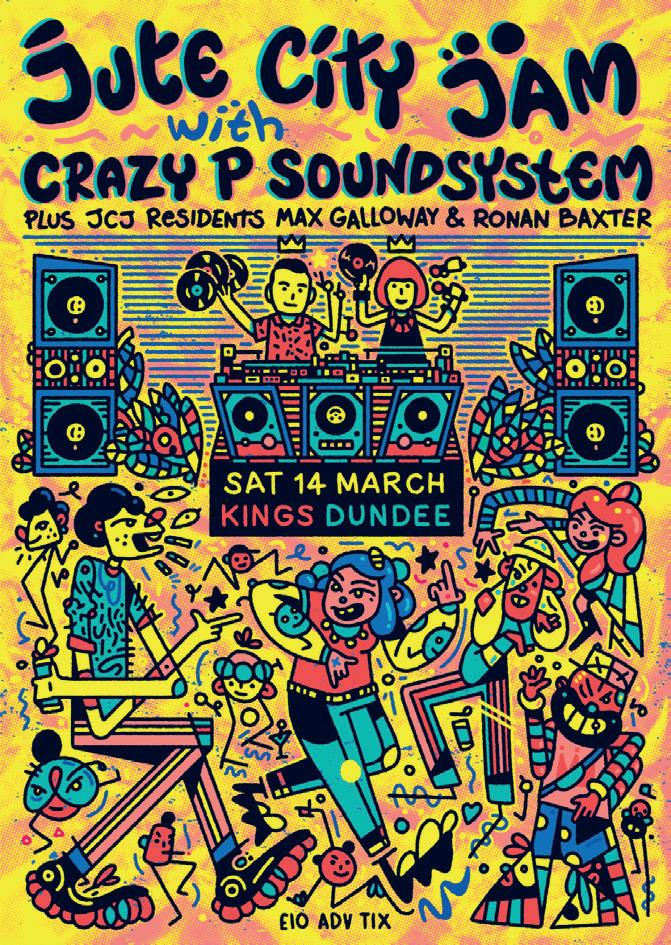
Derby-born Jacob Tomlinson has been designing posters in his signature style since 2011. Illustration heavy with numerous narratives and characters in conversation, Tomlinson describes his style as a weird blend of Keith Haring meets Where’s Wally meets Jamie Hewlett meets the Beano. He made his start drawing flyers for indie bands before picking up poster work in 2017 for Dundee house and disco night, Jute City Jam. Tomlinson says that he is inspired just as much by peoplewatching in clubs as the music itself. “I get into a lot of characters and their interactions with one another,” he says. “I like making something that somebody can stare at, so that if you did have it on your bedroom wall you could look at it every day and maybe spot something new.” A quick glance at his design for a Crazy P Soundsystem event at Kings in Dundee, which was cancelled just before the pandemic in March 2020, depicts a club scene with the infamous acid house smiley drawn into the middle of the speakers and a chaotic dancefloor of geometric
Image: Courtesy of the artist
Image: Courtesy of the artist
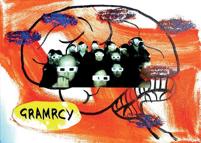
Image: Courtesy of the artist cartoon clubbers. Each design can take around 12 hours to make, and they are always born out of daydream-doodling. “It starts in the sketchbook, which is just a translation of my brain onto the page,” Tomlinson says. “Sometimes the promoter will ask me to include specific things, like the bouncers, then I usually draw it with a pencil roughly or draw directly into Photoshop before adding the colours digitally.”

Let’s Get Physical
For all of the advanced software out there, though, it’s impossible to recreate the effects of tangible media. Some contemporary poster designers still work solely in the physical sphere, or more than likely will manipulate original artwork using technology. Glasgow-based artist Gabriella Marcella is best known as the founder and director of design studio RISOTTO, specialising in risograph printing. Marcella’s signature style can be seen on a 2015 poster for RIDE, a popular hip-hop and R’n’B night at Sneaky Pete’s which came to an end in 2019. The poster was made using risograph and a stencil print, achieving a soft overlayering of tones that just couldn’t be replicated using a printer. Meanwhile, Edinburgh-based photographer Oliver McKenzie used ink, acrylic and collage to make the bold design for a 2020 Gramrcy set at intimate St Andrews party series, Wax Rooms. Unlike the text-heavy posters of earlier eras, the ability to disseminate event information separately online meant that it could focus on being an interpretation of Gramrcy’s headspace music using solely tangible media, before being photographed and transported into the digital realm. And then there’s Al White’s mindblowingly complex designs for the 12th Isle parties. “I use a lot of drawing and
Jacob Tomlinson Image: Courtesy of the artist analogue techniques, especially in the first half of the poster-making process,” says White, who started off making posters in Glasgow in 2014. “I also use Photoshop, so for me it’s about finding interesting ways to take things in and out of the computer and make something that sits somewhere in between. I screenprint a lot of the posters too, which adds another layer to the whole process.” One of his posters for Concrete Cabin – a record label and club night playing drum‘n’bass, grime, jungle, and hardcore – was made using spray paint and digital type, while his two-tone design of organic twisting structures for the last 12th Isle party at The Art School was made by working on top of a previous poster. “I then re-drew the isles to be decayed and demented from the hell we had put them through in that basement,” he says. The prevailing urge to tamper with perfection, and to intrude on Adobe’s symmetry and sleekness with the human hand, is a recurring theme in the evolution of club poster design. It is art that is raw, colourful, loud, and chaotic. It’s gloriously imperfect, and one of the most accurate visual reflections of nightlife that we have.

This article is the final part of our series platforming emergent writers, produced in partnership with Edinburgh International Festival
Follow Chiara Wilkinson on Twitter @chiarawilkinson
Gabriella Marcella
Image: Courtesy of the artist
Oliver McKenzie

A (very) Brief History of Scottish Clubbing
To coincide with the ongoing Night Fever exhibition at V&A Dundee, we asked some prominent members of the Scottish club circuit to share their clubbing memories
Interviews: Nadia Younes
Image: courtesy of Grrrl Crush
Grrrl Crush at Mash House
Photo: Niall Walker

Death Disco Pure

“The Riverside Club was such a fabulous place to put a club on – an old ceilidh hall with a sprung floor, one disco ball with a light, candles on the tables and a killer soundsystem. It was the perfect down ‘n’ dirty club venue and even though we eventually moved to The Art School, which was also brilliant, the Riverside days were my favourite… All the nights I shared the stage in The Art School with my fellow resident, and my best friend, Paul ‘TheeMrMister’ Nicholls still fills me with joy all these years later. Paul passed away in 2010 leaving a huge hole in Glasgow clubland. He was a one-off; a true Glasgow legend.” – Sandra Marron, aka Madame S, on Utter Gutter at The Riverside Club, Glasgow “I think I might have been 15 the first time I went to Pure, no more than 16 anyway. It was utterly insane and felt like the energy of a 12-hour all-nighter condensed into four hours. It was friendly but really intense, and the music was unreal. Although there were other techno/house clubs about, nobody did it like Pure. Pure was, is, and will always be the daddy!” – Kris Walker on Pure at The Venue, Edinburgh “For me, [The Arches] was where the magic happened: Uncle John & Whitelock’s debut gig inside a shack in a makeshift garden at VAULT; Jonny Woo and team lip-synching, fighting and stripping each other at Horse Meat Disco; Bar Art flash-mobbing wearing mirrorball heads, the lycra-clad, bearded baritone Le Gateau Chocolat singing Nessun Dorma, and Ann Liv Young shouting ‘you bunch of A-holes!’ while wetting herself onstage – all at seminal club Death Disco.” – Niall Walker on Death Disco at The Arches, Glasgow “We promoted the Scissor Sisters’ first live gig in Scotland… [and] it was insanely busy. They were blown away, and said the next time they came back to play, they ONLY wanted to play for us. Their next show came about five months later, and we booked them for Abnormals Anonymous at The Art School, but by then they were in the UK top ten. We met a whole new generation of queer kids who had never been to clubs, and didn’t know that they even existed outside of the Polo and Bennets, and whose first “gay” music experience was seeing the Scissor Sisters on Top of the Pops. That was an amazing night.” – Alan Miller on Record Playerz at The Art School, Glasgow “I used to get so stressed before every Grrrl Crush event that I wondered why I started throwing parties. But once we were in the swing of things, I’d always take a moment to stand back and look at what we’d created and I realised what we were doing was important. Bringing the queer community together, providing a safe space for women, non-binary and LGBTQ+ people and championing them both on stage and off. I’d wake up the next day with my faith in humanity restored. That’s what clubbing has always been about for me – finding love on the dancefloor.” – Roberta Pia on Grrrl Crush at The Mash House, Edinburgh “The Reading Rooms was the club the Hilltown Disco collective met at, and were introduced to underground music. This was our home, and the first time we’d been able to curate a full night from start to finish and let Dundee hear what we were about. It was a sell-out crowd that really danced the full night and set the tone for all our nights after.” – Ben Rothes on Hilltown Disco at The Reading Rooms, Dundee
Night Fever: Designing Club Culture, V&A Dundee, until 9 Jan 2022
Wright Sparks
Edgar Wright likes Sparks a fair bit. If The Sparks Brothers, his exuberant 140-minute documentary celebrating the genius pop duo doesn’t convince you of that, then our chat with the Shaun of the Dead director surely will
Interview: Lewis Porteous
Photo: Jake Polonsky
Film
The brilliance of evergreen pop eccentrics Sparks cannot be overstated. Edgar Wright makes a good go of it, however, in his latest feature. The Sparks Brothers may well be the most effusive music documentary ever made, with not one of its 140 minutes given to even the mildest criticism of its subjects. Yet it’s easy to share the director’s affection for the band. Since the early 70s, brothers Ron and Russell Mael have proven Zeligs of global pop culture, responding shrewdly to the defining moods of time and place without losing sight of their own idiosyncrasies and distinctive branding. Their quality control has rarely dipped over a 50-year career, and they steadfastly refuse to play the part of a nostalgia act. After working on this project over a period of two years, Wright’s enthusiasm for the Maels hasn’t dimmed. During our chat with him, we find the director wide-eyed and engaging, approaching his promotional duties as though performing a public service. “If in a nutshell I could say what my aims were for this documentary,” considers the director, “I guess I decided to do it because I thought Sparks should be more famous than they currently are.” Given Wright’s skill for using music to compelling effect within his films, it’s surprising how long it’s taken for him to champion his heroes. “The reason I haven’t used Sparks’ music in my movies is really a credit to them,” he explains. “There’s not many Sparks songs that sit comfortably in the background. They demand your undivided attention and most of the songs have very specific lyrics that will make you think about the subject of the song rather than what’s in the scene. I know because I tried it once, with Hot Fuzz. “I tried to put [1974’s near-chart-topper] This Town Ain’t Big Enough for Both of Us in that, in the scene where Simon Pegg fights Timothy Dalton in a model village. Obviously, the title of the song fit perfectly, but when I tried to put it in there, I found myself not watching the scene but listening to Sparks.” With mock defensiveness, he adds: “I feel like I’ve atoned for my sin of not putting Sparks in Hot Fuzz by making a movie that has maybe 80 Sparks songs in it!”
Edgar Wright
These songs variously cover glam rock, baroque pop, primitive hair metal, American MOR, Eurodisco, new wave, synth-pop, opera and Hollywood musicals (Annette, their screen collaboration with Leos Carax has just opened Cannes to great acclaim). However, it’s the brothers’ use of visuals that proves most likely to captivate the average moviegoer. “Once you start to delve into their aspirations pre-music, with Ron studying graphic design at UCLA and Russell studying film, that makes a lot of sense in terms of how they continue,” Wright observes. “Even before they started trying to make movies, Sparks themselves were very cinematic. A lot of the songs conjure up visuals for you because they’re mini-operas about unusual scenes. “On top of that, you’ve got the music videos, the album covers which all feel like they’re snapshots from films, and the stagecraft,” says Wright. “There’s a well thought-out choreography to how they appear, especially on TV. Sparks were really helped by a show like Top of the Pops being quite intimate with a band, with the [exuberant, camp] lead singer and [deadpan] keyboard player beaming into living rooms in closeup.” Understanding the importance of their telegenic qualities, Wright has sourced and cleared the rights to a treasure trove of archive footage, though he ultimately allows these clips to do too much heavy lifting for him. “I watch a lot of music documentaries and I enjoy ones that are about artists I don’t really care for that much,” he explains. “In fact, sometimes they’re more interesting. But I started to feel that Sparks were the most interesting and influential band who don’t have a documentary about them. I felt that even within their fans, there was a lot of connecting of the dots to do. There was a period pre-internet where Sparks would have these little spikes of success, but never in the same territory at the same time.” Wright’s approach to ‘connecting the dots’ in The Sparks Brothers was to cover everything in chronological order, a move that might be considered unusually thorough if not especially ingenious. The result lacks a satisfying narrative and offers little insight into the notoriously private musicians. By Wright’s own admission, “the big drama is on the records,” though he assures us that the reclusive pair are “almost monastic in their pursuit of being Sparks… what’s in the movie is not a million miles away from what they’re like.” He concludes: “I think sometimes people wrongly take their sense of humour as insincerity… when the truth of the matter is that they’re dead serious about making music and incredibly passionate about what they do. They don’t see making three- or four-minute songs as beneath them; they have fun with the form.”
Ladies’ Man
Back in 2018, the film adaptation of Alan Warner’s The Sopranos was filming in Edinburgh. Three years later, the feature – now titled Our Ladies – finally reaches Scottish cinemas. Here’s our on-set chat with the author, over a bracingly expensive whisky
Interview: Jamie Dunn
It’s a bitterly cold November morning in Edinburgh and two young actors – Rona Morison and Marli Siu – are wearing mini-skirts and chewing on ice cubes on Victoria Street. However, this isn’t the act of masochism it first appears. Rather, it’s an old trick of the movie trade that allows actors to perform outside on freezing days like this one without leaving puffs of misty breath with every line of dialogue. The film in question is Michael CatonJones’s Our Ladies, although no one is referring to it as such today. The working title is The Sopranos, same as the 1998 book on which the film is based. It’s a rambunctious comic yarn about female friendship and small-town life, and centres on five catholic school girls from a working-class port town getting up to mischief in Auld Reekie while visiting the city for a school choir competition. But, for obvious reasons, the original title had to be 86ed, save film bros confusing it for a gangster flick. The Skinny aren’t the only visitors on set today. Alan Warner, the author of The Sopranos, has flown in from his home in Spain to see how this long-in-the-works adaptation is progressing. Caton-Jones needn’t worry about writer interference, however. Warner is keener to grab a whisky at one of his old haunts – The Bow Bar, a few doors down from where the film is shooting – than look over the director’s shoulder. When we sit down to join the Scottish author with a couple of the bracingly expensive Orkney single malts he suggests we buy for our round, Warner explains that in the early days of the project (Caton-Jones bought the film rights in 1998, just as it was publishing), he had planned to write the script himself, but struggled with its structure. “I found it very difficult,” he admits. Veteran Scottish screenwriter Alan Sharp, whose credits include masterpieces like Night Moves and The Hired Hand as well as Caton-Jones’s Rob Roy, took over and whipped the screenplay into shape, but it still wasn’t right. “Alan’s script had a great sense of how to do it visually, but the dialogue maybe wasn’t that crisp.” Another spanner in the works was studio interference. “The studio had different ideas about

how the film should be done,” he explains. “There was a lot of money flying about in those days and big star names were mentioned to come into the film. I think Penélope Cruz was mentioned at some point.” Warner could have lived with any changes apart from one: the setting. “And that was the first thing that happened in Hollywood, of course,” he says. “They said, ‘Oh, what if it was set in Santa Barbara or Miami?’ But Michael, being Scottish, knew it couldn’t go that way. And he stuck by it for 20 years.” Warner has been pretty hands-off during this final pass of the script by Caton-Jones, and he’s happy with that. Perhaps this relaxed attitude is because this isn’t Warner’s first rodeo. His 1995 debut, Morvern Callar, was made into a movie in 2002 by Lynne Ramsay. “I’ve always been of the position you’ve got to let these film dudes do what they want,” says Warner. “People like Michael and Lynne, they’re dreamers; they want to tell stories in images. So you’ve got to just let them run with it.” It’s interesting that of Warner’s nine novels to date, it’s these two focused on young women that have attracted filmmakers. Warner doesn’t put the success of these two books down to any innate talent for writing women characters, however. “After I wrote Morvern Callar, there was a lot of ‘Oh, you do women characters so well.’ But it’s a bit like being told you’re better kicking with your left foot than your right foot. You just go, “Oh, right.” You just accept it. You just hope whoever the character is, male or female, they’re convincing.” He reckons this is mostly down to graft: “It’s crafting and reworking that does it, it’s not as if I have some amazing insight into female psychology. It takes a lot of work.” With Morvern Callar and now The Sopranos immortalised on film, Warner can lay claim to being one of Scotland’s most filmed living novelists (behind Irvine Welsh and, of course, J.K. Rowling). It’s a fact that has him a bit miffed. “In any normal European culture, be it Sweden, France, Spain... if they have famous writers, they make films out of their books. In Scotland, we don’t do that for some reason.” We’re starting to get the impression this topic is something of a hobby horse for Warner. “Maybe I’m an arty moaner,” he says, “but you’d think it would just be natural to have a few of the famous novels made into films – I’m talking work by George Douglas Brown, James Kelman, Janice Galloway – but then they shoot my shit. Why two of my books and not one by those masters? You can’t explain it really.”
Our Ladies is released in UK cinemas by Sony on 27 Aug
Alan Warner appears at Edinburgh International Book Festival, 19 Aug, 11.30am, tickets £12-14
Saddle Up
New Saddle Creek signee Indigo De Souza tells us about crowdsourcing screams for her new album, Any Shape You Take, and recording at Sylvan Esso’s studio
Interview: Nadia Younes
The centrepiece of Indigo De Souza’s second album, Any Shape You Take, features over a minute of screaming, nestled in the middle of a track called Real Pain. Being an incredibly physical expelling of emotion, there is something deeply overwhelming about the expression of screaming, and De Souza captures that intensity so well that it’s almost difficult to listen to at times. The screams were entirely crowdsourced, gathered by De Souza through an online call-out for “screams, yells and anything else”, and all 60 of the soundbites that were submitted to her were included within the final version of the track. “It was painful to listen to some of the recordings,” says De Souza. “It was definitely a catharsis to hear them all together, and to add my own voice in with theirs. It was kind of like a collective pain that felt good to express at the time of the pandemic. “Pain is always there; everyone is always in some kind of pain,” she continues. “And there was something really special about when the pandemic was happening, there truly – and I guess there still is in ways – there is a more collective pain than usual. I [often] feel more separated from people and more alienated in my brain, but at that point it was like, ‘we’re all going through something together for the first time, we’re all collectively feeling a similar thing’.” Born into a creative family – her father is a bossa nova guitarist and singer, and her mother an art teacher – De Souza’s musical journey began at nine years old when she first started playing guitar. She was encouraged to do so by her mum as a means of bringing her out of her shell and combatting her shyness, so to name her debut album I Love My Mom, then, feels like a fitting homage. Originally released in 2018, I Love My Mom was reissued in June this year, following De Souza’s signing to Saddle Creek and just a couple of months ahead of the release of her new album, Any Shape You Take. Both albums were written around and document a particular time period in De Souza’s life, during and in the aftermath of a tumultuous relationship. From the Day of the Dead-style artwork – designed by De Souza’s mother – to track titles like How I Get Myself Killed, Die/Cry and Kill Me, death looms fairly heavily on both records. Instead of a literal death, though, it feels more metaphorical. ‘Now that the baby’s gone,’ sings De Souza on 17 – the opening track on Any Shape You Take – seemingly suggesting a transitional period from her teenage years into adulthood. “It feels like everything I’m doing with music is never super intentional, but more natural,” says De Souza. “So they’re companion albums in that way, because they really kind of carry on from each other, but there are also newer songs on this album, too, that I wrote more recently… To me, they’re just narratives of my life, and they all feel very connected, and all of the old parts of myself feel very close to me now still, and always will.” Having recorded I Love My Mom at home in Asheville, North Carolina between her living room and bedroom, De Souza made the jump from home studio to professional recording studio for the new album. Any Shape You Take was recorded at Sylvan Esso’s studio, Betty’s, in Chapel Hill, North Carolina and produced alongside executive producer Brad Cook (Bon Iver, Waxahatchee). “[I Love My Mom] was kind of like before I knew anything about anything,” says De Souza. “I was just like a little baby, starting to play music with a

Photo: Charlie Boss
band for the first time, and all these songs that I had been singing by myself for years, I suddenly was singing with a band. “[Any Shape You Take] was a very different experience, having the resources that I had and being able to explore every avenue that I wanted to,” she continues. “I love feeling really cozy and comfortable, and like I have a lot of resources in a nice studio… but I also miss a lot of the aspects of the DIY feeling and I think next time I want to do a little bit of both, so I have the best of both worlds.” As we leave De Souza to return to the shooting of the music video for Hold U – the latest single to be taken from Any Shape You Take – it feels an apt way to end our conversation. Perhaps her brightest, most hook-laden track to date, Hold U sounds like De Souza coming out the other side of that difficult period of her life and simply declaring ‘It’s gonna be alright’.
Any Shape You Take is released on 27 Aug via Saddle Creek


