


Let's get the content consistent in the way it looks, sounds and feels.
It’s always been my philosophy that it's best practice to subconsciously make the customer feel it was their idea to think something is cool rather than tell them.
Let's personalize. Personalization of content is a way of building the brand's story and culture. This can create genuine connection between sellers and buyers without feeling like we are forcing it on them.
If the creation is executed correctly the content can be sliced and diced and carried over into all platforms including ecommerce, digital marketing, social media and what we supply to distributors and retailers.

Although video is the most important and effective element of modern marketing, a good photograph is still worth a thousand words. Nothing is better at attracting attention quickly than a photograph. One only needs to look at billboards to see this effect in action.

H O W D O W E M A K E G O O D
P H O T O G R A P H S ?
P L A N A N D P R E P A R E
Let's use athlete product images as an example. We know the athlete’s focus is primarily on racing and this is why it's important we plan ahead for the shoot by having:
clear creative vision. shot list prepared that covers the needs and dimensions for all platforms for sales and marketing assets. clothes selected, steamed and hung at set location. location prepared with props needed. cameras, cards, file type, lighting set up, and test shots done before talent arrives.
By doing this, we ensure a smooth and easy process. The talent arrives, we make it quick, fun and painless. When we ask them to shoot again, there is no hesitation because it was easy and they are happy with the end result. Maybe so much so that they want to post on their own social media platforms.


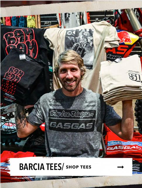
Overhead lighting creates shadows under eyes and is unflattering. That is classic horror film lighting. Color tone makes his skin look red and blotchy.

The idea to take him out of the studio and into your workspace/shop is good, but this takes planning, preparation and better execution.
If there is not time to set up a light and shoot it properly, then it is best to stick with the studio. That should always be set up for last minute occasions.
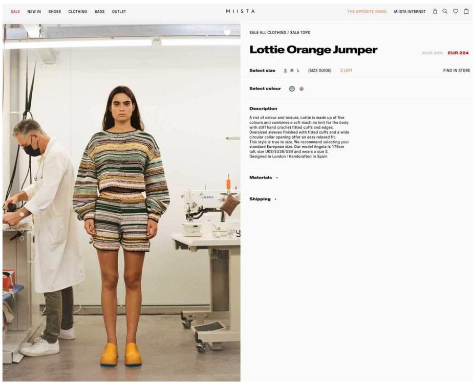

Select a few filters (or editing settings) and apply them to your entire portfolio of assets to ensure consistency

Mike, I know you have your filters. lets review the process.

Dustin
Video is undeniably the most effective tool when it comes to marketing and sales

Short-form or long-form, documentaries or Vlogs, TikTok's or Reels, video can be used in so many different variations, on so many different platforms.
Video allows you to package information into a short narrative that will engage viewers in a way that text can't. This makes them more memorable as people are far more likely to remember a story than a list of facts.
Video can help the business reach new audiences and attract new viewers to your social media pages and website.
Using a video-focused approach to your brand's social media content allows you the ability to tell the TLD story in the most relatable way possible.
Showing up on Instagram consistently is a great opportunity to display a no-salesy story about the evolution and culture of the brand
Posting consistent high-quality and diverse content on the main feed is vital. I feel there should be at least two posts per day, and after testing, it could increase. when first evaluating several months ago on January 11, 2023, @troyleedesigns has posted only 3x. January 11, 2023, January 6 and January 2.
Develop a content plan and stick to it. Preplan and preload. Develop categories that tell the story of the brand such as Supercross, Motocross, Art, Athletes, product, Indycar, Motogp, Heritage, MTB, TLD Team race highlights, etc. The list goes on. We then put those into a schedule. Much of this can be uploaded weeks in advance and automated. If something pops up spontaneously all the better.
Instagram Reels are most effective. Reels provide the brand with an opportunity to demonstrate who they are in a fun, digestible way. This would allow TLD to take advantage of the algorithm and get the brand in front of more people.
Instagram Stories need to use interactive developments. For example, a good practice would be to have one person shooting native vertical video and posting throughout the night of Supercross.


Any brand without a on the YouTube platform lacks a widespread presence
Established brands have accounts with massive subscriber communities. Smaller brands are also tapping into the crazy potential of YouTube and growing their subscriber base. In the moto world, YouTubers are slinging hundreds of thousands of dollars in merch.
Why should TLD be active on YouTube?
YouTube has 1.7 billion unique monthly visitors. In total, the site gets 14.3 billion visits per month. That’s more than Facebook, Wikipedia, Amazon and Instagram.
Everyday, more than 1 billion hours of video are watched on YouTube, surpassing the amount watched on both Netflix and Facebook combined.
54% of YouTube users are Males. Males aged 25-34 are YouTube’s biggest advertising audience.
Competitors are doing it and TLD has better stories to tell.
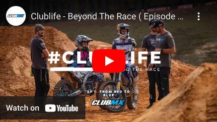

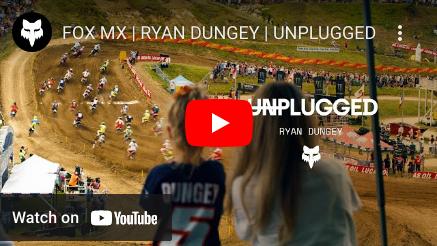
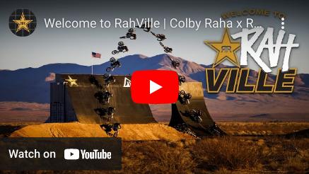
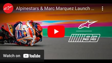
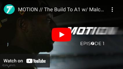

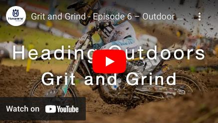


Brand credibility. A good YouTube channel increases brand credibility and is a platform for getting close and personal with the target audience. This creates a sense of culture with the customers
More Traffic. Every brand needs traffic on its website. It's important to lead people to a page and hopefully into loyal customers. A link to the website can be added for viewers to access. This will drive more traffic to the website where they can either subscribe to the brand’s channel, purchase items, or join a mailing list.
The obvious idea is to do a series on TLD’s Supercross season. The idea is to have an 8-10 min video posted at least 1x a week with the proper recipe for CTR. It wouldn't take much. Like a fly on the wall, shoot one day per week of practice and the races. Keep it light and fast paced. Cut this up to an 8 minute recap of the week using the new YouTube way of doing things that engages the algorithm. Hey, if Barcia doesn't mind doing an interview after the race for Vital MX, I'm sure he wouldn't mind doing one for TLD.
Profile videos on TLD’s top athletes from all motorsport. These should come out 1x a month, 8 to 10 minutes, with a consistent look and feel that show the diversity of the brand.

Why should TLD be positing YouTube Shorts ?
Eperimenting with Shorts gives us the opportunity to leverage the momentum of YouTube’s own promotional effort which in effect can grow the channel quicker.
While aargeting older consumers may have trouble reaching its target audience on TikTok, it’s much more likely to be able to find them on YouTube
The majority of the content is just carry over from IG. at least to start with.
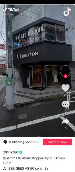
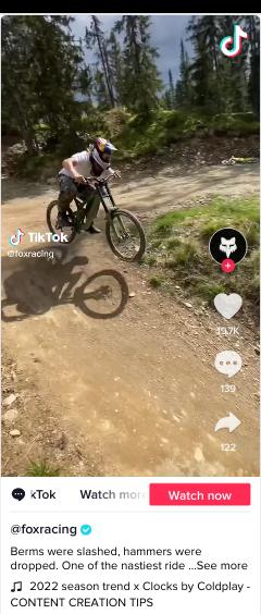
Yes, the platform caters to the younger generation. To be specific with numbers, around 60% of TikTok's users are 16 to 24 years old. Same demographic as Tillys. The cost is minimal in the beginning. its cary over content on shot and edited on a phone in 10min. Have a look at the brands that are actively using the platform.




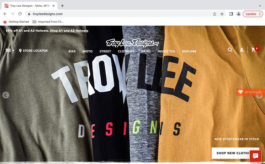
Update your Shopify them to one with more modern shopping experiences and designed to showcase images to support visual brand storytelling My favorite right now is "Stiletto" https://themes.shopify.com/themes/stiletto/styles/chic/preview


Up to 7 words and 41 characters are optimal Mobile first approach - 70% of users are on mobile Numbers, & symbols can help your email stand out, but don't over do it.


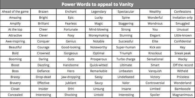
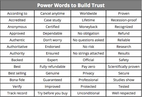
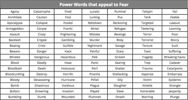
You can trigger an emotional or psychological response in the recipient, which is more likely to prompt a click to open the email. Consider power words that arouse curiosity, appeal to vanity, build trust, or develop FOMO
Run through an online SL tester to get feedback
https://www.omnisend.com/subject-line-tester/ https://coschedule.com/email-subject-line-tester


30 to 55 characters long (mobile first approach)
Use sentence case for Preview Text
Don't lose your message
In webmail clients like Gmail, you only have so much space for both the subject line and the preview text together. Notices how in this snapshot of a Gmail inbox, some preview texts aren't full displayed. Yet others have a lot more space left to make an impact.

Tips:
Add a call to action
Don't repeat the subject line
Make your subject line and preview text work together. Think of it as your Subject Line best friend.
Use the preview text to build curiosity (don't just summarize)
Offer or % off should be incorporated here.
Size
It has to look great on all screen sizes
Hero text, CTA, and main copy should be above the fold when possible. CTA and main copy not as important as hero text.
This could mean Text and CTA may need to be overlayed on the image (mobile first)


If it falls below as many as 70% of recipients won't see it.
Harmony
People are instantly distracted by bad design and will click off your site if your hero image doesn't harmonize with the rest of your layout. Keep your aesthetic in sync by carefully selecting the fonts, sizes, colors, navigation, visuals and copy.
Organization
Part of creating a harmonious design is having excellent organization. Your hero image should have a logical hierarchy and flow, so every piece builds on what came before. This is incredibly important for pairing images with copy.
When a relevant image is paired with information, people can remember 65% of the information 3 days later. Only 10% is remembered from information alone. Make sure your message is clear and connects with your visuals.
The text needs to be easy to read Link to appropriate page so there isn't a high bounce rate. If there is a visual disconnect when the customer clicks through, they are likely to fall off because they don't see what they are looking for.
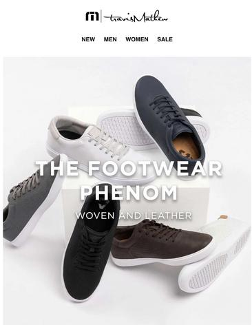
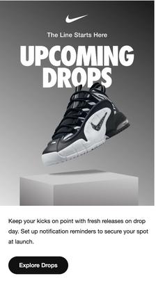
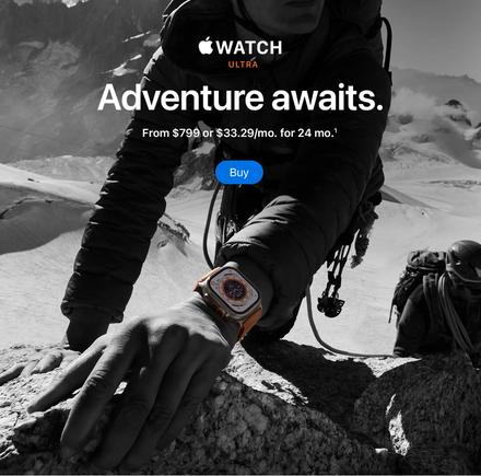
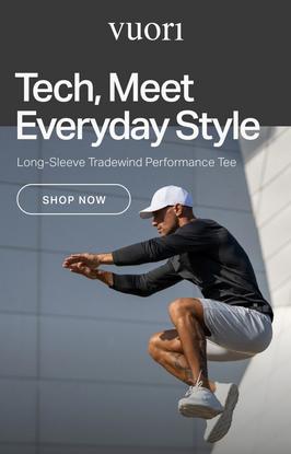


Main copy needs to include incentive or benefit to the customer. A good hero image can instantly connect with your subscribers and build credibility for your brand. It persuades the subscriber to go through the entire email and entices them to click through the CTA.
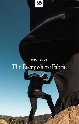
Use action-oriented text.
Get the discount
Reserve your spot
Try it out free
Make your button text large and legible. Your call-to-action button text should be large enough to read easily, but not so large to be considered obnoxious.


Keep it short.
We’ve already mentioned including large, action-oriented text, so this one seems like a no-brainer. If you’ve got large, actionable text, you’ll need to keep the copy short. Two or three words is best but no more than five or six.
Create urgency
Including a sense of urgency in your CTAs helps garner those high click-through rates. Even just adding the word “now” builds some urgency.
Use bright colors
Button colors matter. You want something that’s eye-catching without being too distracting. While green and orange buttons are said to perform best, your button colors will depend on your brand.

Add white space


Be sure to include a healthy bit of white space around your CTAs. The extra white space helps create a visual break and draws the reader’s attention right where you want it.
Keep it above the fold
You’ll want to make sure to have a call-to-action button near the top of your email so users never miss it. It increases the scanability of your emails and calls attention to your main message or offer.
Watch the Hierarchy – usually no more than 3 CTAs excluding PDPs
Your main call to action should be the biggest and brightest, and less is usually more when it comes to choices.
Follow a natural progression.
We read top to bottom and left to right, which creates logical places for CTA buttons: buttons placed toward the bottom or to the right of content tend to outperform other placements. This makes sense from a messaging standpoint, too.
Align CTA with Landing Page
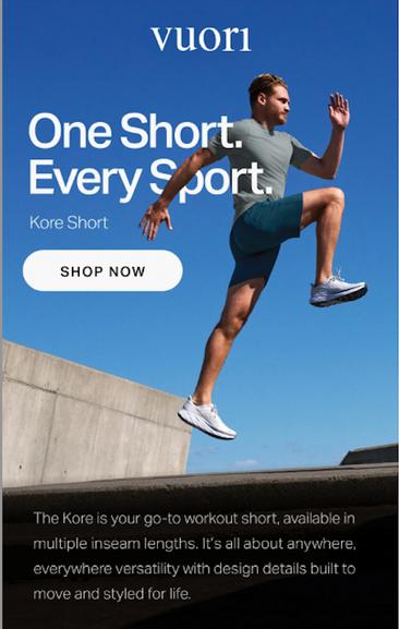
Personalize where possible
Talk about benefits
You know the value of your email. But does your recipient? No, not yet. And it's your job to explain it.
Be brief (short, clear, and concise)


Average time consumer spends on an email is between 8-15 seconds – short clear copy is needed.
One of the worst mistakes email copywriters make is trying to shove the entire story into the email message.
Find a way to summarize what the reader will get in a compelling way, and let them click through to a page on your website for more information.
Let the personality shine through.
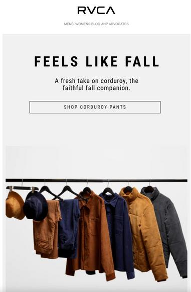
Establish tone and voice
Keeping your brand and demographic in mind, decide on a tone and voice that fits your company style. Keep it consistent in your messaging. Consistency is key to building — and keeping — this connection.

Prioritize clarity, and only then think about "catchiness.“
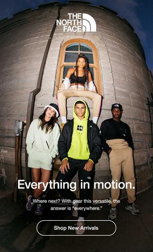
Never sacrifice clarity for the entertainment value.
Align your subject line copy and email copy.
Copy needs to be readable on mobile.


Write in the second person
Writing in the second person means using the pronouns “you,” “your,” and “yours." For example, "Before you leave in the morning, remember to bring your jacket." It means you orient the copy towards the reader, not yourself.


Stick to fewer than three typefaces
The less clutter you have in your email, the more conversions you'll experience. Don't junk up your email with more than two, or a maximum of three, fonts or typefaces.


When creating emails, you should also pay attention to how much of your message is taken up by images and text. Should be balanced
Gifs
Increase your email engagement rates is to add short GIFs to your messages.
ALT Text
Use ALT text in case the image doesn’t show in the email client
Email Width


Should be a responsive Template
650px for images is the best mobile first approach
If your email template is wider than 650 pixels, you're asking users to scroll horizontally to read your entire message. Ensures email appears correct on all device sizes.
Live Text (Future?)
Live Text and Live CTAs to increase deliverability & accessibility
Redo templates with brands to incorporate live text capabilities
Follow Programmatic Email Best Practices PPT
Incorporate UGC – user generated content more
Blogger images/athlete Instagram photos
Use Dynamic Content
Cross selling opportunities, pairs well with, Best Sellers, AMP
Loyalty – how many points they have earned fallback on join loyalty