
2 minute read
COLOURS


Strategic use of colour in a bathroom can bring even the most ordinary of spaces to life. Applying colour to your tapware, accessories, vanities, tiles, paint or even decorative items such as vases can add style and statement to your home. Bold gunmetal, gold, brass and rose gold finishes for tapware and accessories continue to trend and look striking against charcoal, black or hunter green colour schemes or more whimsical pastels like misty blue or pale pink. The colour you choose reflects the kind of atmosphere you want to create.

Round Freestanding Bath & Outlet by Clark
PRODUCT SELECTION TIPS
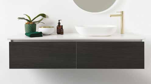
DRAMA – DARK HUES Rich, dark hues like black, charcoal, forest green and midnight blue paired with statement gold or brass tapware and accessories can build a sense of drama in your bathroom.
ENERGY – BOLD COLOURS If you’re looking for a room that is full of energy to wake you up, bold colours like firetruck red, electric blue or canary yellow can capture a feeling of spontaneity and fun. Use bold colours as an accent paired with a more neutral colour to allow it to take centre stage in your design.

Villa Gunmetal Grey Basin Mixer by Dorf
CALM – PASTEL PALETTE If you’re looking to create a relaxing, calm atmosphere then consider a pastel palette. This colour palette is complimented well with gunmetal or black tapware and accessories. NATURE – NATURAL COLOURS Bring the warmth of nature inside with earthy tones like terracotta, sepia brown, ochre or tan, or lush soft tones like sea green and teal. These colours pair beautifully with elements from nature like plants, timber or stone finishes.
DESIGN CONSIDERATIONS
Vivid Slimline Vessel Mixer Brushed Gold by Phoenix
MOOD BOARD Before locking in your colour scheme, collect samples of the tiles, paint swatches and finishes you’re leaning towards and assemble them on a mood board to test how the colours and finishes work together. Seeing it all together can help identify anything that doesn’t work in the scheme.
60/30/10 RULE Figuring out where to use colour can be daunting but if you use the 60/30/10 rule, you can’t go wrong! Select a neutral or light colour for 60% of the room, a secondary colour (usually a richer hue) to support the dominant colour for 30% and a bold accenting colour for final 10% of the room such as tapware and accessories.
LIGHTING Make sure you take the lighting of the room, both natural and artificial, into consideration when choosing your colours as it will affect how they look and the functionality of the room. Darker palettes will need plenty of lighting to offset the darkness they create.


