4 minute read
Robert Reck and the Rise of Southwest Regional Modernism
from Trend 2023
by Trend
A master photographer and architectural historian help us understand how old adobe evolved into some of the most striking contemporary architecture in the West
BY ELMO BACA PHOTOGRAPHY BY ROBERT RECK
Robert Reck has enjoyed several decades of success and renown as one of the Southwest’s preeminent architectural photographers. During this time, Reck’s keen eye and lens have recorded a remarkable transition in New Mexico building arts and tradition as well as in photography itself. As the ancient and historic use of adobe in New Mexico has diminished, the techniques of film and darkroom photography have yielded to digital cameras and computer imaging technology.
About 50 years ago, New Mexico and other western states began to experience dramatic increases in migration and population that would transform urban centers such as Albuquerque and Santa Fe, introduce suburbanization to a state proud of its rural community lifestyles, and import modernist aesthetics to New Mexican architecture and interior design.
Modernism, the essential theme of Reck’s photo suite, is a 20th-century style and lifestyle philosophy that was slow to blossom in New Mexico, first arriving by the 1920s with iconic artists such as Georgia O’Keeffe and John Marin, writers such as D. H. Lawrence and Willa Cather, and tastemakers such as Mabel Dodge Luhan. In architecture, the sleek Minimalism beloved by modernists had to contend with an old and beloved adobe building tradition that stood the test of time, colonialism, and the elements.

These same early modernists were quick to appreciate the malleability of New Mexico’s unique aesthetics to modernist concepts and trends, especially the affinity of adobe architecture to Cubism, the naked power of the dramatic and exotic landscape, and the rich, sometimes abstract cultural expressions manifested in the area’s deep Indigenous and Hispanic folk arts.
The art of architectural photography in New Mexico is, of course, heavily influenced by Ansel Adams. His astounding 1930s images of Taos churches and Taos Pueblo, as well as the unforgettable Moonrise Over Hernandez, NM, radiated with a love of sunbaked mud textures, infinite cloud-filled skies, and the dramatic effects of natural lighting. The solitary building in the vast, temperamental landscape is an Ansel Adams trope that Reck has utilized to great effect in his career.
The transition from Pueblo architecture to Spanish Colonial residential and religious forms and the AngloAmerican Territorial style in the 19th century introduced many innovations, but the essential elements of adobe’s massive minimalist walls and restrained window and door openings has endured. Architect John Gaw Meem became a master at adapting the ancient adobe forms in the 1930s and 1940s to modern materials, and his techniques influenced a generation of designers after World War II.
Sadly, earthen architecture in New Mexico has declined within the past 50 years as labor costs, material technologies, and stylistic and lifestyle preferences (large kitchens and bathrooms, for example) have favored more regional modernist design aesthetics. Adobe bricks have yielded to gypsum board or poured concrete. Wooden door frames and lintels have been replaced by structural steel. And modern glass in generous expanses provides daylighting and views of nature and city much more generous than ever before.
Besides adobe, rubble-stone masonry was utilized to awesome, monumental effect by Ancestral Puebloan builders at sites such as Chaco Canyon. The rustic rubble masonry vernacular style is also common in Northern New Mexico, especially in utility buildings such as barns and stables.
In a dramatic new Santa Fe residence by architect Timothy V. Blonkvist of Overland Partners, precisely fitted sandstone walls contrast beautifully with brushed stainless steel, gleaming against a cerulean sky. Reck’s masterful twilight composition of the Blonkvist house showcases the enchanting lighting effects of the “neo-farolito” lanterns in the xeriscaped garden.
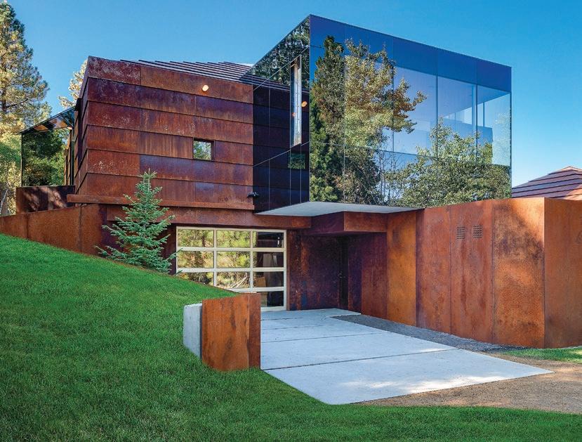
Another image of a residence in Missoula, Montana, designed by Eddie Jones, illustrates the new palette of materials that is transforming contemporary architecture in the West. The sculptural plasticity and rustic textural finish of reinforced concrete nicely enhances rusting Corten Steel in a multilevel house, which offers a counterpoint to the surrounding landscape. A stunning Reck perspective of an angular hallway captures the do-si-do of ethereal green grass and timber and the imposing gravity of tile and concrete.


The photographer also shows us how architect Larry Speck exploits precise harmonies of cubical geometry in the spectacular Torcasso residence overlooking Santa Fe. The perfect form of the cube provides the underlying logic and structure of the Torcasso’s interior floor plan, openings and views, furnishings, and decorative flourishes. Not only does it offer a visual counterpoint to the dramatic views beyond the glass and patio but it also creates a Zen-like ambience inside.
Reck fully exploits this creative tension with deep, focused images that evoke the ever-changing palette of New Mexico’s light, land, and sky while caressing the subtle gradations of toned concrete and wood. A brilliant view of the Torcasso living room showcases an iconic and monumental fireplace articulated by intense chromatic cubes, a playful modernist expression in an otherwise disciplined design statement.

Diamond Schmitt Architects (DSAI) of Toronto partnered with Albuquerque’s Studio Southwest Architects to create one of Northern New Mexico’s most advanced LEED certified buildings at the Student Union Building (SUB) of New Mexico Highlands University in Las Vegas in 2013. The imposing glass and Corten Steel of the building’s exterior dominate the town’s historic Zion Hill site and surrounding neighborhoods of Victorian Queen Anne-style houses.
For lead design architect Martin Davidson of DSAI, transparency and the SUB’s relationship to the town were key. “The city is a remarkable place and this is the gateway to the university, so we developed a design language and chose materials that blend the historic and the new,” he explained. Reck’s abstracted perspective view of the SUB’s grand stairwell illuminates the central transparency theme while evoking the curvilinear earthen-colored forms sometimes seen in Spanish Colonial-era churches.


Through Reck’s lens we see how Zydeco 66’s richly layered and textured bathroom design also interprets transparency effects of glass and mirrors in a recent Santa Fe residence. A traditional New Mexican ceiling of vigas and latillas lends a timeless craftsmanship to the complex materials palette of marble, tile, tigerwood, and porcelain, balanced elegantly by Reck’s framing and lighting in a warm, inviting photograph.
A 1986 Reck photograph of architect Antoine Predock’s Troy House north and west of Taos, nestled in a field of sagebrush, captures some of the essence of Reck’s work in its dramatic juxtaposition of home and mountain, earth, and indigo sky.

“My initial fondness for New Mexico and fascination with the place is, I think, what has captivated others, including great scholars like Bainbridge Bunting and Chris Wilson, and designers like Antoine Predock—it’s the tricultural heritage,” Reck noted. “I’ve enjoyed seeing the evolution and transformation of adobe architecture from mud buildings to its contemporary vernacular expressions, and how the buildings still express the idea of ‘living on the land,’ a value which is dear and precious to all New Mexicans.” R


